
At the same time as maps offer guides to spatially orient their readers, they collect a record of known space for viewers to occupy, collecting and displaying relationships that allow viewers to draw hypotheses about their relation to a totality otherwise not able to be seen. The format of all maps provide tools to understand and collate relations over an expanse otherwise not evident. The possibilities or potentiality for such comprehension–or the experience of the knowable–is encoded in the directions that any map provides to better navigate space by ship, car, train, or plane, but its syntax is also an invitation to inhabit space to formulate a hypothesis about expanse; early modern maps are especially conscious about how they mediated a record of the inhabited world.
My interest in how maps make these relations evident in multiple ways has been a theme of earlier posts; I have elsewhere blogged about the spaces Google Maps present for viewers, and the limited frameworks they offer to occupy space. Once might do well to gauge the productivity of how maps generate hypotheses about an individual relation to expanse by the unity by their representational surfaces–although the pictorial aspects of maps are too readily categorized as qualitative additions, held in contrast to their quantitative construction or collation of precise measurements of terrestrial position.
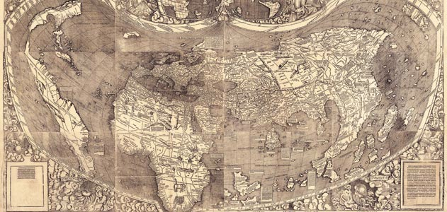
Early modern cartographers in the Dieppe school, like Nicolas Desliens, adopted modern practices in the hand-drawn maps, typified by the below 1566 world map, based on Portuguese nautical charts. The maps retained the format of projection, but offered a new way to inhabit the expanding world map for elite audiences–here by displaying a new region of the earth, Java la Grande, a mythical island that described by Marco Polo and perpetuated by the cartographers based in Normandy: the green swirls on Java recall the engraved illustrations in works of early modern botany or natural history that Sachiko Kusukawa has argued constituted material evidence from the natural world.

Java la Grande is prominently labeled, and the undoubted centerpiece of this world-map by Desliens, even though it is not at its center: it is, rather, introduced as a new area of inhabitation, whose verdant interior is a seat of spices and potential wealth, as well as lying, cosmographically speaking, in a sense as a complementary counterpart to the Americas, echoing the harmonious balancing of landmasses from ancient geography. But the map also advertises the region’s potential wealth to potential backers of voyages. There are, however, limited use of formal codes to structure the map’s surface, despite its notation of tropics echoes of the formal structure of world projections, or other conventions that lend order by structuring the map’s surface for its viewer.
The circumscribed role of America in Desliens’ map is perhaps also striking to modern viewers because it minimizes the expanse of the Americas in a somewhat marginal manner, probably recalling the thin crescent of coastal archipelago in the multi-sheet wall chart the humanist Martin Waldseemüller designed, which did not even name “America,” and gave far greater place to South America—
–though Waldsemüller did name the region on the slightly later set of printed gores that he engraved for purchasers to use to assemble their own globes:
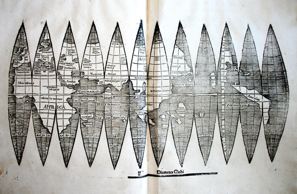
Waldsemüller exploited the expansive wall map of twelve sheets as more compendious and expansive record than a globe. The limited employment of conventions to structure their graphic surface might be explained to some extent by the use of map signs to comprehend a range of toponymic content and limited authority of map signs to structure their surface.
These images synthesize nautical charts in a comprehensive system of knowledge are at a remove from the ways that information is displayed about America–if still an empty land-mass– in later explicitly political maps that placed the Americas as an appendage of royal sovereign space, or as an area of self-government. In an instance of the first case, Georg Bickham invited viewers of his 1748 “Chorographical Description of All the Dominions Subject to the King of Great Britain” to process their relations to its disparate dominions in a coherent ways as nothing less than a political space. The conflation of a chorography of the national community with a global map is a classic conceit of empire: but the below engraving suggests a wonderfully compelling way of reasoning across two hemispheres.
The map, engraved and printed in London for audiences far more familiar with maps, shows continents as unpopulated landmasses, but the relations of whose inhabitants were subject to the royal rule of George II, in a somewhat magniloquent statement of royal rule for its viewers to scan. If the map reveals the expanse of Great Britain’s “Dominions in Europe, Africa, and America,” it is an optimistic knitting together of regions geographically removed, but subservient to the royal crown whose cartouche still occupied center stage.
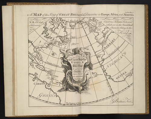
To be sure, this image processes something of a cognitive map of the royal subject’s relation to the vast terrestrial rule of George II as a totality that spans no less than three continents. The map is straightforwardly political, but conjures a land of royal unity that was geographically dispersed, and linked symbolically only in the map. Indeed, the cartouche in which Bickham inscribed the “Lord Majesty” in relation to its subjects has greater prominence or centrality in the map than any place-name or region that is represented on its surface, as well as considerably more ornate a subject of Bickham’s burin in the acanthus-like flourishes and drapery:

The obedience by which the royal subject inscribed the expanse of the map is more prominent than its geographic content because the map is quite distinct from a geographic record. The regions of North America are in fact rarely mapped in much detail aside from their shorelines; greater detail is accorded The Banks, shoals famously dangerous for nautical approaches, than other areas, and the ties to Britain confirmed more by toponymy than by qualitative detail or the density of its inhabitation, and other than its coasts is largely blank, suggesting greater habituation with nautical travel:
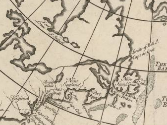
Curiously, in this map of British global possessions, boundary lines among the colonies are noted but seem almost notional than juridical, and far less fixed in space than the rivers with which they intersect, dotted lines that extend into an unknown interior before they peter out into a vast unmapped continent, as if inviting viewers into blank unmapped regions.

The map illustrates the invisible ties of power that united these regions, far-flung as they were, as an image of royal authority. If maps were advertisements of power and illustrations of authority in the early modern period and Enlightenment, this map serves to create a set of fictive ties that united and oriented its viewers to a sense of disconnected space, which the cartographical content of the map was not in itself sufficient to process.
The map complements a written printed chorographical description, as much as it offers a strictly cartographical record, the symbolic use of whose conventions allows us to connect geographically removed regions in its pictorial space.

