
Eric Carle commemorated the tragic story of the 1992 loss at sea of some 28,800 rubber ducks from a container ship in Day-Glo colors in “Ten Rubber Ducks Overboard.” But rather than encountering multiple marine creatures in their adventures, the orange rubber children’s bath toys were in fact carried on quite circuitous routes of nautical travel: after leaving Hong Kong, individual ducks migrated over fifteen years along ocean currents across the polar regions to as far West as the islands of the Hebrides and eastern France, or as far South as Peru’s coast.
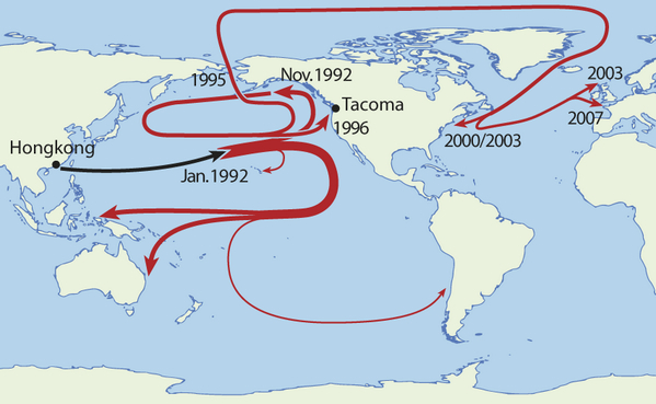
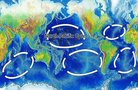
We don’t know the exact numbers, but at least several seem to have avoided, happily, the treacherous waters of the Northern Pacific Gyre of the Great Pacific Garbage Patch–which sadly remains the unfortunate fate of so much plastic substances and waste–where a large portion no doubt lie.
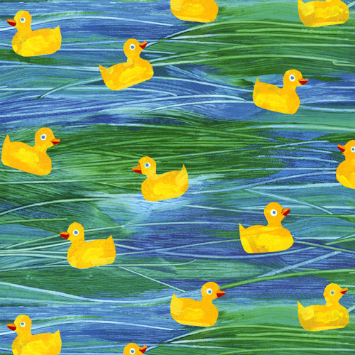
Carle took poetic license to reduce the ducks to ten in his 2005 board book, leading them to meet seagull, geese and whales on their picturesque voyages in the seas.

Whereas Carle offers readers a narrative of charting how the plastic bathtub toys encountered a live flamingo, pelican, sea turtle, seagull, whale and, of course, a group of live ducks, recent maps of ocean populations portray a population that churn beneath one’s feet so rapidly as to challenges a static mapping of the range of its inhabitants–and the changing nature of its populations of the waters, in a range of maps that leave behind the inhabited earth to foreground shifts in the inhabitation of the seas.
Digitized projections narrate the currents of marine biodynamics narrative in a far more three-dimensional fashion than the voyage that Carle charts in charming tissue collage. Digitized projections of the shifts of ocean use similarly bright colors to visualize the shifts in oceanic populations tied both to global warming and atmospheric pollutants. They offer dynamic tools to re-imagine the uses of maps, providing a less prosaic narrative of marine residents that the ducks encountered, and give new urgency to the informational (and narrative) content of oceanographic maps–even as they tracked a similar narrative of the scariness of the interaction between the “natural” and man-made.
The dynamic mapping of oceanic populations suggests ways of responding to the shifting climates of oceans–rooted less as bucolic preserves of nature or wildlife, than as spaces actively reshaped by the human presence and industries.
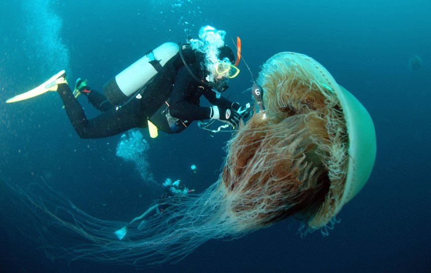
The visualizing the increasing ‘jellification’ of oceans, created by both global warning and the effects of modern industry, has gained increasing attention as the increasingly abundant populations of jellyfish floating along the currents of ocean waters have begun to be mapped, and the permanence of their presence in the oceans begun to be assessed. The overcrowding of jellyfish in the ocean waters have led oceanographers to worry about the impending ‘jellification’ of the seas that would only spare the Peruvian coasts, and a veritable swarming of jellyfish not only in China, where they might be eaten, the northeast waters of America, the Mediterranean, and Alaska but around the Antarctic:
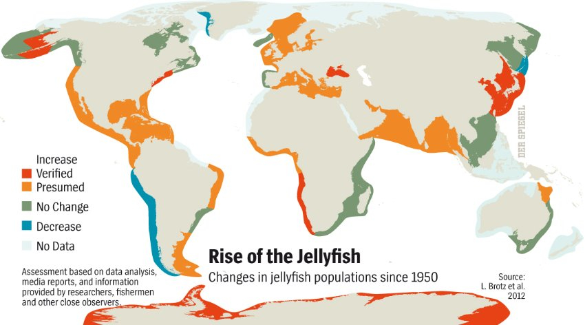
The wide blooms of the jellies bode not only bad news for swimmers’ jellyfish injuries, and led to record numbers of those treated for stings–in Barcelona, upwards of 400/day–but to fishing economies, as the proliferation of the stinging blobs that can cope with increased pollution, murky waters and algae blooms more than other ocean inhabitants, and threaten the food supplies of fish in overfished waters, by competing for zooplankton, as well as nets of fishermen. They flock in large numbers to polluted waters and overdeveloped shorelines with specific intensity.
Among the prime beneficiaries of global warming, jellyfish blooms lead to the release of toxins to oceanic areas and enclosures of farmed fish, jellyfish invasions are described by oceanographer Josep Maria Gili as a simple message of the oceans to mankind: “Your are destroying me.” Driven by currents and carried in the ballast water of tankers and container ships, jellyfish not only displace local populations, but face reduced predators, including, potentially, the monster jellyfish Nemopilema nomurai, with its six-foot bell diameter.
Despite considerable worries that there is actually more plastic than plankton in the ocean, suggesting less mutually convivial relations between synthetic objects and marine life than Eric Carle would have: indeed, oceanic gyres where plastic products tend to be trapped–and some of the ducks no doubt resulted–swirling around in a region twice the size of the state of Texas, that might in time form a destination of disaster-tourism of its own. In the gyre, plastic refuse often outnumbers marine plankton by an astounding and terrifying factor of six to one.
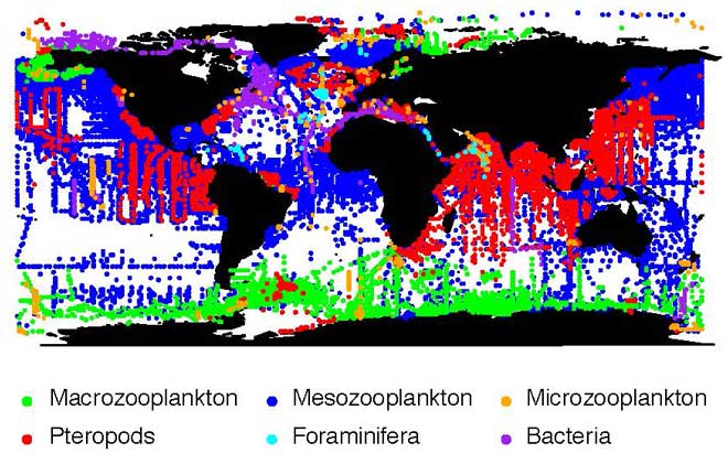
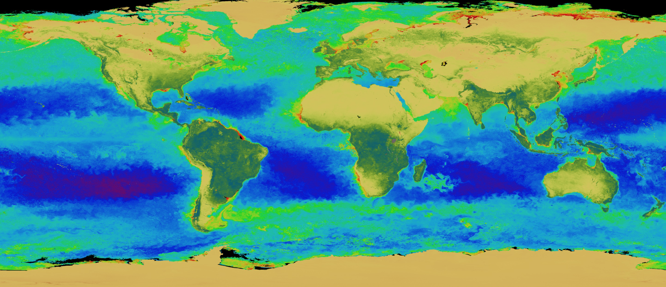
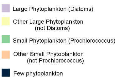
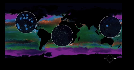
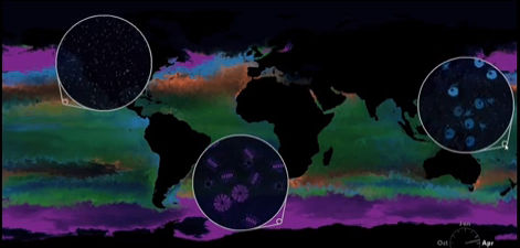
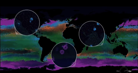
As much as mapping the distribution of plastics in the ocean, ‘mapping’ plankton populations provides a snapshot of varied distributions of these microscopic inhabitants of the ocean’s expanse. The mapping of the larger plankton populations congregated on the poles, and pteropods in the most crowded seas–as well as huge “dead zones” where oceanic plankton recedes–in a complex mosaic of local ecosystems, evident in the computer-generated MAREDAT distribution of photosynthetic plankton, and showing the abundance of zooplankton, that do not use photosynthesis, in comparison to photosynthesizing phytoplankton, and a range of plankton varieties:
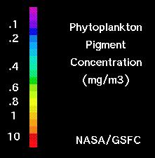
A smaller-grained image of a phytoplankton distribution creates a wonderfully iridescent map of plankton’s oceanic presence in this global distribution of chlorophyll producers–until one can read its legend, or grasp the low levels of populations in areas of the deepest blues, near to the equator.
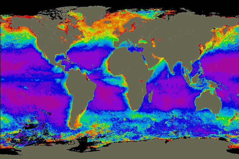
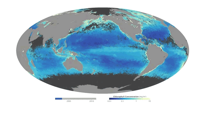
This spectral map of plankton distributions conceals the shifts with seasonal variation, but one can see in these images of plankton populations (based on data generated by NASA’s MODIS instrument) that the distribution of these mostly oxygen-producing microorganisms has higher presence in colder climes, removed from most human effects, where their higher quantities are registered as yellow–in contrast to the absence of dark blues. (The entire plankton atlas database is available online.) The shifts of phytoplankton is marked by a seasonal ebb and flow, however, almost echoing a tidal chart, whose annual flux is tracked in speeded-up time in this digitized “map” based on satellite registrations, in this holistic time-stop graphic of the oceans’ smallest inhabitants.
 NASA/Goddard
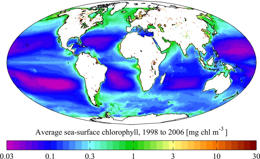
The above visualization echoes the distribution of sea-surface chlorophyll, now averaged out from between 1998 and 2006, to reveal the rise of large “dead-zones” poor in plankton in the oceans, which bode poorly for waters furthest from land:
Regionally, plankton favor colder waters, but its growth is stimulated and nourished, as this map of levels of chlorophyl worldwide in September, 1988, which shows the autumn northern sun nourishing a band of chlorophyl plankton, when southern seas are just begun to bloom:
 NASA
NASA
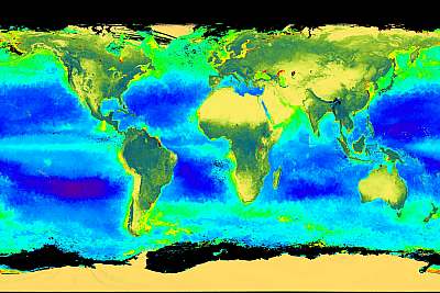
The result is a visualization in which, even in a flat projection, one can see land and earth alike teeming with life, as a SeaWiFS instrument scans the world’s oceans for phytoplankton even as it scans the earth’s surface to look for plant life, by measuring the global circulation of carbon in order to track photosynthesis on land and sea like:
 NASA Scientific Visualization Studio (2001)–SeaWiFS (Stuart A. Snodgrass)
In this synthetic global view, the dark blue areas of low plankton are similar to the aridity of orange deserts, which also provide no chlorophyll–or oxygen–to the atmosphere.
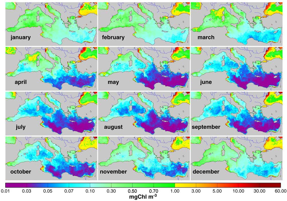
Somewhat similar seasonal variations are nicely revealed in relatively recent visualizations charting their monthly distributions in the Mediterranean, whose warmer waters of the summer (from May to October) especially diminished the plankton populations in its southern edge, closer to the equator, when the north African coast seems to lose its populations, only to be replenished by January, in a set of images that reveal the variability and resilience of local populations:
The increased limits of oceanic zooplankton suggests the shifting nature of the oceans, and their close relationship to our atmosphere.
But it does not measure their variability–or the specificity of distinct plankton populations that far off waters and streams hold, and their lack of discrimination weakens the effective understandings of oceanic biodiversity they communicate. New tools for visualizing these unseen micro-populations that generate so much oxygen on our planet were developed to visualize specific plankton distributions, first prepared for San Francisco’s Exploratorium, based on plankton variety, producing a map of greater discriminating power. The user-friendly map “Living Liquids” was planned by Jennifer Frazier with a computer scientist and help from the MIT’s Darwin Project and the Center for Visualization Interface and Design Group at UC Davis, to create a map of plankton distributions that visitors to the Exploratorium could explore. Living Liquids began from a fluid base-map of varied regional phytoplankton distributions that focussed viewers’ attention on the oceans as a site of rich chromatic and ecological variations, without discriminating between them, to encourage exploration:
The images of such large expanses of declining populations of plankton paint an unpretty picture of our oceans, that parallels the fear of jellification of ocean seas, but also allows us to “see” a richly variegated image of where plankton live–and what type of plankton live where–that provide a clearer holistic image of oceanic populations, using an interactive touch-screen to zoom in on close ups to reveal and explore qualitative diversity within the distribution of local plankton populations with more immediacy than a four- or five-color map allows, creating an illusion of being able to scoop up a handful of water at any place and view it under a microscope, switching registers of visual investigation and exploration.
The complex visualization of the nature of micropopulations is dramatically distinct from a static map; its actively readable surface is a tool of independent investigation in itself.
Local maps of ocean populations also provide crucial tools to frame an exploration of causes for the local variability in such microscopic micro-organisms that examine the specific impact of local industrial change on the living landscape of the sea. If not three-dimensional, such maps chart a nuanced picture of the biodynamics of marine diversity than the static maps of marine life, and powerful tools to register shifting temporal distributions and densities in the boundaries of specific oceanic populations.
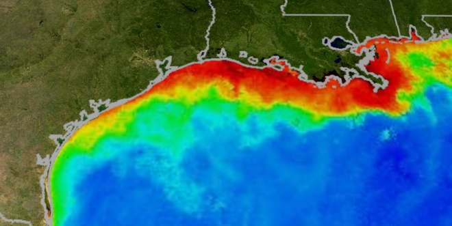
To select but one example of oceanic maps of the impact of human life on biodiversity, let’s start from the dangerously low oxygen levels in the Gulf of Mexico–caused in part by marine pollution. The massive changes in the Gulf’s waters afflict both deep sea populations and phytoplankton alike, has created a “dead zone” of diminished distributions that by 2009 increased worries that pollution–largely caused by fertilizer run-off that augments the presence of nitrogen in the waters and create algae blossoms–and may eventually lead to a local ecosystem collapse. (The so-called “dead zone” came to occupy an area larger than the state of New Jersey, before ocean currents changed its shape.) Similar “dead zones” threaten to expand near the habited shore world-wide, increased by global warming.
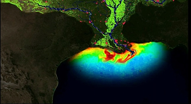
Yet concerns for the growth of oxygen-deprived regions worldwide, paralleling oceanic jellification, create conditions for the abandonment of waters by fish and shrimp alike in “hypoxic” regions, whose number has doubled every ten years since the 1960s, with huge economic consequences for regions as the Gulf of Mexico, whose hypoxic conditions are colorfully mapped by red below during the previous year:
Which brings us back, almost full-circle, to the rise of global populations of jellyfish, and maps onto a change in the population of the open seas.

