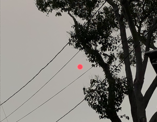
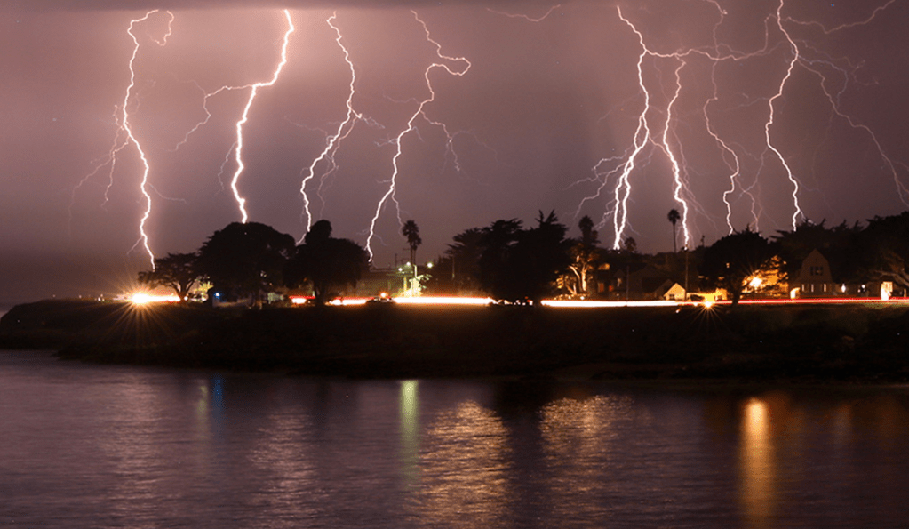
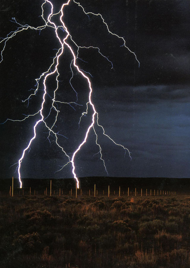
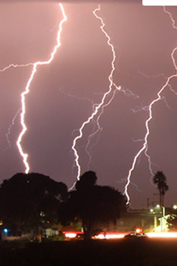
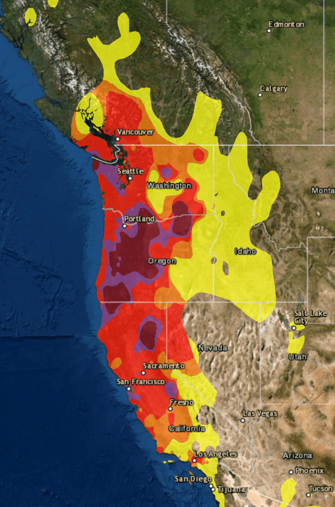
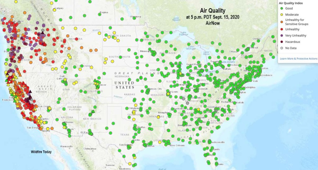
The tracking of local air quality this Fire Season both documents the atmospheric effects of a fire siege of 2020 and provides an eerily contemporaneous way to track the spread of particulate matter from clusters of fires across the western seaboard to be ignited at the end of a long, dry summer in late August. We were not really struck unawares by the dry lightning, but had left forests languishing, not beneath electricity lines–as last year, around this time–but under a hot sun, and high temperatures that we hardly registered as changing the ecosystem and forest floor. This year, the sun turning red like a traffic light in the middle of the afternoon, we were forced to assess the air quality as the blue sky was filled with black carbon plumes that left a grittiness in our eyes as well as in the skies.
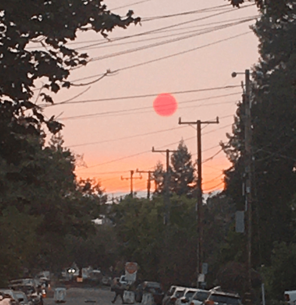
Confronted with a red sun through pyrocumulus haze, we followed real-time surveys of air quality with renewed attentiveness as an orange pyrocumulus clouds blanketed usually blue skies of the Bay Area, obscuring the sun’s light, suffusing the atmosphere with a weirdly apocalyptic muted light, that were hardly only incidental casualties of the raging fires that destroyed houses, property, and natural habitat–for they revealed the lack of sustainability of our warming global environment.
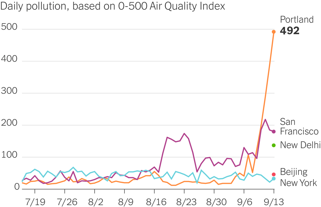
The soot and fog that permeated “clean cities” like Portland and San Francisco came as a sudden spike in relation to the black carbon loads that rose in plumes from the fires, as if the payload of the first bombs set by climate change. The shifting demand for information that evolved as we sought better bearings in the new maps of fires that had become a clearly undeniably part of our landscape was reflected in the skill with which the sites of incidence of dry lighting strikes that hit dried out brush and forest floors, the growing perimiters of fires and evacuation zones across the west coast, and the plumes of atmospheric smoke of black carbon that would leave a permanent trace upon the land, liked to the after-effects of holocausts created by atom bombs by Mike Davis. The measurement of wind carrying airborne smoke emerged as a layer of meaning we were beginning to grasp, a ghostly after-effects of the fields of flams that began from sites of lightning hitting the earth in a Mapbox wildfire map of fields of fire across the states, radiating resonant waves akin to earthquake aftershocks, a lamination on hex bins of the fires that seemed a new aspect indicating their presence in the anthropocene.
The suitably charcoal grey base-map of the state integrates approximate origins of fires, fire spread and greatest intensity of hotspots from satellite imagery courtesy Descartes Labs and NOAA, and air pollution data integrates the fires’ spread across our picture of the state. While human reviewed and sourced, the satellite data embodies the ravages of fire across the state in ways echoed by its black charcoal base map, and reflects the need to develop new visual tools to process their devastation.
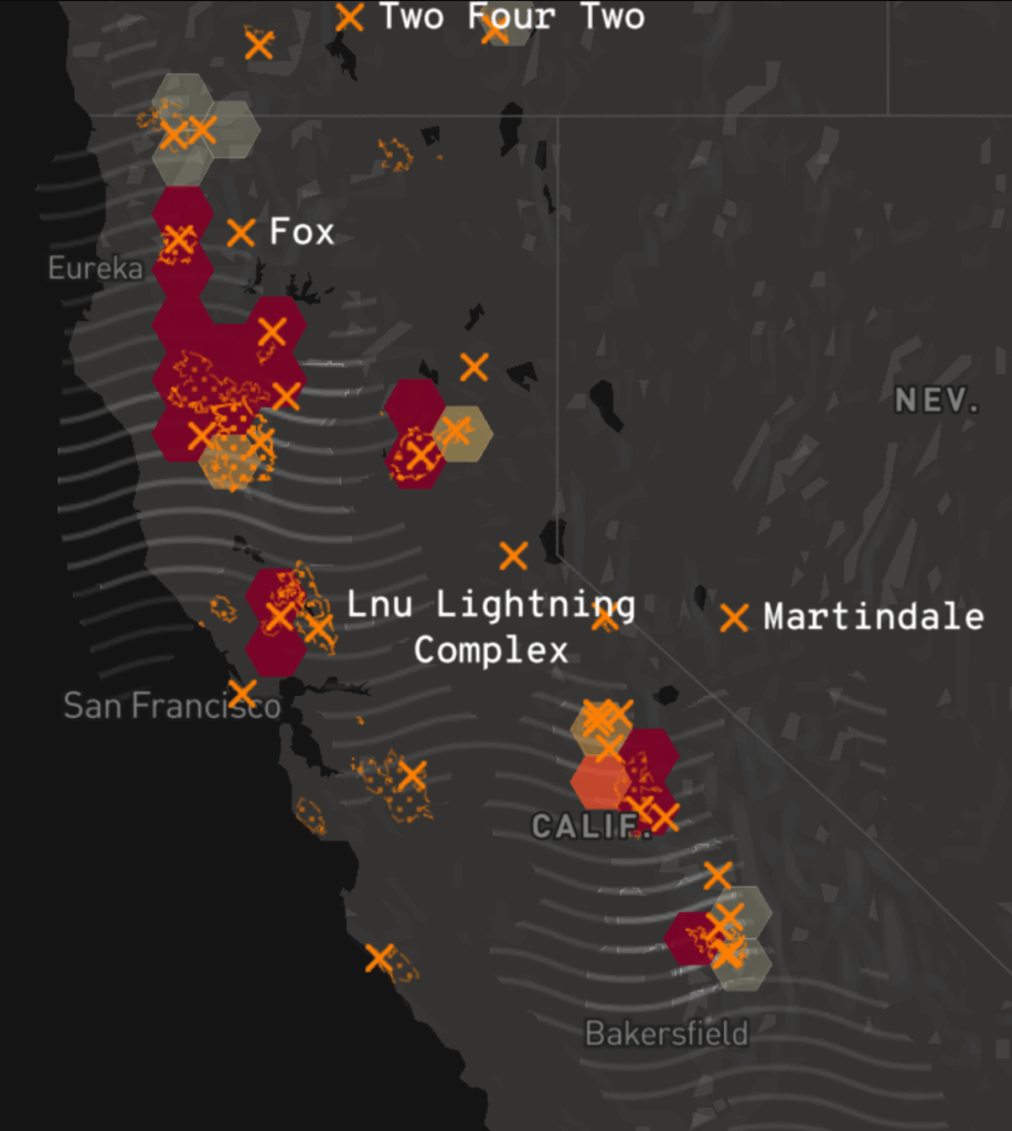

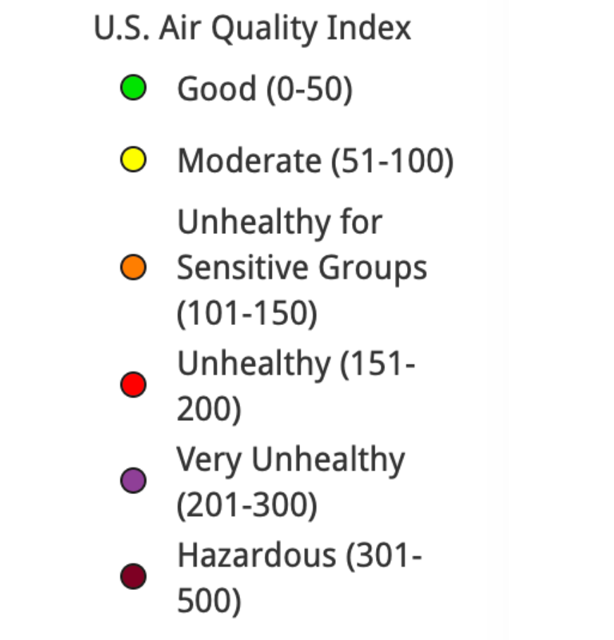
While we began to measure air quality to meet new needs to track ground-level ozone, acid rain, air toxins, and ozone depletion at an atmospheric level, the increased tracking of more common air pollutants since 1990 included airborne particulate matter (PM10 and PM2.5), carbon monoxide (CO), and ozone (O3), we track the effects of wildfire smoke by hourly levels of each at local points, parlaying sensors into newsfeeds as wildfires rage. If stocked with labels of each chromatic layer, are these real-time updates lacking not only legends–but the temporal graph that would clarify the shifting data feeds that lead us to give them the illusion of purchase on the lay of the land we are trying to acknowledge this fire season?

Watching slightly more long-term shifts in quality of air that we breath in the Bay Area, we can see striking spikes of a maximum just after the lighting siege began on August 19, 2020 across much of the state, as air quality decisively entered into a hazardous zone, tracking PPM2.5 concentrations, but entering the worst fifteen air days since registration four times since 1999, when Bay Area Air Quality Management District began reporting the levels of fire smoke in inhabited areas.
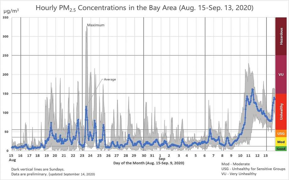
Bay Area Air Quality Management District
We measure fires by acreage, but the sudden spikes of air quality, while not exceeding the smoke that funneled into the Bay Area during the North Bay Fires in 2017, when the Tubbs and Atlas Fires devastated much of the Wine Country, created a run of high-smoke days, were followed by a set of sudden spikes of the atmospheric presence of particulate matter that we tried to track by isochomes, based on real-time sensor reading, but that emerge in better clarity only in retrospect.
It is true that while the AQI maps that offer snapshots of crisp clarity of unhealthy air might serve as an alarm to close windows, remain indoors, and call off school–
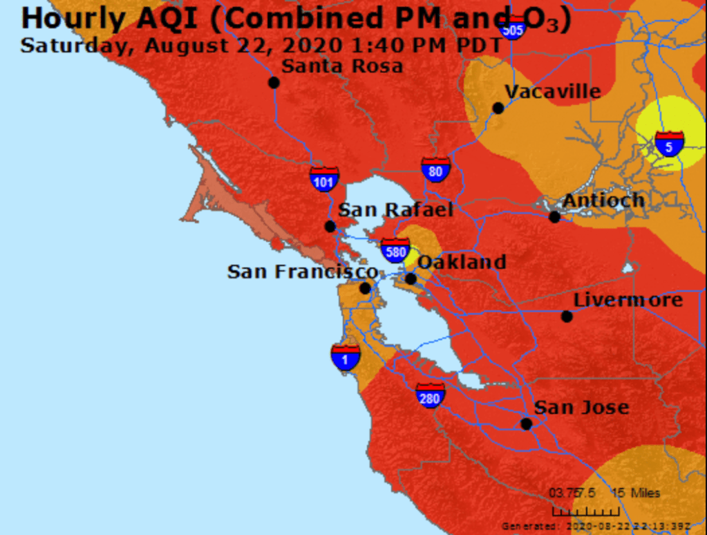
–as particulate matter spread across the region’s atmosphere. We are used to weather maps and microclimates in the Bay Area, but the real-time map of particulate matter, we immediately feared, did not only describe a condition that would quickly change but marked the start of a fire season.
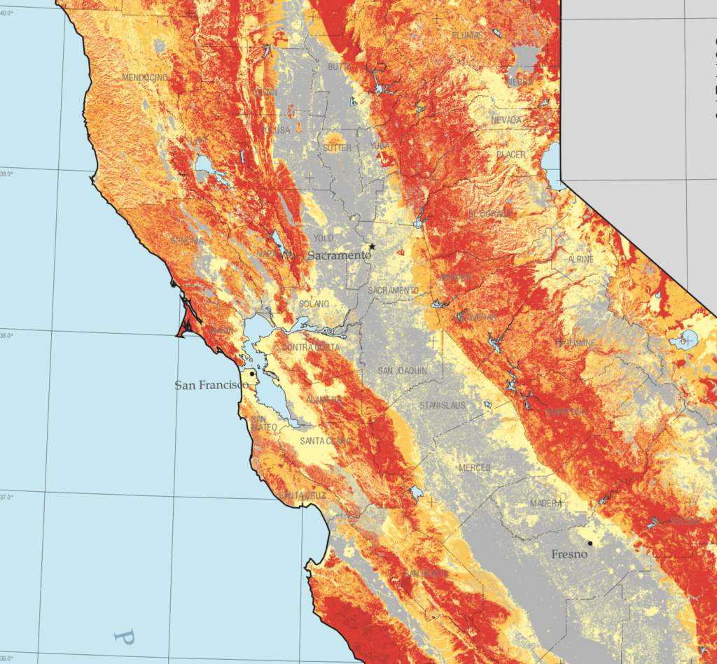
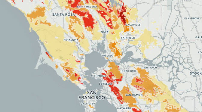
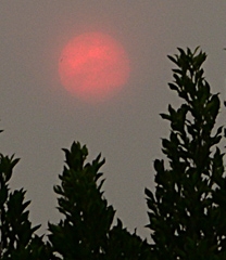
Not only in recent days did the sustained levels of bad air suggest an apocalyptic layer that blanketed out the sun and sky, that made one feel like one was indeed living on another planet where the sun was masked–a sense heightened by the red suns, piercing through grey smoke-cover that had seamlessly combined with fog. Although the new landscapes of these AQI maps generate immediate existential panic, we should be more panicked that while we call these fires wild, they release unprecedented levels of toxins once imagined to be detected as industrial pollutants. The seemingly sudden ways that black carbon soot blanketed the Bay Area, resting on our car hoods, porches, windowsills and garbage bins were not only an instant record of climate emergency, but the recoil of overly dry woods, parched forests and lands as overdue payback for a far drier than normal winter, months and a contracted rainy season that had long ago pushed the entire state into record territory. The lack of soil moisture has brought a huge increase of wildfire risk, not easily following the maps of previous fire history, and persistence of “abnormally dry” conditions across a third of California, focussed in the Sierra and Central Valley–the areas whose forests’ fuel loads arrive carbonized in particulate form.
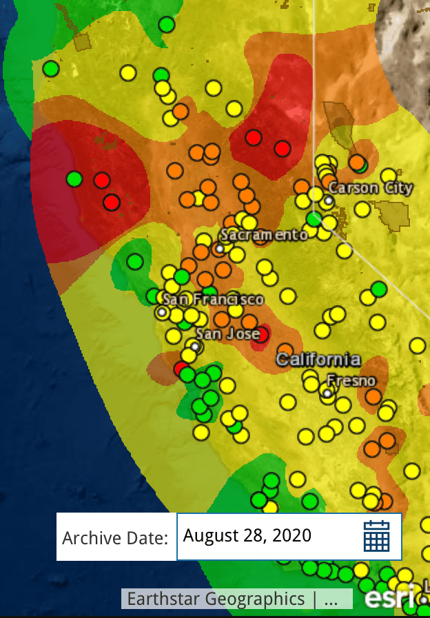
Local monitors of air quality suggest the uneven nature of these actual isochromes as maps–they are reconstructions of what can only be sensed locally, and does not exist in any tangible way we can perceive–but presented what we needed to see in a tiler that made differences popped, highlighting what mattered, in ways that left cities fall into the bottom of the new colors that blanketed the state, in which local sensors somehow revealed what really mattered on August 20: if the “map” is only a snapshot of one moment, it showed the state awash in ozone and PPM.
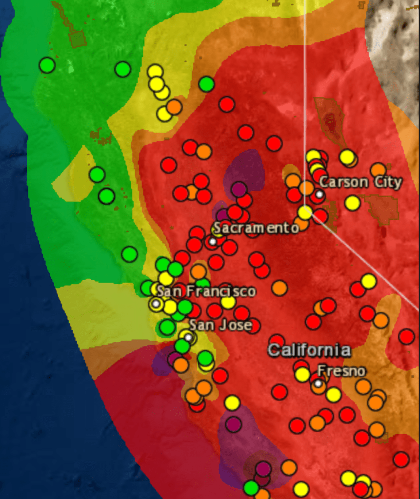
We were in a sort of existential unfolding in relation to these maps, even if we could also read them as reminders of what might be called “deep history”: deep history was introduced by Annalistes to trace climatic shifts, the deep “undersea” shifts of time, on which events lie as flotsam, moved by their deep currents that ripple across the economy in agrarian societies, suggesting changes from which modern society is in some sense free. “Deep History” has to some extent been reborn via neurosciences, as a history of the evolution of the mind, and of cognition, in a sort of master-narrative of the changes of human cognition and perception that makes much else seem epiphenomenal. If the below real-time map was time-stamped, it suggested a deep history of climate of a more specific variety: it was a map of one moment, but was perched atop a year of parched forests, lack of groundwater, and increased surface temperatures across the west: Sacramento had not received rain since February in an extremely dry winter; its inter was 46% drier than normal, and the winder in Fresno was 45% dryer in February. They are, in other words, both real-time and deep maps, and demand that we toggle between these maps as the true “layers” of ecological map on which we might gain purchase.
The levels of dessication of course didn’t follow clear boundaries we trace on maps. But at some existential level, these flows of particulate matter were not only snapshots but presented the culmination and confirmation of deep trends. We have to grasp these trends, to position ourselves in an adequate relation to their content. For the deep picture was grim: most of California had enjoyed barely half of usual precipitation levels after a very dry winter: Sacramento has had barely half of usual rainfall as of August 20 (51%); the Bay Area. 51%; parts of the Sierra, just 24%. And wen we measure smoke, we see the consequences of persistent aridity.

These are the layers, however, that the maps should make visible, And while these shifts of particulate matter that arrived in the Bay Area were invisible to most, they were not imperceivable; however, the waves of smoke that arrived with a local visibility that almost blanketed out the sun. Perhaps there was greater tolerance earlier, tantamount to an ecclipse. Perhaps that seemed almost a breaking point.
For almost a month after the first fires broke, following a sequence of bad air days and spare-the-air alerts marked our collective entrance to a new era of climate and fire seasons, fine soot blanketed the state at hazardous levels, leaving the sense there was nowhere left to go to escape.
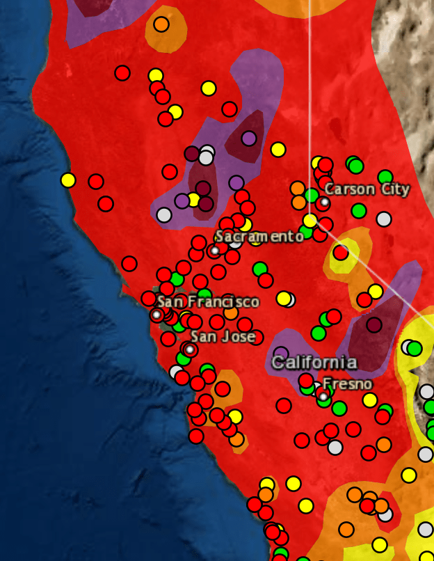

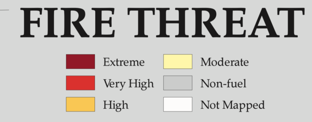
We had of course entered the “Very Unhealthy” zone. If real-time maps condense an immense amount of information, the snapshot like fashion in which they synthesized local readings are somewhat hard to process, unless one reads them with something like a circumscribed objective historical perspective that the levels of PPM5 provides. In maps that are data maps, and not land maps, we need a new legend, as it were, an explanation of the data that is being tracked, lest it be overwhelmed in colors, and muddy the issues, and also a table that will put information on the table, lest the map layers be reduced to eye candy of shock value, and we are left to struggle with the inability to process the new scale of fires, so unprecedented and so different from the past, as we try to gain bearings on our relation to them.

Of course, the real-time manner that we consume the “news” today
militates against that, with feeds dominating over context, and fire maps resembling increasingly weather maps, as if to suggest we all have the skills to read them and they present the most pressing reality of the moment. But while weather maps suggest a record of the present, these are not only of the current moment that they register. Looking at them with regularity, one feels the loss of a lack of incorporating the data trends they depict, and that are really the basis of the point-based maps that we are processed for us to meet the demand for information at the moment, we are stunned at the images’ commanding power of attention to make us look at their fluid bounds, but leave us at sea in regards to our relation to what is traced by the contour lines of those isochrones.

We can, in the Bay Area, finally breathe. But the larger point re: data visualizations is, perhaps, a symptom of our inflow of newsfeeds, and lies in those very tracking maps–and apps–that focus on foregrounding trends, and does so to the exclusion of deeper trends that underly them, and that–despite all our knowledge otherwise–threatens to take our eyes off of them. When the FOX newscaster Tucker Carlson cunningly elided the spread of wild fires ties to macro-process of climate change, calling them “liberal talking points,” separate from climate change, resonating with recent calls for social justice movements to end systematic racism in the country: although “you can’t see it, but rest assured, its everywhere, it’s deadly. . . . and it’s your fault,” in which climate change morphed to but a “partisan talking point” as akin to “systematic racism in the sky.”
While the deep nature of the underlying mechanics by which climate change has prepared for a drier and more combustable terrain in California is hard to map onto to the spread of fires on satellite maps, When climate denialism is twinned with calls for reparations of social injustice or gun control as self-serving narratives to pursue agendas of greater governmental controls to circumscribe liberties, befitting a rant of nationalist rage: the explanations on “our” lifestyles and increased carbon emissions, only pretenses to restrict choices we are entitled to make, Carlson was right about the depths at which both climate change and systematic racism offer liberal “lies”–especially if we squint at tracking maps at a remove from deep histories, and cast them as concealing sinister political interests and agendas, the truly dark forces of the sinister aims of governmental over-reach in local affairs.
“Structural racism” is indeed akin to the deep structure of climate change if the cunning analogy Tucker Carlson powerfully crafted for viewers did not capture the extent of their similarities. For if both manifest deep casualties created by our society, both depart from normalcy and both stand to hurt the very whites who see them as most offensive. The extent of inequalities of systematic racism as present in our day-to-day life as is the drying out landscape. And the scope of climate change is able to be most clearly registered by the evident in trends of diminished precipitation, groundwater reserves or temperature change that create environmental inequalities, too often obscured by the events of local air quality or maps of social protests that respond to deep lying trends.
To be sure, the tracking of environmental pollutants underlay the national Pollution Prevention Act of 1990, and led to a number of executive orders that were aimed to set standards for environmental justice among minority communities who long bore the brunt of industrial pollutants, from lead paint to polluted waters to hazardous waste incinerators. And, as we are surrounded by racial inequalities that are visible in systematic inequalities before the law, and have lowered life expectancies of non-whites in America by 3.5 years, increasing rates of hypertension, cancer, and systematic disenfranchisement of blacks–these extensive inequalities hurt whites, and hurt society. As Ibrahim X. Kendi perceptively noted, White Supremacists affirm the very policies that benefit racist policies even when they undercut interests of White people; they “claim to be pro-White but refuse to acknowledge that climate change is having a disastrous impact on the earth White people inhabit.” Is there a degree of self-hatred that among Carlson’s viewers that informs Carlson’s frontal attack on climate change and structural racism as myths, more content to blame non-Whites for structural inequalities.
But these inequalities are evident in the differences in air quality that climate change creates. For if the AQI maps tell us anything, it is the absence of any preparedness for the interconnections of fire, smoke, and large dry stretches of a long story of low precipitation that have created abnormally dry conditions–indeed, drought–across the state.
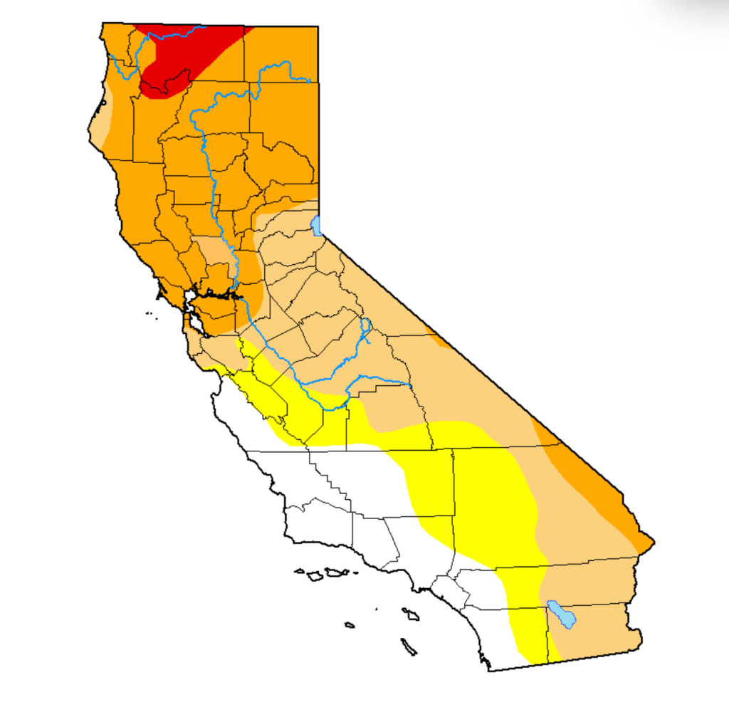
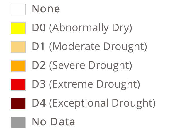
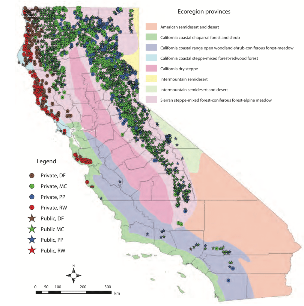
The intensity of severe drought across the conifer-dense range Sierras raises pressing questions of federal management of lands: the moderate to severe drought of forested lands intersect with the USDA Forest Service manage and the over 15 million acres of public lands managed by the federal government manages or serves as a steward.
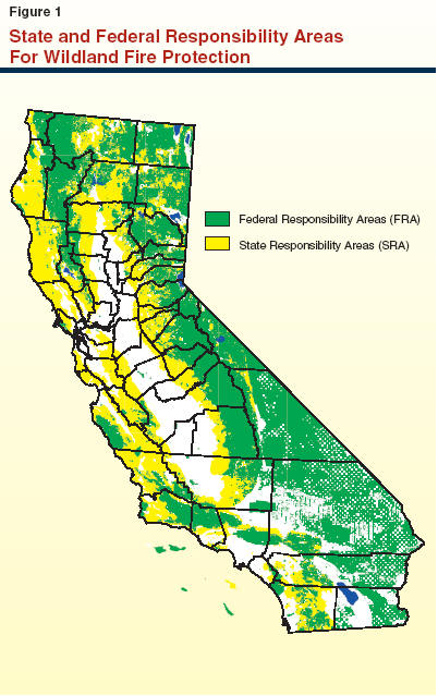
–that crosses many of the dried out wildland and rangeland forested with conifers and dense brush, a majority of which are managed by federal agencies–19 million acres, or 57%– but with climate change are increasingly drier and drier, which only 9 million are privately owned.
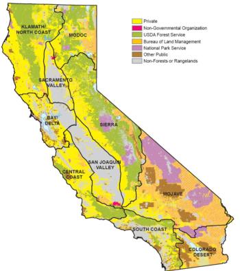
USDA Forest Service Management (Purple), National Parks (Lavender), Bureau of Land Management (Orange)
Yet the reduction of Wildland Fire management by 43.98% from FY2020 to FY2021 in President Trump’s budget continued the systematic erosion of funding for the United States Forest Services. As California weathered longer and longer fire seasons under Donald Trump’s watch, Trump made budget cuts $948 million to the Forest Service for fiscal year 2020, after defunding of US Forest Services by reducing mitigating fire risk by $300 million from FY 2017 to FY2019, cutting $20.7 minion from wildlife habitat management, and $18 million from vegetation management–a rampage beginning with cutting USFS research funding by 10% and Wildland Fire Management by 12% in FY 2018! While blaming states for not clearing brush in forests, sustained hampering of managing federal lands rendered the West far less prepared for climate change. As the costs of containing wildfires rise, the reduction of the Forest Service budget has provoked panic by zeroing out funding for Land and Water conservation–alleged goals of the Trump Presidency–and cuts grants to state wildfire plans by a sixth as fire suppression looms ever larger.
By defunding of forest management, rangeland research, and habitat management, such budgetary measures pose pressing questions of our preparedness for the growing fire seasons of future years; stars that denote public land management might be targets for future dry lightning.
