
Before the mass firings of civil servants, members of government, and oversight by the Trump administration, we were already shocked by two major disruptions that suggest the danger of the new President’s reflexive knee-jerk responses from his over-sensitive gut. Both–the fires in Los Angles and the failure of air safety at Reagan International in DC–are problems of an anthropogenic world, where the structures of traffic flow, water safety, as much cognitive failures of the current President. But the massive problems they suggest we will be facing are problems of mapping, as well. Water doesn’t flow naturally to Los Angeles, a city built in the desert,–as any viewer of Roman Polanski’s neo-noir Chinatown knows.
While the former director of the public utility, Noah Cross, is an evil mastermind too remove public water for his own private ends, is a scarier character, far darker than Donald Trump’s buffoonish public figure, who corrupts his family and the utilities by laying the seeds of a schemes of personal enrichment, and Trump’s inability to map the dangers the nation faces less rooted in venality, he conjures an image of corruption–and imputes corruption–so that the public good is almost entirely hidden, clouded and obscured in airing a broad range of grievances. For the problems of water flowing to the Los Angeles Valley became the dramatic centerpiece of this Depression-era classic, in an attempt to explain the lopsided geography of Los Angeles to the nation, and to do so within a rising taste for disaster movies that boded premonitions of massive destruction–infernos; earthquakes; tidal waves–Abel to be viewed in national theaters.
The United States had long indulged, to be sure, an unsustainably massive demand groundwater pumping for farming in the central valley. The diversion of waters to Los Angeles that caused the regional water table to drop so precipitously as local farmers’ wells ran dry in the largely agricultural San Joaquin Valley north of Los Angeles in central California, as groundwater depletion the aquifer of the Valley that intensified from 1925 to 1975 sucked water from the earth; thousands of pumps suddenly went dry by the 2012–2015 drought, due to cumulative effects of groundwater pumping predating drought, but the question of water use and Southern California on the minds of Robert Towne, who wrote the script of “Chinatown” a 1974 film noir as a drama that featured the opaque conspiracies of water diversion and depletion set during the Depression as a moment of the birth of the contradictions of the unevenly economically divided social landscape of Los Angeles that fit the era of Watergate, and showed conspiracies as deeply seated in the American grain. Cross is a dark nemesis, a seductive land magnate, Noah Cross, played by director John Huston, who pulls punches to divert pumped groundwater from the city to housing tracts in the desert. Chinatown immortalized the schemes of water diversion schemes that remade the sharp social divides in Southern California, whose false respectability seeks to drain the Owens Valley dry that only sharpen the pronounced inequalities in Los Angeles’ stark landscape, reforming the public Los Angeles Dept. of Water and Power for personal gains of massive private enrichment, by bringing the city to where the water flows, rather than by moving water to the city by aqueduct–enabling the urban expansion of Los Angeles.
The film channels a keen sense of short-sighted conspiratorial instability in a world of money and wealth, but may well reflect our own current dilemmas more than we imagined–and a world of graft and corruption that has provided Donald Trump with a means to imagine the status quo. The prescient observation of the cost of redirecting resources was keenly felt by 1974, when Chinatown was conceived, even if the film was set in the Depression. But we are perhaps living it only today. The idea of transformative powers that the redirection of water to the growing city might mask its deep inequities and inequalities, moving it from Chinatown to the “northern Valley,” was a get-rich-quick scheme conflating public and private works, but also a sign of the systemic failure of Los Angeles, and its deeply criminal origins. Was this, the film seemed to ask, really America? Or was the corruption on such a massive scale really what Donald Trump both describes himself as able to prevent, and which the systemic failures that his presidency seem slated to bring, imposing a world of trade tariffs, withdrawing from the world, and an absence of data privacy, indeed eerily akin?

Owens Valley Diversionary Supply of Water
For the creators of “Chinatown,” the Depression perhaps provided a compelling image of the huge wealth inequalities that have since come to be characteristic of the United States, inequities on display with a vengeance in 2025–where the richest men in the world were given front row seats to the 2025 inauguration–men whose combined value provided an image of over a trillion dollars of wealth at one event. Speaking before individuals whose fortunes of four hundred and two hundred billion, emblems of a massive privatization of government, boded poorly for the future. The first months of the Trump White House plagued by seemingly separate issues of fire safety and air safety are rooted in a failure to map increasingly apparent emergencies, specters dangers rooted in the modification of the built environment, as much as policy, that depend on good mapping tools. The eery sense of these inequities and systemic failures echoed through the inauguration ceremony–the fires were still burning, if they had been put out; the promises of American renewal seemed deeply deceptive, hardly addressing wealth inequalities. If “systemic” is among the worlds that the White House offers a guidance not to use, the failures of the first weeks of the Trump presidency seem so systemic to be a harbinger of what is to come.
President Trump seemed almost to stray from prepared remarks, as is his wont, calibrating the value of a rig on national television, as he took time to ponder with marvel how these fires had hurt even “some of the wealthiest and most powerful people of our country” on the stage, and promised to change a situation “everyone is unable to do anything about” but promised to change. Trump would probably never visit the scene the destructive fires had raged, but in detracting from the scale of their devastation he concealed the failures of destruction, loss of housing, loss of healthy land, and loss of economic wealth in the state–foregrounding the major losses of elites.

Trump, as a modern Noah Cross, luxuriated in the face of devastation, concealing the sense of systemic failure. The kinship of systemic failures in Chinatown’s corruption seemed to rise to the surface in this hardly tacit alliance with extreme wealth on the inaugural stage; Trump drew a similar tie to wealth in the face of loss, highlighting on the misfortunes of the “wealthiest and most powerful” amidst a partisan attack on local corruption, from a podium that seemed to trumpet its own corruption. For the President seemed as if he hardly appreciated the scale of the systemic failures that led to the fires, standing before Priscilla Chen, Mark Zuckerberg, Jeff Bezos, Sundar Pinchai, and Elon Musk, who seems to have viewed the inauguration with particular elation, as if the Los Angeles fires were only an example of the previous administration’s failures. If Parmenides suggested that fire was eternal, disordered, and changing, the maps of the destruction of residences seemed a puzzle of poor leadership and a failure of adequate priorities or preparation.
But these emergencies have been oversimplified by being converted to talking points. We often fail to appreciate the huge risk of the present by failing to map these changes, or acknowledge them. Yet without registering the increased risks of anthropogenically modified spaces from the woodland-urban interface or overcrowded skies, we risk losing the knowledge needed to confront these risks. Rather, we seem ready to cut needed federal expertise, believing the national emergency of high energy prices exacerbated by a diminished capacity to protect the nation rom hostile foreign actors. The schemes of corruption of the Department of Water & Power which Noah Cross manipulated to create housing in what we call the Central Vally seemed a look back at the deep levels of corruption from which Los Angeles was born. They pale in comparison to the rampant misuse of public funds for personal gains intertwine of personal advantage and public funds seem on show in the return of Donald Trump to the White House. Another film of 1974 that reveals a terrifying fear of distance from nature featured Mr. Kapital–in Dusan Makavejev’s Sweet Movie, a more comic Mr. Kapital boasted beside Niagara Falls of his plans to re-engineer its natural beauty as a spectacle–“my biggest undertaking in landscape architecture” as “I’m gonna buy it from the Canadian Government, . . . renovate it, redecorate it, get rid of the water, turn off the Falls“–a combination of graft and bombast more worthy of Trump, to amplify the falls’ crashing by “a huge quadrophonic sound system”–the “best available”–to increase its spectacle. Makavejev’s film features Mr. Kapital seeking to transform the natural monument not only to a tourist spectacle but light and sound show, an act of consumer fetishization of exploitation. Trump exploited the disasters of fires and mid-air collision as platforms for his brands, spectacles of his continued campaign and road show, as if they could become illustrations of the need for small government.
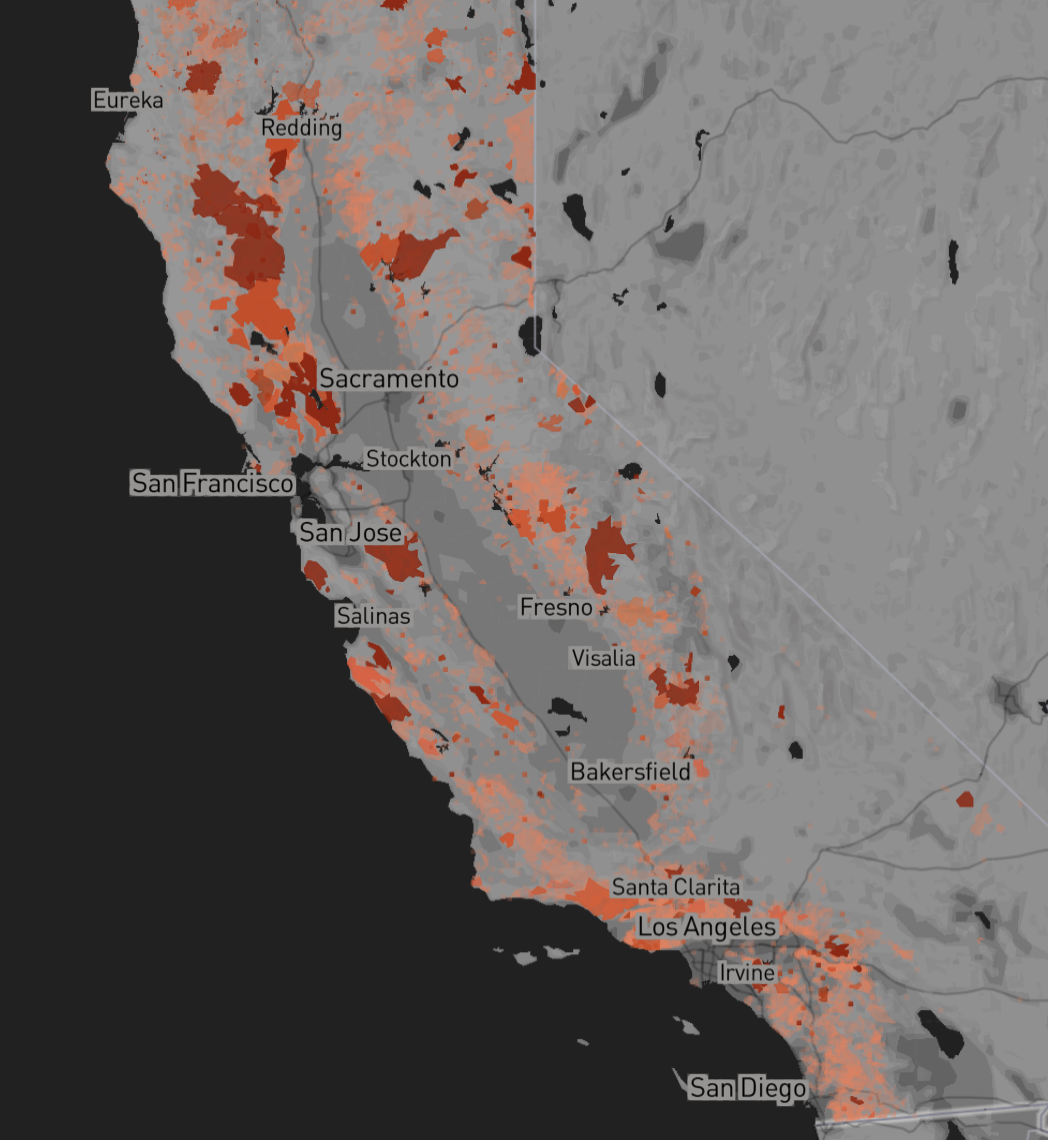
Increasingly determined to use public position for private gain, we have seen ungrounded accusations of mismanagement in the face of the growing risks of the effects of global warming and climate and environment blithely ignored, shifting blame to environmental policies or hiring practices. To do so only distracts our attention from growing environmental risks in an era not only of temperature rise, longstanding drought, and a demand to create agricultural productivity by irrigation. For if rising drought in western states–particularly California, mapped below by from data of Trump’s first term in office as a landscape he should have know well, reveal risks of extreme drought across the entire state.

Increased risks of what we still call wildfires, as if they are far from cities, in woodlands hit by lightning, reflect our impact on the environment, as increased extraction and appropriation of resources have continued without assessing the needs for better water storage, strategic burns, and protective barriers against fires’ spread. But the huge wildfire frequency of Trump’s first term–

Risk of Wildfire Frequency in the Lower Forty-Eight/Gund Institute for Environment, UVM (Dec. 2022)
–grew before lower levels of rainfall, as precipitation plummeted by the start of 2025, a truly perfect storm across Los Angeles, falling so far below usual since October to compromise reserves of groundwater across the county to heighten its combustibility as a site for future fires.
The massive fires that Trump argued we had dismantled defenses was a perfect storm, and a calamity almost foreseeable in public data compiled by NOAA, for which we were unprepared.
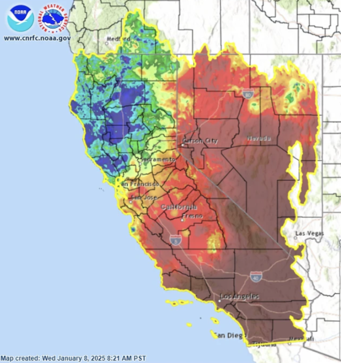

Below Average Rainfall in Southern California, October 2024-January 2025/NOAA
The similarities of President Trump’s policies to the management style of Noah Cross after he left Los Angeles’ ‘public’ Dept. of Water, having rigged local supplies of water, appreciated long before Elon Musk was a fixture of the Oval Office; we will soon be able to look back with romance at Cross’ devious schemes to leech public water resources from Los Angeles aqueducts for private gain. Cross engineered water supply for private ends, the corruption and public malfeasance of pervasive corruption of public resources were a premonition of rampant abuse of public resources, confusing public needs with accusations of maladministration seemingly slated to be a hallmark of the new Trump regime. The loss of insured properties of $30 billion and total economic losses beyond $250 billion pose problems of fire prevention far beyond local mismanagement or malfeasance–but will be one of the greatest costly of disasters we persist on calling “natural” more than man-made. Yet even as we began the Trump Presidency with a declaration of a National Emergency–not from the invasion of the southern border, declared a National Emergency in Trump 1.0, but the fr more menacing specter of “high energy prices . . . exacerbated by our Nation’s diminished capacity to insulate itself from hostile foreign actors . . . in an increasingly crucial theater of global energy competition,” the actual emergencies of climate and airspace that were largely man-made are not only ignored but reframed as errors of bad governance. For while the incoming President issued an early declaration of the need for coast-to-coast “integrity and expansion of our Nation’s energy infrastructure,” the emergencies on both coasts of fires far more massive than regular for January on the west coast and a tragic arial collision on the east coast provided not only spectacles but hints of the emergencies that the Trump administration is ready to exacerbate and downplay, casting their spectacular disasters as the result of the mismanagement of his political opponents.
The mipmapping of how modifications of the environment outside of Los Angeles, or over the skies of Washington, D.C., reveal problems of mapping far deeper than corruption, as they are rooted in deception and willed ignorance that distract us from real problems on the ground and in the sky. The question of moving water to the Los Angeles fires must have hit Donald Trump like a bolt, from a cinematic repertoire Trump has at the ready, and seems poised to provide, as if the cinema-starved Americans, still reeling hurt from pandemic closures, were starved of heroic narratives.
But the accusations of mismanagement that Donald Trump converted two national crises but days into his Presidency–the Los Angeles Palisades Fire he relegated to a local failure of corrupt environmentalists and the tragic in-flight collision at Reagan International–served only to stoke resentment from coast to coast, in denial of the deep stakes of future disastrous scenarios that the country faces with climate warming and the broad deregulation of anthropogenic change. And the current dismantling of ranks of needed forest workers, National Parks, and fire safety monitors, as well as the civil service of FAA engineers and technicians and air traffic controllers–jobs at short levels perennially–suggests nothing less than a massive privatization of resources that the current government has relished to destroy. The current firing of hundreds of “probationary” workers or recent hires responsible from radar, landing and in-air navigation and control automation from air traffic control towers courts systematic disfunction remind us America increasingly is Chinatown, a site of corruption where everyone does as little as possible work: if Trump has presented am image of a declining America, no longer a wealthy society but “a kind of Chinatown where unaccountable power is conspiring against everyday Americans,” compromised by elites, obscuring civil judgements of his own fraud and sexual abuse that deflect from his own “personal and public corruption,” Ronald Brownstein trenchantly observed, to present himself as a savior to the nation, and suggesting that financial elites in a “deep state” have hindered the interests of most Americans.
But the risks of these twin catastrophes at the start of the Trump Presidency suggest the vain boast that Trump will erase the corruption within the state fail to understand the growing scale of our environmental risks. common good. If Chinatown captured the dangers of a world of deregulation and criminality in the Depression era, the increased deregulation that Donald Trump proposes runs rising risks of returning to an era when all America will be Chinatown, lifting laws and regulations of environmental protection and workplace safety, and minimizing what were once norms of public safety standards, transforming all America to a landscape where the corruption of power will conspire against us all. The National Air Traffic Controllers Association has tersely claimed to be “analyzing the effect of the reported federal employee terminations on aviation safety, the national airspace system and our members”–although they include folks working on early warning radar systems for incoming cruise missiles that belong to the defense of national borders. The firing from non-government email addresses, hailing from “ASK_AHR_EXEC_Orders@usfaa.mail.outlook.com,” as if with DOGE fingerprints.
The indiscriminate mass-firings, meant to suggest a “fork in the road,” suggest a collapse of public and private among government. As civil service employees long overtaxed and understaffed are cursorily dismissed, the absence of accountability seems intentionally designed to circumvent regulations. The opaque firing evokes the greed of the “rape of the Owens Valley,” channeling water to the orange groves of a “northwest valley” by silencing opponents and critics, if not by killing, to stave off opposition to the wisdom of ever diverting the Colorado River and city water by Los Angeles Water and Power to quench the thirst of growing urban populations that led William Mulholland to argue, “if Los Angles does not claim the Owens Valley water supply, she will never need it.“
Amalgams of institutional distrust, and corruption of power, have been conjured to help Donald Trump power his way to the Presidency, for reasons themselves rooted in corruption, if promising to combat the untrustworthy corruption of powerful elites–not in the guise of a gumshoe but, as political journalist Ronald Brownstein observed in some astute cultural commentary, that fits the moment as an episode of political demonology, an incarnation of Noah Cross,– that mastermind of the Los Angeles Water System played by John Huston who corruptly allowed it cease to be privatized, but undermined its public performance as a public utility from the shadows. by silencing opponents, discrediting others, and literally killing opponents, Cross presided over a massive diversion for future of plans of property development. A network hidden in plain sight of dams, aqueducts, and man-made diversions carried water outside Los Angeles, opening new real estate lots for future homeowners in a “north-western valley” filled with orange groves,–a surrogate for the as yet unnamed San Fernando Valley where the Los Angeles viaduct led.

Los Angeles Aqueduct and Southern California/from The Water Seekers (1950), by Remi A. Nadeau
The silencing by firing, a massive laying off of skilled workers across under the aegis a Department of Government Efficiency. The eery prerogative of a shadow government, apparently intended to silence to redefine government quite literally by starting from the collective dismissal of Inspectors General, suggests the victory of a non elected body designed to prevent anyone from speaking out.
But the charges of corruption and sense of a rigged system have let President Trump suggest the need for better mapping of how to contain fires’ spread, rather than the dismissal of forest workers and even fire fighters and championing of easy methods to end fires in the future. Rather than by perpetuating a plan of official deceit, coverups, and public deception, current plans to cut forest workers, trail maintenance, and fire fighters to forge an optimal streamlining of government by rooting out public corruption seems the worst possible means of facing a landscape of heightened fire risk, where insurance fails to cover the costs of destructive fires, and encourages rebuilding only for the elites able to rebuild homes in what has been recently declared a disaster area but where fire codes had been not enforced, relaxed, or circumvented any spatial buffers, fire perimeters or barriers to fire spread. The systemic failures of the fire rested in the lack of any adequate areas without brush to stop the fires from spreading–not water, even if the hoses that firefighters were using to combat the blazes did run dry due to a perfect storm of contingencies.
Yet the housing markets that have conspired to create a Paradise without fire walls or buffers offers a hard space to combat fire, or plan for unwealthy residents less ready to pay insurance premiums and not rely on private firefighters. With the increased investments in local fire protection to supplement insurance, wealthier residents increasingly come to rely on private firefighters, and demand for funds for rebuilding without taxation for affordable housing in the region–rentals are quite scarce in Los Angeles, as much of the country, and increasingly out of grasp; and the local cost of rentals are inevitably destined to increase as Malibu and the Palisades and Altadena are rebuilt. The case against letting Malibu burn has, since Mike Davis posed the possibility, been stacked in favor of the super-rich; coastal enclaves that obstruct shore access for the unpropertied have proliferated, even if many beachfront properties are now ominously dotted with singed palm trees, signs of the serious trouble in paradise. Anyone who surveys the wreckage can only marvel at the socially leveling nature of fire–the most expensive if not expansive in American history.
The range of damage that the fires have brought–a clean up that a hollowed-out EPA hopes to complete in months, “working around the clock to get as many properties cleared of hazardous material as quickly and as safely as possible.” But as they confront 4,250,000 tons of structural ash and debris, including many asbestos-laced structures in the Pacific Palisades and Altadena threaten to transform what were bucolic beachfront properties into sites for removing hazardous debris from burnt out electric vehicles, explosive lithium-ion batteries, energy storage systems, propane tanks, swimming pool chemicals, uncombusted paints, and asbestos insulation. The fear of ocean pollution, indeed, suggests a far deeper scar than the value of initial property loss suggests–as risks of emission of toxic gases and particulates continue long after the fires have been extinguished. The fires threaten to become among the costliest natural disasters in American history, the spectacle of the fires ceased, and the goal of “expedited removal” by February 25 is not only optimisitic, but most likely unwarranted, despite deep concerns for toxic seeping into the earth and even filter into the limited levels of groundwater supply. But we have never been able to expect good skills of mapping from the Trump team, whose cartographic ineptitude primarily uses maps to rally up fears and generate grievances, rather than to assess actual dangers and liabilities. (Most current EPA workers dismiss the deadline as impractical if not unhinged and nearly impossible to meet.)

Beachfront Homes along the Pacific Coast Highway after the Palisades Fire/MediaNews
Donald Trump didn’t mention these intractable problems of housing in his inaugural address, but rather only noted “we are watching fires still tragically burn from weeks ago without even a token of defense,” showing almost pathological lack of empathy but raising a grievance familiar to many. The grievance he felt seemed to deflect attention from the dire situation he seemed ready to blame his predecessor, if there was in fact not much federal oversight over what was a local problem endemic to a region of the state that had been deeply impacted by increasingly arid air and winds of over a hundred miles an hour, possibly tied to the very pressures of climate change whose existance he has denied. For fanned by record-breaking winds that are higher, dryer, and more unrelenting than previous years, low humidity has made the region more combustible than ever, allowing flames to rapidly spread over space that outpace fire engines, at a time when fewer fire workers were employed, outside fire season. For five days, flames burned through Pacific Palisades and Malibu and Altadena, creating zones of destruction that truly resembled the destruction of a war zone–provoking worth-the-read comparison to the destruction zones of nuclear weapons. The flattened residential regions that have replaced communities are, however, more like war zones than any Trump has ever encountered, and may send a cautionary signal to the future regional devastation of fires in a warming world. Even with over 13,500 parcels eligible for clearing of debris and rebuilding, the Esri view suggests a chastening future of a burnt-out landscape scarred by fire.
US Army Corps/CA Wildfire Debris Mission/Earthstar Geographics
Without much containment over five days, mega-fires of massive flattened real estate, homes, and work that even before they raised questions about recovery left many in awe of a destructive spectacle that destroyed some of the most valued properties in the coast United States. Watching the fires as they burned through Los Angeles county, one was almost able to bracket questions of how they would leave many unhoused, or the precariousness state common to inhabitants of mansions valued at over $40 million to much of the country, and many lower and middle class Americans: the fires were a terrifying leveling act, immediately expanding an already growing community of unhoused, adding to acute housing shortages across coastal California.
The violent fires were on their way to being contained by the inaugural, as many fire fighters had arrived, and water was being dropped from super-scoopers by the middle of January, including water from the nearby oceans that help to cut of the fires’ oxygen supply and cool burning zones. But they seemed far from Trump’s mind, as the hyperbolic grievance at the rate with which they had proceeded “without even a token of defense” offered no clues to map what had happened. If few engines were initially sent to the blaze and far fewer firefighters work outside the usual fire season in wintertime, containment in many areas had begun by January 10, as particulate matter filled the skies, creating a psychological toll due to stress and evacuation that cannot be measured by metrics of property loss or fire intensity alone in Malibu or Pacific Palisades. Trump had only referenced them as a grievance in his inaugural: if the narratives of the fire focussed on wealthy areas, the failure to include more middle-income areas can frame the response to the disaster.
The massive conflagration created a huge burn area that, after the spectacle of the fire ceased, receded from national attention–even if it should have remained front and center, rather than be argued to be resolved in ways that made up for the failures of on the ground emergency crews. The hyperbole of “without even a token of defense” was unwanted, mis-mapping the spread of multiple fires as due to avoidable error or bad government, and poor environmental planning, more than plagued by inadequate protection or regulations in the increasingly overbuilt wildland interface, that offer increased points of ignition in place of structural barriers and fire breaks to manage the mass fires of future conflagrations. Governor Gavin Newsom had, of course, invited Trump to view the fire damage at first hand, seeking to bring him on board to help hundreds of thousand displaced by fires; Trump promoted false narratives of a lack of water–even after ample sea water helped contain the fires. To see the fires as grievances we lack adequate defenses only echoed in their metaphorical construction migrants from the southern border entering the nation’s border,–as if needed water was blocked by poor government of a “his Los Angeles crew” of Democrats, more than poor systemic planning and climate change.
Trump told the world in his inaugural address as an occasion to view from afar the fires”raging through the houses and communities, –even affecting some of the wealthiest and most powerful individuals in our country, some of whom are sitting here right now” not as tragic moments, or times of heroism, but an infrastructure unable to serve the privileged or America. He complained with surreal pathos how some on that very stage “don’t have a home any longer” and noted others even worse off; the inability of the entitled to secure luxury homes provided a pivot to address the entire nation with a sense of grievance that provided a refrain of his recent campaign: he told America, “we can’t let this happen” to a great system–as we musn’t accept “we have a public health system that does not deliver in times of disaster,” “an education system that teaches our children to be ashamed of themselves–in many cases to hate our country,”– even if the federal governmental does not oversee these programs, or an ability to ensure that things will “change very quickly.” (For his part, Biden had emphasized the importance of providing federal assistance to a region where “All changed, changed utterly” in describing the “terrible beauty being born.”)
The readiness of Trump to channel grievance and discontent in a moment that demanded gravity revealed a pathological lack of empathy, that we soon saw again in the Blackhawk helicopter crash that killed sixty nine–more than the twenty-nine known fatalities in Los Angeles. More than a disconnect from climate change, there was alarming readiness in the President’s readiness to train our eyes on targets as scapegoats degrading our safety and self-image as a nation and erode our nation, rather than appreciate heightened dangers of a system challenged by intense unpreparedness. Yet the stress of a dangerously overcrowded condition–either of residences in the woodland interface, or in the increasingly crowded skies–offered little distance on these real problems, that are far more likely to be harbingers of dangers in a national structure unprepared for climate change or a climate emergency, and without tools to compensate for anthropogenic change. For the problems of human costs that are erased in Trump’s narratives of poor government or management suggest the blind spots of governing that mismap the nation in critical ways and reveal the failure to map dangers of a sudden accelerated downsizing of government. Fires grew in the state by the mid-1940s not only as record-keeping grew, but as increased density of settlement and above-ground electrical wiring expanded, even if they were nothing like the massive fires of recent years.
That change might well come by slashing the Department of Education and its ability to fund school districts, and end funds for fire mitigation. We might do worse than to remove our geography of fire from low rainfall, and consider new means of water storage. But preserving the vanity of what Mike Davis called “fireball suburbs” that is more prosaically mapped as the Woodland-Urban Interface, seeking to preserve a beautiful space for those who can afford high premiums to face heightened fire risk. While the recent Pasadena and Altadena fires are best mapped against the dryness of the soil in Southern California terrain that faced accelerated howling of Santa Ana winds, transforming aridity across much of the newly abundant chaparral, scrub and grasses into so much kindling for fires, the flammable landscape Angelino Davis famously traced to the entrance of new sources of ignition into the Malibu landscape in the 1928 opening of the Pacific Coast Highway to coast views created a new outpost of Hollywood stars along the views of beachfront mansions–indeed, a new sense of property foreign to the region–risked being consumed by “wildfire” in October 1929, a year before a five-mile front of towering flames led firefighters combatting them to fear the impossible containment might lead them to spread to densely inhabited urban areas.
As much as global warming heightened risk of dried out brush and higher velocity of winds, we have shifted a focus from prevention to insurance, rather than clearer laws and consciousness of controlling building materials, fire risk, and surroundings. Benjamin Franklin, who began the first insurance company in America in Philadelphia, as well as the first volunteer fire fighting company, Franklin’s Bucket Brigade, in 1736, was properly called the Union Fire Company, inseparable from the buckets that bore water to put out burning flames that improved fire safety in the newly settled east coast, whose energy sources were mostly both extremely combustible and above ground. Franklin made no bones about privileging the need for prevention in his writings from 1735, noting the need to consider the scale of damages from not adding “a clause too regulate all other Houses in the particulars of too shallow Hearths, and the detestable Practice of putting wooden Mouldings on each side of the Fire Place, which being commonly of Heart-of-Pine and fun of Turpentine, stand ready to flame as son as a Coal or a small brand shall roul against them,” inviting readers note “foul Chimneys burn most furiously a few Days after they were swept: People in confidence that they are clean, making large Fires,” but must be controlled btw fines if with the sweepers needing to be licensed and fined if their preventive work isn’t adequate; public pumps demand enough water “be had to keep them going for half an Hour together” for Fire Engines to perform best “in the Affair of Extinguishing Fires,” with tax exemption or abatement to all helping extinguish “fires . . . whenever they happen”–and covering the roofs of all building sight tiled surfaces, as is the case for all new buildings in London, even if “all the bad Circumstances have never happened together, such as a dry Season, high Wind, narrow Street, and little or low water,” this may have given us a sense of false security n our minds, though if such circumstances “God forbid, should happen, we should afterwards be careful enough.”
We should afterwards be careful enough. Franklin predicted confidently in ways that would make Mike Davis smile and laugh. That very cocktail seems to have happened in Altadena. Franklin was too aware of the danger of electrical strikes from lightening and the combustion of most materials, and flammability of oil and kerosene, sought to ensure the abilities to quench flames collectively. But fires grew as their own identity, to destroy cities undermining the regimes of good governance and disciplined spaces of cities, that urban societies and common fellowship had better protect themselves against: the Great Fire had wildly roared through city blocks unchecked, consuming them amidst helpless cries of help and fear. The fire was an uncontrolled entity, appearing with a vengeance as it “bounded up, as if each flame had a tiger’s life, and roared through, as though, in every one, there was a hungry voice” in Charles Dickens words. Dickens captured how insatiable urban fires roared as they consumed built structures whose hearths and wooden roofs posed heightened risks of combustibility. And it was when he lived in London, worked as an itinerant printer, was a bit of a center for flames and fire companies that were a model for quenching the flames whose “fearful symmetry” could not be framed, or even comprehended by “mortal eye.”
The danger of urban fires were tried to be mapped–and used as cautionary tales. Boston’s Great Fire of 1872 was not mapped by how the winds sent fire raging down streets across the financial district, in the map drawn for Currier & Ives that ran in Harpers, jumping from a burning roof to other buildings under high winds, running down streets as “fire poured with inconceivable force” that was only contained by dynamiting other buildings to create fire breaks in the city’s plant. The outlines of the fire broadcast in national news supplemented stories about fire fighters’ bravery beside ads using the conflagration as grounds to purchase policies to “insure against accidents,” generalizing the need for fire insurance to confront risks in increasingly congested urban areas.
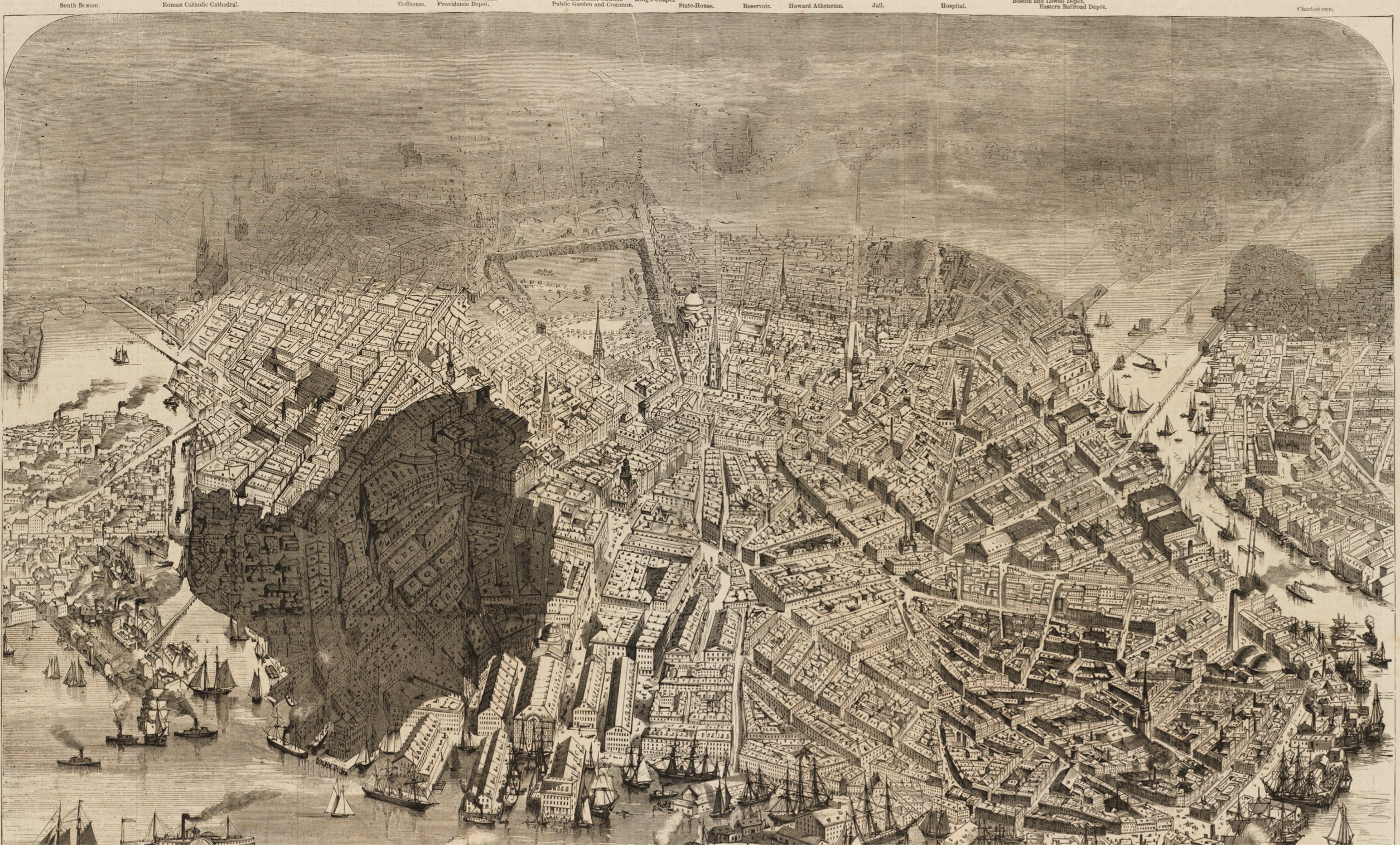
Boston’s Great Fire (1871), Harpers/Norman B. Leventhal Center, Boston Public Library
We are now facing new fires, that roar even louder–driven by winds of seventy to eighty miles per hour, as if facing experiments of flammability in California, and much of the world, that we are only learning how to map, and fearing the even greater roars of a fast-approaching future. And we are only learning to map the rapidly burning landscapes for our eyes, and the dangers they present, and the inequalities that can be born from insurance market, where the rapidly rising costs of insuring homes in much of the old fire zones of the Palisades are most likely to bring booming costs of insurance to obstruct rebuilding in these regions, making the Palisades more outrageously unaffordable and exclusive. Far in the past has receded the recommendation for a protocol of containing risk in teams of firemen, by which these valiant “Men of Prudence and Authority, [may] direct the opening and stripping of Roofs by the Ax-Men, the pulling down burning Timbers by the Hookmen, and the playing of the Engines, and command the making of Lanes, &c. and they are impowered to require Assistance for the Removing of Goods out of Houses on fire or in Danger of Fire, and to appoint Guards for securing such Goods; and Disobedience, to these Officers in any, at such Times, is punished by a Fine of 40s. or Ten Days Imprisonment.”
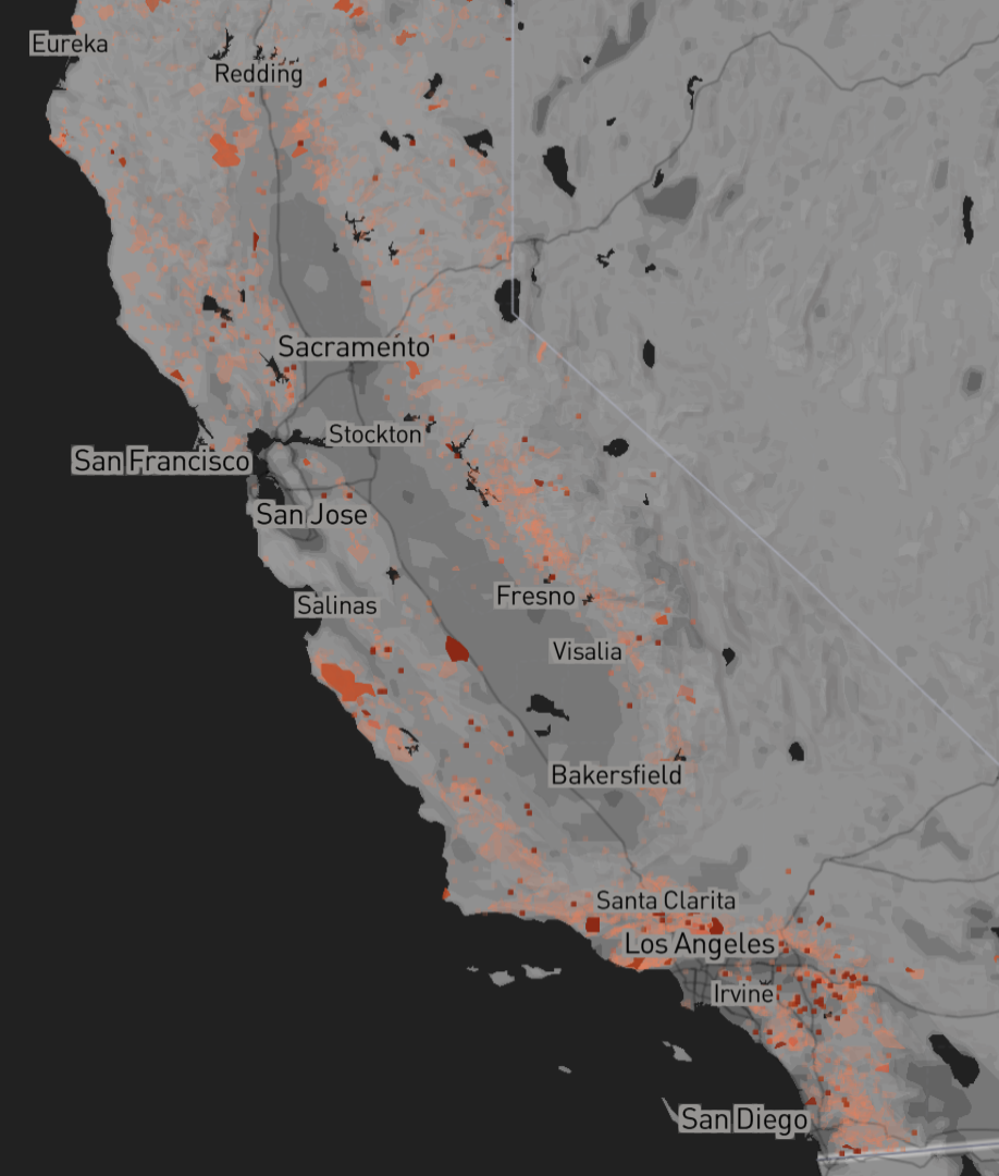
The imposition of regulations is hard to imagine in southern California, where regulations are lifted by the preservation of the exclusive rights to property and luxury of homeowners lucky enough to live in the Palisades near the nearly 700 mansions that tragically burned in the recent fires while not adorable housing, lack the needed fire perimeters or fire-resistant plantings, or protection with adequate local reservoirs. For Franklin, extinguishing fires was a means of mutual assistance for homeowners in urban neighborhoods, more than a Wildland-Urban Interface. But living in the city of Philadelphia was in a sense closer to the wild than we might think, and close to an anthropogenic world of needed to be grasped as far more combustible than the wild–and whose heightened risk of combustibility he demanded be insured. As much as California exists under a different fire regime, the spread of reported fires around Los Angeles grew by 1945 in a growing Wildlands interface, as increased housing density in areas of combustable scrub, electric wires, and poor guarding of a fire permitter in housing created increasingly dangerous conditions for fire spread in the interface. They are tracked in statewide maps of CalMatters‘ Wildfire Tracker–and the responses to the fires in wildlands interface outside Los Angeles predating environmental regulations were far fewer.

Fires Resounded to in California, 1945/Wildfire Tracker–Cal Matters
The fires ignited in the states only significantly multiplied as rising danger of fire prevention grew, with increasingly dense housing along the coastal areas of Los Angeles by 1990,–
Statewide Fires Responded to in California, 1990–Wildfire Tracker–Cal Matters
-that have only consumed a greater area of the state in the interface by 2020, creating an emerging recognizable landscape of great risk. The risk was not born so much as made by the increased density of the woodlands interfaced that expanded with limited prevention strategy on the books.
Statewide Fires Responded to in California, 2020/Wildfire Tracker–Cal Matters
Water trucks were of course crucial in an earlier fire regime of urban regions, as risk grew with urban housing density. In demanding both leather buckets and “discoursing and communicating such ideas as occurred to us upon the subject of fires as might be useful on such occasions,” proudly asking if there was a city in the world better equipped than Philadelphia “with a means of putting a stop to beginning conflagrations” with fire-engines, thirteen ladders, two hundred and fifty buckets, and two fire hooks. He had been so struck by the transformative effects of the Great Fire that had caused houses in London to be built “chiefly of brick,” with walls of brick between each house “found to be, indeed, very helpful in case of fire,” and while Daniel Defoe considered Londoners to be “some of the most careless persons of the world in the world about fire” he approved fire insurance meant that “no sooner does a fire break out, but the house is surrounded by engines, and a flood of water poured upon it, until the fire is, as it were, not extinguished only, but drowned.” The local urban insurance companies founded after the Great Fire “keep in constant pay, and who they furnish wit tools proper for their work, and to whom they give jack-caps of leather, able to keep them from hurt . . . [who] make it their business to be ready at call, all hours of day, to assist in case of fire, . . . very dextrous, bold, diligent and successful,” who “they call fire-men, but with an odd contradiction in the title, for they are really most of them water-men.“
The foundation of an early insurance company in England fourteen years later–The Fire Office–was celebrated as it served all fires, insured or not, and this pillar of public assistance provided Franklin a model for the “Contributionship for the Insurance of Houses for Loss by Fire” with his fellow-volunteer firefighters–insurance companies equipped watermen “to repair all arms of fire,” responding to “all fires that shall come to their knowledge & give the best of their assistance to extinguish the same” as public forms of assistance per local statutes. If “in this world, nothing is certain but death and taxes,” a maxim Franklin took from Defoe’s Political History of the Devil (1726), the fire was nothing if not diabolic as it spread from the canyon mountains down to the shore, consuming houses and businesses and creating billions of dollars in loss. Franklin valued the lightning rod as an invention enhancing safety to aid a new regime of risk in urban landscapes of density, where lightning could strike roofs to cause loss of property–“cease, ye clouds, your elemental strife,/Why rage ye thus, as if to threaten life?/What busy mortal told you Franklin’s dead?/What, though he yields at Jove’s imperious nod,/With Rittenhouse he left his magic rod!“–and electric charge bring fire.
Franklin was alert to the need of fire prevention in 1735, mapping the dangers of a city where “foul chimneys burn most furiously a few days after they were swept.” Philadelphia should not feel secure, even if “all the bad Circumstances have never happened together, such as dry Season, high Wind, narrow Street, and little or low Water: which perhaps tends to makes us secure in our own Minds; but if a Fire with those Circumstances, which God forbid, should happen, we should afterwards be careful enough.” (He had proudly designed iron vented fire-places or Pennsylvania Franklin stoves to rede fire risk.). The city was only waiting for the eventuality of a perfect storm. By 1752, his insurance society would stipulate “no wooden Houses be built after the present Year, . . . nor any of the Hazardous Trades or Businesses following are carryed on, to wit, Apothecaries, Chemists, Ship-Chandlers, Stable-keepers, Inn-holders, Malthouses, Oyl and Colour Men, or which are used as Stores for . . . Hemp, Flax, Tallow, Pitch, Tar, Turpentine, Hay, Straw, and Fodder of all Kinds and Corn unthrasht,” carelessly stored in homes–“the Insurance of Houses from Loss by Fire hath, where the same has been practiced, proved very advantageous to the Publick” underscoring his awareness of the need to “promote so great and public Good as the Insurance of Houses from Loss by Fire, upon the most equal Terms, and apart form all Views of private or separate Gain or Interest.”
Franklin’s visit to London as a printer not only exposed him to a more expansive world of letters, but provided a quite compelling case in point. Fires were already experienced in Philadelphia–for one, the raging fire by which Virginia’s state capitol was deplorably consumed by arson in 1747–but the danger was succinctly and effectively stated by the argument in maps of the devastation of the Great Fire, preserved in memory if its ashes were of course no longer actually smoldering:
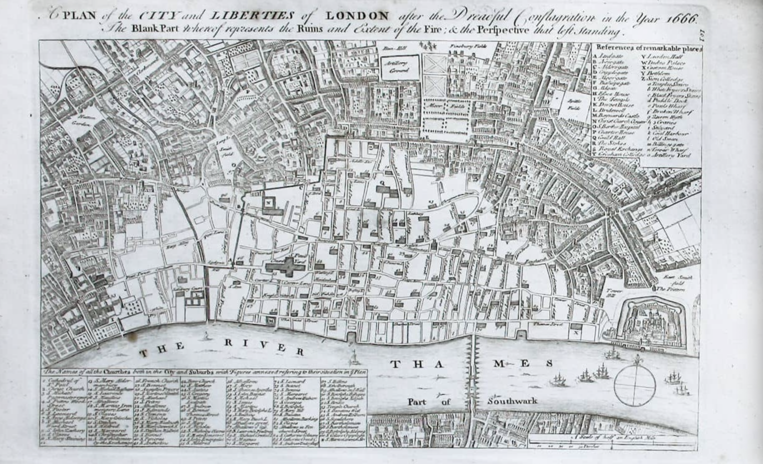
Wencelsaus Hollar,Plan of the City of Long after the Great Fire (1666), from Maitand’s History of London

The bad circumstances happened together in Altadena, even more than were imagined in 1735 in Philadelphia, as high pressure systems sent furious Santa Ana winds into the mountains, and then rushed to the ocean shores, seeming to carry a front of raging fire to the ocean that even the heroic drops of water that were dangerously flown over the flames seemed they might not be able to stop. Franklin printed a famous letter on fire prevention that urged basic preventive steps, before he founded the insurance company as well. The two were simply paired.
Franklin boosted public interest in the need for such insurance policies in best practices. He printed an anonymous letter, and perhaps penned it, arguing not only an end to “the detestable practice of putting wooden Mouldings on each side of the Fire Place,” ignoring their combustibility, by due diligence: “if Chimneys were more frequently and more carefully clean’d, some Fires might thereby be prevented,” leaving “People in Confidence that they are clean, making large Fires” and that ” in the Affair of Extinguishing Fires, tho’ we do not want Hands or Good-will, yet we seem to want Order and Method.” The Boston Fire Society existed from 1717, equipped with ladders, pails, engines and axes, to prevent fires’ spread, but it seems to have been made indelible by Defoe’s account of the scale of destruction of London’s 1666 Great Fire, and the mapping of the extent of the damages of the Great Fire, and indeed by 1744 the model for the rebuilding of London’s burned down center by Christopher Wren.

A Plan of City of London after the Great Fire, in the year of our Lord 1666, With the model of the new City, according to the Grand Design of Sr. Christopher Wren. London, 1749/British Library
Daniel Defoe provided a compelling narrative of the Great Fire’s spread that Franklin encountered, reding about the origins of the fire and with diagnostic skill in an elegant post-mortem to consign it to the past: the scale of loss of thousands of houses, fifty-two guild halls, St. Paul’s cathedral, and eighty-seven parish churches was unimaginable before, if to be expected given the crowded nature of the center,: “the houses all built of timber, lath, and plaster, or as they were very property called paper work” that might combust readily, allowing the fire to move by “on the tops of the houses by leaping from one side of a street to another” in narrow curving streets, given “the manner of building in those days, one story projecting out beyond another, . . . such that in some narrow streets the houses almost touched one another at the top.” Even despite challenges posed by global warming and the acceleration of fires fanned by the unprecedented velocity of Santa Ana winds above the San Gabriel mountains, there are certain problems of fire spread and fire prevention that are not so distant from those Franklin admired in Defoe’s account of the Great Fire of 1666.
In London, Franklin was particularly excited to learn upon his arrival, a new language for fire existed that might be worth importing to Philadelphia. The leaping flames were only mitigated by the fact that insurance companies paid specialists “who make it their business to be ready at call, all hours, and night, to assist in the case of fire; and it must be acknowledged they are bold, diligent, and successful: these they call fire men, but with an odd contradiction in the title, for they are really most of them watermen.” The question of how water was gotten to fire needing to be extinguished is underscored in the letter Franklin had printed in 1734 in hopes to sway public opinion to consensus for a fire company: “we have at present got Engines enough in the Town, but I question, whether in many Parts of the Town, Water enough can be had to keep them going for half an Hour together. It seems to me some Publick Pumps are wanting; but that I submit to better Judgments.”
What sort of judgements do we face in the age of global warmings, and what public pumps do we hope to use? The expansion of fire companies in London was amazingly effective, and renowned, in part as by the Great Fire of Tooley Street of 1860, starting on a waterfront ward, extinguished by the water-canons of fire-ships on the Thames which shoot arcs of water at towering infernos that spewed pillars of smoke to the skies, in an eery echo of the huge grey clouds of smoke that rose over Pacific Palisades and Altadena, creating an unprecedented damage of £2 million by the time the two-week fire stopped smoldering, leading to calls for a public Metropolitan Fire Brigade in place of local neighborhood companies: the incorporation of the city was to large by the late nineteenth century for smaller companies to supervise or carry out, raising questions of the integration of a fire company integrated with other public services of urban maintenance.

Urban Spectacle of the Tooley Street Fire of 1861
The towering flames were rather miraculously confined, but the urban crowds of 30,000 provided an urban spectacle to city dwellers, frozen before the destruction of eleven acres even as the flames were soon stabilized, including the London Bridge station, but the absence of effective hydraulic pumps. The flames that spewed from highly combustible tallow and oil created an urban spectacle early in the era of street lighting, seen for miles around, exemplified the failures of water delivery to leave underwriters aghast; unprecedented losses for insurance companies led to boosted rates–as reflexively, perhaps, to the rates boosted as State Farm is demanding a 22% “interim” jump for home owners across the states after almost 9.000 urgent claims and paying out one billion dollars. Both the fire boats and private engines insurance companies relied to shoot water seemed helpless before the combustion that led to a public company of fire suppression to limit the unsustainable rises in fire insurance premiums.
In the wake of recent wildfires, the absence of preparation or local water supplies led to panic, as if they had not read Davis’ The Ecology of Fear. The disaster drastically depleted insurers’ capital, compelling insurers to claim an urgency greater than in their hundred-year history of serving California homeowners–“risk is greater in California.” in hopes to secure the 2.8 million policies already issued in the state, even if it has ceased issuing policies and not renewed some 30,000–as home insurance contracts, in relatively shocking manner, have been unceremoniously “dropped” in much of the nation in the face of heightened unprecedented climate risk and “non-renewal” rates in much of California had grown in landscapes that were already identified as of high fire risk.
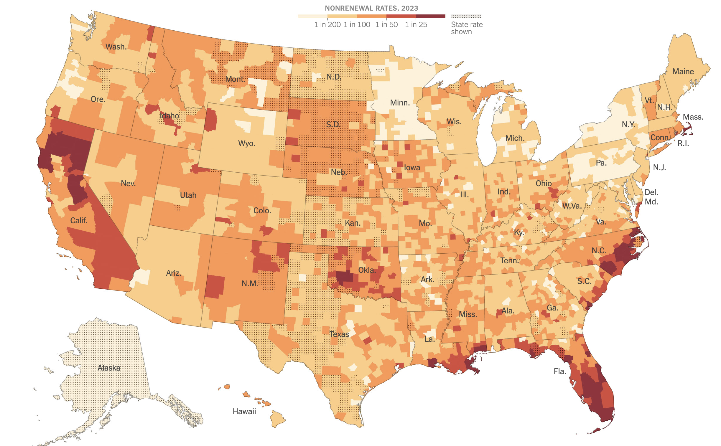
The insurance crisis that is increasingly gripping the nation as the government ignores or denies climate change is fraying the bonds by which insurance ties us. The late Mike Davis, whose evocations of Los Angeles fires have been cited and repeated and piggy-backed on as we again panic at the Palisades and Mountain Fires, was not thinking of the Great Fire of 1660 or of Ben Franklin’s recommendations for joint companies–for Mike Davis, of course, Los Angeles and Malibu might be mapped as a distinct ‘ecology of fear’ long before the Franklin Fire. California fire-fighting lies situated at a similar intersection of insurance and risk, but the absence of offering collective insurance to most suggests the deep dangers of the cyclical burns that much of Malibu and Pacific Palisades have long faced since they were developed in the 1920s.
For all the exceptional conditions global warming created that led the fire to spread at such high speed through the desiccated brush in Malibu, the Pacific Palisades, and Altadena erasing a bucolic landscape in a matter of hours, the intersection of risk with insurance supported a rather careless regime of rebuilding without adequate reserves of water. There were no requirements to create water storage underground in Malibu,–even if Los Angeles County Supervisor Wright realized as much back in 1930, as fire lines collapsed before rapidly burning fifty-year-old chaparral on Los Angeles’ city limits, after Malibu was evacuated, that should “fire raging in the Malibu district get closer, our whole city might go,” as if suddenly sensing the terrible fragility of the bargain of its built landscape before an all too real apocalypse.

Brush Fires Threaten Malibu Inn, October 28, 1935/courtesy Los Angeles Public Library
The often ramshackle houses, local columnist Robin Abcarian later observed, boast “the privilege of being able to gaze out the window at one of the most magnificent natural tranquilizers the world has to offer,” if they are also terrifyingly poised on the edge of natural disaster. One shouldn’t be surprised this is the landscape Thomas Mann wrote Dr. Faustus–a book more often linked to fascist Germany than to Southern California’s idyllic coast. Mann may have sublimated “The Fire” as the force of artistic ambition, more than natural disaster–he arrived as a refugee in California by 1941–but the choice between extreme cold and extreme heat provided the “ruffling, sublime shudders from pate to tiptoe over him who it visits and causing him to burst into streaming tears” perhaps tied to the dramatic swings of burning brush in southern California. Combustible brush fires spread so quickly across the Malibu hills fed by the fuel of abundant brush after last year’s rains, fanned at low humidity, by dry high-velocity winds Daniel Swain likened to an “atmospheric blow dryer” to flatten beachfront properties. (The loss of the Thomas Mann’s house was averted but close; the Spanish style Bel Air villa of fellow-refugee Lion Feuchtwanger, Villa Aurora, was singed recently by Palisades fires as it was again in 2025; Arnold Schoenberg’s home had burnt to the ground in 2015.
The contest between tranquility and chaos in Southern California maps onto the balance of risk and insurance. The veteran Los Angeles columnist detected the dissonance of a promise of peace and landscape of violence. The area’s attraction was underwritten to mask the risks of facing fires even as flames consumed 44,000 acres in Paradise Cove in 1982, over 11,000 acres in 1985, and, by 1993, the “Old Topanga Fire” grew over seven days across 18,000 acres,–covering ten million dollars in losses of public property and over two hundred million in private property damages. California homeowners resettled the region and the Pacific Coast Highway, their fears falsely contained due to the expansion of California Fair Access to Insurance Requirements Plan–FAIR, as laws intended to respond to the inequities of redlining by offering inner city homeowners insurance before historically discriminatory polices in many urban neighborhoods were expanded to “hard to insure fire areas.” Since 2018, FAIR has ballooned to become a major insurer of California properties, becoming a primary insurer of over 400,000 properties, with an astronomic risk exposure of $400 billion, and raising its coverage from $20 million per location to $100 million by, but leaving it unprepared for wildfires across the state as it expanded coverage to areas of wildfire risk by 2024–leading artists to lampoon the old WPA posters used by the National Parks as insurers were compelled to offer coverage for high-risk fire zones, and their exposure approached $350 billion.
Will the Franklin fire and the fires from San Luis Obispo to Indio be a tipping for insuring houses in fire zones? Sales of homes with stunning views that FAIR enabled artificially induced promises of reduced risk in the form of low premiums from the San Gabriel Mountains to Malibu, offering insurance to residences even as they were periodically facing threats of destruction that would warrant fears of building, in a false economy of abundance. But the scale of the fires are difficult to map–57,673 acres already burned, 16,255 structures destroyed, and twenty nine confirmed fatalities, and $186.6 billion of property at risk in Los Angeles, and $112.8 billion in Riverside. The news maps used on television could not but see this as a dark future at best, colored in the charcoal grey that spread across the Southern California skies and fell as flakes into swimming pools. The urgent petition for a rate hike of 22% on the heels of a crisis in insurance markets that follows swiftly from climate crises–as homeowners who lost their housing face questions of to rebuild or not to rebuild–as existential dilemmas in a state State Farm already ceased issuing new policies–and already raised homeowners’ rates by 20% in 2024, before the recent spate of fires in the south.
2025 Fire Incident Archive/CalFire
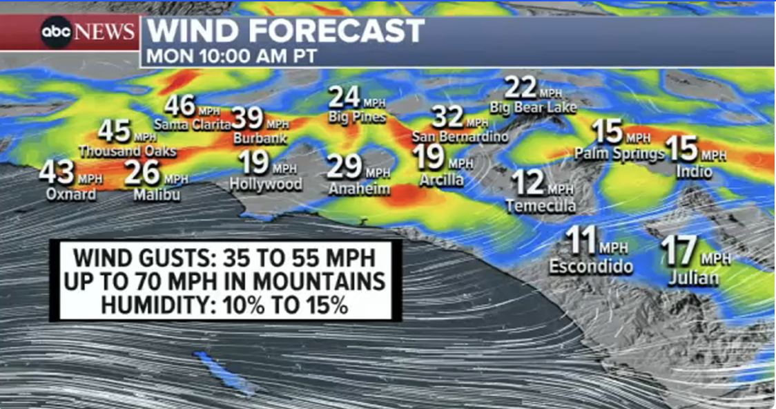
The extraordinarily strong Santa Ana winds that whipped up the flames of fires of up to forty and sixty-five miles per hour–over the speed limit!–that fanned the hills were pointed to for the inferno of the “particularly dangerous situation” in mid-January 13, as urged warnings were issued about infernos that had caused $250-275 billion in damages to property and were not contained, as gusts of wind grew from thirty-five miles per hour to seventy miles per hour, carrying flames and embers across a dried out landscape that indeed lacked water, and where fire fighters had no water in the ground, as they were forced to make heroic fire-drops–and we depended on them to contain the increasingly fanned flames, in ways hard to separate from the heightened levels of fire risk.

The threat to local governance or personal safety were clear, but the precarious nature of the future before such widely fanned flames seemed to offer little real possibility of protection.
Despite President Trump’s image of the valves that would allow water to flow south from the Sierras, and indeed flood the Central Valley, if all obstacles were removed, they would release adequate reserves of water to combat local fires, as if the spread of fires was due to poor water flow. In the Oakland and Berkeley Hills, the fires famously grew in 1991 across an expansive wildllands-urban interface where a firestorm destroying $3.5 billion in today’s dollars spread across dried out grasses with terrifying speed, as trucks arriving in the hills to found a lack of universal hookups to on hydrants, and negotiated destroyed above-ground pumping facilities, as accumulated debris on roofs spread the flames with highly flammable fluids. As the water supply was strained by fifteen hours of continuous drawing off of water the three largest tanks that held over a million gallons of water went dry, as firefighters drained the reservoirs on which they relied, and after four hours of burning under high winds, another million gallon water tank empty as the size of the fire tripled.

Timeline of First Twenty-Four Hours of Palisades Fire and Eaton Fire/Orange County Register
Under the pressure of high winds and with arid ground conditions allowing the fire to speed through combustible brush on the Palisades hills, the other hundred-gallon tank was empty, as it happened–a perfect storm for the fire to spread with a lack of adequate infrastructure in months that were believed to be outside the critical danger zone of fire season usually imagined over by November or December in most normal years. The nucleus of the fire that exhausted the tanks allowed to burn, the fire continued as a thousand fire hydrants across the neighborhood lost water pressure, stripping fire fighters with their basic tool to try to combat its spread, as high winds fanned the flames toward Malibu, and then into the hills where no reservoirs were to be found.

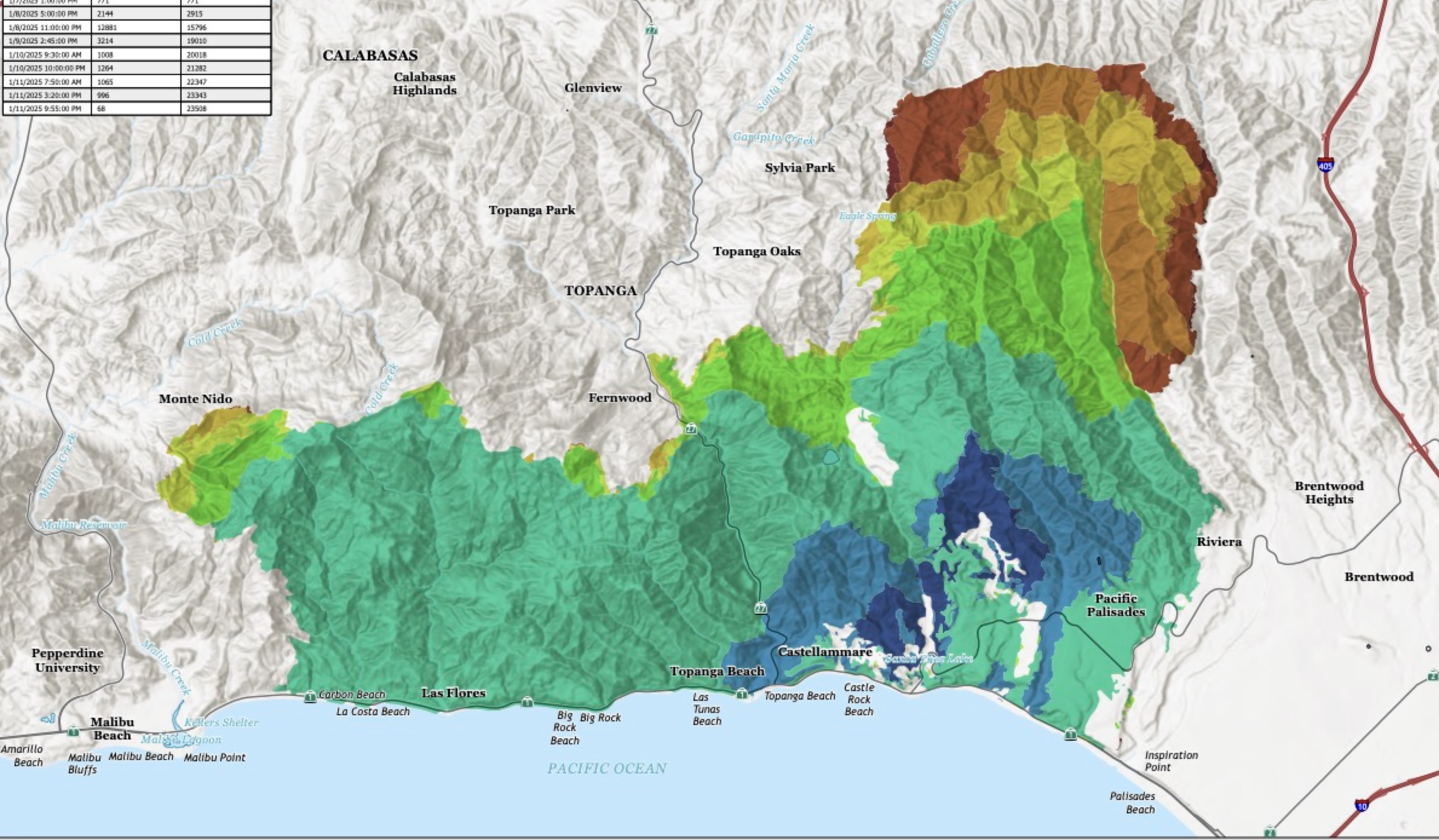
Fire Progression in Palisades Incident/January 7-January 11, 2025 (The Lookout)
The hydrants did indeed go dry. But the fire hydrant became an emblem of the failure to quench the fires in troubling ways, fetishizing the failure of the old industrial warhorse. The hydrant is easier to see as an avoidable failure that distracts from a compromised state of events. For in focussing on firemen’s failure to provide the water needed to put the fires out, we fail to see the poor water pressure as a symptom of stressed urban water supplies, at a remove from the infrastructure of fire suppression, and as a fungible good on a marketplace of allocating abundant natural resources. The system stressed by a rapidly spreading fire in Altadena and the Palisades underscores the absence of urban water networks being designed for wildfires in the WUI, even in the face of growing fire zones and a continued threat of dry temperatures. Rather than trafficking in truth, or in true dangers, the President has elected to traffic in myth–echoing the “mythic fictions” that Thomas Mann felt the German fascists had in the 1930s used to shape political will, using “myths trimmed for the masses . . . [asthe] vehicle for political action–fables, chimeras, phantasms that need to have nothing whatever to do with truth, reason, or science in order to be productive nonetheless, to determine life and history, and thereby to prove themselves dynamic political realities.” (The absence of any underground tanks in the southlands suggest that the problem was not, as Trump would have it, created by Gov. Newsom’s foolhardy desire to “protect an essentially worthless fish” as the smelt, or the dams that he hopes to open to release the “millions of gallons of water, from excess rain and snow melt from the north to flow daily into many parts of California, including the areas that are currently burning in a virtually apocalyptic way.” )
Might an apocalypse fire prevention be averted by adequate investment? The terrifyingly rapid of the expanding fire that approached the 405 as it ran along the shore and Brentwood Heights became an eery sight for urban spectators, who stood motionless on lookouts, as if condemned to remain powerless, entranced as the unwilling audiences for its spread.

Trump seems to seek to reveal a new flowchart to understand the state’s economy of above ground water, but underground water tanks might be a form of insurance able to tether rising premiums. But the problem of a simple failure of hydrants that forced Dick van Dyke to flee his home was not a problem caused by faulty forged hydrants on which the fire department was force to rely.

The lack of water to extinguish the fires that begun–perhaps because of fallen electrical wires; perhaps because of homeless encampments; perhaps due to arson, or negligence, as most fires, have been less often blamed as culprits than poor design. The images of these hydrants were icons in the television coverage of the raging fires that almost dissociated the raging fires from the local landscape in global media. The sturdy old singed hydrants seemed emblems that the scale of maps of fire damage maps were hard to process, as of the residents who gathered to witness the columns of smoke from the nearby hills, wondering if they were safe. The hydrants seemed, however, telling synecdoches of the burnt acreage we cannot grasp or property loss–6.800 structures burnt in the Palisades Fire–that we cannot grasp, or the burn scars that are empty outlines of loss.


Fire Hydrant in Highlands Neighborhood after Pacific Palisades Fire Burnt 23,000 Acres/Loren Elliott
The ghostly form of burnt iron hydrants have become a haunting of the Palisades, a memento mori of modernity and even a haunting of the nation. The skyrocketing demand for private hydrants across Los Angeles seems to mark a major retreat from public utilities, as the hydrants running dry became a spectacle of spectacular failure, rather than a wake-up call. Streamed on media, the rusty hydrant became an emblem of infrastructural failure, and “absolute mismanagement by the city” as if it were a failure of governance that hinted at the failure of public protection. Local storage in tanks had been drained by heavy use in the uphill areas, however, as pressure for long-term usage had decreased so dramatically to make the preposterous charge that local authorities had denied needed water flow by failing to priorities local communities. But the image of the hydrant that ran dry became an emblem of what was wrong in America, the stationary hydrant enduring flames an icon of what happens a state run by a Democratic governor and with a Democratic mayor.
Fighting the fires from huge tanks of water able to hold a million gallons each unsustainably taxed the system, eventually draining the tanks that made water-drops the sole viable tactic to combat the fires, but not before letting fires grow. As water trucks brought in an other 76,000 gallons of water to fight the fires, and more water shipped for drops from the other far larger urban reservoirs, but the dry hydrants and low pressure seems a shock of poor planning and infrastructural failure, that left the stressed-out forged hydrant an emblem of a declining industrial landscape, as if the rust belt failed the Pacific Palisades. But the hydrants were evidence that the true culprits of the destructive fire was local mismanagement–rather than high winds or dry brush.

Dry Hydrant, Pacific Palisades/Eric Thayer
Locals worried about the danger of rekindling of fires that had retreated to seats in trunks or trees’ root systems, believed extinguished, but had only reignited as they were fanned alive by high Santa Ana winds, leaving firemen unable to stop their destructive spread. There was an online issuance of a “Right of Entry” form complete with QR code that could be scanned as a “crucial step to expedite your return home,” but no sense of a return home, or a return to safety was in sight.

America’s declining infrastructure was hardly raised in the last Presidential election. But it was a talking point of Making America Great Again 1.0. There was something truly evil and grotesque in how President Trump attributed the mid-air collision of an airplane descending to Ronald Reagan National Airport Municipal as due to DEI policy, not coordinating flight paths in overtaxed airspace. (The difficulties in the landing has more direct tie to the operation of the nation’s air traffic control tower below recommended levels of staffing,–even if the Reagan Washington National Airport was “not normal for the . . . level of air traffic” at the time of the midair collision over the Potomac. The collision of a Black Hawk helicopter rehearsing a training flight to preserve “continuity of government” to be ready to evacuated political leaders in case of a National Emergency with an incoming flight–became a national emergency. And it was symptomatic of a national emergency far deeper in scale than a single collision. Perhaps the air traffic controller was doing the job of two persons . . . what about the unexplained firing of all members of the Aviation Security Advisory Committee mandated by Congress to oversee safety issues in national airports after the 1988 PanAm 103 bombing over Lockerbie, Scotland? or the vindictive firing of members of the FAA National Defense Program seriously threaten to undermine national safety.
The Reagan airport is severely overtaxed, as overly stressed and as overworked as the air traffic controllers who work there, understaffed. Senator Tim Kaine had already worried about “increasing a safety risk because when you have one plane taking off or landing every minute, while other planes are circling, especially in very constricted air space, like DC’s airspace, you run the risk of serious challenge,” in May 2024, pointing to “flashing red warning sign” of audibly hearing air traffic controllers “having to shout ‘Stop! stop!’ to get two jets trying to use this main runway to stop within 300 feet of each other,” in an airport already overburdened with incoming flights–before the event: “God forbid waking up and looking in a mirror one day,” he worried to congressional reporters, “and say, ‘Wow, I was warned. I was warned and I shouldn’t have done this.’” Or just read the news:

Control Tower and Flight Paths at Reagan International Airport
What was the helicopter doing rounding a busy air traffic area at night, even if its pilot had fancy night goggles? What was the supercool Sikorsky helicopter doing flying at an altitude above two hundred and fifty feet (per the air controllers’ tools) and in actuality three hundred and fifty feet, or fifty feet above the height at which it appeared on the air traffic control display at the time of the mid-air collision–if that figure is a bit approximate for landings, and rounded to the nearest hundred feet, over the Potomac Rive–significantly above a flight path limited at 200 feet, perhaps due to winds. Their field of vision was drastically limited by night goggles, however, that restrict the field to but forty degrees–leaving one without peripheral vision–and facing challenges from the night-time illumination of a city below them, whose reflected illumination had been intentionally intensified by the night goggles that presume a need to augment or amplify ambient light to make one’s surroundings visible–even if the Commander-in-Chief insisted in his preferred all caps podium, it was indeed “a CLEAR NIGHT” for most, at least unless you were trapped in a Blackhawk with a faulty altimeter and wearing night goggles. In that case, your sense of your position was not only hampered, but inevitably compromised.
The difficulty lay in the relation between man, environment, and machine, but that is not saying much. The helicopter’s request for “visual separation” to decouple from air traffic meant that they were decoupled from air traffic, and less dependent on radar, reliant on their own eyesight in an are of enhanced light pollution, multiple landing aircraft that were hard to identify, without radar-based calculations of other planes’ position. The airpower allowed them the flexibility around airports, assuming they enjoyed good visibility; but it is likely that bad readings on a faulty altimeter and garbled warnings from tower controllers prevented advance warnings about the circling aircraft, as they flow to over three hundred feet–a hundred feet over the route’s ceiling altitude–hitting the plane at 278 feet if it had been as high as 400–and if they claimed they had the jet in sight, they were hampered by little guidance save direct observation, failing to to receive guidance from controllers along standard flight paths as they strayed above the allowed height. And if there were more than a few recent near-misses at Washington’s Reagan International, the eventuality of a collision seems to have been waiting to happen, even as the routes of planes was reliant on flight measurement, and often left helicopters manning compromised instruments while allowing the helicopter to fly close to the plane by “visual separation” to rely on coordinating their exact positions in relation to one another in a very crowded night sky.

FAA Chart for Flight Paths around Potomac near Ronald Reagan International
Even if the Blackhawk wasn’t using AI,–though the Air Force is integrating AI to upgrade legacy helicopters like the UH-60, named after an indigenous American leader whose stealth and swiftness were celebrated in a pre-AI world, itself an updated of the UH-1 Iroquois, the tools were at fault. (The names for military aircraft that privilege indigenous models of agility and intelligence are as offensive as the idea of DEI, but in an administration railing against equal opportunity laws won’t likely cease such offensive labels to idealize military tactical technologies.). For all the indigenous metaphors of stereotypes of aerial agility, coordination of the dense flyspace failed, not longer effectively coordinated from the tower, instrumentation failed and all visibility compromised.
What sort of “visual separation” was able to be allowed to a pilot wearing night goggles amidst the glare of the overlit night sky, where the reflections off the Potomac compromised accurate identification that he even had ability to claim he had the right jet plane in sight?

The threshold of safety depended on relations of “human, machine, and the environment” ruled the National Transportation Safety Board–even as President Trump didn’t get that much in seeking a review of “all hiring decisions and changes,”–presuming that things were peachy until the wrong folk were hired, in a massive if blatantly tactical reading of the tragedy before sixty-seven bodies were dredged from the Potomac River, where the airplane from Wichita hit the Blackhawk. That triad doesn’t explain much, but it does express how we all live today. The problem of controllers granting the lovely if opaque circumlocution of “visual separation” with the jet at the moment their flight paths converged begs the question of the advantages of blindness in a metropolitan airspace and the wisdom of allowing pilots wearing night goggles to fly by their own sense of judgement. Why even have air traffic controllers at all?
Trump wants to use “common sense” to understand the magnitude of disaster as based on human error–“we have to have our smartest . . . they have to be talented, naturally talented people,” he lamented as if the the mid-air collision was the latest grievance he had with his predecessor, without showing any empathy for the dead, as if feeling ripped off this occurred on his watch, insisting “we can’t have regular people on this job.” The problem is more likely anthropogenic (air pollution), instrumentation (night goggles); and bravado (“visual separation”), and poorly integrated systems. Why was a helicopter with limited steering control in winds allowed to lurch above its intended path by an airport run way, asking to be released from air traffic control with false confidence, allowing it to pop up in ways that could not but have disarmed the pilots descending to a runway, in one of the most congested airports in the country?
Existing aviation rules require helicopters on that route above the Potomac to stay below 200 feet. In a supercool helicopter, the pilots outfitted with goggles felt they were equipped by technology that they didn’t see left them purblind in a sea of electric light. Was this one the Blackhawks used to capture Osama bin Laden outfitted with technology to avoid radar? As the plane entered its landing path toward the airport, trying to evade collision with the copter by trying to rise from the path of its descent, as airport employees capturing on their cel phones. The new regime of air traffic, and the new regime of public lands and national parks, suggest a systemic failure waiting to happen.

Collisions and Crashes in American Airspace/Trump Crashed This
A historical question about the tragic emergency that is the largest mid-air collision in years: why has no one tied the deeper tragedy off the expanding runways of Reagan National to an airport named after a president determined to fire 11,359 air traffic controllers demanding higher wages, whom he order to return to work or be banned from future employment at airlines? (President Reagan consolidated executive power by angrily firing striking controllers whose labor rights he denied, and declared a “peril to national safety.”
The show of force reduced collective knowledge-pool of a profession we rely on as air traffic grew, orchestrating increasingly congested skies that placed increased levels of stress on controllers. “They are in violation of the law,” even as they had complained on under-staffing, Reagan heavy-handedly flatly “terminated” striking workers with the braggadocio of a cowboy, arguing public safety workers lacked rights to strike in a shift of labor law. He used military scars to make up for shortfalls and break the strike, issuing a directive the FAA hire new controllers to replace an entire professional cohort, reducing proficiency managing flight paths, as controllers did not reach pre-1981 levels for over a decade, even as demand grew in flight control. By silencing union demands for better equipment, depressing controllers’ wages, and increasing stress, Reagan compromised professional status, job security and national safety. “That’s not the way people ought to work,” he had angrily asserted, firing all who didn’t return to the towers by 48 hours–if not, “Tell them when the strike’s over, they don’t have any jobs.” The 13,000 air controllers who went on strike in 1981 compare poorly to the current need of 14,335 controllers to direct air traffic; only 10,8000 working certified air traffic controllers today are 2,000 less than forty years ago, leaving 3,500 control towers short-staffed, despite ever-busier flight paths and congested air traffic. Do workers’ old complaints of poor staffing and shoddy equipment haunt our skies?
Security seems to be a commonality here in the tortured American landscape of the 2020s, when global warming notwithstanding we face infrastructural challenges of unimaginable scale. While Reagan saw the strong-arming of the union who were demanding “a survivable contract” as a real act of political courage bolstering Presidential power, the unprecedented firing of 11,000 Americans from the Rose Garden that the striking air traffic controllers “will be terminated” banned the 11,000 from being rehired to bolster his own power–even after the union had endorsed his candidacy for President the previous year!–the blue skies that allowed air traffic to inch from only 50% of flights to 75% in two days sanctioned the practice of “permanently replacing” workers to diminish the job’s status and cast union-breaking as defending the interests of the everyday man. Despite the hopes to “ground the planes” and empty the skies, the precedent of a wholesale replacement of the striking workers and dismissal from work with a real threat of “permanent replacement” was more than a revision of air traffic control as a line of work, but a labor tragedy that took aim at the AFL-CIO, already weak enough but with difficulties overcoming the precedent, as its striking members were in fact jailed for seeking a four-day workweek and less overtaxed work conditions, and were transformed to a service economy workers without the rights to strike for higher wages. Strikers sfound themselves in jail, without a profession, or even a job to return, an earthquake making air traffic control a far less appealing position; what was a navigational beacon in all weather systems across the national skies, now recast in openly oppositional terms as part of a service economy.

If the government’s breaking of the PATCO strike is often treated as a watershed in labor laws, by reducing the bargaining power of the union that it challenged as illegitimate, another consequence of the strike was to create increasingly stressful working conditions and work shortages that made a weak link in an overburdened system of air traffic. With controllers chronically exhausted from a workloads of increased intensity in a sixty-hour work weeks of increased intensity to monitor flights in over-served airports of increased runways, Trump[s readiness to criticize the quality of workers typically overlooks the increased demands evident, in the judgement of trained air traffic controllers, in the voice of the “very, very busy, very task saturated” controller who was managing the tower in Ronald Reagan International on the night of January 29 when the midair collision occurred. The sympathy an aviation consultant familiar with the workload of air controllers felt for the worker handling air traffic that night is a striking contrast to the absence of empathy for striking workers by the President after whom the airport where the mid-air collision occurred.
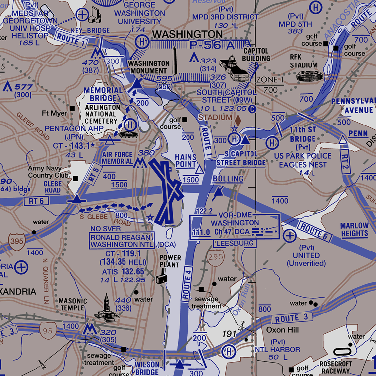
When Ronald Reagan insisted that the strike was not “legal” and that the workers had no ability to negotiate for pay, they took to the streets for a survivable contract, trying to let the nation known that the flights they had presumed available might be stopped–and airplanes grounded–that sent the California Governor turned President into a tizzy, leading him to start training strike-breakers and collectively firing the entire union of a local that had endorsed him in ways that would compromised the profession of air controllers for future years, limiting the attractiveness of a job and ensuring that they would be understaffed and underpaid for decades to come, in ways we have perhaps only very recently begun to receive the bitter harvest of its fruits. The hope of that strike–to ground the planes and empty the skies of air traffic , in an attempt to show the muscles of air controllers angry at their low wages and lack of a viable contract or bargaining terms–
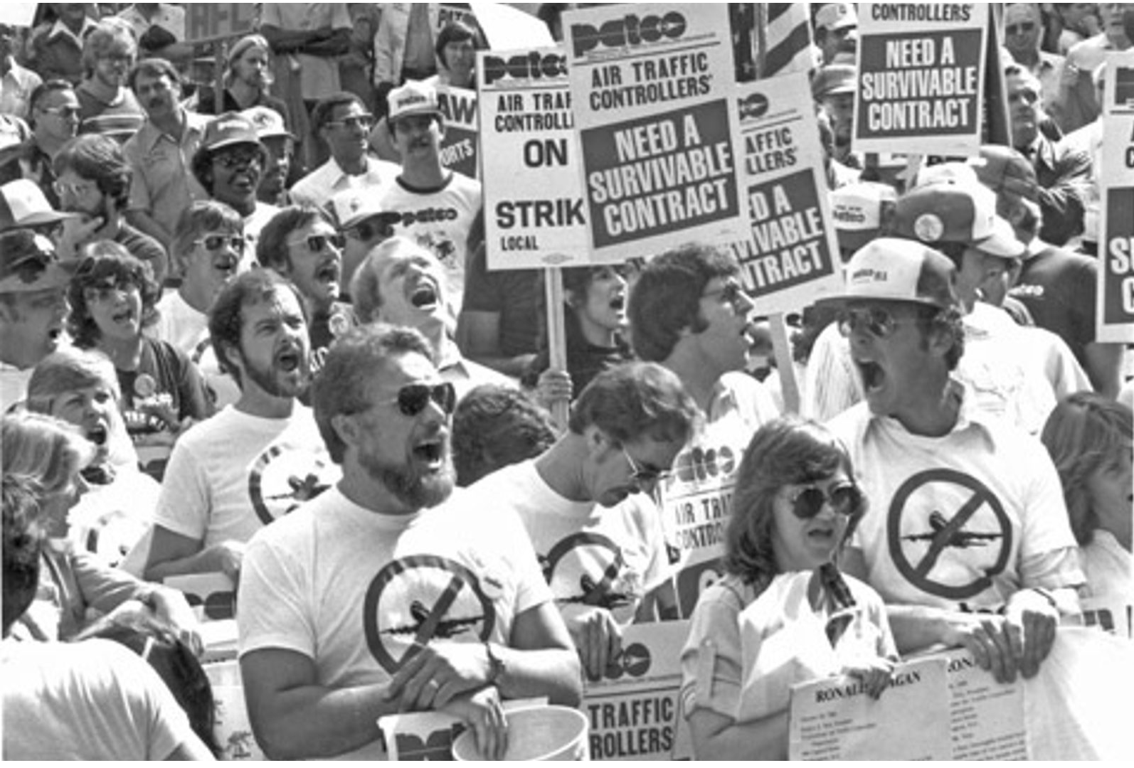
Professional Air Traffic Controllers’ (PATCO) Striking Workers, 1981
–had led them to join the AFL-CIO and show their force in a struggle of collective bargaining that led the President, Ronald Reagan, terrified of the instability empty skies would bring to America’s economy and middle class families, if the image of a sky empty of grounded planes came true.

Isn’t it a typical strategy of Trump to blame the poor training of airport workers for problems of ever-growing workloads, low wages, grueling hours of work that ask workers to cover multiple shifts, and overtime that undermines their performance? Air traffic control– as fire prevention–depends on the transmission of knowledge, and the knowledge loss is serious as cohorts air traffic controllers are constrained by being hired after age thirty-one and retiring at fifty-six years old, reducing the pool of knowledge for operating flight schedules to slim levels for coming decades.) Before the tragic accident occurred, 85% of post-pandemic air traffic control facilities were staffed below accepted thresholds, leaving shortfalls in the staffing of control towers in Dallas-Fort Worth, Atlanta, and Chicago, coordinating the busiest US airspace was an object of contention between the FAA and airlines, leading to cancellations and charges and counter-charges of inconsistent FAA hiring resulting–even as the airspace over the lower forty eight grew increasingly entangled.

The crisis of staffing of certified controllers became a new normal for decades, as the density of airplane routes was poised to escalate quite dramatically, air traffic controllers loosing a union with teeth, and many staffed buy air traffic controllers in training in a job that is plagued by labor shortages as workflow is increasingly challenging to map–in ways that poses a serious safety risk. For the sever shortages of staffing of Air Towers by professional controllers has quite precipitously declined since 2012, and even has not recovered since the pandemic–per FAA public data–long before we were two thousand controllers below the goal that the FAA set with controllers of 9,000–a number quite lower than the certified controllers we relied upon for landings and air safety.

The goals recently se try the FAA and air controllers’ union, in an attempt to get things back on track as the travel across skies is poised to grow in magnitude, suggests many slices of the pie gone with unmet goals.

The FAA report was unavailable on the agency’s website as of early February — if the numbers have resurfaced–in ways some fear is part of the recent purge of government data mandated in executive orders. But the shortcomings of controllers in airports in the nation–even if Texas, New York, California, Wisocins, and Arkansas seem in the red–cannot be seen as a local problem–if the planned expansion of more runways in the relatively narrow airspace over Reagan International is a worry. The crash due to a faulty altimeter occurred in a context of tightly competing air zones, and different priorities of military and civilian air traffic, where supposedly air traffic controllers were, if short staffed, not to blame so much as a convergence of factors. The expansion of air traffic into Washington seemed poised to escalate in ways that would only increase the danger of in-air collisions, warned many senators, including the warning from Virginia’s own Tim Kaine. And National Transportation Safety Board Chair Jennifer Homendy seemed to stressed as she tired to address the grim picture of safety of air travel around Reagan International to reporters, offering that the Fatal collision on tragically converging flight paths before a large FAA map, broaching the possibility the helicopter crew hadn’t heard the directions that air traffic controllers provided to position themselves behind the plane landing of Path Four, at a tense news conference February 14, because the pilot had been talking over them.

NTSB Chair Jennifer Homendy on February 14, 2025/Mark Shiefelbein, AP
As we register with open mouth after the death of sixty passengers and four crew members on the American Airlines regional jet that collided with a Sikorsky helicopter, we should consider how Kaine warned his colleagues that the readiness to expand runways posed a real national risk they had no contemplated. “You’re doing it to convenience a few dozen members . . . at the expanse of everybody who lives around this airport who would potentially victimized if there was some kind of collision,” he told his colleagues, in being willing to pass a bill to increase the runways without even having the air controller staff at an adequate level. And while we have been told it was a bad night at National when the airplane entered the regional airspace, allowing it to collide with a helicopter that was practicing, irony of irony, emergency rescue operations for the President, the safety of our airspace had already long been compromised. The safety we could offer passengers who were flying on board by accommodating to the logic of the skies, and challenge of an increase of flights local air traffic controllers had to accommodate, with New York’s Terminal control Center pulling outsized weight to handle a third of all national air traffic, despite serious attempts to organize “traffic flow management” of commercial aircraft, cargo transport and business jet in a web of air traffic netting that covers the continent like a quilt.
For just thirty minutes before any airplane’s pilot sets their sights on taking off to their destination, all planes notify the next sector of airspace of an adjoining air traffic control tower, to ensure that its flight path will not encounter problems as it approaches a new his airspace or needs to be redirected along an alternate heading or altitude as it plots its flight across the country–moving, as this flight did from Kansas City to Washington. Only after this change is made will the incoming controller accept the airplane into the network whose operation has been overseen by the Dept. of Commerce in July 1936, in the midst of the Depression, but by now expanded to“air traffic control” sectors on which we depend for controllers for safe travels, in order to ensure safe travels.

ARTCC (AIr Route Traffic Control Centers) in Lower Forty Eight
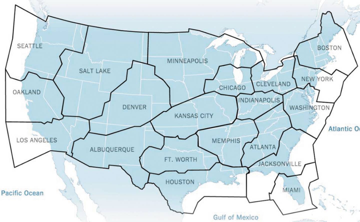
The towers studded across the nation, which are in control of all flight paths at distances from five to forty miles at the densest sites of air traffic, control routing and altitude over immense swaths of national air space, mandating the point at which any aircraft can clears 18,000 feet, when movement is permitted in the cabin, and more. If New York’s control tower covered a sixth of all global flights in 2015, the dispersive governance of the skies manages the scheduling and routing of air traffic of increasing density we never observe from the ground, filtering routing and scheduling decisions through an extended network and routing system, as the hands of local controllers using automated flight routing systems, but control final routing and scheduling from quite dispersed local hubs, within twenty-one united “states” of airspace of disproportionate air traffic.

Which maps are we paying attention to–maps of safety or maps of need? Or are our eyes being taken off the dangers and risks of increasing air traffic on our runways, imagining that this is a problem that doesn’t exist on the ground, as if it were out of sight and out of mind, and with less of a sense of the increasing servicing of airport hubs, even under difficult weather conditions. The level of work exhaustion of air traffic controllers is overtaxing workers’ mental energy and stamina even as President Trump, echoing his predecessor Reagan, has given controllers a kick in the pants, arguing that the FAA has been at fault for hiring policies encouraging “people with sever disabilities” and insisting that DEI initiatives are at fault for “regular people doing this job” rather than the “naturally talented” who might “restore faith in American air travel.”
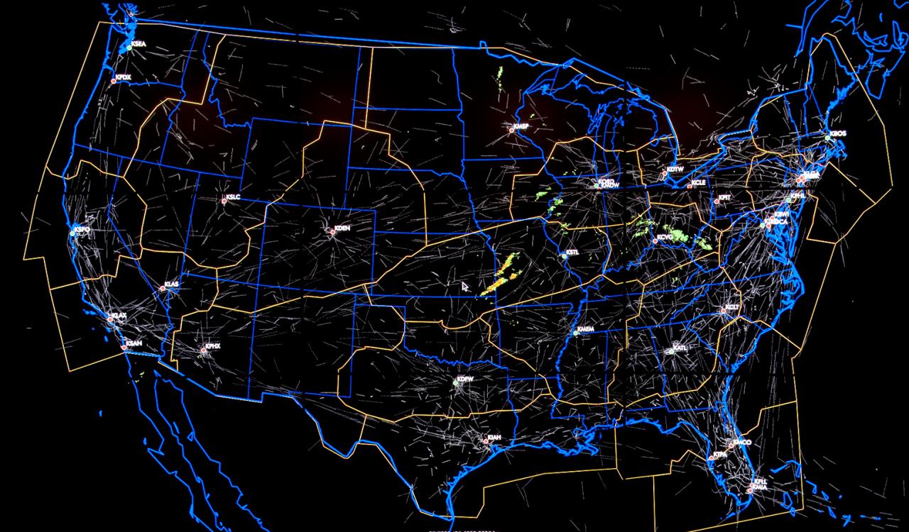
Air Route Centers in Continental United States/Mitre Corporation, 2015
But the density the larger regions by which we map the confusion of air traffic into large boxes as a space that lies far above the ground as if they would continue to seamlessly interact.
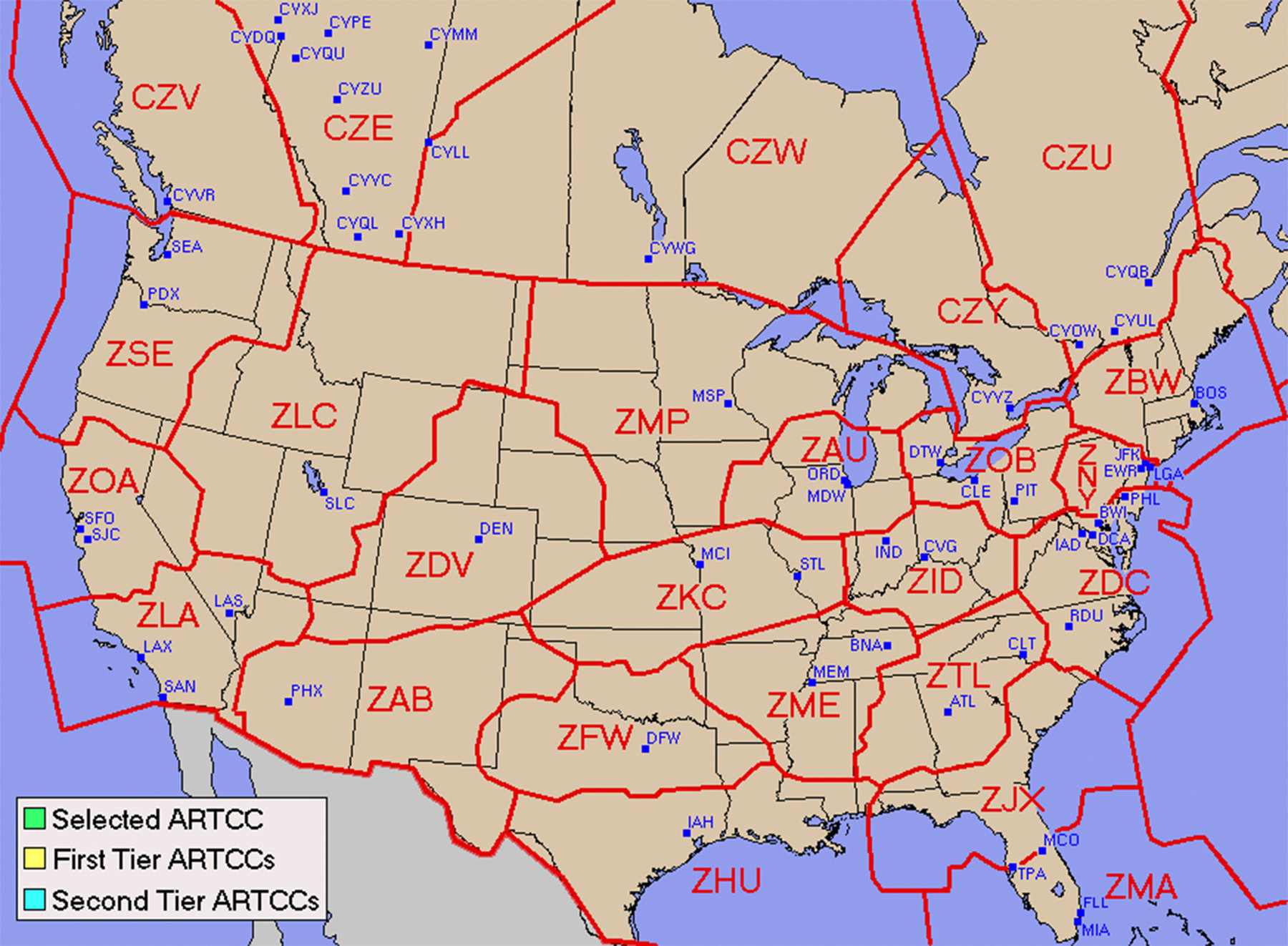

Perhaps we must map not only the pressures of global warming on an increasingly anthropogenic world, whose infrastructure, increased landcover, and impermeability only increased the effects of global warming, but rather ways in which we might better plan to mitigate inevitable catastrophes. For we might talk “now of prevention, where they would be damage . . . for preventing Fires,” in Franklin’s words. The maps of infrastructure may be more readily ignored, as well as the maps of infrastructure, in the glare of the spectacularity of the televised fires. In fact, responders will be sifting through almost a hundred hours of videotape and audio footage as they try to pinpoint the causes of the fire, even as the infrastructure that failed to respond is ignored.
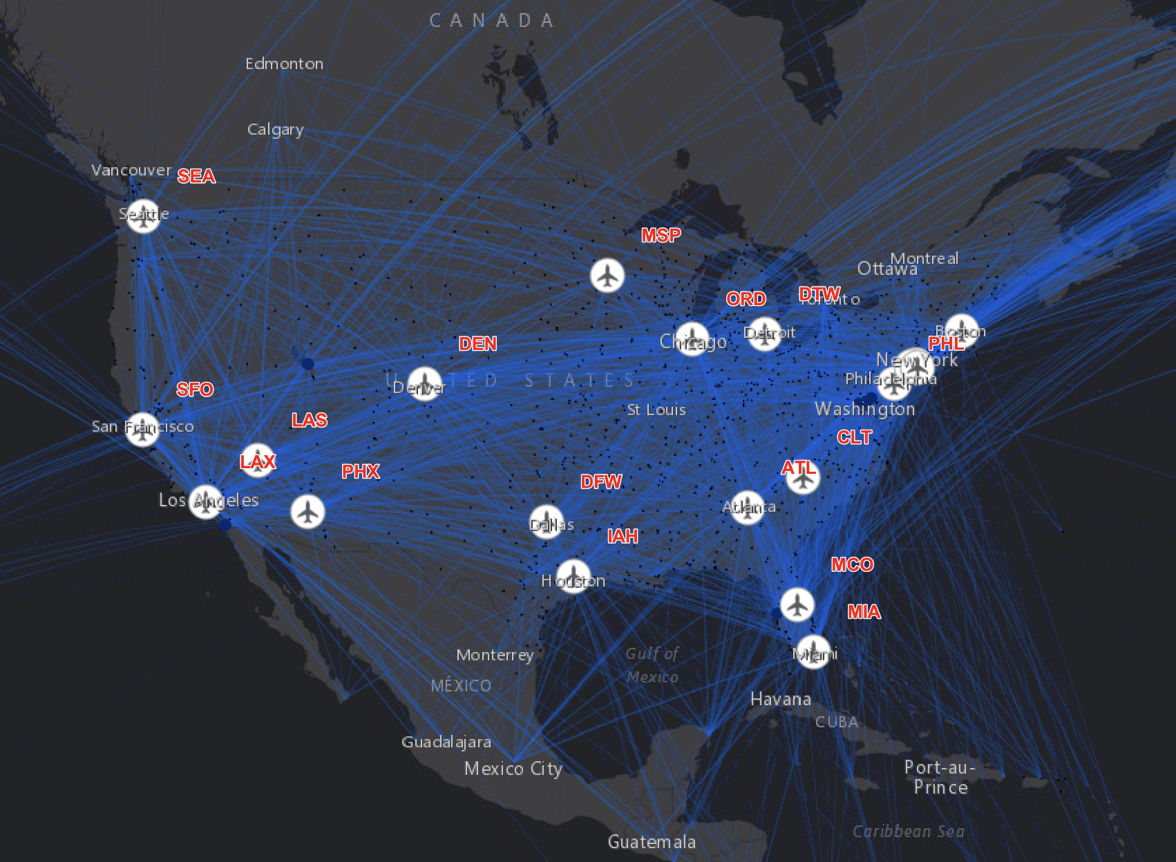
The relation of human, machine, and environment was reprised in the overtaxing of systems of water delivery in the Franklin Fire. Systems of water delivery in Malibu and the Pacific Palisades were hardly equipped for fires of such scale; poor local supervision left critical local reservoirs empty, despite an ever-expanding imbricated Wildland-Urban Interface–or “WUI.”
We need to use better maps, no doubt, as we try to reassess maps of the “WUI” from what we might have seen in northern fires, including integrating water systems into the intersection of chaparral and electrical wires–more than map the locations of houses and overhanging branches, the metric of mitigation in much of the north. Or must we depend on water-drops of daring pilots who must drop them by flying just above smoking infernos?
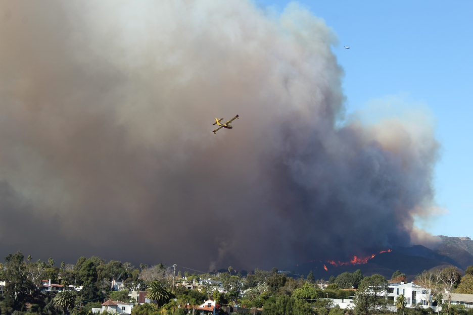
Water Drops over Pacific Palisades Fire, 2025
Every time it is a perfect storm, if the storms keep happening, and fire seasons expand beyond seasons, and not only due to rainfall. We have not created reserves for water capture, on the ground and for local needs. For in allowing hydrants to run dry as flames spread in multiple fires across the combustible landscape of the hills fed by the Santa Ana winds. It was a landscape that was desiccated due to an absence of rainfall, but not because of a chokehold on water supply from the Central Valley or north, and the opening up of those massive “valves”–as much as valves are automatically activated in an individual building’s or hotel’s fire system, the logic by which Trump has extolled the “valves” of an imaginary waterway linking California and Canada,–as if the needed flow of water had been shut off at the border. In the image of a state where water flowed in massive aqueducts, the project seemed one industrial engineering got wrong, where opening and overriding of federal laws protecting endangered species and environmental laws could save the state, to allow a hyperbolic “hundreds of millions of gallons of water [to] flow down into Southern California” as if they had won the jackpot or lottery in his Presidency after being deprived by the bureaucrats and nonprofits in Sacramento.

But such exercises in creative hyperbole hardly helps on the ground . . .
The idea that the water would be able to flow “naturally” from the Pacific Northwest and Canada was an imagined geography indeed, as if all water ran southwards on a national map, analogously to the Mississippi, as it had done for millions of years, rather than that the fire regime of California that global warming had accelerated and expanded was not itself millions of years old. The absence of any southward sloping of land out west, and the low point in the Sacramento-San Joaquin River Delta, means that water hardly flows naturally to the overbuilt southland, but that the region will need new water storage infrastructure. William Shatner’s proposal for an above-ground four foot pipeline that carried water from Seattle to Los Angeles along Highway 5, that might be allowed to leak, no problem, it will do double-duty to irrigate the arid Central Valley, proposed a $30 billion dollar pipeline a decade ago, may inform the Trumpian geography of the state’s water supply. Or maybe the film Chinatown does. Probably, the outdated and undated NAPWA plan, which might exist as a carrot in Trump’s mind to reduce tariffs, for Canada, might exist as a basis to access all the water in the Yukon, and the other reservoirs above the forty-eighth parallel, if it weren’t for the danger those recent fires in the Northwest.
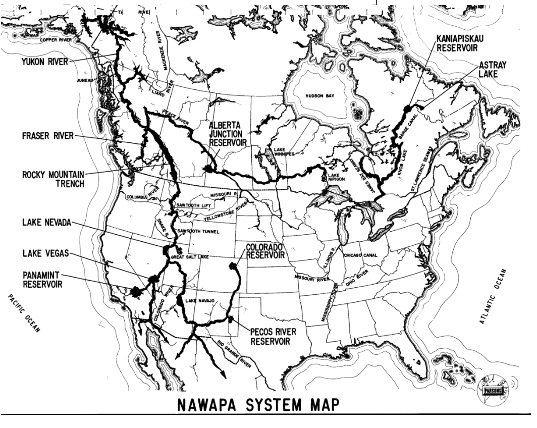
NAWAPA System Map as Imagined by Ralph Parsons (1965)
But the problem may be a difficulty to look local, or build an infrastructure a bit less grandiose. Davis rued that given the scale of the tragedy in Malibu in the 1930 fire, long before the recent fires, the wisdom of opening Malibu to development should have been debated; in contrast, the insurance of Malibu homes in The term which he read in Defoe’s work was of a piece with Defoe’s celebration of rogue wider streets of the city after 1666, a threshold in Anglo-American urban design, in a sense, when “their are many more houses built than stood before on the same ground; so that taking the whole together, there are more inhabitants in the same compass than there were before,” in smaller dwelling with far wider streets. The basic precautions of changes in urban infrastructure to expand in woodlands-urban interfaces, include more reservoirs, attentive practices not only of conservation, and water conservation, but water storage, perhaps in underground tanks, akin to the artificial rivers that were constructed in London, as the New River, to offer London residents a new means for freshwater from Hertfordshire to the urban metropole beyond the River Thames and River Lea, a project at the massive cost of nineteen thousand pounds or in modern currency £4.44 million, costing an eventual £32,000 (£8.43 million today).
As Donald Trump acts to end proposed limits on releasing so-called “forever chemicals” into the environment or rivers, the water that is now able to flow southward in the state is destined to transport increased poison to farmlands it irrigates, ensuring that the water being pumped up from the state’s aquifers will be endangering our food supplies, compromising the health of salmon, and also entering our almonds, lettuce, tomatoes, citrus, grapes, kiwis, and figs–and even the robust market for California wines we will need to be drinking to confront the next climate catastrophe.
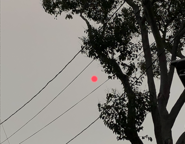
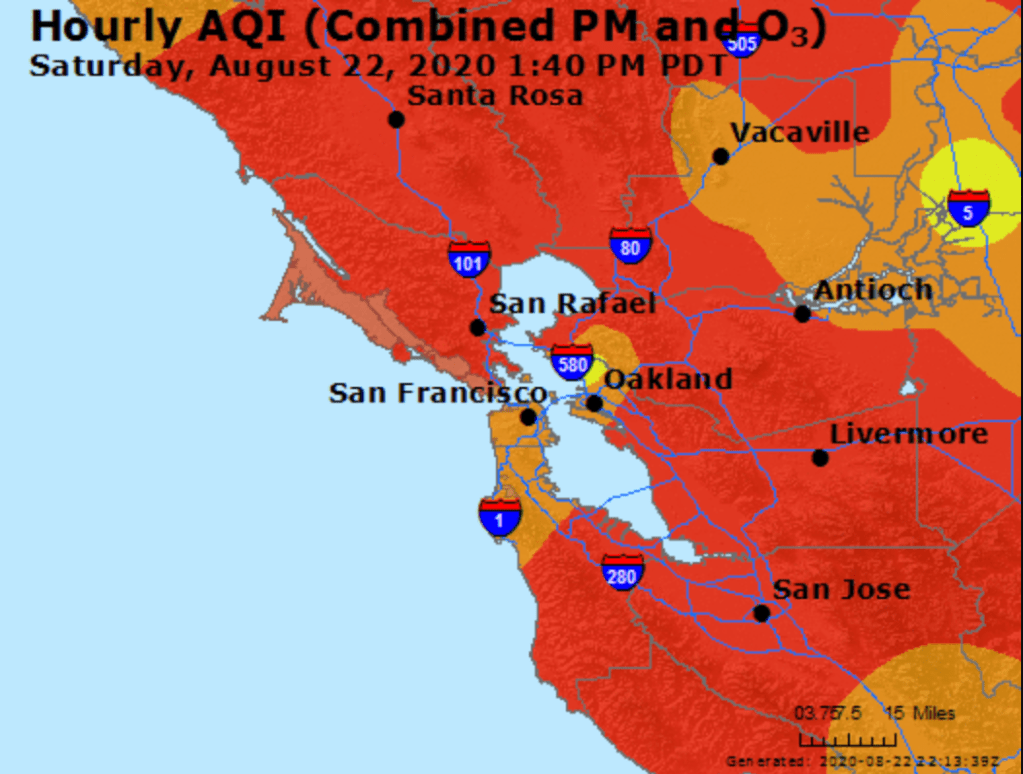
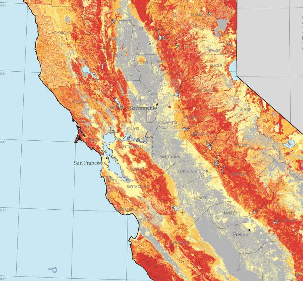
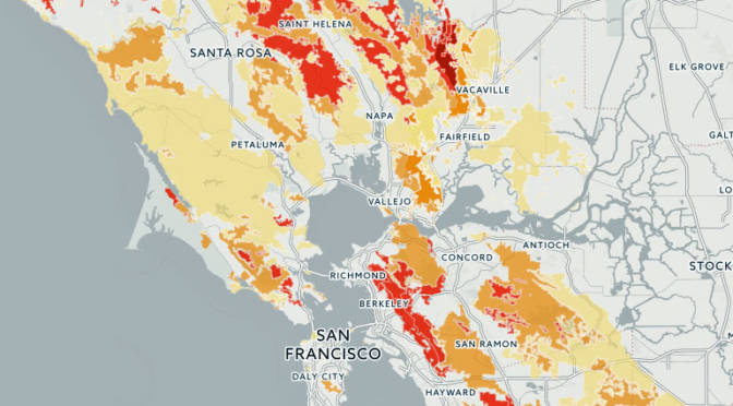
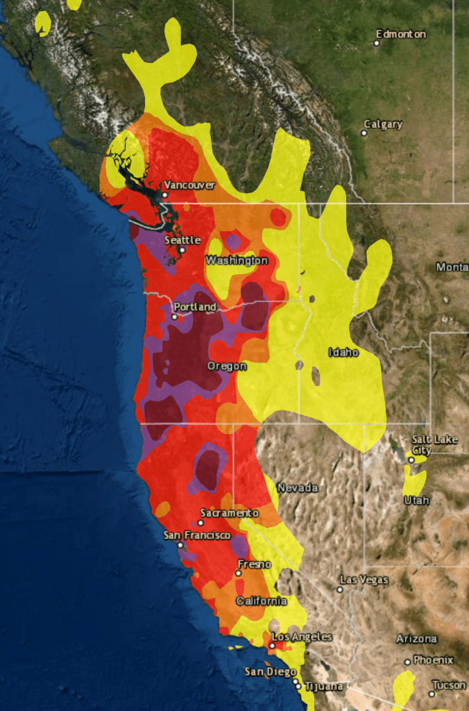

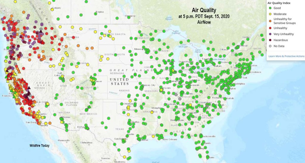
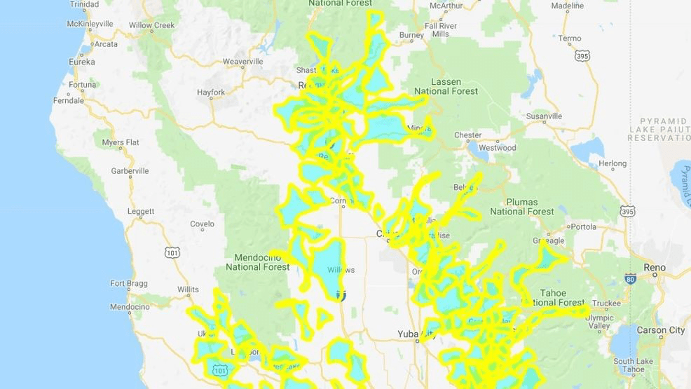
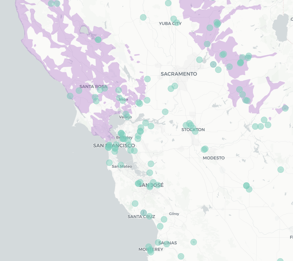
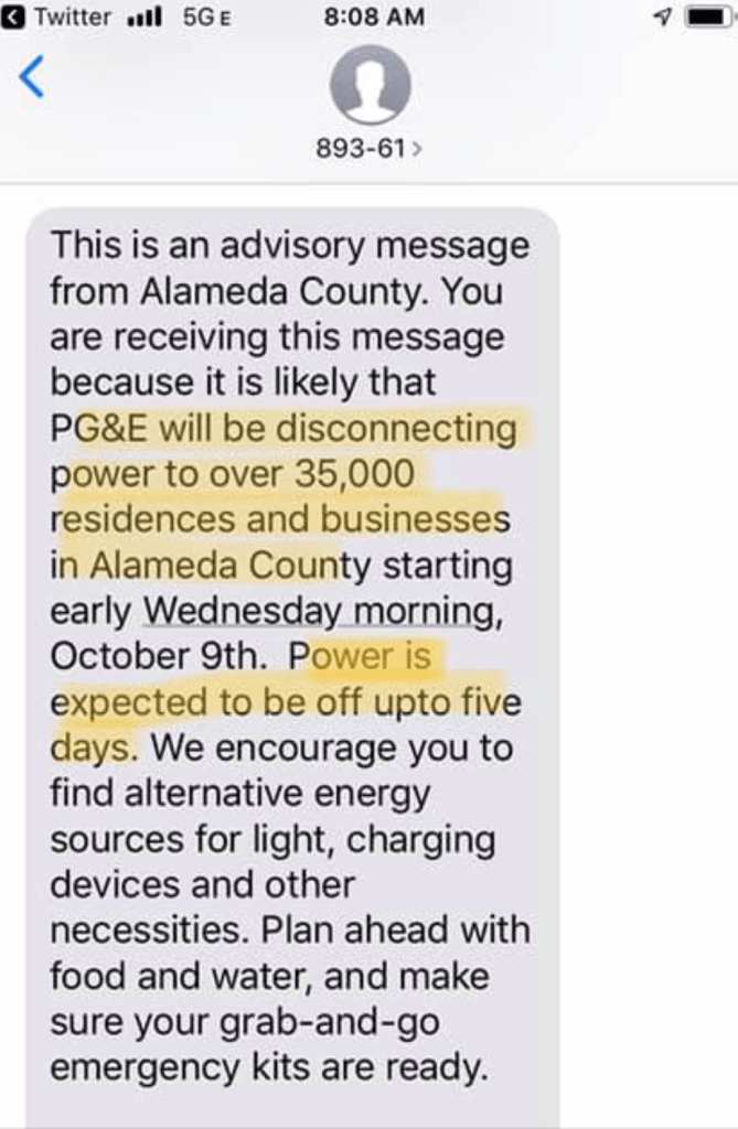
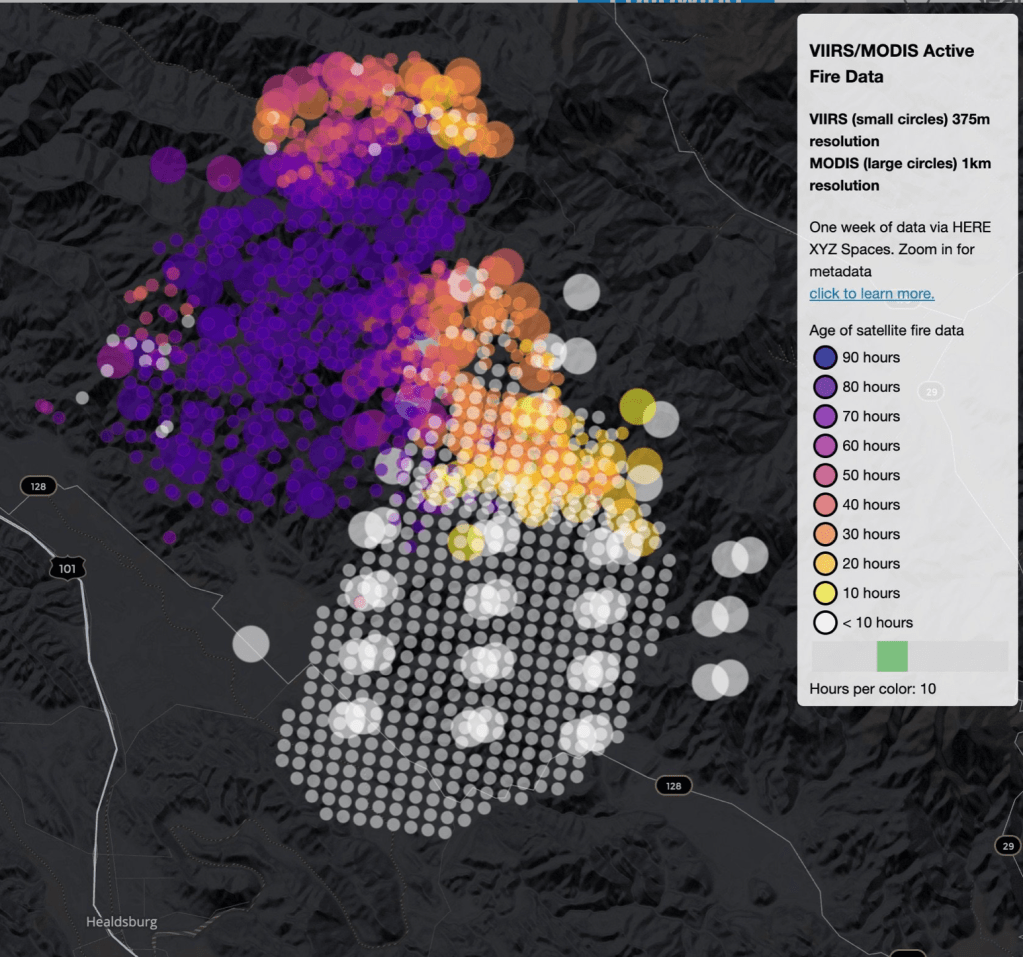
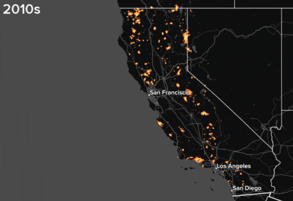
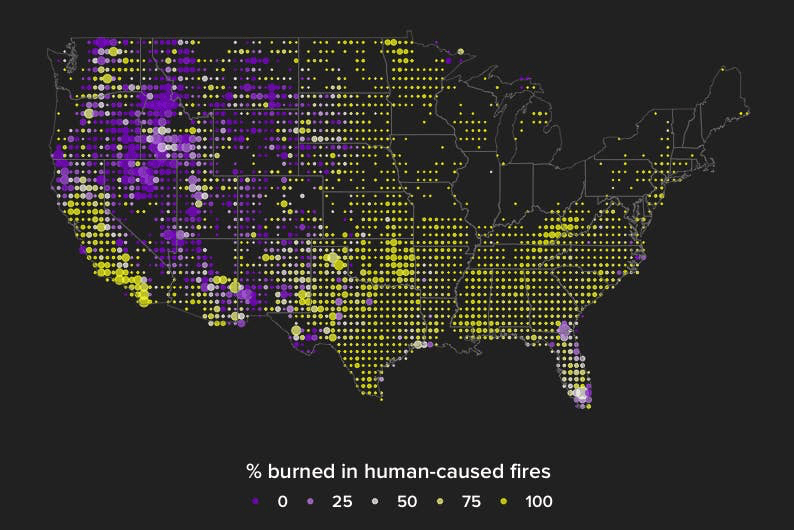

