Questions of scale, distribution, and crowding are increasingly central to mapping and data visualizations. The increasingly troubling geographical crowding of factory farms in the country constitute a cautionary reminder of our shifting relation to the production of food–and the perils not only of concentrating most livestock in inhumanely crowded conditions, but concentrating our farmlands at a physical remove from most populations.
By a perverse twist in the logic of economic conditions, the unprecedented concentration of farmlands at a remove from populations not only changes our food; the ways we to treat food production come with steep environmental costs. This post teases out some of the consequences of the transformation of agricultural practices, as intensified application of pesticides to produce the huge quantities of grain that enable industrial-scale ‘farming’ with their own costs. Despite a renewed culture of small farming in select economies, the remove at which factory farms lie from populations have not only changed our relation to food but created after-effects we have only begun to unpack.
Although the mundane nature of our food supply is rarely so explicitly tied with the anthropocene–a topic especially in vogue, but usually comparison with the carbon footprint or petroleum products. Yet the density of factory farms in America has left inroads in the landscape that seem truly difficult to erase, from the growing number of “food miles” that much meat now travels to processing plants to reach consumers in restaurants and supermarkets, to the damage that technologies of over-fertilization and pesticide-use. The shifting landscape of farming, or of big agra, creates a dense concentration of farms in the United States–a post-modern geography that is revealed in the disquieting distrubution that Chris Kirk of Slate created in a web-based map that calls to attention the select space in which American farmers/1,000 people lie–a map that implies the growing distance of most farmers from markets of food, and indeed the concentration of areas where farmers constitute a sizable share of the population.
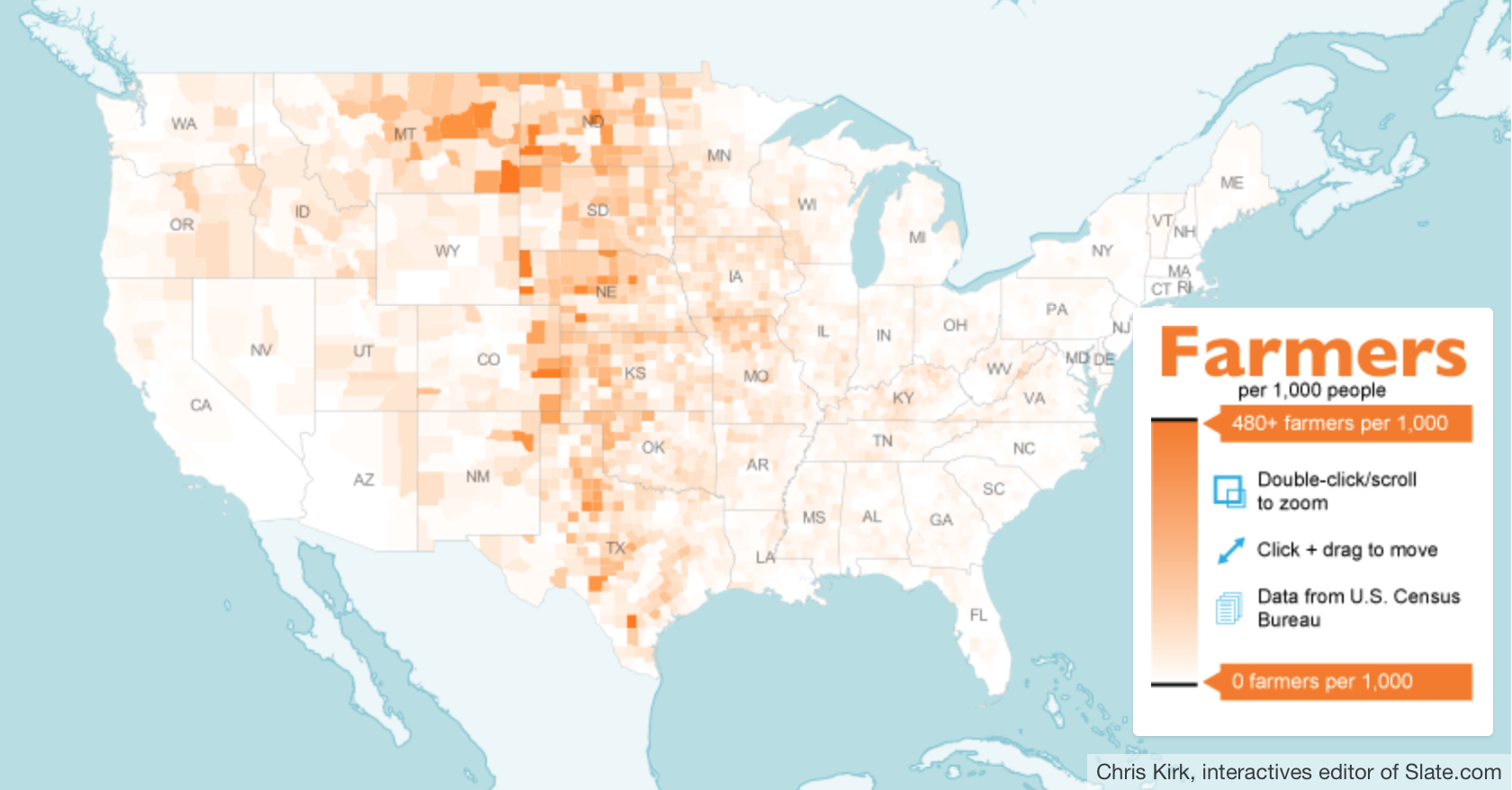
Chris Kirk
Even more striking, perhaps, is the limited range of locations where the production of crops retains greatest value.
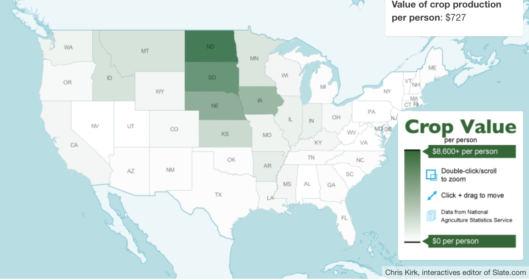
The consequences of this quite uneven distribution will be increasingly significant. Indeed, the greatest environment impact of varied foods are most easily measured by the distances food takes to reaching consumers, the growing “food mileage” fostered by factory farms located in landlocked regions of the country are one of the most strikingly inefficient ways of delivering food–and provide one of the best indices of the impact of food on our environment.
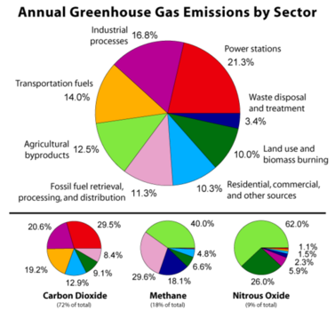
Robert A. Rhode (2000)
1. The data visualization of the distribution of factory farms included as the header to this post places in evidence the concentration of factory farms in America. It tells a story of the changing nature of animal husbandry in a world where markets have become dissociated from agricultural production–and suggests an absence of attention to the origins of most meat, and the redrawing of husbandry, as well as the redrawing of cropland, far from centers of densest inhabitation, where food-miles are further expanded than in any other era of human history–with indelible consequences for the human diet.
For the intensity of the concentration of factory farms in America is emblematic a strange but powerful illustration of economic disequilibria, where expanding farms have rendered independent farming barely profitable, and driven farmers to become technology-happy in their purchase of new tools of pasturing that almost erase the need for pasture. The business model that has replaced crop rotation, and open fields of pasture, has not erased the differences between the farming of cattle, pigs, and chickens, but dramatically decreased them to create a terribly terrifying sort of man-made experiment that may not be only waiting to occur.
Increasingly, technologies of mass-farming livestock are not only removed from pasturing, but adopted in places increasingly removed from centers of population, and depending on transportation networks of their own to arrive at consumers in their less-than-fresh state. The turn toward a dense clustering of factory farms offers a fairly terrifying view of the marginalization of the space where pastured animals dwell–and, of course, chickens have it hardest, both given their size and manipulatable conditions. The remove of current conditions from sustainable roaming and feeding on nutritious grasses may be ironic, given the clustering of factory farms in many areas of the Midwest, but they are particularly torturous to livestock–animals are increasingly raised with limited access to sunlight, fresh air, or open space–and indeed consumers, as such farming techniques increasingly necessitate antibiotics to prevent outbreaks of disease from high-grain diets that are far less healthy for livestock.
The influence of such a concentration of farms seems to leave an increasingly indelible footprint on our environment. The arrival of increasing anthropogenic agricultural landscapes reflects the growing congestion of farmlands–but in a sense begins from the poor stewardship of the land in which the free market has led to a wholesale promotion of the inhumane and unhealthy crowding of a concentration of over-fertilized farms in the so-called heartland of the midwest, a deep distortion that the recent funding for the Farm Bill perpetuates in ways that make it seem difficult to turn back the page on the density of factory farms in many states–and the consequent degradation of the surrounding lands and the environments that factory farms pollute. Mapping factory farms is not only about communicating the incredible scale of current-day farming, but the increasingly indelible traces that they leave on the land by their use of broadly cast nitrogen-rich fertilizer, neonicotinoid insecticides and other herbicides, for which farm workers–or handlers of produce–are rarely provided any protection.
And although interactive maps have yet to develop adequate synesthetic models to render the human sense of smell, the concentrations of factory farms demand models of integrating interactive with scratch-and-sniff techniques to adequately indicate the 13.8 billion cubic feet of waste factory farms collectively generate, in greater excess of what the land can absorb or incorporate–at considerable danger to polluting drinking water and air, since factory farms fail to use manure to fertilize in the manner that farms did in the past, as well as one of the greatest sources of the release of methane gas. Neil Gaiman’s Wednesday recently ruefully remarked “San Francisco isn’t the same country as [the imagined town of] Lakeside anymore than New Orleans is in the same country as New York or Miami is in the same country as Minneapolis,” despite “certain cultural signifiers [like] money, a federal government, entertainment” that perpetuate the illusion of one country like money, television, and McDonald’s.
The area occupied by factory farms suggest something of an actual country within the country, apparently insulated from the population at large, but plays with different rules that stand in increasing danger of contaminating the world from which it appears removed. For maps suggest significant evidence that the arrival of the anthropocene may lie in the growing disequilibria of ecosystems that have grew up around unnaturally dense concentrations of factory farms.
2. The clustering of factory farms charts an ever-expanding distance between food production and consumption, and a deep re-understanding of man’s relation to the environment. The alarming scale at which we have come to produce food has entailed a warping of agrarian environments that produce a limited range of foods on ever-increasing scale. Those pockets of the deepest red–the instinctual signifier of danger–marks an extreme congestion of the landscape with factory farms for livestock and intensive agriculture grown in a scale beyond bulk, whose density carries clear costs. For with over nine million land animals killed each year in order to produce food for Americans in 2014, factory farms have reached a scale and concentration rarely dreamed of, and the scale of its farming has provoked unfamiliar environmental effects: the amount of animal manure produced in expanding factory farms in the United States have come to produce the fastest growing source of the greenhouse gas methane in the US since 2007–and as well as producing animal waste, stream harmful quantities of ammonia, hydrogen sulfide, and particulate matter. And their geographic concentration by 2012, largely in an areas of cheap land, and landlocked states, removes them from the possibility of any transport save trucking–
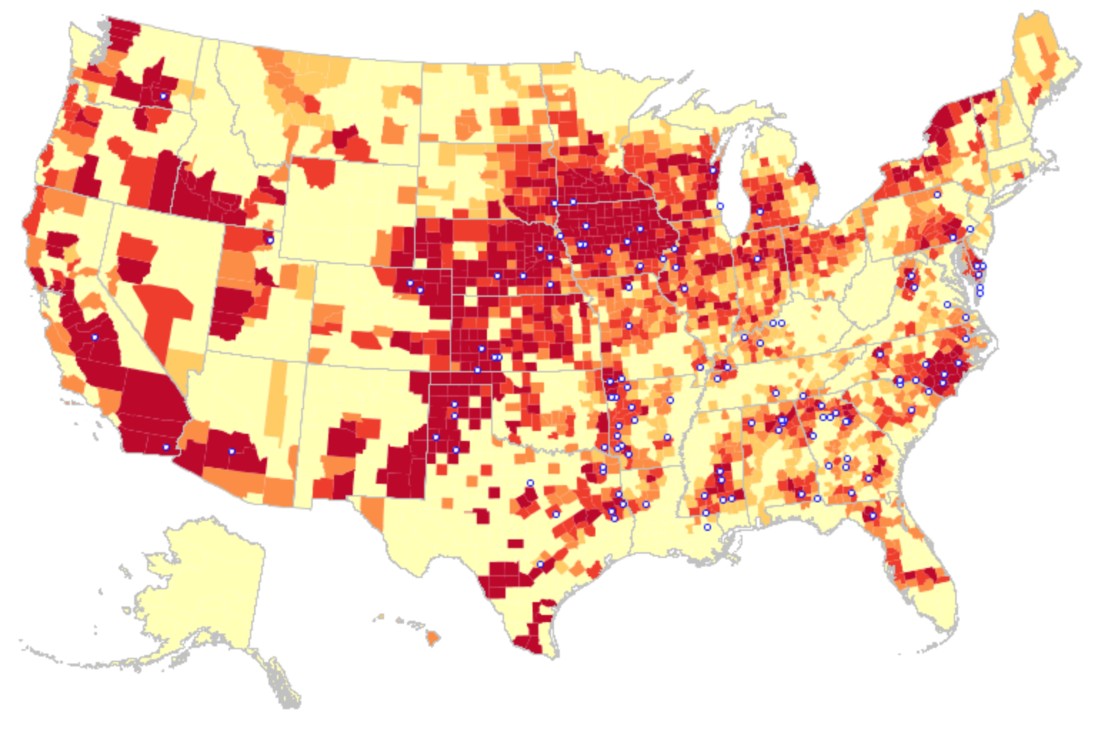
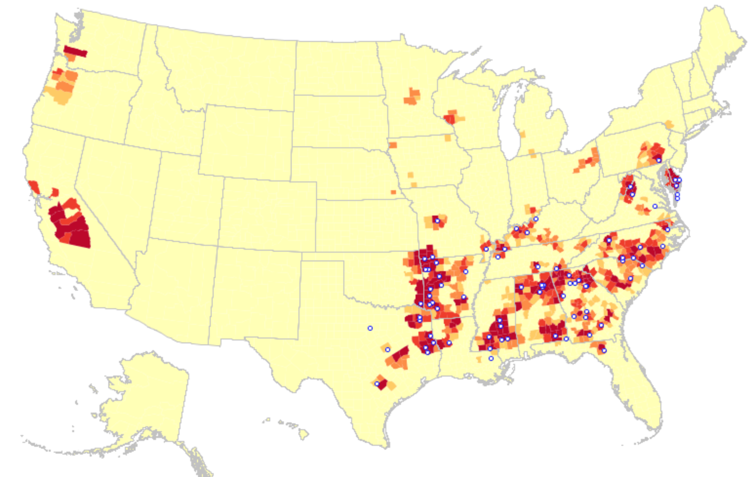
Distributions like the above show the concentration of such “factory farms” across the lower forty-eight states as recently as 2012 demand scrutiny as an object-lesson of a post-industrial agrarian age, whose pockets of deep red or crimson sharply contrasting with wan yellow expanses where factory farms are absent from the landscape.
The distribution demands comparison with a more finely grained map showing the declining number of smaller farms. But its totality confronts viewers with the increasing saturation of pockets of the farms cape in such indelible reds to force us to ask not only about the desirability of producing food so intensively in select regions, but to try to investigate the steep consequences, costs and effects of the colonization of the farmscape by radically intensive factory farms, dedicated to cultivating mono-crops on a far greater economy of scale (and subsidization) than was previously imagined possible. The result is to create a farmscape more increasingly removed from consumers. For the industry of agriculture–either in the form of crops or animal pasturage–contrasts sharply to the very notion of farm stewardship, and indeed is situated at a greater remove from the most densely inhabited land.

Food & Water Watch analysis of U.S. Dept of Agriculture Census of Agriculture Data
Whether or not it is still true that, as Gertrude Stein once said in her Geographical History of America, that “in the United States, there is more space where nobody is than where anybody is,” there are surely a deeper concentration more farms built to “feed” Americans than anywhere else. By using a range of data visualizations, this post poses questions of how we can best orient ourselves to the increasing crowding of the national farmscape with monocultures that the monopolies of farming Big Agra has introduced. It then turns to consider the increasingly steep consequences and costs that they pose in our society of laws.
For the drastic dependence on synthetic fertilizers–which now consume a fifth of fossils fuel use, and allow new economies of scale of monocultures releasing farms from a diversity of crops, at the same time that their production was increasingly subsidized, freeing them from the market. The consolidation and concentration of food-production are enabled by large-scale production freed from sales at the marketplace, doubling of the size of the average farm, while decreasing farms have decreased from 7 million in the 1930s to almost 2 million today, based on an increased ability of production that diminished the nutritional value of produce; animals that are fed almost entirely on a diet of corn produce meat far higher in saturated fats. The toxic cocktail of such distorted land-use is complicated even more by the regular release from factory farms of nitrogen and pesticides into the environment posing problems from oxygenic depletion to drastic decreases in local species’ fertility: the factory farm, liberated from biological constraints of earlier times, has grown to meet radically new economies of scale.
Rather than grow corn, squash, peas, pumpkin, parsnips, carrots or onions, the landscape of the factory farm is focussed on corn–the over-subsidized as the dominant mono-crop grown across the perpetual harvests of over-farmed fertilized lands.
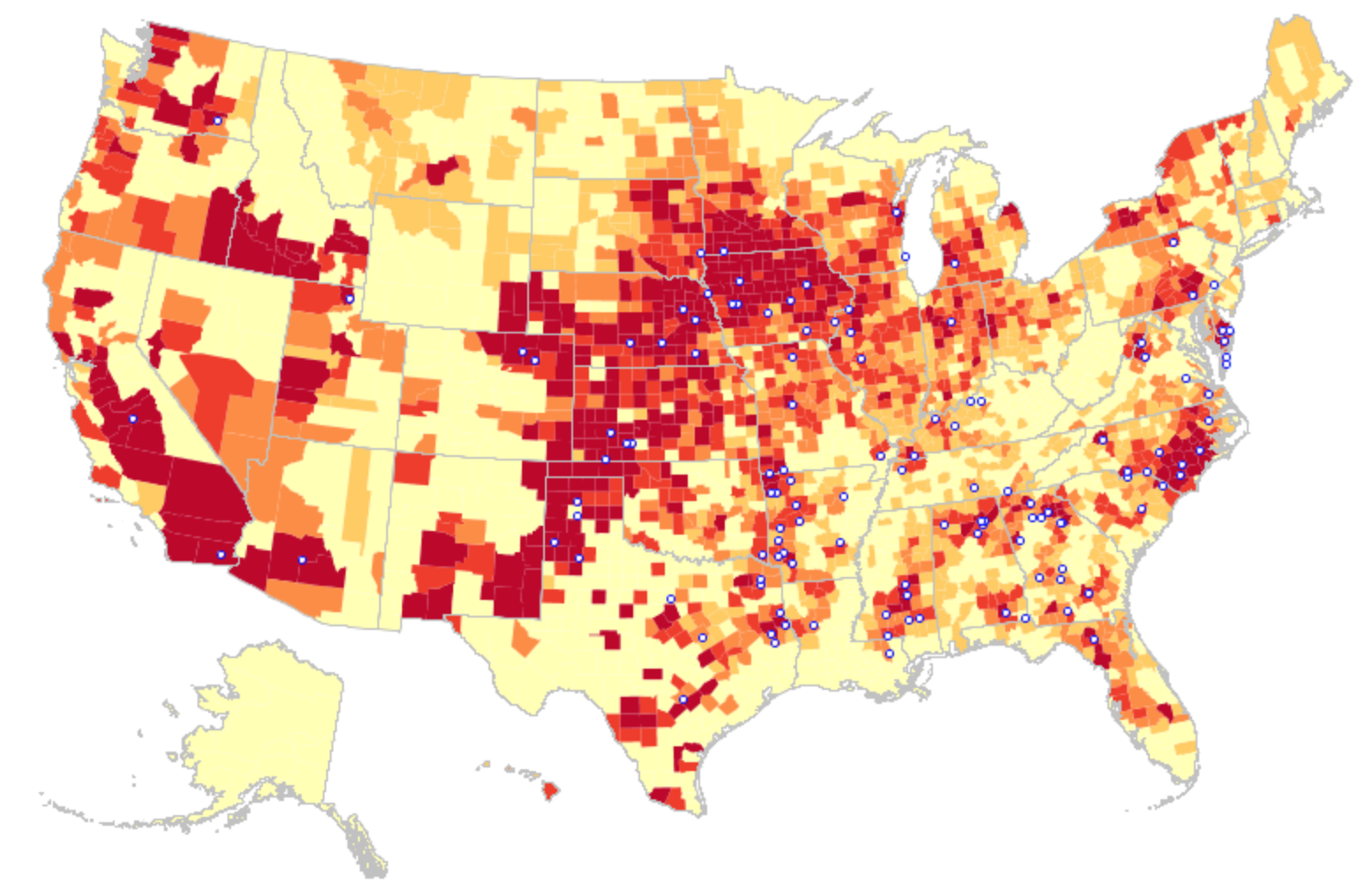
 Factory Farms in the United States, 2002/Food & Water Watch, analysis of U.S. Dept. of Agriculture Census of Agriculture Data
By adopts a crude sort of map algebra comparing data visualizations, this post juxtaposes a range of datamaps that raise pressing questions about such steep levels of concentration of factory farms, and the severity the extreme crowding of space by factory farms that is scarily demonstrated in the above data vis. While they are able to go unnoticed, the proximity of small blue dots that designate “meat plants” in the data vis above seem worthy of special note, both because of the considerable geographical remove of such plants that “feed” much of the nation and the clear bands on which they are situated. Eyeballing these maps of the colonization of much of the midwest, and a density of farming that places a demand on overwatering–and okverfertilizing–select regions, in ways that put an increased premium on long-distance trucking, unfreeze farm products, and huge storage houses. The concentration of factory farms for hogs, for example, creates an intensity and crowding that cannot be conceived as healthy–where sows pumped nurse piglets in gestation crates, as breeding machines, before being led to the slaughterhouse.
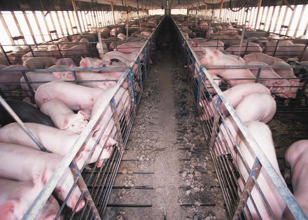
Wikimedia
The concentration of hog farms is abstractly rendered in a map, but their increasing intensity is elegantly communicated to viewers of the several interactive visualizations Food & Water Watch devised from GIS data of USDA agrarian censuses from 2002 to 2012:
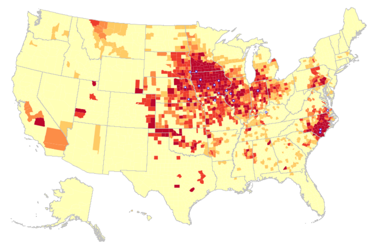
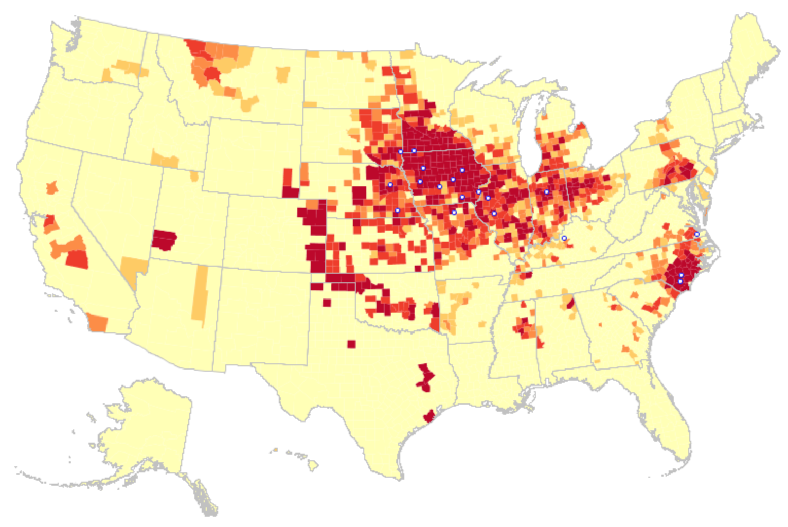
Food and Water Watch
For such livestock and poultry factory farms, largely out of public view, are quite aptly characterized as concentration camps for animals, which “aren’t farms at all”, and the dangers of such a segregation of such segregation of factory farms, which aim to ban observation by journalists or observers. Recent attempts to ban observers from reporting on the practices and conditions in farms run by corporations like Tyson Foods, Smithfield, and Borden–“Ag-Gag” laws–make the mapping of such farms more compelling. Despite the spate of state legislators seeking to tar the observers of the animal factory as guilty of “an act of terrorism,” their mapping far more necessary. For the mapping of the factory farm and the pesticides and fertilizers they spew provides the best way to embody crises otherwise difficult to comprehend from antibacterial resistance to colony-collapse disorder, which have resulted in a decline of 40-50% of bees at farms in recent years that may be due to the increasing use of neonicotinoid insecticides and pesticides that may reduce the homing abilities of bees, and compromise their nervous systems–
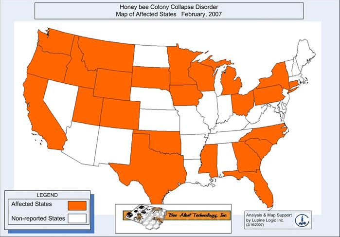
–to deeply uneven distributions of epidemiological imbalances, examined in detail at the end of this post. The density of the colonization of farmlands with factory farms and commercial crops provides a way to embody such complex patterns of causation–even if they hardly resolve the problems they pose.
Such severe environmental imbalances are the product of the concentration of agricultural practices that are increasingly removed form a sense of land-stewardship. The severity of the imbalance created both by the isolation of farms from the landscape and the poor practices adopted by Big Agra without adequate oversight is problematic. The effective cordoning off of such spots as “off the map” make it important to take stock of their distribution, and the distortions created by their economies of scale–economies that both diminish foods’ nutritive value, endanger farm workers and regions, and make it difficult to quantify environment costs and consequences where they exist.
3. Over-use of the “anthropocene” inevitably provokes sighs of deep resignation. But it is rarely tied to the production of food or the bloating of farms beyond a responsible stewardship of th eland. Even if numbering is knowledge, the quite extreme quantitative density and spread of factory farms across what remains of the arable expanse of the central states suggests a shift in our relation to the land from which there is no clear turning back: the data visualization in the header to this post may only scratch the surface of an ill-fated agrarian revolution that entails a shifted relation to the land. This data reveals not only a deep distancing from farmed land, but a change in how things grow and live in the land, and how people work the land. The remove of agribusiness from policies of land management is apparent not only in the changing national farmscape, as well as the broad potential for agrarian mismanagement that the recent proliferation of unmonitored factory farms represent in the United States–where they seem something like the perverse inversion of the yeoman farmer ideal.
For the dramatically increasing density of factory farms in focussed geographic locations have wreaked systemic changes in ecosystems so deeply devastating to be difficult to map in quantifiable or quantitative terms. Indeed, one would be challenged to isolate the very indices by which such devastation might be meaningfully measured or capture the shifts in landscapes of food production of which they are among the most extreme, so removed are they from notions of captivation and husbandry of the recent past, and so widely have they changed not only the produce–GMO or not–and the livestock and animals that are maintained for slaughter. The radically changed relation to the land. Viewed in aggregate, the contours of an almost unbridled presence of Big Agra across specific states offer a striking landscape–and farmscape–that profits from the continued availability of groundwater and aquifers. The consequences of intensive raising of livestock and drastic consequences of agricultural runoff whose abysmal results is readily revealed in other maps.
What notion of the custodial relation to the most intensively farmed regions If the notion of “rewilding” the landscapes of industrialized nations is a response to the growth of the anthropocene, the factory farm epitomizes an expansion of anthropogenic pollutants that have shifted the environmental landscape of developed countries, and come with significant human costs. A growing range of GIS data visualizations that can be seen as symptomatic of an age increasingly obese with data–and difficult to process let alone comprehend, as navigating robust data streams quickly leads to a sense of drowning and disempowerment, the ability to distance oneself from the changing landscapes created by the increased intensity of factory farming provides the possibility of regaining a sense of critical perspective on the anthropogenic changes in the ecosystems of agricultural life. The density of the aggregation of factory farms reveal an imbalance due to lack of clear restrictions on the intensity of their development, the excavation of whose consequences call for more careful comparison to other data maps. To be sure, the lack of restrictions on such intensive farming reflects, in a global context of aquifer depletion, provided by researchers at UC Irvine with NASA data, profiting from the continued supply of groundwater in the central states–
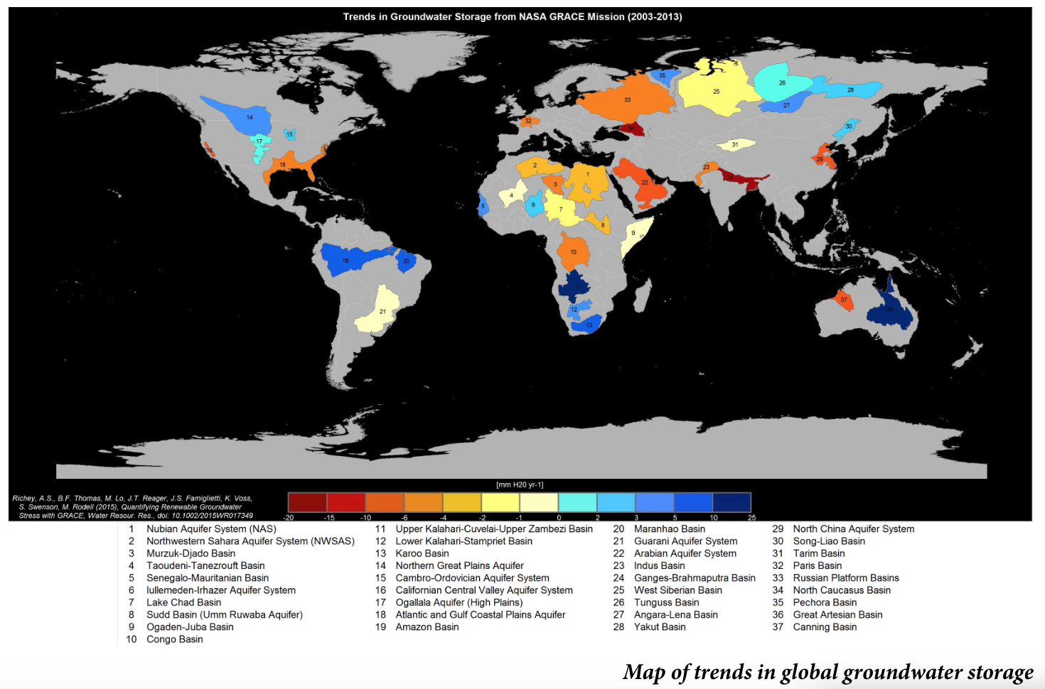

and the peculiarity of that abundance in a global context, which has created a particularly warped perspective on the feasibility of continuing to water such large-scale farms.
The retro maps of annual rainfall in the US produced by Flowing Data reveals, based on NWS data, how weather patterns in 2013 facilitated the sort of spatial distortions in the farmscape that the map in the header documents.
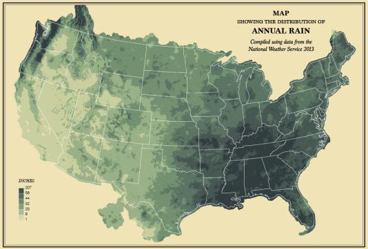
But the intensity of the landscape of factory farms that has been fashioned by Big Agra facilitated a huge rise in GMO crops, pesticides, herbicides and antibiotics that suggest the systemic unhealthiness in the ecosystems that result.
4. The quite rapidly shifting nature of the landscape of farming that has emerged in recent years, when factory farms have gained an unheard of density in many regions that signal a radically changed relation to food, suggests a new horizon of the anthropocene that demands excavation as an infographic that depicts our shifting relation to how Americans inhabit terrestrial expanse–and the risks we run in doing so.
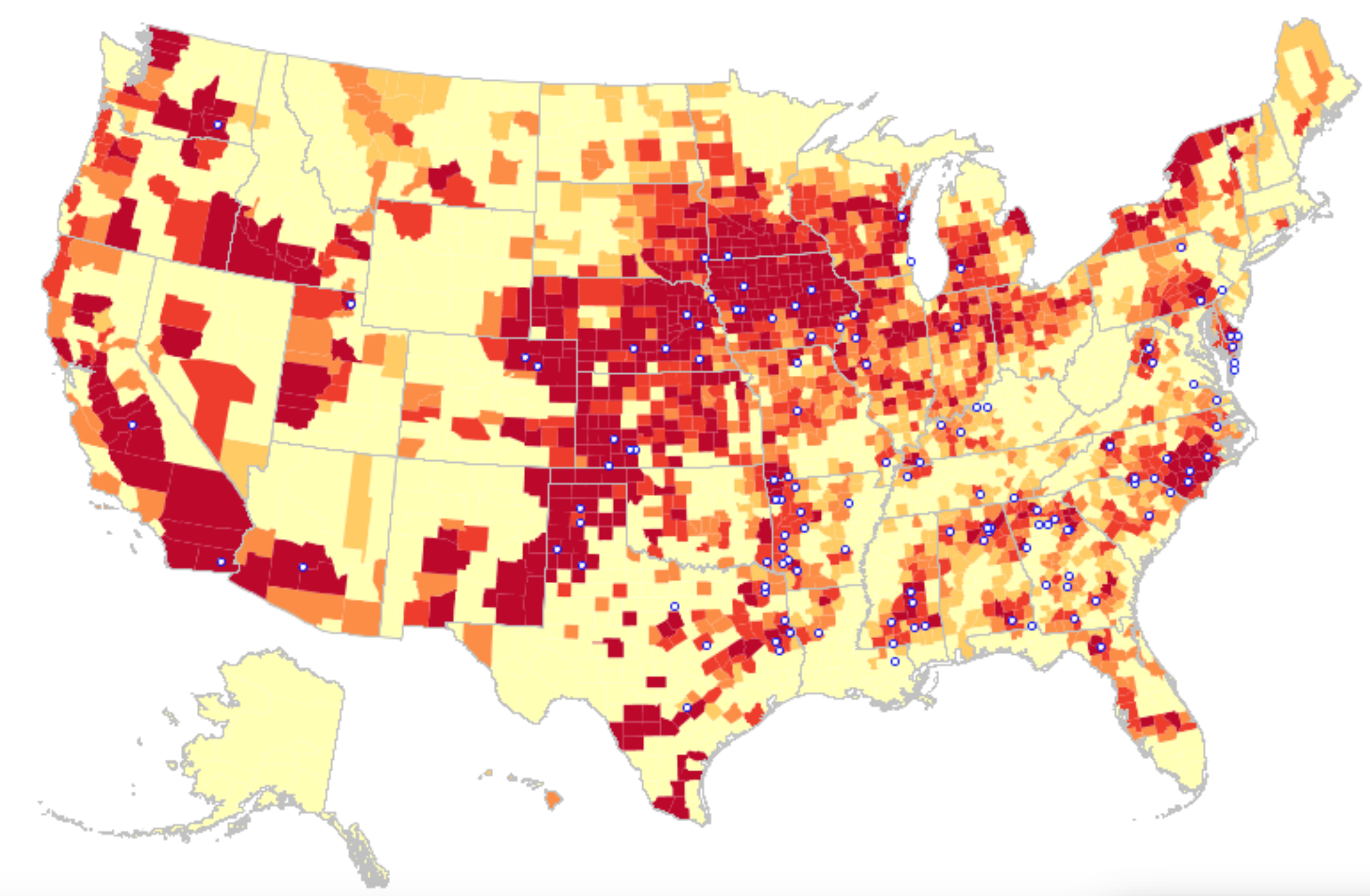

The landscape of farmlands Big Agra has colonized and settled reflects a shift in the notion of land-use tied to globalization. Even as glob tied that have freed humans from their dependence on local or regional ecosystems, the extent of alienation form an agricultural landscapes that have occurred in the past twenty years, and even over the last ten.
For the map reveals a profound super-personal alienation and remove from the farmed landscape, and remove from an ever-increasing density of farmland truly “extreme” in its narrowing of concentration on the potentialities of abundance and perverse privileging of an artificially induced economic abundance of select regions of cattle raising, dairy farming, hog farming, and chicken breeding that cannot be healthy or sustainable as forms of stewardship. In a time when McDonald’s promises us artisan grilled chicken of a “stringy interior” distinguished by a “somewhat chewy texture” and “fake butter flavor,” the broader relation of most consumers to the meat that they eat seems distinctly challenged.
Even if the clustering darkest crimson that denote an extreme density of factory farming happens to aptly indicate the masking of an emotional attachment to place–more central a premise of factory farms than economic demand–the deep unsustainable nature of the density of factory farming is only scratched in the data visualization that is the header to this post. For the deepest reds blanketing central states (and the Central and Imperial Valleys of the western states, as well as clear concentrations of crimson in pockets of North Carolina, Florida, western New York and the northwest) suggest scars that may prevent us from recognizing the places in a map that we might otherwise have recognized or know. The illusion of economic security is in danger of erasing emotional attachments to place, in ways that have only begun to be appreciated or understood.
Such strikingly dense concentrations of factory farms in such regional pockets–indeed, their confounding resilience–is all to evident in the data visualizations that Food and Water Watch has carefully compiled from agricultural censuses over the past decade. The recent multi-media assemblage Factory Farm Nation–an evident reference to “Fast Food Nation,” whose commercial injunction to overeat, “supersize it,” placed the blame squarely on the business of purveyors of easy meals that were sold at illusionistically cheap prices, without asking about their future health costs. Yet what of the rewriting of agriculture that has concentrated dense sites of overfarming into our national landscape, as if to meet the nation’s ever-expanding and insatiable taste for meat? Far from a pastoral landscape, the zones of intensive farming of subsidized monocrops as corn, soy or sorghum so often encouraged by subsidies and so readily converted to a plentiful source of animal feed.
The collective distribution of factory farms spread across the country are not so surprisingly concentrated in its Central Zone. But the business model has taken seed in regions from California to Washington and Idaho, and to Montana, Arizona, New Mexico, and North Carolina–as of 2012, the concentration of both the largest farms and the centers of meat processing were increasingly concentrated not only from decades past, but even over the past ten years, as large regions of deep red–marking extreme concentrations of factory farms–come to overwhelm large regions and specific economies, and be absent from other regions removed from agribusiness.
The spread of factory farming, facilitated both by state subsidies and GMO crops, is partly premised on the economic transformation of agriculture. Less visible are its deeply deleterious environmental consequences and ecological effects–as well as create an increasingly unhealthy food chains–and systems of production that seem forcefully remove the consumer from the farm and manufacturing of food that arrives in most supermarkets across much of America.


5. What makes the concentration of large farms so troubling is both the remove of food from markets and the conditions farming create–from both slaughterhouses and meat-packing plants, shown here by asterisks, and the sacrificing of freshness (and nutritive value) in the over-production of such megacrops. The concentration of farms pose challenges to the survival of small-scale farming outside very select economic niches, from parts of California, like Silicon Valley, to parts of New England and Vermont–and the steep challenges small farms face from Big Agra even in these areas. But they depend on the increasing dependency of farmers on the technologies of farming on which Big Agra depends, both from standardized resistant seeds and pesticides to machinery.
The formidable concentration of cattle farming–a quintessential staple of factory farming–reflects the total distribution in 2012 of factory farms in the country, and even more intensely concentrated in the economies of the midwest,
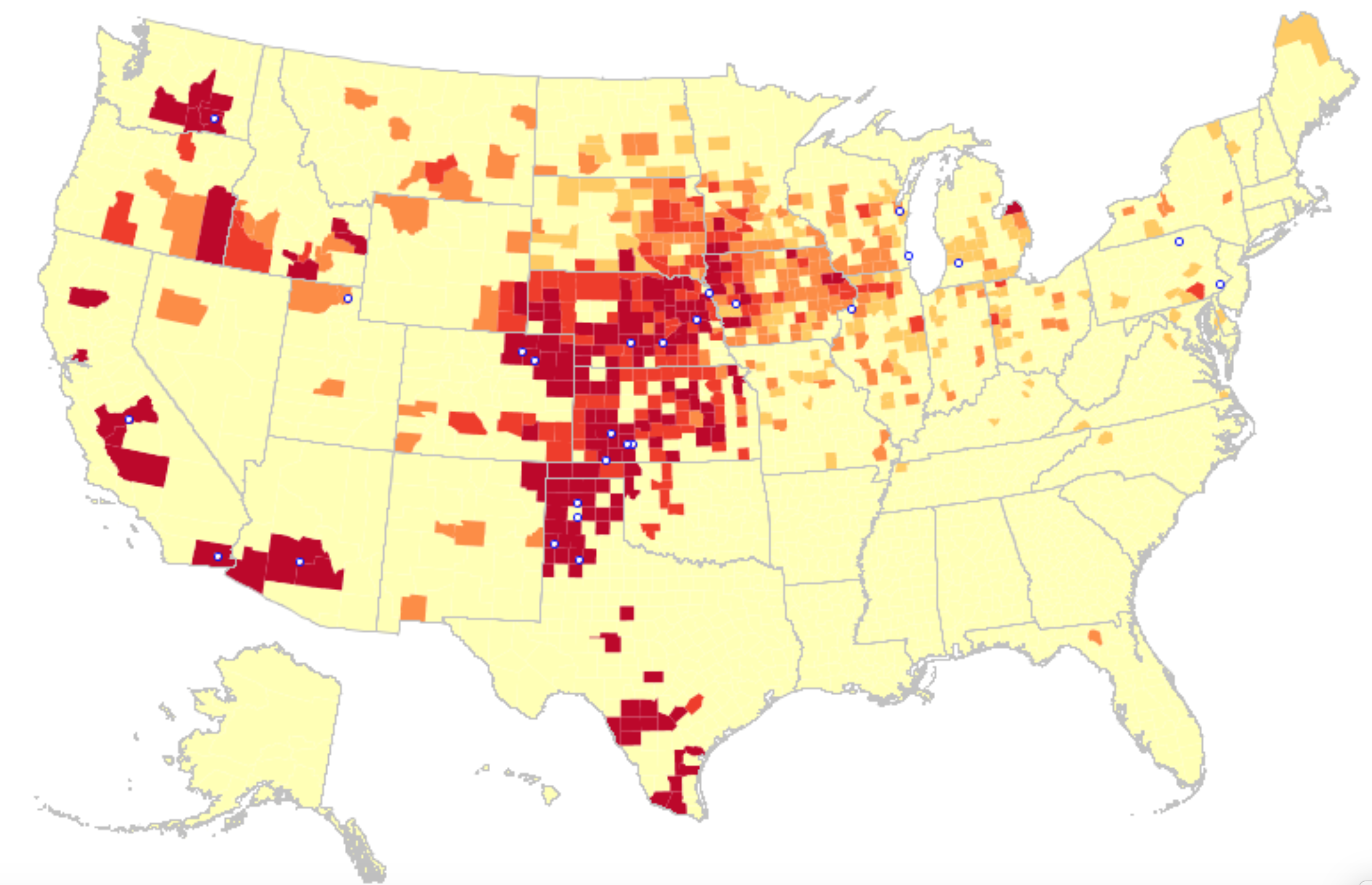

With dairy farmers almost living in a somewhat greater variety of other states as of 2012:
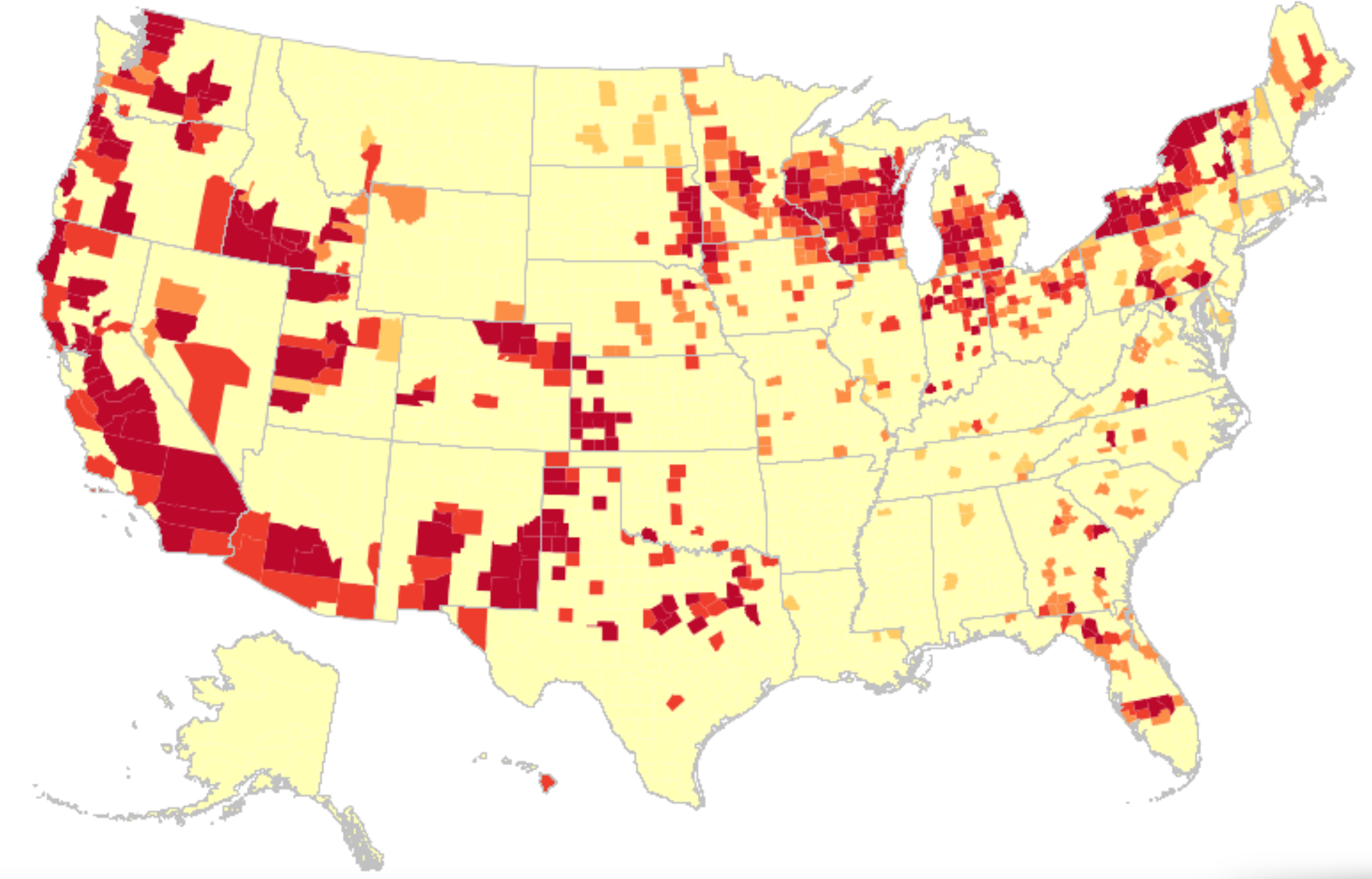

and hog-farming occupying a similarly concentrated, if further contracted, set of select sites largely in the central states:
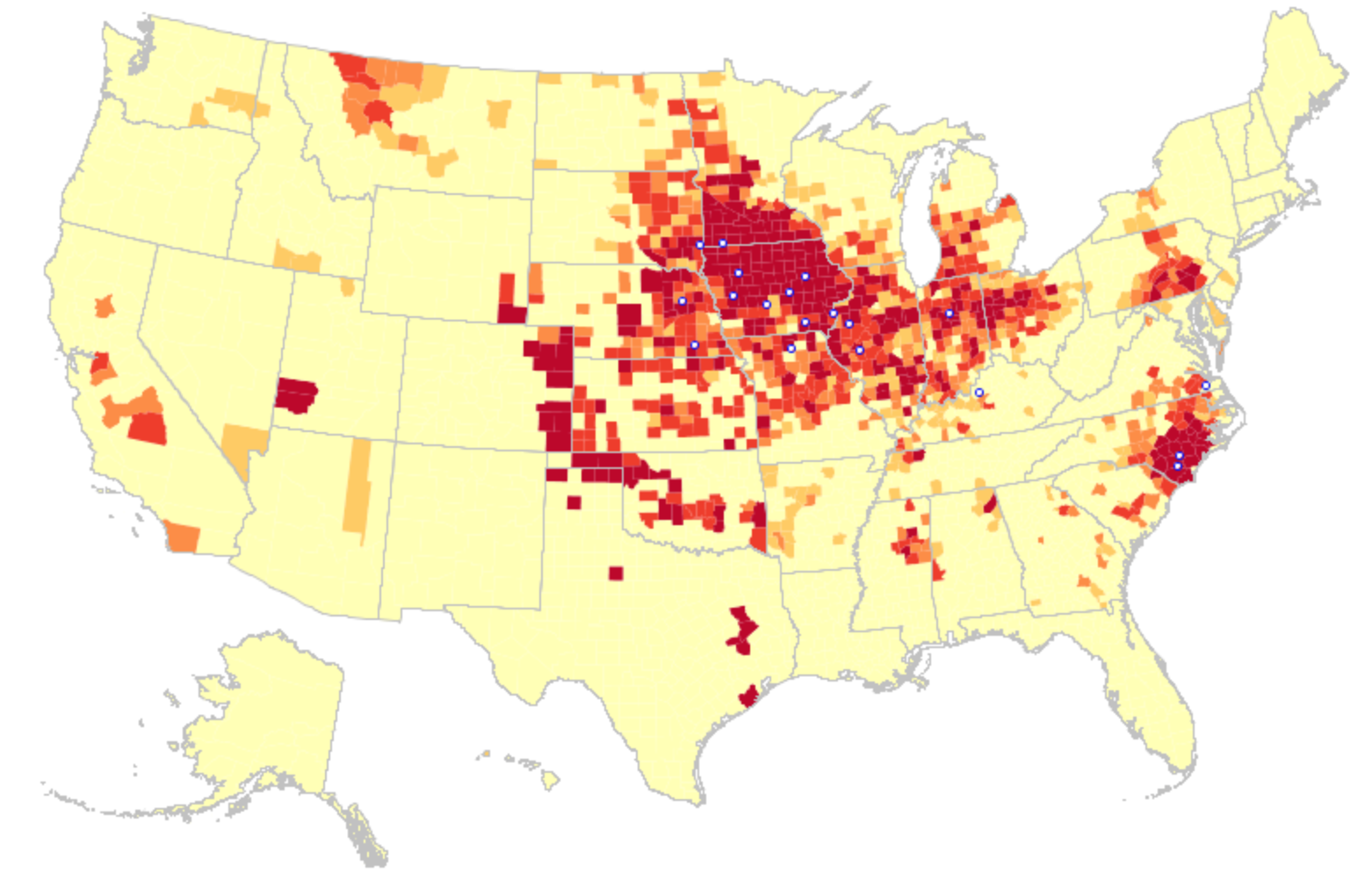

The incredible intensity of carmine clusterings revealed in the data visualization above had profoundly changed from 2002, when the agrarian landscape was marked by a robust density of relatively high factory farms, but with fewer extreme concentrations, and an apparent greater range of meat-packing plants–


and even from the levels of large factory farms across the nation in 2007–
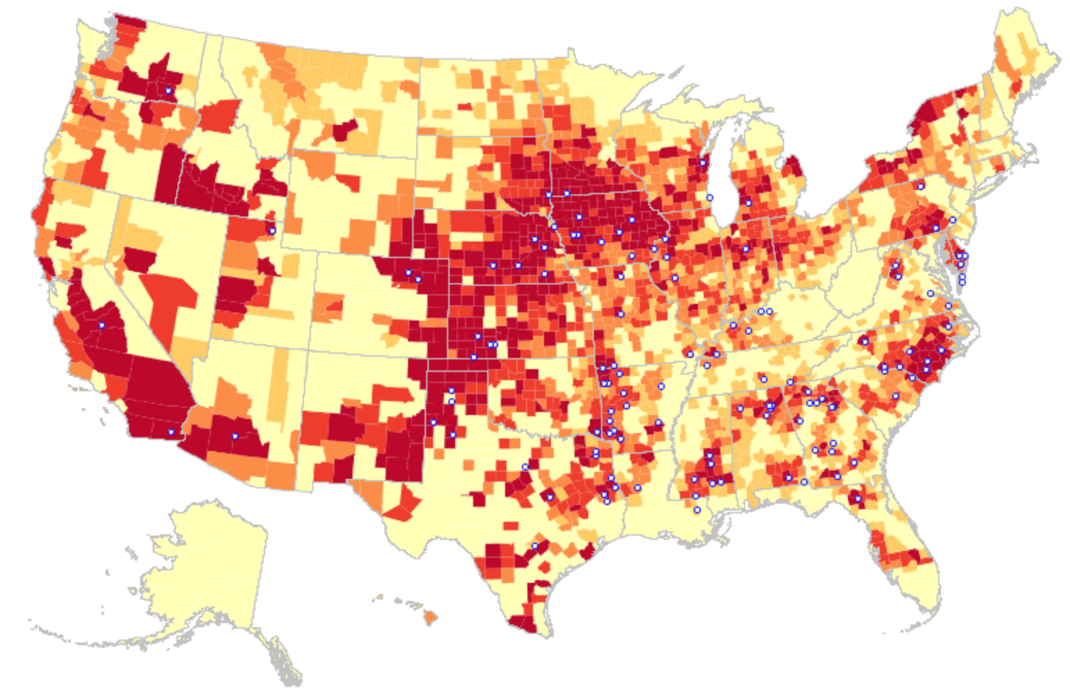

The state of Iowa appears as a uniform red that render its borders indistinct:
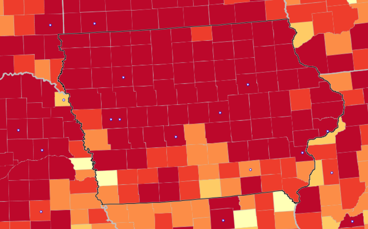
Or the uniform red spread across similar farming states that border the Mississippi, which has helped create one of the largest hypoxic site in the world within the Gulf of Mexico, which absorbs the agricultural runoff emptying from the Mississippi River:
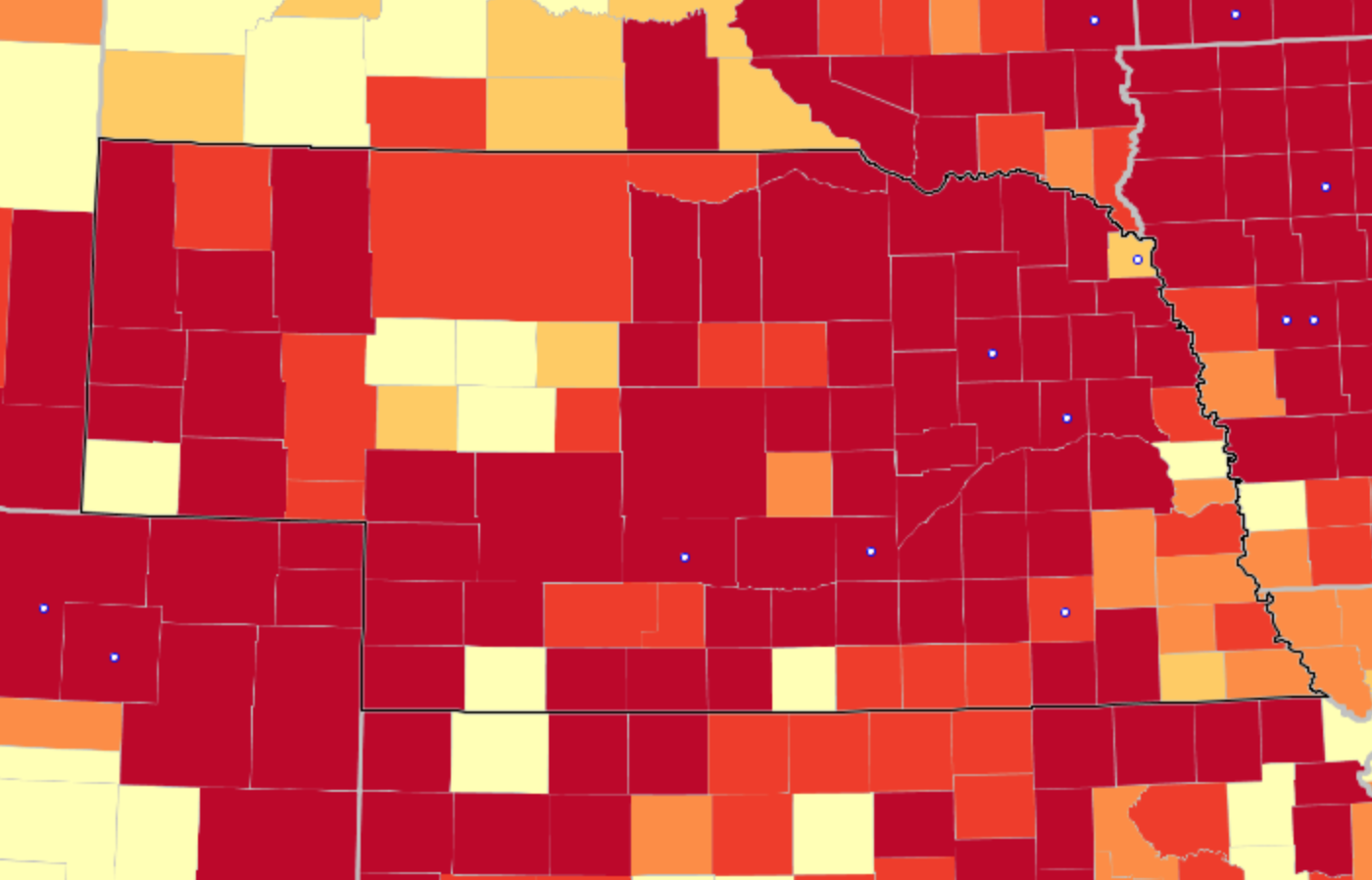
The shift in the notion of a farm is suggested by the concentration in bordering regions of the apparatus of farming–including the threat of resistant strains of bacteria, large feed lots, and almost insoluble problems of the disposal of animal waste.
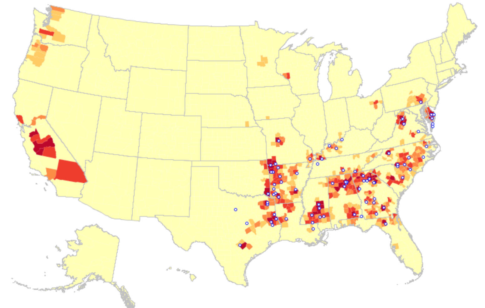
The parallel radical contraction of regions of chicken-meat “farming”–the raising of “broilers”–suggests an unwarranted density of what was once the most familiar of barnyard animals, and now seem to serve much of the country from select areas of megafarms in the southern states, as well as parts of Pennsylvania, California, Wisconsin and Washington, and a range of factory farms along the Mississippi in 2012, that suggest a landscape little changed from 1997, if even more localized:
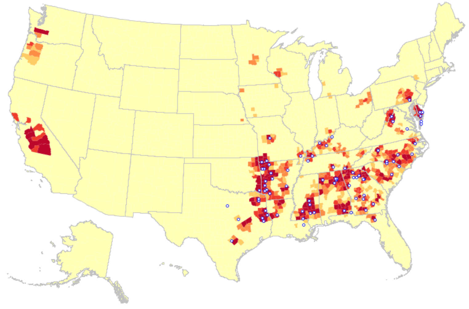
What happened to effect such a change save weak agricultural rules and opportunistic farm policies? One can see a notable consolidation of those “farms” that raise “broilers”–chickens destined for cooking–during the decade and a half between 1997 and 2012, with a rising density of factory farms and the industrialization of poultry farming.
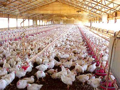
6. The rapid rise of large-scale supplies of feed generate steep risks. Their expansion was doubtless encouraged by the subsidization of ever-larger farms that allowed geographic concentration of intense factory farming in the central states, the densest clustering of centers of meat-packing. Fertilizing practices are a part of the picture of creating large feed lots that are in need of better mapping, and provide the possibility of the supersizing of farms across America together with the expansion of the application of herbicides–as much as pesticides. Such new increasingly agricultural practices characterize most factory farms in America.
A combination of practices such as no-till agriculture, large feed lots, mono crops, and over-fertilized lands are the enabling factors, as much as the consequences, of the spread of the complexes of factory farms across so much of the agricultural landscape of the United States according to the U.S. Department of Agriculture’s recent Agricultural Census.
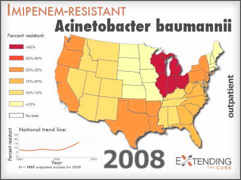
How these practices encourage the unhealthy degrees of concentration of factory farms raising animals for slaughter suggest not only hugely increased animal suffering. The increase of some 20% of livestock that are raised in large factory farms created, for example, a huge amount of manure–some thirteen times that produced by the human population of the United States–that pose a risk to local ecologies. It also courts the steep risk of effectively creating reservoirs of antibiotic resistant bacteria, not only in specific regions, but in the meat that arrives on one’s table or in restaurants, and provokes the evolution of bacteria resistant to the antibiotics that are regularly fed at low dosages to all livestock–effectively increasing the threat food-born pathogens that industry has minimized. Indeed, the mapping of AR bacteria across the United States (antibiotic-resistant bacteria) have begun to be mapped themselves, although the data and certainty of the distributions mapped interactively by Extending the Cure based on particularly resistant infections has created a distribution that demands to be further refined in future years–but have already shown a huge rise over time.
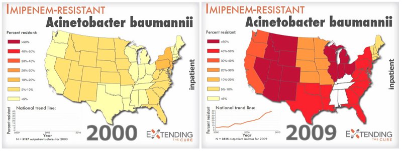
Indeed, the extreme density of such factory farms in areas such as Iowa and Nebraska, whose almost undifferentiated terrain of deep red is studded with staggered meat-packing plants that serve a far greater area, preoccupy–as the steady rise of resistant antibiotic strains of bacteria across our national space, and the rise of antimicrobial resistance, and the huge expenditures of health care that both rises threaten to bequeath. If increasingly sweeping the more developed world, related to both different standards of eating and to the marketing of anti-herbicides, as well as to problems in the recycling of wastewater, the resistance of antimicrobial bacterial strains pose a range of immense health risks–and a current health care cost in the United States that is estimated at 21-34 billion dollars a year, and some 100,000 deaths.
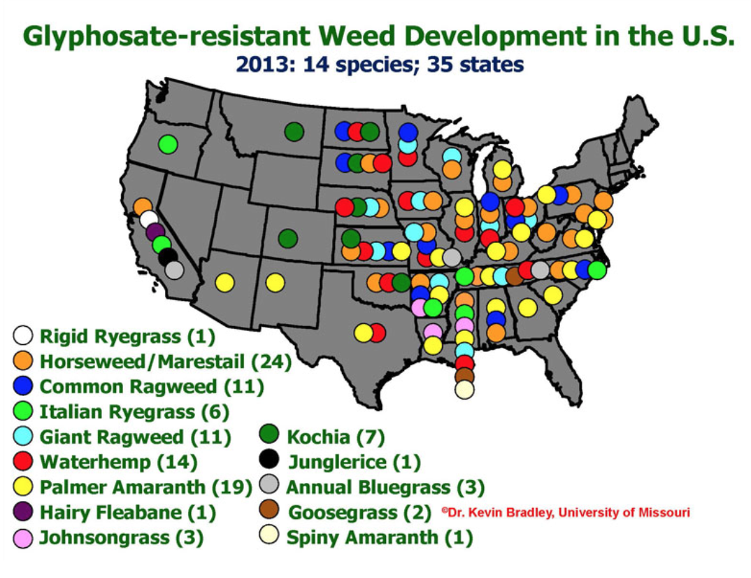
Although the diffusion of AR bacteria are to a large extent dependent on meat consumption, as much as actual locations of factory farms, the distribution of deep crimson in the central states and north and southwest offer an image of disturbing trends that demands to be excavated for its consequences, as well as contemplated for its intensity. (They parallel the rise of glyphosate-resistant weeds.)
This seems to mirror both the extreme concentration of factory farms evident in the central states, as seen above in the case of Iowa,


or pockets of the American South,
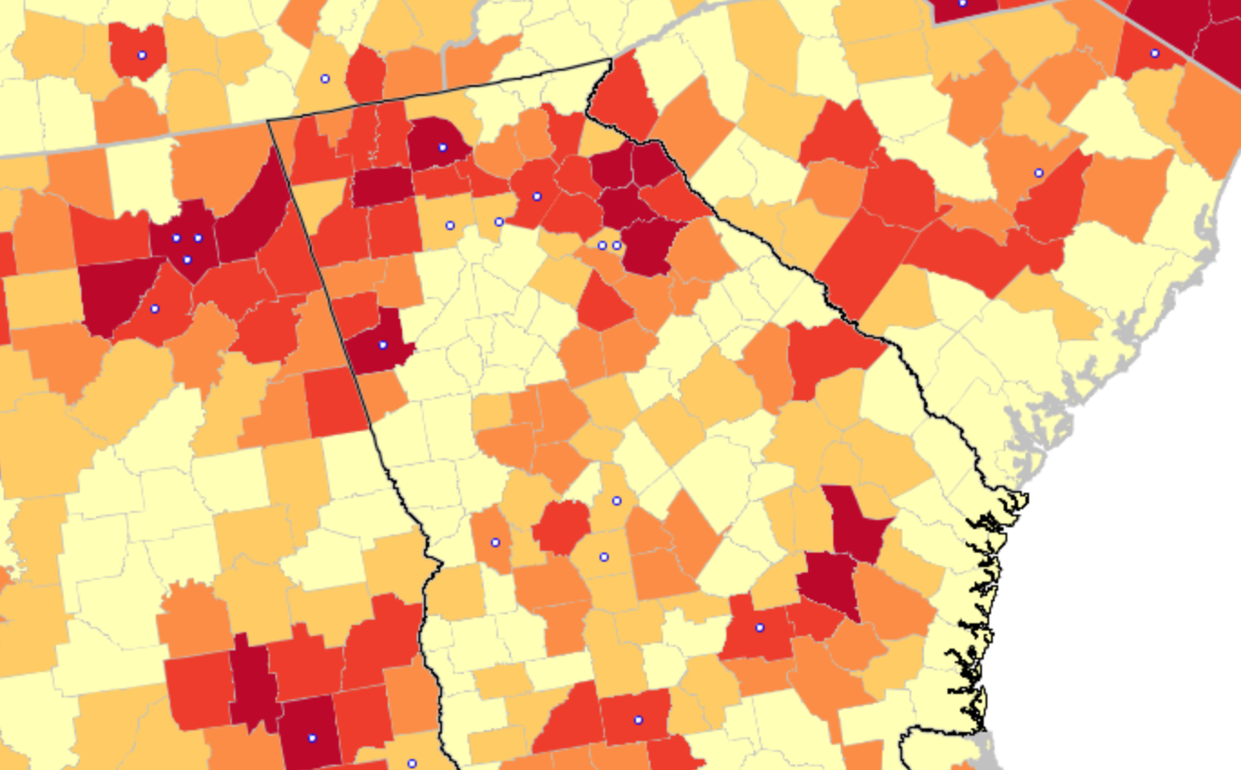

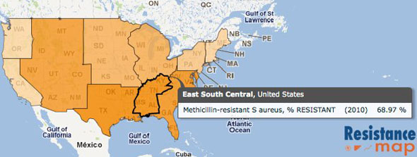
These images trace the increasing remove discrete stretches of farmlands from the bulk of the population, if not an actual alienation of farmlands as the raising and butchering of meat migrates into controlled settings where antibiotic-resistant (AR) bacteria flourish. Resistant strains of staph are a problem worldwide, as the below prevalence map reveals, and Methicillin-resistant bacteria have become common across many of the regions consuming factory-farm raised poultry.

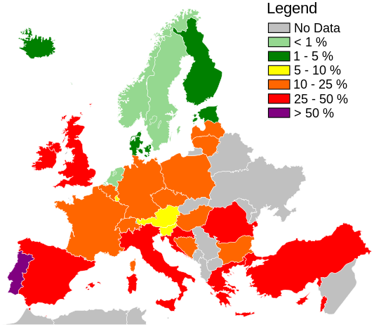
Registered incidence of MRSA in human blood (2008), Wikimedia
But it is one in which the United States remains in the lead–and far ahead of Mexico and especially far ahead of Canada, our neighbors to the north, where one finds anti resistant strains to be a fifth of the prevalence of the US:
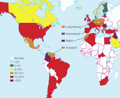
–and which seems concentrate din the eastern southern states, where it seems predominantly communicated in meat:

Such intensive areas of factory farming are more directly tied in the United States due to the unique geography of intensive farming promoted by Big Agra, the Sisyphean twin of the factory farm.
7. Agribusiness is the not-too-silent twin of the factory farm, generating the copious abundance of cheap feed that is the bread and butter of factory farm feed lots–the shortsighted widespread use of herbicides Big Agra increasingly adopts, with minimal federal oversight, has facilitated the suppressing of factory farms of similar short-sighted agricultural practices and the poor stewardship of the land they reveal. Even as the existing studies by the WHO’s anti-cancer arm found “sufficient evidence” that the herbicide glyphosate causes cancer in non-human animals, and “limited evidence” of its causation of chromosomal damage and kidney disease in humans, the Monsanto produced pesticide was reclassified by the EPA with the result of allowing its increased use within the food chain, much as it had earlier shifted the herbicide’s classification as “possibly carcinogenic to humans” to having “evidence of non-carcinogenicity”–a shift of 180 degrees–after Monsanto petitioned to increase the allowable amount of the herbicide that in 2001 was already the most-used agricultural herbicide–and constituted 74% of the herbicides farmers used in California in 2012–having increased some 65% in commercial agriculture during the previous decade.
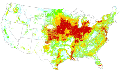
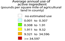
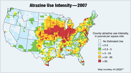
While the widespread uses of such herbicides are not mapped and readily measured with the relative precision and exactitude of factory farms, whose census offers a projection of the estimated extent of the pounds of pesticide used in the US in different states, and indeed an estimated projection of the diffusion of their residue, that demand reflection. The striking spread of Atrazine, among the deadliest herbicide that is most concentrated in the groundwater of the US, across agricultural states may reflect its use on corn. But the subsidization of corn and sorghum have so facilitated a dense concentration of sites of cattle feed–some 80 million pounds were used in American crops in 2014, with a rather striking geographical concentration–that the demands to produce corn in abundance for ready markets has led to a concentration of corn-growing and a concentration of Atrazine application that seems to have changed the groundwater supplies of areas of the United States’ most abundant aquifers:
 USGS
USGS
The extremely high concentration of the particularly pernicious pesticide that has been so aggressively marketed by Syngenta is not only dumped in the ground in massive amounts in the ground. But its traces persist in rivers and streams in 2007 in ways that reflect the expanding scope of its use in agricultural lands including more than half of all corn acreage–two-thirds of sorghum acreage; and up to 90 percent of sugar cane acreage in some states, creating run-off that by agricultural overflow that quite perceptibly pollutes the ambient waters–where it has, Professor Tyrone Hayes has shown, apparently creating sexual abnormalities in amphibian life–conclusively enough for Syngenta to pay $105 million to reimburse cities for the cost of implementing water filtration systems to remove Atrazine from drinking water in 2012 to conclude a class action lawsuit, and a multimillion dollar campaign aimed at discrediting scientists suggesting its the dangers of biological mutation its residues have been compellingly argued to cause. Only long after the EPA had banned the use of the pesticide chlorpyrifos in homes due its close correlation to ADHD, reduced IQ, and poor cognitive development, the same pesticide was widely used in the Central Valley of California on crops of almonds, walnuts, oranges and alfalfa, ignoring the clear dangers that it poses to farm-workers and in run-off, even though the Pesticide Action Network urged an immediate and complete ban to protect agricultural workers and rural communities. The recent plan to restrict the pesticide’s use in farms came against arguments of its manufacturer, Dow Agrosciences, that its presence in runoff has a “negligible” effect, and noting that it is approved for use in some eight-eight other countries.
The spread of Atrazine in streams and waters that has been mapped on the basis of its agricultural use–if hypothetical and based on modeling–indicates the range of its potential spread into the regional groundwater of much of America.
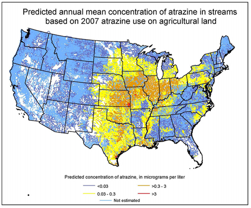
The EPA has unsurprisingly found markedly high concentration in the surface water of those states where Atrazine is applied in greatest abundance, but a notably increased presence of Atrazine in groundwater as well:
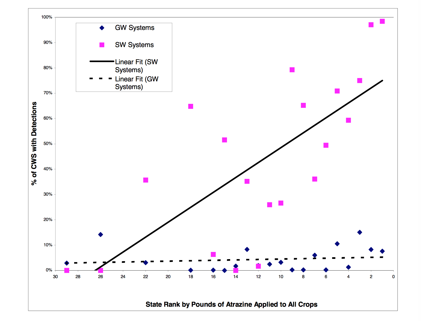
EPA
Are the evident traces of herbicides such as Atrazine that seem evident in the environment similarly passed on through meats from nearby factory farms–and are they indicative of the sorts of attitudes to the environment that factory farming creates? Indeed, a clear varying of the presence of the pesticide in drinking water is registered in those summer months of greatest runoff of water into the environment in a farming state such as Iowa–
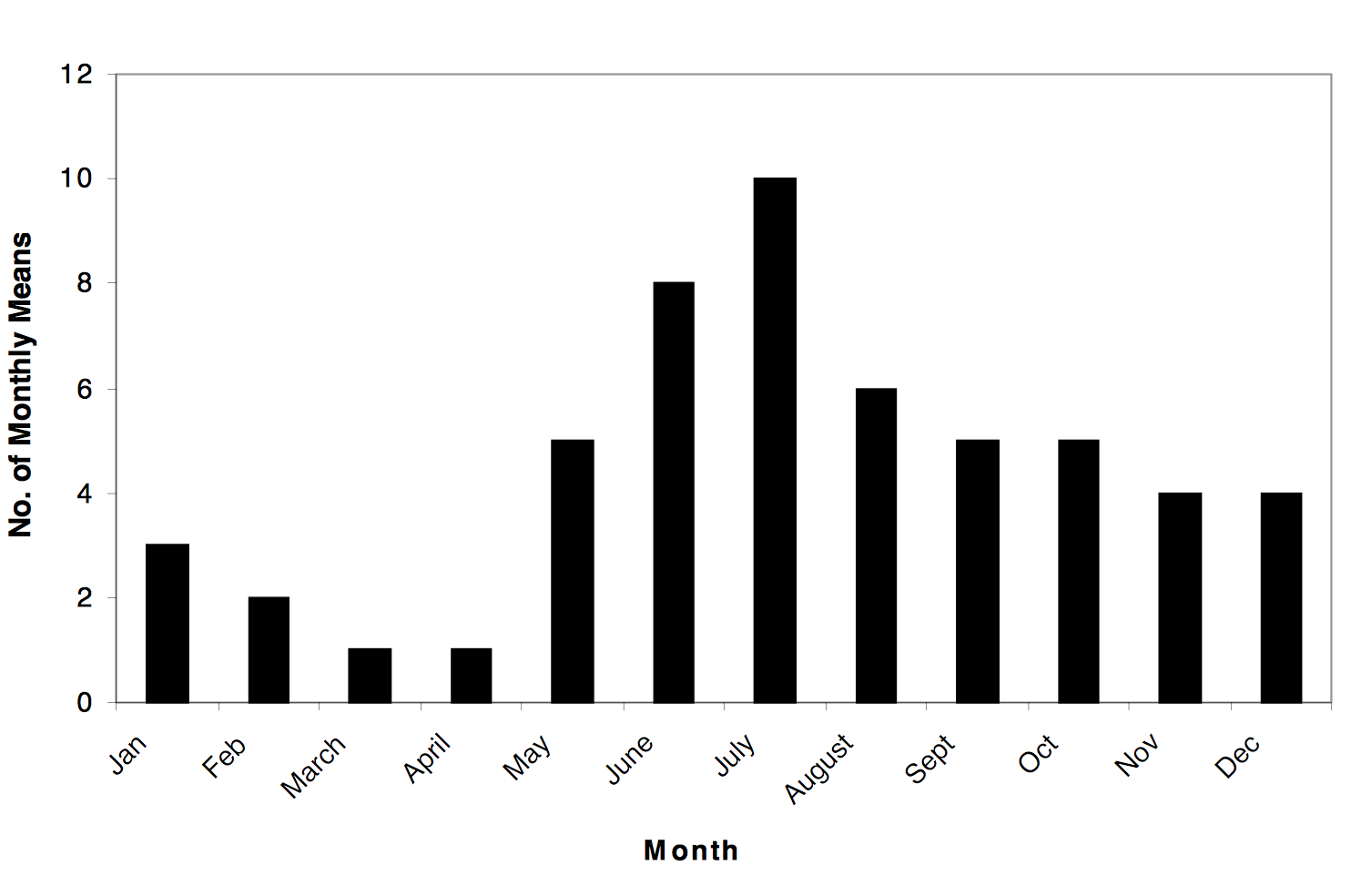
–and NRDC has found remarkable correlations in the pesticide’s concentration in watersheds and Public Water Systems that provide drinking water that reflect its greater presence in surface water, and cannot but raise eyebrows as to the changing quality of water and heath of inhabitants of such regions: even though the high spikes of Atrazine in ground water during the months of June and July, when plants are presumably given the highest doses to keep pests off, the lower national averages measured by the EPA allows such unhealthy levels to exist during a few month every year, although at substantial risk to nearby communities.
The picture of water systems and watersheds with hold high concentrations of the pesticide in both “raw” and “finished” water was measured in 2015, showing greater local concentrations in Kansas, Indiana, Missouri, Ohio, and Illinois, as well Iowa, which suggests the spread of the pesticide’s contamination of regional drinking water supplies.
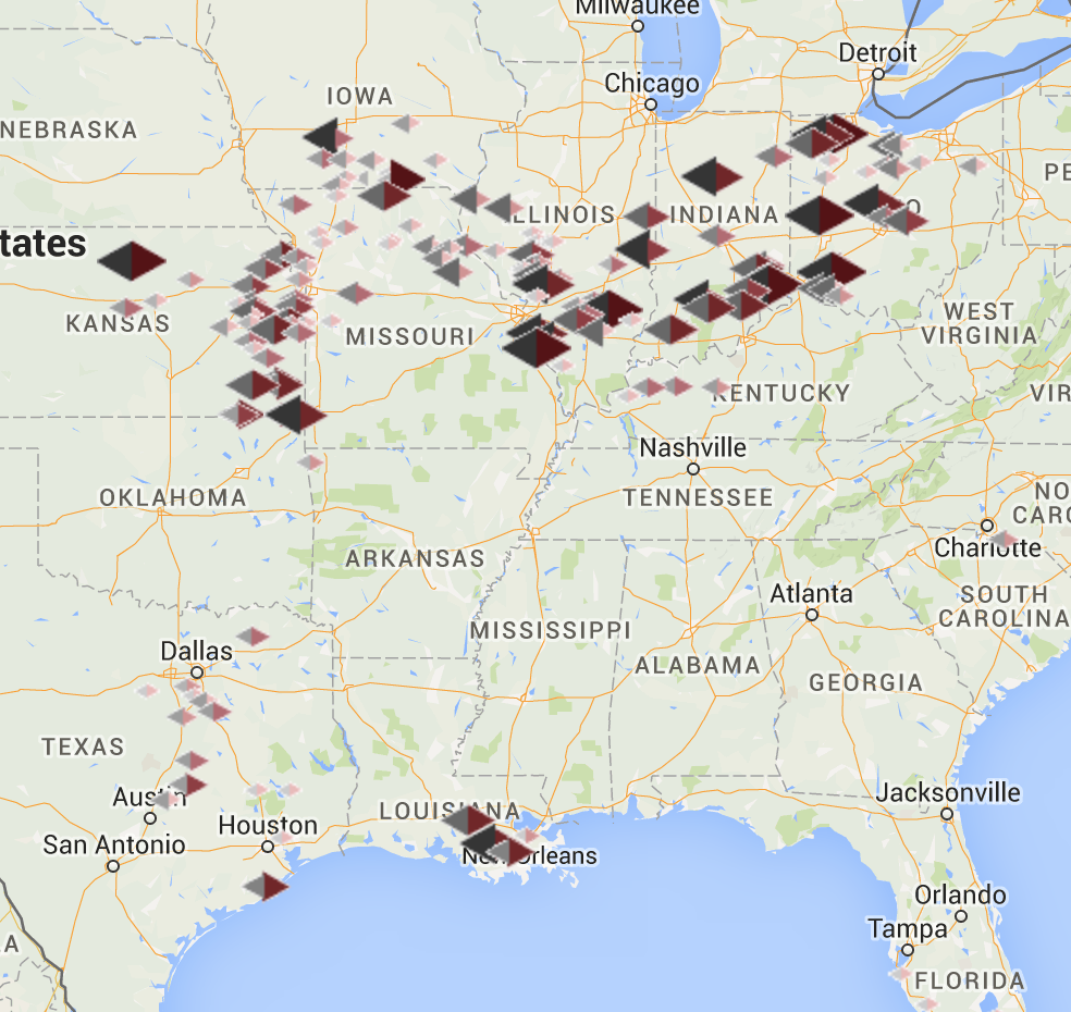
NRDC (map data from 2015)
![IA [Converted] EDIT.eps](https://dabrownstein.com/wp-content/uploads/2015/07/legend.jpg)
There is the sense that a different set of standards has occurred in exposure to health risks in select parts of the nation that reflect the intense application of pesticides like Atrazine in those regions that tolerate factory farms.
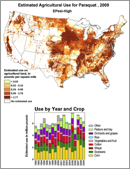
The strikingly intense and expansive use of the most popular herbicide Paraquat in crops from corn to sorghum to tubers and as well to sugar–leaves a considerable residue on crops, even if it is designed mostly to eliminate weeds and other plants. After being both notoriously and extensively sprayed from the air by helicopters in the late 1970s on marijuana and opium fields in Mexico’s Sierra Madre, in a historical roll-out of the pesticide, it has gained wide sales–but also tied to liver, lung, and kidney failure, it has made a huge comeback with the rise of no-till farming at many large farms, broadly distributed across the nation. Also marketed and produced by Syngenta, the corporation has spent considerable funds to dissociate from studies that suggested the close ties of its residues to neurotoxicity and Parkinson’s disease.

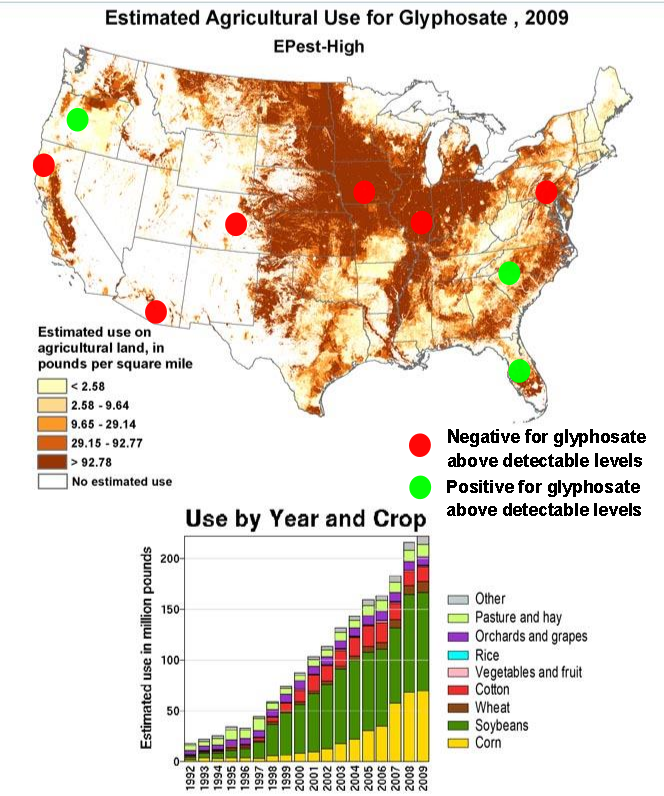
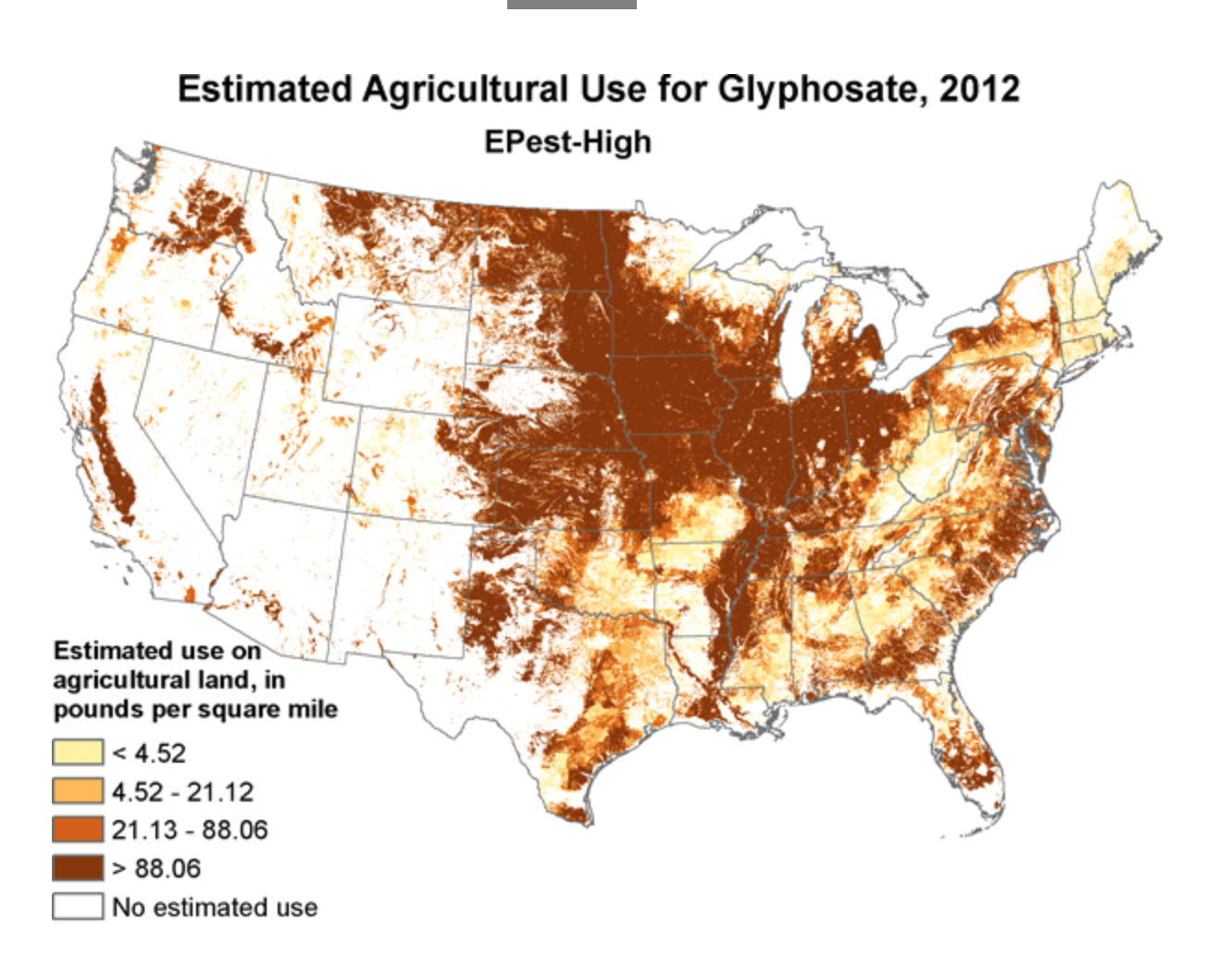
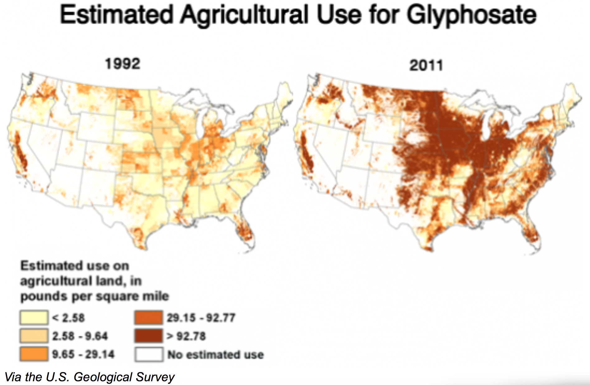
And the remarkable promotion and rise of the agricultural use of Glyphosate–the most popular herbicide across the country–and its residual effects tells a similar story. From 2009 to 2012, is estimated agricultural use was particularly prominent across California’s Central Valley, but expanded across the big farming states of the midwest and eastern seaboard in ways that echoes the distribution of large factory farms.


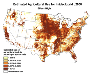
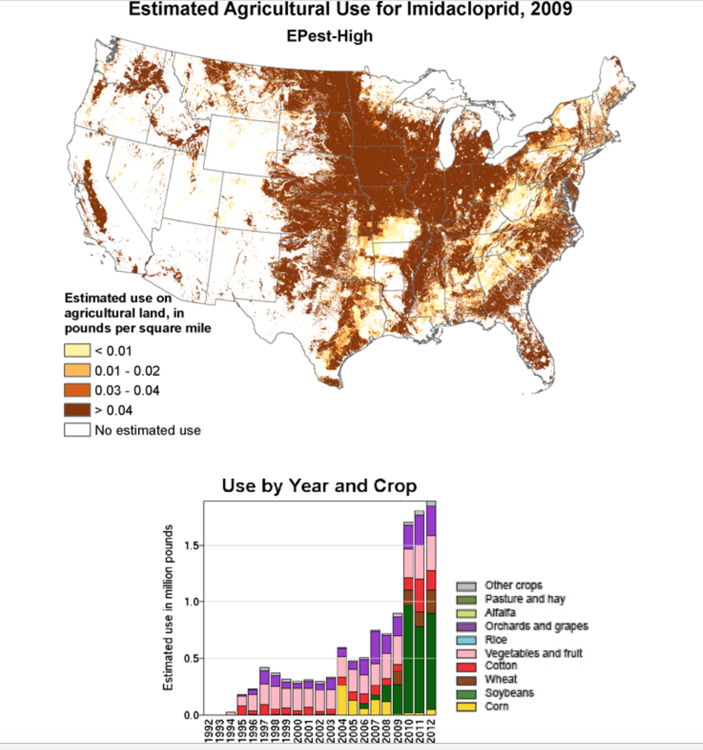
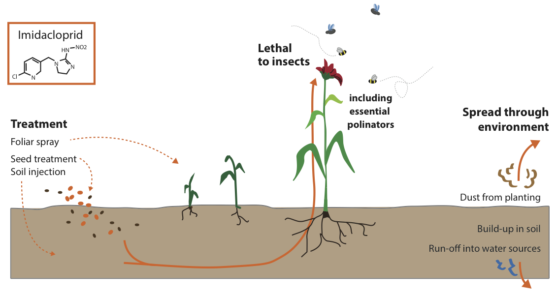
8. A strikingly similar estimated distribution of the potentially devastating neonicotinoid Imidacloprid–believed a major factor in apiary colony collapse disorder–is scarily similar, if not even more widespread geographically–and has only grown.

 CCD/Neonicotinoid

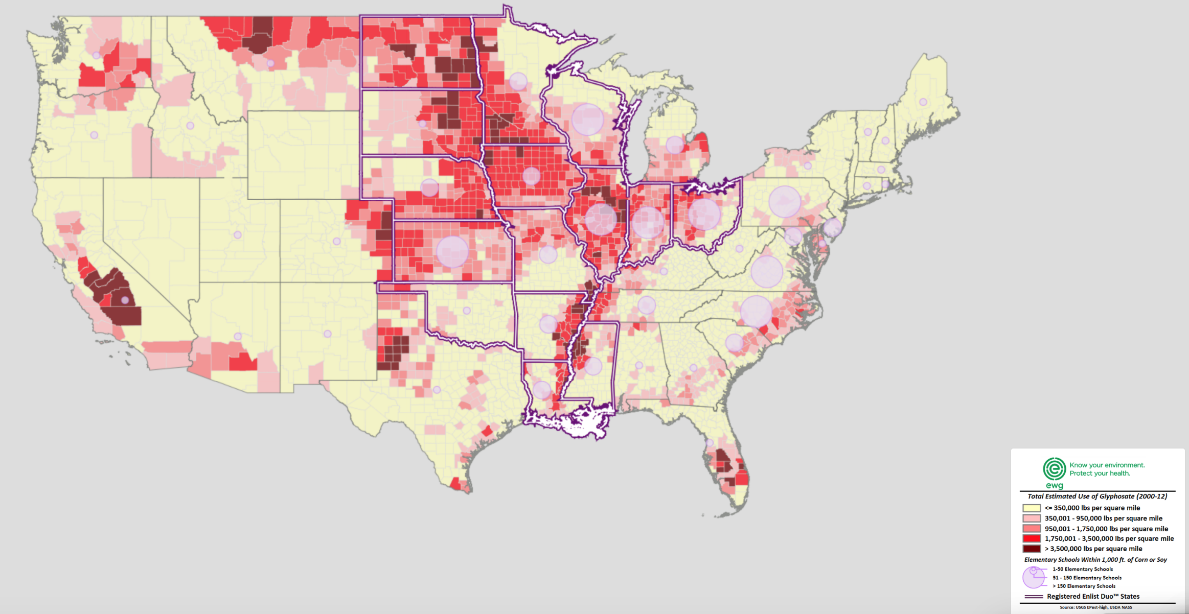
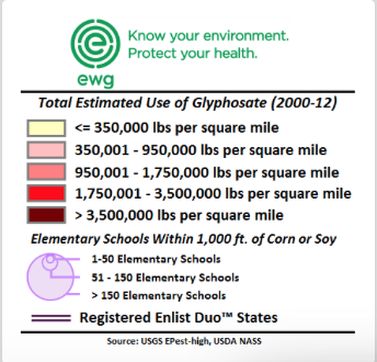
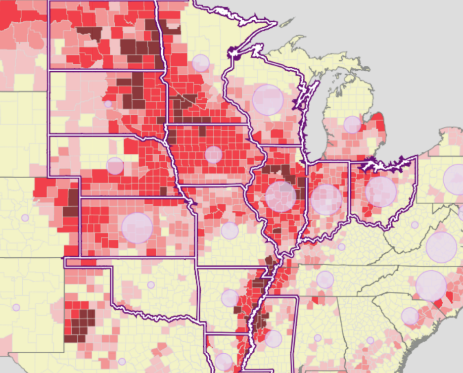
The most common herbicide in America, whose application pretty much mirrors the disposition of agricultural lands in the country, was long ago approved by the EPA, the potential carcinogen glyphosate has been used without the degree of harsh criticism that use of Atrazine faced after repeated studies indicated its potentially debilitating deformities on wildlife. Yet increasing ties of the herbicide to autism have been terrifying–and led Stephanie Seneff to the recent prediction that half of American kids will be autistic by 2025, and the Environmental Working Group to create a quite sophisticated ESRI interactive map designed to help parents learn whether children’s schools lie within zones where glyphosate is sprayed, and reveal the particular concentration of pesticides in close proximity to schools across the central US and Mississippi.
 Estimated Glyphosate Application/Environmental Working Group/www.ewg.org

The probability that the non-selective herbicide, marketed since 1992 under the trade names designed to appeal to a sense of security–like Roundup, Rodeo, and Pondmaster, actually allows residues to accumulate with carcinogenic effects in produce like soybeans and wheat has been suppressed, despite the mapping of its potential effects. This may especially have grown Monsanto has introduced GMO glyphosene-resistant crops–greatly expanding the market of an herbicide still widely marketed at Walgreens and other stores, and used in residential areas as well as in agricultural sites.

8. The rapid rise of GMO crops has encouraged the ascendancy of Roundup, now patented by Monsanto, which has replaced Atrazine. As the effectiveness of atrazine declined, and since many crops no longer tolerate glyphosate, the chemical prohibits the rotation of crops once a common agrarian practice, and suggests a new landscape of over intensive farming, which in corporates herbicide residues–as well, predictably, as glyphosate-resistant weeds in some thirty-five states.

As much as we demonize nefarious chemical corporations who are the purveyors of poisonous sprays, from Syngenta to Monsanto, perhaps the true culprits lie in the lack of agricultural regulation, and poor economic planning that allowed the rise of factory farms, where the rise of cheap feed created by large-scale agriculture has generated the not-so-astoundingly parallel rise of feedlots in factory farms, in ways that have changed the landscape by which much food is eaten across the country, encouraging a free market of consolidation of farms, without calculation of its costs.
Increased population in suburban areas, often quite close to farmlands, has increased the risk of exposure to known carcinogens and rates of childhood cancer. The results of such factory farms and economics of subsidized agriculture has led to an increasing number of schools that lie beside areas where GMO crops are planted, and roundup used, in ways that create considerable risks we haven’t bothered to adequately envision, even if they might be easily foreseen.

Well-funded teams of publicists and scientists help the PR machines that are run by firms such as Syngenta have effectively blanketed the media not only to undermine –and even created its own PR groups, spin teams, scientists, and “grassroots” groups–in a malapropistic move apparently oblivious of its own odd choice of terminology for a producer of herbicides–that is dedicated to misinform American consumers. Such a legacy of promoting agribusiness and factory farms seems a lasting legacy from two Bush administrations that will continue to afflict the country’s landscape in future years, as engines of disinformation distance the meaning of actual debate from the general public.
Based on data that the National Resources Defense Council acquired by a Freedom of Information Act during litigation with the Bush Administration, from the EPA’s “Ecological Watershed Monitoring Program” and “Atrazine Monitoring Program” that they released in August 2009 and from a report on Atrazine contamination in surface and drinking water across the Central United States, the hidden topography of atrazine pollution across the United States reflects the dangers that even low-level pollution in groundwater has created in ways that give a new meaning, if with some symbolic appropriateness, to the much-bandied about notion of what constitute our nation’s “reddest” states.

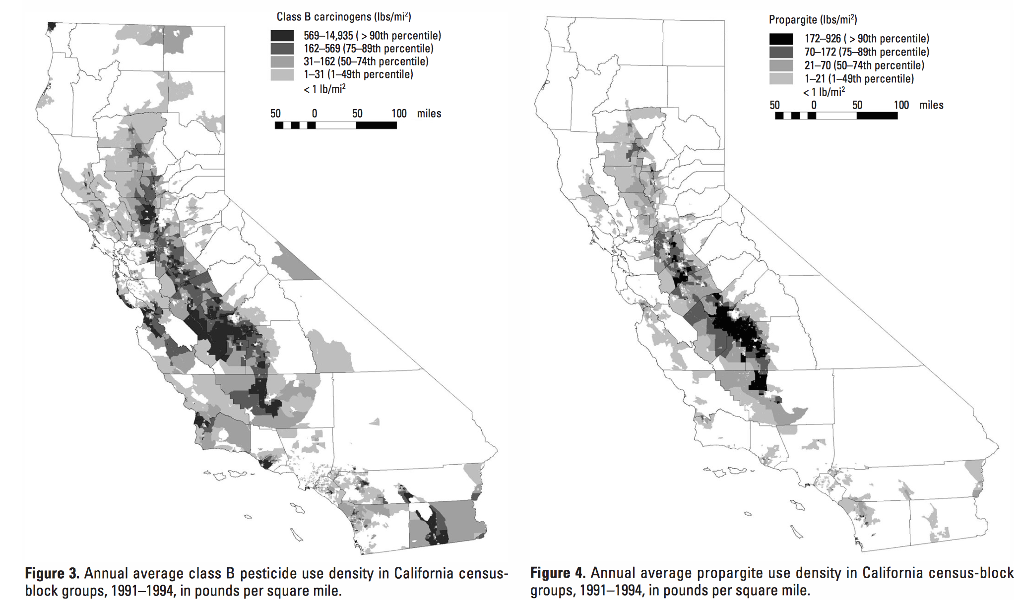
Indeed, the data on the growth of herbicides and pesticides so central to the spread of agribusiness in America, and the consequent reproduction of oversized factory farms, demands mapping and remapping in terms of the prevalence of cancer and other potentially environmentally-induced genetic mutations, and increased incidence of cancer among the young–especially in regions that border beside farmlands were use of Glyphosate and other herbicides or pesticides has rapidly increased. One study that mapped potential exposure to carcinogens commented on the rising populations near to farmlands in the agricultural powerhouse of California’s Central Valley, the epicenter of a state known for using a large share of all agricultural pesticides and herbicides in the US–to reveal their increasing proximity to residential settlements.

9. What are some of the ways of taking stock of the considerable damage of such widespread use of carcinogenic or possibly carcinogenic pesticides, both to farm workers, neighbors, and also in the food chain?
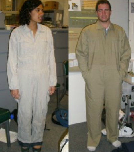
While few contractors provide protective clothing or respirators to migrant or local workers, and many use clothing or cotton bandanas that, when washed with family clothing, risk spreading contaminants within a family, the recent creation of adequate protective costumes farm workers can easily don, such as the Seguro Protective Suit, are actually designed to be worn everyday by farm workers who work with fruit and vegetables in California’s Central Valley, lest workers be forced to dispose of or wash clothes separately: the suit features materials able to repel and absorb airborne pesticides that might otherwise settle on skin or clothes, and prevent them from lodging in the lungs of farm workers who would otherwise be exposed to them. If many workers bring home high concentrations of pesticides into their home and exposing them to steep risks both of birth defects and genetic mutations–despite protective goggles, chemical gloves, or masks.

The residual presence of pesticides lodged in handkerchiefs and bandanas lack adequate chemical filters and carry carcinogens into the home and belongings; and despite current proposals of the Berkeley Expert Systems Technology Lab, producing or providing workers with adequate protective suiting actually rarely occurs.
10. The topography of pesticide use is not exactly news. But the widespread nature of the concentration of factory farms, which approaches terrifying intensity in specific census blocks, seem destined to have an increasing effect on human life. Despite the lack of acceptance of confirmations of the risk of pesticides like Roundup, due to their corporate production, the diffusion of pesticide use exposes both farm workers and populations to increased medical risk, as well as nearby residents and transportation workers.
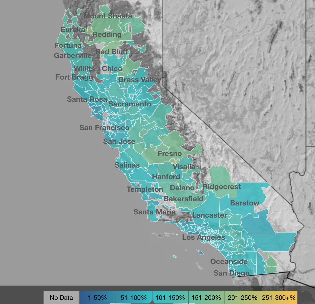
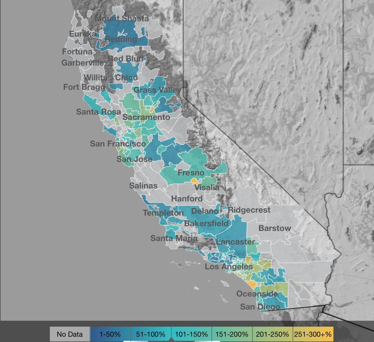
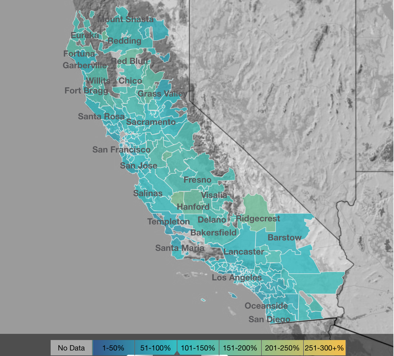
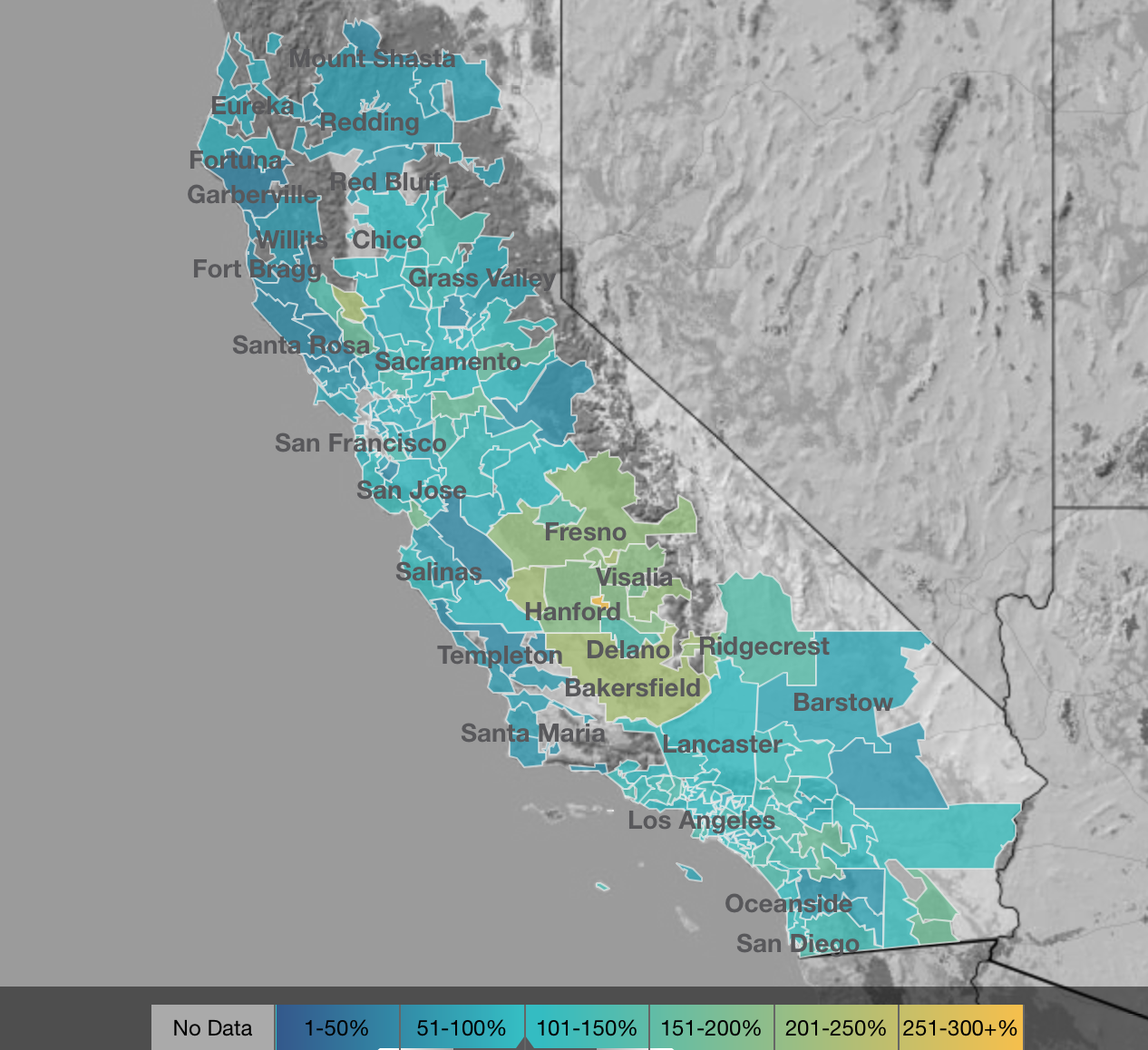
The lack of adequate measurement of rising level of risk is shocking. But its ill effects can be measured and visualized in a recent bevy of maps of causes of hospitalization throughout the state, using data generated by the California Health Care Foundation, to map local variations of operations and disease based on state-wide hospitalizations. Viewing these maps, striking in themselves, is a chance to perform the simple relational algebra to compares the intensity of distributions of farming with the prevalence of illness that might be termed a mental form of map algebra for California alone, without getting into GIS tools, to observe the otherwise unexplained regional and zonal concentration of illness: even without subtracting those areas of least farming, a picture emerges, even without the prevalence of farming areas in or around the central valley.
One might profitably run through a list of reasons for the radical local variations in the distribution of hospitalization for hysterectomies,

cases of bilateral mastectomies,

or gall-bladder removals

in ways that raise clear and pressing questions about the effects of ambient areas.
The different distribution of operations such as coronary angiographies throughout the state rather reflect the relative availability of diagnostic services in specific areas.

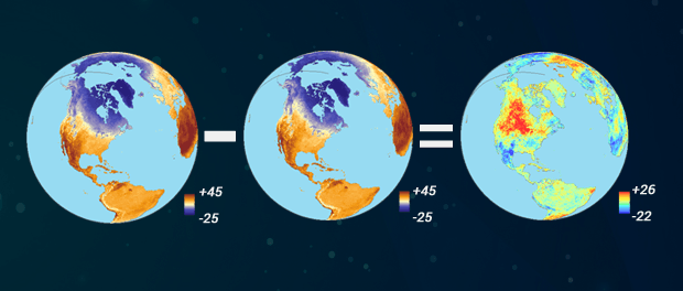
The practice of such “map algebra” involve, properly speaking, creating relations, as by subtraction, of spatial incidence over a set of cells, in order to reveal relations among two temporally sequential or related (or potentially related) raster datasets to reveal interesting homologies, as these maps of NASA’s Land Surface Temperature in North America of 2014 and 2015:

A similar subtraction of individual cells is less able to reveal so clear a contrast of regional variations, perhaps, in the intensity of pesticides and cancer, or the presence of pesticides with the possible likelihood of cognitive impairment and dementia–by Alzheimer’s disease or Parkinson’s disease, or even of depression, and heightened neurotoxicity especially in the case of Paraquat–would provide a compelling correlation over space and a map that would be difficult to ignore. One might begin from a negative map of the correlation of diseases to those areas where pesticides are less prevalently used, or a simple ratio between incidence of illnesses in cells correlated to with the prevalence of pesticide use. In either case, a focus on the increased chance of illnesses in those areas where pesticide use is most intense–and potential carcinogens most intensively applied–demands correlation to hospitalizations as well as to length of chemotherapy treatments.









![IA [Converted] EDIT.eps](https://dabrownstein.com/wp-content/uploads/2015/07/legend.jpg)
