Category Archives: San Francisco Bay

Follow the Money from the Bay Area’s Shores

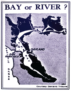
When William Rankin mapped city income donuts across urban America in 2006, the radical cartographer aimed to correlate wealth distributions onto a geometry of concentric circles.  But the donuts of income distribution within the Bay Area do suggest the wedded nature of the bay’s shorelines with distinctly lower incomes, reflecting the deep historical association–outside Marin, but only partly–of the bay’s shore with heavy industry and piers.  The distribution reveals the reduced desirability of living by its often polluted shorelines before their restoration–as much as it recalls the concentric rings of the mapping of flight paths.

William Rankin's Income Donut of the Bay Area (2006)

Donut Distribution Income Scale

APPROACHES TO OAK IN SFO

Inlaid map in San Francisco Airport (SFO), International Terminal

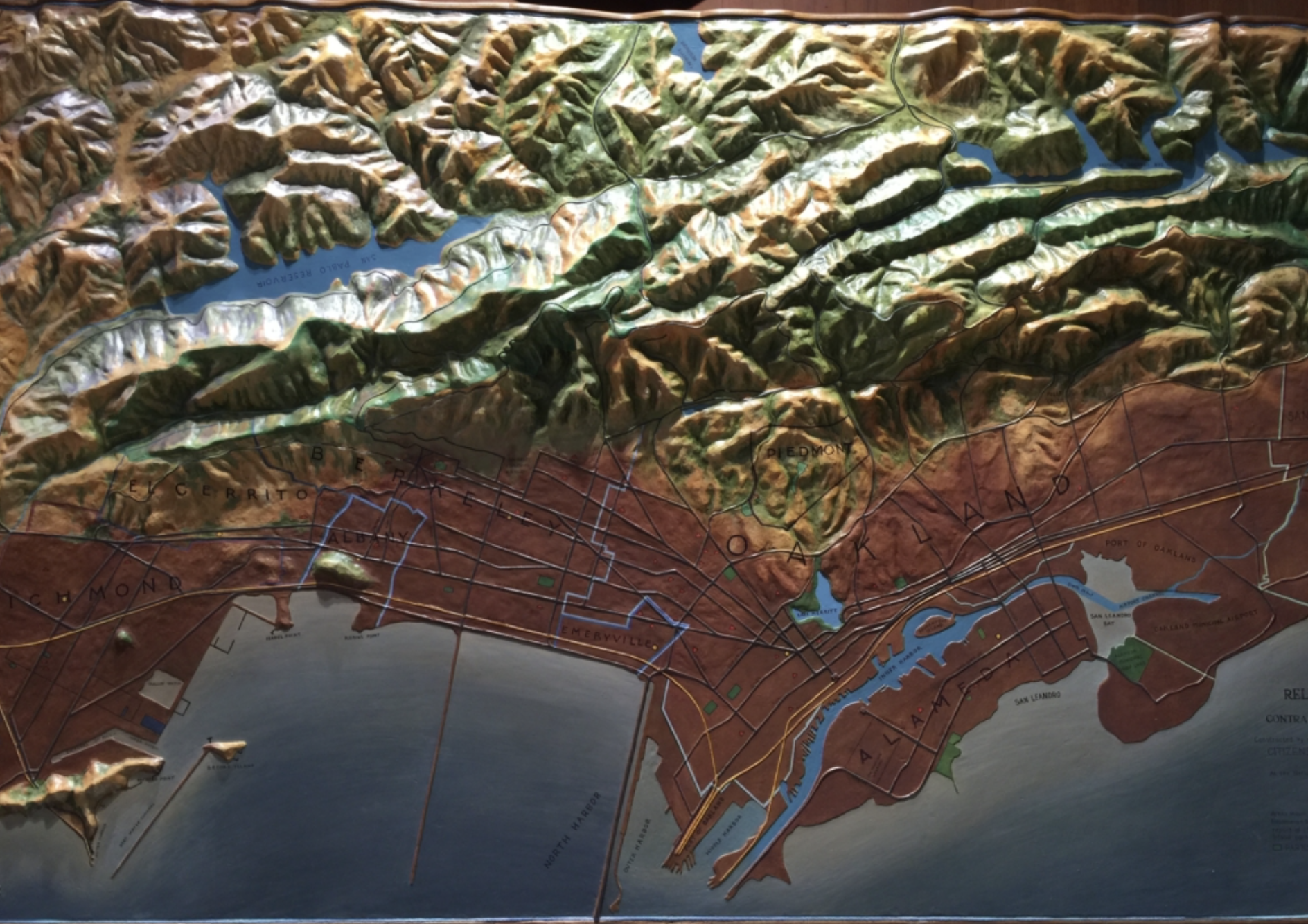
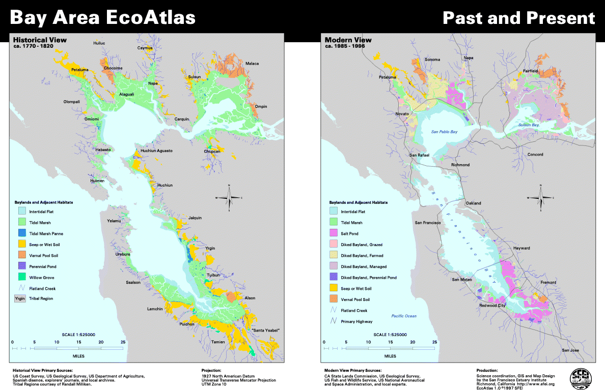
In part, this is due to the pronouncedly low-lying nature of downtown Oakland and the low density housing of the shoreline.  It also reflects how the shoreline–after being reclaimed from marshland–was rebuilt after World War II, when the shoreline of Oakland was substantially rebuilt and emerged as a center of industry.  That industrial shoreline is now fading.  But the distinct social topography it created transformed (and transmogrified) reflect the ecotonal aspects of the bay’s shore from San Jose to Richmond that have not been explored:  the transformation of the bayshore into the site of hazardous waste extended to recent times, when the reclaiming of the coastal shore became a major project of civic attention in the Bay Area–far after the projects of saving the Bay itself.  While running the risk of being too map-obsessed–a challenge, I admit, that is hard to avoid on this blog–the shaping of the shores of the bay can be traced through the avoidance of the bay, a region of intense sociability in pre-Anglo California that is only being slowly returned to in recent years.

The trend of flight from the shores was solidified by the concentration of the highest incomes at the greatest remove from the shorelines that were associated with commerce and shipping–the peninsula–the deepest red of the region, and the similar remove of the Piedmont and Oakland hills, as if to reflect the wonders of automotive transportation that allowed the wealthiest to live at the greatest remove from the urban center.  Tiburon be damned:  to withdraw to lofty peaks far away from the commerce of the shoreline seems to be the distribution of the most desirable land.  (Tiburon, if an outlier to this region, itself stands at such remove from the commercial shorelines of the bay to confirm the trend–Marin City is of course the bit closest to the bay as we know it.)  The economic panorama of the Bay Area makes some sense of region’s socioeconomic distribution and settlement that reflects its industrial past, even though that industry–with the exception of some shipping and oil reserves–is less present in the region today.  Is this a ghost or a legacy?  This mapping makes a sense of the Bay Area’s social topography:  it both clearly privileges panorama that peaks afford, but somehow doesn’t like to look directly at the bay around which it lives.

For living along and beside the bay–or beside the water that were the centers of social interaction for its native inhabitants–was historically rejected both because the waters were the sites of refuse and waste, but also as they became the site of trading, industry, naval yards and slaughterhouses in historical San Francisco and Oakland.  One can see the same income distribution echoed in the map of those buildings in San Francisco whose residents were recently cleared by legalized evictions, based on the Ellis Act that permits landlords to issue legal eviction notices to the tenants of multi-unit buildings, very few of whom lived–or rented–residences that faced or were even near to the East Bay, as one can see in this less elegant–and far more crowded–real estate map, which shows the less desirable nature of properties from the piers to Mission Bay to Hunter’s Point, and the relative clustering of valued homes from the commercial or industrial shoreline:

Ellis Act Evictions

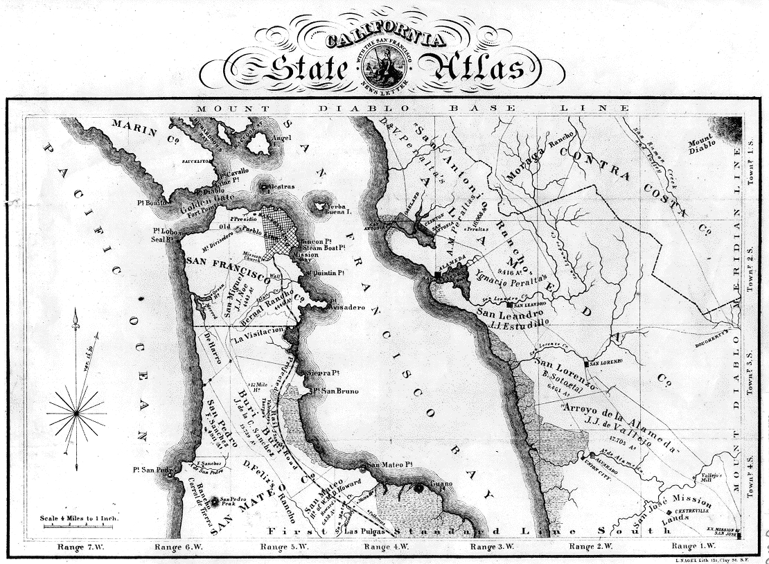
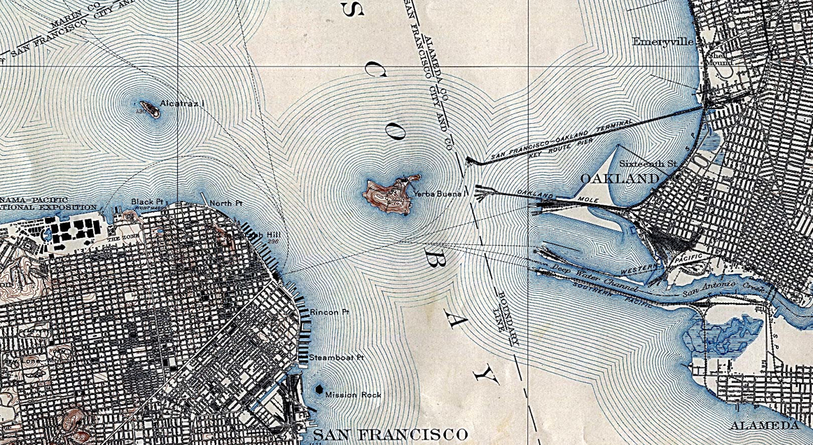
Bill Rankin’s elegant geographical donut mapped local incomes in ways that offers a gloss on the odd historic relation to mapping the distribution of incomes around the San Francisco Bay–a neglected area partly defined by landfill–and later residences–but also by proximity to a body of water that was never that desirable an area of residence save at the Pacific side:  the low-lying shores of the bay facing Oakland were far more associated with commerce, shipyards, and treacherous waters, whose shoreline in 1905 was less bulked up by landfill and far more polluted.  Removed from the hilly topography of the ocean-facing heights. To offer something of a cartographical archeology of how Rankin mapped the distribution of incomes in the Bay Area, one might begin from the Langley map of 1861, when te Western addition grew around docks allowing nautical approaches, more densely inhabited and built than the rockier shoreline of the Ranchos and government lands on the Pacific or Golden Gate, named from Marin’s golden hills as an uninhabited gate to the Bay.

City and CountyCopyright Rumsey Collection

The shores of the city’s peninsula was understood around magnetic lines of nautical approach from 1897 from the Rumsey collection, which measured the coastline as a site of disembarkation and arrival, tracing the topography of the coast in ways that reflect the distance of its use from residential regions.

magnetic sightings in bayCopyright Rumsey Collection

Viewing the city in Charles B. Gifford’s 1862 map of the city from Russian Hill, one can see the areas of settlement perched above the harbor that ringed the city, resting as if it was elevated above the smells, fray, and commerce of the shores, with park-goers sitting in the higher grounds far removed from the traffic of ships sailing in the San Francisco Bay.

San Francisco 1862Bancroft Library, University of California

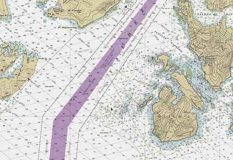
From the late nineteenth century, the downtown was ringed by zones of forbidden anchorage, suggesting dense traffic of ships at its piers.  Shorelines on the city’s eastern half were notoriously dense, outside of the Presidio, the hilly site of the US Reserve, rather than sites of residential housing, to judge by this 1905 US Coastal Survey of the entrance to the Port of San Francisco, in which the eastern half of the city is far more densely built, and its buy shores surrounded by zones of forbidden anchorage of dense water-traffic.  Indeed, the aquatic environment seems far more closely attached to the city in this 1905 map, which suggests a close familiarity of the shorelines at a time when the city was far more often approached by ship, rather than by car, and the deeper waters offered easier approach to the protected cove of San Francisco’s Embarcadero piers without risk of running ashore.

SF Bau amd JSpre;omesCopyright Rumsey Collection

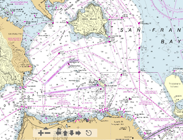
The prominence of such grey “Forbidden Anchorage” zones–sort of like metered parking–provide a reflection of the populated traffic within the bay’s shore that removed it from desirable residence even if it increased its value.   The expansion of areas of port along the Addition up to Potrero Hill created a sparsely populated region of the city as primary port for the region.   The flats off of the shore of Oakland, in contrast, suggested a far shallower areas of docking, no doubt less desirable area of living–refuse must have been washed out by tides from the more stagnant urban shores, where ships arrived by the San Antonio River into Oakland’s port.

Port and San Antonio RiverCopyright Rumsey Collection

The port of Oakland was beset by fetid shallow waters, and a marshy inland, that would have rarely attracted sites of denser residences, despite its clearly planned plant, and its shoreline featured a prominent silt belt around its shallow muddy shoreline.

shallow water of Oakland harbor

The conspicuous “redlining” of neighborhoods near to the shore in Oakland from the 1930s–effectively rendering them less eligible for any financial mortgages or loans that might create neighborhood consolidation or development as a site of residence–created deep divides that have been willfully perpetuated in the city’s current socio-economic landscape, dividing more prosperous Piedmont from African American residents of other areas of the city who could not afford to buy homes there.   Practices of redlining divides in neighborhoods that were granted residential refinancing, captured in the below map of the Home Owners Loan Corporation, reflected existing differences, to be sure, but inscribed socioeconomic divides by formalizing them as formal divides in the existing realty market by destroying the possibility of investment for families living in zones dominated by blacks or African American families, defining four grades of property, and encouraging clauses to be written into titles to not sell to non-whites.

Redlining By the Shore

Maps as the above graded neighborhoods that merited increased caution to lenders in Yellow, and “infiltration of a lower grade of population,” whereas green areas are “hot-spots” and blue “still good” neighborhoods; red “represent those neighborhoods in which the things that are now taking place in the Yellow neighborhoods have already happened,” were home ownership is rare and poor maintenance results, as well as vandalism typical of the slums they often contain.  The area by the water was an area for piers, rather than the elegant Victorian townhouses that lined the substantially higher ground of neighborhoods like Fillmore or Noe Valley, not to mention those elegant multi-room mansions in Pacific Heights, in ways that have migrated into the current social landscape, where the bay is spanned by bridges that define two major traffic arteries.

Sliver of Alameda

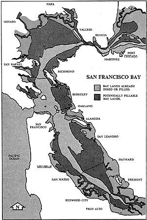
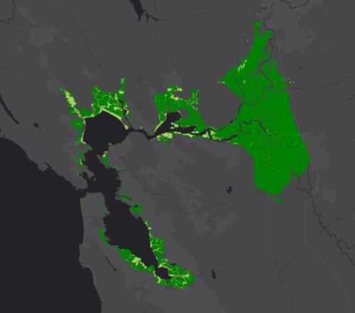
To what extent has the social topography of the city remained the same? The value of low-lying areas by the shore has not diminished, but the flight of wealthy populations inland has led to concentrations of wealthier communities far inland from the shore–both in San Francisco and, far more pronouncedly, across the Bay. One can see a similar large brown swath of (low-income) water in the San Francisco Bay within the American Community Survey, of which Rankin’s distribution is (to some extent) a forbear:  in the recent Survey, the city of San Francisco and Oakland Hills are flush with green, as is Tiburon:  there is, however, as if by a perverse computer glitch reflecting county lines, an odd mismapping that extends to the pockets of low incomes in the Tenderloin downtown, and over across the Bay.

The brown-hued bay of course has few human residents or renters, but is somehow the greatest continuous low-income area, even if uninhabited, by a software responding to fixed county lines, despite the extension of San Francisco county to a tiny sliver of the Naval Base airfield, that one sees outside of inner Oakland:

ACS SF Median Income

When did the odd division of the San Francisco Bay arise that included a slice of Alameda in its scope?

The area was excluded from the naval airstrips on the northern end of the island, but reflect a line drawn across San Francisco Bay, a triangulation from small rock outcroppings on the Bay drawn from the almost-island “Red Rock,” and still visible in the OSM mapping of the corner of Alameda that enters into San Francisco County’s parsing of the bay, and the resulting odd mapping of Oakland’s boundaries that left it with limited water rights–and Oakland’s harbor or port confined to the area between Alameda and its shoreline.  The same low-lying port region–which Henry Kaiser so dramatically expanded as a militarized area, with Point Richmond and Hunter’s Point, during World War II, together with Marin City, and as centers of lower-income housing–transformed the shoreline from an area of wetlands and ecotones to a region of heavy industry. It’s tempting to excavate the maps as a repository of sort of social history of the human relation to the shore across the bay in Oakland, where the port emerged as a site of commerce and industry, as a sort of poorer cousin to the San Francisco piers, remained a second site of the withdrawal of the wealthier populations from the shore. The limited nature of Oakland’s possession of the bay–marked her by the boundaries of the City of Alameda–offer a canvas of the parameters of shoreline commerce along the former San Antonio river.

Alameda in OSM

A somewhat submerged history of the settled bay shore–before the redefinition of the shore as a center of industry that constituted the built periphery of the land–is evident in the layered archeology of the bay’s history in early maps, that offer the possibility of recovering a narrative of the somewhat idiosyncratic bounding of the bay’s shores as the area shifted from a maritime port.

San Francisco Bay extended the county past Treasure Island so that it brushed lightly against the island of Alameda, for some odd reason of territorial jurisdiction, that predates the Flea Market, the naval station at Point Alameda, peculiarly carved out for reasons little to do with military bases, left a sliver of landfill on Alameda cut off from Alameda County, and lying in San Francisco–not the city, but the County, protective of its water and air rights.  The Office of the Surveyor of Alameda helped in inscribing a line “southwesterly in a direct line to a point in San Francisco Bay, said point being four and one-half statute miles due southeast of the northwest point of Golden Rock (also known as Red Rock); thence southeasterly in a direct line to the point on which the lighthouse on the most southerly point on Yerba Buena island bears south seventy-two degrees west, four thousand seven hundred feet,” reads the Senate Journal of 1919.  And so it still appears, in something of an artifact of geodata, outlived its time as a basis for negotiating shoreline and sea. Already, in the 1859 United States Coast Survey, the unique shelf off the shore of Oakland suggested a narrow point of arrival for larger ships–even if the bay suggested a readiness existed to define the San Francisco bay exactly along the shelf of land that extended just out to the spit of man-made land of the mole that ran out to Red Rock, which were less suitable for sailing.

Depth Charges of the Waters in SF- 1869 Coastal Survey

A few early printed maps preserve traces of the redrawing of the bay shore, and note that region where the water intersects with land and probably also lines of county taxation are drawn around the bays’ islands and shores.  The artificial slivering of the island Alameda in the late nineteenth century is echoed long before the building of the Naval Base, in a Leipzig engraving of the early 1890s, an image attributed to James Blick, San Francisco und Umgebung, which illustrated the island of Alameda is mapped as cut by a secant of railroad track at the point, as Alameda bracketed Oakland’s own harbor and port.  But there is no clear delineation of the county line, and the shore area seems primarily defined by the railway lines that run along it.

Leipzig San FranciscoWikimedia Commons

The division of San Francisco Bay postdates the complex settlement of the shores in the East Bay recorded in this openly acknowledged apparent official settlement which evokes a treaty between San Francisco and Oakland.  Derived from surveys that Theodore Wagner compiled  c. 1894, which George Sandow so eloquently engraved, the comprehensive map of the bay charted the oyster beds that Indians had long cultivated, whose mound of clam shells rose some sixty feet high, barely remembered in Emeryville’s Shellmound Road–and is now home to Best Buy and P.F. Chang’s.  The Bayshore area had become, by the late nineteenth century, a site actively contested and divided by prospectors of oysters, which  constituted a very important micro-economy of aquaculture for Oakland’s Morgan Oyster corporation, even in the end of the age of its rancho, at a time shortly after when the city’s amalgamation was formalized, until the increasing waste dumped directly into the waters decreased the imported population of bivalves, and led to declines in local sturgeon by 1920.  The mosaic of lots of oyster beds were mapped some distance offshore, in ways that reveal the dense interaction between the tidal regions where the Ohlone had earlier lived intimately with, that maps allow one to excavate from the late nineteenth century–when the importation of oysters had led to their widespread cultivation in the relatively shallow waters along much of the coast of the East Bay.

Oyster Plots on Map

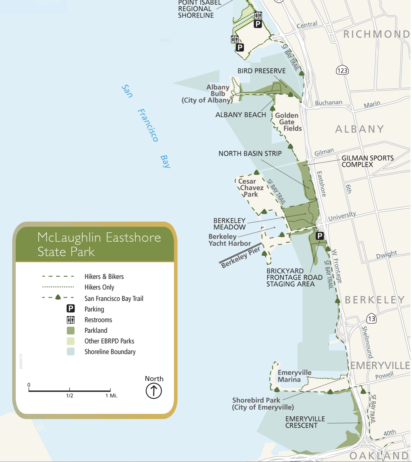
It is eery that the same shores, so long fertile with the shellfish that sustained the Pomo and Ohlone, were later almost filled with landfill, by the mid-twentieth century, and almost so readily sacrificed.  It’s humanizing to look back at the shore divided by oyster prospectors, however, and to see a far more permeable divide that existed between water and land.  The distribution of shell heaps was in a way a reminder of the close relations between land and water that had earlier existed in the physical geography of the Bay, where a mound of shells near the current Emeryville, built over thousands of years of the harvesting of shellfish from the bay–not oysters, but abalone, mussels, and clams–was a notable part of local topography, extending some three football fields in length, a sacred site of burial in the large estuary and Temescal creek, from which some seven hundred burial sites were removed in the 1920s, which were mined for fertilizer in earlier years, and partially leveled in the 19th century to become the site of a dancing pavilion, before being leveled in 1924. The distribution of such middens extended around the East Bay:

Shell Heaps

If the shoreline was a permeable region of wetlands circa 1860, the subsequent hardening of the boundary between land and sea had already occurred by the 1920s, when the region was prepared for industrialization–the wetlands and creeks that were so pronouncedly visible in this early state atlas had been paved over and erased with time, as the shoreline was defined as a fixed boundary of trade and its substantial wetlands disappeared and a clearer division between land and water in the region was effectively over time engineered.

1860 Bay Area Map

An relatively early perspective of the settlement around the Bay’s shores from 1915 that suggests a clearer bathymetric projection of the ocean floors of the bay.  The elegant lithograph indicated the emergence of early landfill of the marshlands of Alameda island, situating the deep water channel for entering the San Antonio Creek  fully in Alameda county, and placing a county boundary line in the middle of the San Francisco Bay.  While it notes significant estuaries in Alameda, the particularly low-lying lands of the East Bay that it depicts at a certain time became the basis for the cartographic fantasy of extending landfill from the shores to increase the amount of land for sale–or for industry–in the Bay Area.

Mission Rock in SF Bay 1918

    The same map reveals a Bay whose bearings were of course primarily aquatic, marked by islands that offered mariners primary points of orientation, and the waters linked by spidery lines.

1915 SF Bay Map

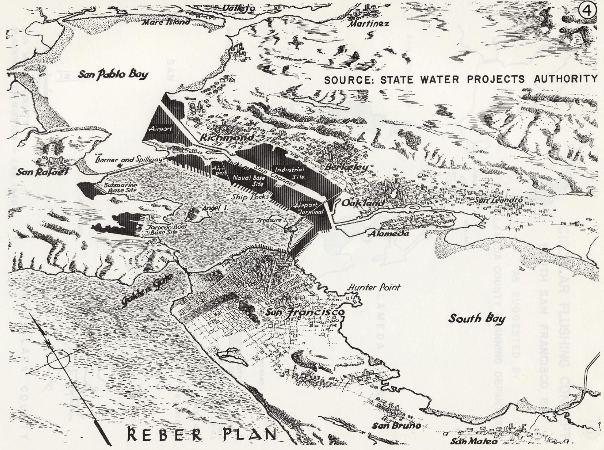
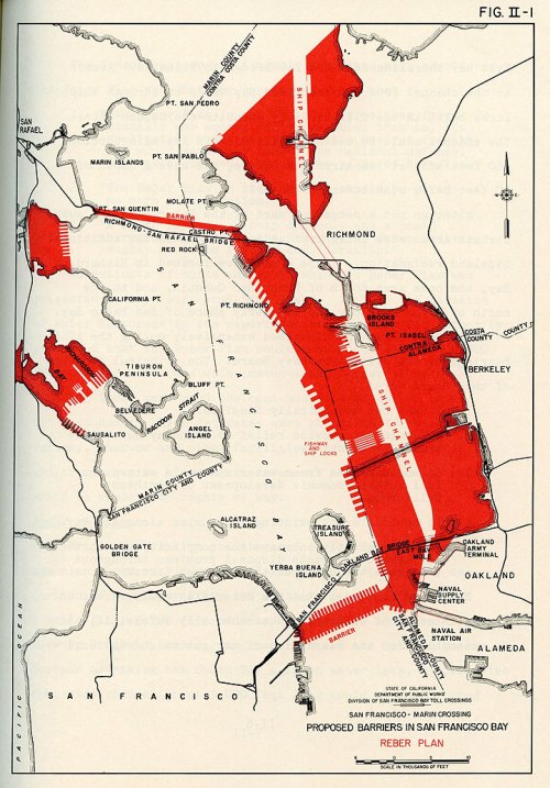
Subsequent post-WWII entertainment of the sacrifice of sunsets and the Bay’s open waters reveals the readiness to development of the coastal waters as an industrial zone that emerged shortly after World War II, as the rise of military bases and the industrial port of Oakland was bracketed apart from the regions of Contra Costa or Alameda County inhabited by a wealthier demographic.  The proposal for  “Lake San Francisco” sacrificed the bay as if it were dispensable:  This compelling evocation of the ecological threat of a proposed narrowing bay waters hinged upon the idea of building over a watershed increasingly seen as a dispensable, whose wasteland of refuse an imagined plateaux would replace, built over a Bay that remained quite polluted, but whose waters seemed as if they would be rendered more manageable:

BIrd's Eye View o Bay

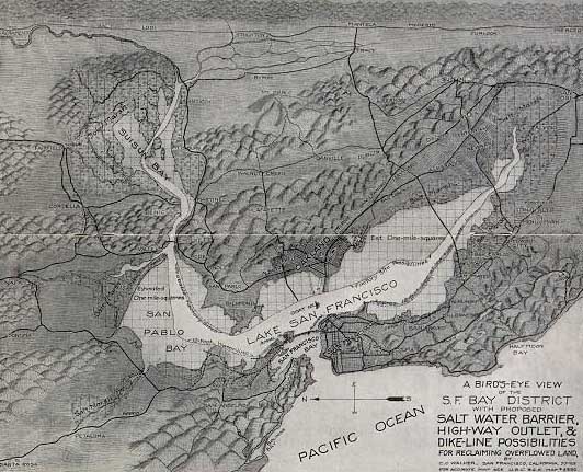
The imagined “highway outlet” for ships alone was cast as a project of land-reclamation, in surprising ways, and seems to have included a surprisingly ecological view of the seven rivers that emptied into the bay as now filling a freshwater lake–and San Francisco Bay being displaced to Baker Beach and the Golden Gate.

The vision compelled collective resistance–long before the civil rights movement–in a wave of ecological awareness that exploited the power of maps for all they were worth to resist the proposed complex of dams, transportation corridors, and landfill that became identified as John Reber’s plan–drafted at wartime, when the local beds of oysters were no doubt no more, and the Bay had become something of a city of industry.  Reber vividly imagined the commerce to be created by facilitating shipping lanes on a redrawn shore, purged of estuaries and irregularities, lined with a sequence of piers and docks.  If adopted, it would make something of a mockery of the Bay Bridge’s first span, and the eagerness to link the Bay that that Bridge’s celebrated completion seemed to inaugurate back in 1936.  The never-completed but almost-adopted fantasy for redesigning the bay as a lake or freshwater region, shared by Marin, Contra Costa County, and Alameda, as well as San Francisco, was based on building multiple barriers in the bay that expunged or limited saltwater from the waters, drawing the sort of imaginary line that seems to have leaped off of an engineer’s drafting table to incorporate Point Richmond, Clark Island, the Albany Bulb and Berkeley Marina with fill that pushed the piers imagined for East Bay ports in the post-war period almost out to Treasure Island, overrunning the Bayshore as if to displace the port and ship locks half-way to San Francisco.  Perhaps this was to alter the property-values of the Bay Area, if only to fill the landfill with an infinite supply of workers’ houses at a time when the rapid expansion of shipping was the order of the day, more than the marine environment; and the workers on the Bayshore could be moved into new prefabricated houses that the landfill would support.

Red-colorized-reber-plan-4480349065_c878e93eb5_o

Bancroft Library, University of California

John Reber’s 1941 plan for radically restricting the Bay’s waters was never adopted, nor was his notion of creating two artificial lakes of freshwater, divided from the sea by ocean barriers.  But the serious contemplation of Reber’s plans and others through 1962–the plans  elicited active defense of the Bay as a region for the first time–suggest that the bay was seen, even after the boom of commerce in the 1950s, as little more than a source for some marine traffic that could be effectively built or beaten back to the Bay itself, and imagined as an area to grow new industry.

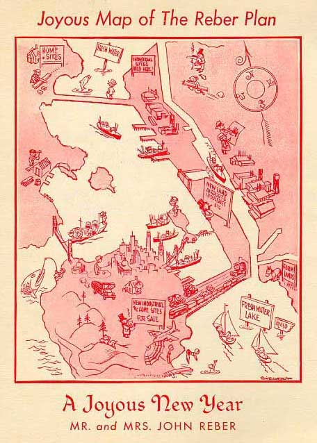
And Reber and his wife were sufficiently joyous to communicate the expansion of coastal building–a gift to realtors, perhaps, but also a plan of industrial expansion–in the future map they staged for their own family New Year’s Card as a misguidedly optimistic celebration of the acceptance of Reber’s plan for expanding landfill on the Oakland and Berkeley shores, and even to divide the bay into separate freshwater lakes, as if in the hope of recreating two sites of Arcadia in the m “Joyous Map” that both balanced and contrasted with the industry of the Kaiser shipyards in Richmond, or along the planned extension of the canal from Alameda and to the new “City of Industry” in South San Francisco near the new airfields:  Reber imagined lakes filled with fish, in which moved poetic sailboats, while the big boats of industry were enclosed by a newly reduced San Francisco Bay.

Reber's Joyous MapBancroft Library

The “joyous” vision of an industrialized bay was beaten back–in large part by a “Save the Bay” group of East Bay Residents, ancestor of the current Save the Bay that, back in 1961, crystallized, momentarily, priorities of the current San Francisco Bay Conservation and Development Commission.  But the image of erecting barriers across the Bay left the image of a sort of aquatic parcellization, as if treating its waters as a built environment, no doubt reflecting the dredging of its waters to allow ships.

Barriers in the Bay-1962Bancroft Library

The battle of the fate of the bay was itself waged in maps, cast in terms of competing visions in relation to the shoreline that would be sacrificed, and with it the relation to the water that had been so dramatically rewritten over time, as residents withdrew from the bay around Oakland, even as they valued the beach at Alameda as a sole point of contact with the sea. What of that odd divide of Alameda County and San Francisco County that persisted, and would be defined by a Trans-Bay Barrier in the above Savage Plan of 1962?  This detail of the map, a telling boundary of the San Francisco Bay, seems to be a holdover of the vision of proposed barriers to the bay.  The landfill on which the Naval Supply Center, Army Terminus and Naval Air Station lie had indeed gained new prominence after World War II in defining the areas topography.  But San Francisco County defined the Bay, and that slim corner of Alameda, drawn here as if at the convenience of a surveyor’s line that ran from Red Rock, sliced a sliver off of Alameda County, almost as if foretelling the later line of the toll-crossing on the Bay Bridge.  But the line itself seems not only fortuitous in placement, but contingent of a redrawing of the bay, perhaps reflecting the vagaries of lines of marine jurisdiction, to judge from the bay’s rendering in this section of the 1915 map, in which Red Rock fails to appear, or have the boundary line function that it later would:  and one can see public lines of transit that linked Oakland to the Key line on the San Francisco-Oakland terminal and to its own deepwater channel.

1915 SF Bay Map

Indeed, the dirtiness and disdain for the Bay’s waters seems to have led it to be regarded as something like an expansive parking lot in the years around Reber’s plan, to be sacrificed for the expansion of automobile-friendly space, as is evident in this plan for a “Southern Passage,” never built, but evoking the imagined “Northwest Passage” of the Hudson Bay Company, that would guide traffic in two places across the bay, that was repeatedly entertained from the 1950s, which treated the bay as something of an extension of the city of San Francisco, bridging Alameda and an offshoot of the 101.

southern_crossing

Returning again to the bayshore as it was shown in the elegant Wagner-Sandow map, waters on the coasts of Richmond and San Pablo were similarly clustered with oyster beds, a micro-economy at the Rancho San Pablo.  The history of the lots of oyster-beds in the East Bay may be even more forgotten, but their mapping seems to unveil a lost tie to the ecology of the estuaries and shallow waters that blessed the region, making it a popular site of native congregation, just before the industrialization of Point Richmond’s or Oakland’s shore.

Mapping Oysters in East Bay--Wagner

Oyster Foraging

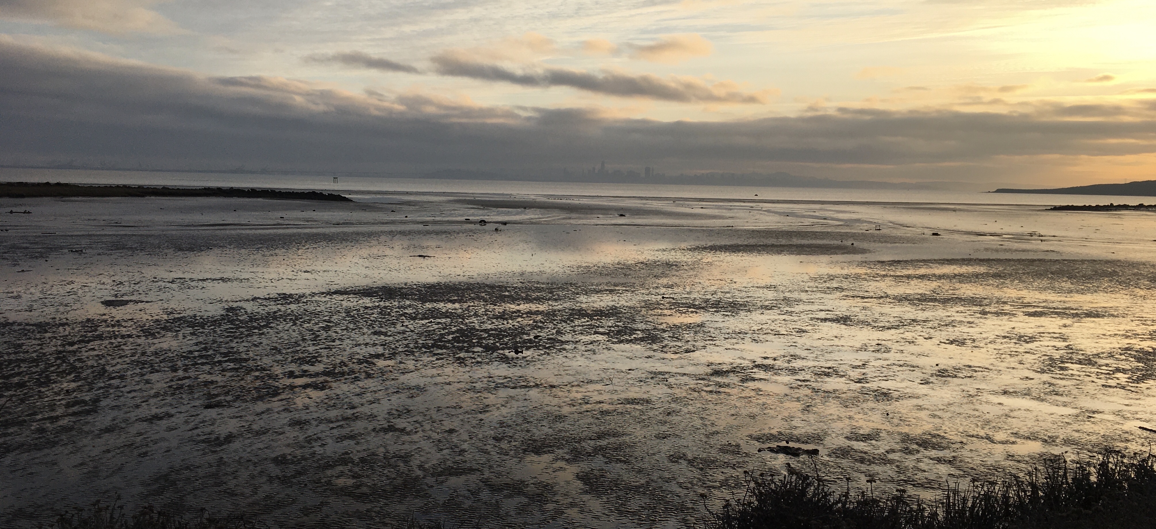
The once-living shorelines remembered in the lithographic engraving show a lost site of commerce, but of sociability, one determined and experienced by the rising and the falling of the tides, in ways that captured a knowledge of landscape we no longer share, but from which the money, flying from commerce and industry, seems to have fled, until the shore might be restored to not only a habitat for birds, but something more than the washing up of detritus along its sandy shores that not only existed before the 1972 Clean Water Act ended the dumping of refuse directly into its waters.

Rancho San Antonio

The overlapping of the waters and lands in the bay was, however, recuperated at a time shortly after the enacting of the 1972 Clean Water Act, an attempt to rid the Bay of the waste that was directly pumped into its waters–without any treatment plants.  The attempt to revision the ecotonal intersection of the region seems something of a rehabilitation of its shoreline, if the abandoned stretches of shores persisted in Point Richmond and in the Emeryville Mud Flats seen from the highways.

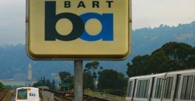
But the way that public transit system of the Bay Area bridges land and sea is, to an extent, commemorated in the simple “BA” logo of the seventies, whose “B” and “A” interlock and overlap in something like a bold rounded font, whose overlap, as if a Venn Diagram, is a cognitive bridging of land and water on the edges where land and water so gracefully intersect–the ecotones of the Bay Area that the Rapid Transit can bridge.  The iconic lexeme maps the region, if in abstractly oversimplified form, indicating the ecotonal mix by the smooth font of the registered trademark and copyrighted logo–although it erases the far more complex history of negotiations with the shores we have lost.  But the environmental optimism it expresses of public transportation across the bay link the regions in something like a neat resolution of the final rejection of plans for more building around the bay.

BART

Several of the above maps shown open an area of the muddy shoreline, although that shoreline still seems a barrier for the city’s own far less fluid income divides.

This post was begun before seeing the successful “Above and Below: Stories from Our Changing Bay”  at Oakland’s Museum of California, but was revised and expanded with its benefit.

1 Comment

February 15, 2014 · 9:42 am

The Curtailed Circulation of Paper Charts

The National Oceanic and Atmospheric Administration’s Office of Coast Survey has long issued authoritative charts of the nation’s coastal waters.  But from this coming Spring, that office of the Dept. of Commerce will cease to print the lithographic charts it has long reproduced on paper in such glorious precise detail.  What is billed as a major move of cost cutting no doubt reflects the dominance of electronic maps consulted on laptops or hand-held devices.  But it also will place a new emphasis on reading charts on the screen media and by comparisons to GPS, using computer screens exclusively rather than in consultation with paper charts.  Is the cost of charting the shifting form of coastlines worth the cost of ceasing production of revised maps?

As a response to the difficulties in reprinting up-to-date paper charts for sailors who often fail to purchase them, the Coat Survey has decided to shift only to distributing charts via on-demand printing, PDFs or electronic charts as of April 13, 2014, both to allow access to updated nautical charts, and allow access to digitized versions of the full range of coastal charts on NOAA servers.  Increased use of digital and electronic charts has dramatically diminished the profitability of commissioning individual lithographic maps, marking an end of an era of American cartography in print.  Yet does the close of a tradition of lithographic reproduction of maps effectively distance us from the delineation of coastal waters?  How crucial was the role of lithography as a medium to translate coastal measurement and tabulation into a recognized graphic format?  Or is the content of the chart so easily separable from the medium?

An online kerfuffle resulted from the announcement of curtailing the longstanding precedent of government-sponsored map printing in a cost-cutting move, and offering of maps only in downloadable form.   The suspension of the paper lithographic charts over which NOAA long exercised a sort of monopoly–and set a standard of the accuracy of nautical cartography–is difficult to take.  It seems, for one, perhaps the final extension of the dominance of online maps and mapping, and to reflect the dominance of laptops or tablets as navigational tools–something that few outside the world of practiced sailing would have imagined as a use for those media.  Although there will be a guaranteed possibility of print-on-demand charts (POD’s), ceasing to print those beautifully detailed lithographs appears a victory for the digitized map-use, most often associated with the digitized format of servers like Google Maps.  While not subtracting the paper map from circulation, it leaves most folks dependent on the two-inch screens of Palms, tablets, or laptops, with built-in Garmin chartplotters or other GPS systems in a sort of snazzy interface.  Indeed, the shift in the circulation of maps has potential reverberations for map literacy and readership, by removing chart-reading from the sort of intense engagement such as pencil marks, course lines, erasures, or time marks that were so long the norm on paper charts.

Are the knee-jerk reservations about ending the printing of lithographic charts based, we might ask, on a romantic the fetishization of the coastal chart–those truly beautiful creations?  It might as well merely register a changing threshold of map literacy.  The most compelling reason is the dominance of a new sense of interface that downloaded maps allow, as well as to keep pace with the expanding number of on board on-line devices from laptops to smart phones.  When GPS allows one to plot one’s global position at sea with an accuracy of within some 16 feet, the nautical chart seems to lose its accuracy.  Although the reactions to NOAA’s s Office of Coast Survey has been quick and often lamented the end of the nautical lithograph, the decision to stop the production of nautical charts is not only regretted.  Indeed, DuckWorks magazine has called paper charts the most dangerous thing for navigators–both in preserving a sense of incorrect measurements and obstructing access to the most up-to-date accurate cartographical information with a direct GIS interface, as another ghost of information worlds past.

Yet if downloadable charts promise an end to the problem of the inaccuracy of outdated maps, the medium also suggests a distinctly different notion of encoding data in nautical charts, now often restricted to the parameters of the medium of consultation–Tablet, handheld GPS device, or even iPhone–that seems the inevitable consequence of the shift in attitudes toward the disappearing the materiality of the nautical chart.  Even if Jeff Siegle of DuckWorks powerfully centers the debate around the “chart-image” rather than the medium, in an era when it’s a truism that “the medium is the message,” doesn’t the shift to downloading digitized versions of coastal charts onto slippy screens suggest a shift in the “period eye” by which we plot expanse on maps?

As screens of laptops are increasingly the primary forms for plotting navigational routes, and the use of chartplotter products or other apps remove the physical map from its centrality as a tool of noting changes in coastline, wreckage, or debris.  The consultation of paper maps is a rarity in an age of the coastal navigation by GPS, and the increasing role of on-line computers on board most ships.  In contrast to the security of the information on monitors, and use of apps as much as instruments, create a new sense of how we interact with nautical space; the frequent revision of paper charts create a sense that the map may often be outdated or incorrect.  Indeed the very iterability of the map–and the monthly updates that NOAA has come to release monthly probably made the choice to go online incumbent–is of a piece with the downloading of updated versions from their server.  Over time, paper charts have been less often consulted in relation to screens, and offer unwieldy forms of interface.  Even if the ability of reprinting of future charts from PDF’s of comparable durability is not that clear,  NOAA will certify print-on-demand chart sellers; the market for paper maps has dramatically shrunk as the authority of the printed chart has eroded over time in comparison to the electronic charting tools.

The announcement to cease printing paper charts seems another page in the “end of maps”–or at least of the lithographic staples that provided a basis to note different observations, routes of travel, or changing plumb-line depths of waters.  The announcement is perhaps not surprising, but suggests a conspiring of reduced funding after federal budget crises, decreased commercial demand, and the victory of the touchscreen viewer as a medium for plotting course have led to the end of unfolding a chart to read expanse, despite the huge distances regularly needed to be covered in nautical travel.  Could one ever depend on a touchscreen format or the individual tiles of a slippery screen’s surface, however, as a medium that allowed one to contemplate or project a course of nautical travel with similar expansiveness?  Practiced sailors lament that the map, while perhaps not a primary guide, augmented skills of orientation with “added redundancy” not only as a check, on which sailors were able to fall back, even as captains relied upon more easily updated electronic charts NOAA released on their servers.  When GPS crashes or goes out, doesn’t one have the same ability of control over one’s course–and a broader framework for judging course–on a paper chart?  But the medium of the printed maps faces an uphill battle in an age of GPS, when the use of dividers to plot bearings seems as rare as astronomical bearings.

Bill Griffin, general manager of Fawcett Boat Supply in Annapolis, Maryland, doubts that “any prudent mariner is going to have paper charts,” and refused to see his own line of sales of paper charts as declining:  “I don’t see paper going away anytime soon.”  Yet others are ready to celebrate the paper chart’s decline and say goodbye to an antiquated medium.  Maine captain Jeff Siegle, who sails regularly on a coastline “strewn with the remnants of sunken vessels that went aground on the rocks, believes that the second most dangerous thing to have aboard a ship is a paper map.  When advanced chartplotter software such as Coastal Explorer reliably record nautical position automatically, the electronic form of mapping allows a degree of interactive reading of the map that contains all the abilities for leaving notations that paper maps possessed, and an active interface with other digital media.  The electronical mapper from a radar pilot, moreover, allows one to visualize position on a screen that one can readily mark:

Electronic Mapper from Radar

Yet is one not sacrificing a degree of map literacy, including the depths taken by plumb lines from boats, that defined earlier NOAA maps, combined with local visible topography?  In maps such as this section of the existing chart of the Valdez Bligh Reef, one finds a path without latitude or longitude in electronic maps, and a far more static rendering of space.  Are we too accommodated to reading a Google Earth interface to negotiate the business of specific details included in the paper chart, or of how a sailor might process his relation to nautical expanse, or are things like the sounding of ocean depths simply TMI once one has registered one’s path?

Valdez Bligh Reef Chart

The sense of scale that a paper chart might afford of the surrounding waters intuitively seems more accessible than the more restrictive reading of an electronic map, as the unfolding of a larger map of the region seems to afford a degree of spatial legibility that stands to be increasingly sacrificed with the diffusion of small-screen tablets, whose ability for zooming in and zooming back seem less easy to map against the area where one is traveling.  Even when one has full access to all the PDF’s of NOAA on one’s own two-inch handheld palm pilot, tablet or iPhone the circumscribed screens of display threaten to remove their readers from a greater context, or a familiarity with shorelines, removed as it is from the encyclopedic detail of the synthesis of measurements that are encoded on the paper chart.  If paper charts were rarely utilized on many ships, eclipsed as they were by electronic charts, retiring the chart seems a sacrifice that responds to the dominance of our habituation to track, zoom in, pan, and zoom out that the static image on the paper chart does not allow.

Even if “We know that changing chart formats and availability will be a difficult change for some mariners who love their traditional paper charts, but we’re still going to offer other forms of our official charts,” Capt. Shep Smith, responsible for the US Coastal Survey’s division of Marine Charts, put the best face on the circumscription of his services to the provision of PDF’s. Given that “advancements in computing and mobile technologies give us many more options than was possible years ago,” the ability to make maps available for anyone to download created a sense of accessibility and widespread distribution of charts always able to be updated–what is more dangerous on a boat than an out of date chart?–and allowed the world of nautical charting to migrate into the most popular interface of our age.  It’s great to download an accurate PDF of the entrance to San Francisco Bay, NOAA Chart 18649–“Entrance to San Francisco Bay.”  On it,  one can find the content of earlier charts, or zoom into details at different scales, as much as its relative pixellation will allow, maneuvering in virtual form across the multicolored screen as a surrogate for moving through space.  What is lost by a lack of the broader context of the chart or its interface with compass seems as odd as the sextant–or the cavalry and bayonets which Barack Obama cleverly invoked in response to Mitt Romney’s unwarranted concerns for our navy’s size.

The use of tablet computers and GPS chartplotters on both larger, commercial vessels and pleasure boats suggests a different approach to the encoding of information in nautical charts, and indeed in using the map as a basis to plot routes of travel, which are frequently confined to repeated pathways.  But the frequent compression of the huge amount of graphic detail on one’s bearings to the form of a small screen–and the need to invest in a large enough screen to view the PDF in a visible form, or to find outlets where downloads can be printed on durable paper.

Golden Gate Chart

To be sure, the general differentials of depth are easily observed, lying as they do around Treasure Island, the pivot point of the Bay Bridge, but lines are less easily traced, measurements be noted for future sailors, or just for oneself, to be stored in a drawer, cabin shelf, or brought ashore for future examination.  As we store fewer hard copies of maps, how does this change our relation to the map as an object, or change the storage and circulation of cartographical records that one can consult?  Does the rise of digital mapping, as feared, decrease the sort of exchange, augmentation, and criticism of the cartographical sources or to the base-map?

The age of celestial navigation that first encouraged the rise of paper charts might be traced to the rise of a mathematics of charting nautical position whose need no longer exists with GPS services and the availability of electronic maps.  If the eulogy of the Salem Marine Society for Nathaniel Bowditch, author of the American Practical Navigator (1802) that featured expanded tables for navigation proclaimed that “the name of Dr. Bowditch shall be revered as one who has helped his fellowmen in time of need, who was and is a guide to them over the pathless oceans” and needed “no monument” to be kept alive “as long as ships shall sail, the needle point to the north, the stars go through their wonted courses in the heavens,” the expansive coastline that Bowditch traced from the Caribbean islands in his “Epitome of Navigation,” the pathless oceans now seem to have paths and positions without bearings.

Bowditch-1st-edition

The broader canvas of Bowditch’s actual chart covered the entire Atlantic, over which he sought to provide tables of reckoning to tabulate navigational position within a frame of longitude and latitude that could be readily consulted, charting an oceanic expanse from coast to coast, linking the ports on its facing shorelines, framing a totality not easily processed or comprehended on even a wide screen:

Bowditch Atlantic

What are we saying farewell to, if not an idea of reading an expansive map in paper form that can be readily preserved in the observatory of a boat, and displayed to its passengers, and to a shift in how one stores one’s own nautical maps of a course one often knows relatively well, and navigates over time?  The new basis for map-use (and map legibility) suggests both a far more limited field and a less personalized basis for translating personal tacit familiarity in plotting course to the map’s format, and a far diminished intersection of map with travel lines, once limited to parameters of backlit screens that offer limited opportunities for convenient collective consultation, or for unfolding to gain a broader sense of nautical course or compass lines.  Even if we are easily able to plan courses and trace routes on electronic screens by grease pencils directly on the surface of a screen in ways that can be easily erased, and download new updates of paper charts onto a handheld, and measure distances with nautical tools atop screens, if not rely on apps, does zooming in and out on screens of electronic form offer the broader contextual that a paper chart provided?  While I doubt  that as a landlubber, I can truly say,one worries that the end of the translation of nautical measurements to the sort of graphic syntax that lithographic maps long offered are truly as easily preserved in pixellated form.

New NOAA mapping format

While the interface of an electronic map with GPS may be a read herring to the downloading of charts as PDF’s , the display of data in electronic maps that is centered around the position of a ship or vessel on ocean waters seems to abstract the vessel from its surroundings:  the display of data in electronic maps is constructed about geospatial position in ways that antiquates the role of reading a chart in order to determine nautical trajectory or course, by centering the screen around ship’s location rather than immersing the reader in a system or abilities of measurement. The victory of the medium of display seems a victory of the ready-made–if not a lazy model of map making.  Like the self-driving Google Car, indeed, the courses of travel on coastal waters are not only almost mechanized on most ferries, or among commercial pilots, whose routes of travel are increasingly computerized, or driven in ways plotted and tracked on digitized maps.

The trimming down of NOAA would no doubt shock its founder, Thomas Jefferson, or William Maury, whose intensive coastal surveys synthesized new nautical knowledge in important ways.  Moreover, in an age of global warming–when we need clear precedents of water-levels and coast detail as something like a benchmark for future decades, the production of paper maps hardly seems an appropriate bureaucratic penny-pinching.  The decreased production of paper maps suggests not only a new use of the map as a basis for record keeping, but a decline in the literacy of reading the detail of our formerly exacting coastal surveys from the days of 1862.

But the very shifting of our coast-lines also suggest the need to provide readily available updates of the configuration of coastlines (who would have thought it?) in the wake of meteorological events like Hurricane Sandy or super-typhoon Haiyan, which call for the immediate remapping of a coastal bearings. And the digitized versions of these maps would offer a clearer interface with newly emerging weather patterns, not to mention the scattering on coastlines of debris from nuclear reactors.  At stake is, essentially, whether electronic charts or downloadable PDF’s offer a format removed from the tactile knowledge that is considered the basis of nautical navigation.  If the basis, it is not the sine qua non, but it does provide an  eery bit of evidence of the colonization of GSI of the world of the ocean seas, as the ocean approaches a form of ready scanning and tiling that stands at a far remove from the tactile sense of unknown otherness once associated with them.

With the dominance of the practice of mapping actual position, we may sacrifice the notion of the structuring of voyages exploration along routes of known islands plotted on a global, rather than a local, surface, one senses, together with specific ways of mapping travel in oceanic space or the ocean as a distinctly different medium of travel.

800px-1544_Battista_Agnese_Worldmap

But the question of how we will continue to navigate our coasts with safety of necessity depends more on understandings of precision and efficiency than it is to the range of options of nautical travel.

Leave a comment

Filed under chartplotters, Downloadable maps, Google Car, Google Maps, GPS, Joseph Nigg, Nathaniel Bowditch, Office of Coast Survey, San Francisco Bay

Mapping Open Waters: Bay or River?

The relation between land, sea, marsh, and landfill provided something of a dilemma of cartographical rendering in the Bay Area, mirroring the fluid relationship that has long existed between land and sea.  But if fluidity of the shoreline of the San Francisco Bay was less understood in terms of erosion, global warming, coastal flooding, and king tides back in the 1950s, the human fiction–and graphical statement–of the map of expanded bay fill provided a potent image to engage the shifting contours of land and sea.

The grassroots community activists reacted to it to protest plans for a radical narrowing of the Bay, whose success created the first inter-city compact for shoreline preservation with broad consequence for habitat conservation in the Bay Area–preserving tidal flats, coastal marshes, and wetlands that stand as a living model for conservationists, in close proximity to the city and coastal highway–as well as a legacy of the protection of open waters.

The subsequent designation of a large strip of coastal lands as a margin including Regional Protected Areas would later cover 1,833 acres of coastal lands and tidelands from the Bay Bridge to Richmond, along eight and a half miles of coast; the removal of all hazardous chemicals and garbage from 1998 restored the seasonal wetlands that were developing atop landfill in the seventy-two acre meadow, which was restored for $6 million over five years in a model to protect habitat and open space, as well as restoring a protective barrier of coastal wetlands that has long helped to protect the shoreline and bay. But the buy-in of 4,000 stakeholders in the multi-year project of habitat restoration and native habitat types however began from a protest map.

The complex bayshore that bridges four to five individual cities in the East Bay presents a complex picture of landscape and shoreline preservation and conservation, one whose sense of wonder and interest was in fact fought out in maps: if the mosaic of shoreline restoration, habitat preserves, parks, and greenspace that dot the coastline of San Francisco Bay between Oakland and Richmond offers a unique way of respecting open space on the margins of developed land, offering a landmark constraint for building out into the bay, the battle of visions for bay conservation were very much waged out through how mapping redefined the individual’s relation to local space and the world.

The story of coastal preservation that has often been cited as a model of a broad range of stakeholders began from a map. When the Save the Bay organization was formed by an improbably interested Berkeley patricians and Sierra Club members to prevent the waters from development and city housing that proposed building out into the bay in the post-war period. The military engineer John Reber drafted a plan that would reduce the bay dramatically, eliminating wetlands by adding landfill West Berkeley into the San Francisco Bay, in a monument of post-war engineering. The project of landscape modification bore all the hallmarks of modernity, and would have dramatically shrunk the bay’s open water, as much as open space, narrowing them by a massive fill to dramatically shrunken size, as well as the expansion of shipping lanes in Marin and Sausalito, that would have altered the Bay Area.

Proposed Barriers in San Francisco Bay (Reber Plan)

The triumphalism of the Army Engineers seemed almost to unite the U.S. Army bases in Alameda as a guideline to shape a modernistically sleek shoreline, punctuated by shipping corridors the open waters would accommodate. The expanded plan identified with Reber and the Department of Public works was announced quickly in the postwar era, as a massive project of infilling tidelands for a deepwater port, airports, and military bases by 1949, that would imagine an expansion of greater pierspace and nautical traffic in a Bay Area that seemed poise for financial growth as a hub of trade, as well as military outpost, expanding an “industrial site” in the smaller cities of Berkeley and Richmond, now equipping them with a airport terminals and a permanent Naval Base, and a Torpedo base in Hunter’s Point, expanding the military presence in northern California far beyond the military base in Alameda.

Reber Plane for a deepwater port, airports, and military bases (1949)[1580 x 1224]

Although the proposal for a contraction of the open waters was set as a landscape view, as if to naturalize it within the scenery, the 1949 proposal attracted heightened possibilities of greater infill that led to the reduction of the San Pablo Bay after its development of a massive landscape intervention for ten years that is rightly included among possible destructions of San Francisco by overdevelopment, even if it would have impacted the entire Bay. But the proposal for subdividing and radically reinventing the San Francisco Bay and bayshore as a basis for further development came to a rather sudden halt after over ten years of expansion, stopping in its tracks the promotion of a a modernistic streamlining of bayshore and bay waters as sites of economic development, as the plans were adopted to proposae an alternative model of conservation.

The questions about conservation that were posed at the local level on the East Bay mounted a staunch opposition, applying pressure as it coalesced through the compelling rendering of an alternative map, questioning the public commitment to a new level of landscape change and leading to a sense of reckoning about bay waters. The logic of remapping the plans of development, and the effectiveness with which a map that posited the problems and dangers development posed, however won buy-in from multiple stake-holders–now exceeding 4,000–of huge consequence.

1. What allowed the revisioning of the Bay’s open waters to be preserved? The Reber Plan would famously attract condemnation as an artificial reduction of the open waters to a shipping land, the power of the map in mobilizing resistance suggests an episode of cartographic creativity as much as public mobilization.

But the very possibility of local resistance to such rebuilding preservation of greenspace in Tilden Park had no doubt provided a stunning achievement for the Works Progress administration, allowing land procured from East Bay Municipal Water District to be converted into the East Bay Regional Parks, in one of the great New Deal projects of land conservation, leading to a decade of landscape transformation across 4,300 acres, the potential of converting lands by the precedent that invited residents to explore the local greenspace must have provided an encouragement to the preserving the bay. And the cartographic celebration of the conservation of lands and expansion of East Bay parks was able to provide a powerful, and indeed liberating way to contemplate and engage the material landscape.

The luxurious relief maps created by the Civil Conservation Corps who had administered the East Bay parks through 1942, since restored, invitingly celebrated pathways to explore and navigate the greenspace in plastic form–made during the 1930s–that preserved an image of a sense of rural versus urban space, back in the days when the hills were far more green.

While the relation between the shore and bay is hardly the focus of the relief map made in the early 1930s for the East Bay Regional Parks–perhaps as a working model to demonstrate the easy linkage of city to open space that the acquisition of lands from the Water District allowed–the careful shading of the bay waters in a gradation from deep blue to the shore provided a quite detailed sense of the sensitive of land and sea that the detailing of several creeks underscores. The aesthetic contemplation of landscape was a consideration of land and bay–or demanded one, offering a rendering of the complex of open space, lakes, creeks, and estuaries as a unified whole, and aesthetic unity, that the transformation of the bay to a shipping channel–or “river,” as polemic maps of the Save the Bay project would affirm. The old piers of Berkeley’s marina was not clearly landscaped, but the shore was defined by the tracks of the railroad, in the restored East Bay Parks relief map in a model of conservation and what land conservation might achieve, and indeed the possibility of securing land against over-development, a plan accentuated by the addition of rustic architecture and monuments in Tilden, Lake Temescal, Sibley, and Redwood Parks. The monument to conservation that had become part of the sense of place contrasted in their ethos with the stark shipping lands that would have altered not only the shoreline, but the bay waters as well.

The counter-map of the Bay waters was inspired by the subsequent brutality of adding infill in the Reber Plan.

Reber Plan: Proposed Barriers in San Francisco Bay (1959)

Designed with the apparent abandon of a crayon coloring book, in order to maximize the piers for arriving container ships in the postwar boom, the Reber Plan suggested a startlingly bold intervention in natural space to accommodate economic growth, crudely imposing economic infrastructure as if saddling it on the bay. For the Army Engineering Corps, the shallow East Bay coast, and large tidal lands, beckoned re-engineering provided a plan to envision the region in terms of “areas susceptible of reclamation” by the year 2020, back in 1957; years before the Bay Bridge, the bay’s low waters seemed ideal for a long-term plan of engineering a shipping corridor from Richmond to Oakland, domesticating the bayshore to maximize its economic utility and shipping locks would contracted San Francisco Bay, in a vision of development imagined in Washington, DC, with the endorsement of the US Chamber of Commerce.

For the project of land reclamation that the Army Corps of Engineers envisioned in the postwar era were a program to transform the settlement of the Bay Area in ways that extended pathways of marine communication by shipping industries as well as the U.S. navy in areas that were long predominantly marshland, imposing a dualistic opposition between “land” and “sea” in an area where the barriers between land and sea were blurred and fluid, and indeed on which local ecosytems were dependent: the eclipse of the regions of the Sacramento River’s expansive estuary were defined by marshland, tidal flats, wetlands, and in the East Bay shoreline, especially in Berkeley, seep or wet soil that the Plan did not register or accommodate, in its premium on economic expansion and strategic development. The coastal mapping projects that the United States Coastal Service had long engaged were put aside, and the stark land/sea duality proposed a limited way of seeing or imagining ‘development’ that seemed a logic of urban expansion that ran against the ways that the conservation ofEast Bay parks ha provided an important precedent to to manage, indeed taking it in different directions than the mapping of open space had set a powerful precedent by the 1940s–and a future that they would want to resist. If a full third of the bay had been diked off, infilled and built out that radically shrunk its open waters, Save The Bay was founded in 1961 to stop the acceleration of projected infill that would severely compromise the Bay, and has survived as an ecological monitor on infrastructure expansion and one-sided plans for development that would adversely affect the integrity of the Bay. The proposed reduction of wetlands and wetsoil along the Berkeley shore became a precedent for the ecological vulnerability of wetlands and bayshore to expansion, at a time when only a small fraction–but a tenth–of the Bay Area’s wetlands remained, and almost none of its shores were publicly accessible to residents, in the manner that the preservation of parks in the hillls provided such an important precedent that led directly to the 1965 foundation of The Bay Conservation and Development Commission (BCDC) to restrict or limit future projects of adding infill to reduce its open waters.

The relative murkiness of the areas the Army Corps of Engineers projected as ripe for infill envisioned a narrowed body of water without coastal access, in sharp contrast to conservation of greenspace around the expanding city:

The vision of the massive constriction of wetlands, tidal marsh, intertidal plains, and shallow sea or seep soil marked 325 square miles a “potentially fillable bay” as if it was an area for potential economic expansion, as much as urban growth, developing the port city as a set of functional shipping channels, seeking to crystallize a notion of functionality that offered no space for conservation. While the infill would have doubled Berkeley in size, the dramatic disappearance of San Pablo Bay by a hundred miles, even if it wouldn’t have obviated need for the Richmond-San Rafael bridge, already opened in 1956, would have been a development project of San Francisco’s coast that expanded the considerable growth of San Francisco by landfill to the entire Bay Area.

The logic of development that the vision of the Army Corps of Engineers promoted publicly in 1961 Save the Bay crystallized around a cartographic revision of Reber’s map was, in a sense, a critical turning point, or crossroads–suggested by the etymology of the word “crisis”–in how the bay could be actively remapped in the face of development, more recently culminating in how San Francisco Estuary Institute has mapped past against present landscape to orient us to historical ecology of the man-made nature of the shoreline we have inherited.

Viewed a bit differently, in materials that were provided by Save the Bay, to situate the organic place of the bay within the western landscape, the rivers whose confluence runs into the Bay join waters from the Sacramento to San Joaquin rivers run to the San Francisco Bay as a delivery of sediment from the landscape, uniting the Sierra Nevada and Coastal Range in its waters.

Save the Bay

If the bottom topography of the Bay had been dramatically altered by the flushing of sediment downstream rivers as the Sacramento, sending sludge into the Pacific Ocean, the arrival of sediment may have set a precedent for the proposed addition of infill that would deliver unprecedented sediment to the San Francisco Bay’s seabed.

But the “green shoreline” of the East Bay suggested a unique biophilic resistance to the addition of landfill, preserving the sense of open waters with which this post began.

So radical was the scale of the transformation of the Bay that Reber drafted to provoke a catalyst for the collective buy-in for opposition at the start of the environmental movement. The counter-map became a rallying cry of the defense of the bay’s open water against development by the shipping industry that affirmed the defense of a privileged relation to place for Berkeley residents, shocked by the alienating nature of the expansion of the lines of old wooden docks that dotted much of Richmond and Oakland, the two largest harbors in the East Bay. The plan would have both promised economic development, and expanded housing, into the Bay, eliminating open waters by amalgamating harbors to a straight manmade shoreline that would have connected the San Rafael Bridge and Alameda Naval Station, imposing expanded shipping lanes over the bay waters, that, as its effects were mapped, were realized to radically threaten habitat. The remapping of the preservation of bayshore helped radically change the perception of the water from the land, that helped to create a place where, when one walks today, the city and San Francisco indeed recede across the tidal flats.

2. The plans for developing the coastline by the addition of bayfill that would create either a vibrant port for pacific shipping industry were stayed as a rallying cry to mobilize opinion around the planned bayfill that would contract the East Bay, erasing wetlands that would be landfilled, dike or leveed for development, as growth of the Bay Area in the postwar period had already brought the filling in of entrance of the Sacramento River and five other rivers to the unique wetlands complex of the Bay Area–a lost environment that has been contracted by urban expansion and the reshaping of the shoreline ecosystem of so much of the bay, from the south Bay to the north bay to the estuary complex that framers of the contracted image of the San Francisco Bay to shipping channels that Reber envisioned took for granted as an inevitable process of development–but which we are now far more liable to map in terms of loss.

The protest to “Save the Bay” was animated by a counter-map that animated resistance that asked residents what sort of bay they wanted to live beyond. The abstract map of a landfill project of 1961 came to concretize the costs of development, and served–perhaps for the very reason that it was not detailed–to generate a broad coalition of protest against the imagined expansion of housing and shipping development in the East Bay. The printed map delineated how much was at stake in proposed coastal transformation so persuasively it became a powerful logo and rallying cry for the Save the Bay project from a new alliance of environmental groups and other stakeholders: if the military engineer’s map documented the modernistic redesign of the natural shoreline, in ways that extended the compromised habitat loss in other areas of the Delta and estuary, the convincing contrast between two visions of the bay–“Bay or River?” the map’s legend directly framed the future of the San Francisco Bay–put breaks on the continued development of much of East and South Bay. The map helped pose a simple question that asking readers to consider themselves stakeholders in a bulwark against massive environmental change in suggesting the near-apocalyptic scale of added landfill in dark black. While the story has been often told, the vital role an engineering map played in pushing back against vested propertied and industrial interests is arresting.

It was begun by a realization prompted from seeing a map announcing the future re-engineering of the San Francisco Bay, reprinted in the Oakland Tribune, and contemplating the possible extent of changes that would reconfigure the shore of an area that drains up to 40% of the land of the entire state, that prompted the preservation of its open waters. The prospect of such a radical remapping of the region’s open water–more than its shores alone–invested the planning map drawn up by the Army Corps of Engineers triggered the attention among three women over tea, contemplating the reduction o the Bay–and the beauty of vistas from their windows–against the areas up for potential expansion, that encapsulated and condensed the areas the Army Corps identified as susceptible for landfill.

The simple two-tone graphic generated a broad awareness of the region at a significant time in urban development, and helped to brakes on the inertia behind the radical reengineering of the bay as a shipping lane. The Save San Francisco Bay project that was the contribution of three women tied to educational groups and educators at the local university by marriage mobilized public opinion around the preservation as the wife of the past University President, Kay Kerr, herself “very disturbed about the filing of the bay” assembled a group disturbed by how “ongoing filling of the edges of the bay for airports, harbors, subdivisions, freeways, industrial sites and garbage dumps,” threatened to transform its open waters to a biological desert. Aptly, she calling an assembled group of conservationists and neighbors to order a meeting in a home overlooking the bay by a map of a produced by the Army Corps of Engineers calling for adding landfill that would leave “little more than a ship channel down the middle,” as she put it.

Proposed 1959 “Reber Plan” for Barriers Expanding East Bay Piers as Shipping Corridor

The City of Berkeley eager to expand to provide more housing, sought to double in size by filling in 2,000 acres of the bay shallows. Indeed, as late as 1980, the City of Berkeley hoped to expand the bay waterfront into a shopping center, resulting in the public trust over tidelands of the East Bay that preserved them from bay fill almost two decades later, in a suit that one of the first legal advisors of the Save the Bay Association directed as amicus curiae, in City of Berkeley v. Superior Court (1980) 26 Cal.3d 515, continuing to defend the bay wetlands’ integry against a defined shoreline.

The ability to stop the projected bayfill set a precedent that altered the relation of citizen groups and ecologists to the preservation of coastal habitat and parkland. The power of the rhetorical contrast between two maps of the future framed a vision of the local environment and access to a coast in an effective manner that one can forget looking out over the living landscape of the Bayshore Trail, but that provides a powerful reminders of how maps mobilize consensus and embodied the wetlands and tidelands as a features we have only more recently detected in the Bay as a wetlands ecosystem, truly far from built space.

Continue reading

1 Comment

March 4, 2013 · 11:02 am