Mapping an Invasive Species? Eucalyptus in Berkeley, CA

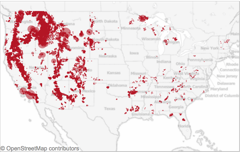
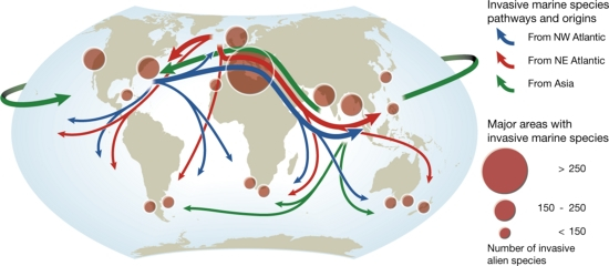
The mapping of invasive species on land or sea provides one of the clearest ways of visualizing our shifting ecosphere:  in mapping of the threat of invasive marine species to coastal ecosystems, Michelle Slosberg developed her marine map of the spread of invasive species in 2011 when an undergraduate at MIT.  She did so by mapping sites of high-risk areas of marine “invasions” along coastal waters, geo-referencing data on ballast water of ships to determine the risks of the presence of invasive species that were carried by ships from one ecosystem to another and specific to the northeastern coast of the United States.

Invasive Marine Species Mapped

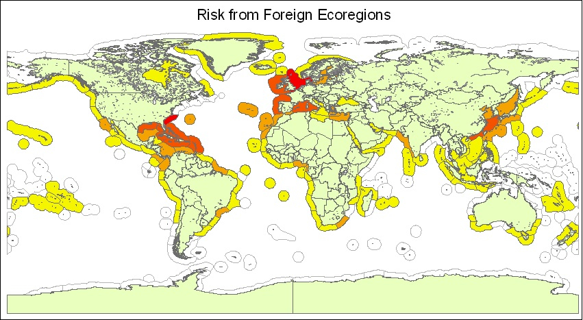
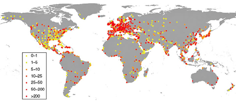
The vectors of travel in ballast water are shockingly widespread, and the container ships traveling from China to across the Pacific, or along the Atlantic, increasingly import species accidentally that are rarely noticed until they propagate:  the number of harmful alien species mapped worldwide have so grown that some 84% of the world’s 282 marine ecosystems are documented to contain invasive species, and in 2008 coastal regions with harmful alien species were dense in ecoregions in the Mediterranean, in the North Sea, and along the California shore and Hawai’i.

number_of_harmful_alien_species-1

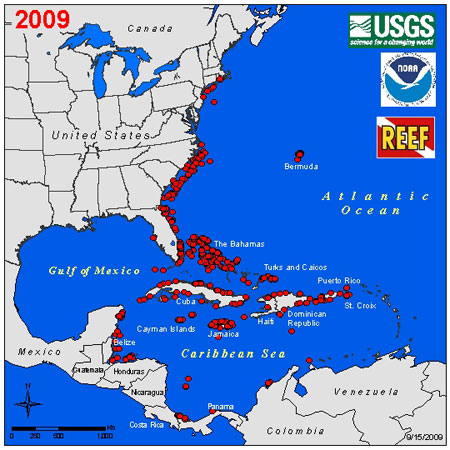
Blue waters note areas where fewer harmful alien species were found to dwell.

The complex vectors of marine migration of alien species have only begun to be mapped, but heighten anxieties about the definition of “national waters” or marine borders, increased by shifting temperatures of ocean habitats and lend new meanings to the maelstrom of modern life:

Major Pathways of Marine Invaders


Fears of the heightened potential of geographic relocation of species by mapping points of transfer paths of airline flights offer by linking regions of similar temperate zones:

map invasive_species

The category of the “invasive” redraws spatial boundaries–and inflects taxonomic identifications–to suggest a shifting map of the natural world, combining nature and culture and resisting the stability of a fixed map.  But mapping the spread of “invasive species” often charts less an invasion in early stages of development than a process of resettlement, as in this map of wild carrots that flourished after they arrived in our national borders 250 years past, but still classified as weeds in mid-western and north-western agricultural fields:

WIld Carrots in US

The wild carrot seems relatively benign, and was introduced at about the same time as domesticated carrots to US farms. But the introduction of eucalypts from New Zealand redefined the Bay Area, where I live, and the exploding trees that are native to Australia–where they are known as “exploding trees” and played such a large role of combustibility in the recent bushfires where they provided exploding fire balls in the air that led to the advance of walls of flame when sustained drought increased the volatility of what became an explosive landscape, a flammability transmitted through the flammable fumes created by vaporized eucalyptus oil.

Australian residents have long called the native species “gasoline trees,” rooting them in an anthropocentric landscape or imaginary, whose highly combustable oils are released in fires, and whose explosions–sometimes sending parts of their crowns to spatially removed sites–create their ability to magnify grass fires into explosive threats of devastating scope, ramping up the danger and scale of the bushfire in what seem spontaneous combustions geographically removed from one another without any predictable pattern. The explosion of euclyptus crowns that can travel fourteen miles in the air increased not only the intensity but geographic distribution of the Australian fires. But the explosion of eucalypts immediately known in the Bay Area was revealed in the Oakland Hills Fire of 1991, when the explosion of blue gums contributed some 70% of the energy during the devastating fires that destroyed upwards of 3,000 homes over days, leading to calls to remove the tens of thousands of blue gums and other non-native species from the ridges that had so long seemed to be a part of the local landscape for Northern California residents who had celebrated their health benefits soon after since their arrival in the late nineteenth century. While they soon exploded, the density of thin Eucalyptus crowding once open spaces raise questions of whether they belong or don’t in this landscape–and what sort of roles the eucs have and what they are even doing there.

Dan Rademacher, Eucalypts North of Claremont Avenue, East Bay

The danger of labeling an “invasive species” by mapping its lines of incursion is to constitute a category that elided the existence of external environmental influence.  But how to chart the undeniable impact of commercial practices or climactic shifts that serve to facilitate the geographic dispersion of an ‘invasive’ species?   The piles of perfumed litter that fill the roadsides of many of the East Bay hills, cascading downhill into the road, provide a nice remembrance of nature, but also are undeniably dangerous kindling for future potential fires, releasing oils in the air not only powerful in fragrance but combustible. And the multitude of Eucalypts that we see locally echoes the spread of blue gums and other eucs across delicate habitats across Malawi, South Africa, and Chile, crowding out local species, as in Patagonia; these large fast-growing plants of Australian origin suck up water and cast shade over other plants, and foliage, crowding out other native plants, in ways that don’t create calls for nativism–but biodiversity.

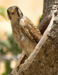
What of the habitats they afford or create? In the East Bay, the euclypts that crowd the hills are improvised shelters and sights of nesting for the elevated platforms that red-tailed hawks take as their eyries, advantageous for their height and stability to allow them to swoop down, and the great horned owl who often succeed them in the same sites of roosting. But the benefits that eucalypts afford these larger predators are cause for worry in themselves as creating imbalances in the delicate dynamic of the biodiversity of any place, as Allen Fish, who directs the Golden Gate Raptor Observatory, and has noted the advantages that shelter in tall trees can give to some species over those that, as raptors, occupy more specialized ecological niches: the eucs may often afford the larger avian predators a privileged position to swoop down into the smaller birds such as kestrels, spotted owls, screech owls, saw-whet owls, and and Coopers’ hawks, or even provide habitat for red-tails who will crowed out sensitive species from the grasslands and savannah, including long- and short-eared owls, and barn owls, that provide a fundamental role in habitat. How to map the effects of such invasive species in dynamic ways, as altering the ecosystems we often separate from maps?

Indeed, mapping the species’ ‘invasive’ nature–or even the term “invasive”–effectively renders transparent the identity of the pernicious plant as a bacillus, deflecting agency from economic practices to the collective species labelled nonindigenous; such maps become distorting lenses to foreground effects of a species’ dangerous tendencies to spread over space that remove blame (or responsibility) from the economic or climactic change to locate it in the species it tracks, and indeed flatten temporal change:  maps of invasive species prove a perfect example of the strategies for the power of map-signs to reframe the experience of nature illuminated by Denis Wood and John Fels.  A classic case is the dangers of rapidly reproducing predatory lionfish through the Florida keys, which having migrated or “arrived” from warmer ocean habitats threaten to destroy local marine life, whose presence can be highlighted, removed from its environment, in a striking map of its marine spread:

lionfish_dis_map

This sort of cartographical compartmentalization circuitously brings us to the battle over local eucalyptus trees, conducted largely around the invasive nature of nonindigenous Tasmanian blue gums long rooted in groves in the landscape of Bay Area hills.  Invasive species of plants are nonindigenous plants that spread in uncontrolled ways to an area they have never lived and lack predators, creating environmental problems and contributing to the extinction of native species and animals.  But how long can a plant be present in an ecosystem and continue to be labelled invasive?

Although airline traffic, like routes of ships, expands the network and increases the speeds at which seeds migrate across the earth, increasing the vectors of moving invasive species by accelerating contact between regions that did not share borders, introduced species–some 50,000 now exist in the United States–is conditioned by the suitability of the environments they arrive–few of which are on the west coast, although the travel of weeds alone cost California at least $82 million per year.  The very virulence of terminology to identify plants and animals as invasive–perhaps the biological threats of a postmodern age–has conditioned how we see the landscape before our eyes.

Recent debates around the proposals to clearcut 22,000 non-native trees in Strawberry Canyon and Claremont Canyon reveal a pitched battle in the Berkeley Hills and Claremont Canyon around labelling the Tasmanian blue gum eucalyptus as ‘non-native.’  Whether or not the Tasmanian blue gum eucalyptus  (Eucalyptus globulus) is correctly labeled as invasive is not only a question of fact, however, but reflects how one maps the place of the towering blue gum trees in the landscape they have created and long lived–and how one maps them as signs of fire-risk.  The removal of the trees that cover a large part of the hills, especially on the west-facing hills of Berkeley and Oakland, from the environment when mapped for clear-cutting, revises their place in Bay Area landscapes, and the struggle that emerges among environmentalists and planners (or local constituent groups, since the division is not so clear) reveals a battle between landscape and map, or a naturalized landscape of welcoming groves and a firescape dotted with unwanted risks, but also offering transcendent moments of their own.

timthumb.php

Many land-owners share deep-running concerns about the fire-dangers created by the branches, shaggy bark, leaves, and seed-pods, all containing highly flammable oils, and explosive proclivities of eucalyptus trees:   multiple vectors of encouraging fire-risk have led the tree to be demonized as primary culprits of the disastrous 1991 fire in the Oakland hills that destroyed so much property and claimed 27, as well as forest habitat.

The characterization of the tree as an invasive–and even as a weed–are all rooted in its change on the landscape, as much as unquantifiable expansion of fire risks.  None seem greater than the piles of as the bark that, shed, create a dry ground cover that inhibits future plant growth, and raises the specter of quickly igniting kindling that stimulate powerful underdrafts after its combustible oils ignite that would push a wildfire’s growth out of control, as updrafts push flaming bark ahead of the actual fire-front, onto the roofs of nearby houses, at the same time crown-fires spread the canopy of leaves create crown-fires among towering trees that carry the level of flames into the atmosphere.  Once their combustible oils ignite, leaves and litter are feared to fuel a raging fire, offering firewood as groves of Eucalyptus themselves explode and ignite.  Hence the fears summoned by imagined firescapes expanding by burning crowns and flaming bark thrown by winds that are provoked by those leaves’ presence.

eucalyptus

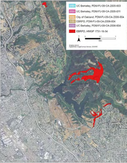
So what are the abilities to contain this vegetation whose vigorous spread seems to obstruct the growth of other plants in the ground area they cover by displacing native plants?  Attempts to map areas for their elimination reflect the fears of property owners, recently saddled with newfound legal liability for responsible land management, and responsive to the availability of federal funds to land management in the hope that future fires would not consume the lands they manage or impinge on nearby houses, and create any suits of environmental liability.  If causing huge financial damages is hoped to be avoided, the question of legal liability seems to have been the primary factor that motivated further attention from large-scale land-owners as the University of California or regional parks.  Already by 1991, the University of California at Berkeley began to clear thousands of “invasive” eucalyptus within the purple section, as part of a larger ten-year plan to remove 25,000 trees from its property–or the grove in the below aerial view in the Claremont Canyon, in projects of “land management” directed to such a reduction of risk.

Claremont Canyon Fire Mitigation
fire_pix

In December 2009, these plans received a setback as FEMA denied four separate grants to the University of California, Oakland and the park system for $5 million to remove eucalyptus, pine and acacia trees from the ridges above Oakland and Berkeley, but plans to for clear-cutting some 82,000 Berkeley and Oakland trees, a quarter of which lie in the protected Claremont and Strawberry Canyons, to be followed up by 700-1400 gallons of herbicide in land belonging to Regional Parks.  Similar interventions clearing eucalyptus encouraged the large-scale project to clear-cut the eucalyptus from the hills–dramatically revising the landscape of the region to be reforested by “native” plants whose seeds may lie buried by eucalyptus litter, and would be re-introduced after careful extraction of each and every blue gum.

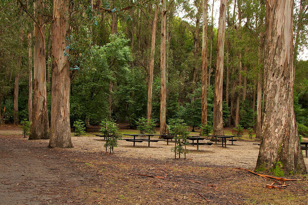
The hills were colonized and indeed filled by eucalyptus, and most especially the Australian import of the Tasmanian blue gums, around UC Berkeley’s campus, in Regional Parks that could be said to themselves litter the  Berkeley and Oakland hills–Tilden, Wildcat, Kennedy Grove, Anthony Chabot, Lake Chabot, Redwood, and Sibley–where the planting of eucalyptus replaced grasses and wildflowers that covered the region, as in this image of the stately eucs that provide posts for Kennedy Grove.

Kennedy Grove

Yet there is some evidence–not widely acknowledged–that cast the eucalyptus as something of a windshield whose presence in dense groves, by blocking winds, would actually fights wind-driven fire, acting both to break and interrupt the flow of the wind that bears the fire and as a screen to trap flying embers that might be in danger of spreading and starting wildfires.

The decision of UC Berkeley to once more seek needed FEMA funds of $5.6 million to fund for the clearcutting began in 2013, with hopes target an expanse of some 22,000 non-native trees from Claremont and Strawberry Canyon, in order to mitigate fire risks for residents haunted by the devastating firestorm that swept through the Oakland Hills in 1991 Oakland Hills that destroyed some 3,000 homes in the hills.  Many residents remember the Eucalyptus as fostering the rapidity with which the flames of the raging fire spread across the hills:  as “fuel-productive” trees that produce huge quantities of combustible litter, they are readily labeled high fire risks, and have few protectors.  Even though some 19,000 non-native acacia, blue gums, and Monterrey pines have already been destroyed, the destruction of the expansive grove destined to be felled and chipped would potentially end a major protective windshield, but would no doubt reduce how we quantify fire risk.  

And the current thinning of Eucalyptus and other invasive species as acacia and Monterrey pine in the regional parks in the East Bay hills, despite the mobilization of a community-based Hills Conservation Network (HCN) to protect them, will cover 2,000 acres, targeting diseased and dying non-native trees as much as converting the region to grasslands, leave a forest spotted with chemically treated stumps where trees once grew.

1024x1024

920x920-3Paul Chin (S.F. Chronicle)/July, 2015

Native Americans regularly burnt grasses to encourage their growth and spread their seeds, inhibiting the spread of trees. This allowed a massive spread of eucalyptus was so extensive in the grassy hills, where they were planted, erroneously to impede further local grass-fires.  The importation of the eucalyptus plant from 1850 was not only for ornamental ends, but to create fast-growing hard-wood forests was originally celebrated–if incorrectly–and presented, strange to say, as a further reduction of hazards of fire that regularly broke out in the grasslands.   They were also screens, to be sure, for further construction of residences and houses in the hills, valued as protective natural obstacles for privacy as houses gained increasing density on the hillsides, placing neighbors in greater proximity than they had wanted–and perhaps offering an even more welcome screen during Prohibition for private parties, as the eucs became part of the Northern California atmosphere, viewed largely as benevolent, convenient ways of adding further salubrious greenery.

The arrival of the trees in the Bay Area was spawned by unsuccessful lumber schemes, designed to meet the needed infrastructure and housing materials for the region’s growing population.  When the Judson Dynamite and Powder Company first introduced the tree in the 1880s to use their canopies and dense foliage in order to hide ravages of construction and muffle sounds of explosion or construction, the trees’ arrival was greeted in local papers as offering relief from the regular grass fires “that almost every year swept over the hills,” as was argued in the Oakland Tribune–a somewhat common-sense theory that research as now revived, although the argument that they offered wood that resisted burning was openly fraudulent.   At any event, the species robustly grew on plantations of trees as Frank Havens’ land company–the Mahogany Eucalyptus and Land Company–planted some three million eucalyptus and Monterrey pine in plantations of 400-900 trees/acre across 3,000 acres in the East Bay, billing the tree as “the most valuable on the face of the globe,” offering hardwood for fences, firewood, shingles, telegraph poles or “ecclesiastical furniture.”  

The tree seemed magically powerful not only in the rapidity of their growth, quickly attained huge heights, but the multiplying of trunks from their bases so their wood could be regularly re-harvested:  yet as it was realized not to be quite so suitable for milling, and  readily cracked, Eucalypt monoculture became jungles able to suck water out of the ground, leading to calls to thin the population that crowded out native species.  As the difficulty of combatting its fires became clear, the survival of the eucalyptus became something of an economic dinosaur that had outlived schemes for the sudden profits of crops of wood.

One can map the spread of the species first planted to disguise sites of construction, mitigate disturbing sounds, or create miniature parks or groves, to a mini-industry of plantations.  But can one ever map the losses or the density of Eucalyptus trees in the Oakland hills?  One can hardly call the tree non-naive to the state, given the century-long spread of the mid-nineteenth century arrival across different micro regions and environments from coasts to valleys to foothills to dry desert:

Eucalyptus globus state-wide

The prime danger that the trees pose to fire is in shedding their foliage, particularly after colder weather:  the 1972 freeze led trees to shed some 50 tons of debris per acre, over an expanse of 3,000 acres, creating a tinderbox of bark; the shedding was cleared by federal disaster funds.  The 1990 freeze played a considerable contribution to the disastrous 1991 East Bay hills blaze which consumed over 3,300 homes, and led East Bay landowners to work to prevent risks of future fires.  Regular clearing in times of intense shedding of shaggy bark–the eucalyptus trees’ “litter”–surely poses a more economic response to the need to mitigate fire risk.

But the characterization of “match sticks loaded with freeze dried fuel” shifted the blame from dead grass, wooden houses, and vacant lots–and points the finger at the invasive tree, and particularly to question its proliferation on public lands.  Loni Hancock, then Berkeley’s mayor proposed chainsawing down thousand of these “invasive species” or “weeds,” to reduce the dangers of fire-risk–albeit while creating dangers of soil erosion and changing the habitat.  The wide planting of the tree throughout the state not only served needed screens or decorative cover, but valuable fence- or scrap-wood and firewood, given its quick growth.)

sheddingbark

The “disorderly” trees that did not clean up for themselves were labeled “invasive” and even identified by the evocative term  “unwanted immigrants” that needed to removed from public parks and lands conceals the risks equally posed by landscaping with non-native shrubs or Monterrey pines.  Tasmanian blue gums have, no doubt because of their visual presence, coppicing, rapid growth, and towering size been seen as weeds, and also been defended as “native enough”–as residents of over a century and a half–continuing the arboreal personification and obscuring debate.  

Berkeley-based poet and Poet Laureate Robert Hass, longtime friend of the eucalyptus’ shaggy bark and camphor smells, got in on the fun when vaunting the blue gum as “California’s largest naturalized citizen,” aware of the serious stakes.  The debate on the trees’ status as alien immigrants set the stage for Verlyn Klinkenborg to enter the debate about “non-native” status of the blue gum eucalyptus, noting that the tree’s exclusion from a “native” land that existed over five hundred years ago relies on a pretty “imaginary snapshot of this continent taken just before European contact,” and, in omphalocentric New York-ese, questionably comparing their place in the landscape to the evolving arboreal landscape of Central Park, whose variety has long welcomed interlopers and foreigners in ways often imagined as a microcosm that reflects the urban population.   The point being that the landscape evolves.

But to shift from a human-centered approach to the place of eucalypts in our environment, it may make more sense to ask the overall environmental impact of the shedding trees.

Yet the California Native Plant Society deems “native” only species predating European contact, and the concerted efforts of public lands to strip the areas that they administer of fire risk have led to a huge investments of regional park and utilities corporations, no doubt eager to respond to insurance threats, to eradicate the blue gum from the local landscape, labeling it as a tinderbox to be uprooted.  A broad range of local authorities who administer parklands–UC Berkeley; City of Oakland; East Bay Regional Park District–have tried to secure up to $5.6 million  from FEMA’s Pre-Disaster Mitigation Grant Program to mitigate fire risk by a plan to remove tens of thousands of eucalyptus.  The group of suspicious non-natives—eucalyptus, Monterey pine and acacia—would be removed in over 1,000 acres, in hopes to expand the indigenous oaks that eucalyptus first replaced.

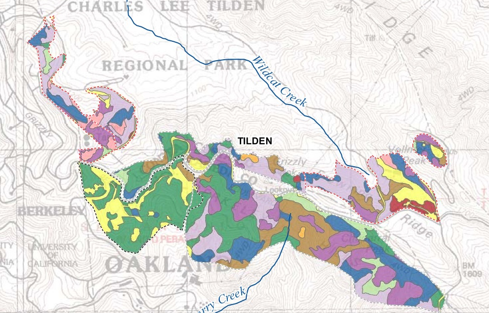
The 2010 result was to put a mosaic of vegetation management on view:

Proposed Actions on Eucalyptus

The 2010 report proposed Hazardous Fire Risk Reduction measures largely administered by the East Bay Regional Park Development:

EBRPD
EBRPD 2

Or, in the most focussed picture of mitigation in the regional parks of the Oakland and Berkeley Hills:

Tilden Termination of Eucs
key

Yet local environmentalists’ have resisted a plan to begin with clear-cutting of Eucalyptus trees, followed by annual application of herbicides, and then five to seven years of pulling seedlings–not only for posing risks to local endangered wildlife, from the whipsnake or California red legged frog, as members of the Hills Conservation Network argue, but may well stand to create even greater fire risks.

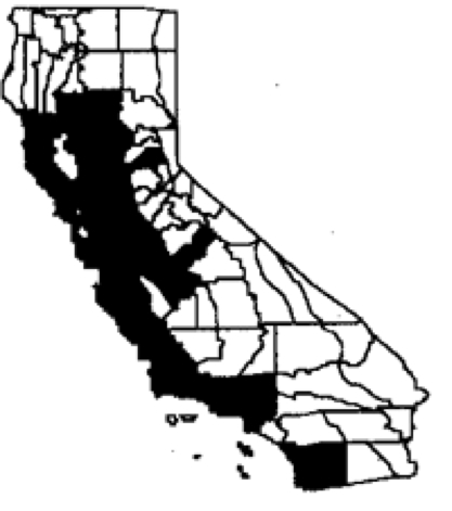
Yet the classification of the tree as “non-natives” is to some extent laughable–to judge by the crude state-wide choropleth of their spread, which is in many senses a basic counter-map to the final solution of arboreal demolition.  Indeed, the demand for their clear-cutting or selective clearing in residential areas reflects a desire to mitigate risks to expensive property, and no doubt lower insurance rates, as much as it reflects a direct tie between the growing risk of fires in California in an age of rising temperatures:

Eucalyptus globus state-wide

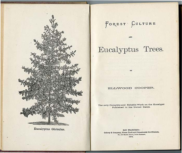
Elwood Cooper, no mere booster of Californian wildlife, wrote in his 1876 Forest Culture and Eucalyptus Trees, distinguished the value of the trees by noting that they “possess qualities which place it transcendentally above all other plants; . . . rendering localities healthy in which to sleep a single night was almost certain death,” placing on their doorsteps credit for making healthy the environment. Recent recent attack on these non-natives for increasing fire-risk on account of their contribution of dry leaves–or “litter”–to the underbrush may contribute to fires spread by their oil-rich tree crowns and highly flammable litters, but contrast to the majesty of the tree that was once seen as a basis for encouraging local forests.

Book

It is hard to imagine the loss of the trees from the landscape, whose branches hold birds’ nests and whose flowers feed hummingbirds and monarch butterflies, whose groves smell “of camphor and the fog-soaked earth,” in Robert Hass’s organic poetics, themselves word maps of the physical experience of the Bay Area he loves.

1 Comment

Filed under alien species, EBMUD, ecosystems, eucalyptus, FEMA, invasive species, mapping environmental risk, mapping invasive species, mitigating environmental risk, University of California

Mapping Commute Routes across California in Pneumatic Tubes

Before Captain James T. Kirk ordered Agent Sulu to place the engines of the USS Enterprise on warp speed  to go boldly to regions of the universe no man had gone before, in 1951 Isaac Asimov described Gaal Dornick waiting nervously for a Jump through hyper-space to visit Hari Seldon on Trantor.  Dornick waited for his first ride on “the only practical method of traveling between the stars” through “hyper-space, that unimaginable region that was neither space nor time, matter nor energy, something or nothing, [by which] one could traverse the length of the Galaxy in the interval between two neighboring instants of time,” in ways that seem to prefigure Kirk ordering Scotty to place engines on “warp speed ahead” from his comfortable console on the Enterprise.  Placing engines on “warp speed” was not only adopted as a mantra by Elon Musk, but offering a promise to move the nation into warp speed on a new sense of transit, where space will be conquered in neo-imperialist fashion as a benefit of the free market, public interest be damned. “People,” Musk has pronounced publicly, “like individualized transport, that goes where you want, when you want,” rather than a public service network of routes, a private transit system far preferable to the vision of “cram[ming] people in the subway,” rooted in an image of the frictionless world.

Musk once was–and no doubt still is–a big fan of Asimov’s Foundation Trilogy (1951), a classic of the  and he’s offered Californians the prospect of something of a hyperspace-trip along California’s Central Valley in the futuristic Hyperloop.  And now the tubes Musk seems to treat as a viable route for futuristic transit, some forty-five years after the unveiling of the pioneering long-planned 3.8 mile Trans-bay Tube and 3 mile bore vehicular tunnels of BART–the Bay Area Rapid Transit system–in September, 1972, that were among the longest in the nation, the most comfortable in its cushioned seating, and the most futuristic of its time, linking the region of the Bay Area as a single unit as a potential for its future growth. Yet if the BART provided an early icon promoting the Bay Area as a hub offering access to residents across an expansive commute–

The original BART map
Original BART Map (1972)

–the promise of shrinking commute times across cities seemed the main aim of Musk’s promotion of the Hyperloop. Its actual intention was to torpedo high-speed rail as an option, using social media to lobby behind the scenes in the court of “public opinion” if not to go behind the state legislature, touting an unbuilt project as a way to stack the cards against public transit.

The notion that Musk, a developer of niche battery-powered vehicles for an exclusive market, using mineral-intensive lithium and cobalt batteries, should be an advocate for rethinking public transit was immediately problematic and questionable, let alone an advocate of safe transit, as a man who has mislead the nation about the safety of its Autopilot system, boosted as the future of self-driving cars, in quite misleading ways–“All you will need to do is get in and tell your car where to go,” the prospective buyers of the car are assured, and even “if you don’t say anything, your car will look at your calendar and take you there as the presumed destination,” boasting of interface abilities of its  Autopilot and Full Self-Driving Features included in Tesla cars with a boosterism worthy of its name of its adopted name. The promise of personalized transit that Musk has long rooted his vision presumes a specific notion of pleasure promising to “increase the happiness of both drivers and mass transit users” in the name of efficiency, and innovation, but rethinks the basic tenets of public transit in ways that meet the aggregate needs of individuals, not of the collective community.

Nikolai Tesla is the namesake of Musk’s company, and was uncoincidentally the false prophet or messiah of electricity. Musk must relish Tesla’s own quite relentless promotion of the bounty of limitless free electricity as well as AC current has been appropriated by Musk to assume his own direct descent from the cult of the Serbian inventor whose work is often tied to robotics, laser, radio, and even x-rays in a relentlessly hagiographic fashion that have promised to spread by association to those who buy Musk’s costly cars, and if vicariously place themselves on the vanguard of electricity-based transportation akin to how Nikolai Tesla’s patents allowed George Westinghouse to introduce the most effective and economic distribution of electric power in America by polyphase current–the most effective means for powering electrical motors–a mantle Musk has channeled in Tesla Model 3’s very own “three-stage” charging stations.  

Musk’s plans for the Hyperloop seemed an expand on the promotion of plans for BART as a modern linkage of the expanding East Bay into an economic unit, the promotion of Hyperloop seemed destine to disrupt the highway system, as well, we have recently learned, render obsolete not only earlier mass transit systems but needed high-speed rail systems in California. Musk has become increasingly aware of the pleasure of creating seismic earthquakes on social media, and the hint of a Hyperloop seemed able to materialize inverted the vision of consolidating Bay Area transit systems that BART aimed to achieve in the 1970s,–

First Proposed BART Transit Map/UC Berkeley, Dept. of Geography

Original BART Map (1972)

–and has been a recognizable model for the future development of integrated mass transit today, in the imagined expansion of Bay Area Rapid Transit reaching by 2050 into Marin (purple line) and Silicon Valley.

Adan Susanek, Bay Area 2050: BART Metro Map and Consolidated Transit Systems (2016)

In place of such an interconnected web, the Hyperloop Musk has recently proposed is a swift, single line. Its promise of transit from San Francisco to los Angeles recalls Asimov’s classic description of a frictionless trip to Hari Seldon, as much as one across California. As much as a serious proposal, it is a promotion better understood as a byproduct of artifacts and ideas generated at Tesla motors, to recast the commute from San Francisco to Los Angeles along airtight aluminum tubes.  Musk first mapped his new mode of travel along hermetically sealed pressurized tubes in ways that reflect the idealized esthetic Google Maps afford of the Golden State as a region removed from any fears of natural disaster, earthquake tremors, or flooding: the overlay of a yellow path of travel let Musk spin a fantasy of real high-speed travel out on Google Maps template, removed from the risk of earthquakes on the Hayward fault or rainy seasons that would dim its solar-powered engines.   It is an innovation similar to that Mush has sold to all those ready to cough up the cash to shift into warp speed collectively, by buying a Tesla, or booking travel to other planets on Space X.

Musk has since confessed to his biographer Ashlee Vance, Patricia Marx has revealed, the alleged proposal for the Hyperloop literally on the back of a napkin was a media stunt to get California legislators to scrap their own future plans for high-speed rail in the state. Musk had never intended to actually build the imagined utopia of mass transit via pneumatic tubes, but to torpedo public plans to expand mass-transit. The voluble libertarian inventor was hardly a fan of mass transit–he deemed it but a “pain in the ass”–but offering America collectively the promise of shifting into warp speed. Although Musk plans on constructing multiple similar networks of bored holes in major cities by his Boring Company that he promises are able to carry “pods” of passengers along electric “skates” at up to 150 mph, including a hyper loop between Washington, DC and New York City, as well as a tunnel network in Los Angeles, he feels public transit in fact “sucks,” and asked “Why do you want to get on something with a lot of other people . . . like a bunch of random strangers, one of whom might be a serial killer.” Indeed, the prospect of such pods promise the ideal of space-age travel that is familiar from 1950’s pulps, more than engineering books or public benefit. The promise was for us to be as hermetically sealed apart from reality as the hero of pulps of the Cold War era. Is this the vision of the future we want?

February, 1953

For Musk has repeatedly decried mass transit is but a distasteful immersion of one’s self among a crowd of unsavory individuals, and the individualized futuristic “pods” he proposes follow rather a technocratic vision of longtermism based in fact on the dreams of Nazi engineer Werner von Braun, a prophet of space travel, and Asimov’s Foundation series itself. The relic of the Hyperloop seems a libertarian spiking of actual plans to expand public transit, by a Neo-colonial project of exploiting “space” and the “future utopia” more tied to megalomania and the false security of oracular prediction compared by Kim Stanley Robinson dismissed as at base just a “story” with rotes not in actual engineering or transit problems, but “the 1920s science-fiction cliché of the boy who builds a rocket to the moon in his backyard, combined with the Wernher von Braun plan, as described in the Disney TV programs of the 1950s.” The image of an antiseptic sealed barrier to prevent a bubble of oxygen for white boys colonizing Mars was a stock image of fantasy literature for many kids sporting a haircut eerily similar to Musk’s own today.

1955


The plan was a way to entice attention to his own abilities to solve the transit problems that plague California as a state, and a vainglorious promotion of how a single company might resolve free from local community input. Robinson lambasted Musk’s hope SPACE-X could promise one-way missions to Mars at a cost of $100,000 to $200,000 per ticket not only as “not believable, which makes it a hard exercise to think about further,” but self-indulgent exercises promoting travel to Mars as a single-company effort, the undermining of a state transit system with a single proposal from Silicon Valley suggested a similar Great Man idea of history, by again pedaling the myth of the futuristic fantastic visions once pedaled by Nikolai Tesla himself and his patents and his vision of a liberating future consisting in free electricity for all.

The map projects an image that obscures questions about how the cars would manage those turns at such high speeds, even as it seeks to conjure the promise of such high-speed travel.  The immediate media stir around the recently tweeted prototype of the Hyperloop makes the prospect of traveling in a vacuum actually all far more concrete.  Planned to run through Quay Valley, a town to be built along Highway 5, midway between LA and San Francisco, to be built with Oerlikon Leybold Vacuum, who helped craft the large hadron collider at CERN in Geneva, capsules flying through vacuum tubes across the state were promised last year, and the cross between a Concorde and air hockey table may have arrived in an actual prototype tested in California over a shorter geographical stretch.

Musk tube take off!
Hyperoop SF-LA

The pioneering tube of high-speed transit would suggest one of the “greenest” travel options in the state. Rather than make the drive down that expanse, or the airplane trip on which Musk may have doodled a map of the idea on a napkin, one commutes in the Hyperloop driven by a fan on its nose that sucks in pressurized air in the aluminum tube in which it is suspended, pushing air beneath and behind it like a hydrofoil, as one speeds in a vessel through the Central Valley past the many cars that travel on I-5:  indeed, the proposed placement of the track of the Hyperloop beside the interstate allows its very structure to offer something of a standing advertisement for speedy velo-commuting.

Although Musk has yet to attract the investors or engineers to build the project along Highway 5 without disturbance to surrounding croplands on aluminum-encased rails on pylons, he promises that its economical construction would soon be able to shuttle seated passengers along on a cushion of air, in cars powered exclusively by fan that runs on batteries powered by solar energy that would rest on the roofs of its reinforced tubes.  To be sure, the Hyperloop offers a radical updating of the sort of proposed transit solutions to link the two metropoles, including the “Sleepbus” equipped with oddly analogous pods, but promising to do the same distance overnight in old-style automotive style fueled by gasoline:

sleepbus-1

In the face of such an outdated (if funky) alternative of overnight transit in an old Volvo bus for $48, Musk advocated his speculative plan as a radical re-imagining of public transit corridors.

It offers evidence of his interest in thinking ahead of the curve for the benefit of the state in which he works.  Musk proposed this vision primarily as an alternative to plans for implementing high-speed rail in California proposed by Governor Jerry Brown.   He couched the proposal as an illustration of an illustration of his public-spirited commitments:  rather than spending the 68 billion dollar price tag on rail to be completed in 2029, Musk promises a commute time from San Francisco to LA in under half an hour, if you’ll just buy his batteries and plan and follow him in the scrapping of all existing public rail systems in the US.  Although the pragmatics of the proposal have all to be mapped out in further detail, his 57-page spec sheet PDF Musk manages, with the help of Google Maps, to flesh out the practicalities with an urgency that makes one wonder why no one every thought of this model for moving through space before–that seems designed primarily to hold skeptics temporarily at bay, and meet the building anticipation for Musk’s plans for a “fifth mode” of transport.  It is amazing that his proposal manages to resolve so many issues, and present itself as a significantly lower-cost alternative to high-speed rail, and even makes one question how “high-speed” the quite expensive rail system would actually be.

In providing commuters with a cabin that is “specifically designed with passenger safety and comfort in mind,” Musk’s plans caters to the jet-set who probably wouldn’t even want to drive.  It’s rather something of an alternative to the airplane.  Musk envisions Hyperloop as the travel of the future, whose construction would be far less costly than a rail system, and directly linked to renewable solar energy.  Since the Hyperloop also evidences of Musk’s commitment to the public good, it is odd that it also undermines recent attempts to create a useful means of public transit that would reduce both air pollution, gas use, and highway-crowding in California.  Musk’s antagonistic presentation of the “bullet train [as] both one of the most expensive per mile and one of the slowest in the world” seeks to use engines created by Tesla to offer a “fifth mode” of public transit able to reach supersonic speeds driven by an electric compressor fan, charged by photovoltaic cells perched on above its path.  Its DeLorean-like doors, like the “Falcon Wings” of the Tesla XTesla X, seductively open to invite passengers to hop on in for the ride . . .

0812_Hyperloop_605

The map for the route is not that different from Highway 5 itself, whose path it follows, but the conceptual mapping of travel through space is decidedly futuristic in tone, boasting traveling speed not beyond light but above 700 miles per hour, allowing something of a Jump between the two not so neighboring cities in California akin to an air hockey table on skiis, which he promised “would generate  far in excess of the energy needed to operate” and whose energy could be stored in the form of compressed air itself.  Told with the urgency that one might associate with the inventor Nikola Tesla himself, the basic diagram of the Hyperloop is devoid of any actual spatial placement–still waiting for its engineer to actually map.

Hyperloop Diagram

The ‘conceptual diagram’ is wonderfully futuristic vision that has been beautifully sketched as a sleek object of a consumer’s fantasy for an aerodynamic car running on skis, more than clearly mapped as a means of transit, whose propulsion system allows it to accelerate quickly to 300 miles per hour before reaching 760 mph by a linear induction motor, making the trip last but 35 minutes:

Musk Engines

Needless to say, the linear induction motor has already been built by Tesla motors, and the solar generators on the roof of the tube use cels from Musk’s own SolarCity company; but mapped on Google Maps to follow I-5, the route becomes a reality, and that huge stretch of Highway 5 that no one really likes to drive on is reduced to a route   the Hyperloop passenger barely registerd as s/he was sucked past:

Hyperloop on I-5

The pneumatic tube isolates commuters from the travel experience, shuttling them from LA into San Francisco in ways that seem perfectly synchronized with the excitement over the new Bay Bridge, whose own futuristic and streamlined design it seems to leave in the dust.

Hyperloop in Bay Area

Granted, we do need to update the systems of public transit that are woefully underfunded and often outdated in the United States.  The existing options are mapped in the below illustration, brought to us by radical cartography‘s own Bill Rankin, comparing the layouts and expanse served by systems of urban mass transit:  the great majority of these mass transit systems follow a simple hub-and-spoke design of regional commutes seem diminished insects once placed beside  the grandiose vision of futuristic streamlined jetting between metropoles of the sort that Musk envisions, raising some questions about the efficiency of Musk’s futuristic system.

URBAN MASS TRANSIT SYSTEMS NORTH AMERICA Rankin

The ways of viewing the city as a self-contained unit is not necessarily a canvass broad enough for spatial travel to accommodate urban growth.  

The limited efficiency of our rail corridors, which aside from the Northeast get low scores–and are in need of massive structural updates–moreover seem retrograde when compared to the system Musk sketched.

rail map scored corridors

Musk, to be fair, advocates an eventual state-wide expansion that would be a virtual state-wide redesigning of the rail system into a range of spin-off Hyperloop stations:  “give me a map,” Tamburlaine said, weary of further battle, “[and] then let me see/ how much is left for me to conquer all the world”–or, in the case of Musk, all the state of California.

larger rout Hyperloop

But Musk doesn’t offer a system of mass transit, but something more like a transit for the haves, and elite type of shuttle that can be experienced by those whose time is worth the public investment on a project that would best serve them.  While he of course isn’t explicit about the audience he is addressing, it is pretty much the same as those to whom he is selling a Tesla S for a $70,000 cash payment–some of which can be recouped through electric vehicle tax incentives, and a monthly saving in energy costs–not the prospective audience, in short, as Amtrak.

And maybe–just maybe–Musk’s futuristic Hyperloop isn’t really so future-oriented after all, but more of a projection of Musk’s own fantasy, designed while scribbled on a napkin while flying from Los Angeles to Menlo Park.  It is striking that the notion of a phasing in of plans for high-speed rail is a plan mapped that has been mapped by the Regional Plan Association America 2050, was premised upon the belief that rail can sustain and facilitate regional economies’ growth in crucial ways, and should be built around them in order to foster their growth.

Phase 2 America 2050

Eventually, the Regional Plan Association envisions a Trans-National Network to connect “megaregions” sharing natural resources and ecosystems–as well as interests–by new corridors to foster their inter-related economic systems:

Trans-America Network 2050

Musk’s plotting of a travel corridor by Google Maps software seems a quick reality, even if one that has come in for some ridicule on late-night TV, that might be mostly for folks who jet-set between two cities on the California coast.  The “reality” of his Google Maps reconstruction of a state-wide system, positioned itself to replace the very cars that his company produces, but is also a pretty darn exclusive ride.  To be sure, Musk invites open feedback and contributions to his design from anyone at hyperlink@telamotors.com.  

But the devil seems, as always, to be lying in its quite murky details:  plans call for “Building the energy storage element out of the same lithium ion cells available in the Tesla Model S is economical,” he assures us on page 38 of the spec sheet for the Hyperloop, using the very supercharger batteries which, he promises, “directly connected to the HVDC bus, eliminating the need for an additional DC/DC converter to connect it to the propulsion system,” provide the linear accelerator with sufficient propulsive energy to accelerate to supersonic speeds, allowing one effectively to ski from Los Angeles to Norcal, or ski back to Bakersfield.  While cool as hell, the axial model of this coastal shuttle suggests few possibilities for expansion to the hinterland, or obstacles form the environment–like earthquakes.   (Musk likes comparing the Hyperloop by comparing it to a cross between the Concorde and an air hockey game, a colorful simile, probably to give the concept a populist appeal; but this is an air hockey game on fixed and tracks.)

But the deeper question behind the funding of the system of Hyperloop may be the degree to which San Francisco and Los Angeles will ever come to constitute a single economy:  the forecasting of a map of national megaregions suggests it may in fact not be one, and provides a picture of the megaregions it wants to link.

Emerging Megaregions

The scheme that Musk floated is not attentive to the clusters of economics, but incarnates the very aesthetic of the Google Map.  Indeed, as a scheme of travel, it perpetuates a means by which one can move through a landscape without registering its existence, and removing space from travel, much as Google Maps isolate place from environment, in a new form of transit whose focus adopts the passenger’s perspective of space, rather than the expanse through which s/he travels, or the impact of building these rails on surrounding farmlands or their potential impact.  In removing the schematic map of rail destinations from any external or material constraints by the dream of frictionless travel in an air-bearing suspension system, Musk maps an argument to channel public monies to a system which awaits its designers and engineers–or at least to plan on doing so to bolster shares of Tesla (NASDAQ:  TSLA) to robustness on Wall Street.

Some concern about Musk’s eagerness about the project encountered has been directed to the far greater price tag it would probably involve, as well as its earthquake-safety, and skepticism about the entire question of whether “the thing would actually work.”  Perhaps the deeper question is whether the state of California–and indeed the coast of that state–provides the sort of economic hub that needs to be connected.  The fantasy that it does seems to grow out of the maps that so prominently convince readers’ of the reality in Musk’s elegant spec sheet.  

These maps suggest yet another way maps generate ways of thinking of and considering space without reflecting on its occupation:  how hard would it be, after all, to travel down the Interstate to not be confined to cars, without having the distractions of the farmland that lies between, and the smell of all those cows?

Hyperloop-Elon-Musk-Train-e1432304356542-980x580.jpgHyperloop concept art from HTT

4 Comments

Filed under California, earthquake risk, Elon Musk, Hyperloop, public transportation

Targeting Sites of Attack in Syria


Syria, for now, remains on the map.  But in the course of over two years civil war aged across Syria, the government of Bashar al-Assad has stock-piled chemical weapons as a last line of security in multiple sites.   President Barack Obama’s administration has made use of chemical weapons against Syria’s population a justification for military attacks against or intervention in the country.  But the prominence given to drawing this “red line” on the use of such weapons neglects to assess the pragmatic results of any intervention, and the nature of what form on-the-ground intervention in the relatively shifting state would take–or what ends such military actions would be able to serve.

The direction of the situation is not good, to be sure. The number of Syrians reported killed, abducted, gassed, or poisoned during the civil war over the past two and a half years, tabulated by Syriatracker, clearly centers the focus of violence around its capital city, Damascus, and is probably vastly under-reported:


Syria Tracker- Missing, Killed, Arrested

The on-the ground situation is more complex than this map of reported violence:  especially if one looks at the disparate groups that have independently continued (or sustained) the ongoing rebellion against the Syrian government, or, even more strikingly, at the huge number of internally displaced Syrians, a number greater than anywhere else in the world; and the  number of Internally Displaced People is difficult to count; estimates are 4.25 million–almost 1 in 5 Syrians.  The consequences of this displacement are impossible to map.


The situation on the ground has provoked this displacement through the fragmenting of the Rebellion into multiple fronts.    An important and informative interactive Al Jazeera map of groups in the Syrian rebellion provides a far more complex measure of divisions among rebellious groups that have attracted different financial and military backing to overthrow Assad also challenging to map:  rebels on different fronts include the large Northern Front near Damascus to Aleppo Front, Idlib Front, and Eastern Front, some in uneasy relations to one another, and is worth examining in depth at its website, in order to understand the mosaic of divisions in a landscape whose sectors are often pointlessly divided between “rebel-held” and those where Assad is dominant:

Mapping Interactive Map of Syrian Opposition
Al Jazeera English

The above image of the fragmented nature of local control, and the independence of each group from one another, suggests the difficulty of defining a clear point of entrance and reveals the nature of ‘proxy war’ that has expanded over two years since the Arab spring, as the response to the Arab Spring of April 2011 that challenged the Assad dictatorship were almost randomly attacked by a violent militaristic security forces that echoed the violent tactics of Bashar’s father, firing live bullets into crowds of protestors and unarmed civilians, killing many innocent children, in acts of carnage and terror documented by Human Rights Watch as killing 587 civilians and over 250 children that emulated the theatrical mass-assassinations orchestrated against Syrians by his father, Haifez al-Assad.  The repressive violence of these events, before civil war, increased the range of foreign bankrolling independent factions of rebellion, which is misleadingly cast as uniform by a map of anti-government forces as the below two-color map devised for Max Fisher of the Washington Post, which borders on intentional political disinformation:

syriaForMax-2


Despite using a uniform color to denote “rebel presence” as a single, uniform beige to mask divisions within “rebel presence” and the numerous individual deals that the Assad regime might make within them–and mask the actual of what David Brooks and others correctly identify as a “proxy war” between Russian planes flying from Iran over the nation, Hezbollah present in Syria, and with multiple “combustion point for further waves of violence.”   The war is, in fact, not properly “civil” at all, so much as a broader war for the realignment of Middle East politics–and despite the attempts of previous administrations to involve rebel groups within the negotiation, the readiness with which the Trump administration seems more ready to strike–or threaten to strike?–from the eastern Mediterranean, Persian Gulf, and Red Sea–with less attention to the ethnic composition of Syria, than its own show of strength.


image.png


We have been particularly ill-served to understand the nature of this “proxy war” by the reductionist attempt to map ethnic diversities in Syria as if they revealed an internal fragmentation of a nation that is being driven apart by exterior forces.  Such a map implies that the many sectarian divisions masked by the creation of the Syria’s borders account for instabilities among rebel groups, as if they are inherent in a multi-ethnic state as an amalgam of faiths destined to implode, regardless of the brutality of the two generations of the Assad regime:

Levant_Ethnicity_lg-smaller1-zoom

Yet the divided nature of the country lies in part in the improvised nature of resistance to a totalitarian regime, and the culture of violence that has been normalized within the Assad regime and within Assad’s security forces–the notorious Air Force Intelligence (إدارة المخابرات الجوية‎), whose ties to chemical weaponry have been substantiated in the recent past.

The drawing of stark divisions between areas controlled by different fronts and subject to government control obscure the near impossibility of drawing these lines of distinction along clear territorial boundary lines–and prepare a deceptively simple image of Syria’s future.  One BBC news-map helpfully re-dimensions the local conflict, mapping government positions toward the coast and eastern cities, around holdouts and temporary redoubts of rebel resistance–although clear mapping of their division is difficult given the shifting landscape of alliances and lines of territorial defence among highly mobile guerrilla forces, who often tactically withdraw, rather than face military engagement, but can’t map the shifting lines of opposition or control–or the relations between the fronts that are themselves supported by different constituencies in a patchwork of strongholds:

Mapping Syrian Conflict BBCBBC/Syria Needs Analysis Project


The map poses deep questions of what intervention would mean without a clear map even available to be read.  They also reveal how much the debate about war is being waged not only in words, but maps.  The focus of global attention is not only on the violence that has divided the country for over two years, to be sure, or the humanitarian disasters created by the many refugee camps on Syria’s borders, but allegations of the use of chemical weapons.  Yet the mapping of Syria’s disasters and composition are central to any discussion of military intervention.

And we now have a map of where strikes might be directed against air force bases and sites of chemical production, courtesy Foreign Policy magazine, which uses a Google Maps template to mark the storehouses of potential chemical factories and air bases targeted as primary sites of missile attack:

Air Bases and Chemical Sites in Syria


What sort of a vision of Syria as a country does it describe?  The visually striking deployment of skulls-and-crossbones icons to designate locations of plants that produce chemical weapons is scary, and so much so that it almost evokes incursions by pirates along the Mediterranean coast–as much as sites of chemical weapons.  (Of course, such sites would not in themselves be targeted, but the decision to avoid them depends on the accuracy of military intelligence; the decision to target all pharmaceutical factories also poses a  future crisis for already over-crowded Syrian hospitals.)  But it suggests a rather blunt map of the notion of military intervention, and reveals the difficulty of projecting a limited surgical strike against selective sites that are removed from the Syrian population.

In the light of the relative military success of the long-distance bombing strikes into Algeria, it seems tempting and morally compelling option to end the violence and self-evident terror of gas attacks by unseating the Assad tyranny, or by providing Syria with a clear warning–although what it would warn we are not sure–against purposefully deploying chemical agents against its citizens.

The map raises many questions by marking so many facilities along Syria’s Mediterranean coast.  It makes one wonder how such a map became so easy to reconstruct–and the wisdom of allowing such a plan of attack to be rendered public on the internet.  For the map suggests that strikes can be easily launched, in a sort of war conducted from aircraft carriers at a distance against Iran’s close ally, firing Tomahawk cruise missiles at them from American warships moved to the eastern Mediterranean–although it’s relatively easy construction has led many to openly wonder why such a detailed range of options would be publicly leaked by the White House in such detail, even indicating the targets of a strike of one to two days against fifty specific sites.  (Reuters found redeployment of many key army, air force, and security headquarters buildings in central Damascus that might attract U.S. cruise missiles, and poison storehouses, if not sites of production, could be moved.)  Would it be worth the potential danger of hitting a storehouse of sarin or FX?

Targeting chemical factories, moreover, does not address the likely existence of available chemical arms–although attacks render their release more likely. Every chemical plant is not the producer of sarin and mustard gas.  In imagining the raids on the air-bases and potential sites of chemical weapons, the map takes advantage of a registry compiled by the  Nuclear Threat Initiative locating where weapons are either manufactured or stored.  Yet despite the offensiveness of chemical gasses, their repellent nature, and their close historical association with threats or attacks of terrorism, what sort of counter-attack on the Syrian population the government would unleash as a response to the attack is not clear.  The attempt to paralyze Syrian aircraft who might attempt to deliver them seems worthy, but the bombing of potential plants risky at best. Bombing sites of chemical production doesn’t sound like that great an idea after all, however, since this would most likely disperse the very gasses that they contain–with more dangerous effects than the uses of Sarin or FX against the Syrian population–if such targeting would of course not be intentional.

The incommensurable relation between an air-raid or selective missile strike with storage-sites of chemical weapons has led several to question the value of such attacks, even after knowledge that the government may have intentionally used poison gas against its own citizens.  There is a small likelihood of eradicating more than a small portion of stockpiled chemical weapons in the country, since, unlike biological weapons, most probably will only be widely dispersed by such a blast–and conceivably hurt civilians as they more widely and rapidly disperse, considerably raising the bar for “collateral damage.”

How any such sort of attack will change “action on the ground”–and the questions of what military strike can alter the humanitarian and moral disaster that Syria has already become–remind us of the pressing need to have a clearer map of the action on the ground than a Google Map can reveal, as we examine consequences of a “limited air strike” beyond the hope to cripple the Syrian airforce or discourage the terrifying possibility of further use of poisonous gas against an opposition–and ask if a “limited air strike” is possible in this complex geopolitical microclimate.

Lastly, the mapping of clear targets and divisions within Syria’s boundaries obscures a hidden–but important–map of refugees on the borders of the country.  As well as having internally displaced millions, the fragmentation of fronts in the country have created a growing humanitarian crisis in camps on Syria’s borders, and the 3.5 million refugees who are estimated to leave the country by the end of 2013 for neighboring regions, further fragmenting and dispersing the country’s population:


map refugees Syria by 2013 3.5 mill


Color-coded according to the largest number of Syrian refugees received in each country, we range from deep purple in Lebanon (more than half a million refugees dwell), and just less than half a million are in Jordan and Turkey, and smaller numbers in Iraq and Egypt  – 161,879 and 75,456.  This alternative geopolitical map serves as a negative view of the strategic relations between he nations.  It also poses a problem of how each of these countries respond to the crisis:  such a data-visualization fails to render the different immediate challenges of each refugee family, their poverty, and their amassing on the borders of each region, rather than throughout the country.  For this is a humanitarian disaster waiting to be mapped.

Given the difficulty in mapping the multiple divisions within the country into rebel and government forces, and the crises of internal and external displacement of Syria’s population, we must resist seeing mapping clear targets of attack.  The maps of clear divisions in the country as a clear opposition of forces are distorting filters that are more distracting than they are informative, with overly neat and tidy boundary lines.  The complex conflicting rebel factions supported by backers, and the sort of power vacuum that would be created by significant and serious destablization of the country or desperate responses (or the shifting of responsibility) that strikes against the country’s remaining inhabitants might trigger.

Syria’s conflict of course exists not only as a map of frontiers and inhabitants.  Worldwide, it should be remembered, there remains significant opposition to military intervention, charted by Mona Chalabi and Charlotte Henry in the The Guardian’s datablog–not only because of longstanding alliances between Iran and Syria, or Syria and Russia, but exceedingly complex questions of what ends intervention would accomplish–and what outcomes it would produce, as well as how it would be sustained.


Condemnation of Intervention


Viewing the conflict in Syria not only through the lenses of national alliances, but by what can be best mapped on the ground, must become more central to US foreign policy objectives.  We cannot “chastise” or “wound” the Assad regime without realizing that we may wound the country, or erase it from the map.

All too easily, from the point of the United States, at least, we risk viewing the conflict either too much on the micro level, or at a remove of the capacity of bomb strikes, paying far less attention to the delicate nature of the situation on the ground.  Indeed, the faux apocalyptic tenor of some maps of imminent war that is tragically advanced by right-wing bloggers, that strip the power of cruise missile strikes from their context–


image


–suggests a removed image of the ability to launch air strikes against a nation at a remove from the ground, and an ability to “target” strikes–the illusion of GPS–at a single dot, without registering the huge impact such strikes would have on a country and is inhabitants.  In an era of shooting first and asking questions later, by 2017 we use maps to fire from the hundred and five missiles on Assad’s “chemical weapons facilities” as “surgical strikes” by tools able to pinpoint chemical weapons storage and research facilities outside Syrian cities, as if they have a fixed non-human target to eliminate.


APTOPIX_Syria_US_88463-cf2b5
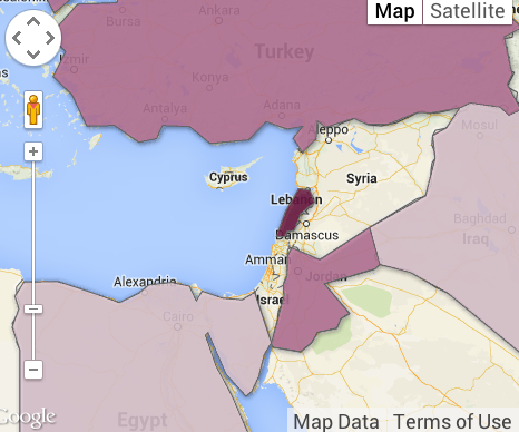
Targeting of Syrian Capital on April 14, 2018/Hassan Ammar/API


Can the promise of mapping with such precision inflate a sense of the ability to intervene from a remove, targeting targets outside Damascus as the Barzah Research and Development Center, or the Him Shinshar complex outside Homs, without terrorizing the Presidential Palace, and without worrying that such armed interventions will not eventually escalate, as they dramatically change the experience on the ground?


image.png

8 Comments

Filed under Mapping Chemical Weapons, mapping ethnic groups, newsmaps, Syrian Civil War

The New Face of Fire and the Mapping of Forest Fires in Yosemite National Park

The enormously destructive spread during the summer of 2013 of a wildfire that began just outside Yosemite National Park, as an illegal fire begun by a hunter spread to consume almost 5,000 acres of protected lands.  The scope of its spread challenges skills of mapping, and raises questions of managing wilderness and containing wind-driven flames.  Even at a distance of three years, the costs of the unmanageably rapid spread of fires is visible in the charred remains of burnt trees that stand, as carbonated sentinels, along the highways one is likely to enter Yosemite Valley.  They are reminders of the fire that began in the nearby Stanislaus National Forest and raged uncontrollably over weeks, consuming almost 260,000 acres of protected lands in the Sierra Nevada over two months.  Even today, expanses of scorched areas with limited green after-growth mutely pose the sort of questions we are compelled to return to maps to resolve, but that current techniques seem inadequate to resolve by imposing layers over a terrestrial base-map.

The mapping of fires is both a cutting edge technology of interactive web mapping, able to track progress, intensity, and rates of evacuation from burning lands with local burn rates with a degree of GPS precision able to synthesize a greater range of data about fires than we have earlier had at our control.  But are the maps of fires effective measurements of the scale of destruction or even the pathways of communication of dangers from fire–a danger increased with the growing number of unsupervised fires in wilderness areas where many homeless are increasingly based, and adequate resources not dedicated–and the spread of fire is simply not able to be that easily mapped.

13556817_1209185672448825_70259730_nUnknown

The steep costs of such fires are not only unable to be comprehended, but so is their scale.  If we map fires to better understand their spread–and the speed at which they travel, as well as the violence of their impact on protected terrain–The cost of this inability to chart the rapid spread of the fire suggest the difficulty to grasp the immensity of the costs of its current danger to the Eastern Sierras–a monumental expanse whose protection constitutes among the most valuable of America’s assets–both the difficulty of charting the ferocity by which fires threaten to destroy, the need for their prevention, and indeed the costs of failing to conceptualize the destructive costs of fires’ containment.  For if the charred remains of dead redwoods and sequoia suggest the unstoppable progress of the fire in the hot summer of 2013, they remind us that increased summer heat threaten to incredibly steep costs and pose future challenges for mapping the spread of firespace.


Burnt-trees-stood-smoky-aftermath-Rim-Fire.jpg
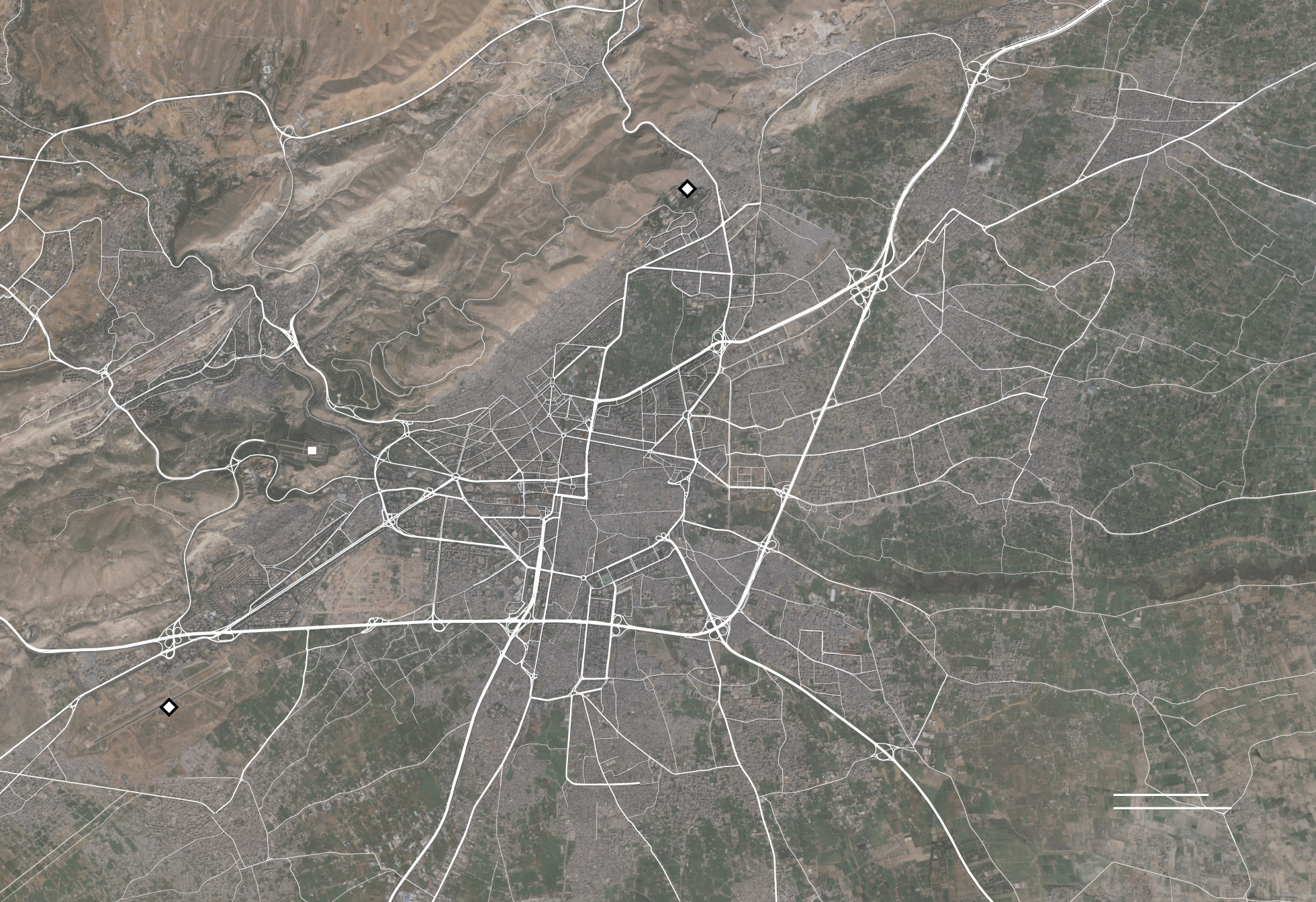
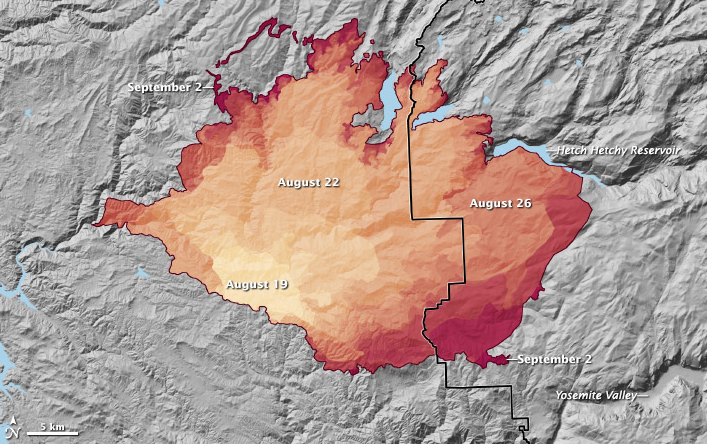
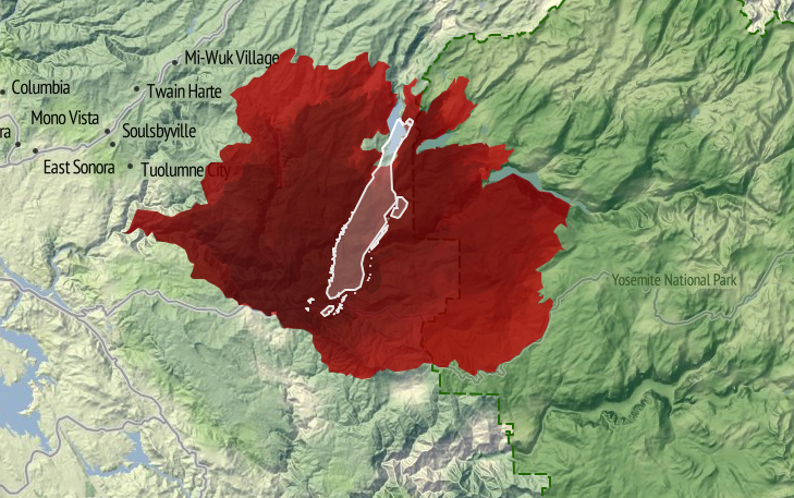
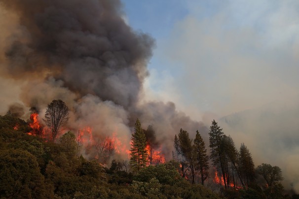
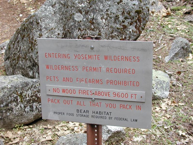
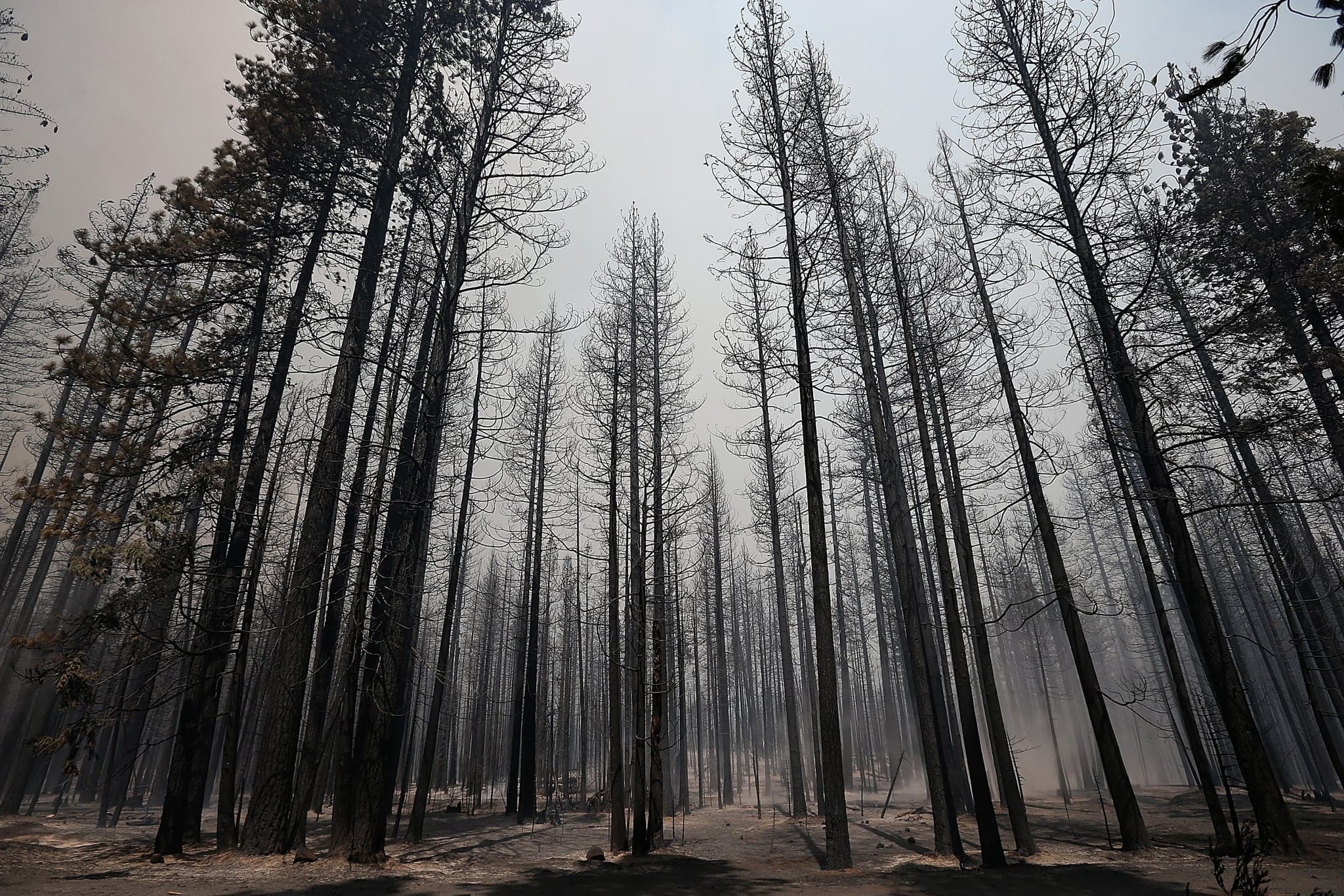
Burnt Trees Shortly after Rimfire Getty / Justin Sullivan


Burnell Falls--2015?  SierraNewsONline.png

Sierra News/Candace Gregory (2015)

97764220-1.jpg


The terrifying rapidity with which the 2013 forest fire spread to become the largest-ever fire in recorded memory in the Sierra Nevada mountains posed such difficulty to be controlled from the middle of August that demanded to be mapped, but its expansion challenged the adequacy of mapping tools.  The fire not only led to evacuations from the park as it extended into northwestern Yosemite, and to call for increased numbers of forepeople to control the blaze, as its shifting distribution and spread pressed so many firefighters into active duty to contain its growth, by both representing and masking its causes for and proportions and the difficulty of controlling its spread.

For although a number of fires occur yearly in Yosemite Park–either by lightning strikes, unattended campfires, or lapses of attentiveness, the specificity of the 2013 rim fires’ spread was due not only to its expanse, or proximity to  Hetch Hetchy Reservoir, but to the winds that drove it, which distinguished it from other fires that are more easily controlled.  For the rapidity of the spread of the fire distinguish it from the range of wildfires along the west coast that Ben Jones, using government data, mapped from 2002-2012 in Tableau.


Forest Fire Hotspots

Whereas most of the fires that occur in the western part of the country were during the summer months, and most were caused as a result of lightning strikes, the vast majority were less than a quarter acre in size–and only a handful (one hundred and fifty-eight in a decade) exceeded 5,000 acres.  The fire of 2013 consumed over 250,000 acres, making it a striking challenge and almost unique case to map its geography and spread–and providing an almost predictable worst-case scenario given the radical reception of the snow-pack in the Sierras that year–a decline that has only continued in recent years.


Yosemite Conservancy--Half Dome's Snow Pack

Yosemite Conservancy–Snow Pack around Half Dome


Much as the weather systems in the Valley and mountains are notoriously difficult to forecast or record, the winds–like the swaying of the slender Lodgepole pines, among the first to move into a burned environment, or the increasing density of trees across the Sierra Nevada, or the density of old-growth trees as the Douglas fir or Ponderosa pines that fill Stanislaus and Tuolomne counties, and run into the confines of Yosemite outside which they lie.  And yet we are compelled to turn to the maps that so elegantly charted the troubling progress of the fire over a sequence of days, drawing out the progress of forest burning over weeks, even as we were fed new maps daily, together with weekly composites, of the progress from which we were perforce geographically removed.  Watching and mapping the spread of the fire became increasingly dramatic and compelling precisely because of the difficulty with which it was contained–as if the fire resisted the abilities for synthesizing and bounding its own spread as it rushed in high winds across tree tops, breaching the boundaries of roads and approaching areas of denser settlement.

Spread of %22Rim%22 Fire Spread of the Rim Fire from August 19 to September 2, 2013, as reported on InciWeb. Credit: NASA Earth Observatory

After consuming over 257,000 acres, the Rime Fire is 92% contained–two giant sequoia groves preserved–and trapped in a fixed perimeter at a low intensity, and the number of fire-fighters down from over 4,500 to 287. But the rapid expansion of the fire raises questions of containment, continuity, and scale beyond the categories we can most easily comprehend–say of cities such as Manhattan island, here trapped in the red expanse of blazes, or Berlin–images that adopt the familiar format of territorial maps.  For while these images effectively communicate the size of the region to which the blaze expanded, they also create a false equation by which to understand its origins, spread, or possibilities for its eventual containment.


Manhattan in Yosemite Blaze

Berlin Mapped on Yosemite Blaze


But such mapping of expanse provides little communication of the nature of its human causation, or of the difficulty in the reversal of its spread, while they impress its expanse. The values of measurement, scale, and proportionality which determine the construction of maps provide less value as criteria to map a fire that is able to leap from the underbrush to branches and the crowns of red pines, sugar pines, cedar, ponderosa pine and Douglas fir–among which fire travels in ways less understood by metaphors of terrestrial continuity, whose rapid expansion is facilitated and fed by decades of neglect at thinning forests on the park’s perimeter on account of substantial reductions of funding for adequate preventive firefighting by controlled burns of underbrush.  (And the consequences of such reductions will be felt further by drought and higher, where the  temperatures in the western United States bound to increase fire frequency by drying and warming landscapes.)

The result created something of a tinderbox in the Stanislaus forest, where the extensive undergrowth helped to ignite the fourth largest forest wildfire in California since 1932–a blaze that only slowed as it met far less underbrush in Yosemite National Park itself, where it also encountered far less dead wood, overgrown forests, and debris on the forest floor.

177184416Justin Sullivan/Getty Images


If the terrestrial map provides a poor visual metaphor for the communication and progress of the fire, maps also provide limited tools to understand the dynamics of fire containment.  To speak of “footprints of actively burning fires” in Yosemite Park not only misleads.  It mis-represents the abilities for the fire’s containment and impending danger of its astounding spread from a small canyon in the Stanislaus Forest.  Unlike the image implied by a single ‘footprint’ of clearly defined bounds, multiple fires that have spread from Yosemite Park’s rim into the park itself in ways that cannot a single block or region, as is by now increasingly evident with the spread of the fire Labor Day weekend into the San Joaquin valley and the spread of smoke into the Valley itself, obscuring the very views for which the park has been so long known with dense smoke and leaving a burning smell in the National Park that has not only symbolic resonances as a region of protected wilderness, but is a historic example of the protection of a preserve of wildlife and old forest growth.  It is difficult to register the destruction of space and place watching the spread of the fire’s leading edge over several weeks on an animated map of its almost unstoppable progression: http://gu.com/p/3tgff/tw.


To be sure, the historical spread of fires in the park due to lightning strikes can be understood as a process of forest management, as Kate Wilkin has shown by using color-coded polygons to trace the quilt-like nature of historical fires in the mixed conifer forest in Illilouette Creek Basin in the Upper Yosemite wilderness.

[youtube http://ourenvironment.berkeley.edu/where-fire-working-california]

Kate Wilkin

The quilt-like nature of historical forest fires in the park however contrast to the immediate ways that we map the progression of a fire.  The mapping of the expanse of a fire that crosses roads, boundaries, and other mapped lines poses problems that are not only cartographical in nature, but address the effectiveness of communicating the fire’s spread to the interested public–and the danger future wildfires pose.  The demand for compiling an updated image of the fire’s progress in the hopes to capture the destructive phenomenon that raged for several weeks and consumed an expanse of over 350 square miles–almost 100 of which lie in the boundaries of Yosemite National Park–and which threatens to overwhelm and destroy its precious landscape.  For most maps fail to embody the fire’s own contours, causes or impending expanse.

Repeated re-use of the “footprint map” of the fires in media outlets minimize the facts of its spread or existence of a clear perimeter around the “rim” fire by confining it to a fixed area, in ways that the animated map recapitulates in mapping the gradual if jerky expansion of an ink-stained red expanse to fill nearby canyons and valleys as it comes to border and surround the Hetch Hetchy reservoir itself. Indeed, much of the fire that has burned in the Stanislaus Forest has remained off the radar–though this has been where most of the burning has occurred–given the dominant media focus devoted to Yosemite Park’s wilderness–and the region’s iconic status as protected wilderness in the national imagination:  indeed, the fire is more compelling than the fourteen active or contained fires in the state that are mapped on the California State Fire Map by transposing CAL FIRE data to a Google Map of the region, replacing the usual pinpricks by swirls of red flames to denote alive fires, and white flames to denote those “contained.”  A “contained fire,” in this iconography, commands less visual attention, if not being discounted–despite the map’s benefits viewers, the remove of its map signs from the landscape they are overlaid is a particularly perilous way to foster public discussion about fire dangers.


Fires Contained and Burning in CA

Generic Google Map of Wildfires CA


The moral failure of abdicating abilities of creative mapping to communicate the process or movement of fires has severe implications for our ability to appreciate, understand, and combat their spread–especially in the benign construction of the containment of a fire’s spread.  Similarly, notwithstanding the intent to try to map the entirety of the area engulfed by flames, the mutable areas engulfed by fires and the discrete paths of its travel, and the travel of smoke or ash, are masked and left silent in the mapping of its “footprint.”  Unlike the “footprint” of a building, house or complex, indeed, the fire resists definition by boundaries, or to be easily controlled, although that image has been repeated in new stories about the “rim fire” that cannot be safely contained, as if to quell fears of the difficulty of drawing boundaries around its recently expanding brushfires that threaten greater destruction of the oak, pine, and older growth trees in the park’s upper reaches.  The 94 square miles of national wilderness consumed by fire in northern Yosemite over Labor Day weekend, up from only 74 square miles the previous day, have been unable to be contained because dense smoke obscures aircraft visibility sufficiently to obscure pilots who might otherwise drop water to contain the blaze, although they have since begun to fly once more as of September 1.

The difficulty to map changing nature of the fire–and the limits on firemen’s ability to control it–need to be better registered and more effectively communicated if it is to be adequately described.  For even if it is tempting to isolate the burning region as removed from the most-visited destinations in the park or locations of many campsites, the failure to map the fire both conceptually seems an obstacle in clarifying its dynamic–or even the plurality of fires that have begun to burn.  Given the small portion of the fire controlled, which grew quite slowly from 2% to 9%, given its poor accessibility, and, only more recently, to 12% and 15%–as if the doubling of the percentage under control could match the expansion of the wildfire, its mapping might better reveal the obstacles to control its spread, indeed, rather than process a set region or place that has been evacuated of inhabitants. It’s unclear, in short, how maps of the fire process the disaster’s scope or meaningfully present the relation of firefighters to it:  if not negligible, the relatively minuscule share of controlling its rapidly growing expanse rely on Google Maps to chart the fire’s expanse in relation to human habitations or sites of evacuation in problematic ways; maps of the fire’s perimeter and coverage inadequately represent the disaster’s situation or dimensions, and their re-use in most newspaper and media outlets confuse the fire as a human event–or an event that impacts human settlements–even though it surely does in part.  But the result is to confuse the object of the map, and the nature of the fire with its threat to residences near to or in the park, and the drama of resettlement outside the most threatened region.


Footprints of Actively Burning Fires--Google MapAugust 24, 2013 map of closures and evacuations in park


Fire Shot Aug 25Map the US Forest Service website, August 24, 2013


For the impact of the fire is surely its destruction of a habitat long preserved and sanctioned for wildlife in the Sierra:  a map of its relation to sites of human evacuation suggest only a small part of its impact in an area long preserved from settlement, by privileging areas from which residents have been asked to relocate or withdraw–and fatally confuses or misrepresents the nature of the fire by privileging its relation to human settlements and sites of evacuation, as if that would magnify its dangers.  The dryness in the forests that have contributed to their spread remain unmapped in such schematic projections, as are the currents of high winds that facilitate its spread, as the fire remains a block to be combatted and confined–its flickering boundaries in most maps of the region are a reminder of its extremely rapid spread. The inadequate nature of abilities to map its rapid spread inside the borders of Yosemite Park, or to control its rapid progress in the back-country just four miles away from Hetch Hetchy Reservoir, and then at the reservoir, posed deep questions of how to map the growth of and control over the fire, and the ways that maps of fire communicate a convincing relation to its spread by demarcating a fixed perimeter in red–or shading the entire firespace in red.

This is not to say that there is an absence of maps of the fire’s spread, but that they are–in general–absent form the news cycle, in its search to provide an up-to-date snapshots of the fire’s progress and the impact that it is having on human settlements. The spread of the fire from a canyon in the Stanislaus Forest  provides a compelling image of the spread in high heat with prevailing winds, moving in jumps from the upper branches of trees as well as passing along the dried out underbrush.  But few, as below, use an informative backdrop of the potential for fire-risk to plot the fire’s widening perimeter, compiling data of fire progression over the weeks of August 17-28 by GIS software to orient viewers to the fire’s rapid expansion and to the dangers of the fire’s further spread:


Fire Spread in the SierrasSF Gate, August 28


The powerful overlaps of data in the Esri map that integrates wildfire potential in the region with the fire’s spread uses layering of data to create a dynamic surface to map fire progression. In sharp contrast, images deriving from Google Map templates place pastel pinpricks to individuate sites of evacuation in the parks in a field of green, as if to allow us to read the spread of the fire a human story in a far more static map–relinquishing responsibility to map the spread of the fire.  More than providing actual or precise information, the maps are removed from the fact of the fire–which is oddly absent from them, as is the nature of the fire’s rapid spread.  The presence of the fire is even muted by the placidly pale iconic markers that Google Maps employ–periwinkle markers and a light green screen–seem antithetical to the violence of the very fire it charts, or the brush, oak, and pine that fuel its continuing spread.  One would not know that the fire has been burning for more than a week, or that it was in danger of consuming some 225 square miles, and could easily send out sparks a mile and half beyond its current perimeter.  As the rim fire in Tuolumne County, CA has expanded far beyond 150,000 acres–four times the size of San Francisco–little help or solutions seems to materialize for its extinction, even as huge amounts of flame retardant and water are dropped over the region by fixed-wing tankers. More recent visualizations of the fire incorporate the icon of an isolated yellow flame in a map of evacuations, closures, and shelters for evacuated outside the rim’s periphery.


Evacuations, Closures and Evacuation SheltersLos Angeles Times DataDesk, August 26, 2013

Rim-Fire-at-2-p.m.-Monday

SF Gate, August 27, 2013

Yosemite Fire Footprint August 28SF GateAugust 27, 2013


But attempts to chart the huge damage of wildfires in terrain maps of the “rough footprints of actively burning fires” can barely communicate the progress of its destruction.  From a small canyon fire, the brush fire has consumed oaks, pine, and threatened giant Sequoia trees, in what might be the largest recorded wildfire in California history:   it resists being mapped.  In fact, rather than being contained, in other words, the problem of mapping a fire never more than 7% contained has not been confronted by the news agencies that pretend to map its spread.   The stop-action image of a bounded range of danger suggests an almost wishful level of control over a fire that has increased in size by over 10% each day, the slow growth of the proportion of its containment from 5% to 2%, back to 7% and then to 15%, if comforting, seem less statistically meaningful–especially with at least fifteen more days expected until the fire is contained in mid-September. How much more likely is the lack of control only to grow as it expands?

The map is mute on these questions, or barely registers a response.  More problematically, the maps “lie” in drawing clearly demarcated boundaries of control for the viewer, to use Mark Monmonier’s phrase in How to Lie with Maps, reducing the multiple effects of the raging fires to an entity mapped only in relation to settlement–despite its far larger destruction of the wild–erases how the fire has transformed the land. An early image from the Los Angeles Times confined itself to highlighting spot fires in the perimeter that was threatened seemed to conceal the fire’s rapid spread in almost every direction of wilderness in the National Park as much as they illustrate its danger zones:


Footprints of Actively Burning Fires--Google Map


If all maps are translations, the ability to translate how fires have spread from a small brush-fire of some 400 square feet in a remote canyon of the Stanislaus forest to consume over 250 square miles challenges the ability of any map.  The distribution of fires on August 23 was already less circumscribed, as the rim fire seems to have rapidly expanded along the mountain tops, light orange clouds providing evidence of recent burning.  Shifting mapping to a terrain-view, and measuring fire activity, raises an entirely different set of dangers, in this map of August 23, if the ring of fire still seems limited to the rim, and only vaguely suggesting the danger of its spread and the limits of being at best only 5-8% contained for several days, if containment has grown to 20%:


Rim-Fire-Modis-Fire-Ignitions-2000-MDT-Aug-23-2013


Indeed, the map conceals the lack of much of a strategy to deal with a blaze that has become increasingly difficult to contain save by letting it burn itself out.  While the map of boundary lines lain over a landscape map is removed from the nature of the fire’s progress, the recent perimeter of fire is oddly removed from the fire’s effects in comparison to the map of its progressive expansion from Stanislaus Forest to the border of the National Park.


Fire Progression from Stanislaus to Yosemite Park


A more recent map, including a further array of MODIS satellite-sensed thermal hotspots and active fires in an Esri overlay map provides a more realistic, if substantially scarier, image of its evolution as a growing heat source–the practical problems of mapping the fire’s expanse to an entire shore of Hetch Hetchy Reservoir also suggest the steep challenges of its containment.


Yosemite Fire Map August 28SF Gate, August 28, 2013

One of the deepest worry of many in reaction to the maps is of course the relation of the fire to the landscape.  The fire of course threatens the region of wilderness that the park was dedicated to preserve–a nationally sanctioned wilderness within Yosemite park whose pristine old-growth forests that have been enshrined in our collective memory within a long tradition of American photography.  The mythic photography of Yosemite’s wilderness was nicely undermined in Roger Minnick’s famous 1980 color chromogenic print of a visitor contemplating the Valley’s glacial waterfalls from Inspiration Point–her hair pinned up within a kerchief of its prominent sites.  Despite the touristic appeal of the region, the image of the natural splendor of sheer rock cliffs, waterfalls and trees remains a central to the American imagination of wilderness.


11253601


Some maps distance worries of natural destruction by placing the National Park at a reassuring distance from the raging fires, accentuating the fire’s distance from the Valley, and the old-growth regions of giant Sequoia–mapping the expanse of the park in relation to the more delimited region fires have spread, as if distinguishing the smaller bounded region that is burning from a much larger whole, as in this fairly uninformative map that seems to separate the fire from the park, which is silent about the pathways of the fire’s spread or expansion.


Three Times Expanded Fire


If maps draw boundaries, this map from USA TODAY draws a clear distinction between a red region of 133,000 burnt acres and the park’s wilderness.  But the problem of understanding the spread of the fire through the area gives rise to the deepest anxieties around its expansion, many of which focus on pressing questions of the relation of the fire to Hetch Hetchy, the dammed-up glacial valley turned man-made reservoir that has fed San Francisco and the Bay Area since the late 1930s, and to which the spread of the fire is perilously close–and firefighters continue to watch carefully a reservoir that is surrounded with blackened, defoliated trees for signs of new fires, beneath a black blanket of smoke.  As ash falls in snowflakes into the drinking-water reservoir, we are told repeatedly that purification systems are in place, although it is less often noted that the fire has interrupted the production of a huge amount of hydroelectric power, or that San Francisco Public Utilities Commission quickly spent $600,000 to purchase power on the open market at considerable cost, fearful of the imminent dangers posed by the fire’s rapid spread–and the perilous proximity of the blaze to Hetch Hetchy Reservoir have led its power plants to be closedalthough even after the fire reached the reservoir, we assured drinking water would still be safe.

Yet as the fire spreads, even at 20% contained, the threat of particulate matter entering the drinking water that the reservoir supplies is not over. Meanwhile, the older trees and considerable biodiversity that provided a rallying cry for the Park’s creation from the 1890s are now threatened, as, continuing the military metaphor of combatting the fire, the San Francisco Chronicle has asked if the giant Sequoia have “finally met their match,” as if preparing to say goodbye to the oldest trees in the park that Roosevelt loved–and that have lived in the park for over 1,000 years. The maps disseminated in the news do not often register the lack of rainfall in the region, often noted by some commentators on the fire but crucial to comprehend both its spread and the challenges of extinguishing the wildfire. Fires are not that uncommon in the state, or Northern California’s forests and parks, based on national climactic data; but if fire-risk is widely measured and announced, maps give immediacy to that risk:  over 400 square miles of forest fires are being combatted across the state by over 9,000 men and women. While the map may minimize the expanse of the Yosemite fire and its , and risks naturalizing the spread of fires across the state, a map of the eight fires currently burning in Northern California reminds us of the constraints by which they would be adequately able to be controlled.


Fires in NoCal Cal Dept Forestetry and Fire Protection (CAL FIRE), National Climactic Data Center, USA TODAY research 8:25


The multiple sites of wildfires, and the muting of the dangerous phenomenon by abstract icons, do remove relative the experience of the fire and its danger.  But the image of the designated area of wilderness perhaps most feared to be threatened and violated by this year’s out-of-control rim fire–the fear of whose loss may be tragically prefigured by the emblematic loss by incineration of Berkeley’s Tuolumne Family Camp outside the park, whose buildings and trees were obliterated by fire on the weekend of August 25, having served campers since 1925. The burning was commemorated in a recent public vigil in the city of Berkeley, CA, a poignant expression of loss amidst mind-numbing procession of images of flames. For the symbolic nature of burning in a pristine region of wilderness, less accessible by roads and less able to be travelled by vehicles, lies at a base of the many anxieties about the forest fire in the news.  Indeed, the sanctioned nature of the Yosemite Wilderness as distinct from a simple National Forest, and existing with its own decorum of wildlife conservation, and a relative minimizing of human garbage or refuse, and of power vehicles, is a preserve of wilderness region whose loss would be even more incalculable:


yosemite__


???????????????????????????????


The demarcation of “wilderness” may seem obtuse, either as a designation in need of designating (in order to be protected).  But it reflects how few areas of wilderness exist:  the mythic pristine nature of the region, and the danger that its very inaccessibility poses to fire control, combined with the danger of fires to the densely forested area, filled with dry, dead wood as well as underbrush, making the fires so difficult to contain by firefighters or equipment, and suggesting something of an inevitable narrative of loss and destruction that works toward its tragic denouement. A significant part both of the compulsion and oddity of attempts to map the fire’s spread is the very contingent nature of any mapping of wildfires, and the fact that one is mapping something that is difficult to contain–as opposed to containing an image of nature readily comprehended in a map.  The purportedly unforeseen velocity with which the fire spread of course make difficult any single capture of events within a map difficult–and even more difficult than mapping lines of military engagement and war.   Metaphorically mapping the fire as engagements on a line of combat begs questions of how the fires might ever be contained–save by burn-out fires that attempt to stave the fire’s spread by controlled burns, downwind of the larger fires, between the perimeter of the main fire and a line of control.


Burn-Out Fires in YosemiteJae C. Hong / AP


These fires raise questions of the dangers of identifying the fire as a single entity in need of monitoring or control.  What is being mapped in a plot of burning trees, when fires in the upper branches notoriously jump from tree to tree, in ways difficult, or extremely challenging, to control from the ground?  Should one map vectors of transmission, and intensity of heat, as well as location?  Or the high winds that now threaten to carry the fire further north into the park? These are aspects that seem to challenge the conventional newspaper maps that use Google Maps templates to locate the fires–and are difficult to digest because they effectively rhetorically diminished potential impact of a fire that would so rapidly spread, even in trying to map it to discreet locations in space that have been identified as dangerous to human populations, obscuring the nature of the burning across the region.


Yosemite Fire Map LA Times


These maps diminish the danger of the fire in a sense, by omitting the extent to which the extraordinary dryness of the region will only lead the fire to spread rapidly. What is the way, one must ask, that fires travel or “know” space, or what sort of continuity exists for fires that the notion of a mapping of terrestrial continuity fail to show or reveal?  The question of the further igniting of fires, or the time-indexed travel of fires, is a bit more challenging to read, but far more informative as a model to understand the problems of how it can be combatted or contained, and the manner that it threatens to impinge on the so-called “green perimeter” of the forest itself–even minimizing the fragility of the perimeter that is shown as if it were a fixed line. More importantly, perhaps, they shunt aside questions of how the fire would be contained and provide limited public understanding of the disaster, by perpetuating the image of a contained disaster, even as banner headlines scream about the rapidity of its expansion in the air in a region that has long been parched without rain, and whose high risks for fire were long noted. This map, of August 23, provides a view of the initial spread on Friday, based on the US Forest Service’s Remote Sensing Applications Center (RSAC), based on the analysis of spectral bands in satellite imagery of areas with expanded wildfires better to visualize local variations in the intensity and spread of fires in expansive regions as Yosemite National Park:


Rim-Fire-Modis-Fire-Ignitions-1915-MDT-Aug-23-2013-Southeast-(Yosemite)

And reveals its approach to Hetch Hetchy’s shores, and rapid spread to the center of the rim–and the set of consequent dangers to water supplies minimized in recent news reports of Monday, August 26:

Proximity to Hetch Hetcy

The spread is evident from the intensity with which wildfires spread during the previous day:

Rim-Fire-Modis-Fire-Ignitions-0215--MDT-Aug-22-2013-with-perimeter-1


The value of this map, of course, is a primary concern with mapping the fire’s spread, then situated within the human settlement of the area, but using map conventions to fit the unique characteristics by which they fire spreads.  Already one can see the stark spread of the fire over an entire region, and the relative impossibility of containing the inevitable inward spread of the fire from the rim, toward what seems an inferno of dense pine and oak, as well as burning overhead threatened giant Sequoia trees and redwoods.


Proximity to Hetch Hetcy


Although the techniques specific to active fire maps are widely used specific to the Dept. of Forestry, a panicked tweet urgently worried that the fire’s spread had been minimized (and inadequately mapped) to reduce the extent of the fire by August 25, as if the spread of the fire toward the end of had been suppressed–and the proximity it seems to have gained to the Valley and to Yosemite Village.


Rim Fire latest MODIS map aug 25


The influx of large numbers of fire fighters from other states helped contain the fire, by last count, some 15%, a statistic that might mitigate its current spread. But little has been said in the media–until quite recently, and then only in select places–about the relation of this fire’s spread to a Congress that depleted needed funds for fire-fighting abilities or fire-suppression technologies.  If a casuality of the 24-hour news cycle, the budget cuts come not only from fiscal irresponsibility but a reluctance fueled by stubborn refusal of climate change deniers to recognize that the forests have become increasingly flammable, as water as diminished in such areas as the region of the High Sierra.  Even as the fire rages, the US Dept. of Agriculture mandated a spending freeze on forest restoration programs and firefighting budgets to help maintain fire awareness at high levels, although the Dept. of Forestry has spent more than a billion dollars on fires suppression this year, and 1.9 billion the previous year.  This may well be the unspoken story lying within the story, and the one whose effects are still waiting, tragically, to be adequately mapped.

 The drastic reduction in the Sierra’s snowpack has continued to raise alarms, but all too little has been done to contain or prepare for the need to contain wilderness fires, or the potential losses of nationally protected landscapes they risk destroying.
SierraNevada_tmo_2014018
Reduced Snow Pack in the Sierra Nevada Mountains in August, 2014

Leave a comment

Filed under data visualization, Mapping Yosemite Rim Fire, National Parks Service, western united states, Yosemite National Park, Yosemite Park, Yosemite Valley, Yosemite Wilderness

On Viewing the Flattened Past

Immediate access to images, maps, and other information makes us wax nostalgic for postal delivery on a 24-hour clock, and stamped snail mail six days of the week.  Even the labor of licking and affixing a stamp seems antiquated now.


Google Classic


If the notion of allowing a thirty-day wait in red bold letters is the best addition to this artificially aged virtual post card, the app “Historic Earth” offered touchscreen reminders of the pastness present in a landscape that was ever mapped for a short time, in a neat if cautionary collaboration between university libraries and iTunes.

The re-use of maps that this app encouraged provide an interesting case of the circulation of older maps that digitization allowed.  It’s as if Google Earth teamed up with an expansive archive of older maps, allowing us to summon on screens images of place which retain feel and detail and of paper originals, which were georeferenced to modern maps of the actual positions where one stands, using the background of an OpenStreetMap to suggest a layering of a map of actual space.  (OSM is a crowd-sourced alternative to Google Maps that provides a platform to load maps inspired by Wikipedia, whose over 600,000 contributors offer GPS readings, often taken with simple handheld units, aerial photographs, and other geospatial data, in the largest collective mapping project on Earth; the non-proprietary notion of the map OSM uses lends itself especially well to “Historic Earth.”   The service is also popular  as an alternative to default backgrounds in GPS receivers.)  The astoundingly large trace-density of OSM in Europe alone make it a perfect model for providing a background for older maps, as is made clear in a map Eric Fisher plotted of its specificpoint density:


1280px-OpenStreetMap_GPS_trace_density

The value of such a comprehensive open-source database facilitated the very features of geolocation “Historic Earth” boasted as its central selling point–providing an easily adjusted template of even broader scope than the uploaded maps covered.  The concept of geoindexing a variety of older maps for daily reference is exciting, but the curiosity in  older maps of all places was  not uniform for all sites  even the marketers realized that the interest of split-screen historical maps of few places were as compelling as those of the built environment of New York City, and even these poorly translated to an iPhone’s small screen:

The contrast of a cut-screen overlay was :

Historic EarthTM 1885 iScreen


How did the OSM background help “Historic Earth” work  to view local landscapes through the screens of old maps?  On the one hand, the app “Historic Earth” provided a great way to appreciate the map as a human artifact–as well as, more obviously, an earlier sedimentation of human space.  The maps that were made available in the app–formerly available from iTunes at bargain basement prices of $3.99 (£3.99 in the UK), uploaded from digitized images of the Osher Map Library, synchronized to one’s own GPS-determined position.  Rather than map actual space, or presume a single point of view, the app offered users a form of virtual time-travel through scanned media:  the experience of looking at an archive or junk store (or glove-compartment) is collapsed into the real-time consultation of a range of maps of wherever you are; the maps rotate in synchrony with your current location–so long as that location has been mapped.  (The availability of maps of North American cities is evident in the below screen, for example, especially of the Northeast, LA, and Midwest, as well as parts of the Northwest around Seattle:  urban views, one would guess, would work the best on this sort of app.)


historicEarth01.7Ves6uAjM23Z


Representations of a geographic space were geo-indexed for viewers, who could choose the epoch, from among the available years!  The strikingly high-res app reflects the large collection of digitized maps of Historic Map Works, which already boasted a “geographic time machine.”   The app goes further than digitization by providing a crucial element of geocoding to index this sizable virtual archive of over one million property maps, old road maps, antiquarian atlases, nautical charts of oceans, star maps, and views of place.  Their digitized collection constitutes something of a veritable grab-bag of images–predominantly focussing on North America and including England and Ireland, and while this is not able to provide the universal coverage one would like, the collection mirrored a considerable market-share.  In short, the app provided access to the world’s largest single collection of geocoded maps, both to “map the history of cities, times, buildings and landmarks” and “watch the landscape change over time.”  Historical Earth offered viewers readily accessible proof that all landscapes had a history.

Whereas Historical Map Works grew out of the internet ancestry industry, with the somewhat interesting demand to ‘visualize where your ancestors lived,’ albeit in schematic form, the app offered a counter-map to Google Maps, or anti-Google map, at the same time that app’s coverage grew, by exchanging a standard or uniform Google Earth visualization for the proliferation of a multiplicity of maps from historical eras–raising questions, I suppose, of where the market lies.  The expansion of this app at a heady time of the expansion of totalizing catalogues of images on-line mirrors the extreme optimism of a widely usable web interface for digitized maps.  But the range of time that folks seemed interested in looking at old maps was limited, in comparison to other mapping software.  Unfortunately,  the app launched in October 2009 received mixed reviews, and folded the following year, despite the 32,000 high-resolution images of American cities and multiple antiquarian maps it promised to correlate.  But the app deserves examination as a response to the widespread digitization of images.

Historic Map Works met the antiquarian in us all with the desire for a material record of place, by allowing us to order our own “personalized maps” of place suitable for framing above the fireplace or in one’s library, a ready-made family heirloom.  In contrast, the app would allow one to flip through a variety of maps at any site, through views oriented relative to your actual position, providing a record not only of space but, documenting “changing space perception” as Urban Tick put it, by comparing the changing manners for representing the salient features of a place where one is actually located.  The special feature “lock frame when browsing maps” allows one to select a demarcated frame of reference–and a rubric for placing one’s position relative to areas of the maps one might want to consult–to make it far easier than dealing with originals that might demand a similar practice of orienting oneself to each map as one goes through the requisite period of initial orientation to gain one’s bearings.

But is this really not a diminishing of what one might call map literacy, or the ability for reading information from maps?  In a kind of antiquarian’s Google Street View, one can look through sepia-colored lenses at the past, condensed at a safe distance and with only an aura or hint of materiality, arrayed on the screen of one’s tablet or phone, adjusting the map by a slider in the same way that one reads Google maps, panning and zooming on a touch-screen, and in essence forgetting how maps are read.  It creates, as well, some wacky hybrids, so that one can imagine oneself keying one’s position to a mid-19th century map while strolling in lower Manhattan, by the same iconography of a Google Map:


9134_310253195696_2317062_n


That could be fun.  Or, if it would be any use, while driving in a landscape that you thought was familiar, but might want to see exactly how upper Manhattan looked and was mapped a hundred and fifty years ago:


9134_310253200696_1174201_n

Needless to say, it flattens history:  we see, rather than inhabited lands, lines of property (old real estate maps) and architectural views, all represented in synchrony with the present GPS-derived screen, with little sense of their evolution (make your own links) or social geomorphology, to coin an absurd phrase to capture the gamut of forces that shaped the world in its current disposition and form.
Speaking of dispositions and maps, flattening history on maps can work in at least several (or multiple) ways, even the end result is two-dimensionality.  There is something of a self-referential circularity to the practice of mapping–albeit a compulsive one of providing a total image of the earth’s surface–analogous to the use of OSM in the ill-fated if temporarily super-popular on-line version of Monopoly City Streets–but along the lines of the basic diachronic question, “Isn’t it amazing how much things have changed over the last 1,800 years?”   This underlies, and is even openly asked, by the Washington Post‘s Max Fisher in the synoptic survey of all world history in but 40 maps, a post recently cobbled together from varied sources.
It took more than the simple ten whose design Peter Barber of the British Library judged worthy to be named the ten “greatest” maps to sum up human history as well as effective cartographical communications and shifts in cartographical media:  to be sure, Fisher adapted the maps from a website boasting “40 maps they didn’t teach you in school, but essentially offers a Robinson global projection (or the variation of the Mercator projection that serves as the Google Maps template) to ask informed readers “how many of this map’s divisions are still with us today?” and break down a variety of economic databases or Gallup Polls on a multicolored data visualization.  Two measure such stereotypically quasi-racist questions whether national Muslims worldwide “believe in democracy rather than a strong leader” or view “religious conflict” as “a very big problem” in their countries:  these maps serve to reveal “big secrets” that we already suspected, in short, or provide us, as the map of countries that possess nuclear warheads; North Korea’s missile range, or the infographic that sadly compares economic inequality in the United States to the rest of the world–in each case transposing sourced data to familiar (if not generic) cartographical schema.
My favorite two are typical in being less about rendering space, spatial relations, or really even the explanatory ability of the map:  the first, revealing who “loves and hates America [i.e., the United States], an emblem of our current isolationism–
map-opinion-of-us
–and another that maps “self-love,” but also reflects the meaningless nature of emotional “liking”–in the sense, itself residing in that meaningless, promoted by Facebook culture–of where people feel “most loved yesterday” in the world:
love-map
Each map poses as a sort of revelation about global conditions in a pretty half-hearted way:  folks aren’t that happy in central Asia, but Americans and Canadians, as well as Brazilians and Australians and South Africans (and Saudi Arabians!), seem pretty well off!  One is tempted to read the greyness of Russia as a gruff “there is no data here,” but it is a more believable probably less than half.  The ‘map’ of Central Africa is sad, but does it map that much anyway, except what we already expected?  In spite of the global purview of each, re-use of identical cartographical templates in each of these images diminish their cartographical arguments–or obscure in intentional manner the power of the map as an argument.
Fisher’s map is likely to celebrate in somewhat jingoistic and reassuring fashion of explaining what one already knows, as in the affirmation of “where it is best to be born” whose broad swaths of blue and expanse of red only obfuscate variations in the economic data used to decide what “best” means:
where-to-be-born-map3
It’s odd that Fisher only included two maps weren’t digital constructs or data visualizations for his post at WaPo.  Both of these are in fact newly designed maps, and both border on cartoons:  a historical missionary map of Africa of ca. 1908 and a 1990 map of a Russian political scientist Igor Pannarin, inexplicably chosen, prognosticating dissolution of the United States would split into six distinct pieces by 2010, each parts of separate sovereign states, in a reverse fantasy.
Only these maps out of those that Fisher posts make clear arguments, either as propaganda or wishful thinking (or fantastical projections)–but both do so in ridiculous forms.  The other maps, deriving from a digital sphere, celebrate the transparency of the map as an elucidation, that hint at ethical problems in the naiveté of the re-use and circulation of maps in the blogosphere that echo the range of ethical problems Ellen Ulman associated with the “digital environment.”
Perhaps this environment is yet another inflection of a post-modern condition:  does our ability to map most everything undermine or empty reading maps as sources or categories of information or to read them as descriptions of space?

2 Comments

Filed under counter-map, digital environment, Facebook, georeferencing, Google Classic, Google Earth, Google Street View, Historic Earth, Historic Map Works, Igor Pannarin, infographic, Max Fisher, Open Street Maps, Peter Barber, Robinson Projection