Tag Archives: Google Maps

Mapping License Plates/Maps in License Plates

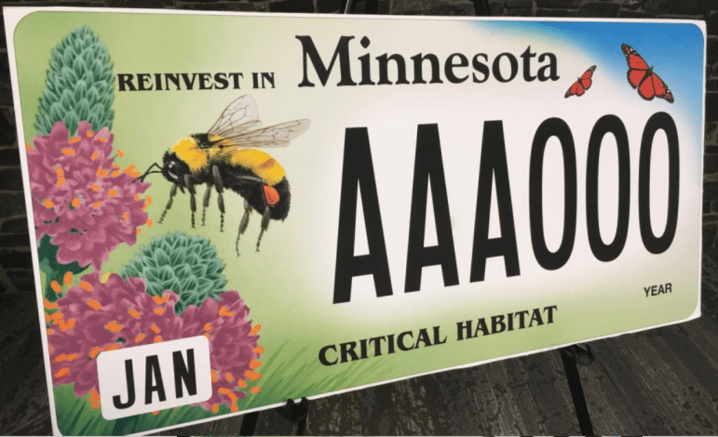
In a world where much inhabited land has become paved, and indeed where paved roads interrupt habitat, ecosystems, and formerly open land, the icon of the America license plate has perhaps rather unsurprisingly become a token of a bucolic sense of place. The images on license plates are not perhaps intentionally advertisements for travel, but often appear to be–from the designation of Oregon as the “Pacific Wonderland” to the promotion of California beaches as a perennial sunset, lined with palms, or Florida as a site of admittedly man-made orange groves.

If cars offer a bit of a billboard of the driver, my own adoptive motorized state of California set a new standard for defining itself by wonderful license plate designed by California painter Wayne Theibaud as an arts plate specially designed to represent California, “Coastline,” whose iconic design of a beach, palms and setting sun in a single panel have funded arts education programs premiered in 1994–the license plate whose sales and renewals have generated over $74 million for the California Arts Council, as “Coastline” is a perpetual gift to his adopted state set a standard publicizing California’s ability to offer artists assistance by a dedicated website for license plates! The sun-drench he’d optimism of the world-view of Theibaud seemed to be distilled, reframed from a painted panel to nestle within the rounded curves of the license plate, the neoprene colors of a sewing sun seemingly a gesture the surfing culture of the coastline that was being depicted–the image was called “Coastline,” even if this was not the entire state–as if offering anyone a utopic view of the state’s riches on its Pacific Coast Highway, a site of intensely scenic traffic in the state, if the volume of traffic on Highway One, or PCH, is pretty hard to determine, and varies dramatically with road closures due to mudslides, fires, and vehicles.

If Theibaud’s work is far more often exhibited in museums worldwide–as well as in Davis!–while other designers of license plates are less well-known, the shift in designing the license plate as an alternative map of automobile registration–and presumably its drivers residence–offers a unique way to establish place on the road, to stake a sense of location on the increasingly mobile crowded highways on which we travel, reminding ourselves of locatedness, even while we are on the road. If the late California painter Wayne Theibaud argued that ‘the best abstract painting . . . is one that comes from something, but it may not be evident,’ calling its process an invitation to ‘speculate and paint the picture of your own devising.’

The experience of driving down coastal California is evoked by and seems to have inspired the license plate he was commissioned to designed to fund state art education programs, the abstract forms of the painting also inspired the artist to make a statement of the power of pictorial arts– they now go for about a hundred dollars on eBay, so valued are they as forms of art of their own as an image which “captures the beauty of the California beach sunset,” evoking a place that we might have long considered, looking only at maps, something that attracts one to drive around, with an automotive experience of its own. While Theibaud probably didn’t only expect folks to study them on the highway, or from behind the wheel, the illustration of place from an abstract expressionist who indulged himself and his viewers with cakes, gumballs, and roadways offers an idealized if familiar driving experience, moving directly into a blinding setting sun with one’s eye on the road.
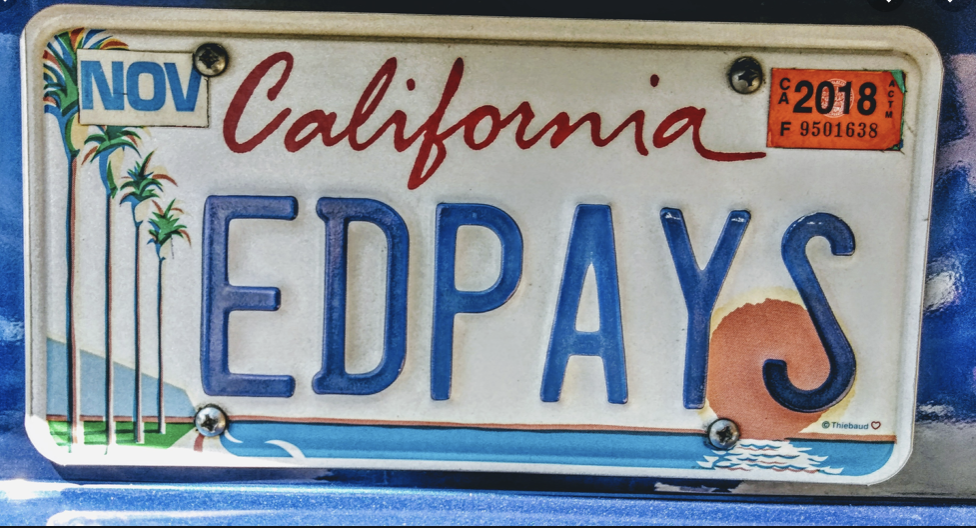
Wayne Theibaud, “Coastline”

The neoprene palette that Theibaud adopted was familiar from his other word, and quite enchanting, transforming or mutating the everyday into an electric view of modern life that let us see the quotidian with new eyes. (To be fair, while Theibaud was showcasing his California roots by that neon ocean blue and setting sun, he was only embraced as a California artist after having found less success in art markets outside the state, and after he became a carpet-bagger in reverse, rolling his canvases up into his old car and driving cross-country to find a New York dealer, with fellow-painter Mel Ramos. The road trip that led the UC Davis faculty member to return to be celebrated as a local pop artist led to the commission for a state’s license plate that expressed his deep concern with the public interest,–if not the most reproduced image of his pictorial corpus–confirming his status as a California artist, for whom California’s landscapes and cityscapes became almost staples of abstract expression, rather radically suggest one might best experience the place by car.
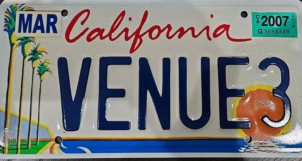
But the dayglo colors he indulged in the license plate whose setting sun is almost an abstraction, extending an orange horizon line that frames the vivid blue ocean and seems to intersect with Theibaud’s road, transformed dayglo palette into a sense of place, if it creates an icon of the state that privileged its coastal highways to Los Angeles, if not the Davis-San Francisco commute. The energy of the bright, open skies that distinguish the state is conjured by the bright colors of the palette that Theibaud, a former sign-painter, chose to express himself–

–are hardly similar to the colors one might find on a map, so much as Sherwin-Williams, but they convey an almost abstract idea of place, conjuring the coastline that was increasingly identified with California, as much as a basis to illustrate a specific landscape, or place: it is almost a state of mind. The frame of the license plate lay at angle to the actual color palette of spectacular coastal scenery the highway offered, transfigured through a Southern California imagination of an artist born in Arizona who grew up in Long Beach, who must have often commuted to the southlands; I’d bet was happy to ignore the bumper-to-bumper bottlenecks at either end of the expressway, despite rewarding views of the San Gabriel mountains as one enters LA, for a romantic coastal view.

Bixby Bridge Big Sur California PCH

Thiebaud’s pioneering work on metal is hardly the high point of Theibaud’s rich artistic career. But it prefigured the vast expansion of not vanity plates, but pictorial maps, or counter-maps to the maps we depend on to navigate roadways that allow us to meet our destinations. And in an age when the world increasing arrives to us in license plates in a way radically removed from the road, in short visual statements, the way that these pictorial images of an unbuilt site, distilling a purity of place on the license plate that rarely exists on the roads themselves. For if the highway offers an unfolding of space and landscape by which we promise to be endlessly entertained, it was no coincidence that Theibaud’s shore-centered perspective in Coastline dialectically generated, as if to illuminate other landscapes that it occluded despite its expansiveness, of mountain ranges–and even to enter the oceanic expanse of its coast–ocean water delightfully dripping off the tale of the whales offshore its coastal waters–in the so called “Whale Tale” plate of the California Coastal Commission–as a new sort of imperative on the license plate, transcending a landlocked place–
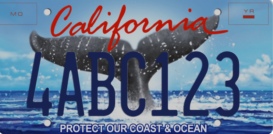
Whale Tale Plate/California Coastal Commission

–that oasertes the unique privileges of Californians as coastal residents by its injunction to dedicate ourselves to coastal protection as if driving on roads were compatible with a clean coastal ocean.

What is the recent turn to shift from vanity plates to license plates that bear testimony to our personal of world improvement? An unforeseen outcome of Theibaud’s creative design may have led many o to wear on your car, or encouraged privileged Angelinos to indulge options of alternative fantasy landscapes, indulging their own artistic skills on a broad cartographic take on the state, to model possibly more preferable to options the state offers, mostly modeled after screen shots of an age of iPhone tourism, that has helped reinforce a bounteous relationship to the land.
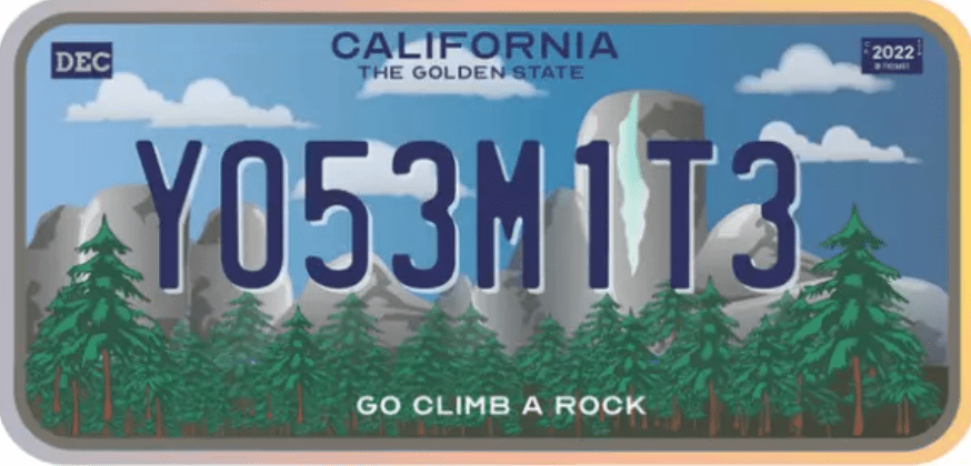
Reader-Submitted Alternate Landscape Design for License Plates, LA Times, 2022

Does the alphanumeric annotation born of computer texting suggest an origin for this image of Half Dome? Could Thiebaud have imagined unleashing the futility of self-designated artists to project alternative image of the state, having pioneered and opened the potential fertility of license plates as canvases? As if in reaction to Theibaud’s preference for the warmer colors of his coastline, the ranges of mountains rising behind the sea became a default alternative in recent years, or the most part, even in environmentally conscious variations to call attention to the mission of Keeping Tahoe Blue–substituting the treasured lake amidst snow-capped Sierras for the coastline of the Pacific–
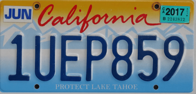
–far starker and more angular than the smoothed curves of Thiebaud’s version of Margaritaville. The mountains are to be sure, if angular, a welcome prospective that acknowledges the ranges that are the spine of the state, hardly as austerely patriotic bent of the South Dakota’s sculpted faces–
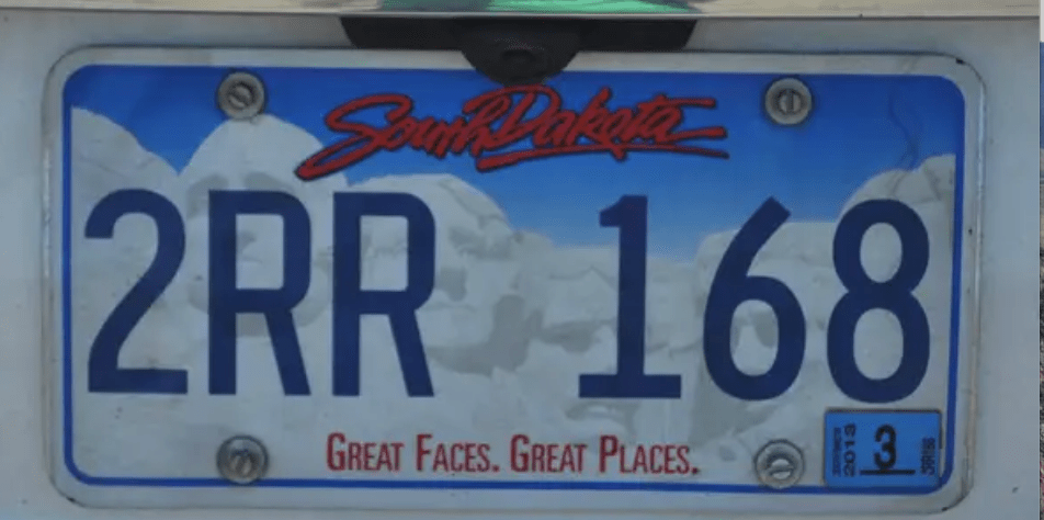
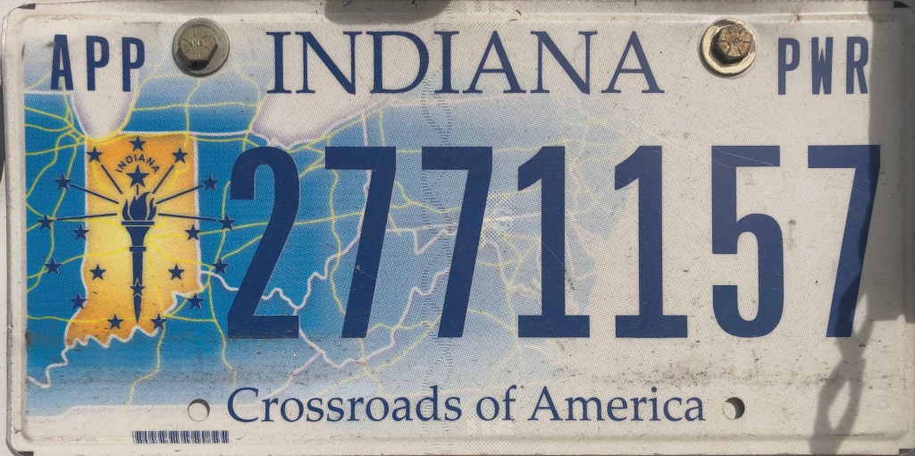
Indeed, the ideal view mediated by the license plate, if not God’s Eye, is about as far from the road as one could get, and intentionally so–a far cry from the plates on trucks that one might see from the midwest, that take the highway map–and geographic image of the state as the center of the USA–that seems unique in reminding one of the highway system left tacit in most license plates!

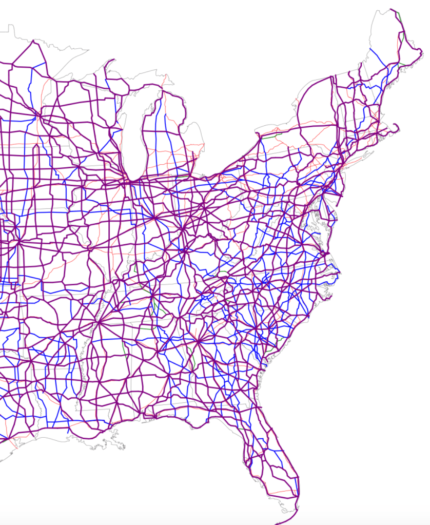
Its design prompts one to remember the central location of Indiana on those unfolded highway maps, in deed, making it an outlier that might very well prove the rule and the thesis of this post. But if the plate was a unashamed symbolization of the power of the midwestern state it maps at the nexus of highways that constitute the nation’s cartographic center, pictorial plates have been adopted in recent years, perhaps encouraged by embossed landscapes, in pictorial detail that almost seek to restore a sense of specificity of place in order to compensate for the placeless spatiality that most motorists experience on most paved highways. Was this due to the death of the paper map, I started to wonder? Or the replacement of physical maps with GPS guidance systems? What of the fate of the maps whose forms used to once define license plates?

Bear me out.

The recognition of place in the frames of plates, increasingly born of qualitative arts, emerged in the 1950s, after all, in reaction to the growth of drives on highways, and the velocity of interstate travel. If cars sped across the landscape, glimpsing roadside scenery without fixed orientation, did the landscapes of license plate promised a sort of counterpoint?

2003 Colorado License Plate.jpg
Colorado Plate Design, c. 2000
2018 Florida license plate IYT E32.jpg
Official Florida Plate, 2018/Dickelbers

Can this official design–here retaining the vague outline of the form of the state, panhandle to the keys–meet a need for place to compensate for the anomie of the skein of the highway systems and web of interstates that now cover much of the countryside, and indeed constitute almost a space of their own, unmoored from place?

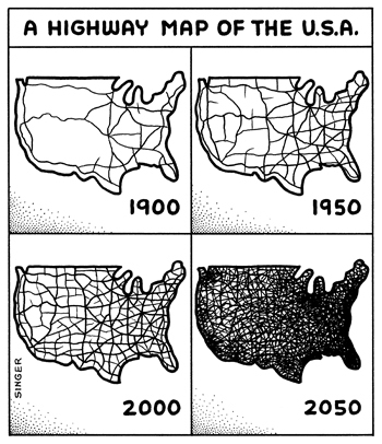
A Highway Map of the USA

Indeed, the rough condensed history of our roadways often seem to have assumed a sense of replacing the places that they traverse or connect, as corridors of transit may have replaced the dominant sense, for many Americans, of where they are located or what sense of place they occupy in the heterotopia of the road. There is a story that this all began with the potato, the early move of Idaho to rebrand itself as the site of its bumper crop, as if reminding viewers it stood in balance with the open road or the future of technology, as if producing a bumper crop just before the Stock Market crash that led so many to rely on supplementing their meals with potatoes that the first pictorial plate in the United States may well have lost some of its luster.

But the humbler hope of agrarian Idaho’s earthy Secretary of State was not only to attract tourists by a flashy “gold potato” but boost the image of a state beyond an alphanumeric identification or serial design, by a visual symbol of pride that have been claimed to have so radically enlisted artistic license in promoting the state’s self-image to create changed atttitudes to the plate as a space to register not only ownership, but a changed relation to an actual geographic place.

1928 Idaho Potato License Plate

While the image of the potato on a field of green may have been akin to promoting the “new gold” of potatoes to Idaho farmers, to inspire regional settlement, it may be that the interest in promoting interest in the place of the potato would bolster tourism in an increasingly automotive culture, and the Secretary of State must have had some sense in the contrast of the rootedness of the spud in Idaho fields with the cars speeding along its interstate, perhaps headed to the Grand Canyon or Mt. Rushmore, and compel pride of place to make Idaho worth a detour for some time–or even plant one’s roots (or irregularly shaped tubers) for future rewards.
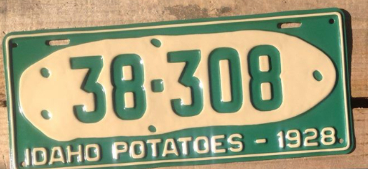
For the first pictorial plate that affirmed the state’s agrarian economy may have been a bit tongue in cheek, a far cry from the open spaces that emerge with a sense of optimistic longing, able to conceal the fact that one is driving in space at high speeds, which if they have included some politicized slogans–as New Hampshire’s commanding assertion, dating back to the Revolutionary War, to “Live Free or Die,” adopted by Gov. Meldrim Thomson as a point of pride to leave his imprint on the sensibility of his state, although the adoption at the height of division around the Vietnam War seemed a summon conservative patriotism, if adoption of the two-fisted motto seemed to manufacture the semblance of a timeless tradition.

The rise of new symbols for states that went beyond a map was suggested in the glorious image of Oregon’s pristine rivers, without a map or even a landscape, in the tones of the incredible fish who return to the state perpetually, traveling along long coastal rivers from the Pacific–the massive Columbia, Snake, Klamath, or Umpquah–by the ghostly rainbow salmon, that suggest the site of wilderness and confluence with the Pacific ocean, to denote the bounteous riches of the state.
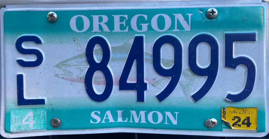
As the legends and mottoes of license plates has expanded far beyond that golden spud, to promote a sense of locality that was perhaps less in the earth but similarly evocative of a landscape able to be experienced above the ground. If historian Rick Just argued “license plates became a different thing after that potato,” screen printing and graphic design have allowed the license plate to become a cartographic and pictorial surface of their own, and a sight for the optimistic reinvention of place, as much as a tourist advert: if there was a change in motto as Arizona decided to follow suit with a catch moth, and stamped “Grand Canyon State” on its plates in 1940, as World War II meant that fewer and fewer families visited the national park’s gorgeous trails, and, in the boom of the postwar era, Minnesota beautified itself as a ‘Land of 10,000 Lakes.”  The visual surface of the plate has become a site of increasing multiplication of attempts to refashion states as places within the small acreage of the license plate itself, creating idyllic scenes that denoted place, as if in response to the placelessness of being on the road.

The politicization of the design of these most common designators of place on cars, the license plate, is hardly surprising. After all, the rise of the proprietorial sense of designing ones own plates is not a far jump to that of viewing the format of the license plats as if this designation of plate were not forms of public writing.  Even without considering the broad notion of what sort of writing this constitutes, the readiness to treat license plate design as if it were an avenue for freedom of speech or a form of expression reveals an identification with self and car to an expressive form and on a semantic plane.

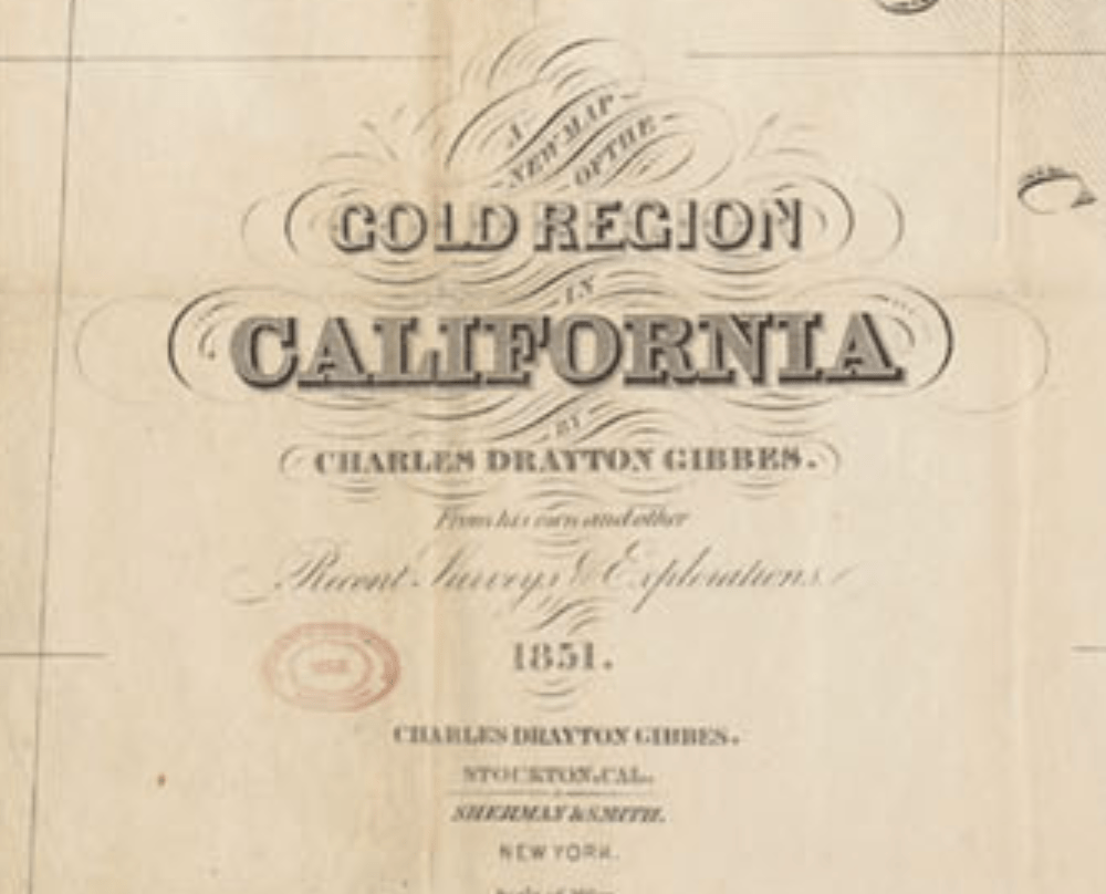
The sorts of legal claims for freedom of speech–or plate–suggests not only an acceptance of the license plate in political discourse, but a pronounced shift not only in the aesthetics but in the use and construction of license plate design from the rudiments of denoting site of registration in the past. If the license plate has only emerged in the past twenty years as a surface of almost pictorial illustration, the purposeful playing with its surface as a sight of design suggests the expansion of graphic design, and understandings of the map as an image of identity. While the gold potato may recall the many maps of the “Gold Regions of California” that were present from 1851 in how Charles Drayton Gibbs promised prospective buyers he had mapped in “Golden California,” using suggesting color choices to suggest where prospectors might do well to look–
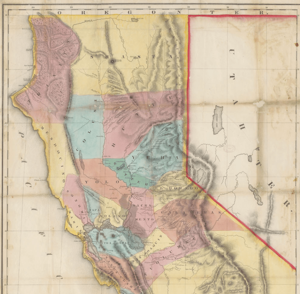
the fantastic places of license plates have expanded with both creativity and cartographic guile, showing increasing abandon about their objectivity, and staking greater premium on piquing interest from moving motorists and passersby.

For during the past twenty years, we have come to identify the content of one’s plates as transcends an identificatory tag, expanding its graphic opportunities as an occasion to raise state revenues and provide vanity illustrations of individualization on the highway and driveway at considerable costs.  Perhaps it is worth asking how this relates not only to freedom of expression, but to our sense of place.  It is perhaps on account of the massive growth of graphic designers and graphic arts, as well as the ease of printing airbrush designs on metallic surfaces, that the license plate, that modest of all surfaces, has recently become something of an advertisement–along the lines of U-Haul moves; the images on license plates have become evocative landscapes that almost embed viewers in their content, depicting a sense of place that seems more alluring than neutrally mapped.  Indeed, the growth of new landscape icons on the license plates that are seen on the road seems to have inspired the coterie of graphic designers at Ars Tecnica to assign an award for the “ugliest license plate” to appear, at the start of the new millennium.

The elevation of the license plate as a site of destination and akin to a tourist advertisement suggested the rise of advertising as much as the pragmatics of automobile registration. The expansion of the world of graphic design to the license plate that suggests a shifting notion to place, as much as of graphic templates in the age of photoshop, but betrays a search for transforming the plate, akin to the car, to a site of identity and meaning, that is deeply tied to the driver’s sense of self, or a convergence of state interests to the desires of drivers, evident in expansive menus of graphic design that DMV’s offer owners of cars, and that offer a gallery on the road, offering a diversity that is sharply American, and seems quite unlike the maps that one might make of European license plates, pre-EU.
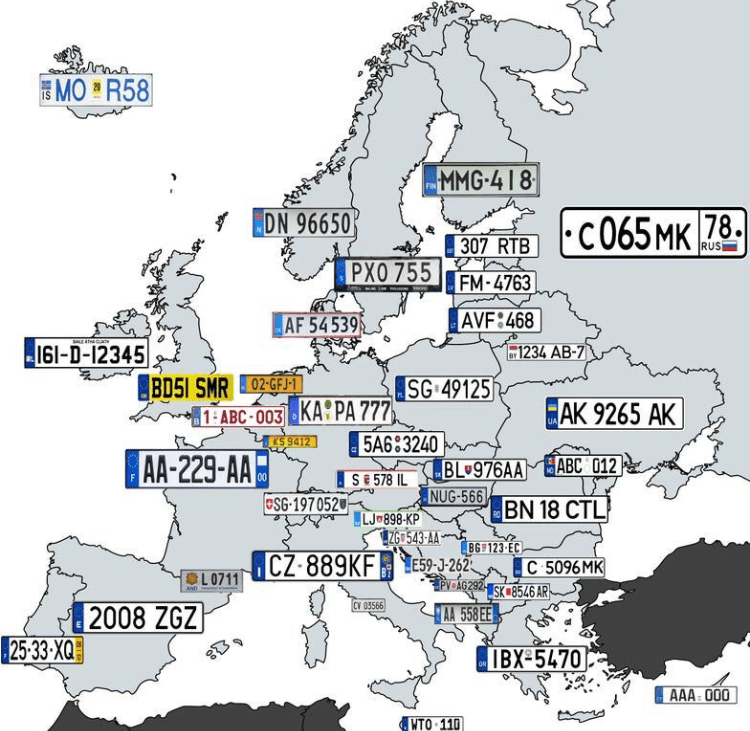
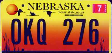
Far from seeing the plate as an official signifier, the rise of graphically complex plates moved a stable signifier of location and regional provenance.  Beyond being a form of taxonomic classification, or an add-on for vehicle registration, the personalization of plates have brought a search to capture the essence of place of patently nauseating kitsch–
6b4450df687af33052b994d7e201293a

–that summons the struggle for place to still exist in a post-map world, as much as it conjures a sense of place that we might really recognize, as if an affective image that tries to appeal to the state’s residents, by its increasing remove from the geographical map–and far more numinous and faux evocative sense of landscape meant to evoke the magic of place.
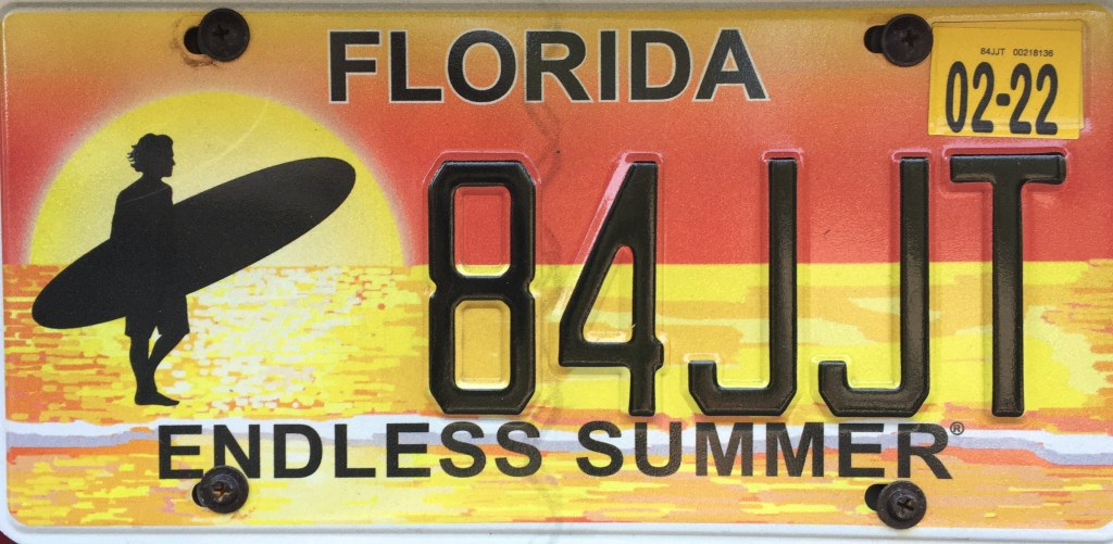
Such a change might well correspond to a sense of the increasing placelessness of a nation that lacks clear edges, and where states have an identity almost invisible save in electoral votes. If the representational unit of the state has declined in national politics, for all practical purposes, there is a sense of reclaiming local identity in the license plate in increasingly immaterial political map.

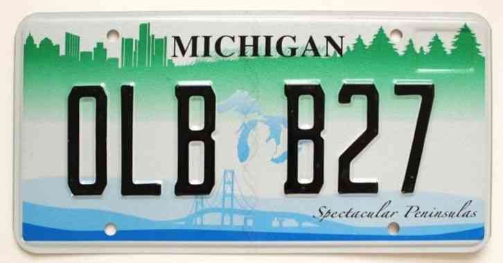
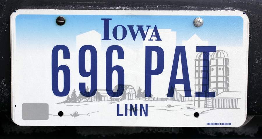
Indeed, the victory of such airbrushed images of landscapes–instead of maps–seem all too often akin to advertisements for tourist travel, airbrushed imagery, which as much as claiming to evoke a sense of place suggests something akin to perpetual placelessness of an alteration of rural and urbanized landscapes blending into one another, almost suggestive of an appeal for place before the increasing lack of differentiation of the national landscape, even when evoking a map to give stability to a fleeting sense of place.
n
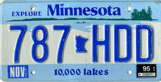
Indeed, despite the radically limited cartographical content of the raised state pictured on the New York State license plate, a considerable effort was invested in affirming the iconic centrality of the state, even it it is a barely recognizable or distinguished blob of paint when raised metal when at close hand.  

To be sure, New York license plate design is distinguished by its ability to comprehend a broad geographic unity, and functions as a mapping as an illusion shrinking the geographical distances between, say, Niagara Falls and Manhattan in a somewhat short-lived attempt to spread across the economically and culturally quite diverse state–
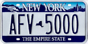
ny_license_plate

–as if to champion the miracle of the transport of water in its hydrological infrastructure, where the water of northern reserves are channeled downhill to fit urban appetites and needs: the parking of two vignettes of quite different scenes, demographics, and even political inclinations, links the upper state and the metropolis of New York City (or Manhattan), by moving from the bucolic scene of Niagara Falls, an abundant cascade of water and iconic from postcard view, to the image of the Empire State Building in the concrete skyline, linking built and natural environments in persuasive ways that the state map may in some ways fail to do so effectively any more, using the old role of vignettes to construct a new affective regional identity–
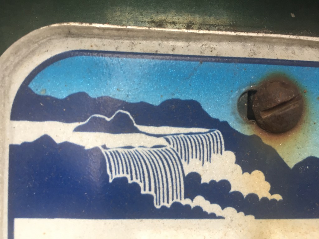
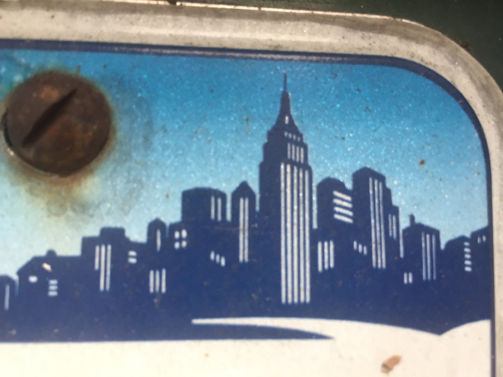
–that trumps actual geographic continuity, if embedding both in an imagined skyline, itself bridged by the words “New York.” more than reality. The license plate relies on the map, even if only as an atrophied remained, as a hyphen between alphanumeric license numbers, to create this bridge, and remind us of the affective relation to a region!

Although these dramatically reduced maps are but tokens, a visual pause between digits, numbers, or letters, and have lost geographic identifying functions for most states, they affirm a sense of unity. The placement of small, raised maps in northeast states–New York; New Jersey; Connecticut; and, to an extent, but in a different fashion, Pennsylvania–suggests a survival of the cartographical as a remainder of which some states are not ready to let go or consign to the dustbin of history, even in an age of GPS and digitized maps.  Not really a visual fetish, but a designator of place, distinguished by an exaggerated appendix of Long Island, the New York image is no doubt the most familiar and recognizable, even if its edges are quite abstractly smoothed so that they provide little resemblance to an actual map, which is reduced to a mere token.
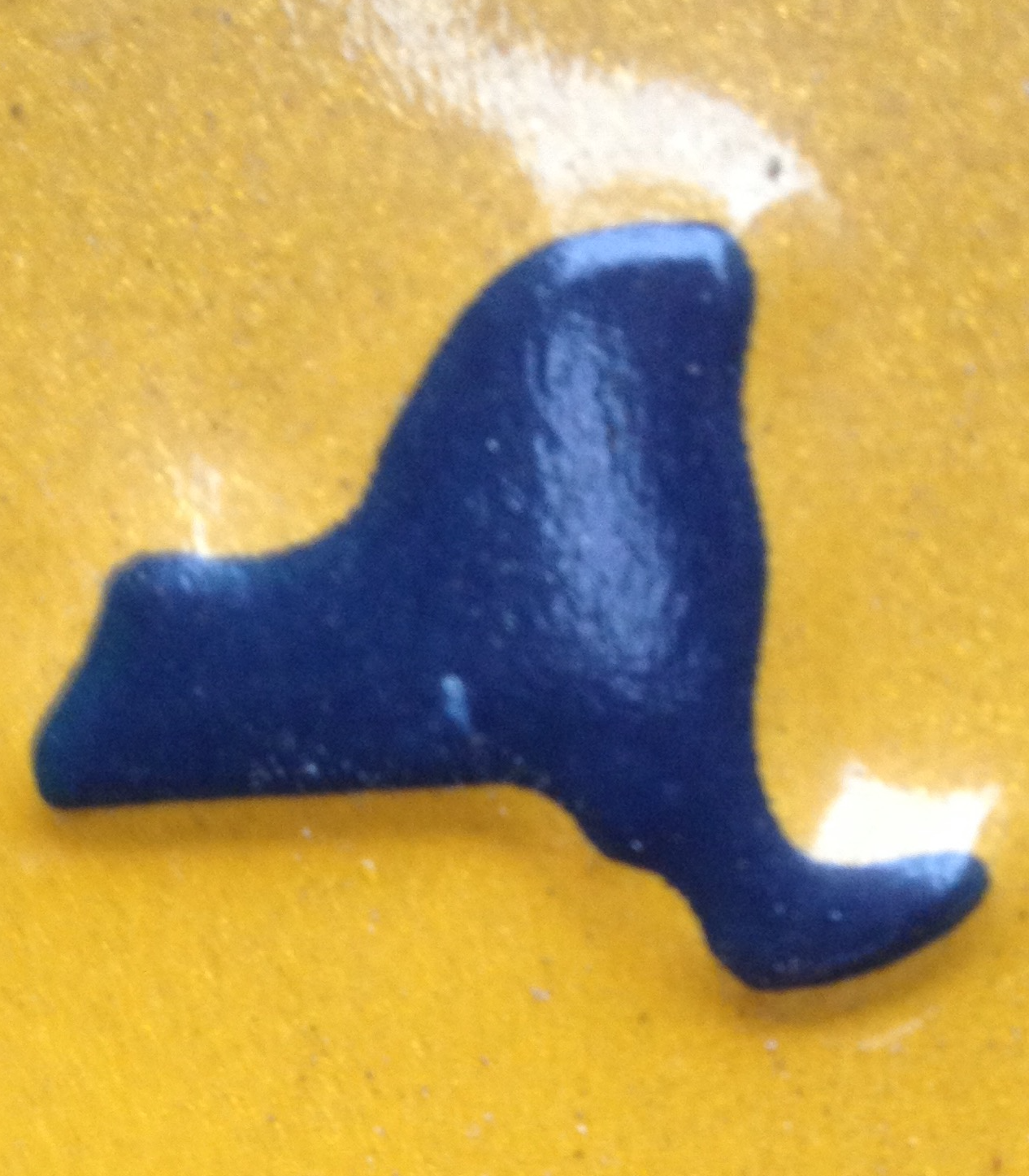
NY state blip on license plate.png

While the map is paired by a similar centrality of New Jersey in license plates in the greater metropolitan area–and in the image of the ‘keystone state’ that is used to punctuate Pennsylvania plates, the diminished centrality of the map in license plates suggests a certain sense of loss, and a sense of bolstering the symbolic currency of the meaning of the old jigsaw puzzle map.
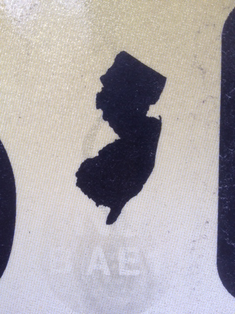
NJ.png

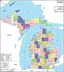
To be sure, there is an ativistic survival of maps migrated into some license plate templates, as if to curry favor among an older audience–that continue to try to reconcile the built horizon of Detroit and the bridge that spans the great lakes with the blue icon of those majestic bodies of water themselves, which, while in fact spanning several states and two nations, provide a symbolic shorthand for the state and its unity to the Upper Peninsula, as well as foregrounding or advertising its spectacular peninsulas–
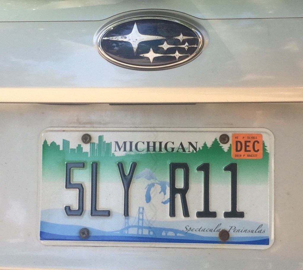
–as the sun setting over Lake Michigan, in the prospect of “Great Lakes Splendor” shows a sunset through the iconic span of the bridge, foregrounds the landscape’s unity by cool blues lake waters.
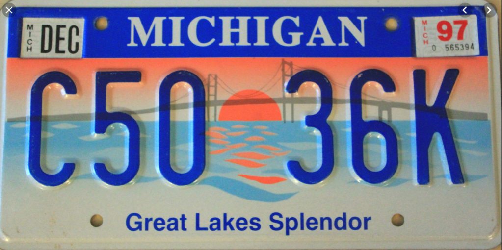
The issue may be relatively pronounced. For unlike other states, save Hawaii, and no other non-cosstal states actually bridge bodies of water in their sovereign space. Indeed, if maps provide the most familiar and powerful ways of uniting space in a coherent fashion, the problem of coherence in the “other border state” are profound.

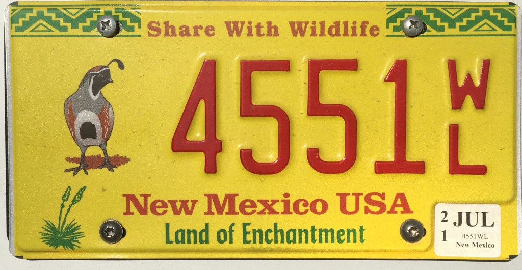
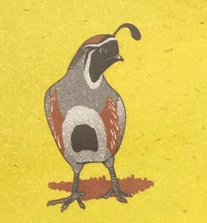
There is a cure pleasure, indeed, in attempts to restore a sense of native habitat, all too rare in the license plates I have studied, by foregrounding the natives quail of New Mexico–an added treat when this motorist discovered it was a feature that was an option at his DMV, and a way, perhaps, to compensate for deep guilt at the change of global atmosphere that the release of carbon and greenhouse gases the driving of the car–even if it is electric–releases while on the road.
–if the inclusion of an actual non-automobile driving person to watch out for on the road seems to be one of the more important injections that would lead the license plates to be seen as a valuable injunction drivers should not lose sight–in this case, quite brilliantly fit within the Rocky Mountains of the Rocky Mountain state.
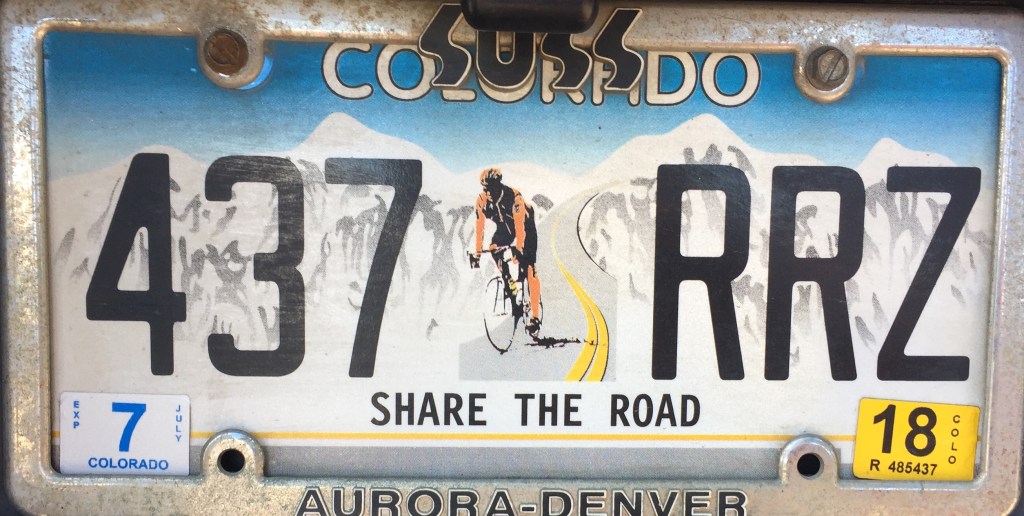
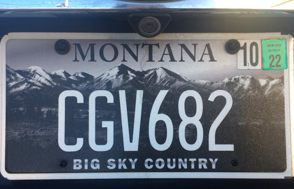
A strikingly similar generic skyline was adopted not only for Colorado, the Rocky Mountain State, but in grisaille tones, by the state of Montana, less sporting, perhaps but with a broad deep-ground perspective that situated the state on the edge of the mountains, using the greytone minimalism to suggest a broadly atmospheric setting, if with markedly less snow.
Leave a comment

Filed under classificatory schema, iconography, license plates, mapping United States, states rights

Drawing Hypotheses on a Newly Mapped World

At the same time as maps offer guides to spatially orient their readers, they collect a record of known space for viewers to occupy, collecting and displaying relationships that allow viewers to draw hypotheses about their relation to a totality otherwise not able to be seen.  The format of all maps provide tools to understand and collate relations over an expanse otherwise not evident.  The possibilities or potentiality for such comprehension–or the experience of the knowable–is encoded in the directions that any map provides to better navigate space by ship, car, train, or plane, but its syntax is also an invitation to inhabit space to formulate a hypothesis about expanse; early modern maps are especially conscious about how they mediated a record of the inhabited world.

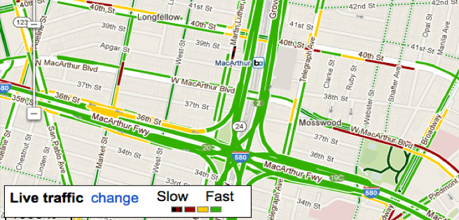
My interest in how maps make these relations evident in multiple ways has been a theme of earlier posts; I have elsewhere blogged about the spaces Google Maps present for viewers, and the limited frameworks they offer to occupy space.  Once might do well to gauge the productivity of how maps generate hypotheses about an individual relation to expanse by the unity by their  representational surfaces–although the pictorial aspects of maps are too readily categorized as qualitative additions, held in contrast to their quantitative construction or collation of precise measurements of terrestrial position.

Early modern cartographers in the Dieppe school, like Nicolas Desliens, adopted modern practices in the hand-drawn maps, typified by the below 1566 world map, based on Portuguese nautical charts.  The maps retained the format of projection, but offered a new way to inhabit the expanding world map for elite audiences–here by displaying a new region of the earth, Java la Grande, a mythical island that described by Marco Polo and perpetuated by the cartographers based in Normandy:  the green swirls on Java recall the engraved illustrations in works of early modern botany or natural history that Sachiko Kusukawa has argued constituted material evidence from the natural world.

800px- Globe by Nicolas_Desliens_Map_(1566)

Java la Grande is prominently labeled, and the undoubted centerpiece of this world-map by Desliens, even though it is not at  its center:  it is, rather, introduced as a new area of inhabitation, whose verdant interior is a seat of spices and potential wealth, as well as lying, cosmographically speaking, in a sense as a complementary counterpart to the Americas, echoing the harmonious balancing of landmasses from ancient geography.  But the map also advertises the region’s potential wealth to potential backers of voyages.  There are, however, limited use of formal codes to structure the map’s surface, despite its notation of tropics echoes of the formal structure of world projections, or other conventions that lend order by structuring the map’s surface for its viewer.

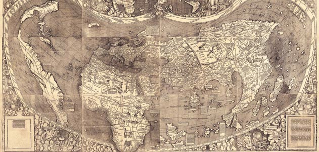
The circumscribed role of America in Desliens’ map is perhaps also striking to modern viewers because it minimizes the expanse of the Americas in a somewhat marginal manner, probably recalling the thin crescent of coastal archipelago in the multi-sheet wall chart the humanist Martin Waldseemüller designed, which did not even name “America,” and gave far greater place to South America

Waldseemuller-Map-631

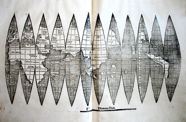
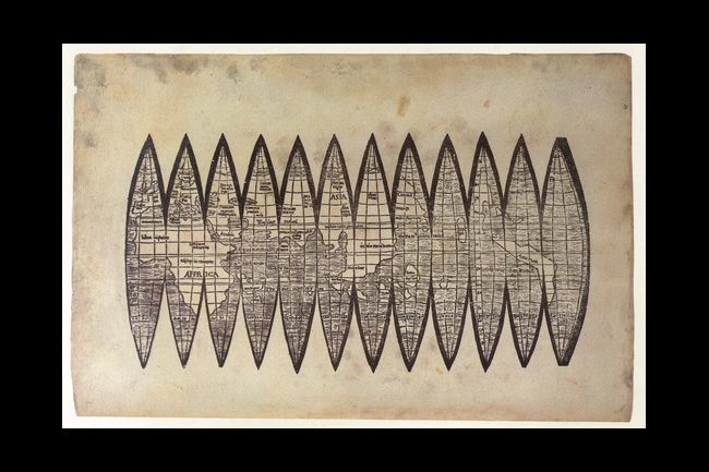
–though Waldsemüller did name the region on the slightly later set of printed gores that he engraved for purchasers to use to assemble their own globes:

Wertvolle Waldseem¸ller-Karte entdeckt

Waldsemüller exploited the expansive wall map of twelve sheets as more compendious and expansive record than a globe.  The limited employment of conventions to structure their graphic surface might be explained to some extent by the use of map signs to comprehend a range of toponymic content and limited authority of map signs to structure their surface.

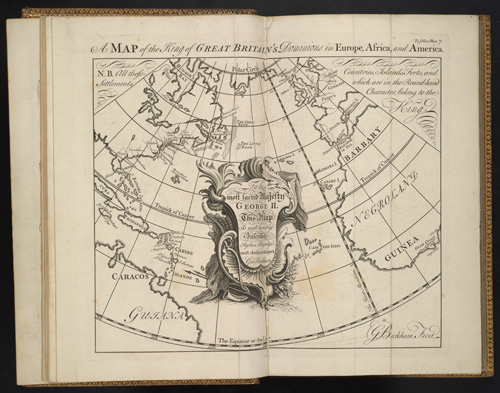
These images synthesize nautical charts in a comprehensive system of knowledge are at a remove from the ways that information is displayed about America–if still an empty land-mass– in later explicitly political maps that placed the Americas as an appendage of royal sovereign space, or as an area of self-government.  In an instance of the first case, Georg Bickham invited viewers of his 1748 “Chorographical Description of All the Dominions Subject to the King of Great Britain” to process their relations to its disparate dominions in a coherent ways as nothing less than a political space.  The conflation of a chorography of the national community with a global map is a classic conceit of empire:  but the below engraving suggests a wonderfully compelling way of reasoning across two hemispheres.

The map, engraved and printed in London for audiences far more familiar with maps, shows continents as unpopulated landmasses, but the relations of whose inhabitants were subject to the royal rule of George II, in a somewhat magniloquent statement of royal rule for its viewers to scan.  If the map reveals the expanse of Great Britain’s “Dominions in Europe, Africa, and America,” it is an optimistic knitting together of regions geographically removed, but subservient to the royal crown whose cartouche still occupied center stage.

Chorographical England 1748

To be sure, this image processes something of a cognitive map of the royal subject’s relation to the vast terrestrial rule of George II as a totality that spans no less than three continents.  The map is straightforwardly political, but conjures a land of royal unity that was geographically dispersed, and linked symbolically only in the map.  Indeed, the cartouche in which Bickham inscribed the “Lord Majesty” in relation to its subjects has greater prominence or centrality in the map than any place-name or region that is represented on its surface, as well as considerably more ornate a subject of Bickham’s burin in the acanthus-like flourishes and drapery:

Crest as Cartouche

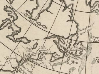
The obedience by which the royal subject inscribed the expanse of the map is more prominent than its geographic content because the map is quite distinct from a geographic record.  The regions of North America are in fact rarely mapped in much detail aside from their shorelines; greater detail is accorded The Banks, shoals famously dangerous for nautical approaches, than other areas, and the ties to Britain confirmed more by toponymy than by qualitative detail or the density of its inhabitation, and other than its coasts is largely blank, suggesting greater habituation with nautical travel:

Upper Canada--1748

Curiously, in this map of British global possessions, boundary lines among the colonies are noted but seem almost notional than juridical, and far less fixed in space than the rivers with which they intersect, dotted lines that extend into an unknown interior before they peter out into a vast unmapped continent, as if inviting viewers into blank unmapped regions.

trailing boundary lines of political division

The map illustrates the invisible ties of power that united these regions, far-flung as they were, as an image of royal authority.  If maps were advertisements of power and illustrations of authority in the early modern period and Enlightenment, this map serves to create a set of fictive ties that united and oriented its viewers to a sense of disconnected space, which the cartographical content of the map was not in itself sufficient to process.

The map complements a written printed chorographical description, as much as it offers a strictly cartographical record, the symbolic use of whose conventions allows us to connect geographically removed regions in its pictorial space.

Leave a comment

Filed under Dieppe School, Georg Bickham, George II, Java La Grande, Martin Waldseemüller, Nicolas Desliens, pictorial space, Sovereign Maps

Mapping Worldly Entrances to Hell

We are all perhaps forced carry our very own hells with us,  even keeping their maps and the routes of access to get their  in our heads.   If the location of Hell has been mapped and re-mapped as a personal experience since the Renaissance, defining fixed locations of Hell projects something of a state of mind to the world’s physical geography.  If, to quote Marlowe’s Mephistopheles, “Hell hath no limits, nor is circumscrib’d/ In one self place; but where we are is hell,/ And where hell is, there must we ever be,” the places Hell resides is almost a practice of mapping that reflects a culture’s cartographical imagination, hell has proliferated in the age of genocide on an unknown scale, as the atrocities of Armenia, Cambodia, Argentina, Bosnia, Iraq and Rwanda have created new landscapes from hell that have proliferated in the world as real places of a level of trauma that transcends any normalcy, including the normalcy of a map.  And the appearance of worldly hells over much of the world may have its  rhetorical apotheosis in the fondness Donald Trump had for mapping hell on earth–the cities of America that are now “crime ridden hell holes” and the “hell holes” that are the origin of immigrants who cross the US-America border–even if the hell-hole that might be a prototype was in Guantanamo, not Mexico.’

In antiquity, it was easy for the son of Anchises, Pious Aeneas, founder of Rome,  able”to descend into Avernus” directly since for him “Death’s dark door stands open day and night,” with the dire foreknowledge that “to retrace your steps and get back to upper air,/That is the task, that is the undertaking./Only a few have prevailed.” If it was  possible to be ferried across the River Styx and “to explore the dark abyss/ . . .  in the pathless/Shadowy valleys” where fate had called him, few would know if they would return, as the abyss was not that easy to leave even if one knew the entry-point.    There was a time, lest we forget, when entrances to worldly hells lay confined to the walls of churches, in the threatening death panel paintings of the Last Judgement,–

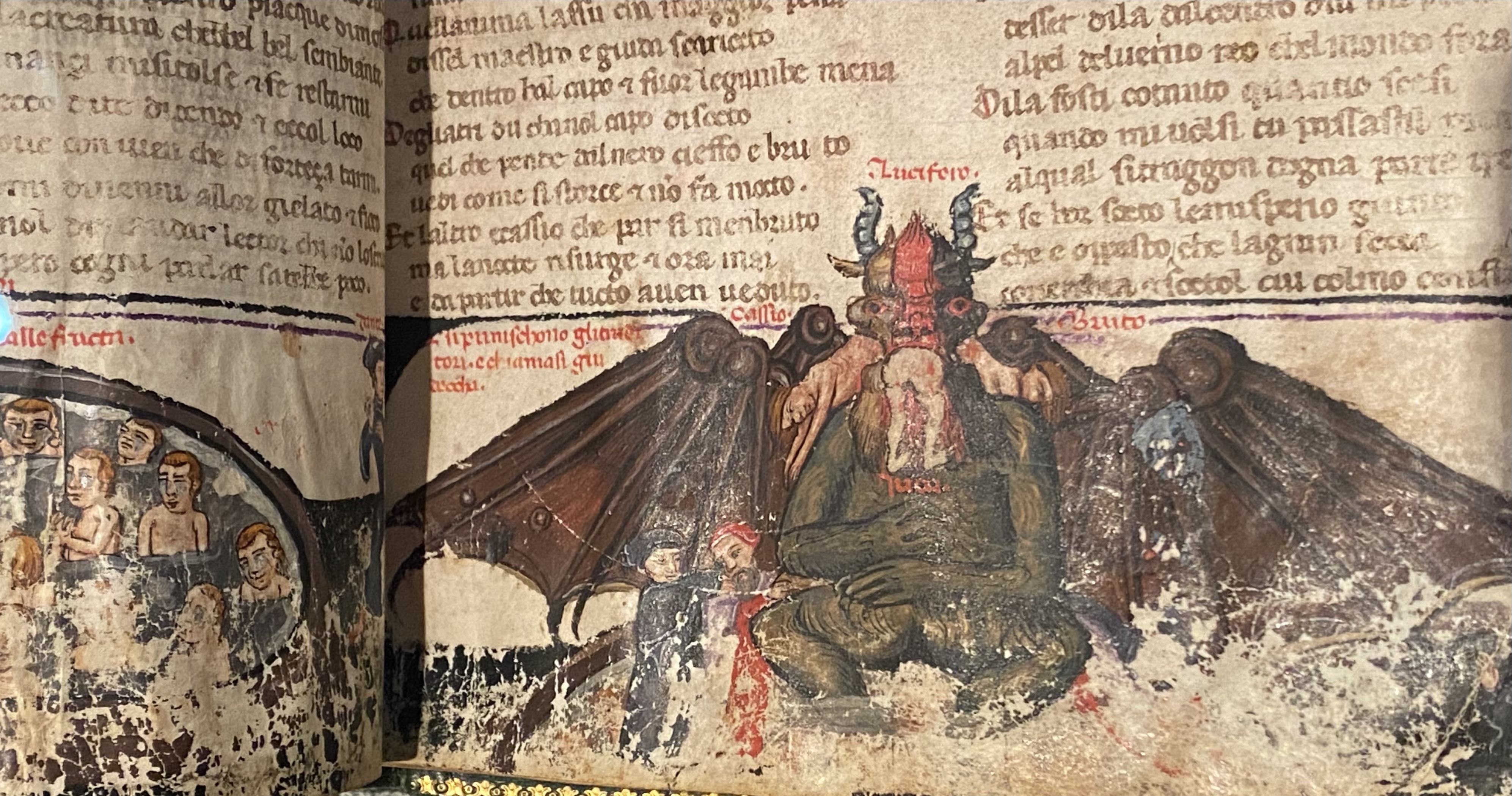
–or lay safely at the foot of the manuscript pages of Dante’s Inferno–just under the terra fima poetic text–

Inferno manuscript of the Third Quarter of the Fourteen Century, MS. Holkham misc. 48/Courtesy Bodleian Library

At the time of the war of the Holy League against the Turks, the painter El Greco seemed to have outdone Dante, or remapped the landscape of hell one had read in his poems, in new ways, as a precipice toward which Europe was about to hurtle, seen through the gaping mouth of a shark, as a worldly incarnation of the diabolic, that the pact between the Pope, Rulers of France, Spain, and Venice were able to expel from the world, leading troops to beat back the Turks from the Mediterranean, as if to affirm the sacrality of Europe against outsiders.

The maws of hell in El Greco’s terrifying piece, long kept in the Spanish monarch’s personal royal collections, suggested that the monarch had averted hell from entering into the modern world, keeping it at bay in ways that had only grown increasingly problematic and perhaps apparent over the divide of Christianity in the sixteenth century, an era when the jaws of Hell became more broadly apparent across Europe.

El Greco HOly Alliance Hell

shark like maus of hell

It may be that we carry around our personal hells with us.  But the mapping of worldly entrances to hell came back with a fully secularized vengeance in the Second World War and long before.  For the problems of these atrocities challenges on an ethical and moral scale the commensurability of our conventions of mapping, and with it any commensurability itself.  Perhaps the muted colors and odd grey zones by which earlier concentration camps in the Nazi era suggest that they are zones “off of the map,” indeterminate spaces ringed by green fields, all but exempts them from conventions of mapping, their primitive barracks, gates, transports, mess halls, work fields, ditches and crematoria all outside of “normal” space, and unmapped, left to strain credibility–even if they were viewed from space by reconaissance flights, these spaces and their modern proliferation cannot be adequately morally mapped in ways we know the world.

FARBEN_DWORY

This sense of places out of the normal, hardly part of humanity, has perhaps led to the proliferation of maps of hell online.  The problem of proliferating hells is a one good way to describe modernity.  From Samantha Powers’ attempt to map “problems from Hell”  as eventualities the United States government will be condemned to face to the problems of mapping atrocities that recurred in the terrifying landscapes of Hades, Argentina, worldly hells have proliferated in the world from Nazi concentration camps to sites of disappearing that ask us to map the presence of hell in the world, in a grim geography of devasttion that challenged pallettes and iconography to describe adequately.

grim geogrqphy of devastationaBefore these maps of spaces of dehumanization and devastation, we are really looking into hellish worlds we had not been able to see before.   But even these dots cannot capture the scale of the hellscapes that emerged for the accelerated loss of life within the industrialization of death that proceeded from Heinrich Himmler’s order of 19 July 1942 stated that unleashed mass-killings from bullets, fire, and gas extermination to fullifll the demand that by the end of December 1942, all Jews, gypsied in Greater Germany be killed, leading to an unprecedented intensity of rates of mass-killings almost impossible to map on paper or by a graph, challenging as the spatial dynamics of the three-month long burst of killings is poorly documented–intentionally–and indicate a terrifying challenge to the world of the data vis that challenges the imagination to even attempt to “map” in the over 40,000 camps of imprisonment and mass-killing that were built between 1933 and 1945, dedicated to imprisonment, forced labor, or mass killing sites dedicated to exterminating Jews, Sinti, Roma, Communists, and so-called “enemies of the state.”
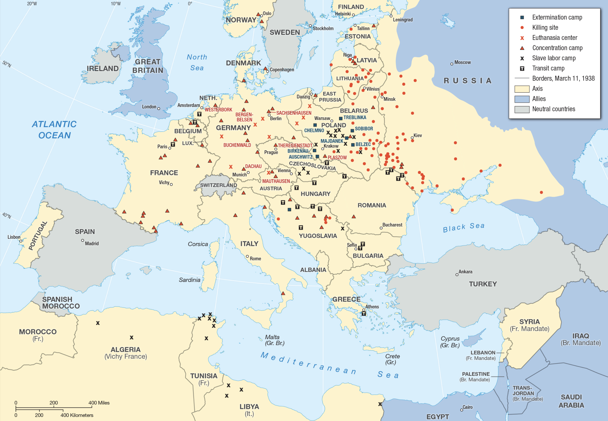
extermination

aau7292-f1

There is a sense of the utter inadequacy of an aerial view–or indeed even Google maps–to map the horrors of sites commensurate to their moral and ethical existence, as if they lay resolutely and stubbornly outside the known world and could not be assimilated to the categories by which we map it.

Landscap

Aerial Reconnoissance Flight over Auschwitz-Birkenau, April 4, 1944 

It’s perhaps not a surprise that every culture seems to have its own notion of Hell but of where the location of hell and its entrance is.  If one can pinpoint and map it in an image of the known world, perhaps one can escape its presence in one’s own mind.  The poet Czeslaw Miłosz wondered, in a very late poem of 2003, “Have we really lost our faith in that other space?/ Have they vanished forever, Heaven and Hell?/ . . . And where will the damned find suitable quarters?” and bemoaned almost tearfully the unimaginable proportions of the “enormity of the loss,” but there is considerable existential comfort in being able to map Hell with security, and indeed to map the intersection between hell and the world that seems normal, as if the presence of Hell demands of expressibility that elicit stubborn difficulties in placing recurring reappearances of Hell on the relative poverty of conventions we use in a global map of human settlement. The problem of mapping hell was perhaps long a part of humanity, as much as the evils of genocide stupefy in their excess, and raise questions of how to map not only people and places but souls in the world.  Mapping hell is, indeed, something of a poetic feat.

Mapping was long about finding a place for the soul in the world, however, as much as ordering spaces or offering way-finding.  You know the lay of the land, and the parts you want to avoid.  As if consciously and quite intentionally one-upping Christopher Marlowe, on seeing the efflux of modern industry afflicting  London, Percy Bysshe Shelley imagined “Hell is a city much like London— A populous and a smoky city,” to comment on the transformation of England; his belief that “It is not necessary to consider Hell and the Devil as supernatural machinery” is uncannily similar to the many maps that pinpoint Hell’s multiple worldly entrances for those eager to read them.  It has long been far more satisfying if one can try to pinpoint the entrance points in informed fashion, using some sort of knowledge or evidence to buttress the choice.  The location of “Hell” or the underworld was, of course, pre-Christian, even if it is now colored by Christian sources; Hell is a pre-Christian mental geography that was mediated by Christianity and its own specific notions of suffering  and remorse, but also is a place that we all know exists, and are eager to find–although not to go there ourselves.  Is it any surprise that the dominance of point-based mapping, with its comprehensive tally of location, raises the fundamental moral question of mapping a common relation to hell?

Perhaps it is a coincidence that the proliferation of hells began with the dominance of new national maps, and new military maps, crafted to enable us to think outside of a national frontiers, created a point-based mapping system like the Universal Transversal Mercator, that raised moral questions of where hell was, and that hell exists in the lives of most modern refugees, who live not only outside the edges of borders, but, as the unhoused, outside of geolocation systems.

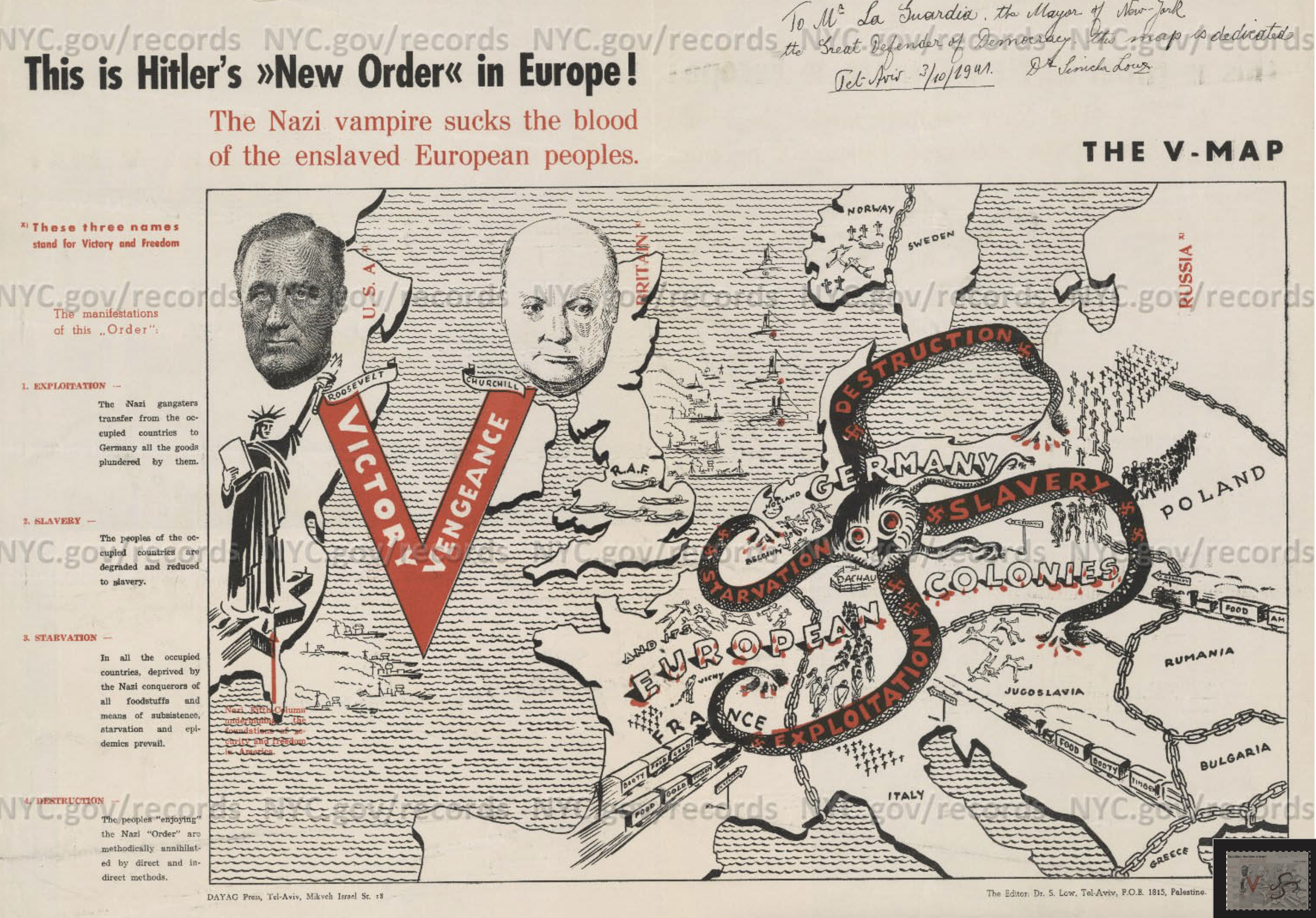
But perhaps our current maps, dominated by geodata, force the question of the lack of location of a hell, at the same time as we are seeing a proliferation of global hells, all absent from the point-based maps that we treat as surrogates for reality.  According scripture, Hell is located deep down in the earth, without either geographic specificity and far more figuratively evocative than precise.  Hell is  reality and state of mind for the Gospels and Apocalypse; it is not a precise location:  it is a place where in “outer darkness: there shall be weeping and gnashing of teeth” (Matthew 25:30), whose inhabitants are “in agony in this fire” (Luke 16:24), surrounded by “the devil and his angels” (Matthew 25:41).  The topography of the new camps made little sense in rational mapping systems, but as a vampiric relation to the enslavement of people, before the scale of atrocities could be imagined.

nazi-vampire-1941

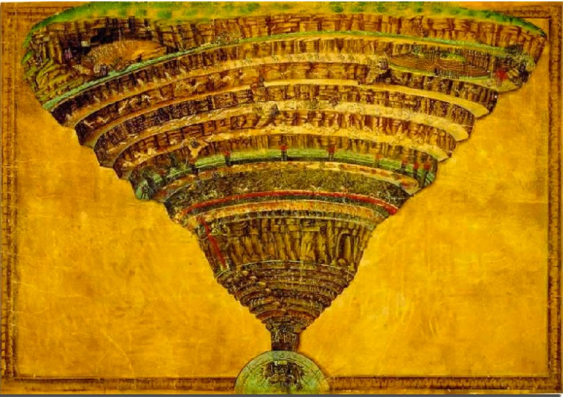
The image of perpetual burning, self-consumed bodies has been embellished with extensive pictorial detail as a place of eternal punishment, and a site of the destruction of both body and soul and of unending separation from both; it was based on the Old Testament idea of  “Sheol” as an abode of the dead (Psalm 49:13-14)–or of those with no abode or place to be, but this place with no life was always seen as closely connected to our own.  Hell was deeply spiritual for Dante and in his age–the appeal that we had an informant who had in fact been their to survey its complex topography and descending rings of punishments bore the satisfying sense that we knew where we are in the moral compass of life.  The appeal of Dante’s map of hell is evident in the considerable care and detail which Sandro Botticelli and others used to delineate the space through which where Virgil led Dante and navigated among the inhabitants of hell’s circles–an image popular in the late fifteenth century–that could be examined with some recognition and even more amazement as a site of the afterlife.

Botticelli's Ms Map of Dante's Hell

When Dante’s Florentine editor Girolamo Benivieni’s prepared a printed edition including engraved maps, the portal to Hell was strikingly placed in explicitly modern geographic terms within the terraqueous sublunary world:

Benivieni 1506 Dante's Hell

The deep comfort of this clearly mapped ontology of the afterlife is to some extent preserved today.  Online, we can also navigate this image, thanks to digitization of manuscript images, on one’s very own, and explore the mind-blowing map that Sandro Botticelli drew as if confronting the page from inches away in all its gloriously imagined Dantesque details.  The mapping of Hell has taken off in ways that oddly reflects a pretty secular age; sites of anguish and suffering are, it turns out, still pretty compelling to map in a geographical lens.

Compelling woodcut maps described the topography of the realm of the Dantesque afterlife with exquisite geographic care:

1527_33.wc1.150dpi

Hell was long an individualized affair, and rightly so, the culmination to a balance of sins physical and of mind.  But the mapping of a public geography of hell–entrances to the underworld, now navigated not only but Virgil and Vulcan, or even Percy Jackson, but able to be pinpointed on a map.  There seems to be somewhat of a flourishing of the addition of “Hell”-sites on the web today, in fact, something of a response to the absence of this all-too-concrete state of mind from the reaches of Google Earth–not that some folks haven’t tried.  Perhaps the absence of hell’s location on Google Maps–or how Hell frustrates that portal promising ubiquitous coverage to any user–may have helped generate something like a proliferation  of on-line pseudo-erudition about Hell’s possible locations, and the curiosity that it could be in fact right around the corner in some pretty familiar sites that we can arrive at by our devices.

The appeal of mapping hell–and at looking at the sites where others map hell–is a branch of the Googlish compulsion to provide a total mapping of humanity, as much as a religious ontology, and is reflected in the proliferation of models of Hell that circulate online and provide some sort of satisfaction that we known where we are.

Continue reading

1 Comment

Filed under Apocalypse, Biblical Geography, Global Displacement, Google Earth, Hell

Environmentally-Induced ADD

The disorientation of “environmentally-induced” Attention Deficit Disorder is not the result only of a piling up of diagnostic categories:  it is a piling up of detailed sensory stimulation, a lack of filters for hedonistic pleasures, an assault on the senses that defies information overload but approximates a disorientation of sensory overstimulation:  if ADD hyperactivity made it into DSM IV, entering a Whole Foods store and not knowing which aisle to walk down, even though you have entered the pleasure palace only in search of a tooth brush or some strawberries, is a bit of an induced disorganizational phenomenon in itself.  You find yourself under some sort of assault in a land of such overwhelming abundance where objects cry out as if you really need them, and sales assistants, who have the right to give away up to $20.00 of goods per day if it will boost sales, beckon with potentially enticing trays of moist carrot cake or fresh juices, all of them hard to ignore.  The attention to accumulating all of these goods under one rooftop and in such an attractive display makes it difficult for one to sustain attention to the task of shopping, or getting what one needs for the menu in your hand, as the culinary details with which one is assaulted or to which one is invited to be privy lead to repeated careless mistakes about putting things into your shopping cart.  Being “often needlessly distracted by external stimuli” (criteria number 8 in DSM IV) become a way of life when cruising that supermarket aisle, not to mention difficulty organizing things necessary for tasks (number 7), in this case leaving the store.  (Perhaps one also encounters a difficulty awaiting its turn to enter DSM V.)

This is an odd permutation of the cult of self-identifying as a locavore, or circumscribing the terrain from which cultivated food will be consumed to a restrictive radius.  As we discover the American terroir in our kitchens with Rowan Jacobsen, indulging in the locality of geographically specific flavors, we’re apt to wonder where we are even as we fantasize about the benefits of living off the land.  It’s no doubt in part that we need to remedy this sense of dislocation–of remove from the sources of our food–that we rush headlong into sourced tastes.  But there is something odd about being offered a geographic pedigree of locally farmed food and not being able to process whether you really need to relocate it into your refrigerator, or  single origin beans on whose origins you can’t place a value.  The collection in our high-end supermarkets of vegetables of excellence provenance, identified by agrarian footnotes beside their price tags, often seems intentionally and oddly disorienting in itself. so culturally removed is our own map of the origin of eggplants, apples, cranberries or kiwi from our sense of where we are and the reasons why we entered into this store, anyways.  Is the scholarly apparatus on those placards informative or a nagging distraction?  It is hard or at least a challenge to hold in one’s head the map to which objects of fixed provenance in the supermarket correspond.

But the cost is one of extreme disorientation as one enters the brightly-lit floor of the local supermarket that caters to such high-end locovoric tastes.  It is one thing to have a map of terroir on the wall in a wine shop for customers; the map is a tool of identification and situation of the grape or the vine, and demand a degree of expertise (or map-literacy) to be read.  There was a clear identification of provenance in an ice-cream store that boasted to use only the milk of family farms in Vermont for its super-premium blends (as did, at first, and to some extent still, Ben & Jerry’s) or the ice-cream pleasure palace in Bologna, Italy, that claims to use only milk from the Romagna (the local region surrounding the city in north-central Italy) to make its highly saturated super-rich gelato (la Sorbetteria Castiglione)–but locovoraciousness looses focus as it is staged in a setting of consummate marketing and, its counterpart, hedonistic consumption.

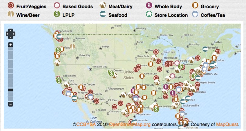
As if response to the criteria of sourcing vegetables from a ten-mile radius at some local farmers’ markets in the region, the folks at Whole Foods have offered to clear this up for customers in an on-line local foods map that allows us to look at what local goodies stores offer across the country–even though this can help us sort the information overload of the aisles, as we look scour the country for the locally produced goods that might be available at our own Whole Foods outlet–or develop the sort of eco-lust of a committed locovore at the foods available to other Whole Foods customers around the country, leaving one only to gaze at the mapquest image to dream of purchasing foods in other supermarkets of brighter  aisles.  The idea is to think local, but market nationally.

Whole Foods Local Foods Map

One kind of looks only at the geography of the sort of foods one wants to eat, in other words, as much as the folks that live there.  A similar problem of mapping goes on in the supermarket.  The question is how to map the abundance, and how to map the variety of distinctly sourced goods.  That there is little seasonal variation to inform the vegetal abundance in the aisles of supermarkets increased the disorientation; one finds year-round tomatoes from Mexico or plums and berries from Chile that have organic claims.  Flourescent lighting doesn’t help, and the nicely lit fruits and vegetables, often under their own miniaturized rain-showers, beckon with a take-me-home sheen as the mute locally farmed sirens of the produce aisle.  A simple aisle-map won’t suffice since the sensory stimulation of the store makes it hard to not enter its labyrinth.  Perhaps we’ll all be better encouraged to take Ritalin before going shopping in the future, or acquire better filters to screen out beckoning samples and signage that boasts fidelity to locally farmed goods, if one adopts a generously restrictive meaning for the term.

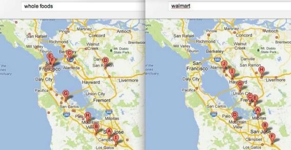
The disorientation is not only geographic, but sociological.  Of course, when we are looking with lust at those avocados, red cabbages, plums, and apples with a sort of existential desire, it’s tempting to forget the rest of the world and its social geography, so much is the origin of the apple the prime focus of our ecological concern.  Not many folks even enter into this flood-lit arena of healthy and tasty treats.  Matt Iglesias’ retweet of Jarret Barrios’ division of the geography of Whole Foods v. Wal-Mart stores in the Bay Area maps a nice geography of consumption patterns, even if one allows that Wal-Mart is interested in buying cheaper real estate, in terms of the markets that each chain store caters:


bayarea.jpg.CROP.article568-large

At least one can see who might go into all those Whole Foods to be disoriented by their variety, or speculate on what their disposable incomes are likely to be.  And one wonders at the elite charmed circle that those organic veggies seem destined to feed.

It is a far more focussing experience to focus attentiveness on the eating of sourced foods; food does belong on the plate.  Now, a locally sourced hamburger from Marin farms of the sort sold at Super-Duper is a great  example of “sourcing the previously unsourced,” as it were, and turning back the tide of intentional geographic anonymity.  And who could resist eating beef under a map of the regions of cuts of beef?  What better image for a burger joint that featured grass-fed beef from Marin county?

Photograph by David Paul Morris

Leave a comment

Filed under Attention Deficit Disorder, DSM IV, Walmart, Whole Foods

Maps, Mapping, Globalism: Imaging the Ecumene’s Expanse

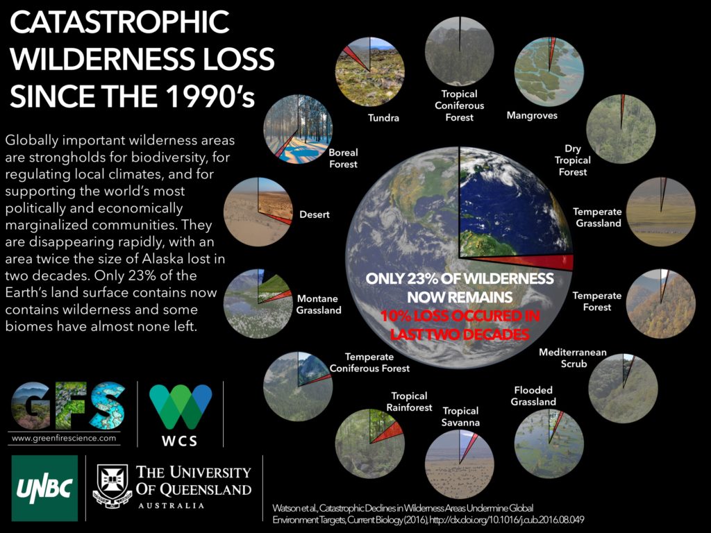
That most ancient of words, Oikumene, expanded from the Greek “oikos” to designate a dwelling or residence, or ecumene denoted less the technical abilities of mapping or tools for describing of the world than the demarcation of inhabited lands in which civilized people or members of the church existed:  but the divulgation and expansion of the notion of mapping abilities have in recent years, since the explosion of information databases and during intense globalization since the 1980s, extended the notion of the ecumene that has grown to extend beyond the map.  It increasingly is invested as a terms with ethical connotations to understand or foreground humanity’s relation to its environment–or retake the human from the map–at a time when virtually no part of the world is not inhabited.  Indeed, the possibility of drawing frontiers between an uninhabited and inhabited world–or of defining limits of the inhabitable world–is so diminished that the concept of bounding areas are not clear; the areas of the earth that are no longer inhabited, its “open spaces” or unsettled areas have catastrophically declined in the past twenty years.

But the continued interest we have in describing how we occupy the world, if not demarcating the boundaries of the world, is at the center of the data flows and databases we process in GIS and that increasingly lie at our finger tips.  The instant generation of maps of the inhabited areas of the world have paralleled the catastrophic decline since the 1990s, when a tenth of existing wildlife declined and the catastrophic losses of wildlife confirmed at the  IUCN World Conservation Congress:  the shocking fact that only 23 percent of wilderness remains doesn’t even include the future effects of global warming, the current crisis in history’s tragedies mankind is currently in the process of having created or on its way to create.  Indeed, the destruction of wilderness–what are deemed intact landscapes that are mostly free of human disturbance–has perhaps most radically changed the nature of the inhabited world.  Since the “Last of the Wild” map was first published in 2002, the loss of almost a tenth of formerly uninhabited lands in the last decade is the most rapid expansion of human settlement of the planet, with some 3.3 million sq km of once-uninhabited lands lost, of which 2.7 million sq km2 are considered globally significant–a loss of some carbon biomass in forests destroys a resource that offsets atmospheric CO2.

wild_infographic2-1-1-1024x768

But let’s return to maps, such realities being to painful for me to contemplate.  Even as the entire earth is now inhabited, much is to be gained in the concept of actively mapping expanse both by preserving an analytic relation to that image of expanse, too often rendered abstractly in computer-generated cartographical media, and encouraging an analytic relation to how the material contents of maps embody space.  Crafting an image of the inhabited world as a bound expanse enjoyed a somewhat neglected historical lineage as a form of knowing the nature of an inhabited world and of orienting viewers or readers to the expanding unknown from the Roman empire:  the considerable intellectual heft of the term inherited from ancients–Eratosthenes, Ptolemy, and Strabo–and its signification of the inhabited and inhabitable earth informed most Renaissance maps and atlases, in which practices of mapping gained new epistemic ends as mediating comprehensive knowledge.

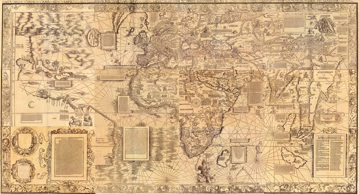
The comprehensive genre of the atlas, an illustrated set of maps promising true global coverage of lands linked by seas, developed in concert with the knowledge that the inhabited world extended beyond earlier imagined confined, and borrowed an expansiveness previously limited to nautical cartography or mapping.  The description of the distance to the edges of the world, if inherited from antiquity, provided a model for understanding the nature of the discoveries for the educated audiences among whom the first maps of the terrestrial ecumene first circulated both in manuscript and print–from the illuminated codices produced in Florence to the massive twelve-sheet wall-map announcing the Columban discoveries that the erudite Martin Waldseemüller compiled in the early sixteenth century Strasbourg from the school at nearby Saint-Dié-des-Vosges.

.

Waldseemuller-Map-631

The visual qualities of mapping, symbolized as an expansive landscape, cast the embrace of the inhabited world with qualities of perceptual transcendence over its variations and divisions.  Ancient geographic treatises included few maps; but mapping the ecumene created a relation of expanse and an observer’s eye in the late fifteenth century by organizing and ordering the globe’s inhabitation.  And although it’s odd to think of the ecumene as an inheritance of ancient geography that’s still employed, the inheritance mapping the inhabited earth resonates with Geographic Information Systems–although fashioning an image of the world’s geography has little of the ethical intent it seems to have enjoyed in both the ancient and early modern worlds.  When we daily orient ourselves to how space is inhabited on our computer screens, iPhones, or androids, we frame an image that bounds a record of how space is inhabited either to orient us to where we are going or how the presence of cars, people, bacilli, or weather defines the inhabit world.  Paradoxically, the growth of GIS technology has increased the manner of ways we can chart the inhabitation and presence of man in space, if it has not increased how we define its continuity, it has also provoked both a Renaissance of mapping and a crisis in the authority of the map as a representational record of the ecumene and its bound, as well as its bounded nature.

While the rest of this post isn’t exactly heavy lifting, but is stuff I’m still processing and finding my way around.

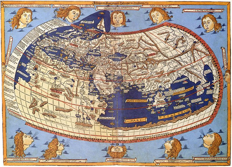
1.  The assemblage of maps in a sequence of global coverage was identified with the cultural distinction Ptolemy gave to the project of world-mapping on a graticule of meridians and parallels, to be sure, both compressing a growing sense of the world’s navigable expanse and indexing its toponymy along climactic zones.  The term ecumene challenged the mental imagination by encompassing local variety in a capacious global category, ordering a global map in a neatly bounded surface beyond the Indian Sea, and up to the limits of known land, in a feat of mental dexterity as much as precise or accurate map of exactly determined scale.  The lower boundary of the map copiously noted “terra incognita,” as later projections–and left it at that, as an expansive white space that exists beyond the sea and lakes of the moons, as this Florentine map includes, adopting the notion of an extensive northern ocean to frame the inhabited world–even while seeing the Indian Ocean as closed.

800px-Claudius_Ptolemy-_The_World

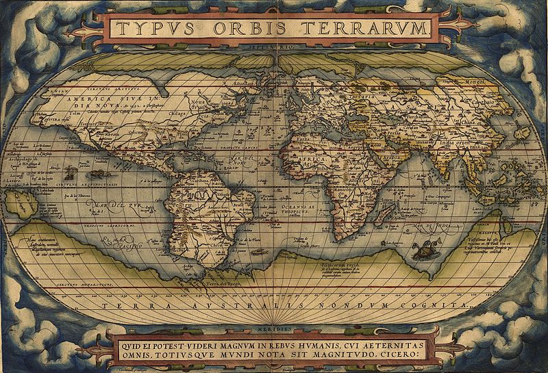
Indeed, even as the world grew more detailed and other continents were registered as inhabited, as in the Ortelian planisphere, the growth of regions of terra incognito expanded, as if to parallel the known regions which were designated by naturalistic landscapes:  the unknown regions of “America dive India Nova” were paralleled with the imagined “Terra Australis,” a later configuration of the mythical Java la Grande.

800px-orteliusworldmap1570

The ancient Greek astronomer and scientist Claudius Ptolemy proposed using terrestrial maps on geometrically derived parallels and meridians as tools of portmanteau-like capacity to comprehend terrestrial spaciousness, by segmenting the world’s inhabited surface by degrees of longitude.  The notion of mapping totality was particularly fertile for early map-readers a decade before 1492.  The tools for mapping the ecumene or inhabited world provided an ambitious compendium of global knowledge, although the geographic knowledge of the world was limited–and still was by the time of this world map, illuminated circa 1482:  although restricting the ecumene for modern eyes, its capacious reach extends south to inner Ethiopia and northward, beyond its broken frame, to embrace northernmost isles beyond Thule.  Rings of uninhabited islands indeed constituted, John Gillis has recently noted, part of the mental furniture on the boundaries of the inhabited world for most fifteenth-century men, and suggested a comforting bounding of the world that seemed to illustrate its protection and insulation, lying as it did between uninhabitable climactic zones and far-off seas.

The ethno-centered ancient term maintained a sense of charting the world’s recognizable inhabitants or those that mattered to the readers of maps:  so, in the Augustan age, Roman’s referred to the expanse of the empire as the ecumene, beyond which lived barbarians.  But even as it retained a bounded sense for Renaissance readers, the totalizing image of an ecumene provided a way to imagine the population of an expanse greater than lay in the ken of most–and to understand coherence within a world that included information from far-off lands, even if many fifteenth-century people lacked clear geographic categories of spatial division of an inhabited terrestrial expanse.  The edges of the earth were oddly clear for a period that suggests limited familiarity with expanse: the monsters and extraordinary riches found there were included in fifteenth-century editions of Ptolemy’s handbook of world geography, including elephants in the island of Taprobane, beyond India, trees that had leaves year-round, multitudes of serpents, and cannibals.  These were the signs of the world beyond what humans knew, and included the bare-footed gymnosophists of India.

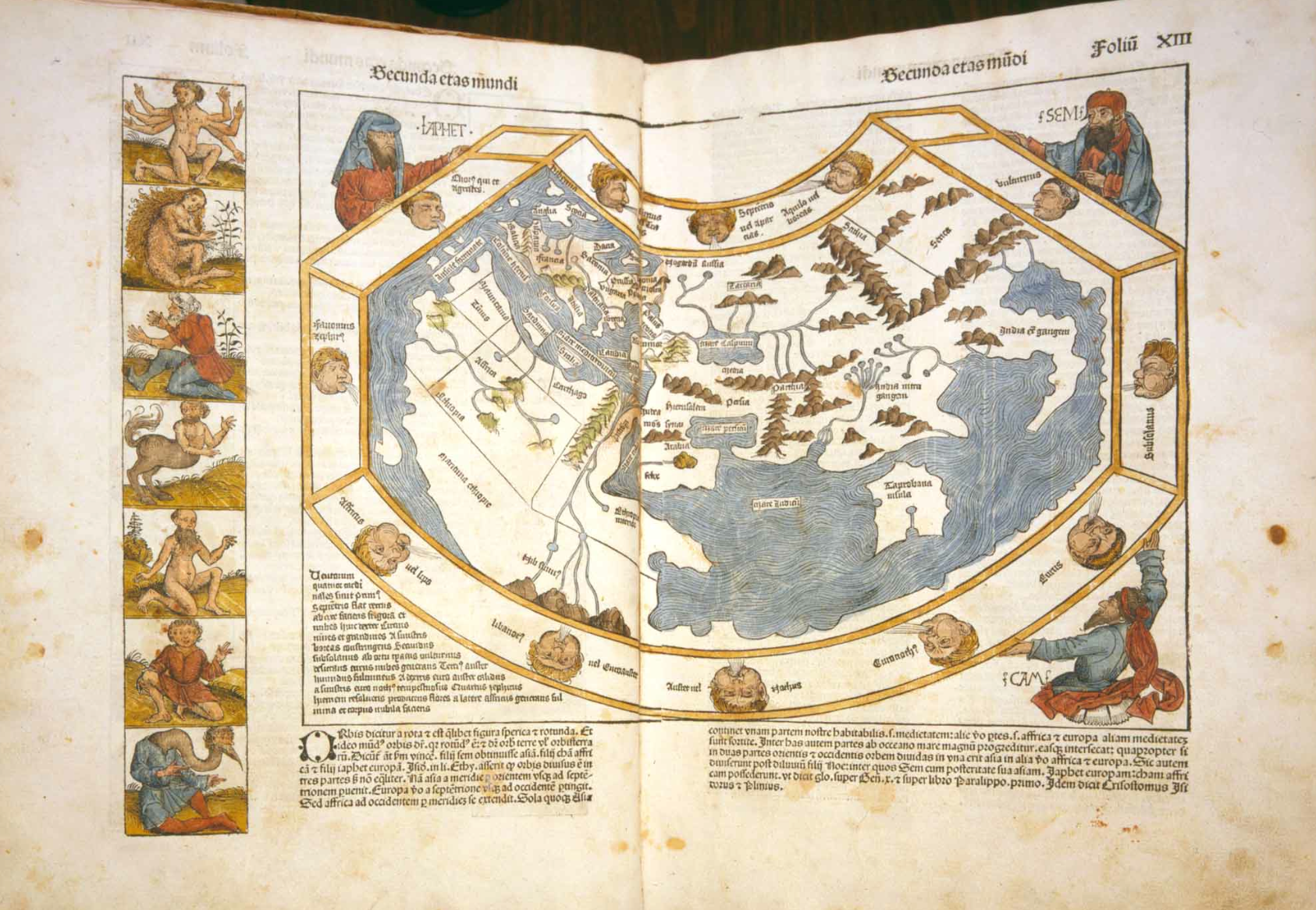
The compendious divisions of this mental map in a sense informed an engraved world map printed as the sixth page of the 1493 Nuremberg Chronicle, or “Book of Chronicles,” a “universal” history that promised a temporal compendium of world history, embracing historical ages in order to be able depict the division of continents from its creation through after the recession of waters in the Noahic flood through the succession of worldly empires that Augustine and Orosius had famously described–a work that captured the early taste for engravings as mediating information in Renaissance Nuremberg.   Romans discussed their empire as the ecumene, imitating how Greek geographers discussed an ecumene at whose fringes lived fundamentally other foreign Peoples, outside the scope of human concern and beyond the limits of human inhabitability; the world-map in the Chronicle placed outside its borders the excluded races of  Cynocephali, one-footed Sciopods, reverse-footed Antipods, bearded women, and one-eyed cyclopean monsters.  These lay outside the three regions divided among Noah’s three sons Shem, Japhet and Ham, or ecumene, and outside its image of the inhabitable world where humans dwelled, but also reflected the new world that the recession of waters in the Noahic flood had revealed to human sight, and the projection of the world that its editor included registered the shock of the prospectus terrarum that the lessening of global waters worldwide revealed–and the ecumene it unveiled:

SECUNDA ETAS MUNDI


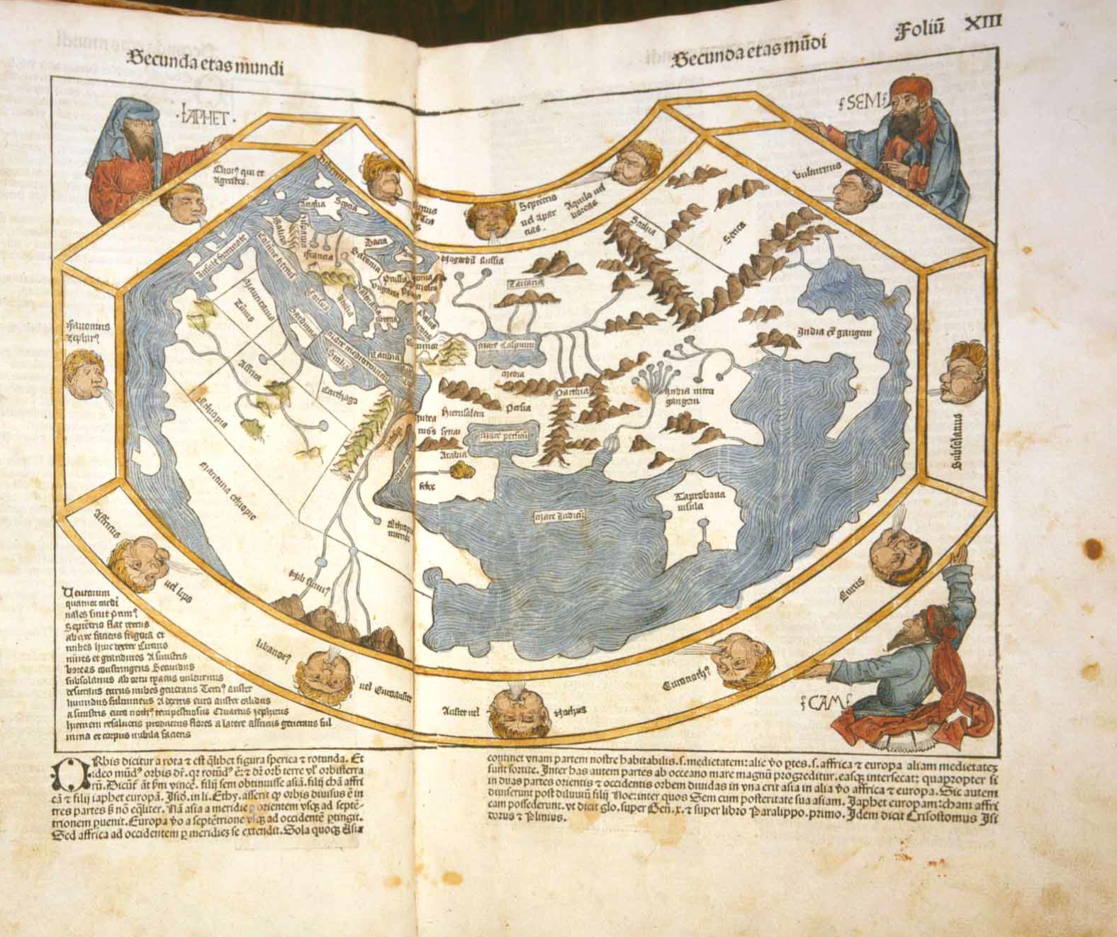
Hand-illuminated versions suggests significant curiosity in these creatures placed outside of the map’s ruled boundary who dwelled in a different space from the river-nourished environment of what one supposed to lie on the edges the habited world:


Secunda Aetas Mundi


The ecumene had of course already expanded dramatically by 1490 or 1493 that challenged thought about its both its boundedness and uniformity and cartographical forms to represent spatial expanse.  It continued to expand dramatically in the following years for readers of maps.  Similar monstrous races were included on its peripheries:  in the northern limits of Asia, a boundary of the inhabited world, even in Martin Waldseemüller’s learned Carta marina of 1516–both in response to literary sources and travelogues as well as the mental furniture of the bounded region of human habitability.  Many of these races were left off of the map as “an empirically known space,” for the very reason that they challenged and threatened a human space, and the boundaries of the world revealed by maritime exploration were unknown–even if sea monsters were increasingly banished from the more the edges and unknown areas of the more refined world maps, as the Carta marina.


Waldseemuller 1516 carta nautica


The consciousness of limits of habitability or human settlement was a graphic expression of Strabo’s mandate that geographers show the world’s inhabited part, as much as its inhabitants or populations to readers to satisfy curiosity and to respond to a need to describe its limits, as much as its totality:  “the geographer must describe the inhabited world in its known parts, neglect its unknown regions, as well as what is out of reach” (II, 5,5), placing a primacy on describing those parts of the world or communities in which humans live.  Although most fifteenth-century people did not easily domesticate the idea of an extensive space, let alone an undifferentiated expanse, picturing the unity and comprehensiveness of the ecumene became a basis for thinking about expanse, and comprehending difference:  the image of the ecumene in the Nuremberg Chronicle became a basis for continuing a rambling shapeless narrative grounded in a series of embedded or potted histories of place, each defined around an individual city and city view:  the ecumene was the landscape, if you will, in which each was situated.  There is often limited notation of a matrix of parallels and meridians in what might be called a readable fashion in early Ptolemaic maps:  it helped make space legible and material–or a sense that they are conventions of understanding the dramatic contraction of global space, but not indices of way-finding or marking place, as in these gores, identified with Waldseemüller’s school of cartography, ostensibly made for a small globe.


waldseemuller_map_found_4_7_2012


What has happened to the notion of the ecumene?  Even as the Ptolemaic ecumene was expanded, the community embraced in the map grew, rather than being abandoned, if New Worlds were processed into a map that reduced the prominence of Europe at the center of the inhabited world.  But the expanse of the ecumene held together, as it were, a sequence of regional maps, partly because the concept contained the promise that the whole world could be divided and known in synoptic form in a series of synoptic images that reconciled spatiality and territoriality.  Although mapping the continuity of expanse undergirded Renaissance cartographical images, the precision offered considerable wiggle-room, as it was limited only to the known.  But the division of space into bounded records of expanse were influential; the “chorographical” map of community became a counterpart of the totalizing coverage of a geographic projection.  To be sure, such maps responded to the diversity of ecumene that were discovered.  And maps provided models to mediate culturally fragmented collectivities, and fashion coherence across confessionally-divided communities– as the national map Oronce Fine designed of France to the French national atlases of the late sixteenth century to the English maps of Christopher Saxton, or Philip and Peter Apian’s maps of Central Europe, or a cycle of maps of the Italian peninsula that Egnazio Danti organized for a corridor leading to the apartments of Catholic Pope, discussed in an earlier post.  The coherence of each of these regions provided a sort of microcosm to the ancient geographic ecumene as it gestured to the wold that Romans civilized.


2.  The second half of this blogpost shifts focus.  In ways that less linked to cartographical models, it uses the notion of an ecumene to interrogate the survival of a  mapped global space in more modern mapping techniques.  We now lack similar boundary lines, of course, and measure contact among its regions rather than being awed by the immensity of the world’s expanse.  But the same term gained an ethical heft  in Enlightened thought to express a mandate for cosmopolitans to inhabit the world to become citizens of its entire expanse and cultures.  This shift in meaning, often thought of as a rupture, suggests continuities with the contemplative uses of globes for ancients as signs of learning or stoic remove.  The modern recuperation of the ecumene, distinct from its sense of the community of Christians (inherited from the Enlightenment) or the community of mankind is more striking as a relation to a lived environment, in ways that recuperates the ontological category of ecumene in order to describe and refer to the “humanized” world in which we now live–whose surface is more fully inhabited than ever before, but its nature shaped and informed by humanity both in regional environments and as a whole.

Augustin Berque has emphasized the benefits of attending to a relation, described by Tissier, between man and the planet in his 1993 article in the journal Persée, striking for how they dispense with the very category of a map if provocative for how they recuperate the ancient term in an ethical sense.  The term “ecumenical” oriented the term to the continuity in a community of believers.  But the ethos recuperated by Berque refers to what is human in the world, and a way of being, stripped of a fixed ethnocentric perspective.  By locating the “oikumenal” in terms of human geography stripped of a cartographical foundation, his sense eerily prefigures the images of the inhabited world that are both the benefits and costs of GIS as a basis for judging one’s own relation to the global world.  Berque has removed this ancient term of encyclopedic or positivistic coverage as a material register of geographic toponomy and the ancient craft of map making that embodied a fixed relation to the world.  His construction of an ecumene encompassing human society and its relation to the environment melds nature and culture in ways similar to the ancient term in its ethical connotations.  But his usage oddly dispenses with its graphic construction in favor of a global consciousness:  for in calling attention to the “ecumene,” has removed mankind’s relation with the earth’s surface is removed from a simple demonstrative function of the map:  much as the medium of GIS  defines the inhabitation of the world from one slant or subject, Berque asks us to embrace the multiple effects of mankind on the planet.

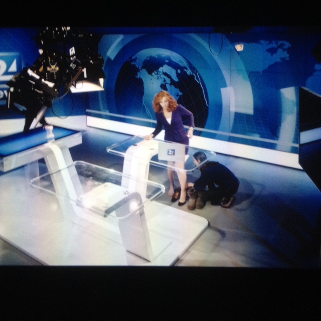
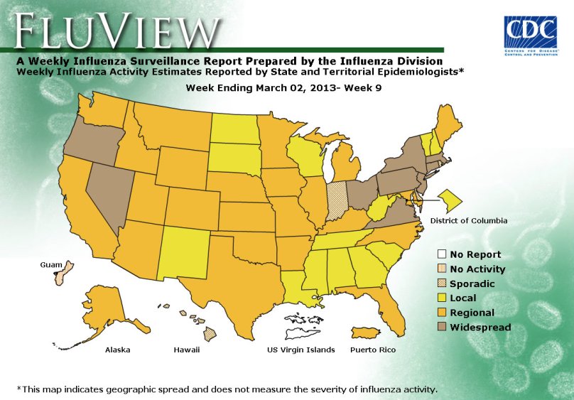
Berque believed that with the humanization of the planet complete, and the physical planet dominated by the effects of human life, more emphasis should be placed on a phenomenological analysis of the relation of subject an ambient by this Greek term, now removed from mapping practices to embrace human geography as a tool to consider the relation of man and his [made] environments. Putting aside the value of Berque’s point, the disposition of this philosophical standpoint  reflects the deconstruction of the privileged place of the terrestrial map and of geographic knowledge in GIS, and the image it perpetuates of the inscription of a human geography.  The relation of man and his planet–or the effects of man on the planet–are now the scope of a wide range of GIS maps of human habitation and Google Earth, or maps of influenza, infections and disease in data visualizations or geographic metadata catalogues, whose aim shift from physical geography to the place of mankind in it.  Increasingly, we are prepped to see the world nightly with a false immediacy of the nightly news, less focussed on territorial boundaries than a token of comprehensive coverage, prepped for consumption much as the newscasters who present an account of the “daily novelties” are prepped and outfitted in the apparatus of a news room.


Newscaster prepping.png.JPG


As put it eloquently (and cleverly) by Bruno Latour and friends, our ideas of territory so clearly derive from maps that the digital ubiquity of mapping places us into a new relation to territory:   we now navigate not based on “some resemblance between the map and the territory but on the detection of relevant cues . . .  to go through a heterogeneous set of datapoints” by which to move from different posts to gain new bearings.  We are always navigating a new relation to territory, or understand territorial models, not assuming defined and predetermined boundaries.  This notion of the environment is based on an ability to read signs of its inhabitation and peopling, rather than with reference to previously mapped territories, and is rooted on the ability to navigate by using maps on a screen, rather than on paper–in which the lack of resemblance indeed has further purchase (and persuasive power) as a gain in both certainty and objectivity.


3.  The analytic nature of the reader’s relation to GIS maps is less based on embodying place or expanse in a cartographical manner, because it is not rooted in mimetic qualities.  For the map, in much GIS, is used essentially as the primary field to encrypt variations in data, and removed from any pictorially descriptive function.  Put better, the map is something of a found object, a template, an objective construction in which we sort out the real information that is displayed upon it in an appealingly objective fashion, but one that lacks an orientational power rooted in mimetic claims and indeed turns away from making any actual mimetic claims:


usmap9

Indeed, the underlying positivism of the objectivity of the map is recycled in most visualizations that are rooted in GIS.  If modernity, as Doreen Massey put it, involved “a particular hegemonic understanding of the nature of space itself, and of the relation between space and society,” drawing expanse on multiple computational platforms in GIS has decoupled space from a precise location:  we now know from a true “view from nowhere.”  The differentiation of terrain or local constructions of space are of less interest than the projection of meaning on a map that is treated as a screen, and several significant local markers may be absent or not noted.  Shifting scale by moving a cursor does not create a more readable space, but provides a very odd reframing of space as a unit that is not comprehended by the reader, but able viewed simultaneously at multiple scales of changing parameters, zoomed into and out of, and adjusted on a digitized scale bar. Our current National Research Council argues in its spatial literacy report on spatial thinking that “the important thing is that they allow for the spatialization of data and use a range of types and amounts of data,” lending primacy to the readability of data over the analytic or representational basis of map-making.

What is physical geography, after all, in many of these maps?  The prime mandate is to map one’s relation to the environment in a readable fashion, rather than to encode layers of local topography or meaning, and to streamline the map to allow its reconfiguration in different datasets that prepare for readability, rather than granularity or density of meaning.  Again, this is based not in mimesis, and no longer based on the notion or mimetic projection of territory:


MacArthur Freeway 11-00

Children's Hospital 11-51

If we speed this up, to look at a sort of time-stop photography of cabs in San Francisco’s downtown area, as did Stamen design in a pioneering map that combined aesthetics and the abundant database of the surveillance operations of Google Maps, and is based on readings taken from the GPS data of the Yellow Cab Company of San Francisco, available also as a film:

Stamen Cabs

Or, in Shawn Allen’s map/photo, which resembles a direct transcription of the taxicab scene in downtown San Francisco on June 15, 2012:

Shawn Allen's map:photo

Does an impoverishment of spatial literacy or toponymy result from such containers of datasets that use maps as formats?  The omniscience and transcendence of the map viewer is immeasurably increased, but the viewer is the receptacle of data, as much as the perceiver of the scene:  new currents are configured and new flows revealed, as data from a variety of sources are richly encrypted into the surface of any given image, compressing the sort of media to which we might have access to a single screen.  One has a different sort of relation to a screen than to a variegated surface, reading a way of configuring information in different ways:  but the difficulty with the screen in particular is its lack of a sense of spatial embodiment. Compare it to an earlier map of the same region, not at all sparing with information but bending backwards to compress legible content within a description of the city’s environment:

sfharbor

These are, perhaps, essentially different modes of data compression, based not only on distinct tacit presumptions, with one angled toward data flows, rather than to the ostensible objectivity of a perceptual model.   But the difficulty to embody data flows can generate an oddly 2-D superficiality that forsakes the very quality transcendence to which earlier ecumene aspired.  Data-streams provide a selective mapping that illuminates one angle of analysis, as it were, rather than aspiring to process an image of the entire city’s or world’s actual inhabitation.

Let’s however insist on being more concrete.  When used to display shifts in a census, the map below displays data removed from topography or centers of population density, and is a data visualization without refined conventions to process its content or meaning for viewers, even if its meaning is quite serious and subject quite human, because it displays information on a static template with little interpretive key–since this map is less of an autonomous and self-standing unit of meaning than a map that demands to be read in reference to familiarity with a map of the distribution of the state’s population:

CO2 emissions


The above map of CO2 emissions of Northern California households elegantly foregrounds one specific reading of the relation of man to the environment. The challenge raised by such an elegant map is to retain communicative flexibility of the conventions of terrestrial mapping, however.  In any GIS map, there is the anger of emptying the format of project from content such as topographic variations, specific local detail, or the dynamic relations of space and habitation within a map:  the conventions of the format gains an iconic or symbolic register alone, in short, and is considerably impoverished as a description of terrestrial habitation when it serves as a field to display data flows or project a database.  One issue is to combine the data with how the analytic framework of the map integrates word and image or creates a structural distribution–something like the poetics of mapping–rather than employ maps as a passive container for spatial information instead of actively creating a way of thinking about space. The mapping of the results of a census regularly lack a sense of topographic variation or differentiation of urban and rural population which would render it more meaningful, and give a plasticity to its already remarkable contents as readable content.  This partly lies in the lack of a dynamic relation between the visual field of the map and its reading, as in this map of the regional variations in the India’s regional population per square kilometer:


dastes_F2


The map does not exploit its own conventions of orienting readers to space or expanse.  But GIS mapping offers a significant range of angles by which to read and explain its content.  The relevance of clarifying readers’ relations to the environment are in fact pressing, as revealed on this interactive map–which even includes an option for the reader to learn in detail what s/he can do to help:


Scenarios of Global Warming


At the same time as this pessimistic picture of the actual eventualities of climate change in the age of the anthropocene, the radically shifting nature of a world which is no longer shaped by proximity, or challenged by distance.  The map of internet penetration suggests, rather than a new map of inequalities alone, the new obstacles to the penetration and responses to messages worldwide, and, no doubt, contributed to the difficulty of the transport of needed goods and medical supplies to western Africa during the current epidemic of Ebola, which seems to have left populations scarred by the difficulty in transatlantic communication, as much as the lack of adequate maps, as OSM-H has shown, of adequate mapping on the ground.


2000px-InternetPenetrationWorldMap.svg


Indeed, the map of internet penetration, for all its unpleasant echoes of a colonializing perspective, where first-world countries receive greatest coverage, reveals the extreme difficulties of penetration of all of the coastal countries of West Africa–unlike Nigeria–where the highly contagious virus has proved most difficult to be contained, and information about  the virus less able to be widely disseminated.

Are the edges of the penetration of the internet the most vulnerable edges of the inhabited world, and as the edges of the accessibility and sharing of human information the most vulnerable to cataclysm?


4.  To some extent, this takes us back to Berque’s notion of the ecumene.  But the relative thin-ness of encrypting data projection on the map is so less fine-grained to impoverish the relation between reader and map or registers of engaging readers:  the granularity of the map is particularly great perhaps because the map’s visual qualities are less closely joined with its textual ones, or the hypertext only uses the map as a static schema. There seems the danger of how maps direct our attention to spatial variations and complexity with the proliferation of maps as visual media across different venues and platforms, and a dissipation of the authority of demarcating expanse or of compacting data in a uniform surface.  Perhaps this recalls Berque’s notion of the ecumene as a set of relations to the environment, which can be read in different ways rather than in one way.

The question of habitation has become turned, like a prism, to illuminate new points of view and angles of perception, a topography of habitation indeed seems beside the point.  After all, there are no real areas of the globe that are not inhabited, and the questions of orienting individuals to space seem more pressing than ever on ethical, ecological, and moral grounds alike–if not of just making sense of the effects with which man inhabits space. In a somewhat ponderous post, let’s offer a comic conclusion, however, rather than carping about media for mapping in an age of digital reproduction and increasing vectors of data flow.  The GIS map has become a versatile demographic tool to reframe questions and reveal spatial links, possible vectors of influence or pathways of causation, and indeed maps of emotions or violence.  The question is at root what sort of remove it places the map reader to interpret those vectors on its surface.  There is a temptation to deflate the authority of the descriptive value of such a matrix for its lack of fine grain.  Amidst the attempt to map the Arab Spring there was the inevitable  GIS irony of naturalizing political movements with the ephemerality of a weather map–more a mental map of what the media presented, to be sure, rather than a map designed to orient its content to a reader practiced in interpreting a map’s construction or its conventions.  The map has the value for its viewers of an illusion of transparency and a medium of omniscience:


middleeast_map21_1829864a


Or GIS-inspired variations on sabre-rattling from the American right, which was openly alarmist (if not antic) in tone, against a backdrop from Wikipedia commons:


ZIO_middle_east_map_jpg_big_1


These pseudo-news maps come from the GIS family of signs, even if they are not based on actual data.  They orient viewers with a wiki-like remove. It makes sense that at this point ecumene denotes more of an ethical stance to describe man’s relation to the environment, shifting from to what that process of inhabitation might mean; there is no demand for graphically rendering the inhabited world, but rather the ways mankind inhabits the earth and has filled and marked its space.  But there is a loss of mapping habitations. And so map making in the flexible media of GoogleMaps is no longer an expandable portmanteaux of fine grain, but rather a matrix of data streams where one charts multiple consequences of inhabitation rather the local terrain.  If we no longer have Sciopods outside of our human realm, we lose a sense of an ethics of mapping or even of relating to maps when we dispense altogether with practices of map-making.

Leave a comment

Filed under anthropocene, data visualizations, globalism, Google Maps, metageography, Ptolemaic geography