The late, great outlaw historian of cartography, J. B. Jackson, founder of Landscape and a Lone Ranger of the Berkeley hills, argued that the geography of the freeway was a dominant but rarely appreciated subject of academic study. For Jackson argued that despite much study of maps and topography, cars coursing through space provided a new experience of space itself, and one that was poised to become the dominant way we experience the landscape. Contrasting the space of the highway to the space of Mexica adobes, Jackson believed he identified the problem of writing about the experience of national space in the twentieth century, explored in a series of essays on the shifting perception of geography and highways, and the mapping of the new settlement of space.
Rebecca Solnit published a lovely article that might be seen as an expansion of some of Jackson’s points, but which takes a map as emblematic of the ways that commute routes suggest the dangers of such a shifting of the inhabitation of San Francisco’s public space. For Solnit, the 2012 map that has been called “The City from the Valley” reflects the precipitous housing market of San Francisco as it makes evident the “invisible” network of a series of unmarked bus stops that ferry workers not to freedom, but to work. The maps mark what Solnit describes as the arrival of “Google Invaders” in the city, and she sees it as concretizing the menace that an influx of new cash from Silicon Valley workers that has flooded the San Francisco real estate market, and effectively placing many of its current residents–focussing on the artists who have made the city their own–not only at a disadvantage, but as the apartments were they lived become targets of eviction. As apartment buildings they lived in are converted from rental units to feed the insatiable demand for housing, the rising market prices of housing are met by an audience which uses a separate transit system–and renders unoriginal whatever organic community and economy Jane Jacobs saw as the basis for the American city.
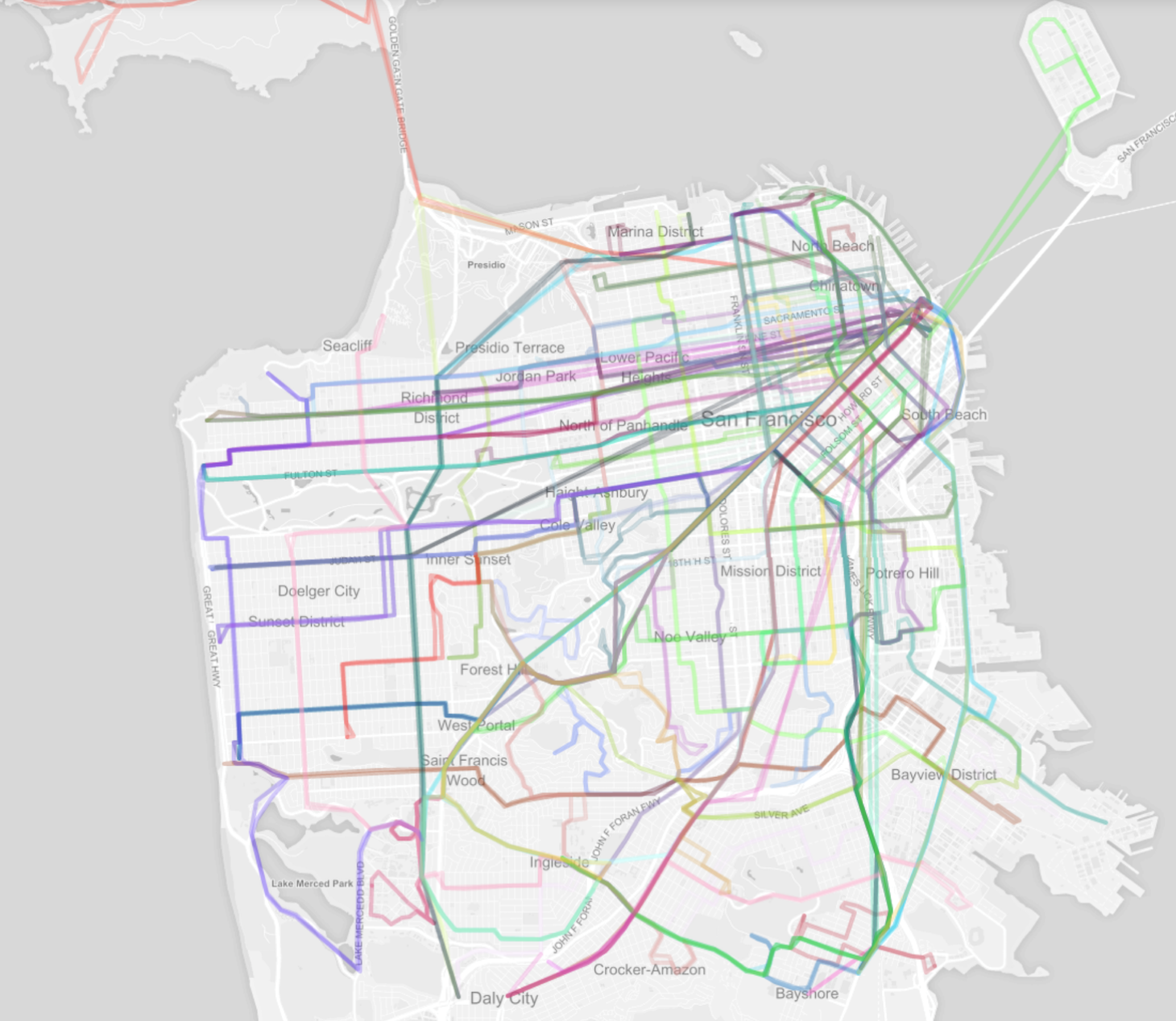
The “shadow” transit network of private busses that ferry workers to extra urban employers who pay low taxes–and none to the city–tells us much about the way the Valley feeds the city, and the ways the city stands in relation to the Valley. The mapping of transit contrasts, for example, to the apparent organic unity of the city’s transit system plotted from OpenStreetMaps, whose individually colored lines ferry workers and tourists within what seems its discreet organism:
Solnit has recently immersed herself in the problems of mapping San Francisco, and her piece brings together some of the familiarity with San Francisco as a residential city with an eery foreboding that San Francisco has come to symbolize a lifestyle with appeal among a breed of commuters to behemoths of Silicon Valley, who she characterizes as faceless sorts, ferried by dark-windowed private buses operated by each employer, as if Storm Troopers in suits. The possibility of buying real estate in this city faces a squeeze generated by hugely wealthy potential residents who work outside the city, contribute minimally to its quality of life, and rely on corporate subsidized commuter buses that undermine the prospect of public transportation–and adopt a new means to use the urban infrastructure for tech workers to travel to their jobs in Silicon Valley not sharing revenues with the city.
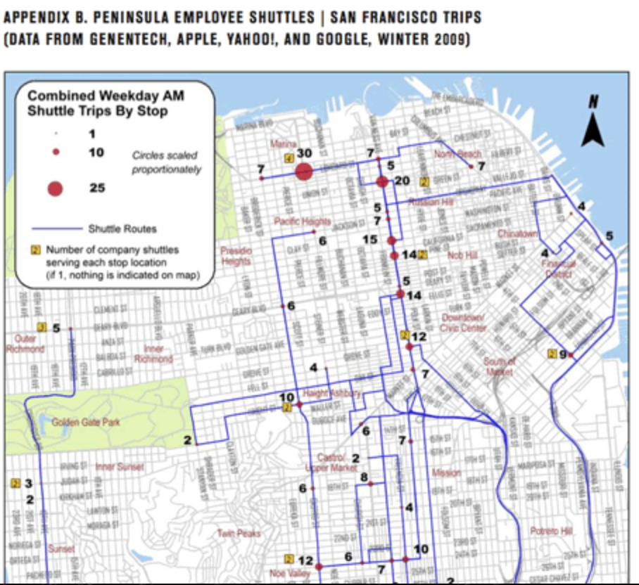
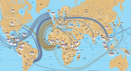
Solnit included with her complex and more multi-faceted argument is captured a single map of the new private transport routes that have been introduced, as a shadow system of urban transit, by Google, Apple, and EBay: Geoffrey A. Fowler crowed that “A San Francisco design firm has literally drawn a map showing how the city and Silicon Valley are growing closer together through a network of private corporate buses” in The Wall Street Journal, heralding the growth of a new archipelago insulated by new commute routes that linked monied preserves. Calling the network “the future of transit,” the routes are designated for corporate workers, rather than urban residents, and ferries them along special corridors from residences to places of work, severing connections to the places where they live without using municipal transport or brining benefits through local highway tolls. The transit system that serves this new population of inhabitants working in the Valley reveals a sort of parallel existence of a financial network that has vampyrically sucked or absorbed the housing market, and daily moves to work at a remove from the city’s space on multiple peninsula shuttles whose opaque windows move folks to their work away from home, and funnel every increasing salaries into the housing market: or, to reverse metaphors, the map that shows movement to and from the Valley might be seen as mapping not only the routes of busses that were not known publicly before the publication might be taken as emblematic of the influx of Silicon Valley money that increasingly feeds San Francisco’s population.
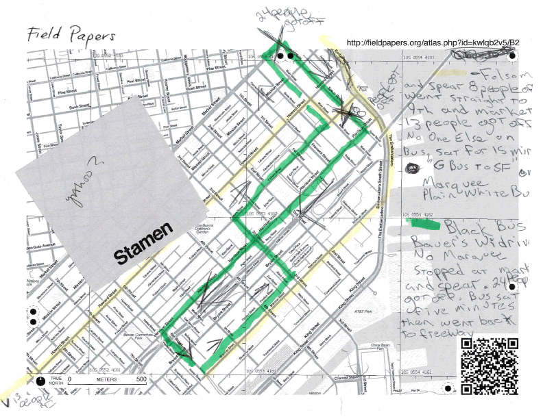
While such lines are private, and the sites of stops secret, the Stamen group used Field Papers to do an ethnographic mapping of private bus routes based on first-hand observation in order to create an alternate “atlas” from data traced by hand, and then scanned back and retraced in GIS systems like QGIS or OpenStreetMap. The result is to publish the shadow routes that the private bus lines use to ferry workers from San Francisco to Silicon Valley. Its designers devised the routes that these large busses with wifi and dark glass windows take to provide an elite mode of conveyance to work to contrast it to the existing transportation networks that serve the city, based on careful observations and plotting of such private bus routes based on close observations of the pathways that the buses actually take, using Field Notes to sketch the routes then assembled into a synthetic coherent system. And they have called it “The City and The Valley” to highlight the unique relation of a city where residents increasingly go to the suburbs to work, and money from the Valley enters the city to inflate its astronomically ascendant rents.
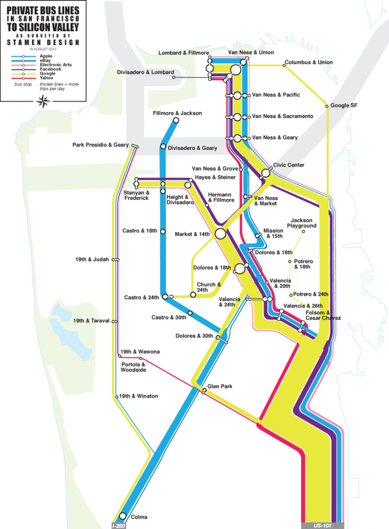
By plotting and publishing a rendering of the network of private busses against an OpenStreetMaps base-map, the exclusive commuter system could be charted in winking reference to a famous public transit system–Massimo Vignelli’s 1972 MTA map of the New York Subway, whose comprehensive Graphics Standard Manual invested something like modernity to the public transit system of New York City–that highlighted the exclusive clientele that the buses were created to attract, but imagining one would be able to similarly move between their lines in a nice conceit.
The map provides a basis to define the corridors of transit for those who are looking where to buy their houses that will guarantee access to the restaurants, theater, clubs, cafes or aura of their new chosen city of residence, San Francisco, in which they have arrive, and was indeed drafted by a small design firm most of whose workers live in the Mission–and have seen the busses rather than ever taken them. Solnit argues that the network of private busses effectively created a snare for its current inhabitants by forcing up real estate prices to unreasonable rates: the map addresses those bus riders who work for Google, Ebay, Facebook, Apple, Yahoo and Electronic Arts, and has itself already even been used by over-eager developers in Bernal Heights to show the convenience of location to these corporate buses, and promote the ease of access to private bus lines that their neighborhood allows.
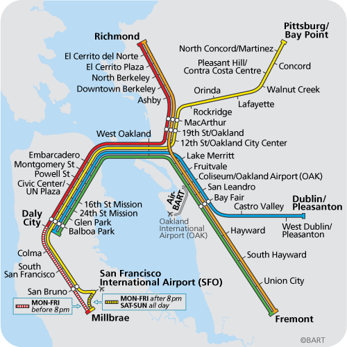
The adoption of iconography from the familiar image of its public transport, the Bay Area Rapid Transit system, is telling. Urban routes of transportation are mapped but dwarfed by the major corridors of the bright yellow stream of Google commuters,––– overflowing the commute from Lombard and Filmore to Van Ness, accompanied by a strong bright blue line of Apple workers.
The colors reference the Vignelli map, but also seem to replace or revise the familiar image of BART routes, while appropriating the schema of primary colors that designate the Colma, Richmond, Pittsburg/Bay Point, Dublin/Pleasanton and Fremont routes. The subtle shifting of colors from the solid green, red, orange, yellow, and deep blue of BART lines seems undeniable: the day glo colors of the Private Bus Lines map are both more hip, squeaky clean and somehow more oblivious to their urban surroundings.
Jackson theorized freeway views created a relation to space that deserved to be acknowledged, and called for buildings to respond to its landscape. The darkened windows of private buses obliterate any relation to the landscape serve as pods that ferry highly paid workers from home to work, so that they needn’t be harried by the urban space that ostensibly surrounds them. They are less interested in a relation to space, or the navigation of lived space, than the preparation of a speedy route of commute.
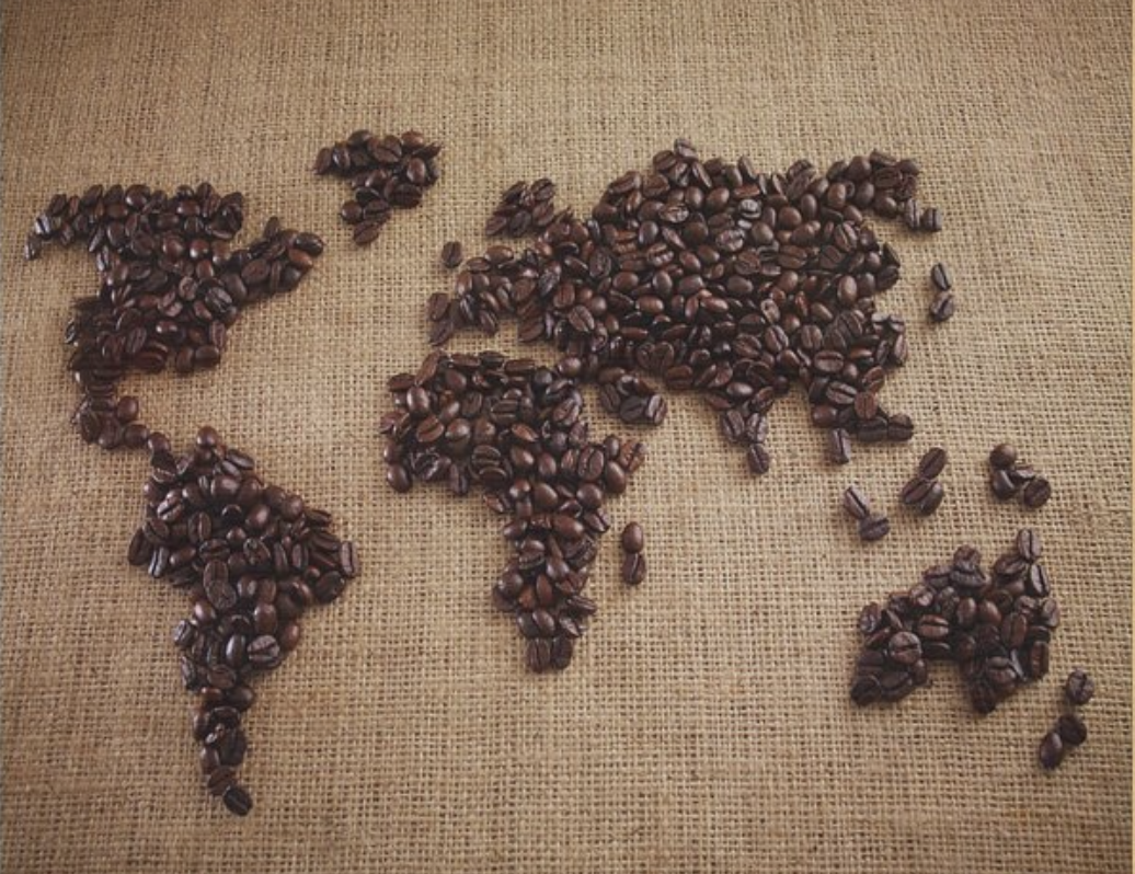
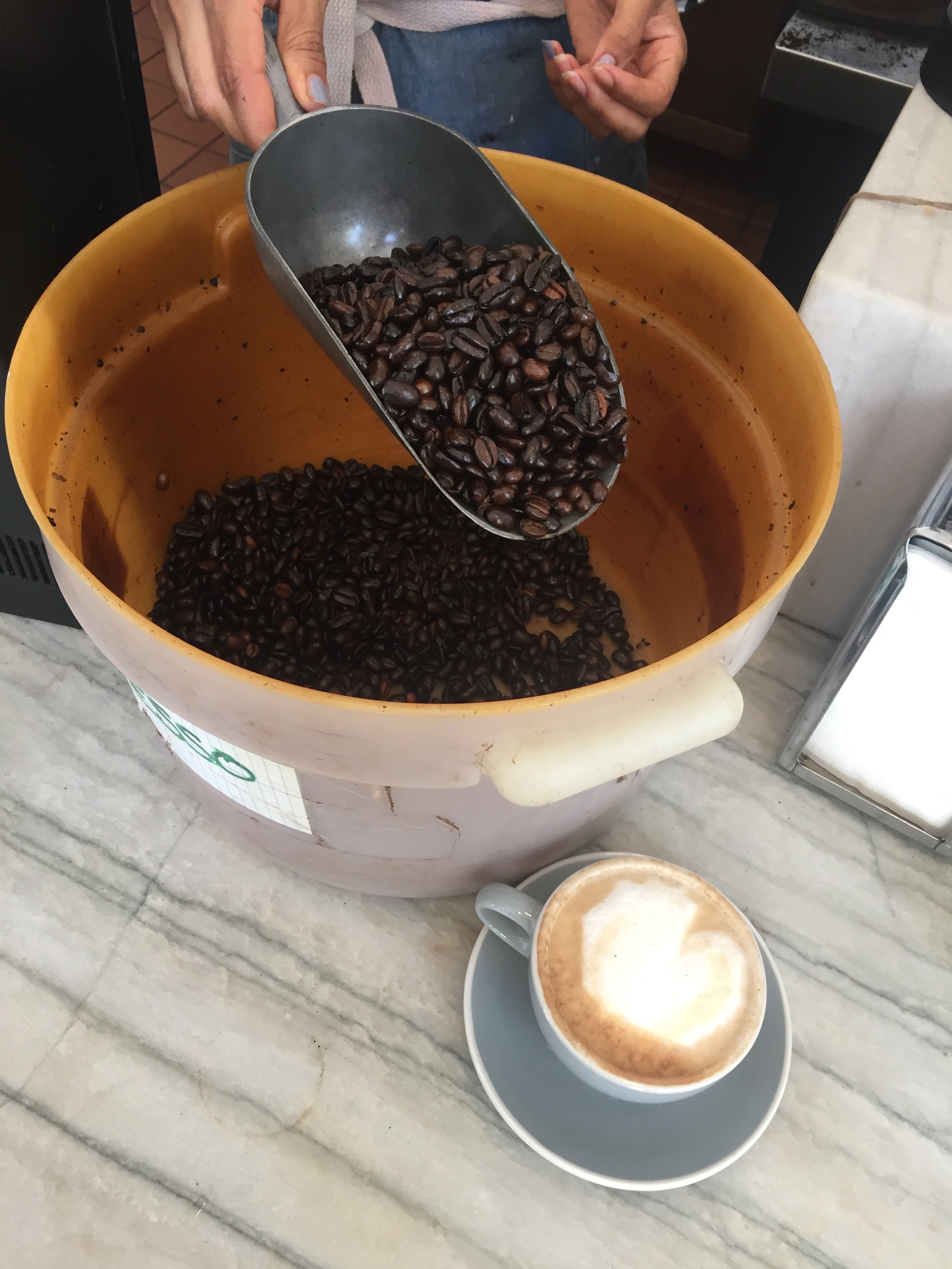
Coffee beans elegantly strewn across the gridded surface of a burlap sack may map the entire world; but they can only belie the fact that the area suitable for growing coffee beans stands to be reduced by as much as half by 2050, if climate change continues. In the face of increasing demands for fresh beans from developed countries, Arabica beans that have long flourished in the ecology of tropical highlands may well stop receiving the year-round rains that not only enable but nourish their growth, and demand more water than the ground naturally holds.
With caffeine currently ranked as the second most traded commodity world-wide–the global trade of caffeine is second only to oil, and suggests a similar manner of speeding along through space, adenosine receptors in our brain blocked off because of caffeine intake to block our biological clocks–we seem to be cutting off our own abilities to reflect on the growing crisis of a demand for caffeine, driven by self-medication by espresso drinks, that curtails our ability to reflect on how sustainable the expansion of coffee-farming across tropical highlands actually is, long-term, as coffee growing seeks higher grounds with rising global temperatures. Henry David Thoreau, in a classic of American literature, described his fellow countrymen as asking ‘What’s the news?’ upon rising at a time when ‘after a night’s sleep the news [became] as indispensable as the breakfast’ relishing his coffee and roll as he asked it, ‘Pray tell me any thing new that has happened to a man any where on the globe,’ but the globe, and not only because of global warming, seems more clearly distilled, condensed, and involved in that cup of coffee than it was even in Thoreau’s day.
If that isn’t as great a wake-up call as the aroma of coffee, what is? As we shop for single-origin coffee from a variety of global locations, we might do well to consider not only the global footprint of coffee beans, beyond the bird-friendliness and fair trade nature of the beans we brew, but the networks of global exchange by which the brew was not only long nourished, but has expanded to become almost a new lingua franca of the globe. As the number of coffee stores and outlets in airports has multiplied, in a mark of the escalating global demand, the way beans map the world is perhaps less important than the global networks that have facilitated coffee to travel and to circulate so intensively and so abundantly to fill our daily caffeine fix. Indeed, the local coffee shop in Oakland, aptly named World Ground for a shipping hub of the beans that long arrived to be roasted in the old port town, before the container ships started to clog Oakland’s ports with cars, furniture, and cheap imports at cheap overhead, Oakland offered a safe harbor for imported cargo that filled many ships’ holds of those burlap sacks of beans, as well as spices and unrefined sugars, sacks of coffee were taken from the holds by gangs of longshoremen by “throwing coffee” to be sent to warehouses that filled the downtown with its enticing aromas. And the memories of such transport might be conjured, unintentionally or not, but he Oakland shop that used a map not to describe the variety of blends sold but overpowering map of global trade packed into that aroma–
–erasing the actual routes of shipping and the labor of overseas transport, distorting a projection to appear the curling steam emerging form the cup that is the base of the entire superstructure of the coffee business, but conveying the bounty of those shipped beans in the continents off this map–North America, for one, as well as the bulk of Europe–allowing the Yemeni, South American (Honduras, Brazil, , and African coffees to be foregrounded, if sacrificing Sumatra, New Guinea, Bali and Java located in the other hemisphere of this projection. If the aroma was the residue of all that labor on the docks, the cup provided the alluring base of all that superstructure, concealing the imbalances of trade and exploitation that had grown up, of course, in plantation systems. The first map of American coffee foregrounded that sweet spot Oakland lay, in Coffee, its History, Cultivation and Uses (1872) that provided a helpful sense of the global remit of the taste for coffee from the Sandwich Islands to Kuai to the Yucatan, and the global extraction routes of a cup of beans.
A Chart of the Globe Showing the Several Places where Coffee Is or May Be Produced and where it is also Used Coffee: Its History, Cultivation and Uses (1871)
The map tinted the “principle areas serviceable to the growth of Coffee and in which it can be readily cultivated” to inform global customers, and perhaps markets of investors, of the global value of coffee beans after the growth of telegraph lines, suggesting a condensation of the world market for coffee beans that so readily slips to the back of our consciousness and minds, especially before we’ve had a cup. When accomplished food photographer Adam Gault captured an image of roasted beans on a burlap bag, situated on an what seems an Ortelian projection, woven burlap threads recalling a graticule, or just the art of coffee roasting, as beans on burlap are almost a sub-genre of Gault’s work. the absence of the smell of coffee seemed a sanitization of the routes by which beans are shipped globally from the equatorial belt of coffee-growing, but a joke on the near-global appeal of caffeinating with a dark roast. Gault’s clever photograph dates from the Iraq War, curiously, the first to be based on use of GPS satellites as a sort of proof-of-purchase illustration or test of GPS in a global environment,–if the points rendered by beans on the equirectangular faux graticule of a coffee bag suggested the enabling of coffee transport from growing zones as a more pleasant upside to how the nineteen satellites then in orbit allowed “coalition” forces run by American command centers to pinpoint the enemy in a desert terrain.
But the double duty that the coffee bag served as a time-tested GPS grid of coffee beans showed off the emergence of coffee roasting as a global network, allowing beans from economically disadvantaged regions to arrive smoothly onto the counters of Starbucks, Peets, or Cafe Nero for a morning ritual of pleasure. The 1991 print has since become a stock image and shorthand for globalism and globalization, displayed as a mural in coffee shops, that has a clear correlate in the sourcing of coffees from around the equatorial belt, in parallel to the growth of coffee shops as meeting places to sample the distillation of blends defined by place-names, condensed into a drip coffee brew. The photograph strikes one as a record of the reach of coffee farms and plantations, but brackets the global impact of coffee, not to mention the ties of coffee to climate–those networks of trade seem to advertise the global proximity of place to fresh coffee at any point in the world, the roasted bean a neat play on the point-based geography that has been rendered suddenly proximate to the farming of fresh coffee for a customer’s pleasure.
The pleasure of coffee is hardly captured in the image, however, and part of the appeal of the popular “map” may lie in seeing a cartographic joke removed from the ways we sense coffee–its aroma and its taste–both hardly able to be be captured in a purely visual register, as much as questions of what real map a near-global availability of coffee conceals. It is something of a resolution to the question of the great Viennese philosopher posed in a work he completed in Salzburg, toward the end of World War II, investigating the uses of language, and their relation to lived experience, that pondered the lack of words to describe the aroma of coffee–“Describe the aroma of coffee–why can’t it be done? Do we lack the words? And for what are words lacking?–But how dow we even get the idea that such a description must after all be possible?have you ever felt the lack of such a description? have you tried to describe the aroma and not succeeded?“–that may relate to his own interest in describing a Proustian recognition of coffee upon returning from Cambridge to Vienna, taking coffee’s aroma as a case of how any object is described in words, or what language game that might define the familiar ritual of coffee-drinking. If not able to translate the aroma, it might be flattened to a suitably rustic burlap screen, whose appearance a visual crutch orienting you to a variety of pleasant aromas which exist outside language, if hiding the wheels of a global infrastructure of cultivation and shipping allows the barista to fill your cup.
Americans were sold the image of a nearby “land of coffee” of bucolic cultivation in the postwar period, arriving from afar in a world of interconnected global commerce, long before World War II. We were apt to forget how the organization of coffee crops is an inheritance of the plantation economy immersed in a geography of natural resources and ecological imbalances created by climate change. If the history of the plantation and land conversion gained less place as coffee was first promoted as a modern convenience arriving effortlessly and extracted painlessly from a far-off land of abundance whose aroma would summon Americans to their morning coffee in early morning waking hours and as they moved from unconscious life to bracingly hot cups of a steaming beverage, whose aroma triggers in Pavlovian fashion a re-awakening as the welcome taste of coffee and cream to start the day.
“World of Coffee,” Colombian Pavilion, Golden Gate International Exposition, San Francisco 1939
The ‘Land of Coffee’ promoted at the International Exposition noted but concealed the clearing of grounds, weeding, picking “cherries,” washed and fermented and re-washed before air dried in the tropical air for a long voyage to preparing a smooth, rich, amber-clear brew, enjoyed as a rich blend. The travel of coffee beans was black-boxed for the customers, concealing the remote cultivation of beans from a global bean-growing belt since massively grown on a global scale of production.
Today, we know vaguely brand-sounding sites of the farming of coffee beans, of varied intensity and darkness, on a richly described palettes that often assume greater importance as a register of sense-perception than the beans’ provenance. The place-names of coffee beans are a richly robust exotic geography of their own, fair trade, to be sure, but almost independent from an actual global geography, lying like a set of reference points existing detached and at a remove from an physical ecosystem or geography. If coffees are classified as shade-grown, organic, bird-friendliness or not grown in the forest canopy, the remove of coffee from geography growing in proportion to its market and customer demand, not to mention the 500,000 families farming coffee beans in Colombia’s mountainous highlands alone.
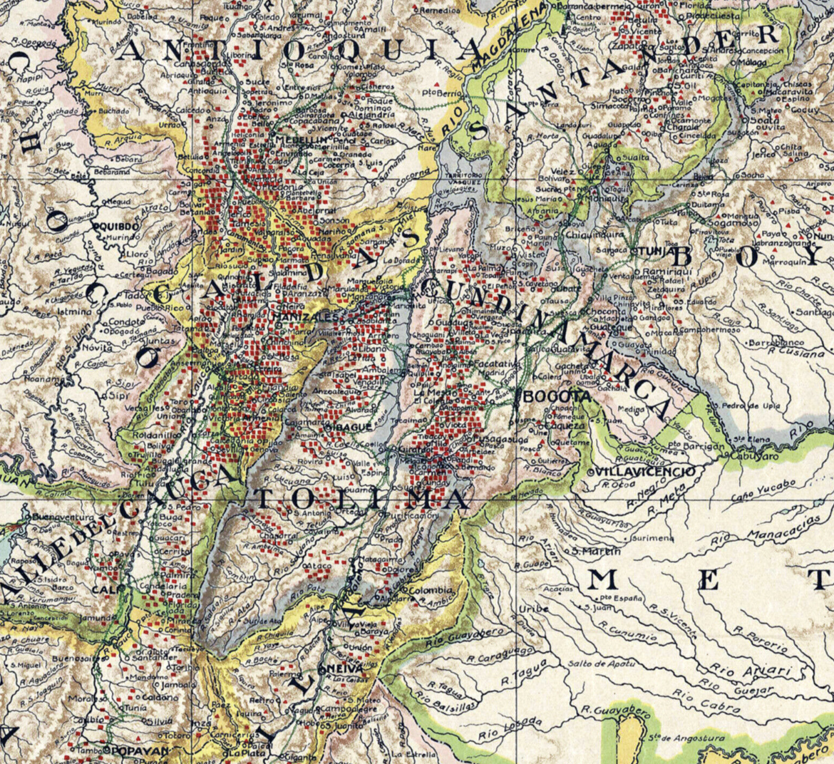
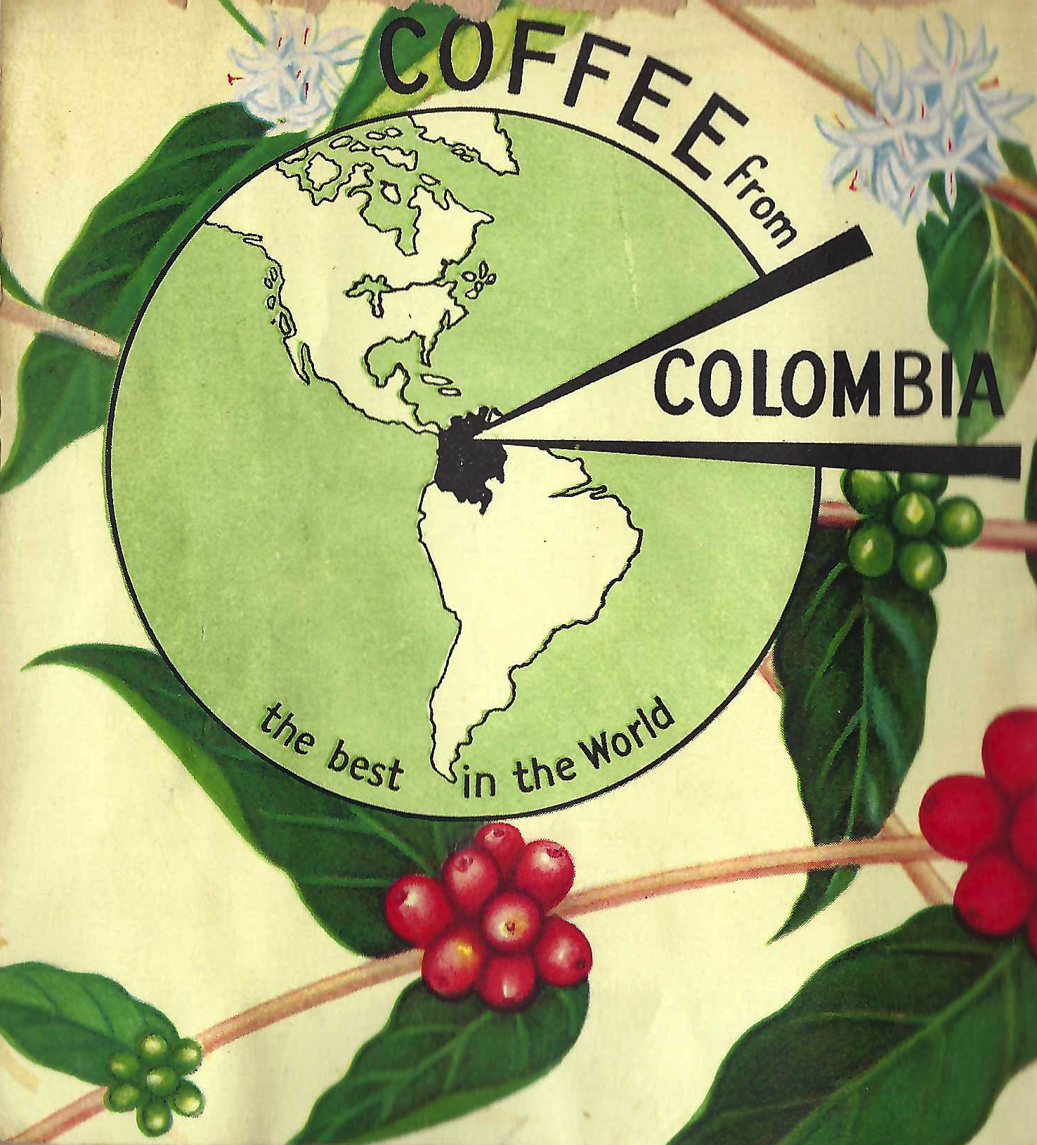
If the promoters of Colombian coffee at the Colombian Pavilion promised “the greatest writers, poets, scholars have long been and are today great users of coffee,” which “sharpens the mind” as it “buoys the spirit,” as well as improving physical health and morale, proven by Washington’s classification of coffee as indispensable to mobilized troops, the provision of coffee seemed a peace-time dividend of the beverage grown in plateaus “at the very gates of the Panama Canal,” in a country whose climate, soil, and altitude were perfectly adapted to producing fine coffees for its northern neighbor–and offered a detailed mapping of census of coffee growers and distances of shipping from plantations, from the recent geodetic survey that revealed the with harvesting seasons, free for coffee businesses, marked the scientific status of maps made of Latin America by the American Geographic Society of New York since 1922, rather than state agencies, of apparent authority–elevations, hard-edged contours, and colored relief, even where little surveying occurred: Colombia Growers used the geodetic survey to plot the coffee survey to sell Americans an image confirming the dominance of Colombian goods, using a map made to promote American cartographic imperialism, as well as international trade. (It may appear quaint that the upper left time-table notes distances of plantations and farms to nearby shipping ports, rather quaintly, to promote the well-connected nature of Colombian coffee farms to a global shipping network, but the large bulk of bean transit still arrives today by container ship.). If the timetable of distances from farms to coastal shipping ports seems quaint, the same ports ship beans globally today.
Coffee Map of the Republic of Colombia, World’s Largest Producer of Mild Coffees, Prepared by the National Federation of Coffee Growers of Colombia, 1: 2,750,000 (1933)
Distances from Coffee Centers of Production to Five Coastal Shipping Ports
The global terrain of coffee production has almost astronomically grown to meet current consumption levels, at a briskness that can barely compare to population growth, moving beans from the equatorial band of coffee farming across the globe. Globally, 25 million farmers now rely on their production of the beans today–most of whom are small farmers–but rising temperatures predicted could radically reduce and effectively circumscribe what those in the know call the “coffee map” that tracks the traffic in beans, their shipping across seas, and arrival for roasting, before arriving in the United States of America, in a huge infrastructure of extraction and transport of container ships moving beans globally.
The residents of the United States appear to be perhaps so least problematically united by consuming caffeine that when Starbucks CEO Howard Shultz floated his name as a credible Independent candidate for U.S. President, able to shift a stubbornly challenging electoral map tilted to Republicans, it provoked pangs of angst in the Democratic Party, almost akin to reflux. The emergence of coffee as a new social glue in the United States was perhaps hardly new, but coffee-drinking may be our final national ritual. Starbucks offers an early morning altar of waking sociability, with an ubiquity that probably led Howard Shultz to imagine that the drink’s national popularity might lead to his election even in an age of increasingly oppositional–if not confrontational–politics of hyper-partisan divisions. Shultz’s candidacy might be probably in what is increasingly a nation of coffee- drinkers, where consensus might be best defined around a hot morning beverage, or at least one proven susceptible to coffee marketers, where satisfaction can be perhaps most easily imagined in relation to well-roasted beans. Is drinking coffee together one of the few rites that persists in a landscape of bowling alone?
The threat of self-candidacy of the coffee bean mogul once seemed a clever gambit to reach beyond parties, perhaps one destined to follow the fear of a post-Trump oligarchy that deflated the Democratic Party, and inspired critical commentary from the oligarchical crowd of Bloomberg, Buffett, et al., who presented the real threat of a coffee-driven candidacy as a thwarting of the American people. While the coffee once flowed from Colombia as a sign of America’s cartographic imperialism over Latin America, the image of Shultz as a moderator of the current Pax Americana seems to have tried to convert coffee to a new symbol of American global supremacy in an era of globalization, as if the task of transporting, roasting, and brewing rotating blends sourced from equatorial lands for globally dispersed markets provided a bracing surrogate of American global dominance. Perhaps his candidacy can be understood domestically–Shultz’s popularity as embodying American power grew as if the promise to lower the prices of a venti might tilt the electoral map, and meet cravings that the nation had become plagued: the conversion of beans to espresso-based drinks like cappuccino pose questions rooted in old-style economic geography, however, of shipping beans to roasteries, whose currency demand mapping, as the absence of geographic reflection seems suddenly to render global consciousness soluble in a cuppa joe.
If Howard Schultz coasts on a new wave of the capital of coffee’s aroma, a model of self-fashioning of economic wealth refreshingly different from Bloomberg, Trump, and Buffett, with profit margins far more rooted in investment in intangibles, we might remember coffee’s clear ties to processes of global warming we rarely see in a cup of coffee or scoop of invitingly glistening dark beans. In the lure of the inviting coffee cup, we are perhaps most apt to forget the global fears of deforestation, environmental devastation, shrinking groundwater, and sensitive habitat all underlie the triggering aromas and inviting sight of those scoops of fresh dark-roasted beans. His candidacy can be understood just as well as a form of displacing concerns about global warming, climate change, fragmented ecosystems, and habitat loss, in which plentiful ventis keeps arriving on the counter or in customers’ to go cups, preserving a new normal that sanctions Americans’ continued oblivious consumption of caffeine. If the transport and global sourcing of coffee continues, normality might seem to be able to be preserved.
The sorts of disruption in growing beans that localized drought in those tropical highlands seems almost destined to bring–as the worst dry spell in decades that hit Brazil’s coffee belt, destroying a third of the crop or a decline by a half in coffee bean yields in Tanzania since the 1960s, as temperatures warm and the ground becomes more wet, stand to grow not only the price of the two and a quarter billion cups of coffee we humans consume daily, in what seems like a private experience, meaning that the beans will no longer be so abundant in those burlap bags, or so plentifully and bounteously displayed in buckets that tempt the spending of a few bills on an easy pick-me-up that feels all too eerily like an intravenous feed.
In Columbia alone, coffee leaf rust that is the consequence of weather that is both warmer and wetter stand to damage some 60% of the country’s agricultural land by 2050, making for a decreased abundance of beans and ever more removed cup of joe. Indeed, coffee beans are particular enough about growing conditions that to remain optimal conditions of production, the temperature should remain between 18–21°C, and once rising above 23°C, bean quality declines and the plant grows far too fast, noticeably changing its taste, flavor bouquet, and aroma . . . with a detectable shift occurs with only a rise of only half of a degree at the wrong time in the growing season, in ways that could change coffee harvests far sooner that one might expect.
More than any other sector of life, the tremendous growth of coffee consumption over the past decades invites a daily morning exercise of geographic literacy. In hubs of metropolitan coffee drinking, the local origins of beans are invested with a provenance that is supplemented by detailed descriptions of their practices of cultivation. The geographic here primarily signifies or maps to the gastronomic; provenance of coffee has a deeper resonance than the locations of their roasting, and erases the huge distances traversed in their transportation or the local climates in which they were produced. The importation of coffees and costs of coffee farming are naturalized within local coffee bars as a geographic palate, as we’re accustomed to having Sulawesi, Rwanda, Burundi, and Tanzania among the rotating coffees of the week, and in our cups; their names, instead of the once-dominantColumbian or Brazil beans, are part of our routines that are often stripped of geographic signification as place-names–even though they might be better understood as a geographic lesson with climate warming as its subject.
The Federación Nacional de Cafeteros de Colombia, with offices in New Orleans and San Francisco, as well as New York, thanked the Consulate General in the booklet that it printed for the Colombian Pavillion in the Golden Gate International Exposition of 1939 in San Francisco–an occasion to mark the anniversary of the opening of the Panama Canal, some twenty four years earlier at the Panama-Pacific Exposition, rhetorically asking readers in openly boosterish terms, “How about a second cup of Colombian coffee?” The all caps response–“IT’S GOOD FOR YOU!”–sought to refute fears of the jitters, lack of sleep, or uneasy stomach that coffee-drinking might bring, as it promoted Colombia coffee as the world’s best among global varietals–with some considerable cartographic license–
–if the climactic map that it worked from suggested the deeply colonial cartography of coffee beans on what seems a zonal map, but which is credited to Rand McNally & Co as authoritative record of the global climates in which coffee beans actually grew. On the heels of the recent remapping of much of Latin America in apparently authoritative form by the
“Coffee Growing Countries Follow the Equator,” from The Land of Coffee (1939)
While Colombia showed itself in all caps, second only to Brazil as a coffee exporter, the pamphlet oriented readers to the global market for coffee in the then-current language of globalism. “If you were to fly around the world, following the path of the Equator, and if you could look out across the half of the Tropical Zone on either side of your plane,” it began, using the novelty of the Air Age to describe the accessibility to global markets to which American coffee drinkers could benefit, “you would behold the fifty or more countries–some of them large to be sure, some of them but tiny islands–in which coffee today grows.” While “coffee did not always grow the length of this wide belt that circles the earth at the tropics,” the global networks of trade that facilitated its global spread from the 9th century, when a humble Arabian goat herder was “credited” with the discovery that the roasted beans might create a beverage, if a more survivalist story of a Dervish, Hadji Omer, exiled from the land of Mocha in 1285, survived for days on the berries of one coffee tree while in hiding, was the first to steep some beans after browning them in an open fire, whose popularity was only cemented as the popularity it won in Turkish coffee houses in Constantinople, drawing customers from deserted mosques, lead to the fad to move first to Venice by 1615, and New York soon after by 1640, coffee houses were founded there in and Boston in the colonial period, before the dissemination of the plant to French colonies from Martinique to the East Indies shifted the “map of coffee growing” to lead grounds for coffee planting to Cuba, leading land to be cleared in Colombia, after Spanish colonization introduced the bean to the South American mainland.
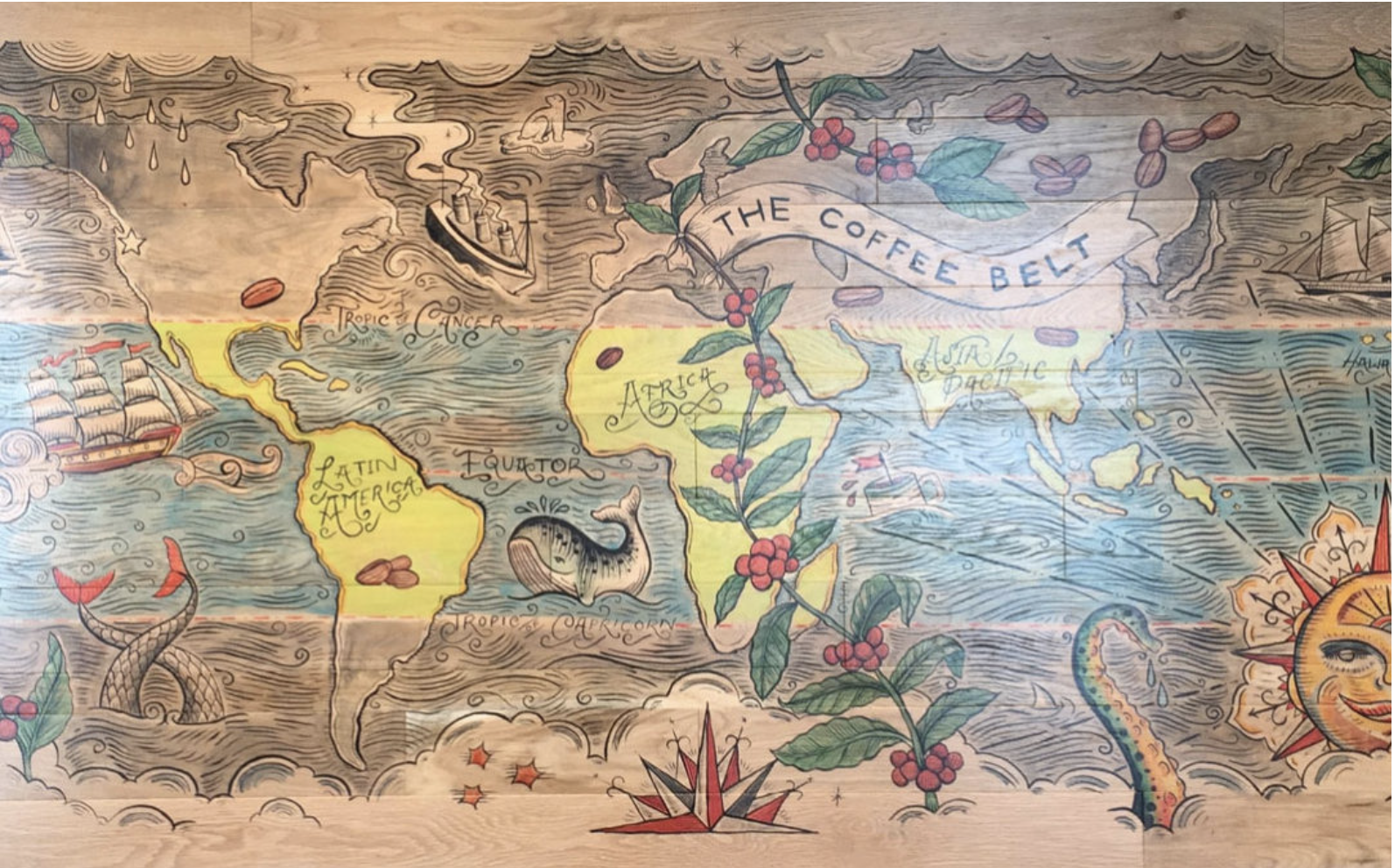
Today, the most globalist of all coffee chains, Starbucks, openly invites us, in the age of globalism, to remember a map as a decorative object, where place names are overlapping and indeed colliding with descriptors of the good on a map that seems more decorative than geographical in content, recurring as a backdrop for savoring the aromas of its blends, the global map colored, predictably, a rich coffee-shaded hue, all boundaries elided or obscured in a world that seems saturated by java, as if for the benefit of the drinker’s taste, providing a decorative map to enhance the drinking experience in a roadside Starbucks, on Highway 5.
The lush landscapes in the faux manuscript nautical map overwhelms whatever denotative content of the tropics. The majestic wall map was quite intentionally reduced to a backdrop for taking a coffee break, pausing in one’s itinerary as one is driving along a California freeway and pausing at a rest stop. It is striking that there is barely any attempt in this mock-antique global map of even making any place legible, only vaguely treating the map as a sort of division of coffee flavors, but treating the globe as saturated by the flavor of beans–rather than of states or nations; descriptors are suspended as if disembodied, across a mock gold-leaf field, indicating the earthy, herbal, and chocolate tastes of coffees from “Asia” or the “Pacific”–rather than specifying distinctions of beans originating from Indonesia, Yemen, Java, Bali, New Guinea, or Ethiopia, where the leafs of coffee plants stretch, beneath the Tropic of Cancer. The lands are a uniform brown, saturated with coffee flavors of disturbingly uniform tone, the descriptors lie on a gold field as if to offer themselves as what we sense as coffee consumers.
Indeed, the triumphal map seemed to almsot displaced by the beans’ descriptor of the beans, whose deeply colored beans provide the more compelling descriptor of the coffee that seems to have indeed displaced the very legibility of place, if not its notion in a map, as they become the site of sensing the flavors of “nutty” coffee beans, the islands are left distinctly defined but without any sense of sovereign identity, and the number of coastal islands of possible cultivation almost infinite in number.
As we drink coffee daily, and isolate the coffee-drinking experience as an ecstatic one that almost exists without place–but is based on the construction of a place to drink coffee apart from the work world or the street, in a space of selective privilege and almost private intimacy, can maps even help to process the origins of coffee plants, or the mystification of converting a place-name to a descriptor, in ways that seem to extract the beans’ flavor from their site of origin?
They might not disrupt the individual experience of a good cup of coffee, an intensely pleasurable and even intensely neurologically stimulating activity, but map the names tied to the pleasure off caffeination to the broader land of the land, moving from the domestic sphere of coffee drinking and the half-private space of cafés where the precious brown liquid now circulates before being imbibed at considerable costs, all too easily concealed in the privacy of our pleasures–
Louis Marin-Bonnet, “Woman Taking Coffee” (1774) Cooper Hewitt (inked engraving)
–to the global world in which this space must be situated. and the global markets on which they our all too easily internalized habits of caffeination increasingly depend.
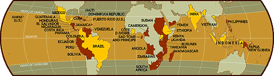
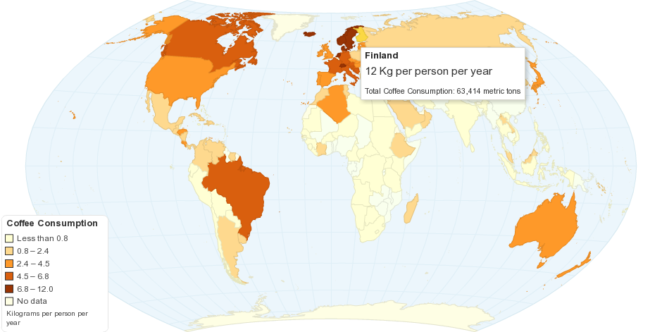
The lopsided distribution of this conversion of toponymy into gastronomy is evident in a map of where this huge rise of coffee consumption and importation has occurred. If coffee beans were introduced to the future United States in the eighteenth century, coffee has become among the leading importers of beans worldwide. Americans now consume some 23 gallons each day (or 22.1 according to Wikipedia)–but declined far below the 48 gallons Americans were said to consume annually in 1946–0r the 62 gallons downed annually in far chillier Finland. Yet it has become part of bloodstream–literally–and an unprecedented (although we lacked earlier metrics) 161,000 folks listed coffee making or serving as a “skill” in 2013.
We might call this the browning of North America, ignoring that the distribution of local blends, pioneered by Peets and popularized by Starbucks, before being refined by Blue Bottle or Four Barrel, masks variations in a topography of coffee drinking in the United States far more variegated than the homogeneous brown of the United States. (The fact that Canada is yellow may seem comforting, but conceals the very urban nature of this social ritual: notice how those brown dots congregate around Toronto, Montreal, Vancouver and Ottawa . . . ) The absurdity of nationally ranking habits of daily caffeination aside (although there’s an academic press title in here somewhere), the most striking aspect of this map is the huge area of the world left in white, shown here only from the equator since no countries below the equator import coffee beans in such quantity.
Indeed, the ten largest coffee importers, mapped in yellow, not brown, suggests the sharp imbalance of equatorial countries whose products tend to wake up folks in northern climes, in a map whose palette is a ramp that seems composed of light and dark roasts.
National Geographic
The more detailed mapping of the production of coffee by bags of beans, mapped by Oxfam for 2001, showed a nicely skewed data distribution, with those non-growing regions left suitably blank, as if they thirsted for the brown stimulant that came pouring (or steaming) in from equatorial climes:
Oxfam
There is a clear “coffee belt” whose discovery and demarcation the Coffee Grower Association of Hamburg claims responsibility for:
German Coffee Association
The Starbucks map referenced geographic precision of “our coffee belt” in decorative terms, as the flower and pods of the beans overlap the geographical content, and the letters on the map are changed to almost decorative forms, colored the hue of coffee.
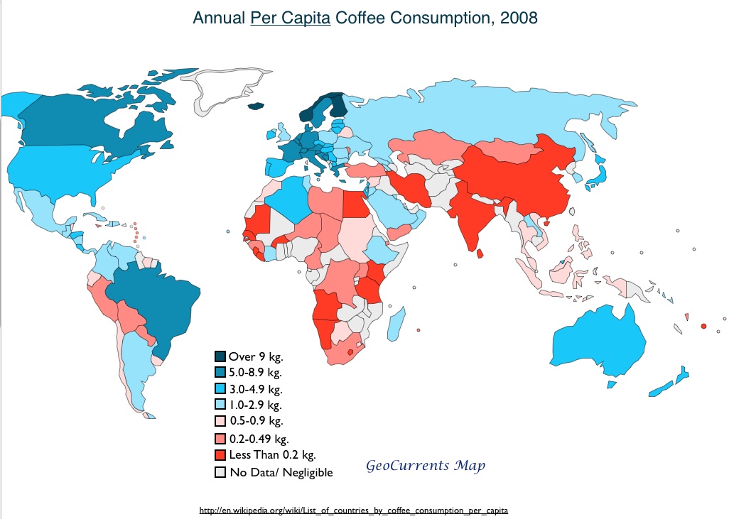
And a lot of imported coffee is needed–creating what has indeed long been a pretty big business interest in the US, even before the boutiques of metropolitan areas from the 1990s. Even if, once this huge amount of unroasted beans is divided per capita, rendering regions like Canada and Scandinavia distinctly darker, and measured by consumption of cups/day alone, the geographic distribution looks a bit different in 2011 when mapping coffee consumption per capita in this clickable map of circa 2008:
Which returns us to the interests that all maps conceal. By the alchemy of toponymy, the regions from which the beans themselves derive, of course, come from the very equatorial regions that are the sites of forestry. Far from a bucolic image of verdant plains, the expansion of coffee growing has made significant incursions in local habitat, in danger of disrupting ecological niches that this map of coffee-growing conveniently obscures by depicting the bean as growing in undisturbed areas of verdant green.
This is evident in this far more anodyne map, prepared by someone trained in the school of quite openly neo-corporate graphic design:
I appreciate the hand-drawn oval projection, crafted with care in the midwest city of big shoulders, which suggests that if all roads led to Rome, all beans flow to Chicago:
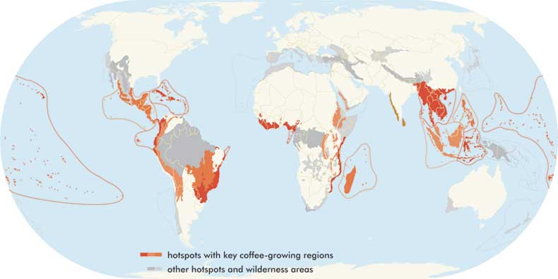
A more informed map might link the cultivation not only to forested regions, but to the very “hot spots” whose local biodiversity is most threatened by global warming, and where the inefficient use of water widespread in coffee cultivation least practical and most pernicious. For it is not only equatorial areas, but from the driest areas on earth:
Conservation International
The overlap of ‘hot spots’ map onto coffee-growing regions alarms; coffee cultivation is widespread in 16 of the 34 most threatened ecosystems. And this is the tip of the iceberg, to use a somewhat mixed metaphor unless one considers iced coffee, of the paradox: privileging the locality of cultivation in maps of caffeine consumption reinforces the fragility of local ecosystems. This is a very different map, speaking map now, from the manner that an earlier cartographical image set the details of consumption as an inevitable but conscious choice, concentrated in one icon, as opposed to the naturalization of growing in isolated pockets of uniform unattractive gray of our analytic objectivity, suggesting the weight of coffee consumption by its distribution of black donuts–an interesting symbolic choice:
Indeed, the conscious coffee drinkers at the Water Footprint in the Netherlands have mapped the severely disproportionate gross virtual water import that results worldwide:
The “flows” of coffee beans might be mapped, if somewhat less legibly, in comparison to those of chocolate, whose parallel commerce from the New World matches it as a popular stimulant from the New World, as Marcie Norton reminds us, that in fact was similar in its function to coffee:
In part, this is a local story, with much of the jumping value of java able to be registered in the Port of Oakland. If the bar graph which groups all beans as a whole, independent of destination, it confirms Oakland’s significance as a global hub of the importation of coffee beans. By 2012, the burgeoning Bay Area community of coffee roasting in the Bay Area took advantage of the fact that Oakland is the second largest site of coffee importation in America, thanks in no small part to the Panama Canal, as engineers who work in Silicon Valley began to scrutinize the thermodynamics of roasting in popcorn poppers or Whirly Pops, stove top, and propane-powered barrel roasters, as close study of roasting past the first and second crack of beans that approached the Maillard process led to the latest expansion of food prep knowledge, as the valuation of the beans imported through Oakland encouraged DIY roasters to fill their kitchens with smoke, seeking the perfect smokiness and acidity in beans whose specific burnt sugar, fig, oatmeal stout, pumpkin and pepitas map worlds of taste contained (and accessible) in coffee beans.
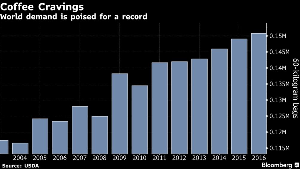
The jump of coffee cravings stateside have expanded at an unprecedented rate fed by Starbucks, with the kilogram consumption of coffee bags breaking world records, per Bloomberg, driven by a nation of junkies whose cravings may only continue to break global records and encouraging disposable incomes devoted to feeding an addiction that is increasingly part of the local landscape of coffee houses.
Let’s recall the lopsided nature of a current map of coffee indulgence that this demand reflects–
–as we note odd emptiness of the very areas where the extractive powers of coffee were so long based if we return back to the Starbucks map from which we began, the areas of Europe, now colored a dun caffeinated color, obscuring that it is the center from which the rage of coffee consumption began.
We might consider the possibility of a re-mapping our daily habits or affectation for caffeination, through this map of the network of coffee distribution and consumption, removed from most familiar geographic categories. The schematic map is courtesy San Jose-trained Roxanne Pasibe:
Or we might consider the huge environmental shifts that the market for farming beans has created, in the “hotspots” for coffee growing that creates new pressures on sustainable lands, and wilderness areas alike, compromising and threatening biological diversity across the equatorial belt. Coffee growing regions now exist in clear overlap with some thirty-four biodiversity hotspots, creating questions, as sustained consumption of the stimulant has spread across the globe with ever greater intensity, that it may compromise both the forest community and biodiversity, as the tentacles of its global trade threaten land stewardship in the most sensitive habitats whose conservation is endangered by coffee farms.
In the initial graphic, the beans naturally drop to the ground, and into our bags. Let’s try to map how they come to get there, and into our cups.
This rendering of the future site of a University in Berkeley by R. D. Yelland imitates the genre of a real estate ad and bucolic fantasy amidst rolling hills: after the foundation of great land-grant universities in the middle west, the painting suggests the existence of basic walkways and streets for the university that are framed by banks of local vegetation and trees. It is not a map of the area, but suggests a prospect of a future map of the region, rendering the vision of a spiritual site for education that inspired Samuel Hopkins Willey when he purchased the land “for the dream of a college.” It is a place that was not yet defined, but was ready to be mapped and settled as a seat of learning and formation.
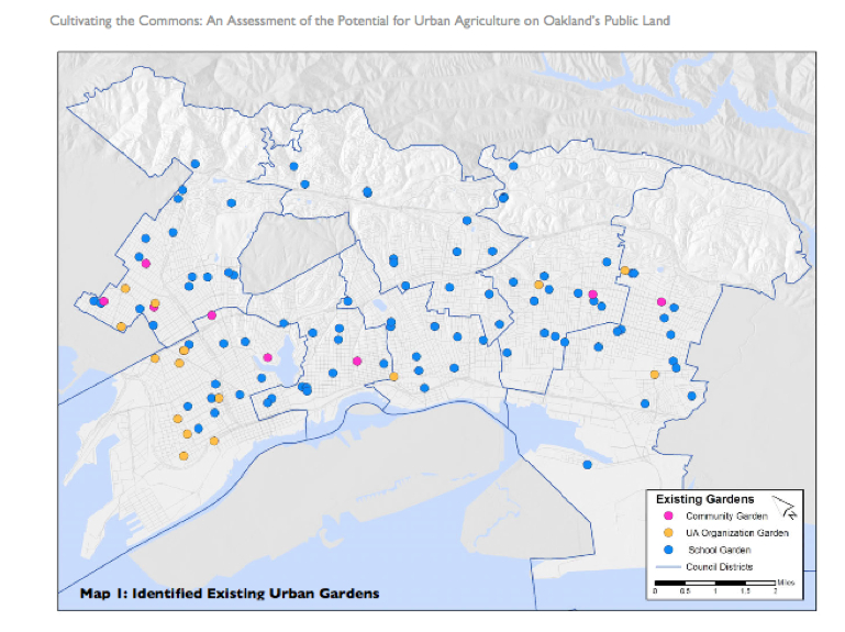
The historical remove of this scene is striking, but a sort of agricultural archeology exists today in Oakland and the East Bay that has just begun to be mapped. This map of urban farms and farming,while of different cartographic form and far more based on actual statistics, suggests how from a number of school gardens in the Oakland Unified School District, at least seven “community gardens” can be identified in the region as well as some neighborhood farms. Rather than point to a project of ‘regreening’ Oakland, a city without much arable land–and more notorious than other cities in Northern California for large range of paved areas and highway routes–the map reveals not only renewed attention to urban farming, but a new attitude toward urban space that the expansion of urban gardens has directed attention. And the map suggests the future prospect for the city as an inhabitable space.
In the wake of farmers’ markets and the rise of Berkeley’s Edible Schoolyard project, the question of access to fresh vegetables and produce has become a social justice question in Oakland, as in the rest of the nation. Not only is there a conscious desire to restore active gardens and gardening to urban space, but a large educational role of the garden is evident in how with the help of the California Department of Education’s Garden in Every School program and the University of California Cooperative Extension‘s school garden program, in Oakland nearly 100 childhood development centers and elementary, middle, and high schools have active school gardens to teach science and nutrition. The network designated by blue dots in the above map of Nathan McClintock reveal an expanding network of city gardens, which may have laid seeds for the City of Oakland’s Community Garden Program, the gardens of City Slicker Farms and the People’s Grocery, and other programs focussing on rooftop gardens, gardening for kids, and urban urban gardening workshops or centers.
The expansion of these farms do more than try to restore the tie of urban space to local agriculture, or remind us of the farming lands that used to border cities up to the mid-twentieth century, and still border some towns as Madison WI. Despite the fact that few cows moo in Berkeley, the image of Berkeley as an agricultural region survives in Berkeley Farms, McClintock mapped the city’s gardens to assess the potential that exists for projects of urban agriculture in Oakland’s large number of public lands. To be sure, McClintock and his team see limited viability for a regreening project on a large scale in Oakland–not only is this less in need in a place where agricultural produce is available nearby, but the expense of repatriating and cleaning soils of many public lands, including the Alameda airstrip or the vast number of underground oil storage tanks near the harbor and old train lines (who can imagine urban homesteading near Livermore?). But as any urban map presents an image of the city, the shift suggests a deeper change in how the city is seen. And despite the hazards of old house paint, new models of “phytoremediation” use plants to leech metals from the soil, as intense addition of compost may immobilize existing hazardous levels of lead.
But the map draws attention to or adumbrates a shifting attitude to urban space that asks us to reconsider the nature of Oakland’s urban space. The smaller blue dots that designate school gardens and dot the landscape have in the past decade set the basis for a flourishing of smaller farming areas and several sizable community gardens, most built and cultivated to serve the communities where they exist; a recent push toward the local sourcing of agricultural produce in the city has given impetus to a broad, if focussed, rise of clusters of local farming, most prominently associated with City Slicker Farms. Although a large number of plots were zoned for heavy industry in Oakland and modern Emeryville, much of East Oakland is both available and ready for agricultural use. The goal of using local sources for food was embraced by the Oakland City Council in 2006, when it established the goal of 30 percent local sourcing, and the attention to the benefits of urban agriculture as a source for local jobs and growth encouraged subsequent creation of the Oakland Food Policy Council. (For more on the formation of Urban Agriculture movements in the city see http://www.foodfirst.org; McClintock’s study is a model of mapping of the viability of local food sources: http://www.oaklandfood.org/media/AA/AD/oaklandfood-org/downloads/27621/Cultivating_the_Commons_COMPLETE.pdf
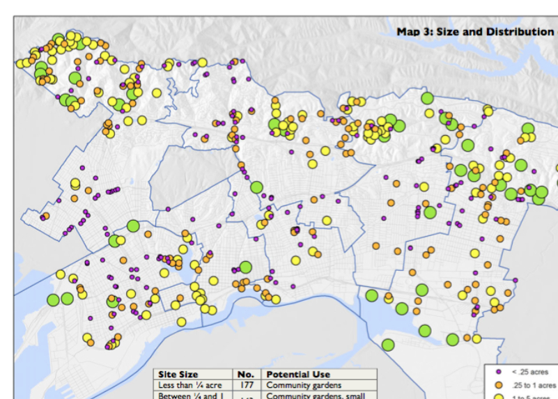
McClintock’s map of the relative sizes of these farms reveals that despite the small numbers of urban farms of substantial size, the considerable number (and clustering) of farms above 5 acres in East Oakland in 45 ‘urban farms’ that have changed the landscape of the city in recent years.
These farms could never meet Oakland’s demand for greens, despite the hope for a significant production of food from local sources. They do not return to a vision of the city as garden, but have changed what McClintock calls the “ecological footprint” of the city: these two maps provide a basis to understand how, if on a lesser level than farming in Detroit and elsewhere, residents have used urban farming to transform the city’s landscape and, by selling to local residents after the model of farmer’s markets, changed those residents’ relation to the land together with their access to fresh food.
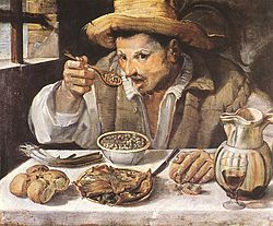
Captured at the very moment he is poised to bring cucchiaio to mouth and taste the spiced beans he is set to enjoy with bread, green onions and wine, the hungry if iconic “Beaneater” or “Mangiafagioli” captures the early modern appetite. It is tempting to map the goods on his table as a record of subsistence. Caught in the act of devouring spoonfuls of lunch by the late Renaissance Bolognese painter Annibale Caracci, the anonymous portrait has become an icon of local food and a snapshot of culinary history from early modern Italy. Literally engaged in the moment of pleasure of joining food to his body, poised above his plate mouth open, spoon raised, the Beaneater shows the contents of the spoon to the viewer by a perspective of an odd but undeniable intimacy.
The Beaneater’s expectant stare engages us to consider his soup of beans–more than the rolls of bread or glass of wine, or the bunched scallions below his wrist, as a moment of pleasure on which we as viewers concentrate. For as much as the personhood of the Beaneater, food is undeniably its subject, and his food–the spatial specificity of eating in late sixteenth century Italy.
The image of eating is celebrated enough to provide the cover of cook books, and compelling because it is rooted in a specific place: it reveals a joy in the simple pasta of beans, onions, bread, and wine, immersed in the Mediterranean economy of oil that defined cuisine in northern Italy and Rome around 1590. The painting, which indulges the Caracci family’s taste for painting everyday life, from butchers to fish-sellers, may belong to a genre of the performative nature of eating, but is so iconic as one of the earliest images of the simplicity of the so-called Mediterranean diet–and condenses a map of the food habits that defined class behavior, or social strata in cities–and the pleasure of local, familiar food.
The image became iconic unlike Caracci’s other images of butchers or later images of fish-mongers bas the template for the Sicilian artist Renato Guttuso’s classic illustration of Italian eating, which was the cover of Elizabeth David’s Italian Food (Penguin 1965)–a series of books on regional cooking that preserved food as local and fresh, in ways associated with Alice Waters and, in Europe, the Slow Food movement. The image is an icon of local eating, where vegetables, oil and wine engross bean-eater absorbed in consuming local Roman food.
Guttuso’s images of earthy, sun-drenched vegetables of Sicily evoked a strong tie to place that David presented to English readers; the cover of her book echoed Guttuso’s rendering of earthy qualities of local cuisine, in ways that seemed to give a fresh awareness of the stuff of foods, and their origins, for a postwar country waking up from packaged rations and voyaging abroad, and eager to discover its own cuisine.
Maps help untangle how highly personal eating habits and practices relate to place. In the winter, we buy and eat blueberries and grapes from Chile, tomatoes from the Netherlands, garlic from China, or just don’t know from where the multi-sourced food that arrives in confected packages was grown. Mapping food supplies, food circulation, and the economics of its price forces us to come to relate food to place–and follow the routes food travels as it reaches our plate, teaching us how food systems mediate our relation to the space where it is grown.
The call to action to “vote with our forks” reflects not only a desire to eat good food, but to appreciate the origins of grown food, from its cultivation to practices of animal husbandry, and a call for responsibly to map the food on our plates. It raises possibilities for historical maps of shifts in food supplies, of understanding the first airlifts of tomatoes from Dutch greenhouses, or the economy by which fish are flown around the world–in the hope of reclaiming an awareness of mapping food, this blogpost discusses the ethics and benefits of rendering food cartographically.
1. The project of mapping extends far beyond enjoying local cuisines–that’s a great thing, but mapping is here a critical project. The volume aims to achieve a re-mapping of our relation to the land in understanding the routes by which food arrives in our refrigerators, kitchens, and plates. As we search for maps to excavate or understand how food ties us to a basic relation to the land, it’s not surprising that food-mapping, as much as food-writing, is a way to call to attention the problematic estrangement of food from place in contemporary life. For maps of food prices and growing regions attempt to preserve a clearer relation of food to place and to help understand how complex our relation to food has become.
The maps compiled in FOOD: An Atlas–discussed in my first post in this blog–raise a number of thought-problems about the relation of food to place. Each attempts to preserve and privilege local notions of our relation to food as we are starting to situate traffic in food within an age of the global circulation of goods. It is the ideal gift for fans of farmers markets, and to those interested in taking back their relation to food. The interest in mapping food starts from mapping the sources of the food we eat, but advocates a new ethics for mapping food to understand our relation to space. In a series of crowd-sourced maps of different scale that are grouped thematically, they image eaters’ relations to regions and the mediation of local to global in foods. What is compelling about this “atlas” is how each of the maps subverts the universalizing authority of the map by privileging access, availability, and the distribution of food and by asking us to start to remap our own relation to networks of food supply.
The maps were drawn to create a living geography that mirrors a geography of food through questions of local availability and exchange, as well as by mapping food consumption: they reveal how all food exists in a network that links us to place. The mapping of food is a necessary extension of writing about food if we are going to take seriously what place and location mean in our food supplies.
2. Food has long been mapped.
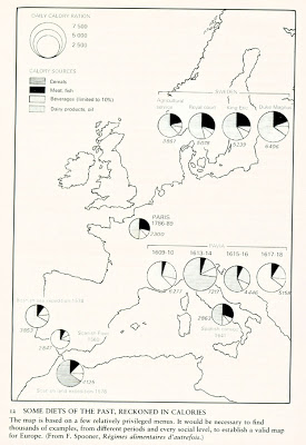
Food tastes define regions; the resources of food are often mapped to define the integrity of geographic areas, patterns of transhumance, and geographic divides. Take, for instance, an early historical map of the divide between the consumption of oil and butter in early modern Europe, of the sort used as critical tools to understand the material basis of civilizations by members of “the Annales school” of French historiography, and exemplified by the work of Fernand Braudel, who sought to illuminate the “deep structures” and rhythms of a Mediterranean mapped by vines and olive groves.
The division was seen as as basic to the nation, rooted in north-south divides, and presented as easily able to orient oneself to as by a compass, even if more likely through regional themed restaurants, bistrots, and cookbooks–as if geography underpinned destiny, even allowing for multi-ethnic tolerance and a myth of national coherence in the pentagram that seems to capture the European divide of Mediterranean and on-Mediterranean cuisine on a simple index exactly corresponding to national départments, even if it suggests a shaded spectrum as much as a firm geographical divide.
To be sure, this generalizes in part the divisions in France to understand the divisions in European consumption at large, separating the Mediterranean economies into vegetal and animal fats. One might compare the amount of disposable money spent on vegetable oil versus butter, to reveal the mythic divide of the “butter line” in France, an image that was perpetuated in school textbooks ten years ago as a sharp culinary divide that smacked of the persistence of localism in the nation, if not lines of national fracturing: the north is the land of butter, school kids learn, even if it fades into the orange-hued Mediterranean south the land of oil through a fuzzy land of light green, where butter only slightly dominates households’ grocery bill.
Knafou, Géographie: Les hommes et la Terre (1997)
The map echoes with deep structures of fat use and food preparation that structure the land, as uses of sweet butter or salted butter distinguishing each départment of la France, along less clear north-south divides, although the lack of serious gradations of color in this map where many reveal fairly equal divides are betrayed by the stark chromatic divides that preserve regional fracture lines:
But it also used maps to delineate a lived space that expanded beyond the experience of its actors, their emotions, and relations to life. The nation may be a culinary map, of sorts encouraged by cookbooks on “French Cooking” the combine culinary divides,
but the tradition of local distinctions of food tastes in départments, even with increasing geographic mobility, is reflexive, and belts have been mapped between the uses of butter, margarine, and oil, that may map more complex and fluid divides in food use, in this 2012 map of what presents a picture of greater regional complexity to map readers.
In Francophone fashion, the Annaliste maps statistical divides as learning aids that exploit the objectivity of cartographical accuracy as a scientific foundation for historical inquiry. Rather than map routes of historical exchange or structures of daily life, they map agronomic foundation of political cataclysms or events s to draw distinctions that are not viewable to actual participants, rather than the finer grain of local variations. Such a map of butter and oil maps the habits of consumption and reliance on fats to draw a line of difference that distinguish and demarcate the Mediterranean, but have an odor of essentialism that perpetuates the naturalization of differences. These lines of division return along different latitudes:
What’s lost in drawing such crisp lines of division is the meaning of local. We privilege lines of regional and national differing as explanations of difference, without looking at how meaning was made on the ground, even as these maps seek to reveal the coherence of deeper structures from the “folds of the Mediterranean” to the proportion of arable lands. A related if distinct danger in mapping food differences is that we elide consumption and production, or view the economies of production and consumption as a unit, rather than examine the choices available in a market that could reveal how populations relate to a complex global market of food.
The Annaliste maps made sense as a way to understand the distribution of goods or the distribution of resources in a map of zones of caloric intake:
Of course, when one thinks of how French map food, one thinks of terroir as a championing the authority of local wines:
Maps such as the above value place, location, and authenticity. But authenticity is a scarce commodity, and food maps look far more strange as food choices are mediated by the vagaries of a food economy, responding often to the availability of disposable income, scarcity, or market forces. We have seen a recent rise of islands of awareness of food and islands of distinct eating patterns and even archipelagoes. Such islands are created or emerge near to fresh produce growing areas, or farms, as farmers’ markets arrive in cities with the promise of “fresh” food grown in a “local” way–if not in the cities where the markets occur, but in farms that promise sanctioned growing practices–and access to a sense of place in our plates. To be sure, the creation of farmers markets in cities can be active ways of reclaiming pubic spaces as sites of sociability and exchange, and probably are tied to the ‘greening’ of urban space associated with projects of urban agriculture of the sort that has also begun to be mapped.
But there is a way that the issues staked out in these maps engage the globalization of food consumption, the mediation of foods in the urban marketplace, where food is removed from place and eating removed from the places of growing food, consumers lack a clear set of tools for remapping one’s relations to food, as there is of restoring a sense of place to one’s dining plate. “Place” is not understood in terms of cuisine, however, but geographic specificity: as wine is regionally grown, coffee beans or honey are sourced, linked to “origins” that we’ve lost sight of in a global marketplace, and high-end markets promise to recapture a specific place of origin–presumably one cleaner than the spaces in which we live–and a sense of authenticity that we used to look for in local cuisines or while traveling.
3. Maps draw our attention to the local through the maps in FOOD: An Atlas.
For the maps that it includes focus an eye on the manner it maps how food travels over space through an ethics of cartographical representation. The open-sourcing of maps for this volume suggested an attempt at recovering a transparency in understanding the sources of food, and removed the project from a single authorial bias. There is indeed a shared pleasure of providing different maps of food sources, and at revealing exchanges in a variety of food products in different cartographic formats and conventions. The many maps of modern practices of food consumption clarify our current (confused) relation to the land in relation to questions of the just access to food and food supplies in ways that mirror a new concern with food and social justice activism, by revealing the value of a new ethics for mapping food. Such an ethics of mapping were raised by the late Brian Harley in the early 1990s, when he called for guidelines in formulating principles to help formulate maps that are themselves made to support moral or ethical judgments.
The geographer Brian Harley was preoccupied (he seems always to have been preoccupied by something pressing in the meaning of maps) by an ethics of mapping and the ethical nature of the questions that mapping practices inevitably raise. He raised a set of questions in the spate of short articles that preceded his untimely decease including: what are the ethics of cartographical practices? could a more ethical cartography exist? can we move from “what map is good?” to “what map is just?” Isn’t the problem of map making not only in preserving standards of cartographical illiteracy in an age of the rise of automated and computer-generated cartography (Google Earth?), but in a failure of attending to the ethics that are concealed in the universalizing project of mapping and the interested nature of any map? It would be unjust not to map sites of toxic waste, and to pretend that they didn’t exist or were not worthy of consideration.
To do so would be to indulge in the cartographical illusion of mapping a sanitized relation to space.
Familiarity with such questions might explain the interest generated in maps of food. They present our relation to the land, or map how food mediates that relation to the land. They recognize that our relation to the land is mediated in maps, how we eat food is also a way to construct or relation to place. The gathering in one book of a set of particularly inventive means for mapping our relation to place pioneer a new iconography to map food that questions the uniform distribution of space in maps, and our relation to what we eat.
Beyond being maps of the appropriation and distribution of food, the maps found in FOOD pose questions of the justness of mapping that recap how social justice has become a concern in food supply and policy. This makes food-chains and consumption the perfect focus for Harley’s focus on making the map “a socially responsible representation of the world.” Harley was troubled by the historical Eurocentric value of cartographical projections, but concerned with the need to bridge practical commitments to precision, accuracy, and exactitude with questions of the morals of cartographical representations that moved beyond the pretense or illusion of objectivity. His concern with ideological naturalization might begin from how mapping oceans as bright blue concealed environmental impact of industry on water-safety, and universalizing one blue concealed variations in clean water supplies by creating the illusion of abundance; created a misleading uniformity in soil-qualities; how USGS maps omitted sites of toxic waste.
Harley’s concern partly echoed worries that the majority of information imparted to students is removed from ethics, and concern that the aesthetic or perceptual questions of mapmakers needed to be returned to an awareness of the moral judgments made in cartographical design. This concern is evident in the search for a new iconography of mapping in FOOD to reveal the implications of how food circulates in the modern world, removed from caravans and naval routes, but suddenly dictated by market forces and global exchange: the concept of mapping the transaction of food supplies illuminates the all-too-easy naturalization of a relation to food. There is a danger to forget discrepancies in the availability and scarcity of fresh food; lest we forget this, witness the urban “food swamps” where more junk food is sold than fresh produce. We might forget where tomatoes come from, viewing them as located only in a grocery: yet witness the established routes of the importation of tomatoes across Europe, where crops move and circulate along routes removed from natural settings. And witness the uneven distribution of major crops in the United States. We can learn more about our food, and increase awareness of its sources, by continuing to map where our food comes from by reading how foods are distributed in maps, rather than letting maps naturalize our relation to space.
Harley’s concerns with such an ethics of cartography no doubt began from keen historical awareness of the basis in maps as the English Ordnance Survey with military needs, or the uses of mapping in processes of colonialization in South Asia or the naturalization of Apartheid in the former South Africa, downgrading or erasing informal black settlements in maps; this cartographical distortion suggested either the illegitimate nature of their claims to space or lesser place within the consciousness of the maps’ intended audience:
These maps of South Africa distorted the social landscape of townships in ways that masked actual size of settlement towns, making it impossible to locate the settlements or place them in collective knowledge, and granting greater prominence to a network of white settlements which the maps treat as more historically permanent and hence more legitimate. Such maps are perhaps inherently conservative to a dangerous degree, as they retained “white” cities as the most important for their users, erasing the stability or permanence of settlements–or presuming that no user would be interested in locating them in the map.
Harley’s consternation at the dilemmas of mapping led him to challenge mapping as primarily mathematical and note that it was fundamentally illusory in how it re-described the world. In calling for a more “self-critical, socially sensitive, politically street-wise approach to the practices of map making and the objectives of cartographical activity” Harley hoped that cartographers could “recapture control over the morality of the map” in ways that exercised moral judgment, rather than “being relegated to becoming a robotic arm of an institutional or commercial patron” (Harley 1991). Although he devoted less attention to the consumption of maps or the levels of literacy of reading maps, focussed as he was on the construction of maps and the contexts in which they constructed a social reality, Harley valorized the literacy of reading maps as a way that ethical statements could be made by mappers. He was particularly concerned lest the makers of maps unintentionally become instrumental in undermining an ethical relation to the landscape in which we live–and perpetuate a simulacrum restricting our relations to social space as well as to agrarian place.
4. Harley’s work has usually been read in relation to critical deconstruction, have the rise of the moral cartographer. Many of Harley’s critics have called him optimistic (or utopian) for hoping that maps could change our attitudes to social space. But perhaps it is not so utopic at all in an age of globalism. Since Harley asked that we consider the moral benefits of mapping the world in a new way, and how questions of social justice can be endorsed by cartographers, the proliferation of GoogleMaps have distorted or make misleading links between places, and their totalizing claims to objectivity have revealed their flaws or limited reliability. Crucial to Harley’s call for an ethics of cartography was a refusal to accept only official data that might obscure or silence local variations and local meanings: we have seen a range of new mapping forms in recent years that call attention to the overlooked, from maps of superfund sites to Crow and Lodha’s Atlas of Global Inequalities (2011; http://ucatlas.ucsc.edu/index.php).
These maps use the familiar cartographical certainties to define monolithically uniform spaces in relation to each other, without much fine grain for local differences and, despite their illuminating observations of inequalities, sacrifice relations to place to draw and reveal stark contrasts in national GDP.
The losses of the erasure of local meanings was central to Harley’s call for a new ethics of cartographic practice, engaging not only the conventions of mapmaking that create stark hierarchies of meaning and prominence, but the iconographies by which distributions were noted. Harley was particularly preoccupied that the increasing institutionalization of technologies of Geographic Information Systems and automated cartography would omit a local relation to the landscape–and indeed promote a uniform mode of mapping often insensitive to local social or environmental issues. But the malleability of the computer-generated statistical map has created the opportunity for expanding the map as a critical tool in Crow and Lodhi’s Atlas, so that questions about global relationships can be readily viewed across space and time with iconic power.
A more seriously revisionist approach might play off of our familiarity with the significance of cartographic icons or even color schemes. One example of engaging the familiar color-schema of maps that have dominated the media in recent election cycles to create a new map of meaning in our political divides lies below. This map re-appropriates the stark red-blue division in its syntax, re-presenting how we understand the divisions between red and blue states not in terms of ethnicity, race, or the voting tendencies of segmented pie charts of the population. We can understand this stock division by mapping underlying social practices, as revealed this map of the prevalence of bookstores versus churches across states:
The mapping of the prevalence of bookstores generally follows patters of urban settlement–the places most likely for a bookstore to occur that would be economically viable, to be sure. Although a telling snapshot of American, the map may not hold as bookstores dwindle or become less economically feasible in more states; one might be tempted to extrapolate that with the greater likelihood of the closure of bookstores, as Amazon and online sales expand, the expansion of red states threatens–but the map is a tool to reveal social practices, rather than a map of the characteristics that determine a population.
The statistical map reveals how the occupants of each region view space, however, and the sorts of spaces in which they chose to live. And we can see that there is no such thing as a homogeneous red or blue space, or a clear map between, as Zook and Graham put it, faith and reason. The density of bookstores or churches in each place is divided by a national average, we can map a propensity for lifestyle choices, rather than the actual decisions or actions of a given population.
This sort of a map as an ethical intervention, in other words, by revealing the complexity of a landscape and asking us to relate it to the sort of landscape in which we live or want to live, rather than draw clear divisions based on statistical averages or means. We should have maps of food that allow us to know what foods we chose to eat, and what foods are most available in our environment–or the agrarian environments or marketplaces from which the food we eat derives.
5. The maps in the self-published curated collection FOOD: An Atlas are all inventive uses of cartographical iconography to illuminate the local by mapping local meanings and currencies of food. They offer provocative templates to examine our own relation to food. The editors reveal their commitments to food justice activism, mapping eating habits over space to reveal how constraints of economy, availability, and attitudes to food inform discrepancies of food consumption.
Does the density of farmers’ markets in Berkeley whose vendors are required to sell food from a minimum of ten mile radius reveal a geographic pocket that will encourage new attitudes to food? does the actual access of the produce sold at farmers’ markets provide an index into local attitudes to changing patterns in the consumption of food?
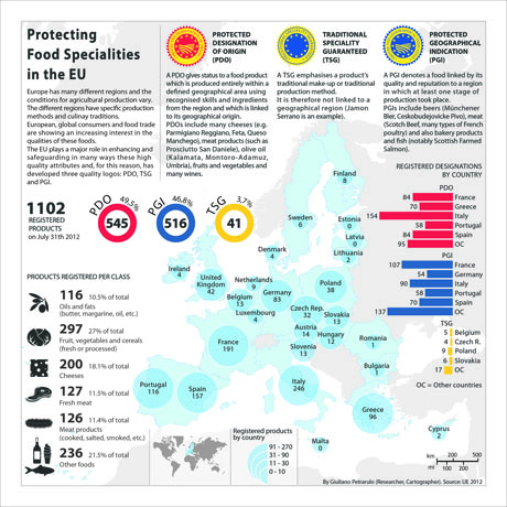
Does the way that the food industry draws with surprising ease from a range of geographic sources create a new sense of how we relate food to place? It is particularly compelling to view a map of how regions protect or safeguard local food specialties in the European Union, protections no doubt militated in part to protect local economies:
It is in some way an act of resistance and a way of framing spatial knowledge to assemble a new “map” on a regional plate. Take the time, in other words, as you eat, to map the origins of the food that shows up on your plate. If you’d like to do so with more precision, or are uncertain of the origins of what you eat, feel free to use a handy program as a guide, at http://www.thefoodmap.org/
There will be an informal collective publication party for the book of maps and an ongoing discussion about its February 17 release party at Smilodon Plaza outside McCone Hall at the University of California at Berkeley: Food: An Atlas Release Party.
Where: Smilodon Plaza at McCone Hall** University of California Berkeley, California
When: Sunday, February 17, 2013 11:00 a.m. – 5:00 p.m.
We read more maps than ever before, and rely on maps to process and embody information that seems increasingly intangible by nature. But we define coherence in maps all too readily, without the skepticism that might be offered by an ethics of reading maps that we all to readily consult and devour. Paradoxically, the map, which long established a centering means to understand geographical information, has become regarded uncritically. As we rely on maps to organize our changing relation to space, do we need to be more conscious of how they preset information? While it is meant to be entertaining, this blog examines the construction of map as an argument, and proposition, to explore what the ethics of mapping might be. It's a labor of love; any support readers can offer is appreciated!