Yearly Archives: 2015

The Consequences of Over-Crowding our Country with Factory Farms

Questions of scale, distribution, and crowding are increasingly central to mapping and data visualizations.  The increasingly troubling geographical crowding of factory farms in the country constitute a cautionary reminder of our shifting relation to the production of food–and the perils not only of concentrating most livestock in inhumanely crowded conditions, but concentrating our farmlands at a physical remove from most populations.

By a perverse twist in the logic of economic conditions, the unprecedented concentration of farmlands at a remove from populations not only changes our food; the ways we to treat food production come with steep environmental costs.  This post teases out some of the consequences of the transformation of agricultural practices, as intensified application of pesticides to produce the huge quantities of grain that enable industrial-scale ‘farming’ with their own costs.   Despite a renewed culture of small farming in select economies, the remove at which factory farms lie from populations have not only changed our relation to food but created after-effects we have only begun to unpack.

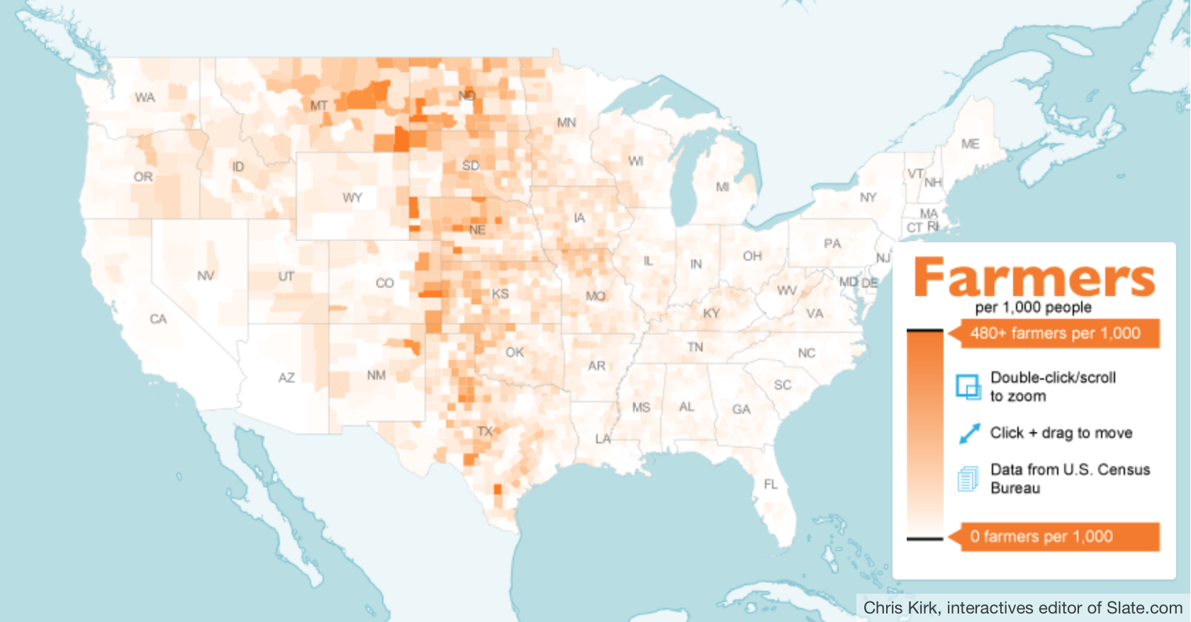
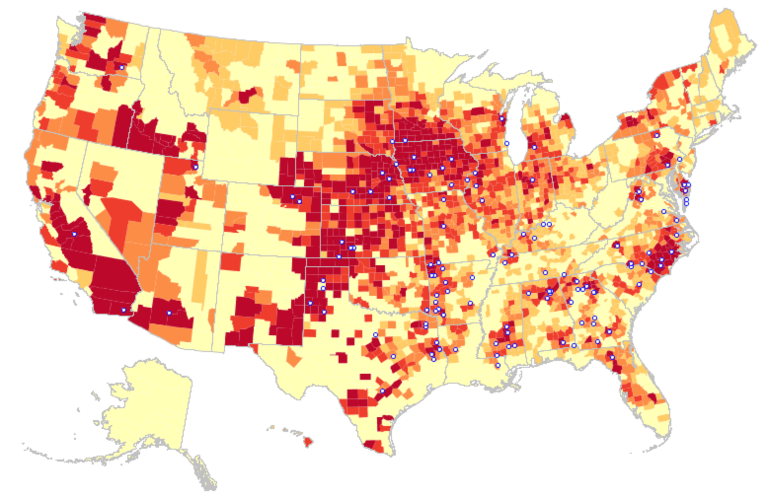
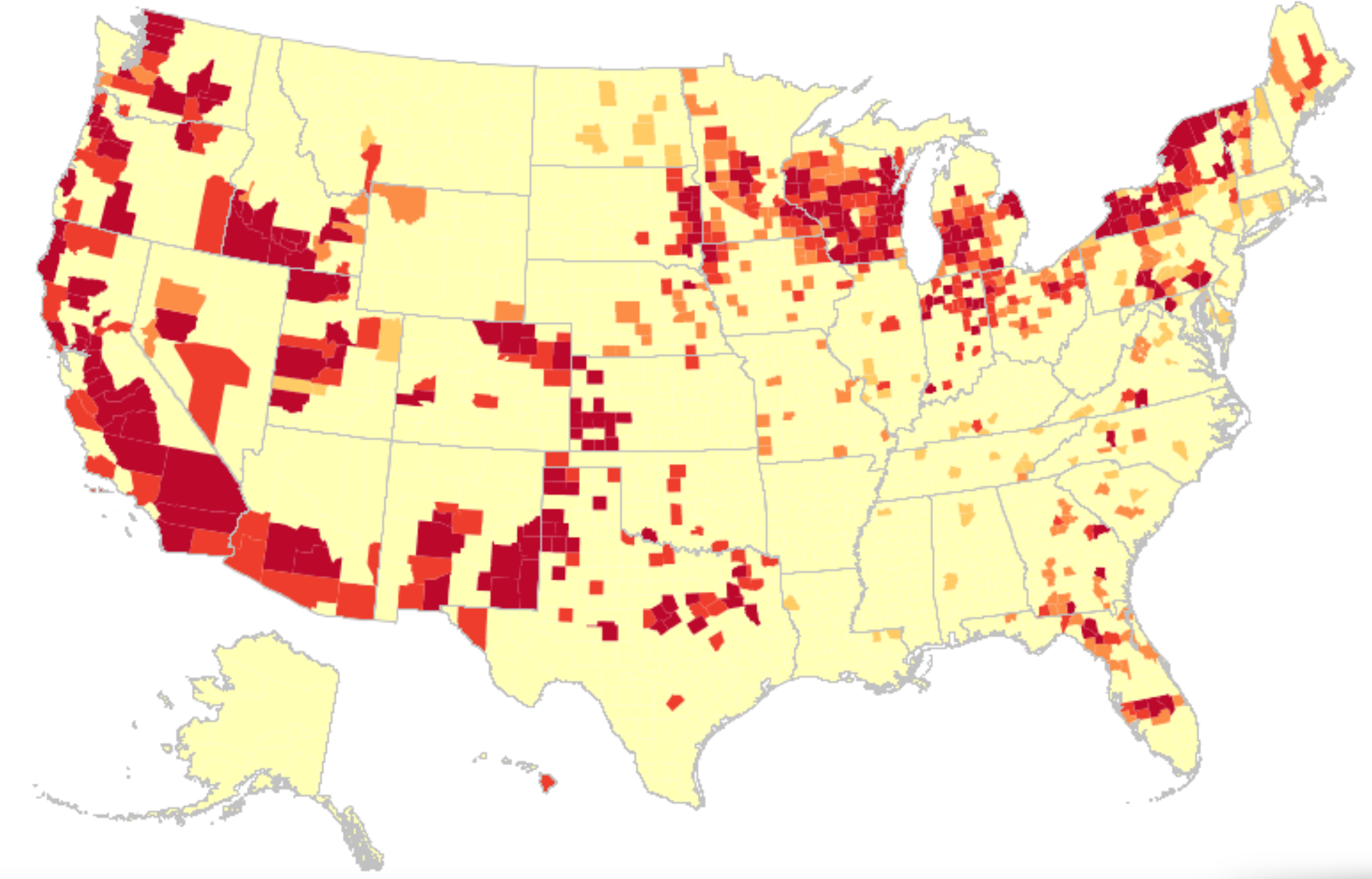
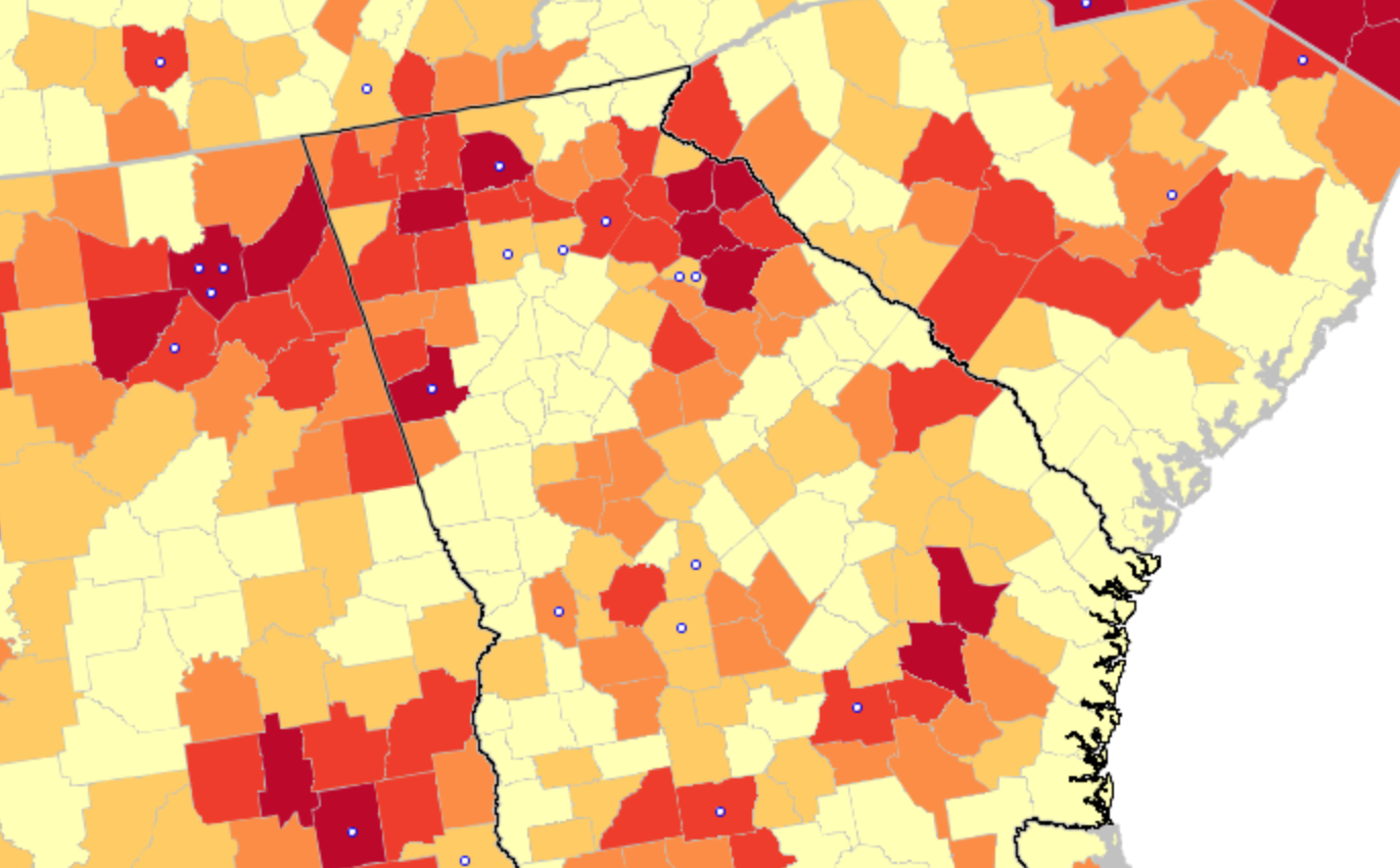
Although the mundane nature of our food supply is rarely so explicitly tied with the anthropocene–a topic especially in vogue, but usually comparison with the carbon footprint or petroleum products.  Yet the density of factory farms in America has left inroads in the landscape that seem truly difficult to erase, from the growing number of “food miles” that much meat now travels to processing plants to reach consumers in restaurants and supermarkets, to the damage that technologies of over-fertilization and pesticide-use.  The shifting landscape of farming, or of big agra, creates a dense concentration of farms in the United States–a post-modern geography that is revealed in the disquieting distrubution that Chris Kirk of Slate created in a web-based map that calls to attention the select space in which American farmers/1,000 people lie–a map that implies the growing distance of most farmers from markets of food, and indeed the concentration of areas where farmers constitute a sizable share of the population.

Farmers:100 eah state

Chris Kirk

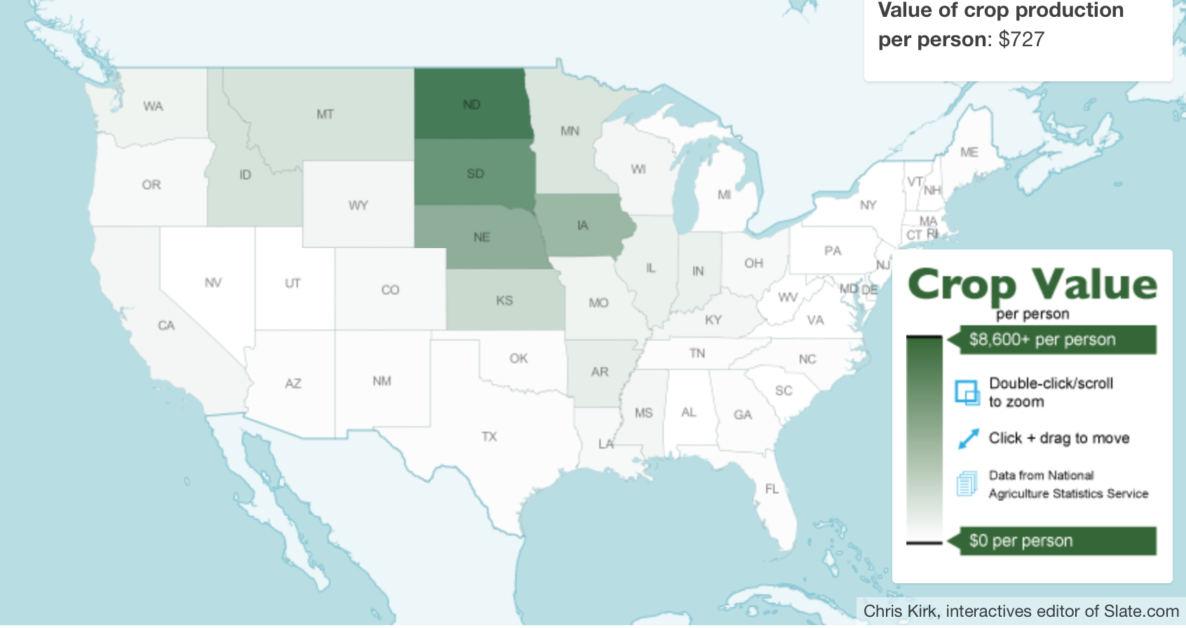
Even more striking, perhaps, is the limited range of locations where the production of crops retains greatest value.


Crop Value

The consequences of this quite uneven distribution will be increasingly significant.  Indeed, the greatest environment impact of varied foods are most easily measured by the distances food takes to reaching consumers, the growing “food mileage” fostered by factory farms located in landlocked regions of the country are one of the most strikingly inefficient ways of delivering food–and provide one of the best indices of the impact of food on our environment.

32b75d68bd9abbf1986c2474c58c6ee0

Robert A. Rhode (2000)

1. The data visualization of the distribution of factory farms included as the header to this post places in evidence the concentration of factory farms in America.  It tells a story of the changing nature of animal husbandry in a world where markets have become dissociated from agricultural production–and suggests an absence of attention to the origins of most meat, and the redrawing of husbandry, as well as the redrawing of cropland, far from centers of densest inhabitation, where food-miles are further expanded than in any other era of human history–with indelible consequences for the human diet.

For the intensity of the concentration of factory farms in America is emblematic a strange but powerful illustration of economic disequilibria, where expanding farms have rendered independent farming barely profitable, and driven farmers to become technology-happy in their purchase of new tools of pasturing that almost erase the need for pasture.  The business model that has replaced crop rotation, and open fields of pasture, has not erased the differences between the farming of cattle, pigs, and chickens, but dramatically decreased them to create a terribly terrifying sort of man-made experiment that may not be only waiting to occur.

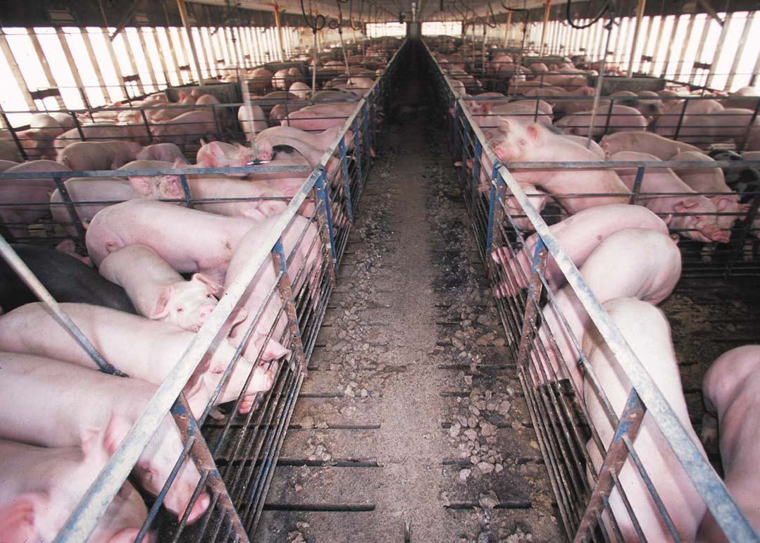
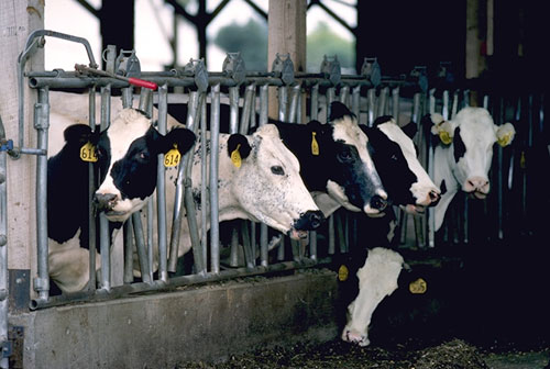
Increasingly, technologies of mass-farming livestock are not only removed from pasturing, but adopted in places increasingly removed from centers of population, and depending on transportation networks of their own to arrive at consumers in their less-than-fresh state.  The turn toward a dense clustering of factory farms offers a fairly terrifying view of the marginalization of the space where pastured animals dwell–and, of course, chickens have it hardest, both given their size and manipulatable conditions.  The remove of current conditions from sustainable roaming and feeding on nutritious grasses may be ironic, given the clustering of factory farms in many areas of the Midwest, but they are particularly torturous to livestock–animals are increasingly raised with limited access to sunlight, fresh air, or open space–and indeed consumers, as such farming techniques increasingly necessitate antibiotics to prevent outbreaks of disease from high-grain diets that are far less healthy for livestock.

The influence of such a concentration of farms seems to leave an increasingly indelible footprint on our environment.  The arrival of increasing anthropogenic agricultural landscapes reflects the growing congestion of farmlands–but in a sense begins from the poor stewardship of the land in which the free market has led to a wholesale promotion of the inhumane and unhealthy crowding of a concentration of over-fertilized farms in the so-called heartland of the midwest, a deep distortion that the recent funding for the Farm Bill perpetuates in ways that make it seem difficult to turn back the page on the density of factory farms in many states–and the consequent degradation of the surrounding lands and the environments that factory farms pollute.  Mapping factory farms is not only about communicating the incredible scale of current-day farming, but the increasingly indelible traces that they leave on the land by their use of broadly cast nitrogen-rich fertilizer, neonicotinoid insecticides and other herbicides, for which farm workers–or handlers of produce–are rarely provided any protection.

And although interactive maps have yet to develop adequate synesthetic models to render the human sense of smell, the concentrations of factory farms demand models of integrating interactive with scratch-and-sniff techniques to adequately indicate the 13.8 billion cubic feet of waste factory farms collectively generate, in greater excess of what the land can absorb or incorporate–at considerable danger to polluting drinking water and air, since factory farms fail to use manure to fertilize in the manner that farms did in the past, as well as one of the greatest sources of the release of methane gas.  Neil Gaiman’s Wednesday recently ruefully remarked “San Francisco isn’t the same country as [the imagined town of] Lakeside anymore than New Orleans is in the same country as New York or Miami is in the same country as Minneapolis,” despite “certain cultural signifiers [like] money, a federal government, entertainment” that perpetuate the illusion of one country like money, television, and McDonald’s.

The area occupied by factory farms suggest something of an actual country within the country, apparently insulated from the population at large, but plays with different rules that stand in increasing danger of contaminating the world from which it appears removed.  For maps suggest significant evidence that the arrival of the anthropocene may lie in the growing disequilibria of ecosystems that have grew up around unnaturally dense concentrations of factory farms.

2. The clustering of factory farms charts an ever-expanding distance between food production and consumption, and a deep re-understanding of man’s relation to the environment.  The alarming scale at which we have come to produce food has entailed a warping of agrarian environments that produce a limited range of foods on ever-increasing scale.  Those pockets of the deepest red–the instinctual signifier of danger–marks an extreme congestion of the landscape with factory farms for livestock and intensive agriculture grown in a scale beyond bulk, whose density carries clear costs.  For with over nine million land animals killed each year in order to produce food for Americans in 2014, factory farms have reached a scale and concentration rarely dreamed of, and the scale of its farming has provoked unfamiliar environmental effects:   the amount of animal manure produced in expanding factory farms in the United States have come to produce the fastest growing source of the greenhouse gas methane in the US since 2007–and as well as producing animal waste, stream harmful quantities of ammonia, hydrogen sulfide, and particulate matter.  And their geographic concentration by 2012, largely in an areas of cheap land, and landlocked states, removes them from the possibility of any transport save trucking–

2012

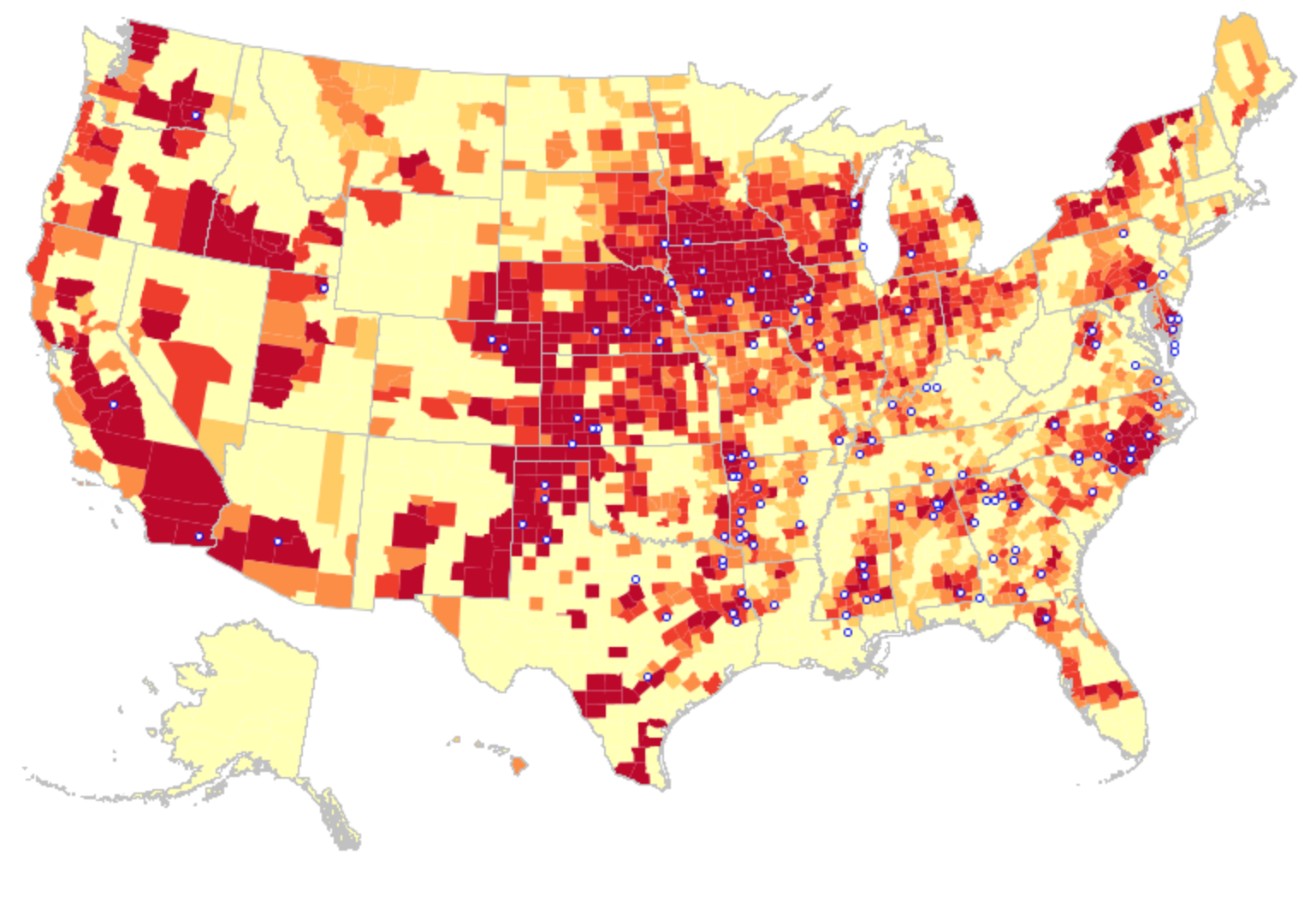
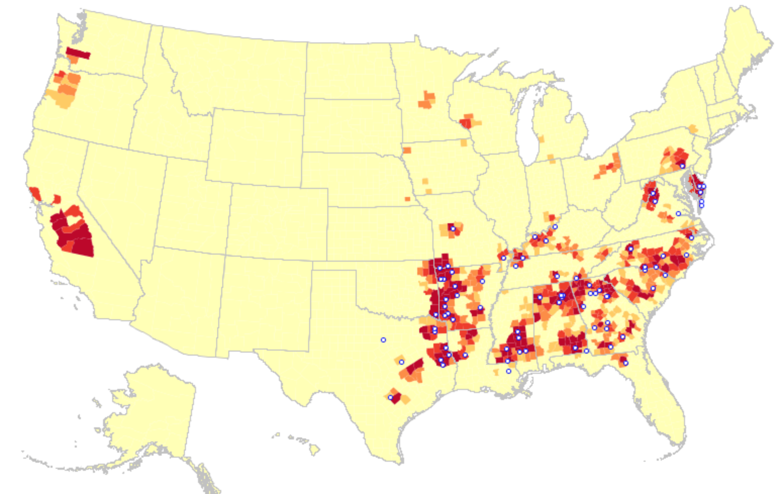
Distributions like the above show the concentration of such “factory farms” across the lower forty-eight states as recently as 2012 demand scrutiny as an object-lesson of a post-industrial agrarian age, whose pockets of deep red or crimson sharply contrasting with wan yellow expanses where factory farms are absent from the landscape.

The distribution demands comparison with a more finely grained map showing the declining number of smaller farms. But its totality confronts viewers with the increasing saturation of pockets of the farms cape in such indelible reds to force us to ask not only about the desirability of producing food so intensively in select regions, but to try to investigate the steep consequences, costs and effects of the colonization of the farmscape by radically intensive factory farms, dedicated to cultivating mono-crops on a far greater economy of scale (and subsidization) than was previously imagined possible. The result is to create a farmscape more increasingly removed from consumers.  For the industry of agriculture–either in the form of crops or animal pasturage–contrasts sharply to the very notion of farm stewardship, and indeed is situated at a greater remove from the most densely inhabited land.

2012

Food & Water Watch analysis of U.S. Dept of Agriculture Census of Agriculture Data

Whether or not it is still true that, as Gertrude Stein once said in her Geographical History of America, that “in the United States, there is more space where nobody is than where anybody is,” there are surely a deeper concentration more farms built to “feed” Americans than anywhere else.  By using a range of data visualizations, this post poses questions of how we can best orient ourselves to the increasing crowding of the national farmscape with monocultures that the monopolies of farming Big Agra has introduced.  It then turns to consider the increasingly steep consequences and costs that they pose in our society of laws.

For the drastic dependence on synthetic fertilizers–which now consume a fifth of fossils fuel use, and allow new economies of scale of monocultures releasing farms from a diversity of crops, at the same time that their production was increasingly subsidized, freeing them from the market.  The consolidation and concentration of food-production are enabled by large-scale production freed from sales at the marketplace, doubling of the size of the average farm, while decreasing farms have decreased from 7 million in the 1930s to almost 2 million today, based on an increased ability of production that diminished the nutritional value of produce; animals that are fed almost entirely on a diet of corn produce meat far higher in saturated fats.  The  toxic cocktail of such distorted land-use is complicated even more by the regular release from factory farms of nitrogen and pesticides into the environment posing problems from oxygenic depletion to drastic decreases in local species’ fertility:  the factory farm, liberated from biological constraints of earlier times, has grown to meet radically new economies of scale.

Rather than grow corn, squash, peas, pumpkin, parsnips, carrots or onions, the landscape of the factory farm is focussed on corn–the over-subsidized as the dominant mono-crop grown across the perpetual harvests of over-farmed fertilized lands.

2002 Factory Farm All Map USA

legend factory famrs
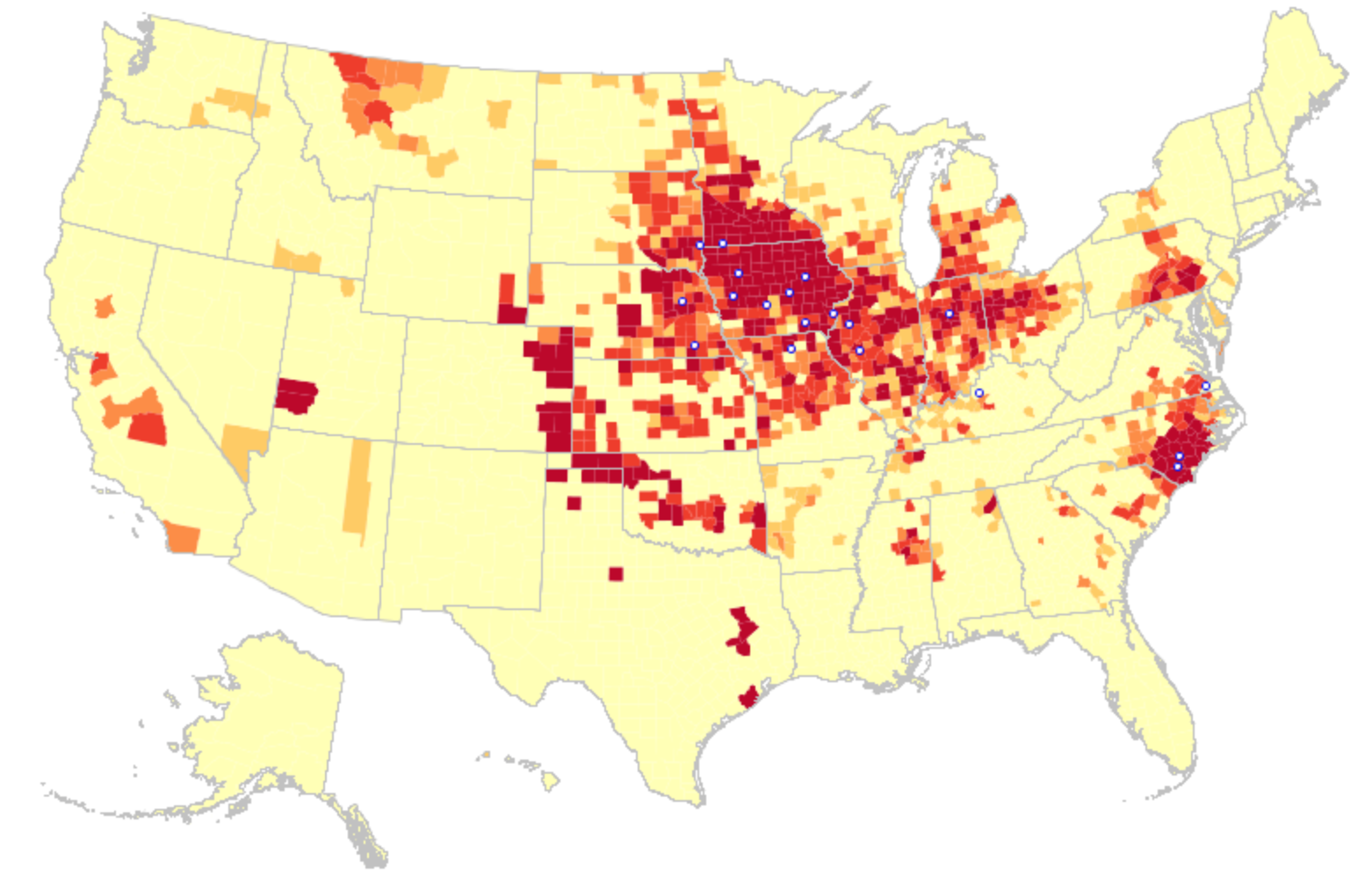
Factory Farms in the United States, 2002/Food & Water Watch, analysis of U.S. Dept. of Agriculture Census of Agriculture Data

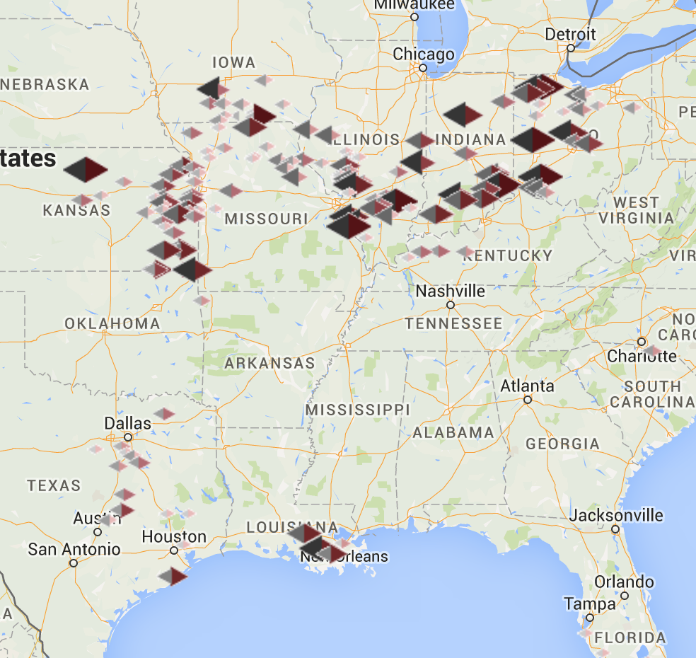
By adopts a crude sort of map algebra comparing data visualizations, this post juxtaposes a range of datamaps that raise pressing questions about such steep levels of concentration of factory farms, and the severity the extreme crowding of space by factory farms that is scarily demonstrated in the above data vis.  While they are able to go unnoticed, the proximity of small blue dots that designate “meat plants” in the data vis above seem worthy of special note, both because of the considerable geographical remove of such plants that “feed” much of the nation and the clear bands on which they are situated.  Eyeballing these maps of the colonization of much of the midwest, and a density of farming that places a demand on overwatering–and okverfertilizing–select regions, in ways that put an increased premium on long-distance trucking, unfreeze farm products, and huge storage houses.  The concentration of factory farms for hogs, for example, creates an intensity and crowding that cannot be conceived as healthy–where sows pumped nurse piglets in gestation crates, as breeding machines, before being led to the slaughterhouse.

Hog_confinement_barn_interior

Wikimedia

The concentration of hog farms is abstractly rendered in a map, but their increasing intensity is elegantly communicated to viewers of the several interactive visualizations Food & Water Watch devised from GIS data of USDA agrarian censuses from 2002 to 2012:

hogs 2002

Hogs 2012

Food and Water Watch

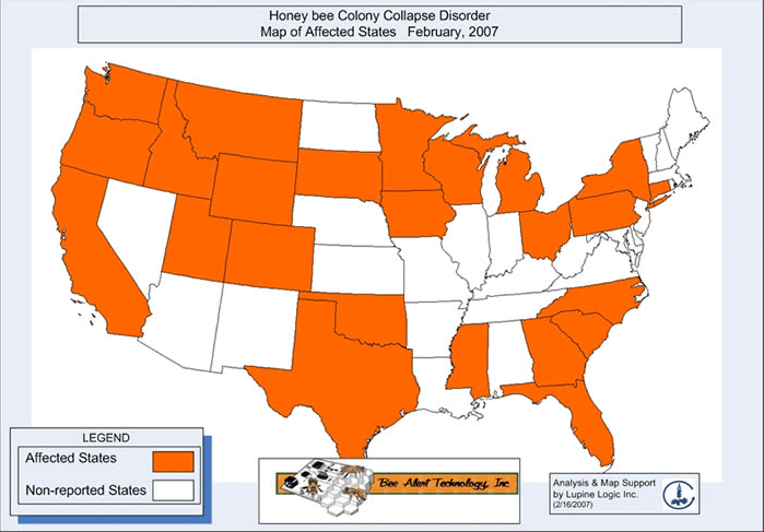
For such livestock and poultry factory farms, largely out of public view, are quite aptly characterized as concentration camps for animals, which “aren’t farms at all”, and the dangers of such a segregation of such segregation of factory farms, which aim to ban observation by journalists or observers.  Recent attempts to ban observers from reporting on the practices and conditions in farms run by corporations like Tyson Foods, Smithfield, and Borden–“Ag-Gag” laws–make the mapping of such farms more compelling.  Despite the spate of state legislators seeking to tar the observers of the animal factory as guilty of “an act of terrorism,” their mapping far more necessary. For the mapping of the factory farm and the pesticides and fertilizers they spew provides the best way to embody crises otherwise difficult to comprehend from antibacterial resistance to colony-collapse disorder, which have resulted in a decline of 40-50% of bees at farms in recent years that may be due to the increasing use of neonicotinoid insecticides and pesticides that may reduce the homing abilities of bees, and compromise their nervous systems–


9474246_orig


–to deeply uneven distributions of epidemiological imbalances, examined in detail at the end of this post.  The density of the colonization of farmlands with factory farms and commercial crops provides a way to embody such complex patterns of causation–even if they hardly resolve the problems they pose.

Such severe environmental imbalances are the product of the concentration of agricultural practices that are increasingly removed form a sense of land-stewardship. The severity of the imbalance created both by the isolation of farms from the landscape and the poor practices adopted by Big Agra without adequate oversight is problematic.  The effective cordoning off of such spots as “off the map” make it important to take stock of their distribution, and the distortions created by their economies of scale–economies that both diminish foods’ nutritive value, endanger farm workers and regions, and make it difficult to quantify environment costs and consequences where they exist.


3.  Over-use of the “anthropocene” inevitably provokes sighs of deep resignation.  But it is rarely tied to the production of food or the bloating of farms beyond a responsible stewardship of th eland.  Even if numbering is knowledge, the quite extreme quantitative density and spread of factory farms across what remains of the arable expanse of the central states suggests a shift in our relation to the land from which there is no clear turning back:  the data visualization in the header to this post may only scratch the surface of an ill-fated agrarian revolution that entails a shifted relation to the land. This data reveals not only a deep distancing from farmed land, but a change in how things grow and live in the land, and how people work the land.  The remove of agribusiness from policies of land management is apparent not only in the changing national farmscape, as well as the broad potential for agrarian mismanagement that the recent proliferation of unmonitored factory farms represent in the United States–where they seem something like the perverse inversion of the yeoman farmer ideal.

For the dramatically increasing density of factory farms in focussed geographic locations have wreaked systemic changes in ecosystems so deeply devastating to be difficult to map in quantifiable or quantitative terms.  Indeed, one would be challenged to isolate the very indices by which such devastation might be meaningfully measured or capture the shifts in landscapes of food production of which they are among the most extreme, so removed are they from notions of captivation and husbandry of the recent past, and so widely have they changed not only the produce–GMO or not–and the livestock and animals that are maintained for slaughter.  The radically changed relation to the land.  Viewed in aggregate, the contours of an almost unbridled presence of Big Agra across specific states offer a striking landscape–and farmscape–that profits from the continued availability of groundwater and aquifers.  The consequences of intensive raising of livestock and drastic consequences of agricultural runoff whose abysmal results is readily revealed in other maps.

What notion of the custodial relation to the most intensively farmed regions If the notion of “rewilding” the landscapes of industrialized nations is a response to the growth of the anthropocene, the factory farm epitomizes an expansion of anthropogenic pollutants that have shifted the environmental landscape of developed countries, and come with significant human costs.  A growing range of GIS data visualizations that can be seen as symptomatic of an age increasingly obese with data–and difficult to process let alone comprehend, as navigating robust data streams quickly leads to a sense of drowning and disempowerment, the ability to distance oneself from the changing landscapes created by the increased intensity of factory farming provides the possibility of regaining a sense of critical perspective on the anthropogenic changes in the ecosystems of agricultural life.  The density of the aggregation of factory farms reveal an imbalance due to lack of clear restrictions on the intensity of their development, the excavation of whose consequences call for more careful comparison to other data maps. To be sure, the lack of restrictions on such intensive farming reflects, in a global context of aquifer depletion, provided by researchers at UC Irvine with NASA data, profiting from the continued supply of groundwater in the central states–


Global Water Storage 2003-13

legend UC Irvine


and the peculiarity of that abundance in a global context, which has created a particularly warped perspective on the feasibility of continuing to water such large-scale farms.

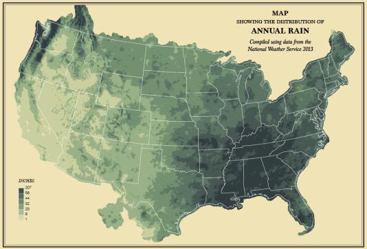
The retro maps of annual rainfall in the US produced by Flowing Data reveals, based on NWS data, how weather patterns in 2013 facilitated the sort of spatial distortions in the farmscape that the map in the header documents.


CHzuHwCUYAANoph.jpg-large

But the intensity of the landscape of factory farms that has been fashioned by Big Agra facilitated a huge rise in GMO crops, pesticides, herbicides and antibiotics that suggest the systemic unhealthiness in the ecosystems that result.


4.  The quite rapidly shifting nature of the landscape of farming that has emerged in recent years, when factory farms have gained an unheard of density in many regions that signal a radically changed relation to food, suggests a new horizon of the anthropocene that demands excavation as an infographic that depicts our shifting relation to how Americans inhabit terrestrial expanse–and the risks we run in doing so.


Big Agra Maplegend factory famrs


The landscape of farmlands Big Agra has colonized and settled reflects a shift in the notion of land-use tied to globalization.  Even as glob tied that have freed humans from their dependence on local or regional ecosystems, the extent of alienation form an agricultural landscapes that have occurred in the past twenty years, and even over the last ten.

For the map reveals a profound super-personal alienation and remove from the farmed landscape, and remove from an ever-increasing density of farmland truly “extreme” in its narrowing of concentration on the potentialities of abundance and perverse privileging of an artificially induced economic abundance of select regions of cattle raising, dairy farming, hog farming, and chicken breeding that cannot be healthy or sustainable as forms of stewardship.  In a time when McDonald’s promises us artisan grilled chicken of a “stringy interior” distinguished by a “somewhat chewy texture” and “fake butter flavor,” the broader relation of most consumers to the meat that they eat seems distinctly challenged.

Even if the clustering darkest crimson that denote an extreme density of factory farming happens to aptly indicate the masking of an emotional attachment to place–more central a premise of factory farms than economic demand–the deep unsustainable nature of the density of factory farming is only scratched in the data visualization that is the header to this post.  For the deepest reds blanketing central states (and the Central and Imperial Valleys of the western states, as well as clear concentrations of crimson in pockets of North Carolina, Florida, western New York and the northwest) suggest scars that may prevent us from recognizing the places in a map that we might otherwise have recognized or know.  The illusion of economic security is in danger of erasing emotional attachments to place, in ways that have only begun to be appreciated or understood.

Such strikingly dense concentrations of factory farms in such regional pockets–indeed, their confounding resilience–is all to evident in the data visualizations that Food and Water Watch has carefully compiled from agricultural censuses over the past decade.  The recent multi-media assemblage Factory Farm Nation–an evident reference to “Fast Food Nation,” whose commercial injunction to overeat, “supersize it,” placed the blame squarely on the business of purveyors of easy meals that were sold at illusionistically cheap prices, without asking about their future health costs.  Yet what of the rewriting of agriculture that has concentrated dense sites of overfarming into our national landscape, as if to meet the nation’s ever-expanding and insatiable taste for meat?  Far from a pastoral landscape, the zones of intensive farming of subsidized monocrops as corn, soy or sorghum so often encouraged by subsidies and so readily converted to a plentiful source of animal feed.

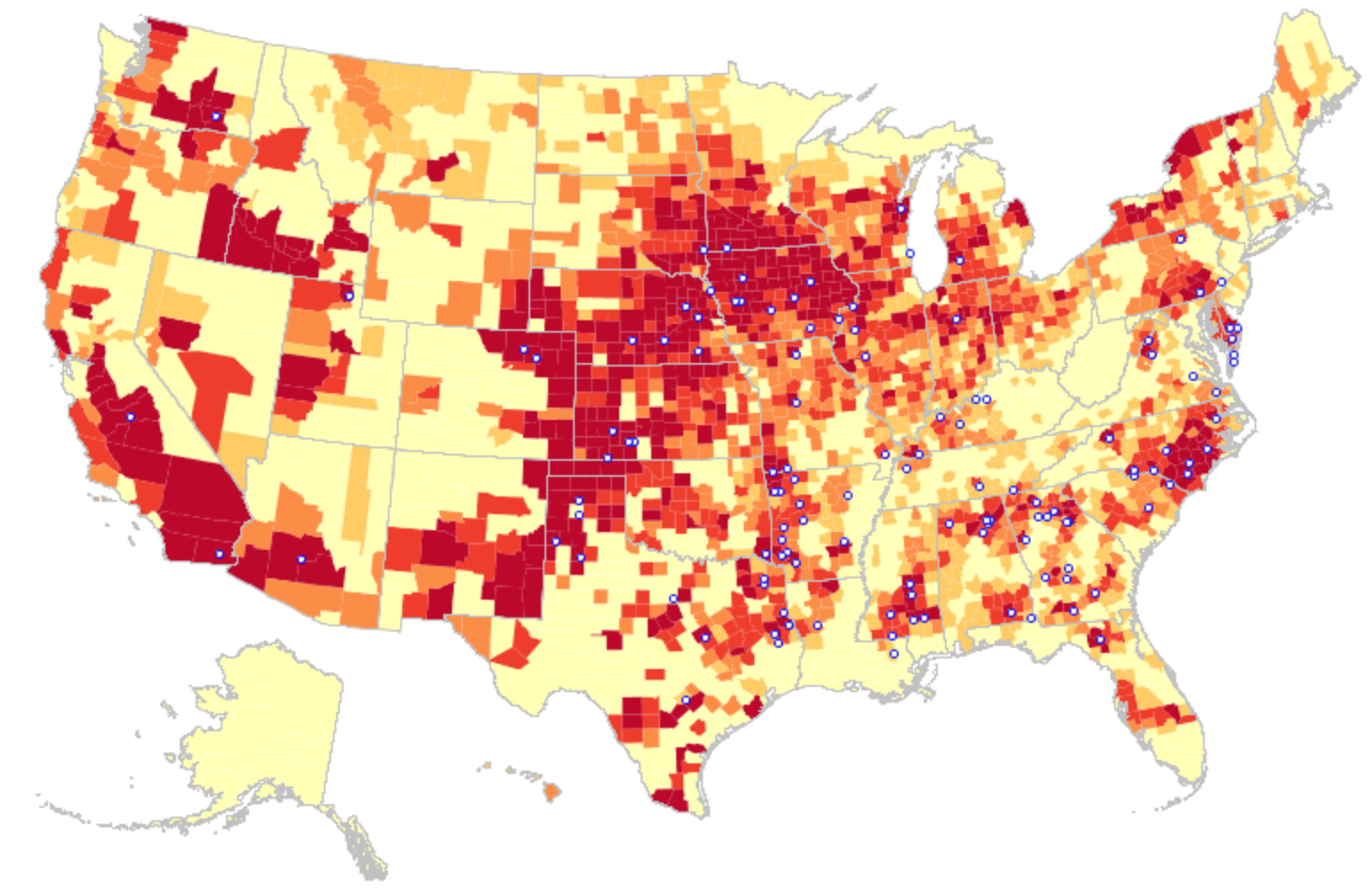
The collective distribution of factory farms spread across the country are not so surprisingly concentrated in its Central Zone.  But the business model has taken seed in regions from California to Washington and Idaho, and to Montana, Arizona, New Mexico, and North Carolina–as of 2012, the concentration of both the largest farms and the centers of meat processing were increasingly concentrated not only from decades past, but even over the past ten years, as large regions of deep red–marking extreme concentrations of factory farms–come to overwhelm large regions and specific economies, and be absent from other regions removed from agribusiness.

The spread of factory farming, facilitated both by state subsidies and GMO crops, is partly premised on the economic transformation of agriculture.  Less visible are its deeply deleterious environmental consequences and ecological effects–as well as create an increasingly unhealthy food chains–and systems of production that seem forcefully remove the consumer from the farm and manufacturing of food that arrives in most supermarkets across much of America.


Big Agra Map

Big Agra Map


legend factory famrs

5.  What makes the concentration of large farms so troubling is both the remove of food from markets and the conditions farming create–from both slaughterhouses and meat-packing plants, shown here by asterisks, and the sacrificing of freshness (and nutritive value) in the over-production of such megacrops.  The concentration of farms pose challenges to the survival of small-scale farming outside very select economic niches, from parts of California, like Silicon Valley, to parts of New England and Vermont–and the steep challenges small farms face from Big Agra even in these areas.  But they depend on the increasing dependency of farmers on the technologies of farming on which Big Agra depends, both from standardized resistant seeds and pesticides to machinery.

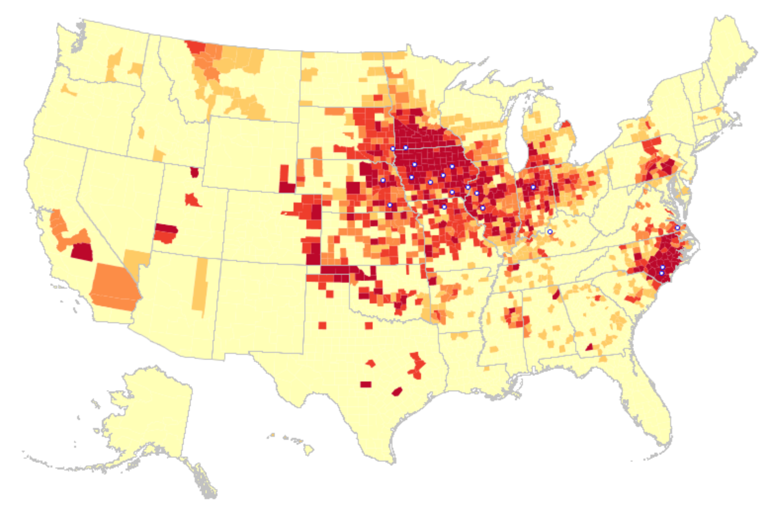
The formidable concentration of cattle farming–a quintessential staple of factory farming–reflects the total distribution in 2012 of factory farms in the country, and even more intensely concentrated in the economies of the midwest,

Factory Farms: Cattle

legend factory famrs

With dairy farmers almost living in a somewhat greater variety of other states as of 2012:

Factory Farm Dairy 2012

legend factory famrs

and hog-farming occupying a similarly concentrated, if further contracted, set of select sites largely in the central states:

hog farming

legend factory famrs

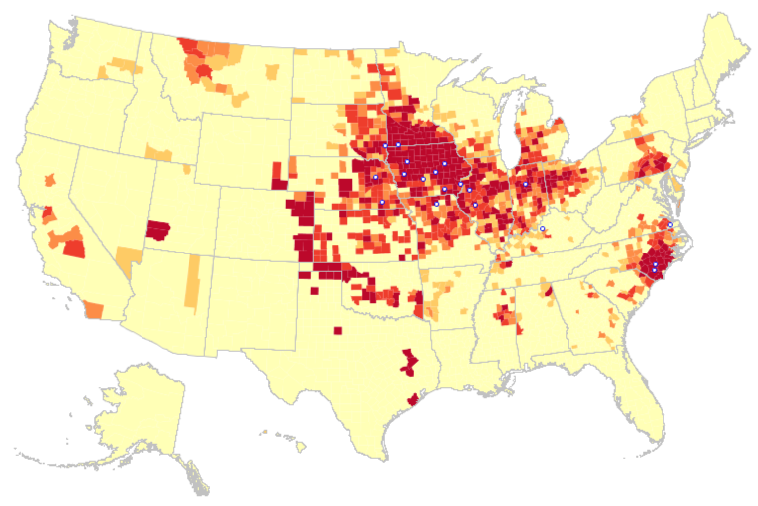
The incredible intensity of carmine clusterings revealed in the data visualization above had profoundly changed from 2002, when the agrarian landscape was marked by a robust density of relatively high factory farms, but with fewer extreme concentrations, and an apparent greater range of meat-packing plants–

Big Agra Map

legend factory famrs

and even from the levels of large factory farms across the nation in 2007–

2007 Factory Farm Map Concentration

legend factory famrs

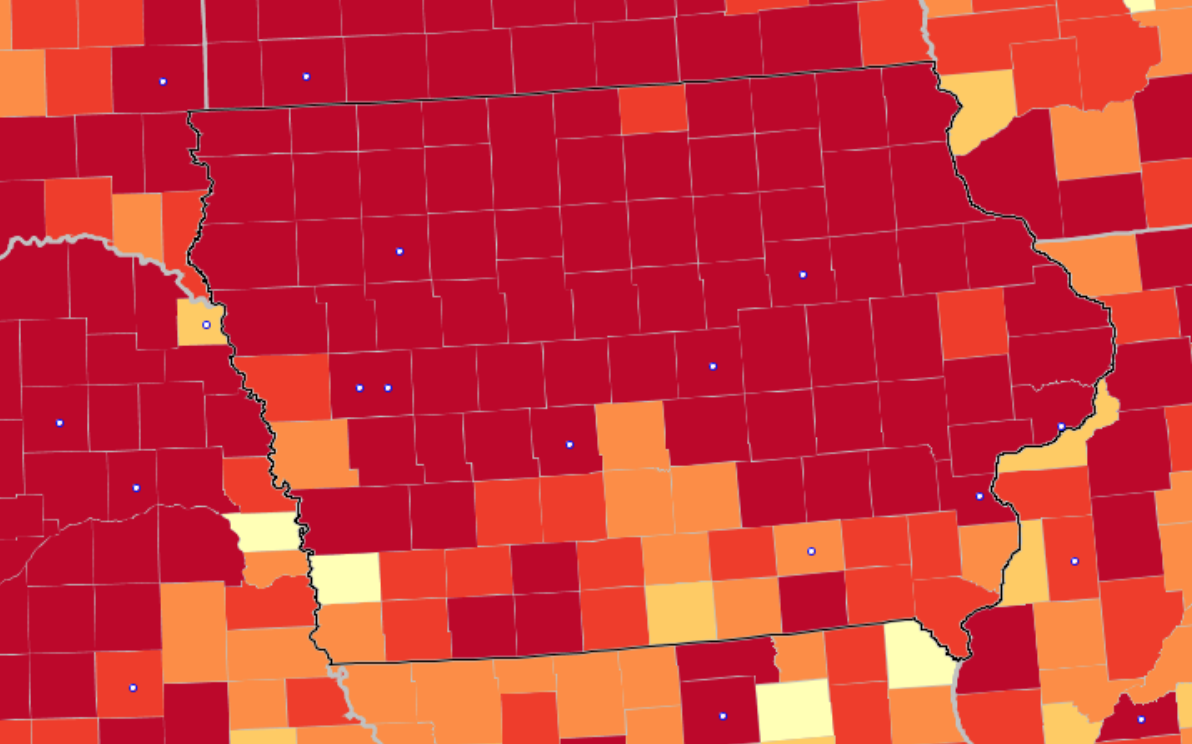
The state of Iowa appears as a uniform red that render its borders indistinct:

Iowa

Or the uniform red spread across similar farming states that border the Mississippi, which has helped create one of the largest hypoxic site in the world within the Gulf of Mexico, which absorbs the agricultural runoff emptying from the Mississippi River:

midwest factory famrs

The shift in the notion of a farm is suggested by the concentration in bordering regions of the apparatus of farming–including the threat of resistant strains of bacteria, large feed lots, and almost insoluble problems of the disposal of animal waste.

hqdefault

The parallel radical contraction of regions of chicken-meat “farming”–the raising of “broilers”–suggests an unwarranted density of what was once the most familiar of barnyard animals, and now seem to serve much of the country from select areas of megafarms in the southern states, as well as parts of Pennsylvania, California, Wisconsin and Washington, and a range of factory farms along the Mississippi in 2012, that suggest a landscape little changed from 1997, if even more localized:

chicken breeding

What happened to effect such a change save weak agricultural rules and opportunistic farm policies?  One can see a notable consolidation of those “farms” that raise “broilers”–chickens destined for cooking–during the decade and a half between 1997 and 2012, with a rising density of factory farms and the industrialization of poultry farming.

broilers 1997

broilers 2012

FF-BroilerChickens

6.  The rapid rise of large-scale supplies of feed generate steep risks.  Their expansion was doubtless encouraged by the subsidization of ever-larger farms that allowed geographic concentration of intense factory farming in the central states, the densest clustering of centers of meat-packing.  Fertilizing practices are a part of the picture of creating large feed lots that are in need of better mapping, and provide the possibility of the supersizing of farms across America together with the expansion of the application of herbicides–as much as pesticides.  Such new increasingly agricultural practices characterize most factory farms in America.

A combination of practices such as no-till agriculture, large feed lots, mono crops, and over-fertilized lands are the enabling factors, as much as the consequences, of the spread of the complexes of factory farms across so much of the agricultural landscape of the United States according to the U.S. Department of Agriculture’s recent Agricultural Census.

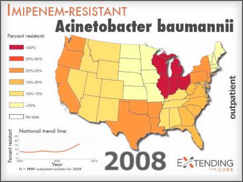
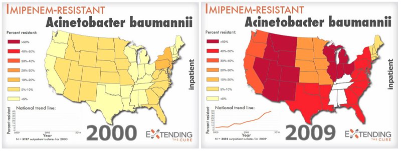
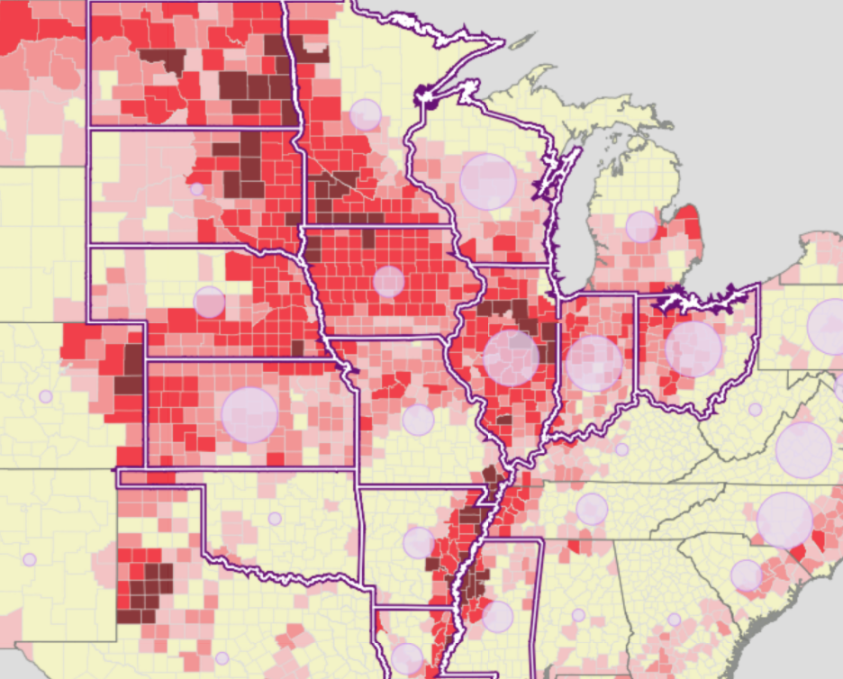
How these practices encourage the unhealthy degrees of concentration of factory farms raising animals for slaughter suggest not only hugely increased animal suffering.  The increase of some 20% of livestock that are raised in large factory farms created, for example, a huge amount of manure–some thirteen times that produced by the human population of the United States–that pose a risk to local ecologies.  It also courts the steep risk of effectively creating reservoirs of antibiotic resistant bacteria, not only in specific regions, but in the meat that arrives on one’s table or in restaurants, and provokes the evolution of bacteria resistant to the antibiotics that are regularly fed at low dosages to all livestock–effectively increasing the threat food-born pathogens that industry has minimized.  Indeed, the mapping of AR bacteria across the United States (antibiotic-resistant bacteria) have begun to be mapped themselves, although the data and certainty of the distributions mapped interactively by Extending the Cure based on particularly resistant infections has created a distribution that demands to be further refined in future years–but have already shown a huge rise over time.

mrsa_us_map_blog_final

p4-us-maps

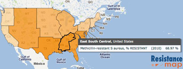
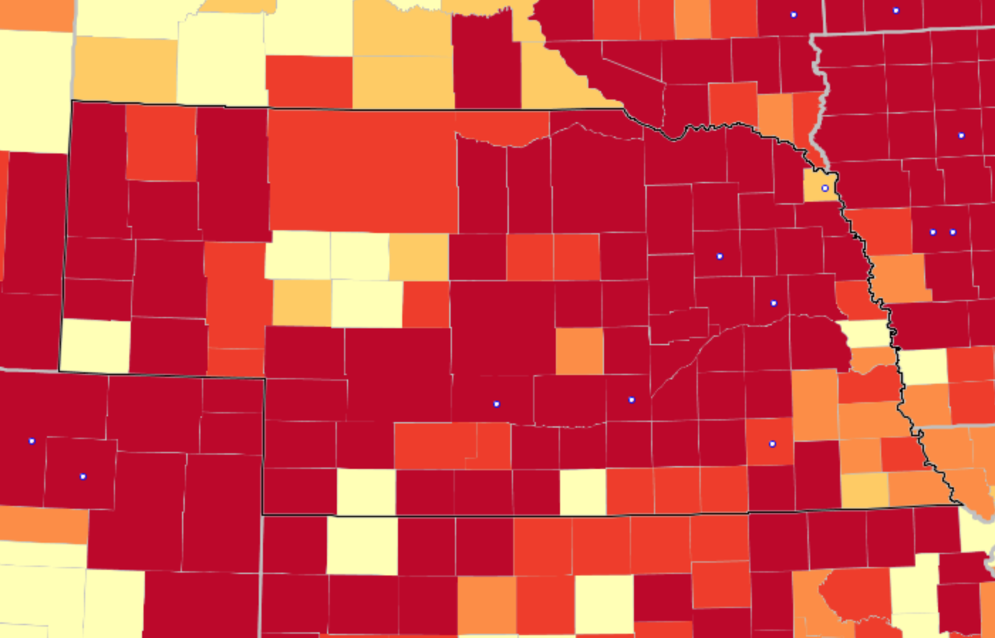
Indeed, the extreme density of such factory farms in areas such as Iowa and Nebraska, whose almost undifferentiated terrain of deep red is studded with staggered meat-packing plants that serve a far greater area, preoccupy–as the steady rise of resistant antibiotic strains of bacteria across our national space, and the rise of antimicrobial resistance, and the huge expenditures of health care that both rises threaten to bequeath.  If increasingly sweeping the more developed world, related to both different standards of eating and to the marketing of anti-herbicides, as well as to problems in the recycling of wastewater, the resistance of antimicrobial bacterial strains pose a range of immense health risks–and a current health care cost in the United States that is estimated at 21-34 billion dollars a year, and some 100,000 deaths.

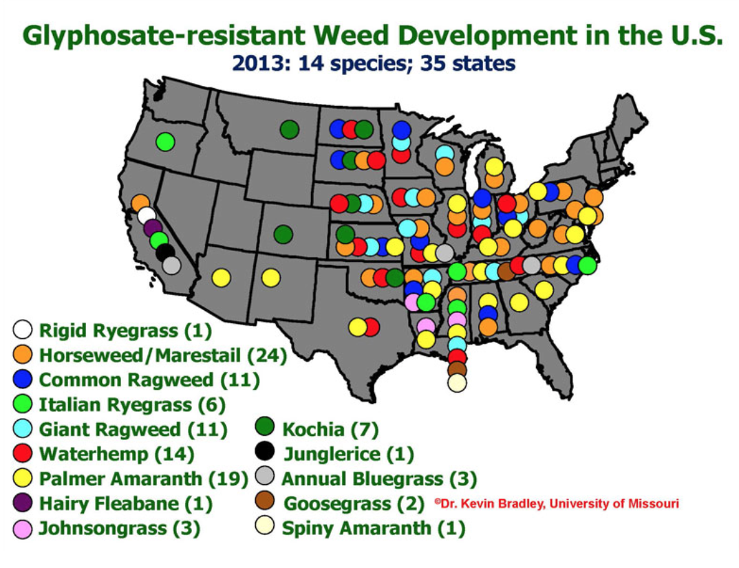
Although the diffusion of AR bacteria are to a large extent dependent on meat consumption, as much as actual locations of factory farms, the distribution of deep crimson in the central states and north and southwest offer an image of disturbing trends that demands to be excavated for its consequences, as well as contemplated for its intensity.  (They parallel the rise of glyphosate-resistant weeds.)

This seems to mirror both the extreme concentration of factory farms evident in the central states, as seen above in the case of Iowa,

Iowa

midwest factory famrs

or pockets of the American South,

Southern States

legend factory famrs

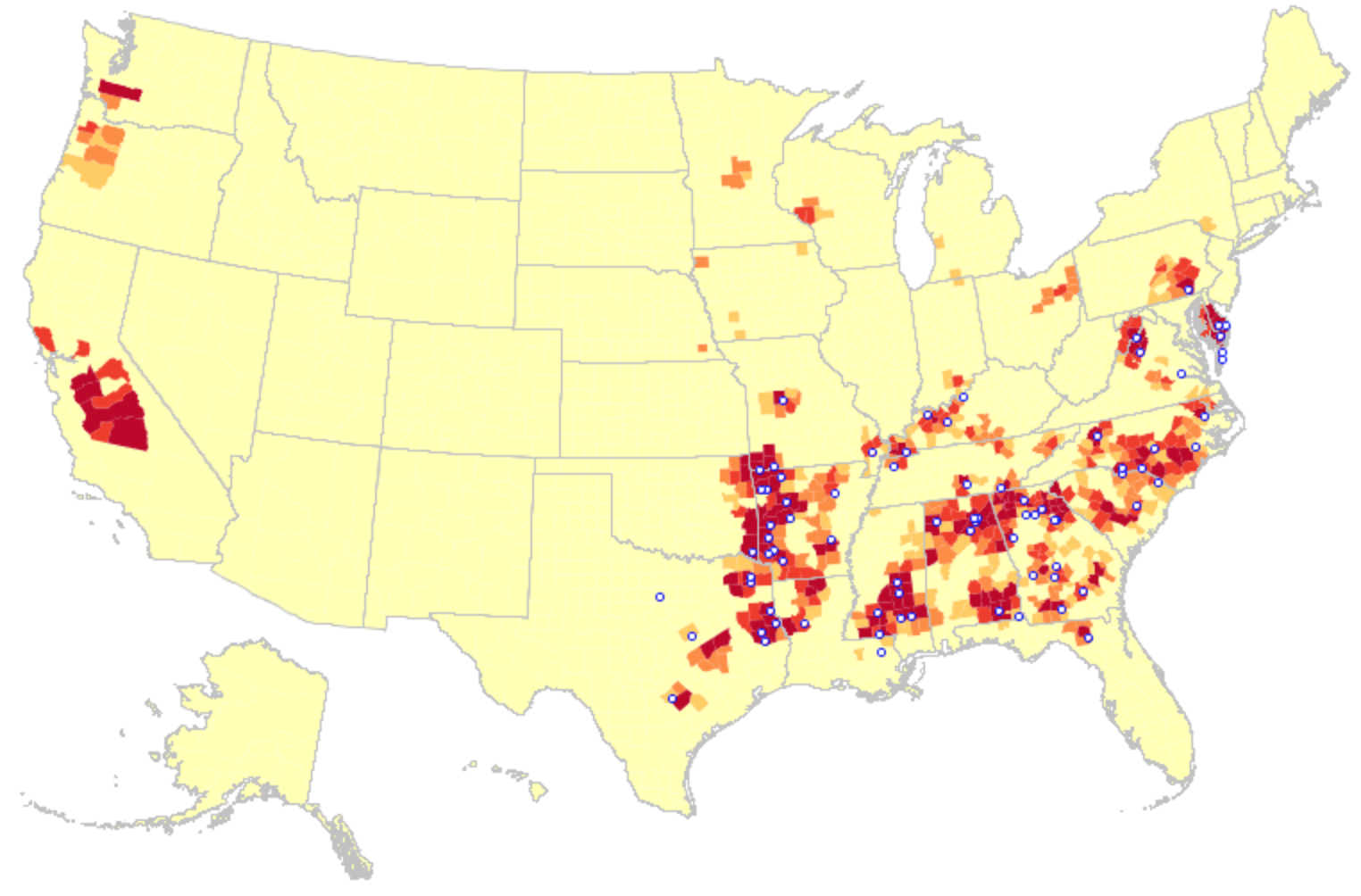
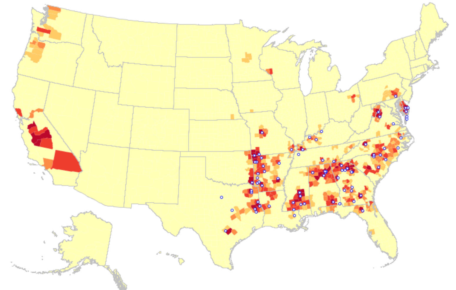
These images trace the increasing remove discrete stretches of farmlands from the bulk of the population, if not an actual alienation of farmlands as the raising and butchering of meat migrates into controlled settings where antibiotic-resistant (AR) bacteria flourish.  Resistant strains of staph are a problem worldwide, as the below prevalence map reveals, and Methicillin-resistant bacteria have become common across many of the regions consuming factory-farm raised poultry.

FF-BroilerChickens

533px-EARSS_MRSA_2008-en.svg

Registered incidence of MRSA in human blood (2008), Wikimedia

But it is one in which the United States remains in the lead–and far ahead of Mexico and especially far ahead of Canada, our neighbors to the north, where one finds anti resistant strains to be a fifth of the prevalence of the US:

38mrsa06

–and which seems concentrate din the eastern southern states, where it seems predominantly communicated in meat:

mrsa_us_map_blog_final

Such intensive areas of factory farming are more directly tied in the United States due to the unique geography of intensive farming promoted by Big Agra, the Sisyphean twin of the factory farm.

FF-DairyCowsFeedlot

7.  Agribusiness is the not-too-silent twin of the factory farm, generating the copious abundance of cheap feed that is the bread and butter of factory farm feed lots–the shortsighted widespread use of herbicides Big Agra increasingly adopts, with minimal federal oversight, has facilitated the suppressing of factory farms of similar short-sighted agricultural practices and the poor stewardship of the land they reveal.  Even as the existing studies by the WHO’s anti-cancer arm found “sufficient evidence” that the herbicide glyphosate causes cancer in non-human animals, and “limited evidence” of its causation of chromosomal damage and kidney disease in humans, the Monsanto produced pesticide was reclassified by the EPA with the result of allowing its increased use within the food chain, much as it had earlier shifted the herbicide’s classification as “possibly carcinogenic to humans” to having “evidence of non-carcinogenicity”–a shift of 180 degrees–after Monsanto petitioned to increase the allowable amount of the herbicide that in 2001 was already the most-used agricultural herbicide–and constituted 74% of the herbicides farmers used in California in 2012–having increased some 65% in commercial agriculture during the previous decade.

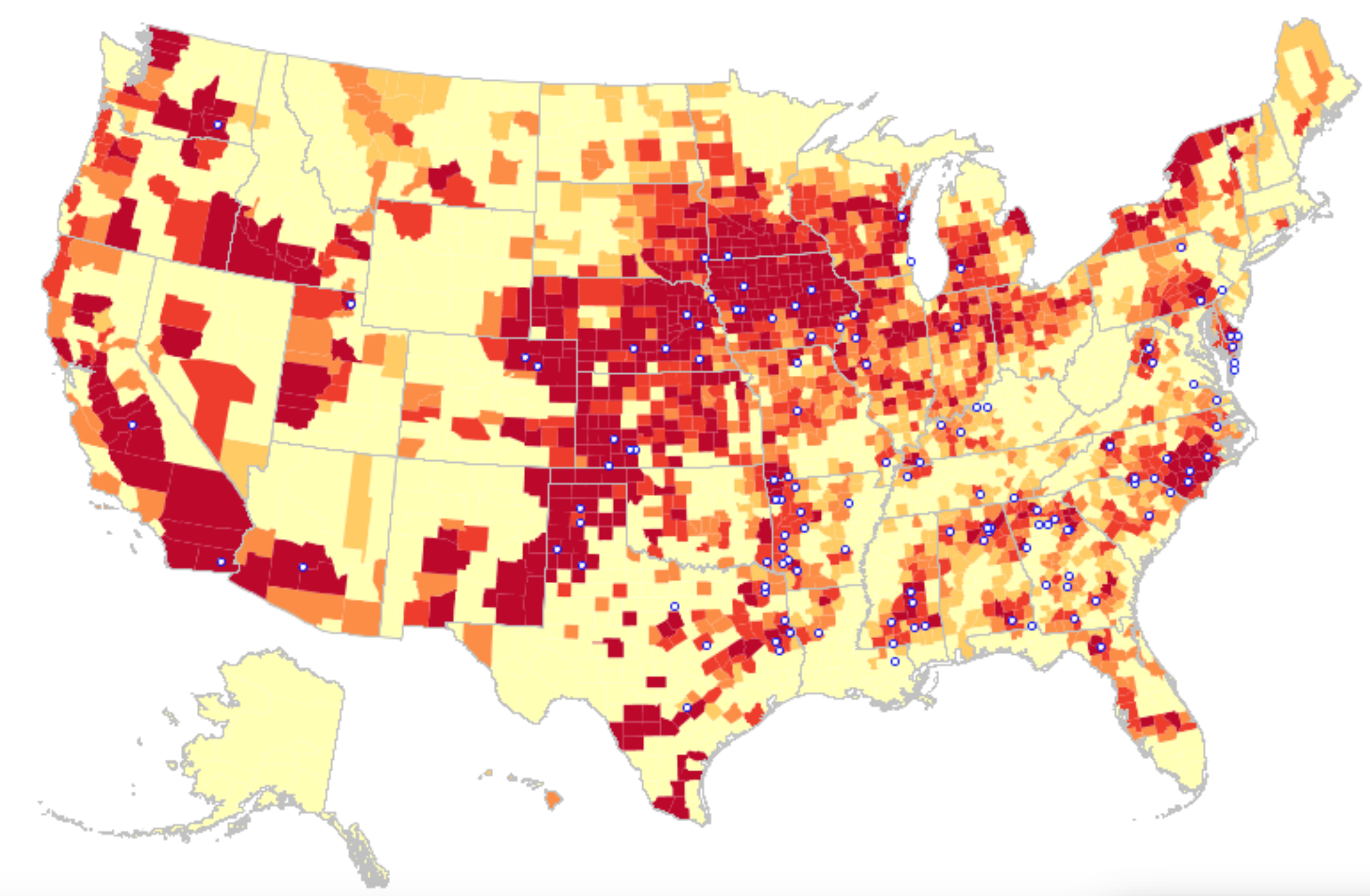
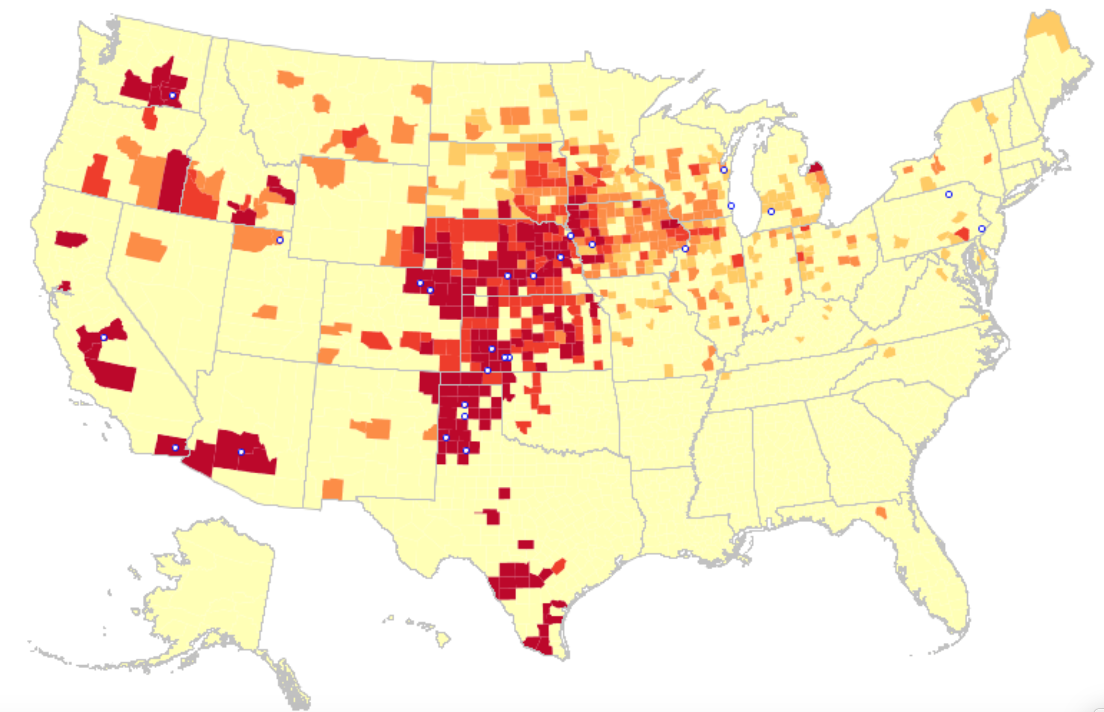
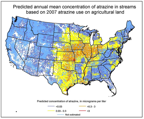
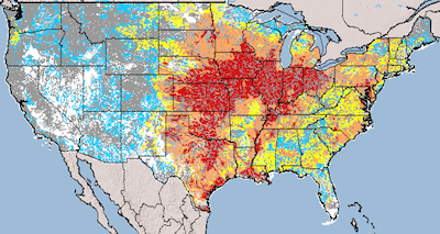
While the widespread uses of such herbicides are not mapped and readily measured with the relative precision and exactitude of factory farms, whose census offers a projection of the estimated extent of the pounds of pesticide used in the US in different states, and indeed an estimated projection of the diffusion of their residue, that demand reflection.  The striking spread of Atrazine, among the deadliest herbicide that is most concentrated in the groundwater of the US, across agricultural states may reflect its use on corn.  But the subsidization of corn and sorghum have so facilitated a dense concentration of sites of cattle feed–some 80 million pounds were used in American crops in 2014, with a rather striking geographical concentration–that the demands to produce corn in abundance for ready markets has led to a concentration of corn-growing and a concentration of Atrazine application that seems to have changed the groundwater supplies of areas of the United States’ most abundant aquifers:
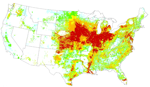
map-atrazine-us-usgs

map-atrazine-use-keyUSGS

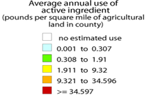
The extremely high concentration of the particularly pernicious pesticide that has been so aggressively marketed by Syngenta is not only dumped in the ground in massive amounts in the ground.  But its traces persist in rivers and streams in 2007 in ways that reflect the expanding scope of its use in agricultural lands including more than half of all corn acreage–two-thirds of sorghum acreage; and up to 90 percent of sugar cane acreage in some states, creating run-off that by agricultural overflow that quite perceptibly pollutes the ambient waters–where it has, Professor Tyrone Hayes has shown, apparently creating sexual abnormalities in amphibian life–conclusively enough for Syngenta to pay $105 million to reimburse cities for the cost of implementing water filtration systems to remove Atrazine from drinking water in 2012 to conclude a class action lawsuit, and a multimillion dollar campaign aimed at discrediting scientists suggesting its the dangers of biological mutation its residues have been compellingly argued to cause.  Only long after the EPA had banned the use of the pesticide chlorpyrifos in homes due its close correlation to ADHD, reduced IQ, and poor cognitive development, the same pesticide was widely used in the Central Valley of California on crops of almonds, walnuts, oranges and alfalfa, ignoring the clear dangers that it poses to farm-workers and in run-off, even though the Pesticide Action Network urged an immediate and complete ban to protect agricultural workers and rural communities. The recent plan to restrict the pesticide’s use in farms came against arguments of its manufacturer, Dow Agrosciences, that its presence in runoff has a “negligible” effect, and noting that it is approved for use in some eight-eight other countries.

The spread of Atrazine in streams and waters that has been mapped on the basis of its agricultural use–if hypothetical and based on modeling–indicates the range of its potential spread into the regional groundwater of much of America.

map-atrazine-streams-500

atrazine_map2


The EPA has unsurprisingly found markedly high concentration in the surface water of those states where Atrazine is applied in greatest abundance, but a notably increased presence of Atrazine in groundwater as well:


Atrazine in Crops:Water EPA for Surface and Ground

EPA

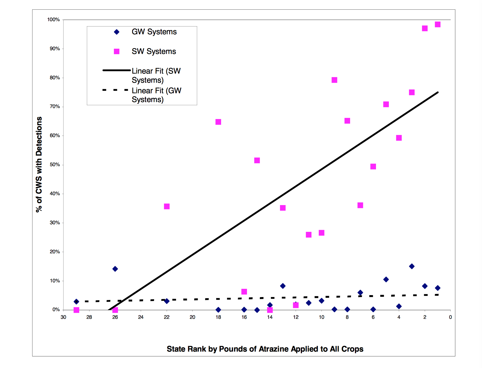
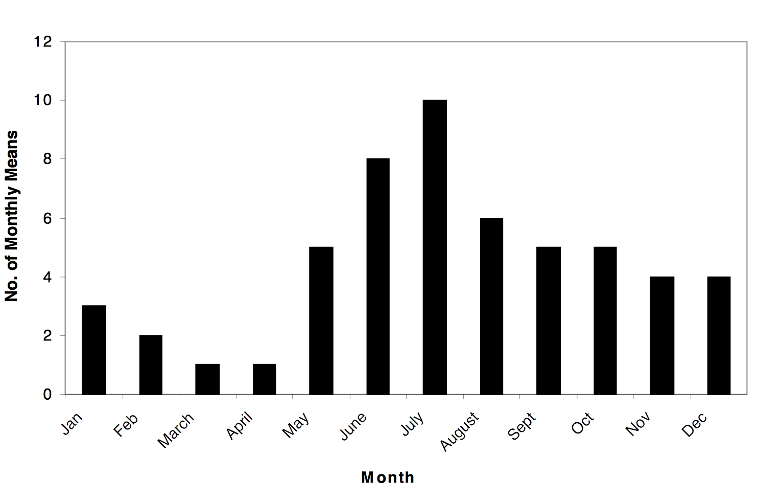
Are the evident traces of herbicides such as Atrazine that seem evident in the environment similarly passed on through meats from nearby factory farms–and are they indicative of the sorts of attitudes to the environment that factory farming creates?  Indeed, a clear varying of the presence of the pesticide in drinking water is registered in those summer months of greatest runoff of water into the environment in a farming state such as Iowa–

Atrazine Levels Reflect Planting Season in Iowa

–and NRDC has found remarkable correlations in the pesticide’s concentration in watersheds and Public Water Systems that provide drinking water that reflect its greater presence in surface water, and cannot but raise eyebrows as to the changing quality of water and heath of inhabitants of such regions:  even though the high spikes of Atrazine in ground water during the months of June and July, when plants are presumably given the highest doses to keep pests off, the lower national averages measured by the EPA allows such unhealthy levels to exist during a few month every year, although at substantial risk to nearby communities.

The picture of water systems and watersheds with hold high concentrations of the pesticide in both “raw” and “finished” water was measured in 2015, showing greater local concentrations in Kansas, Indiana, Missouri, Ohio, and Illinois, as well Iowa, which suggests the spread of the pesticide’s contamination of regional drinking water supplies.

Atrazine in Stream Water

NRDC (map data from 2015)

IA [Converted] EDIT.eps

There is the sense that a different set of standards has occurred in exposure to health risks in select parts of the nation that reflect the intense application of pesticides like Atrazine in those regions that tolerate factory farms.

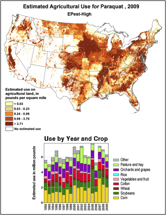
The strikingly intense and expansive use of the most popular herbicide Paraquat in crops from corn to sorghum to tubers and as well to sugar–leaves a considerable residue on crops, even if it is designed mostly to eliminate weeds and other plants.  After being both notoriously and extensively sprayed from the air by helicopters in the late 1970s on marijuana and opium fields in Mexico’s Sierra Madre, in a historical roll-out of the pesticide, it has gained wide sales–but also tied to liver, lung, and kidney failure, it has made a huge comeback with the rise of no-till farming at many large farms, broadly distributed across the nation.  Also marketed and produced by Syngenta, the corporation has spent considerable funds to dissociate from studies that suggested the close ties of its residues to neurotoxicity and Parkinson’s disease.

fig-072

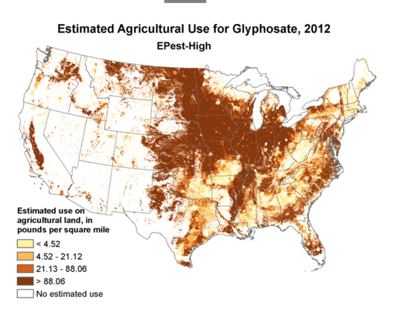
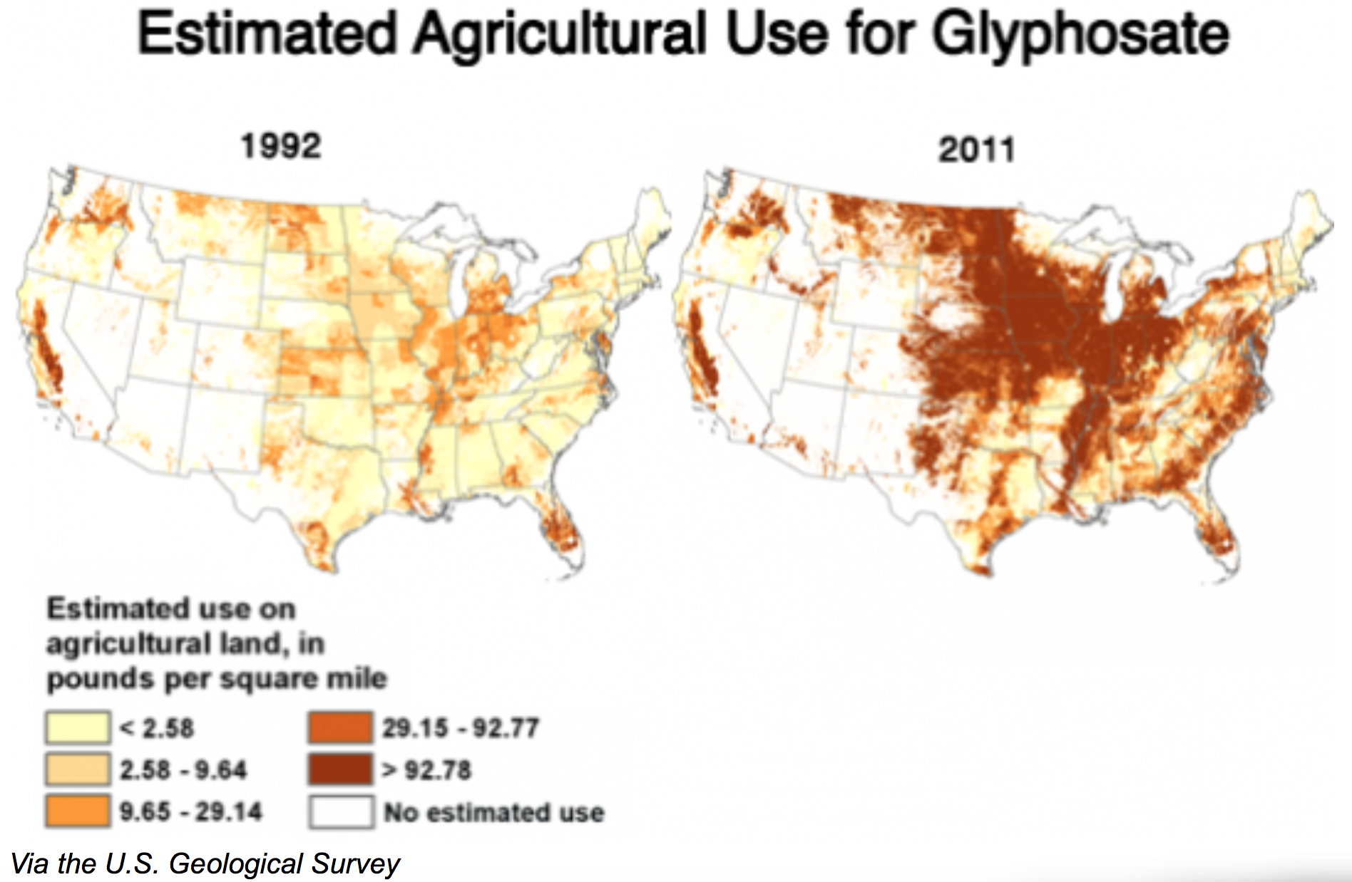
And the remarkable promotion and rise of the agricultural use of Glyphosate–the most popular herbicide across the country–and its residual effects tells a similar story. From 2009 to 2012, is estimated agricultural use was particularly prominent across California’s Central Valley, but expanded across the big farming states of the midwest and eastern seaboard in ways that echoes the distribution of large factory farms.

GlyphosateUsage2009

Untitled 5Glyphosate high 2012

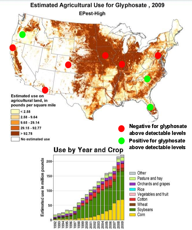
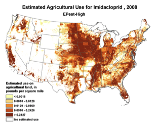
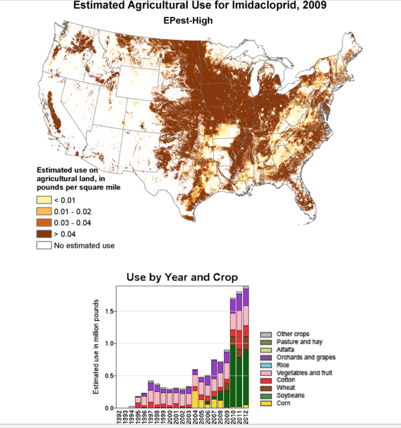
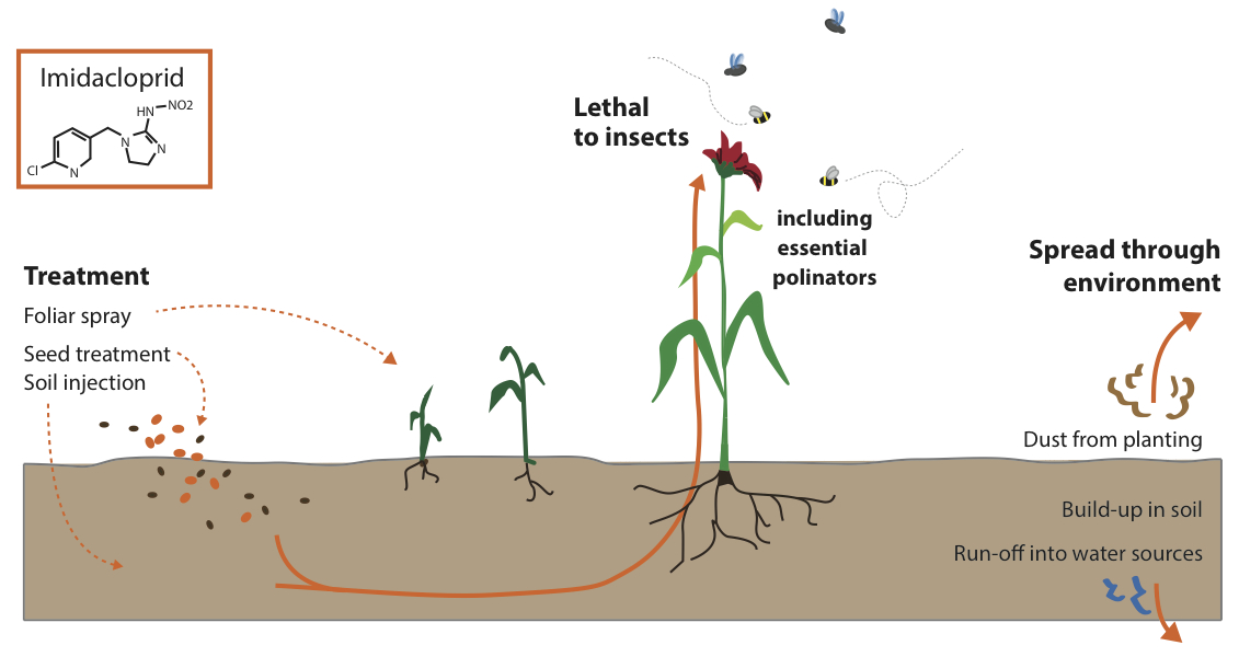
8.  A strikingly similar estimated distribution of the potentially devastating neonicotinoid Imidacloprid–believed a major factor in apiary colony collapse disorder–is scarily similar, if not even more widespread geographically–and has only grown.

2008mapimidaclopridCCD/Neonicotinoid

CB-FIgure-1

The most common herbicide in America, whose application pretty much mirrors the disposition of agricultural lands in the country, was long ago approved by the EPA, the potential carcinogen glyphosate has been used without the degree of harsh criticism that use of Atrazine faced after repeated studies indicated its potentially debilitating deformities on wildlife. Yet increasing ties of the herbicide to autism have been terrifying–and led Stephanie Seneff to the recent prediction that half of American kids will be autistic by 2025, and the Environmental Working Group to create a quite sophisticated ESRI interactive map designed to help parents learn whether children’s schools lie within zones where glyphosate is sprayed, and reveal the particular concentration of pesticides in close proximity to schools across the central US and Mississippi.

elementary schools
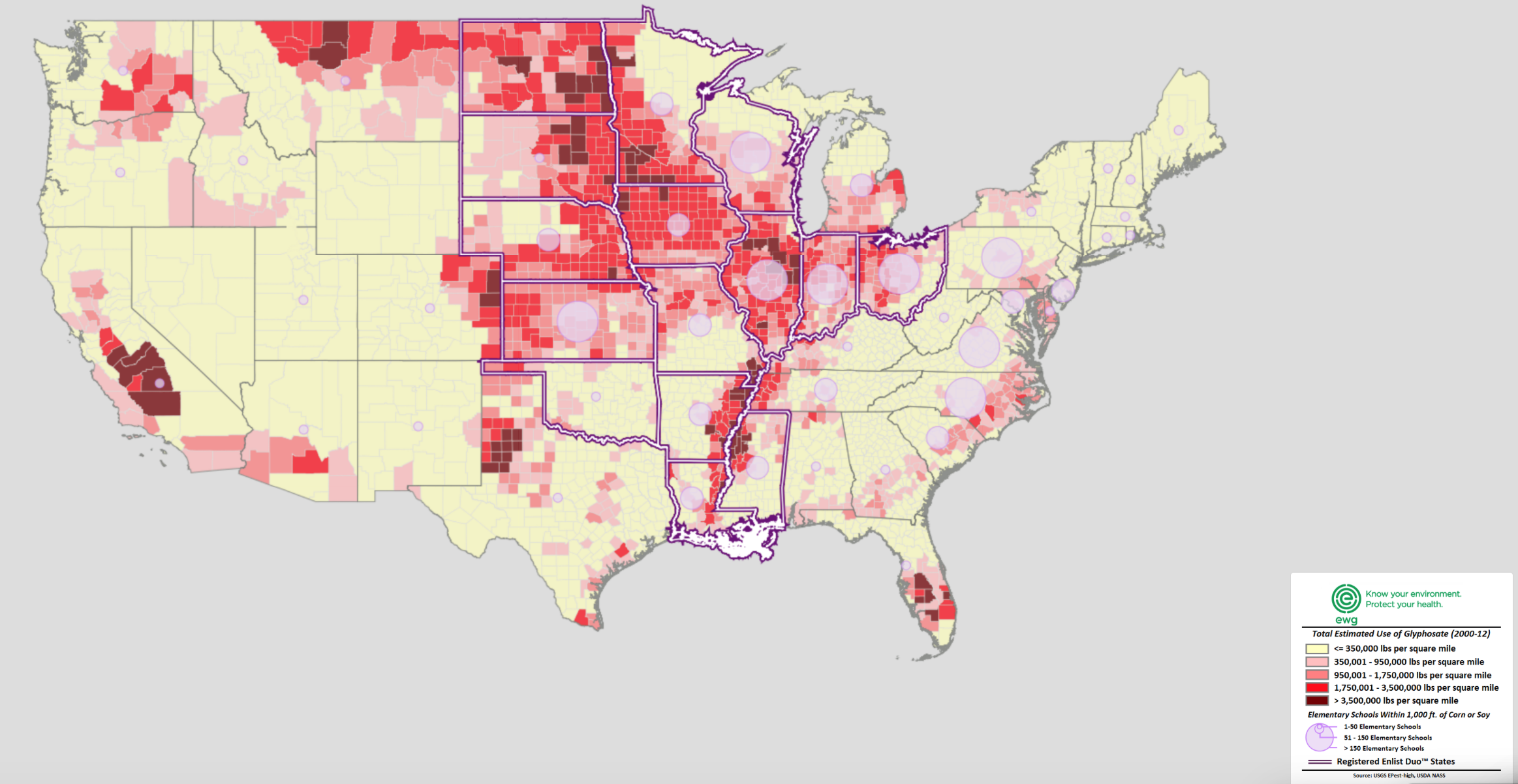
Estimated Glyphosate Application/Environmental Working Group/www.ewg.org

EWR legend

The probability that the non-selective herbicide, marketed since 1992 under the trade names designed to appeal to a sense of security–like Roundup, Rodeo, and Pondmaster, actually allows residues to accumulate with carcinogenic effects in produce like soybeans and wheat has been suppressed, despite the mapping of its potential effects.  This may especially have grown Monsanto has introduced GMO glyphosene-resistant crops–greatly expanding the market of an herbicide still widely marketed at Walgreens and other stores, and used in residential areas as well as in agricultural sites.

Glyphosate

8.  The rapid rise of GMO crops has encouraged the ascendancy of Roundup, now patented by Monsanto, which has replaced Atrazine.  As the effectiveness of atrazine declined, and since many crops no longer tolerate glyphosate, the chemical prohibits the rotation of crops once a common agrarian practice, and suggests a new landscape of over intensive farming, which in corporates herbicide residues–as well, predictably, as glyphosate-resistant weeds in some thirty-five states.

resistant weeds

As much as we demonize nefarious chemical corporations who are the purveyors of poisonous sprays, from Syngenta to Monsanto, perhaps the true culprits lie in the lack of agricultural regulation, and poor economic planning that allowed the rise of factory farms, where the rise of cheap feed created by large-scale agriculture has generated the not-so-astoundingly parallel rise of feedlots in factory farms, in ways that have changed the landscape by which much food is eaten across the country, encouraging a free market of consolidation of farms, without calculation of its costs.

Increased population in suburban areas, often quite close to farmlands, has increased the risk of exposure to known carcinogens and rates of childhood cancer.  The results of such factory farms and economics of subsidized agriculture has led to an increasing number of schools that lie beside areas where GMO crops are planted, and roundup used, in ways that create considerable risks we haven’t bothered to adequately envision, even if they might be easily foreseen.

Total Schools in States within 1,000 feet of roundupd:GMO corn or soybeans

Well-funded teams of publicists and scientists help the PR machines that are run by firms such as Syngenta have effectively blanketed the media not only to undermine –and even created its own PR groups, spin teams, scientists, and “grassroots” groups–in a malapropistic move apparently oblivious of its own odd choice of terminology for a producer of herbicides–that is dedicated to misinform American consumers.  Such a legacy of promoting agribusiness and factory farms seems a lasting legacy from two Bush administrations that will continue to afflict the country’s landscape in future years, as engines of disinformation distance the meaning of actual debate from the general public.

Based on data that the National Resources Defense Council acquired by a Freedom of Information Act during litigation with the Bush Administration, from the EPA’s “Ecological Watershed Monitoring Program” and “Atrazine Monitoring Program” that they released in August 2009 and from a report on Atrazine contamination in surface and drinking water across the Central United States, the hidden topography of atrazine pollution across the United States reflects the dangers that even low-level pollution in groundwater has created in ways that give a new meaning, if with some symbolic appropriateness, to the much-bandied about notion of what constitute our nation’s “reddest” states.

atrazine_distribution_map_400_0_0

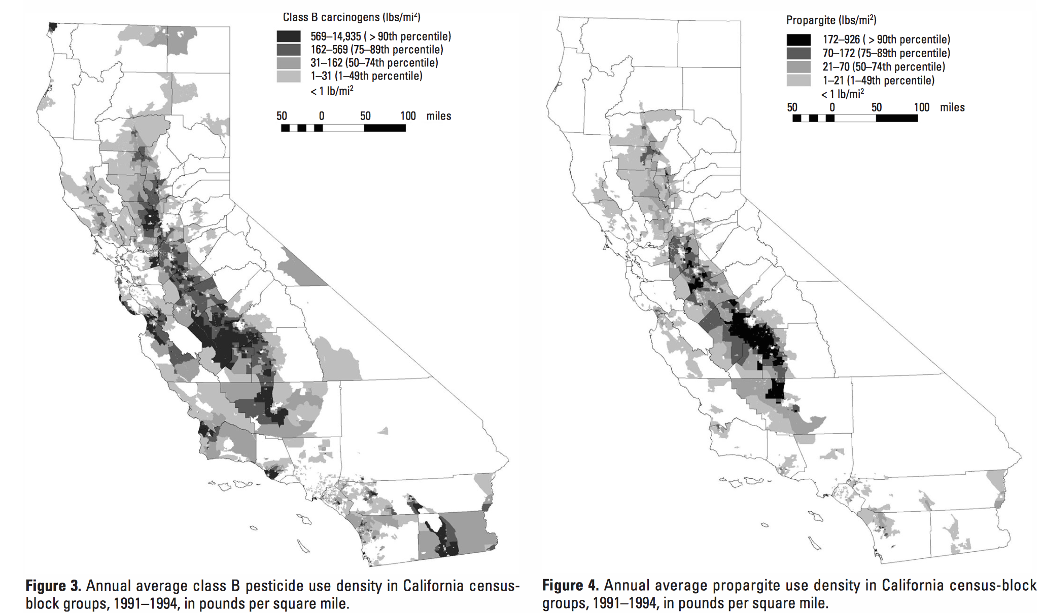
Indeed, the data on the growth of herbicides and pesticides so central to the spread of agribusiness in America, and the consequent reproduction of oversized factory farms, demands mapping and remapping in terms of the prevalence of cancer and other potentially environmentally-induced genetic mutations, and increased incidence of cancer among the young–especially in regions that border beside farmlands were use of Glyphosate and other herbicides or pesticides has rapidly increased.  One study that mapped potential exposure to carcinogens commented on the rising populations near to farmlands in the agricultural powerhouse of California’s Central Valley, the epicenter of a state known for using a large share of all agricultural pesticides and herbicides in the US–to reveal their increasing proximity to residential settlements.

Propargite

9.  What are some of the ways of taking stock of the considerable damage of such widespread use of carcinogenic or possibly carcinogenic pesticides, both to farm workers, neighbors, and also in the food chain?

While few contractors provide protective clothing or respirators to migrant or local workers, and many use clothing or cotton bandanas that, when washed with family clothing, risk spreading contaminants within a family, the recent creation of adequate protective costumes farm workers can easily don, such as the Seguro Protective Suit, are actually designed to be worn everyday by farm workers who work with fruit and vegetables in California’s Central Valley, lest workers be forced to dispose of or wash clothes separately:  the suit features materials able to repel and absorb airborne pesticides that might otherwise settle on skin or clothes, and prevent them from lodging in the lungs of farm workers who would otherwise be exposed to them.  If many workers bring home high concentrations of pesticides into their home and exposing them to steep risks both of birth defects and genetic mutations–despite protective goggles, chemical gloves, or masks.

uites

The residual presence of pesticides lodged in handkerchiefs and bandanas lack adequate chemical filters and carry carcinogens into the home and belongings; and despite current proposals of the Berkeley Expert Systems Technology Lab, producing or providing workers with adequate protective suiting actually rarely occurs.

10.  The topography of pesticide use is not exactly news.  But the widespread nature of the concentration of factory farms, which approaches terrifying intensity in specific census blocks, seem destined to have an increasing effect on human life.  Despite the lack of acceptance of confirmations of the risk of pesticides like Roundup, due to their corporate production, the diffusion of pesticide use exposes both farm workers and populations to increased medical risk, as well as nearby residents and transportation workers.

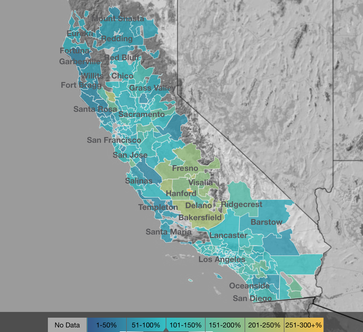
The lack of adequate measurement of rising level of risk is shocking.  But its ill effects can be measured and visualized in a recent bevy of maps of causes of hospitalization throughout the state, using data generated by the California Health Care Foundation, to map local variations of operations and disease based on state-wide hospitalizations.  Viewing these maps, striking in themselves, is a chance to perform the simple relational algebra to compares the intensity of distributions of farming with the prevalence of illness that might be termed a mental form of map algebra for California alone, without getting into GIS tools, to observe the otherwise unexplained regional and zonal concentration of illness:  even without subtracting those areas of least farming, a picture emerges, even without the prevalence of farming areas in or around the central valley.

One might profitably run through a list of reasons for the radical local variations in the distribution of hospitalization for hysterectomies,

hysterectomies in California

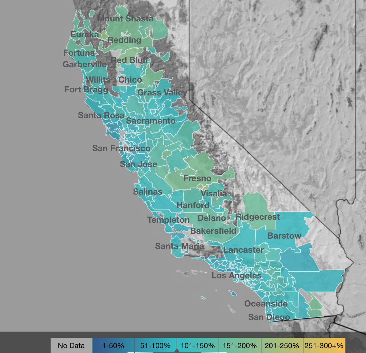
cases of bilateral mastectomies,

bilateral mastectomy

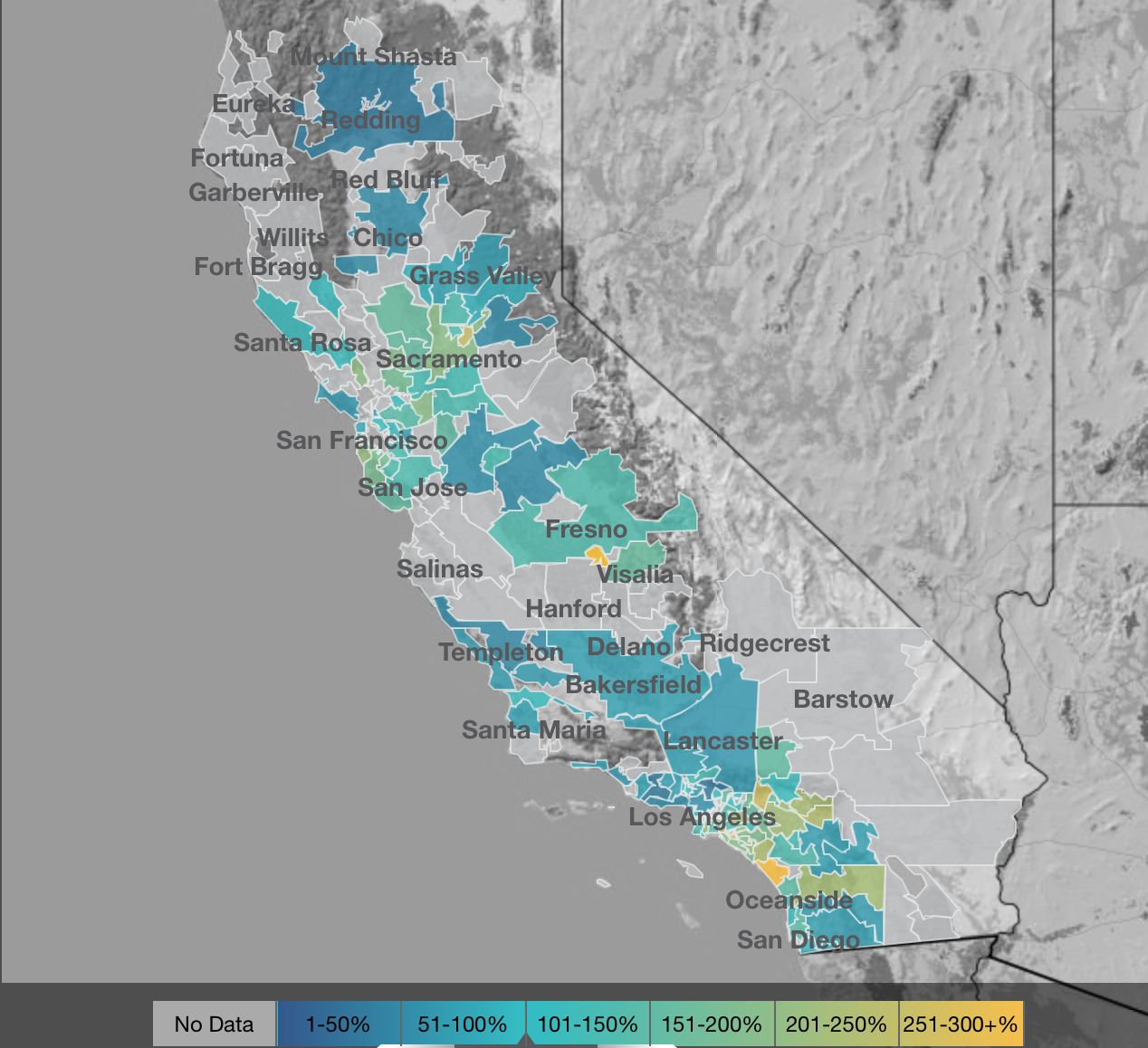
or gall-bladder removals

Gall Bladder Removal CA

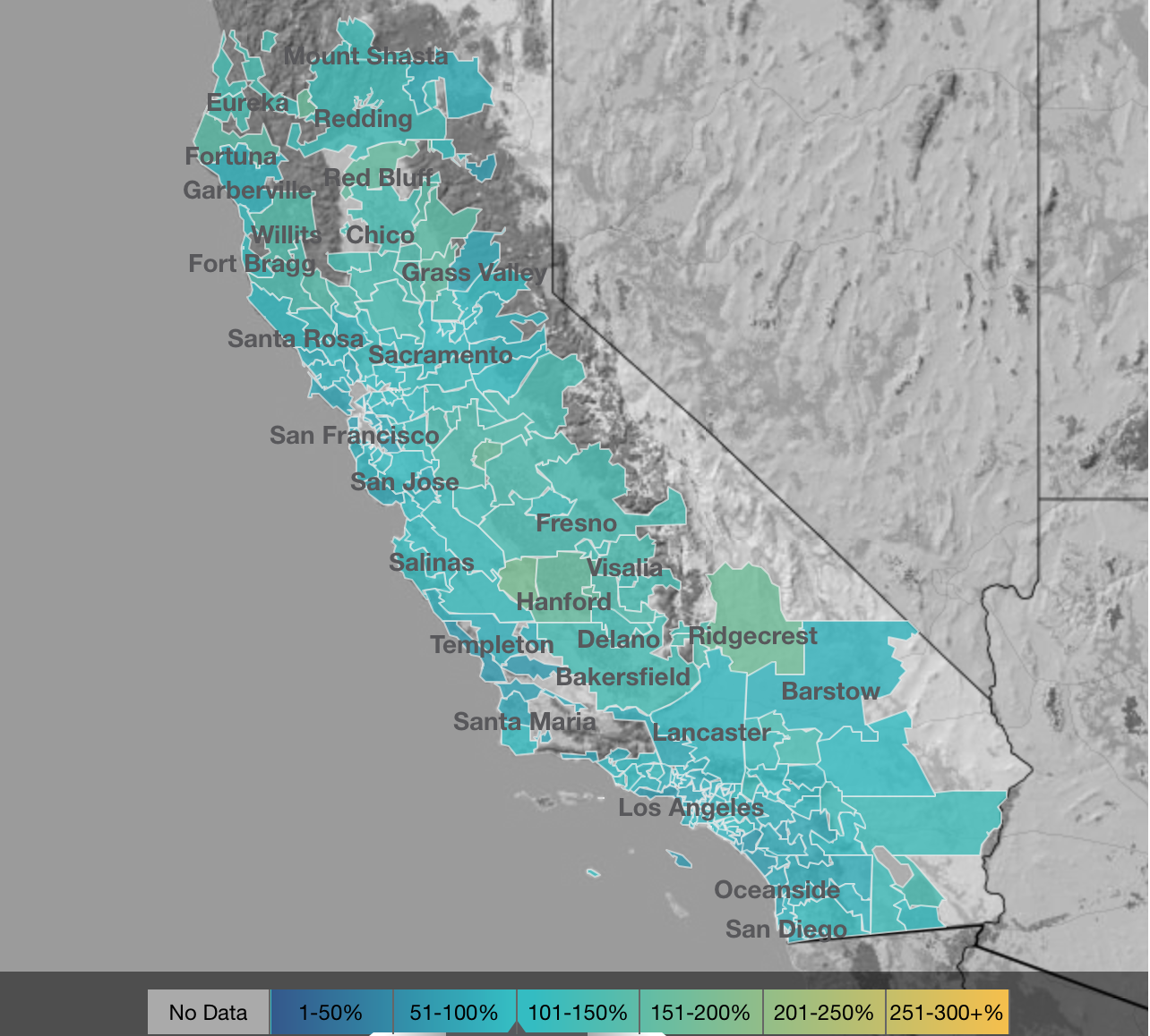
in ways that raise clear and pressing questions about the effects of ambient areas.

The different distribution of operations such as coronary angiographies throughout the state rather reflect the relative availability of diagnostic services in specific areas.

coronary angiography

The practice of such “map algebra” involve, properly speaking, creating relations, as by subtraction, of spatial incidence over a set of cells, in order to reveal relations among two temporally sequential or related (or potentially related) raster datasets to reveal interesting homologies, as these maps of NASA’s Land Surface Temperature in North America of 2014 and 2015:

Map-Algebra-Logo-1

A similar subtraction of individual cells is less able to reveal so clear a contrast of regional variations, perhaps, in the intensity of pesticides and cancer, or the presence of pesticides with the possible likelihood of cognitive impairment and dementia–by Alzheimer’s disease or Parkinson’s disease, or even of depression, and heightened neurotoxicity especially in the case of Paraquat–would provide a compelling correlation over space and a map that would be difficult to ignore.  One might begin from a negative map of the correlation of diseases to those areas where pesticides are less prevalently used, or a simple ratio between incidence of illnesses in cells correlated to with the prevalence of pesticide use.  In either case, a focus on the increased chance of illnesses in those areas where pesticide use is most intense–and potential carcinogens most intensively applied–demands correlation to hospitalizations as well as to length of chemotherapy treatments.

88 Comments

Filed under Big Agra, data visualizations

Sleeping Roads, Ancient Highways, and Paper Towns

What’s the significance of names on a map?  Do they register roads that belong to the territory or only reflect continued use?  What sort of authority does a mapped road, byway, or highway retain in common law–and for how long must it be recognized as a road?  The existence of place-names and routes on a map have become an increasingly contested way to preserve a sense of place, and the survival of the “sleeping roads” of Vermont, the “Class 4” roads that are not maintained by towns, even if some receive some limited maintenance, suggest a historical network of the past, still partly visible and indeed rarely used, but providing a vanishing network of the past inhabitation of rural space and its organization before the introduction of the interstate system.

“If you walk down that road,” a Vermont farmer gestured at the end of Lavender Road in Central Vermont, “it’ll be like you’re walking into the past.” Meaning that the flat stone walls bordering the path, now overgrown with ferns, fallen logs, exposed granite, and an abundance of mushrooms and twigs, not to mention suspicious looking poison ivy, was an earlier system of land management and division, as well as an earlier route of access among the private property that divided Central Vermont hills, Long before I-89 ploughed through the countryside of central Vermont as a central artery of automotive traffic, cut through dark bedrock of metamorphic Cambrian and Ordovician eras, seizing thousands of acres across the state and displacing houses and farms, the roads we now see as arteries that cut through old forests and Silurian and Devonian metasedimentary rocks displaced the roads that once defined travel, reducing once luscious habitats of oak forests to the veils of Potemkin forests. Those illusory strips of six to ten trees deep to create the illusion of forest for tourists and motorists on the highways that cut across New England, vestiges of an earlier arboreal ecosystems living only in the minds of motorists on paved roads from which they rarely deviate or depart.

 
Two Thousand Acres Seized to Make Way for I-91/Vermong State Archives and Records

Newly Paved Interstate Curves through the Waterbury/Middlesex region, circa 1960/Vermont Historical Society

The very same roads that are no allowed to afford prospects of the fall foliage for which the same landscape is so well known were, of course, creations of an earlier area of land-movements and massive landscape shifts. What roads lie beneath them? How can they be seen or even mapped?

6K stock footage aerial video flying over interstate 89 through colorful trees  in autumn, Sharon, Vermont Aerial Stock Footage AX150_453 | Axiom Images

Interstate 89

The survival of so many earlier “sleeping roads” are increasingly threatened in an age of the road. The increased division of the long predominantly rural state on property lines, driven by a  market of construction threatens to obscure local knowledge and a long-valued sense of place that the cutting of highways had long altered. If the preservation of dirt roads without much gravel in Vermont towns was an early development, which contributed recently to the real fears of erosion with flash floods and inundations, the drainage problems of the considerable number of municipal roads in the state have remained largely unpaved–about 75% in 2018, of municipal roads that comprise some 70% of total road miles–the problem of best drainage practices are an inheritance of the longstanding protection of the states rural character in its towns. But the landscape of the interstates brought a deep local resistance to the remapping of interstates and federal roadways that Vermont towns were quick to protect their local character in keeping with a longstanding agrarian economy, rooted in pasture and the production of cows’ milk. 

Yet the increased presence of paved miles, even despite the increased danger that the state faces from stormwater damage and erosion in cases of increased stormwater and river inundations, has threatened the value of local roadways. The rapidity with which many roads were re-graveled, and provided with new culverts, ditches, and drainage systems after they washed out in the massive rains of the summer of 2023 led to a sense global warming as the latest threat conspiring to wash out the old lattice of historic roads in the state, and a quick and rapid defense of the local roads that were so much of the tourist industry depends. The deep sense of injustice in the prospect of loosing the legal status of “ancient” and long-pathways preserved in records of in local townships face possible obliteration in the legal memory as such unpaved roads–often more tacitly known than still used for commerce–are going to be reclassified.  Indeed, as the state’s legislature has decided to reclassify common law roads to homogenize property records across the state, the outburst of local mapping seems not an act of antiquarian obscurantism, but a defense of local knowledge in an age of globalism and satellite mapping, where few of the older roads might appear from the sort of satellite-based mapping systems on which we increasingly depend.  While many of the “class 4” roads might be sought out by mountain bikers, eager for off-road experiences, or back roads where they can snake around mountain farms, but only maintained if deemed necessary for the public good. Yet the rediscovery of these “ancient roads” that are still able to be found on some edges of historic farmlands open up prospects of the topography of the past, evident in the gaps between tree tops and the old stone walls of the edges of the pathways, rather than their navigability or use.

The plan for a massive reclassification of “ancient” highways on the books but actually dormant in much of the state of Vermont may be a pro-development land grab, but suggests that the struggle for designating once common lands as private property (and resistance to it) are waged on maps.  The recent promise to reclassify registered but unnamed byways in the state–a mass of roads which were at one time used or previously surveyed as common-law byways, but have since fallen out of use to different degrees–has unintentionally generated a set of local storms about public memory.  In a state where many current town roads remain unpaved, and many more have faded into the largely forested landscape, their traces still in evidence in the midst of a somewhat bucolic space of passage, tree growth impeded by the stones and often muddy road between old flat stone walls that had once been built to separate famers’ bow long overgrown fields.  

The drive to reclassify the diversity of unpaved roads and common law byways once preserved in local jurisdictions reveals the rise of property development for whom the retention of old systems of spatial classification obfuscates the exchange of private lands.  And if the preservation of old farmlands in Vermont provided a rare historical perspective of longue durée for early twentieth century historians as George Perkins Marsh, who rote long before the rise of environmental history or of the Annales school focussed on land management practices as a lens to observe long-term changes in social history. And in a fascinating illustration of how local collective mapping practices provide a unique point of resistance to mapping software systems that are primarily oriented to paved space, rather than the commons, or, as it is now known, the closely connected right to wander.

The Vermonter developed a broad history of the dialectic relations of what we call the Anthropocene between “man” and “nature” avant la lettre. He dis so out of a deeply American vantage point on world history, as he contemplated the “destruction wrought” on his native state’s local landscape in 1864, about twenty years after Henry David Thoreau lamented the presence of the intrusion of railway lines in the idyllic space of Walden Pond. He offered a global perspective that took its spin from his deep impression by the effects of the retreating and shifting landscape of Vermont, where he had been born in a farmhouse, the vantage point from which Marsh defined his perspectives on human destruction of the global landscape.  After travels in Italy and study of the deforestation Mediterranean basin, he bemoaned that the case of Vermont’s loss of native trees as a similar global historical shift of consequence; in the introduction of his massively learned work, Marsh affirmed that “The earth is fast becoming an unfit home for its noblest inhabitant, and another era of equal human crime and human improvidence . . . would reduce it to such a condition of impoverished productiveness, of shattered surface, of climatic excess, as to threaten the depravation, barbarism, and perhaps even extinction of the species.”  In his metahistorical masterwork, Man and Nature, Marsh contemplated the “wide a circle of disturbance we produce in the harmonies of nature when we throw the smallest pebble into the ocean of organic life” and watch it send ripples across the surface of a body of water, offering one of the more prescient images of the cascading effects of anthropogenic change in the Anthropocene.

Vermont’s deforestation was so accelerated and traumatic in scope that–long before the expansion of its interstate that destroyed farms, homes, and an agrarian economy–the state offered an important perspective for articulating an early environmental vision of the planet’s dire state that in 1874 Marsh found it to carry “the force of revelation.” As immersion in the resettlement of dustbowl refugees prompted historical reflection of self-made environmentalist Clarence Glacken, about man’s relation to the habitable environment; his experience of resettling refugees forced from farms by a lack of rain prompted sustained reflection on the relation of “man to environment” that resulted in the synthetic surveys he taught in the 1950s, which culminated in Far From the Rhodian Shore, a compendium of classical to enlightenment thought that was in the course of being complemented by a second volume when it appeared in cloth in 1976. If Glacken viewed the interaction of humanity and the environment as a baseline for humanism, the devastating experience of deforestation provided for Marsh a baseline for the dangerous rewriting of relations to the natural world; the scale of the deforestation witnessed in Vermont as a circumscription of access to natural worlds provoked a terrifying resonance with the deforestation of the Mediterranean he witnessed, leading him to view environmental change as a altering one’s relation to the world, when the logging industry clearcut oak, birch, below 2,000 feet in a massive harvesting of wood, producing 375 million board feet of wood by 1889, and leading the treeless slopes of Mt. Tom near a town known as “Woodstock” to experience massive soil erosion with hard rains that it altered its shape in Marsh’s own line of sight. His own reflection on “man [as] a disturbing agent” able to turn natural harmony to discords wherever he arrives generalized the land-altering consequences of clearcutting without constraint as a force of history: and whereas metahistorical interpretations of Hayden White and others may smell of the libraries where men like Michelet, Burckhardt, Marx and Vico worked, we might well map the alteration of lived environments provided the optic by which Glacken and Marsh structured pessimistic historical dialectics of their own.

A log drive on the White River
Log Drive on the White River Near Sharon, VT/Vermont Historical Society

The massive rewriting of Vermont’s once rich arboreal landscape by the 1890s was so extensive to alter the economy of the land and man’s relation to it. The scope of devastation was not without resistance as the old map of a relation to landscape was preserved, in no small part by th donation of a Middlebury legislator who incarnated local ideals of environmental stewardship by decrying devastation of “timber butchers”: as soil erosion was devastating local tourism, legislators founded a Forestry Commission, similar to the Board of Agriculture, leading Middlebury legislator Joseph Battell to act preemptively to purchase and donate a thousand acres of forested land comprising Camel’s Hump, Bread Loaf Mountain, and other peaks of the Green Mountains to the state so that they preserved their form–and later donated lands from Hancock to Fayston, to his alma mater, Middlebury College, a land grant that provided the nucleus of the broadleaf trees in the Green Mountains National Forest.

If the extraction of wood from the state’s lands reshaped the soil as the cutting of trees on many hills was accompanied by rise in quarrying to mine slate, granite, marble, and copper; often, smelting left wastelands behind in place of forested lands–leaving old growth trees to act as wayfinding signposts for a drivable road network created on cleared land, paved or graded to allow increased automotive traffic unsuited to dirt roads from 1908.

Did not the rebuilding of paved roads as Interstate 89 not encourage the growth of a fossil fuel economy in the 1960s as it cut across once forested terrain, forcing the vision of Marsh’s coherent landscape further into the receding past, as automotive space shifted the function, use, and scope of a local infrastructure of roads?

The back of this 1964 photograph reads, "Unvailing [sic] of new gas signs on I-89." An exhibit at the Vermont History Museum features historic photos from before, during and after the construction of the state's interstate highway.

New Gasoline Station Signs placed along Interstate 89 (1964)/Vermont History Museum 

The local resistance to such a reclassification of roads in the rural state, which has attracted its share of fierce defenders of the local rights of communities long granted precedents to federal or state law, make the proposed elimination of “Ancient Highways” from local law a matter of contention.  The proposed reclassification of a multiplicity of roads poses a problem of having ceased to reflect the sort of use of landscape that developers want to encourage and private home-owners want to ensure.  Given the shifting nature of land use in Vermont, where older houses are increasingly on the market, as smaller agricultural farms close and die out, a premium has developed for the clear definition of ownership without any liens or qualifications.  Hence the increasing tensions between local municipalities in the state and any move by state government to abolish roads they long oversaw.  In a sense, the increased interest in helping demand for fungible residential properties that can be sold without qualification have run up against the multiplicity of roads that have continued to remain on the books.

As the real estate market in Vermont seems poised to heat up in much of the state, and smaller towns face a demand for brisk sales and a large pool of properties arrive on the market, the state seeks to remove any obstacles to development or become notorious for arcane property laws, remapping the “ancient” roads of Vermont opts to treat them as ancient, and, far more than unpaved, not part of its future landscape.  Yet the quilt of county regulations of roads that existed for most of the eighteenth century and was retained in most local maps before World War II reflected a local landscape of counties and townships rarely challenged before the arrival of interstate federal highways across the state during the 1970s, erasing the varied paths, trails, and common-law roads, long overseen by local city Selectboards and regarded as parts of the local landscape.

A Quilt of Counties
Continue reading

Leave a comment

Filed under anthropogenic change, antidepressants, GIS, GoogleMaps, the commons, Vermont

Mapping Our Shrinking Shores

Coasts have provided the primary cartographical invention to understand the risks that erosion pose to property:  the coast-line is the boundary of the known land, and determines the outer bound of the real estate.  But the coastal fixation of the landlubber privileges the illusion of the fixity of the shore.  More than ever, assumptions about the fixity of shorelines must fall away.  Perhaps the most haunting take away from the Surging Seas web-based map of global shorelines forces us to take into account the inevitable mutability that must be accepted with the rising of ocean-level associated with climate change.

The web-map presents itself as a set of tools of analysis, as much as cartographical techniques, by which the rise of sea-level that has already risen globally some eight inches since 1880 stands to accelerate–emphasizing the alternate scenarios that the acceleration of sea-level rise stands to bring over the next hundred years, introducing a new concept of risk due to coastal flooding.  The availability of accurate GPS images of the elevations of homes have provided the possibility of sketching scenarios of sea-level rise to create readily zoomable maps of elevated ocean levels that confront us with at least the image of the options which we still theoretically have.  The contrasting futures created in this cartographical comparison shocks viewers with a salutary sort of operational paranoia only increased as one fiddles with a slider bar to grant greater specificity to the disastrous local consequences of rising sea-levels world-wide.

shanghai

In ways quite unlike the wonderfully detailed old NOAA Topographic Surveys which map shorelines at regular transects, or T-Sheets, recording the high waterline of tides across 95,000 coastal miles and 3.4 million square miles of open sea, the coastline is less the subject of these web maps than levels of potential inundation.  In a negative-mapping of possibilities of human habitation, blue hues invade the landscape in a monitory metric emphasizing the regions at risk of being underwater in a century.  Whereas scanned T-Sheets can now be viewed by a historical time-bar slider, the fixity of space or time are less relevant to the web maps than the gradients of possible sea-level rise caused by carbon emissions might force us to confront.

Surging Seas forces us to confront the possibilities of the future underwater world.  The infiltration of a deep shade of blue commands the eye by its intensity, deeper shades signifying greater depth, in ways that eerily underscore the deep connection that all land has to the sea that we are apt to turn our backs upon in most land maps, showing the extent to which a changing world will have to familiarize itself to water-level rise in the not-distant future.  It’s almost paradoxical that the national frontiers we have inscribed on maps has until recently effectually made impossible such a global view, but the attraction of imagining the somewhat apocalyptic possibility of sea-level rise seems almost to map a forbidden future we are not usually allowed to see, and has a weirdly pleasurable (if also terrifying) aspect of viewing the extensive consequences of what might be with a stunning level of specific and zoomable local detail we would not otherwise be able to imagine, in what almost seems a fantasia of the possibilities of mapping an otherwise unforeseen loss, not to speak of the apparent lack of coherence of a post-modern world.

For the variety of potential consequences of disastrous scenarios of sea-level rise posed can be readily compared with surprisingly effective and accurate degrees of precision, in maps that illustrate the depths at which specific regions stand to be submerged underwater should sea-level rise continue or accelerate:  zooming into neighborhoods one knows, or cities with which one is familiar, the rapid alteration of two to seven feet in sea-level can be imagined–as can the fates of the some 5 million people worldwide who live less than four feet above sea-level.  For if the shores have long been among the most crowded and popular sites of human habitation–from New York to London to Hong Kong to Mumbai to Jakarta to Venice–the increasing rapidity of polar melting due to climate change stands to produce up to a seven feet rise in sea-level if current rates of carbon emissions, and a mere four degree centigrade rise in global temperature stands to put the homes of over 450 million underwater, which even the most aggressive cutting in carbon emissions might lower to only 130 million, if rates of warming are limited to but 2°C.   (If things continues as they stand, the homes of some 145 million who currently dwell on land in China alone are threatened with inundation.)

The recent review of the disastrous consequences of a rise of two degrees Centigrade on the land-sea boundary of the United States led Climate Central to plot the effects of a-level rise of at least 20 feet on the country–and foreground those regions that were most at risk.   The webmap serves as something like a window into the possible futures of climate change, whose slider allows us to create elevations in sea-level that the ongoing melting of the polar ice-cap seems poised to create.  As much as offer compare and contrast catastrophes, the immediacy of recognizing the degree to which places of particular familiarity may soon stand to lie underwater performs a neat trick: for whereas a map might be said to bring closer the regions from which one is spatially removed or stands apart, making present the far-off by allowing one to navigate its spatial disposition in systematic fashion, the opacity of those light blue layers of rising seas obscures and subtracts potentially once-familiar site of settlement, effectively removing land from one’s ken as it is subtracted from the content of the map, and charting land losses as much as allowing its observation.

The result is dependably eery.  The encroachment of the oceans consequent to rising sea-level propose a future worthy of disaster films.  But the risks can be viewed in a more measured ways in the maps of sea-level on the shores of the United States calculated and mapped by Stamen design in the Surging Seas project that allows us to imagine different scenarios of sea-level rise on actual neighborhoods–the set of interactive maps, now aptly retitled Mapping Choices, will not only cause us to rethink different scenarios of shifting shorelines by revisiting our favorite low-lying regions, or allow us to create our own videos of Google Earth Flyovers of different areas of the world.  Mapping Choices provides a way to view the risks and vulnerabilities to climate change made particularly graphic in centers of population particularly low-lying, where they testify to the clarity with which web maps can create a vision of imagined experience as we imagine the actual losses that global warming is poised to create.  And although the recent expansion of the map to a global research report, allowing us to examine possible global futures that are otherwise difficult to comprehend or process the potential risks posed by the inundation of low-lying inhabited regions for a stretch of thirty meters, the potential risk of inundation is perhaps most metaphorically powerful for that region that one best knows, where the efficacy of a simple side-by-side juxtaposition of alternate potential realities has the unexpected effect of hitting one in one’s gut:  for debates about the possibilities of climate change suddenly gain a specificity that command a level of attention one can only wonder why one never before confronted as an actual reality.

Alternate Scenarios

Maps are rarely seen as surrogates for observation, and web maps often offer something like a set of directions, or way finding tools.  But the predicted scenarios of sea-levle rise allows one to grasp the local levels of inundation with a specificity that allow risk to be seen in terms of actual buildings–block by block–and wrestle with the risks that climate change portends.  The lack of defenses of populations in many regions are definitely also at great risk, but to envision the loss of property and known space seems oddly more affecting in such an iconic map of Manhattan–and somewhat more poetic as an illustration of the fungibility of its hypertrophied real estate and property values.

Of course, the data of Climate Change allows a terrifying view of the future of four degrees centigrade warming on low-lying Boston and the shores of the Charles, as the city is reduced to a rump of an archipelago–

Boston

or the disastrous scenarios for the populations in the lower lying areas of Jakarta–

Jakarta

or, indeed, in Mumbai–

Mumbai

Viewers are encouraged to imagine the risks of the possible alternate futures of just two degrees with an immediacy that worms into one’s mind.  The possibilities that GPS offers of instantaneous calculations of shoreline position and elevations allow one to view a potential reality where one can focus on individual streets with inspirational urgency.

But such scenarios seem somehow particularly graphic illustrations of risk for those regions where there has been a huge investment of human capital, as New York City, where it might seem credible enough to be mapped that they are poised to melt not into air but vanish beneath ocean waves.  For if Marx predicted with spirited apocalypticism at the very start of the Communist Manifesto that capitalism would destroy value to money as it expanded into future markets, as market forces abstracted all things into money–and “all that is solid melts into air”–the twentieth-century expansion of possibilities of environmental and human destruction have lent unprecedented urgency.  While for Marx the metaphor of melting of inherent value was the product of the capitalist system, the capitalist system bodes a strikingly similar image of sinking into the seas.  For huge expanses of the old industrial city–the piers and the old manufacturing zones, most all of the Jersey shore and area around Newark, Long Island City and the Gowanus canal seem sink apart from the shoreline in the future New York that Surging Seas creates, in ways that seem the consequence of industrial production and carbon surging far beyond 400 parts per million (ppm), with the addition of some 2 ppm per year, in ways that make it a challenge to return to the levels deemed healthy–let alone the levels of 275 ppm which the planet long held through the mid-eighteenth century.

That drought, hurricanes, disappearance of arctic ice (up to 80% in summertime) and rising sea levels are tied to the growth of greenhouse gasses hint how global capital might be closely linked to the sinking into the seas, and suggest the surpassing of a tipping point of climate change that is the counterpart to melting into air might be viewed, in New York City’s economic geography, as if to offer a poetic reflection of the migration of capital into the financial centers of the city downtown from its piers or areas of industry–

NY:NJ

–although half-hearted joking references to Marxist maxims (or geographers) is hardly the topic of this post, and the island of high finance that would be created in downtown Manhattan would hardly have ever been planned as an island.

Lower Manhattan Island?

What one might someday see as the lopping off of much of lower Manhattan might be far better tied to the runaway markets of a free-trade economy, rather than rational planning, and has no clear correspondence to property values.

lopped off lower Manhattan

Indeed, the mapping of the prospective loss of those residential parts of the city “where poor people dwell” (as do minorities) is undeniable, if one looks at the 2010 American Community Survey, regarding either in the city’s distribution of ethnic groups or households earning below $30,000, who remain the most vulnerable to the danger of rising ocean levels.

ACS 2005?

Income under 30,000American Community Survey (2010)/New York Times

But the disappearance of the Eastern Parkway and the Jersey shore are a blunt reminder of the extreme vulnerability of the built environment that lies close to sea-level–

Eastern Parkway and Atlantic Avenue above the seas

–and an actually not-too-apocalyptic reminder, but the mapping of consequences of man-made change that goes under the rubric of anthropocene, and is most apparent in the increasing quotient of carbon dioxide in the atmosphere and the warming that this may bring.  For if it has been approximated that there has already been a rise of sea-levels by some eight inches since 1880, the unprecedented acceleration of that rate, which will increase the dangers of floods from storms and place many of the some three thousand coastal towns at risk, are likely to increase as the sea level may rise from two to over seven feet during the new century.

350ppm-chart-300_fixed

The distribution is by no means uniform, and more industrialized countries, like the United States, are producing far more particulate matter, although they have been recently overtaken by China from 2007, and have atmospheres above 380 ppm in the Spring, making them more responsible for rendering higher temperatures–although the lower-lying lands below the equator may be most vulnerable to the consequences of climate change.

Screen Shot 2015-07-13 at 8.20.11 PM

Screen Shot 2015-07-13 at 8.21.44 PMScreen Shot 2015-07-13 at 8.22.35 PMVox– A visual tour of the world’s CO2 emissions

The increasing levels of particulate matter are attempted to be more locally mapped in Surging Seas.

The changes extend, in a nice dramatic detail, into the Central Park Meer rejoining the East River with the predicted inundation of much of the posh residential area of Manhattan’s East Side, all the way to Fifth Avenue.

Truncated NJ and absent upper East side

It is difficult not to compare the scenarios sketched in Surging Seas maps to some of the maps of those future islands of New York that Map Box and others allowed Sarah Levine to create maps of the heights of buildings from open data after the pioneering maps of Bill Rankin’s 2006 “Building Heights.”   When Rankin remapped Manhattan by taking building height as an indirect index of land value, he saw the island as clustered in distinct islands of elevation above 600 feet:

manhattan-heights

Radical Cartography (2006)

Levine used similar data to chart the fruits of Mammon in buildings above sixty stories.  Maps of skyscrapers beside the gloom of Surging Seas suggest those towers able to withstand the rising seas brought by global temperatures jumping by just two degrees Centigrade.  If one moves from the map of the bulk of lowest sections of lower Manhattan–

Two Inches in Lower Manhattan

with reference to Levine’s brilliantly colored carmine mapping of the highest buildings in the Big Apple, above forty-seven or fifty-nine stories, which one imagines might provide the best vantage points that rise above the rising waves, especially when located on the island’s shores.

Mapping NYC by Sarah

Sarah Levine Maps Manhattan

There’s a mashup begging to be made, in which the tallest buildings of over fifty stories at the tip of the island peak up above the cresting waves, and the rump of buildings in lower Manhattan offer contrasting vistas of the city’s contracting shores.  The buildings that create the canyons of urban life, the buildings of elevation surpassing sixty stories might suggest the true islands of Manhattan’s future, as much as the points that punctuate its skyline.

Sarah's Lower Manhattan

The realization of this possible apocalypse of property made present in these maps offer the ability to visit impending disasters that await our shorelines and coasts, and imagine the consuming of property long considered the most valuable on the shore–as rising seas threaten to render a whispy shoreline of the past, lying under some six meters of rising seas.  The prospect of this curtailing of the ecumene, if it would bring an expansion of our nation’s estuaries, presents an image of the shrinking of the shores that suggests, with the authority of a map, just how far underwater we soon stand to be.

Eastern USASurging Seas: sea level rise after 2 degrees centigrade warming

All actual maps, including Levine’s, provide authoritative reporting of accurate measures with a promise of minimal distortions.  But visualizations such Surging Seas offer frightening windows into a future not yet arrived, using spatial modeling to predict the effects of a rise in sea-level of just five feet, and the potentially disastrous scale such a limited sea-level change would bring:  the coasts are accurate, but their inundation is a conservative guess, on the lower spectrum of possibilities.  For in a country in which 2.6 million homes are less than four feet above current sea-levels, the spectral outlines of chilly blue former coastlines peak at a future world are still terrifying and seem all too possible, as much as potential cautionary tale.  The concretization of likely scenarios of climate change remind us that however much we really don’t want to get there, how potentially destructive the possibility of a several degree rise in ocean temperatures would be.

Leave a comment

Filed under Climate Change, coastal flooding, data visualization, global warming

Around the World in Submarine Internet Cable

As we attempt to navigate the ever-expanding seas of data in the information economy, we can overlook the extent to which data streams run underneath the world’s seas to create a quite concrete sense of the interlinked.  For such cables underlie the increasing notion of geographical proximity we experience daily, from the world of big finance to mundane online transactions.  Ocean floor mapping had barely begun when the first cable was laid underneath the Atlantic, connecting England to the United States by being painstakingly laid by throwing thousands of kilometers of telegraph cable overboard ships from wooden beams loaded with cable, moving from the middle of the Atlantic in two opposite directions. The efforts that lasted four years, begun in 1854, created a subaquatic bridge of metal wire, by 1858, eight years after the first cable beneath the English Channel, brought nearly riotous celebrations in New York City,–where the latin of the first functional transatlantic cable led to citywide celebrations.

Crowing that “at last the great problem is solved,” Walt Whitman heralded the achievement of the laying of the Atlantic Telegraph as a precedent that “set all doubts are forever at rest as to the practicability of spanning the world with telegraph wire–of joining Europe, Asia, Africa, America and Australia together by electric current,” at the same time as revelers invaded City Hall. The celebration of the shrinking of the world was an early mark of globalization, and the erasing of continental frontiers. The image of electricity as a fluid able to be channeled, controlled, and conveyed, all the while insulated from harm, provided a basis for joining America to the Old World, founding father Benjamin Franklin had argued a century earlier, tying Philadelphia to the capitals of European learning, beyond state governance–long before a national electric grid. While the seashore was being celebrated as a discovery of the wild in an increasingly overpaid world, the laying of cable was an achievement worthy of celebration beyond previous limits of human travel, erasing all natural obstacle and edgess, if the cable’s breaking quickly emerged as the weak links of a triumphal vision of globalization: the increased vulnerability of internet cables in recent years, whether in the North Sea or Baltic or off the coast of Africa, suggested the material fragility of transnational networks of finance, communications, and audiovisual streaming we are overeager to naturalize, forgetting that they rest on infrastructure. If we want to see ourselves as modern, and globalized, overly eager to forget or deny the fragility of global linkages.

Even if the cable broke in four years, the insulating jute fibers wrapped around the wires eaten through by a hungry worm, the steel casing of cables’ housing was reengineered against breakage in punishing conditions of the ocean floor, the protection of deepsea cables has extended as an independent offhosre infrastructure we all depend, at depths of over 20,000 feet below. The electric lines were almost in fact a country apart. Several generations earlier, the founding father of America, Benjamin Franklin, animatedly announced “Electricity is a vast country, of which we know only some bordering provinces; it is yet unreasonable to give a map of it, and pretend to assign the laws by which it is governed.” The metaphor is pretty stock, but the map he imagined might have as its basis a way of attaching pre-revolutionary Philadelphia to the wider world, as, even by the Schuylkill, “we are in a fair way of soon becoming as well acquainted with that terrible element, as with . . . the invention of the air-pump,” by advancing the new nation into new realms by drawing electricity from the thundering sky, using silk as an insulator to protect the experimenter flying the kite from the shock of electromagnetic charge drawn from the heavens on the string on which he had suspended a key.

Benjamin Franklin was quite eager to imagine the European innovation of Teutonic scientists with sparks and charges to be recreated in the colonial entrepôt, imagining that the fearsome world of a fluid “electrical fire” might be “collected” and “drawn off” as a resource of generative power, if he imagined the kite would be flown from a window indoors, harvesting electricity from the heavens as a fluid resource that might be understood by market dynamics as flowing in directions and along straight lines. Franklin seemed to imagine electricity as a new resource of fluid wealth, drawn from the heavens and generated out of the air, whose currency might be gathered to be redircted across borders of nations or state jurisdictions, as if from as yet unmapped lands.

The attempts to map the current iteration of underseas cables that carry internet signals rather than only electric charge as a new vital network of a global economy, in inevitable need of repair but also of maintenance, demanding to be mapped as it runs outside of the limits of state governance. But the map of electric cables and WiFi lines across the oceans increasingly in need of mapping as the infrastructure of underwater current seems a country apart, a region offshore and hidden in the deeps. The generative power of electricity by which Franklin was so excited seemed able to be channeled through bodies, human and animal, as a dynamic “currency,” whose oscillating flows mirrored market transactions, as if it were able to suture the global division of continents by new “bonds” that carried and put in circulation the bipolar interface as a harmonized market, anticipating underseas cables, but depended on the material ties.

A photograph of a display showing cables of various thickness as well as a model of a grapnel.

The hopes of governance of a network of cables suggest almost a living structure of its own. The cables are the material substrate of our sociability and economic ties, but a have become increasingly difficult to map in necessary detail or expanse to scale. The mid-nineteenth century optimism of joining continents by underseas cable were imagined as a network that spun out from London, contracting the surface of a world that appeared the ghost of a British Empire, the delicate web of tangled underseas cables of fiber optic cable, that now are estimated to extend across the global seabed to connect most of the world’s data plans and streams at over 1.4 million km, along the ocean’s floor, buffeted by currents, mudslides, and even the lines of fishing trawlers, even as the global spinning out of submarine cables has grown astoundingly over the past thirty-five years, since the first fiber-optic cable extended on the Atlantic Ocean’s seabed floor in 1988, by ATT, France Télécom, and British Telecom, with an optimism mirroring the first underseas cable of the mid-nineteenth century.

Wired World: 35 Years of Submarine Cables in One Map ...

The mapping of such cables–carrying not only telegraph signals, as in the 1800’s, and, much later, wifi along fiber-optic lines wrapped in steel, lie among the hundreds of cables that would collective run over a million miles back to back beneath the earth’s oceans. The criss-crossing of underwater canyons and deepwater divides, linking the financial transfers, ensure the continued global transit of messaging signals, and internet providers’ continued service, in a complement to the satellites which ring the planet in outer space. Although the satellites are only be able to carry a fraction of the information that the cables send between continents that hug the seabed: satellites can indeed only carry a half of a percent of the traffic that courses across underseas cables, making them a vital infrastructure on which we increasingly depend in more ways that we imagine. The hidden infrastructure of the hidden deep suggests a network that is terrifyingly fragile, and is able to be mapped in quite concrete terms as a material substrate on which globalization can be mapped if its fragility can be maintained, and the dangers of underseas breakage and disruption prevented against.

transatlantic seabed profile

1. The global impact of the underseas cable was, to be sure, seamlessly felt to be a contraction of the global surface analogous to shipping routes of trade, as they were mapped in an 1893 global map trumpeting shipping routes and cables that contracted the world’s surface as the dawn of a new era of an earlier globalization.

The World on Mercator’s Projection, Showing Sailing Routes and Underseas Cables/1893

The smoothly curved hatched routes of lain cable that crossed from England to the Boston and Newfoundland underseas promised the realization of the globalization that Whitman had celebrated, if Thoreau turned a cold shoulder, predictably, to the “grandeur of this creates achievement of the Nineteenth Century.” Thoreau was not impressed at the cables of telegraphy, who found its benefits rested on illusion as much as advances, in his predictable skepticism, as “pretty toys which distract our attention from serious things,” presciently fearing the contents of the first messages born by underseas cables were more frivolous messages than ones of import, worrying that the haste of the construction of telegraph cables proceeded more quickly than there was information needing to communicate. But the amount of economic transactions, speculations, and data flows that are flowing under the world’s oceans outstrip the powers of reflection, or indeed comprehension.

For the American Poet, it confirmed the “practicality of communicating across the Atlantic,” on the eve of America’s Civil War, was a triumphant enterprise whose “immensity” threw cold water on doublers was cast in disturbingly radicalized terms, to be sure, as a bond that liberalized a bond by which “Saxon extends the hand of amity to Saxon,” of an “all-conquering race that is always progressing and extending its power and influence, whether in the icy Arctic and Antarctic or in the tropical heats of India” by “lighting flashes from shore to shore: Whitman sung the “chord of communication” that would “vibrate forever with the peaceful messages of commernse, the lightning-winged words of the press, and the thousand anxious queries of individual affection to the health and happiness of the absent and the loved” in the Brooklyn Daily Times, as an ethnic triumphalism that “conquered time and space . . by man’s inventive power” as a sublime achievement. And the raptures into which the transatlantic cable set the poet who so desired worldly unity in 1858 saw the miracle of allowing the world to “reason together,” “without the aid of palpable agencies” suggests a fascinating promotion of a discourse network uniting Old and New Worlds whose map was aptly chosen by Telegeography as a harbinger of a new horizon of information exchange in the twenty-first century.

And even as the landlubbers Leopold Bloom and Stephen Dedalus paused with the hoi polloi of actual sailors in a wooden cabman’s structure in Dublin, overhearing Italian and imagining the opening of new routes to London–not to say that they had ever traveled extensively–“fell to woolgathering on the enormous dimensions of the water about the globe, and ineluctably found the conversation of others turn to “talking about accidents at sea, ships lost in a fog, collisions with icebergs, all that sort of thing,” in 1904, the contraction of global transit cannot but be seen as a precedent of the smoothening of information transit today, pace James Joyce.

2. The spans of privately funded fiber optic undersea cables that have been lain across oceans floors, some stretching over 28,000 kilometers, are a literalization of global circumnavigation. They provide an image of global networking as well as offering the most massive engineering feat on earth that is hidden to human sight–and are more an emblem of globlization, in many ways, than the contraction of global space.  And the rapidity with which further cable is being lain to link the world’s data flows along faster and more secure lines of communication mirrors global interconnectedness–senses of connectivity and warping past concepts of proximity, unifying the differently owned cables. Conjuring of a surprising antiquated format of charting coyly suggests the increasing interconnectivity of the Information Age, and it also channels the extreme novelty of being interlinked. The retro iconography of a chat channels the very claims of modernity that TeleGeography, a global telecom, pioneered to channel information–and done so by familiarizing viewers with a distinctly concept of space by how we are increasingly interlinked on information highways often concealed far beneath the sea.  Rather than naturalize an image of high-speed connections, the clever choice to rehabilitate a slightly romanticized earlier mapping of oceanic expanse suggests the new space of online data.  And it takes the notion of the electronic frontier seriously, by seeking to orient viewers to the new mental space that such sunken data lines create.  If the map of the bridging of oceanic by sunken internet cables domesticizes the transcendence of distance through the increasing interconnectedness of information flows.

There is clear pleasure in the retrograde mode of mapping also reveals the actual distances that the physical substrate of the World Wide Web inhabits in so doing, and suggests that we would do well to remember the physical substrate by which the global financial economy is interlinked. To be sure, the format of the map echoes laying the first undersea cables across the Pacific, in the mid-nineteenth century in 1850, when the thrill of mapping the expanse of undersea cable was mapped for the first time enabled possibilities of direct communication networks in the Anglophone world that the poet Walt Whitman himself–he who asked readers ponder the image of a thousand acres, and the linkages among all Americans, and in older age would celebrate the inauguration of the first transcontinental railroad.

Whitman provided a vertiginous reaction that registered the excitement that the cable trigged in the United States in a rather short newspaper article of 1858 focussed on the “moral effect of the Atlantic cable” on the nation, which barely touched on its technological triumph: it is striking that Whitman, long practice in the material practices of setting type to mediate the human voice, celebrated the technology of the cables laid under the ocean by wooden boats as linking communication between England and the United States, as Anglophone nation, by a cutting edge technology of deeply spiritual significance by which he was fascinated. The piece is a sort of meditation on human geography, or the aesthetics of space that the cable changed in a profoundly deep historical–as well as submarine–manner, bridging distances of communication in new ways.

Whitman was long fascinated by the compilation of voices in type, and networks of communication that spanned nations as the railroad. In 1858, already an established poet, he celebrated the cable as as a material network for transporting semaphore, if not human voice, transcending space and binding England and America in truly inseparable ways as a sign of the fostering of global peace–attracting much popular celebration, even if he judged it would not “bring one iota of personal benefit” to the majority of American inhabitants, the electrification of “unbounded excitement” makes it seem as if the internet was introduced to all, in democratic fashion, generating a level of excitement, evoked in the map below of the Submarine Telegraph, worthy of “glorifying a grand scientific achievement” that outstripped any “merely material considerations” by its ability to “thrill every breast with admiration and triumph” in ecstatic terms: Whitman waxed poetic as he praised how “the sentiment of union that makes the popular heart beat and quiver,” more than its technological advantage, imagining that the network set a deep tie spanning the Anglophone world betwden two countries “no longer [able] to keep each other at arms-length.”

The role of technology in furthering the natural relations within or coherence of a nation–a point of fascination common to the institutional infrastructure of America Whitman also celebrated of his own poems–was almost cartographically conceived as a way of unveiling unities within the world able to bridge space, and even, at times, time, able to transport and convey messages that depended on oceanic travel.

Was the technology of the Submarine Cable an extension of the national unity Whitman already celebrated of the United States? The bond that the cable created was cast as a profound historical event, leading England and the United States to set aside any rivalries, having forged this deeper bond of both “heart and feeling”–the network was a deep-lying embodiment of shared purpose, even if it was not seen! Perhaps its very invisibility added to its power. Whitman had celebrated in the 1855 Leaves of Grass the very conceit of achieving such a “merge” through his poetic voice, a merge between peoples, races, and classes; he was open to the idea that the Cable achieved a merge between nations, allowing voices or at least semaphore to span space. Accordingly, he invested the transatlantic coupling of two nations with almost spiritual dimensions. The cable’s laying open new chapter of global history opened by triumphs of ingenuity, skill and technology was less of interest than the “exultation with which it has been greeted and the unbounded enthusiasm with which it has everywhere been received” to foster a sentiment “that makes the States throb with tumultuous emotions and thrills every breast with admiration and triumph.” The cable indeed became a form of sexual congress and intimacy between continents, for Whitman, as much as a communications network, the cable from Newfoundland a fundamentally triumph over international dissensus.

Can one imagine a better promoter of the sort of information highway that realizing poetic goals “material bond for the transmission of news of the rise and fall of stocks,” as Whitman seems to merge his role as newspaperman and poet to celebrate the mystical resonance of cable that would make the designers of the internet applaud. Whitman was amazed that the “mighty outburst of enthusiasm all over the land” that the laying of the cable provoked in the United States, greater than any in his recollection, beyond other celebrations of the nation: the apparent contradiction that “Probably to an immense majority, the Telegraph Cable will not bring one iota of personal benefit” would be outweighed by the “union of the Anglo-Saxon race, henceforth forever to be a unit.”

Whitman was almost anticipating how TeleGeography didn’t only borrow the antiquated iconography of marine charts to celebrate globalization, but found a precedent to celebrate relying high fiber optic cable across the ocean floor: a communications network has perhaps rarely been cast so openly in spiritually elevating terms by someone not its promoter. There was of course considerable physical effort, and much planning, now unseen, as well as the loss of thousands of cable underwater for several years, until warships, loaded with cable, divided the oceanic span by setting off from a point in the midst of the Atlantic in opposite directions, to create a subaquatic bridge, after having lost kilometers of metal wire, by 1858.

The first message took over sixteen hours to arrive in full from England’s Queen Victoria to U.S. President Buchanan, by undersea cable–

The shrinking of distances was a powerful breakthrough of the ability to map space in different metrics, however, than every seemed possible for transatlantic travel. And it’s hence quite apt that the antiquated techniques of mapping global relations were reprised by the folks at TeleGeography to remap the current global growth of internet cables by the syntax and aesthetics from an Age of Discovery.

The appealing charting of the hidden network of submarine cables designed by TeleGeography didn’t only borrow the antiquated iconography of marine charts from an Age of Discovery in order to promote the expanding spread of submarine fiber-optic cables in amusing ways.  For the image served to suggest the shifts in spatial connectedness that such increasingly rapid data flows have allowed, and to suggest a map that, in focussing on the seas–and the overlooked areas of marine space–returned to an interesting if somewhat overlooked spatial metaphor to consider and visualize the extent to which global financial networks and information systems move in particularly flexible ways across the permeable boundaries of nations, if not the degree to which national units have ceased to be the confines that matter, as cross-border flows are increasingly the primary sorts of traffic that matter to be mapped.

Phone Calls in 2012

4. A more familiar global remapping of phone calls,constructed on a study by students of business, Pankaj Ghemawat and Steven A. Altman, partly funded by the logistics firm DHL, an approximate quantification of globalization was made by the metrics of cross-border telephone calls in 2012 worldwide, in which the thickness corresponds to the minutes spent on the phone–and presumably the closeness of connections, if filtered through the relative costs of calls and the ability to pay them.

In a sense, the chart featured by TeleGeography openly incorporates less data, while noting the varied speeds of connections, in an image of interconnectedness, and positions itself less as a cutting edge snapshot of globalization or globalized than at the dawn of the possibilities of future interconnectedness that the laying of fiber-optic cables of greater speed can promote.  If the map of telephone calls raises questions of information flows, some 41 percent originating in what the authors identified as “advanced economies” to “emerging economies,” and only a small fraction (9%) originating in an “emerging economy,” the technology may also illustrate the precise demographic that continue to adopt telephony:  the authors observe that the dominant “calling patterns” reflect “interactions due to immigrants,” with most international calls being placed from the United States to Mexico and India, countries of first-generation immigrants–rather than reflecting actual information flows.

TeleGeography seems decidedly optimistic about the possibilities for global circumnavigation fibre-optic cables can promote.  In place of offering a map of actual flows of data, or a revealing look at where cables lie, the adoption of an aestheticized image and iconography of the nautical chart to map the ever-expanding web of cables that connect the world advances an argument about the sorts of ties cables facilitate, in order to illustrate and promote the ever-increasing multiplicity of ways information can travel across the globe without regard for the bounds of the nation-state.  Even as we bemoan NAFTA, or raise concerns about the Trans-Pacific Partnership, the networks of cables that currently span the terrestrial sphere divide into 285 separate privately owned segments show a coherent network has rapidly grown–its extent more than doubling in length over the past three years–and seems poised to only grow in coming years, to render national protectionism a thing of the past:  the map leaves viewers only to imagine its benefits.  While not seeking to quantify actual data flows, the scope of the map seems to be to naturalize the broad range of traffic lying such cables allows, if it is also jumps backwards over the many traditions of oceanogapahical mapping to show a seafloor that is not marked by drifting continental plates and scars of underwater earthquake activity–

ocean_floor_map_1050x700

NOAA

–but a smooth surface of cables that seem to be lain without ever encountering natural obstructions or topographical variations in the ocean floor.

The expansion of transcontinental submarine travel was on the cutting edge of the 1850s, and the laying of miles of lost submarine cables the Atlantic floor may have led Thome de Gamonde to realize hopes for a tunnel between England and France that parallel the previous laying of cable–

–and project the first underwater tunnel linking England and France in 1855 for rail, a project stopped for “strategic reasons” though the idea of such a chunnel–imagined by Napoleon’s mining engineer of mines as conveying horse-drawn carriages–

–was only completed until Francois Mitterand was driven by Rolls Royce (a concession?) to board the inaugural train.

The linkage between the nations was a feet of boring a hole, but bridged the very question of territoriality that the first plans of the 1855 version, presented to both Napoleon III and Queen Victoria to be forged through undersea rock, as if piercing the earth’s mantle–

–posed to territorial bounds, and the definition of sovereignty.

5. The submarine network of cable now totals upwards of 550,000 miles.  Although it is never seen above ground, and lies concealed beneath the seas, it now seems to animate most international commerce.  There is a pleasant irony in adopting the decorative aspects of marine charts to map a contemporary image of global circumnavigation, since they gesture to deep shifts in the seas of information, but also evoke the marvel of rendering visible what is all but unseen.  The exact locations of such cables are not displayed, of course, but the stylized presence suggests a decidedly early modern form of boastfulness–“according to the best Authorities [and] with all the latest Discoveries to the PRESENT PERIOD,” the extent to which the infrastructure of the Information Age spans the seas.  What once was a site of marvels revealed by the officer turned conservationist Jacques Cousteau is a field for information carriers, even if monsters inhabit its depths.

submarine-cable-map-2015-l

The “New Map” updates the recent rapid exponential expansion of the network fiber optic cables in recent years as a sort of corporate promotion, rehabilitating the marine chart to naturalize the submarine network that now carries a large share of global financial and administrative information worldwide.  Retrospectively mapping the expansion of this exoskeleton of the anthropocene ignores the technologies on which such mapping suggest, recalling the abilities to technologically harness steam, wind, and power to recreate the romance and adventure of global circumnavigation in an updating of the 1873 romance and fast-paced adventure Jules Verne told of a race against the mechanized clock by a constellation of transit networks.

Verne en 80 Jours

For much as Verne offered a quickly paced adventure mildly disguised celebration of technological unification of the globe, the retrograde if glorious map masking as an engraved superimposing high-fibre cables on image of the ocean as understood in days gone conceals the clear corporate interests or material technology that underpin the Information Age. And the recent expansion of a trans-continental high-tension submarine fiber network able to carry 26.2 terrabits/second of data across the undersea floor–which once took seventeen hours and forty minutes–is an awesome acceleration of time that unbinds us from all accustomed temporal constraints in a dizzying fashion. Even as Russian and other spy ships are operating in dangerously close proximity to the cables that carry an infrastructure of global communications that maintain the illusion of the open exchange of information across territorial bounds. (The safety of the antiqued map dispels any such fears of disruption of information exchange in its friendly presentation of a mysterious unknown underwater world.). And now that 99% of global internet traffic occurs thousands of feet undersea–from Netflix to now literally offshore financial transactions to email, the more black-boxing a map can perform, the better!

The appeal of the map not only is of an oceanic unknown–but an act of traversing the very national boundaries that seemed so solidly perpetuated in paper maps. The map of the oceanic unknown celebrates the laying of a material web of the world wide web as if it were another oceanographical detail, but masks the unseen nature of the cables that were lain in hidden fashion underneath the seas:  indeed, rather than the slightly earlier Verne-ian classic of 1870 with which it is often paired, the map doesn’t heaven to futuristic science, but sublimated a similar story of submarine itineraries.  Indeed, the map offers a picturesque recuperation of an aesthetics of global unity that serves to reframe the newly prominent submarine network that ships recently strung across the ocean floor.  It conceals the labor and mechanical drudgery of doing so–both the engineering or the fragility of the fibre-optic network, and the material basis of an electromagnetic carrier lurking deep under the seas.  In the Cable Map Greg Mahlknecht coded, the spans of current cables already connect hubs of communication across oceans at varied but increasing speeds, now approaching 26.2 terabits/sec across an astounding 6,6000 km from Virginia Beach to Bilbao, Spain. And while the depths of such cables is not apparent in most maps, the lodging of the cables on the ocean bedrock, 8,000 meters beneath sea-level, is argued to promise the “stability” of such an infrastructure that seem removed from the effects of human interventions from such old-fashioned add-ons to the seafloor as anchors or submarines.

Greg's Active

And the planned additions to the network, in part enabled by warming waters, are poised to greatly expand:

Greg's Transatlantic

Greg’s Cable Map

The work that the map modeled after an engraving of global seas does is serious, for it integrates the growing network of fiber-optic cable at the ocean’s floor into the seascape that nautical charts showed as a light blue watery expanse.  For as the price for fiber-optic cables precipitously dropped since 2000, this material infrastructure of global financial markets has not only grown, but kept up with the rapid improvement in network communication along a growing network of 250,000 km of submarine cable most folks have limited knowledge, and whose public image is in need of better PR, the more eye candy the better. The complex web of what Russ Fordyhce of Infinera has slyly called “the workhorse of the Internet” using fiber optic–a seemingly antiquated technology in an age of streaming and cellular towers, in a high-speed fiber network able to carry internet traffic that roots a virtual world. Such high-pressure sub-sea links expanded subsea capacity by an Intelligent Transport Network, expanding the network of undersea cables to meet broadband needs across the word by 100G flows.

6. The increased speed of such expanded capacity for submarine transport is akin to a living network of “intelligence transport.” But it also suggests a massive updating of our notions of transportation, by a restricted number of undersea fiber cables that seem staged to supersede cable networks in providing bandwidth. The pictorial addition of such fairly florid decorative detail from nautical charts to invest the routes of hidden submarine cables’ with an aesthetic that both caused it to be named one of the best maps of 2015 and exemplifies how to lie with maps, if the current expansion of fiber network capacities suggest that the network of just four years ago are indeed antiquated by the Infinera and other organizations promising to transport data at significantly greater and greater speeds.

submarine-cable-map-2015-l
article-1196775-0568D94B000005DC-41_634x286

The 2015 map, published online, but emulating the paper map, seems to conceal the extent of work that went into not only laying the cable, but ensuring that it was not disrupted, but blended seamlessly into the surrounding submarine landscape.  FLAG–the Fiberoptic Link Around the Globe–after all offered a sort of modern updating of the boast of Jules Verne’s Phineas Fogg.  For Fogg wagered £20,000 that the speed of the combination of trains and steamboats would allow him to travel around the globe so that he could return to the very same seat he occupied in the Reform Club in London in only eighty days–a boast based on his trust in the speed of modern conveyances of steam travel.  For Fogg’s image of interconnectedness was realized in the copper cables that conducted telegraphy traffic.

These telegraphy cables lain under the Atlantic by the 1880s by the Eastern Telegraph Company across the Atlantic and Pacific, which by 1901 linked England to North America, India and Malay in a network of communications that offers a vision of corporate interconnection spanning the expanse of the British Empire and providing it with an efficient communications system that was its administrative and commercial underpinning.

british-empire-cables

Eastern Telegraph Company (1901), planned cables shown by dotted lines–Wikimedia

But rather than perform the feat of circumnavigation, the matrix of underwater internet cables is based on the creation of a submarine matrix to carry any message anywhere all the time–when it can be linked to an on-land cable–save, that is, in Antarctica, where the frigid waters, for now, would freeze the cable and disable it.  Fogg staked his wager after noticing a map showing the construction of British rail exchanges that allowed long-distance transit across India, believing in his ability to achieve global circumnavigation on a network of carriers, based on his trust as a passenger and subject of the British Empire–and the infrastructure the enabled news, commerce, and administrative connections to travel with velocity, leading twenty-four of the thirty ships capable of laying cable-laying to be owned by British firms by 1896.  The framed cartouche in the upper right of the 2015 Submarine Cable Map echoes the triumphalism of the “present day” in boasting of the achievements by which, since “the first intercontinental telephony submarine cable system TAT-1 connected North America to Europe in 1958 with an initial capacity of 640 Kbps, . . . . transatlantic cable capacity has compounded 38% per year to 27 Tbps in 2013,” as US-Latin American capacity has nearly quadrupled.

The map, revealing the material network to what most of us perceive as coursing through the air, less effectively places the course of cables in evidence than depicts their now naturalized course.  The seascape of the Information Age seems, indeed, to demand the naturalizing of the courses of submarine cables, shown as so many shipping lines, running across the Atlantic and to the Caribbean, around the coast of Africa, from India to Singapore and to Hong Kong and Japan, before coursing across the Pacific.  Is its quaint cartographical pastoralization of the courses of communication under the oceans, we see a reverse rendering of a materialized image of globalization, disguised by a faux nostalgia for the mapping of the as yet unknown world that will be revealed by the impending nature of an even greater increase of data flows.  Indeed, the breakneck speeds of data transport are noted prominently in some of the cartouches framed at the base of the map, which suggest the two-fold subject of the map itself:  both the routes of cables that were laid on the ocean floor, and the speed of data transport their different latency allowed.  The cartouche is a nice rendering of the corporate promise of delivering data that TeleGeography presumably makes to its customers, despite the different ownership of many of the stretches of cable that exist, and the lack of harmony, proportionality or geometric design in how the cables are in fact lain.

Latency of cables

That the network of submarine cable retains a curious focus on relays in England that is a telling relic of the nineteenth century.

The internet’s network still seems to start in England in Porthcurno, moving to Spain and through the Strait of Gibraltar, across the Mediterranean to Alexandria and then turn down the Gulf of Suez through the Red Sea, and around the Arabian Peninsula to Dubai, before moving across the Indian Ocean to Bombay and on to Malaysia and through the South China Sea to Hong Kong and up the coast of China, it creates an even more expansive set of exchanges and relays than Fogg faced.  For while Fogg was dependent on rail to traverse the United States as well as much of Europe, where he could pass through the Suez Canal to reach a steamer engine, and then cross India by train, before getting a ship at Calcutta to Hong Kong and Yokohama, the multiplicity of connections and switches that the submarine cables create disrupt any sense of linearity and carry information at unheard of speed–fiber-optic cables carry information at a velocity that satellite transmission cannot approach or rival.

Around_the_World_in_Eighty_Days_map

Voyage of Phineas Fogg by rail, steamship, and boat–Wikimedia

The relays of paired cables now enable the instantaneous transmission of information between continents realize a nineteenth century fantasy of an interlinked world in ways that expanded beyond contemplation, the possibility of visiting the countries that FLAG traces are actually verges on impossibility–if only since the network offers multiple pathways of simultaneous transit.

The ambitions of those earlier Telegraph cables in connecting the world far transcends Fogg’s plan to create a path by which he could move between transit hubs.  His plans are dwarfed by the ambitions of modernity of the range of active and future underwater cable revealed in Greg’s Cable Map in ways that suggest the ambitions of creating an ever-more intensely interlinked world, where increasing number cables have been laid to fashion the actual physical infrastructure of the internet.

Greg's Cable Map

Greg’s Cable Map (click here for detail on each lines)

We often render the “hidden world” of privately owned transatlantic and other cables as a separate underseas world of cables lying on the seabed, able to be disrupted at its nodes, but removed from alike the shoreline and terrestrial world.

Underseas World

In strong distinction from such an image, the recuperation of something like nautical engraving by TeleGeography makes the clever point of naturalizing the greatest infrastructure of the Information Age–one that sometimes seems to have outweighed investment in the visible infrastructures of our cities and roads–within the currents of our seas, and as colored by the very hues by which the land is mapped as if to show the seamlessness of the communicative bridges that they create.

Given the extreme overload of data that these maps reveal–and the eeriness of a world created by the extent of cable laid–It’s in fact quite apt that the telecom firm TeleGeography showcased the interconnected nature of global communications this year by adopting the style of nineteenth-century cartographical tools.  It’s probably not at all a coincidence that in this age of big data, there’s a deep romance in the symbolic reclaiming of the crisply engraved lines of nineteenth-century cartography that folks like Nathan C. Yau of FlowingData pioneered in the online publication of a Statistical Atlas of the United Sates with New Data, refiguring information of the 2010 Census and 2013 American Community Survey.  Although designed in bits, the maps emulate the engraved delineations created for Francis Amasa Walker’s first Atlas:  Yau announced he had done out of some disgust that budget cuts prevented the Bureau of the Census from creating the atlas displaying its data in a Census Atlas–despite its success in accumulating so much data.

A quite clever and versatile graphic designer, Yau has often publicly posted sequences of detailed non-dynamic maps that evoke the lithographic detail and crisp objectivity with which Walker created multiple legible embodiments as the Director of the US Census from 1870, when his interest in data processing led a set of new maps of the nation to be printed in Harpers Magazine, and the Census to grow to 22 volumes.  So well are we trained in grasping information via elegant visual forms that Yau bemoaned the absence of a similarly set of stately maps by evoking the project Walker envisioned as a form of mapping serving the public good:  and his online images embody data lying in the repository of Census data, from geological records to the distribution of human populations–and digest data to recognizable form, whose individual snapshots seem a nostalgic embodiment of data available from the American Community Survey.

landcover-forest1

FlowingData, “Map Showing the Area of Land Cover for Forests within the Territory of the Coterminous United States” (2015) from data compiled by American Community Survey (2013)

population-density

Flowing Data, “Map Showing Five Degrees of Density, the Distribution of Population” (2015) from American Community Survey (2013)

It is somewhat less expected that the format of an engraved or traditional map be showcased to reveal the system of submarine cables lying on the ocean’s floor:  few would consider the invisible network with nostalgia for the medium of the paper map.

To be sure, the very subject of internet cables are more appropriately rendered in an appropriately futuristic mode that habituates us to its ambitions by expanding the colors of a public transit map to reveal an image of an interlinked world–

internet-cable-map-640x433

The decision to “go retro” breaks conspicuously with such a choice for the futuristic design, and accommodates the multiplying extent of fiber optic cables that have been laid across the world’s waters so as to network the globe.  Only in 2014, TeleGeography issued a staggering map of the improvements in linkages of relays in submarine cable systems, suggesting the extent of the interlinked world to which we have become familiar not only thanks to Edward Snowden, but to our reliance on global data flows that increasingly enable financial markets worldwide, surpassing material constraints.

2014 Telegeography

TeleGeography (2014)

Such a map is overly schematic, indeed, since many of the cables’ paths are not openly disclosed.  From the land, we cannot see the landing sites where such fiber-optic cables go underwater, as Trevor Paglen has recently reminded us, in a series of diptychs that contrast the cables barely concealed in NOAA maps and the otherwise placid landscapes of the beaches beneath which they run; few realize the extent to which the information that travels on them is likely to be monitored as a form of mass surveillance, which we are far more likely to associate with satellites or surveillance, but are in fact far more efficient.

But the complexity of the how information is carried along such cables is as boggling to the mind as the awesomeness of its ambitions.  Perhaps recognizing the sense of overwhelming its readers with data overloads in its maps, the 2015 map of submarine cables from Telegeography updated the format of an engraved map, and put in online in a fully zoomable form, to allow one to examine its lovingly rendered detail in a map that harkens back to charts of nautical discoveries but celebrates the rapidity of delivering information in an updated version of the corporate triumphalism of the Eastern Telegraph Company.  That map, which boasts in evocative language to be revised “according to the best Authorities with all the latest Discoveries,” foregrounds the multiple linkages of fiber optic cables that carry the vast majority of communications–of which “oversea” satellites link but a fraction–so efficiently they at first carried upwards of a thousandfold as much data compared to the older copper cables that lay below the sea recently–280 Mbps of data per pair–and moved 100 Gbps across the Atlantic by 2012–and the prediction 39 Tbsp is even feared to barely satisfy demand.  For transatlantic cable have come to carry some 95% of international voice and data traffic, and are viewed as a fundamental–if unseen–part of our global infrastructure, potentially vulnerable to disastrous interruption or disruption.

The familiarity of the “New Map of the Submarine Cables connecting the World” is not only charming; it is a somewhat subtle naturalization of the  new materiality of information flows so that they are regarded as a part of our new lived environment.  To be sure, the paths of cables are highly stylized, as if they fit within the oceans’ currents, although they sacrifice accuracy even though they suggest their private ownership and considerable density.

submarine-cable-map-2015-l

The open-ness of this mapping of submarine cables has been rare until recently–as recently as 2009, the location of the cable that arrives in the UK at Cornwall Beach was kept secret even on military maps, although commercial fishing trawlers and other boats are provided with access to them, somewhat paradoxically but unsurprisingly, lest they run across and damage the undersea cables that relay so many vital data flows across the globe under the seas, and whose severing could potentially come at a cost of as much as $1.5 million per hour.

America to three continents

The actual density of such cables laid at the bottom of the sea is not displayed on the above map, of course, which conceals their precise locations or the complexity of their routes, which are tantamount to secrets of state and off most maps.

interactive Map
2013-04-20_093527

The map designed by TeleGeography is indeed a romanticized vision of the pathways that information courses around the world, undersea, in an information age; the recuperation of the iconography more familiar from a printed map of the seas than the layers of a web map or data visualization naturalize the presence of such submarine cables in an odd exercise of familiarization.  We might be more suspect of the cartographical tricks of rendering, naturalizing the courses that submarine cables take when we examine the definitive maps of actual submarine cables or study the extent of such offshore cables in an interactive map and more carefully scrutinize their actual expanse.  (Such maps are not actual renderings of their situation on the seabed, if the stark layers that chart these cables are decidedly less harmoniously balanced with the light shades of the mock-engraving, Submarine Cables Connecting the World.)

Decidedly fanciful if naturalistic sea monsters could denote the limits of the known world or the boundaries of secure navigation in many early modern charts, the inclusion of this most pictorial of cartographical iconographies familiar from early engraved maps are aptly appropriated to suggest the absence or gaps in the interlinked nature of space and of what passes as our sense of continuity in 2015–as well, on a not so subliminal level, to evoke the dangers of their disruption.

Transatlantic

So naturalized is its cartographical iconography that the map suggests the new environment of internet cables in which we live.  This naturalization might be nowhere more evident than in the exotic appearances of marine creatures included in its seas.  A longstanding historical association exists between sea monsters with the North Sea, after monsters were first rendered as crowding its overflowing oceans in glorious detail by the bishop-geographer Olaus Magnus in his 1539 map of the land and waters around Scandinavia, who seems to have borrowed from bestiaries to illustrate the dangers that sailors would face in its waters, and to delight his readers and attest to the variety of the created world.

b

James Ford Bell Library, University of Minnesota

A strikingly similar sort of horned seal and spouting fish quite appropriately make an appearance in the 2015 Submarine Cable Map of  TeleGeography within the North Sea and Arctic Ocean, as if to suggest the frigid waters that restrict the services such cables deliver–the spouting animals and seal lifted from Olaus Magnus’ Marine Chart frolic just beyond the regions that are currently covered by the cables’ crowded course.

Is this a hidden representation of what actual spatial limits constrain where countries are able to lie further submarine cable? Or is our dependence on underseas cable not a new affordance that we are unlikely to want to leave, demanding we fall back on the paper maps of the ocean floors as we attempt to repair, reconnect, and preserve the networks of cable on which we increasingly have come to depend? Telecommunications giants like Orange, the French communications company, have come to employ a miniature dedicated marine fleet of repair ships, on call 24-7, to address the dangers of cables broken due to mudslides, tsunami, ships setting anchor, trawling nets, or deepwater avalanches arriving with detailed nautical charts and grapnels to locate, capture, and rejoin the ends of cables in order to lift them up from the ocean floor to splice, repair, and then allow them to sink again to the ocean floor, keeping the fiber-optic network alive, for the time being, as if it were a living being, in need of rewiring and surgical repair. Several secret fleets are dedicated to repair what might well be the world’s most important infrastructure–and perhaps the infrastructure that has most enabled the phenomena of globalization–

Active and Planned Underseas Internet Fiber-Optic Cables, 2024/TeleGeography

The hundreds of thousands of miles of slender cables that lie on seabed paths along the world’s oceans floor is an apt image of globalization, aptly colored in deep sea blue by the Verge, remind us how fragile so much the oceanic expanse we neglect in our increasingly landlocked era is in the globalized world, linking Europe to Asia and erasing the divisions of continents, demanding constant attention for subsea repairs, ensuring the global network that carries bank transfers, internet communications, and an international economy can survive across borders, shepherding signals across the ocean deep we neglect at our own risk.

1 Comment

Filed under "Atlas of True Names", data visualization, globalization, information economy, World Wide Web

Refugee Traffic Scars the Globe’s Surface

Almost any graphic is inadequate to represent the plight of displaced refugees.  The aggregate numbers astound: the sixty countries from which 30,000 people were forced to leave their countries each day over the previous year.  While these numbers reflect only those designated candidates for asylum and refugee status–and do not reflect the extent to which those fleeing from persecution and have expanded so dramatically–the image charts the number of asylum-seekers that grew to over 1.2 million in 2014.  Yet the quantities of those considered for refugee status can hardly be adequately processed, let alone mapped in aggregate–or the recognition of refugee status processed on Europe’s borderlands.  The map of refugee flight in red arcs across a map lacking political frontiers and boundaries seeks to foreground just how frantic the desperate search for pathways to new homes have become, and how wide-ranging these itineraries.  If they seek to provide a sort of negative to the privileged paths of an age of increased air travel and suggest the desperation of forced spatial migration, they silence the actual stories of refugees.

What sort of stories does this simplified map simply omit?  The stories of those journeys are interrupted by death, while they are far smaller, of course remain absent:  the perilous trajectories of individuals fleeing Syria, Iraq, Africa, Indonesia, Afghanistan and Pakistan however risk not only their lives, but increasingly their legal status as they undertake huge geographic migrations in search of new homes elsewhere, traveling by boat, on foot, or along paths promised by human traffickers.  The sleek image, despite its attempted accuracy, shows the intensity of itineraries as embossed on the map as if to disfigure the notion of global unity that runs against the very narrative of global unity implicit in a iconic equidistant azimuthal projection centered on the North Pole which emphasized global harmony as World War II was tried to be forgotten, which as the official flag adopted by the United Nations adopted in October, 1947 promoted an image of global unity:


Flag_of_the_United_Nations.svg

Harrison Polar Map/Official UN Flag

But the problem of effectively mediating the growing plight of stateless and displaced from “hot-spots” across the world poses not only a problem of the geographic imagination, but of the ethics of mapping.  For the aggregate mapping of those deserving or awarded refugee status not only presses the limits of the data visualization, bound to simplify itineraries of refugees far more fragmented and indirect than can be mapped, but that no data visualization can group the individual stories that the sheer numbers of those displaced by conflict and violence are barely possible to comprehend.  Refugee traffic suggests a level of instability difficult to condense in any map:  and is “traffic” not a fatally flawed metaphor, suggesting a possibility of monitoring or policing, bureaucratically inflected, blind to varied reasons for the rapid growth of refugees?

The hot-spots from which those crossing borders were readily recognized as refugees were increasingly focussed on wealthier countries since before World War II, but the growth in those granted humanitarian status as refugees had already been defined around clear epicenters back in 2007, when millions of the population in Pakistan, Syria, Palestine, and Iran were accorded status, after having crossed borders, as refugees, and large numbers of asylum seekers in the United States, Canada, and Europe had started to grow–the map, which seems an earlier version of the decentered azimuthal projection later chosen by the graphics editor and cartographer at the New York Times, similarly serves to suggest the global nature of a problem largely centered in the Middle East.

7_refugees_and_asylum_seekers

WRSC

The choice of trying to map the data of those declared refugee to show the arcs of their arrival from global hot spots on a decentered azimuthal terrestrial projection aptly maps the crowding of the globally displaced in 2014.  But the choice of transferring the collective itineraries to a global projection–in a sort of perverse mapping of flight paths suggests the most deeply troubling side of global inter-connectedness, and perhaps its deepest source of stress–by scarring the world’s surface in a frenetic criss-cross of arcs.   UNHCR data of the global monitoring of refugees’ origins and points of arrival in new homes served to reveal an aggregate picture of resettlement in “Global Trends in Migration of Refugees” based on the accordance of refugee status, but in doing so erases the complex negotiation of the fate of asylum seekers, as well as the painfulness of the itineraries the globally displaced increasingly suffer.  Is it ethical to hope to draw equivalences of the growing problem those claiming asylum as refugees by showing their arrival along idealized clean arcs?

Are we in danger, moreover, of representing refugees by the designation that western countries who grant them asylum accord them, for lack of complete or adequate data of the dynamics of displacement and mass-migration?

1. The graphic seems apt by rendering a scarred world.  But it also seems an all too cool comment on the violent status quo, in which the number of displaced people raising risks by falling back on a modernist aesthetic that fails to capture the violence of displacement and indeed the placelessness of the refugees:  the distinctive azimuthal projection, whose particular properties orients the world around the common locus of refugees’ eventual destinations, so as to suggest the range of their flights, rendering the range of collective arcs of geographic displacement at a uniform scale.  Although the projection, which echoes the cartographical rendering of a global space in the flag of the United Nations, illustrates the actual global consequences of the heartbreaking tragedy of over fifty million refugees and internally displaced (IDP’s) across the world, their fortunes remain impossible to map, and difficult to visualize.  Indeed, despite the difficulties of mapping those displaced, and problems of protracted displacement that have eroded societies, images often remain far more powerful than maps.


displaced persons


By mapping the aggregate destinations of the displaced by flared arcs, of uniform size, the visualization maps the eventual destinations of refugees, as determined according to the UN’s Refugee Agency, and foregrounds the question of their destination rather than the reasons for their displacement.  The costs of such an omission are considerable.  The question of how to represent displacement, and how to mediate the experience of the refugee, raises questions of how to visualize population within a map.  The record numbers of those forced to flee their homes over the past year raise questions of whether resettlement can ever be enough–and if the tragedy incurred by displacement, without a clear destination and often just beyond the borders of the country one fled, trapped in war zones, or stranded in temporary settlements, aggregate trends of displacement seem oddly removed from refugees’ experience.

For while the smooth arcs of geographic relocation data are compelling, they transform the often desperate flight of refugees by an aesthetics of minimalism that rather reduces the scope of the spatial displacement that the terrifying numbers of persecuted refugees experience, and foregrounds the sites at which the displaced arrive–perhaps to remind us of the distance of the United States’ retention of an annual ceiling of resettling 70,000 refugees–and not the unrepresentable scope of the violence of spatial dislocation and tragedy of searing social disruptions.  The deepest difficulty to represent is the precipitous slide toward poverty, hunger, and poor health care of most refugees, whose arcs of travel are both far from smooth, but so rocky and economically destabilizing that the challenges of orienting oneself to its crisis are indeed immense.  And they only begin to chart the number of internally displaced and causes and scale of displacement–and the lack of political will that protracted displacement and flight have created on the ground, in their abstraction of refugee flows.  For while the distribution of internal displacement challenges one to create a compelling graphic, the dynamics of displacement by the Norwegian Internal Displacement Monitoring Center across some sixty countries seem so difficult to embody–or process–that to demand clearer visualization to comprehend the scope of internal displacement of those who are rarely granted asylum–or are accorded the so desired status of refugees.

IDP

IDMC

In its gesturing to the equidistant azimuthal projection of the United Nations, the visualization of refugee traffic evokes the clear ideals of the UN as an institution in its refusal to privilege a specific geographical centering.

600px-Emblem_of_the_United_Nations.svg

The focus in the visualization on UNHCR data of resettlement emphasizes a narrative of resettlement, even some sixty years after UNHCR first directed global attention to the “World Refugee Year” in 1959, with hopes “to encourage additional opportunities for permanent refugee solutions through voluntary repatriation, resettlement or integration, on a purely humanitarian basis.”  For in showing clean arcs that deliver the displaced, analogously to a frenetic set of flight paths, collapsing the time of one year, the tragedy of the unsettled are oddly ignored.  For although the flared arcs on the projection effectively pose questions to the reader about the impact of refugees’ arrival in Europe and wealthier countries, it shifts the question provocatively from the human rights abuses and disasters which provoke such flight–and ignores the terrifyingly young age of so many refugees, over half of whom are less than eighteen.

In seeking to grasp the scope of statelessness and displacement, and the psychic as well as economic questions of displacement, can’t we do better?


2.  Representing the global crisis of the displaced is by no means simple, and data visualizations are often inadequate to represent the travails of the refugee.  But although the movement of the displaced mirrors what UNHCR determined were the destinations of the displaced in 2014, the minimalist projection of terrestrial expanse oddly and dissonantly removes them from the humanitarian crises that created their displacement:  the countries noted in the terrestrial projection recedes into the background behind bright flared arcs that trace in aggregate the migratory paths refugees actually took in ways almost abstracted from experience–and in ways that may effectively unintentionally serve to diminish their plight by expressing it in an aggregate.  While an alternating focus on Southern Sudan, Syria, Iraq, Ukraine and Burma where many have been forced to flee their homes can afflict the most clear-headed with a temporary case of Attention Deficit Disorder as they puzzle at the multiple crises that convulse refugees to flee, leaving millions of Iraqis (2+), Syrians (3.2+), and Rohyingya to remain stateless, their flight is rarely linear, and the omission of the uncertainty of any refugee’s path or flight is troubling.

If the global visualization illustrates the increased intensity of the problem of displaced refugees over the previous year, even as it tracks the scars that divide it.  By using a set of specific points to another on a globe centered on where the greatest refugee traffic occurred, the data vis represents actual distances to countries of asylum, displaying pathways of asylum refugees took on a map of accurate distances, and traffic of truly global scope.  Although the densely crowded red arcs obscure much of France, Germany, and other sites of destination for the displaced as if to exaggerate an influx of to Europe, they illustrate a growing recognition that the scale of human displacement is a global crisis–as much as a crisis of resettling refugees.

The array of intersecting red arcs in the map underscores the proximity of an inter-related world, and provocatively foregrounds the increasingly global scope of a multiplying crisis of displaced persons that have come to scar much of the world’s surface.  The problem of how to synthesize the diverse local experiences displacing increasing refugees across the globe both internally and to other countries is resolved by using UNHCR data to map the growing traffic of the displaced that the we will increasingly be challenged to come to terms. Yet what of the image of interconnectedness that they reveal?  While foregrounded in an equidistant projection that renders evident the symbolic unity of around a nexus of departure of refugees from Africa, Syria, and Ukraine who arrive in Europe, the crimson arcs literally cut across the image of coherent harmony emphasized in the azimuthal projection, by locating sites at uniform distances to emphasize its unified image of the inhabited world–the same reasons it was adopted in different form in the flag of the United Nations–which also downplays the very national differences and frontiers more often inscribed in terrestrial maps, using an equidistant azimuthal projection of the world centered on its pole to project an ideal of global harmony.

The data visualization “Global Trends of Migration” foregrounds a marred world, however.  In it, the sites of refugees’ arrival is often even rendered illegible, disorientingly, by blotches of solid red created by converging flared red arcs.  Was there a somewhat alarmist decision to flare the ends of these arcs at the sites of the “arrival” of refugees, as has been suggested elsewhere by Martin Grand Jean?  For Grand Jean observes that in doing so, the concentration of apparent endings attract greater visual attention than the sites from which persons are displaced, or the intensity of the displacement:  we hide our eyes from the atrocities, in short, and the true nature of the crisis and humanitarian disaster, perhaps in ways informed by UNHCR data on the need to better process refugee flow.   One might go farther in this critique:  for in flaring such endpoints, the image not only oddly downplays the sites of emergency from which they seek asylum, and the unmitigated tragedy of those who remain displaced, but conveys a sense that the flights are smooth.

To be sure, the very term “traffic” that recurs to describe the “Trends in Global Migration of Refugees” seems a bit of an oblique misnomer.  It almost obfuscates the experience of those who were only recently forced to flee their homes, as much as render them for the viewer.  For the elegant aggregation of such a uniquely tragic dataset may not fully come to terms with the growing global tragedy of the apparently unmitigated spread of refugees from an expanding range of sites–and the steep human rights challenges the exponential expansion of global or internal exiles creates.  Although the attempt to synthesize UNHCR data and map those flows offer one of the clearest tools by which to process, comprehend and synthesize the rapid expansion of individuals who were forcibly displaced over the past year, and come to term with that expansion.  But it hardly comes to terms with the desperation of their travails or the difficulty of their departures.  Indeed, by covering much of Europe in busy red blotches it disarmingly foregrounds and describes the arrival of refugees who have successfully left their countries–more than the mechanics of their displacement.  And there is a sense, almost paranoiac, and to be resisted, that the arrival of these streams of refugees who enter the Eurozone almost threaten to cancel its identity.


Cancelled Europe?


What is lost in the image’s busily crowded surface is perhaps made up for by the frenetic intensity it uses to ask us to confront such trajectories of tragedy and desperation.  But as an illustration, the elegance of the visualization seems to mislead viewers through its concentration on a geometry of arrival–and the smoothness with which it invests the desperation of forced departures. Despite its impressive effects, there seem multiple reservations about the possibility of creating an adequate data visualization.  In translating the tragic dataset of forced migrations as a point-to-point correspondence, its simplification approximates the wide geographic itineraries of that the globally displaced have been forced to seek–and understates the tortuously complex paths they actually followed.

Indeed, tensions are implicit in the stark modernist aesthetics of rendering the paths of refugees and the global imperative to address the pressing refugee problems that raise questions of the ethics of mapping the displaced.  The cool modernist aesthetics of “Trends in Global Migration” obscure the messiness of refugees’ own lives.  In recent years, the Refugee Highway and others have sought to address in foregrounding the global “hotspots” of mass-migration–by combining qualitative and quantitative data.  They have tried to reveal what open routes exist for those seeking asylum and capturing the resourcefulness of the refugee–noting possible destinations of asylum, and sites of resettlement, or differentiating between routes taken in fleeing by land and sea to help viewers appreciate the scope of the refugee disaster.  In the image below, Refugee Highway reveals the presence of airplanes over industrialized nations where more refugees are apt to settle or seek asylum suggests the steep symbolic liabilities of Wallace’s stark “Global Trends.”


refugee highway map Refugee Highway-Legend The Refugee Highway

Another alternative visualization, proposed by Grand Jean on the basis of the very same UNHCR 2014 database, places less visual emphasis on the sites of refugees’ arrival, or sites of eventual asylum, but use similar lines as the red arcs of migration, apt for suggesting bloody scars  but less illuminating of the proportions of displaced and, as Grand Jean nicely notes, not weighted in any way, so that the 6,000 Mexican refugees that arrive in Canada are illustrated in an equivalent manner to the million refugees from Syrian territory that have arrived in Lebanon.  Gran Jean has generously proposed an alternative visualization that salutary in varying the thickness of lines that denote refugees’ displacement from sites of humanitarian crisis that confronts the limits of doing justice to the representation of displacement, sacrificing the modernist aesthetics of the image to ensure its greater readability:

Refugees-world

Martin Grand Jean

The attention Grand Jean returns to the sites of displacement can be easily rendered in ways that distinguish the different regions and countries from which the 14.37 refugees UNHCR registered have sought asylum, using color to start to distinguish the sites from which refugees were displaced–and start to diminish the information overload of the data visualization of this global crisis.

actual areas

Martin Grand Jean 


There is value to imitating the information overload created by the expanding crisis of global refugees, but it raises questions of the ethics of mapping disasters.  Much as it is difficult to comparatively map the multiplications of centers of forcible displacement, it is difficult to even heuristically approximate the varied qualitative circumstances of the world of the refugee–as much as one would like to grasp the extent of the desperation of exile from the boundaries and neighborhoods of one’s former home.


2.  The elegant economy of the jaw-dropping visualization in the Times of the refugee crisis compellingly transposes the aggregation of annual refugees to illustrate its deeply global nature.  The crisis of those forcibly displaced on a symbolic level by the harmony of uniform spatial relations–in the mode of early modern cordiform maps–although, of course, those thin red lines of scarification disrupt whatever harmony exists across the globe, despite the attention that it calls to its inter-relations, in the manner of the polar azimuthal projection surrounded by two olive branches of peace that was designed as an emblem of the United Nations to suggest the proportional representation of the continents, and lack of privileging one area of the world by Donal McLaughlin, who interest in the transparency of visual communication led him to propose its design in 1946 as a seal for the UNO.

The popularity of the visualization of “Global Trends” lies in its success in cleanly sorting a significantly large dataset in a readily legible terms in ways that insist on the proximity of accumulated crises dispersed across the globe in isolation from one another–but which affect the world and demand a global response.


Flag_of_the_United_Nations.svg

\

One unarticulated if implicit institutional message of the equidistant polar projection in the “Global Trends” graphic is that it captures the pressure that the displaced place on the ideals expressed by the equidistant polar azimuthal projection featured on the UN flag.

Even if the very globalization of a refugee crisis makes it hard to focus on the status of those forcibly displaced or the context of collective hot-spots from which folks have fled, so clearly does it abstract individual itineraries of flight from their local contexts, the intensity of its busy red lines captures the overwhelming image of desperation, even if limited to those who have found asylum–not the refugee camps clustering on the borders of Syria, Sudan and Myanmar–it captures the intensity of forced migrations worldwide, if not the circumstances of their internal displacements or their deaths in transit and at sea.  The poor and often perilous conditions of the camps and settlements are left off of the map, as it were, as are the circumstances of ocean travel often brokered by human traffickers.

For the greatest lie and fabrication in the narrative of Global Trends of Displacement is the illusion it perpetuates that all refugees possess and have a destination–and indeed that all refugees arrive.   The extreme unmessiness of rendering the actual tragedy of refugees’ itineraries in purified form with a coolness worthy of Le Corbusier or Eero Salonen frames the crisis of refugees as if tracking airplanes’ movement or allocating resources.  To an extent, this is the result of the UNHCR dataset, which focuses on the arrival in camps or countries of asylum, rather than displacement or the camps were refugees and fleeing persons congregate along the borders of nearby countries.  But the visualization deriving from the data provides readers with a quite misleading illustration of the crisis at hand.  For in concealing local details, they obscure both the individual stories of sacrifice as well as the conditions or scarcities that has driven such a steep expansion of fleeing across what have often increasingly become quite shaky and undefined border-lines, readily renegotiated in theaters of war.


Sudanese refugees mappedUNHCR, Refugees from Southern Sudan by mid-December, 2013


Rather, the image created communicates an impression of cleanly engineered arcs of geographical mobility and direct paths to resettlement.  Unlike earlier visualizations, the elegant red arcing lines adopted in “Global Trends” present the UNHCR data as if to suggest that all refugees arrive–even though the dataset is of course only about those who do seek asylum and resettle elsewhere, and predominantly in countries far removed from their homelands.  This narrative of spatial displacement may obscure a deeper set of narratives of dislocation.


Global Trends in Displacement: Destinations New York Times

One sacrifices a sense of the local in the arching red lines in the gripping aggregation of global refugees over the past year in “Global Trends,” also pictured the header to this post.  The data vis indeed broached the difficulties of comprehending what has increasingly and ultimately become a global crisis at the end of an age of empire in readily comprehensible terms.  Although the paths of refugees’ flights threatens to muddy the specific travails from which folks are forced to flee in the data visualization, as well as their specific circumstances and travails, it synthesizes and processes the almost unsustainable streams of forced flights from refugee hot spots by foregrounding the actual routes of displacement–while misleadingly suggesting that all refugees found future homes.

Indeed, it maps the unmappable by mapping the pathways of those forcibly displaced:  yet of the 60 million displaced globally, the map focusses on the 14 million (almost a quarter of those displaced worldwide) who have left their countries in 2014 alone, offering what is probably an under-estimation of the encyclopedia of travails that can never, at another level, map or synthesize–as if the routes of fleeing can ever be adequately represented by being sketched on the perfectly engineered arcs akin to the smoothly engineered pathways of multiple airplane flights along which a very different demographic travels.  Refugees are of course unlikely to experience such travel, more characteristic of readers of the Times, who would surely be prone to recognize the map as a sad perversion of global flight paths, converging on Eruopean capitals, the United States, Canada, and Australia.

Global Trends in Displacement: DestinationsNew York Times

One feels only awe at the overwhelming nature this sort of dataset, itself difficult and dizzying to process because it offers little real cue for orienting oneself to the complex totality of narratives it collectively encodes.  Whether the augmentation of refugees worldwide can be seen as a quantifiable crisis–and removed from human terms and individual costs–is a question that cannot be here addressed.  But the conversion of the crisis into human flows is a compelling way to try to come to terms with how we’ve come to inhabit the world in rather chilling ways, by plotting some of the data from the United Nations High Commissioner on Refugees on a global projection centered on the primary areas of regional crisis–not without posing the question of why such a global focus of the refugee crisis exists.  The nexus of the refugee “crisis” is so widely spatially distributed, indeed, to leave its “focus” dizzying as one tries to better internally process the extent of displacement worldwide:


detail refugees map New York Times


3.  The frenetic business of the long distance “traffic” pictured on the global map can also be reorganized and viewed, or disaggregated, piecemeal, luckily,  in order to make some sense of the terrifying abundance–or obesity?–of the disturbing dataset whose aggregation reveals the close relations between countries in an age of globalization, if it cannot threaten to obscure the dramatic narratives of individual experience.  The data is condensed into misleadingly orderly (if dizzyingly distracting) mesh of intersecting red lines, arcing over the earth’s surface and boundaries–as if to capture the global nature of the crisis, but which painfully erase the multiple individual narratives of struggle, internal displacement, and blossoming of the unplanned cities of refugee camps, and the different material and environmental constraints against which refugees have to contend and struggle. The comforting illusion that each refugee has a destination–or endpoint–ignore the improvised settlements now dot maps of Jordan, Turkey, Chad and South Sudan, and hold some two million souls, or the deaths of refugees in transit or at sea–runs against the demand for an adequate dynamic map of their own, as if in a sort of reverse map of sites of human habitation inscribed on maps.

Such a map would describe dislocation in greater detail than the valiant ESRI “story map” of those refugee camps administered by the UNHCR, whose slippy map invites one to inspect the numbers of displaced in different camps, but stands at a significant remove from their actual circumstances or experiences of displacement of the story it purports to tell.

efugee camps ESRI Fifty Most Populous Refugee Camps (an ESRI story-map) ArbatDarfur Refugee Camp in Chad Arbat_Transit_Camp_3-3-2014 Arbat Transfer Camp for Syrian Refugees in Iraqi Kurdistan

4.  Could one rather include in such a map variables such as the length of time required for transit from each country, the amount of time required for transit, or the possibility of making such travel–all potential ways to represent the ordeal of displacement in ways that viewers might understand?  Or could one indicate the violence of the displacement in a quantitative way?

Indeed, the focus of the data vis on the routes of migration that refugees take runs against the widely accepted and reported truth that the number of internally displaced persons has expanded far beyond the growth of refugees seeking asylum in recent years–also reported by Sergio Peçanha–if the growth of IDP’s worldwide has surely increased the desperation of those refugees who leave countries of origin.

IDP's New York Times

The greatest single lie that this elegant map of refugees across the world tells in its distribution of a dataset is that all refugees have a destination to which the flee that can be mapped–a lie that the red arcs that imitate the paths of air traffic encourage.  For the paths of those fleeing are of course rarely so removed from the ground or so truly globalized in their dispersion.  In addition, there is a shift of attention from the sites where a truly unmanageable set of crises for refugees exists to the density of points of arrival in European countries as France, Germany, England, Italy, and Sweden, as well as Australia, Canada and the US–all rendered by but a single point or nexus of arrival, or destination–and often obscured by clotted red lines.  Does this detract the readers’ attention from the sites of humanitarian emergency that prompted the rush of refugees? The crowded the image evokes the image of something like a blood splatter, the result of the expansion of the intensity of combat in multiple theaters that, after all, set the mechanisms of displacement in motion, which the practice of aggregation erased.  In ways that imitate the The Refugee Project’s attempt to map arcs of resettlement of those seeking asylum since 1975 in interactive fashion within a single globe, the density of lines that converge in Europe and elsewhere suggest the deeply linked question of the global multiplication of forcibly removed refugees, and the proliferation of a forcible statelessness across so much of the modern world.


Screen Shot 2015-06-25 at 12.10.41 PMThe Refugee Project 


But, on the other hand, the visualization’s immediate popularity, registered by wide retweeting, responds to the cognitive difficulty–if not impossibility–of coming to terms in a clear-headed manner with the dizzying multiplication of growing numbers of refugees and internally displaced people in our increasingly destabilized world. There is considerable clarity in how the orderly arcs mirror the readily recognizable form of a map of destinations of flights, if there is something truly odd in how they represent the terrifyingly troubled transit of peoples in times of war.  Perhaps the map aptly captures in symbolic fashion the desperate flight from regions in its numbers alone, acting like a sort of blood splatter map on the world–although one where the wounds seem to lie in those countries that receive refugees, rather than the sites of the violence that provoked their transit.

For the greatest difficulty with the data visualization remains the remove of its narrative content from the subjective experiences of the refugees than the absorption of refugees in their new countries, and the apparent equivalence that it draws between both the proportion of refugees or the experiences of refugees from different countries.  Hence, the conspicuous inclusion of numbers of departed whose final destinations were a specific country and the foregrounding of the names of those countries that were most likely destinations in the developed world–the United States, Canada, France, and Sweden among them–several countries were a sharply xenophobic ultra-right has been recently recognized as on the rise. Take, for instance, the dispersion or draining of Syrian populations, which despite its orderly symmetry offers only a stripping of data to approximate the ongoing struggles on its disintegrating borders.  During the recent Civil War, some 11.6 million people, almost half of its entire population, have been displaced, half arriving in Egypt, and only a relatively fortunate few arriving in European or industrialized/westernized nations.  Representing the length of time required for resettlement would at least be a surrogate and index for the nature of the experience of refugees that would be a possibly more ethical model for mapping displacement than the dispersion of the Syrian population on simple arcs–without notation of how many displaced Syrians remain, and omit the distortion suggested below of a smoothly engineered migration from refugee camps.


Syrian refugee displacement New York Times


5.  The infographic maps but one corner of the dilemma of global refugees.  One way that the infographic must be read is in dialogue of the as-yet limited reactions of advanced economies to the growing global refugee crisis, to be sure, at a time when it may make less sense to retain the attitudes of protectionism and fears of immigration, evident in the expansion of only 70,000 refugees to the United States during Fiscal Year (FY) 2015 on the basis of “humanitarian concerns” as “in the national interest,” and the retention of limits of admissions in accordance with clear ceilings for each region.  For does such an imposition of such ceilings come to terms with the global desperation felt by the displaced?

admissions of refugees--refugee resettlement assistance FY 2015

White House

There is an obligation to come to terms with the steep fears of immigration and better help readers better wrestle with the plight of the displaced.

An untold understory of the infographic that is less evident in the image used in this post’s header is the considerable concentration of a huge proportion of refugees–some 85% by the count of the United Nations High Commissioner for Refugees–in one specific geographic region, and the lack of resources that are effectively able to be devoted to these refugees’ fates.  (And this may well be an underestimation of population flows among the internally displaced.)  The majority congregate in regions running from Turkey to Southeast Asia, past Ethiopia to Kenya and the Central African Republic, although one imagines that the displaced in Ukraine are just absent from the dataset, and less able to be accurately measured by the UN numbers.  The region populated by millions of displaced is circled by dotted lines below.  In each of these regions, most relatively impoverished, refugees are often exchanged among countries with limited resources to process compelling human needs–for example, Ethiopia holds  665,000 refugees from Somalia and South Sudan–where they are bound to press further upon limited existing resources and fragile economies.

85% refugees


What will be the result of these interconnections–and whether they won’t demand far greater global interconnectedness–is not clear.

But the ongoing expansion of refugees in areas where there is no clear governmental or administrative organization will prove especially difficult to map adequately, despite the compelling nature of the “Recent Trends” visualization, such trends are poised to expand in future years, especially from Ukraine as well as Syria and Myanmar.

Global Trends in Displacement: Destinations New York Times

It seems most likely that, at some level, the data visualization of the destinations of refugees as seeking asylum from their country of origin unconsciously records how far we have come from the optimism of picturing the possibility of global unity the United Nations auspiciously hoped to inaugurate in 1946–by the agency which compiled the UNHCR database.

600px-Emblem_of_the_United_Nations.svg


6.  There is a significant difficulty, of course, in mapping refugees and the increased clustering of camps that they create in so-called demilitarized border zones.  For each image condenses multiple narratives that one wishes one could tease out, but confronts an image in which one sees limited apparent possibility of resolution save further instability. South Sudan possessed some of the greatest emergency of the refugees of modern times and the twenty-first century both in the some 700,000+ asylum-seeking refugees in neighboring countries at most recent count and one and a half million plus internally displaced persons (IDP’s) within its fragile boundaries, many driven by intense food shortages as well as by an increasingly militarized and fearful situation:  almost a third of the country’s population lack food.  Emergency refugee activities have haven mapped in South Sudan from 2012.  Even as the subsequent refugee crisis generated in the Syrian Civil War has further pressed credulity, South Sudan exemplifies a refugee situation spun out of control with no clear resolution, before which one stares at the map agape,–almost conscious of the continuing inadequacy of ever resolving its narrative in the immediate future.  Back in 2012, UNHCR helpfully mapped refugee settlements (camps) and clusters of individual refugees–denoted in the second map of South Sudan below by inverted triangles; refugee settlements are shown by pink houses–spread both to camps in Ethiopia, and less organized communities on the borders of poor (and undeveloped) countries like the Democratic Republic of Congo or Central African Republic, states with their resources already spread thin.


images-16 Refugee Camps and Refuggees around South Sudan Aug 2012 2012 Sudan map legend

UNHCR By 2013, the number of displaced was combined with arrivals of those displaced from nearby areas and states:


1930_1366189226_province-orientale-january-2013


By 2014, about three-quarters of a million displaced persons were displaced and 4.9 million were in need of assistance as the borders continued to be particularly permeable and fear drove displaced persons out of the country:


179514-ECDM_20140318_SouthSudan_Refugees


The continued displacement of refugees has only grown considerably during 2015, with increased fighting in South Sudan and the Upper Nile states, at the same time as water and sanitation has continued to deteriorate across the region.  Spurring the possibility for increased refugees, food insecurity of food has grown–as food grows more scarce–in ways that the visualization leaves silent but might provide a telling under-map of the flow of refugees across increasingly fragile borders, in situation maps that foreground departure and the failure of containment within civil society.  Such maps obscure the systemic problems that are bound to make the tally of refugee counts only tic higher over time, perhaps, which might be revealed in deeper layers to suggest the levels of instability that afflict the region. One telling map to compare reveals the increasingly imperiled aquifers and drastically declining availability groundwater.

If we consider the drought to be located in California’s central Valley–a thin orange strip by the Pacific Ocean–the decrease in groundwater NASA satellites have mapped over the past decade quite dramatically extends across the Sudd Basin and Lower Chad Basin in Africa and the entire Nubian Aquifer System and the Congo Basin–as it groundwater shortages has drastically grown across the Arabian aquifer and Indus Basin over the same time.  Water is not the sole issue here, of course, but the unrest that scarcity provokes demands mapping, and GIS visualization, as a layer below the civil society, which in much of Africa and regions without and which never saw the need for infrastructures of water transport is no doubt particularly acute.


Global Water Storage 2003-13 legend UC Irvine


The consequences of depleted aquifers and groundwater across the Lake Chad Basin, Sudd Basin and the Nubian Aquifer System (NAS)–the greatest body of fresh water in the Nile basin,  and Congo Basin have provoked a catastrophe of global proportions, while we returned to the possibilities of the contagious spread of Ebola across the world as if it were the sole apocalypse on our mental radar for much of the past year. The rise of fatal–or near-fatal–the expansion of those attempting to flee food shortages and declining economies in Africa have appeared in or occasioned increasing news reports from the western media, as Italians have called in increasingly strident tones for all of Europe to turn its attention to focus on the flight of refugees in the Mediterranean ocean–which the Italian navy can barely respond to in adequate manner, and create a web across the Mediterranean simplified in the red routes below.  Already the most “deadly stretch of water for refugees and migrants” in 2012, the refugee crisis intensified in 2014–often encouraged by human traffickers who deceptively promise perilous passage that is often not followed through, perhaps making this current year–2015–the most deadly in recent memory for those attempting the crossing in ships as they flee humanitarian disasters in Libya in ways that have only begun to be quantified and mapped.


GUARDIAN MAPS MEDITERREANEAN MIGRATION ROUTESThe Guardian


01_Mediterranean-Sea


85188.adapt.676.2 National Geographic


The complex story of tragedy and loss that the map conceals is difficult to communicate in conventional cartographical forms, as the each circle represents the suspected or confirmed loss of human passengers.


mediterranean-460-1 New York Times


One understory to this migration, without doubt, is the huge refugee crisis across the Sub-Saharan continent, where 15 million have been displaced in the past year alone:


15 million displaced in sub-Saharan Africa

The “refuge flows” are oddly almost not with a human face, as if they seem a triangular exchange of goods.  As we map refugee traffic in a manner that suggests that the flows of people are removed from a dynamics of struggle on the ground, but guided by an invisible hand or able to be imagined as a coherent network of flow, as if they at times arrive and depart from the same place, we lose a sense of the human costs of the deep scars that they draw over the surface of the inhabited world.


Global Trends in Displacement: Destinations But these overlapping and crisscrossed waves of displacement, if terribly difficult to disentangle, are compressed into so many misleadingly orderly arcs:  their stark form and geometric curvature elided or erasef the struggle, or indeed desperation, that we know companies the experiences of all refugees, and show an image of migration that may be as good as it gets. It surely sends an alarm about the status and state of the stateless refugees forced to flee their homes that forces us to negotiate our own relation to the changed face of the world.  But its curved red lines decisively and assertively arrogate the numbers of those who have sought asylum into smoothly completed arcs in an oddly unproblematic way, given the scarcity of solutions at hand.

3 Comments

Filed under data visualizations, global refugees, immigration, infographics, refugee crisis, refugees, Syrian refugees