Tag Archives: carbon emissions

Facing Extreme Climate Upon Re-Entering the Paris Climate Accords

In an age it is disturbingly familiar for news maps to place us on tenterhooks by grabbing our attention, the existential urgency of the blanket of the continent with icy arctic air was no exception. But if the images of sudden entrance of frigid air shocked most states in the union and lower forty eight, the farther one collapsed the week of freezing cold, the more one could see a clarion call for the re-entrance into the Paris Accords. It was as if NOAA visualizers of meteorological disturbances, newly liberated, were free to show the dangerous consequences of the tippy polar vortex and uncertain weather in an era of extreme climate change. Bright color ramps foregrounded falling temps in rich magenta or icy blue were almost off the charts, from the uppermost end of the spectrum in their duration–below–or in the low temperatures that were advanced–in maps that push the boundaries of expectations with urgency.

As maps of the hours the nation was plunged into subzero trace a purple cold front advanced all the way into the deep south as it spread across the continent from up north, the continent shivered under the icy blues over the mid-February cold spell. As we re-enter global climate accords, and consider what global accords can come to terms with climate change, it seems opportune to consider the alerts that remotely sensed mappings of our changing global climate chart. The chromatic intensity jarred with the familiar spectrum of meteorological maps to shock the viewer: the map challenged any reader to try to place the arrival of cold air and hours below freezing in a frame of reference, to dismiss the incursion of icy air up to the US-Mexico border as an irregular occurrence, more than a harbinger of premonition of the cascading effects of extreme weather, let alone a warning of the limits of our national infrastructure to adjust to it.

If the focus of the NOAA maps of the National Weather Service fulfilled their mandate by focussing on the territoriality of the United States, these images and the news maps made of them communicated a sense of national violation, if not of the injustice of the incursion of such unexpected freezing temperatures and Arctic air, as if it were an unplanned invasion of the lifestyle, expectations, energy policy, and even of the electric grid of the United States, oddly affirming the American exceptionalism of the United States’ territory and climate, as if the meteorological maps that confounded predictions were not a global climactic change.

And in the maps of the fall in national temperatures, as in the header to this post, the news that the nation witnessed a frozen core spread south to the southwest, almost reaching the border, seemed to shift our eyes from a border that was mapped and remapped as permeable to migration, to a map of unpreparedness for climate change, almost echoing the systemic denial of climate change that has been a virtual pillar of the Trump Presidency on the eve when Donald Trump had permanently relocated to Mar a Lago, one of the last areas of the nation that was not hit by the subzero temperature anomalies that spread across north Texas, Oklahoma, Kansas, Missouri, New Mexico and Iowa, plunging the many states we though of as “red” during the past election an icy deep blue interior in mid-February down to the Gulf Coast–as if the colors were a national crisis not of our own making for a nation that had obsequiously voted Republican, withdrawn from the Paris Accords, and allowed the warmer temperatures to be located only in the state where Donald Trump was now residing in Mar a Lago.

–that , as the week of arctic air’s arrival wore on, the newspaper of record glossed by a color ramp of low temperatures few residents southern states expected to be plunged into subzero surroundings. The color ramp they chose to chart how gelid air poured set off a cascade of events and disasters nicely demonstrated cascading effects of climate change on the nation, as the shock of low temperatures sucked the national attention away from the border, and begged one to come to terms with the challenge of climate emergencies in global terms. The frozen core of the nation was a wake-up call, re-re-rendering the familiar Red, White and Blue in faded out terms of the distorted levels of cold the nation currently confronts–the increased escalation of which we are projected to face.

Lowest Temperatures in Country, February 12-16/New York Times, February 18, 2021

The entrance of gelid air from a polar vortex poured across much of the midwest in unrelenting fashion. Plunging subzero temps hit the Texas coast that overloaded electric grids and shocked weather maps that seemed out of whack even for mid-February, as even the sunbelt of the southwest turned gelid cold as subzero temperatures arrived over a week, plunging the arctic neckline down into Texas, and almost across the southwestern border.

Continue reading

Leave a comment

Filed under anthropogenic change, Climate Change, data visualization, global warming, weather maps

The Cognitive Clouding of Global Warming: Paris and Pittsburgh; Creditors and Debtors

The argument of America First seems to have been extended to its logical conclusion as the apparently selected President of the United States has single-handedly subtracted the nation from a map of climate change.  By denying the place of the United States in the Paris Climate Accords, President Trump seems, in the most charitable interpretation, to have acted on his own instincts for what was the benefit that accrued to the country in the very short term, and after looking at the balance books of the United States government for what might have been the first time, decided that America had no real part in the map of the future of a warming world.  Rather than outright denying global warming or climate change, Trump decided that the conventions established to contain it by the world’s nations had no immediate advantage for the United States.  

The result wasn’t really to subtract the United States from the ecumene, but from the phenomenon or at least the collective reaction of the world to climate change, and openly declare the supremacy of his own personal opinion–as if by executive fiat–on the matter. The personal position which he advanced was so personal, perhaps, to be presented in terms of his own clouded thinking on the matter, or at least by seizing it to create what he saw as a wedge between national consistencies, and to use wildly incommensurate forms of data to create the impression of his own expertise on the issue–and to mislead the nation.  For Donald Trump took advantage of his having Presidential podium to diss the Paris Accords by a torrent of alliteration developed by a clever speechwriter as resting on a “cornucopia of dystopian, dishonest and discredited data.”  Even if one wants to admire the mesmerizingly deceptive excess of alliteration, the notion of rooting an initial response to planetary climate change in the perspective of one nation–the United States of America–which produced the lion’s share of greenhouse gasses–is only designed to distort.  

By pretending to unmask the Paris Accords as in fact a bum economic deal for the United States, as if it were solely designed to “handicap” one national economy, set a sad standard for the values of public office.  For as Trump dismissed data on climate change as discredited with mock-rage, and vowed that the entire affair had been designed by foreign groups who had already “collectively cost America trillions of dollars through tough trade practices” and were desiring to continue to inflict similar damage.

But the large future on trade imbalances–which he treated as the bottom line–he staged a spectacle of being aggrieved that seemed to take on the problems of the nation, with little sense of what was at stake.  Trump’s televised live speech was preeminently designed only to distract from the data on which the Accords had been based.  And even as Trump sought to pound his chest by describing the Accord as a “bad deal for Americans,” that in truth “to the exclusive benefit of other countries.”  By turning attention to an America First perspective on global warming, Trump sought to replace the international scope of the challenge–and intent of the much-negotiated Climate Accords–by suggesting that it obscured American interests, even if it only took America’s good will for granted.  As if explaining to his televised audience that the agreement only “disadvantages the United States in relation to other countries,” with the result of “leaving American workers–who [sic] I love–. . . to absorb the cost in terms of lost jobs [and] lower wages,” he concealed the actual economics of withdrawing from the Accords were buried beneath boasts to have secured “350 billion of military and economic development for the US” and to help American businesses, workers, taxpayers, and citizens.  

In continuing to dismiss the data out of hand about the expanded production of greenhouse gasses, Trump seems to seek to overturn the deceptions of data visualizations that have alerted the United States and world about the consequences of unrestrained or unbridled climate change. Trump ridiculed the true target of the nearly universally approved Accords, scoffing at the abilities to reduce global temperatures; instead, he concentrated on broad figures of lost jobs in manufacturing and industries that are in fact small sectors of the national economy, and incommensurable with the dangers of ignoring global warming and climate change, or the exigencies of taking steps to counter its recent growth.

global warming
Increased Likelihood of Temperature Surpassing Previous Records by 2050 and 2080

oceanic-warming
Sea Surface Temperatures against a Historical Baseline of a Century Ago/Climate Central

As if years of accumulated data of earth observation could be dismissed as deceptive out of hand by executive authority, independent of an accurate judgement of its measurement, Trump dismissed expert opinion with the air of a true populist whose heart lay in the defense of the American people and their well-being–as if they could be abstracted and prioritized above the world’s  Trump’s largely rambling if gravely delivered comments in the Rose Garden press conference that painted himself as daily fighting for the country cemented the alliance of populism and a war on science by its odd substitution of bad economic data for good scientific data.  

The switch is one in which his administration has specialized.  His address certainly culminated an outright dismissal of scientific conclusions based on a distorted America First picture of the world, where a stolid declaration that “the United States will withdraw from the Paris Climate Accords” made sense as form of national defense–despite the potential global catastrophe that rising global temperatures and sea surface temperatures threaten. Is the technique of juxtaposing statistics and muddying data an attempt to undermine evidence, or an illustration of his insecurity with giving authority to data, or to scientific authority, the mirrors his concern about concealing “his profound illiteracy,” or his insecurity about illiteracy, that linguist Geoffrey Nunberg argues not only distance his own speech from words, and discredits their currency, but an insecurity of having to rely on language and linguistic skills alone, in ways that might be well seen as analogues to his plentiful use of all caps on social media, as stepping outside of the language of public life to a medium more direct and complicit with his audience, if outside the usage standards of a written language.

The catastrophes were minimized by being argued to be based on “discredited data” in a bizarre flourish designed to dismiss scientific concensus  Trump conspicuously faulted not only the “discredited” but distracting nature of data  in the speech he gave in the Rose Garden on June 1, 2017 that supposedly justified his announcement of withdrawing from the Paris Climate Accords in 2015 to limit heat-trapping emissions of carbon fuels that have been tied to observed climate change.  Rather than foreground the international nature of the accords among agreed upon by almost 200 nations, trump advanced the need to heed local interests, perversely, but even more perversely argued that the Accords resulted from disinformation.  He spoke to the world to chastise their recognition of scientific observations, in so doing destabilizing not only global alliances but undermining a long-negotiated climate policy by pulling the rug out from long accepted consensus not only of climate scientists but a role of national leadership that sought to remedy the failure of the Kyoto Protocol of 1997.  Trump turned his back on the Climate Accords on how to curb greenhouse gas emissions  by proclaiming their unfairness to American interests, and attacking unwanted constraints on American industry, through his own deployment of data that was even more discredited as an excuse to walk away from the prospect of a greener world.

Exiting the Green.png  Al Drago/New York Times

1. If Trump steered the nation away from green energy and into darkness, Vladimir Putin seemed to mock Trump’s rationale for the withdrawal when he mused, jokingly but ever so darkly, that “maybe the current [U.S.] president thinks they are not fully thought-through,” making open fun of Donald Trump’s image of global leadership by wryly noting in ways that echoed the absurdity of Trump’s defense of the local in place of the global.  “We don’t feel here that the temperature is going hotter here, . . . I hear they are saying it snowed in Moscow today and its raining here, very cold,” Putin noted, as if relishing undermining long-established trends in climate data by invoking a populist championing of local knowledge as if it trumped the advantages of earth observation that satellite observation has long provided.   Populism trumped expertise and Putin laughed at the possibility that the Accords might soon fail as a result.

Given the longstanding desire of Moscow to be released from constraints on exploring the billions of tons of Arctic oil on which Russia has chosen to gamble, Trump’s almost purposive blindness to a changing environmental politics of the global economy astounds for its parochialism, and its championing of place to dismiss undeniable effects of climate change that seems closely tied to carbon emissions.  For with a false populism that championed the limited perspective of one place in the world–or one’s own personal experience–Trump dismissed the maps and projections of climate change, on the basis that the “deal” was simply “BAD.”  And as a man who views everything as yet another deal, while he pronounced readiness to “renegotiate” an accord he sought to cast as a failure of President Obama to represent America’s interests, the rebuke fell flatly as the accord was never designed to be renegotiable.

Putin’s remarks were met by scattered laughter of recognition, and some smirks at the decision of the American president to withdraw form a long-negotiated set of accords to the collective dismay of our military and environmental allies, and its implicit endorsement of deniers of climate change.  The potential “axis of mass destruction” France’s climate minister has cautioned against might indeed be one of mass distraction.  For in dismissing and indeed disdaining the historical accords to limit carbon emissions, Trump sought a soundbite sufficient to stoke suspicions the climate treaty.  He sought to cast it as yet another deeply rigged system of which he had taken to compulsively warning Americans.  Such a metaphor of bounty was jarring to reconcile with onerous economic burdens cited as the prime motivations for deciding to reject the Paris Accords on Climate Change.  The jarring cognitive coinage seemed to connote its negative by a disorienting litotes; but perhaps the most striking element of the entire news conference was that Trump offered no data that backed up his own pronouncements and appearance of steadfast or only obstinate personal resolve.

Before the coherence of the embodiment of climate change in maps, Trumps jarringly juxtaposed radically different sorts of statistic to snow the nation–and the world–by disorienting his audience, on which Trump turned to a litany of complaints and perceived offenses striking for providing no data of any sort, save several bits of false data.  As much as Trump betrayed uneven command over the data on climate change, as if embedding discrete numbers in unclear fashion that supported a self-evident argument, as if they addressed one of the most carefully documented changes in the atmosphere of the world.  By juxtaposing a threat that “could cost Americans as much as 2.7 million lost jobs by 2025“–a number described as extreme but decontextualized to exaggerate its effect, framed by the dismissive statement  “Believe me, this is not what we need!“– with a projected small temperature decrease of two tenths of a degree Celsius–“Think of that!  This much”–as if to indicate the minuscule return that the “deal” offered to the United States that would have made it worthy accepting its costs–

sub-buzz-27555-1496436714-1

The gesture seemed designed to juxtapose the honesty of direct communication with the deceit of the experts.   Trump’s notion of direct communication concealed the surreal enjambment of disproportionate numbers more striking by the difference of their scale than their meaning.  Of a piece with his citation of partial statistics that exaggerate his points, from “95 Million not in the U.S. labor force” as if to imply they are all unsuccessfully looking for work, targeting some 8 million immigrants as “illegal aliens”ready for deportation, or how immigrants coast American taxpayers “billions of dollars a year.”   Such large figures deploy discredited data difficult to process to conjure fears by overwhelming audience, distracting from specific problems with large numbers that communicate an illusion of expertise, or even overwhelm their judgment by talking points disseminated in deeply questionable media sources.

If the power of this juxtaposition of unrelated numbers gained their effectiveness because of a lack of numeracy–Trump’s claim of 100 million social media followers lumps his followers on Twitter, Facebook and Instagram, many of whom may be the same people, and other fake persona —the numbers seem to exist for their rhetorical effect alone, as if to awe by their size and dismiss by the miniscule benefits they might provide. The point of contrasting such large and small statistics was to suggest the poor priorities of the previous administration, and dilute form the consensus reached on the modeling of climate change.  To be sure, the Trump administration also barters in fake facts on Fox News Sunday. inflating the number of jobs in coal industries, that show a misleading sense of the government’s relation to the national economy, generating a range of falsehoods that disable fact-checking, obscuring the fact that the global marketplace increasingly gives preference to cleaner energy and clean energy jobs more quickly others sectors of our national economy beyond energy industries.  The ties of Trump’s administration to fossil fuels–from the Secretary of State to the Secretary of Energy to the Secretary of the Interior down–employ the obsfuscating tactics of fossil fuel industries to obscure benefits of low-carbon fuels.  Indeed, the inability to “renegotiate” a deal where each nation set its own levels of energy usage rendered Trump’s promise of the prospect of renegotiation meaningless and unclear, even if it was intended to create the appearance of him sounding reasonable and amiable enough on nightly television news.

Broad hands.png
Cheriss May/Spia via AP

Another point of the citation of false data was to evoke a sense of false populism, by asking how the Accords could ever add up.  In isolating foregrounded statistics great and small, tightly juxtaposed for rhetorical effect, the intent seems consciously to bombard the audience to disorienting effect.  We know Trump has disdain for expertise, and indeed the intersection between a sense of populism with disdain or rejection of science may be endemic:  in formulating responses to a global question like climate change that he has had no familiarity with save in terms of margins of profits and regulations.  Rather than consulting experts, the President has prepared for public statements by consulting sympathetic FOX media figures like Kimberly Guilfoyle who pander by endorsing the notion of a climate conspiracy–not experts, who use data as obscuring foils, suggesting an ecology of information originating from pro-fossil fuel industry groups.

Continue reading

Leave a comment

Filed under data visualization, data visualizations, Donald J. Trump, global warming, statistics

Mapping Our Shrinking Shores

Coasts have provided the primary cartographical invention to understand the risks that erosion pose to property:  the coast-line is the boundary of the known land, and determines the outer bound of the real estate.  But the coastal fixation of the landlubber privileges the illusion of the fixity of the shore.  More than ever, assumptions about the fixity of shorelines must fall away.  Perhaps the most haunting take away from the Surging Seas web-based map of global shorelines forces us to take into account the inevitable mutability that must be accepted with the rising of ocean-level associated with climate change.

The web-map presents itself as a set of tools of analysis, as much as cartographical techniques, by which the rise of sea-level that has already risen globally some eight inches since 1880 stands to accelerate–emphasizing the alternate scenarios that the acceleration of sea-level rise stands to bring over the next hundred years, introducing a new concept of risk due to coastal flooding.  The availability of accurate GPS images of the elevations of homes have provided the possibility of sketching scenarios of sea-level rise to create readily zoomable maps of elevated ocean levels that confront us with at least the image of the options which we still theoretically have.  The contrasting futures created in this cartographical comparison shocks viewers with a salutary sort of operational paranoia only increased as one fiddles with a slider bar to grant greater specificity to the disastrous local consequences of rising sea-levels world-wide.

shanghai

In ways quite unlike the wonderfully detailed old NOAA Topographic Surveys which map shorelines at regular transects, or T-Sheets, recording the high waterline of tides across 95,000 coastal miles and 3.4 million square miles of open sea, the coastline is less the subject of these web maps than levels of potential inundation.  In a negative-mapping of possibilities of human habitation, blue hues invade the landscape in a monitory metric emphasizing the regions at risk of being underwater in a century.  Whereas scanned T-Sheets can now be viewed by a historical time-bar slider, the fixity of space or time are less relevant to the web maps than the gradients of possible sea-level rise caused by carbon emissions might force us to confront.

Surging Seas forces us to confront the possibilities of the future underwater world.  The infiltration of a deep shade of blue commands the eye by its intensity, deeper shades signifying greater depth, in ways that eerily underscore the deep connection that all land has to the sea that we are apt to turn our backs upon in most land maps, showing the extent to which a changing world will have to familiarize itself to water-level rise in the not-distant future.  It’s almost paradoxical that the national frontiers we have inscribed on maps has until recently effectually made impossible such a global view, but the attraction of imagining the somewhat apocalyptic possibility of sea-level rise seems almost to map a forbidden future we are not usually allowed to see, and has a weirdly pleasurable (if also terrifying) aspect of viewing the extensive consequences of what might be with a stunning level of specific and zoomable local detail we would not otherwise be able to imagine, in what almost seems a fantasia of the possibilities of mapping an otherwise unforeseen loss, not to speak of the apparent lack of coherence of a post-modern world.

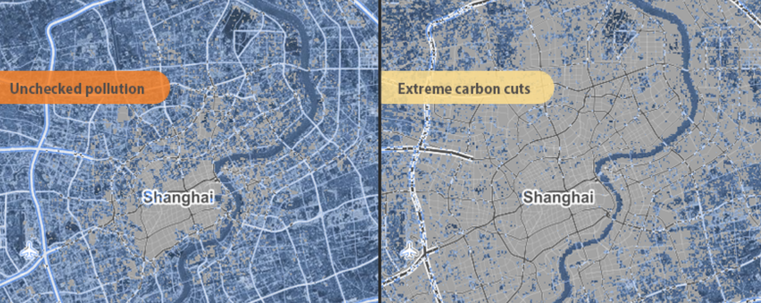
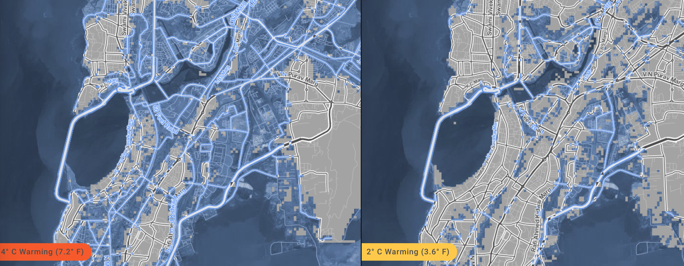
For the variety of potential consequences of disastrous scenarios of sea-level rise posed can be readily compared with surprisingly effective and accurate degrees of precision, in maps that illustrate the depths at which specific regions stand to be submerged underwater should sea-level rise continue or accelerate:  zooming into neighborhoods one knows, or cities with which one is familiar, the rapid alteration of two to seven feet in sea-level can be imagined–as can the fates of the some 5 million people worldwide who live less than four feet above sea-level.  For if the shores have long been among the most crowded and popular sites of human habitation–from New York to London to Hong Kong to Mumbai to Jakarta to Venice–the increasing rapidity of polar melting due to climate change stands to produce up to a seven feet rise in sea-level if current rates of carbon emissions, and a mere four degree centigrade rise in global temperature stands to put the homes of over 450 million underwater, which even the most aggressive cutting in carbon emissions might lower to only 130 million, if rates of warming are limited to but 2°C.   (If things continues as they stand, the homes of some 145 million who currently dwell on land in China alone are threatened with inundation.)

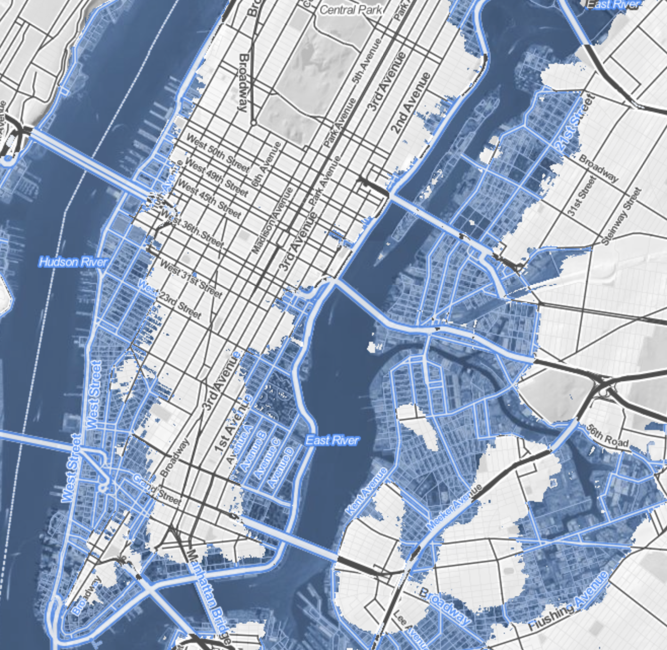
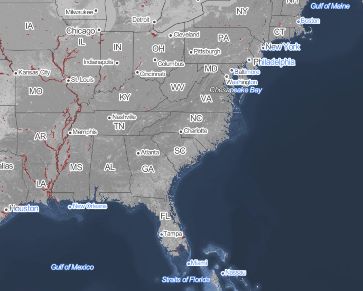
The recent review of the disastrous consequences of a rise of two degrees Centigrade on the land-sea boundary of the United States led Climate Central to plot the effects of a-level rise of at least 20 feet on the country–and foreground those regions that were most at risk.   The webmap serves as something like a window into the possible futures of climate change, whose slider allows us to create elevations in sea-level that the ongoing melting of the polar ice-cap seems poised to create.  As much as offer compare and contrast catastrophes, the immediacy of recognizing the degree to which places of particular familiarity may soon stand to lie underwater performs a neat trick: for whereas a map might be said to bring closer the regions from which one is spatially removed or stands apart, making present the far-off by allowing one to navigate its spatial disposition in systematic fashion, the opacity of those light blue layers of rising seas obscures and subtracts potentially once-familiar site of settlement, effectively removing land from one’s ken as it is subtracted from the content of the map, and charting land losses as much as allowing its observation.

The result is dependably eery.  The encroachment of the oceans consequent to rising sea-level propose a future worthy of disaster films.  But the risks can be viewed in a more measured ways in the maps of sea-level on the shores of the United States calculated and mapped by Stamen design in the Surging Seas project that allows us to imagine different scenarios of sea-level rise on actual neighborhoods–the set of interactive maps, now aptly retitled Mapping Choices, will not only cause us to rethink different scenarios of shifting shorelines by revisiting our favorite low-lying regions, or allow us to create our own videos of Google Earth Flyovers of different areas of the world.  Mapping Choices provides a way to view the risks and vulnerabilities to climate change made particularly graphic in centers of population particularly low-lying, where they testify to the clarity with which web maps can create a vision of imagined experience as we imagine the actual losses that global warming is poised to create.  And although the recent expansion of the map to a global research report, allowing us to examine possible global futures that are otherwise difficult to comprehend or process the potential risks posed by the inundation of low-lying inhabited regions for a stretch of thirty meters, the potential risk of inundation is perhaps most metaphorically powerful for that region that one best knows, where the efficacy of a simple side-by-side juxtaposition of alternate potential realities has the unexpected effect of hitting one in one’s gut:  for debates about the possibilities of climate change suddenly gain a specificity that command a level of attention one can only wonder why one never before confronted as an actual reality.

Alternate Scenarios

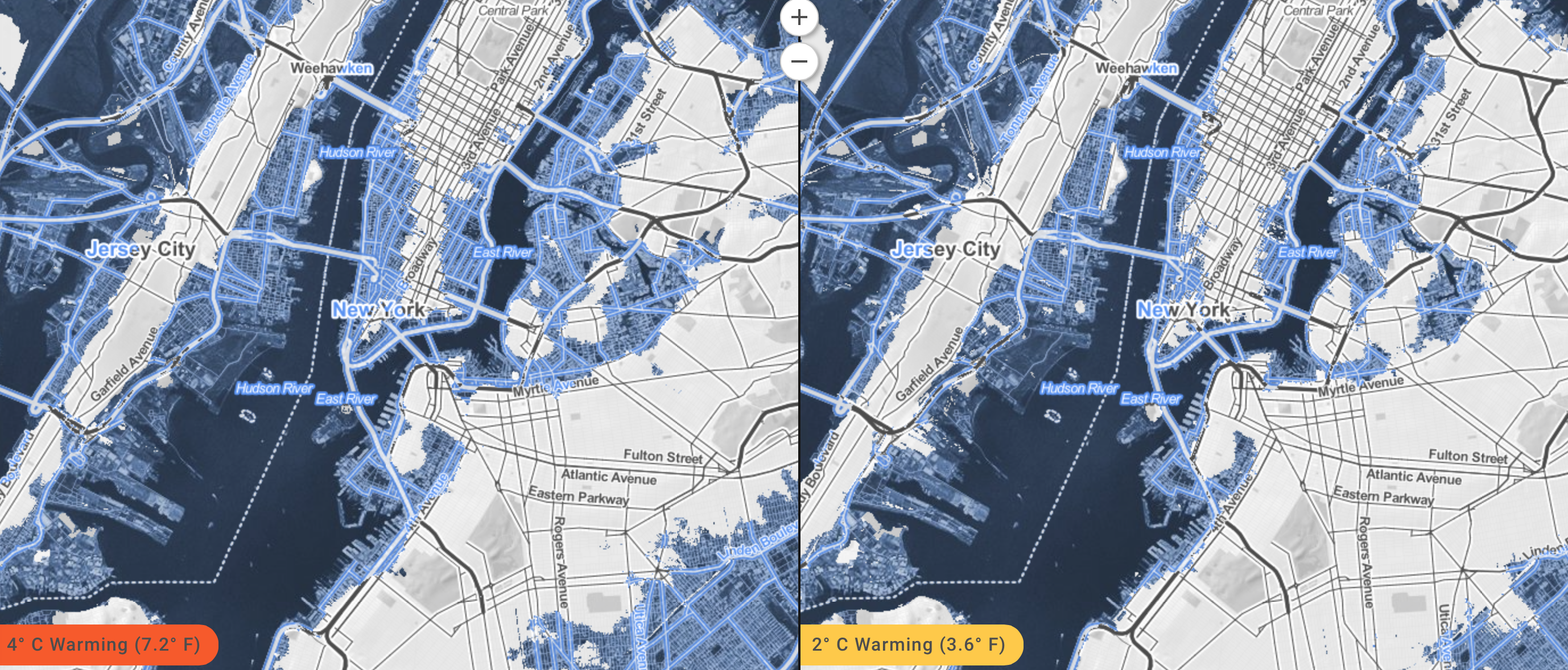
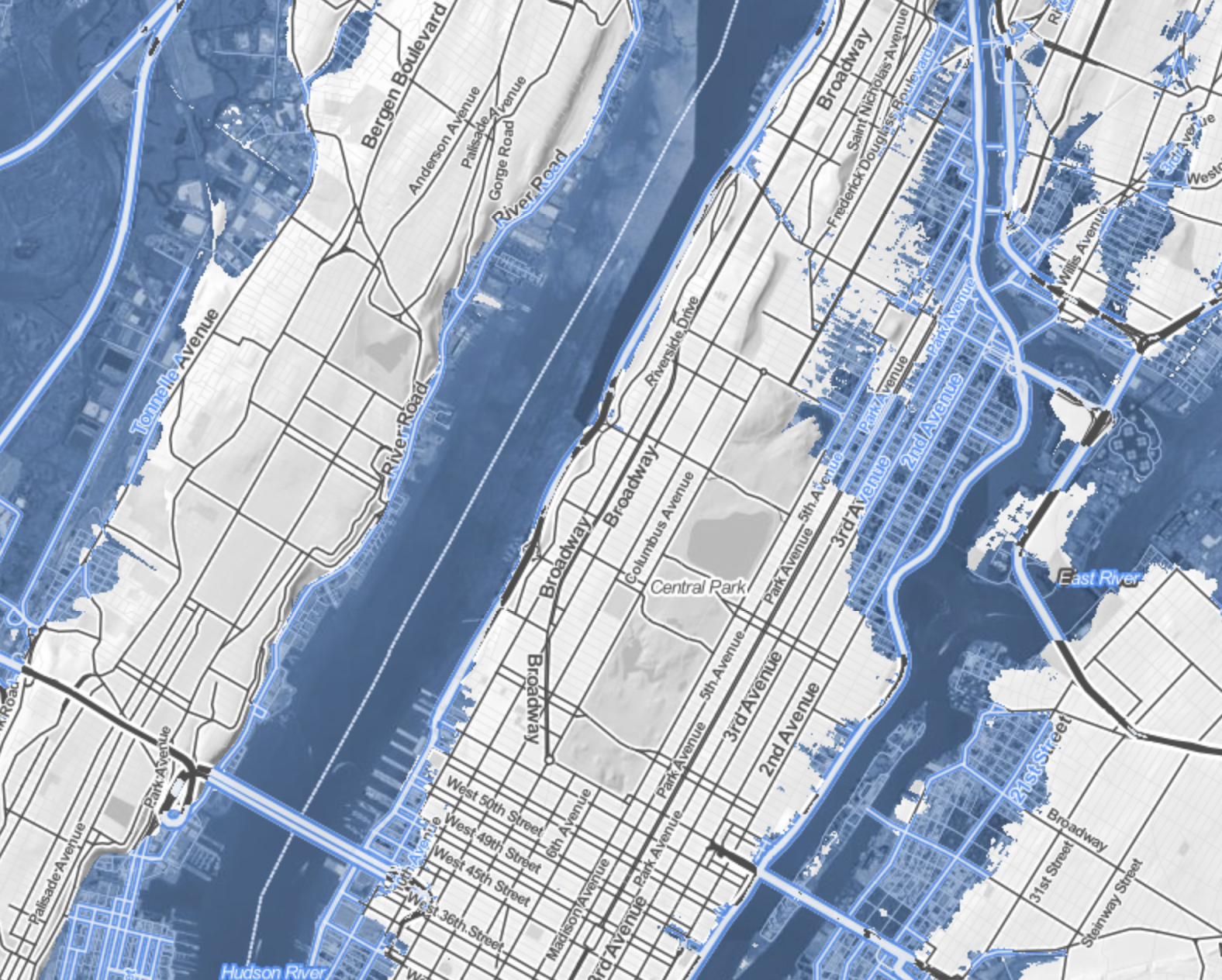
Maps are rarely seen as surrogates for observation, and web maps often offer something like a set of directions, or way finding tools.  But the predicted scenarios of sea-levle rise allows one to grasp the local levels of inundation with a specificity that allow risk to be seen in terms of actual buildings–block by block–and wrestle with the risks that climate change portends.  The lack of defenses of populations in many regions are definitely also at great risk, but to envision the loss of property and known space seems oddly more affecting in such an iconic map of Manhattan–and somewhat more poetic as an illustration of the fungibility of its hypertrophied real estate and property values.

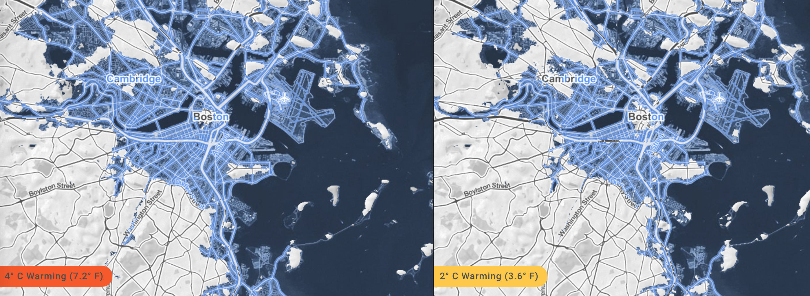
Of course, the data of Climate Change allows a terrifying view of the future of four degrees centigrade warming on low-lying Boston and the shores of the Charles, as the city is reduced to a rump of an archipelago–

Boston

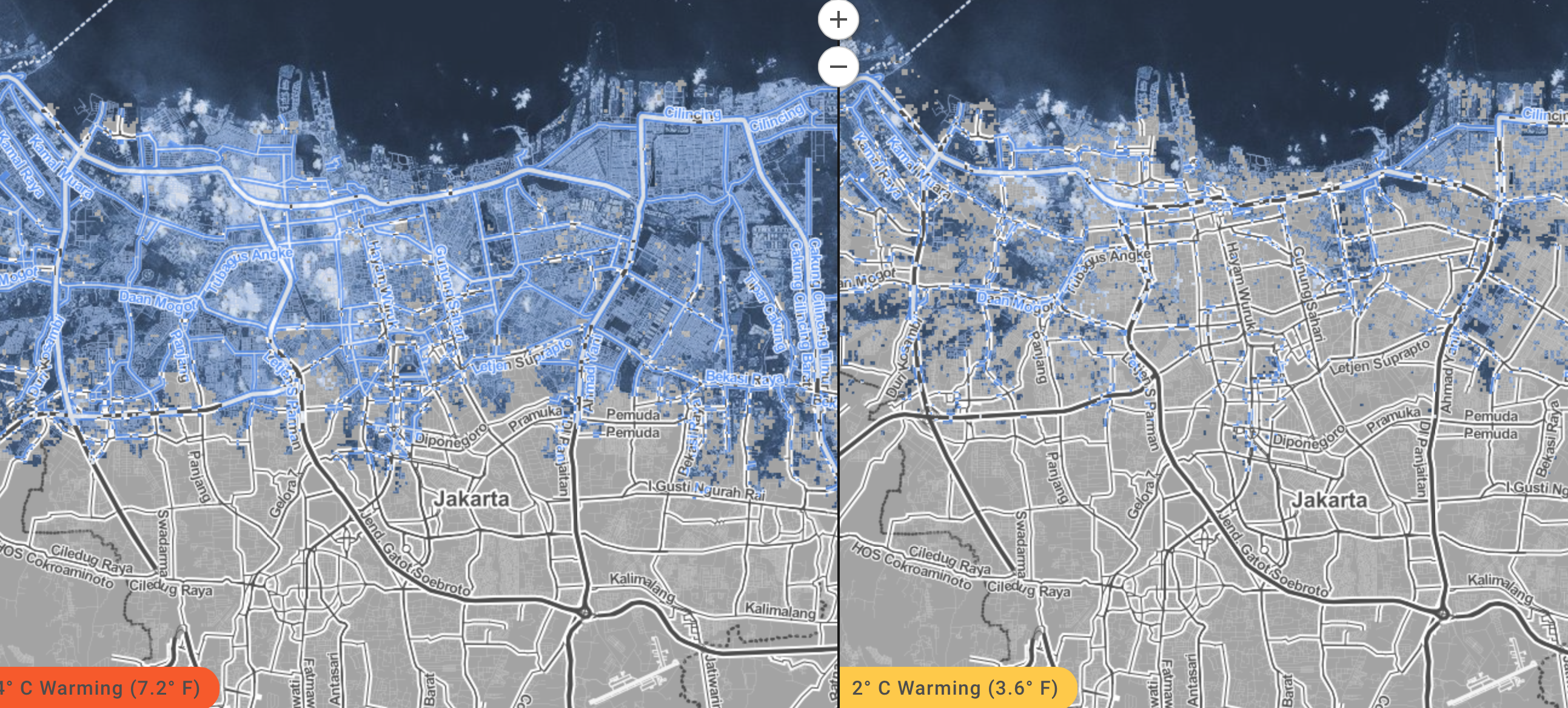
or the disastrous scenarios for the populations in the lower lying areas of Jakarta–

Jakarta

or, indeed, in Mumbai–

Mumbai

Viewers are encouraged to imagine the risks of the possible alternate futures of just two degrees with an immediacy that worms into one’s mind.  The possibilities that GPS offers of instantaneous calculations of shoreline position and elevations allow one to view a potential reality where one can focus on individual streets with inspirational urgency.

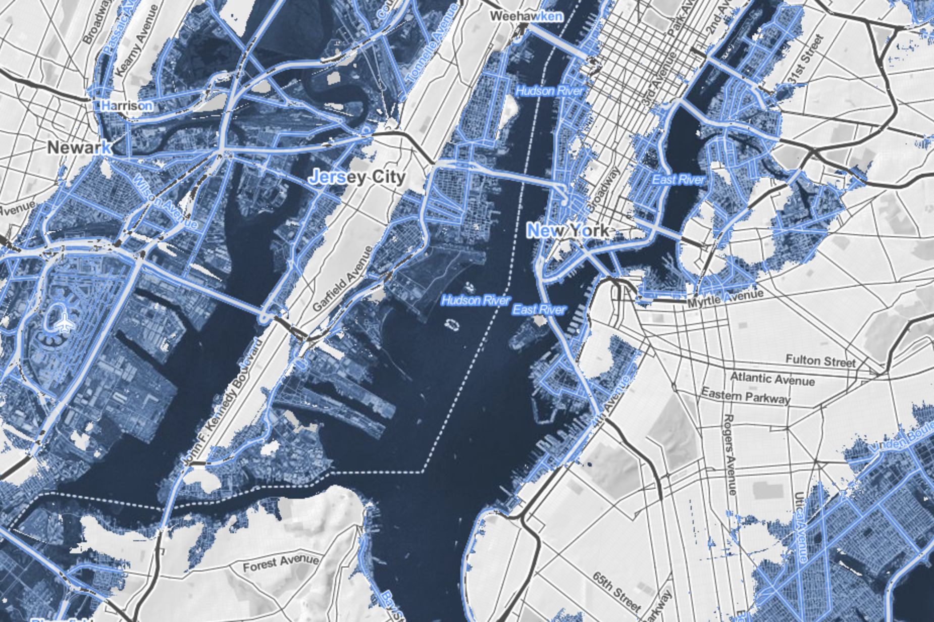
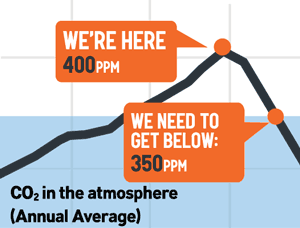
But such scenarios seem somehow particularly graphic illustrations of risk for those regions where there has been a huge investment of human capital, as New York City, where it might seem credible enough to be mapped that they are poised to melt not into air but vanish beneath ocean waves.  For if Marx predicted with spirited apocalypticism at the very start of the Communist Manifesto that capitalism would destroy value to money as it expanded into future markets, as market forces abstracted all things into money–and “all that is solid melts into air”–the twentieth-century expansion of possibilities of environmental and human destruction have lent unprecedented urgency.  While for Marx the metaphor of melting of inherent value was the product of the capitalist system, the capitalist system bodes a strikingly similar image of sinking into the seas.  For huge expanses of the old industrial city–the piers and the old manufacturing zones, most all of the Jersey shore and area around Newark, Long Island City and the Gowanus canal seem sink apart from the shoreline in the future New York that Surging Seas creates, in ways that seem the consequence of industrial production and carbon surging far beyond 400 parts per million (ppm), with the addition of some 2 ppm per year, in ways that make it a challenge to return to the levels deemed healthy–let alone the levels of 275 ppm which the planet long held through the mid-eighteenth century.

That drought, hurricanes, disappearance of arctic ice (up to 80% in summertime) and rising sea levels are tied to the growth of greenhouse gasses hint how global capital might be closely linked to the sinking into the seas, and suggest the surpassing of a tipping point of climate change that is the counterpart to melting into air might be viewed, in New York City’s economic geography, as if to offer a poetic reflection of the migration of capital into the financial centers of the city downtown from its piers or areas of industry–

NY:NJ

–although half-hearted joking references to Marxist maxims (or geographers) is hardly the topic of this post, and the island of high finance that would be created in downtown Manhattan would hardly have ever been planned as an island.

Lower Manhattan Island?

What one might someday see as the lopping off of much of lower Manhattan might be far better tied to the runaway markets of a free-trade economy, rather than rational planning, and has no clear correspondence to property values.

lopped off lower Manhattan

Indeed, the mapping of the prospective loss of those residential parts of the city “where poor people dwell” (as do minorities) is undeniable, if one looks at the 2010 American Community Survey, regarding either in the city’s distribution of ethnic groups or households earning below $30,000, who remain the most vulnerable to the danger of rising ocean levels.

ACS 2005?

Income under 30,000
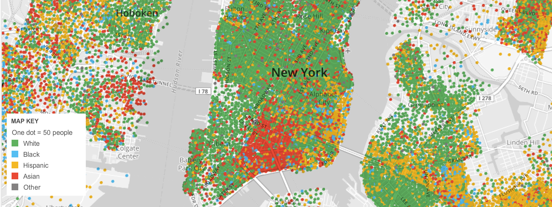
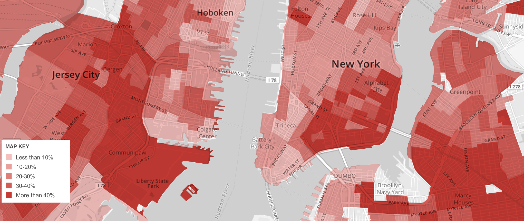
American Community Survey (2010)/New York Times

But the disappearance of the Eastern Parkway and the Jersey shore are a blunt reminder of the extreme vulnerability of the built environment that lies close to sea-level–

Eastern Parkway and Atlantic Avenue above the seas

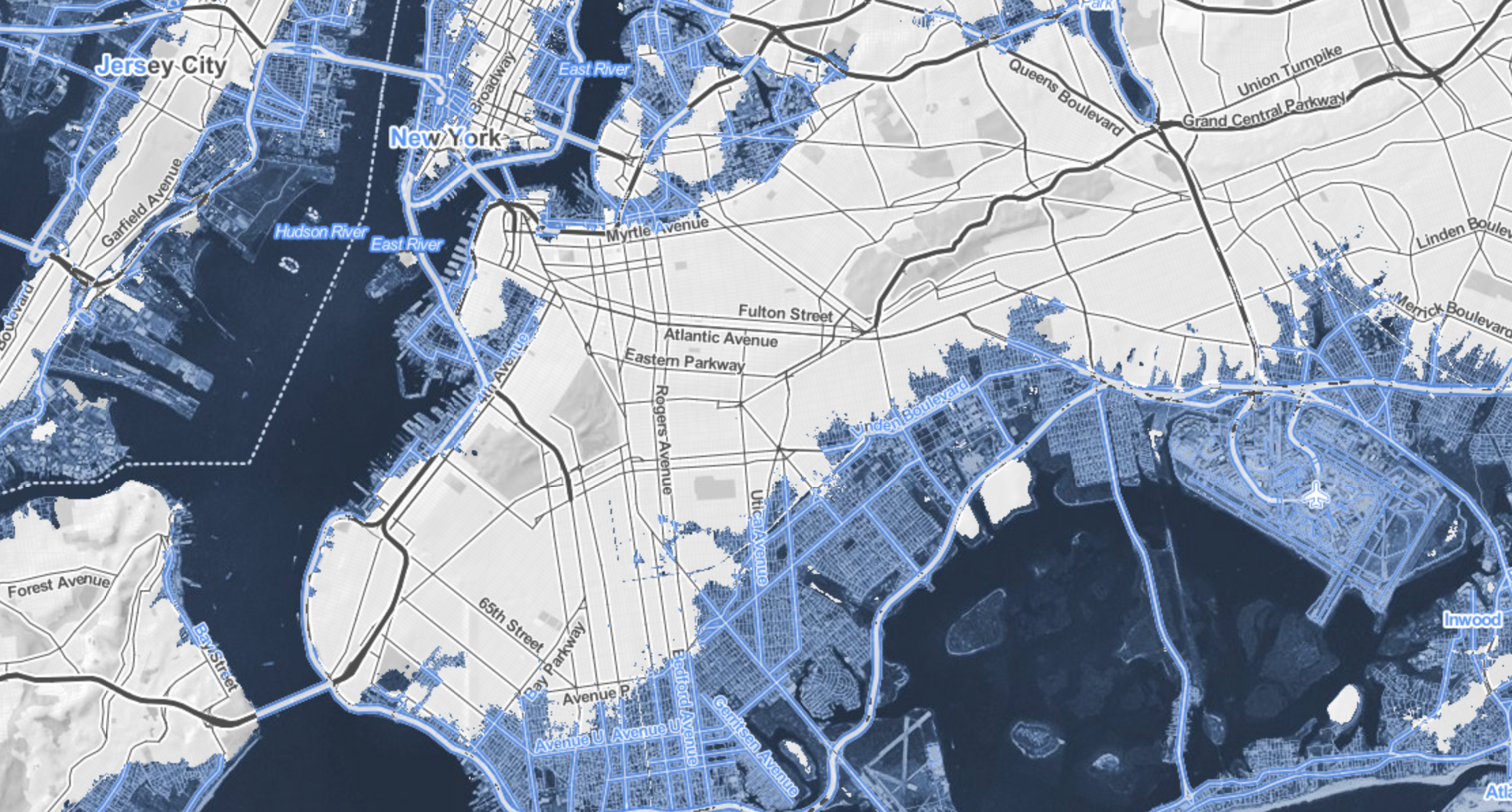
–and an actually not-too-apocalyptic reminder, but the mapping of consequences of man-made change that goes under the rubric of anthropocene, and is most apparent in the increasing quotient of carbon dioxide in the atmosphere and the warming that this may bring.  For if it has been approximated that there has already been a rise of sea-levels by some eight inches since 1880, the unprecedented acceleration of that rate, which will increase the dangers of floods from storms and place many of the some three thousand coastal towns at risk, are likely to increase as the sea level may rise from two to over seven feet during the new century.

350ppm-chart-300_fixed

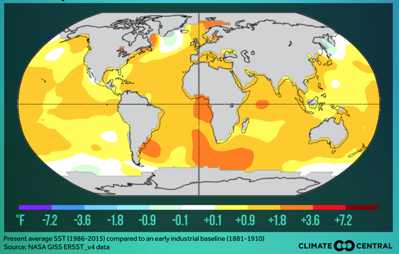
The distribution is by no means uniform, and more industrialized countries, like the United States, are producing far more particulate matter, although they have been recently overtaken by China from 2007, and have atmospheres above 380 ppm in the Spring, making them more responsible for rendering higher temperatures–although the lower-lying lands below the equator may be most vulnerable to the consequences of climate change.

Screen Shot 2015-07-13 at 8.20.11 PM

Screen Shot 2015-07-13 at 8.21.44 PMScreen Shot 2015-07-13 at 8.22.35 PM
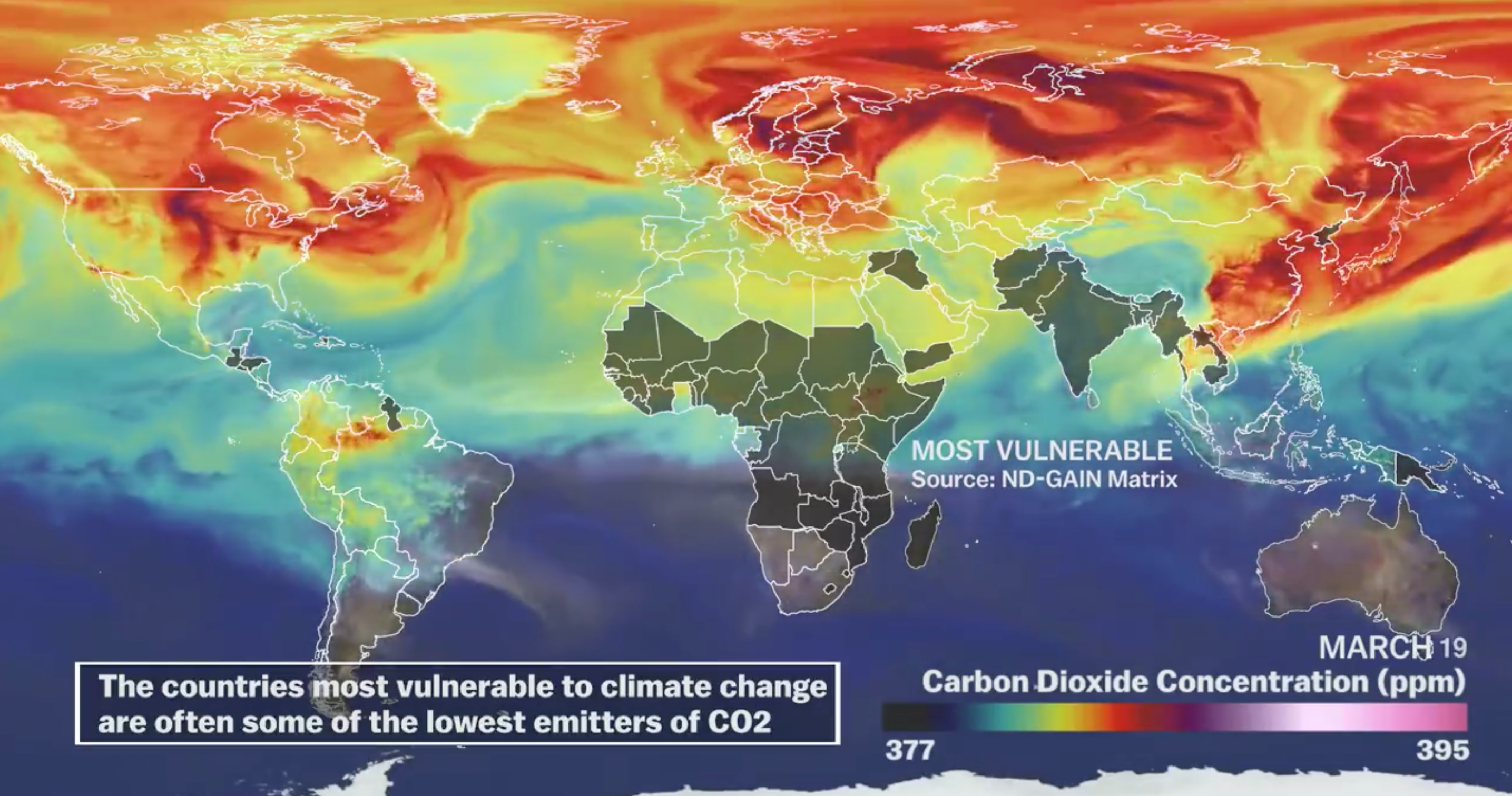
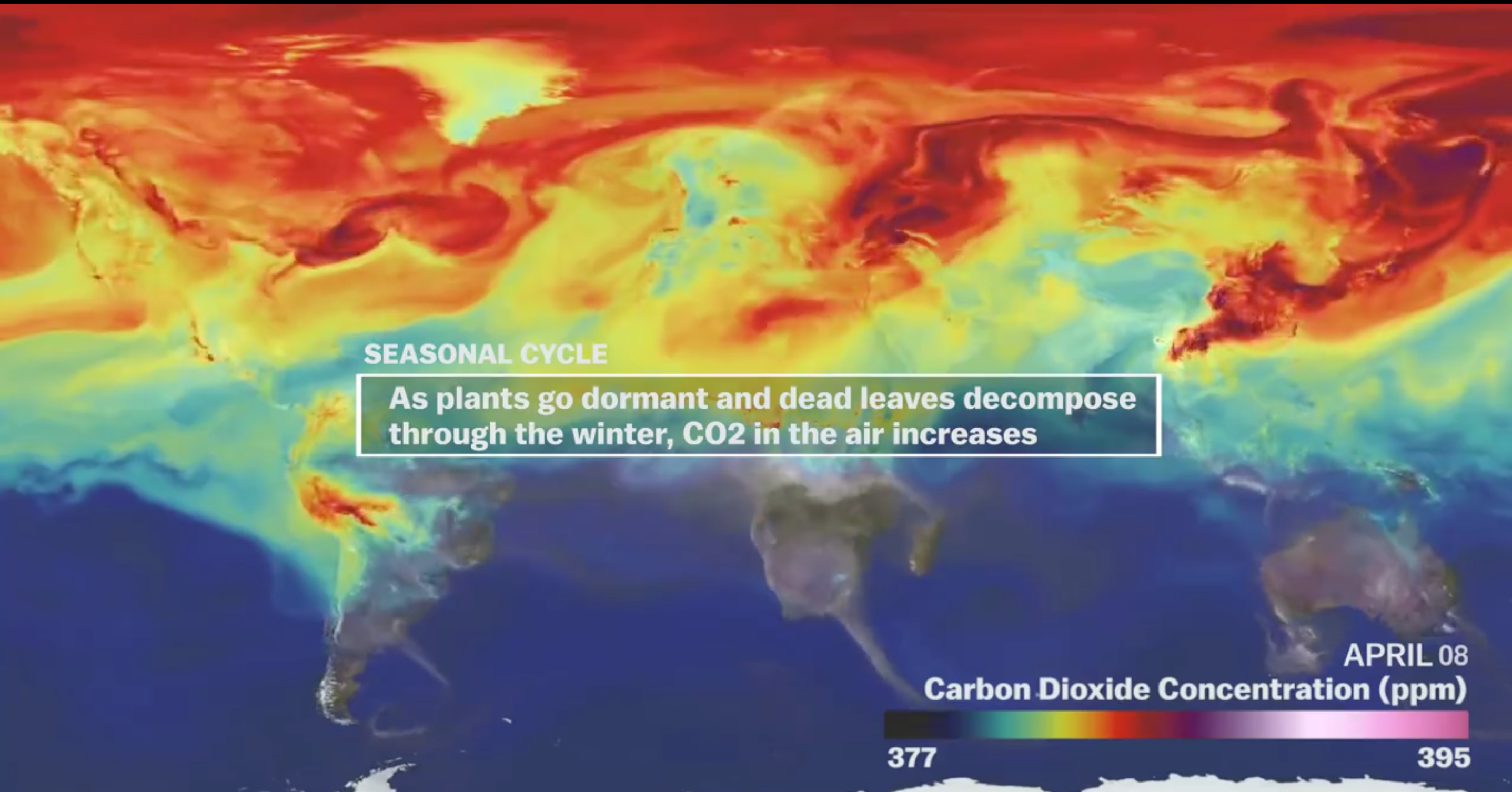
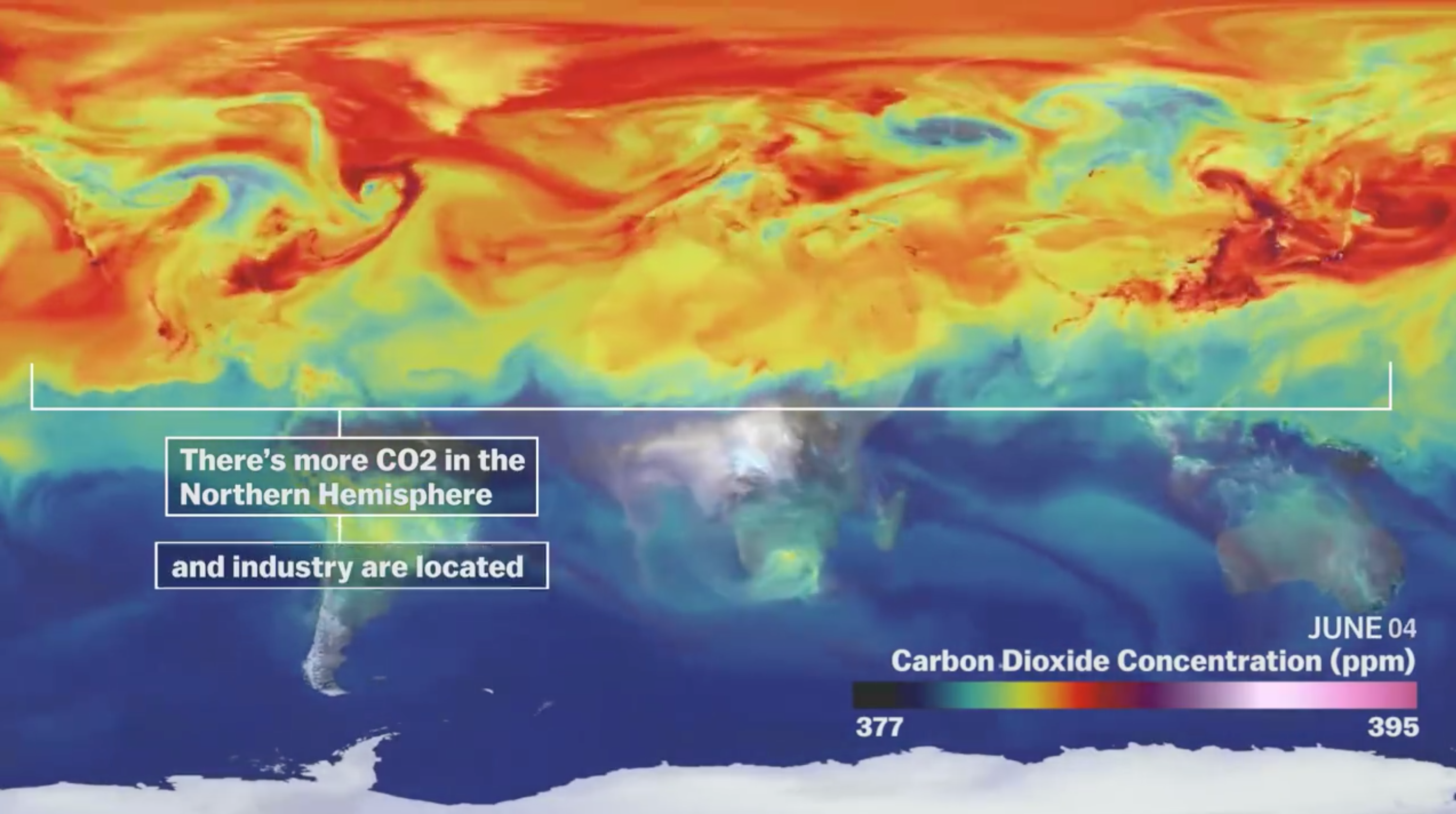
Vox– A visual tour of the world’s CO2 emissions

The increasing levels of particulate matter are attempted to be more locally mapped in Surging Seas.

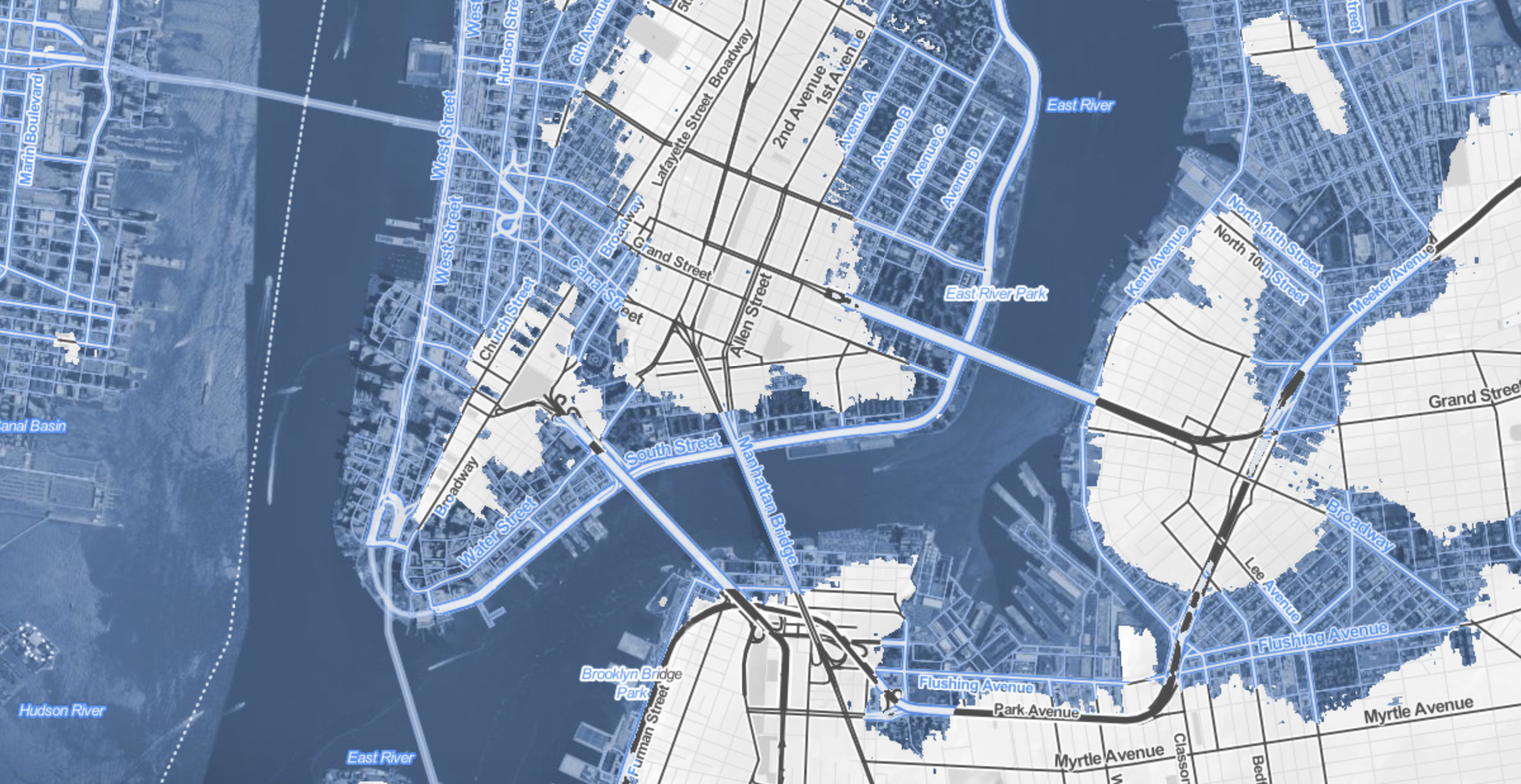
The changes extend, in a nice dramatic detail, into the Central Park Meer rejoining the East River with the predicted inundation of much of the posh residential area of Manhattan’s East Side, all the way to Fifth Avenue.

Truncated NJ and absent upper East side

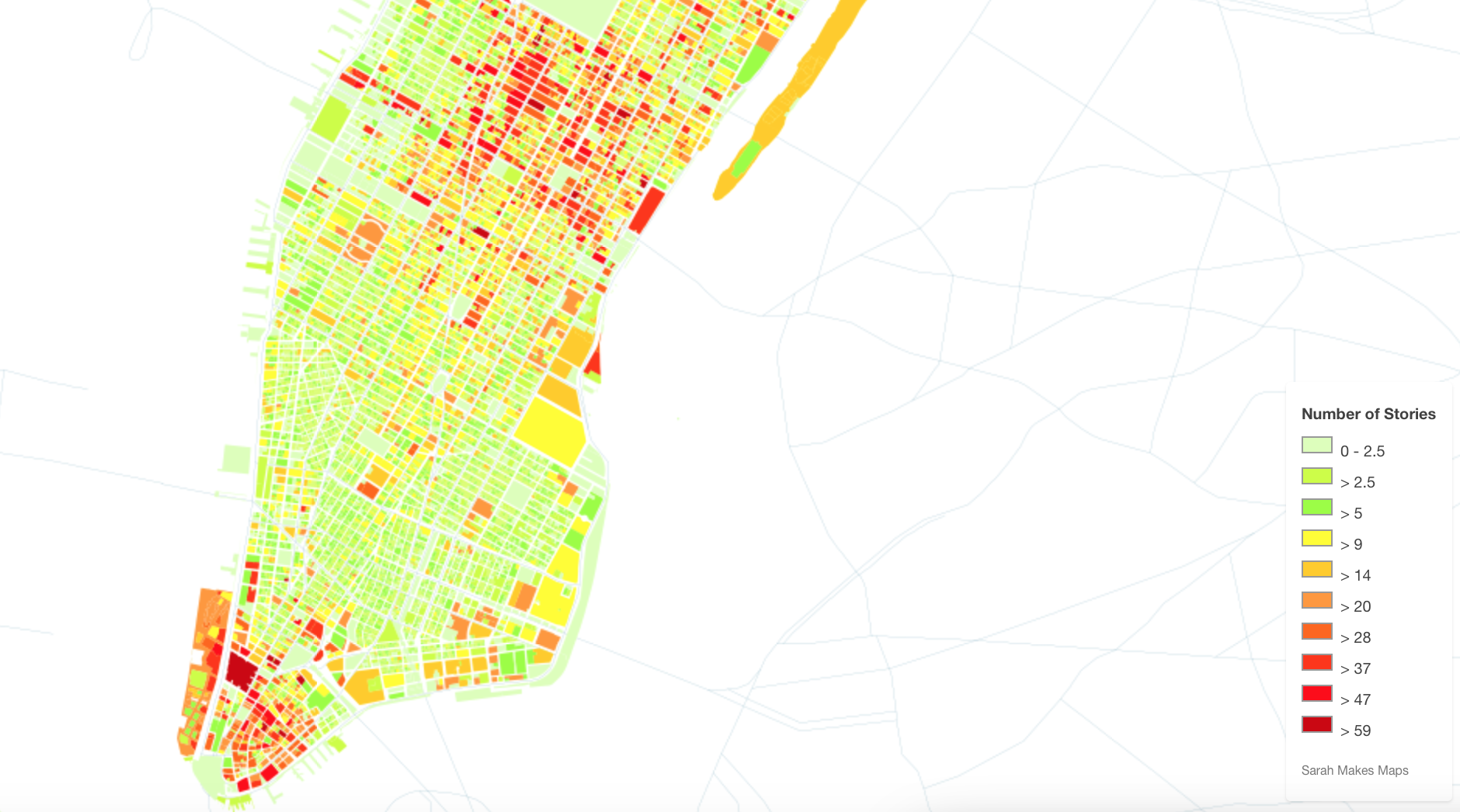
It is difficult not to compare the scenarios sketched in Surging Seas maps to some of the maps of those future islands of New York that Map Box and others allowed Sarah Levine to create maps of the heights of buildings from open data after the pioneering maps of Bill Rankin’s 2006 “Building Heights.”   When Rankin remapped Manhattan by taking building height as an indirect index of land value, he saw the island as clustered in distinct islands of elevation above 600 feet:

manhattan-heights

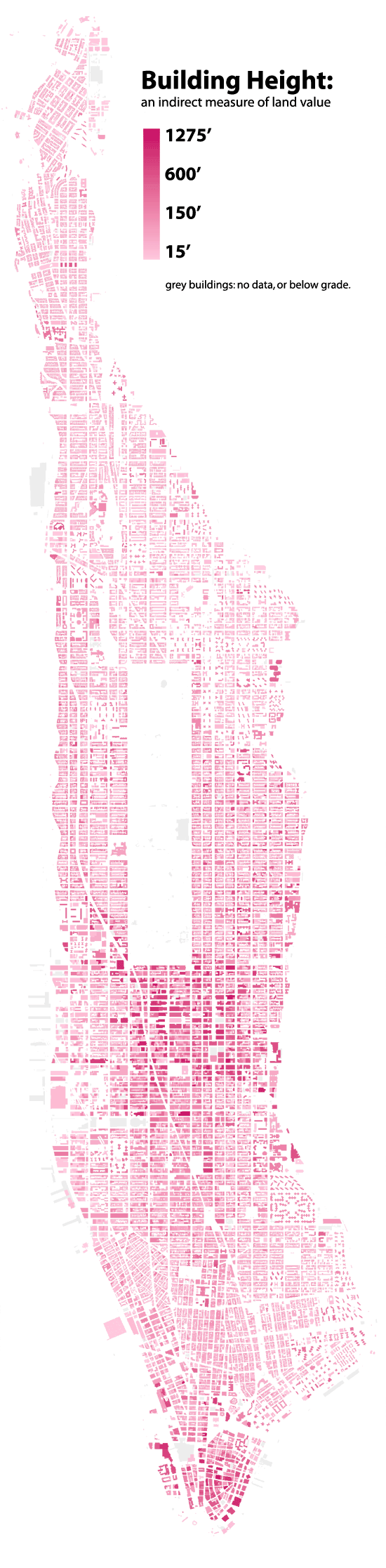
Radical Cartography (2006)

Levine used similar data to chart the fruits of Mammon in buildings above sixty stories.  Maps of skyscrapers beside the gloom of Surging Seas suggest those towers able to withstand the rising seas brought by global temperatures jumping by just two degrees Centigrade.  If one moves from the map of the bulk of lowest sections of lower Manhattan–

Two Inches in Lower Manhattan

with reference to Levine’s brilliantly colored carmine mapping of the highest buildings in the Big Apple, above forty-seven or fifty-nine stories, which one imagines might provide the best vantage points that rise above the rising waves, especially when located on the island’s shores.

Mapping NYC by Sarah

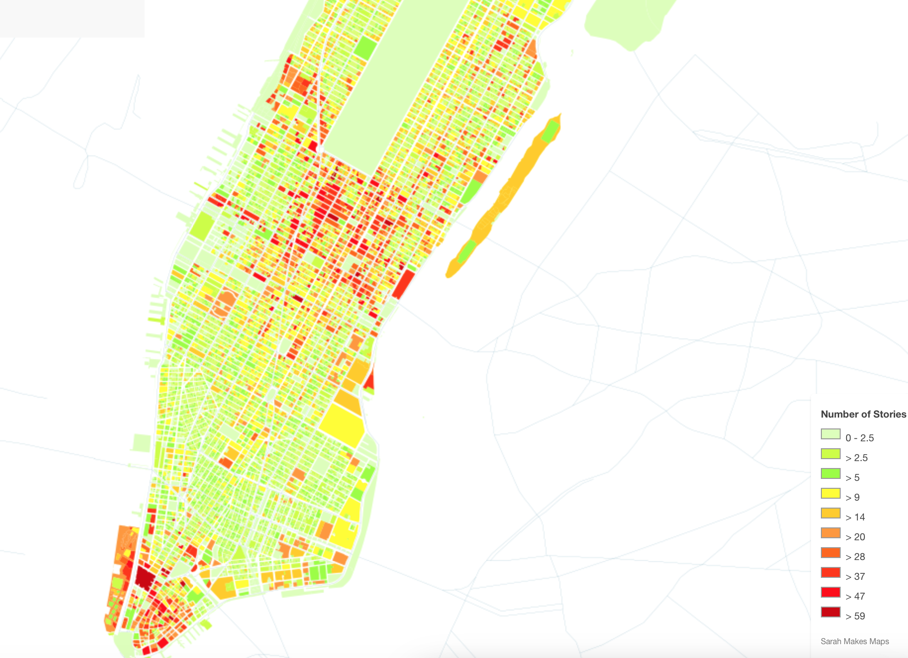
Sarah Levine Maps Manhattan

There’s a mashup begging to be made, in which the tallest buildings of over fifty stories at the tip of the island peak up above the cresting waves, and the rump of buildings in lower Manhattan offer contrasting vistas of the city’s contracting shores.  The buildings that create the canyons of urban life, the buildings of elevation surpassing sixty stories might suggest the true islands of Manhattan’s future, as much as the points that punctuate its skyline.

Sarah's Lower Manhattan

The realization of this possible apocalypse of property made present in these maps offer the ability to visit impending disasters that await our shorelines and coasts, and imagine the consuming of property long considered the most valuable on the shore–as rising seas threaten to render a whispy shoreline of the past, lying under some six meters of rising seas.  The prospect of this curtailing of the ecumene, if it would bring an expansion of our nation’s estuaries, presents an image of the shrinking of the shores that suggests, with the authority of a map, just how far underwater we soon stand to be.

Eastern USA
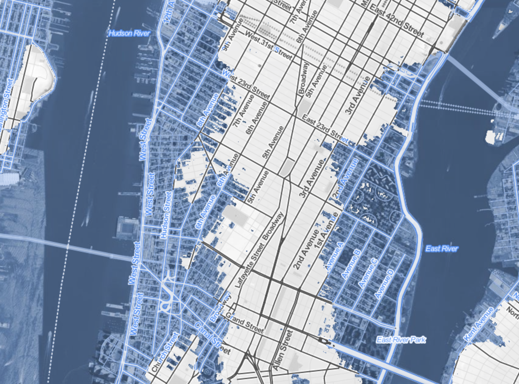
Surging Seas: sea level rise after 2 degrees centigrade warming

All actual maps, including Levine’s, provide authoritative reporting of accurate measures with a promise of minimal distortions.  But visualizations such Surging Seas offer frightening windows into a future not yet arrived, using spatial modeling to predict the effects of a rise in sea-level of just five feet, and the potentially disastrous scale such a limited sea-level change would bring:  the coasts are accurate, but their inundation is a conservative guess, on the lower spectrum of possibilities.  For in a country in which 2.6 million homes are less than four feet above current sea-levels, the spectral outlines of chilly blue former coastlines peak at a future world are still terrifying and seem all too possible, as much as potential cautionary tale.  The concretization of likely scenarios of climate change remind us that however much we really don’t want to get there, how potentially destructive the possibility of a several degree rise in ocean temperatures would be.

Leave a comment

Filed under Climate Change, coastal flooding, data visualization, global warming