Category Archives: data visualizations

Florida Tweets

Can we believe anything from the office of Governor Ron DeSantis? It was the height of irresponsibility, but one that should make Jack Dorsey breathe a sigh of relief that at last he is no longer responsible for Twitter: the Florida Secretary of State used bad data about the rates of COVID infection around the nation to trumpet the peninsula as a vacation land as a safe space in the pandemic, using an utter absence of ethics to promote disinformation about viral spread in the peninsula that almost echoed the denialism Governor DeSantis long promoted in bashing vaccines, masking, or market constraints as a way of combatting viral spread, even if his assertion ran against established ideas of contagious disease and viral transmission. Florida is facing numerous existential threats, from sea-level rise to saltwater flooding of coastal areas, but promotion of the state as a site of safety from the global pandemic was the height of duplicity.

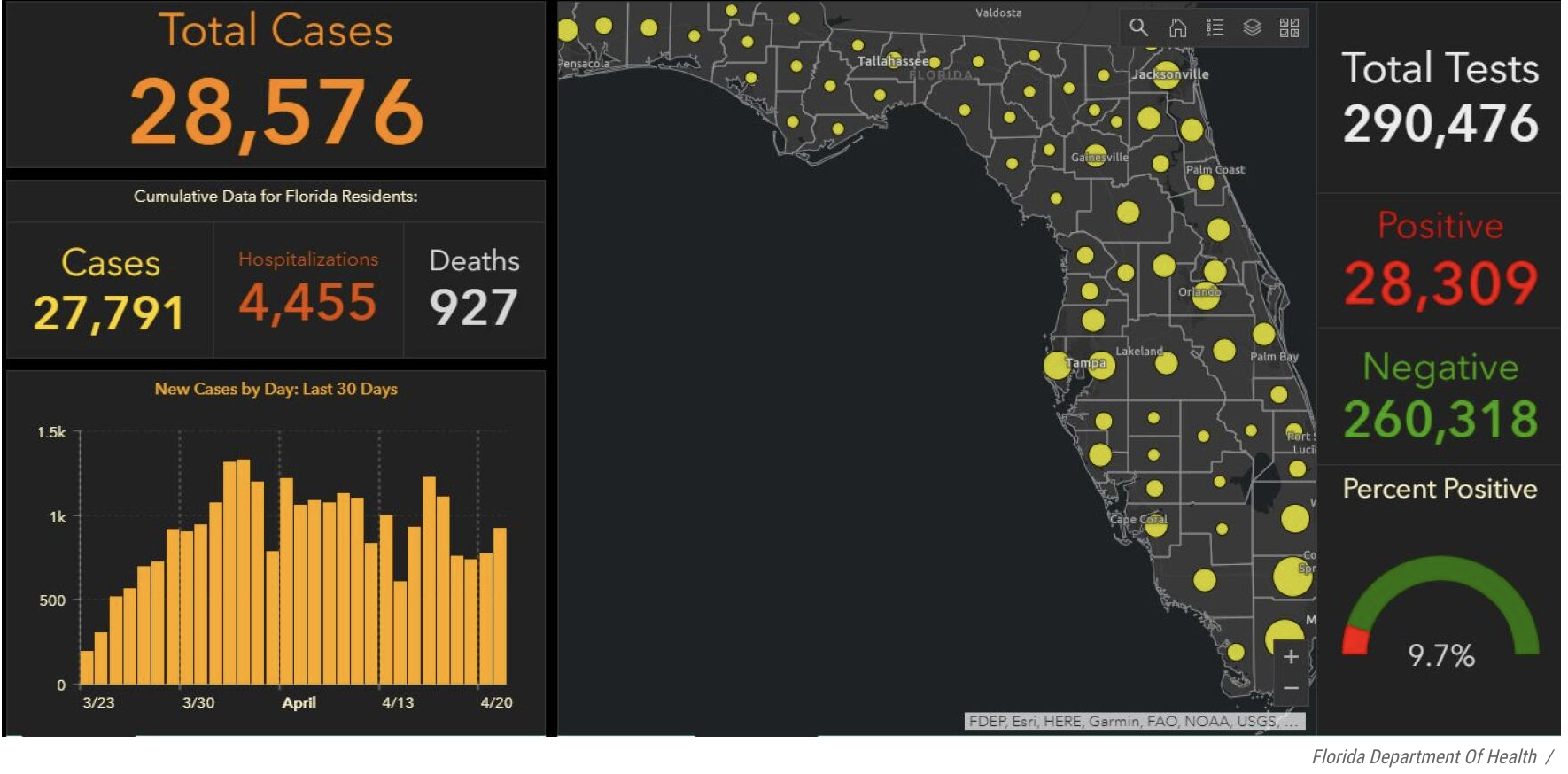
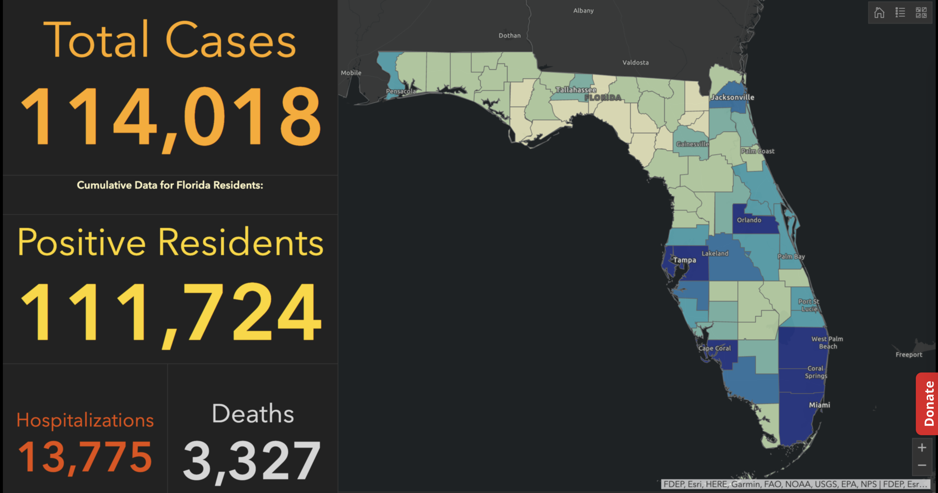
Exercising the prerogative DeSantis long claimed to guard the health practices of Florida, apart from the nation, his office and press secretary must have been thrilled at the latest pre-Thanksgiving COVID data vis that the issued by the CDC, that showed Florida as lying apart form the nation in a bucolic preserve of blue of low coronavirus transmission rates. The announcement by Florida’s Dept. of Public Health on June 8, 2020 of the first twelve deaths due to COVID-19 in the state of Florida 0, when just over 63,000 were testing positive in the state, led the DoH to promise to “provide more comprehensive data,” releasing daily reports on COVID-19 cases in Florida on the DOH COVID-19 dashboard is also providing updates once per day for every Florida county, “available here,” of new positive cases, that state residents and the nation watched rise. If folks had become habituated to dashboards as a way of accessing up-to-date data on viral transmission and public health, the tweeting out of a map that integrated outdated data on infections in Florida with shifting national picture as even as the arrival in the United States of an Omicron variant put a chill on national travel over the Thanksgiving weekend, but year-end travel was predicted to see a rise in air-travel that would approach pre-pandemic days.

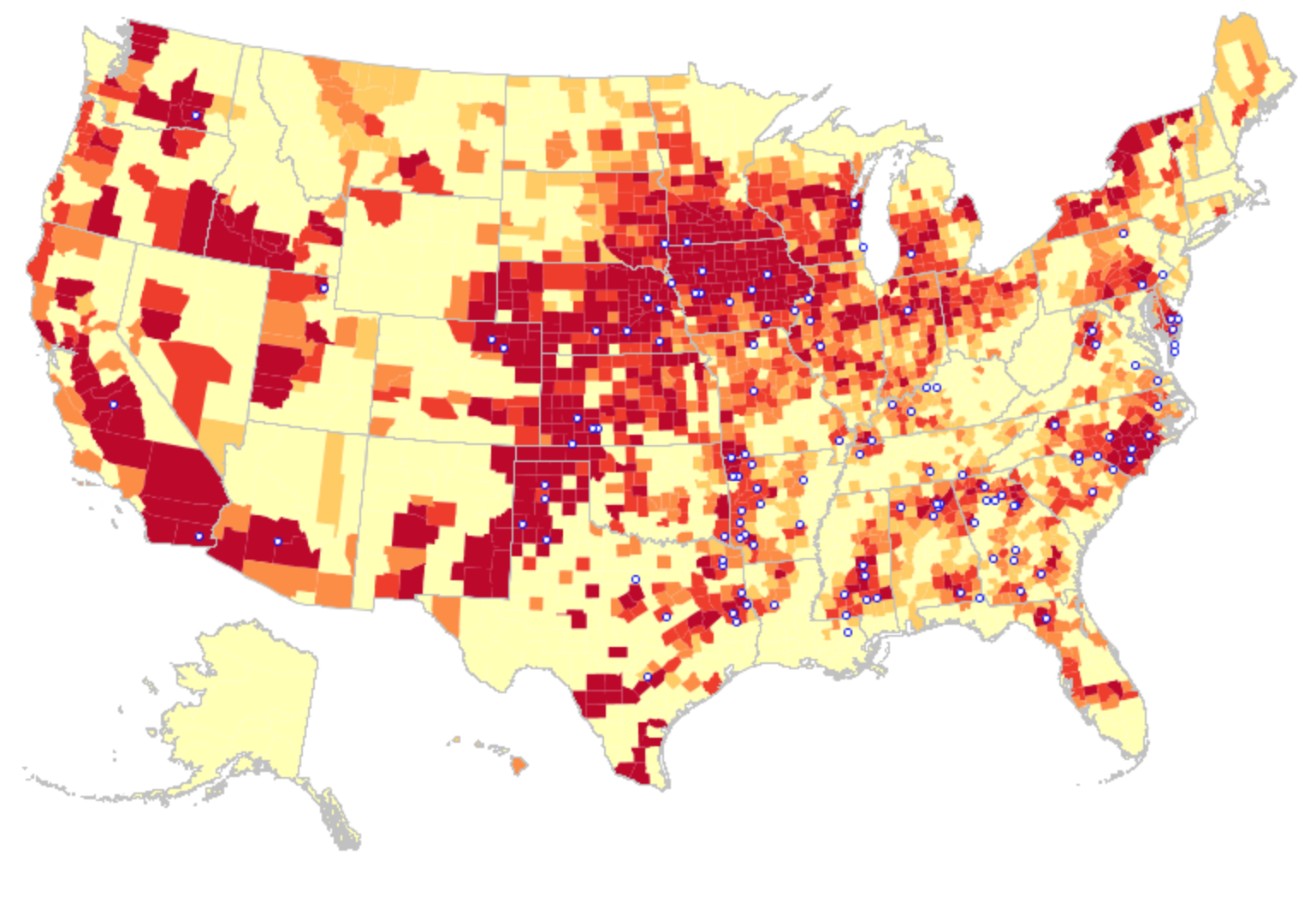
The Age of COVID has encouraged an amplification of graphic story-telling about the hot spots and safe spots of viral transmission or local virulence. And the infographic appearing to label Florida, the nation’s storied vacationland, as featuring far lower community transmission seemed ripe for a retweet. Caroline Pushaw, Florida Governor’s social media savvy press secretary, seems to have issued it as an invitation to the state’s winter beaches, as if Florida policies had, despite anti-vaccination campaigns and few masking mandates, gone beyond other states in reversing the high rates of COVID-19 mortality that once afflicted the state per public dashboards of years past.

COVID-19 RIsk Rate/Harvard Global Public Health/Talus Analytics
July 2020

Gov. DeSantis was a huge denier of the infectious nature of the virus, even resisting Trump’s own calls for Americans to stay at home when possible to contain virtual spread, arguing that imposing any “lockdown” and “shutting down the country” was an excessive response. DeSantis’ prominent place in Trump’s inner circle of response to the pandemic increased his profile in the COVID response, and inflated his own sense of national responsibility, as well as causing his pro-business policies to shift in March 2020 by closing Florida schools in the end.

The national map of community transmission rates attempted to bolster Gov. DeSantis’ national credibility. The arrival of the Omicron variant, boasting over three times as many mutations as the delta variant, became an opportunity to boost perceptions of Gov. DeSantis’ public health creds. Despite the Governor’s vaccine denialism and diminishment of public health risks–and utter lack of interest in vaccine equity–low rates of transmission offered a useful icon of peninsular identity to promote the governor on the national news, from FOX to OANN, as if to suggest that “as winter approaches,” Florida was doing something right–as if in an invitation to the nation to make travel plans to consider visiting the sunshine state.

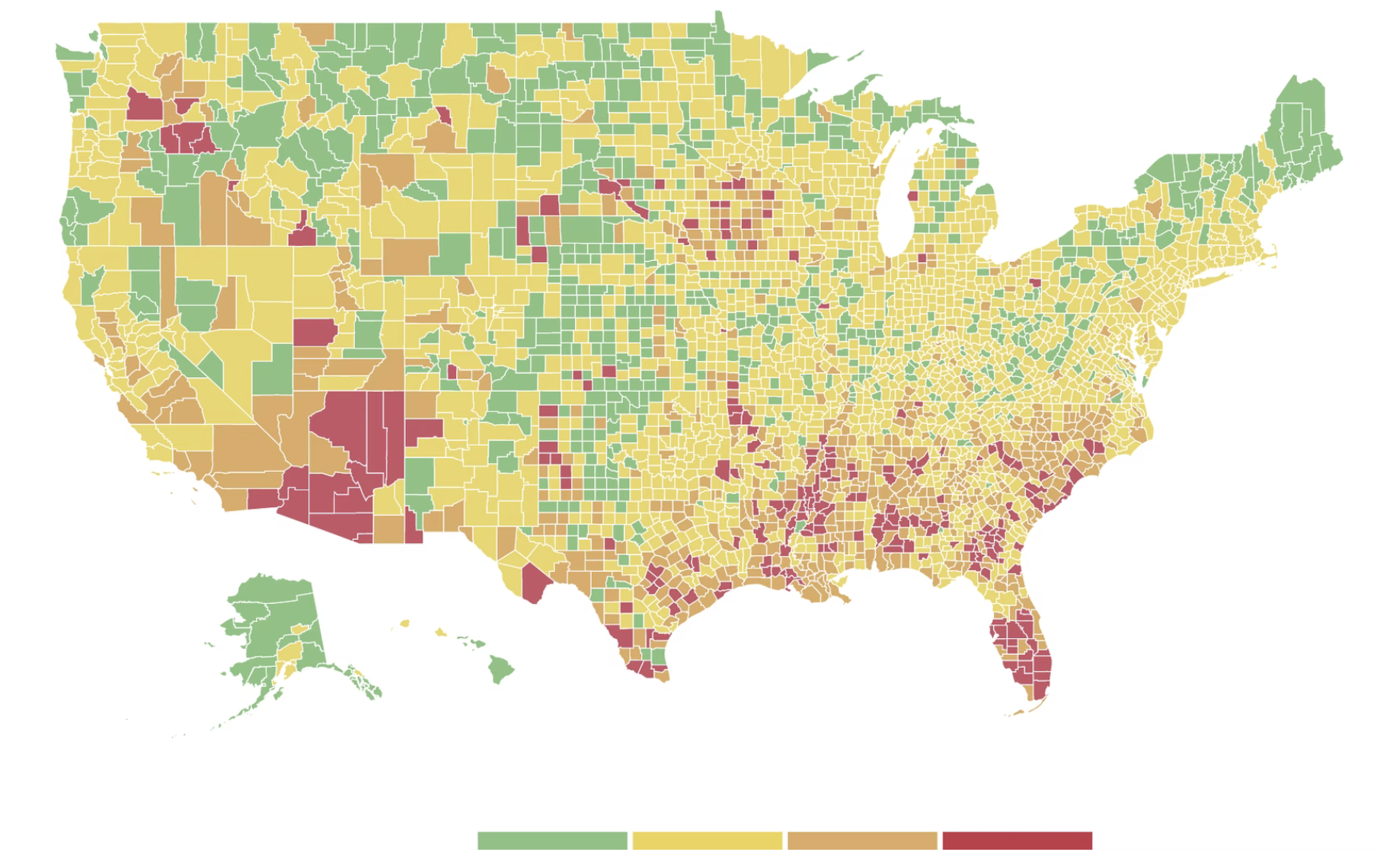
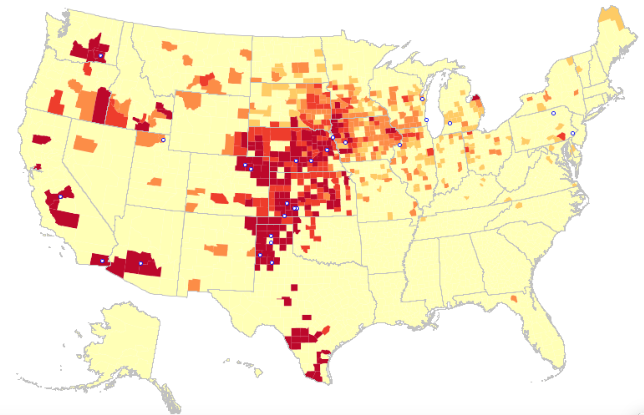
It must have been clear quite immediately to DeSantis’ press secretary, who tweeted it to her 22,000 Twitter followers as evidence of an ethically dubious ethical invitation to the Sunshine State for future travelers–per what seemed currently reported transmission levels. Strikingly, low levels of community transmission in most counties south of the Mason Dixon line would obviate the need for mask-wearing even in public after the arrival of new variants, although not the bulk of the nation, colored red for high levels of transmission that merited masking in the all counties colored red for high levels for which the CDC recommended masking in public to contain potentially very dangerous COVID-19 transmission in the form of new variants.

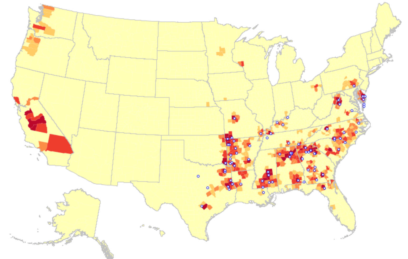
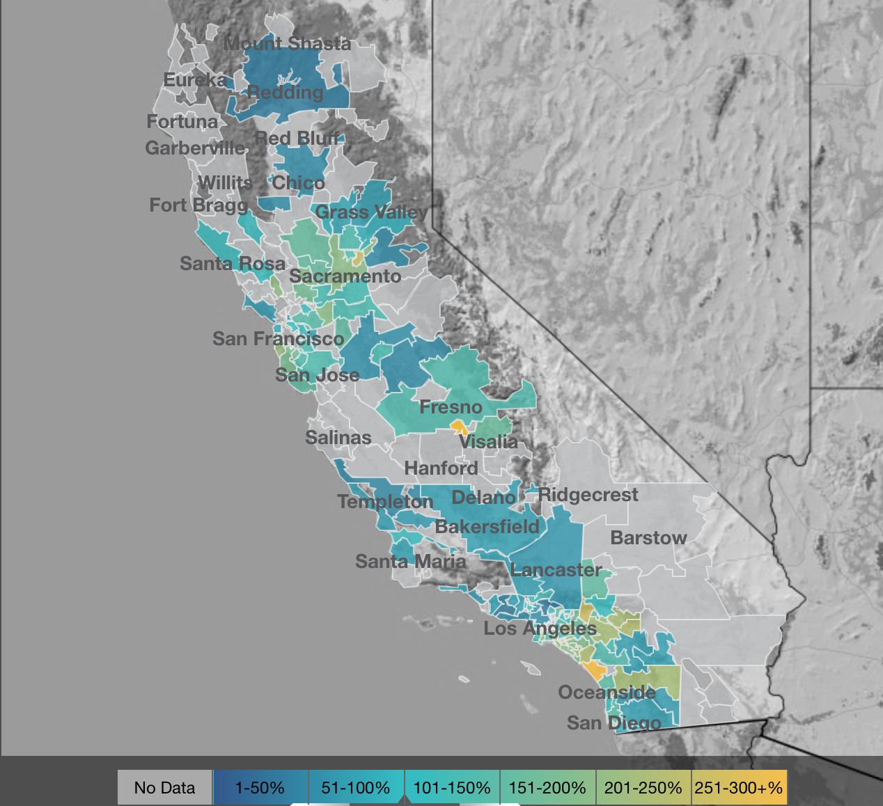
But the map “lacked” a legend and was in many ways cherry-picked–or based on cherry-picked data, as the statistics for infections in Florida were decisively from an earlier date than the rest of the country, artificially rendering its community transmission rates low. It seemed as if the apparently real-time picture was evidence of a stark change of events that talking heads debated as if it were proof and evidence of DeSantis’ underestimated smarts in pushing back against national health policy. Yet the story is far more complicated–and far more Machiavellian–as the pristine blue image of the state–a blue aquamarine that handily recalled those beaches and sun’n’fun for which Florida was long celebrated in the national imaginary-was based on counts from a different time than the dates of cases in all other states, conveying the appearance of salubrity when that was not the case.

Did the state’s office really fudge the public data on its case rates, which it had long ceased releasing daily, using outdated numbers to showcase an apparent contrast sharply evident on state lines? The meaningful legend that might be juxtaposed with the “snapshot” that the delayed reporting of statistics of coronavirus transmission in Florida shaped might be the way that the state had in fact earlier been rocked by successive waves of coronavirus infections, a roller coaster of infections of which the state Governor, who had only recently unveiled a new image for the separate task force of the state that showcased its unique health policies, seemed oblivious, but whose bursts of new cases of infection seemed the bête noir against which DeSantis was forced to tilt in the public eye.

For in taking the emblem of an alligator fiercely guarding its territory, must have loved the data visualization that “mapped”–if deceptively–the improbable case his unique health policies not only separated Florida from national guidelines, as a paradise free from mask-wearing and vaccine mandates. It was a perfect case of how maps lie, which removed him–or his press secretary–from any liabilities, as the map gained a robust afterlife on social media, free from the constraints of real public health data or true comparison of COVID case counts.

DON'T TREAD ON FLORIDA': Ron DeSantis Promotes 'Pro-Freedom' Flag | Sean  Hannity
October 21, 2021 by @GovRonDeSantis

Modeled after the Gadsden flag, the image radiated a stubborn sense of obstinacy as the omicron variant lead to renewed fears of a new spike of coronavirus in Florida, worry that found an odd counterpoint in the map the press secretary took comfort in tweeting out. Yet by Christmas, the gift of the CDC data vis seemed not the gift that keeps on giving at all, as Omicron infections had hit the Sunshine state, proving that its barriers were hardly fixed frontiers.

Although most all Florida had been colored red for much of the summer–amidst concern for the Delta variant, and for “breakthrough” infections–and the new tracker map seemed a lucky break. As the omicron variant leading to rising fear of a new spike of coronavirus in Florida, DeSantis’s press secretary took comfort in an opportune recently issued CDC map to suggest that, low and behold, things had changed, and current COVID visualizations showed “low transmission rates distinguished the panhandle and peninsula, as if the state public health policies had in fact, contrary to recent pandemic history, been doing something right all along.

The crisp borders of low community transmission that seemed to define Florida seemed to be a tip-off, even if the image that was tweeted out was picked up on FOX-TV and other “sources” of right wing or alt right news. The image of a combative alligator defending its territoriality, as a sign of local resilience before fears of rising rates of infection and hospitalization, and is now available at PatriotFlags.

The image of defending a swamp fit DeSantis’ promotion the ports of the Sunshine state as the logjams in ports on the east coast and west coast created problems for transportation hubs in California, Washington state, and New York. “We’re also seeing increased costs, inflation, and higher food prices,” he added. “We in Florida,” DeSantis ventriloquized for the state, showcasing his mastery of boosting public health with the bona fides of a newly minted pro-business eecutive, “have the ability to help alleviate these logjams and help to ease the problems with the supply chain,” with little care for vaccine mandates: In Florida, “At the end of the day, you shouldn’t be discriminated against based on your health decisions.” 

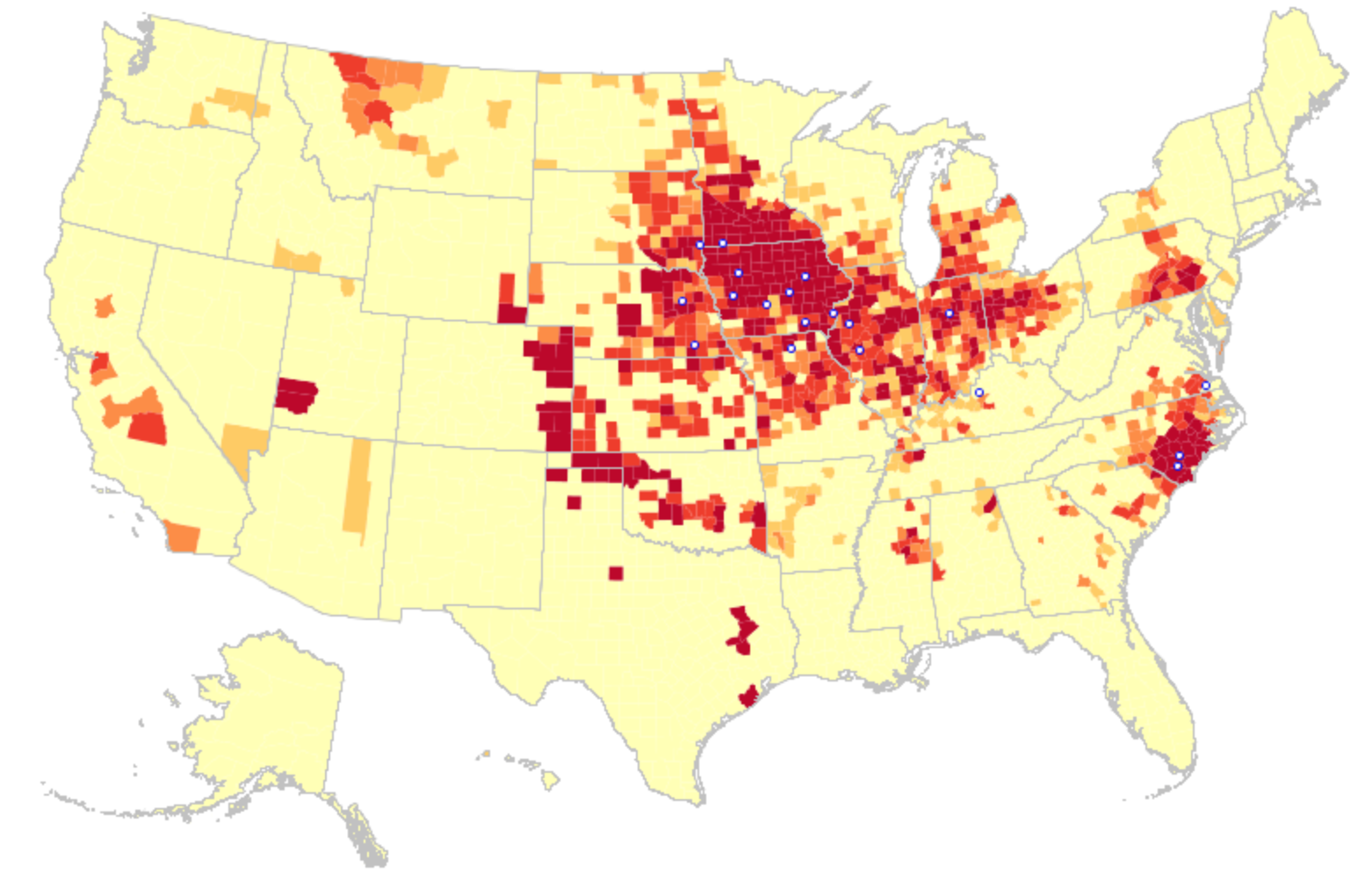
When Christmas did come, it didn’t seem that the state of Florida was particularly bad off in relation to the rest of the nation–but the rising death rates related to COVID-19 dramatically grew across the peninsula in truly terrifying ways, drenching the peninsula pink, and belying those low transmission rates about which Gov. DeSantis’ office was so eager to tweet out.

The level of disinformation is rather without precedent, but speaks in many ways to the hyper-reality of maps of COVID-19 infection that were based on rather dubious and incomplete data providing a rudder in an age of uncertainty. DeSantis’ press secretary tweeted out the CDC map to bate the anti-vaccine commentariat. Arriving pre-Thanksgiving, it seemingly celebrated the arrival of a new state of salubrity: the boundary lines of Florida popped bright blue of unearthly nature not because of what Florida was doing right, but was based on data of community transmission rates at days behind the rest of the nation: state data days out of synch with the national norm created the impression of statistically low transmission rates in the state, and south of the Mason-Dixon line, affirming how things were always better in Dixie.

DeSantis had been comparing the low rates of per capita COVID mortality in Florida, despite its large share of elderly, from March, 2021, claiming higher mortality rates for seniors in forty other states had offered evidence that his policies were indeed far more effective than those states that mandated lockdowns and suspended schools, insisting on the benefits of helping businesses and keeping local commerce flow. As FOX news commentators spun the CDC map of community transmission rates as evidence of nothing wrong with fighting masking mandates, or vaccinations.

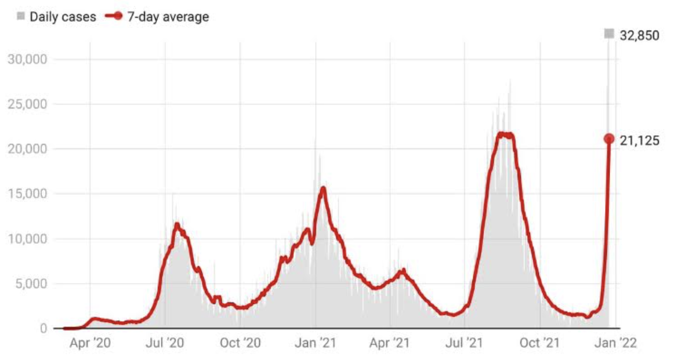
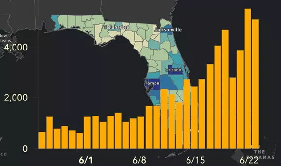
Yet by mid-December, 2021, reality had reared its ugly head. Skyrocketing rates of infection from the Omicron variant proved the folly of asserting any containment of the coronavirus that any policy of one state might so easily fix, as the high rates of infection shifted the panorama of the pandemic, with the fifty millionth case of COVID-19 recorded, and deaths due to the virus across the country topping 800,000–far more than the deaths of the US Civil War, by recent estimates, and more than the current population of Seattle. And if Florida was increasingly as red as the nation, the rise of COVID death rates by the month’s end had effectively eroded all of DeSantis’ suggestion of the benefits of adhering to alternative models of public health care.

covid-map-us
CDC Dashboard, December 2, 2021

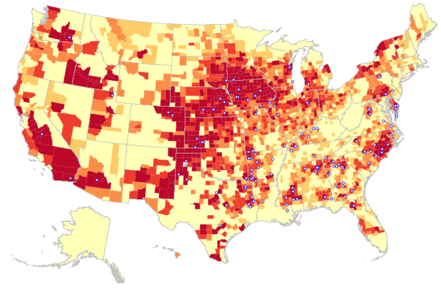
If the arrival of the Delta variant had led to the growth of mortality by another 100,000 in two and a half months, the advance of the more transmittable Omicron would stain the whole map red, bridging boundaries and state divides, as thirty three states hosted large infections, with little clear relation to their health policies–save perhaps low population rates and density. By Christmas 2021, national dashboards of infection rates made it clear that Omicron infections advanced not only through the northeast but along the sandy beaches of the Sunshine state.

National COVID Infections/Mapbox
December 20, 2021

Yet that single CDC map in the header to this post suggested low COVID transmission rates in Florida was suspiciously more than opportune. For it suggested, lo and behold, starkly lower transmission rates across the panhandle and peninsula, as if the state public health policies had in fact, contrary to recent pandemic history, been doing something very right all along, as DeSantis continued to fence with Joseph Biden’s attempts to devise mandates of mask-wearing and vaccines, all but defining himself as a sort of shadow-government in opposition to the White House, in the manner, say, that now-disgraced Governor Andrew Cuomo and California’s own Gavin Newsom played to Donald Trump, as if voices of stability in the time of need. DeSantis had provided an alter-reality of risk-free no masking or vaccines, freedoms at work and at school, refusing to limit the social interaction and tourism that Florida needs–even accepting cruise lines and offering to provide shipping ports–arguing that reopening was indeed in everyone’s interest, variants be damned: could it be that the CDC was offering a map validating that his policies were working well after all?

Florida boasted low transmission rates, putting the past history of the pandemic in the past, and effectively inaugurating a new news cycle that made this the map to count on and trust–the one dated that very day!–and putting lack of COVID vaccination out of folks’ minds as they booked their family travel plans for late 2021-2. Florida regained its storied status as a site for healthiness and well-being, unlike, it looked at that moment, like the rest of the nation, leading FOX commentators to spin new stories about the long-term success of DeSantis’ absence of clear public health plans.

For although Gov. DeSantis had pulled the plug in June, 2021 on a public-facing COVID-19 dashboard tracking daily updates on cases, deaths, and open hospital beds across the state, inviting those glued to their computers to take two giant steps back from the spate of emergency preparedness that seized the nation from March 2020, the CDC data vis plotted handily outdated data, skewed from rising rates of Omicron that were spooking the nation.  As there was no public source of infection rates in the state that was available anymore, the disturbing orange dots that crowded the Florida beaches on the COVID dashboard of the past seemed like it was dispensed with, and the seas calm and skies rosy in a bright blue of low transmission levels–despite DeSantis’ longstanding opposition to vaccine mandates or even public masking across the state.

Instead, the spokeswoman of the DeSantis regime tossed to right-wing news sources a rosy picture of the calm waters of Florida–he must have loved the blue azure that the state was tinted to proclaim low community transmission rates over the Thanksgiving weekend, as if it was a sea of tranquility in a nation that was revving up as word of Omicron spread. (“I hope you make it through Omicron,” the man behind me in Whole Foods said as if a neighborhood sage, finger of the pulse of the rising national pandemic anxiety that had recently seemed safely in the rear-view mirror.)

The CDC image of transmission offered a useful icon of peninsular identity for DeSantis’ media savvy press secretary, who tweeted it out to her almost 22,000 Twitter followers as a dubious ethical claim of the health that the Sunshine State held for all future travelers, according to the current community transmission levels. Indeed, as this detail of the data vis shows, the lower than substantial levels of community transmission in most counties south of the Mason Dixon line would obviate the need for mask-wearing even in public after the arrival of new variants, that the CDC had advised for all counties colored red for high level of transmission.

David Schultz/Orlando Sun Sentinel from US Center for Disease Control Data

The striking if deceptive visualization that Ron DeSantis’ press secretary tweeted out on Thanksgiving morning had the benefit of depicting the desired “low community transmission” rates that seemed to confirm DeSantis’ attempts to bolster confidence in his public health policies, even if his longtime war on vaccination was not the success story that the map showing the state as an island of relative salubrity was based on an outdated tally of infection rates in the state whose public health policies seemed a concerted effort to sew fears of vaccine safety. DeSantis’ press secretary, who has cultivated a broad presence on twitter since gaining the job, aimed to promote public perceptions of the success of the Governor’s bellicose strategy of vaccine denialism and scoffing diminishment of public health risks.

The data vis was important to tweet out at 6:30 am to hit the national news outlets, because it helped begin or frame a narrative that Christina Pushaw, who had long questioned the value of a “piece of cloth” and long defended the Governors’ criticism of mask mandates. The low transmission rates that cast the peninsula as an island of salubrity amidst national rising fears distinguished Florida as a rare area in which the CDC was not returning to recommend mask-wearing even among those vaccinated–at least per appearances, or a superficial reading, endorsing the exemplary nature of its public health protocol. Unlike most all counties in the nation, prominently colored high-risk red to indicate the return of high transmission rates, Florida (a “red” state) was bright blue as a safety of haven as it had, conservative media argued, weathered out the storm of masking hysteria. All of Florida had been colored red for much of the summer–amidst concern for the Delta variant, and for “breakthrough” infections–and the new tracker map seemed a lucky break.

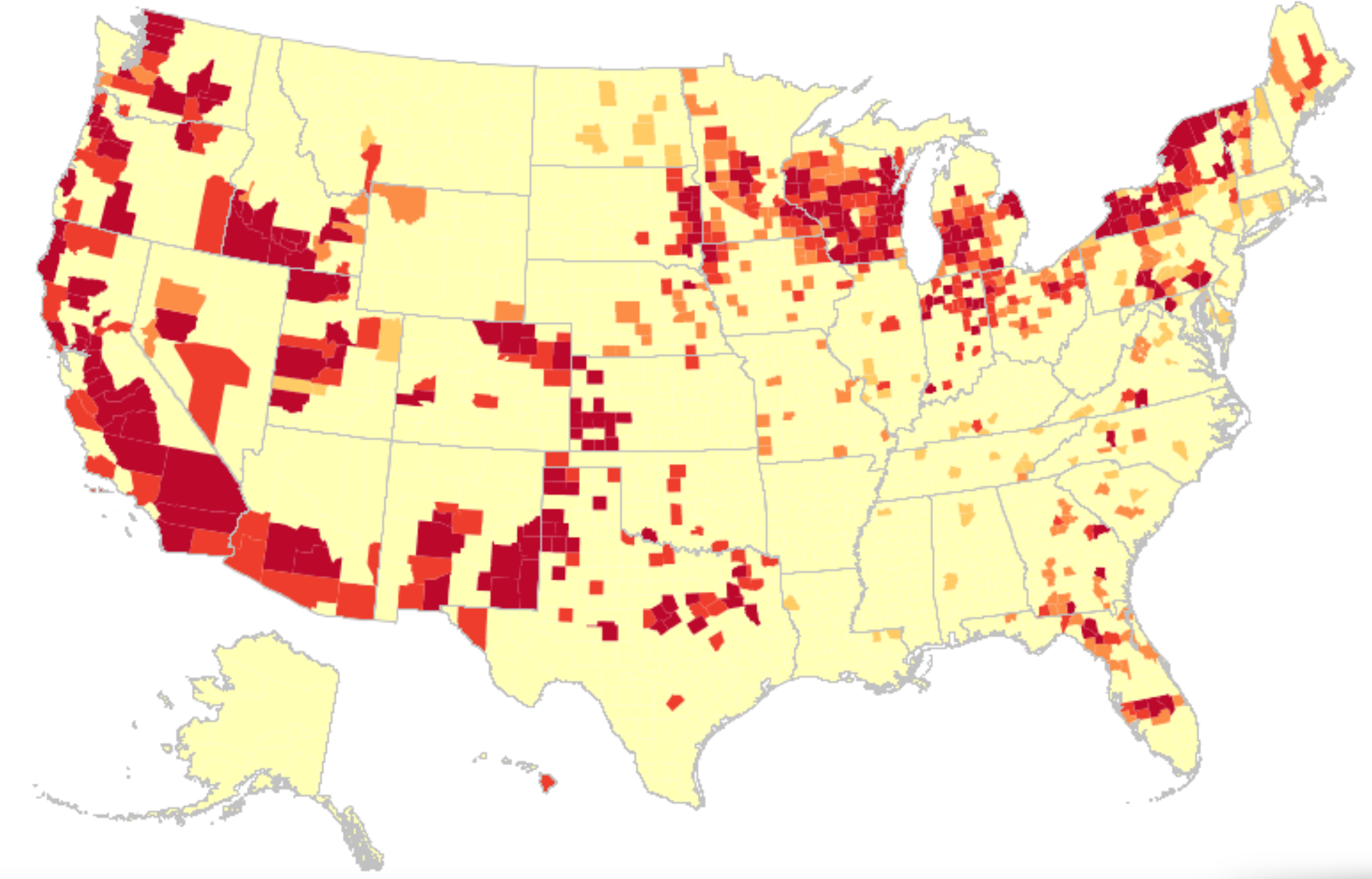
But the data was off, way off. In fact, the data vis used cherry picked numbers of a previous days that concealed the hight rates of transmission that existed for southern Georgia and all of Florida–as an updated vis of community transmission for the very next day revealed. The shifting image of transmission rates suggested the lag in data that the state was providing the CDC, as well as the greater risk for variants the nation now faces as a whole. But the data vis, entered into the media cycle of the nation, threw many off ground, in its apparent objectivity. Perhaps that was the job of a press secretary: to distribute any image that provided cover for the Governor who had faced criticism for his handling of COVID-19 by fashioning a new media cycle.

These maps show the levels of COVID community transmission in Florida's counties on Nov. 30, when data for the state was missing from the CDC's portal, and Dec. 1 after the state's data was updated. (Source: U.S. Centers for Disease Control)

So intertwined is travel with the identity and economy of the state, that it was no surprise that the Florida beaches already made it grounds for public health concerns, and the measures during Spring Break, 2021, gave rise to a spike of COVID cases from new variants. In Spring, 2020, infections in Florida had just begun as its beaches filled, and rose again in the summer; but this Spring seemed the textbook case of exactly “what a lot of public health folks have been afraid of.” Increased partying brought rates of infection of a magnitude six times greater, with up to five variants, in the second spike of infections in the state.

The Governor came under fire for his resistance to mask-wearing, social distancing, and toleration of partly open restaurants and beaches, as the coronavirus literally ate into his popularity, and he became something of a “mini-Trump” as Trump’s popularity slid, and many questioned if his positions reflected political expediency and short-term gain, rather than Florida’s interest. But by May he was proclaiming “landmark legislation” banning “vaccine passports” in the state, boasting that the state had, unlike others “avoided protracted lockdowns and school closures in Florida because I have refused to take the same approach as other lockdown Governors,” boasting that the legislation forbade the danger of arbitrary school closures or shutterings, and that “In Florida, your personal choice regarding vaccinations will be protected.” A year after school closures rocked the nation, calling for a rededication of state funds to pay parents for home schooling on FOX, the economic nightmare of state over-reach replaced fears of infection.

Lindsey Burke: Coronavirus school closings should prompt states to pay  parents to educate kids in other ways | Fox News

March, 2020

DeSantis’ sense of himself as a savior grew in public statements and edicts denying any government overreach, his national ambitions were evident. Arguing that while many other states were just beginning to re-open, Florida was responsibly opening up. He cast the new COVID surge as but a summertime blip, as he embraced “freedom” as a choice of parents by keeping schools open, refusing policies of masking in public, and questioning the wisdom of masking or vaccines, even threatening to not pay county officials who enforce mask mandates, trusting the survival of FLorida’s tourism industry would consolidate his status. Governor DeSantis stood his ground as an ardent supporter of his anti-masking policies and a Trump legacy. He attracted admiration and interest of the communications professional, Christina Pushaw, whose admiration of how DeSantis stood up to “persuasive . . . false narratives” begun in the public press. Pushaw all but publicly identified herself as a new press secretary for the beleaguered governor, whose admiration of his public heath policies, landed her a job but helped to transform the press secretary to an alternative news source, to remap the risk of COVID-19 by a new public health narrative–a narrative that, until recently, had only lacked the right data maps to treat her office’s social media as a new news source.

A screen grab of a tweet written by Ron DeSantis Press Secretary Christina Pushaw.

The rise of infections in Florida echoed the first opening up Florida to tourism in early May, 2020 that continued through June. The recent promotion on social media of the low transmission rates in the state suggest difficulties in balancing a parallel calendar of tourism on which Florida has long relied to the accurate tally of community transmission–a tension that may go back, for Governor Ron DeSantis, to his office’s extended tussles with the GIS analyst at the Florida Dept. of Health who first constructed the dashboard of daily and cumulative infections in the state.

While the Governor had claimed that he would “follow the data” in his opening plans, there were deep concerns that the data was not transparent. When Pushaw wrote a set of attack pieces on the GIS analyst who felt that figures of infection rates were being manipulated, massaged or suppressed infection rates, DeSantis’ Lieutenant Governor promoted it as evidence of “one of the biggest media fails during the pandemic.” DeSantis soon gained a new press secretary, who had essentially applied for the job by praising the skill with which the Florida governor had resisted public masking and vaccines, working to combat the “devastation caused by socialism . . . happening in our country,” and assailed the “big lie” about corruption that a GIS analyst had charged the state. The woman who had worked as an attache in Georgia for Mikheil Saakashvili, now working in Ukraine, might not be a common itinerary to Florida’s Governor’s office, but Pushaw wrote, “If there are any openings on the governor’s comms team, I would love to throw my hat in the ring.” Having assailed the GIS architect of the Dept. of Health COVID dashboard, she offered her services to Florida’s embattled governor to shift attention from COVID-19 infection rates.

After taking the post, Pushaw cultivated a broad social media presence by tweeting some 3,800 times in her first month on the job,–including one arguing watching one’s weight was more protection against COVID-19 than “a piece of cloth” or mask, and promoting the state’s organization for Florida residents of free “antibody infusion treatments” across the state.

Image
State-Run Monoclonal Clinics for COVID-19/@GovRonDeSantis, August 28, 2021

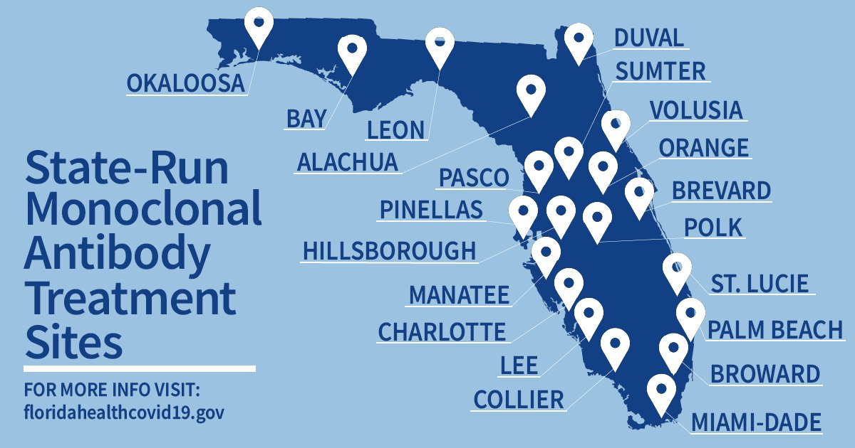
While the map of “state-run treatment sites” seemed to counter the data visualizations of local infection, it tried to set a counter-map to images of level infection or mortality. The notoriety of COVID-19 cases in Florida must have encouraged De Santis’ press secretary to retweet a CDC map dated November 25 that appeared to document low transmission rates in almost all state counties–offering evidence of the healthiness for Christmas visitors. Notwithstanding its Governor’s longstanding resistance to masking and infrequent masking in public spacearding one of the biggest media fails during the pandemic.”. The map retweeted early morning on Thanksgiving Day a shout-out for shifting public perception of the state, as it paints the state as the being sole site of “low” community transmission in the nation, and followed the calls for more praise for DeSantis’ brave strategy of handling the pandemic, since Pushaw became press secretary, both from the Wall Street Journal (Media Ignore Florida COVID Recovery,” October 31, 2021) and Fox News, on which DeSantis echoed Pushaw’s points as he claimed poor media coverage in relation to COVID-19 “deadly” in mid-November, after a rough summer in which 60,000 deaths related to COVID-19 afflicted the state. In early November, One America News Network promoted a special report from this summer (“America’s Governor and Florida’s Grit”) about DeSantis’ guaranteeing of increasing access across Florida of “a life-saving COVID-19 drug” that reduced severe illness.

It was hardly surprising with such lead-up of an alternative narrative on Conservative news that Pushaw seemed to seek to boost the narratives that were launched in conservative media when she retweeted a new data map of COVID community transmission news on 6:30 a.m. Thanksgiving morning as if to target Christmas travel plans to be discussed at the harvest feast that rather highlighted the far lower transmission of COVID-19 relative to the rest of the country as fears of COVID variants multiplied nationwide. The map with national imprimatur showed a drop of community transmission levels in Florida alone, and seemed to offer some back-of-the-envelope evidence that the spikes of previous years in the southern states and in Florida had created local resistance to the coronavirus and its new variants.

The bifurcated image of the nation that showed Florida as, essentially, the sole site of low COVID transmission, would be sure to attract attention and conversation, political ethics be damned. Flying in the face of the longstanding resistance of Florida Governor Ron DeSantis to curtail out-of-state tourism that encouraged him to keep the state open to travel, DeSantis’ new press secretary used the map to show Florida open for tourism, after having weathered three waves of spiking coronavirus infections. Perhaps the state’s poor planning for public health in the past by lifting guidances ofr mask mandates might, DeSantis ventured, create safety in the beaches of the Sunshine State in a winter of variants, as the ‘conservative’ media–Wall Street Journal and FOX–had hinted might be the case.

DeSantis’ groundless claims of safety found somewhat predictable support from FOX commentators in sustaining “natural resistance” to COVID-19 from past exposure, a “natural” immunity better than vaccination, was a data-based strategy, although what sort of data they were using is unclear. (The CDC finds those who had recovered from COVID-19 but were not vaccinated were five times more likely to contract it again than the fully vaccinated.) The conflicts DeSantis’ office seemed to manage between a state economy dependent on tourism and the calendar of increased community transmission suggests a lack of transparency, but also a duplicity based on improvised off-the-cuff diagnoses of a dangerous disease.

The lack of COVID-19 transparency that had been a continuing issue in the state since 2020 had reared its ugly head again, and just in time for post-Thanksgiving Christmas planning. Indeed, the absence of transparency was particularly troubling as we increasingly depend on dashboards, tracing, and positivity rates in grappling with the virus and its ongoing mutations. As the self-declared attack dog of the GOP, Governor Ron DeSantis was by 2021 boosting the dubious concept of “natural immunity against COVID-19” as the forefront of a fight against mandating vaccines for large businesses, exempting from vaccination all recovered from Covid; with full vaccination rates in Florida about 60%, around the national average, Florida ranked twenty-first among states providing at least a single shot to residents. Those already vaccinated in Florida were mostly elderly–a demographic on which DeSantis had dutifully concentrated to provide the vaccine. But many residents in the state, liberated from mask-mandates, were partying, barhopping, hitting the beaches, as masking was unenforced at schools, kept open five days a week, or on cruises–DeSantis promised cruise ship companies that in Florida, they wouldn’t need “vaccine passports.” Bahamas Paradise Princess Cruise Company promised that “safety, fun, and vaccines” were all priorities as it docked in Palm Beach on June 25, having suspended per CDC regulations on March 14, 202, and the fireworks festivies cancelled the previous July 4 due to COVID restrictions were planned again, now with a Cuban reggaeton as a featured guest for the festivities, voluntary masking, as Florida as a state checked out from updating its COVID-19 dashboard, tracking updated cases and deaths across the state.

Governor DeSantis, amidst COVID spikes, emerged as a Trumpian cheerleader standing steadfast in against a “biomedical security state” as COVID infections spiked yet again: “Florida, we’re a free state–people are going to be free to chose to make their own decisions.”

Daily Cases of COVID-19 Reported in Florida by State and Local Health Agencies/New York Times

Days after DeSantis challenged Biden’s authority by declaring “We’re respecting people’s individual freedom in this state,” and banning businesses from adopting vaccine mandates–even though the state’s sizable elderly population was demonstrated to be at risk for co-morbidity.

At the same time, a DeSantis spokesperson and press secretary retweeted a rather striking map with CDC imprimatur made rounds on Twitter: the striking data visualization suggested that rates of community transmission plummeted in comparison to the lower forty-eight. While the image depended on the outdated data Florida provided the CDC, a symbolically powerful image as rising alarm about rising rates of transmission injected fear in holiday plans.

DeSantis’ energetic and telegenic press secretary, Christina Pushaw, whose Twitter profile shows her pushing her hair over her head with a smile as if seeking to embody Florida cool, seemed all but to channel a vacation advertisement in her retweet. In promoting the alleged decline in COVID-19 cases from it appeared that Florida had been granted a reprieve as folks were finalizing winter vacation plans in the face of worries about increased infection rates. Pushaw’s tweets had been flagged for vacuuming up right-wing media–a constituency to which she had belong–and had already been suspended once from Twitter in the past. But she retweeted a CDC data vis to promote the apparent decline in rates as evidence that the state provided the secure vacation spot to soak in sunshine this winter after a stressful year.

@ChristinaPushaw

The bright blue expansed that so conspicuously appeared to isolate the peninsula in a sea of high rates of community transmission of COVID cases appeared to promise Florida offered some sense of shelter from the storm. Yet in spite of all its apparent objectivity, the CDC data vis Pushaw tweeted out on social media didn’t really prove the assertion of Keesman Koury of the Florida Department of Health that low cases of community transmission the data vis registered reflected the “result of our innovative and strategic COVID-19 response that focuses on prevention and treatment,” as if that included no mask mandates or social distancing. As if providing evidence of how much the global pandemic was fed by local bad messaging and toxicity, Pushaw boasted of its safety as if promoting a healthy vacation site in the tradition of the State Tourist Board: “Florida still has the lowest case rate per 100,000 in the entire country and this continues to decrease,” as if the data vis provided cutting edge news, sufficient to rethink the state’s ham-handed response to preventing the virus’ spread.

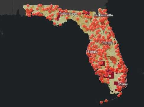
The tweet amounted to outright disinformation–and showed sense of the media savvy of a National Interest journalist turned DeSantis spokesperson known for offensive and off-topic tweets of scurrilous content. Few out-of-staters may have known that she had been accused of stalking the Florida Dept. of Health geographer and data analyst Rebekah Jones, the geographer responsible for having publishing and curating data of COVID-19 infections daily tracking infections, hospitalizations, and deaths related to infection across the state–having built the COVID-19 dashboard to track cases and deaths. Jones had been terminated by Florida’s Department of Health for “extensive, unauthorized, communication” about the dashboard–where she was in charge of answering public questions–and unceremoniously fired May 18, 2020, after raising questions about changes in the publication of data and functionality from May 5, including the combination of tallies of total negative COVID tests and positives, perhaps to lower the calculation of COVID positivity on the dashboard she designed, and the re-tallying of deaths certified as due to coronavirus infections.

As the beaches of South Florida were readying to re-open, Jones, fearing the state fudged public health data irresponsibly, unethically adding negative tests in a false aggregate–even if conducted for the same person–to diminish the ranking of positivity, even as DeSantis proclaimed he was “following the data” in re-opening. Months earlier, Jones had created the dashboard and apologized for the lowering of mortality rates announced per Florida’s Dept. of Health, in the course of reclassifying many coronavirus-related deaths, as the Dept. and adding fewer deaths despite rising mortality rates in Florida to deaths verified as related to COVID-19. The state argued it would “continue to provide the most up-to-date information to arm Floridians with the tools and knowledge necessary to flatten the curve,” but seems to have shifted the nature of its total counts of deaths or indeed of positive cases of infection. But, unlike the state dashboard, Jones showed the density of confirmed COVID infections and the few Florida counties which, by her count, ready to reopen. 

1. The data aggregated on Jones’ alternative dashboard suggested that rather than the curve flattened, only two of sixty-seven counties in Florida met the state’s established criteria for re-opening. She complained Florida’s Dept. of Health had wanted her to delete the report card of infections per county, as it showed “that no counties, pretty much, were ready for reopening;” FDOH didn’t want that visible on the dashboard in ways that would “draw attention” to an inconvenient truth, she said in mid-June. (At the same time, the state had witheld data on deaths certifiably related to COVID-19 at nursing homes and assisted living facilities, unlike other states, to keep figures low.)

As the data guru in charge of publishing the data, Jones would be expected to be central to any public health work that was based on the data. But she alleged her refusal to lower the state’s positivity rating to allow it to meet its target for reopening led her to be dismissed: as the state became an epicenter for infection in March 2020, the state faced increasing pressure to meet goals to be “ready to open” for the summer.

Rebekah Jones in her office at the Florida Department of Health.
Rebekah Jones at Florida Dept. of Public Health/Photo Courtesy Rebekah Jones

Despite noting the “dramatic changes” on the data portal of concern back in May, 2020, Jones, whose dashboard had long been trusted as a source, seemed to feel it had swung beyond her control: she would only say in early May, “I helped them get it back running a few times but I have no knowledge about their plans, what data they are now restricting, what data will be added and when, or any of that.

The long familiar site which Florida residents had used to orient themselves to daily updates of county-by-county breakdowns of new and total positive cases of COVID infections, virulence, hospitalizations, and deaths had shifted,–about a month before infections would peak–

Woman who built Florida's COVID-19 dashboard removed from project | wtsp.com
April 22,2020

–and infections in the state broke previous records, adding nearly 9,000 new cases in a new daily record by June 22, 2020, before the arrival of the Delta variant.

New COVID-19 cases for Friday, June 26 - IMAGE VIA FLORIDA DEPARTMENT OF HEALTH
Screengrab via Florida Dept of Health, for Friday, June 26 2020

The numbers of positive cases for state residents grew, as hospitalizations, during that very summer, when they ballooned, and multiple counties in the state grew deep blue.

SCREENGRAB VIA DEPARTMENT OF HEALTH

As if in response to what she contended was an unmerited ouster from Florida’s Dept. of Health for failing to fix datasets, Jones quickly founded her own alternative “rogue” informative COVID-19 dashboard, Florida’s Community Coronavirus Dashboard.

2. While DeSantis had outlined, under the approving eyes of then President Trump, plans to re-open the state by placing “public health-driven data at the forefront” along fixed “benchmarks,” his data guru insisted her refusal to be part of promoting “misleading and politically driven narrative that ignored the data;” she constructed an alternative dashboard showing only one of the sixty-seven counties in the state revealed sufficiently low positivity to warrant reopening or easing restrictions on social distancing. The exclusion of positive antibody tests on the Dept. Health website was clarified on the new site, which aimed to be far updated daily and far more user-friendly when it appeared in June, 2020, and tracked the rise of positive cases that summer, adding increasing features of legibility and of tracking change over time.

Florida's Coronavirus Dashboards
Florida’s Community Coronavirus Dashboard, June 2020

The new site foregrounded total “COVID Positive People” detected in both PCR and Antigen tests in running tallies, listing new positives from the previous day, running counts of recoveries, and available hospital beds beside a county-by-county breakdown, the dashboard offered a far more synthetic fine-grained map of the COVID-19 ground-game of public health to grow public trust. The rival dashboard that debuted in mid-June aimed to show accurate geodata of “what’s going on in a straightforward, nonpolitical way,” FloridaCOVIDAction.com synthesized publicly available open data, mined from state reports but not reported straightforwardly on state-run websites.

As it became clear that the data for which Jones and a group of epidemiologists had been never incorporated in DeSantis’ vaunted plans to rely on the data in plans for re-opening the state; reopening brought a five-fold surge in COVID infections by mid-July. The expansion surpassed the rate and number of Covid-19 infections than any other state in the pandemic, breaking records for the highest number reported in a single day–15,300–or in New York in early April, during the worst outbreak in the city. The wave, which might well have been prevented, strained hospital and treatment by antivirals. It called into question the logic of DeSantis’ reopening plans, or how much he had relied as promised on health-driven data, but a blind adherence to the sense of “best practices” that could allow the economy to be open, beaches and restaurants stay open with adequate distancing, and schools not be closed–meeting short term demands and needs for the summer economy, but sewing skepticism.

April 23, 2020/Drew Angerer

The state in fact seemed to lack even sufficient testing to measure the scale of the outbreak, even as he reopened the state at a far faster clip than New York or California, re-opening all gyms, bars, indoor dining at restaurants, schools, pools and salons and ending stay-at-home orders but a month after they went into effect, to welcome tourists to the state from Memorial Day, increasing the risks to the state’s older residents greatly, before closing the bars in late June. By November, after an other rise in COVID cases ran through the state, Jones’ public message to the Florida Dept. of Public Health to “speak up before another 17,000 people are dead” as the dashboard stood at 17,460 COVID-related deaths in the state, law enforcement served a search warrant at Jones’ home, guns drawn, seize the laptops from which the former GIS manager of the Division of Disease Control and Health Protection ran the alt dashboard–“all my hardware and tech”–seven months after her firing from the Dept. of Public Health.

The dashboard of rising COVID infections released on an ArcGIS platforms was a bombshell that placed her in the public eye–and was regularly updated. The alternative website seems to have led to her attack as a discontent “rogue” rather than a whistleblower in the national news. Its release lead to subsequent national media slamming of Jones in conservative media as a serial social media abuser, as outlets tagged the former public health official as a “super-spreader of COVID-19 disinformation,” to defuse her own charges of community transmission. Jones was charged of being guilty of having openly invented lies “about Ron DeSantis’ Press Secretary” using social media to pedal pandemic falsehoods. @GeoRebekah temporarily de-platformed on Twitter, Pushaw crowed that her suspension revealed Jones’ untrustworthiness and abuse of the medium, calling it “long overdue.” No doubt infuriated and flustered by DeSantis’ own consistently relax and dangerously reckless policies on keeping schools open and removing COVID protection policies, Pushaw must have been not only frustrated, but a target of DeSantis’ ire.

Pushaw went further by attacking the GIS systems manager as nothing less than “the Typhoid Mary of COVID-19 disinformation,” echoing the bombast of the DeSantis regime. DeSantis and his office dutifully applauded Jones’ temporary suspension as evidence for her duplicity, as guilty of “defamatory” statements and a “COVID super-spreader,” happy to see her public profile reduced. Comparing the systems manager to an Irish-born cook whose asymptomatic infection spread to her employers what was known as Salmonella oddly served to demonize her as an immigrant carrier of disease, echoing Trump’s obsession with “foreign” origins of COVID-19; it shifted attention from dangerous mortality levels in the state, and gestured to an era when the pathogenic transmission of salmonella was not understood, more than inadequate responses of the Governor’s office to three waves of COVID-19 in the state. A leader who had and would repeatedly cultivate “strongman tactics” in a dangerous time, as Ruth Ben Ghiat recently noted as this blog was first written, DeSantis performed a version and vision of leadership that seemed to establish himself as an autocratic leader of Florida, with a proposed a new Florida State Guard to assist the National Guard in public emergencies, that he would oversee as a state militia, that could act “not encumbered by the federal government” or federal regulations, from federal masking policy to vaccination mandates, and banned vaccine mandates or masking in public as unsafe and unscientific.

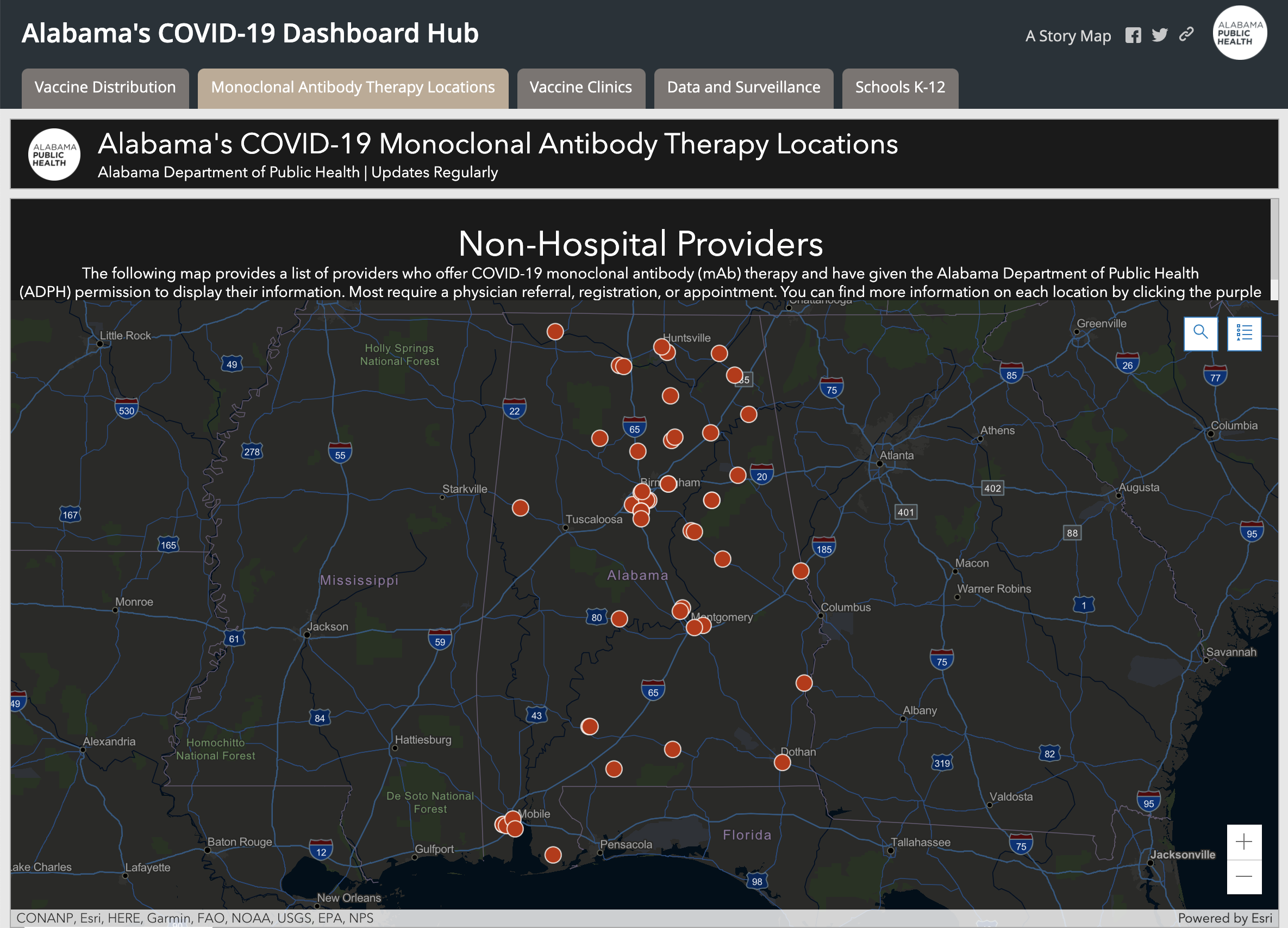
DeSantis chose another official to be an attack dog to step up vaccine disinformation. The campaign of disinformation continued DeSantis had appointed a surrogate “State Surgeon General” who stood beside vaccine skeptics who encouraged misinformation from claiming the vaccine altered your genetic RNA to a lack of scientific consensus in its value. Surgeon General Ladopo spread dangerous COVID denialism, instructing the public “to stick with their intuition and their sensibilities,” demeaning the public health value of the vaccine a misguided “religion” and emphasizing the monoclonal antibodies treatments DeSantis has vigorously promoted in the place of vaccines–and indeed as an alternative public health policy. In so doing, he mimicking the public health maps like Alabama’s “COVID-19 Dashboard Map” that foregrounded Monoclonal Antibody Therapy (mAb) therapy as a counterpart to Vaccine Distribution in an ESRI Story Map; Alabama’s Dept. of Health boasted a 60-70% success rate at “preventing high-risk patients” from being hospitalized–a strategy of off-loading any public health care policy or plan.

Monoclonal antibody therapy
Alabama COVID-19 Dashboard;Non-Hospital Providers of Monoclonal Antibody Therapy

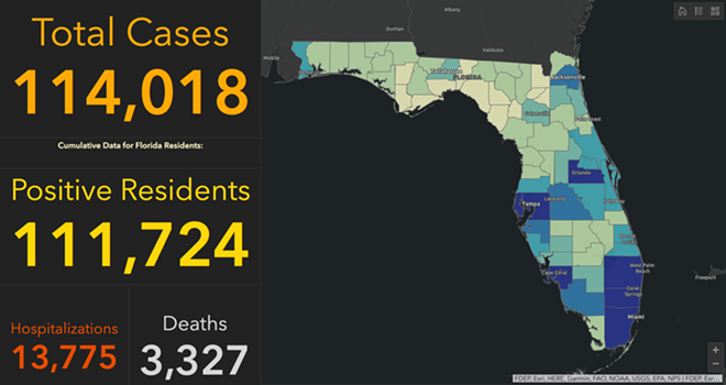
If we are approaching a time in the history of COVID-19 when our fears of catching the disease may soon be replaced by an acceptance that we may become infected, and will manage that infection, the hope to navigate infections that would be more severe among the unvaccinated populations suggest a tinderbox that will require an armed guard of the sort DeSantis has imagined as running when he announced in Pensacola his plans for a military unit with uniforms tagged “FLORIDA” rather than “U.S. ARMY” from a podium bearing the sign “Let Us Alone” that echoed the “Don’t Tread on Florida” sign displayed at a special October session of the state legislature to counter federal COVID-19 vaccine mandates. The curious unveiling of a “civilian volunteer force that will have the ability to assist the national guard in state-specific emergencies” seemed design either in case of another surge, or to support DeSantis’ distinctive public health policies. The banner “Let US Alone” first displayed in the 1841 inauguration of Florida’s first Governor, William Moseley, was a cause for celebrating the independent health policies in the state, which had by then reached the third-highest number of infections in the nation–3,730,395.–and the third-highest number of deaths, 52,647.

The image shard of a combative alligator defending its territoriality, Florida’s own Gadsden flag was unveiled at a press conference speaking out against vaccine as the new logo of the state: the alligator with gaping jaws, ready to attack or defend its ground, was tweeted out on October 21, 2021 by @GovRonDeSantis as a sign of resilience and power in the face of the fear of rising rates of infection and hospitalization, and is now available at PatriotFlags. The image of defending a swamp fit DeSantis’ promotion the ports of the Sunshine state as the logjams in ports on the east coast and west coast created problems for transportation hubs in California, Washington state, and New York. “We’re also seeing increased costs, inflation, and higher food prices,” he added. “We in Florida,” DeSantis showcased the pro-business benefits of his health politics with the confidence of a newly minted executive, “have the ability to help alleviate these logjams and help to ease the problems with the supply chain.” In Florida, unlike Biden’s America, DeSantis proclaimed as a rallying call, “At the end of the day, you shouldn’t be discriminated against based on your health decisions.” 

DON'T TREAD ON FLORIDA': Ron DeSantis Promotes 'Pro-Freedom' Flag | Sean  Hannity

Gadsden flag - Wikipedia
Gadsden Flag

The Gadsden Flag, beloved by separatists–and displayed at the door of a neighbor of mine in Berkeley with the slightly menacing words “Don’t know what it is? Look it up!”–has of course become a treasured emblem of the right, and Patriot groups, as well as militias, and was flown on the U.S. Capitol briefly on the morning of January 6, 2021.

3. Pushaw and Jones had a long history of entanglement. The ways that their fraught relations determined the battles over the local messaging on the pandemic remind us of how its global spread was brewed in the toxic channels of local miscommunications about public health. Governor DeSantis had only hired Pushaw as a press secretary, per WaPo, after realizing public messaging on COVID-19 crucial to his public image. The Florida Governor seems to have been especially keen on Pushaw’s exposé of Jones’ “big lie” about DeSantis’ reticence in releasing total counts of positives, long before he restricted state dashboards to weekly updates of limited information by June, 2021, as total cases of infection surpassed 1,7783,720, creating a crisis in calm as the state faced a second spike. By then, Florida ceased reporting deaths or infections daily to the CDC, making them hard to tally with regularity, and shifted the format to weekly tallies of vaccination and infections, as the “surveillance dashboard” radioed staying away from the beaches around Daytona Beach or from Fort Lauderdale to Miami Beach, even as new cases seemed to decline, and hospitalizations grew, as the daily tabulations of resident deaths and COVID positive suddenly ceased.

COVID dashboard 020821
June 4, 2021

The articles Pushaw had written attacking Jones’s whistleblower status may have encouraged a long-running conflict that led her to be charged with “computer crimes”; Jones’ charged the press secretary with having stalked the GSI analyst obsessively and aggressively, slurring her reputation after she was fired, allegedly for insubordination for refusing to undercount infections and magnify the number of people tested. The vindictive attacks on the data analyst obscured the problems of reduced clarity of replacing the daily updates on which viewers had relied with weekly tallies.

Florida Covid-19 Dashboard and Surveillance Dashboard
Florida's Rising COVID-19 Numbers: What Do They Mean? : Coronavirus Updates  : NPR
June 24, 2020/Florida Dept. of Health Public Dashboard

The Surveillance Dashboard offered a comprehensive running count and cumulative tally that Jones was charged with having crashed before her dismissal from the Dept. of Health, six months before the police entered her house in December, 2020, weapons drawn, to seize her computers as the novel coronavirus was spreading widely across the state.

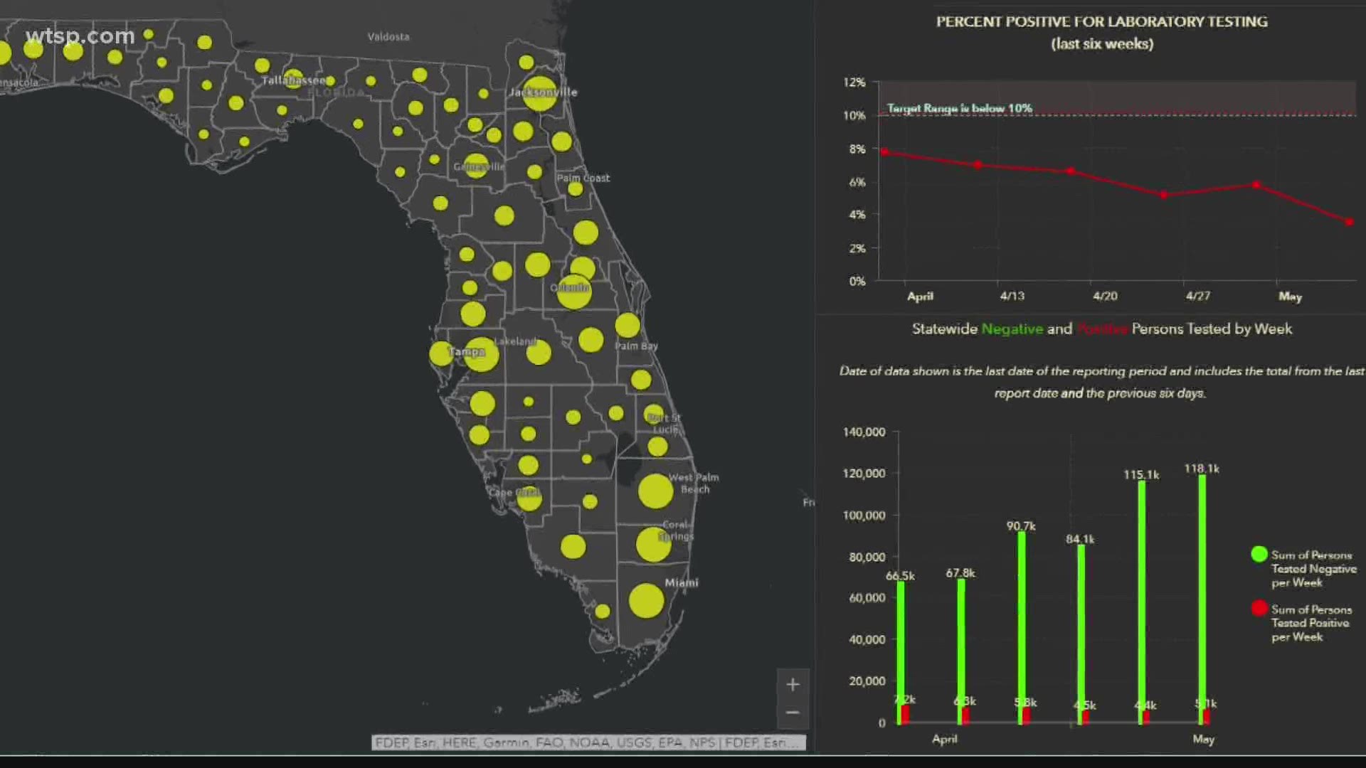
Despite the value of allowing state residents to orient themselves to the spread of COVID-19, Jones disturbingly suggested the state was playing fast and loose by manipulating data of infection rates by slimming counts of positives by omitting almost 10,000 antibody tests from its tally. Yet by June 22, 2020, twice broke records for single-day infections in a week: the state dashboard of daily data announced a new record of nearly 8,000 infections and 13.5% positivity rate–a critical number just over the early baseline for re-opening of 10% positivity–even if the WHO baseline for reopening was set in May, 2020, in preparation for summer, at 5% or lower for two weeks. Playing fast and loose with time-stamped data in troubling ways, DeSantis assured the public in mid-June as positivity grew that journalists should realize the past was more important than the present in his allegedly data-driven response, rather than the policies he had adopted: “the main thing is just for folks to look, in May, if you remember end of April, May all the way through, you know coronavirus was relatively quiet in Florida. You had manageable cases. Our positivity rate was 4 or 5 percent consistently.

Only in late June, 2020, was a Public Health Advisory issued that back-tracked on Governor DeSantis’ longstanding objections to preventive measures like public mask-wearing, social distancing, and caution. In fact, some 20 million cloth masks distributed statewide that “all individuals in Florida should wear . . . in any setting where social distancing is not possible” and social interactions limited for all over age sixty-five. The cautionary tone was not alarmist, keeping bars and restaurants open in the sixty-four counties it defined as in “Phase 2,” and allowing all retail businesses and gyms to operate at full capacity, entrusting their clientele to practice social distancing from one another, as part of a “plan on public recovery.

Coronavirus Rising in Florida, Arizona, California and Texas: What We Know  - The New York Times
June 24, 2020

Yet the Governor, in his wisdom and care for his pubic perception , issued an Executive Order Affirming Freedom to Choose emulating the then-President, by June 2021, after school boards considered adopting mask-wearing mandates for their students, as a part of schools being “open for instruction” since the summer of 2020, noting how “masking may lead to negative health” and the CDC “guidance . . . lacks a well-grounded scientific justification.”

By August, as the weekly counts of new infections surpassed 110,000, according to CDC data the most in any state of the country, Floridians missed getting daily updates on the counts of infections per county. The old regularly updated dashboard has became a focus of public attention in what seemed a laboratory case of an unfolding public health disaster–DeSantis had phased out county-by-county daily breakdowns as he issue weekly tallies, having argued that the state had rounded the bend, and removed the regular daily updating of dashboards on which Floridians had long relied on to orient themselves. Age breakdowns and a geographic distribution by county–features of the old dashboard–were no longer available, even as schools were reopening, parents deciding on vaccination and masking, and public trust frayed.

June 22, 2020, via Florida Dept. of Health (screengrab)

Since the escalating records of early summer cases in 2020, the state dashboard had provided a familiar breakdown of infections, offering real time information based on age in a county-by-county breakdown that all of a sudden wasn’t there as a guidepost for local decision at a critical time, once it had been removed.

More crucially to this post, the constraints over how much information of COVID transmission was publicized–and how accurately it was compiled–suggested that DeSantis’ office commitment to ensuring the calendar on which the state’s economy for tourism depended had displaced the monitoring of a calendar for community transmission. By June, 2020, the Florida Dept. of Health substituted weekly COVID tallies in place of the daily breakdown and count that Jones had worked, explaining that the state wanted to streamline information and reported daily case data to the CDC. The new weekly dashboard failed to orient users to a geographic distribution of COVID-19 or what counties infections had occurred, so prominent in the old dashboard; it provided little data that could be drilled down into, by abandoning a county-by-county distribution and dropping the stark visualization of state counties as a “third wave” of COIVID-19 infections hit in 2021, and DeSantis mused that the county-by-county breakdown might be useful to some.

July-August “Third Wave” of COVID-19 infections in 2021 in Florida/New York TImes

DeSantis proclaimed the state had turned the bend. But as Florida led the country in newly confirmed cases in early August, 2021, folks wondered why the daily dashboard of old was no longer readily available as a tool of visualization, worrying that the daily updates were pulled by the Governor’s office prematurely in June, as the pandemic led to more hospitalizations in the state than ever before, but the Governor’s office, rather than offering public health data to state residents, asked for patience “in returning to normalcy”–even after twenty-four days with over 1,000 new cases discovered daily. And in tweeting a map of low transmission rates in the post-Thanksgiving days, claiming COVID cases had begun to “bottom out in Florida,” while they started to peak nationwide, Pushaw seemed to seek to clean up Florida’s public image, by directing attention on social media to an alternative reality that may have benefitted a map that rendered rates of community transmission taken, albeit a map that had benefitted from the new timeline at which Florida was releasing data to the CDC. Indeed, the release of figures of community transmission at different times from the country seemed to offer evidence of how clear-headed policies had kept local transmission rates low, even if the data ws comparing apples and oranges.

The tweet seemed to seek to erase memory of those dashboards of the recent past, that might well have kept tourists away from Florida, due to high positivity rates. The apparently credible picture showing low risks of viral transmission statewide was a retrospective reprieve of sorts for the inexcusably poor public health policies of the past. Although the CDC had updated data on community transmission for the nation, the state received a rather convenient break: for local data had ceased to be updated with much regularity for Florida, compared to the rest of the union, rendering its counties an almost continuous bright blue. Pushaw’s early a.m. tweet was the perfect graphic for her smiling Twitter profile, which recalled the vacation ads of old that promoted the salubrity of the state’s sunny beaches.

The imaginary fault-line that seemed to isolate the panhandle and peninsula as a sight of purity and safety was itself a creation of the lag in the reporting of state data, rather than reflecting a break in community virulence or the “bottoming out” of COVID cases. But the implication that Florida had suddenly become an area of low community transmission reflected cherry-picked data crafting a false comparison between apples and oranges, so to speak, since the state’s data had stopped updating as the rest of the country suffered from rising rates of COVID-19. Was the absence of inclusion of available data on the national COVID data tracker a mistake, or a convenient untruth of deeply unethical nature?

The maps of cases, infection levels, and fatalities, had been if only six states have mask-wearing mandates for the vaccinated and unvaccinated, whereas in 2020, forty-three states had adopted them, the low levels of transmission seemed to promote an image of azure seas across the peninsula that was oddly akin to the images promoting the Vacation Land U.S.A state from the mid-1950s, presided by a beneficent smiling sun, whose rays boded health for all–where the sun was able to be drunk to good health daily in the state’s unofficial elixir, fresh orange juice. Concerns about the continued popularity of winter beach destinations during the rise of the new Omicron variant may have been leading many to rethink their vacations, but the data vis was dropped at a strategic time to plug the beaches’ open space as a space for rejuvenation, a ready get-away for those seeking escape from COVID stress.

“Come on Down to Fabulous Florida,”
State of Florida Tourism advertisement placed in National Geographic, 1952

The couple romping through the surf promised escape in a “lovely peninsula, with its 30,000 lakes and 1,400 miles of mainland coastlines, which is continuously cooled by refreshing [ocean] breezes” is removed from the fears of coastal erosion that recently reared its heads in the collapse of the Seaside FL towers. But the coast beckoned as a site of sociability, for many who had been spooked by the rise of COVID-19, the beach offered an image of health in ways that rehabilitated the classic cinematic myth of the sunshine state of ocean fun.

The past imaginary was one of all carefree abandon, promising a year-round vacationland, outside of the normal flow of time or the seasonal change–as the 1954 advertisement put it, “WARM in Winter–COOL in Summer!“–that would produce “a fabulous state of well-being.”

1954 State Travel Advertisement, “Fabulous Florida . . . WARM in Winter-COOL in Summer!

The “extra special” nature of Florida as “one of the world’s greatest concentrations of fun facilities” was tied to its beaches, but stretched “border to border,” mapping a vacationland free from worry. Was Republicans’ not readiness of to nix the federal budget over mask mandates, and resist previous mandates on vaccination that would buck the federal advisory that folks “resume activities without wearing a mask or physically distancing” in areas of high or significant transmission risks, mandates for the unvaccinated only existed in reliably “blue” states–California, Connecticut, and New York–where they did not face legislative pushback, and the mask mandate for all only applied to those island territories with uncertain public health infrastructure–Puerto Rico, Guam, and the U.S. Virgin Islands–where an outbreak could be devastating, and where Democrats acknowledged the public costs as critical, from Hawaii to New Mexico to Nevada to Illinois, where the COVID scare remained fresh in memory.

Florida was long an outlier of mask-wearing, especially on its beaches, per this classic Mapbox data visualization of the likelihood of meeting masked friends in public from mid-July 2021, that reflected the split sort of realities with which the nation had been confronting COVIDThe rarity of spotting mask-wearing in midsummer 2021 was super spotty in the Sunshine State, especially on its beaches, in a state seemingly torn by parallel realities.

Wat is the Likelihood of Encountering Groups of Five People Following Mask-Wearing Mandate in the United States? New York Times/July 17 2020

The stark local divisions of adopting masks in public space won world-wide attention early in the pandemic. No masking regulations on beachfronts were a sort of albatross for the state governor DeSantis, famous for issuing a forceful Executive Order later in the month, resisting school boards trumpeted the absence of “well-grounded scientific justification” that mask-wearing reduced transmission and finding an absence of sufficient evidence masking could reduce community transmission in the state schools, had openly run against national opinion and allowed “all all parents have the right to make health care decisions for their minor children” affirmed patients’ “rights under Florida law” and vowed to protect all Floridians’ constitutional freedoms. By the time that the new CDC visualization dropped, anxiety was growing the rebound of COVID-19 both in Delta and omicron variants would kill the tourism industry for Christmas Vacation 2021, and DeSantis’ spokesperson must have been primed.

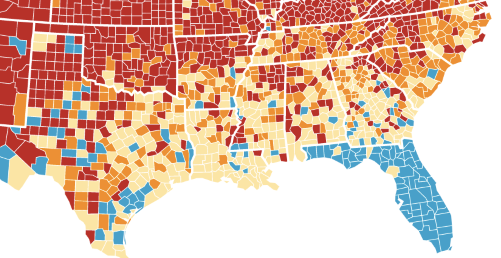
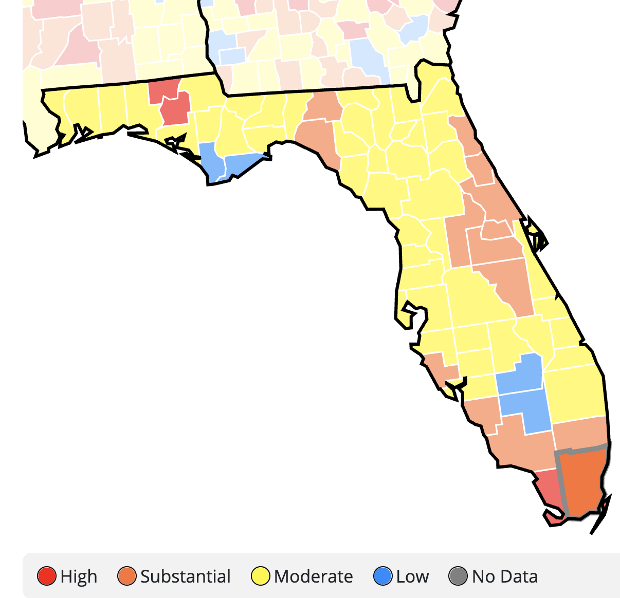
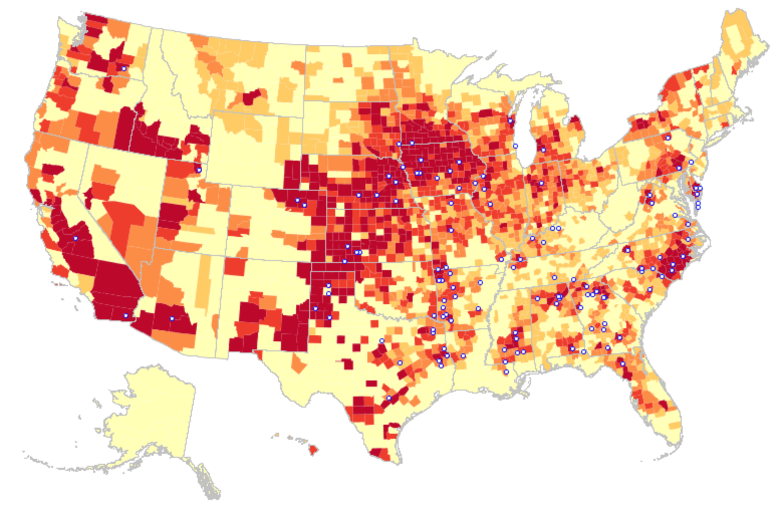
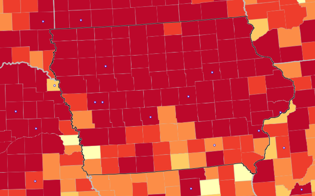
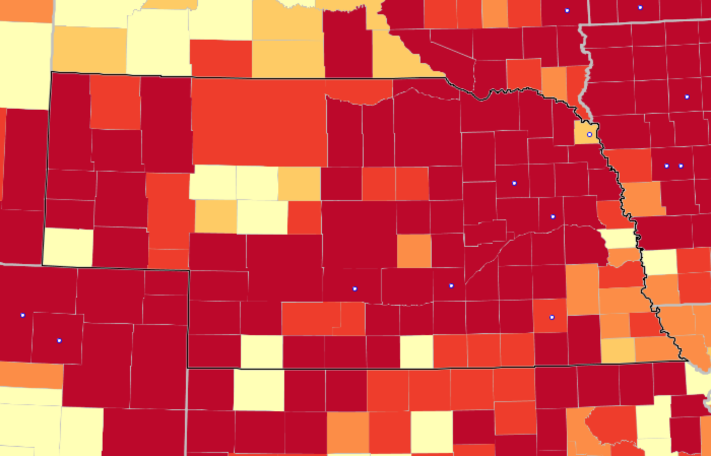
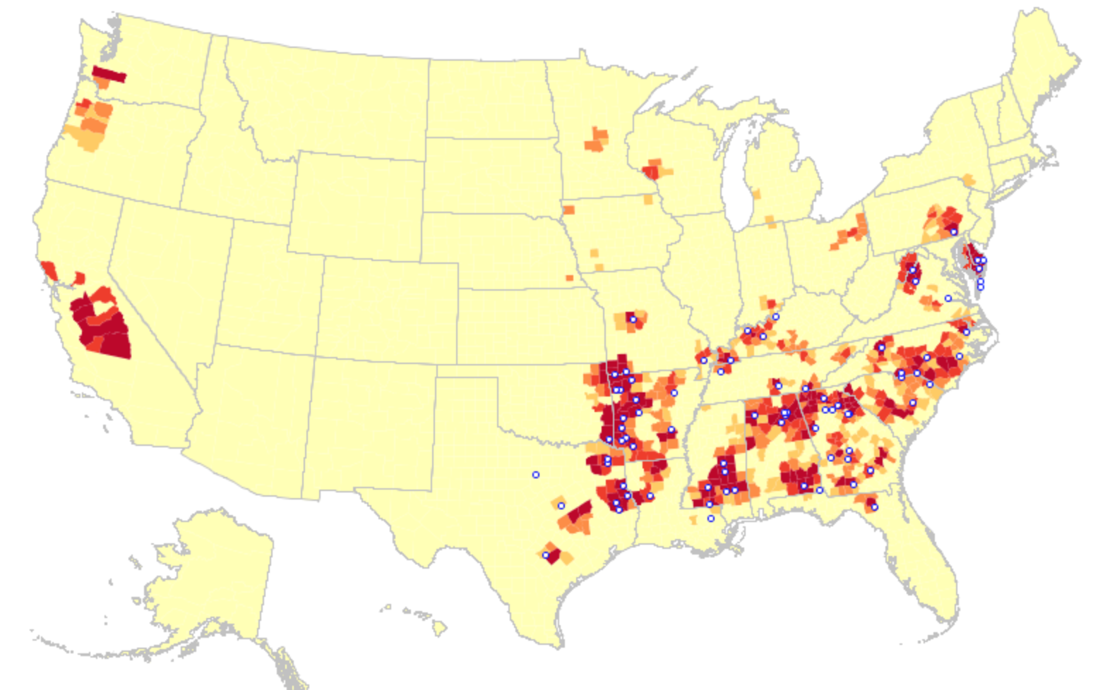
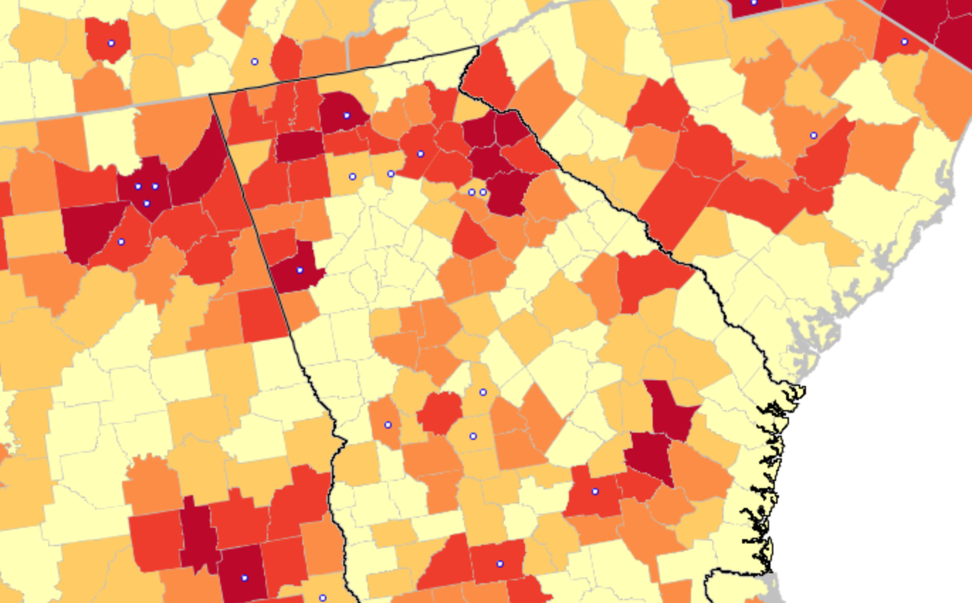
The flimsily persuasive nature of the cherry-picked data of the data vis can be handily spot checked on the CDC website itself, by stepping back just one day for a better view of the risk levels of putting caution aside and heading to the beach. For the lag of a few days of renewing data reminds us of how important the daily release of accurate data is, and how easily it can skew a national image of community transmission that seems to provide a “snapshot” of national levels. Florida’s rates of infection didn’t remain an island from the nation, so much as a lag in reporting failed to show comparable rates of infection to the rest of the nation. The differences were not so pronounced: indeed, the previous day–November 24–mapped the state as being a site of moderate and substantial transmission that could not have suddenly shifted in but one day, so much as the new visualization fit the “narrative” about DeSantis and COVID-19, more than the situation that Floridians experienced on the ground.

And flipping back just a few days previous, the stark divides of low rates of transmission and the substantial to high rates in other states offered little grounds for off the cuff collective diagnoses of the greater hardiness that exposure to COVID due no mask mandates offered a benefit to the state’s population, or might in fact be considered a viable public health policy: a month earlier, transmission seems roughly equivalent on the Florida or Texas coast, and relied on uniform assessment and tallies–but we may have reason to suspect Florida of undercounting to keep its numbers low.

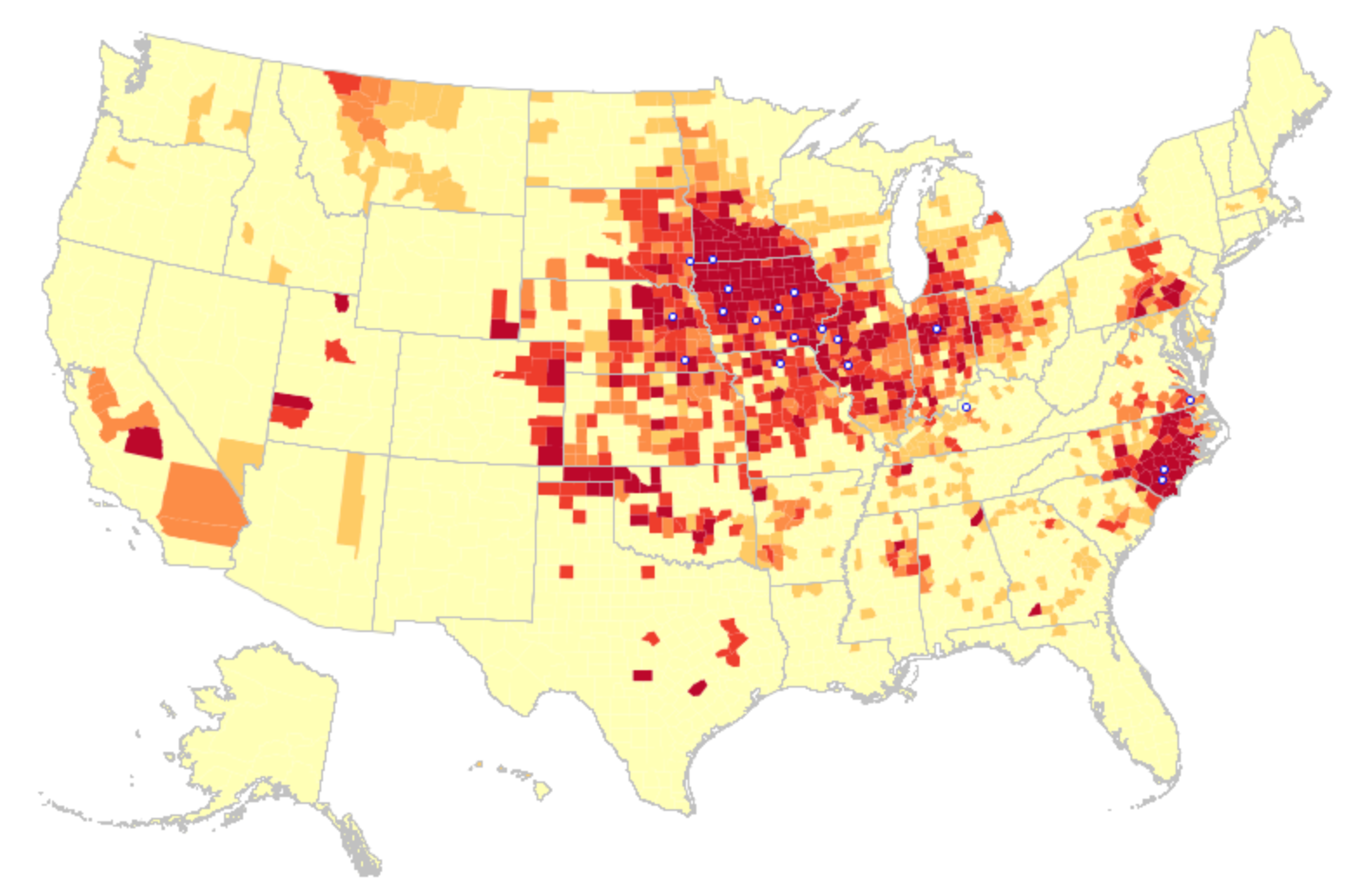
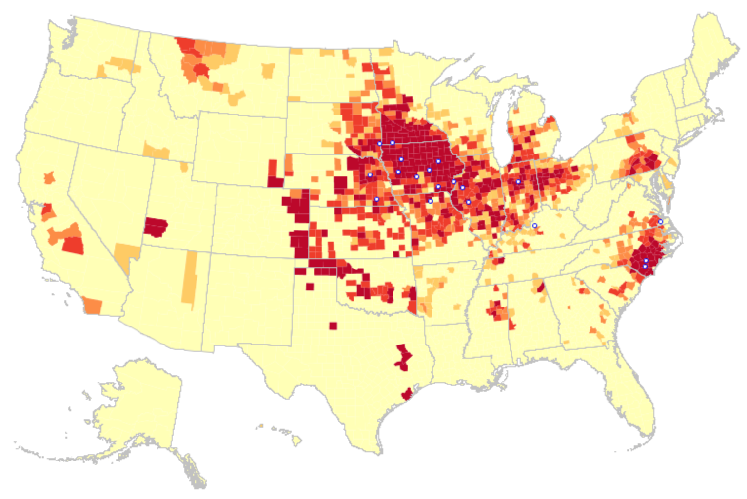
The lay of the land was basically not at all that clear-cut. One can only hope that few made travel plans after seeing that bright blue peninsula on social media: a better bet, it seems, would be Puerto Rico, if the mask-wearing mandate could be tolerated by visitors. In fact, the very areas that visitors might be hoping to travel–from Daytona Beach to Cocoa Beach, or the area around Miami and South Beach, down near the peninsula’s tip–suggested areas of substantial and even high risk, save for the area lying in the Everglades.

Community Transmission by County in the United States, November 26-December 3,
CDC Covid-19 Data Tracker by County

Indeed, a Moderate Risk seemed the fate of much of the state, if the tracker were looked at with regularly updated data sets. And this is relying on the numbers that the Department of Health provided–numbers that might be well scrutinized, given the complaints their former data guru had raised. All said and done, the “narrative” was not one of the power of a Governor to imagine his ability to purge COVID infections from the state, so much as a burst of virulence that demanded to be mapped and tracked in better detail.

CDC COVID-19 Data Tracker, November 26-December 2 2021

2 Comments

Filed under COVID-19, data visualizations, Florida, public health, social media

Blurred Boundaries and Indigenous Lands

Geodesy has increased the number of claims by extractive industries through remote sensing, and especially over indigenous lands. Yet crowd-sourced tools of geolocation have also enabled a range of counter-maps of indigenous native land claims that have pushed back on how industries that have increased access to the resources buried beneath the very lands to which indigenous groups have ancestral claims. Indeed, powerfully innovative webmaps like Native Lands–previously launched as “Tribal Lands”– provide not only a new standard for cartographic literary, but to change ideas of property–as much as give vitality to ideas of property within a new cartographic medium. Indeed, if the original moniker of “Tribes” suggests a non-state actor, the enhanced claims to a public voice in “native” lands suggests an alternative way to stake property rights, and acknowledge and redress the multiple land “cessions” that stripped indigenous property rights.

Boundaries were an invention of the enlightenment, creating clear lines of personal property as well as national bounds. The blurred boundary lines offer an opportunity for ethical redress of the lost of lands indigenous have roundly suffered from the uninvited Anglo settlers of North America, a counter-mapping that is alive and well on web maps. The decisive choice to blur these boundary lines reflects the cartographic preoccupations with which the American government long has regarded indigenous inhabitants–not only as the governors of states and then the federal government forced migrations of tribes into areas that they viewed as “uninhabited,” but as late as 1877, when the Secretary of Interior deemed “there is some difficulty in drawing a line sharp between the California Indians and their neighbors,” who, Stephen Powers told his superiors, “shade away from tribe to tribe, from valley to valley, so that one can seldom put his finger on a river or a mountain-range and say that here one nation ends and another begins.” If landscapes were refigured as bounded expanse, the attempt to inject a sense of on-the-ground experience in maps is the goal of the open source mapping platform Native Lands–an attempt to integrate indignity into the platform of mapping itself.

The cartographic undoing of the primacy accorded to settled land and settlers’ claims is not only revisionary, but a new reality we have rarely seen–the cartographic inheritance of the first settlers of North America eagerly imagined extending land claims westward to the Mississippi River, encompassing the Great Lakes in their maps–

–as if the claims of land might continue to extend westward, across what was seen as tempting green, fertile, and unclaimed, if perhaps not uninhabited, unordered lands populated by the Outworks, Outagamis, Osages, as the Uttawais in upper Virginia straddling to New York, Iroquois or Six Nations on the edges of Pennsylvania and New York, Missasagos north of Lake Erie in a nominal Virginia, Twigtees of Virginia, Cherakees in North Carolina, and Algomkins on the borders between Virginia and Canada, and Creeks in South Carolina and Georgia nestled within the borders of existing colonial land claims, as if their relation to the land didn’t need to be mapped, and had no borders of settlement–or rights–of their own. “Illinois” was “expelled by the Iroquois,” and the contested borderlands, but the conception of wandering or itinerant landless groups was clear.

A New and accurate Map of North America, Drawnfrom the famous M. Danville with Improvements from . . . English Maps, London, 1771

The map was printed in London with the benefit of recent cartographic sources from French Jesuits as D’Ainville as an invitation to settle North America, promising open lands able to be surveyed and owned by future immigrants, and an early evidence of envisioning America as a land of wealth, the landlessness of indigenous was clear. It was a legacy, moreover, firmly lodged in our nation’s own cartographic imaginary, that has long understood indigenous as outside of federal bounds. Indeed, the mapping of properties in the North Atlantic for English Plantation Owners in the British Empire saw no place for the very indigenous who were figured so prominently in feathered headdresses in the map of North America’s cartouche.

Indeed, the original 1755 map for the Earl of Halifax and other Commissioners of Plantations baldly all but invited the staking of claims to property as there for the taking across the entire continent!

Map of the British and French Dominions in North America (1755), Library of Congress

The mapping of property by straight lines and tools of surveying had promised the opening of the entire continent, as if without any objections or interference from those inhabitants who lived on ancestral lands. If the same pastel color scheme is adopted, for new ends, in NativeLands.com, the maps try to undo the tyranny of cartography in opening up the continent. For disregarding or blurring of any boundaries is a way of disenfranchising indigenous from the continent, and denying that any territory existing among a peoples long cast as lacking government and having or claiming a title to land. If one might succeed in mapping the inhabitants of a land continued to be seen as contiguous with an unbounded nature as better mapped by language groups than territoriality: even the largest of indigenous nations in the Central Valley of the state “have no common government, and not even a name for themselves”–just “a common language, with little divergence of dialects for so great an area as it embraces . . . but little community of feeling.” Rather than defend territorial boundaries, Stephen Powers noted in a North American ethnology Tribes of California, that tried to shoehorn indigenous into mapped states, tribes in the Sacramento Valley “believe that their first ancestors were created directly form the soil of their respective present dwelling-places.” Whether the language of borders and boundaries had been returned to in the expansion of the western settlements and the creation of reservations of bordered territories, already salient in newly mapped “Western territories” of the early nineteenth century, showing indigenous settlements in vague termsbeyond Little Rock, Louisiana, and the Kansas prairies.

The question of how to reconcile indigenous inhabitants of the new world with the tools of mapping states was.d long felt, an epistemological struggle, at heart, cast as a legal search to draw bounds on indigenous maps, less rooted in exclusive claims of property–the basis for western maps–or property laws. Rather than embody a “commons,” the long and tortured history of land sessions affirmed to native peoples, often signed under duress, without clear understanding of their consequences of what provided precedents for land claims, informed–or stand in uneasy dialogue with–maps of indigenous presence across North America, as rights of land use were marginalized from the 1830s, with the appropriation of indigenous lands sanctioned by the Indian Removal Act (1830). As the forced migration and approval of dispossession continued, Thoreau’s sought traces of indigenous inhabitation of New England–through the adoption and compilation of place-names and sites that he found of special significance to the nation–to push back against that Act, perhaps, as if to reclaim or restore symbolic awareness of that fast-fading past.

Thoreau returned eagerly to early maps, imagining an earlier era of cohabitation in the New World he imagined might be recuperated or intuited from Champlain’s 1612 “Carte Geographique de la Nouvelle France,” which he had idealized as capturing a moment of contact where natives were not yet mapped off a new national map. If Thoreau had little basis for creating blurred boundaries in his maps, NativeLands hopes to use online platforms to affirm the existence of precedents for the future, with the benefit of hindsight of the historical cessions that confined the indigenous presence of Americans into far more constrained territorial confines of current “reservations” and lands of indigenous governance–even in as small an area as Long Island, an area dear to Walt Whitman, who knew it as Paumanok in homage to its first inhabitants, and recognition of the early land cession of Algonquians resident in the region who in May 3, 1639, deeded the region to one Lion Gardiner of which the webmap shows a far more complex picture than Whitman rather idealistically and romantically imagined to derive from a historical document of the 1639 land cession signed by “Yovawan, Sachem of Pommanocc.”

Thoreau rather hopefully that he might access an accurate remapping of historical land-claims in his own native New England by an earlier print precedent. He viewed the early modern map as lenses to mediate an area of settlement before settlement and contact, soon after he had left his solitary retreat at Walden Pond. Although Champlain in 1608-11 only encountered the tribe he knew as the Armouchiquois while exploring the St. Lawrence River and Maine coast, he took far greater notice of their presence than the current federal government, or indeed the state of Massachusetts in its recently completed land surveys of privately held and public lands. Yet the historical map Champlain created of native peoples and fruits resonated with him as a deep tie to the land, leading Thoreau to retrace its contours to capture that primeval moment of real contact.

Clear designation of the past presence is oddly evident in notations of early modern maps, albeit outside of clear boundaries. Indeed, on the surfaces of many early modern maps, the capital letters of early colonial states commingle with the tribal presence of Shuman, usually mapped near the Rio Grande; Natchitoches, a Caddo-speaking people now located at the borders of Texas, Oklahoma, Arkansas, and Louisiana; the Cododaquio or Great Caddo on the Red River; Chicachas or Chickasaw of the southeastern woodlands, whose forced migration west of the Mississippi lost their ancestral lands in 1832; or Tchatas or Choctaw who once dwelled across what be came Alabama and Mississippi–or the Alabamans or Alibamu tribe, tied closely to the Coushattas, belonging to the Creek confederacy. These names, and others, legible on the map, as evident in the 1764 Atlas petit marine, were preserved in maps prior to American independence and sovereignty, can be seen as stylistic ancestors of the alternative forms of noting ancestral claims on web-based maps.

The growth of consciousness of ancestral land claims has promoted a need to accommodate property claims that had promoted a mapping of jurisdiction along clearly demarcated lines, ending or eroding indigenous land claims, and parallel the search for a new legal framework to acknowledge and recognize past claims of historical habitation that had been eroded by a treaties, land cessions from claims of collective possession, and fit a new legal language of ancestral lands often excluded from property law. After all, back in the famous if not canonic account of the Plymouth Plantation that the Puritan William Bradford wrote, the sites of Europeans were already firmly set back in 1650 on the “vast and unpeopled countries of America, which are fruitful and fit for habitation, being devoid of all civil inhabitants, where there are only savage and brutish men which range up and down, little otherwise than the wild beasts of the same,” perpetuating a quite distasteful image among Puritans–who saw the inhabitants as satanic in ways that are difficult to acknowledge–of lacking ‘civil’ grounds of inhabiting the selfsame lands, as well as being “cruel, barbarous, and indeed treacherous, . . . merciless [in their] delight to torment men in the most bloody manner.”

The rather hateful image Bradford painted meant that hey not only lacked license to inhabit the lands by property rights, but constituted a civil danger for those settlers who colonized them–or arrived to set up commerce and trade on them. Bradford, who wrote the Plymouth Plantation history in the immediate aftermath of the Peace of Westphalia, inscribed the New World as an anti-Westphalian order of no boundaries, akin to a state of nature, but also left open the possibility of inscribing the landscape in a post-Westphalian order, an imaginary of boundedness that was divided by frontiers and mapped indigenous outside boundaries around exclusion, an imaginary of space that has continued to inform the cartographic imaginaries of indigenous from early anthropologists as Alfred Kroeber’s maps of Indian languages in California to today–not imagining the indigenous societies of the world to exist outside of and in relation to a bounded state or miniature mini-states. To be sure, Kroeber, an upper middle-class German Protestant born in Hoboken, New Jersey, imbued with the ideals of Boasian anthropology was of deeply rationalist bent, if a proponent of cultural relativism, was an unapologetic positivist, if, as his fellow-student Edward Sapir, believed the individuation of what Sapir called ‘linguistic stocks’ were distributed in regions that did not reflect anything like national lines and allowed a flow distinct from race: as Sapir suggested that structurally unified linguistic groups in aboriginal America might spread over like-minded cultural groups, rather than being isomorphic with cultural divides, and indeed mingle with one another and go to the same intertribal religious ceremonies, the groupings of language are historically rooted, not coinciding with divides culture or race, and not implying a nation–so much as rooted in a distinct setting–

Alfred Kroeber, “Indigenous Languages of California,” University of California, Dept. of Anthropology (1922)

–the divides of “native California” Kroeber mapped stood as a surrogate for the absence of laws, or of national belonging or identity. Sapir, born in Pomerania but migrated to the United States at 5 years of age, must have studied with the father of American anthropologists worked with Kroeber to map indigenous languages after finishing his doctorate in Native American languages, was soon employed by the Geographical Survey of Canada given his expertise in indigenous language families as the Athabascan, Algic (Algonquin), Uto-Nahuatl, Southern Paiute and Chinkookian language groups, providing some of the first authoritative “maps” of regional indigenous languages, enticed by the manner that indigenous languages shook traditional assumptions of the origins of language, and committed to the study of linguistic typologies distinct from race or ethnicity, collaborating with indigenous informants and setting his sights under Kroeber’s influence on the Yahi language between the Feather and Pit rivers in Shasta county, the language of Ishi, the “last wild Indian” who claimed to ‘have no name because there were no people to name me,’ or left to speak his name. For Sapir, a German Jewish refugee, the problem of the study of disappeared languages as linguistic groups was painful, but must have promised a sort of weird redemption.

The problem of mapping the presence of past indigenous remained on the front burner of native peoples. The difficulty of mapping the inhabitation of the continent outside of a Westphalian optic of fixed boundaries, by European concepts of territoriality and land possession, posed problems of the mapping indigenous presence of an epistemic dimension. The cession of land and territory, and the removal of land rights, have been cast in this Westphalian optic, networks of migration, trade, and sacrality or social spaces of the indigenous societies–and their relation to entities like rivers, lakes, or mountains, fails to translate into a syntax of polygons and bounded edges,–even if these are the edges by which property and parklands are increasingly understood. This has pose a problematic that Tribal Lands seeks to resolve. How can the multidimensional relation to space among indigenous be figured or mapped?

The problem of the plurality of land recognitions that NativeLands documents in its mobile maps across America document the complexity of native land claims in its web maps as a bounteous flowering of a multitude of local claims that seek not only to evoke the ancestral lands, but to show the wealth of inhabitants who, far from wandering, regard their claims to land as historical, and indeed were compelled to historically compelled to cede them. By the mapping of actual cessions and land claims, the wealth of material the mapping engine assembles offers a radically different nature of continental inhabitation–inhabitation that long antedated the Puritans’ arrival.

The rich range of pastel colors in these webmaps suggests the range of claims that we must, moving forward, be compelled to entertain and would do well to celebrate. Modern Canada constitutionally only explicitly recognizes three groups of aboriginal or indigenous–the Inuit, Métis, and generic “First Nations”–the multi-color blocks of native lands and historic “cessions” of tribal lands suggested a new understanding of how Canada had long celebrated its multiculturalism as a “mosaic” and not a “melting pot”–but showed the divisions of the land claims of a plurality of indigenous groups never recognized by Canadian law–and still quite problematically recognized in public acknowledgements of respect for land long inhabited by indigenous or “autchothones” proclaimed with piety by national airlines whose flight paths criss cross endangered boreal forests that tribes have long inhabited.

Air Canada went to pains the national company took at presenting a land acknowledgment in the form of a public announcement to all passengers, as if a remediation of the incursion of their airspace. But the video quickly turns to promote the airline as a platform for personal advancement that actual indigenous elders–if not leaders–embraced, affirming the cultural mosaic called into question if not challenged by the shard-like divisions staked on NativeLands, and its maps of historical land sessions. The flight over land seems to acknowledge indigenous claims to regions of pure waters and lands of a boreal forest, that maps an odd acknowledgement of indigenous presence from the air–paired with testimonials from Air Canada workers of native parentage attesting to longstanding fascination with the planes flying above over native lands and in airspace that was never properly defined–and the company’s commitment to secure these rights, as the major national company of state-run transportation.

–that suggest a respect traditions from the perspective of the modernity of air flight–as First Nations asserted data sovereignty over the lands they inhabit by a system of automated drones from 2016, to build a transportation infrastructure available to communities often isolated from infrastructure roads–and the notable fact that Canadian indigenous constitute the fastest-growing population in Canada, a notable fact of increased political significance, raising questions of the integration of their communities that could be reconciled with the historical transfer of land in the numbered treaties, 1871-1012, to transfer tracts of lands to the crown for promises that were rarely kept.

The odd status of indigenous lands in the nation puts the national airline of Canada at a unique relation to indigenous territories in recent years: while Canada’s divided system of federal sovereignty has begun to affirm aboriginal title in legal terms, and recognize autonomy of regions of indigenous settlement within Canadian sovereignty of the entire nation, the status of First Nation’s title are like islands of federal supervision in provinces, leaving national agencies like Air Canada, which reserves Parliament’s legislative jurisdiction over “Indians and lands reserved for Indians,” in an outdated legal formulation, a unique and privileged ties to lands of aboriginal title: the title of the nation is understood as parallel to and not in conflict with historical title of First Nations, which are incorporated into the nation as islands of federal sovereignty which still exists over the regions of the Numbered Treaties, which have never been legally dissolved.

Numbered-Treaties-Map.svg

Numbered Treaties and Land Cessions with Indigenous First Peoples, 1871-1921

Is Air Canada, the national airline service, not acting as a proxy of the federal government in acknowledging the continued land claims of Native Peoples hold to old growth boreal forests below routes the airline often flies? The question of indigenous properties and indigenous autonomy is in a sense bracketed over areas Canada acquired from Great Britain in 1867 and purchased from the Hudson’s Bay Company three years later? The increasingly pressing question of how to acknowledge native sovereignty is hoped to be accommodated to the Canadian image of a “cultural mosaic” of sorts, and the NativeLands offers what might be best seen as a response to that mosaic–not an image of interlocking shining cultures of sparkling individuality, but the overlapping rights of possession not rooted in firm boundary lines, but in forests, rivers, and streams, not as a generic bucolic region out of cities or accessible infrastructure, but a new form of mapping, rooted in notions of neighboring places, and acting as a neighbor to places–and inhabiting spaces–that is distinct from an Anglo-American system of property rights.

To Learn More about the Indigenous Peoples of Canada, Click the ‘About Us’ Onscreen Tab”

For although the maps of Anglo settlers–attracted by the shifting global markets for goods, from cotton, to gold, to petroleum, all claimed without consent from their longtime inhabitants–erased or omitted local claims to land by those seen as nomadic, and of an earlier historical developmental stage, with a cutting logic of relegating their very presence to the past, the reframing of collective memories to inhabiting lands and regions offers a plastic and particularly valuable cartographic resource for remediating the future. The change parallels the first assertion of reversionary practices to land title, marked by. the Nisga’a Land Title act of 2000, which guaranteed title to lands outside of a historic chain of property deeds, allowing the determination of titles dependent on competing interests, by which the state can ensure ownership that incorporate traditional ways of recording property interests, outside of a property system of deeds: the new legal authority of the state may as well have inspired, this post suggests, a new form of mapping, in a webmap able to register mutually competing interests in compatible ways, rather than privileging historical titles of written form. In this sense, the growth of webmaps offer a new form of an open repository for competing claims, not linked to a legal system that has long favored colonial or settler claims.

The problem of a project of decolonization of course was greater than a map could achieve–but the relentless colonization of indigenous spaces and places needed a public document or touchstone to return. The presence of native tribes was never in question during the colonization of the continent–if one can only ponder the notion of the Library of Congress, Daniel Boorstin, who commemorated the approach of European and native cultures as so culturally fruitful for American culture, rather than one of loss. But how to take stock of the scale of loss? Northern California has been recently a site of active indigenous resistance to a legacy of colonization, the cartographic unearthing of land claims offers a new appreciation of increasing pluralistic possibilities of occupying the land.

Webmaps offer the possibility of stripping away existing boundaries, in cartographically creative ways, by interrogating the occupation of what was always indigenously occupied in new ways. Henry David Thoreau was plaintive as he voyaged down the Concord River, realizing how native lands had been not only usurped by the introduction of European grasses and trees, not only leading the apple tree to bloom beside the Juniper, but brought with them the bee that stung its original settlers; pushing downriver and “yearning toward all wilderness,” he asked readers, “Penacooks and Mowhawks! Ubique gentium sunt?” The signs of longstanding presence are not erased, but present on the map. And although lack of fixed boundaries on native lands have long provided an excuse to stake claims that exclude inhabitants who are seen as nomadic, or not settled in one place, and laying claim or title to it, and “without maps,” the blurred boundaries of NativeLands re-places longtime residents on the map, wrestling with the long-term absence of indigenous on the map.

NativeLands.ca

It is, perhaps, not a surprise that the crowd-sourced interactive website Native Land Digital that was the brainchild of Victor Temprano, in the midst of the heady environment, CEO of Mapster who worked on a pipeline-related project, circa 2016. The sourcing of maps for indigenous land claims was pushed by his own anti-pipeline activity that involved remapping the place of planned lines of transport of crude oil from the boreal forest south to New Orleans on the KXL project and to Northwest ports Victoria threatened native lands and the ecological environments exposed to threats by drilling and clearcutting and risks of leaks. The current live charting at a live API offers total coverage of the globe, as may be increasingly important not only at a time of increasing unrestrained mineral extraction to produce energy but the retreat of ice in global melting that will alter animal migration routes, thawing permafrost, and sudden drainages of inland lakes that might call attention to new practices of land preservation.

The rich API provides a reorientation to the global map promising a powerful new form of orientation. Temprano, an agile mapmaker, political activist and marketer, framed the question of a more permanent digital repository of a global database of indigenous geography, that put the question of indigenous map front and center on the internet globally. The product, that led to an ambitious open source non-profit, sidestepped the different conceptions of space, time, and distance among indigenous communities, or the blurriness of fluid bounds, and opted the benefits outweighed the costs of an imagined the collection of maps of ancestral lands in term by the GIS tools of boundaries, layers, and vector files, as a rich counter-map to settler claims, able to collate lands, language and treaty boundaries on a global scale. The dynamically interactive open-source interactive project, known for its muted pastel colors, rather than the harsh five-color cartography that reify sovereign lines that posits divide as tacit primary categories of knowledge, is subtly compelling in its alternative non-linear format, that invests knowledge in sensitivity to the contributions of each of its viewers: dynamic, and administered by a non-profit with native voices on its board.

It is, inventively, able to maintain the dual display of a site where one could easily navigate between native and Canadian place-names and explore “indigenous territory,” as if it might be mapped by mapping space onto time in the broadly used cartographic conventions that have developed and flourished in online mapping ecosystems–and offered the benefit of creating layers able to be toggled among to layers of treaties by which land was legally ceded, overlapping language groups, and a decolonized space that was particularly sensitive in Canada, where the ability to engage outside colonial boundaries had been placed on the front burner by extractive industries. There is a sense, in the crowd-sourced optimism that recalls the early days of OpenStreetMap and HOT OSM, of the rewriting of maps and the opening of often erased land claims that crashed like so many ruins that accumulate like a catastrophe as wreckage that has piled at the feat of an Angel of History who is violently propelled by the winds to the future, so she is unable to ever make the multiple claims and counter-claims in the wreckage at her feet whole, and the pile of ruins constituted our sense of the progress of the present, even as it grows toward the sky. Was this a new take on the cultural mosaic of Canada, now revised as a problem of staking claims to the visions of property that the land cessions of the Native Treatise of Canada erased.

The website was the direct reaction to the active search for possibilities of extracting underground petrochemical reserves on indigenous lands in Canada. The growth of the website north of the border however has resonated globally, underscoring the deep cultural difficulties of recognizing title to lands that was long occupied by earlier settlers. If many of the claims to petroleum and mineral extraction in indigenous land is cast as economic–and for the greatest good–the petrochemical claims are rooted in an aggressive military invasion, and are remembered on NativeLands.Ca as the result of abrogated treaties and land cessions that must be acknowledged as outright theft.

The history of a legacy of removing land claims and seizing lands where Anglos found value has led many to realize the tortured legacy–and the unsteady grounds on which to stand to address the remapping of native lands. General Wesley Clark, Jr. acknowledged at Standing Rock, asking forgiveness in 2016, almost searching for words–“Many of us are from the units that have hurt you over the many years. We came. We fought you. We took your land. We signed treaties that we broke. We stole minerals from your sacred hills. We blasted the faces of our presidents onto your sacred mountain. . . . We didn’t respect you, we polluted your Earth, we’ve hurt you in so many ways, but we’ve come to say that we are sorry.” Crowd-sourced maps of claims on NativeLands offer an attempt at remediation, although a remediation that might echo, as Chief Leonard Crow Dog responded at Standing Rock, “we do not own the land–the land owns us.”

Oceti Sakowin (Sacred Stone) camp near the Standing Rock Reservation, Cannon Ball, North Dakota, United States on December 6, 2016.

The sacred lands that had long reserved sacred lands in ancestral territory to indigenous tribes were indeed themselves contested at Standing Rock in 2015-6, when the 1868 Treaty of Ft. Laramie that assigned Sioux territory east of the Missouri River and including the water that runs through these ancestral lands as including the water, but the protection of these waters as within ancestral lands was not only challenged but denied by the proposed Dakota Access Pipeline, even if the water runs through Sioux territory, as it long had, leading the Sioux Nation to bring suit against the US Army Corps of Engineers for having planned the pipeline through their ancestral lands, and attracting support of military veterans who objected to the continued use of Army Engineers to route the pipeline through historical and cultural sites of the Upper Sioux that ran against the lands reserved fort he Sioux nation.

Indian Claims Classification Determination of Sioux Territory across Missouri River

The challenge or undermining of ancestral claims to land by the DAPL offered a basis for accounting or tallying of the respect of previous treaties and land claims. In the rise of the webmaps Native Lands, a new and unexpected use was made of the very cartographic tools that facilitate international petrochemical corporations–and indeed military forces–to target lands valued for mineral production with unprecedented precision have helped to stake a claims for the land’s value that undercut local claims to sovereignty. The website offers a way to preserve claims that were never staked earlier so clearly, and to do so in dialogue with broken treaties as a counter-map taking stock of the extent of indigenous lands. It is as if, within the specters of extractive industries’ deep desire to possess the targeted energy reserves, and at the end of a history of dispossession and destruction, the indigenous that were systematically killed and removed from their lands over the nineteenth century, at whose close 90-99% were killed, in a massive and unprecedented theft of land, forcing them from migratory habits to receive religious instruction and live on bound lands to which they were confined. In Canada, where NativeLands grew, displacement of land rights began from clearing herds of bison herds from Prairies to begin construction of the Canadian Pacific Railway, the principle commercial artery to the West, that had by 1869 shifted indigenous resources to rations that rarely arrived, to be replaced by cattle on lands settled by European farmers and style of agriculture. The melancholy history Plenty Coups framed of the extinction of Crow sovereignty went beyond land rights: “when the buffalo went away the hearts of my people fell to the ground, and they could not lift hem up again: after this, nothing happened.”

Time stopped because the imposition of new modes of agrarian regime recast native lands as terra nullius to be settled by Anglo and European farmers, a surrender of land title from 1871-1921 that nullified local land claims. The cartographer and framer of the U.S. Census, newly appointed to what would be the Bureau of Indian Affairs, Francis Amasa Walker conducted the first review of 300,000 Native American in the United States of 1874, trying to sort out the theft of land over four hundred treaties. Walker’s agency was not clear, but if he bemoaned theft of ancestral lands fertile and rich with game, confined in land that could not support them and dependent on rations, there is some sort of redress in how the NativeLands maps invites us to retrace the sessions of lands that undermined these indigenous land claims, erasing the nations not deemed fit to have place or stake belonging in American made maps that Walker helped to codify, placing the loss of land that Plenty Coups did so much to try to protect and retain, against all odds, in making trips to Washington DC to allow Crow claims to survive in this new White Man’s world. Even if the claims that he preserved were less than they had been originally allotted–just 80%–he forestalled desires to claim land for gold prospecting and mineral extraction that are effectively on the cutting block once again today.

Continue reading

2 Comments

Filed under California, data visualizations, indigenous land claims, native lands, tribal lands

The Cognitive Clouding of Global Warming: Paris and Pittsburgh; Creditors and Debtors

The argument of America First seems to have been extended to its logical conclusion as the apparently selected President of the United States has single-handedly subtracted the nation from a map of climate change.  By denying the place of the United States in the Paris Climate Accords, President Trump seems, in the most charitable interpretation, to have acted on his own instincts for what was the benefit that accrued to the country in the very short term, and after looking at the balance books of the United States government for what might have been the first time, decided that America had no real part in the map of the future of a warming world.  Rather than outright denying global warming or climate change, Trump decided that the conventions established to contain it by the world’s nations had no immediate advantage for the United States.  

The result wasn’t really to subtract the United States from the ecumene, but from the phenomenon or at least the collective reaction of the world to climate change, and openly declare the supremacy of his own personal opinion–as if by executive fiat–on the matter. The personal position which he advanced was so personal, perhaps, to be presented in terms of his own clouded thinking on the matter, or at least by seizing it to create what he saw as a wedge between national consistencies, and to use wildly incommensurate forms of data to create the impression of his own expertise on the issue–and to mislead the nation.  For Donald Trump took advantage of his having Presidential podium to diss the Paris Accords by a torrent of alliteration developed by a clever speechwriter as resting on a “cornucopia of dystopian, dishonest and discredited data.”  Even if one wants to admire the mesmerizingly deceptive excess of alliteration, the notion of rooting an initial response to planetary climate change in the perspective of one nation–the United States of America–which produced the lion’s share of greenhouse gasses–is only designed to distort.  

By pretending to unmask the Paris Accords as in fact a bum economic deal for the United States, as if it were solely designed to “handicap” one national economy, set a sad standard for the values of public office.  For as Trump dismissed data on climate change as discredited with mock-rage, and vowed that the entire affair had been designed by foreign groups who had already “collectively cost America trillions of dollars through tough trade practices” and were desiring to continue to inflict similar damage.

But the large future on trade imbalances–which he treated as the bottom line–he staged a spectacle of being aggrieved that seemed to take on the problems of the nation, with little sense of what was at stake.  Trump’s televised live speech was preeminently designed only to distract from the data on which the Accords had been based.  And even as Trump sought to pound his chest by describing the Accord as a “bad deal for Americans,” that in truth “to the exclusive benefit of other countries.”  By turning attention to an America First perspective on global warming, Trump sought to replace the international scope of the challenge–and intent of the much-negotiated Climate Accords–by suggesting that it obscured American interests, even if it only took America’s good will for granted.  As if explaining to his televised audience that the agreement only “disadvantages the United States in relation to other countries,” with the result of “leaving American workers–who [sic] I love–. . . to absorb the cost in terms of lost jobs [and] lower wages,” he concealed the actual economics of withdrawing from the Accords were buried beneath boasts to have secured “350 billion of military and economic development for the US” and to help American businesses, workers, taxpayers, and citizens.  

In continuing to dismiss the data out of hand about the expanded production of greenhouse gasses, Trump seems to seek to overturn the deceptions of data visualizations that have alerted the United States and world about the consequences of unrestrained or unbridled climate change. Trump ridiculed the true target of the nearly universally approved Accords, scoffing at the abilities to reduce global temperatures; instead, he concentrated on broad figures of lost jobs in manufacturing and industries that are in fact small sectors of the national economy, and incommensurable with the dangers of ignoring global warming and climate change, or the exigencies of taking steps to counter its recent growth.

global warming
Increased Likelihood of Temperature Surpassing Previous Records by 2050 and 2080

oceanic-warming
Sea Surface Temperatures against a Historical Baseline of a Century Ago/Climate Central

As if years of accumulated data of earth observation could be dismissed as deceptive out of hand by executive authority, independent of an accurate judgement of its measurement, Trump dismissed expert opinion with the air of a true populist whose heart lay in the defense of the American people and their well-being–as if they could be abstracted and prioritized above the world’s  Trump’s largely rambling if gravely delivered comments in the Rose Garden press conference that painted himself as daily fighting for the country cemented the alliance of populism and a war on science by its odd substitution of bad economic data for good scientific data.  

The switch is one in which his administration has specialized.  His address certainly culminated an outright dismissal of scientific conclusions based on a distorted America First picture of the world, where a stolid declaration that “the United States will withdraw from the Paris Climate Accords” made sense as form of national defense–despite the potential global catastrophe that rising global temperatures and sea surface temperatures threaten. Is the technique of juxtaposing statistics and muddying data an attempt to undermine evidence, or an illustration of his insecurity with giving authority to data, or to scientific authority, the mirrors his concern about concealing “his profound illiteracy,” or his insecurity about illiteracy, that linguist Geoffrey Nunberg argues not only distance his own speech from words, and discredits their currency, but an insecurity of having to rely on language and linguistic skills alone, in ways that might be well seen as analogues to his plentiful use of all caps on social media, as stepping outside of the language of public life to a medium more direct and complicit with his audience, if outside the usage standards of a written language.

The catastrophes were minimized by being argued to be based on “discredited data” in a bizarre flourish designed to dismiss scientific concensus  Trump conspicuously faulted not only the “discredited” but distracting nature of data  in the speech he gave in the Rose Garden on June 1, 2017 that supposedly justified his announcement of withdrawing from the Paris Climate Accords in 2015 to limit heat-trapping emissions of carbon fuels that have been tied to observed climate change.  Rather than foreground the international nature of the accords among agreed upon by almost 200 nations, trump advanced the need to heed local interests, perversely, but even more perversely argued that the Accords resulted from disinformation.  He spoke to the world to chastise their recognition of scientific observations, in so doing destabilizing not only global alliances but undermining a long-negotiated climate policy by pulling the rug out from long accepted consensus not only of climate scientists but a role of national leadership that sought to remedy the failure of the Kyoto Protocol of 1997.  Trump turned his back on the Climate Accords on how to curb greenhouse gas emissions  by proclaiming their unfairness to American interests, and attacking unwanted constraints on American industry, through his own deployment of data that was even more discredited as an excuse to walk away from the prospect of a greener world.

Exiting the Green.png  Al Drago/New York Times
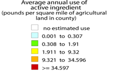
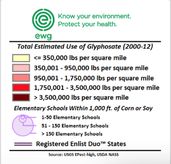
1. If Trump steered the nation away from green energy and into darkness, Vladimir Putin seemed to mock Trump’s rationale for the withdrawal when he mused, jokingly but ever so darkly, that “maybe the current [U.S.] president thinks they are not fully thought-through,” making open fun of Donald Trump’s image of global leadership by wryly noting in ways that echoed the absurdity of Trump’s defense of the local in place of the global.  “We don’t feel here that the temperature is going hotter here, . . . I hear they are saying it snowed in Moscow today and its raining here, very cold,” Putin noted, as if relishing undermining long-established trends in climate data by invoking a populist championing of local knowledge as if it trumped the advantages of earth observation that satellite observation has long provided.   Populism trumped expertise and Putin laughed at the possibility that the Accords might soon fail as a result.

Given the longstanding desire of Moscow to be released from constraints on exploring the billions of tons of Arctic oil on which Russia has chosen to gamble, Trump’s almost purposive blindness to a changing environmental politics of the global economy astounds for its parochialism, and its championing of place to dismiss undeniable effects of climate change that seems closely tied to carbon emissions.  For with a false populism that championed the limited perspective of one place in the world–or one’s own personal experience–Trump dismissed the maps and projections of climate change, on the basis that the “deal” was simply “BAD.”  And as a man who views everything as yet another deal, while he pronounced readiness to “renegotiate” an accord he sought to cast as a failure of President Obama to represent America’s interests, the rebuke fell flatly as the accord was never designed to be renegotiable.

Putin’s remarks were met by scattered laughter of recognition, and some smirks at the decision of the American president to withdraw form a long-negotiated set of accords to the collective dismay of our military and environmental allies, and its implicit endorsement of deniers of climate change.  The potential “axis of mass destruction” France’s climate minister has cautioned against might indeed be one of mass distraction.  For in dismissing and indeed disdaining the historical accords to limit carbon emissions, Trump sought a soundbite sufficient to stoke suspicions the climate treaty.  He sought to cast it as yet another deeply rigged system of which he had taken to compulsively warning Americans.  Such a metaphor of bounty was jarring to reconcile with onerous economic burdens cited as the prime motivations for deciding to reject the Paris Accords on Climate Change.  The jarring cognitive coinage seemed to connote its negative by a disorienting litotes; but perhaps the most striking element of the entire news conference was that Trump offered no data that backed up his own pronouncements and appearance of steadfast or only obstinate personal resolve.

Before the coherence of the embodiment of climate change in maps, Trumps jarringly juxtaposed radically different sorts of statistic to snow the nation–and the world–by disorienting his audience, on which Trump turned to a litany of complaints and perceived offenses striking for providing no data of any sort, save several bits of false data.  As much as Trump betrayed uneven command over the data on climate change, as if embedding discrete numbers in unclear fashion that supported a self-evident argument, as if they addressed one of the most carefully documented changes in the atmosphere of the world.  By juxtaposing a threat that “could cost Americans as much as 2.7 million lost jobs by 2025“–a number described as extreme but decontextualized to exaggerate its effect, framed by the dismissive statement  “Believe me, this is not what we need!“– with a projected small temperature decrease of two tenths of a degree Celsius–“Think of that!  This much”–as if to indicate the minuscule return that the “deal” offered to the United States that would have made it worthy accepting its costs–

sub-buzz-27555-1496436714-1

The gesture seemed designed to juxtapose the honesty of direct communication with the deceit of the experts.   Trump’s notion of direct communication concealed the surreal enjambment of disproportionate numbers more striking by the difference of their scale than their meaning.  Of a piece with his citation of partial statistics that exaggerate his points, from “95 Million not in the U.S. labor force” as if to imply they are all unsuccessfully looking for work, targeting some 8 million immigrants as “illegal aliens”ready for deportation, or how immigrants coast American taxpayers “billions of dollars a year.”   Such large figures deploy discredited data difficult to process to conjure fears by overwhelming audience, distracting from specific problems with large numbers that communicate an illusion of expertise, or even overwhelm their judgment by talking points disseminated in deeply questionable media sources.

If the power of this juxtaposition of unrelated numbers gained their effectiveness because of a lack of numeracy–Trump’s claim of 100 million social media followers lumps his followers on Twitter, Facebook and Instagram, many of whom may be the same people, and other fake persona —the numbers seem to exist for their rhetorical effect alone, as if to awe by their size and dismiss by the miniscule benefits they might provide. The point of contrasting such large and small statistics was to suggest the poor priorities of the previous administration, and dilute form the consensus reached on the modeling of climate change.  To be sure, the Trump administration also barters in fake facts on Fox News Sunday. inflating the number of jobs in coal industries, that show a misleading sense of the government’s relation to the national economy, generating a range of falsehoods that disable fact-checking, obscuring the fact that the global marketplace increasingly gives preference to cleaner energy and clean energy jobs more quickly others sectors of our national economy beyond energy industries.  The ties of Trump’s administration to fossil fuels–from the Secretary of State to the Secretary of Energy to the Secretary of the Interior down–employ the obsfuscating tactics of fossil fuel industries to obscure benefits of low-carbon fuels.  Indeed, the inability to “renegotiate” a deal where each nation set its own levels of energy usage rendered Trump’s promise of the prospect of renegotiation meaningless and unclear, even if it was intended to create the appearance of him sounding reasonable and amiable enough on nightly television news.

Broad hands.png
Cheriss May/Spia via AP

Another point of the citation of false data was to evoke a sense of false populism, by asking how the Accords could ever add up.  In isolating foregrounded statistics great and small, tightly juxtaposed for rhetorical effect, the intent seems consciously to bombard the audience to disorienting effect.  We know Trump has disdain for expertise, and indeed the intersection between a sense of populism with disdain or rejection of science may be endemic:  in formulating responses to a global question like climate change that he has had no familiarity with save in terms of margins of profits and regulations.  Rather than consulting experts, the President has prepared for public statements by consulting sympathetic FOX media figures like Kimberly Guilfoyle who pander by endorsing the notion of a climate conspiracy–not experts, who use data as obscuring foils, suggesting an ecology of information originating from pro-fossil fuel industry groups.

Continue reading

Leave a comment

Filed under data visualization, data visualizations, Donald J. Trump, global warming, statistics

Mapping Rome’s Pasts from Piranesi to Freud and Back

We now map mega-regions that extend along highways far beyond the former boundaries of cities, along roads and through suburbs increasingly lack clear bounds.  The extent of such cities seem oddly appropriate for forms of mapping that seem to lack respect for physical markers of bounds.  These maps reflect the experience of their environments as networks more than sites, to be sure.  It may be surprising to see the mapping of the ancient world as a similar network, and to try to understand the mobility of the ancient world and Mediterranean in terms of modern tools of mapping travel–that would put NATO to shame, demanded to be studied as mobility research.

Roads to Roads to Rome,” by Moovel Lab

–that now provides a way to imagine travel in the pedagogic aids, as well as visual candy, by which we imagine the coextensive nature of an ancient past, mapping travel times, interconnectedness, and flow in the Roman Mediterranean, as if it were a smoothly interconnected network of transit enabling civilization, as varied digital humanities sites from Stanford to Europe assure us.

To privileged flow echoes the absent edges we have lost in our global mapping, tied to globalization, as William Rankin and others argue, more tightly that we are still unaware. Using algorithms to render overland flows of mobility that converged on the city of Rome in the ancient world may mix more metaphors and tools to digitize the past in distorting ways. These are uncanny resemblances to the maps in which we live, as much as told of the past, if they are used in heuristic ways: tracing the spatial extension of extra-urban areas along distended networks of paved space suggests not only a conquest of the antique, but its transcendence, mapping ties within as well as to an ancient world. The analogical nature that Freud gave the expertise of archeology staked out the claims he made for a new science firmly planted in objectivity of a personal past, by a powerful conflation of the personal past with the objectivity of sedimented layers of time. 

If Freud understood the self as able to be revealed as a sort of substrate created by interactions of instincts and society, of which the psyche was the result, archeology provided a metaphor, but also a model for excavation and for storytelling to understood psyche as an objective map. And if we are coming to acknowledge not only that archeology was a guiding metaphor for Friedrich Nietzsche that Freud adopted and embraced in his explorations of the psychic traces of personal pasts, in concrete terms that were more rooted to the tie between seeing and saying in their works–and in the therapeutic cure–that explored a terrain hardly able to be seen as transcendent, so much as excavating deep labyrinths in the psyche. For Nietzsche’s use of archeology as a metaphor of knowledge was more rooted in the visual and the concrete helped Freud focus on the “trace” as part of an artifact through the maps he had encountered of the physical situation of a past in Rome, in ways that he was able to transpose so creatively to the physical sites of the psyche not only in the human brain, but in the textures of memory that were, for Freud, quite compellingly concrete.

For Freud’s maps of memory are hardly transcendent, but relied on archeological maps that recuperate the detail of the local, and are hardly able to transcend the suffering or traumatic, or imagine space in algorithmic contours but ones deeply specific and self-made: whose contours and specific way stations are able to be narrativized in telling, and are explored as they are retold with attention to their imagery, psychic and remembered, and unable to transcend individual experience They play with the immediacy of the remote, and the delivery of a past into a tactile present, that was mediated by archeological maps, however, and a sense of the accessibility of a lost past, or past thought lost, that the fantasy of archeology allowed, an ability to shift between temporal registers at the same with a dexterity that the analyst claimed his won special sleight of hand if not intellectual property, rooted in the specific and concrete detail in the psychic past but able to be narrativized as objective discovery in the privileged studio from the layers of narrative and words of the analysand.

1. If the metaphor of the historical map paralleled with uncanny temporal precision in twenty-seven sheets of the Palestine Exploration Fund’s gambit to illustrate the Old Testament as collective history, the map of Rome became the most famous typos for excavating a personal, rather than the maps of Old Testament History that even presumed to detail the prophetic divisions of Ezekiel. Freud had higher aspirations, far more removed from religious divination or airs of prophecy. He eagerly affirmed the task that faced “great discoveries are made by the great discoverers” on New Years Day 1886, as he pondered questions of nerve pathologies that might be allowed by indulging in cocaine, as doors of consciousness, that affirms the scale of his desire for still deeper discoveries. He late rued it as his “fate to discover only the obvious: that children have sexual feelings, which every nursemaid knows; and that night dreams are just as much wish fulfillment as day dreams,” he had claimed his “discovery” of the infant attachment to its mother in 1931 as fundamentally important to world-view that it paralleled “the [recent] discovery of [the 4,000 year old] Minoan-Mycenaean civilization behind that of Greece,” by Sir Arthur Evans had heralded, readily coopting the interest in recovering “vestiges” of psychic attachment and trauma in the human mind in archeological terms. While the milky grey matter resists a road map of intertwined nerves, veins and arteries that nest in musculature around bones. 

Freud claimed to have been prevented from his own profession aspirations to be a surgeon as “anti-semitism had closed those ranks . . . to the point where they kept the Jews out.”  But the deep concerns he voiced about forsaking his professional vision for himself were in part met by the identity of an archeologist, a compelling figure and metaphor for individuating traumatic memory and healing:  he represented himself in the trenches of archeology, as a sort of purified version of his excavation of emotions, rather than raking through the psychosexual muck. If Freud has been cast as a crypto-biologist, a modernist, a fabulist, a detective, the inventor of the dynamics of psychology, and as a hopeless positivist, the figure of the archeologist, one might suggest, capacious to hold all these roles and historicize them in ways that suggest a distinctly specific unity,–especially if we remember the modernity of archeology as a science.  For Freud was ready to see symptoms as able to be excavated as psychological strata through the process of analysis. 

While this might be traced to the excavation of primal emotions in the fifth century BC archeological statues of Pheidias, revealed in the terror in the bulging eyes, flaring nostrils and gaping jaw of a single horse of a chariot drawing the Goddess of Night in the Parthenon–

Pheidias, Head of Horse from Pediment of Parthenon Sculptures/British Museum

–what Freud called the dream-work opened overlapping memories in the mind that he rendered as the physical plant of a city, a living object that was wrongly seen and regarded as dead. The chariot that carried one of the Moon Goddesses of the Night across the evening sky–Selene, sister of Helios and Zeus, most likely–echoes the intense cathartic shock of the excavation of emotional encounters Freud claims that the surface of dreams allowed him to work with his patient to extract.

The figure of archeological discovery both purified and monumentalized his discoveries.  They figure of the archeologists not only lent status to his new profession but the analogy exaggerated the objectivity of his discoveries and purified them in objective form. His discovery of the oedipus complex, dated to October, 1897, was described an alarmingly definite moment of realization, and later intimations of future discoveries filled his notebooks and diaries in ways that have assumed an epochal character of a new topographic landscape of a world submerged in the individual mind.  Even as Freud moved from physiological interpretations to hermeneutic interpretations, figures of cartography and the archeologic status of maps were metaphors that dignified “discoveries” of infantile sexuality, Oedipus complex, or keys to dream-interpretation heralded to be of the same rank “as a genuine ancient discovery” (SE I: 263).  These discoveries were, he increasingly came to believe, a “royal road to the unconscious,” in a figural construct modeled on networks of Roman roads built for to facilitate the transit and transportation, a figural basis for future discoveries?  

Freud rewrote the language of discovery–and scientific discovery–from positive perceptions by locating insight in recovery of the “memory trace” by remapping the human psyche as tangible landmarks recovered from lost sedimentary strata with considerable flair.  Did not the recent inscribing the name of the father of psychoanalyst on a neoclassical facade of an abandoned church in Oxford, England not exploit the conceit of an ancient temple as a doorway for the initiated?

Freud’s passion for the totemic role of archeological antiquities as aestheticized objects was perhaps not the sold reason his aristocratic student Marie Bonaparte gifted him a red-figure vase of the ancient God Dionysius that had been recently excavated from grounds in the south of Italy.  The valuable urn was long displayed in his office, winning a privileged place among the two thousand of antiquities in his own personal , echoed the deep analogical role of archeological excavation in Freud’s thought, confirmed to some extent by how Bonaparte’s telling gifting of the urn came to be selected as the final resting place for his ashes in Guilder’s Green–a sort of pilgrimage site holding the ashes of Freud and his wife, the former Martha Bernays; the vessel where the family placed his cremated ashes would have situated his place in a clear intellectual pedigree of excavating lost pasts intertwined with a sexual psyche, but seemed a sort of assumption of identity as a pilgrimage site from 1939, removed from Jewish funerary rites or custom, in the ancient context of the offering to a god. Freud was long respectful of “Princess Marie”–as he called her, assuring his grandson she would be his own “first patron” of art, and gifting her the first sculptures Lucien Freud made in art school, the exchange of objects was heavily charged.  The archeological analogies of antiquities consolidated his own cultural status in a self-made field he sought to invent.

The image of an enthroned Dionysus, god of regeneration, fertility, ecstatic transport, and insanity, relaxing with a caduceus like staff, wreathed with laurels, was entertaining a maenad, a fanatical female follower, in a slightly perverse token of the reverence Bonaparte felt for her teacher, lay among the Egyptian and Roman funeral urns that he had collected with a passion, and while no funeral mask was made of the psychoanalyst who cheek had physically degenerated, that image of regeneration seemed apt.

But they offered a far more pervasive basis to map the psychical world in ways that a surgeon might never be able to attain by their simpler instruments and tools.  For they cast claims of pschyoanalytic insight as finds by far more than an analogy, as many note; the power of the map of an excavation is less appreciated as a claim for objectivity at the culmination of an Enlightenment inquiry, however, joining materia medica with art in a sleight of hand.  The “royal road” to the unconscious Freud claimed to offer was a rhetorical reconstruction o the psychic formation of the subject not nearly as tangible as a cultural tour of Italy in a Grand Tour of historical monuments, but situated in the cultural aesthetic formation that linked archeological expertise to the individual mind, and resonated with the archeological maps of the Roman ruins of ancient cities quickly adopted as forms of building on Viennese and Central Europeans walls as descriptions that were iconic signs of their intellectual pedigree as mirrors of their own cultural stature and prestige.  The analogical argument located heightened intellectual transport of the uncovering psychical layers as a fixed topographic terrain of archeological finds,—akin to how Poole’s famous Historical Atlas of the Roman Empire. Archeology, as much as neurology, offered convincing criteria for Freud to pronounce the terrain of his discovery, beyond any interest in therapeutic judgement.

Reginald Stuart Poole, Romanum Imperium (1896-1902)

To affirm his discoveries Freud wanted–or needed–such a detailed analogical map. Only it was able to offer a sufficiently powerful rhetorical figure of sorts able to announce and lend status to truly major discoveries, and he was, by extension, a great man. As the ancient world was mapped in the late nineteenth century of the archeologist, numismatist and orientalist Reginald Stuart Poole’s tracing of the boundaries of the Roman Empire and other antiquarians raised hopes of rendering the discovery of a submerged roadways materially present across Europe, the recovery of the pasts present in the individual mind was similarly explained by the superimposed fabrics of past selves–akin to the Palestine Exploration Fund’s own public relations campaign by detailed maps.

2. Was not the fiction of a historical atlas a powerful way to recast the materiality of past experience in familiar scientific terms? The hopes for remapping the underground network of identity was present in the extent of ancient stone aqueducts, eleven of which fed Rome and a network feeding the Bay of Naples, that brought water to cities’ public baths, and the public roads of the empire on which messengers, couriers, and soldiers traveled, the palimpsestic network of Roman roads that appeared both a civilization of space and empire. It was indeed an organic substrata of civilization, and the organization of urban space of Rome offered a concrete figures Sigmund Freud seized with eagerness as a rational basis basis to describe and monumentalize the material presence to the mind of an individual’s past. Freud’s adoption of such powerful figures of speech for his own discoveries benefitted from of a growing concrete relation to urban space perpetuated and broadly reproduced in maps, which themselves mediated a romantic fantasy of securing immediate access to past spaces and to the unity of space, that became central to the construction of a unity of psychic space, if not the uncovering of the engineering and indeed economy of the psyche–and a very physical metaphor of the discovery and “unearthing” of its map.

If the totality of Roman roads were mapped from the nineteenth century to the growth of online encyclopedia circa 2000 to concretize ancient history, the role of maps to concretize a relation to the past has since grown exponentially. The network has a new iteration from Stanford’s ORBIS in a brilliant interactive form of mapping Roman roadways–a “GPS for the Roman Empire,” with costs of transport and time of travel included, as an ancient UPS system or FedEx key–to represent important arguments of the spatialities of the ancient world. But the mania of mapping the ancient networking of the Roman Empire as a unity. The maps prompted me to do a deep dive in the materialities of “Rome” that maps have conveyed, hoping to excavate subjective relations to early maps of Rome and perhaps in the virtual interactive web-maps’ geospatial emphasis.

How Ancient Roman Roads Were Built - WorldAtlas

If the demand for mapping the Mediterranean expanse of the Roman Empire is perhaps motivated by deep interests in placing Rome within a global history–a global scope all too evident in the very name of ORBIS and its website–the mapping project offers the different perspective on the ancient world contrast to the competing layers that were long understood as essential in Rome itself.

The current geospatial turn has emphasized the map as a network to plan travel, by seasons, modes of mobility, and route, as if on a modern travel network, projecting flows, nodes, and network, in a conceptualized in unique if not much more graphically embodied than earlier GIS overlays, if offering a dazzling array of ancient options of of mobility on hand–ship, horse, foot, river–and breadth of spatial expanse as a rich board game of open source data from ancient times as much as an invitation to “explore” the ancient world, as Elijah Meeks and Walter Scheidel exhort users.

ORBIS, The Stanford Geospatial Network of the Ancient World, W. Scheidel and E. Meeks

The warping of time evident in recent web maps of the ancient world does a neat double-trick, both s them from historical time and erasing the complex techniques of reconstructing past space. But the relation to travel networks is predominantly flat, as if spatiality exists in an easy translation or iterability of online resources, using the Google template–or other online networks–as a matrix for antiquity.

Rather than the painstaking assembly of a familiar palimpsestic relation to known space, the ancient roads of Roman Empire are converted to a known space, akin to a known world, whose routes open up to us as if a space for walking. There is a disturbing loss of all complexity of processing time and space, in these graphic analogues of the medieval precept, “All roads lead to Rome,” literally ‘”mille viae ducunt homines per saecula Romam [a thousand roads lead men forever to Rome]” as Alain of Lille had it in 1175, in his Liber Parabolarum, have long merited data visualization, so present are they in the collective European unconsciousness. (That they would flow through Denmark, Hamlet’s home, Estonia, and Ukraine, seems perhaps a fitting sort of surprise.)

In tracing the ties of the self through the unconscious, Freud was very clear in an early work: given the incomplete nature of clear records of the unconscious or the past, he worked as a “conscientious archeologist,” not omitting any authentic fragments, and noting the gaps between reconstructions and the “priceless though mutilated relics of antiquity” which it has been the “good fortune” of the archeologist to be a bee to “bring to the light of day after their long burial.” The tie is obvious one, in part, but a deeply poetic act, as well. Freud’s reference to the science of archeology–often seen as a means of legitimization of psychoanalysis as a discursive project of investigation, apart from purely poetic framing, elevating the level of science of neurology to the epistemic plateaux of archeology to manufacture or support its claims to rigorous certainty.

3. In the years when Freud was fresh from the coining of the term “psycho-analysis” in 1896 in Vienna, a plumbing of the mind, seeking prestige for the term and the therapeutic practice mirrored Freud’s interest in collecting antiquities. He was both drawn perhaps to the assembly of fragments as central forms of reconstructing knowledge, defining both the status and ethical quandaries posed by his claims to be mapping the human mind. The etiological hope to “elucidate,” “reawaken,” or “reveal” personal histories about which patients had “no inkling of the the causal connection between [submerged memories] and the pathological phenomenon” was to be “exposed . . . in a most precise and convincing manner,” as Freud and Breuer wrote triumphantly in 1895, as if convinced they uncovered the “pathogenesis of hysteria as a source of psychic traumas, even as they promised to “refrain from publishing those observations which savored strongly of sex.” To chart repression of past sexual encounters, they aspired to a far more sanitized plane of writing, of which archeological plans provided a model if not a fons et origo. If hypnosis provided the basis for recreating hysterical phenomena, in all their associative relations, Freud’s turn from hypnosis as a revelation of a trauma or repression demanded a new syntax of tools of unveiling and revelation.

For late nineteenth-century archeology was, for many, Freud included, first and foremost a form of mapping, mutilated and buried if the “relics” of antiquity were, and the analogy of mapping as a form of bringing to knowledge, and indeed sharing among readers, as much as the creation of a given dramatic scene or “primal” scene that was repressed, and that the patient might be liberated from in its detailed reconstruction. The freighted sense of psychoanalysis as a new form of mapping, and indeed as a form of cartographic knowledge, indeed jostled with the poetic nature of interpretation in Freud’s works, and deserves to be uncovered and excavated in full.

The learning of Rome, and of archeology, suggested a model both as tied to art and as objective in its referents, but dignified a field of interpretive action of digging for memories, removing them from the muck of their associations or even of the human action of embodied life. But the scalpel-like precision of the archeologist assembling and reassembling fragments to piece together a compelling narrative of a past mystery–as much as plumbing the messiness of sexual memories. The emphasis of Carlo Ginzburg on the reading of clues in the dream-interpretation is perhaps a “paradigm” of study, but was dependent on the visual nature of evidence that allowed Freud to put dream-interpretation on secure footing, positing the individuation of key traumatic memories in dreams or psychic visions as a condensation of meaning in one moment of personal history. (The figure of the Gradiva to which Freud kept returning was an image of the Eleusian mysteries of rebirth: the secrete rites depicted by the dancing Maenads that the figure of Norbert Hannold saw, so crucial to the defining of psycho-analysis as a resolution of neurosis, is from a dancing group of Maenads engaged in the most secret of ancient religious ceremonies, but is taken for the striking figure of an individual woman: is the ancient mysteries, associated with an annual fertility rite and the return of Spring, to which only initiates and priests were allowed to see or participate, and ceremonies of initiation thought to have been accompanied by a psychoactive stimulant. The rites, often reproduced in reliefs, became a basis for Carl Gustav Jung to understand psychoanalytic treatment, long after Freud; as a reconciliation with death, the mysteries suggested a cartharsis Freud was increasingly understanding as a moment of psychic cleansing able to eliminate hysteria by its roots in one’s memory by calling it to conscious awareness. Was this present in the frieze?)

Yet the personal history that Freud sought to elevate by dream-interpretation was doing a lot of lifting, borrowed from the excavation of archaeological diagrams of a collective European past. The pervasive network of roads Roman endures as an overlay of imperial roads, present to most students in the nineteenth-century, whose elusive coherence as an “Orbis Romani” and “Imperium Romanum” was widely studied in cartographic form. From the time of their printing as teaching aids in post-Napoleonic Europe through the emergence of archeological sciences, included the 100,000 km of ancient public roads as the nervous system of its imperial unity, the image of a Europe that was continuous and defined–as much as a network of nations or a puzzle of territorial clusters–provided a new image of the peace at the end of the wars, and of a coherent culture.

Keipert, “Imperium Romanum” 1858, Edinburgh (Courtesy Donald Rumsey Library and Map Collection)

The diffusion from 1844 of a strikingly map of the roman public roads in “Ancient Italy” produced by The Society for the Diffusion of Useful Knowledge may have aided Emerson to treat the road network nothing less than a template of human knowledge, if not a common point of reference for learning, if not for reading works of ancient Roman history.

We may be compelled to apply the same data driven images to ancient Rome, driven due to our own continuing and increased disorientation on the proliferating data maps.  But does their logic maintain the complexity of time, space, and place in the ancient world, or how might it better attract interest, by casting the map as a site of investigating not only space, but time? In Ralph Waldo Emerson’s “History,” delivered about 1836, Emerson felt compelled to locate the beginning of the history of man’s relation to nature in the “life is intertwined with whole chain of organic and inorganic being” from the totality of how Rome’s system of “public roads beginning at the Forum [that] proceeded north, south, east, west, to the center of every province of the empire, making each market-town of Persia, Spain and Britain pervious to the soldiers of the capital” as an image of the extension of the individual ties to the world by pathways extending from the human heart.

Ancient Italy, Society for the Diffusion of Useful Knowledge (1832, rep. 1844)

Emerson long preceded Freud, of course, but eerily echoed his points about human psyche when he waxed rather eloquently that as the organic looking map of roads of the Roman Empire, “man is a bundle of relations, a knot of roots, whose flower and fruitage is the world.” Emerson’s notion of the individual as a changed by engagement in nature, and hence always in flux, sharply contrasted to Freud’s famous sedimentary construction of the human psyche in terms borrowed from archeology, but both are searchingly constructed not only in cartographical terms, but in reference to tactile maps of Rome’s past.

mobility fingerprint ROme

The start of these roads–in the below visualization the light blue point anchoring a record of ancient Rome’s primary routes of travel–marked the Forum, the very site Edward Gibbon claims he conceived the scope and scale of his multi-volume Decline and Fall of the Roman Empire (1776), and, if the point is taken as the city of Rome, where Freud attempted to reprise Emerson in more positivistic terms, in the famous figural description of the temporal layers of personal experience existing as so many archeological strata or laminated sheets of time in the human brain, telling readers they might understand the psyche if they “suppose Rome is not a place where people live, but a psychical entity with a similarly long and rich past,” before, out of frustration, abandoning the metaphor as a way to grasp the interaction of personal history in the mind, before admitting a spatial analogy not able to capture the historical landscape any psychical entity creates.

The imagination of Rome as a “universal past” may be deemed overly Eurocentric and dated today, but the cartographic origins of Freud’s hopes for promoting access to the multi-planar or multi-dimensional nature of psychic realities have been less grasped as a model not only of universality, but of the legibility that maps claim to provide, untangling a network not only of roads but allowing the eye to untangle historical periods, by a palpable relation of the past. The image of access to the past through its material structures was offered nowhere more than in the engravings of the architect artist who oversaw the excavation of Pompeii–Giovanni Battista Piranesi, architect and archeologist as well as accomplished draftsman. Piranesi was involved rooted in the esteem of archeological investigations, whose artistic cartography became a guide to the ruins of Rome’s classical world. Venetian-born, his virtuosity became Rome’s perpetual touristic visual guide, who had oriented Enlightenment Europe to its ruins, unveiling the hidden pasts eighteenth-century Enlightened tourists looked to orient themselves to Rome. If Piranesi began exploring the cavernous monumental ruins of Rome soon after he was –working to realize Clement VIII’s program of a new classicized monumental architecture of the Lateran church and other cathedrals–only to end his career designing imaginary prisons whose cavernous interiors invention had a darkness perhaps with other metaphorical parallels to Freud’s excavation of the unconscious.

But that is another story, less tied to the architecture of the ancient world, more to the monstrosity of modernity than the archeology of the past, or the pastness of the past. If Piranesi in the 1770s captured the astounding recovery of Pompeii’s Temple of Isis with an unimaginable materiality of a recovery of the past, akin to a time portal–the ruins of the Temple were European-wide phenomena of a physical, tactile recovery of Roman ruins seen mostly as fragments after their archeological discovery in t1760s–spaces to navigate and explore among erudite and learned voyagers, akin to the entrance into another world by an unimagined or unimaginable portal, whose drawing sought to capture the astounding contact with a lost past era–

–Piranesi would only later turn, as Freud turned to the prison of consciousness, to the terrifying recovery of the prison ruins of his later invention late in his career as a prolific draftsman of the uncanny the are able to be taken as illustrations of the psychosocial prisons of modernity.

Perhaps Piranesi’s actively broad reflection on the imagining and imaging of Rome’s pasts was born out of the attempt to map the network of travel from and to Rome. The success of mapping the distances of travel from Rome on Roman roads, that might have some power as an organic material manifestation not only of the past, but of the Emersonian idea for seeing the roads of Rome as a master metaphor for man’s relation to nature or to the natural world–but raises questions of the deep power not of Rome’s universality, but the power with which cartographic attention has so valiantly attempted to use its tools to untangle Rome’s pasts.

Moovel Labs, 2019

Despite the limitations of their coverage of space, and the limited benefits of imagining the ability to measure times of travel or distances to monuments as a record of ancient space or Roman life, it is tempting to be satisfied with placing it in a network. For to do so offers a way of envisioning ancient Rome as a mega-city and hub of transit.  But the erasure that this brings in humanistic experience of the map is striking.  If we now move to Rome on paved roadways with utter facility and ease, the sense of unpacking Rome’s significance in the European landscape–or its significance in time–seems washed away in the data map, as if the historical significance of what was once understood not only as a historical center, or center of cultural ties, but the focus of a network of paved roads that united the Roman Empire is all but erased, and is now only an example of the visualization of urban mobility, and of a time when all roads might lead to a privileged city–Rome. There is something suspicious utopic at foot, if also something visually entrancing.

The risk of a loss of materiality is steep: for we seem to lose a sense of the presence of the map of the city, visualizing the distances of travel, costs of economic transit, and time of travel in a web of commercial exchange we both project back our own sense of disorientation.  When we use modern notions such as that of the urban mobility fingerprint as the folks at Moovel labs did in concretely visualizing the medieval saying that “all roads lead to Rome” in its  project of mapping distances from the ancient city, we run the risk of insisting on the transparency of data, reducing maps and the pattern of mapping to a substrate of spatial relations sufficient in an almost ahistorical sense, and risk asserting the authority of an app over material processes of building and mapping Rome across time.  

Continue reading

Leave a comment

Filed under ancient Rome, cultural memory, data visualizations, Rome

The Consequences of Over-Crowding our Country with Factory Farms

Questions of scale, distribution, and crowding are increasingly central to mapping and data visualizations.  The increasingly troubling geographical crowding of factory farms in the country constitute a cautionary reminder of our shifting relation to the production of food–and the perils not only of concentrating most livestock in inhumanely crowded conditions, but concentrating our farmlands at a physical remove from most populations.

By a perverse twist in the logic of economic conditions, the unprecedented concentration of farmlands at a remove from populations not only changes our food; the ways we to treat food production come with steep environmental costs.  This post teases out some of the consequences of the transformation of agricultural practices, as intensified application of pesticides to produce the huge quantities of grain that enable industrial-scale ‘farming’ with their own costs.   Despite a renewed culture of small farming in select economies, the remove at which factory farms lie from populations have not only changed our relation to food but created after-effects we have only begun to unpack.

Although the mundane nature of our food supply is rarely so explicitly tied with the anthropocene–a topic especially in vogue, but usually comparison with the carbon footprint or petroleum products.  Yet the density of factory farms in America has left inroads in the landscape that seem truly difficult to erase, from the growing number of “food miles” that much meat now travels to processing plants to reach consumers in restaurants and supermarkets, to the damage that technologies of over-fertilization and pesticide-use.  The shifting landscape of farming, or of big agra, creates a dense concentration of farms in the United States–a post-modern geography that is revealed in the disquieting distrubution that Chris Kirk of Slate created in a web-based map that calls to attention the select space in which American farmers/1,000 people lie–a map that implies the growing distance of most farmers from markets of food, and indeed the concentration of areas where farmers constitute a sizable share of the population.

Farmers:100 eah state

Chris Kirk

Even more striking, perhaps, is the limited range of locations where the production of crops retains greatest value.


Crop Value

The consequences of this quite uneven distribution will be increasingly significant.  Indeed, the greatest environment impact of varied foods are most easily measured by the distances food takes to reaching consumers, the growing “food mileage” fostered by factory farms located in landlocked regions of the country are one of the most strikingly inefficient ways of delivering food–and provide one of the best indices of the impact of food on our environment.

32b75d68bd9abbf1986c2474c58c6ee0

Robert A. Rhode (2000)

1. The data visualization of the distribution of factory farms included as the header to this post places in evidence the concentration of factory farms in America.  It tells a story of the changing nature of animal husbandry in a world where markets have become dissociated from agricultural production–and suggests an absence of attention to the origins of most meat, and the redrawing of husbandry, as well as the redrawing of cropland, far from centers of densest inhabitation, where food-miles are further expanded than in any other era of human history–with indelible consequences for the human diet.

For the intensity of the concentration of factory farms in America is emblematic a strange but powerful illustration of economic disequilibria, where expanding farms have rendered independent farming barely profitable, and driven farmers to become technology-happy in their purchase of new tools of pasturing that almost erase the need for pasture.  The business model that has replaced crop rotation, and open fields of pasture, has not erased the differences between the farming of cattle, pigs, and chickens, but dramatically decreased them to create a terribly terrifying sort of man-made experiment that may not be only waiting to occur.

Increasingly, technologies of mass-farming livestock are not only removed from pasturing, but adopted in places increasingly removed from centers of population, and depending on transportation networks of their own to arrive at consumers in their less-than-fresh state.  The turn toward a dense clustering of factory farms offers a fairly terrifying view of the marginalization of the space where pastured animals dwell–and, of course, chickens have it hardest, both given their size and manipulatable conditions.  The remove of current conditions from sustainable roaming and feeding on nutritious grasses may be ironic, given the clustering of factory farms in many areas of the Midwest, but they are particularly torturous to livestock–animals are increasingly raised with limited access to sunlight, fresh air, or open space–and indeed consumers, as such farming techniques increasingly necessitate antibiotics to prevent outbreaks of disease from high-grain diets that are far less healthy for livestock.

The influence of such a concentration of farms seems to leave an increasingly indelible footprint on our environment.  The arrival of increasing anthropogenic agricultural landscapes reflects the growing congestion of farmlands–but in a sense begins from the poor stewardship of the land in which the free market has led to a wholesale promotion of the inhumane and unhealthy crowding of a concentration of over-fertilized farms in the so-called heartland of the midwest, a deep distortion that the recent funding for the Farm Bill perpetuates in ways that make it seem difficult to turn back the page on the density of factory farms in many states–and the consequent degradation of the surrounding lands and the environments that factory farms pollute.  Mapping factory farms is not only about communicating the incredible scale of current-day farming, but the increasingly indelible traces that they leave on the land by their use of broadly cast nitrogen-rich fertilizer, neonicotinoid insecticides and other herbicides, for which farm workers–or handlers of produce–are rarely provided any protection.

And although interactive maps have yet to develop adequate synesthetic models to render the human sense of smell, the concentrations of factory farms demand models of integrating interactive with scratch-and-sniff techniques to adequately indicate the 13.8 billion cubic feet of waste factory farms collectively generate, in greater excess of what the land can absorb or incorporate–at considerable danger to polluting drinking water and air, since factory farms fail to use manure to fertilize in the manner that farms did in the past, as well as one of the greatest sources of the release of methane gas.  Neil Gaiman’s Wednesday recently ruefully remarked “San Francisco isn’t the same country as [the imagined town of] Lakeside anymore than New Orleans is in the same country as New York or Miami is in the same country as Minneapolis,” despite “certain cultural signifiers [like] money, a federal government, entertainment” that perpetuate the illusion of one country like money, television, and McDonald’s.

The area occupied by factory farms suggest something of an actual country within the country, apparently insulated from the population at large, but plays with different rules that stand in increasing danger of contaminating the world from which it appears removed.  For maps suggest significant evidence that the arrival of the anthropocene may lie in the growing disequilibria of ecosystems that have grew up around unnaturally dense concentrations of factory farms.

2. The clustering of factory farms charts an ever-expanding distance between food production and consumption, and a deep re-understanding of man’s relation to the environment.  The alarming scale at which we have come to produce food has entailed a warping of agrarian environments that produce a limited range of foods on ever-increasing scale.  Those pockets of the deepest red–the instinctual signifier of danger–marks an extreme congestion of the landscape with factory farms for livestock and intensive agriculture grown in a scale beyond bulk, whose density carries clear costs.  For with over nine million land animals killed each year in order to produce food for Americans in 2014, factory farms have reached a scale and concentration rarely dreamed of, and the scale of its farming has provoked unfamiliar environmental effects:   the amount of animal manure produced in expanding factory farms in the United States have come to produce the fastest growing source of the greenhouse gas methane in the US since 2007–and as well as producing animal waste, stream harmful quantities of ammonia, hydrogen sulfide, and particulate matter.  And their geographic concentration by 2012, largely in an areas of cheap land, and landlocked states, removes them from the possibility of any transport save trucking–

2012

Distributions like the above show the concentration of such “factory farms” across the lower forty-eight states as recently as 2012 demand scrutiny as an object-lesson of a post-industrial agrarian age, whose pockets of deep red or crimson sharply contrasting with wan yellow expanses where factory farms are absent from the landscape.

The distribution demands comparison with a more finely grained map showing the declining number of smaller farms. But its totality confronts viewers with the increasing saturation of pockets of the farms cape in such indelible reds to force us to ask not only about the desirability of producing food so intensively in select regions, but to try to investigate the steep consequences, costs and effects of the colonization of the farmscape by radically intensive factory farms, dedicated to cultivating mono-crops on a far greater economy of scale (and subsidization) than was previously imagined possible. The result is to create a farmscape more increasingly removed from consumers.  For the industry of agriculture–either in the form of crops or animal pasturage–contrasts sharply to the very notion of farm stewardship, and indeed is situated at a greater remove from the most densely inhabited land.

2012

Food & Water Watch analysis of U.S. Dept of Agriculture Census of Agriculture Data

Whether or not it is still true that, as Gertrude Stein once said in her Geographical History of America, that “in the United States, there is more space where nobody is than where anybody is,” there are surely a deeper concentration more farms built to “feed” Americans than anywhere else.  By using a range of data visualizations, this post poses questions of how we can best orient ourselves to the increasing crowding of the national farmscape with monocultures that the monopolies of farming Big Agra has introduced.  It then turns to consider the increasingly steep consequences and costs that they pose in our society of laws.

For the drastic dependence on synthetic fertilizers–which now consume a fifth of fossils fuel use, and allow new economies of scale of monocultures releasing farms from a diversity of crops, at the same time that their production was increasingly subsidized, freeing them from the market.  The consolidation and concentration of food-production are enabled by large-scale production freed from sales at the marketplace, doubling of the size of the average farm, while decreasing farms have decreased from 7 million in the 1930s to almost 2 million today, based on an increased ability of production that diminished the nutritional value of produce; animals that are fed almost entirely on a diet of corn produce meat far higher in saturated fats.  The  toxic cocktail of such distorted land-use is complicated even more by the regular release from factory farms of nitrogen and pesticides into the environment posing problems from oxygenic depletion to drastic decreases in local species’ fertility:  the factory farm, liberated from biological constraints of earlier times, has grown to meet radically new economies of scale.

Rather than grow corn, squash, peas, pumpkin, parsnips, carrots or onions, the landscape of the factory farm is focussed on corn–the over-subsidized as the dominant mono-crop grown across the perpetual harvests of over-farmed fertilized lands.

2002 Factory Farm All Map USA

legend factory famrsFactory Farms in the United States, 2002/Food & Water Watch, analysis of U.S. Dept. of Agriculture Census of Agriculture Data

By adopts a crude sort of map algebra comparing data visualizations, this post juxtaposes a range of datamaps that raise pressing questions about such steep levels of concentration of factory farms, and the severity the extreme crowding of space by factory farms that is scarily demonstrated in the above data vis.  While they are able to go unnoticed, the proximity of small blue dots that designate “meat plants” in the data vis above seem worthy of special note, both because of the considerable geographical remove of such plants that “feed” much of the nation and the clear bands on which they are situated.  Eyeballing these maps of the colonization of much of the midwest, and a density of farming that places a demand on overwatering–and okverfertilizing–select regions, in ways that put an increased premium on long-distance trucking, unfreeze farm products, and huge storage houses.  The concentration of factory farms for hogs, for example, creates an intensity and crowding that cannot be conceived as healthy–where sows pumped nurse piglets in gestation crates, as breeding machines, before being led to the slaughterhouse.

Hog_confinement_barn_interior

Wikimedia

The concentration of hog farms is abstractly rendered in a map, but their increasing intensity is elegantly communicated to viewers of the several interactive visualizations Food & Water Watch devised from GIS data of USDA agrarian censuses from 2002 to 2012:

hogs 2002

Hogs 2012

Food and Water Watch

For such livestock and poultry factory farms, largely out of public view, are quite aptly characterized as concentration camps for animals, which “aren’t farms at all”, and the dangers of such a segregation of such segregation of factory farms, which aim to ban observation by journalists or observers.  Recent attempts to ban observers from reporting on the practices and conditions in farms run by corporations like Tyson Foods, Smithfield, and Borden–“Ag-Gag” laws–make the mapping of such farms more compelling.  Despite the spate of state legislators seeking to tar the observers of the animal factory as guilty of “an act of terrorism,” their mapping far more necessary. For the mapping of the factory farm and the pesticides and fertilizers they spew provides the best way to embody crises otherwise difficult to comprehend from antibacterial resistance to colony-collapse disorder, which have resulted in a decline of 40-50% of bees at farms in recent years that may be due to the increasing use of neonicotinoid insecticides and pesticides that may reduce the homing abilities of bees, and compromise their nervous systems–


9474246_orig


–to deeply uneven distributions of epidemiological imbalances, examined in detail at the end of this post.  The density of the colonization of farmlands with factory farms and commercial crops provides a way to embody such complex patterns of causation–even if they hardly resolve the problems they pose.

Such severe environmental imbalances are the product of the concentration of agricultural practices that are increasingly removed form a sense of land-stewardship. The severity of the imbalance created both by the isolation of farms from the landscape and the poor practices adopted by Big Agra without adequate oversight is problematic.  The effective cordoning off of such spots as “off the map” make it important to take stock of their distribution, and the distortions created by their economies of scale–economies that both diminish foods’ nutritive value, endanger farm workers and regions, and make it difficult to quantify environment costs and consequences where they exist.


3.  Over-use of the “anthropocene” inevitably provokes sighs of deep resignation.  But it is rarely tied to the production of food or the bloating of farms beyond a responsible stewardship of th eland.  Even if numbering is knowledge, the quite extreme quantitative density and spread of factory farms across what remains of the arable expanse of the central states suggests a shift in our relation to the land from which there is no clear turning back:  the data visualization in the header to this post may only scratch the surface of an ill-fated agrarian revolution that entails a shifted relation to the land. This data reveals not only a deep distancing from farmed land, but a change in how things grow and live in the land, and how people work the land.  The remove of agribusiness from policies of land management is apparent not only in the changing national farmscape, as well as the broad potential for agrarian mismanagement that the recent proliferation of unmonitored factory farms represent in the United States–where they seem something like the perverse inversion of the yeoman farmer ideal.

For the dramatically increasing density of factory farms in focussed geographic locations have wreaked systemic changes in ecosystems so deeply devastating to be difficult to map in quantifiable or quantitative terms.  Indeed, one would be challenged to isolate the very indices by which such devastation might be meaningfully measured or capture the shifts in landscapes of food production of which they are among the most extreme, so removed are they from notions of captivation and husbandry of the recent past, and so widely have they changed not only the produce–GMO or not–and the livestock and animals that are maintained for slaughter.  The radically changed relation to the land.  Viewed in aggregate, the contours of an almost unbridled presence of Big Agra across specific states offer a striking landscape–and farmscape–that profits from the continued availability of groundwater and aquifers.  The consequences of intensive raising of livestock and drastic consequences of agricultural runoff whose abysmal results is readily revealed in other maps.

What notion of the custodial relation to the most intensively farmed regions If the notion of “rewilding” the landscapes of industrialized nations is a response to the growth of the anthropocene, the factory farm epitomizes an expansion of anthropogenic pollutants that have shifted the environmental landscape of developed countries, and come with significant human costs.  A growing range of GIS data visualizations that can be seen as symptomatic of an age increasingly obese with data–and difficult to process let alone comprehend, as navigating robust data streams quickly leads to a sense of drowning and disempowerment, the ability to distance oneself from the changing landscapes created by the increased intensity of factory farming provides the possibility of regaining a sense of critical perspective on the anthropogenic changes in the ecosystems of agricultural life.  The density of the aggregation of factory farms reveal an imbalance due to lack of clear restrictions on the intensity of their development, the excavation of whose consequences call for more careful comparison to other data maps. To be sure, the lack of restrictions on such intensive farming reflects, in a global context of aquifer depletion, provided by researchers at UC Irvine with NASA data, profiting from the continued supply of groundwater in the central states–


Global Water Storage 2003-13

legend UC Irvine


and the peculiarity of that abundance in a global context, which has created a particularly warped perspective on the feasibility of continuing to water such large-scale farms.

The retro maps of annual rainfall in the US produced by Flowing Data reveals, based on NWS data, how weather patterns in 2013 facilitated the sort of spatial distortions in the farmscape that the map in the header documents.


CHzuHwCUYAANoph.jpg-large

But the intensity of the landscape of factory farms that has been fashioned by Big Agra facilitated a huge rise in GMO crops, pesticides, herbicides and antibiotics that suggest the systemic unhealthiness in the ecosystems that result.


4.  The quite rapidly shifting nature of the landscape of farming that has emerged in recent years, when factory farms have gained an unheard of density in many regions that signal a radically changed relation to food, suggests a new horizon of the anthropocene that demands excavation as an infographic that depicts our shifting relation to how Americans inhabit terrestrial expanse–and the risks we run in doing so.


Big Agra Maplegend factory famrs


The landscape of farmlands Big Agra has colonized and settled reflects a shift in the notion of land-use tied to globalization.  Even as glob tied that have freed humans from their dependence on local or regional ecosystems, the extent of alienation form an agricultural landscapes that have occurred in the past twenty years, and even over the last ten.

For the map reveals a profound super-personal alienation and remove from the farmed landscape, and remove from an ever-increasing density of farmland truly “extreme” in its narrowing of concentration on the potentialities of abundance and perverse privileging of an artificially induced economic abundance of select regions of cattle raising, dairy farming, hog farming, and chicken breeding that cannot be healthy or sustainable as forms of stewardship.  In a time when McDonald’s promises us artisan grilled chicken of a “stringy interior” distinguished by a “somewhat chewy texture” and “fake butter flavor,” the broader relation of most consumers to the meat that they eat seems distinctly challenged.

Even if the clustering darkest crimson that denote an extreme density of factory farming happens to aptly indicate the masking of an emotional attachment to place–more central a premise of factory farms than economic demand–the deep unsustainable nature of the density of factory farming is only scratched in the data visualization that is the header to this post.  For the deepest reds blanketing central states (and the Central and Imperial Valleys of the western states, as well as clear concentrations of crimson in pockets of North Carolina, Florida, western New York and the northwest) suggest scars that may prevent us from recognizing the places in a map that we might otherwise have recognized or know.  The illusion of economic security is in danger of erasing emotional attachments to place, in ways that have only begun to be appreciated or understood.

Such strikingly dense concentrations of factory farms in such regional pockets–indeed, their confounding resilience–is all to evident in the data visualizations that Food and Water Watch has carefully compiled from agricultural censuses over the past decade.  The recent multi-media assemblage Factory Farm Nation–an evident reference to “Fast Food Nation,” whose commercial injunction to overeat, “supersize it,” placed the blame squarely on the business of purveyors of easy meals that were sold at illusionistically cheap prices, without asking about their future health costs.  Yet what of the rewriting of agriculture that has concentrated dense sites of overfarming into our national landscape, as if to meet the nation’s ever-expanding and insatiable taste for meat?  Far from a pastoral landscape, the zones of intensive farming of subsidized monocrops as corn, soy or sorghum so often encouraged by subsidies and so readily converted to a plentiful source of animal feed.

The collective distribution of factory farms spread across the country are not so surprisingly concentrated in its Central Zone.  But the business model has taken seed in regions from California to Washington and Idaho, and to Montana, Arizona, New Mexico, and North Carolina–as of 2012, the concentration of both the largest farms and the centers of meat processing were increasingly concentrated not only from decades past, but even over the past ten years, as large regions of deep red–marking extreme concentrations of factory farms–come to overwhelm large regions and specific economies, and be absent from other regions removed from agribusiness.

The spread of factory farming, facilitated both by state subsidies and GMO crops, is partly premised on the economic transformation of agriculture.  Less visible are its deeply deleterious environmental consequences and ecological effects–as well as create an increasingly unhealthy food chains–and systems of production that seem forcefully remove the consumer from the farm and manufacturing of food that arrives in most supermarkets across much of America.


Big Agra Map

Big Agra Map


legend factory famrs

5.  What makes the concentration of large farms so troubling is both the remove of food from markets and the conditions farming create–from both slaughterhouses and meat-packing plants, shown here by asterisks, and the sacrificing of freshness (and nutritive value) in the over-production of such megacrops.  The concentration of farms pose challenges to the survival of small-scale farming outside very select economic niches, from parts of California, like Silicon Valley, to parts of New England and Vermont–and the steep challenges small farms face from Big Agra even in these areas.  But they depend on the increasing dependency of farmers on the technologies of farming on which Big Agra depends, both from standardized resistant seeds and pesticides to machinery.

The formidable concentration of cattle farming–a quintessential staple of factory farming–reflects the total distribution in 2012 of factory farms in the country, and even more intensely concentrated in the economies of the midwest,

Factory Farms: Cattle

legend factory famrs

With dairy farmers almost living in a somewhat greater variety of other states as of 2012:

Factory Farm Dairy 2012

legend factory famrs

and hog-farming occupying a similarly concentrated, if further contracted, set of select sites largely in the central states:

hog farming

legend factory famrs

The incredible intensity of carmine clusterings revealed in the data visualization above had profoundly changed from 2002, when the agrarian landscape was marked by a robust density of relatively high factory farms, but with fewer extreme concentrations, and an apparent greater range of meat-packing plants–

Big Agra Map

legend factory famrs

and even from the levels of large factory farms across the nation in 2007–

2007 Factory Farm Map Concentration

legend factory famrs

The state of Iowa appears as a uniform red that render its borders indistinct:

Iowa

Or the uniform red spread across similar farming states that border the Mississippi, which has helped create one of the largest hypoxic site in the world within the Gulf of Mexico, which absorbs the agricultural runoff emptying from the Mississippi River:

midwest factory famrs

The shift in the notion of a farm is suggested by the concentration in bordering regions of the apparatus of farming–including the threat of resistant strains of bacteria, large feed lots, and almost insoluble problems of the disposal of animal waste.

hqdefault

The parallel radical contraction of regions of chicken-meat “farming”–the raising of “broilers”–suggests an unwarranted density of what was once the most familiar of barnyard animals, and now seem to serve much of the country from select areas of megafarms in the southern states, as well as parts of Pennsylvania, California, Wisconsin and Washington, and a range of factory farms along the Mississippi in 2012, that suggest a landscape little changed from 1997, if even more localized:

chicken breeding

What happened to effect such a change save weak agricultural rules and opportunistic farm policies?  One can see a notable consolidation of those “farms” that raise “broilers”–chickens destined for cooking–during the decade and a half between 1997 and 2012, with a rising density of factory farms and the industrialization of poultry farming.

broilers 1997

broilers 2012

FF-BroilerChickens

6.  The rapid rise of large-scale supplies of feed generate steep risks.  Their expansion was doubtless encouraged by the subsidization of ever-larger farms that allowed geographic concentration of intense factory farming in the central states, the densest clustering of centers of meat-packing.  Fertilizing practices are a part of the picture of creating large feed lots that are in need of better mapping, and provide the possibility of the supersizing of farms across America together with the expansion of the application of herbicides–as much as pesticides.  Such new increasingly agricultural practices characterize most factory farms in America.

A combination of practices such as no-till agriculture, large feed lots, mono crops, and over-fertilized lands are the enabling factors, as much as the consequences, of the spread of the complexes of factory farms across so much of the agricultural landscape of the United States according to the U.S. Department of Agriculture’s recent Agricultural Census.

How these practices encourage the unhealthy degrees of concentration of factory farms raising animals for slaughter suggest not only hugely increased animal suffering.  The increase of some 20% of livestock that are raised in large factory farms created, for example, a huge amount of manure–some thirteen times that produced by the human population of the United States–that pose a risk to local ecologies.  It also courts the steep risk of effectively creating reservoirs of antibiotic resistant bacteria, not only in specific regions, but in the meat that arrives on one’s table or in restaurants, and provokes the evolution of bacteria resistant to the antibiotics that are regularly fed at low dosages to all livestock–effectively increasing the threat food-born pathogens that industry has minimized.  Indeed, the mapping of AR bacteria across the United States (antibiotic-resistant bacteria) have begun to be mapped themselves, although the data and certainty of the distributions mapped interactively by Extending the Cure based on particularly resistant infections has created a distribution that demands to be further refined in future years–but have already shown a huge rise over time.

mrsa_us_map_blog_final

p4-us-maps

Indeed, the extreme density of such factory farms in areas such as Iowa and Nebraska, whose almost undifferentiated terrain of deep red is studded with staggered meat-packing plants that serve a far greater area, preoccupy–as the steady rise of resistant antibiotic strains of bacteria across our national space, and the rise of antimicrobial resistance, and the huge expenditures of health care that both rises threaten to bequeath.  If increasingly sweeping the more developed world, related to both different standards of eating and to the marketing of anti-herbicides, as well as to problems in the recycling of wastewater, the resistance of antimicrobial bacterial strains pose a range of immense health risks–and a current health care cost in the United States that is estimated at 21-34 billion dollars a year, and some 100,000 deaths.

Although the diffusion of AR bacteria are to a large extent dependent on meat consumption, as much as actual locations of factory farms, the distribution of deep crimson in the central states and north and southwest offer an image of disturbing trends that demands to be excavated for its consequences, as well as contemplated for its intensity.  (They parallel the rise of glyphosate-resistant weeds.)

This seems to mirror both the extreme concentration of factory farms evident in the central states, as seen above in the case of Iowa,

Iowa

midwest factory famrs

or pockets of the American South,

Southern States

legend factory famrs

These images trace the increasing remove discrete stretches of farmlands from the bulk of the population, if not an actual alienation of farmlands as the raising and butchering of meat migrates into controlled settings where antibiotic-resistant (AR) bacteria flourish.  Resistant strains of staph are a problem worldwide, as the below prevalence map reveals, and Methicillin-resistant bacteria have become common across many of the regions consuming factory-farm raised poultry.

FF-BroilerChickens

533px-EARSS_MRSA_2008-en.svg

Registered incidence of MRSA in human blood (2008), Wikimedia

But it is one in which the United States remains in the lead–and far ahead of Mexico and especially far ahead of Canada, our neighbors to the north, where one finds anti resistant strains to be a fifth of the prevalence of the US:

38mrsa06

–and which seems concentrate din the eastern southern states, where it seems predominantly communicated in meat:

mrsa_us_map_blog_final

Such intensive areas of factory farming are more directly tied in the United States due to the unique geography of intensive farming promoted by Big Agra, the Sisyphean twin of the factory farm.

FF-DairyCowsFeedlot

7.  Agribusiness is the not-too-silent twin of the factory farm, generating the copious abundance of cheap feed that is the bread and butter of factory farm feed lots–the shortsighted widespread use of herbicides Big Agra increasingly adopts, with minimal federal oversight, has facilitated the suppressing of factory farms of similar short-sighted agricultural practices and the poor stewardship of the land they reveal.  Even as the existing studies by the WHO’s anti-cancer arm found “sufficient evidence” that the herbicide glyphosate causes cancer in non-human animals, and “limited evidence” of its causation of chromosomal damage and kidney disease in humans, the Monsanto produced pesticide was reclassified by the EPA with the result of allowing its increased use within the food chain, much as it had earlier shifted the herbicide’s classification as “possibly carcinogenic to humans” to having “evidence of non-carcinogenicity”–a shift of 180 degrees–after Monsanto petitioned to increase the allowable amount of the herbicide that in 2001 was already the most-used agricultural herbicide–and constituted 74% of the herbicides farmers used in California in 2012–having increased some 65% in commercial agriculture during the previous decade.

While the widespread uses of such herbicides are not mapped and readily measured with the relative precision and exactitude of factory farms, whose census offers a projection of the estimated extent of the pounds of pesticide used in the US in different states, and indeed an estimated projection of the diffusion of their residue, that demand reflection.  The striking spread of Atrazine, among the deadliest herbicide that is most concentrated in the groundwater of the US, across agricultural states may reflect its use on corn.  But the subsidization of corn and sorghum have so facilitated a dense concentration of sites of cattle feed–some 80 million pounds were used in American crops in 2014, with a rather striking geographical concentration–that the demands to produce corn in abundance for ready markets has led to a concentration of corn-growing and a concentration of Atrazine application that seems to have changed the groundwater supplies of areas of the United States’ most abundant aquifers:

map-atrazine-us-usgs

map-atrazine-use-keyUSGS

The extremely high concentration of the particularly pernicious pesticide that has been so aggressively marketed by Syngenta is not only dumped in the ground in massive amounts in the ground.  But its traces persist in rivers and streams in 2007 in ways that reflect the expanding scope of its use in agricultural lands including more than half of all corn acreage–two-thirds of sorghum acreage; and up to 90 percent of sugar cane acreage in some states, creating run-off that by agricultural overflow that quite perceptibly pollutes the ambient waters–where it has, Professor Tyrone Hayes has shown, apparently creating sexual abnormalities in amphibian life–conclusively enough for Syngenta to pay $105 million to reimburse cities for the cost of implementing water filtration systems to remove Atrazine from drinking water in 2012 to conclude a class action lawsuit, and a multimillion dollar campaign aimed at discrediting scientists suggesting its the dangers of biological mutation its residues have been compellingly argued to cause.  Only long after the EPA had banned the use of the pesticide chlorpyrifos in homes due its close correlation to ADHD, reduced IQ, and poor cognitive development, the same pesticide was widely used in the Central Valley of California on crops of almonds, walnuts, oranges and alfalfa, ignoring the clear dangers that it poses to farm-workers and in run-off, even though the Pesticide Action Network urged an immediate and complete ban to protect agricultural workers and rural communities. The recent plan to restrict the pesticide’s use in farms came against arguments of its manufacturer, Dow Agrosciences, that its presence in runoff has a “negligible” effect, and noting that it is approved for use in some eight-eight other countries.

The spread of Atrazine in streams and waters that has been mapped on the basis of its agricultural use–if hypothetical and based on modeling–indicates the range of its potential spread into the regional groundwater of much of America.

map-atrazine-streams-500

atrazine_map2


The EPA has unsurprisingly found markedly high concentration in the surface water of those states where Atrazine is applied in greatest abundance, but a notably increased presence of Atrazine in groundwater as well:


Atrazine in Crops:Water EPA for Surface and Ground

EPA

Are the evident traces of herbicides such as Atrazine that seem evident in the environment similarly passed on through meats from nearby factory farms–and are they indicative of the sorts of attitudes to the environment that factory farming creates?  Indeed, a clear varying of the presence of the pesticide in drinking water is registered in those summer months of greatest runoff of water into the environment in a farming state such as Iowa–

Atrazine Levels Reflect Planting Season in Iowa

–and NRDC has found remarkable correlations in the pesticide’s concentration in watersheds and Public Water Systems that provide drinking water that reflect its greater presence in surface water, and cannot but raise eyebrows as to the changing quality of water and heath of inhabitants of such regions:  even though the high spikes of Atrazine in ground water during the months of June and July, when plants are presumably given the highest doses to keep pests off, the lower national averages measured by the EPA allows such unhealthy levels to exist during a few month every year, although at substantial risk to nearby communities.

The picture of water systems and watersheds with hold high concentrations of the pesticide in both “raw” and “finished” water was measured in 2015, showing greater local concentrations in Kansas, Indiana, Missouri, Ohio, and Illinois, as well Iowa, which suggests the spread of the pesticide’s contamination of regional drinking water supplies.

Atrazine in Stream Water

NRDC (map data from 2015)

IA [Converted] EDIT.eps

There is the sense that a different set of standards has occurred in exposure to health risks in select parts of the nation that reflect the intense application of pesticides like Atrazine in those regions that tolerate factory farms.

The strikingly intense and expansive use of the most popular herbicide Paraquat in crops from corn to sorghum to tubers and as well to sugar–leaves a considerable residue on crops, even if it is designed mostly to eliminate weeds and other plants.  After being both notoriously and extensively sprayed from the air by helicopters in the late 1970s on marijuana and opium fields in Mexico’s Sierra Madre, in a historical roll-out of the pesticide, it has gained wide sales–but also tied to liver, lung, and kidney failure, it has made a huge comeback with the rise of no-till farming at many large farms, broadly distributed across the nation.  Also marketed and produced by Syngenta, the corporation has spent considerable funds to dissociate from studies that suggested the close ties of its residues to neurotoxicity and Parkinson’s disease.

fig-072

And the remarkable promotion and rise of the agricultural use of Glyphosate–the most popular herbicide across the country–and its residual effects tells a similar story. From 2009 to 2012, is estimated agricultural use was particularly prominent across California’s Central Valley, but expanded across the big farming states of the midwest and eastern seaboard in ways that echoes the distribution of large factory farms.

GlyphosateUsage2009

Untitled 5Glyphosate high 2012

8.  A strikingly similar estimated distribution of the potentially devastating neonicotinoid Imidacloprid–believed a major factor in apiary colony collapse disorder–is scarily similar, if not even more widespread geographically–and has only grown.

2008mapimidaclopridCCD/Neonicotinoid

CB-FIgure-1

The most common herbicide in America, whose application pretty much mirrors the disposition of agricultural lands in the country, was long ago approved by the EPA, the potential carcinogen glyphosate has been used without the degree of harsh criticism that use of Atrazine faced after repeated studies indicated its potentially debilitating deformities on wildlife. Yet increasing ties of the herbicide to autism have been terrifying–and led Stephanie Seneff to the recent prediction that half of American kids will be autistic by 2025, and the Environmental Working Group to create a quite sophisticated ESRI interactive map designed to help parents learn whether children’s schools lie within zones where glyphosate is sprayed, and reveal the particular concentration of pesticides in close proximity to schools across the central US and Mississippi.

elementary schoolsEstimated Glyphosate Application/Environmental Working Group/www.ewg.org

EWR legend

The probability that the non-selective herbicide, marketed since 1992 under the trade names designed to appeal to a sense of security–like Roundup, Rodeo, and Pondmaster, actually allows residues to accumulate with carcinogenic effects in produce like soybeans and wheat has been suppressed, despite the mapping of its potential effects.  This may especially have grown Monsanto has introduced GMO glyphosene-resistant crops–greatly expanding the market of an herbicide still widely marketed at Walgreens and other stores, and used in residential areas as well as in agricultural sites.

Glyphosate

8.  The rapid rise of GMO crops has encouraged the ascendancy of Roundup, now patented by Monsanto, which has replaced Atrazine.  As the effectiveness of atrazine declined, and since many crops no longer tolerate glyphosate, the chemical prohibits the rotation of crops once a common agrarian practice, and suggests a new landscape of over intensive farming, which in corporates herbicide residues–as well, predictably, as glyphosate-resistant weeds in some thirty-five states.

resistant weeds

As much as we demonize nefarious chemical corporations who are the purveyors of poisonous sprays, from Syngenta to Monsanto, perhaps the true culprits lie in the lack of agricultural regulation, and poor economic planning that allowed the rise of factory farms, where the rise of cheap feed created by large-scale agriculture has generated the not-so-astoundingly parallel rise of feedlots in factory farms, in ways that have changed the landscape by which much food is eaten across the country, encouraging a free market of consolidation of farms, without calculation of its costs.

Increased population in suburban areas, often quite close to farmlands, has increased the risk of exposure to known carcinogens and rates of childhood cancer.  The results of such factory farms and economics of subsidized agriculture has led to an increasing number of schools that lie beside areas where GMO crops are planted, and roundup used, in ways that create considerable risks we haven’t bothered to adequately envision, even if they might be easily foreseen.

Total Schools in States within 1,000 feet of roundupd:GMO corn or soybeans

Well-funded teams of publicists and scientists help the PR machines that are run by firms such as Syngenta have effectively blanketed the media not only to undermine –and even created its own PR groups, spin teams, scientists, and “grassroots” groups–in a malapropistic move apparently oblivious of its own odd choice of terminology for a producer of herbicides–that is dedicated to misinform American consumers.  Such a legacy of promoting agribusiness and factory farms seems a lasting legacy from two Bush administrations that will continue to afflict the country’s landscape in future years, as engines of disinformation distance the meaning of actual debate from the general public.

Based on data that the National Resources Defense Council acquired by a Freedom of Information Act during litigation with the Bush Administration, from the EPA’s “Ecological Watershed Monitoring Program” and “Atrazine Monitoring Program” that they released in August 2009 and from a report on Atrazine contamination in surface and drinking water across the Central United States, the hidden topography of atrazine pollution across the United States reflects the dangers that even low-level pollution in groundwater has created in ways that give a new meaning, if with some symbolic appropriateness, to the much-bandied about notion of what constitute our nation’s “reddest” states.

atrazine_distribution_map_400_0_0

Indeed, the data on the growth of herbicides and pesticides so central to the spread of agribusiness in America, and the consequent reproduction of oversized factory farms, demands mapping and remapping in terms of the prevalence of cancer and other potentially environmentally-induced genetic mutations, and increased incidence of cancer among the young–especially in regions that border beside farmlands were use of Glyphosate and other herbicides or pesticides has rapidly increased.  One study that mapped potential exposure to carcinogens commented on the rising populations near to farmlands in the agricultural powerhouse of California’s Central Valley, the epicenter of a state known for using a large share of all agricultural pesticides and herbicides in the US–to reveal their increasing proximity to residential settlements.

Propargite

9.  What are some of the ways of taking stock of the considerable damage of such widespread use of carcinogenic or possibly carcinogenic pesticides, both to farm workers, neighbors, and also in the food chain?

While few contractors provide protective clothing or respirators to migrant or local workers, and many use clothing or cotton bandanas that, when washed with family clothing, risk spreading contaminants within a family, the recent creation of adequate protective costumes farm workers can easily don, such as the Seguro Protective Suit, are actually designed to be worn everyday by farm workers who work with fruit and vegetables in California’s Central Valley, lest workers be forced to dispose of or wash clothes separately:  the suit features materials able to repel and absorb airborne pesticides that might otherwise settle on skin or clothes, and prevent them from lodging in the lungs of farm workers who would otherwise be exposed to them.  If many workers bring home high concentrations of pesticides into their home and exposing them to steep risks both of birth defects and genetic mutations–despite protective goggles, chemical gloves, or masks.

uites

The residual presence of pesticides lodged in handkerchiefs and bandanas lack adequate chemical filters and carry carcinogens into the home and belongings; and despite current proposals of the Berkeley Expert Systems Technology Lab, producing or providing workers with adequate protective suiting actually rarely occurs.

10.  The topography of pesticide use is not exactly news.  But the widespread nature of the concentration of factory farms, which approaches terrifying intensity in specific census blocks, seem destined to have an increasing effect on human life.  Despite the lack of acceptance of confirmations of the risk of pesticides like Roundup, due to their corporate production, the diffusion of pesticide use exposes both farm workers and populations to increased medical risk, as well as nearby residents and transportation workers.

The lack of adequate measurement of rising level of risk is shocking.  But its ill effects can be measured and visualized in a recent bevy of maps of causes of hospitalization throughout the state, using data generated by the California Health Care Foundation, to map local variations of operations and disease based on state-wide hospitalizations.  Viewing these maps, striking in themselves, is a chance to perform the simple relational algebra to compares the intensity of distributions of farming with the prevalence of illness that might be termed a mental form of map algebra for California alone, without getting into GIS tools, to observe the otherwise unexplained regional and zonal concentration of illness:  even without subtracting those areas of least farming, a picture emerges, even without the prevalence of farming areas in or around the central valley.

One might profitably run through a list of reasons for the radical local variations in the distribution of hospitalization for hysterectomies,

hysterectomies in California

cases of bilateral mastectomies,

bilateral mastectomy

or gall-bladder removals

Gall Bladder Removal CA

in ways that raise clear and pressing questions about the effects of ambient areas.

The different distribution of operations such as coronary angiographies throughout the state rather reflect the relative availability of diagnostic services in specific areas.

coronary angiography

The practice of such “map algebra” involve, properly speaking, creating relations, as by subtraction, of spatial incidence over a set of cells, in order to reveal relations among two temporally sequential or related (or potentially related) raster datasets to reveal interesting homologies, as these maps of NASA’s Land Surface Temperature in North America of 2014 and 2015:

Map-Algebra-Logo-1

A similar subtraction of individual cells is less able to reveal so clear a contrast of regional variations, perhaps, in the intensity of pesticides and cancer, or the presence of pesticides with the possible likelihood of cognitive impairment and dementia–by Alzheimer’s disease or Parkinson’s disease, or even of depression, and heightened neurotoxicity especially in the case of Paraquat–would provide a compelling correlation over space and a map that would be difficult to ignore.  One might begin from a negative map of the correlation of diseases to those areas where pesticides are less prevalently used, or a simple ratio between incidence of illnesses in cells correlated to with the prevalence of pesticide use.  In either case, a focus on the increased chance of illnesses in those areas where pesticide use is most intense–and potential carcinogens most intensively applied–demands correlation to hospitalizations as well as to length of chemotherapy treatments.

88 Comments

Filed under Big Agra, data visualizations