The Lexical Landscape: Islands and Divides

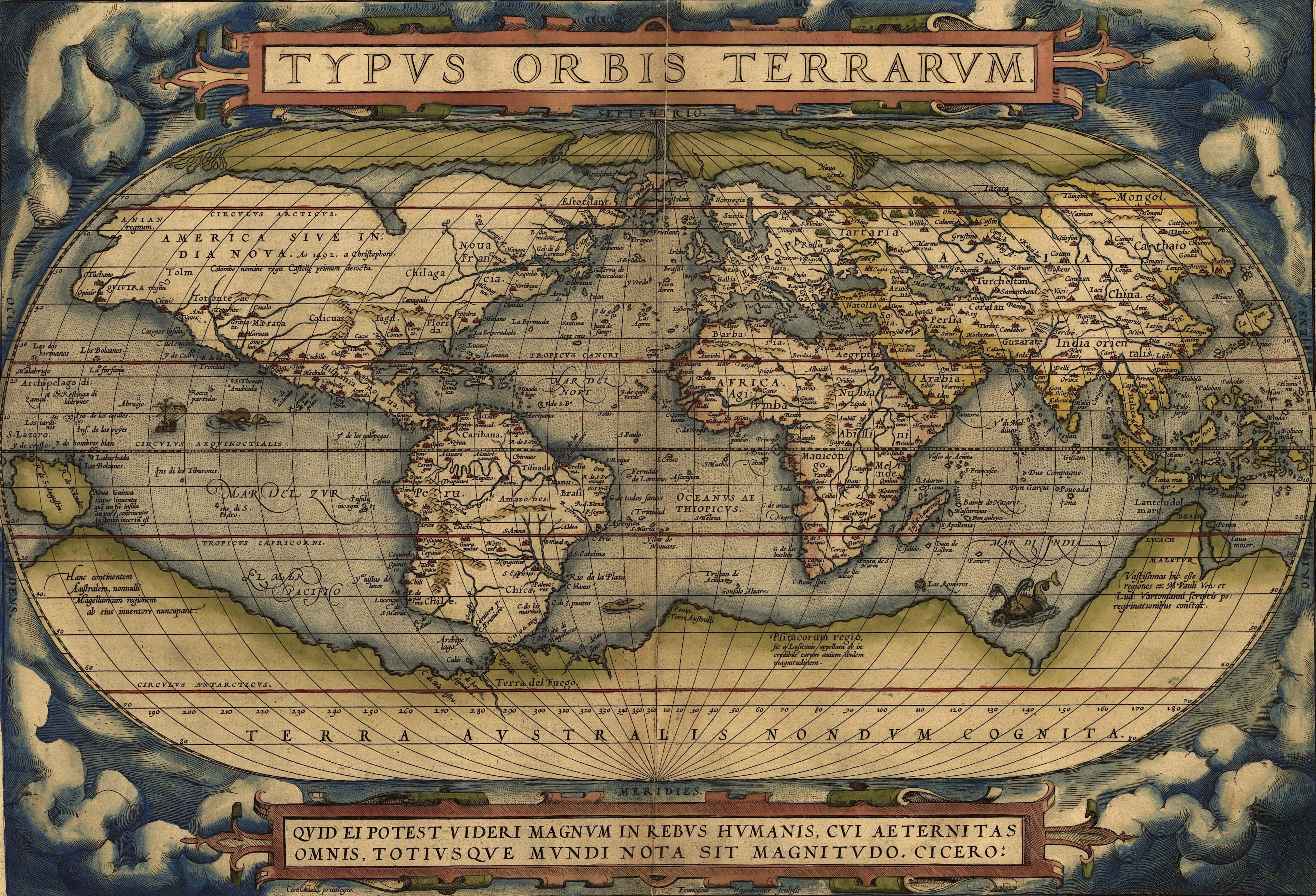
With lines of civic dissent and division dominantly drawn in our media, it’s refreshing that the statistician Joshua Katz took measurements of usage to map more chromatic variations across the national landscape.  It’s striking that usage habits, for different reasons, go against the idea of a melting pot, and reveal a deeply ingrown retention of lines of difference difficult to interpret and even often to draw.

But if the results of the end-product of a class in applied spatial statistics is not clear, the maps provide sources that are endlessly fascinating to pore over not only for the varieties of what they map but to extrapolate what more they might mean, since they reflect such sharp divisions over space.  Despite our increased cultural homogenization as a nation, and the blurs of globalization, these maps demonstrate a not too surprising insularity of a range of linguistic practices, from accents to stress to word-choice.  And although based on existing data, Katz mapped those statistics in particularly persuasive form provide enough grist for thought as “heat” maps from surveys of regional changes in pronunciation originally compiled by Bert Vaux and Scott Golder.

The resulting images have spread like wildfire across the internet as vehicles to visualize national divides in ways far more entertaining and erudite than the sort of electoral infographics that still haunt the unconsciousness of anyone who has tried to track trends in the incoming results of presidential elections, predictions based on polls, or listened to the denouements of their breakdown and analysis.  Rather than mapping an actual choice or preference, these maps track and give meaning to a set of disparate choices to reveal a linguistic landscape more than its immediate causes; the sequence of maps is intriguing because they lead us to hypothesize what the multiple causes that underlie such phonetic patterns or lexical choices are–or what the social meanings of these patterns of linguistic boundary lines or pronounced insularity might be.  Rather than reveal a nation “bowling alone,” or a world atomized behind computer screens and shifting consulting positions and service jobs, they map surprisingly healthy clusters of the sociogenesis of word use far more comforting or reassuring to the eye than rigid political divides.  At the same time, the proliferation of some maps–presented by Business Insider as maps of the “deepest linguistic conflicts in America” in twenty-two images, use the map as a prism to reflect chromatic differences in ways that map the multivariegated communities within the contiguous forty-eight.  And when one compares the divisions in the full range of 122 of the questions asked in the dialect survey, the map is used as a sort of lens for refracting multiple divides we probably didn’t know existed or only tangentially kenned.

The public records of national divides on a lack of consensus seems healthy to me.  Now we know there are clear areas of the country where they continue to cut the grass, not mow the lawn, and even if associated with a traditional deep South of Louisiana, usage extend to western Pennsylvania, southern Ohio, and Indiana: mowing the lawn, cutting the grass Far more entertaining than something as indeterminate as a weather map, if only because of the multiplicity of deep divides of regional English they reveal, these maps give more vitality and dynamism to the country’s mouths in an era of apparent ideological chasms and oppositions fostered in large part by 24-7 news.  Without a legend, or what Wood and Fels call a paratext, or interpretive apparatus, the maps are simple declarative statements–each constellation of meaning in which raises intriguing questions about their possible analysis. The multiple maps through which a range of questions are individually refracted reveal the different divides in a set of composite pictures of the nation, raising questions about the fine quality of grain of the divides that maps can reveal. To be sure, the Southern United states are regularly regarded and cast as one of the strongest linguistic subdivides of regional English.   It is striking that the unique accents in southern states stands out in th composite data visualizations Katz sorted out to represent the differences in the enunciation of one single word–“lawyer”–across the contiguous forty-eight: isolation of Legal langauge However tempting to read the island of pronunciation as evidence of an isolated island of legal practices, or a veiled attitudes to what those JD’s do or protocols they follow, the map poses fun questions of how signifier is itself mapped to signified, using the form of a map to re-examine the images of division with which we’re all too familiar.   The dichotomy in the choice of pronunciation rests more in the vowel combination at the word’s center than what it signifies, however, if the insularity of that pronunciation is pronounced; more than reveal an insularity of habits of legal reasoning, the divide is structured by local dialect starkly drawn at the Mason-Dixon line: isolation of Legal langauge Not to mention its distinct preference for celebrating THANKS-giving, and not thanks-GIV-ing: thanksGIVing


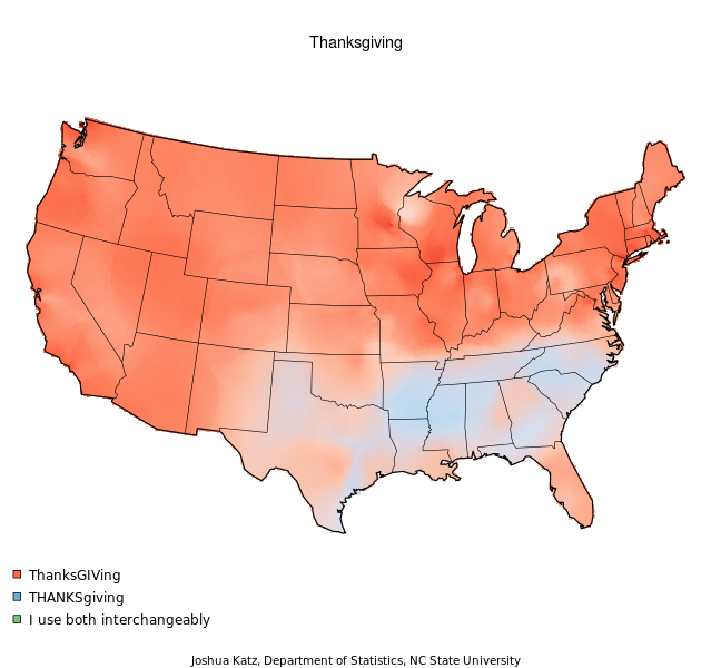
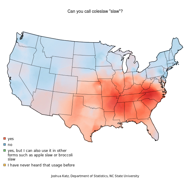
The southern United States historically distinguished by cuisine, and this converts onto its strong preference for slaw, even more broadly than by its shwas:  the clear dominance of slaw across much of Kansas, Kentucky, West Virginia, northern Florida, and Texas, as well as Mississippi and Alabama, speak to its local culture of food, as does the limits of the northern Germanic influence of ‘coleslaw’ in central Pennsylvania, Ohio, and northern Illinois–and this time, the fuzziness of its line of demarcation shows greater signs of permeability to culinary terms for sides to the north:

Land of Slaw But the question of “icing” v. “frosting” presents yet another spectrum of preferential divides, which rather than being almost divided in Pennsylvania finds its clearest locus of consensus there: icing:frosting


On the other hand, if we know that the “hoagie” is Pennsylvanian and the “hero” sandwich dominates Long Island, the “sub” is eating up the country, perhaps courtesy Subway Sandwiches:


sandwiches and subs


Other habits of reference are similarly surprisingly localized, even about attitudes to how much we can abbreviate one place-name in the country to a simple article, like this map of what “the city” means (if not New York) are more deeply rooted in preferred signifiers.  The centering of abbreviation of New York City to a simple “the” surprisingly  reveals a deep westward reach of New York’s cultural hegemony, despite the persistence of insularity in the national language-scape or usage map.  There is a similar agreement–if of a very insular sort–in designating what “the city” means in what might be called the tri-state area, if the implicit referent is fuzzy across the nation, save that particular region of southern Florida, apparently permeated by northeastern habits of linguistic reference once again.

The City!


Others are more bizarre, as the rituals of the evening before Halloween:


Sub

Who can explain the adoption across Wisconsin of “Mischief Night”?

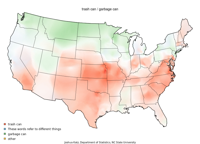
The sociogenesis of trash seems particularly difficult to explain, even though the dividing line in autumn temperatures might explain why “garbage can” dominates the triangular area from northern New Jersey to Vermont’s border with New Hampshire, over to the Great Lakes, and roughly from Chicago north, while trash cans dominate anything south of 42 degrees north, with the odd exception of Utah.  Temperate climates can’t explain the difference, give the shading of New England toward ‘trash,’ notwithstanding its apparently non-native provenance.

Garbage v. Trash


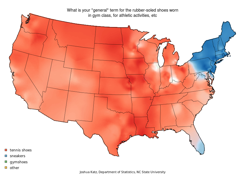
Given the compelling ways that maps create constellations of meanings and embody entities that one never ever saw, it’s tempting to indulge in armchair philosophizing about the patterns that they show. Far more than one expected, the maps show many intriguing regional redoubts of pronunciation or  pockets of word-choice that jump out of the national landscape.  These divides are surprisingly but comfortably strong, in other words, even varying among one another. Take the survival of the sneaker in the northeast, transcends pronunciation, and its survival in the southernmost parts of Florida hints at the presence in that state of many northeastern transplants:


Sneakers! Despite a lack of clear preference for dividing mayonnaise according to a three-part breakdown to components nation-wide, there are surprising hold-outs for a three-beat scanning of the slippery stuff in Montana, New Jersey and Long Island: NYC Mayonaisse

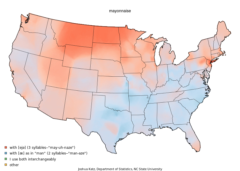
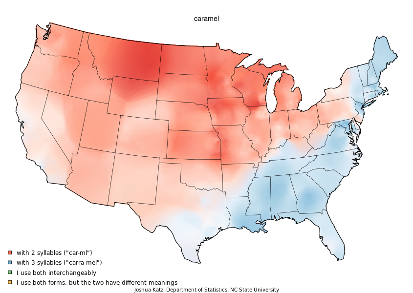
Phonetics often trump actual cuisine.  What about the sudden disappearance of two vowels from “caramel” across the Ohio River?

Caramel


As much as this map for the use of “sneaker” reveals a boundary in choice of signifier, more than phonemes, one could argue that some divides of word choice are determined and perpetuated by local commercial interests.  This seems illustrated by the dominance around Atlanta, Georgia of the signifier “coke” as the empire of a brand, even if it doesn’t explain the national pop/soda divide:

soda streamThis is interesting, since we’ve moved from accents to regional English of name-brand:  yet “coke,” no longer based in Atlanta, doesn’t seem to have a base there, so much as being a dominant term in Louisiana and Alabama, even as “soda” dominates the northeast and California and pop the midwest north: soda:pop:coke


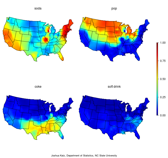
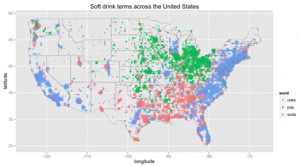
Perhaps “soda” is a term generated in larger sports arenas.  But isn’t social custom more likely to explain the intense burning reds of soda around metropolitan Chicago and Kansas City, in spite of surrounding lands that opt  for pop?  But this is a long debate, that Schwartz cannot perhaps hope to resolve in an authoritative manner.  Edwin Chen, a Twitter data scientist, for example dedicated time to construct a more pointillist map, of finer grade, while forsaking the color-range of a composite, to indicate a similar tripartite division of mapped space, with a preference for ‘pop’ clearly clustered around Lake Michigan, for some reason, and ‘soda’ dominating coastal regions almost exclusively, with a more concentrated representation in central Texas, around San Antonio and Dallas.  Is ‘soda’ just the more urban drink?  How does this map map onto drinking venues, concession stands, and watering holes?  Chen’s map, hoping to resolve these questions by geo-tagging tweets, and then making sure in a review that they were in reference to soft drinks, rather than brands, revealed a similar dominance of “Coke” around its former hub, Atlanta, confirming both its specific density and dominance.


Chen's Soda Map


He then, exploiting his databank of tweets, extended his map across the world, which aside from revealing a curious preference for pop in Italy, found the global hegemony of Coke a true case of globalization, but in surprising inverse relation to the contiguous forty-eight:


Coke in the World


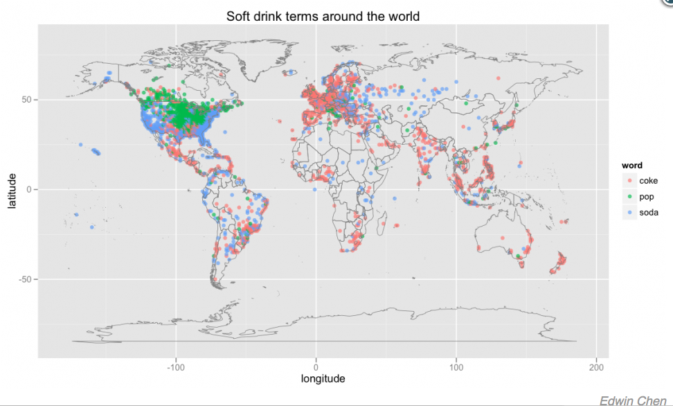
With respect to Mr. Chen, the map only slightly reveals the dominance of “pop” above the 49th parallel, in part since tweets using the word ‘soda’ don’t necessarily correlate to actual usage preferences in spoken English, and ‘coke’ often tweeted.  (Anyways, tweets with the word “coke” cannot be claimed to  correspond clearly to a linguistic usage map.)

Ways of talking about and moving through space are perhaps most intriguingly map against geographic space.  Perhaps the set of maps that suggests a clear relation to habits of moving across expanse is the division, removed from phonetics and purely a notion of choice of signifier, is the pronounced preference for the freeway in the western states, or the end of the dominance of the highway in the Pacific Time Zone, and the reign of the freeway across Southern California:


Spaciousness of the Freeway

To clarify why Colorado defines one boundary of the lexical dominance of the highway is not evident.  But the maps out a distinct manner to move through space in cars, the expansiveness of freeway travel in Utah, Nevada, Oregon and parts of northern California, where light blue shading marks consensus around the constraints of highway travel, and the dominant freeway culture in green haze surrounding Los Angeles and Seattle. Motion through space or automotive travel are as pronounced as differences of phonology, revealed by the fragmentation of the “roundabout” in the Western states, Midwest, and Florida, where they are perhaps identified with planned communities or suburbia, and northern New England’s adherence to “rotary,” with Connecticut, while “traffic circles” dominate the oldest settled lands of the eastern states and those southern Florida transplants.fragmentation of the roundabout 
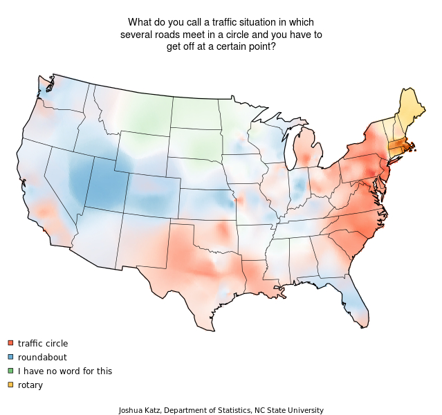
The road map is complex and would entail a detailed comparison to the national highway map.  A similar decisive break is seen in the culture of the service and frontage road, where South Carolina displays an affinity to the exclusive dominance of “frontage” in the expanses of highway in the Midwest, Mountain States and much of the west.

service roads v. frontage roads

These terms to move through space in cars are not, however, the deepest divides:  the vanishing as one moves westward of the term ‘supper,’ absent from the DC area but almost fully gone west of Utah and Idaho, indicates a striking persistence of a divide in usage where one’s surprised to find it a big deal.  The decline of “supper” in the western states, the DC area and around Detroit augurs the end of its exclusive use for the end-day meal, this ostensibly New England practice is not only to some extent retained there, but ingrained in the Dakotas:  supper has been extinct, to judge by the usage map, in California, Oregon, and Washington, and lost distinctive meaning in much of the rest of the country.

Limits of Supper, melding with dinner

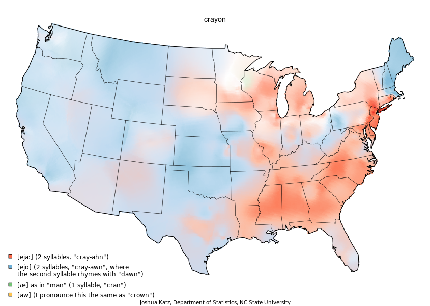
The deep divides continue about the phonetic habits difficult to analyze as linguistic divides.  The lines of division around vowel pattern of “crayon,” that almost universal tool of creative expression in the arty preschool set, is complex to imagine or assign to any cause:  the central Eastern states seem linked to the deep south, in contrast to the word’s contraction to one syllable in northern Wisconsin and the dominance of a more open second syllable across western states.  These clearly marked divides, far more difficult to explain, may be tied to preschool cultures, but is more likely linked to an interesting variation among some single-usage pockets and significant ranges of hybridised pronunciation.

americans-cant-even-agree-how-to-pronounce-crayon.jpg

At the end of the day, there is no red vs. blue in the way we speak, even if an infinite range of oppositions and variations pervade.

Leave a comment

Filed under Bert Vaux, Bert Vaux and Scott Golder, data visualization, linguistic boundary lines, maps of regional English, regional English, soda v. pop, statistical maps, Twitter-feeds

Drawing Hypotheses on a Newly Mapped World

At the same time as maps offer guides to spatially orient their readers, they collect a record of known space for viewers to occupy, collecting and displaying relationships that allow viewers to draw hypotheses about their relation to a totality otherwise not able to be seen.  The format of all maps provide tools to understand and collate relations over an expanse otherwise not evident.  The possibilities or potentiality for such comprehension–or the experience of the knowable–is encoded in the directions that any map provides to better navigate space by ship, car, train, or plane, but its syntax is also an invitation to inhabit space to formulate a hypothesis about expanse; early modern maps are especially conscious about how they mediated a record of the inhabited world.

My interest in how maps make these relations evident in multiple ways has been a theme of earlier posts; I have elsewhere blogged about the spaces Google Maps present for viewers, and the limited frameworks they offer to occupy space.  Once might do well to gauge the productivity of how maps generate hypotheses about an individual relation to expanse by the unity by their  representational surfaces–although the pictorial aspects of maps are too readily categorized as qualitative additions, held in contrast to their quantitative construction or collation of precise measurements of terrestrial position.

Early modern cartographers in the Dieppe school, like Nicolas Desliens, adopted modern practices in the hand-drawn maps, typified by the below 1566 world map, based on Portuguese nautical charts.  The maps retained the format of projection, but offered a new way to inhabit the expanding world map for elite audiences–here by displaying a new region of the earth, Java la Grande, a mythical island that described by Marco Polo and perpetuated by the cartographers based in Normandy:  the green swirls on Java recall the engraved illustrations in works of early modern botany or natural history that Sachiko Kusukawa has argued constituted material evidence from the natural world.

800px- Globe by Nicolas_Desliens_Map_(1566)

Java la Grande is prominently labeled, and the undoubted centerpiece of this world-map by Desliens, even though it is not at  its center:  it is, rather, introduced as a new area of inhabitation, whose verdant interior is a seat of spices and potential wealth, as well as lying, cosmographically speaking, in a sense as a complementary counterpart to the Americas, echoing the harmonious balancing of landmasses from ancient geography.  But the map also advertises the region’s potential wealth to potential backers of voyages.  There are, however, limited use of formal codes to structure the map’s surface, despite its notation of tropics echoes of the formal structure of world projections, or other conventions that lend order by structuring the map’s surface for its viewer.

The circumscribed role of America in Desliens’ map is perhaps also striking to modern viewers because it minimizes the expanse of the Americas in a somewhat marginal manner, probably recalling the thin crescent of coastal archipelago in the multi-sheet wall chart the humanist Martin Waldseemüller designed, which did not even name “America,” and gave far greater place to South America

Waldseemuller-Map-631

–though Waldsemüller did name the region on the slightly later set of printed gores that he engraved for purchasers to use to assemble their own globes:

Wertvolle Waldseem¸ller-Karte entdeckt

Waldsemüller exploited the expansive wall map of twelve sheets as more compendious and expansive record than a globe.  The limited employment of conventions to structure their graphic surface might be explained to some extent by the use of map signs to comprehend a range of toponymic content and limited authority of map signs to structure their surface.

These images synthesize nautical charts in a comprehensive system of knowledge are at a remove from the ways that information is displayed about America–if still an empty land-mass– in later explicitly political maps that placed the Americas as an appendage of royal sovereign space, or as an area of self-government.  In an instance of the first case, Georg Bickham invited viewers of his 1748 “Chorographical Description of All the Dominions Subject to the King of Great Britain” to process their relations to its disparate dominions in a coherent ways as nothing less than a political space.  The conflation of a chorography of the national community with a global map is a classic conceit of empire:  but the below engraving suggests a wonderfully compelling way of reasoning across two hemispheres.

The map, engraved and printed in London for audiences far more familiar with maps, shows continents as unpopulated landmasses, but the relations of whose inhabitants were subject to the royal rule of George II, in a somewhat magniloquent statement of royal rule for its viewers to scan.  If the map reveals the expanse of Great Britain’s “Dominions in Europe, Africa, and America,” it is an optimistic knitting together of regions geographically removed, but subservient to the royal crown whose cartouche still occupied center stage.

Chorographical England 1748

To be sure, this image processes something of a cognitive map of the royal subject’s relation to the vast terrestrial rule of George II as a totality that spans no less than three continents.  The map is straightforwardly political, but conjures a land of royal unity that was geographically dispersed, and linked symbolically only in the map.  Indeed, the cartouche in which Bickham inscribed the “Lord Majesty” in relation to its subjects has greater prominence or centrality in the map than any place-name or region that is represented on its surface, as well as considerably more ornate a subject of Bickham’s burin in the acanthus-like flourishes and drapery:

Crest as Cartouche

The obedience by which the royal subject inscribed the expanse of the map is more prominent than its geographic content because the map is quite distinct from a geographic record.  The regions of North America are in fact rarely mapped in much detail aside from their shorelines; greater detail is accorded The Banks, shoals famously dangerous for nautical approaches, than other areas, and the ties to Britain confirmed more by toponymy than by qualitative detail or the density of its inhabitation, and other than its coasts is largely blank, suggesting greater habituation with nautical travel:

Upper Canada--1748

Curiously, in this map of British global possessions, boundary lines among the colonies are noted but seem almost notional than juridical, and far less fixed in space than the rivers with which they intersect, dotted lines that extend into an unknown interior before they peter out into a vast unmapped continent, as if inviting viewers into blank unmapped regions.

trailing boundary lines of political division

The map illustrates the invisible ties of power that united these regions, far-flung as they were, as an image of royal authority.  If maps were advertisements of power and illustrations of authority in the early modern period and Enlightenment, this map serves to create a set of fictive ties that united and oriented its viewers to a sense of disconnected space, which the cartographical content of the map was not in itself sufficient to process.

The map complements a written printed chorographical description, as much as it offers a strictly cartographical record, the symbolic use of whose conventions allows us to connect geographically removed regions in its pictorial space.

Leave a comment

Filed under Dieppe School, Georg Bickham, George II, Java La Grande, Martin Waldseemüller, Nicolas Desliens, pictorial space, Sovereign Maps

Imploding Maps or the Artifice of Cinematic Apocalypse

It hardly is a coincidence that the narratives of many disaster films parallel less of a storyline than what might be described as an imploding map:  the destruction of familiar landmarks, the upending of orientational signs on a map, and unsettling of the known world extend far beyond the erasure of whole cities, whether New York or Los Angeles, from the map–or even an existential sense that we are the sole survivors, stranded on the surface of an unmarked map.  Such filmic narratives mirror a sense of deep anxiety about the coherence and reliability of the map, or of how maps might help us to navigate space and to process a cohesive or coherent record of terrestrial expanse.  When one enters cinematic space, there is the horror, which we can barely stop watching, of having that sense of space implode, as the familiar landscape which we’ve been accustomed to orient ourselves within is suddenly open to threats of inevitable destruction.

Cultural critic Mike Davis has excavated a history of filmic adaptations of the destruction of Los Angeles, pointing to the multiple fictive destructions of the city of angels by tornadoes, storms, earthquakes, fires, sea monsters, snakes, wolves, or wild bees as a projection and a response to the fragile ecology of the city itself–as if the screen images of natural destruction were the return of a repressed awareness of the region’s ecology of So Cal, and particularly of the basin from the San Andreas Fault and San Gabriel mountains to the Pacific.  Of course, Los Angeles has been defined so many times since the 1950s in film, it is difficult not to lapse into chronicling the appearance of such cinematic destructions, if not evident restlessness on the part of screenwriters to move from the 1974 “Earthquake” to volcanoes, viruses or tidal waves–as in the film “Volcano” (1997), when a volcanic eruption threatens to destroy the entire city and its inhabitants.


Volcano2

Davis made a strong case that the fairly self-referential act of destroying what was the epicenter of movie-making in the United States was not about the medium of film, but the denial of the quite precarious environmental volatility in the city itself.  “Earthquakes and fires and floods are just the normal metabolism of the landscape,” Davis remarked in an interview; “but we deliberately, almost, keep putting ourselves in harm’s way,” or court disaster in order to deny it.  Take the building and rebuilding of mansions at the mouth of canyons out of which the Santa Ana winds carry fire every decade or two.  He observed that at the same time natural disasters in Southern California were minimized in much of the early part of the century in the press, there was an odd normalization of the destruction of LA in particular in a slew of films that detract attention from the political ecology of the region in the name of entertainment.

87863

In a somewhat early modern way, the city of Los Angeles became a microcosm on which to project world disaster (or the disasters of modernity) that repeatedly recurred in a string of bloated disaster films of the 1970s and 1980s, from “Earthquake” (1974) and “The Towering Inferno” (1974) to “The Swarm,” that dangerously threatened white men.

earthquake still

The relations between the destruction of Los Angeles that repeatedly occurred on film had clear grounds to be confused with the fires that ravaged its nearby hills–especially for the inhabitants of the city itself.  The recent 1990 Station Fire arson provoked an interested comparison to the mushroom cloud that would be created by the tonnage of a Hydrogen Bomb.  “Was it Hollywood that provoked the Station Fire, as a means to assert that life must follow its ‘art’?” asked one blogger wrote.

Aug2009_LA_Fire cloud

To be sure, the fire created both a filmic image of destruction, and exploded the calm coherence of a map of the region:


article-1210417-063EFDC5000005DC-431_964x633

News outlets took some pleasure in the perverse congruence of Hollywood representatives and those charge of response, as Arnold Schwarzenegger himself  traced the fire’s effects on a state map as if to contain the disaster that unfolded on TV:


article-1210417-064133B8000005DC-962_964x644

Davis was not only concerned with film-sets, of course.

Davis showed how the rise of apocalypses that engulfed LA paralleled a deep historical denial of the ecological destruction perpetuated by the encasing of rivers in concrete and destruction of open spaces revealed in the 1930 Olmsted-Bartholomew Report, “Parks, Playgrounds and Beaches.”  This report, which detailed the effects of rampant urban expansion–and in the 1990s became an icon and emblem for the destruction of LA’s natural environment, and a “lost Eden” irrigated by riverine paths was transformed into a transformation of the Los Angeles river into a freeway–had the odd distinction of being suppressed by the very Chamber of Commerce that had commissioned it to be drawn, so clearly did it represent an image of the city that they city did not want to encourage.

plate46

Something similar is at work in the disorientation created by the implosion of familiar sites and landmarks–and mental maps–in films that localize destruction or map apocalypse for the masses at the multiplex.  Whereas Davis provides an image of a city that relentlessly throws itself into harms way with oblivious denial and a slight shrug, there is a pleasure in watching the familiar destruction of the map compensates for our own fears of disorientation in striking ways.

This is the destruction of a local network, or a lived network, as if to assert the authority with a fatal stroke of an imaginary world that engulfs the viewer in its violence.  The effects are uncanny.  The juxtaposition of “news” and filmic narratives of destruction in the post-9/11 world has been widely noted, as have the precursors of the tragic suicide attacks that killed so many on studio lots and in the megaplex.  The parallel between images of destruction and of the towers’ collapse is chilling–as the common difficulty many had in discriminating the destruction in New York City (and elsewhere) from the familiar images of a disaster film.

Unknown

The rising threshold of shock value of scenes of mega-destruction in many films of the 1990s both contrasted with the relatively quiescent era of the Clinton years, and made it oddly difficult to distinguish fantasies of urban destruction from actual destructive events. There is a broader sense of disorientation to which the recurrent implosion of familiar maps on the multiplex screen reveals–as well as a deflection of anxiety about something as potentially tragic as a terrorist attack.  The implosion of the maps  is worth contemplating in recent films, because it creates something of a parallel universe on screen that oddly offers a promise of orientation on a level of fantasy in its repetition of a global or a micro-apocalypse.  There’s a fairly big prehistory, of course, for the destruction of iconic place-markers, from:

escape-from-new-york

to Los Angeles besieged in war:

Destruction of LA


The implosion of the coherence of place in these pictures suggests the attraction of watching a literal implosion of the known map in both films shortly before the disastrously fatal airplane attacks of 9/11.  And since then, Hollywood seems to have responded by treating the screen as a sort of imploding map of the world on truly phantasmagoric proportions and scale, as the urban canyons created by the iconic Empire State becomes a site of Amazonian appearance, blending nature and culture and undermining our maps:


transformed landmarks

The city itself becomes the prime the battleground for the future and the site of total and utter disorientation to a degree that is itself sublime:
Battle- LA
The most recent Roland Emmerich disaster pic of 2012, rife with conveniently ‘disinformational’ plots that explain global warming by the release of abundant neutrinos by solar flares– rather than any human activity–cryptically and mystically tied to the prediction of a global catastrophe in the Mayan calendar designed to claim box-office victories by a heady mixture of apocalypticism and pseudo-science:  the rise of temperature in the world’s core leads global eminences to save humanity by a commitment to preserve a select 400,000 in new Noah’s Arks in Tibet, as they raise the funds to do so by–you guessed it– allowing the super-rich to buy tickets for just a billion a head. (That’s a fifth of the film’s production cost.)  Los Angeles isn’t just destroyed, but falls with all California into the waters of the Pacific–significantly raising the bar on the films Davis describes–as a destabilizing shift of the crust of the Earth causes a massive 10.9 earthquake of the sort predicted by the hack Charles Hapgood–who has a sort of cameo appearance by video–as tsunamis and volcanic eruptions result in global mayhem on a scale and scope whose imagined perspective on worldly disaster rivals Albrecht Altdorfer’s mapping of an ancient battlegrounds in his 1529 “Battle at Issus“–whose panoramic canvas whose aerial perspective of near-global purview the movie’s poster both recalls and recreates to entice potential viewers into theaters to watch.
2012_Poster
The Battle of Alexander at Issus. Oil painting by the German artist Albrecht Altdorfer (1480-1538). 1529.
Of course, the scale is biblical in proportion.  But who cannot deny that the difficulty of mapping current crises from global warming to the war on terror has not created a veritable deluge of films that challenge one to grasp their mapping of world-collapse in ways that seek to rival and upstage contemporary apocalyptic threats?
The 2015 film “San Andreas” proposes we watch the opening of the fault line in the landscape opens, and we watch the obliteration of the familiar landscape of Los Angeles from the elevated view of a safety helicopter, as, further north, tsunamis arrive in the San Francisco Bay and obliterate the heavily trafficked Golden Gate Bridge:
San Andreas #2
San Adreas #1
Andreas #4
Amid “megatsunamis” that send aircraft carriers to the White House lawn–killing the American president–even as the eruption of the Yellowstone Caldera covers most of the United States and Las Vegas with volcanic ash and debris, and Hawaii basically disappears as volcanos explode, the map is shifted beneath one’s feet, as Africa rises in elevation and South Africa–that lovely place–and the Cape of Good Hope become the site that the ark carrying lucky few lands.  The world map is destroyed in shreds, even as the heroes search for a lost map that may promise redemption, until the colonialist capital of Capetown is finally resettled, and a hope of harmony restored.  Is this a restoration of the colonialist map of a white Cape?
A global pandemic provides the background or only context for the 2014 version of “The Last Ship,” which revisits a tale of post-nuclear holocaust:  the earlier plot focussed on two submarines, one American and one Soviet, that travel from the Barents sea and Arctic Circle to tour a world whose sites are destroyed or covered by dense clouds of radioactive smoke, from London to Gibraltar, through the lifeless Mediterranean and through the Suez Canal until they make it to an uncontaminated French Polynesia after having braved a nuclear winter in the Indian Ocean until they are forced, as even that island is destroyed, to McMurdo Station to find new homes.  In contrast to the global tour of the “Nathan James” after it fires its last nuclear strike on ICBM silos, global pandemic has rendered the world uninhabitable in the TNT “Last Ship” (2014):  video communications to the ship stranded in Antarctica for months without contact inform its captain of the death of the president and vice-president and thousands more as a virus has made its own world tour from Cairo, the site of its ininitial outbreak, to Russia without government, London burning, and leaving most dead.  Filled with aerial footage scanning Antarctica, imprecations of global duty, blazing guns and more, Michael Bay’s TNT “post-apocalyptic action drama” centers on the paleomicrobiologist conveniently located on the ship as she works to manufacture a virus on the last ship floating, the known world long gone.
The world doesn’t explode so much as our map of it implodes.  Without any map for the future, there is a sense that the world is itself gone: the map no longer covers up the territory, or obscures it, but implodes with the world’s expanse:  the metaphysical beauty is the imploding map.  The recuperative role of the medium of film can also, of course, provide a comfortable context in which to relive the lost in a fantasia of recurrence or re-centering, where we can inhabit the very bodies that themselves stare at the twin towers’ collapse:
Unknown-1


There’s a familiar melancholia in Nicolas Cage’s wistfully longing eyes that once more brim with stoic regret.  He might be recalling an era of films with more coherent narratives, or a more ground-bound perspective on human events that he seems resignened to accept as a thing of the past.

2 Comments

Filed under 9/11, apocalypses on film, mapping total war

Aquifers/Monocrops

Recent news of the quite devastating dwindling of the High Plains aquifers sent me back to how William Rankin charted the uneven distribution of monocrops in the United States.   For the authority with which maps render a depletion of High Plains aquifers as an “underground pool drying up”–as if it were a record of nature, intensified by global warming, echoed in the discussion of a dwindling or disappearance by the time  the aquifer that runs from the sands of Wyoming reaches Kansas and the Texas panhandle, leaving farms without the groundwater on which their livelihood depends.  Although long characteristic of the nation’s landscape, the underground water that feeds the high plains long taken for granted to dry up–in ways that challenge mapping tools or a reliance on cartographical practices as tools explication.  How much this has been intensified by increasing temperatures of summer months, maps reveal the extent to which the depletion of landwater has been exacerbated by agribusiness and the dramatic unsustainability of irrigating subsidized crops from an aquifer that is, due to evaporation, rarely recharged.

Most maps of aquifers’ depletion effectively minimize the impact of patterns of human inhabitation on the plains–if only because they don’t register how nature no longer exists as an autonomous category, or how all maps represent the human shaping of a “natural” record.  The authority of the map erases the effects of inhabitation, or the very agricultural practices that much of the same article describes of an intensification of irrigation across the region, uniformly distributed without regard to the level of the water-table.  They naturalize the presence of water in the ground, as, most simply, by coloring the aquifer’s expanse by a uniform blue, as if to render a plentiful underwater sea readily accessed by drill.


High Plains Aquifer


The shifting water-levels of the irrigation have however shifted the availability of this hidden underground reserve challenge us to use map to expressing the dynamics of its depletion.  Use of the Northern Great Plains aquifer system for irrigation has long consumed over half of underground aquifers:  irrigation of lands in Wyoming and Montana regularly feeds the aquifer system itself, as excess irrigation feeds the aquifer itself in those states.  Yet water-level monitoring in the High Plains aquifer led to increasing declines in its level from the start of its intensive irrigation from 1950, and has most recently led to the failed search for new wells in its southernmost reaches.

The long-term decline of water levels have been concentrated further south in its almost 112 million acres for at least five years.  The mapping of water-levels revealed a decline of almost 100 feet by 1980, when the irrigated acreage used for agriculture most dramatically grew from just over 2 million acres to 13.7 million.  In the high plains, unlike the great plains, the aquifer itself was rarely restored with water withdrawn from pumping and wells, and an expansion of the demand for water from agrarian land-use led to a single-headed search for extraction even if little water was to be had.  The gradual draining of the southernmost aquifer was in a sense long known:


Water Level Declines

The recent chronicling of the transformation of fertile plains into dust by the New York Times stands at the end of a depletion already mapped by 2009:  if the compelling article painted a somewhat passive picture of the depletion of the aquifer that has so shaped the American landscape, the problem of mapping water and crops lay in the implicit tone of a naturalization of water-loss–whose effects nicely intersect with fears for the effects of global-warming–whose ‘news’ may exist in its delayed economic impact on farming, rather than on the absence of warning signs.   When Ashley Yost told the reporter Michael Wines “I’ve raised 294 bushels of corn an acre there before, with water and the Lord’s help,” he grouped water with the divine assistance, as if it didn’t come out of the ground.

The combination of landscape images of the effects of a parching of agricultural fields with a set of regional maps threaten to naturalize the changing hight plains landscape and minimize the ways in which all maps pose arguments–as much as Matthew Staver’s striking image of arid corn fields–because they fail to register the dwindling as the effect of their practices of inhabitation and a changed dynamic of water-use.

PLAINS-articleLarge-v2Matthew Staver

The recent drop of the aquifer of some four and a quarter feet in Kansas from 2010-11 is a call for alarm not only as a “lack of water”; the drying up of landwater during the summer months has led to a dramatic decline in the amount of corn cultivated in that state that reflects a failure of agrarian planning and a concentrating of water-resources in monocrops–as much as the depletion of an existing water reserve in a uniform fashion over time, accompanied by an expansion of water-hungry crops such as corn, beside others like wheat, in the region–not to mention the raising of livestock on water pumped from aquifers.  The destructive intensity of the drainage of water that never returns to the aquifers lying deep below rest on processes of extraction and irrigation to a degree that can never be replenished never lay in the individual farmer.

I’ve discussed Rankin’s maps that speculate on the consequences of the uneven distribution of crops and land-use in an earlier post.   The correspondence of that aquifer to large corn monocrops they’ve been used to supply is striking when one maps the expansion of corn as a subsidized crop across the nation.  What amounts to a submerged sea and had long seemed an unending resource of underground feeding supply has finally begun to exhaust itself–with disastrous consequences for farming communities who depended on its supply as if were a cash cow to irrigate less than fertile lands in the former dust bowl.   Corn monoculture was facilitated and undergirded by the unsustainable illusion of irrational abundance of an unending supply of underground springs.

Rankin's Map of Crops

Although the patchwork of intense corn-farming may not be dominant in relation to wheat (shades of green) or silage (yellow), the intense patchwork of corn-cultivation in an area not particularly rich in water-sources suggests the ill-effects of agricultural subsidies on the distribution of natural resources.

patchwork of tan

The tan patchwork reveals a depletion of landwater in the very region a region that the New York Times singled out as revealing the adverse effects a dwindling aquifer had on farmers’ productivity.  The ill-effects of sustained drilling in vain attempts to force underground water to rise in pumps range from the depletion of the region’s water-level to the survival of crops.  But its maps conceal a story of the depletion of resources across the plains with the increased reliance on pumps.  The difficulty to pump water grew further south extract demand grew to feed central-pivot irrigators to drench crop lands so as to enable them to remain emerald green and fertile in spring and arid summer months, at the very time that the intense sun dries them, the terrain maps present the present consequences of irrigation practices as the new nature of the plains.

The map that shows a “drying up” of hotspots on the paths of underground aquifers is a map of the future of US agriculture.  But the dramatic dark-spots in the area of north Texas and Kansas, the edges of the underground aquifer and the areas of new corn farming, demand to be further unpacked.


Hot-Spots of Aquifers


Indeed, the extent to which the cultivation of corn as a dominant monocrop maps onto the depletion of the once-plentiful national aquifers in Midwestern states recently in the news, as the regions whose agrarian geography was defined by big center-pivot irrigators–temples to the belief of infinite water-extraction and the plenty of crops–have been able only   to water circles of diminished radii as the aquifer has declined. Yet if “up to a fifth of the irrigated farmland along a 100-mile swath of the aquifer has already gone dry” at the same time as summer temperatures have risen, we need to accept how much of it was forcibly extracted by men hungry for cash.


Htospots from Kansas to Texas


The maps of this water-depletion reveal the need for revising the expectancy that regions of Nebraska, Kansas, Oklahoma, and Texas that occupy the High Plains Aquifer of North America.  What amounts to an submerged sea and had long seemed an unending resource of underground feeding supply has finally begun to exhaust itself with disastrous consequences for farming communities who depended on its supply as if were a sort of cash cow that could be used to irrigate already fertile lands.  The question is in part how such agricultural practices can change.

The correspondence between corn and landwater gets scarier when one notes the  intensity with which aquifers had begun to be drained by ground-water withdrawals as early as 2000 to nourish the spread of thirsty crops such as corn that have led to increasing reliance on unwarranted extracting of groundwater.
Ground-Water Withdrawals 2000


The dramatic rise of irrigated acreage in this region maps onto the epicenter of a devastating dwindling of the plenty of aquifers in Texas, Nebraska and Kansas–and onto the period corn was subsidized:


Irrigated Acrage


The steady rise of ground-water withdrawals for irrigation was particularly dramatic in the 1990s for Texas and Nebraska, and the decline in regions like Kansas may have already been precipitated by a draining, as much as a drying up of, aquifers:


Ground-Water Withrdrawls for Irrigation

1 Comment

Filed under agribusiness, agricultural subsidies, agriculture in america, groundwater, High Plains Aquifers, mapping ground-water withdrawals, Mapping Water Depletion, monocrops, monoculture, water table