Category Archives: GIS

Sleeping Roads, Ancient Highways, and Paper Towns

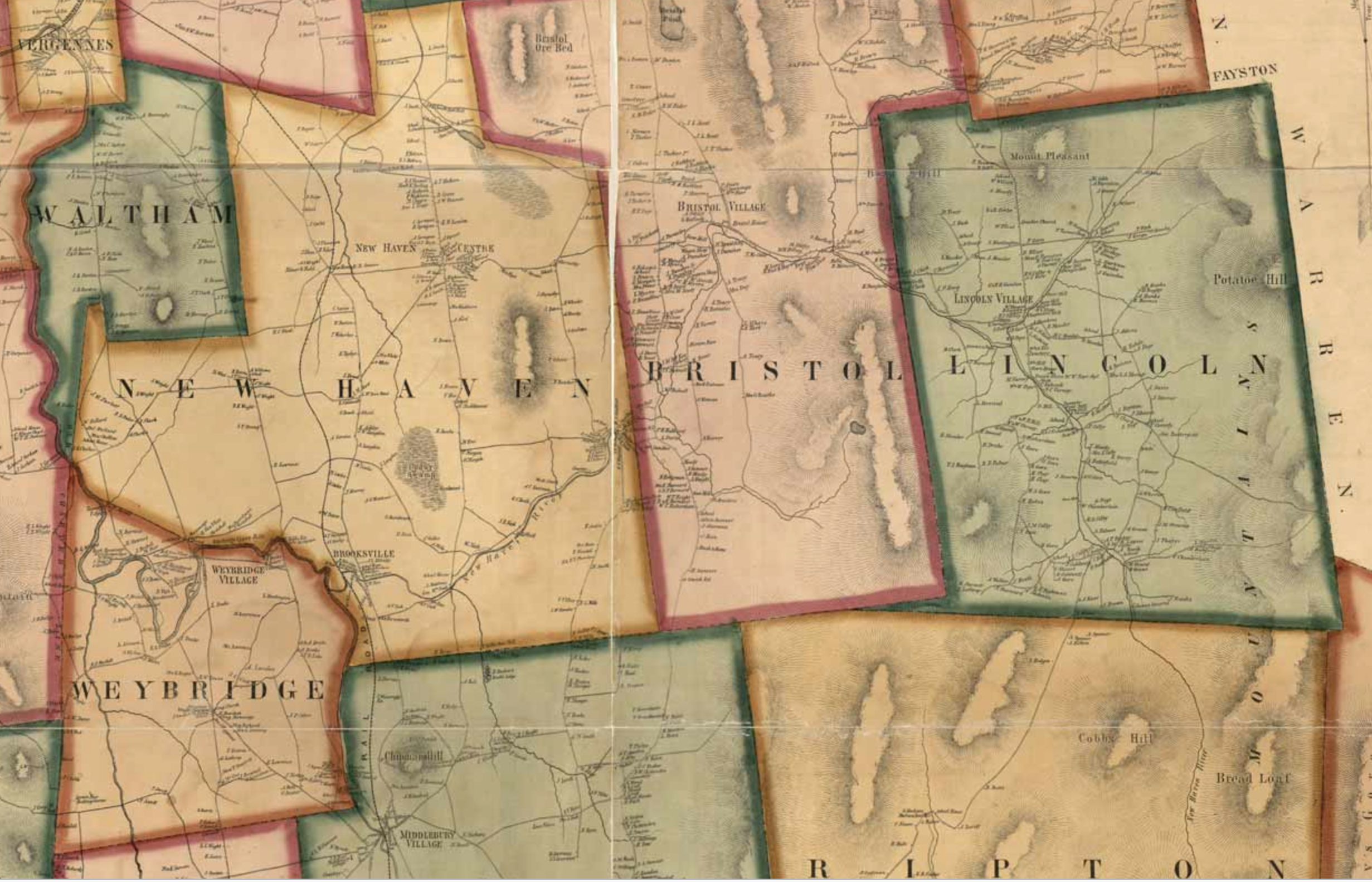
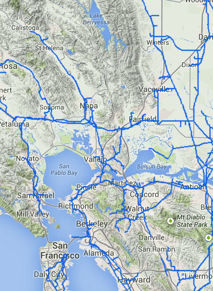
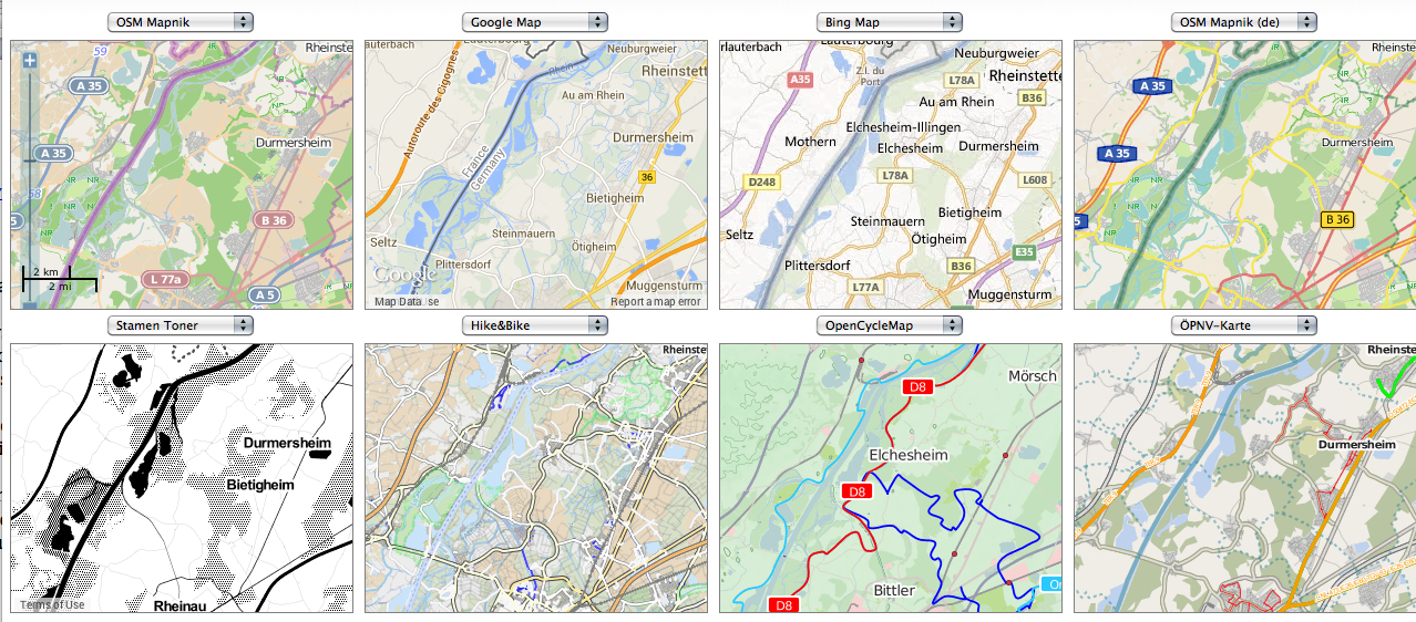
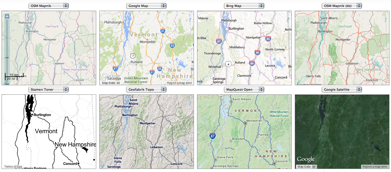
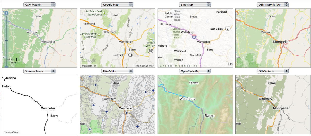
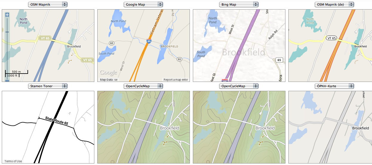
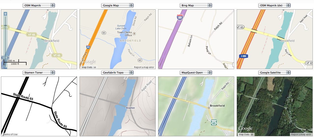
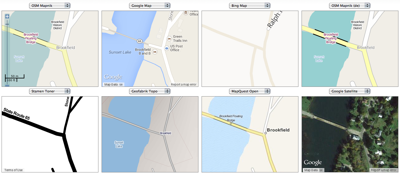
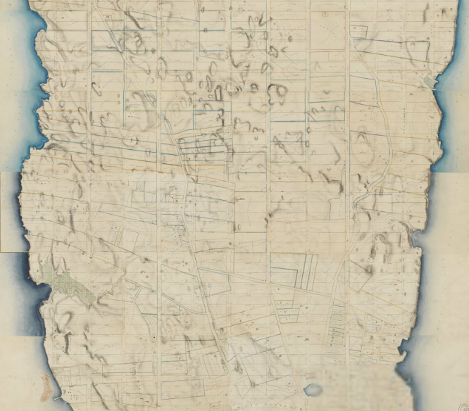
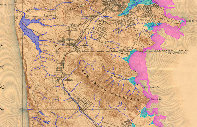
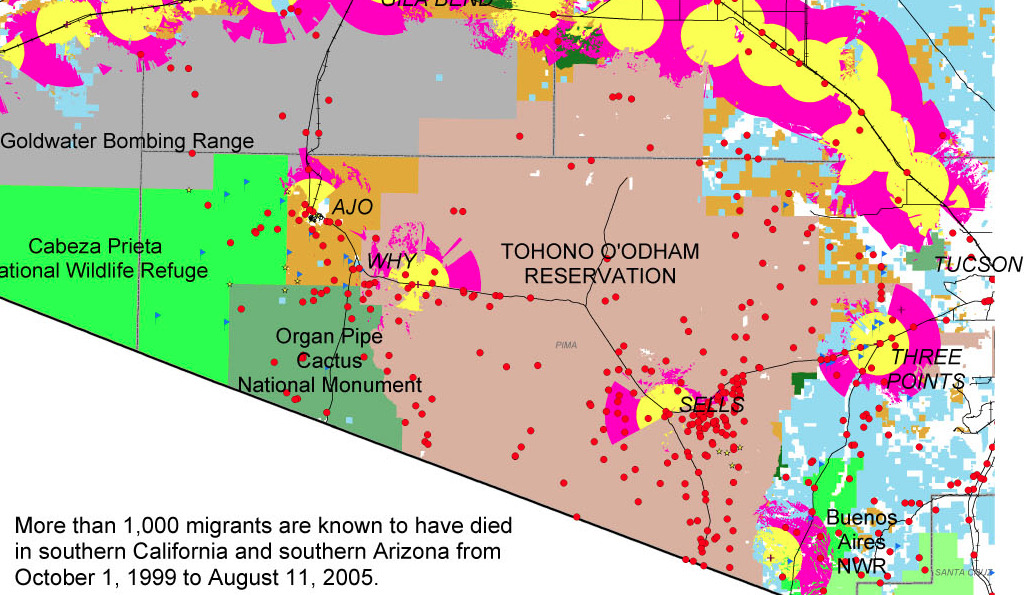
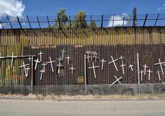
What’s the significance of names on a map?  Do they register roads that belong to the territory or only reflect continued use?  What sort of authority does a mapped road, byway, or highway retain in common law–and for how long must it be recognized as a road?  The existence of place-names and routes on a map have become an increasingly contested way to preserve a sense of place, and the survival of the “sleeping roads” of Vermont, the “Class 4” roads that are not maintained by towns, even if some receive some limited maintenance, suggest a historical network of the past, still partly visible and indeed rarely used, but providing a vanishing network of the past inhabitation of rural space and its organization before the introduction of the interstate system.

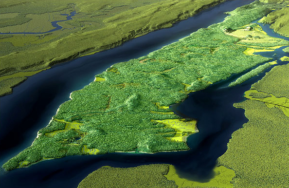
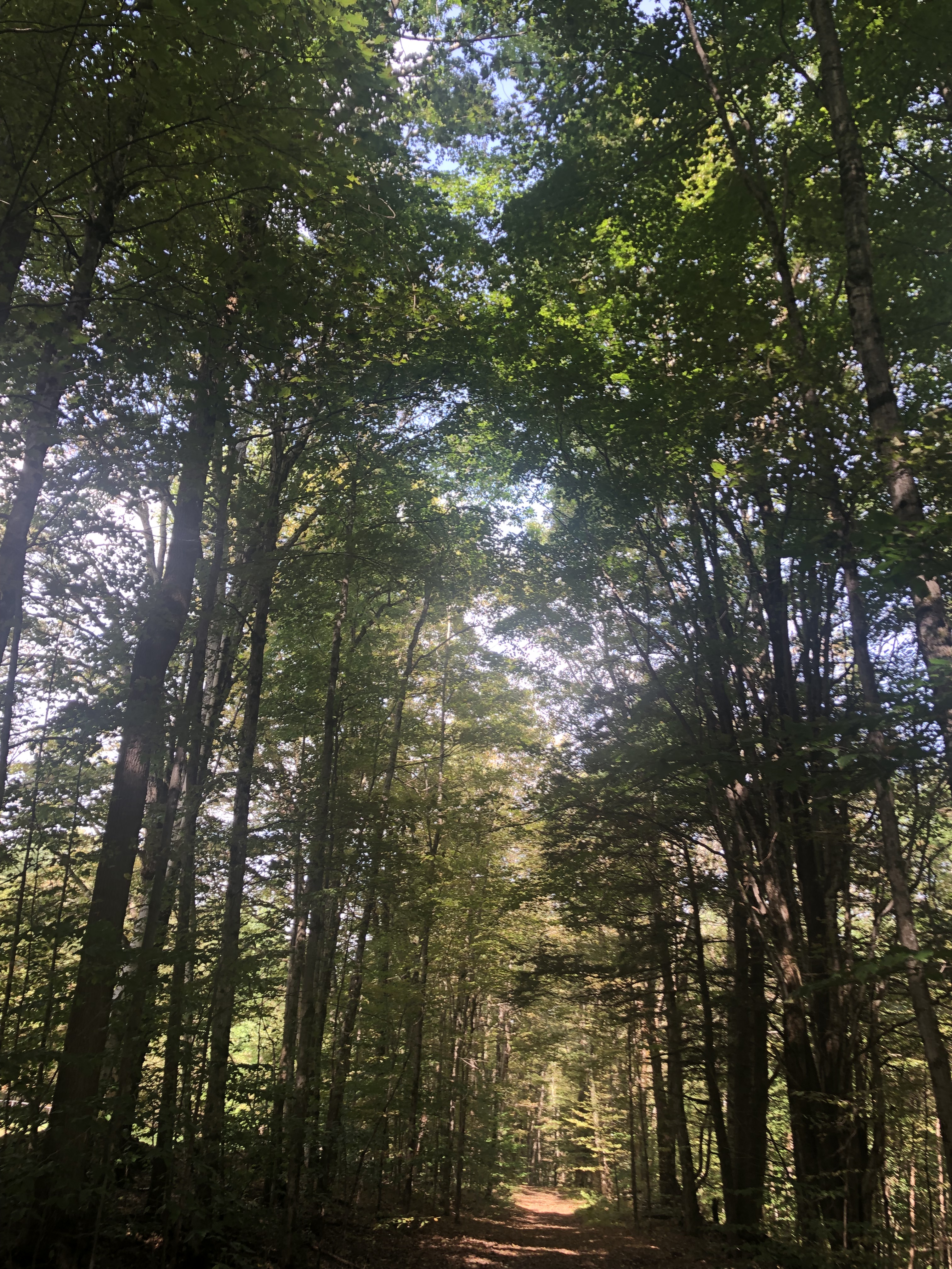
“If you walk down that road,” a Vermont farmer gestured at the end of Lavender Road in Central Vermont, “it’ll be like you’re walking into the past.” Meaning that the flat stone walls bordering the path, now overgrown with ferns, fallen logs, exposed granite, and an abundance of mushrooms and twigs, not to mention suspicious looking poison ivy, was an earlier system of land management and division, as well as an earlier route of access among the private property that divided Central Vermont hills, Long before I-89 ploughed through the countryside of central Vermont as a central artery of automotive traffic, cut through dark bedrock of metamorphic Cambrian and Ordovician eras, seizing thousands of acres across the state and displacing houses and farms, the roads we now see as arteries that cut through old forests and Silurian and Devonian metasedimentary rocks displaced the roads that once defined travel, reducing once luscious habitats of oak forests to the veils of Potemkin forests. Those illusory strips of six to ten trees deep to create the illusion of forest for tourists and motorists on the highways that cut across New England, vestiges of an earlier arboreal ecosystems living only in the minds of motorists on paved roads from which they rarely deviate or depart.

 
Two Thousand Acres Seized to Make Way for I-91/Vermong State Archives and Records

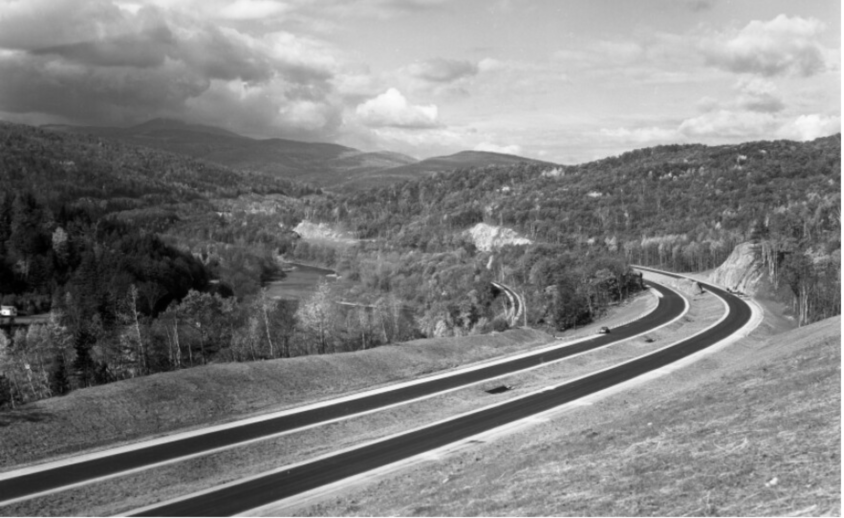
Newly Paved Interstate Curves through the Waterbury/Middlesex region, circa 1960/Vermont Historical Society

The very same roads that are no allowed to afford prospects of the fall foliage for which the same landscape is so well known were, of course, creations of an earlier area of land-movements and massive landscape shifts. What roads lie beneath them? How can they be seen or even mapped?

6K stock footage aerial video flying over interstate 89 through colorful trees  in autumn, Sharon, Vermont Aerial Stock Footage AX150_453 | Axiom Images

Interstate 89

The survival of so many earlier “sleeping roads” are increasingly threatened in an age of the road. The increased division of the long predominantly rural state on property lines, driven by a  market of construction threatens to obscure local knowledge and a long-valued sense of place that the cutting of highways had long altered. If the preservation of dirt roads without much gravel in Vermont towns was an early development, which contributed recently to the real fears of erosion with flash floods and inundations, the drainage problems of the considerable number of municipal roads in the state have remained largely unpaved–about 75% in 2018, of municipal roads that comprise some 70% of total road miles–the problem of best drainage practices are an inheritance of the longstanding protection of the states rural character in its towns. But the landscape of the interstates brought a deep local resistance to the remapping of interstates and federal roadways that Vermont towns were quick to protect their local character in keeping with a longstanding agrarian economy, rooted in pasture and the production of cows’ milk. 

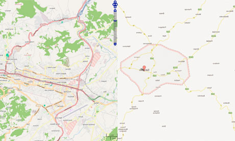
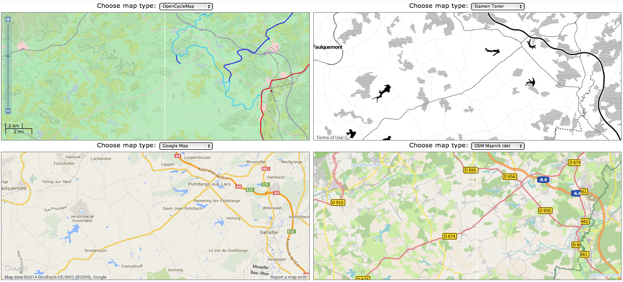
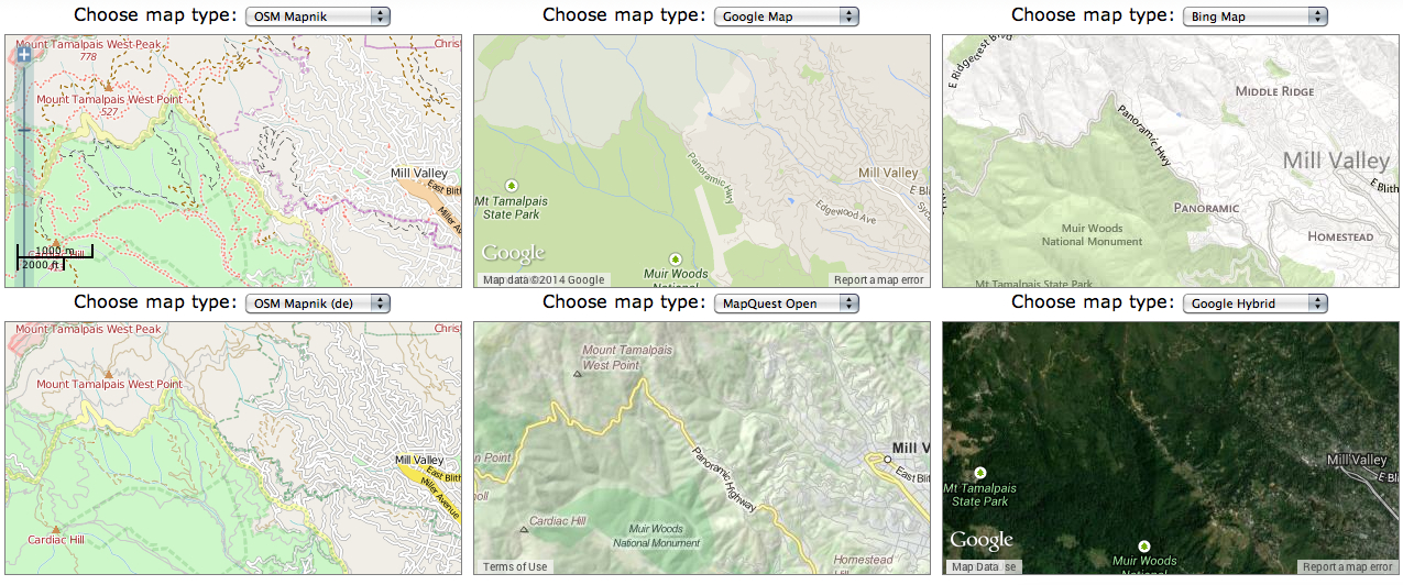
Yet the increased presence of paved miles, even despite the increased danger that the state faces from stormwater damage and erosion in cases of increased stormwater and river inundations, has threatened the value of local roadways. The rapidity with which many roads were re-graveled, and provided with new culverts, ditches, and drainage systems after they washed out in the massive rains of the summer of 2023 led to a sense global warming as the latest threat conspiring to wash out the old lattice of historic roads in the state, and a quick and rapid defense of the local roads that were so much of the tourist industry depends. The deep sense of injustice in the prospect of loosing the legal status of “ancient” and long-pathways preserved in records of in local townships face possible obliteration in the legal memory as such unpaved roads–often more tacitly known than still used for commerce–are going to be reclassified.  Indeed, as the state’s legislature has decided to reclassify common law roads to homogenize property records across the state, the outburst of local mapping seems not an act of antiquarian obscurantism, but a defense of local knowledge in an age of globalism and satellite mapping, where few of the older roads might appear from the sort of satellite-based mapping systems on which we increasingly depend.  While many of the “class 4” roads might be sought out by mountain bikers, eager for off-road experiences, or back roads where they can snake around mountain farms, but only maintained if deemed necessary for the public good. Yet the rediscovery of these “ancient roads” that are still able to be found on some edges of historic farmlands open up prospects of the topography of the past, evident in the gaps between tree tops and the old stone walls of the edges of the pathways, rather than their navigability or use.

The plan for a massive reclassification of “ancient” highways on the books but actually dormant in much of the state of Vermont may be a pro-development land grab, but suggests that the struggle for designating once common lands as private property (and resistance to it) are waged on maps.  The recent promise to reclassify registered but unnamed byways in the state–a mass of roads which were at one time used or previously surveyed as common-law byways, but have since fallen out of use to different degrees–has unintentionally generated a set of local storms about public memory.  In a state where many current town roads remain unpaved, and many more have faded into the largely forested landscape, their traces still in evidence in the midst of a somewhat bucolic space of passage, tree growth impeded by the stones and often muddy road between old flat stone walls that had once been built to separate famers’ bow long overgrown fields.  

The drive to reclassify the diversity of unpaved roads and common law byways once preserved in local jurisdictions reveals the rise of property development for whom the retention of old systems of spatial classification obfuscates the exchange of private lands.  And if the preservation of old farmlands in Vermont provided a rare historical perspective of longue durée for early twentieth century historians as George Perkins Marsh, who rote long before the rise of environmental history or of the Annales school focussed on land management practices as a lens to observe long-term changes in social history. And in a fascinating illustration of how local collective mapping practices provide a unique point of resistance to mapping software systems that are primarily oriented to paved space, rather than the commons, or, as it is now known, the closely connected right to wander.

The Vermonter developed a broad history of the dialectic relations of what we call the Anthropocene between “man” and “nature” avant la lettre. He dis so out of a deeply American vantage point on world history, as he contemplated the “destruction wrought” on his native state’s local landscape in 1864, about twenty years after Henry David Thoreau lamented the presence of the intrusion of railway lines in the idyllic space of Walden Pond. He offered a global perspective that took its spin from his deep impression by the effects of the retreating and shifting landscape of Vermont, where he had been born in a farmhouse, the vantage point from which Marsh defined his perspectives on human destruction of the global landscape.  After travels in Italy and study of the deforestation Mediterranean basin, he bemoaned that the case of Vermont’s loss of native trees as a similar global historical shift of consequence; in the introduction of his massively learned work, Marsh affirmed that “The earth is fast becoming an unfit home for its noblest inhabitant, and another era of equal human crime and human improvidence . . . would reduce it to such a condition of impoverished productiveness, of shattered surface, of climatic excess, as to threaten the depravation, barbarism, and perhaps even extinction of the species.”  In his metahistorical masterwork, Man and Nature, Marsh contemplated the “wide a circle of disturbance we produce in the harmonies of nature when we throw the smallest pebble into the ocean of organic life” and watch it send ripples across the surface of a body of water, offering one of the more prescient images of the cascading effects of anthropogenic change in the Anthropocene.

Vermont’s deforestation was so accelerated and traumatic in scope that–long before the expansion of its interstate that destroyed farms, homes, and an agrarian economy–the state offered an important perspective for articulating an early environmental vision of the planet’s dire state that in 1874 Marsh found it to carry “the force of revelation.” As immersion in the resettlement of dustbowl refugees prompted historical reflection of self-made environmentalist Clarence Glacken, about man’s relation to the habitable environment; his experience of resettling refugees forced from farms by a lack of rain prompted sustained reflection on the relation of “man to environment” that resulted in the synthetic surveys he taught in the 1950s, which culminated in Far From the Rhodian Shore, a compendium of classical to enlightenment thought that was in the course of being complemented by a second volume when it appeared in cloth in 1976. If Glacken viewed the interaction of humanity and the environment as a baseline for humanism, the devastating experience of deforestation provided for Marsh a baseline for the dangerous rewriting of relations to the natural world; the scale of the deforestation witnessed in Vermont as a circumscription of access to natural worlds provoked a terrifying resonance with the deforestation of the Mediterranean he witnessed, leading him to view environmental change as a altering one’s relation to the world, when the logging industry clearcut oak, birch, below 2,000 feet in a massive harvesting of wood, producing 375 million board feet of wood by 1889, and leading the treeless slopes of Mt. Tom near a town known as “Woodstock” to experience massive soil erosion with hard rains that it altered its shape in Marsh’s own line of sight. His own reflection on “man [as] a disturbing agent” able to turn natural harmony to discords wherever he arrives generalized the land-altering consequences of clearcutting without constraint as a force of history: and whereas metahistorical interpretations of Hayden White and others may smell of the libraries where men like Michelet, Burckhardt, Marx and Vico worked, we might well map the alteration of lived environments provided the optic by which Glacken and Marsh structured pessimistic historical dialectics of their own.

A log drive on the White River
Log Drive on the White River Near Sharon, VT/Vermont Historical Society

The massive rewriting of Vermont’s once rich arboreal landscape by the 1890s was so extensive to alter the economy of the land and man’s relation to it. The scope of devastation was not without resistance as the old map of a relation to landscape was preserved, in no small part by th donation of a Middlebury legislator who incarnated local ideals of environmental stewardship by decrying devastation of “timber butchers”: as soil erosion was devastating local tourism, legislators founded a Forestry Commission, similar to the Board of Agriculture, leading Middlebury legislator Joseph Battell to act preemptively to purchase and donate a thousand acres of forested land comprising Camel’s Hump, Bread Loaf Mountain, and other peaks of the Green Mountains to the state so that they preserved their form–and later donated lands from Hancock to Fayston, to his alma mater, Middlebury College, a land grant that provided the nucleus of the broadleaf trees in the Green Mountains National Forest.

If the extraction of wood from the state’s lands reshaped the soil as the cutting of trees on many hills was accompanied by rise in quarrying to mine slate, granite, marble, and copper; often, smelting left wastelands behind in place of forested lands–leaving old growth trees to act as wayfinding signposts for a drivable road network created on cleared land, paved or graded to allow increased automotive traffic unsuited to dirt roads from 1908.

Did not the rebuilding of paved roads as Interstate 89 not encourage the growth of a fossil fuel economy in the 1960s as it cut across once forested terrain, forcing the vision of Marsh’s coherent landscape further into the receding past, as automotive space shifted the function, use, and scope of a local infrastructure of roads?

The back of this 1964 photograph reads, "Unvailing [sic] of new gas signs on I-89." An exhibit at the Vermont History Museum features historic photos from before, during and after the construction of the state's interstate highway.

New Gasoline Station Signs placed along Interstate 89 (1964)/Vermont History Museum 

The local resistance to such a reclassification of roads in the rural state, which has attracted its share of fierce defenders of the local rights of communities long granted precedents to federal or state law, make the proposed elimination of “Ancient Highways” from local law a matter of contention.  The proposed reclassification of a multiplicity of roads poses a problem of having ceased to reflect the sort of use of landscape that developers want to encourage and private home-owners want to ensure.  Given the shifting nature of land use in Vermont, where older houses are increasingly on the market, as smaller agricultural farms close and die out, a premium has developed for the clear definition of ownership without any liens or qualifications.  Hence the increasing tensions between local municipalities in the state and any move by state government to abolish roads they long oversaw.  In a sense, the increased interest in helping demand for fungible residential properties that can be sold without qualification have run up against the multiplicity of roads that have continued to remain on the books.

As the real estate market in Vermont seems poised to heat up in much of the state, and smaller towns face a demand for brisk sales and a large pool of properties arrive on the market, the state seeks to remove any obstacles to development or become notorious for arcane property laws, remapping the “ancient” roads of Vermont opts to treat them as ancient, and, far more than unpaved, not part of its future landscape.  Yet the quilt of county regulations of roads that existed for most of the eighteenth century and was retained in most local maps before World War II reflected a local landscape of counties and townships rarely challenged before the arrival of interstate federal highways across the state during the 1970s, erasing the varied paths, trails, and common-law roads, long overseen by local city Selectboards and regarded as parts of the local landscape.

A Quilt of Counties
Continue reading

Leave a comment

Filed under anthropogenic change, antidepressants, GIS, GoogleMaps, the commons, Vermont

Mapping the Quake beneath American Canyon

The ways of mapping the effects of latest 6.1 earthquake–the largest in a quarter of a century–raise questions not only of the damages it left in its wake, or tragic human injuries, and property loss, but the web of services it disturbed.  The expanse across which the quake’s rumbling was felt at 3:20 am endured only twenty seconds but seemed to last several minutes, shaking the sides of buildings and houses, waking panicked residents, and breaking 50 gas lines and 30 water mains, leaving some 10,000 without power.  In ways that oddly echo the interconnected nature of communication networks, the quake centered in American Canyon was hard to embody or illustrate, if the measurement of the rumbling along the stretch of major faults lying along the San Andreas Fault that lies between the Pacific and North American tectonic plates was exact.


earthquake-620x412


The “shake map” quickly generated by CISM revealed a quite specific concentration of incidence, some 6.7 miles underneath the earth’s surface, whose effects reportedly woke sleepers in the early morning both in San Francisco and Oakland, and as far as the South Bay and Davis.


Screen-Shot-2014-08-24-at-21.21.08


The distribution of losses created by Napa restaurant closures and damages to buildings or rows of shattered unopened wine bottles might be on some minds–and a multitude of isolated images of individual incidents proliferated on social media, even as maps were created to track its impact.  But for all the many images of local damages and disruptions, from trailer parks to freeway ramps, posted on Twitter and social media, images of the web of outages in PG&E outage maps seemed the most compelling representation of the effects of its wake, even if the most abstract–and in a Google Maps format, that reveals the extent of the energy supplier’s range of gas lines and power lines.


outage map pg&e after quake


legend pge


The comprehensive coverage of the map–and the surprisingly uneven progression of individual outages from the epicenter–make the map a clearer synthesis of the earthquake’s impact than the dramatic footage of fires in trailer parks diffused on news agencies, or the images of damages to unreinforced masonry buildings in downtown Napa.  The distribution that it reveals are both more convincing and readily apprehended descriptions of the cascading effects of the earthquakes in this region than the specific descriptions of injuries and damage paraded on the nightly news.

The range of individual maps generated in response to the event convey a less vivid sense of its disruptions, perhaps as they were less immediately able to register its impact in ways viewers could apprehend.  The USGS generated their own crowd-sourced “Did you feel it?” map, somewhat less scientifically, that tried to measure the dispersion of intensity around northern California, taking the 3:20 am quake–and not its several aftershocks–as its focus:


nc72282711_ciim

The geocoded responses provided data for an intensity map over a surprisingly restricted area, using 21,000 unsolicited responses:


nc72282711_ciim_geo

Later that morning, service seemed to have been partly restored, but if the range of local disruptions reported at 11 am diminished, their effects also apparently extended far beyond the aftershocks experienced by inhabitants of nearby regions:


Outages, 10-49 am


legend pge


By mid-afternoon, or 2:30, the disruption only slowly diminished.


PG & EOutages 2-30 pm

legend pge


Even though such automatically generated maps lack an author, the data they display organized a collective story for readers by which to understand the scope and scale of the earthquake’s effects.

Yet such maps might also serve as greater sources of information.  The greater engineering superstructure of the Bay Area–including highways, exit and entry ramps, gas mains, airports, public transportation, rail lines, and sewage systems–are all particularly serious potential sites of damage still difficult to be adequately mapped.  Indeed, the parallel expanse of a still relatively poorly mapped network of gas lines in the PG&E system–many of which recently existed only in the very paper forms in which they were originally drafted years ago–makes the final and continued effects of the earthquake difficult to determine.  The web of aftershocks indeed shadow the expanse of a poorly mapped web of gas lines across Northern California that has yet to be fully monitored for leakages in an antiquated system or even comprehensively mapped, whose potential leakages could trigger a disaster more serious than the San Bruno explosion of a natural gas pipeline in 2002, for which PG&E sustains it has no responsibility.


Gas Transmission Pipelines PG&E


Focussing only on the mapped network on natural gas pipelines in northern California that might have experienced breakages or fissures in the American Canyon quake, whose particularly dense network of gas mains around Napa is here mapped at greater scale:


Gas Main Network, larger scale


The questions of liability that would be raised by the inadequate mapping of the state, condition, and quality of existing gas mains around the Bay Area to public safety make it mandatory to release a full and comprehensive mapping of the quality of existing gas main lines and the potential dangers to which they would be exposed in earthquakes, far beyond the documented physical damage to buildings.  As much as counsel customers on its Facebook page “If you smell gas or are experiencing another electric or gas service emergency as a result of this earthquake, please call 1-800-743-5002 immediately,” and caution them that “If you shut off your gas service, do not turn it back on,” the availability of a truly comprehensive map–unlike the above maps provided by PG&E’s GIS system, “as a courtesy and for general information purposes only,” without a disclaimer that the map’s information is accurate without independent verification.

3 Comments

Filed under American Canyon Earthquake, Community Internet Intensity Maps, crowd-sourced maps?, GIS, Interactive Maps, Mapping Earthquake Damages, Mapping Earthquakes, Northern California, USGS

Local Landscapes in OSM: the Shifting Economy of Mapping Place

A battle-cry of the ages goes out over the internet–Crowdsourced OpenStreetMap Trounces Google Maps!–in a banner New York Times headline so shocking it evokes the battle of David and Goliath of the Information Age.  The battle-cry hinted at the victory of not a company, but of the members of a mapping community who slung myriad shots from the slings of multiple local mappers in Sochi,most of  whom we only know by their monikers, to topple trust in the corporate behemoth’s maps at the same time as the whole world was watching.  And the basis by their cartographical diligence is evident in the juxtaposition of two visuals of the ski runs at Sochi that we’ve been watching on TV, since we can easily contrast it to the terrain on which we’ve already watched so many ski events–and use them to track the skiers whose slalom courses we might was better placed in space.  The on-site demand for maps is so acute that the divergence from the now nearly ubiquitous Google Maps engine is striking, and has caused a bit of a shockwave in the mapping micro-world–“In Sochi, Open Source Maps Beat Google”–as if this was a not-to-be-unnoticed Olympic event, when the “Wikipedia of Maps . . . has bested the corporate giant” at its own game.

The mapping of the Olympic games marked not only a symbolic victory, but a dent in what Adam Fisher aptly terms the “Google Maps-based ecosystem” that has grown out of the widespread reliance of a small and growing sector of the economy on the Google map making machine.  The reliance on map-providers is evidence that even now, in an age of satellite maps and extensive geovisualization, mapping is a marketplace and a business to best orient viewers to an image of the ground in some very interesting ways:  rather than exercising the dominance of organizing “all the world’s information” through a monopoly geo data, fast on the heels of some rather nasty accusations that some yahoos caught using Google IP addresses had set out to vandalize OpenStreetMaps from India, entering false information in their competing images to undermine trust in their accuracy by things from reversing the directionality of one-way streets and altering script in order to dissuade users of expectations for OSM’s accuracy.

As much as an act of random hooliganism, this is a sort of trade-war waged by undermining the credibility of the opposition–a huge change from the days when Google might have sponsored OSM’s annual conference.  Alas, no more, as the two generators of landscapes are at one another’s necks:  at the very time that Google is trumpeted as inevitably on its way to charting a road-map to world domination, cracks in its geo location armor appear.  And the interesting part was, in part, that rather than finding weaknesses or inaccuracies within the many photographs that Google engineers thread together to create a database of terabites that allow us to flip through an apparently seamless photograph of the world, the absences lay in the value of selectivity in labeling the sites, routes, and courses that athletes took, and their exact levels of elevation:  information absent from the outdated photographs Google used in its Earth View.

The two media of mapping provide essentially different landscapes–and a different access to the surroundings that they described.  These contrasting visions of landscape are so readily generated by the Map Compare tool designed by Geofabrik, which actively promotes the commercial use of open-sourced maps.  Designed to suggest the difficult selectivity and clarity that the Google offers on the environments it maps, the juxtaposition of the ski runs from the Google Earth view and OSM map are a triumph in the value of embedded signs and measurements of elevation, as well as potential routes of skiing on the slopes of Sochi.

.sochi-ski-satellite

Despite the authority of the Google Map view, the rhetorical power of this juxtaposition between these forms of mapping shows the extent to what Open Source allows in the recently built environment of the Olympic village:  one is immediately struck by the absence of the Skiing Pavilion on the less-often updated Google Maps views, where not only the routes of skiing on the local slopes are less often noted, but the structures built for the Olympics remain entirely absent, and the far limited points for attending to the landscape and its elevation. There is less data in the Google View, even when one goes outside Google Earth.

Indeed, the comparison and turned up many more signs of orientation than the blank spaces of Google Maps which so strikingly recall the “terra incognita” covered by cartouches in early modern maps of the New World or the icy uncharted regions of polar expanse.

ab4561346

Sochi Ski Center Mapped

What seem open areas marked by the faintest of trails or icy frost engage viewers in concrete ways in the OSM maps, raising questions about how they effectively invite us to see, and what constructions that they use to invite us to contemplate space from eight models of the same landscape.  In an age of the huge expansion of Geographic Information Systems and geovisualization, it is amazing not that different modes of mapping circulate–that’s to be expected–but that their contents will continue to be so diverse, or that the very multitude of information that they’re designed to visualize are available in so many competing models.  The ‘Map Compare’ function devised, in ways that recall the classic art history course’s comparison of two slides side by side each other, provide a slippy-screen template to compare any regions with the boast that the open-sourced OSM version will both be more complete and inclusive in its details, and a better commercial model for anyone interested in mapping any city, anywhere, on demand, on account of the multiple modifications OSM users have made.  The story of the more complete coverage of OSM is anything but new, but the recent focus on the demand for better maps in the Olympic games is a great news story, making the lack of information on Google’s map browser comparable to the shoddy quality of the ready-made rudimentary hotels in Sochi in quite potentially embarrassing ways.  Despite the copious Street View detail, Google’s maps of Sarajevo were lacked in the information and visual detail that OpenStreetMap could readily provide to its users.

open-versus-closed

Sarajevo OSM Google

For all the innovation of push-pins mapping cities, Google seems to have neglected the Bosnian and Herzegovinian landscape, and the very elements of regional mapping we need for detailed spatial orientation.   The mapping of green space,  rather than the Olympic village and the architecture of the skiing slopes, that OpenStreetMap provides a distinctly different approach, which makes it more valued so often by hikers or outdoorsfolk, rather than the streamlined images of roads of Google Maps that so often cast geographical surroundings only as lightly colored muted blocks.  Is OSM a more geographically ethical mapping of space, in ways that reflect how its composite character derived from a community of mappers, as much as a collective crowd-sourced medium whose users have championed it as an anti-corporate mapping model of map making?

The differences in local mapping are evident in the sextet of views that  Map Compare function offers.  Starting from Geofabrik’s local town, Karlsruhe, which seems the default starting place for Map Compare, one can scan the different levels of information they supply, in a massive time-suck and complex compare-and-contrast exercise, moving a nice view of the area around the town’s central castle, that invites visitors to compare what sort of map they’d rather use to navigate the city’s groundplan and to do so with the grain and detail that best illuminate or shine a light on the fabric of its urban planning:

Central Karlsruhe

Moving around Karlsruhe, away form the castle, one can compare alternate mapping views, which offer their own alternative glosses on the fabric of urban space, and their own points of entrance to it:

8 Maps Karlsruhe

There’s a neat abundance, underscored by a healthy pinch of relativity, in this crowding of a variety of perspectives.  Although there is an association of certainty with the map, each of the above images, using different databases which are often protected by copyright, offer different tags to recognize and navigate exactly the same environments, some focussing on the greenery and paths through it, or the road maps and the presence of the national border near Durmersheim, and others letting the national borderline slip into barely detectable gray.  There is a certain healthiness in this plurality–a plurality underscored, in the case of OpenStreetMap, by the varied contributions individuals have made over time, a la Wikipedia, to its contents.  There is a crossroads at which each stand, between data and design, that reflects an attempt both to give and to parse the most useful information in attractive form, and to create a selective map that give each meaning:  as far as selectivity of its record of urban space, the Stamen Toner map in the lower left gives it the most prominent definition by far:  it is something like a bleached version of a diagram of urban design.  The notation of walking-friendly regions of the city in the “Hike and Bike” map offer something like an index of walkability; the OSM De map, made by local German mappers, provides the clearest model to navigate the network of the largest driving streets in Karlsruhe.

And we can follow each into the nation, at a similarly close scale, toward those regions on the French-German border, near Durmersheim.  The maps foreground the different natures of indicating not only country roads and trails, but the nature of national boundary lines, suggest fairly radically different selective views of the local landscapes.  Are roads more important, or is green space?


8 Veiws Maps of Durmersheim

Or, in a clearer juxtaposed context, closer to home, but with similar concerns for the mapping of green space, contrast the highlighting of lakes, freeways, or greenery of the countryside, which the German OSM details in its lakes and countrysides, whose rather picturesque palette of lakes and greens that contrasts with the blah matte of Google maps, in whose flattened 2D color scheme the lakes stand out, but paths to navigate the landscape are annoyingly muted:

Comparing Info Foregrounded in Mapped Landscapes in Germany

Even if the map in Stamen Toner offers the sharpest contrast, as a strictly road map, the German OSM offers a clearer–or crisper–reading of the autobahn’s highway system and its levels of classification–important to drivers, but mute on Google Maps.  The relatively unprocessed nature of the OSM platform, which after all privileges the local detailing of a landscape in ways that are argued to recover the craftsman like nature of remapping space, albeit in a digital format, and after all process the viewer’s relation to place in ways that champion the individual agency of the locally situated mapper’s techniques.  Rather than deriving form LandSat imagery, even if including the backdrop deriving from Bing to ensure its global coverage, thanks to the new friends it gained at Microsoft, or satellite imagery, the structure of OSM uses a form of illustrator that seek to rehabilitate the familiar values of accuracy and open debate in the creation of a local map:  we are all, OSM users say, digital mappers, and can take back the overdetermined datasets all too often passively read and interpreted via GPS.

It’s well known that the detail put into the OSM maps offer a less synoptic view point on areas without roads–or where one might be more likely to travel as a pedestrian or hiker on a dirt path.  Close to my home, OSM is widely favored by hikers in National, State or Regional Parks.  Moving to one of the world’s most strikingly beautiful areas, around Mt. Tamalpais in Marin, the pronouncedly different views of space offer distinct ways of negotiating place and terrain, from the relatively blanched Google Map view of the terrain of the State Park to the mock-lithographic topography of MapQuest or Bing to the comprehensive detail of OSM–more busy, for some, but extremely relevant to orient oneself to the world-famous green space:  the density of the trails around Mt. Tamalpais in Marin are perhaps extreme, but this isn’t information that one would want absent from one’s world mapping system (or data) and suggests an erroneously vacant image of the park:  and the absence of points of elevation from most all mapping platforms, even if all GIS data is always “imperfect,” reminds us of the importance of finding criteria of selectivity that are comprehensive enough.

Mt. Tam Visualized

The question of cartographical comprehensiveness in a sense resonates with the perennial fantasy of mapping a complete view of place or region, trumping the difficulties of distortion with which mapmakers have perennially struggled.  But comprehensiveness–or accuracy–is less the point than the filters on data that exist in the structures (and databases) of certain GIS platforms.  Questions of accuracy are relative to the sort of point of view that one wants to measure, to be sure, and elevation points or nature walks might not be relevant to some–or ski runs.  But the features of the landscape surely are, and so are the role of maps as tools by which we attend to those features.  Something of the distinction that French theoreticians like Jean Baudrillard made between media of film and television in relation to the human imaginary seems to offer an apt point of distinction between the collective visualizations of OSM and the muted visuals in Google Maps, derived from LandSat photographs:  there is no trace of the imagined relation to the place or region in the platform, which offers far less of a basis to imagine one’s own relation to the places that it maps.

Moving to the greener space of the northeastern United States as a test case, I wanted to examine in some detail the different features of each platform a region that I know well, using the scalable functions of each to zoom into a specific place in the green space of central Vermont.

The distinct landscapes of different mapping media nicely foreground the benefits of Geofabrik’s own Topo map, and the OSM counterparts that suggest even greater detail and differences in the options of roads, paved and unpaved perhaps–for long an important local question–as well as variations of landscape green.  While MapQuest provides some important basic detail here, OSM offers a better view of the greenery and scenery, encrypting more information at a great density, especially in contrast to the generic light greens of Google or Bing.  (Sure, you have the Google Earth function to toggle to, but having a single sheet–either on a screen or paper print out, is an important navigational and orienting tool.)

Map Compare-  Vermont and NH

Moving to a local landscape that I know even better at first-hand, in greenish north-central Vermont, we can alternate among a range of mapped views to foreground or highlight distinct areas of the topography and roads that run through the flattened map:  between the topographic views of a cycle map to the routes of a Hike & Bike, the simple landscapes of an Open Cycle map, or the austere Bing and generic Google Map with its crowding of place names at odd angles, while the OSM offer views of the greenery that few others can beat.
8 Maps Near Montpelier

As we focus on a clustering of lakes further south on the Interstate, scrolling down at a greater scale, the clustering of three lakes offers a specific point to contrast mapping styles and the different data they embody and store, out of which we might focus on the somewhat notorious bridge across the lake that occurs in six of the following eight maps, but which I can confirm exists, a bridge which, while on the other six maps, it’s never noted that one cannot drive across:

Lakes and Ponds near Brookfield VT

The contrast in mapping styles grows more evident around the smaller town of Brookfield proper, where the variety of map-signs offers a sharpened difference in perspectives on place:  the eight different conventions of noting the interstate are not only surprisingly different in color scheme to differentiate their source, but the mapped data seems surprisingly distinct in these images:  OSM Mapnik suggests a bridge, lined in black, and overpass, but both disappear in Google Map, and in Bing Sunset Lake disappears, while in none of them is the fact that the bridge is wood, floating, but mostly submerged, and closed much of the year to driving noted.  Not only is the coloration and breadth of Interstate 89 distinct in each, but so is the presence–or absence–of the small lake, the old wooden Floating Bridge that cuts across the Sunset Lake, and the foliage that surrounds Brookfield village itself.  But the inability to traverse that Floating Bridge, either in winter, when it is covered by snow, or in summer, since it has been blocked to all but foot traffic, made me smile at the multiple absences in the map engines arrayed below.  And, perhaps as important for motorists, which mapping renders the transformation of paved to unpaved roads?

Map Compare-  Brookfield VT x 8

What is the best way for a map engine to engage its viewers?  A slightly tweaked variety in another grouping of maps of the entrance to the floating bridge one can’t traverse by car, at magnified scope, suggests the range of arranging information in only one small intersection, and the need to constantly compare mapping forms for their different level of detail:  from the differences among dirt and paved roads, to the range of topographic detail, to the view that the so-called Floating Bridge is in fact perpetually sinking in Brookfield, VT.  At the end, it will all depend on what we want to see in maps, and the array is simply and increasingly boggling.


Dirt v. Paved in Brookfield VT x 8

For while Google has gobbled upwards of six million miles of streets for Street View, the interest in offering an accurate survey of the land surrounding seems to have eluded, as the aim of completing a complete set of photographs of place–as if to seduce us to allowing Google to maintain a system of location-awareness through it–may be removed from what we want to see when we trust the selectivity of the map. For a generation weaned on video, and gratified by the dazzling display of visuals, the sunny streets of Street View and panorama of Google Earth may be enough eye candy for some, but the need for selective filters and for improving semantic legibility in maps might well lead the best maps to be those that are most carefully iteratively refined.

Leave a comment

Filed under Compare Map, GIS, Google IP

Green Urbanism? Blue Urbanism?

Since maps invite their viewers to enter an image of the natural world, as well as to relate places to the broader geographic context in which it lies, they offer increasingly useful perspectives to relate the ocean to the land.  The perspective they offer on all regions has long been rooted on the land,  however.  And the coasts–and indeed the dangers–for adhering to such a “landlubberly perspective” on our rising oceans are increasingly apparent.  A perspective that privileges mapping inhabited lands –and orienting viewers to a set notion of place–places us at a particularly disastrous disadvantage when assessing questions of climate change, or reacting to the increasingly lethal storms, tsunami, and typhoons encountered as the inevitable consequences of climate change, and that coastal cities–from New Orleans to New York to the devastated Philippine coastal cities of Tacloban, Ormac or Baybay–seem condemned to repeat.

In continuing to rely on maps whose perspective denies that of the future expansion of oceanic seas, we threaten to lose perspective on our changing relation to the sea.  We have long found threats of the invasion of ocean waters difficult to integrate in an inherited image of the city as a bounded entity, and continue to draw clear lines around the cities in which we dwell:  our maps draw clear lines between land and water.  Perhaps this is because waters seem so difficult to circumscribe or bound, and the fluid relation between land and water difficult to render accurately or draw.  When an influential movement of urban architecture and planning calls for a greater integration of the natural world–so often bound outside of cities or city walls–within urban entities, they retain the notion of the bounded city.  Recuperating the term the entomologist and biologist E.O. Wilson coined, “biophilia,” to express the “innately emotional affiliation of human beings to other living organisms” in human nature that demanded attention, they argue that cities need to promote contact with nature, since, Wilson argued, such contact provides a spur to creativity, productivity, and well-being.  The planning of “biophilic cities” is dedicated as a movement of urban design to “contain abundant nature” in their structure.  The championing of “model cities”–such as Perth or Singapore–are promoted as examples of the “biophilic” age of urban architecture.

Yet are these models (often located in semi-tropical climates) not limit cases where we can most easily integrate oceanic waters into a built environment?  For by isolating the city as a unit in which to restore nature, there seems more than a bit of bio-fetishism in singling out new spaces where blue waters can enter an urban environment:  the optimism of its evangelical tenor as a movement of urban planners, dedicated to reframing the reintegration of cities with the watery surroundings has gained a broad charge and dedicated following, including partner cities that border on water such as San Francisco, Portland, Milwaukee, Vitoria Gastiez (Spain), Birmingham (England), and Wellington (New Zealand).  While the benefits of such urban architecture appear considerable, the challenges for expanding the role of the ocean in the horizons of city-dwellers seem only the start of restoring the historical isolation of the city from watery life, or integrating the oceans within our future urban planning.

The movement of blue urbanism is an illustration of courageous dedication to a project of reintegrating aquatic and urban environments–at least, presumably, before the shores of cities will be redrawn by ocean waters.  The considerable cognitive benefits claimed for these more enriched urban networks build on movements for integrating networks of urban “green-spaces”–including not only parks but green-belts and even forests is a reasoned reaction to urban sprawl and overbuilding and way to take charge of the built environments we create.  “Blue urbanism” would comprehend a watery frontier, offering opportunities for immersing children in rivers, urban parks, watery excursions, and underwater ambients which surround cities.   Blue urbanists espouses an improved integration among the fauna and flora lying near aand around cities within something like a green belt–and espouse the value of an analogous “blue belt” as a way to foster a new attachment to the waters and their shores, rather than seeing them as limits of built city.

Yet does emphasis on the human benefits of such contact carry a all too narrowly restricted notion of what a watery surrounding might be?  The watery oceanic borders of cities are in themselves rarely mapped, though the shifting waters of the Gulf Stream and other currents determine the shoreline inhabitants of North America, but might a map provide a fuller perspective on the interchanges and ecosystems lost by drawing firm barriers between urban and ocean life?

1.  The “blue urbanism” that Timothy Beatley advocates wields the rhetoric and best practices of green architecture’s “integrated network of urban space” to invite us to re-imagine cities’ relation to the shores on which they border.  Yet there is concern that such projects of rebuilding turn away from the depth of our historical remove from the waters that surround our cities–an increasingly pragmatic concern after the very fragility of this divide has been so traumatically revealed in recent decades, from damages inflicted on US cities by Hurricanes Katrina and Sandy or, afield, the Indian Ocean Tsunami and super-typhoon Haiyan.  The ecology of biophilic design, for all its benefits, could benefit from a broader global ecology, basing itself less on the benefits of human friendship with the biosphere, and being more oriented to global contexts of the cost of climactic shifts by looking back to the geography of the past–lest the affections of biophilia border on the bio-fetishism of the philistine.  The precepts of adaptation and resilience to mitigate bad policy decisions are of intense importance; historic maps offer base-lines to qualify the alienation of cities from their shores that compliment the need to build green and blue belts.  The maps we have drawn about urban areas may provide a basis to recuperate the integration of life along the shorelines we have lost, in short, and the nature and settlement of life along the city’s shore–as well as the ways that oceans serve less as a barrier to than interface with the shore.

While we map the trespass of waves over the finely drawn boundary lines of territories, measuring incursions across demarcated shorelines and property lines, and mourning the scope of damages and loss, we seem to remediate via maps–much as how OSM-mappers have begun to chart buildings and routes in the Philippines for delivering humanitarian supplies, as a way of rebuilding, if at first in virtual form–to restore urban infrastructures in digital form.

Mapping Tacloban via OSM

Yet these maps do not comprehend, for lack of a better word, the sea.  The terrible human costs of each of these events serve as something of an intimation of the threats global warming poses to urban environments, and invite rethinking notions of ‘planning’ replacing the imagined stability of  a built frontier of urban society with a more permeable line of inter-relations, even as we come to appreciate how little conscious “planning” went into the drawing of earlier boundary lines.  Both the human and material costs of these events compel an appreciation of the role of the shoreline, as well as intimations of the threats global warming poses to urban environments and indeed the world we have built.

Homes in Samar provinceReuters

Naturalists have recently begun to realize the power of maps to invite reexamination of our relations to place, however–often by using historical maps to excavate the shifting historical relation to the natural world that have led us to draw such finely parsed lines between planned urban environments and their surrounding waters to assess the costs of these sorts of fantasies of spatial distinction:  if we don’t build on the water, we cannot ignore it but at our collective peril.

Map offer a particularly precise if plastic means to situate place that are able to register deeper, less easily visualized, chronological changes and global contexts, or shifts within a regional ecosystem that would be otherwise difficult to conceive.  In age of rising oceans and global warming, maps draw relations between local settings and global changes to help assess the extent to which global warming threatens to obliterate or erode the stability of our concepts of place.  Maps of the circulation of waters around specific cities compel us to rethink an inherited oceanic boundary.

2.   Can a “blue architecture” invite us to re-imagine bifurcated schema of ordering of space to which we have reduced the relation between land and sea to a simply drawn line?  Or have we lost a relation to the land that a new building project cannot recover without clearer lenses to view the relation between water and planned environment, and to be invited to appreciate a clearer register of the relations between coastal cities and the surrounding sea, and, indeed, of the delicate interdependencies that are the basis for our sense of place, and underwrite how we imagine “place” as a category?  A historicized art of mapping stands to call attention to the ecosystem that might lurk beneath the threat of climactic change, and understand the changes they pose to local ecosystems.  The art of mapping provides unique tools to invite viewers to consider local settlements, and develop tools to re-imagine a relation to the sea new building projects alone cannot foster.

Sanderson's Base Map

We can appreciate the huge changes wrought in a relation to the shore by how a cartographical reconstruction of Manhattan island revealed in this stunning 1782 British Headquarters map drawn at the painstaking scale of 6 1/2 inches per mile reveals the island’s coastline as it was experienced by Lenape tribespeople.  Using the watercolor map as the base-map for his digital reconstruction of the local environment, landscape ecologist Eric W. Sanderson of the Wildlife Conservation Society worked over five years to create GIS database, geo-referencing landmarks and sites to reconstruct the forgotten landscape based on 200 control points.

Sanderson’s completed map has a beauty that invites viewers to explore a computer generated landscape’s verdant arboreal landscape and rich wildlife, moving with amazing apparent precision over a web of lost streams, rivers, and hills that agricultural and urban development erased over time–most all of the more than 570 that distinguished the island Lenape members to give the name “Mannahatta,” the ‘island of many hills,’ and to map over 627 varieties of plants in the island, and the 233 types of birds and 24 different mammals who lived in its delicate interstices of interlaced ecosystems, in its swamps, ponds and the estuaries of its shores.

The older shoreline strikingly engages one’s mental map of Manhattan’s shore.   It jar one’s notion of place, and shift the stability of shorelines, streets, and riverine banks within one’s head.  Superimposing data from a Google map visualization of the verdant forests, ponds, streams, and marshes before four centuries of landfill shrunk its coastal geography, the map reveals a huge change in place in a powerfully persuasive graphic form.

Indeed, the superimposition of the shifted maps–the street grid and coastal drives laid above the earlier contours of the island’s expanse– is compelling by the complex cognitive dissonance it creates, placing multi-lane expressways and drives on the expanded edges of the island, so that they run across the marshland estuaries of the Lower East Side or cut into the blue waters around the island, suggesting the actual de-naturing of the landscape even more than the de-naturing of place that all Google Mapping templates seem to afford–and far more eerily reminding us of the extent to which we’ve effectively distanced ourselves from the expanse that the island once occupied as well as the ecosystems that it held.

Welikia 1609 Map of Mannahatta

3.  The remove of the world of this island situated on merging saltwater and freshwater, and with a dynamic verdant ecology is apparent from Markley Boyer’s stupendous digitization, which recreates the island seen by Henry Hudson in 1609, and which, if not a map per se, compels us to both explore its content by mapping them against our own experiences and spatial imaginaries.  The almost palpable landscape invites us to explore its content, as if as it invited Henry Hudson and his men in:

Mannahatta's verdant paradise 1609
These now absent beaches, marshlands, and estuaries in the landscape offer a striking contrast to the current shore.

Mid-Manhattan
The integration of its coasts to the river echo the shorelines that John Randel, Jr. famously mapped in delicate watercolors in a detailed rendering of its many hills between 1818-20, even as the grid of streets was lightly traced and projected above a far less level urban topography, where the city descended in differently manners to the rivers and estuaries on its shorelines, most of which have been erased by time:
Randall Farm Maps

Boyer’s glorious digital reconstruction recreates the shimmering presence island of hills, rivers, and trees that Lenape knew in its speciated glory, mapping the messiness of that shore in ways that inspire a vision of or compelling case for the optimistic dream of restoration of these shores:
Mannahatta:Manhattan from south
4.   Maps offer persuasive forms to re-think cities’ relations to oceanic shores, perhaps more compellingly altering deeply set attitudes than new practices of planning to integrate more fluidly and esthetically water and land.  Although Beatley calls, at http://www.biophiliccities.org, for new attitudes to the surrounding world, and fostering a new culture of lifestyle, curiosity, and an integration of the tactile presence of the seas in “blue urbanism,” we  might better appreciate the nature of the frontier created between city and water not only in the benefits of immersive aquatic environments in cities, but respond to the absence even of registering seas in urban planning by examining how we came to map a disconnect between cities and ocean– and the cultural divide that has emerged between shore and urban space that was elaborated from the mid-nineteenth century, and is now deeply established by zoning, districting, EPA standards and urban planning texts.

In asking to extend our concepts of cities to the oceans that surround them, we might work not only to make new maps, but use old maps to be mindful of the need to extend our sense of place through the refiguration of urban spaces–noting how maps mark and register the depths of the cultural divide between urban and oceanic space, and examining maps to chart the losses of a shifting historical relation between the city and ocean.  Such a remapping of the city’s relation to the land is echoed in the recent interactive mapping project of Stamen Design, Surging Seas, which tracks rising sea-levels caused by storms or flash-floods, mapping sea levels in relation to the inhabited land–and visualizing a nine foot rise in sea-level of nine feet, here in lower Manhattan, based on data from Climate Central.

Stamen-TriState Submerging Seas
And the interactive site allows one to track what changes would happen if the sea-level were to rise it to a ten full ten:

Surging Seas--NYC, 10 Feet

5.  At a recent discussion in San Francisco’s Exploratorium about relations between land and sea promoting such a “Blue Urbanism,” the relations between place and global change rightfully gained considerable attention.   Most presentations focussed on specific examples of cities, but the problem was pressingly (and depressingly) relevant given the recent typhoon.  Occurring in a room exhibiting such splendid shifting nine-panel global color video projections, courtesy NASA’s LandSat satellite photographs or the Goddard Flight Center, of Global Precipitation Levels, Sea Surface Currents and Temperatures, Ocean Currents, or, below, Global Aerosols, they seemed to provide a unique context for rethinking the presence of the local in relation to the sea.  For only in rethinking built relations between land and sea, and the compartmentalization that led to the diffusion of aerosols, the shifting of water temperatures, and  changes in the level and salinity of oceans over the past one hundred years, can we measure the human footprints already left on environment.

Global Aerosols Exploratorium

One such remapping of such relations and attitudes might begin from maps, it began to appear–and from the inspiration maps might provide to remap relation around San Francisco, not only by seeing how space was filled by the city–or the urban conquest of space–but rather how the negotiation of the boundary with the sea was based on spatial practices of such longstanding nature, entailing and perhaps rooted in the representational practices of defining space as an area of settlement and urban planning–and a practice of planning that sees space as filled up by housing projects that cut off the marine space of the sea.

The projected maps on plasma screens raised questions of how to rethink the sedimentation of such deeply set cultural practices, if only by providing a context for the dramatic remapping of urban environments at a remove from the ocean’s ebb and flow–or relate place to a far broader context of environmental change.   When Rebecca Solnit recently offered a haunting analogy between global warming to the processes of gentrification that threaten the fabrics of urban neighborhoods–both occurring with blinders to the overall structure and coherence ecosystems, whether the social ecosystem of urban space or global ecologies, and of removing oneself from our role in creating a scenario of global warming or urban change.

6.  The history of spatiality and of spatial practices that define the city may suffer, one soon realized, from the separation of such “spatial practices” from an appreciation of urban environments.  The circumscription of the spatial is partly inherited from the conceptually pioneering–if idealizing– strain of thought in the work of the French sociologist Henri Lefebvre, whose notion of in The Production of Space was rooted in an Aristotelian or Kantian categorization of space as a human creation.  For when Lefebvre distinguished forms of apprehension among social practices, representations of space, and symbolic models of spatial representation, he refined how Aristotle cast position as a category of human apprehension and Kant affirmed space as an attribute of human judgement–rather than an ecological space of multiple species’ interaction, or indeed of biological overlap.  Instead of commodifying space from a human point of view, we fail to register either local specificity or the density of coexistence around place:  maps can return attention to all too often forgotten margins of settlements, and effectively reconstitute place in a greater environment.  A similarly broad sense of the sea-shore as a “primeval meeting place of the elements of earth and water, a place of compromise and conflict and eternal change,” as much as opposition, was suggested by Rachel Carson, who suggested the basis for understanding the shorelines by “the long rhythms of earth and sea that sculptured its land forms and produced the rock and sand of which it is composed”–and the biological communities specific to each.  She chose a map of the Gulf Stream as a sort of emblem for the situated knowledge of the shore, using a version of the 1769 chart of Benjamin Franklin based on the working knowledge of a Nantucket sailor, Timothy Folger, that is the end-paper for her 1950 The Sea Around Us; Carson praised the map for transmitting understanding of ocean currents–and for the first time locating the course of the equatorial Gulf Stream, or “Gulph Stream,” on a map, in ways that embodied a tacit familiarity with the flow that many sailors well knew, but which Franklin, as Postmaster General, was frustrated to find absent from any chart.

seaarndusop2
The recovery of the rare original Franklin-Folger map showed a pointedly less centrally defined Gulf Stream than the composite map reprinted above, but illuminated a new need for mapping oceanic expanse–in this case, for the postmaster general to elucidate the greater time needed to traverse the Atlantic from England, which world maps or charts had long excluded, in failing–or, more accurately, not knowing how–to map the seas.

Franklin- Map

7.  The question then becomes how to adequately map the seas, as much as urban space.  The ability to register and communicate familiarity with place–and with a watery space–is particularly lacking in most urban maps.  The absence is a considerable difficulty for adequately registering knowledge of the sea on its own terms, or the shoreline and its inhabitants.

Or can we use maps to register a shifting knowledge of the ocean’s shore?  One charge for spatial history would be to excavate the construction of space in different environmental contexts.  If it is to extend beyond the recapitulation of space as a human construction, “space” might be more adequately placed in a global–and less of a human–context by recognizing and affirming space as an ecological category.  One place to start would include the negotiation of deeply set cultural categories of division and differentiation that are framed in maps, taking the map as a human artifact–rather than a representation or a practice, a model of interaction that conditioned and provides evidence of lived experienced.  For the tendency to idealize space at an Apollonian remove–an image perpetuated, to be sure, in maps which subject the cognition of space to human understanding–abstracts space as a category of apprehension, rather than registering the density of interaction through a suitably “thick mapping” across boundaries, borders, and regional change that recuperate buffer zones, watersheds, and shorelines we have lost–in ways the art of mapping is uniquely suited to portray.

The challenge of recuperating the network of estuaries and streams that once surrounded the low-lying areas around the San Francisco Bay, for example, might negotiate with how we constitute the terrain for urban life by drawing a clear divide from the surrounding waters–or the perpetuation of the fantasy of drawing a clearly demarcated line dividing water and land.  Rising seas once flooded a river valley to create San Francisco Bay, whose many inhabitants  long existed in relation to a less clearly defined shore.  Maps can reveal how humans have interacted with the Bay over time that created deep mental barriers to interaction.   One can trace the shoreline moving in hundreds of feet inland, and slowing in past centuries to but a millimeter a year, or a city block over the last century, as a  shape-shifting feature with which bay residents have negotiated in different ways since a time when people lived near the bay, and negotiated with its salty marshlands, as a map of native American Shell Heaps that ring the bay eloquently reveals by noting the clear buffer zones that inhabitants created on beaches to meet rising tides.

BayShellmounds 001

The maps registers crucial details of the negotiation with marshlands and wetlands now lost or recently restored, outlining an image of interaction with the sea that is not immediately recognizable, and difficult to negotiate with our own changed landscape.

The particular coastal region near El Cerrito indicates the building up of these mounds to create a permeable barrier from the resident crustaceans along the marshlands running from north of Albany Hill to behind Point Isabel–now landfill, then a remote rock in the Bay.

BayShellmoundsCerrito)

The salt marshes, and the five creeks that fed them, are evident in this detail of the 1856 US Coastal Survey:

Salt Marshes

Yet as people moved inland from an 1850 shoreline was reduced by almost a third all of a sudden in last fifty years in a quite rapid and decisive manner, to create a new sense of the stability of the shoreline that segregated land and sea which will be particularly challenging now with the rise of sea levels projected global warming.  The illusory stability of the shoreline is however inevitable . . .  and the bay on track to expand again by 2100, to return to its size of 1850, in ways that pose disastrous consequences for such overbuilt regions of low elevations.  All low-lying areas are threatened by this projected expansion of the ocean, from Foster City to the treatment plants near to the Bay, to Oakland and San Francisco’s low-lying airports . . . and Oakland’s port.  In cities with waste facilities, oil tanks, refineries, ports and airports lie close to the water, as in Richmond, Oakland, the Carquinez Strait and Albany, ocean waters pose very real environmental threats illustrated by the tsunami’s breaching of the Fukushima Daini power plant.

8.  Can we redesign the shoreline differently?  Observing these low-lying areas that stand in close relation to the water in this map of 1850, we might consider the importance of beaches that can constitute a natural buffer to the shore, and the need for restoring their role as transitional zones and regions that has been so precipitously eroded in our environment.  For the erosion of such transitional spaces–and the overbuilding of the shores–has rendered more vulnerable low-lying areas such as Albany, Emeryville, Oakland or El Cerrito, encouraging blinders about the potential possibilities of future risk.

Sandy beaches that once circled San Francisco similarly served as barriers to the encroachment of the sea.  The loss of beachfront corresponded to a huge expansion of reclamation by landfill, and a resulting loss of estuaries, widely known around the Marina, and evident in the expansion of the city’s shores from an 1895 USGS topographic survey:

Lost Land SF-Historical Creeks and Shore marina detail

The loss of estuaries, creeks, and rivers in the entire peninsula of San Francisco since 1895 is less well-known, but even more dramatic:

SF Built Out:Loss from 1895 Topo

Will the process of getting to know the shoreline again provide a way to make them stable barriers once again?  Will we be able to provide natural resources by fluvial deltas, and support the growth of these buffer zones to do better on a second chance, by expanding an estuary system linking to the ocean that was so drastically mis-designed in the 1950s, when it was even proposed–if the proposal was reversed–to pour more landfill into the Bay, and re-zone the estuary, in order to fill an expanding housing market?

Bay or Rivewr

While it was not so prominent as the urban planners had proposed, the dramatic loss of such crucial buffer zones as tidal wetlands is evident in a comparison of first coastal survey of 1850  in this overlay of coastal maps, courtesy the San Francisco Estuary Institute, detailing the configuration of the coastline as it was and as we have made it,  over the century and a half of urban growth throughout the Bay Area–and the dangers that this poses:

baynature_829

The map cannot begin to conjure the shifting dynamic within the landscape and ecosystem we have lost–although the system of dykes and landfill suggests the beginning of the possible excavations of a lost shoreline.

This image of the expansion of the city’s urban claims to housing derives from a cultural and deeply anti-ecological view of the city as a site of stability–and ocean was seen as a site of antagonism on which, in the domesticated image of the bay, the city could rightfully expand–and the estuary be recast as a river to accommodate housing needs.   In starting to change our attitudes to our shorelines, and to view them as sites for other residents and as permeable barriers, we might start from changing our attitudes to the sea:  and remember, with Rachel Carson, that it is through our expansion of the “artificial” nature of cities that we have forgotten and somewhat brazenly rewritten our relation to the shoreline and the sea.

florida-coastline

Maps, of course, forge bridges between nature and culture in provocatively engaging ways–and engage viewers by mapping these relationships.  If we are starting to remap place in provocatively interactive ways, the challenge is to best map the shifting relation between place and the global changes that call for an extensive remapping of place within the world.

Leave a comment

November 14, 2013 · 10:19 am

Mapping Migrants’ Deaths along National Divides

Mortality is mapped to gain a grasp of geographical distributions of illnesses over space.  The mapping of death helps to embody the pathways of disease, and allow us to see otherwise inapparent vectors of transmission, which have historically provided crucial ways to assign meanings to a disease’s effects and pathways.  In ways, the map manufactures and embodies the pathways of a disease’s infectious spread: the rise of deaths in the borderland between the United States and Mexico can only be mapped as a dereliction of national responsibility that charts an erosion of civil and moral codes.  The recent erosion of civil law and attacks on immigration law conceal a longstanding withdrawal of responsibility along the border, opening the way to creating the borderland as a military jurisdiction—rather of civil law.

We have long mapped diseases to grapple with their causation.  Even before the bacillus of a disease might be known or seen, the founder of modern epidemiology, John Snow, critiqued miasmatic theories of contagion by mapping the distribution with which cholera spread across London neighborhoods during the 1854 London epidemic, visualizing the disease as a social network of contagion by a dot map of neighborhood outbreaks that used a dot map to as proof that “nearly all the deaths had taken place within a short distance of the [Broad Street] pump” whose water was a vector of transmission.  The distribution of mortality around public fountains provided a basis to demonstrate vectors of contagion for Dr. Snow, and by mapping all deaths from cholera to have occurred in recent years in relation to one pump on Broad Street in relation to London’s thirteen city wells by a voronoi diagram.

By locating each and plotting the distribution of deaths from cholera in the city in relation to the significant incidence of deaths form cholera near specific street-pumps revealed a way to grasp infectious transmission from the Broad Street pump that embodied a new notion of contagious diseases that challenged miasmatic transmission—making for the first time a clear spatial argument about how disease existed and moved in an urban environment, and presented a second map, with clearly traced polygons to indicate routes of transmission to the local parish showing routes of walking by which the disease was transmitted—using the recent mapped deaths from cholera in London Edmund Cooper tabulated—


—in hopes to encourage a level of civic engage about the origins of cholera infections that had plagued Londoner’s for twenty eras in the city’s fabric.

The source of deadly infections that this famous data visualization revealed suggests the communication of fatalities by a clustering that indicated clear routes of the spatial communication of a viral infection, focused on a large subset of deaths in close vicinity to the Broad Street pump, even without bacteriological or microscopic evidence.

The exact distribution Snow organized contrast to the terrifying distributions of the deaths of migrants seeking passage across the border, which resists any extraction of an explanatory framework or conclusion, but raises questions about the inhumanity of the terrain we have created.

Snow-cholera-map-1.jpg


Dot maps of migrant deaths follow no such clear distribution, and has no sense of transmission form a single site.  It forces us to acknowledge the deep problems of the criminalization of immigration on the Mexican-US frontier by charging its human costs.  The sites of mortality from hunger and thirst are tragically dispersed over a far great undefined space, but embody the human costs of existing border policy, even a decade before Donald J. Trump used the management of the southwestern border as a campaign talking point to pole vault into public politics.

No similar diagrams can be drawn to elucidate the range of dead bodies discovered in the desert of migrants who were attempting transit into the United States for better homes: can one better explain their deaths b a virtual miasma of cruelty that fills the air of the border zone. Their deaths were caused by dehydration and starvation, as well as cold, but suggest nothing so much as a miasma of neglect. The distribution of deaths of migrants in the Organ Pipe Cactus National Monument, adjacent Cabeza Prieta National Wildlife Reserve, and O’Odham Reservation already illustrated a dereliction of national responsibilities.

The map is a deeply tragic reminder of the loss of life that is forgotten in the dry expanses of these deserts where the border, such as it is, lies, and the distinctly disturbing regime of a lack of interest or care for human fate that—even with the mortality of children in detention camps at the border—still can stretch incredulity at the evidence it offers of a large theater of cruelty.  They recall the denial of burial to the bodies of enemies in the ancient world, left as prey to dogs and vultures:   the Enlightenment jurist Giambattista Vico faced considerable difficulty explaining to his readers that there was a time when the bodies of anyone was left unburied in an earlier age in his Scienza Nuova, “an inhuman custom—so contrary to what the  writers on natural law of all people’s claim to have been practiced among any nation— . . . which [once] prevailed among the barbarous peoples of Ancient Greece,” described in Homer’s Iliad, and at which he marveled as “crude, coarse, wild, savage, volatile, unreasonable and unreasonably obstinate . . . and foolish unreasonable customs,” far removed from his own age and from the imagination of his readers, so “discordant” was it with our own civil age. Yet the unburied dead whose bodies have been located in states of extreme decomposition along this border zone reveal a discordant reminder of the return of such an inhuman custom on the borders—and within the borders—of what we consider is a region that is distinguished and administered by civil laws. Whether this region can be rightly considered a region of lawfulness or civility seems to be raised and put on the front burner by the discovery and attempted identification of the human remains discovered lying in the desert, often dramatically decomposed, of migrants’ bodies dating from the administration of George W. Bush.

If Vico could scarce imagine the barbarity of leaving bodies exposed to the elements even in war—and the spectacular cruelty of the dragging of the body of Hector around the perimeter of Troy three times—among those who “were held to have spread humanity across the world,” given the sheer physical disgust of leaving the body unburied, and given that “all gentle nations certainly concur that souls [of the unburied] remain restlessly on earth, wandering around their buried bodies,” from Guinea to Peru to Mexico to Virginia to New England to Siam, the readiness of Christians to leave the dead unburied by the border, if not intentionally, haunts the border region with its own inhumanity. The violence of this early heroic age was before the age of laws of nations, for Vico, and belonged to the age of “violent and impious men who dared to enter the cultivated fields [] in pursuit of the weak who had fled thither to escape them,” and belonged to “the vulgar customs of the barbarous Greece” of Homer’s day, and adequate burial in fact constituted one of the three institutions of human society—with marriage and religion—in ways that betray the huge remove of a heroic era, which incredibly lacked burial customs or rites, from our own.

Yet the abandonment of unburied bodies has returned in the no-man’s land of the US-Mexico borderland, where the abandoned bodies of would-be migrants fall between governing bodies and accepted customs.  Migrants that were stopped during the course of their attempts to reach a new life in the US were clustered at a distance from the border but reveal the amazing distances many undocumented migrants travel before they collapse, without food, and most often out thirst and dehydration–leaving them exposed as “prey to dogs and vultures” in the very horrifying ways that Vico was so horrified. The recent spatial distribution of such abandoned cadavers and corpses, left without any rites of burial, force the viewer to scrutinize its mute surface of dots against a deceptively pastel base map as if they might magically be able to glean or recuperate the silent, forever-lost stories of migrants who lost their lives attempting to cross the border, and the stories of whose travails and travels can never be told. The ends of their lives, reduced to the finality of a bright red circular dot in the data visualization, out of scale, arrests attention but is disarmingly and alarmingly flat, resistant to any further narrative or even identifiable name.  Over 2,000 dead migrants whose bodies were retrieved at a significant distance from the border suggest their desperation to make their way across the border by clandestine routes, and the extreme climactic difficulties that they face, with few adequate provisions for crossing deserts whose expanse they feel forced to travel to search for jobs–risking their lives to do so.  

Ex Voto painted to express thanks for successful crossing of the Rio Grande

If the many migrant deaths of those attempting to cross the border between the United States and Mexico are often expressed by crosses that are hung on sections of the fragmentary “border wall,”—

—the precise distribution of the dead in sites of their death is rarely preserved in public memory, and the archive of dead migrants who did not survive passage is rarely assembled as a geospatial record.

The number of the dead remains but a fraction of those who have actually died attempting to travel north, leaving detritus and lost objects in their wake that only beg deciphering as images.  For although their overlap suggest something like a clustering that might belong to an external infective agent, the alarming nature of the red points call attention to the human costs–and the anonymity of lives lost–that are the victims of the intense dangers of border-crossing that migrants accept and undergo, who we have forced to accept and risks of dehydration, heat stroke, hyperthermia, and starvation which have killed them.

GIS Mapping of Individual Deaths on Arizona Border

If the deaths of those attempting to cross the border will probably never be know with precision—and is often lost to oblivion—the recovery of human remains affords a grim picture of the actuality of recovering the dead, and the attempts to name, identify, commemorate and memorialize their fates as well as prevent the loss of their identities, despite the jarringly abstract geospatial symbology of this map, and the minuscule proportion of those remained that have been so far identified.

This project of memory and memorialization, echoing the imagery of northward passage in the famous Underground Railroad taken by fugitive slaves taught to recognize the handle of the Big Dipper to follow the North Star to find their path to freedom, “Follow the Drinking Gourd,” the symbol of the constellation has been adopted by the Humane Borders organization which has identified remains and sought to allow them offer needed geospatial assistance to migrants in their search to find a path north.

2 Comments

Filed under boundaries, data visualization, GIS, mortality maps, US Border Patrol, US-Mexico Border