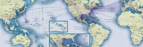
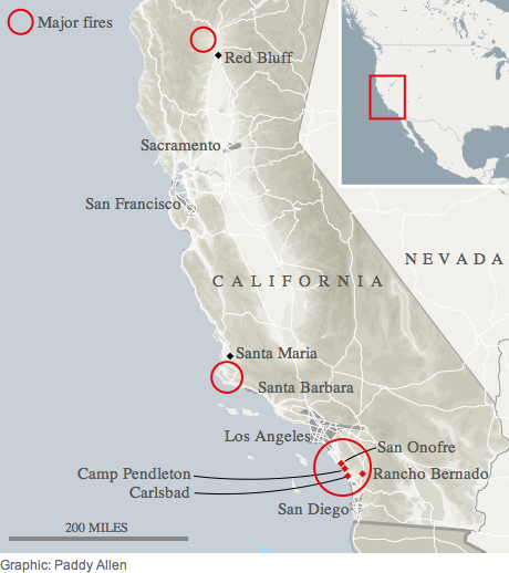
New markets of maps are always emerging, and we seem to have our own interest in making maps for an growingly de-centered globalized world. But perhaps one of the oddest markets is for the rehabilitation of the itinerary in a globalized age, a rehabilitation that seems not only against the grain but designed to bequeath greater familiarity to a space often felt to shift beneath one’s feet: where one is as one watches the landscape unfold in the most current flight maps almost undermines the position of the viewer as if to reinforce whatever queasiness one might feel while suspended high above the earth in a crowded flight cabin.
In an attempt to create a sense of individuality in the in-flight experience that seems safely guided by a captain piloting the plane, the in-flight maps omit the range of other planes crowding the airspace of the world, and indeed the possibility that the plane is steered remotely or by an automated program, giving a sense of collective participation in mapping the steady course of the airplane’s flight-path in a proliferating variety of formats. Whereas airline-based in-flight tracking maps are generated for paying passengers for apparently utilitarian ends, the fairly antiquated medium of spatial representation is compellingly abstract–and often can prove as disorienting as much as orienting. Increasingly, the tools for envisioning the path of your plane on a Mercator projection–serendipitously fitting in the frames of video screens inset above most tray-tables in Economy flights–which allow us to imagine the global context of airplane flight paths in unique ways.
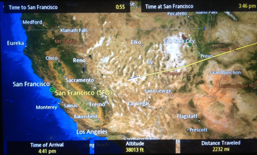
Wildly out of scale and based on estimated representations of flight paths, the maps displayed behind tray-tables on the backs of seats claim an odd sense of exactitude designed to increase confidence, the maps convince us that we are in good hands, and suggest that once we have entered on our course of air travel we have entered into a unique relation to the land but also a position of safety, in which we will be safely guided to our eventual destinations.
Is it any coincidence that the map is viewed as one has little sensation of moving, and needs to be reminded of progressive trajectory of global motion across it? The inclusion of a directional set of arrows, resembling an early modern wind rose, atop the rather detailed bathymetry of the ocean floor suggests a reminder of global travel. If there is a superfluity of detail in mapping the ocean in a ramp of bright iridescent blues, the map also serves somewhat as an invitation to future destinations–
–that reflect the increased expansion of air travel from a time when plane rides seemed to sketch something like a single transcontinental highway in the air with a few turn-offs:
The proliferation of airspace in recent times is well-known. But less scrutinized or contemplated is the value of retaining or communicating a personalized map of the travel of the individual plane across an empty cloud-free sky, as a distillation of the personal experience of flight. The disorientation of these personalized maps consulted above tray tables provides the clearest reminder between snatches of sleep or airplane reading that we are indeed in motion at that very moment, providing a register of distance travelled, height, and arrival time as well, in the upper left-hand corner, time remaining in flight–and the depiction of the magnified presence of a plane over the land that lies contracted below, wildly out of scale with the perspective of the plane that moves across its surface.
Edward St. Aubyn nicely described the odd nature offered by the constant counterpoint of the disembodied relation to maps for passengers faced with the cartographical options of geolocation in rapid-fire succession. If the provision of data seems to revel in informative abundance, the information overload easily loses coherence for many viewers, so carefully crafted are the maps to command attention over the short-term, as if to compensated for the limited attention-spans that is assumed of most airplane passengers. The dizzying disorientation with which the shifting scale of the map, showing a child “their plane hovering near the Irish coast, south of Cork,” suddenly “expanded to show London and Paris and the Bay of Biscay,” only to morph yet again to an “informational feast” that “[at] the next scale included Casablanca and Djibouti and Warsaw” in ways that immediately undermined any comfort of its color-saturated informational content. If airline companies may hope to present to its passengers a form of reassurance, the abundance of maps, apparently exulting in the possibilities of representing a course of transit, and as a result communicated “told you everything except the local time on the plane.” If St. Aubyn sees the superabundance of information on the map as deeply alienating, it is also a reminder of the alienated nature of the in-between space of transit. For one is in an intermediate place in the plane, which remains outrageously magnified on the map, but also outside of it, moving across time zones with the apparent potential of moving to any place on the map, and indeed eventually moving outside its frame, as one shifts among maps that seem to lack any indices, but hurriedly create or improvise a sense of place as long as we are in the air.
With the crowding of the paths of the airways, the itineraries overhead are not only an “informational feast,” but a progressive sense of the unfolding of the flight path that one can watch, while seated, from an empyrean point of view, that is truly satisfying to frame not one’s sense of where one is, but of how much flight time remains. For if the seated passenger is removed from any sense of place, during the course of transit, the map allows one to be a spectator of where one is flying and enlists the most recent mapping graphics to do so, foregrounding the varieties of visual entertainments of map reading while we are in the air compounding the iconography of the cloud cover of a weather map, the remove of the plane from the ground foregrounded by the ridiculously out of scale rendering of the aircraft.
The plane is in a sense part of but not part of the map, a sort of talisman that gives us a sense of direction and markers of distance as we are removed from the earth.
The yellowing map that was compiled of brutally dehumanizing acts of violence across the United States from the start of the last century presents what seems another country. The preponderance of dark splotches marking incidence of such outbreaks like a pox not only suggest the deeply rooted nature of a radicalized terror we must confront. Their spread possesses an alarming–if not terrifying–correspondence to the relatively sudden spawning and foundation of privately held prisons across identical states. In ways that reflect the difficulties of imagining clear social consensus, and at the same time reveal the ugly divides in attitudes to individuals, the map that compiles the occurrence of lynchings seems not to be only a removed archival record, but a seems an actual precedent for the race-based nature of mass incarceration in America today.
The spate of such privatized prisons and institutions of confinement seek to balance the actual overcrowding that plagues most state-run circular facilities today–facilities that are stained not only by outbreaks of disease, unjust incarceration of the mentally ill, violations of human rights, and overcrowding and unsanitary conditions. But even as the institutionalization of dehumanizing violence that seems to have disappeared all to readily from public view has left deep psychic scares in the country in ways difficult to map or even gauge as what can only seem a one-time normalization of racialized violence, and if such crimes against humanity pose steep challenges to comprehend, the question of their remove–and whether the past is ever dead, or even past–is raised by the realities of racially biased incarceration that contemporary society still seems to tolerate.
The yellowed map remains so heart-breaking as to seem what may be a foreign country in the openness of racially motivated violence, to be sure: the image that maps all lynchings that were recorded in US states and counties from 1900-1931 record a widespread dehumanization in the fairly recent past, but seems a landscape of hatred–and racial animosity–that has receded into the past, and that few could imagine or acknowledge any social proximity. The national map, based on research of the Tennessee-Based Tuskegee Institute for the early twentieth century, or just years after the journalist Ida B. Wells in 1895 had tabulated the widespread phenomenon of lynching blacks in the 1890s, pictures a nation so consumed with hatred and vigilante violence to seem far removed from our world–as if truly foreign country, the widespread frequency of lynching over three decades that it maps suggests a terrible if tacit sanctioning of public violence and violent dehumanization directed largely against blacks. The barbaric dehumanization may appear confined to certain region that one would want to demonize as different, but the breadth of its generality from Louisiana to Arkansas to Texas to Georgia to Florida and to Virginia is truly terrible and mind-boggling to comprehend–and only based on the availability of data. Must must have been lost, or hard to confirm.
Similarly challenging to comprehend, as Bryan Stevenson has noted, is habituation to a landscape of violence that must have been the intentional and psychically indelible result on blacks. The distribution of cases of lynching across early twentieth century America reminds us, terrifyingly, of an acceptance of such an extra-legal institution of racist persecution. It hits us, with the visceral shock that, allegedly, the then-Malcolm Little felt when he first heard Billie Holiday sing the signature “Strange Fruit,” a meditation on the rash of lynchings in the South, after arriving in New York City. Holiday evoked “black bodies swinging in the Southern breeze” in ways by which the future Malcolm X was deeply moved at their lamentational refrain describing the dehumanization of blacks. The yellowed map provokes a similar punch to the chest, iasking its viewer to recognize a country where a dehumanizing hatred was widespread, and lynchings regularly occurred across the “gallant” South that Billie Holiday evoked with spooky bitterness.
The spectacle of the hideous violence enacted by vigilantes on black bodies seems most densely concentrated in areas of deep south–most especially in Georgia–but a large area of “southern trees” span the fields of Louisiana, Alabama, Mississippi, Arkansas and South Carolina, where racial hatred and uneasiness had deep roots and provoked profoundly deep social anxieties at challenges to social segregation. The practice of lynching seems to have been clearly tolerated further north and further west to Washington, Utah, and even California, forcing us to consider the expanse of the “strange and bitter crop” we often locate in a time so removed from our own. Such a strikingly expansive geography of organized vigilantism and improvised executions across so much of the United States now seem difficult to comprehend–going far beyond racism in their distancing of men as others–as the familiarity of dehumanization it implies was a forceful distancing of oneself from others’ lives and experience, and readiness to exempt them from a universal system of justice.
But is it only a historical coincidence that a remarkable geographic concentration of both the growth of federal prisons from 1950 and of rates of incarceration mirrors the distribution of lynchings both along the southern Mississippi and in western Florida–two sites of the greatest growth of federal prisoners? The echo of exclusionary disenfranchisement is more than eery: for if the number of lynchings seem focussed to some extent along the Mississippi River, from Arkansas to Louisiana, South Carolina, Alabama, Georgia, Texas and Florida–the map is based on recorded data alone, and must exclude or omit what lies outside recorded lynchings that, if the victims of mob violence were white or caucasian victims in the nineteenth and early twentieth century, were overwhelmingly African American in majority from 1900–and rarely perpetrated on few whites from the 1920s–suggests that we re-examine this Tuskegee Institute map against the patterns of incarceration with which our country is now also plagued.
The even greater detail of a similarly heartbreaking distribution recently and more authoritatively delineated by the Equal Justice Initiative’s survey of a full seventy-three years of lynchings foregrounds premeditated vigilantism aimed at African Americans, and predominantly in Southern States, that claimed some 4,000 lives of their victims in a far more extensive manner than previously believed–wildly incommensurate with the relatively minor infractions which inspired a brutality and level of atrocity that responded more to anger at apparent violations of the segregated status quo. The map that Bryan Stevenson of the Equal Justice Initiative releasedgreatly expands earlier lists released by the Tuskegee Institute from 1912, and includes previously unreported collective massacres similarly intended to terrorize local black communities through what can only be described as a culture of extreme violence across the Old South:
Equal Justice Initiative (source)/Visualization and graphic from New York Times
The emergence of such a landscape of violence across southern states over the years 1870-1950 suggests the extensive nature of brutally performed executions that were no doubt designed to terrorize the population, far beyond retributive justice as public spectacles of violence that were acted out on black bodies: the troubling levels of such violent executions reveals strikingly sharp concentrations at sites across the South where blacks were most subordinated–along the Mississippi, as well as in Alabama, Georgia, and northern Florida–and insubordination feared. The distribution of such popularly sanctioned violence against blacks no doubt reflects the concentration of populations of blacks in the deep Southern United States by 1950, with a few exceptions, even after the great migrations to New York City, Chicago, and Los Angeles, and suggest the reality of a landscape of terror from which many blacks able to do so removed themselves:
Library of Congress
The expanded evidence of sustained patterns of such violently dehumanizing practices of lynching–at times in reactions to race riots, as in the densest site of the atrocity, and most densely in Louisiana, reached numbers so astounding that they cannot capture the habituation to violence based on “racial terror,” and indeed the unleashing of something like a repressive dehumanization that has been historically underestimated in its expanse. Stevenson suggested the very long-term effects of how “the lynching era created a narrative of racial difference, a presumption of guilt, a presumption of danger so readily assigned to African Americans in particular–and that’s the same presumption of guilt that burdens young kids living in urban areas who are sometimes menaced, threatened, or shot and killed by law enforcement officers.” Does the spate of the construction of jails in many of the same regions suggest something of a similarly misguided–if by no means as openly violent or explicitly dehumanizing–a disproportionate strategy of response?
If the past is indeed a foreign country, our country retains an institutionalized ‘othering’ of criminal populations that has come to fulfill similarly monitory functions if not similarly terrorizing roles, that run against our better instincts. The ongoing expansion of institutional structures of imprisonment might however be compared to the geographic multiplication of lynchings in the early part of the twentieth century, as a similarly misguided attempt at justice. Although density of the concentration of lynchings across the Southern states evocatively mark a vanished record of openly sanctioned violence of vigilantes and murder, the proliferation of jails in some of the same regions of the country raise questions about the widespread acceptance of practices of imprisonment in contemporary America. Although imprisonment removes felons criminals from the public eye, the widespread acceptance of practices of imprisonment in contemporary America seems haunted by a distance from humanity analogous to the normalization of the vigilantism of earlier times. Indeed, the belief that crimes of immigration, drug possession, or other non-felony offenses merits excluding persons from civil society by mass-incarceration, and the collective incarceration of African Americans in which this results, seems more than eery sense of continuity with the past.
For the map made from findings of the Tuskegee Institute and printed by the by the American Map Company circa 1931, presents a troubling distribution of the social ills of the inter-racial hatred in early twentieth century America. The map, based on the decision to compile data on lynchings at the prescient decision of Booker T. Washington, shows Georgia and Mississippi at the top of the cumulative tally of such a vigilante justice, the locations of the vast majority of which are known, resonates with maps of slave-owning some two generations prior. It also offers something of a historical perspective on continued state-sanctioned violence of correctional authorities against imprisoned felons in America today–and perhaps a window into how we are able to turn the other cheek to a pronounced widespread ‘othering’ of a large population of the nation. Mapping of the spread of mass-incarceration and prison construction suggest a shadow of the terrifying precedents of the absence of legal protections for all citizenry, and readiness to marginalize members of society and to suspend civil protections. The distribution of imprisoned Americans and the costs of imprisonment document a similar image of the scars and severe social costs today–judging only from the topographies of prisons and imprisonment in the United States.
Wikipedia: prison incarceration rates by state as of 2008; based on statistics from US Bureau of Justice
The map strongly contrasts to the actual localities of highest crime, as compiled from an FBI Uniform Crime Report, of 2012, despite some similarities: indeed, the contrasts are even more apparent when it comes tot eh contiguous darker states of high incarceration in the southernmost states.
1. The occurrence of lynchings that we can track like a pox from a century ago might go some way to explain striking reluctance to abandon state-sponsored executions of the imprisoned in America’s legal system. The willingness to turn the other cheek to demonized populations by excluding them from either civil rights or legal protection of their persons even suggests a sense of the validity of imprisonment that stayed with us in the disenfranchisement and expulsion of those classified or tarred as felons. For our prison system seems, as we look at it in detail, to operate outside of the sense of individual rights we imagine a legal system would secure, and reveals a strong sense of excluding demonized members of our society from the social order, out of the belief that incarceration is the best service we can offer. This is a question that we might do well to revisit, especially when we consider the widespread evils that a socially sanctioned system of particularly violent retributive “justice” held across several generations in many counties across the United States.
Maps indeed condense pictures of nations. The national maps of incarceration offer a troubling image of our civil society, whose system of justice seems to tug at its seams of civil society as we direct increasing funds to maintaining a carceral state across the country. Is the perpetuation of an expanding system of imprisonment and prison construction a vicious cycle with terrifying historical precedents? Have we expanded our prison system, even more bluntly, in ways that provide a rationale for a new violence of social exclusion?
As US courts continue to imprison more folks than China–a nation whose population is nearly four times our size–the attempt to believe we are able to control the spreading number of imprisoned, and to continue to deny prisoners any rights, suggests a greatly diminished notion of the social good. The provide something of a map of a masked immobile population, relocated from the cities to marginal areas in upper New York state, northern California inland, southern California desert, southern or central Texas, or southern Florida coast, too easy to be forgotten even as we watch, only somewhat guiltily, multiple seasons of “Orange is the New Black.” For while we are watching sequential seasons of the social interaction among inmates, we are acknowledging both the thin line dividing characters and a carceral system and reaching into the life of imprisoned, voyeuristically, attracted by the ability to cross a dividing line between the imprisoned and those out of prison we don’t often traverse: the inmate-inmate sociability among women we almost seem to know in orange is all the more engrossing because of the setting in Danbury prison to chart the social topography of a foreign land where we like to think of ourselves as unlikely to go.
2. A set of infographics on the social costs of the meteoric expansion not only of prison populations, but of almost improvised solutions to deal with prison costs, will suggest not only the serious social costs of the continued expansion of mandatory jail sentencing, but the extent of social violence and disturbances that the institutionalization of such sentencing–and of sentencing of young kids to Life Without Parole–has already produced. The maps of jails and practices of imprisonment across the country show not only a sort of sanctioning and sublimation of a similarly oppositional rhetoric but also their institutionalization. Maps that locate the changing distribution of prison populations or provisionally released parolees across the nation and state of California–and in urban communities–should send a number of red flags about the sort of society that our tax dollars are working to create through the expanding possibilities of incarceration. The expansion of the prison industry within the United States has long won widespread ire of many, but has also increasingly been mixed or seasoned by a growing sufferance of the unequal distributions of the prison populations and demographics.
The overt if passive tolerance of the evolution of a system of imprisonment and as a society apart, defined by its own operations, protocols, and possibilities of employment and economic viability within the United States is something akin to a cancer eating at civil society. “Mass-incarceration on a scale . . . . unexampled in human history is a fundamental face of our country today,” as Adam Gopnik observed back in 2011, and has created a bizarre social map threatening to warp the civil fabric and government alike. It is no coincidence that the almost routine nature of carceral practices and prison sentencing is at the cry of in the television dramatic comedy “Orange is the New Black,” which traces the lives and fate of women imprisoned on drug charges who we would not “expect” to follow behind bars. In the Netflix series, a correctional facility re-appears as a soundstage, in a bizarre sleight of the unconscious where the socially repressed preponderance of imprisonment returns, or the marginalized becomes a stage filled with characters with whom we identify. We become the complicit audience and spectators: the show’s broad appeal may well rest in how the following maps of the huge growth of incarceration has dramatically affected our national fabric.
Maps are compelling media to process the reality of incarceration and its hidden and actual costs, and help to confront the huge social costs of the very processes of dehumanization we often want to hide–but risk to create very lasting social and humanitarian dangers. For we similarly rarely observe either the social costs of the scale of imprisonment that we have undertaken across the fifty states, or the expansion of what stands as virtually a separate state of the incarcerated–a state devoid of civil rights or voting rights, but which is not only increasingly silenced, but which we do not want to recognize. In a manner similar to which lynching was a silenced rite of violence in much of the south and elsewhere that was rarely recognized–witness the power of Billie Holiday’s song, Strange Fruit, composed by Abel Meeropol, after he was so haunted by photographs of lynchings that led him to compose the song in 1939–until society was made to face its sanctioning of mob-based violence and outright cruelty. When we look at the percentages of imprisoned in some of the very same states, we cannot but continue to flinch.
3. From an implicit tolerance and acceptance of crime as a part of daily life in urban society, over three decades the United States has transformed to an incarcerating society of proportions that have never been known before. Prisons are increasingly constructed across the country to house increased number of prison sentences handed down: their construction is not based on the changed the character of justice, but made prison a procedural part of policing criminal activities, with the result of shifting our social topography more than the economic recession. In ways that seem to offer para-urban societies of imprisoned life, prison life has emerged as a false compartmentalization of social actors. This division corrodes the social fabric and may well derive from an obsession with the procedural operations of the law that culminate in the legal naturalization of the process of incarceration. William J. Stunz implied so much in his Collapse of American Criminal Justice, where he tied the new legal culture that promotes the dominance of incarceration to the institutionalization of a terrifying proceduralization of meting justice, that privileges process over individual rights. If mass-incarceration is the United States has become a part of criminal policy across many states, the criminal system, Professor Stunz argued, is as much at fault for the adoption of jail sentences as part of confronting crime. The increased reliance on incarceration–and the dehumanization of prison populations held in not only unsanitary conditions but with poor medical attention–create a situation rife with overcrowding, squalid conditions of life, and little structure or actual occupation for inmates’ time.
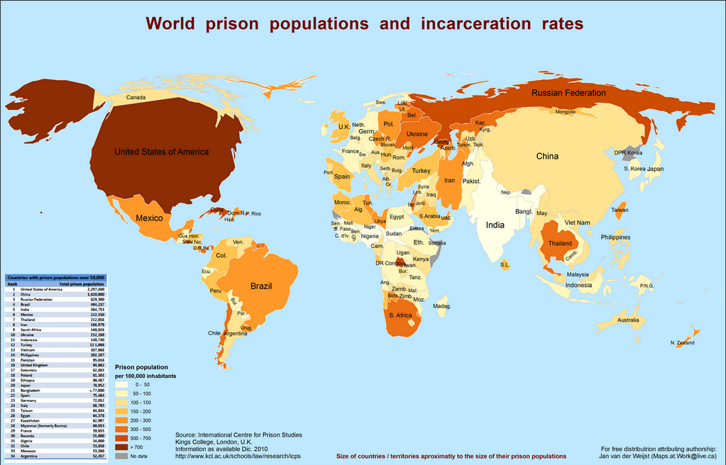
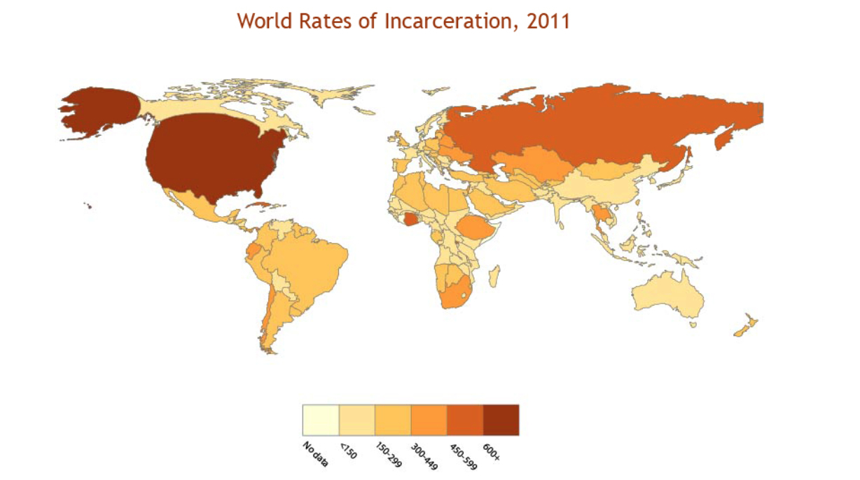
The Centre for Prison Studies at Kings College London nicely distorts a Robinson projection to show the hugely distorted proportion of their population of imprisoned populations as of 2010, shading nations in darker hues in correspondence with the percentage of its own citizens the country jails, in ways that not only bloat the United States’ landmass, but shows it to be the country that imprisons the greatest share of its population–over 700 per 100,000–surpassing, in so doing, either Cuba, South Africa, or Thailand, as well as the Russian Federation and China. and suggesting the broken nature of our addiction to imprisoning our fellow-citizens.
International Centre for Prison Studies/Kings College, London
The increasingly poor conditions in the US prison population are, for now, not able to be mapped–no doubt because of poor availability of data. But the poor conditions in the carceral state in the United States parallels both the increasing expansion of a prison system and the privatization of prisons as centers of “managing” imprisoned populations, often including solitary confinement and other abusive practice, rather than responding to rights of humane imprisonment–as if the construction were not an oxymoron.
The global context of our habituation with imprisonment however conceals the relative readiness of certain states are ready to treat their residents, but and the clear domination of southern states–“Red” states?–to a policy of zero tolerance, or readiness to look the other way in ways that provide . The map conceals the fact that the greatest growth of prisons in recent decades, between 1979 and 200, occurred in Texas (706%) and Florida (115%)–which show ample deep blues of a rich culture of imprisonment–but also New York (117%), California (177%), and Georgia (133%), where imprisonment has increasingly emerged as a way of life, in ways tat seem independent of political parties. Perhaps this arose from anxieties of immigration in the first two states–Texas saw 133 prisons built in 2000 alone; Florida 84 and California 83 over the same two decades–but building of further prisons to house an expanding number of imprisoned has become routine in our national justice system: Minnesota built 60 prisons; Georgia 42; Illinois 40. Was imprisoning not in some way seen as a way of reorganizing society by 2008?
The annual cost of $5.1 billion in prison construction in 1995 alone to feed this growth of mass-incarceration is unable to be sustained.
Wikipedia: prison incarceration rates by state as of 2008; based on statistics from US Bureau of Justice
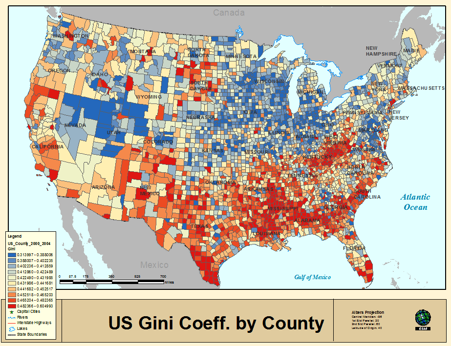
The uneven concentration of prison populations in much of the United States reflects the distinctly larger likelihood that rural populations will be sending their populations to prisons that has risen markedly from 2006 to 2013, with a considerable decline in the numbers of prisons from larger cities as Los Angeles–a decline of 69%–and San Francisco–a decline of 93%–which suggests not only a greater gentrification of the city, which may explain the considerable if lesser reduction of people sent to prison in Brooklyn as well in this period–37%–or Durham, North Carolina–
–but a clear sense of “keeping it safe” in many counties that maintain their own policies and practices of active persecution, as noted Peter Wagner of the Prison Policy Initiative, which determine how the punishment fits the crime.
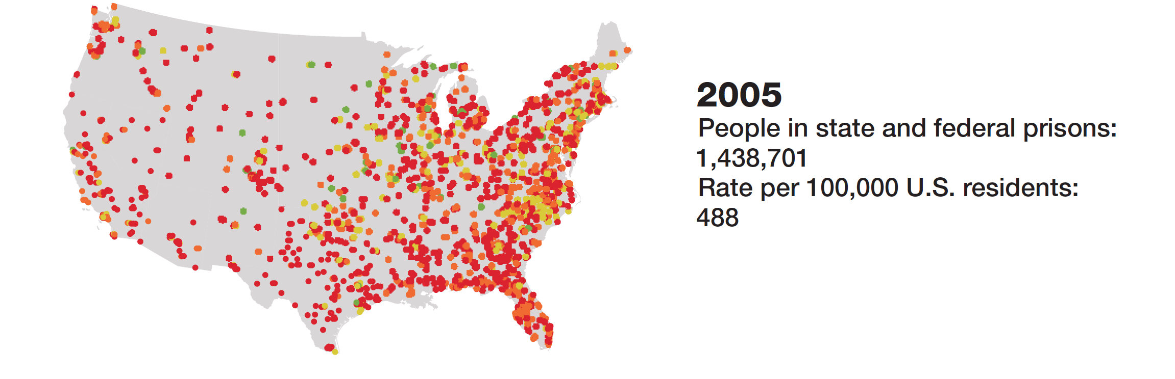
Indeed, the privatization of the process of prison construction in the United States has led a greater amount of prisons to be built in the country than Stalin built in Russia, and has defined us as the paragon of the incarcerated society. Rose Heyer created stunning map of US prison proliferation from 1900 to 2000 for the Prison Policy Initiative, represented the United States at the International Cartographic Conference and Map Exhibition in 2005, charting the growth of populations housed across the country in federal prisons from 57,00 to 1.3 million. The result reveals the hidden population of a lost metropolis that is dispersed across the country–whose demographic size rivaled (and now surpasses) the population of the city of San Diego, but are located behind bars across the country, often removed from cities, whose expansion suggests a negative nation within our own:
4. How to process the map of growing incarceration–or indeed map the terrifying phenomenon?
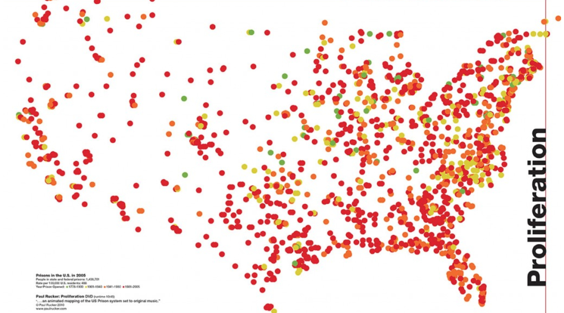
Composer Paul Rucker has crafted an eery performance piece about “the proliferation of the US prison system if seen from a celestial point of view,” animating the augmentation of prisons across the nation through 2005, echoing Heyer’s map, that concludes with in an image documenting the infestation with practices of incarceration: if light green beacons dot the country with prisons through 1900, yellow dots spring up after 1940, and then morph to orange dots through 1980 in a sequence of pulsating lights that mark prison foundations in ways increasingly difficult to process or get one’s mind around as a growing landscape of confinement. The topography of sanctioned violence against individual offenders may be concentrated in the Deep South for multiple reasons. But it corresponds to a map of the willingness to see criminals as ready for incarceration that oddly echoes the landscape of income inequality across the country.
More striking is the shift in the topography of US Federal prisons across the land since 1950–when prisons were concentrated in but a few states, and understood to be marginalized from the body politic–boggles the mind: we live in an era of prison-contracting, marked not only by a growth of state prisons, but widespread practices of incarceration.
What has happened? If the spread of prisons map somewhat onto the nation’s major cities, the overlay of red dots that suggest dots of blood marking prisons built from 1981 to 2005 seem to suggest a spread of smallpox or toxic pustules across the land, as the spread of incarcerating institutions finds its counterpart as wistful cello bowing gives way, as the nation reddens as clear regions of penal proliferation gives way, to the current image of the nation in his multimedia performance, and a plaintive cello to concludes with electric bass guitar and snare drums, offering a frustration and rage against the institution of incarcerating institutions, as much as a mode to contemplate the contours of this new status quo. The accompanying soundtrack of the multimedia presentation compels attention to the conditions of life for those residents of the expanding carceral state that now confines a surprisingly sizable proportion of the residents of many states–and over 3% of its total residents nationwide, according to a meme that has circulated on the internet, if, just as terrifyingly, it seems to reflect African Americans as much as the general population. Already a decade ago, many states were approaching or at a situation with 5% of their populations under control of prisons or criminal justice.
Rather than lie concentrated in an archipelago of incarceration, the web of prisons house over 1.5 million inhabitants is a true pox upon our houses, but embodies a large population of imprisoned, spread across the nation in legally sanctioned confinement.
Try to track the same impending expansion of practices of incarceration in dramatic progression, follow Rucker’s transfixing musical meditation on the “celestial point of view” on confinement–
to its conclusion, and try to distance yourself from the massive assault on civil liberties that is perhaps its primary consequence. The terrifying dimensions of such a carceral expansion remaps the country as a center of confinement, as much as an embodied territory. What happens to the hidden population as a result?
5. The dramatic dehumanization of prison populations raises fears of a crisis in health, mental health, and empathy whose impact has still not been fully felt for many other residents in the country. Yet the impact on the country cannot be denied: “Orange is the New Black,” a retelling of the true story of Piper Kerman, serves as some sort of barometer of the national subconscious, by which to come to terms with the expansion of such routinized imprisonment as a way of managing populations. The prison system, indeed, has expanded to provide a system for the geographic dispersal of criminal populations into private prisons that is as striking as the spread of institutions of incarceration across the land. And among those imprisoned, the rise of imprisoned women by some 646% between 1980 and 2000–or over double the rise for men, according to the Sentencing Project–our prison population has slowly begun to demographically change, the large majority of women being sent to state and not federal prisons for non-violent offenses. The show’s huge popularity rests on the degree to which prison-life can change the structure of many American families, but how we’re increasingly apt to not know prison society or to even take the time to examine its structure.
The multiplication of prisons across the nation, paired with the habituation of sentencing to jail terms, has created deep social stresses across most of the most challenged communities, most vulnerable to dropping out of high school or fragile family structures where single parents are unable to support kids to the extent that they need. The “system” has begun to redistribute prisoners across the nation, leading prisoners to often be shifted, on account of the exiling of local prisons or closure of older sites, hundreds of miles from their homes and possibilities of family visitation, like prisoners in Washington, D.C. who are routinely sent to prisons in Texas, Florida, or California after the closure of the Lorton, Va., prison which formerly housed them in ways that radically increase the probabilities of recidivism, basing oneself on statistics from the CourtServices and Offender Supervision Agency of Washington, D.C.
The odd expanse of the distribution of D.C. offenders throughout to some twenty-six states nation-wide is not completely atypical for the broad redistribution of inmates in federal prisons in the frequent separation of families in ways that militate against visitation rights.
One can get a similar snapshot of the removal of kids from their parents that acute levels of imprisonment and incarceration generates in this map of children of imprisoned populations in Illinois prisons, in a geomapping of those receiving assistance from the Illinois Department of Children and Family Services based on a Statewide Provider Database, breaking the state’s prisons into their racial composition in relation to those children and youth who were in the database from 2009: the result shows the dislocation of parents from their kids, the isolation of children at an age vulnerable to high drop-out rates, and the vulnerability of African-American families.
6. And what of the current proliferation of privatized jails, institutions which suggest not only the monetization of imprisonment, but even, in building their economy on institutions of imprisonment, perpetuate an effective incentivization of imprisoning felons? The augmentation of the number of prisons run by private agencies–contracted out by the state–in a practice that rapidly increased since 2000 in the G.W. Bush administration so that institutions of incarceration now cost the country upwards of $50 billion to administer and run, and have come to be part of states’ local economies. The rise of private prisons in our society has grown to some extent independently from rates of imprisonment, as they almost seem to generate a false need for practices of incarceration, as multiple contractors of prisons have come to meet the demand in multiple growing states, and not only because they are legally guaranteed to turn a profit.
Although many prisoners were assigned to build military materiel during World War II, to compensate for the shortage of working men, the expansion of such for-profit entities with independent voices as corporations and lobbyists suggests something like a system of displacing costs and balances, an idea with one foot back in the industrial revolution, and another in the notion of paying off exorbitant costs generated by the criminal justice system itself–inserting the expanding number of prisoners in a market for cheap labor that can compete for jobs sent off-shore, oddly congruent with conservative demands to downsize government costs. The dramatic expansion of private prisons are, for the most part, though not entirely, concentrated in the southern states: Florida, Missouri, Arizona, Texas, and the trio of Alabama, Mississippi, and Louisiana, the top three states most likely to send their population to prison, are the places most likely and ready to send their citizens to prison. The emergence of such for-profit groups as the Corrections Corporation of America (CCA) or GEO Group constitute not only massively powerful forces of federal lobbying, investing from 1.5 to 3.5 million dollars in backing legislative efforts to expand imprisonment, and sentencing terms, but to redefine the notion of criminality in ways that are in danger of undermining our democratic values. Both corporations are publicly traded, in a perverse exploitation of practices of imprisonment as money-making ventures. The GEO Group happily describes itself in corporate newspeak as “the first fully integrated equity real estate investment trust specializing in the design, development, financing and operation of correctional, detention, and community reentry facilities worldwide,” casting itself as an optimum source of investment, rather than as an institution that benefits society or counters crime: the odd perversion of the rhetoric of institutions of hospitality masks the experience of the prison as a profit-making exercise, somewhat analogous to the workhouses from the 19th century industrial revolution.
Such prisons market themselves as sites of investment at the same time as they constitute something akin to legalized sweatshops, which sanction slave-labor type conditions, unregulated and un-unionized,without overhead, that perpetuate violent sites of prisoner-prisoner violence as well as abusive relations to prisoners, and a virtual race to incarcerate in order better to exploit the incarcerated.
While this map focusses on three companies of “private prisons”, in the state of Texas alone, the number of privately run prisons boggles the mind, and lead one to wonder how their expansion can imagined to respond to an actual public good:
7. It is important to remember that imprisonment offers itself as something akin to a national epidemic. Placed in a broader context, the rise of prisons across the land raise red flags about the sad state of the anomaly of our incarcerating society. The global willingness to incarcerate populations reveals how this lopsided choreography plays out in the global stage, however, and raises some eyebrows about the readiness of our institutional use of prisons across the country, if we didn’t need the living example of Guantanamo Bay as an example of how hard it is to wean ourselves from the incarcerating operations so common to American life as a way to settle social disputes–creating outsized populations of prisoners in such places as Guantanamo Bay, like Panama, Guadeloupe, St. Lucia, Barbados or Martinique. According to the US Bureau of Justice Statistics, American jails hold 25% of all prison inmates on earth. How did prison become such a readily institutionally accepted part of our society and legal system? Does America offer a model from which the culture of incarceration has diffused?
A cartogram of imprisonment devised by The Society Pages, to inflates the size of countries with the greatest incarceration rates, and shrink those countries which incarcerate fewer than 150 per 100,000 people, and expands the United States to Brobdingnagian proportions:
The swing toward ready imprisonment–and the ready criminalization of behavior or reliance on a prison system to absorb the marginalized, despite the clear dangers of incarceration both to psychological health and well-being, as well as to human compassion, suggest a looming crisis in our belief in a system that is not really able to help us in the end. Since the year 1980 alone–when I was about to start college–the social costs of sanctioning such an expansion of practices incarceration seems staggering. If the continued growth of incarcerated individuals is pursued in the belief that it can solve social ills that have been barely addressed, its e cost to our society demands to be calculated.
Has any other nation ever been able to afford the costs of incarceration that such policies dictate? At a cost of 24,000 per inmate per year, the costs of incarceration are perhaps most gravely social, but increasingly financially infeasible.
Wikipedia
Our current rates for incarcerating youth are as strikingly disproportionate, raising even greater fear of the dangers of our penal addiction:
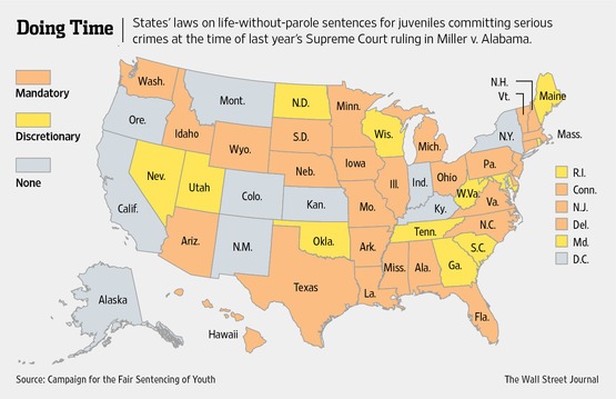
The spread within our justice system of the initials “LWOP”–sentencing to life without parole–seems a fit between the need to house criminalized populations and the expansion of an true economy of incarceration, where the only chance to make sense out of the national population guilty of crimes is to incarcerate them at considerable national cost. (Prisons bring real jobs to a city, including not only guards, but food services, sanitation workers, drivers, and an injection of federal or state monies, as well as, in the short-term, construction jobs.) The topography of Life-without-Parole sentencing across the nation is a particularly unseemly sight when we realize the current institutionalization of the sentencing structure across the states, to which New York, Indiana, Kentucky, Colorado, Kansas, New Mexico, Montana, Oregon, California, Alaska are the only exceptions across fifty-one states, across which life sentencing of youths in Florida and Louisiana seem shockingly high and almost legally accepted by courts:
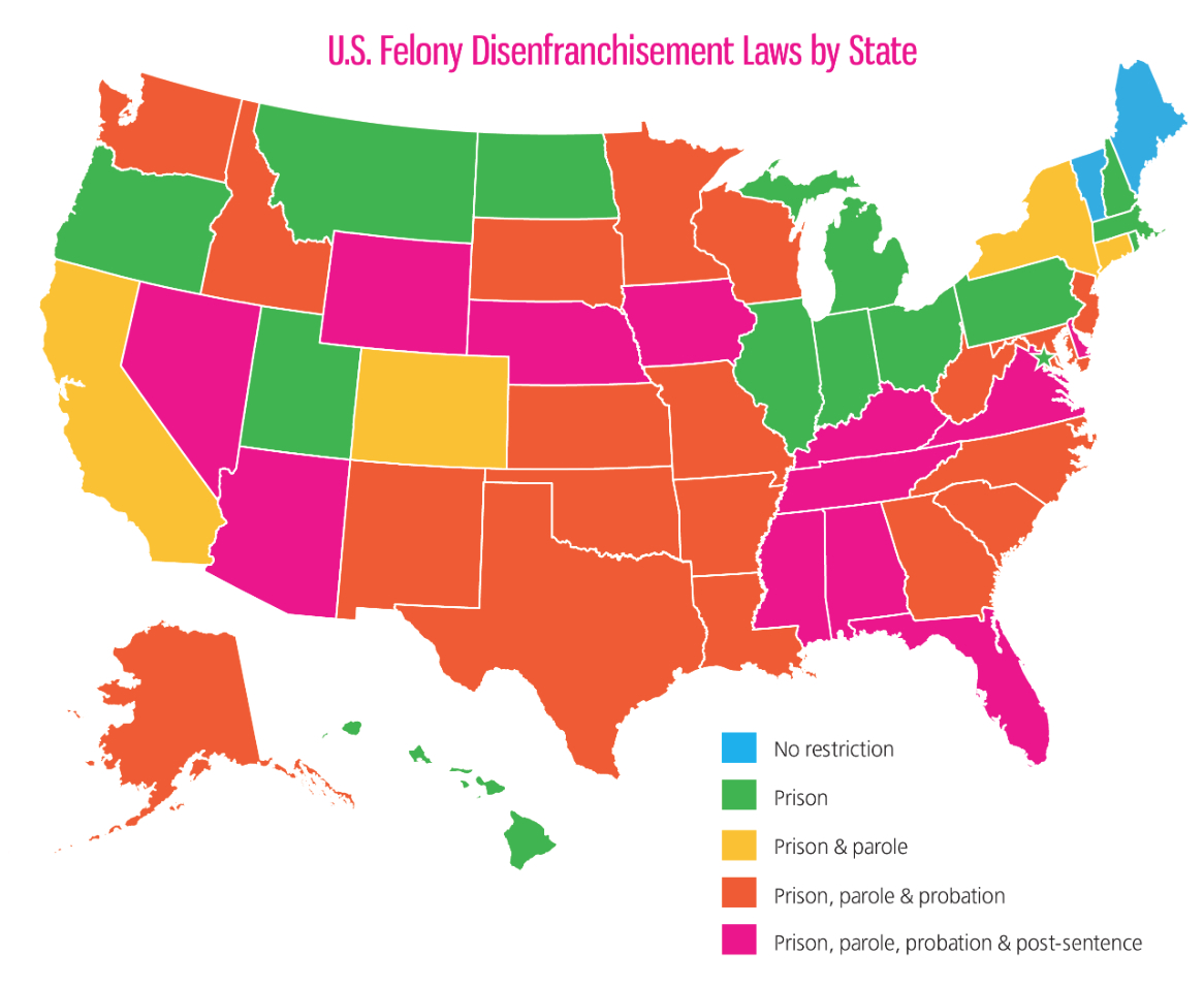
We all know that growing up in a prison is not the best site for emotional development or health care, the legally sanctioned expulsion of incarcerated from our society has grown, increasingly strong and widely accepted as the consequence of felony: felons are disenfranchised so widely that in much of the nation poses a real threat to their civil rights. Most all states deny to prisoners the right to vote, and many extend that to periods of probation or parole, to the extent that over 6 million votes are excluded–even as conservative groups have seized on prisoners’ voting as the number one form of voting fraud. With about one in every 33 American adult citizens in jail or prison or on parole–in some form of correctional control–in 2013, the end result is a massive act of disenfranchisement that potentially undermines our democracy and democratic values:
The potential long-term disenfranchisement of African American populations who are routinely sent to prison for lesser charges, or to those charged with illegal immigration, poses long-term difficulties for our civil society, as well as on our sense of community.
8. This is true on the level of states, as much as a national level. Local populations of the imprisoned have strikingly deteriorated over time, as states have not been able to keep up with the sentencing of criminals to prison terms or life without parole. Even though we saw record-high numbers of prisoners in most states in 2008, when the quintupling on prison expenditures seem to have been first noticed in infographics, the large prison populations in California, the the increased tendency of states to lower prison rolls has hardly reached federal prison. A record high number of Americans still seems to continued sent to prison, increasing the number of imprisoned Americans for the first time in history to 1 in 100.
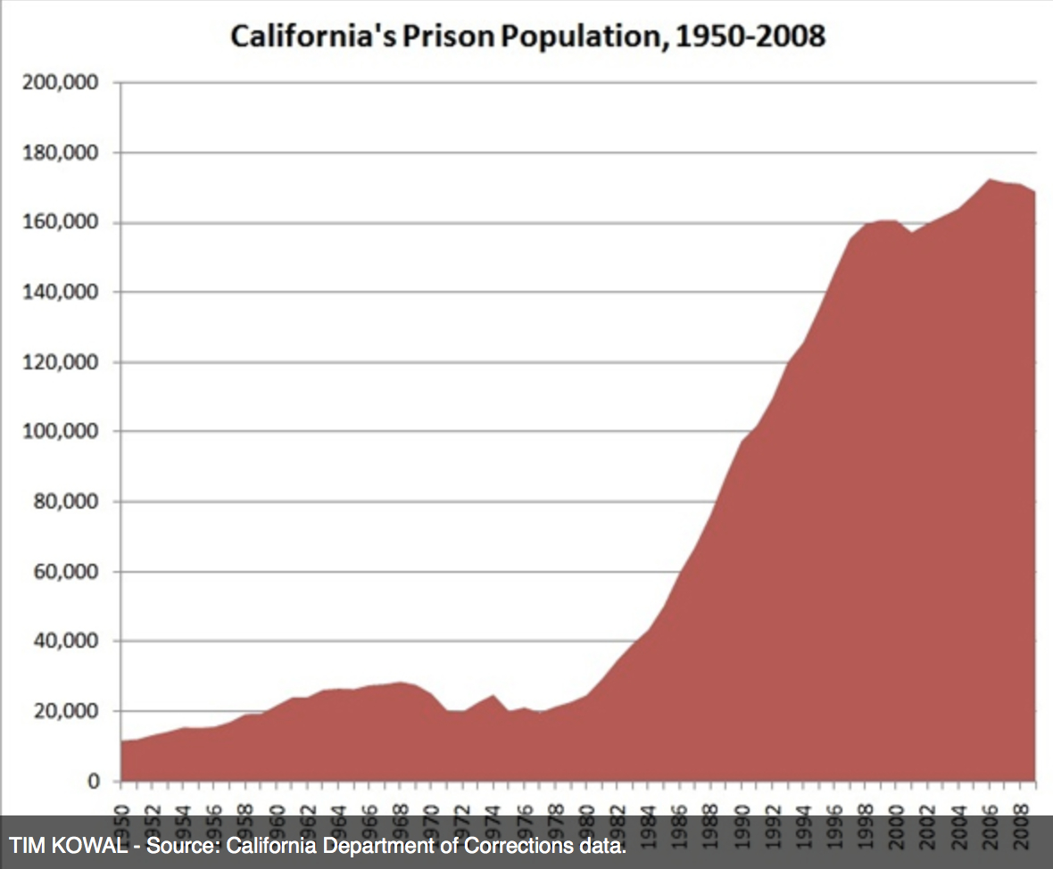
To take one example, the tremendous growth in the prisons of the state of California, once considered the pride of the country, has responded to a rage of procedural sentencing–in part due to the acceptance of a new law that allowed victims of crime to speak at parole hearings of an incarcerated, in ways that reduced chances of parole, and allowing the state’s governor to overturn parole board decisions. And the notorious 1988 advertisement that aired in the presidential primaries, turning the fortunes of George H. W. Bush around by showcasing the dangers of giving a furlough to a convicted criminal led to a fear of reducing incarceration or granting releases on parole, in ways that encouraged the reinvention of criminal incarceration as a new normal, or status quo. Neighborhoods, family members, and networks of friends share carceral experiences and stories, as well as knowledge of orange clothes, in a seismic shift of staggering proportions since the early 1990s, with few or little sufficient social services to be reintegrated into society.
An interesting statistic is mirrored in how the desire to secure our own borders, and pursue immigration offenses, as much as to police criminalized drugs, has led to an explosion of prison populations in ways that have contributed to challenges in current capacity:
One result is a major reason behind the rise of privatized prisons, no doubt, and the deep problems that they create for personal and civil rights. One hidden story of this splurge of construction–and the institutionalization of prison terms that has resulted–is, incredibly, that the rage of sentencing across the nation has created problems in accommodating and housing–or containing–future prisoners, as the practice of sentencing outstrips even the rapid rate of prison construction in several of the most prison-friendly states, including such large states as California, Ohio, and Illinois, as well as in states like Virginia and New Jersey that bear the brunt of urban criminality from nearby states or regions, with the result of an overflowing of penal institutions in many of the states that hold the largest cities:
The quite lopsided nature of the national choropleth conceals regional disparities in each state that result from a growing reliance on prisons to solve social problems or disputes of criminality or criminalized acts. But both state and federal authorities in the United States habitually displace the site of prisons from those areas where prisoners or their families dwell, and indeed to build prisons at sites geographically removed from where prisoners once dwelled. And census figures of prison populations show some disquieting imbalances in the equilibria of prison populations. One can see a markedly increased density of incarcerated African Americans in the country’s penitential system–often removed from the cities in which the prisoners originally dwelled, to be sure. With 1 in 33 black men in jail, the effects on families across the country is unthinkably severe, if not statistics that threaten to unravel the fabric of our civil society.
One can even detect in census figures a clear pattern of “forced migration” of African Americans to site of new prisons in one decade, a change presented on Prisoners of the Census but not reported in most news agencies:
A strikingly similar change in the social composition of counties that the incarceration of Latinos has created offers a similar displacement of incarcerated from their families, friends, and children–or parents, based entirely upon the construction of new correctional facilities:
What are the effects of this new populace of prisoners, and how much have national authorities taken time to consider the consequences of the real stresses on our society that result from it? One result is increasingly to divide the country, or create increasing blind alleys of bleak social narratives in select pockets of the country, which our system of imprisonment effectively marginalized from public view.
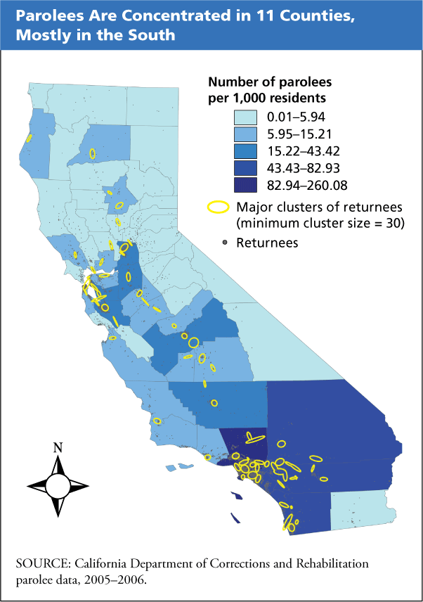
The distributions in each state of incarcerated populations are clearly concentrated in urban environments, where prison sentences seem a regular recourse of local authorities. There is a considerable clustering in specific regions in the south lands, both of those sent to form part of prison populations and parolees, if one looks at California, whose south lands seem to show a congregation of incarceration, as well as parolees. One can only wonder about the unique topographies created by the extreme density of parolees in specific areas–often around cities such as Oakland, Los Angeles, and San Diego–but extending into the interior and Imperial Valley. What sort of discussions does the clustering of returning folks on parole create within such cities and areas? What makes a spot a likely one to which parolees want to return, and to meet family members from whom they were separated from one another? What makes such separation ethically justified?
The contradictory rise of a new group of “pay-to-stay” prisons in the East Bay (and elsewhere) invites prisoners to pay an extra $155 per day to avoid being sent to the county jail facility, and rather occupy one of the Fremont facility’s 58 beds, if they can afford to do so–and suggests a tacit admission of the failure of the prison system, if not a relinquishing of state responsibility to treat inmates well. One must apply before to a judge and be screened by jail, and pay a one-time processing fee, as if joining a country club, and has led to ACLU’s criticisms of the institution of a separate “jail of the rich.”
9. Of course, the effects of the system of incarceration on local communities are widely different, if only because widespread practices of widespread incarceration are designed to marginalize communities from the nation as a whole. The concentration of prisoner re-entry into civil society in the regions around Los Angeles and pockets across the state is striking, revealing the potential proportion of prisoners and the health-risks they pose in specific areas of the state–Kern, Alameda, Los Angeles and San Diego accounting for almost half of the total number of parolees in the state.
An even finer lens might be directed to the distributions of those formerly incarcerated in precise urban neighborhoods, and an outsized spending in specific neighborhoods from which a predominance of men and boys are incarcerated at considerable expense. The finely grained studies of New York City’s incarcerated provided an opportunity for the microscopic examination of the provenance of the incarcerated, and raises eyebrows of empathy about the communities from which they arrive in jails. One could go much further, of course, to delineate the disproportionate nature of urban incarceration. The staggering studies of Eric Caldera and others show the disproportionate effective cordoning off of specific urban populations in prison cells, and to muse on the map as an illustration of social costs of imprisonment. Caldera and his team have tried to correlate the costs of imprisonment with city blocks to show the way that our expenditures on prison in 2003 correlated with specific neighborhoods in Brooklyn, NY, that cast a clearer light on the distribution of imprisonment in our society.
Caldera’s aim is of course not to identify a topography of centers of criminality, so much as the lopsided nature of cultures of incarceration that become the new normal in specific areas and to specific courts. The costs to society, of course, are often extreme, given the huge costs not only to specific boroughs, but to specific regions of those boroughs.
Neighborhoods and areas which effecitvely “send” young men to prison are strikingly concentrated in just one poorer area or zone of each borough, suggesting the deeply lopsided topography of New York’s social fabric, as well as the deeply rooted cultures of incarceration where specific neighborhoods are, in essence, incarcerated, both disrupting families and making orange the new normal and incarceration a fact of daily life.
Disrupted families are a deep national cost that is impossible to calculate, and with which social services can’t hope to keep up.
This count omits those regions which palm the fees for social disturbances caused by teens onto their parents, as if to abdicate the social responsibility of the state over the underage. After kids are taken off to prison, the state does not even offer to foot the bill, suggesting the abdication of the moral, ethical, and individual consequences that a stay in the slammer might create or only intensify. The decision to abdicate responsibility for such teens–to reverse charges on the families from which they have come–seems the most ethically unjustifiable position of all: isn’t this a lawsuit waiting to happen? While parents are free to negotiate a new rate for the costs of investigations, criminal justice fees, incarceration, and even for wearing of an electronic bracelet that places the offender on GPS, accumulated criminal justice fees can allow court officials to garnish parents’ wages, claim tax refunds their parents are owed, or place liens on the parents’ property to secure fees. The Assistant District Attorney of Alameda County explains: “That’s part of being a parent; you’re responsible for your kids and their actions.” God bless San Francisco County?
Can one really conscionably place the financial blame on the families, in an age of the widespread de-funding and decline of graduation rates in public schools? The picture of those likely to face incarceration who are high-school dropouts are startling.
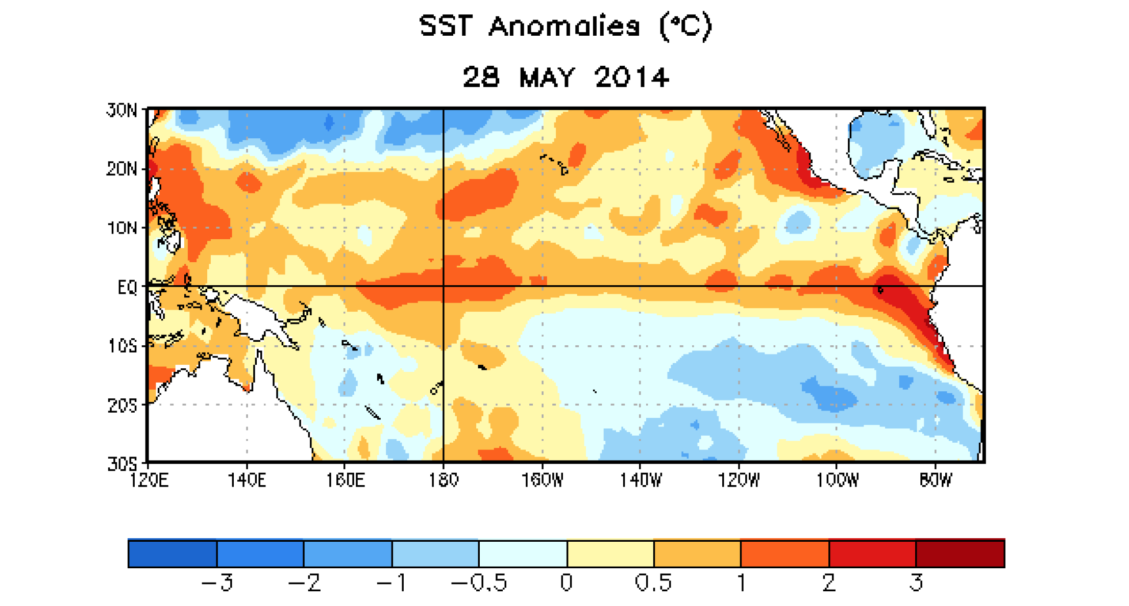
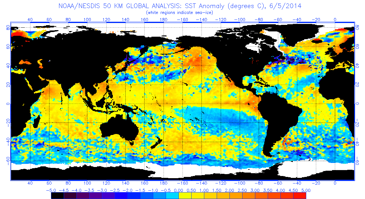
Classical terrestrial world maps–either the detailed terrestrial world projections that associated with the atlas-makers Mercator and Abraham Ortelius or those terrestrial planispheres noting cities and ancient monuments of Ptolemaic design–were based on a need to find a solution to how to transfer the curved surface of the world to a flat surface. When we are talking about global events–from warming to El Niño–we need to synthesize global variations in a spectrum of a set of surface temperatures that only a satellite can assemble, and to read them as inscribed on a global surface. The virtual image of weather changes depend on information removed from actual landscape, or inhabited land–but rests on the persuasive power of a compelling image of the earth’s curved surface in the synthesis of a coherent image of ocean temperatures over a continuous expanse of the earth’s surface: although undoubtedly provoked by the world’s inhabitants, and a revealing record of the anthopocene, the mapping of oceanic temperature is something of a record of climatological impact and of the increasing need to come to comprehend shifting temperatures of the word’s oceans in truly globalized terms.
Is this map more powerful because it recalls a familiar globe, and because it promises to mediate record of the ocean’s equator that would be otherwise totally unable to be visualized in a coherent visual form? The global visualization creates a compelling record to understand the odd embodiment of a shifting pattern of climate prediction, even if the synthesis lacks reference to a cartographical model or a set of scribal practices. The map provides a way of detecting (and indeed predicting) unusually warm ocean temperatures that create El Niño, in ways that trace the preconditions to create a cascade of climactic changes provoked ocean surface topography through a visual syntax akin to a weather map: the virtual globe deploys digital media to map movement across and motion through oceans, tracing shifts in subsurface ocean temperatures over space that would be otherwise concealed from sight: the silhouettes of the continental masses not only displace attention from the land, but subordinate land weather patterns to the irregularities changes in atmospheric pressure and sea temperatures that they foreground in a strikingly technicolor map whose hues mirror heat-sensitive readings, rather than areas of settlement. (Continents are only present as ghostly images in these maps that direct our attention and interest to the phenomena sensed in ocean waters.)
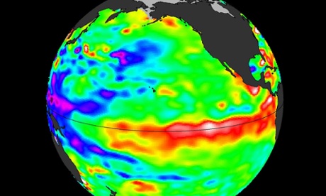
The satellite thermal map of the swelling of seawater around the equator, generated by NASA’s Jet Propulsion Lab, tracks the temperatures beneath the swelling of oceanic waters to forecast El Niño oscillations this summer and fall. By tracking significant sea surface temperature anomalies, they trace changes to gauge the possibilities of potential future major weather disruption of the globe, and to try to comprehend the shifts in temperature that might change weather systems in so drastic a way to impact food chains, agricultural economies, and climactic experiences in similarly out of the ordinary ways, exposing the otherwise hidden shifts in ocean temperatures by catchy chromatic spectrum of colors around the equator.
Rather than only trace migrations, the map marks pronounced sea surface temperature rise across the Pacific is suggested by the surface’s deep crimson reds, extending from the islands off Singapore. The Google Earth satellite view contrast to the arboreal distribution of the topography more evident, as if to embody the threat that it poses to the landmasses that are the usual focus of world atlases.
The spread of warm waters across the Pacific indicated in such maps echo the famous charting of sea-temperature anomalies of 1997-98 El Niño, which La Niña followed, when the end of trade winds led warm waters to slosh Eastward, pushing cooler water down from the surface, and interrupting the feeding habitats of fish and aquatic environments and interrupting the local marine food web. The map traces shifts in surface temperatures by tracking of anomalies in the below video to suggest an advancing augmenting of surface temperatures across the equatorial Pacific.
The anomaly of equatorial sea-temperatures across the Pacific is most easily pictured by mapping the greatest warmth in red: the visualization of global variations across the ocean surface suggests sustained pattens of temperature rise, mapping not only temperatures but their divergence the form the median, and tracing patterns in their variability over time–far more meaningful in the global ecosystem than the relations between surface temperatures tout court.
The result is a new globalist map, tracking not countries and border lines or borderlands, but that “other ecumene”–that other inhabited world–of oceans and ocean life:
At least the hope is to start to direct attention to it, and to an area of the world’s temperatures that are not often mapped. The above visualization rests on an ability to synthesize a coherent constellation of multiple factors–prepared in a cogently digested form–but proves a guide to local imbalances and deviations, in the hope that we can grasp the global impact of these increases in the collective image that results, offering considering subtlety to register local shifts across space that help reveal the whirls, eddies, flows and sloshes across the ocean seas, even if it might require far more learning to interpret in its consequences than the more familiar sorts of weather maps that we are used to access on line. While not a globe or a sphere that earlier globe-makers might recognize, the elegantly articulated silhouetted continents suggest contre-jour qualities of the map, as if demanding that we start to try to pay attention to the deeper temperature changes in the seas that will reveal how shifts in atmospheric pressure create temperature shifts that will lead to a redistribution of nutrients in the ocean created by the consequent shift in upwelling and alter rainfall patterns worldwide or create droughts or typhoons as the result of an unusual warming of waters just below the ocean’s surface.
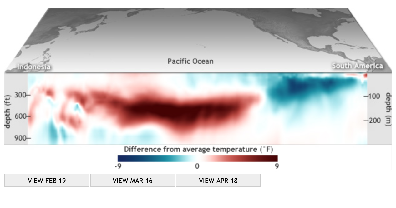
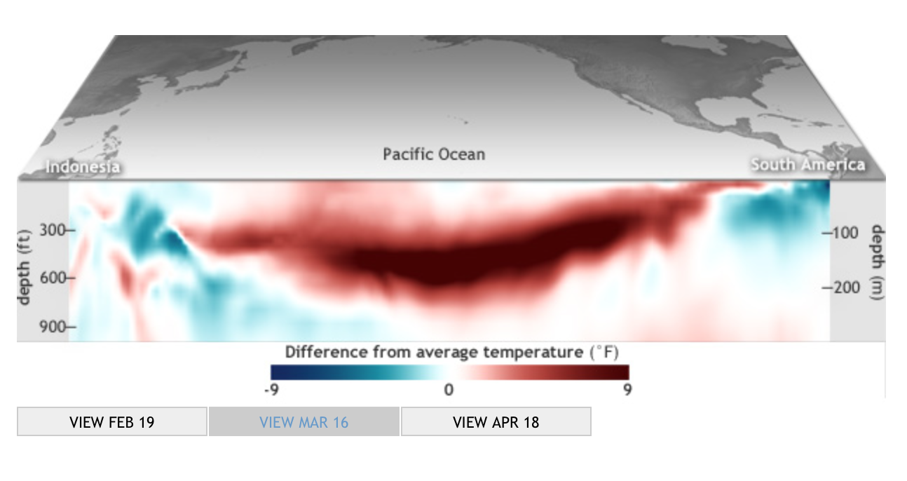
The dazzling image of the surrounding medium that conditions and prepares the climactic variations of the unmapped land to which they are so deeply linked, create an image of a global weather system we are only slightly prepared to come to understand. The map’s comprehensive coverage of ocean temperatures is a shocker of a visualization, employing a rainbow of gradations of color to striking effect that combines both the exactitude of pinpoint images and the tools of digital visualization. It is a sort of learning experience or primer on the immensity of global climate change, creating several deeply intractable pockets of climate change all closely located offshore, scarily noting the surprising relative proximity of the warmest areas to those regions, shown in white, which designate the remaining regions of polar ice, at the same time as the change in temperature seems embodied at an odd remove from the viewer or the surrounding shores. Similarly generated maps created from remote sensing constitute some of the greatest emblems of the environmental disasters of our time. Other options used by NOAA to chart the swell in temperatures in the upper 300 meters of the Pacific ocean in 2014 track a growing swell of something like an oceanic monster that grows in swells beneath its surface, evoking something of a large-scale sea monster that gradually began to reach across the Pacific toward the shores of South America, against the easterly winds that usually send surface water west across the Pacific.
The progress of waters beneath the ocean’s surface seem to track an animated entity in this set of subsurface charts, which capture the progress of the slosh of water magnifying the subsurface temperatures across the Pacific out of actual proportions to increase the visibility of temperature changes that seem to flow as if they were submerged underwater almost biomorphic forms resembling monstrous worms or undersea tornadoes that channel currents of churning heat that span the pacific, deep below the ocean’s surface:
mid-February, 2014
mid-March, 2014 mid-April, 2014
In a Kelvin wave, pushing from the warm waters of Indonesia to South America, the slosh of ocean waters can prompt the cascade of atmospheric events. The bounded parameters of the visualization are limited to the ocean, but are meant to provoke a similar imagining of the potential events that such a swell might trigger, and provided one of the first indications of a probability of possible climactic shifts over the months to come. Despite the specificity of readings that it can coherently synthesize, the chromatic blending of these measurements in a real ‘heat map’ of ocean temperatures create a false demarcation of categories, by removing the temperature changes from their effects in magnifying their deviation from the norm. Mapping the ocean as a surface of travel or site of navigation has long challenged the categories of visualization employed in land maps, if only because of the fact that the notion of oceanic space challenged the categories that were developed to visualize surface topographies.
The synthesis of mapping temperatures at different depths track migrations of water in the medium of the ocean is perforce removed from the specificities of place transcribed and tried to be pinpointed in earlier engraved maps, that tried to render legible the currents, routes, currents and eddies of the sea, or to record the variations in the underlying ocean floor. The globalist maps of the ocean’s temperatures that result offer something more like an animated graphic, instead of an objective form, because they lack clear contour lines or fixity that were the basis by which so many earlier ocean maps tried to calibrate currents, negotiate sea-routes, track winds, or map the topography of the ocean’s floor.
The embodiment of the expanding biomorphic swell in subsurface temperatures, mapped as extending across the Pacific, renders the shift in temperature as gliding contra corrente. They offer a major change in the claims and abilities of totalistic mapping of the oceans, and in the attribution of embodied characteristics to the ocean–which emerges now, if in ways that seem metaphorically misleading, as somewhat organic, as if it were something of a separate living entity from the land, which almost gained its own context, rather than appearing as either a surface for viewing nautical travel–
Rumsey Associates
–or the result of an array of bathymetric bearings of submarine topographies by collating depth-soundings taken by sailors on weighted lines.
Of course, the topic of the maps–global climate change–is itself removed from the precision to mapping nautical location to calibrate calculated routes, path, or place as marked by means of a line, and understand risks of nautical travel, and a concept of travel rooted to the ocean’s superficies. The maps of oceanic temperatures not only reflect the transferral of maps from paper to the far more heavily pixellated medium of the screen, but a search for visual formats of embodying shifting temperatures that were often elusive as subjects of global mapping in earlier charting traditions.
As such, they suggest, in the rhetoric of uncovering hidden changes detected by satellite, both the need to try to process global shifts in temperature in tactile terms, an eery remove at which the changes in oceanic temperature lie from the viewer, hinting ominously and only by extension about the likely possibility of future risks of global climate change to which the world’s inhabitants are now, as if suddenly, finding themselves to be subject.
The new premium on taking stock of mapping temperature change is about learning to visualize the migration of ocean temperatures as if by analogy to a weather chart–and indeed the resemblance to the images of cold fronts on the Weather Channel seems striking–but in ways that take into consideration how these movements in temperature migrate in currents and swells through and across the ocean’s own watery medium, and cannot only be considered in the localized perspectives of the individual points of a depth-charge. For the mapping of oceanic temperatures are not only a way of mapping the communication of heat, or the rising temperatures of the world and its atmosphere, but the newly inter-related concept of what it means to be warm.
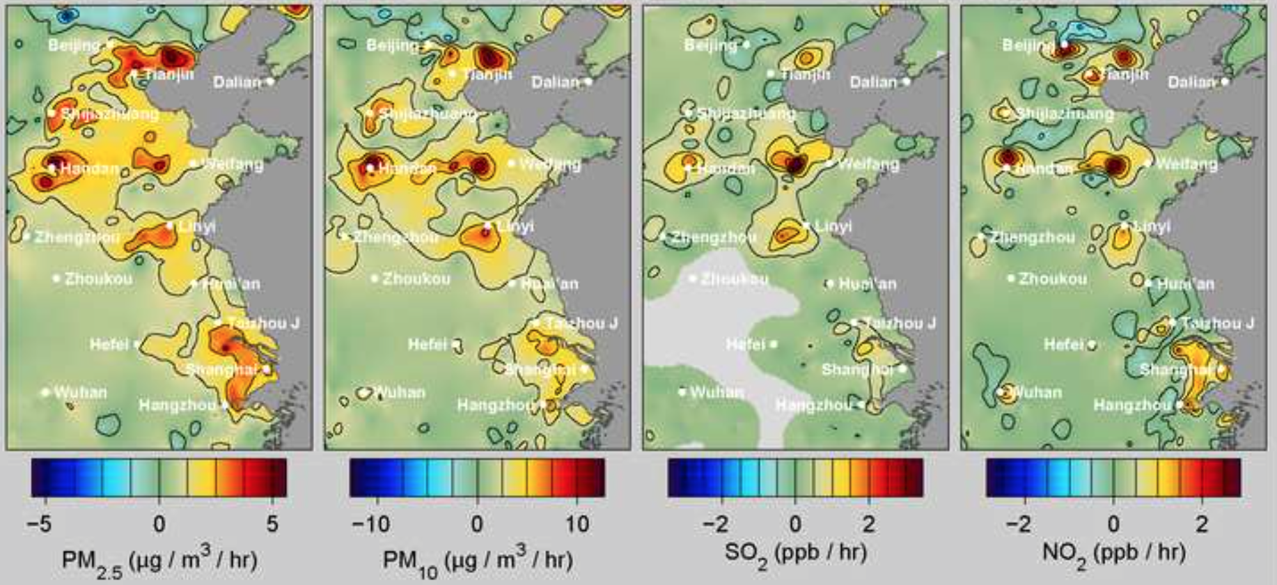
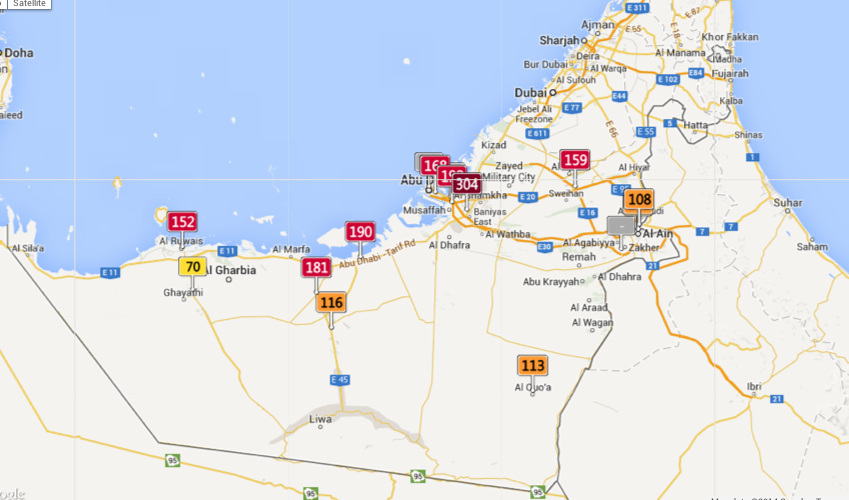
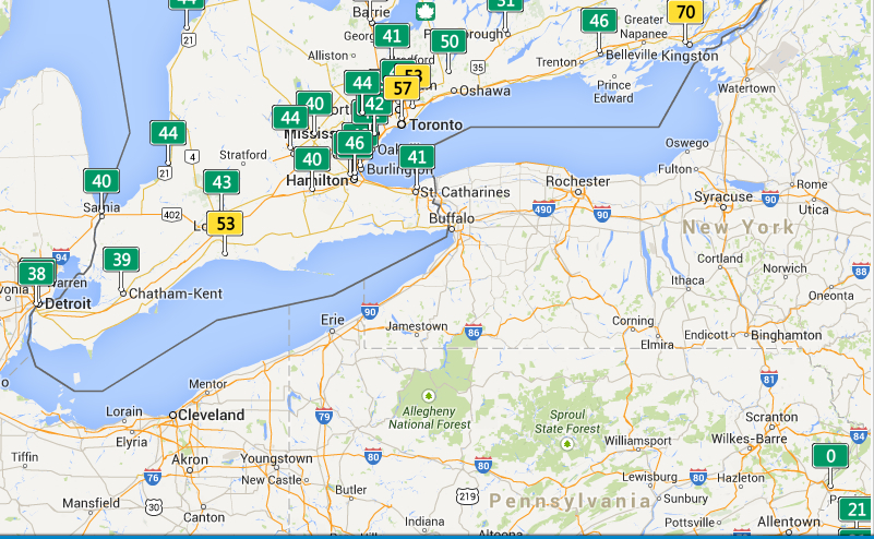
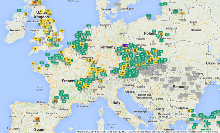
The notion of the Age of the Anthropocene has inspired an attempt to pinpoint the thresholds of contemporary environmental change. The recent maps that register the shifts in the Air Quality Index at specific sites offer a way to register the impact of anthropogenic impact on the breathed environment that are especially compelling in tracing the momentous impact that man-made industry–and specifically the burning of coal–has in propelling global inhabitants into an age of the Anthropocene, and indeed in impacting local environments. The changes of global climates pose peculiar difficulties of mapping by placing ourselves as viewers outside of the momentous changes they describe. For the notion of mapping the arrival of the Anthropocene–or the signs of the visible impact humans left on the environment raises questions of how a map can trace the footprint humans have left on the earth’s biosphere. If the epoch of the Anthropocene challenges one to position oneself outside the very processes in which one knowingly or unknowingly takes part, or indeed capture the consequences of a geological change in the biosphere to human life.
Do the differences of the AQI provide a sufficiently compelling map of the local dangers of potentially catastrophic environmental change? Recent “revisionist ecologists” or self-styled pragmatists have called for forging or discovering possible “Paths Toward a ‘Good’ Anthropocene,” as Andy Revkin discussed at his New York Times Dot Earth blog, which stresses not the ecological evils of a narrative of global pollution, but the potential that values determine necessarily tough choices, striking debate that has reverberated in the Twitterverse as a perilous promise or a necessary evil under the hashtag #Anthropocene. Revkin’s “Paths to a ‘Good’ Anthropocene,” has struck a nerve as subverting the core beliefs of Environmentalism by tweaking it with the prefix New, under the banner of eco-pragmatism. One part of the basis for such “eco-pragmatism” seems to be the tired nature of the narrative of environmental ecology–or rather, of the alarmist hue that, for Keith Kloor, has morphed over the years from talk of a plundered planet a sixth extinction, and a baked planet to characterizing a planet under severe ecological pressure from multiple directions. The narrative of the anthropocene, an odd term adopted in common parlance, narrates less a disaster than a widespread constellation of impacts of the human on our notions of nature, of sexual reproduction and differentiation, of genetic transmission, and on the geological record or livability of the atmosphere.
Can maps help this debate, by charting a differentiated view of “impact” and its geographical differentiation and spatial distribution, or in other words tracking anthropogemoc changes in hopes to mitigate its effects?
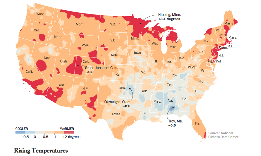
Can practices of mapping offer means to capture and conjure that constellation of changes, or tools visualize the momentous mechanisms of climatological change in which the human is folded into the environment–and economic activity inscribed in nature–that might most effectively communicate its arrival? Can effects of the Anthropocene be tracked over space? As Shakespeare imagined “his cheeke the map of daies out-worne” in Sonnet 68, as if the face were a map of temporal changes wrought by time, so that “when beauty liv’d and dy’ed as flowers do now,/ Before these bastard signes of faire were borne,/ Or durst inhabite on a living brow,” the maps below of local levels of air pollution bear the scars of time and global capital. To track the disparities that mark the close of the Holocene is to trace the introduction of previously unforeseen limits on the expansion of human activities and indeed the sphere of human freedom. While the entrance into the Anthropocene has been laid at the footstep of industrialized nations with considerable justification, rather than being understood only as a category of geological time, the odd currency of the geological term with a geography of the earth’s habitabilty.
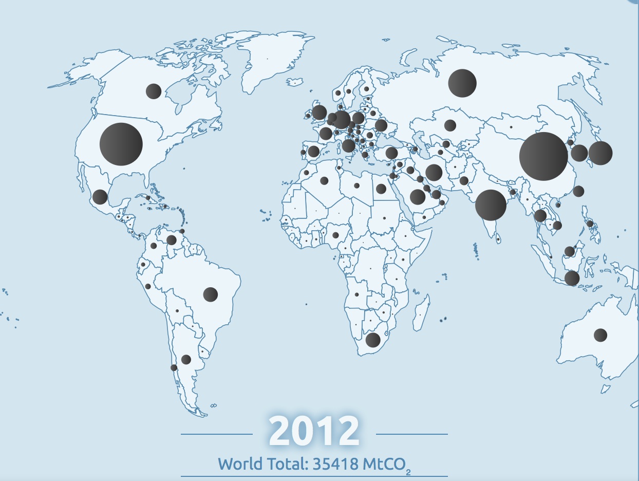
The difficulty–if not near-impossibility–of returning to a healthier presence of CO2 in our atmosphere “from [current levels] to at most 350 ppm” voiced by climatologist Dr. James Hansen–and the organization 350.org– might be less easily solved than they hope, and might even risk orienting discourse on the Anthropocene toward remediation and restoration of equilibria. Indeed the hope for such a return to a level of safety from current levels surpassing 400 ppm are not only a huge change from early eighteenth-century levels of 275 ppm, may distract attention from the deeper consequences of the enmeshing of the human in the biosphere: the deeper inequities of our globalized economy are revealed in a more variegated map of our entrance to the Anthropocene. The disproportionate contribution of industrialized countries to carbon emissions create well-known ethical questions of the distribution of shared responsibility for a crisis in climate change given the unequal distribution of the anthropogenic origins of climate change, emblematized by the disparities in fossil fuel emissions worldwide–which most ominously ballooned from the mid-1960s to the present day.
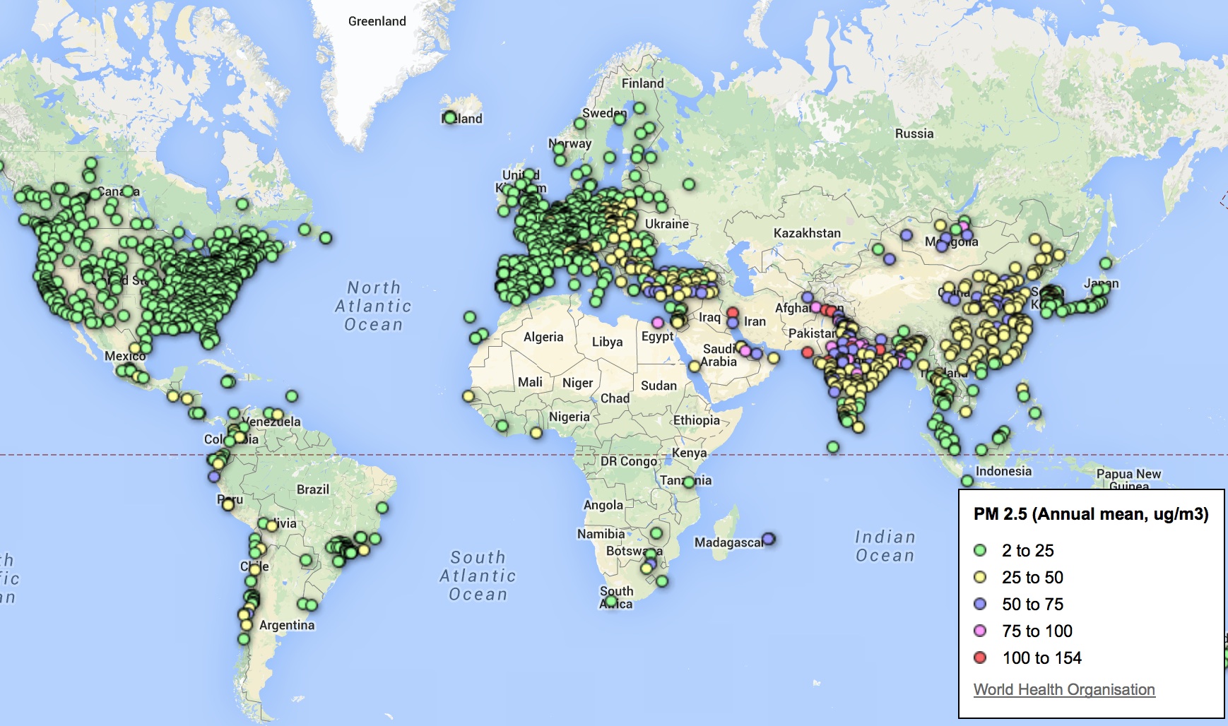
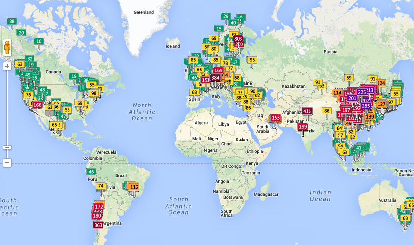
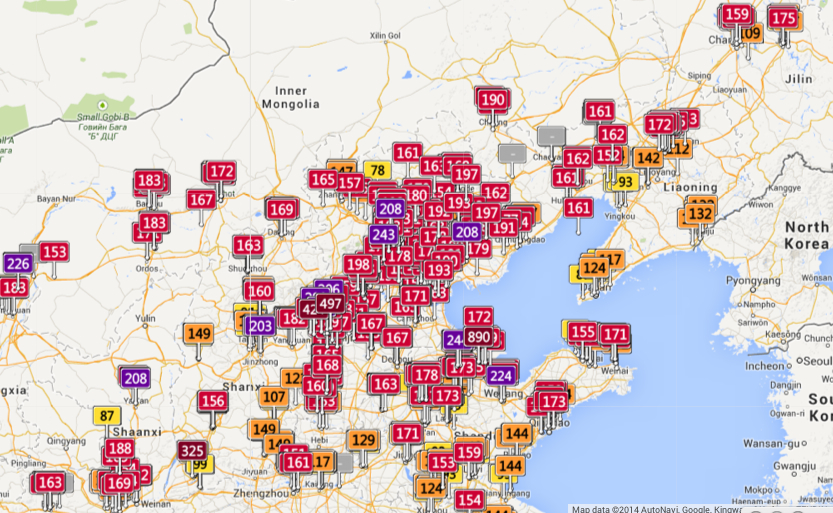
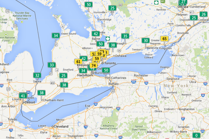
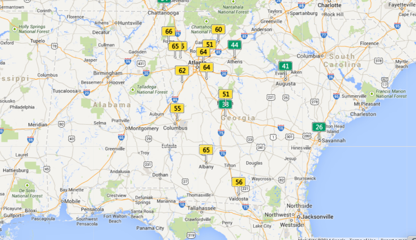
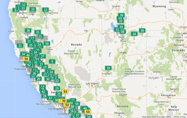
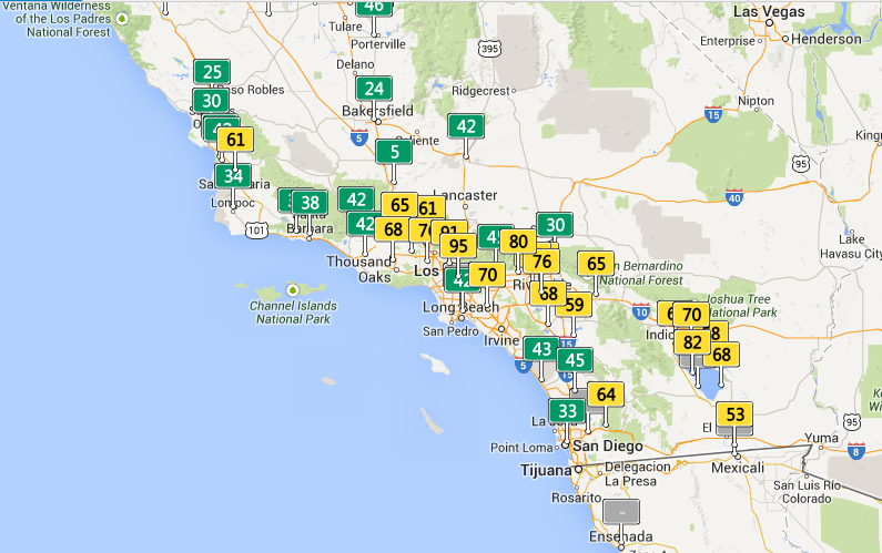
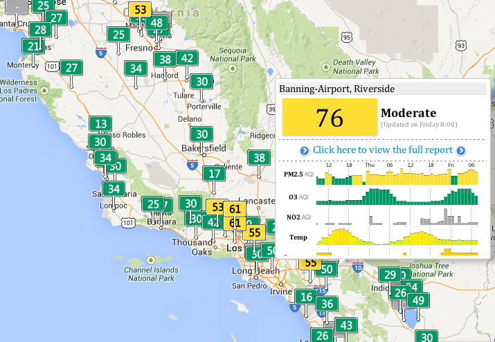
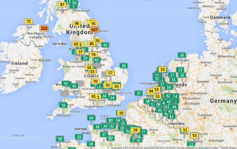
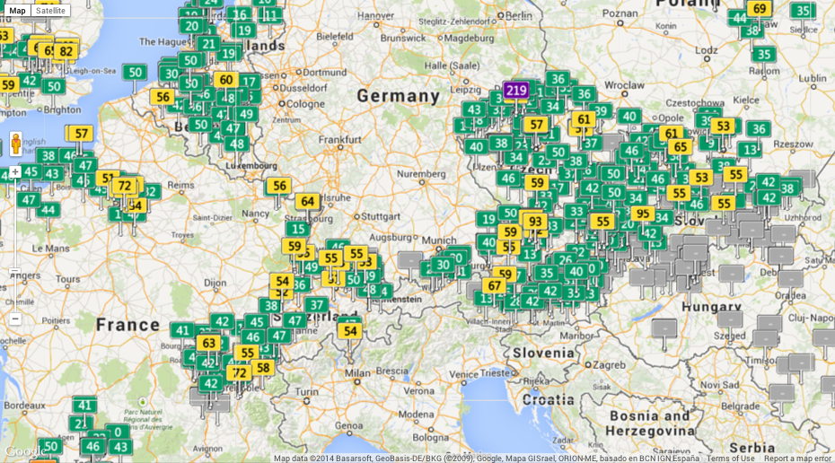
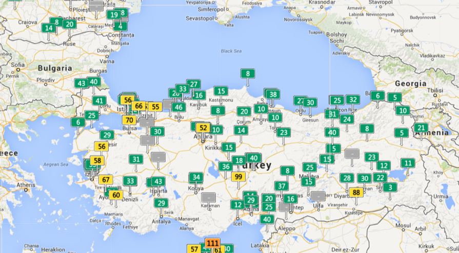
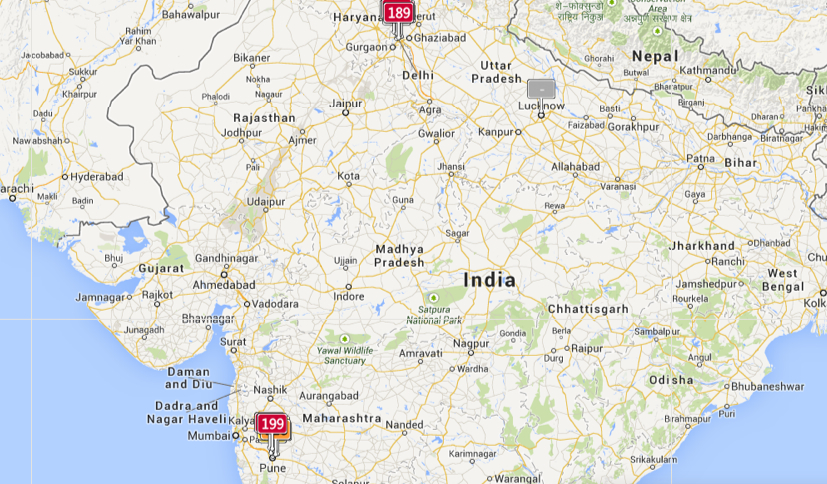
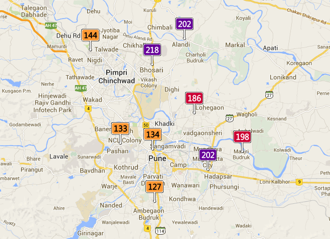
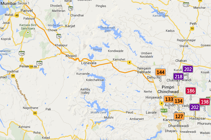
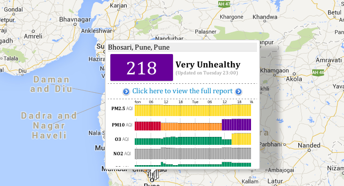
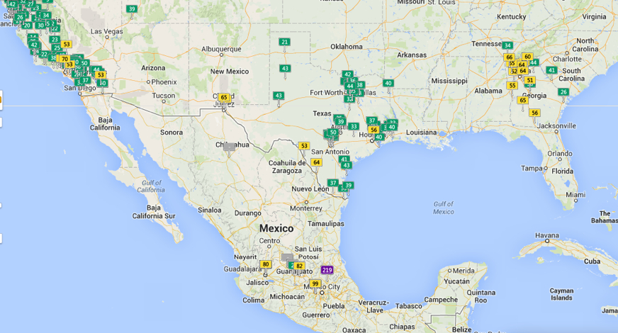
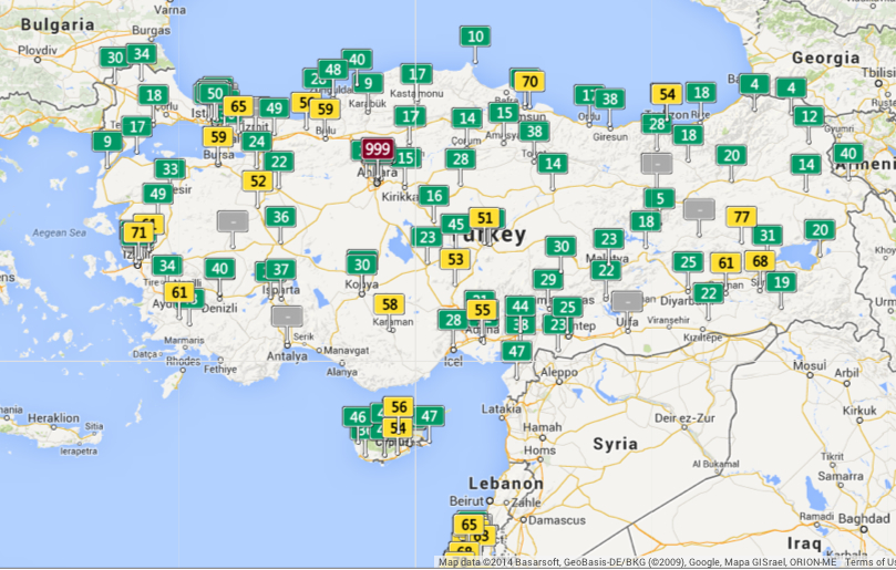
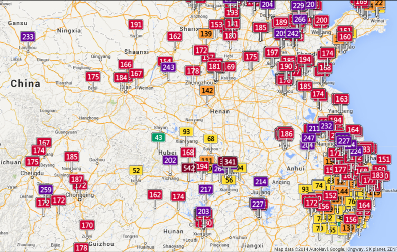
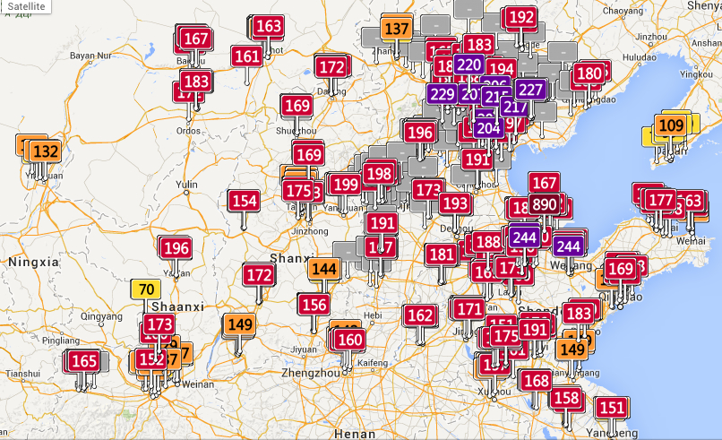
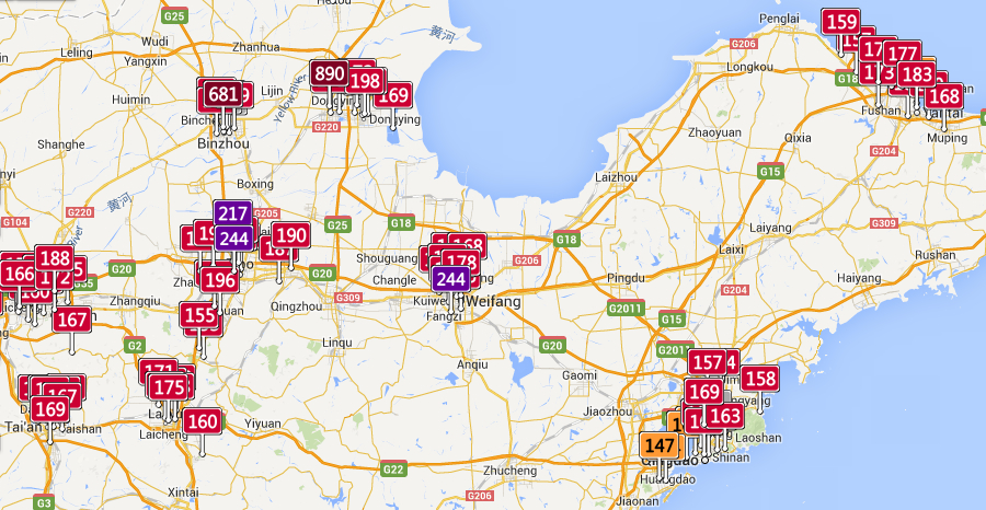
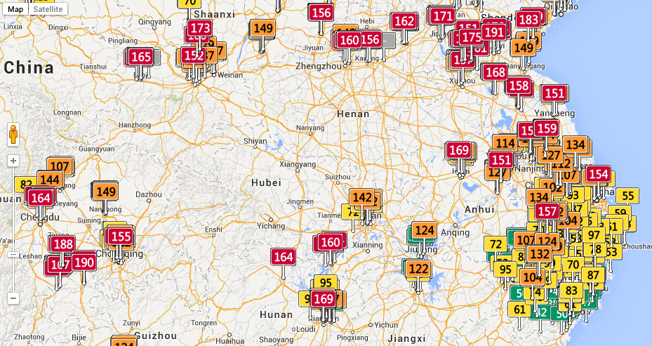
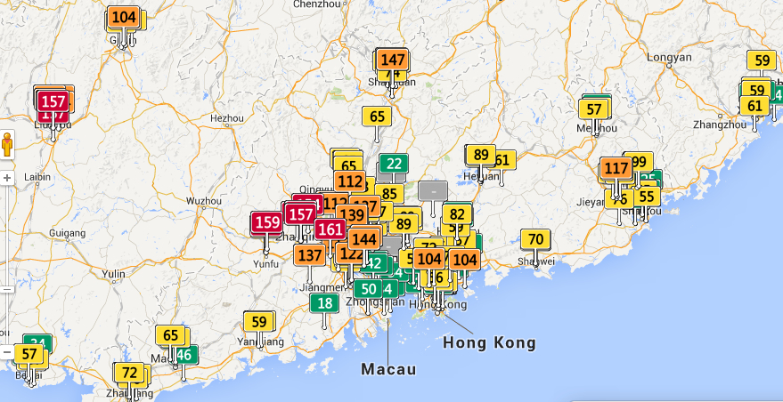
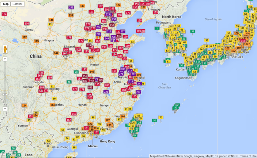
Despite the use of maps to localize disparities in fossil fuel emissions, map smog map smog or define localized ozone holes, no greater detail is available in maps than disparities in air quality. As we struggle undertake to trace such disparities, it is especially striking web-based maps reveals deep discrepancies in how levels of pollution have constrained questions of habitability at local levels, already evident in the imbalances revealed in data taken from the World Health Organization of the variations in the distribution of local means of small particle matter less than 2.5 microns across the earth.
The challenge of translating changes in the biosphere to a static map is not easy. Even visualizing the range of changes runs the risk of reducing or distracting the intensity of their impact. Dipesh Chakrabarty has aptly observed how environmental change constitutes “as a geophysical force, [a situation where] we now wield a different kind of agency as well – one that takes us beyond the subject/object dichotomy, beyond all views that see the human as ontologically endowed beings, beyond questions of justice and human experience.” For the very reason that we are immersed in its changes, we are challenged to read the record of massive changes and shifts in global environment of the sort registered in a map.
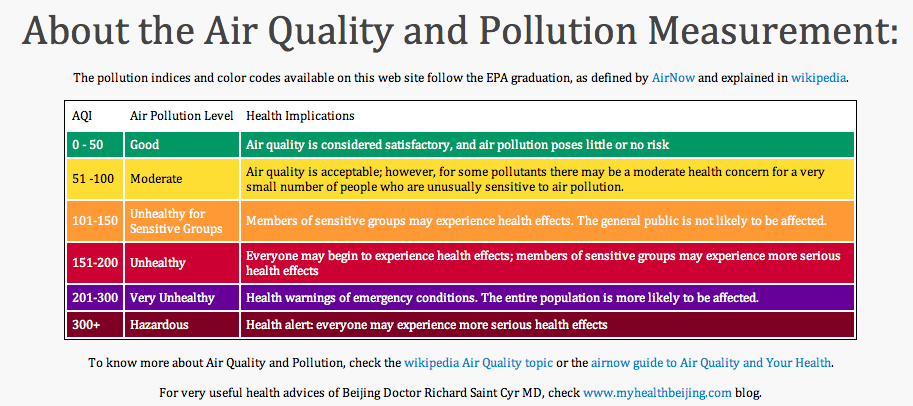
But the regional distributions of variations in that manmade environments have been recently readily synthesized on a Google Maps API to provide a scary spectrum of how we alter polluted air quality in real time: the shifts in select areas of the world–even if these areas which release pollutants that of course disperse worldwide–reveal one image of the uneven distribution of our entrance into the era of the Anthropocene. And although the ethics surrounding the degree to which over-industrialized countries have over-contributed to the advancing of markers of the dawn of the Anthropocene–from global warming to increased CO2 emissions to ocean salinity–the spectrum of the local distribution of air pollutants demands to be read. The coding of such pollutants in the AQI keys each region by its departure from acceptable levels of health–and indeed the departure from standards of the Holocene, based on different levels or parts per million of contaminants able to lodge in the lung.
If the dawn of the Anthropocene presents itself as a counter-discourse to a globalized economy, raising the multiple specters of the risks and dangers of unfettered economic development and growth, it reflects inescapable constraints on those very practices and presumption of human liberties: for it articulates “biogeochemical processes which [not only clearly] imperil the human species’ life-support system; it is also the antithesis of a politico-ontological condition central to modernity: freedom,” as Ben Dibley has observed in his Seven Theses on the Anthopocene, and articulate the parameters or constraints in which human freedom must henceforth now be re-understood–constraints in which mechanisms of the market might be able to secure and to perpetuate livable conditions of an easily habitable space.
Mapping real-time concentrations of pollutants offer snapshots of specific moments, rather than images of a geological “deep time” or defining a single tipping point of long-term ecological flows. But the discrepancies in global air pollution registered in a real-time air quality index map charts reported measurements of airborne pollutants in a Google Maps API to trace a shifting canvas of how we are now engaged in the alteration of the environment. While misleading to some, in its claim that “Good” levels of pollution exist in many regions, the distribution raises stunning divisions in the levels of local atmospheric contamination based on air quality indices. As of today, the map suggested particularly localized pockets of pollutants, with a surprisingly large number of sites marked red (Unhealthy; 151-200 AQI, as defined by AirNow) and violet (Very Unhealthy, 201-300 AQI), and three sites in Delhi, Finland, Austria, and Coyhaique, Chile viewed of Hazardous air quality levels of over 300, which qualifies for a health alert. This sort of mapping of the man-made environment, where discrepancies in air pollution can be readily registered, offers something of a map of anthropogenic effects. Variations in pollutants offer blunt tools to trace the disparities of anthropogenic impact on the global atmosphere–or to register a “local” distribution of the geophysical forces of the impact of Anthropocene.
As one scrolls across or zooms in to discern the different distribution of colored placards that dot the map’s familiarly and largely light green surface, one readily flags something like environmental divides across both large regions of the global atmosphere, as well as specific noticeable differences of place, no doubt relating to industry, and shifting standards that raise the question of whether entrance to the Anthropocene is indeed the other side of the coin of globalization, or how much local, regional, and indeed striking national differences persist in this mapping of inhaled air, clustering in individual countries’ different standards of emissions for industry or automobiles.
The cartographical labels in the above map tracking air-pollutants offers a new grounds for the label “Red China” by the density of its clustering of unhealthy levels of air pollution as of this May 22:
A recent study from the researchers at Berkeley Earth has measured the devastating effects of such levels of pollution, caused mostly by coal-burning, on China’s population, and does better by discriminating the levels of specific pollutants: the lack of restrictions on coal-burning contributes a devastating number of deaths of 4,400 Chinese each day, totaling some 1.6 million annually, on account of the diffusion of airborne particles of less than 2.5 microns in diameter–able not only to lodge in the lungs, but be absorbed into the bloodstream, in ways that t take the notion of the Anthropocene to the level of the embodied. Based on hourly readings at some 1,500 stations in mainland China, Taiwan and Korea, the distribution of almost entirely man-made pollutants can be tied with relative certainty to increasing rates of asthma, strokes, lung cancer, and heart attacks. And the numbers are shocking, from the concentration of particulate matter in the particularly pungent sulfur dioxide, released by burning fossil fuels, or nitrogen dioxides, a toxic pollutant emitted from the widespread combustion of petrochemicals:
Alarmingly high levels of pollutants greater than 2 ppb/hour.
It is no surprise that sites of industry where coal-burning is allowed offer more clearly defined sites of concentration of Sites of industry divide and readily distinguish air quality dramatically worldwide and in North America, revealing the local impact of the human on the biosphere:
The largely “green” California, whose ocean rim encourages a high quality of air, even with its own well-known pockets of pollution in its Southlands:
Piled up green rectangles don’t all equally signify healthy air quality, one should again note, but the discrepancies from Los Angeles to Tijuana, Mexico are nice to place in relief.
Given the increased amounts of small particulate matter of a radius of less than 2.5 microns in much of southern California, whose clickable feature show the somewhat overly bulky embedding of data in this world map–
the proportion of this particularly pernicious pollutants to entering and lodging within human lungs can’t help but recall a current rash of uncontrolled fires searing southern California’s coastline this mid-May, themselves tied to the effects of human presence:
Such considerably broad variations in air quality force one to wander more broadly over the slippy map’s surface, exploring ties, evoked in how Ben Dibley’s characterized the Anthropocene as newly emerging global apparatus folding global economic relations in the geographic that creates the “terrestrial infrastructure for global capital.” The arrival of an Anthropocene, Dibley clarifies, “signals a geological interval since the industrial revolution, where, through its activities, through its numbers, the human species has emerged as a geological force now altering the planet’s biosphere,” evident in the exponential growth of the human population and the arrival of new geographical strata of Anthropocene rock built to serve the needs of ever-expanding inhabitants: concrete highways, sidewalks, parking lots, airports and landing strips, or Superfund sites of toxic waste or garbage patches and trash vortices, steel shopping centers, loading zones, or the earlier mines, garbage dumps, and railroad depots that collectively signify the remaking of the inhabited world, but whose totality comes to create parameters for future growth. The changing global apparatus to the earth system in which the human is an agent appears the underside of a narrative of modernization, whose inescapable telos is not emancipation from natural forces or limits, but entrapment by them: freedoms to pursue economic development become the primary threats to the support system enabling human life. Despite difficulties in relying on Google Maps as a measure of the constraints on that freedom, the measure of atmospheric pollutants lift a corner on the increasingly circumscribed limits that actually curtail individual freedom. Its measurement is particularly compelling for what they suggest about how economic development tied to the project of modernity come to constrain the world’s continued inhabitation by human life–as the pernicious nature of the development of Abu Dhabi throws into relief.
This sort of a map is predicated on the numbers on which it is based. The variations in measurements of air quality are striking on the Canadian border, perhaps revealing different standards or sampling practices.
Europe offers interesting variations in quality of healthy air, with most danger signs located in the UK and North Sea:
Central Europe, thought a bear of industry and coal, seems both highly monitored and at the same time roughly comparable to England:
But the pocket of air quality that is literally off the charts one day near to Ankara–999–raises questions about how relatively low readings are in cities quite nearby.
To be sure, Anatolia can also, in other real-time maps, seem quite green on other days:
Real-time air pollution seems egregiously under-reported in South Asia, however, despite real high readings in two concentrations that seem quite situated at first glance:
But a slightly magnified scale reveals greater local detail in a polluted zone:
Even if the readings of unhealthy air quality around Pune and Mumbai, if concern for alarm, are not comparable to Ankara:
The accessibility of a full report of air quality of any place on a pop-up screen suggest a level of detail, to be sure, that this post does not do justice. But one is impelled to marvel at the stark inequities in the Anthropocene, both surprising and unjust, from Mexico City to Ankara or China:
The striking global inequalities of concentrations of air pollution that seem particulate endemic across China cannot, however, help but give pause for the hazardous concentrations of particulate matter that they indicate.
Despite a dangerously uniform measurement of particulate matter (AQI) verging on or surpassing 200, the concentration in Shanxi provide is particularly striking near its shore, and reaches an apex of 890 in Shangdong province, despite poor air quality of particular unhealthiness in the gulf:
The remarkably high levels of air pollutants along the Yellow River is particularly alarming and striking, since pockets of particulate matter of less than 10 microns, particularly dangerous to the respiratory system, approach hazardous levels in Shangdong (890), and even finer–and more dangerous–clusterings of much more dangerous particulate matter of diameter less than 2 microns, able to lodge more deeply in the lungs, reach hazardous levels in Bizhou. Have the health risks been conceived?
In the south of China, from Chengu to Hubei to Anhui provinces, one can trace a stream of red flags along rivers, and multiple regions of unhealthy air quality deep in the interior:
The far better air quality in the Guangdong region, in sharp contrast, reveals concentrations of airborne pollutants outside of the port of Hong Kong.
But what to make, on the eve of the accord between China and Russia on natural gas pipelines, of the apparent absence of limits on air pollutants in so very much of the PRC?
The commercial tie-in is rather obvious, and the map may be a marketing device for masks made to filter out particulate matter, in a wonderful example of cartographical product placement:
The color-saturated mapping of regional changes in temperature across the contiguous United States provided a commanding visual for the front page of the New York Times of May 6 to capture changes in the US climate: placed on conspicuously above the fold and standing alone, just below the headlines, the graphic served multiple functions in a strikingly effective way. The weather map that was first released by the Obama White House elegantly and effectively served–in ways that words could not–to combine several narratives of climate change that synthesized the findings of a recent committee of scientists on the wide-ranging effects of global warming. This is an unprecedented victory of the map, the most effective single tool to describe the complex process of a veritable cascade of environmental shifts, by selectively focussing on a known variable of local warmth. The orange and bright reds of the map arrest the eye in ways an article or headline could not, and effectively provoke a cascading set of side-effects and reactions to occur in readers’ minds that served to grasp the finality of warming’s consequences. As one mind quickly moves off the map of stark changes of temperature to the effects of future droughts and increased aridity of soil, consequent crop-shortages, and subsiding ground-levels, imagining the marked depletion of cool air, streams and rivers that would dry, and an increasing dependence on energy to create artificially cool environments.
Although it is static, the historical map suggests a spectral future forecast for the nation that dramatically moved from back pages to headline news. It mirrored a roll-out of the announcement as part of a dialogue with weathercasters on television news programs in a gambit to engage the public in the question of climate change. Indeed, the graphic mimicked the presentation of weather maps on TV, images of the national forecast that the Weather Channel has made all too familiar. Even if the map documents changes of the previous century, it shares the iconic status of the sort of severe weather forecast that The Weather Channel has accustomed us to interpret and to see. We’re now trained so often to interpret and to read similarly colorized climatological forecasts to trace regional emergencies that the Times‘ map seemed to recuperate these conventions to make a polemic point not so much about the past–“US Climate Has Already Changed”–but about the possible futures that the map forebode. For weather maps offer the most acceptable medium of future predictions, where they have currency as credible tools for short-term forecasting.
The range of information in the map that summarized a century of rapidly shifting local climate temperatures How could such a gamut of consequences be convincingly understood or presented other than in a map? The visual immediately triggered multiple questions of effects on species, forests, farmlands, new sorts of vegetation, and shifting insect populations described in the article, which a reader some decades ago would be challenged to link. The effectiveness with which the map implicitly summarized the ramifications of these potential changes, or provoked its readers to react to its orange and read heat-distributions, presented an ominous vision of the future, as well as the historical past of a century of warming weather that the headline announced. As if with the ominous fatality with which science fiction authors like Arthur C. Clarke described the future of a world battered by asteroids, the map opened up a view on the consequences of environmental change in a future world, even if its headline announced an event firmly rooted in the past century, synthesizing as it did the findings of two periods in the past hundred years.
The finality with which the map released by John P. Holdren documented a change that had already occurred across the nation’s regions, but made it to every weather bureau and station across the country, as if to maximize the newfound familiarity of audiences to engage meteorological maps as a way of making its own polemic (and of course partly political) point of how drastically rising temperatures stand to redraw the familiarity of the world. Extending far beyond earlier warnings voiced by the UN, or the pronouncements of an Inter-Governmental Panel on Climate Change whose report documented the melting of the ice-caps and collapse of sea ice in the arctic, the migration of many fish out of their habitats, and impending dangers of rising seas. Perhaps these global images were too remote, or difficult to visualize. The powerful invocation of the weathercaster seemed to give greater reality to the scary prognostic in the contiguous United States, and concretized the multiple threats of climate change in an image that confirms the changing nature of the ground beneath our feet. Some may criticize the focus on the United States alone in an interconnected world, as if the isolation of our country’s climate somehow removed it from a global problem and dilemma, or placed undue emphasis on the effects of emissions on the climate in the US. But the image of actual experiences spurs a call for reaction and response, and, in an echo of the tactics of the Obama administration, reveals the increased “cartographical literacy” in the reading and interpreting forecasts in persuasive national weather maps.
The emulation of the televised weather forecast is no doubt what makes the map appear so immediately effective.
The map of the entire country was in ways a counterpart to the images of November 2012, around the time of Hurricane Sandy, simply titled “What Could Disappear,” which asked viewers to imaging the shifting coastlines of rising seas, and pictured the coasts that rising ocean waters could redefine, submerging beneath the sea low-lying areas of what we consider habitable land–as well as flooding all of Galveston, TX and some 45% of Long Beach.
The New York Times
But rather than engage with complex claims of climatological futurology, the front-page graphic was both at the same time historical in perspective and even more apocalyptic. In announcing or intoning “US Climate Has Already Changed,” it reminded us of the consequences of rising temperatures at a historical remove that was still part of our present and an uneasy glimpse to the future we have mad, using tense whose finality foreclosed debate in quite incontrovertible ways. The map’s comparison of temperatures over a century effectively resolved debates, separating the actual consequences of climate change on a familiar environment from debate about its mechanism and reminding us of its man-made origin, and untangling the dangers of the changes that it wrought from the cascading (if terrifying) mechanism of ocean levels rising, habitats altering, fish migrating, the extinction of species, and deaths of coral reefs. The map was able to link itself to a multiplicity of lived experiences and actual fact, and conjure a scarier–precisely since undefined–picture of what was to come–an era of increasing heat. (Its associations might almost be as apocalyptic as the hallucinatory surreal dream from a 1959 episode from Rod Serling’s The Twilight Zone, “The Midnight Sun,” in which the earth exits its elliptical orbit and moves toward the sun, warming the nation so much as to induce crazed radio weathercasters to stray incoherently off script and panicked Americans to flee abandoned cities en masse to Canada in search of cooler climes.)
The particularly powerful graphic of the map of regional variations in rising temperatures was quite devastating in its depiction of how–despite some regional differences–none save rare pockets of settled land experienced anything approaching a decline in reported weather temperatures. For those that did, mostly concentrated in the lower Mississippi basin, they experienced quite slight declines: it presented an image of a continent on fire, almost about to be consumed by flames, burning from its edges, if, the accompanying article noted, increasingly soaked by torrential rains.
The New York Times
The growth of areas already warmer on an average of some two degrees suggested an encroaching of scarlet red blotches across the land from all sides, particularly in southern California and Arizona, Utah and New Mexico, the northern eastern seaboard, and the Great Lakes, with Bob Dylan’s native Hibbing seeing the greatest temperature change of over a massive three degrees. The map powerfully synthesized the effects of human-induced climate change in ways that are not only impossible to rebut, using findings of a national committee that has been in existence for over a decade–but was by far the most effective among the various interactive graphics it released. The simple synthesis in a four-color map of the contiguous US immediately showed rising temperatures in some of the more inhabited areas of the nation, from New Mexico to Southern California, to the New York-Washington corridor.
In selecting a map to represent the consequences of climate change that were detailed in the report, the images suggested less of an infographic than a sort of disease map of a climate that has gone off the tracks. Even if it might be faulted from its insistence on removing the US from the world, and focussing on one place within a complex web, as well as flattening its findings in cartographical form, the image is powerfully links the land to a set of abstract changes we cannot fully comprehend, but whose effects we can perceive. This is the stunning victory of the static map.
We read more maps than ever before, and rely on maps to process and embody information that seems increasingly intangible by nature. But we define coherence in maps all too readily, without the skepticism that might be offered by an ethics of reading maps that we all to readily consult and devour. Paradoxically, the map, which long established a centering means to understand geographical information, has become regarded uncritically. As we rely on maps to organize our changing relation to space, do we need to be more conscious of how they preset information? While it is meant to be entertaining, this blog examines the construction of map as an argument, and proposition, to explore what the ethics of mapping might be. It's a labor of love; any support readers can offer is appreciated!