Mapping License Plates/Maps in License Plates

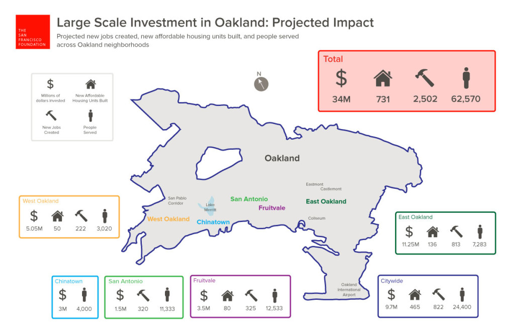
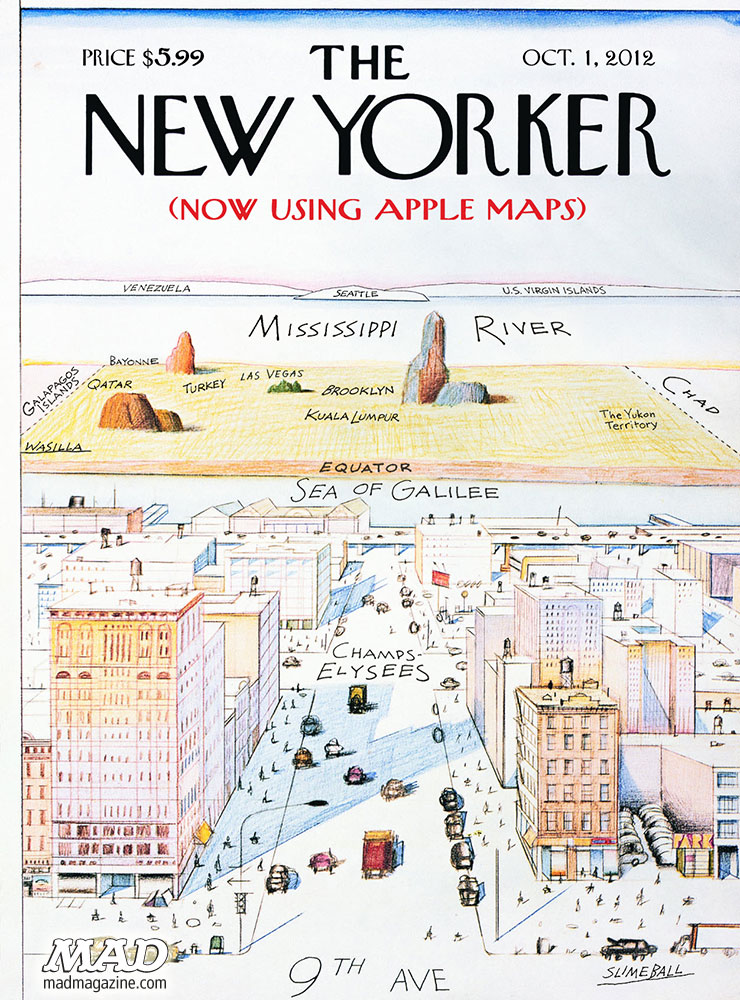
In a world where much inhabited land has become paved, and indeed where paved roads interrupt habitat, ecosystems, and formerly open land, the icon of the America license plate has perhaps rather unsurprisingly become a token of a bucolic sense of place. The images on license plates are not perhaps intentionally advertisements for travel, but often appear to be–from the designation of Oregon as the “Pacific Wonderland” to the promotion of California beaches as a perennial sunset, lined with palms, or Florida as a site of admittedly man-made orange groves.

If cars offer a bit of a billboard of the driver, my own adoptive motorized state of California set a new standard for defining itself by wonderful license plate designed by California painter Wayne Theibaud as an arts plate specially designed to represent California, “Coastline,” whose iconic design of a beach, palms and setting sun in a single panel have funded arts education programs premiered in 1994–the license plate whose sales and renewals have generated over $74 million for the California Arts Council, as “Coastline” is a perpetual gift to his adopted state set a standard publicizing California’s ability to offer artists assistance by a dedicated website for license plates! The sun-drench he’d optimism of the world-view of Theibaud seemed to be distilled, reframed from a painted panel to nestle within the rounded curves of the license plate, the neoprene colors of a sewing sun seemingly a gesture the surfing culture of the coastline that was being depicted–the image was called “Coastline,” even if this was not the entire state–as if offering anyone a utopic view of the state’s riches on its Pacific Coast Highway, a site of intensely scenic traffic in the state, if the volume of traffic on Highway One, or PCH, is pretty hard to determine, and varies dramatically with road closures due to mudslides, fires, and vehicles.

If Theibaud’s work is far more often exhibited in museums worldwide–as well as in Davis!–while other designers of license plates are less well-known, the shift in designing the license plate as an alternative map of automobile registration–and presumably its drivers residence–offers a unique way to establish place on the road, to stake a sense of location on the increasingly mobile crowded highways on which we travel, reminding ourselves of locatedness, even while we are on the road. If the late California painter Wayne Theibaud argued that ‘the best abstract painting . . . is one that comes from something, but it may not be evident,’ calling its process an invitation to ‘speculate and paint the picture of your own devising.’

The experience of driving down coastal California is evoked by and seems to have inspired the license plate he was commissioned to designed to fund state art education programs, the abstract forms of the painting also inspired the artist to make a statement of the power of pictorial arts– they now go for about a hundred dollars on eBay, so valued are they as forms of art of their own as an image which “captures the beauty of the California beach sunset,” evoking a place that we might have long considered, looking only at maps, something that attracts one to drive around, with an automotive experience of its own. While Theibaud probably didn’t only expect folks to study them on the highway, or from behind the wheel, the illustration of place from an abstract expressionist who indulged himself and his viewers with cakes, gumballs, and roadways offers an idealized if familiar driving experience, moving directly into a blinding setting sun with one’s eye on the road.

Wayne Theibaud, “Coastline”

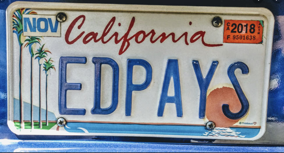
The neoprene palette that Theibaud adopted was familiar from his other word, and quite enchanting, transforming or mutating the everyday into an electric view of modern life that let us see the quotidian with new eyes. (To be fair, while Theibaud was showcasing his California roots by that neon ocean blue and setting sun, he was only embraced as a California artist after having found less success in art markets outside the state, and after he became a carpet-bagger in reverse, rolling his canvases up into his old car and driving cross-country to find a New York dealer, with fellow-painter Mel Ramos. The road trip that led the UC Davis faculty member to return to be celebrated as a local pop artist led to the commission for a state’s license plate that expressed his deep concern with the public interest,–if not the most reproduced image of his pictorial corpus–confirming his status as a California artist, for whom California’s landscapes and cityscapes became almost staples of abstract expression, rather radically suggest one might best experience the place by car.

But the dayglo colors he indulged in the license plate whose setting sun is almost an abstraction, extending an orange horizon line that frames the vivid blue ocean and seems to intersect with Theibaud’s road, transformed dayglo palette into a sense of place, if it creates an icon of the state that privileged its coastal highways to Los Angeles, if not the Davis-San Francisco commute. The energy of the bright, open skies that distinguish the state is conjured by the bright colors of the palette that Theibaud, a former sign-painter, chose to express himself–

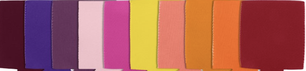
–are hardly similar to the colors one might find on a map, so much as Sherwin-Williams, but they convey an almost abstract idea of place, conjuring the coastline that was increasingly identified with California, as much as a basis to illustrate a specific landscape, or place: it is almost a state of mind. The frame of the license plate lay at angle to the actual color palette of spectacular coastal scenery the highway offered, transfigured through a Southern California imagination of an artist born in Arizona who grew up in Long Beach, who must have often commuted to the southlands; I’d bet was happy to ignore the bumper-to-bumper bottlenecks at either end of the expressway, despite rewarding views of the San Gabriel mountains as one enters LA, for a romantic coastal view.

Bixby Bridge Big Sur California PCH

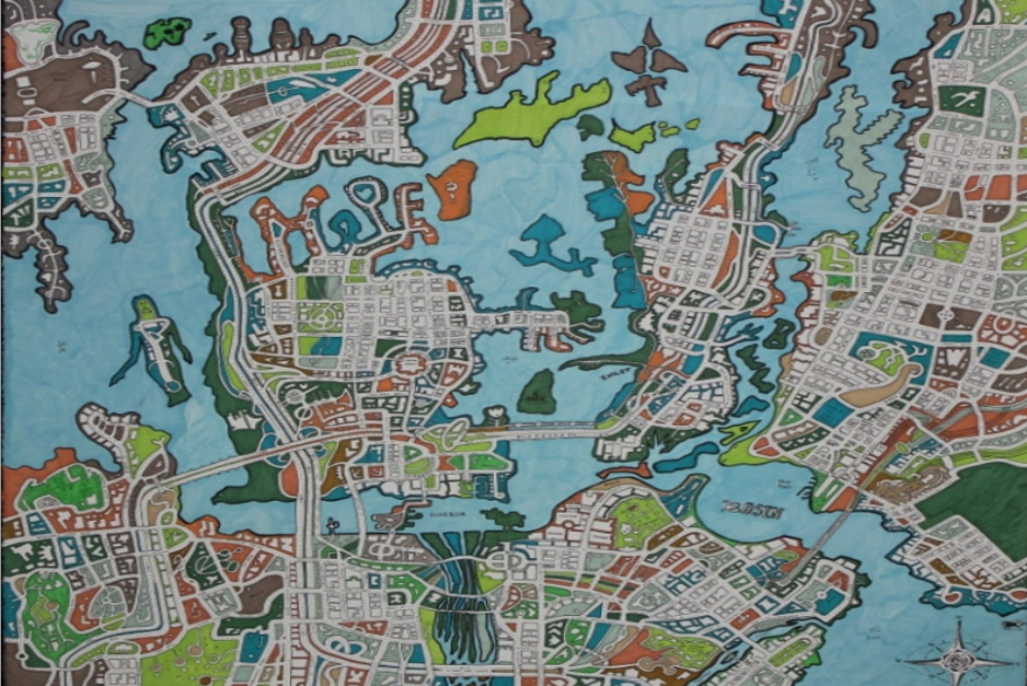
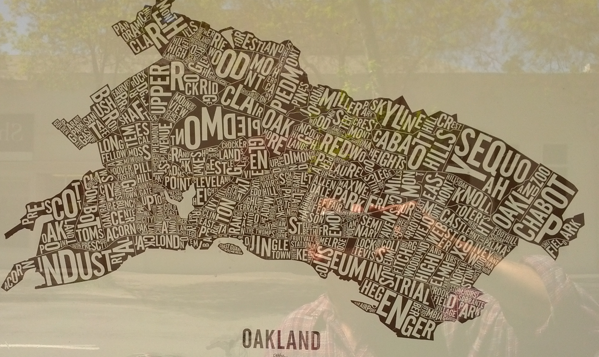
Thiebaud’s pioneering work on metal is hardly the high point of Theibaud’s rich artistic career. But it prefigured the vast expansion of not vanity plates, but pictorial maps, or counter-maps to the maps we depend on to navigate roadways that allow us to meet our destinations. And in an age when the world increasing arrives to us in license plates in a way radically removed from the road, in short visual statements, the way that these pictorial images of an unbuilt site, distilling a purity of place on the license plate that rarely exists on the roads themselves. For if the highway offers an unfolding of space and landscape by which we promise to be endlessly entertained, it was no coincidence that Theibaud’s shore-centered perspective in Coastline dialectically generated, as if to illuminate other landscapes that it occluded despite its expansiveness, of mountain ranges–and even to enter the oceanic expanse of its coast–ocean water delightfully dripping off the tale of the whales offshore its coastal waters–in the so called “Whale Tale” plate of the California Coastal Commission–as a new sort of imperative on the license plate, transcending a landlocked place–

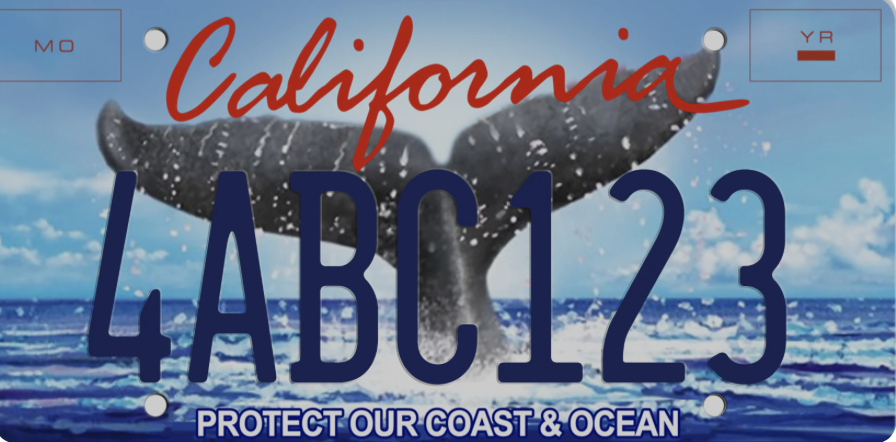
Whale Tale Plate/California Coastal Commission

–that oasertes the unique privileges of Californians as coastal residents by its injunction to dedicate ourselves to coastal protection as if driving on roads were compatible with a clean coastal ocean.

What is the recent turn to shift from vanity plates to license plates that bear testimony to our personal of world improvement? An unforeseen outcome of Theibaud’s creative design may have led many o to wear on your car, or encouraged privileged Angelinos to indulge options of alternative fantasy landscapes, indulging their own artistic skills on a broad cartographic take on the state, to model possibly more preferable to options the state offers, mostly modeled after screen shots of an age of iPhone tourism, that has helped reinforce a bounteous relationship to the land.

Reader-Submitted Alternate Landscape Design for License Plates, LA Times, 2022

Does the alphanumeric annotation born of computer texting suggest an origin for this image of Half Dome? Could Thiebaud have imagined unleashing the futility of self-designated artists to project alternative image of the state, having pioneered and opened the potential fertility of license plates as canvases? As if in reaction to Theibaud’s preference for the warmer colors of his coastline, the ranges of mountains rising behind the sea became a default alternative in recent years, or the most part, even in environmentally conscious variations to call attention to the mission of Keeping Tahoe Blue–substituting the treasured lake amidst snow-capped Sierras for the coastline of the Pacific–

–far starker and more angular than the smoothed curves of Thiebaud’s version of Margaritaville. The mountains are to be sure, if angular, a welcome prospective that acknowledges the ranges that are the spine of the state, hardly as austerely patriotic bent of the South Dakota’s sculpted faces–

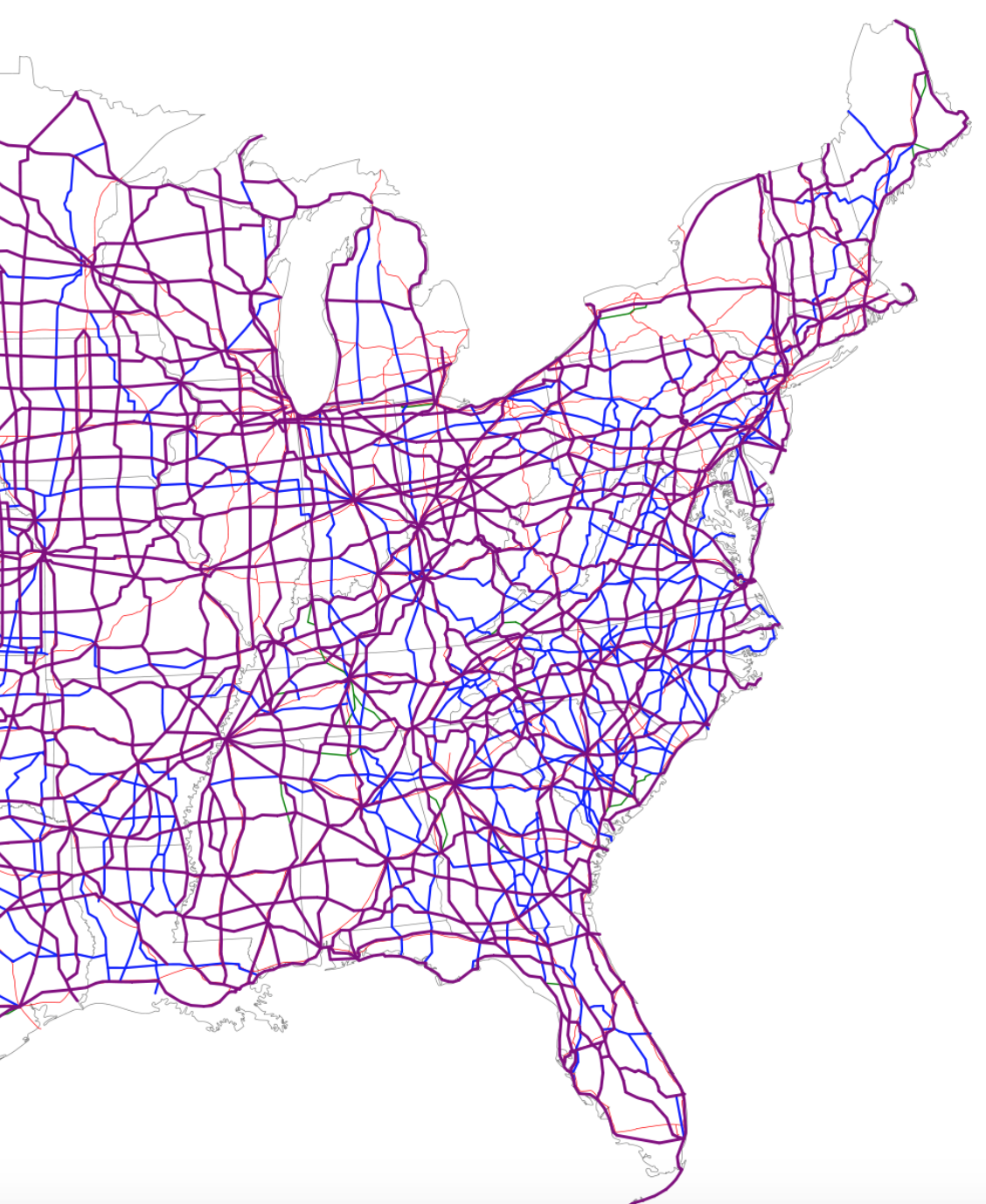
Indeed, the ideal view mediated by the license plate, if not God’s Eye, is about as far from the road as one could get, and intentionally so–a far cry from the plates on trucks that one might see from the midwest, that take the highway map–and geographic image of the state as the center of the USA–that seems unique in reminding one of the highway system left tacit in most license plates!

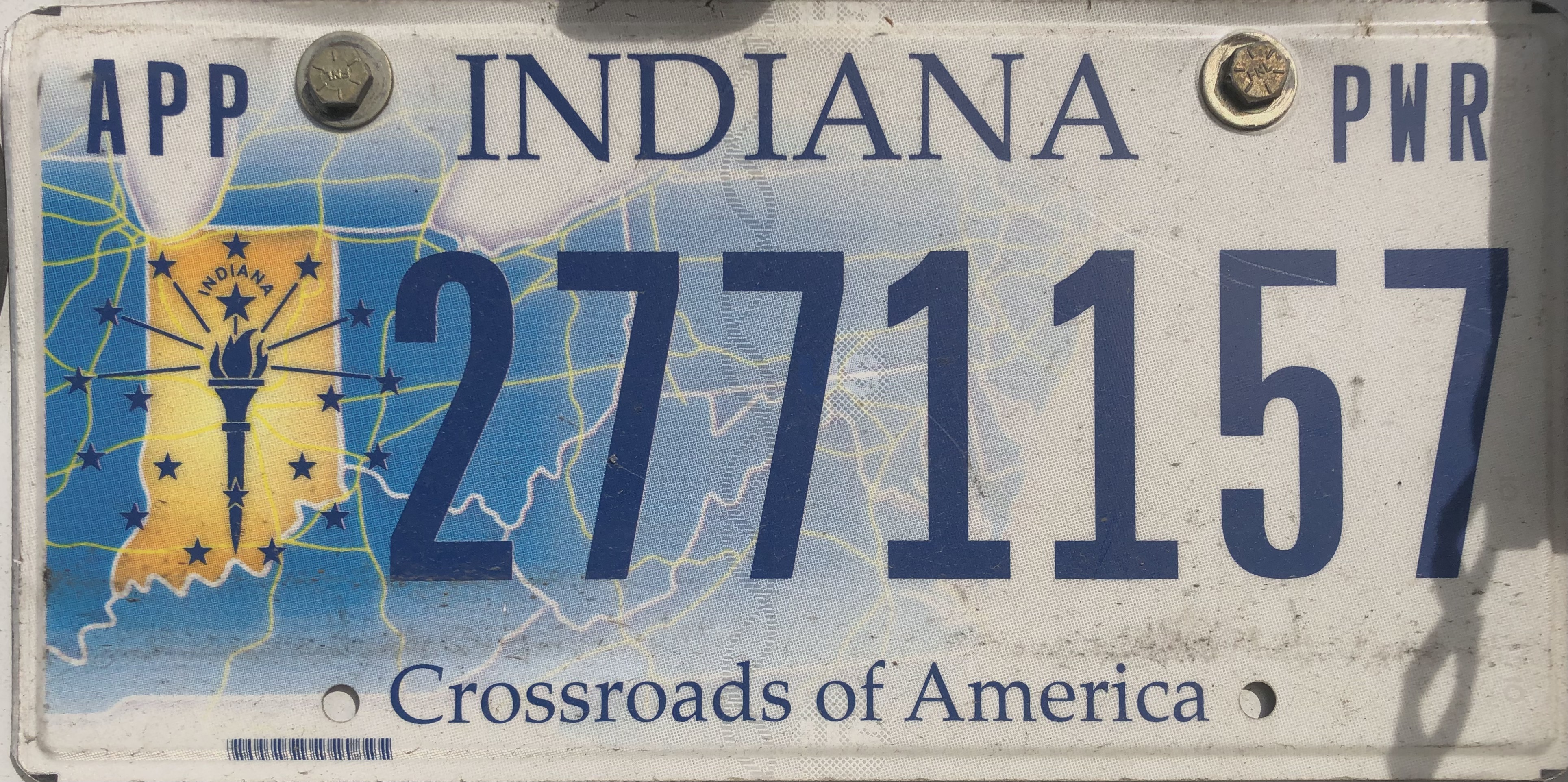
Its design prompts one to remember the central location of Indiana on those unfolded highway maps, in deed, making it an outlier that might very well prove the rule and the thesis of this post. But if the plate was a unashamed symbolization of the power of the midwestern state it maps at the nexus of highways that constitute the nation’s cartographic center, pictorial plates have been adopted in recent years, perhaps encouraged by embossed landscapes, in pictorial detail that almost seek to restore a sense of specificity of place in order to compensate for the placeless spatiality that most motorists experience on most paved highways. Was this due to the death of the paper map, I started to wonder? Or the replacement of physical maps with GPS guidance systems? What of the fate of the maps whose forms used to once define license plates?

Bear me out.

The recognition of place in the frames of plates, increasingly born of qualitative arts, emerged in the 1950s, after all, in reaction to the growth of drives on highways, and the velocity of interstate travel. If cars sped across the landscape, glimpsing roadside scenery without fixed orientation, did the landscapes of license plate promised a sort of counterpoint?

2003 Colorado License Plate.jpg
Colorado Plate Design, c. 2000
2018 Florida license plate IYT E32.jpg
Official Florida Plate, 2018/Dickelbers

Can this official design–here retaining the vague outline of the form of the state, panhandle to the keys–meet a need for place to compensate for the anomie of the skein of the highway systems and web of interstates that now cover much of the countryside, and indeed constitute almost a space of their own, unmoored from place?

A Highway Map of the USA

Indeed, the rough condensed history of our roadways often seem to have assumed a sense of replacing the places that they traverse or connect, as corridors of transit may have replaced the dominant sense, for many Americans, of where they are located or what sense of place they occupy in the heterotopia of the road. There is a story that this all began with the potato, the early move of Idaho to rebrand itself as the site of its bumper crop, as if reminding viewers it stood in balance with the open road or the future of technology, as if producing a bumper crop just before the Stock Market crash that led so many to rely on supplementing their meals with potatoes that the first pictorial plate in the United States may well have lost some of its luster.

But the humbler hope of agrarian Idaho’s earthy Secretary of State was not only to attract tourists by a flashy “gold potato” but boost the image of a state beyond an alphanumeric identification or serial design, by a visual symbol of pride that have been claimed to have so radically enlisted artistic license in promoting the state’s self-image to create changed atttitudes to the plate as a space to register not only ownership, but a changed relation to an actual geographic place.

1928 Idaho Potato License Plate

While the image of the potato on a field of green may have been akin to promoting the “new gold” of potatoes to Idaho farmers, to inspire regional settlement, it may be that the interest in promoting interest in the place of the potato would bolster tourism in an increasingly automotive culture, and the Secretary of State must have had some sense in the contrast of the rootedness of the spud in Idaho fields with the cars speeding along its interstate, perhaps headed to the Grand Canyon or Mt. Rushmore, and compel pride of place to make Idaho worth a detour for some time–or even plant one’s roots (or irregularly shaped tubers) for future rewards.

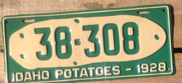
For the first pictorial plate that affirmed the state’s agrarian economy may have been a bit tongue in cheek, a far cry from the open spaces that emerge with a sense of optimistic longing, able to conceal the fact that one is driving in space at high speeds, which if they have included some politicized slogans–as New Hampshire’s commanding assertion, dating back to the Revolutionary War, to “Live Free or Die,” adopted by Gov. Meldrim Thomson as a point of pride to leave his imprint on the sensibility of his state, although the adoption at the height of division around the Vietnam War seemed a summon conservative patriotism, if adoption of the two-fisted motto seemed to manufacture the semblance of a timeless tradition.

The rise of new symbols for states that went beyond a map was suggested in the glorious image of Oregon’s pristine rivers, without a map or even a landscape, in the tones of the incredible fish who return to the state perpetually, traveling along long coastal rivers from the Pacific–the massive Columbia, Snake, Klamath, or Umpquah–by the ghostly rainbow salmon, that suggest the site of wilderness and confluence with the Pacific ocean, to denote the bounteous riches of the state.

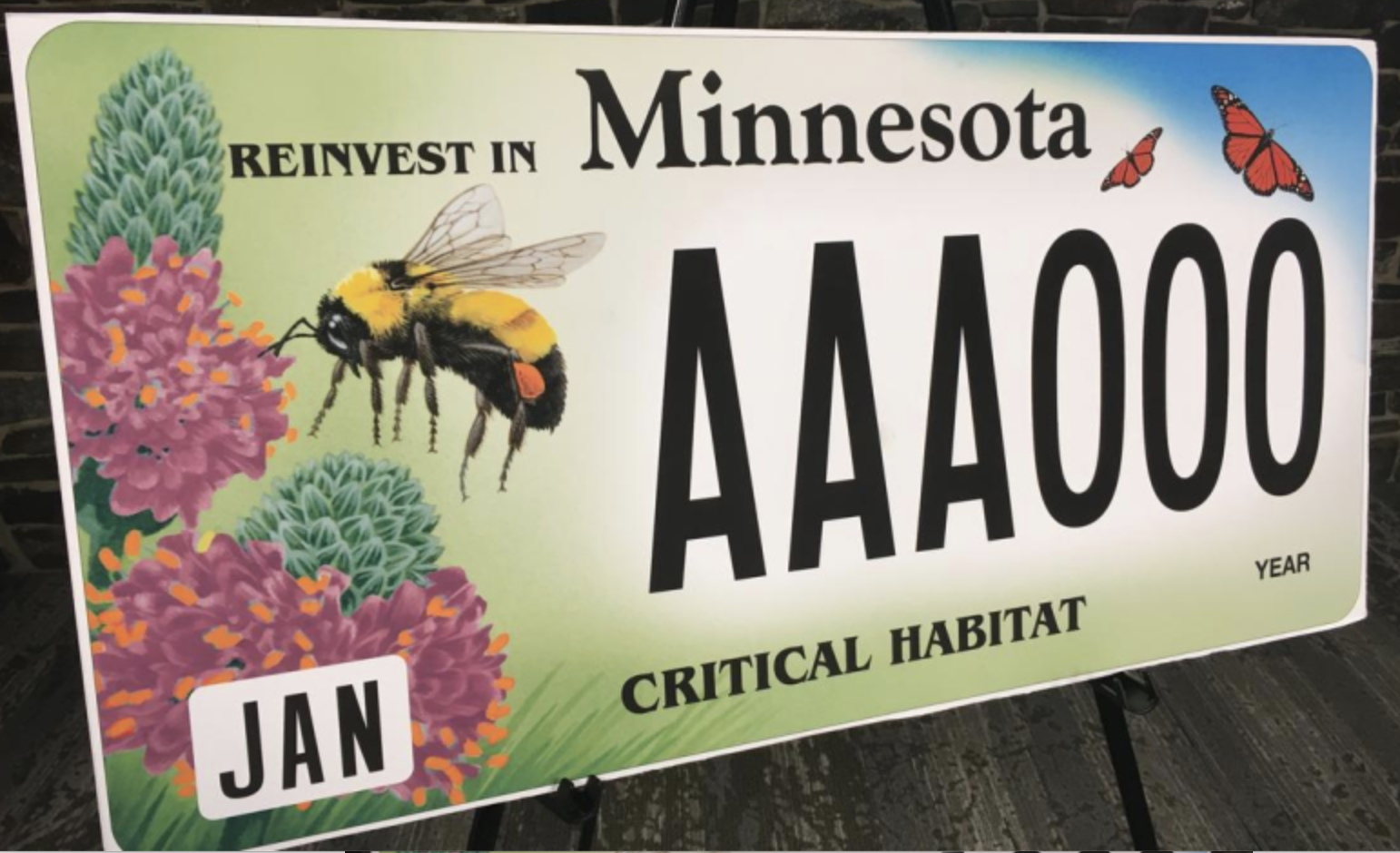
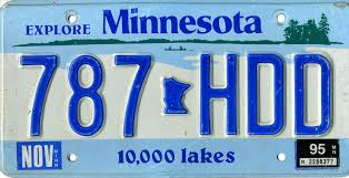
As the legends and mottoes of license plates has expanded far beyond that golden spud, to promote a sense of locality that was perhaps less in the earth but similarly evocative of a landscape able to be experienced above the ground. If historian Rick Just argued “license plates became a different thing after that potato,” screen printing and graphic design have allowed the license plate to become a cartographic and pictorial surface of their own, and a sight for the optimistic reinvention of place, as much as a tourist advert: if there was a change in motto as Arizona decided to follow suit with a catch moth, and stamped “Grand Canyon State” on its plates in 1940, as World War II meant that fewer and fewer families visited the national park’s gorgeous trails, and, in the boom of the postwar era, Minnesota beautified itself as a ‘Land of 10,000 Lakes.”  The visual surface of the plate has become a site of increasing multiplication of attempts to refashion states as places within the small acreage of the license plate itself, creating idyllic scenes that denoted place, as if in response to the placelessness of being on the road.

The politicization of the design of these most common designators of place on cars, the license plate, is hardly surprising. After all, the rise of the proprietorial sense of designing ones own plates is not a far jump to that of viewing the format of the license plats as if this designation of plate were not forms of public writing.  Even without considering the broad notion of what sort of writing this constitutes, the readiness to treat license plate design as if it were an avenue for freedom of speech or a form of expression reveals an identification with self and car to an expressive form and on a semantic plane.

The sorts of legal claims for freedom of speech–or plate–suggests not only an acceptance of the license plate in political discourse, but a pronounced shift not only in the aesthetics but in the use and construction of license plate design from the rudiments of denoting site of registration in the past. If the license plate has only emerged in the past twenty years as a surface of almost pictorial illustration, the purposeful playing with its surface as a sight of design suggests the expansion of graphic design, and understandings of the map as an image of identity. While the gold potato may recall the many maps of the “Gold Regions of California” that were present from 1851 in how Charles Drayton Gibbs promised prospective buyers he had mapped in “Golden California,” using suggesting color choices to suggest where prospectors might do well to look–

the fantastic places of license plates have expanded with both creativity and cartographic guile, showing increasing abandon about their objectivity, and staking greater premium on piquing interest from moving motorists and passersby.

For during the past twenty years, we have come to identify the content of one’s plates as transcends an identificatory tag, expanding its graphic opportunities as an occasion to raise state revenues and provide vanity illustrations of individualization on the highway and driveway at considerable costs.  Perhaps it is worth asking how this relates not only to freedom of expression, but to our sense of place.  It is perhaps on account of the massive growth of graphic designers and graphic arts, as well as the ease of printing airbrush designs on metallic surfaces, that the license plate, that modest of all surfaces, has recently become something of an advertisement–along the lines of U-Haul moves; the images on license plates have become evocative landscapes that almost embed viewers in their content, depicting a sense of place that seems more alluring than neutrally mapped.  Indeed, the growth of new landscape icons on the license plates that are seen on the road seems to have inspired the coterie of graphic designers at Ars Tecnica to assign an award for the “ugliest license plate” to appear, at the start of the new millennium.

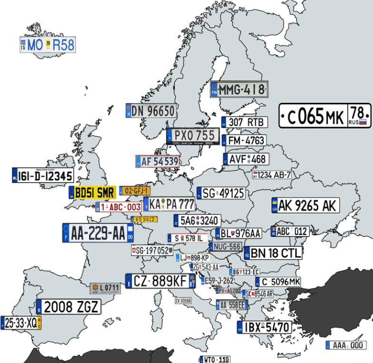
The elevation of the license plate as a site of destination and akin to a tourist advertisement suggested the rise of advertising as much as the pragmatics of automobile registration. The expansion of the world of graphic design to the license plate that suggests a shifting notion to place, as much as of graphic templates in the age of photoshop, but betrays a search for transforming the plate, akin to the car, to a site of identity and meaning, that is deeply tied to the driver’s sense of self, or a convergence of state interests to the desires of drivers, evident in expansive menus of graphic design that DMV’s offer owners of cars, and that offer a gallery on the road, offering a diversity that is sharply American, and seems quite unlike the maps that one might make of European license plates, pre-EU.

Far from seeing the plate as an official signifier, the rise of graphically complex plates moved a stable signifier of location and regional provenance.  Beyond being a form of taxonomic classification, or an add-on for vehicle registration, the personalization of plates have brought a search to capture the essence of place of patently nauseating kitsch–

6b4450df687af33052b994d7e201293a

–that summons the struggle for place to still exist in a post-map world, as much as it conjures a sense of place that we might really recognize, as if an affective image that tries to appeal to the state’s residents, by its increasing remove from the geographical map–and far more numinous and faux evocative sense of landscape meant to evoke the magic of place.

Such a change might well correspond to a sense of the increasing placelessness of a nation that lacks clear edges, and where states have an identity almost invisible save in electoral votes. If the representational unit of the state has declined in national politics, for all practical purposes, there is a sense of reclaiming local identity in the license plate in increasingly immaterial political map.

Indeed, the victory of such airbrushed images of landscapes–instead of maps–seem all too often akin to advertisements for tourist travel, airbrushed imagery, which as much as claiming to evoke a sense of place suggests something akin to perpetual placelessness of an alteration of rural and urbanized landscapes blending into one another, almost suggestive of an appeal for place before the increasing lack of differentiation of the national landscape, even when evoking a map to give stability to a fleeting sense of place.

n

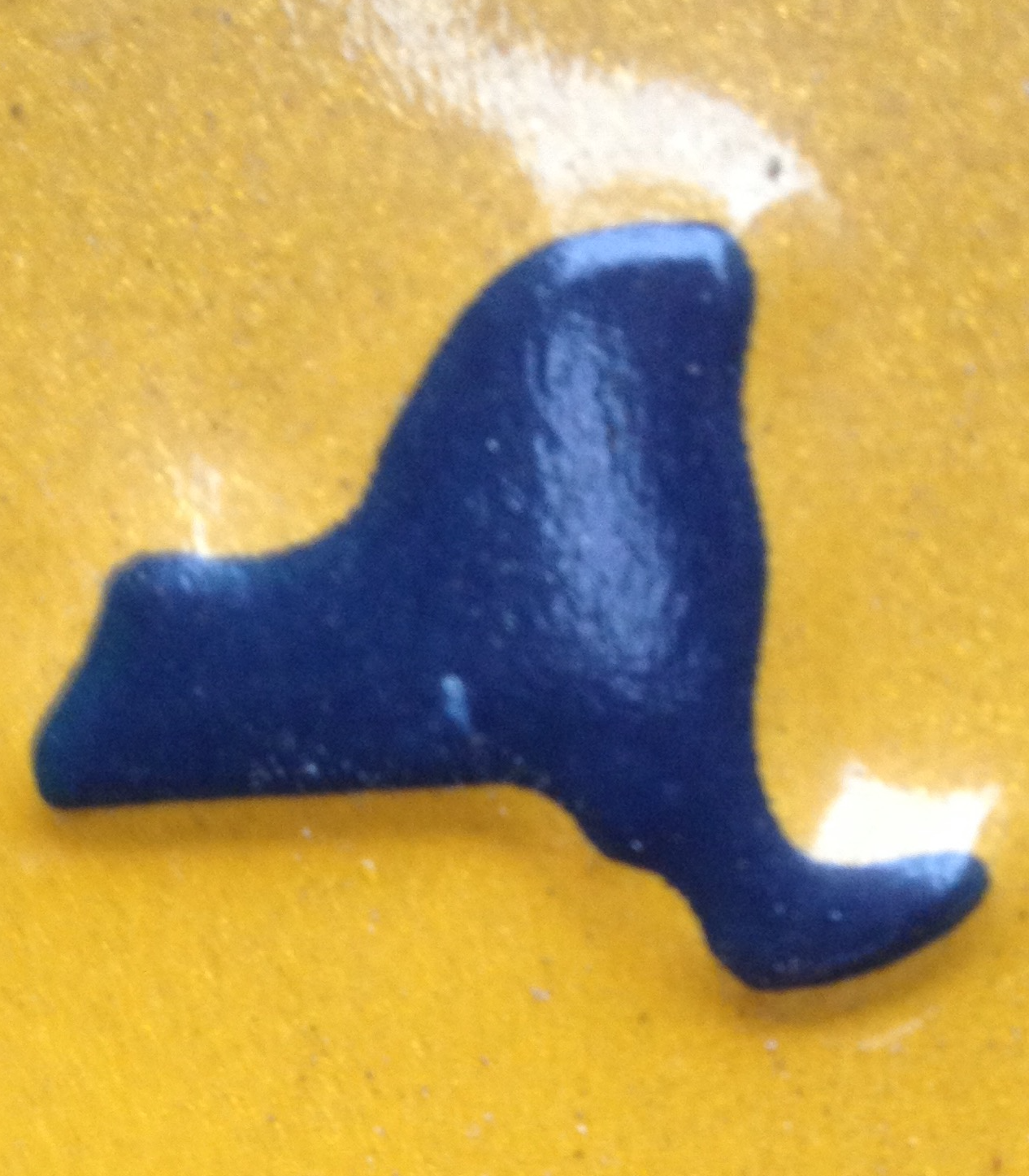
Indeed, despite the radically limited cartographical content of the raised state pictured on the New York State license plate, a considerable effort was invested in affirming the iconic centrality of the state, even it it is a barely recognizable or distinguished blob of paint when raised metal when at close hand.  

To be sure, New York license plate design is distinguished by its ability to comprehend a broad geographic unity, and functions as a mapping as an illusion shrinking the geographical distances between, say, Niagara Falls and Manhattan in a somewhat short-lived attempt to spread across the economically and culturally quite diverse state–

ny_license_plate

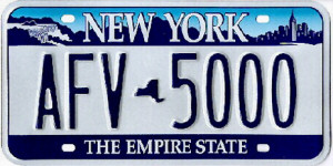
–as if to champion the miracle of the transport of water in its hydrological infrastructure, where the water of northern reserves are channeled downhill to fit urban appetites and needs: the parking of two vignettes of quite different scenes, demographics, and even political inclinations, links the upper state and the metropolis of New York City (or Manhattan), by moving from the bucolic scene of Niagara Falls, an abundant cascade of water and iconic from postcard view, to the image of the Empire State Building in the concrete skyline, linking built and natural environments in persuasive ways that the state map may in some ways fail to do so effectively any more, using the old role of vignettes to construct a new affective regional identity–

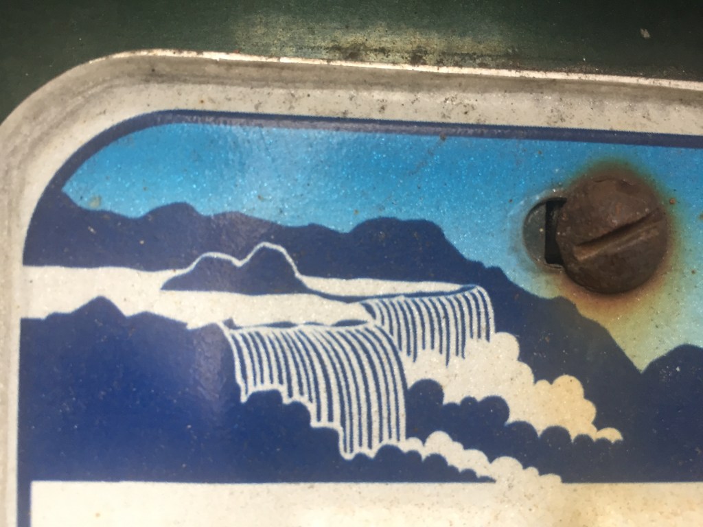
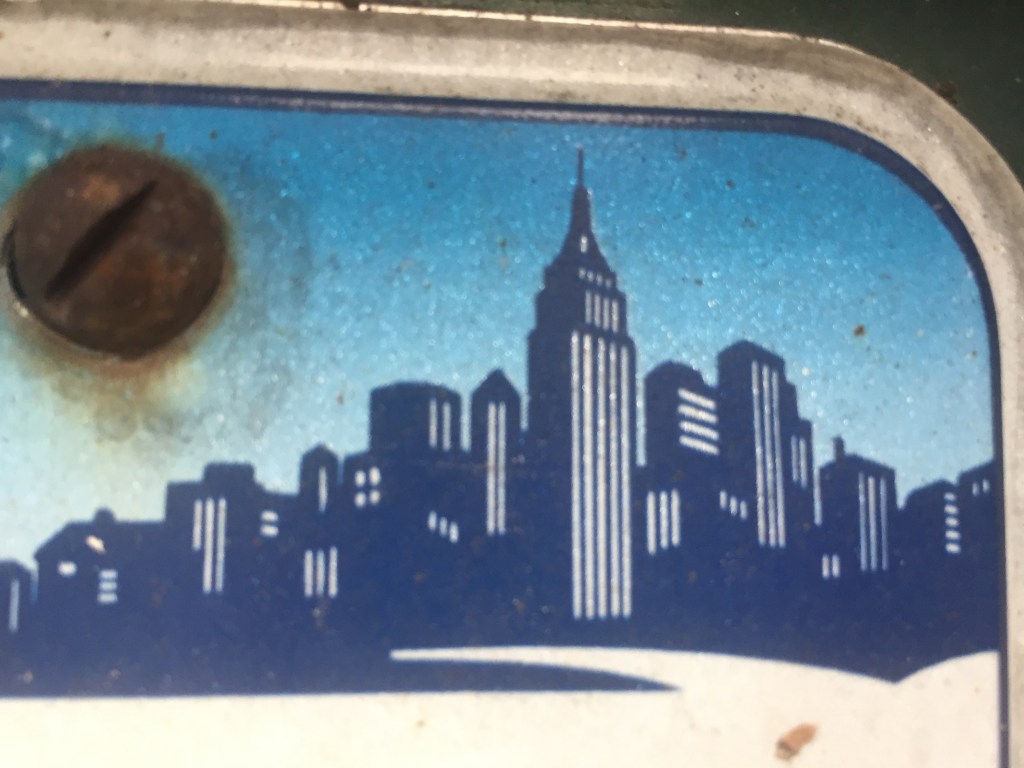
–that trumps actual geographic continuity, if embedding both in an imagined skyline, itself bridged by the words “New York.” more than reality. The license plate relies on the map, even if only as an atrophied remained, as a hyphen between alphanumeric license numbers, to create this bridge, and remind us of the affective relation to a region!

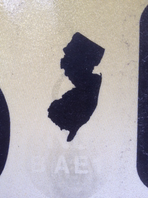
Although these dramatically reduced maps are but tokens, a visual pause between digits, numbers, or letters, and have lost geographic identifying functions for most states, they affirm a sense of unity. The placement of small, raised maps in northeast states–New York; New Jersey; Connecticut; and, to an extent, but in a different fashion, Pennsylvania–suggests a survival of the cartographical as a remainder of which some states are not ready to let go or consign to the dustbin of history, even in an age of GPS and digitized maps.  Not really a visual fetish, but a designator of place, distinguished by an exaggerated appendix of Long Island, the New York image is no doubt the most familiar and recognizable, even if its edges are quite abstractly smoothed so that they provide little resemblance to an actual map, which is reduced to a mere token.

NY state blip on license plate.png

While the map is paired by a similar centrality of New Jersey in license plates in the greater metropolitan area–and in the image of the ‘keystone state’ that is used to punctuate Pennsylvania plates, the diminished centrality of the map in license plates suggests a certain sense of loss, and a sense of bolstering the symbolic currency of the meaning of the old jigsaw puzzle map.

NJ.png

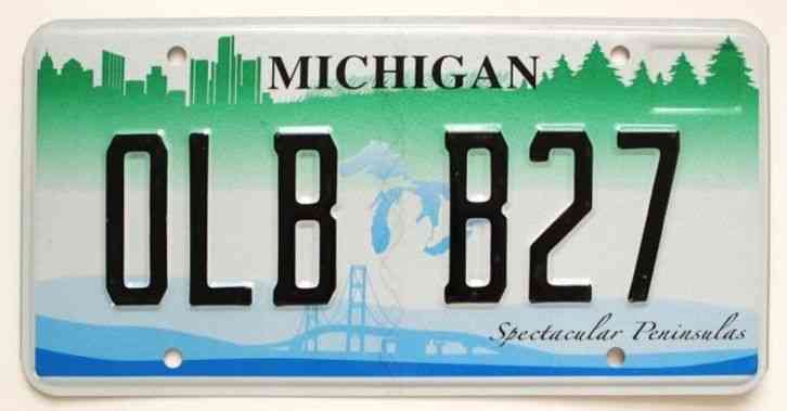
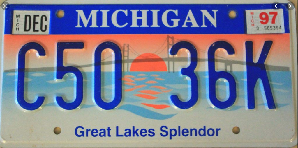
To be sure, there is an ativistic survival of maps migrated into some license plate templates, as if to curry favor among an older audience–that continue to try to reconcile the built horizon of Detroit and the bridge that spans the great lakes with the blue icon of those majestic bodies of water themselves, which, while in fact spanning several states and two nations, provide a symbolic shorthand for the state and its unity to the Upper Peninsula, as well as foregrounding or advertising its spectacular peninsulas–

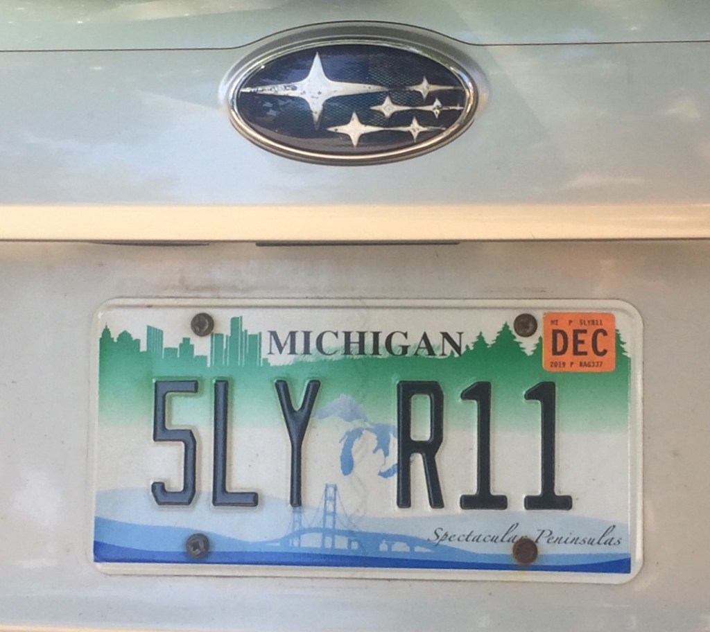
–as the sun setting over Lake Michigan, in the prospect of “Great Lakes Splendor” shows a sunset through the iconic span of the bridge, foregrounds the landscape’s unity by cool blues lake waters.

The issue may be relatively pronounced. For unlike other states, save Hawaii, and no other non-cosstal states actually bridge bodies of water in their sovereign space. Indeed, if maps provide the most familiar and powerful ways of uniting space in a coherent fashion, the problem of coherence in the “other border state” are profound.

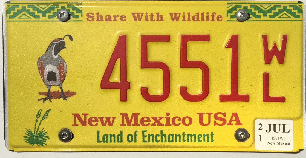
There is a cure pleasure, indeed, in attempts to restore a sense of native habitat, all too rare in the license plates I have studied, by foregrounding the natives quail of New Mexico–an added treat when this motorist discovered it was a feature that was an option at his DMV, and a way, perhaps, to compensate for deep guilt at the change of global atmosphere that the release of carbon and greenhouse gases the driving of the car–even if it is electric–releases while on the road.

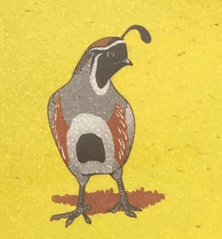
–if the inclusion of an actual non-automobile driving person to watch out for on the road seems to be one of the more important injections that would lead the license plates to be seen as a valuable injunction drivers should not lose sight–in this case, quite brilliantly fit within the Rocky Mountains of the Rocky Mountain state.

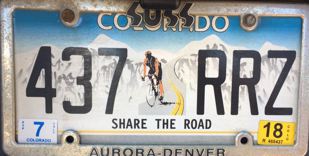
A strikingly similar generic skyline was adopted not only for Colorado, the Rocky Mountain State, but in grisaille tones, by the state of Montana, less sporting, perhaps but with a broad deep-ground perspective that situated the state on the edge of the mountains, using the greytone minimalism to suggest a broadly atmospheric setting, if with markedly less snow.

Leave a comment

Filed under classificatory schema, iconography, license plates, mapping United States, states rights

Oakland Represented Variously: What We See When We Map Oakland’s Inhabitants

The range of ‘open’ online data that is available for a city such as San Francisco showcases the city’s clear definition of a public space.  Although there are plenty of spaces of local meaning and importance in Oakland, from the site of Occupy near the mayor’s office to nearby Chinatown and Lake Merritt, or from Fruitvale Station to west Oakland urban farms and on to Alameda, the fragmented nature of public space is difficult to map coherently.

When it comes to public space, the East Bay and Oakland–despite a rich variety of parks, an estuary, and increasing vitality of Jack London Square–is a polycentric sprawl, its former downtown interrupted by freeways, and open boulevards dotted with closed commercial centers, beauty supply zones, or dense interchanges.  This is in part due to how little the diverse areas and neighborhoods of the city know themselves.  How to map the inhabitants of Oakland, CA, given the considerable diversity across neighborhoods?  Does it exist as a unified social space, or what image of the city emerges?  By looking at some of the census maps of the city, and mining the range of information compiled in them by displaying their data in mapped form, we can process and digest the complexly variegated nature to view its population’s profile.  (Indeed, the problems of politically representing the complex composition of a somewhat divided city were revealed in the most recent mayoral election of 2014.)

The sprawling city challenges the abilities of the social cartographer as much as the post-modern space of Los Angeles, even in this real-estate view.  Maps of any scale organize social space by relevance, preparing a selective record of its inhabitation and revealing networks for ready consultation.  Maps of any scale create a simulacrum or construct of social reality, as much as simply orient their readers:  the city’s salient features highlighted and network of organization explained, omitting other spaces and residents. We might start by acknowledging how the below bird’s-eye view of Oakland from c. 1900, of unknown origin, celebrating the city’s settlement and early Bay Area Real Estate:  the engraving showcases an open urban grid as an area becoming future realtors to its shores:  if mostly green and largely uninhabited, presents a prospective view of the city-port as a commercial center, showcasing notable houses of prosperous residents that distinguished Oakland’s built environment, and beckoning viewers to its estuary and the man-made shores of its new Lake as if to shift our attention from the city of San Francisco.

Oakland 1900

Elevated or “bird’s eye” views praising urban identity and architecture such as this anonymous print had a long tradition.  Such imagined constructions that gained currency as encomiastic forms, often complemented by poetic paens to their social harmony.  If the artist who engraved and designed the elevated map is not known, the presentation of the city’s growing physical plant and street structure echoed the architectural elegance of earlier urban views, as the visual encomia to the elegance of architectonic form of Venice in the virtuosic perspective designed by Jacopo de’ Barbari circa 1500 of his own creation.  De’ Barbari exploited skills of perspective to craft a graphic and pictorial encomia to his native city’s architecture and burgeoning wealth to trumpet its social distinction; an earlier elevated view of Florence, sold by the cartographer and engraver Francesco Rosselli similarly celebrated and displayed the architecture of his native city.  De Barbari famously employed to evoke the harmonious order of his city, also lying in close proximity to surrounding wetlands, by displaying its distinctive harmony–vaunting its delicate socio-political balance figuratively by deploying his mastery of creating a previously unimaginable perspective to considerable effect, showing the density of its architecture in the watery surroundings.

Jacopo_de'_Barbari_-_Plan_of_Venice_-_WGA01270

Even if much of present Oakland seems a bit of a blank slate, whose territory expands from its port and the man-made lake built to beautify its urban estuary, the print of c. 1900 divides plots and settled acreage, as the surrounding images of buildings that testify.  This is not only a pictorial space, but an attempt–as the Rosselli and de’ Barbari maps–to show the social space as harmoniously mapped to a pictorial space of representation, and distinguish the city as a microcosm of the world.  Both maps offer  sophisticated visual glosses on the ancient notion of a “chorography” or qualitative view of a community, elegantly overlaying and equating their imaginary perspectival space with he social spaces of each city.

Can we create a modern chorography of Oakland that both displays and comprehends its dynamic heterogeneity, or would the city split into social divides?  Google Maps clearly fails to do so, but what would a comparable mapping of Oakland’s populations look like, perhaps mapped from the ground up–in the manner that Jacopo labored to achieve?

OAK Topographical

There was clear redlining of much of the East Bay’s residential areas in real estate maps for the East Bay cities dating from the Depression, in which Home Owners Loan Corporation rated neighborhoods for the refinancing of mortgages  that amounts to a reflection of the value of property in the East Bay, and reveal an odd mosaic of the city that privileged some regions, but also include a clear redlining of those regions by the Bay and the main arteries of transportation that continue to define Oakland’s port.  The red-lining of the city’s residential areas in the New Deal structured the city’s social geography in  imaginary construction ofways that reflect the continued exclusion of African Americans and blacks from the market of legitimate home mortgage in much of America through the 1960s, described so compellingly by Ta- Nehisi Coates, and in Oakland not only reflect the deep divides in residential ownership but created social disparities but record scars that make the city’s future harmony particularly difficult to re-imagine.  The zones of imbalanced opportunities for home ownership that long existed in the city created perpetuated deep social divides among its residents, often left without the chances of refinancing that were available to many other residents from the 1930s in the United States, as its port and low-lying areas became victims to a classic image of “blight” with roots in its deep abandonment by the public good in ways not yet overcome.

OaklandBerkeleyHOLCmap

From the first settling after the San Francisco earthquake of the Oakland hills, the demographic divides Oakland’s settlement seem to have been reflected in the value of residential ownership in its neighborhoods in ways revealed in the fractures lines of the map of the Home Owners’ Loan Corporation, and which have continued to divide its neighborhoods even after a period of urban growth.  The absence of clear neighborhoods or community organizations around the major traffic arteries that Oakland has long been defined by at its port and older shipping canals created something like a social divide not only in this early HOLC map, but that has been perpetuated within the socioeconomic divisions that were so starkly reflected in the “red-lining” of urban real estate.

Redlining By the Shore

Even if Oakland has been billed a “livable city,” the “split personality” is revealed in the divides starkly illuminated by a map of social lifestyles generated by an ESRI tapestry charting dominant lifestyles–purple noting High Society; blue “upscale avenues;” teal “Metropolis;” light bright blue “metro trendsetters;” green “seniors;” and tan and brown “inner city,” “highrise,” or “up and coming.”

The map shows the city’s split personality:

esri dominant lifestyle est bay

In a year that boasted crowd-sourced mapping of the San Francisco Bay, organizing the demographic divides that continue to shape Oakland deserves our sustained attention–and the varieties of viewing the divisions and distributions in the settlement of Oakland’s space.  Unlike San Francisco, dominated by some 359 skyscrapers in its downtown and other regions, Oakland is far more geographically disperse and diffuse, with only a small number of buildings over fifty meters all clustered by Lake Merritt–including those noted in blue, under consideration or construction.
Skyscrapers in Oakland-  50 meters

The recent ambitious and brave investment intended to equalize these clear socioeconomic divisions and to prevent them from being perpetuated by public services from schooling to economic opportunity is a step in the right direction and, based on a back-of-the-envelop calculation, seems to have its priorities and direction of resources fairly straight in how it has decided to invest in Oakland’s neighborhoods’ futures.

OaklandOpportunityImpactOverview-1024x663Distribution of San Francisco Foundation’s Investment in Oakland

But how to frame and orient the viewer of a map of the city’s demographic divisions is fraught, given the difficulty of uniting Oakland as a whole, or even in abstracting an analogously unified image that connects its disparate inhabitants.  The network that bounds the city was advanced rather optimistically in a map that elegantly promoted the lost or abandoned system of Key Cars whose web linked downtown Oakland to the Temescal and Alameda–the infrastructure for the local economy that it did up until its complete dismantling by 1959.

Map of Oakland and Vicinity- Key Car System

The serviced networks that any map foregrounds, even one of transit routes, engage their readers by networks of inter-relationships.   The above map affirms a network of transportation for their rider, suggesting the ways that the infrastructure by which the Key-Car systems united downtown Oakland and the vicinity–much in the manner current BART maps promise to link everywhere in the East Bay in a radius to Point Richmond, Brentwood, and San Jose.  The current BART network may link the Bay Area, indeed, as Oakland seems to be forsaken as being the economic it was by transit authorities and Bay Area residents.

But Oakland is also a city whose social space was long both divided and eviscerated, as the network of streetcar transit was dismantled, the railroad stations that centered the town from the 1880s declined or closed, preparing for the razing of the West Oakland residences of many porters for the MacArthur maze, long before the collapse of the I-880 Cypress Freeway in the 1989 Loma Prieta earthquake–and the subsequent massive shifts in home-ownership as a large number of houses went underwater after 2007 led to a wave of foreclosures that was almost distributed across the city, and which redefined its social space once again.

FORE_MAP

The divides and diversity in Oakland make the mapping of the city of particular interest as tools to understand its social reality.  In a society where we are regularly mapped and surrounded by maps, the critical of reading maps is recognized as an important tool to negotiate and mediate lived social space.  What sorts of divides and continuities emerge in a city like Oakland, historically defined by considerable racial diversity and income disparity?  How to map so many variations in one place?

When Denis Wood and John Fels described the map as an ideological construction of space or territory, they took time to examine the surrounding ‘paratext’ to maps as keys or markers that revealed the ideological construction of the space within the “nature” of the map, created by interpretive legends and iconography, as well as the semiotic conventions of the map itself:  yet interactive urban maps provide much more of a creative cartographical conventions and treat the map as something like an open text.

In their critical examination of the authority inherent in the medium of the map, The Nature of Maps, Wood and Fels argue that the relation between a map and territory exists through how cartography–as much as cartographers–“constructs the natural world” in relation to other sign systems, construing the relation of a ‘map’ to ‘territory’ by how maps inescapably make their subject ideological.  Taking as their case in point maps of nature, they argue the order of maps demand assent from readers through what they call the ‘postings’ and the relays that the map creates to the world it ostensibly depicts, and the new understandings of space it creates.  Wood and Fels argue “relays” in maps, tied to the texts inherent in them or positioning in books or  paratexts, which uniquely promote the construction of meaning, effectively organizing complex mental spaces to understand nature in maps, whose structure demands assent to create truth-claims about nature, and transform the space of the natural world into a structure by which nature is spatialized as known.  The Barbari and Rosselli views assert an ideology of the local, spatializing the city as it is best viewed and encomiastically celebrated as a microcosm, even though the “paratexts” by which one reads a map are left tacit for their viewers.

Yet the map does not begin from an empty space, so much as it is rooted in a space that is inhabited:  it indeed tracks multiple networks of inhabitation.

Oak 1871 Birds Eye View

Tempting as it is to argue that social space fills in the empty space of a geographic region, the maps of Oakland’s inhabitants suggest a remaking of the city’s social space–and present an image of the remaking of that space viewed from the ground up.  For rather than providing a fixed or authoritative transcription of space that promotes “a standard scientific model” that creates a “mirror of nature . . . through geometry and measurement,” as Harley wrote was endemic to the discipline of cartography, or invest authority in a single map, the variety of Google Maps templates to plot data from the US Census for the years 2005-9 create a set of multiple maps in themselves each provisional, which they invite viewers to act by ordering their content.  It is perhaps no surprise that, in an age when maps proliferate, and we are both regularly mapped and surrounded by maps, the appeal of the website is that it provides tools to select variables and determine geographic parameters about the city that we can know:  indeed, their interactive nature provide a shifting notion of a map as a graphic fixity.  Wood and Fells primarily examined the organization of space within the printed map, critically reading map’s insertion in printed texts and their relation to the semiotics of written legends.

The compilations of maps based on census data offer, at a far greater granularity than other maps, to divide space by variable criteria of income, race, or level of education to offer what might be treated as elements of a composite picture of the city’s inhabitants–from the ground up–rather than demanding assent to a given cartographical record.  In a sense, the interactive maps below start a discussion about the nature of mapped space from which one can begin to examine the city’s social space.  The interactive map creates an open text whose variables and criteria users can create.

They provide a basis to question, critique and re-evaluate question the dominance of stereotypical categories of local violence or gangs as relevant descriptors of the city, but provide a bit more complex picture of its social composition.  For the interest of these maps lie in how viewers map them as simulacra against their mental maps, rather than in their mimetic claims:  ‘simulacra’ since all maps are both filters of information that parse the relevance of social space and embody a coherent order of space, providing deeply social tools for reading.   Rather assigning integrity to the map as a unique document, we can understand its ‘social life’ through how each creates and constitutes its own social reality for readers:  the Google Maps templates offer a basis to refract socio-economic distributions in the city, rather than fetishize the authority of the given map as a form that commands assent; the familiar templates increase the improvised nature of the comparative mapping exercise.  But Matthew Block, Shan Carter, and Alan Maclean are also particularly inventive graphic artists in how they use of Google Maps–especially in comparison to how it is usually used by others.

The interactive maps created from the Census Bureau’s American Community Survey provide tools to track social realities across the nation, and filters to view specific variables in each zip-code and neighborhood.  I’m interested how maps embody Oakland as a coherent entity, and in Oakland a test-case to examine maps as embodiments of space and to illustrate spatial divides, as well as to filter different aspects of social space.  The interactive maps devised by Block, Carter, and Maclean employ Google Maps templates to invite viewers to process the coherence and divides within data from the US Census in spatial terms, using data for the years 2005-9 to create multiple maps, generated on demand, that refract or mediate statistical realities in visual formats which provide compelling ways to embody and understand social realities from the ground up. The statistical “maps” map at stunningly finer grain that reality–by “Mapping America: Every City, Every Block,” as they boast–that use tools of mapping creative interventions to analyze the Bay Area and its inhabited landscape; the mapping forms offer tools more than vehicles to demonstrate variables of race, income, education, or presence of recent immigrants, offering alternative models by which the region might both be mapped and, by extension, surrogate realities by which its composition might be known.  As much as surrogate realities, they refract pieces of that reality that we must juggle and assemble for ourselves, less attentive to the semantics of the Google Maps frame than their content. One might compare them to conventional maps based on skimpier data, to which their detail and agility provide a sort of foil–starting from the graphic charting crime-density in the Bay Area based on the police blotter.

Berkeley:Oakland Crime Density

The map is surprising for how the area immediately around the campus is a thick blotch of indelible red, bleeding into its nearby areas and along Telegraph Avenue like indelible ink.  Most of this “crime” is based on calls to the Police Dept., including a significant number of calls about problems of noise around fraternity row:  the impermeable barrier both around campus can be explained by the different policing agency that supervises the university’s campus, and the boundary of the Berkeley Hills to the East.  Crime is mapped not only indiscriminately, but distributed to reflect the contours of public complaints, as much as actual crimes.  Although the red splotches and streaks around much of Oakland and focused in its downtown seems in keeping with the difficulty of maintaining control over the dispersive city, while around UC Berkeley are dense stains of intense crimson that corresponds to the frequency of calls that the local police receive near campus.  It is interesting to contrast the map to that of San Francisco–where a huge amount of crime is clustered in the downtown, near the Embarcadero, Tenderloin, and Mission and some pockets around Van Ness–in a broad field of relatively crime-free green.

SF Crime Density

And so, if we shift mapping forms to a sort of heat-sensitive map of the violence committed and reported, the hot-spots of Oakland are more readily apparent–almost as a diffuse miasma of violence spread over neighborhoods like a viral form whose trajectory is difficult to explain or track:  heat-sensitivity is an apt cartographical metaphor of the subject charted:

eastbay_violent crime

The map of hot-spots of violent crime provides a different picture, if a tragic one, extending along the city’s major streets deep into East Oakland.  One might ask how this maps onto the city’s racial diversity. Given common predispositions, it might make sense to reflect on the city’s composition with greater granularity.  Does violence correlates to the complex ethnic or racial distribution of the city?  or to income?  or to gangs, as often suggested?  The interest of the interactive maps lies how viewers map these simulacra against their own individual mental maps, as much as in their mimetic claims:  ‘simulacra’ since all maps are both filters of information that parse the relevance of social space, providing deeply social tools for reading.   Rather assigning integrity to the map as a unique document, we can understand its ‘social life’ through how each creates and constitutes its own social reality for readers. Aside from the heat-spots in West Oakland, race is not a determining factor in a clear a way at all, although the ethnic diversity of Oakland–a historically African American city with a rapidly shrinking number of areas dominated by African American populations.  It’s in fact striking that the greatest mix of black and hispanic Oaklanders in any neighborhood occurs on the edges of Oakland:  and that the island of Piedmont is the only area that’s white.

oakland-racial-map

Census Block legend

The same data can readily be re-mapped to present a distinctly different picture of the city, emphasizing urban diversity, by using the US Census Bureau’s data from 2005-9, using the American Community Survey.  Block, Carter and Maclean exploit the Google Maps platform to embed Census data in color-coded terms, which shows small pockets of African American concentration by light blue, but relative integration with the greatest concentration of Asians near Chinatown downtown.  The below aggregates units of fifty people, rather than proportional composition, to provide finer granularity of the population and of each neighborhood in Oakland, if in a less than dynamic manner:

Race in Oakland Google Mapped

Oakland’s complex diversity might well be compared to the clearer clustering in other urban regions of the Bay Area, where whites are more concentrated in clearly bound neighborhoods, and Asians similarly concentrated in areas around Golden Gate park (Inner and Outer Sunset)–if with considerable overlap of Asian and Hispanic populations in the Mission:

Mapping Race across Bay Area

%22Greater Mission%22

Far more sharply defined geographies of racial separation define New York City, where property values create the starkly demarcated racial composition of  Manhattan, and concentrations of blacks in outlying peripheries in the Bronx, New Jersey, Queens, and Brooklyn, as well as part of Harlem:

NYC Racial Map from 20005-9 census

We see a different picture of Oakland if we look at outside racial self-identification, but examine economic diversity at a finer grain in its neighborhoods.

Back to the Bay Area, stark income divides define the landscape of Oakland in this map of median family incomes in the same dataset, more than race:

Oakland Household Income Mean

More specifically, the map reveals clear divides and income troughs where median incomes have sunk below $25,000, often reflecting food deserts and islands of an evil toxic brew of desperation, hungry desire, and distraction:

Below 25,000

For Oakland, the website Spotcrime employs catchy icons to track arrests (handcuffs); arson (flames); assaults (fists); burglaries (masked faces under hats); robberies (men running with money-bags); shootings (cross-hairs); thefts (purple silhouettes of men running); and vandalisms (green cans of spray paint spraying red), creating a detailed map to set off mental alarms in the name of a call to “know your neighborhood’s dangers”:

Assaults, Arrests, Arson, Burglary, Robbery, Shooting, Theft, Vandalism

Even if the violence and theft are predominantly in low-income areas, where the map dutifully foregrounds these impressive icons, doesn’t it remove a lot about what good happens in the same low-income areas?  After counting 1, 077 shooting incidents in Oakland in 2011 with 1, 594 victims of guns–the largest category among which (140) belonged to minors, and the greatest sub-group 16-year-olds (40) and 17-year-olds (38)–John Osborne used Google Maps to represent in a fairly schematic way the urban distribution of fatal shootings by neighborhood:

Shooting Map in Oakalnd 2012

The terrifying concentration of aggregates off International Boulevard, a major thoroughfare in East Oakland, past Fruitvale Avenue, the overwhelming majority of whose suspects are male.  In abstracting each as discrete, of course, the map is less successful underlying ties to both prostitution rings or drug deals, so much as a platform to make claims about gangs or organized crime.  The following map of victims of shootings reveals an even somewhat scarier density in the identical area of West Oakland:

Victims in oakland 2011

What kind of image of Oakland emerges?  It’s difficult to map it clearly.  One striking effect of the greater scale and definition of the maps based on the 2010 census is that the considerable proportion of resident immigrants in the city, which reveals a considerably high percentage–often more than half and up to 70% if not almost 80% in West Oakland, across from Alameda–of foreign-born residents, which demonstrates a considerable geographic mobility among residents that seems specific to the area:  Oakland has long been a cosmopolitan center that attracted the displaced to its margins.

Oakland Foreign Born Map

Immigration is not criminality, but suggests the margins of the city are where the displaced arrive:  displacement might be something of a thread in Oakland’s history, from the arrival of (far more wealthy) San Franciscans after the 1906 earthquake in Piedmont to the Chinese-American railroad laborers who settled downtown, the railway porters whose families created a large community in West Oakland from the 1880s, and workers for the shipyards, or rich communities of Eritreans, Africans, Native Americans (Lakota or Dakota), Hispanic, Hmong, Vietnamese, Somalians and Congolese who most live in cheaper housing and are likely to be taken advantage of in varied ways.  As of 2004, Oakland somehow ranked tenth in the US for the largest number of immigrants, according to the 2006 Census, despite a less vigorous local economy, and almost 30% of its entire population is foreign-born.   The margins of the city somehow remain greater and far larger than its center.

But Oakland remains known, despite this mobility, despite the presence of city gangs, a more deep-seated and almost endemic presence and prime descriptor of the city.  One can–and many do–blame gang-violence, or the competition for turf; but the violence is difficult to separate from prostitution and drug-related crime, not necessarily competition between gangs or gang-related activities, even though gangs do suggest a culture of violence.

Gangs in Oakland

Gangs are difficult to measure, although the intensity of turf-wars would seem to make it easy to use the map as an indicator of violence.

Yet if one looks at a broader map of “gangs,” the variables seem impossible to keep constant, even in a hand-drawn map of gangs in East LA from 1978 purporting to decode ‘insider knowledge’ about a topography of violence, but provides only the sketchiest of tools:

1978-eastlos-gang-map-oplg-300x224

The difficulty of attributing meaning to the mapping of gangs is more apparent if one notes their widespread presence, given this–perhaps unreliable–map taken off of a “National Gang Map” which reveals a dramatic concentration of gangs and gang members in the Westernmost states:

National Gang Map

Perhaps their presence itself reveals an attempt to make meaning from life or to carve it out of one’s social terrain to the greatest extent that is possible. One compelling map maps educational attainment–with the brightest yellow indicating an inability or difficulty to complete High School at 70%–with less than high school completion hovering around 40% among families.

Education--Less than high School degree

In the Bay Area at large, the failure of education in the Foothill-International area is striking, and is doubtless also some degree of failure in socialization if not of public education, and maps a continuing challenge for the city’s School Board and public schools.

70% no HS Bzy Area

And a corresponding map of college-educated Oakland reveals a bounded drop in below 20%, more roughly characterized at 5-14% with a BA, with large numbers of closely bordering districts hovering between 5-8%:  this might be one measure of the cultural insulation and isolation of the region, if not a clear barrier to what is often described as an ‘achievement gap.’

College-Educated Oakland

Those empty tan regions are a measure of the difficulty of shifting a divide between different Oaklands, because it maps a cross-generational or at least temporal divide in the given area over time.  The heterogeneity of Oakland is nonetheless striking even in its inequalities, to turn back to map racial diversity of Bay Area generated in bright colors on the NYT website of Block, Carter and McLean, since it suggests a picture of considerable promise.

Racial Composition OAK in Bay Area

But of course a map is not a picture.   It is a picture of variability, which can shift depending on one’s chosen criteria.  In the distribution of income levels in North Oakland, aggregating incomes of twelve families reveals a telling integration of an income-mix more striking and apparent than the in the above demographic models:  despite a scattering of upper-income levels across this North Oakland area from Emeryville, across San Pablo, and up to Broadway Terrace and Grand Avenue, lower income levels are present virtually throughout the region, with the exception of East of Broadway, although Broadway provides a clear dividing line of high incomes and lower ones, and the 880 corridor below MacArthur dotted with light blue markers.

my-neighborhood-income-map

The color-coded map of relative incomes provides us with some possibly meaningful correspondences to the hot-spots in crime.  But I wouldn’t advance the sort of argument that maps crime–or gun-violence–onto variations in household income.  The pictures of the city offer limited tools that suggest possible sites of research that might help to connect these dots.  But they offer useful, ground-up mappings of the city’s inhabitants.

Processing the relations among inhabitants of Oakland offers a way to renegotiate your relation to the city as a whole.  Mapping is about navigating, as well as processing, a surfeit of information, and about making the connections among it, grosso modo, that exist.  The fine grain of the census maps provides both a corrective to our preconceptions, and the start of something like a more fair–and illuminating–map of the city’s social space.

4 Comments

Filed under Oakland, Oakland CA, open data, Racial Diversity, US Census

The Recent Resurgence of Manually Made Maps

A somewhat celebratory survey of the recent rage for manually designed maps affords a veritable visual smörgåsbord of aesthetic pleasure and innovative graphical design.  It is interesting and tempting to compare them to the craftsmanship of manuscript maps, a subject discussed in an early post in this blog.  But the survey oddly makes little reference to the notion of the ‘counter-map’ that resists the omnipresence of the digitized map, and the manner we have come to be immersed in the traffic and generation of digitized maps.  To be sure, these are images suitable for framing.  But the appeal is in part a knee-jerk reaction to the satellite photo or the schematic land view.

In mediating a more fully stylized map of first-hand knowledge of urban areas clearly reacts to the increased hegemony of Google Maps–add your own business here!  map your way to work!  note your favorite coffee shop or restaurant near work!–as a plastic form of collective memory.  And, of course, a data resource on which Google can draw  in its own work.  The hand-drawn map is the map stripped of metadata and made without surveying instruments.  For the self-made map re-invests the format of mapping with a vibrancy and immediacy to enliven inhabited space once more–and indeed enliven the medium of the map that seems to slip out of our grasp as it turns up on our hand-helds, and even tracks our own habits of shopping, physical movement, data usage and cel phone use.  When we see the self-made map–and we buy them because of this–on Etsy or in the house of hipsters, we re-recognize places, and subscribe to how they define our emotional relation to space in ways that many other web-based maps make us feel more alientated.

If our memories are recorded in our maps, which note centers of interest, sites of pilgrimage, historical buildings, or public parks, the processing of how we track places worldwide in Google Maps is not somehow wrong or diminished, but has the sad effect of erasing any sense of specificity.  There is a display value of the map that is diminished from its reappearance on a tablet or smart phone, but also a dramatically reduced range of semantics or iconography:  it’s hard to imagine Charles Sanders Pierce, who enjoyed his spell of work on the conventions of map making and determination of spatial coordinates for the US Geodetic Survey, dressed in a neon shirt emblazoned with a corporate logo, using his expertise to boast of the benefits of Google Maps in tutorials.  The semantics of the Google Maps project is geared not toward innovation, but streamlined synthesis and ready access, after all.

And there is something of an erosion of display-value of the digitized map approximating Walter Benjamin’s concept of aura, since the refinement of data in digitized form approximates a concept of disembodied mechanical reproduction:  the emotional tie to the map is in a sense severed, the trace of the hand absent, the physical touching of the map’s surface gone.  These maps provide the clues and signs to reconstruct a mental map of place in one’s mind’s eye, rather than synthesizing the authoritative satellite composites whose clicks release downloaded data, but draw fewer associations from synaptic ties.  The focus of enriching the map’s metadata removes any trace of the hand.

Mapmakers like the artist Jenny Sparks set out to recuperate the specificity in place that still exists and see the map as a medium to invite the viewer to explore.  While there’s a tendency to map a uniform green, Sparks’ comprehensive imaginary but copiously detailed ichnographic stark rendering of the collective architecture of elevated skyscrapers in New York in 3D, in ways that collapse street-view into a crisp crowding of built boxes.  The map, interspersed with memories and words, includes Bob Dylan on 4th Street; Beatniks in Greenwich Village’s Washington Square; and the Farmer’s Market on Astor Place, and is interactively enriched with text.   Sparks winks at the zoom function of Google in the elevated buildings  of Manhattan, each carefully drawn, and words that unpack the cornucopia of memories that the built space of the city holds, as some sort of metonymy for its residents.


New York map by Jenni Sparks


The pop-up three dimensionality of the map plays with the flattened two-dimensional view of maps, but suggests a bird’s eye view into which viewers can peer.  A few close-up details of Sparks’ self-made map of reveal how the skilled placement of words among 3-D buildings in her imagined elevated view draws you into a space linked or bound by the colored avenues of underground subway lines, peering into its so densely cluttered detail:


Close-up of New York map by Jenni Sparks

The closer one looks, the easier to see an image of place saturated with the visual interest that Google Maps just fail to afford, as one falls into the map in order to get to know its neighborhoods, suggesting a unique zoom-in function that the clumsy navigability of Street View only approximates:

Sparks' NYC


The rise of the hand-drawn map not only is a testament to design or a rebirth of a craft, but uses precepts of design to counter the vagaries of digitization Google so actively promotes, in championing the synthetic properties of a register of businesses, places, and personal routes.  I’ve written elsewhere, earlier in the year, about Becky Cooper’s recent anthology of the recent efflorescence of maps that personalize one’s relation to place, almost a collection of tools to encode personal meanings for a broader audience.  These images recuperate the aura of the map and its materiality, its hand-made status and both the physical practices of encoding place and decoding space.

Something similar is going on in how Stephen Wiltshire draws Manhattan’s skyline from memory, lovingly attending the scale, proportions, and perspective views of each of the many skyscrapers whose sight so impressed Wiltshire on his first trip out of England that he promised to move to New York “in the future,” and claimed to have already designed his Park Avenue penthouse.  Wiltshire’s retention of and fascination with urban environments has been discussed by Oliver Sacks, and is the subject of Cities (1989) or Floating Cities (1991).  But his drawings are the intuitive opposite of a map’s abstraction of place by selectivity and spatial remove.


new_york_panorama_banner


Unlike Wiltshire’s intuitive renderings of urban space, the abstraction of space of a place underlies these hand-made maps, which sketch something like a hierarchy of relevance within their totality.  There’s a huge appeal in reclaiming the map as an intimate record of place, as well as an art of encoding meanings that encourage further examination, as this “mash-up map” based on the personal experience of Shawn Watts, and might be best described as his spatial experience of a long-distance relationship, compiling the places they had been together not only in his native Montreal, but in Athens, Washington, DC, and Philadelphia, as well as Montesquieu, France, and reflects his own deep pleasure in “hiding secrets in maps” as opposed to publishing information, and a pleasure in using the map’s form to map or be the surrogate for an interior emotional state:


Shawn Watt's Shutterbug


For Watts, the density of meaning in maps becomes a way to unravel and eloquently express one’s own state of mind in public form, and to invite the viewer to partake in the pleasure of decoding its contents.


Hope Mapped


This somewhat but only partly legible hand-made silkscreen map of London comes in varied colors, populating areas with figures and words to approximate a paper cut-out hanging as much as a map:


553390_479276322084293_1624826968_n

If these maps treat the map as an artwork, the trace of the hand on the map is even more present in the medium of linotype map, recalling Renaissance single-point engravings or woodblocks.  The linotype word-map Marc Webber designed of Amsterdam, a historical center or clearing-house for engraved maps, places front and center the words often absent from Google Earth or many digitized maps to use them to fashion a sculpted cityscape, whose linotype words offer something of an alternate surface to see the city in one’s mind’s eye:


Mark-Webber-Amsterdam-Map-120-x-100cm-Linocu-Print-on-Paper-e1331468741268


In Webber’s ‘map’ of Amsterdam, the written landscape becomes a site to explore and its very surface a sight to ponder; the texture of its woodblock words gains new textural richness as it is seen from different angles, from which the materiality of place-names on its linoleum-like surface increases in impact:


Amst Linotype-Looking at Map's Surface


Moving in to examine details more closely, the map assumes status as a surrogate for the world, as if the one-to-one map of which Borges dreamed or described is suddenly translated to words that substitute for things, as well as to the notion of a word-map:


centraal_station_wider


The Central Station assumes a newfound concrete prominence that transcends its place-name, without the curled Stedelijk Museum beside it, from a distorted view of this mapped space:
centraal_station_close


Somwhat more derivative or second-generation forms of manual mapping already exist on the market, as the sort of silkscreen word-maps popular in New York that maps the city’s neighborhoods, many of which are as much destinations as the city itself–and might provide a tourist map of realty.  If it is meant to evoke neighborhoods, it oddly recalls  real estate, even as its cartographical transcendence of space seeks to create something like a cascade of memories whose every words might serve as triggers, rooted within lived experience.


Manhattan word map


If the map seems a bit of a bare-bones realty map to the uninitiated in New York life, it is far less elegant and inviting than pictorial perspective views realtors employed of San Francisco to enjoin viewers to become settlers.


Vene! Vidi!  Vicet!


There’s far more detail in a linotype word-map of New York City.  The silkscreened map plays with the legibility with which maps use words to arrange space by surrounding Manhattan island with big, looming, isolated blocked fonts–inserting recognizable neighborhoods and cultural monuments in an what seems a more improvised mish-mosh of fonts from a printer’s tray, rather than from a pull-down menu, arranging the text to replicate what might better correspond to the place of regions within our mental geography, all the while emphasizing the extremeley crowded nature of inhabited space in New York boroughs:


New_york1


Sensitive as always to the particularity of place, Marc Webber’s quirkily detailed ‘word-map’ of Paris is more elegantly artisanal in how it fills the surface of the map, exploiting a range of fonts to arrange historical layers and tiers of class and style from the staid if impressive Opera to the lounging letters of Montparnasse, moving rangily down large streets.

Paris map by Mark Webber

The written city is more demanding of a mastery of fonts, to be sure, since it also depends on the arts of assemblage; the word maps sold in the Bay Area provide a nice counterpart since its patchwork of its complicated topography is so impressively dense, and the only area of uniformity seem the Presidio or the landfill regions of Bayview:

SF Word Map GREEN

An alternative to this sort of mapping, illuminating the micro level of street-names, graces the design of one of Upper Playground’s t-shirts, suggesting the relative size of individual streets by their prominence in a list of names, that lends currency to the idea of the wearable “map”:

Upper Playground Tees SF name map

The diversity and unity of nearby Oakland is aptly captured in this patchwork roughly-hewn word map by Oakland native Ozan Berke of its 146 neighborhoods:  the jumbled density is almost rendered illegible by crowding, but with such dexterity that the artist/mapmaker uses to capture its diversity.  The density of some neighborhoods balance the urban intensity of some areas with the far more light settlement of the hills (Montclair, Sequoia; Claremont Hills; Skyline; Joaquin Miller):

Oakland Word Map

dD_Oakland_26x18-PR_2


Writing the unity of the city in a sequence of place-names reconstitute the whole in a new form, as if by magical transmutation or an alchemy of type: this artist adroitly resolves the absence of the seceded largely ‘white’ village Piedmont from the city with the contribution that this town-within-a-city continues to make, writing its “name” as a neighborhood in mirror-writing, the “OMD” among the largest and most eye-catching in the map.

The declarative blending of words with place resonate with the politics of remapping popularized in the urgent signs displayed in the recent Occupy Movement outside Oakland’s downtown City Hall in Frank Ogawa Plaza to the iconography of the protest movement–mapping the helicopters that whirled overhead, but minimalizing their police surveillance to the upper corner of the map, and giving prominence to the placards that protesters held in front of City Hall–the scene at which these maps were sold:


Hella Occupy System Sucks

It is fitting to contrast the map to the elegance of San Francisco should be captured in the distinct media of a paper-cutting map, adapting the Chinese art of  Jianzhi (剪纸):

Paper Cut Out SF

The remove that all place cartographical practice from digital media or design is central, I would argue:  the artist reclaims their own synthesis of a unified whole as the subject of the map.  All evoke the late Saul Steinberg’s over-reproduced map of New York, famous as a poster and originally a New Yorker cover, used to suggest the limited global perspectives of its residents or the centrality of the city in a mental map of the world.  That map has its response in the recent satire of Mad magazine’s “Slimeball” mismapping mediated by and poking fun at the recent failures of Apple Maps.  The revision of the classic Steinberg view of the New Yorker’s View of the World  plays with the spate of failures that app by calling attention to the radical disconnect between even a familair place and digitally mediated map, as if to suggest the depths at which we’ve been had!


MAD-Magazine-NewYorker-View2-2012


The growth of such a range of hand-drawn maps seems to me a reclaiming of place–as well as of mapping skills–that has come to gain a special niche of its own in the craft economy.  We are discontent with the proliferation of maps from which we are increasingly alienated–and which abstract information in ways confined to, say, only three viewing preferences.

There is still a possibility of changing less the digitized reconstruction of space than the notion of what Google defines as information, of course:   and perhaps the range of hand-drawn maps suggests some ways that this might be done.  The above view of New York, or rather its prototype, makes me wonder about maps that reprioritize the structure of information imposed on the templates of Google Maps:  a map, say, that would not note the Russian Tea Room or Trump Center and Empire State, but create historical layers of Automats, bodegas, Chock Full o’ Nuts, and 5-and-10 stores or the shifting confines of invisible ethnic neighborhoods in the city, and the impact of waves of migration.  This falls back on a map of memories.  And then, after all, it probably wouldn’t be hand drawn any more.

2 Comments

Filed under Aura, Charles Sanders Pierce, digitized maps, hand-drawn maps, Jenny Sparks, Jianzhi, linotype map, Marc Webber, Oliver Sacks, Saul Steinberg, Shawn Watts, Stephen Wiltshire, Street View, Walter Benjamin

The Will to Map: GPS and its Discontents

Navigating the necklace of highways that hug the Santa Cruz Mountains beyond San Jose with a GPS map affixed to the windshield, you become both disoriented from the panorama before your eyes and quickly aware of the token roadmap GPS offers.  What is the map on the screen doing in the car and when do we need to look at its content?    The question emerges since it’s not clearly a partner to the voice-directions; the interface between isn’t evident or apparent:  the overlay of data on the terrain graphic of a Google Maps backdrop seems interactive, but shows a route, and not a guide or a means to explore paths of other possible travels.  There’s a need to offer a map in our map-saturated culture–but the map is no longer a clear way to translate familiarity with space to their readers, so much as an added document.

The difficulty of internalizing directions from the onscreen map derives from its limited use to orienting oneself, and is unlike the roadmaps that readers internalize over time.  It is not only ready-made and disposable, but seems to exist to satisfy customer expectations for a visual record more than offer users an actual guide.  It has limited relation to the injunctive directions declaimed by a Siri-like voice, and seems a source of ornament despite an absence of actual visual interest, as if it was designed to meet nostalgia for the visual records of automotive navigation on highways and interstates or for a time when we needed maps.  Some drivers might object to directions from a disembodied voice, instead of someone informed about the topography or terrain.

Without those over-creased highway maps in our glove compartment, one grapples with the minimalist Google Maps graphics before surrendering passively to the intoned directions, still frustrated that we can’t  transpose directions from the map, and conscious of being cognitively challenged, but perhaps pleased to contemplate a landscape of trees overhanging on each side of the mountain roads and to follow a course traced from on high.


Boulder Creek Map Traffic


The mechanics of the synthesis of a digitized map is of course completely different compilation of meaning.  But it is most striking that the map didn’t need to be there, and wasn’t that likely to be consulted as a navigational tool and of limited use if one strayed off course the curvy roads in the Santa Cruz mountains; if so, we’d be more likely to look at a paper map anyway, for the image provided little easily-consumed information of fine grain about the mountain roads; the verbal directions were so removed from the map as if to devalue the long history and use of maps as autonomous media: rather than provide the purification of spatial experience often attributed to maps, the schematic Mapquest image distances experience so abstracted from an actual route of travel to minimize our sense of reading space.

As well as a shift in how mapped information is synthesized, digitized maps mark a shift in reading terrestrial expanse and reading one’s place in maps, diminishing the relevance of a coordinate system or apprehension of spatial inter-relations.  Whereas the Mapquest route that defined a path of travel, navigation by GPS seems a new relation between map-use and environment.


images-1

The relation to its pixellated surface is rooted in fascination with the image that adjusts on one’s screen synchronized to one’s actual bearings, rather than reading one’s course and the options that it presents.  GPS was not made for wanderers.  The screen notes a route on a formal schema abstracted local terrain, which is replaced by a generic image, its data mediated at a remove from the world as if “flattened” to two dimensions, rather than the sort of surface that invited multiple possibilities.   The map produced on demand places cartography with limited sense of permanence; the personalized nature of the map it creates, as in a service economy, offers an image of terrestrial location that dazzles, but is only commensurate with a specific viewer’s specific needs, and as it is part of a system that provides on-demand maps that can be immediately generated for any global region.

Santa Cruz Mountains

The place of reading a GPS map in a car or a mobile phone is independent from the expectations for both providing and decoding the map.  How maps are read over time offers perspective on how maps address their readers by embodying a relation to space through their synthesis of spatial information.

Such an emphasis is distinct from, say, one on the mathematics by which cartographical projections synthesize data on a uniform graticule or techniques of transferring the curved surface of the world:  one can appreciate these precepts only in a very vague sort of way, similar to ignorance of how GPS generates a map, to read its organization.  As the video by which Google promotes Trekker as a natural extension of a user’s relation to their environment during a walk in the woods.  The mechanics by which the cameras stuffed into a bulky backpack remain both mystified and  outside of the average viewer’s appreciation or ken, but the user is amazed at how the digitized synthesis takes us through a mind-bogglingly detailed record of space.

One is awed by the alternative surrogate awesomeness that the map provides of the Grand Canyon.  The data such maps compile for readers implies a very different sort of map-reading from te far smaller-scale trail maps of a similar region which offers clues to travel on foot, rather than car, whose color-coded signs of elevation, trail lines, and symbols of orientation offer a semantic register to decode.

berryvreekfallsmap

The legibility of the above map engages different cognitive skills to decipher our position than the plastic formats of mapping in GPS, which derives from a  dramatically different context of the corporate investment in map making, less dependent on attracting viewers than provide comprehensive access.

Google Earth’s data collection and synthesis is unlike that of the National Geodetic Survey’s mandate to maintain “a consistent coordinate system that defines latitude, longitude, height, scale, gravity, and orientation throughout the United States” for the public, by which “everyone accurately knows where they are and where other things are anytime, anyplace.”  Criteria for mapping are now market-driven and based on providing information for consumers in an explosion of available maps.  Google acquired the digital mapping company Keyhole back in 2004, allegedly when Sergey Brin claims to have been so wowed by digitized maps of bombing Iraq he saw on television.  The digitized satellite maps that Keyhole provided afforded a new way of defining one’s relation to an over-mapped world:  Google’s vice-president, Jonathan Rosenberg, celebrated how the military-grade map-provider used by the Department of Defence was repositioned as it became “a valuable addition to Google’s efforts to organize the world’s information and make it universally accessible and useful,” allowing users to “fly like a superhero from your computer at home to a street corner somewhere in the world–or . . . map a road trip” by tapping information collected via satellite and airplanes through easy-to-use software.  The rhetoric was fulsome as the acquisition was completed: “The sun is shining brightly in Mountain View,” read the press release, describing Keyhole employees as “all smiles” and Google employees as “all open arms,” as the same software used by the US government to track the arrival of smart bombs to Iraq via a multi-terabyte database (and begun by a venture capital firm backed by the CIA) was re-deployed to dramatically expand the wide, wide world of GPS.

Driving through the region near Mountain View, one couldn’t help think of how the removed view on the GPS screen was a diminished share of the mapping tools Google had purchased.  It’s striking that even in 2004, Google felt the need to calm anxieties about the potentially intrusive nature of such satellite technology that would cover the United States, but was energized by the belief it could unseat Time-Warner’s Mapquest–as it has– in providing its users with a far more robust mapping technology to orient themselves.  “It’s not like you are going to be able to read a license plate on a car or see what an individual was doing when a particular image was taken” in ways that would violate their privacy,” Keyhole’s General Manager, John Hanke reassured the public.  The photographs, after all, were from a database generally six to twelve months old, rather than being real time.  But recent indications about intrusive surveillance suggests that such a project might not have been far from the CIA’s mind in funding the project, which Google rolled out as an innovation in both convenience and reach to craft high-tech maps for viewers from satellite views by its powerful search engine.

GPS  situated its customers into a culture already bombarded by images by granting vicarious participation in a Brave New World of digitized maps.  What is striking in the maps is the near-absence not only of textual but semantic content, which are dramatically reduced in its imagery to increase its ready legibility.  The ways maps were understood in specific sites of reading, argues the medievalist Patrick Gauthier Dalché, who examined the questions that readers from Italian humanists, monks, or the readers of marine charts had for maps, and called attention to the ways of reading maps as much as their semantic construction.

Considering the combinations and forms reading practices a printed map engaged opens interesting possibilities to understand relations of text and image in early printed maps whose readership is not known; it documents the cultural translation of mapped information from manuscript to print, and raises questions for the materials of reading we wax nostalgic when using GPS systems.  It is common to compare the shift in mapping space that digital  interfaces allow to the shift from manuscript and print in the European Renaissance, both as an increased legibility of space that maps diffused and the greater circulation of  maps as reproducible engravings.  We might take time to reconsider the different semantic varieties of map-reading print encouraged,  examining how early printed maps ask viewers to engage a representation of expanse to understand them as forms of spatial literacy.


Ptolemaeus Teutsch


Few land-masses are evident to modern viewers of this printed map of apparently spherical form, an early German translation of Ptolemaic precepts that transposes the form and outlines of a manuscript projection. Most likely adapting the semantic forms originating from a Ptolemaic codex its printer or engraver transposed the map onto the gridded surface of a globe to create the illusion of a mathematically derived spherical projection.  Although the spherical projection is but an illusion, the transposition of a Ptolemaic projection to a spherical grid provided a new way to read its place-names:  a few place-names on the surface of this printed map–“Europa,” “Asia,” “Ethiopia,” and a “Mare Indicum.”  Although the map echoed the tripartite organization of mappaemundi, numbers keyed locations to written descriptions unlike the ancient places listed in manuscripts of Ptolemy’s geographic manual:  the names were not only abstractions, but numbers provided tools to gloss a sophisticated primer of geographic knowledge, using Euclidean precepts to render global expanse on a uniform plane.  Readers would have seen the map and its accompanying German text–the map appeared as the fold-out endpaper of a book titled Ptolemaeus Teutsch–as mediating the ancient classical treatise of world-geography to a broader audience than a tradition of learned geography.

The map abstracted expanse as if to address readers familiar with single-line engraving by compacting of terrestrial relations–although it does not seem to have been as successful as a commodity as its printer hoped.  The limited success of the booklet may reflect the extent to which it dramatically and rather drastically condenses geographic data to symbolize measured expanse in a spherical format that imitated how globes prepared a surface for readers to  actively gloss, interpret, and reflect on its symbolization of expanse, and a dynamic tool to render and encode the distribution of worldly expanse.

Europa


The reduced size of the engraving encouraged its engraver to use numbers instead of bulky toponyms, in order to create an easily consultable spatial template for placing the known regions on a ruled plane surface which comprehended–and mimicked–the terrestrial globe.


Globe of Ptol Teutsche


If the GPS system made me think of the manner information was processed and distilled on the screen in a passive form of readership, the positioning of place on the globe suggested a combination of tools of single-line engraving and a facility to abstract a geometric record of spatial relations, often tied to a unique exchange between humanist and artists in Nuremberg’s visual culture that printers eagerly exploited to expand the book market.

The map recalls its rough contemporary, Martin Behaim’s Globe, celebrated for concretizing a “mental image” of a new relation to space and place in Nuremberg around 1490. Although it omits America,  the globe’s surface assembled an image of oceanic expanse that confirmed Behaim as master of crafting a modern relation to a  legible space from nautical charts circa 1492.


Behaim Vorstellung


This modern recreation of the Behaim globe’s underlying map suggests how the engraved spherical map reflects the status of globes as material records of regional relations, representing terrestrial curvature as much as to measure spatial relationships with precision or provide a guide for travel, and indeed to arrange the disposition of place on a globe.

The engraving reproduced skills of reading the commodity Behaim presented Maximilian I in 1492; it indicated appreciation of the material construction of the globe in imitating the epistemic claims and encyclopedic intent by combining visual and written on its surface, if in far compacted form.


Behaim's Globe


Behaim had earlier sailed with Portuguese vessels for several years, where he gained access to supposedly secret charts, and fashioned the globe from them, working with the painter, woodblock cutter, and printer Georg Glockendon to assimilate an abundant and expressive tradition of written geography even as they embodying expanse in a new form of material media. Earlier  publishers of colored maps for translations of Ptolemy’s ancient Geography unsuccessfully attempted to reach broad audiences; Behaim’s erdapfel provided a  materially impressive way to depict a comprehensive record of the inhabited world; if it exaggerated the world’s oceanic expanse, it  profited from empty oceans to inscribe written accounts of travelers from Marco Polo to Mandeville, in ways readily readable at a reader’s eye-level.

Behaim-Globus


The self-standing globe attempted to replace written geographic media it amply cited in as a materialization of global expanse, as much as completing empty spaces on the map’s surface:  it suggested empty spaces as a way to pique interest among its readers.  Unlike scholarly editions of Ptolemy, the material condensation of Behaim’s erdapfel was a powerful painted media, juxtaposing huge continents with islands that spill across its surface, making less reference to meridians or parallels than texts to orient its audience and invite them to pour over its content.

Globe's Written Surface


The globe echoes imperial regalia.  Designed for the Holy Roman Emperor Maximilian I, the modernity of the globe is thematized in a 1939 film about Behaim as a man of action, “Das unsterblich Herz,” portraying Behaim as a  precursor to Columbus, and a Germanic figure of modernity (rather than, say, Luther), whose will to map the world and African coast modernized the imperial heritage of Holy Roman Emperors:  no doubt his globe was imagined as something like a precursor to the Third Reich.  The cinematic retelling of how Behaim fashioned a globe of comprehensive coverage for Kaiser Maximilian I glorified the mapmaker’s imperial service.

The master of kraft, roughly contemporary to Columbus, is presented as conscious of the strategic deployment of maps as tools of dominance that broke with the medieval past:  this Behaim recognized the inaccuracy of sundials or timepieces at sea, and his decisive realization of the need for portable clocks enabled him to map the shore of western Africa, filling uncharted regions of the globe on account of his dedicated perseverance.  The film celebrated Behaim as a man of action and genius, representing the globe-maker’s craftwork and the material globe as an icon of modernity.  The Nuremberger’s skilled instrument making is indeed juxtaposed in the film with two other measures or standards of modernity, clocks and ammunition, which define a modern conception of time and finality that fundamentally broke from medieval conceptions of time and space; the globe-maker seems a figure who rises above medieval conceptions of the closure of the world’s confines, if not of the confines of an imperial expanse–if he also seems a bit manic in his vision than one might suppose of the historical Behaim.


Behaim--Unsterblich herz


The historical Behaim is far more complex, and so is his modernity.  Although the film lionizes a globe-maker who epitomized a way of being-in-the-world for its audience, Behaim worked from manuscript nautical charts to make his globe, and if he fashioned the globe was a modern way of interfacing with space by embodying it in concrete form, the globe provided a medium for reading space informed by multiple sources that its surface effectively synthesized.

Modern reconstructions of the globe and close-up photographs demonstrate how the globe creates a legible surface, a site of reading where place and space not primarily mediated  by meridians or parallels, as much as a grandiose modern conceptions.  Islands as those here around Taprobana suggest less of a unified than fragmentary regions for their reader to imagine, haphazardly situated on  the surface of the far-off the unknown shore of Asia, and as incomplete as closed.  Panels of text seem to anticipate the reading of a new notion of expanse, but treat the globe’s surface more as a composed text than a pictorial cartographical record.


Globe's Written Surface


The organization of meaning on the globe was no doubt in many ways understood as a site of writing, as well as a surface on which to trace extensive rivers, discovery lakes, or find move from the landscape to surrounding written texts.  Conceptually familiar sites like the rubicund Red Sea  provided reminders as much as depicting actual oceanic conditions–as is evident in this lovingly crafted modern facsimile of the globe in Alberta (Canada)–as much as a uniformly distributed graticule; the globe reveals the epistemic difficulty of synthesizing nautical and terrestrial maps even as it provides a surface for reading both in relation to one another.


Globe of Behaim- Africa

Interrogating the map as a scene of reading afford a lens to read the map than evaluating it as a purely formal geometric projection of expanse, but as a material interface.  Behaim’s stationary globe and the printed spherical projection both vaunted the map as a form of reading that its printers believed would reach a large audience.

The German translation seems less profitable as a printing enterprise, and survives in but two editions–only one of which includes the map, now stored in the New York Public Library which was discovered and squirreled out of wartime Europe by the book collector Erwin Rosenthal.  But it suggests a new consciousness of the map as a form of reading space, one that might be reproduced in the form of a German-language primer for a large audience of readers.  The preservation of a measurement of terrestrial relations is often argued to have redefined the map as an autonomous register.  But the sense of the globe as a legible space is even more apparent.  It’s not a coincidence that some of the first globes were donated to libraries, synthesizing written information that parallel the growth of early modern libraries; early globe-makers donated terrestrial and celestial globes to the Vatican libraries–still private, but a world-famous repository of manuscripts and codices.  If print was an early information overload in demand of new expertise to process, the globe was both an abundantly copious container of meaning and a particularly modern means for ordering terrestrial expanse.

Questions of legibility provided the engine for the reproduction of early modern maps.  Even as lines of parallels and meridians were foregrounded in this map by Peter Appian, amplified by Vespucci’s maps and those to include the Americas, reading a globe-like surface was more important for consumers than being able to trace terrestrial locations, although it clearly vaunted the indexicality of place as a basis to better organize place-names or textual content–which now seems subordinate to the disposition of a mapped expanse within a frame in this image based on Martin Waldseemüller’s 1506 wall map, which first named “America,” vaunting a new ability by which a framed expanse could be read, over which our eyes could skim in super-human ways, much as maps offer the neat trick of both embodying  space and allowing us to escape our own embodiment.


Iuxta Ptolemei Cosmographi Traditionem

It’s difficult to recast maps as other than sites of intensive reading. The digitized screen of GPS seems strangely disembodied because it lacks similar tools of decoding. For rather than a dynamic semantic surface, GPS provides limited visual navigational tools that interface with the viewer, even seeming to diminish its readers cognitive skills by replacing a legible register of space.  That is why the map is hard to replace as a material object or legible register.

Leave a comment

Filed under Google Maps, GPS, GPS maps, Keyhole, Mapquest, Martin Behaim, National Geodetic Survey, Siri, Trekker, user interface

Mapping Reactions to Marriage Equity and Equality, at Home and in the World

The radical transformation over just ten years in the status of marriage equality in the United States–progressing from the first prohibition of rights to same-sex marriage and first licenses issued in the state of Massachusetts to the recognition of same-sex marriage nationwide–has “made our union a little more perfect” in 2015 no uncertain terms, as President Obama perceptively observed recognizing the recent decision of the U.S. Supreme Court.   The verdict has also brought us into line with recognition of a social order, and forcefully recognized marriage as a human right.

The ground seems to have changed beneath our feet.  In recent times, the United States was of course a relative outlier in the recognition of the sanctity and legality of same-sex marriage: both just two years ago, and indeed during the ten years when the issuance of same-sex marriage licenses first began.  Although there is continued reference to “insider” sorts of knowledge that may inform pronouncement and recognition by Justice Anthony Kennedy that “It would misunderstand these men and women to say they disrespect the idea of marriage,” and unconstitutional to deny a right permitted by the U.S. Constitution, the apparent rapid change in state policies of recognizing marriage equity-and sanctioning same-sex marriage licenses–did not only have its origins in the retrograde retrenchment of the “Defense of Marriage Act”–a piece of legal attempt to prevent the acceptance of same-sex marriage enacted in Utah twenty years ago back in 1995, which has however been subsequently overturned.

1.  A broader global map contrasting the criminalization of same-sex marriage against its sanctioning reveals that rather than about red- and blue- states, or even political affiliation, debates on marriage equity are actually about human rights and dignity–in the face of which state statutes restricting marriage were disputes about legal definitions of matrimony–and demanded that an accumulation of scores of local legal precedents struck them down.  For dismissing “traditional marriage laws” as both legally retrograde–see below–and of painful personal consequences, and the acknowledgment of civil and natural rights.

Mapping the Legality of Marriage to Death PenaltyMax Fisher/Washington Post

The ancient geographic concept of ecumene described the world inhabited by men–excluding torrid zones that did not permit life, and based the concept that one could circumscribe the limits of its inhabitability.  One could just as easily trace the world inhabited by gay marriage today, noting, however, not actual atmospheric variations in climate or temperature as the prime indices of livability, but mapping the distribution of legally recognized same-sex unions.

Despite the current evidence of ties between maps and surveillance, the maps visualization of the legal permissibility of gay marriage suggests a deep distortion on the appearance that the world’s surface is by and large inhabitable for all–red dots indicating place where gay unions are penalized, in this visualization created by OpenStreetMap contributors in Tableaux.

matrimonio legalizado

While a global visualization of different legal standards reveals that this is by no means a local issue, it does suggest the outlier status of the United States on a question of civil rights, already resolved in the jurisprudential thought as well as social practice in much of western Europe, Canada, Argentina, and Brazil, as well as South Africa.

2.   Such world maps offer valuable context for interpreting the recent reversal DOMA faced within the United States, and Justice Kennedy’s majority opinion on the constitutionality of same-sex marriage.  For they help us better map ourselves in a global context:  we seem more than a bit retardaire in our legal codes in the Anglophone tradition, if you didn’t notice, and perhaps the least cosmopolitan of all:  the 49th parallel cuts a pretty sharp line across North America for gay unions, and a deep break between the US and much of Central America.  (Let’s bet this wasn’t on the short-list of Obama’s conversations with his African allies–at least until he reaches South Africa, a rare case of the legality of gay marriage in that continent.)

Despite a huge change over the markedly a dramatic seachange in the legal definition of past fifty years across individual states of the union, the national policy about marriage inequality in our fragile union seems to make the United States something of an outlier across much of the world’s populations–and most especially in regards to most of its traditional allies.  Before the Supreme Court confirmed the right of marriage for all, the court moved to reject the a huge quantity of local legislation enacted at the state level in striking down the DOMA and Proposition 8 in June 2013.  The court’s decision explicitly reacted to and rejected the decisive progress in LGBT legislation recently charted in 50 Years of Changewhich was recognized by winning an award for the most successful dynamic narrative map.  Its attempting to map and measure local acceptance of marriage, civil unions and domestic partnerships across a starkly divided nation, and indeed the changed tapestry of the nation, ended up describing the changed landscape of marriage equality in recent years across our national union, in ways that effectively worked to map a salient cultural and sociological change over space.  For such a map is a description of a mutation of legal opinion over space, as much as it charts a broad cultural change or a shifting consensus about public speech.

3.  A map devised by Rashauna Mead, Erin Hamilton and Vanessa Wetzel from the University of Wisconsin, Madison, and tells a dramatic parallel political narratives of both the dramatic expanding limits for marriage equity and an intensified polarization among those states denying or legislatively banning civil unions (shaded orange or dark orange) and legal recognition of domestic partnerships, civil union or same-sex marriage (light blue; dark blue; black).  The 2013 map was awarded the NACIS prize for narrative map, and provides an illuminating narrative of legislative change that was so fundamental to Kennedy’s decision.  The piecemeal progression of individual changes toward legal recognition of cohabitation and marriage equality, if a very minority movement until the 1990s, have come to divide the nation within the last five years along increasingly stark lines:

1963 civil rights

1980 civil unions

1997 gay unions

civil unions 2010

Cibil RIghts Marriage Equality 2013

Maps created by: Erin HamiltonRashauna Mead, and Vanessa Knoppke-Wetzel, from Fifty Years of Change

Of course, the divisions defined by such chromatic contrasts are now relics of a past patchwork of legal customs that was primarily defined by local statutes, but which clear pronouncement of equity had to occur to change the map to one hue.

Same Sex Marriage 2015

The increased divisions over an issue that had hardly entered the national legal debate during much of the era of expanding civil rights had at first polarize the nation, but almost inevitably receded into the past as the strength of resistance to marriage equity was struck down.  Put in perspective by this animated info graphic, Fifty Years of Change, the difficulty of crafting consensus on a polarizing issue is apparent, particularly in an era of increased recognition of states’ rights when the assertion of anything like a national standard–even as a matter of human rights–threatens to smack of federal intervention for several of the current Supremes.

Justice Kennedy’s sentiment that human dignity must be respected in a global context, one could argue, even if the United States lags far behind our NATO allies in accepting LGBT civil rights.  Kennedy’s recent forceful (and more compelling) formulation that marriage is a right of self-fulfillment that “embodies the highest ideals of love, fidelity, devotion, sacrifice, and family” is a conservative notion of marriage–but the impassioned defense of equal rights to a union that “embodies a love that may endure even past death” enshrines the notion of equal rights in a powerfully forceful manner.  It essentially emphasizes the injustice of denying the possibility of its fulfillment and their full participation in society. The construal of the right to a marital union and the inability to preserve exclusion from marriage as an institution and ensure “equal dignity in the eyes of the law” reflects less a change in attitudes, but strictest rpreservation of individual rights.

It is striking that the debate about such social and institutional acceptance have become so clearly divided in different geographic locations, even as the world is increasingly globalized.  The widely differing responses that were provoked by the question “Should [your] society accept homosexuality?” showed French and Canadians only mildly supportive of legal recognition of same-sex sacraments, and even less positive response elsewhere, including Brazil, despite strong support in Spain and Germany, and similarly lukewarm support in Japan.  The provocative nature of marriage inequality may put us just barely ahead of the median, if far behind the cutting edge of judicial recognition of individual rights.  But it would be, one senses, for Justice Kennedy, an unwarranted position to deny that right or legally exclude anyone from its obligations and duties.

gay-tolerance-map_630

It is incumbent to try to imagine a future map of areas that hold same-sex marriage an inalienable human right.

4.  The question of social attitudes toward marriage, while often mapped, are not prominent in Kennedy’s stirring opinion.

Despite the uniform blocks used in the above maps, actual maps would require greater granularity of a complex issue–and an attempt to map the variations on the ground in different states’ populations has been increasingly attempted in recent years, as a change in attitudes has seemed to become increasingly diffused both in media and in public debate to a degree unprecedented twenty years ago.  In 2012, City Lab in The Atlantic created a static detailed palimpsest of a map fascinating in its progressive shading and detail of tracing competing attitudes to marriage equality, so rich with variations that it was taken up by Democratic Underground, and particularly popular because it punctured the notion that there was a dominant tendency to reject the social acceptance of marriage of gay couples in the United States–and seems to have registered a tipping point, suggesting as it does a shift in the probability of an eventual common social consensus about same-sex marriage, rather than a deep or irreversible social divide that had long been retained–perhaps reified in a perverse way by recent national elections–as a stubborn spatial imaginary of the limited social consensus about the universality of marriage rights across the United States.

The map, extrapolating from data in create an Esri tapestry segmentation to parse gradations of social acceptance of marriage equality.  Charting differences in intensity by green and yellow, and the strength of opposition in orange and red, the map of public opinions reveals a true tapestry of social attitudes across geographical divides, showing consensus across many states, and even marking far more consensus than ambivalence:

Esri Tapestry--Gay marriage support

City Lab (2012)

There is a bit of a lack of consensus, to say the least, yet a very deep density of apparent unease at gay marriage in specific swaths. The big news of giving greater local detail to these complex negotiations of our notions of marriage suggest the traditional coastal rapprochement in a political spectrum, but a broad shift in the most densely populated areas of the nation. But strict opposition to marriage equality seems too clearly stand in the minority–even in the electoral map–in ways that suggested the possibility of moving toward a more perfect union.   Of course, the question of public opinion is distinct from the question of law, but the accumulation of legal precedents that the granting of broad acceptance of same-sex marriage as a right brought opened a broad window for relatively rapid change.

Such a map of attitudes must be placed beside the changing geography of where spouses of the same sex reside.  Although the legal equality of a right to marriage was not couched in terms of a cultural change by its framers, the spectrum of attitudes revealed in the recent analysis based on county-by-county estimates using the 2010 Census that provides the basis for the map by Gary Gates at U.C.L.A. of where same-sex spouses live.  If undeniably a function of local jurisprudence, it clearly reveals considerable concentrations of such marriages even in areas where same-sex marriage was not itself legalized as well as suggesting a steep opposition of acceptance to same-sex coupling that suggest the long-term struggle the country will face.

Where Same-Sex Couples Live

2010 Census County-level estimates mapped by Gary Gates, Williams Institute (U.C.L.A.)

For all the mosaic of attitudes revealed in the City Lab map of 2012, in other words, that less precise map must be read side by side the contrasts that future Censuses will reveal.  However, the question of individual preferences–and reported data on household status–is not a predictor of legislative change.  By 2014, the accumulation of a range of local precedents and statutes that recognized the validity of marriage as a right attainable by any two individuals of either sex had been effectively recognized throughout the country, making it difficult to deny the right as an individual decision tied to the security of a family, home, and rights to insurance, inheritance or wages:  if a bifurcation existed in local statute legislation across the country, that has some interesting correlations to the above survey of opinions, if it also reveals a deep disconnect between the official policies of many states and their residents–including parts of Michigan and North and South Dakota, and indeed much of Texas.

2014 bifurcation

5.  The rapidity of this historical change is incredible, because it has been so rapid, and, in a sense, so much of a relief for much of the country. Although there exist few clear historical pointers able to be identified for such a widespread legislative embrace of the right to marriage, even if it’s acceptance have been long seen as akin to the racial hatred that are rooted in an even more explicitly odious practices of oppression, the overcoming of oppression seems undeniably healthy in creating a more perfect union in the nation.

For the acceptance of marriage as a right has become undeniable, and the differences in acceptance–if few were able to allow it earlier–decayed in the face of an attempt to deny marriage to all.

Leave a comment

Filed under civil rights, marriage equality, same-sex marriage