
All maps stake propositions: as much as embody geographical information, they make arguments about how a landscape is inhabited. But climate change maps that model future scenarios of warming, increasing dryness, sea-level rise, or glacial melting are propositions in a strict sense, as they construct frames of reference that orient us to, in the very ways Wittgenstein described propositions, “a world as it were put together experimentally.” Shoreline change can be mapped in deep historical time, or over the past century, in interactive ways that reveal and allow us to zoom in on individual sites of sensitivity–
–but the processes of mapping such change cannot rely on contour lines drawn on a base map. For to do so is to abstract a static photograph from a global process that they only compel one to try to better visualize and comprehend. The processes of change are extremely complex patterns of causation that exceed most map-viewers competencies, despite the wide diffusion of claims and counter-claims about global warming and climate change in public discourse, which has effectively increasingly threatened to dislodge the preeminence of any position of expertise on the issue, demoting the actuality to a theory and removing many public statements on its existence from the map of coastal change, or the relation of the land to submerged territory. We are in danger of adopting an increasingly terrestrial or land-locked relation to how climate change affects shores, because we map from the boundary of the landform, as if it were fixed rather than a frontier of interchange and exchange, both above an under ground.
Far more than other maps, maps of climate change demand unique training, skills, and education to unpack in their consequences. And when the propositions staked in maps of climate change have increasingly come under attack for political implications, as if the scenarios of climate change are formed by a cabal of data scientists and climate scientists to advance independent agendas, or a poorly articulated and politicized climate research, it seems that the special skills used to interpret them and the training to view them have come under attack for not corresponding to the world.
Real fears of the danger of the delegitimization of science run increasingly high. But attacking the amazingly dense arrays of data that they synthesize seems to suggest an interest in shutting down the very visualizations that allowed us to conceive and come to terms with climate change. The open suggestion that digitized scenarios of climate maps were only designed to terrify audiences and advance interests not only undermines discussion and debate, but seems a technique to destabilize the emergence of any consensus on climate change. Although the fears of an immediate loss of climate data may be overstated for the nation, the loss of a role in preserving a continuous record of global climate data is considerable given fears of reducing space-based remote sensing. Such observation provide one of the only bases to map global climate data, ranging from aridity to water temperature to temperature change over time. The hard-line stances that Trump holds about climate sciences are expressed in terms of the costs they generate–“very expensive GLOBAL WARMING bullshit,”–but extend to denigration of climate scientists as a “glassy-eyed cult” by science advisor William Happer–who in George W Bush’s Dept. of Energy minimized the effect of man-made emissions on climate change.
Both bode poorly for the continued funding of the research agenda of NASA’s earth sciences division. And the need to preserve a more coherent maps of man-made climate change grow, choosing the strategies to do so command increased attention. The dangerous dismissal of climate sciences as yet another instance of “listening to the government lie to them about margarine and climate change” or prioritizing the political impact of their findings to draw attention to global warming and climate change seems to minimize the human impact on climate and recall the censorship of climate science reports from government agencies by governmental agencies and political appointees from a time when de facto gag orders dissuaded use of the term “global warming” over a period of eight years, a period of the harassment and intimidation of climate scientists. The term of “climate change” seemed agnostic of human agency–unlike Al Gore’s conviction that “global warming” was a global emergency. As well as actively destabilizing ties between human-caused emissions of carbon dioxide and other heat-trapping gases with global warming, Bush asked government agencies investigate “areas of uncertainty” which his successor tried to clarify through explicit research goals.

Yet the role of maps in making a public case for climate change and its consequences seem to have made the project of climate tracking and earth observation under increased attack, as the project of mapping climate is in danger of being removed once again from scientific conclusions about global temperature rise, subsurface ocean temperature rise, or glacial melting–as the ways that climate change maps embody actual environmental risks is effectively minimized.
This post is less concerned with such destabilization than to ask how we climate maps may respond to the hostility to the propositions advanced in climate change maps–and suggest the need for more compelling tools to map and visualize local consequences of climate change. For as maps of climate change make fewer demands to engage their observers, their persuasive nature is being developed in new directions that seem extremely profitable to exit the misleading charges and countercharges about maps as evidence-based. The prospect of the depletion of data of earth observation could eliminate one of the most powerful tools of persuasion–maps–of the dangers climate change and global warming pose to the increasing instability of our national shores.
Many maps as the above show oddly unchanging shorelines, as if a template of global geography will endure without widespread changes over time. A specific problem in advancing these maps may be in moving from the global–by now quite well-documented–to the local effects on specific places, all the better to concretize their meanings to best orient viewer to the possible future scenarios we might face. For the problems of articulating the internal relations within climate change maps–and the complex webs of causation that they presuppose–may have unwittingly increased the gap between the highly expert visualizations that data maps synthesize and the projections of future climate scenarios that they stake–all too often registering, without, perhaps, figuring out how to create maps that encourage viewers to explore the creation and consequence of climate change, and perhaps even the metrics of drought, warming, soil moisture, glacial melting, CO2 concentrations, and ocean-temperatures they render. Indeed, the development and currency that existing remote mapping technologies have already won to synthesize an unprecedented breadth of climate information suggest a basis for using maps to tell compelling narratives of the dangers of climate change.
The increased literacy of reading climate maps has perhaps set the stage for involving viewers in much more sophisticated–and compelling–interactive narratives on climate change. But recent denial of data provided from remote observation rests on the mistaken belief that data rich maps are not means of making judgements, so much as arguments and attacks. The suggestions of the “unfair politicization of science”–so similar in its accusatory tone to the politicization of judges–is hardly new, but seems a new sort of public shaming: it obscures how all science is politicized but the word “politics” seeks to tar federal agencies by a form of public shame by striping them of the illusion of objectivity. Both intentionally destabilize the coherence of pictures of climate change, as if to deny its occurrence or actuality. The deflation of accumulated expertise not only deeply discouraging but maddening to the very scientists who have painstakingly collected and correlated accurate earth observation data to make it available world-wide.
The radical skepticism of “climate change deniers”–the very term reduces science to the level of opinion and belief–rejects the maps that are created as records of the accelerated progress of climate change. For one of the fiercest objections to the collection of the data of global temperatures, sea-level change, coastal or polar melting is not the data alone, but the increasingly apparent judgement is that shifts in temperature, moisture, and heat-trapping greenhouse gases are caused by human activities: earth observation provides a shadow-mapping of the human impact on the global atmosphere, mapping sites of habitation to climate change. Indeed, the sort of maps of shores that they create are unlike the coastal hydrographic surveys used for nautical navigation that images of coastal change they provide are still being devised. Whereas coastal surveys were designed for record-keeping, the research-based mission of NASA earth observation has been unfairly made a target of politicization by discrediting the formal properties of climate maps as if they were intentionally misleading persuasive tools. In ways the mirror image of academic studies of cartographical design–“all maps are arguments,” as Denis Wood and others remind us–the most sophisticated studies of climate change are attacked as reflecting arguments of scientists rather than actuality.
The increasingly prominent status of climate-change maps as statements about warming trends, from Al Gore’s Inconvenient Truth to Gore’s influence on the release of the feature on Google Earth’s 3D mapping program, offering viewers to explore abilities for mitigation of climate change parallel to the United Nation’s Climate Conference (COP15), by visualizing the disastrous effects of climate change through 2100. Such compelling tools–including most recently free ArcGIS shape files to map climate change by layers showing both climate change and renewables–to grasp the enormity of dire situation we face on a global scale. But the persuasive ends of convincing viewers of the dangers of climate change and local impact of emissions are diluted in the global scale of many maps. But with more CO2 present in the atmosphere than ever before in the past 650,000 years–to judge by ice samples and the physical record–earth observation also provides the only possible way to continuously synthesize the rising temperatures consequences of a concentration of CO2 in the global atmosphere, whose modeling of drought severity offers an opportunity for diagnosing climate change and is potential consequences of reduced precipitation world-wide by 2099–of potentially great economic impact for human activities on the globe–using a Palmer Drought Severity Index (PDSI), incorporating both temperature and precipitation data to calculate water supply and demand and suggest soil moisture.
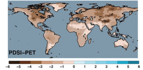 Scenario of Reduced Precipitation World-Wide in 2099, using Palmer Drought Severity Index
–to the increased impact of polar melting as a consequences of rising temperatures, as able to be visualized and embodied in the shifting shorelines created by sea-level rise.
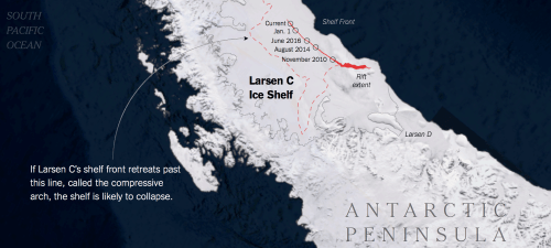
Yet to tell the clearest narratives of such potential changes, the flat nature of the map runs the risk of masking local details by the very dramatic image of an arid landscapes that it conjures. the most dramatic narratives of global warming that are captured in such maps are rendered in specific detail. Remote observation has recently revealed by the growth of an individual crack in one Antarctic ice shelf, monitored from space, at such unprecedented speed as rising seawater temperatures have prompted the shelf’s retreat, potentially altering the glacial structure of the entire Antarctic peninsula, as the dislodging of such a huge iceberg but a collapse or retreat in Antarctic ice shelves that stands to provoke the melting of glaciers that it has retained in West Antarctica that could be globally perceived, effectively destabilizing the relations between land and sea globally.
The primary difficulty of shifting perspectives to a new form of continuity–less rooted in the visual field of the map’s frame, and able to synthesize a broader relation between local and global that signified significant complexity, Yet many such global maps of climate change unfortunately depict a flatland, less suggestive of the complex dynamics of climate change, and removed from human agency: while invaluable to document warming and climate change, their risk is an inability to communicate the complexity of climate change, and to depict the different sorts of continuity that climate change maps demand. Even as the addition of graphs attempt to escape from a cartographic “flatland” that erases the dynamics of climate change, and offer a data-rich synoptic shot of the dangers of climate change, they are often oddly removed from local context in ways that render them less powerful as images. Such visualizations have been contested by a newly vocal contingent climate change deniers in recent years.
1. The proposals that are embodied in maps of climate change scenarios have of course entered political discourse with new immediacy, in an environment of political contestation akin to a blood sport, and reflect the discrepancy that while among Democrats some 85% accept human caused climate change, of Republicans only 38% do so–and the proposals in maps have become forms of stirring up the political base. And the current concerting erasure of data on climate change–and outright removal of the Climate Action Plan and any federal roadmap to address climate change that the Obama administration developed have been erased, as has, of course, the public announcement of national commitment to the United Nations climate negotiations, a subject of particular opposition in the incoming Trump team.
While the regulations that have been framed from such maps–regulations on carbon emissions; greenhouse gases; industrial pollutants of extractive industries–were justified by these maps, the maps themselves become a bête noire of that new breed of climate deniers, not known best for the niceties of their arguments. For undermining broad scientific consensus that identifies human activity as the primary engine behind the advancement of global warming seems a principle in the proposed restructuring of the place of earth observation in NASA and the relation of earth observation and the Environmental Protection Agency. (It isn’t surprising @RogueNasa has become an “unofficial resistance” team and a radical site of tweeting needed information–with the assurance that “if the time comes that NASA has been instructed to cease tweeting/sharing info about science and climate change, we will inform you.”) Even as “climate change deniers” have filled Trump’s administration—from Pence and Bannon to Michael Flynn, Nikki Haley, Elaine Chao, Mike Pompeo and Rick Perry, as well as Scott Pruitt, Rex Tillerson, and Reince Preibus–climate change denial seems something of a litmus test of an administration that cedes unprecedented influence to proponents of extractive industries. Even as ocean-surface temperatures relentlessly and rapidly accelerate, the “climate change deniers” who contrast themselves to “believers” in climate change, as if the issue were a matter of debate–have centrally attacked how expert measurements are incarnated and embodied in maps.

All maps are indeed arguments, but there’s great danger in reducing these climate maps to arguments about climate change designed to mislead. For in dismissing maps of recent or future shoreline change as creations, whose data of earth observation needs to be silenced, we approach something tantamount to “cartographic silencing” that is particularly dangerous–if not toxic–to democracies and a scientific debate, which will only prevent best understanding the consequences and extent of environmental change and blindside the investments in understanding climate change. There is some irony here: perhaps since Donald Trump and company have greatly hugely benefitted and openly profited from the big data, grinning all the way to his surprising electoral victory based on psychometric profiles compiled by sifting through Facebook profiles to model their probably political affiliations and sympathies in a MyPersonality database, the organizing of earth observation from continuous climate monitoring by governmental agencies was quickly recognized as dangerous to prove industry. For the maps led the increasing importance of climate monitoring by government agencies to be identified with an abiding interest of the current government to prevent the sort of carbon emissions whose accumulation were treated as the primary cause of man-made causation of advancing climate change.
The extreme language of climate change deniers was once cast as crimes against humanity. But the pushback of anti-regulatory groups is extremely strong on data-maps that embody climate change, because the subtraction of such maps from public domain would be perhaps the greatest source of destabilizing debates on the scope and anthropogenic causes of climate change. Recent media blackouts on scientists working at regulatory agencies as the EPA terrify. They do more than hint at a culture tantamount to cartographical silencing, of Orwellian proportions. The threat to to subtract data maps sketching future climate scenarios from public debate that are sought by climate change deniers, hoping to erase the transit of greenhouse gases across the world and weaken the compelling case that they make for anthropogenic climate change, seem a fantasy of taking the image as the only vehicle for argument about climate change: and engaging the map, rather than the question. For while dismissing climate change as a reflection of urban heat islands or groundcover change–both of which offer contributing factors, but don’t capture the danger of locking the climate in to cyclically rising temperatures as CO2 concentrations ineluctably rise toward 400 ppm–the deniers seem to think that the datamaps of scientific outreach, made for public consumption by NASA and JPL among others, provide propaganda for an arguments advocating environmental regulations, even as the intensity of meteorological irregularities will not be erased.

The disinformation created by silencing maps of future climate-related dangers may hamstring NASA research scientists and future earth observations in unprecedented ways. The increased fear of disengaging United States mapping systems of remote earth sensing from global climate problems–analogous in its short-sightedness to disengaging the United States from global refugees–in ways particularly dangerous to integrating global warming within our spatial imaginaries. The climate of the current administration seems to encourage and allow rogues from EPA nominee Jeff Pruitt to assert rather duplicitously scientists can “disagree about the degree and extent of global warming and its connection to the actions of mankind;” Trump’s nominee for Energy Secretary Rick Perry to claim “the science is not settled” on climate change; and Trump’s nominee for Interior Department to equivocate that global warming is “not a hoax, but it’s not proven science either.” Such statements are broadsides, designed to distance viewers from scenarios of climate change that are mapped, and even to erase the evidence data maps present. Are the current suggestions of restricting information about climate possible in an era when so much is not only out there but the amnesiac electorate must bump against the stored databases of climate science? Despite the dangers of placing a gag order on EPA employees, or instructions of the agency to eliminate climate-related webpages is a form of disinformation that will disappear years of data on climate change, removing climate change data ranging from greenhouse gas emissions to Climate Change indicators from future mapping and from open debate, the maps that have already been made, and interactive mapping technologies that seem destined to grow on the coasts, suggest the resilience of the climate map in ways that will increasingly engage viewers with new narratives of the scope, detail, and dangers of climate change.
The climate change deniers have perhaps seized on the very question of earth observation because climate maps have been so long promoted as reminding us of the dangers that climate change pose to the world. Perhaps the preeminent target of attack on maps as misleading evidence has roots in the attacks on Al Gore’s slideshow on climate change–subsequently made into an award-winning film. While An Inconvenient Truth may have changed the map on climate change, such maps are being being openly re-written by a Trump administration sowing disinformation about origins of changing carbon-levels in our atmosphere and wind-borne greenhouse gas emissions swirling in our skies,– by effectively eliminating the global monitoring from which they derived, and removing maps such as the below from public science museums.
The open dismissal in which Bannon was instrumental of dismissing the famous slide show Al Gore took on the road after his narrow 2004 defeat, showing Gore posed before a backdrop not of mapping the spread of greenhouse gases but targets in the US economy–

–openly sowed disinformation by mismapping the dangers depicted in rasters of climate change maps.
The data organized by geographical criteria is familiar as a way to better orient us to its distribution—from the presentation of election results in every congressional district across the United State; the racial breakdown in each census tract; to carbon emissions or population change–the lack of clear questions of geographical relations that they pose may run the risk of creating a snazzy shape-file with less meaning as an actual geographical distribution we can get our minds around. Most often, they demand digging deeper into the datasets.
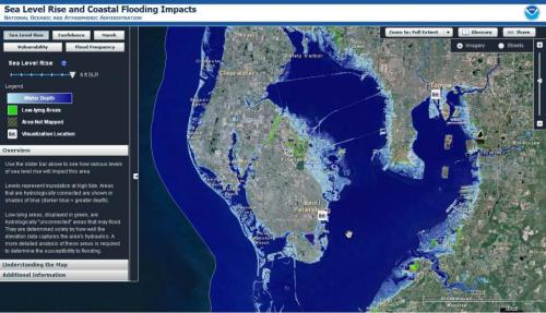
2. Our nation has long been committed to the survey and measurement of our coastlines, from the creation of the National Oceanic and Atmospheric Administration–not a research body, but an organization long commited to the measurement and analysis of hydrographic surveys and shoreline change that has roots in the charge to survey our shores and coasts and that has grown to include the measurement of national precipitation and fisheries surveys, as our notions of the anthropogenic effects on the complex ecosystems of our shores have grown. In contrast to the broadly detailed if flat images of coastal surveys in the past, current images of coastal hazards from climate change project pictures of the dangers of dramatic changes in coastal habitats and for coastal populations due to projected sea-level rise that describe a picture difficult to comprehend in the abundance of data they synthesize or multiple narratives they contain.
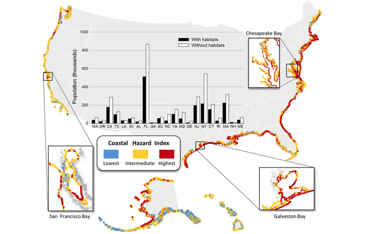
The insets included in this data rich map suggest the importance of creating a more interactive, zoomable online version that would take advantage of online tools to create a tool for exploring local questions of coastal change, and indeed creating an image that might be navigated across different future scenarios of climate change. While the process of coastal flooding and sea-level rise is based on conjecture, the power of such a more immersive and more concrete map would be particularly significant and compelling
Question of coastal management and abatement have increasingly suggested limits for future building and the construction that provide much more immediate stories of specific sites, but the broad mapping of risk of coastal flooding, king tides, and ocean pollution are all too often left overly abstract in national maps, and demand more distinct visualization against a detailed terrain view to be best processed and comprehended.
But as our ability to combine local detail with broader stories of climate change grow, the future of the climate map and its relative resiliency will be less likely under such broad attack. From images of climate change from shifting shorelines to greenhouse gas emissions in the global atmosphere, maps of warming and climate change have been increasingly accused of being massaged to make greatest visual impact on viewers: the problem of making the immensely complex causation behind climate change concrete in their global scale concrete. But the sort of questions that can be asked about the geographical distribution of flooding cannot tell us more about the producers of emissions, or the so much as the areas most sensitive to a changing climate that is increasingly changing by degree–the mechanics of climate change are not apparent in a geographical map, but alternate scenarios of the consequences of climate change on changing shorelines can be made more concrete, and rendered in forms more clearly able to be grasped.
The recent curtailing of public speaking by climate scientists in federal employ–in blogposts, articles, or editorials–is akin to the more disturbing cartographical silencing that climate change deniers appear ready to propose. For while rejecting the propositions of maps outright is a way to evacuate them of persuasive value,– even as mankind is busy creating the greatest crisis in global history. Indeed, maps that are created from satellite monitors to further earth observation allow the complexity of climate change to be understood through the specifics of what “global warming” entails, even if the concept may be far too complicated to be sufficiently grasped in all aspects. The question of what might be the new climate norms of a world of rising sea-levels and shifting shorelines.
The image in this post’s header focusses on the nation–and the security of groundwater along the nation’s shores–in ways not linked to global warming or climate change. But the image of a nation increasingly permeable to saltwater pollution and whose pollutants leach into the surrounding seas with increasing consistency cannot be understood save in light of climate change. If the image in the header to this post doesn’t tell a story of the rise of ocean levels that is an impending catastrophe of the anthropocene, it cannot be seen but as a creature of the era of sea-level rise, when the stability of the shoreline is increasingly erased, and it exists as a threshold of eventual crossing that could even appear on the scale of a national map, rather than being confined to local tide tables: the dizzying proportions of unprecedented sea-level rise are challenging to map, but maps provide the best way to orient viewers to its impending occurrence. And maps provide the only effective way to synthesize or model the consequences of the distribution of an uptick of tides that is feared to be but a prelude to the possible eight foot rise of sea-level by the century’s end. Indeed, by translating such a map into the potential local impacts that future water-levels may bring to our shores–as this map by Green Info Network–future water levels can be viewed and embodied against the watersheds, shorelines, estuaries and beaches that they would compromise with a gloriously specific detail, including the infrastructural changes as we will confront projected shoreline change in roads, rail, and parks.

3. The maps that are modeled after and based on remotely sensed data are rich with information that has the ability to clarify complexity of causation in ways that are increasingly relevant to how we interact with our lived environments–and the habitats of endangered species worldwide. The extent of information that is compressed into the most useful maps of shoreline change depict a changing relation between land and sea particularly important to capture to understand the global scope of planetary warming. The very propositions of climate change are so complex and multi-causal, with cascading effects producing rising temperatures, sea-level rise, and higher king tides, that they are difficult to map–and yet we need maps to give voice to the rich datasets of sea-level, surface-temperature, groundwater, and glacial thickness and density that is not possible on a national or global level–but may provide the best means of communicating the effects of climate change. The map of the permeability of shorelines to saltwater invasion in the header to this post stands as a surrogate for the impending disasters of climate change, as the offshore pollution from run-off that is tracked in blue marks the parallel leeching of pollutants into the sea.
The data-rich result is an image of the porousness that shore lines increasingly destined to face in an era of rising temperatures: while most of these maps don’t include charts,– whose increasing presence in most maps may remain implicit in climate maps of shoreline change, which aim to trace the changes in in the coastal barrier over time. For the harvesting of data to measure shoreline change, polar melting, and glacial erosion derives largely from remote measurements of earth observation long ago codified into NASA’s charter in surveying hydrographic records for mariners and boats–
–but remotely surveyed records of temperature, rain, humidity, soil-moisture and ice thickness create a perspective of data-abundant information that demand to be translated into a compelling–and explorable–visual language.
Such maps have served to make the case for measuring and calling attention to climate change in particularly useful ways, as the image of regions now vulnerable to saltwater pollution can help manage groundwater sources. But they are misleadingly understood or cast as tools of professional advancement, as the large-scale changes that they so successfully register compellingly reveal. And the research commitment of NASA to the earth sciences helps continue to develop innovative methods of remotely monitoring of coastal change that effectively embody the complexity of climate change in persuasive ways.

The continuous data from NASA remote sensing maps provide the global coverage that allow this complexity to be grasped, and maps provide the best tools to describe the local impact of global warming. Cartographers face increased challenges to register such changes–even as many are working to adapt new conventions to charge climate change, it is also true maps are at risk for being increasingly alienated from their audiences in their relative sophistication and expertise, in part because of the ability to synthesize an increased amount of huge quantities of data on climate observation has exposed them to rejection–and indeed led them to be attacked. The fear of reducing the purview and charter of NASA’s remote observation, and indeed trying to downshift earth observation to agencies without a research mandate of their own, promotes a dangerous down-grading of the role of public communication of scientific knowledge from government agencies, embodied in the improbably advocacy by the firebrand Republican congressman Daniel Webster to eliminate government funding of the American Community Survey, based on his interpretation of its randomized sampling of three million households as a “random survey” not deserving of federal funding: indeed, rather than focussing so much on the internal divisions of the nation’s recent voting preferences,
–we may be neglecting the danger of the rapidly increasing vulnerability of our shores.

4. Imminent dangers of defunding such a mission of earth observation, to be sure, suggest a cartographical silencing in the attempt to end discussion of the effects of man-made activities on climate change that is terrifying, and difficult to confront or process in itself. As a Presidential candidate, Donald Trump denied the contribution of industries to global warming, despite the high rank of the United States in the global emission of greenhouse gases. Trump sees the production of such maps as tantamount to an assault on corporate regulation. Indeed, the refusal to map the changes in shorelines onto human actions and to remove them from human agency–either to naturalize these changes or remove their imminent danger for human settlement–is especially acute. But the proliferation of mapping technologies, and advances in detailing shoreline change, save in the unlikely chance that they are entirely eliminated and defunded, working to provide more compelling narratives of global complexity.
As if to conceal the large contribution that the nation makes to greenhouse gases in the earth’s atmosphere, and the temperature rises on Earth’s surface consequent to their emission, without greenhouse gases, the recent decision to begin a purging all mention of climate change on the Trump-run website Whitehouse.gov–the new page promises that “for too long, we’ve been held back by burdensome regulations on our energy industry, while avowing to end “harmful and unnecessary policies such as the Climate Action Plan and the Waters of the U.S. rule“–mirrors the policy of the Environmental Protection Agency, according to its website, to suspend some $4 billion of grants and other assistance agreements that is directed to in part to state-led climate research and efforts to improve air and water quality to local projects of environmental justice, discrediting the notion of government involvement in climate monitoring that has been invaluable to understanding climate change and responding to its effects. Indeed, the Guerrilla Archiving Event’ to preserve EPA programs and datasets available online last December in Toronto–emulating the Internet Archive–responded to the potentially transient nature of such climate data.
For now, with funding is on hold, fears of a silencing of climate data suggest a continued destabilization of the picture of climate change it records. Yet the importance of affirming that coherence, and the place of climate modeling in mapping its consequences might allow, is a necessary basis to take stock of our shifting environment through he increased persuasiveness remote sensing offers. The makeover of websites and disappearance of data after the inauguration of Trump reflects not only a transition of White House URL’s; the migration of the Climate Change Page to the national archives diverts attention from climate change and for the environmental consequences–as well as the mapping–of climate change. Although average global temperature would be −18 °C (0 °F) without their presence, the global land-ocean temperature index has risen just shy of a full degree with the 40% increase in the atmospheric concentration of carbon dioxide from 1750 to 2015, in ways that stand to alter the current coastlines in ways we are slowly starting to map with satisfactory complexity.
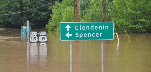
The alarming trends of coastal endangerment–occurring because of a combination of rising sea-levels, erosion, and saltwater invasion–raise almost apocalyptic fears. But they need to be captured and registered as an ongoing process, in order best to express a dynamic driven by multi-causal and indeed recursive processes. As we struggle to comprehend the cascading effects of complex causation that comprise the concept of climate change, we increasingly rely on maps, and are beholden to them, but increased skepticism about their claims serve to support the corporate interests that the silencing of continuous data feeds able to document the extent of climate change. It’s perhaps no coincidence that so many of the recent protests in response to Trump’s anti-scientific pro-corporate policies, a movement led in the Trump cabal by EPA transition advisor Myron Ebell, have arisen on or near the shores–not only in traditionally “blue” states.
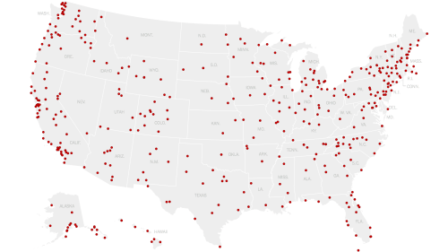
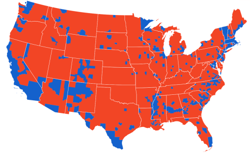
Women’s March Against Trump/NY Times/January 21, 2017
Or, to use an upbeat image of resistance in what promises to be a blogpost of far bleaker future scenarios,
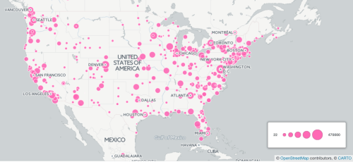 Women’s March/Group Estimates/Map created by
 ![]() Eric Compas
Eric Compas
But if we can be permitted to have such an exultant map of the national scale of resistance to Trump and his policies, the role of climate change maps is perhaps complicit in some sense in allowing climate change “deniers” to dismiss the findings that they embody, as if the scenarios of climate change were digitized illustrations were designed to delude.
The politicization of data maps might indeed reveal the effects of increasing coastal incursions. After all, lived experiences are far more powerful than even the most fearsome projections of the outcomes of ice-cap melts that chart sea-level rises of sixty-six meters –even as they insist such rises are “not a threat” and question anthropogenic causes of sea-level rise, the complexity of changes are elided or surpassed in the digitized images that imagine alternate scenarios of polar melting and sea-level rise in ways that stop from embodying their disastrous consequences or effects for coastal residents.
but address audiences with monitory images that are striking yet actually not data-rich–
Such monitory graphical renderings are sufficiently removed from actuality to lie only in the far-off future. Such fictional forecasting in digitized images of future scenarios may undermine their authority, indeed, by being not that effective, or actually data rich, and may even provoke skepticism from audiences as digital creations made in order to invite unsubstantiated fears by embodying possible worlds in deceptive ways, not rooted in actual observations.
But it is perhaps in the farther north, near the polar areas, where the widespread melting of permafrost threatens to release untold further greenhouse gases into the atmosphere as the permafrost retreats and advancing thermokarst–areas of permafrost thaw–advances across the arctic, that the Arctic landscape has begun to collapse, and if one looks only at the twenty year period already measured by NASA’s earth observatory between 1990 and 2010–basically before the Obama administration began to monitor climate change and advocate adequate regulations in response to a broad environmental crisis in the world–the Arctic landscape has changed to a significant area of wetlands where permafrost once existed, as melted water has created an increasing number of lakes, both as regions of lakes, and lakes and wetlands, that have converted a fifth of permafrost regions to s. A thermokarst, remapping the range of lakes not only in the Canadian arctic–

–but in the erosion of an arctic landscape that can be documented by the surprising density of lakes found across much of the previously frozen circumpolar regions:


![]() Nature Communications, D. Olefeldt et al.
Nature Communications, D. Olefeldt et al.
The distributions of such rradical changes in these less populated–but nonetheless inhabited–regions, where the presence of newly emerging lakes can be classified loosely from ‘Low’ (10% or below), ‘Moderate’ (10-30%), ‘High’ (30-60%), or ‘Very High’ (60–100% regional coverage), by GTOPO30 data, we can see a shifting differentiation of land and sea focus attention on the new nature of landforms. Have such amazingly detailed data maps have come to successfully direct attention, interest, and observation to the local consequences and complexity of climate change in ways that have made them the subject of attack?
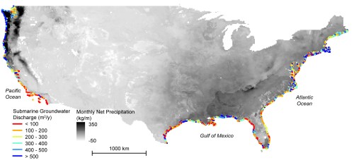
Ohio State/NASA-JPL/Caltech. “Continental Patterns of Submarine Groundwater Discharge
The commanding nature of such data-dense visualizations traces the confusion around our shores’ stability in an image almost dream-like in the porous boundaries of shores that it creates. In suggesting submarines water transit, the map disrupts one of the clearest and most familiar of cartographic conventions, after all, and replaces clear shorelines of a nation with a multi-colored perimeter that suggests the instability of shores. As climate change has created a drought in California that is the harshest in 1,200 years, the increased vulnerability of many coastal regions in the state to saltwater invasion is pronounced in coastal aquifers–especially south of San Francisco or much of Florida’s coastal areas in the south and north–as it is in the low-lying lands off the Gulf of Mexico and American South–at the same time as ocean pollution from submarine groundwater discharge has increased. If Rachel Carson long ago suggested the complexity of the intertidal zone as an intensely productive ecosystem for the development of life of particular sensitivity, the delicate nature of the coasts is more than ever made apparent in such a map, where strong participation increases groundwater discharge that may include fertilizers and industrial pollutants.
The global scale of climate change has provoked a cataclysmic confusions between land and sea with a greater complexity that cartography can help us to begin to grasp, far broader than on a single nation. The presence of underground flows of freshwater to the ocean, and the increased susceptibility of land-to-sea contamination described in a recent study of underground water exchanges and dissolved chemicals that leach from the edges of the North American continent itself changes both our notion of the shoreline. For the above map registers the dramatic changes of coastal water quality due to anthropogenic disturbances in the changing geometry of coastal drainage from farmlands and in inhabited areas, providing a new view of discharge previously largely limited to riverine flow by Submarine Ground Discharge, changing our understandings of the porous nature of the shoreline and the relation between land and sea on a continental scale.
5. Climate change maps stake propositions in increasingly pressing ways, but may in fact not make the case with sufficiently compelling persuasion, since they diminish the complex agency of climate change. Using continuous rasters based on data feeds, they orient us to the actually shifting nature of our shores, as much as the spatial continuity of land maps: indeed, the relation between such a change on global scale to local places–and the new relation between space and place created by climate change–is pressing but difficult to capture or express for a broad audience. For unlike land maps, the image that climate change maps provide may demand considerable expertise to read, even if they present themselves for immediate comprehension. For although their continuous rasters of climate change maps appear to be distanced from scientific expertise, the maps address and are presented to their viewer as ways to orient information without making many demands on interpretative skills. Condensing truly huge amounts of data and often modeling of future scenarios, the maps have frighteningly occasioned considerable skepticism, by those who cast their continuous rasters as illusory theoretically informed models and imagined creations of scientists who seek to advance an agenda–as if data from remote observations were massaged to frame an interested argument of an unsubstantiated agenda, rather than in hope to process information for viewers so that climate changes can be understood, by suggesting the permeability of previous geographical–and cartographical–constructs, such as shorelines and shores. With increasing sporadic dumping of water in much of the United States, the complex interchanges between land and sea have been increasingly mapped with greater sophistication and ability from remotely sensed measurements, creating a sense of the continuity of water exchanges across the coasts that will be increasingly important to define our country’s resilience to the 0ngoing process of climate change.
But such maps command attention precisely by revealing the considerable sensitivity across the nation to a range of hot spots of shoreline change–changes due to the man-made discharge of chemical contaminants and the incursion of salty water into wetlands and coastal aquifers that will be particularly sensitive to climate change. Indeed, the monitory value of such maps outweighs the doomsday scenarios that they might depict, for they provide the best ways of responding on an institutional level to the unknown consequences of climate change. By illustrating the remote measurement the levels of contaminants that reach the coast, and the incursion of saltwater across national shores, the map both assembles a set of nation-wide data not otherwise accessible, and helps localize dangers of saltwater intrusion and coastal pollution across the over 15 billion tons of freshwater flowing to the coasts in preparation for climate change. By providing a baseline for the changing coastal habitats by groundwater transfers that few recognize, the map effectively synthesizes a range of earth observations in a map of incredible richness and density, which tampering with the mandate for earth observation stands to seriously compromise.
The extremely rich and sophisticated datasets in such rasterized “images” derive from ongoing projects of global data collection that provide the most accurate basis to comprehend the complexity of climate change. Yet the remote sensing that undergirds them is now in danger of being shuttered or severely limited by the United States President Elect, who stands to curtail the availability of data on which much of the world has come to depend–as if the messenger is being thrown out for the interests that it allegedly advocates. Despite the increased evidence all around us of the effects of climate change, we run the risk of a collective disorientation by cutting off the data feeds, in a bizarrely calculated and self-interested manner. Indeed, the corporate interests that are designed to cut of regulation of land and ocean pollutants or greenhouse gas emissions seem designed to remove themselves from the map of climate change, or to curb the monitoring that has lead such maps to become such powerful ecological arguments. Even if a range of private firms that provide satellite imagery cannot provide a full accounting of polar regions–which result without geographic features from space–or the necessary geographic rectification that NASA remote sensing ensures.
Continuous earth observation is entirely dependent on remote monitoring. In order to map climactic changes, we depend on the generation of data from remote sensing that NASA has increasingly provided from the administration of George Bush. The targeting of very technologies and abilities to map climate change is a ‘cartographical silencing’ that is almost anti-modern, and steeped in a radical skepticism of scientific authority and empirical documentation. Bent by the primacy of economics, Trump has chosen environmental advisors apt to darken by eliminating the extent to which the government has greatly expanded a network of satellites orbiting the earth whose feeds monitor and calibrate changes in weather, ocean, and surface water, and ice-cover at the northern and southern pole, upending investments in visualizing climate by the United States since George Bush’s presidency, when emergency funding was arranged to preserve the archives of satellite imagery of earth from Landsat satellite, recognizing the importance of preserving continuous data feeds, until Landsat 7 was launched with multispectral imaging bands by April 15, 1999, supplying images and digitized data to all public users world wide at their own lowest possible costs. The creation of comprehensive and both spatially and temporally continuous maps of climate change central to NASA’s mission depends on remote earth observations from sources orbiting the planet.
 Select NASA’s Earth Science Satellites (NASA)
The feeds of such a range of earth science satellites constitute a mine for data harvesting and earth-imaging to accurately calibrate environmental hazards to best diagnose and respond to their increasing occurrence. The data feeds providing a sense of temporal continuity that can communicate–and helps viewers grasp–the theoretical complexity the instability of globalized climate change, and the enormity of its effects on our national water supply and the dryness of our world even at a time of potentially rising seas and saltwater incursion of shoreline lands. Yet the information that such color-enriched maps are given is given an agency that has led them to be dismissed, as if the very difficulty to decipher in their saturated rasters leads them to be condemned as misleading creations, whose apparent remove from human experience is oddly troubling for many.
The complex basis for representing continuous rasters that are nt otherwise easily perceptible from remotely sensed data may oddly engender its own skepticism. Only from satellites can we map fluctuations in the seas and ocean shores, not otherwise seen by many offer a constructive form of critical cartography, or surveyors. For the continuous rasters they produce, unlike territorial maps, omit the fixed frontiers of nation-states or any sign of clear boundaries or noting of sites of human habitation,–in ways that may indeed make them emblems of a globalization that many climate change “deniers” seek to reject: as if the Paris accords recognized the cartographic image of an inter-dependent word we don’t want to accept. This post began from the questions of whether the question of whether the symbolic form of climate change maps encourages them to be so skeptically seen. For climate change deniers, the data richness of such visualizations and projections of climate scenarios have been taken as grounds for wild skepticism about their contents. Such skeptics claim to resist their presuppositions. The abrupt and blanket denial of what an incoming administration labels “politically correct science“–indeed, as not science, but politics, as if these could ever be separated–entails disrupting the very same remote sensing projects by which climate change was effectively visualized.
More satellites of remote observation are in the works, and in line with the climate science research projects that scientists at NASA are engaged. And it is difficult to believe that the prestige of NASA will be successfully targeted or diminished in a Trump administration, even if that seems to be the intention of the current President. The investments in projects already on the books–and the continuity of NASA research projects that are pencilled in for future years–provides the only guarantee of security in the somewhat conservative and necessarily long-term nature of plans of scientific institutions. Indeed, the recent decision to award a contract to launch a satellite designed to monitor world-wide surface water levels to SpaceX–SWOT, or the Surface Water and Ocean Topography satellite, seems to exemplify such investment in climate modeling–
 NASA SWOT rendering
–seems trying to guarantee the survival of remote monitoring programs fundamental to tracking and understanding climate change, if it is not the final investment in a program many appointees to an incoming Trump administration plan to cancel entirely or defund.
Indeed, potential and seemingly inevitable cuts of the Earth Sciences budget of NASA threaten a very dangerous form of cartographical silencing never foreseen. The satellite destined to improve climate forecasting and prediction with a launch date of 2021 would be difficult to cancel. So would adequate detection of the anthropogenic nature of climate change–a lynchpin in the constraints on industrial power plants that are so desired to be cut by extractive industries. In classic Trump doublespeak, the public denial on Hugh Hewitt’s radio show of man-made global warming, repeated during the Presidential race, sought to focus attention of voters on increased energy costs he claimed that he could lower, and expanded as an attack on Barack Obama for agreeing to the Paris Climate Accords as a foreign imposition of constraints on the American economy, designed to serve “foreign interests” and not American ones, and discussion of climate change only as justifying “just a very, very expensive form of tax”–lest anyone thought it had a basis in scientific fact. The loss of remotely monitored information, however, if able to upset the construction of maps of ocean temperature rise, would come at severe costs of removing us from any orientation on climate change.

Although it’s increasingly vital to direct attention to climate change, lack of attention to communicating the complexity of climate change is belied by the illusion of solidity in the continuous rasters that track heat-trapping greenhouse gasses or oceanic salinity.
Rendering the processes or mechanics of climate change will remains extremely difficult–the intangibility of causation may be an underlying liability of the success of embodying climate change in maps. Yet the difficulty may encourage considerable skepticism and resistance to accepting that its mechanics have a human causes–in spite of the dramatic pace of ever-rising temperatures and need to try to address their danger in ways we have so tragically not been able to come to terms. So how can the persuasive power of the properties of such maps better serve to document the dangerously increasing growth of temperatures at land and sea, and increasingly insecure margins of our shores?
Even as climate change maps are attacked and devalued as if they were created and based on self-interest, foreclosing earth observation data suggests interests greater than a map could contain–and a form of cartographical censorship or silencing that is particularly dangerous and willful. Indeed, the registration of such data suggests one of the only ways to gain purchase on the momentous and accelerating changes brought by man-made activities that have come to define the era now called the anthropocene.
5. For as much as challenging the drawing of shores as a straight lines, the overlapping of the margins of the shores–the biologically crucial tidal zones and marginal ecosystems to which Rachel Carson called attention as dense biological laboratories for micro-organisms and coastal inhabitants–are threatened by the growing temperatures, rising sea-levels and king tides, in ways that lack tangibility in most weather maps or climate modeling: the relative invisibility on such large-scale maps of the impact of sea-level rise on estuaries, coastal wetlands, coral reefs, and ocean margin ecosystems that need to be more carefully scrutinized.
Much remote sensing of temperatures may fail–perhaps because its use of data sources has made a selective record of information so difficult to foreground. The rush of information of global climate is in part especially difficult to process for an untrained viewer. Indeed, even in the most recent data maps designed to show the rise in temperatures on land and sea in a map retain a stable boundary between land and sea–

–as do maps of the mean departures from average temperatures over the past year:

Despite extensive information about the detail and scope of temperature rise from remote sensing of the planet, we risk avoiding the sensitive and increasingly inevitable erasure of a clear boundary between land and sea, retaining a crisp delineation of the very coastlines whose erasure seems increasingly inevitable.
The increased possibility of the dumping of huge amounts of water on formerly dry states like California trace the arrival of total accumulated rainfall with weirdly removed and abstracted process, leaving the coastline of the state crispy defined in an underlying base map on which to track the precipitation that arrived in the first week of January, 2016–

January 7-10, 2016/NASA Earth Observatory
–and rightly focusses on the anomaly of total rainfall as its subject, without suggesting the increased lack of clarity between land and shore in global warming weather patterns.
6. The increased insecurity of coastal regions demands better mapping to incorporate alarming shifts of sea-level to help us better to process our shifting relation to the oceans. And in an era when we are imagining a network of medical information that might instantaneously connect all patients of a specific cancer to one another and indeed to map the total number of cancers victims, the notion of plotting sea level rise in specifics and in relation to climate change demands greater work–if it has been an area of increased attention–rather than being deprived of necessary continuous data feeds that gain new coherence in geographical form.

 Photo: Dave R/Flickr (Creative Commons)
We lose a sense of bearing on the eery rising king tides that we experience day to day in the California coast, however, without their data. Despite aspirations to recreate a sense of tangible presence in such maps, derived from the latest NASA data, revealed that temperatures in North America the second-hottest year on record, but seem removed from a concrete sense of place–despite the predominant trend to warming. Lest we treat this image of increased land and ocean temperatures as the “new normal”–to appropriate an over-used phrase whose monitory value sadly lacks. Yet the phrase seems almost destined to migrate to multiple zones in coming years, as it is difficult to grasp in what normalcy consists so far as temperature, rainfall, snowpack, and the dramatic changes of such rising temperatures,–if the rasters and enhanced colors of such data-based maps don’t appear with greater immediacy, the absolute shifts are all too apparent.

Despite the need to detect local effects of temperature change, such changes are easily lost among the overwhelming information overload of these carefully calibrated maps, which painstakingly assemble data culled from remote sensing, much as the climate change models receive inputs of temperature changes, wind direction, speed, and atmospheric presence of carbon gases that inform their underlying equations. The global compilation of multiple sites of record warmest temperatures, especially in Indonesia and Afghanistan, as well as Alaska and Siberia, suggest a dangerous flirting during a few months of a temperature rise of 1.5°C, with February coming it at 1.63°C above early industrial levels and March with an average increase of 1.54°C, driven by increasing carbon emissions. The narrative of meteorological projections that might accompany such a shift in of temperature–“coastal storms and hurricanes; king tides; widespread flooding; ten to twenty feet of rain expected“–are absent from such maps, but reflected in their content.
The dots are not easily connected for most viewers of the map, whose power seems hamstrung and to speak to few. Without imagining legends of forecasts of climate change models–“Heavy rains. Rising ocean levels. Intensifying desertification. Saltwater incursions in coastal regions.”–we might try to remedy how the flat maps lies as if at a cognitive remove from the impacts of climate change, viewed with suspicion that attempt to discredit their dire warnings as selective interpretations of evidence whose conclusions are massaged to terrify. Climate change deniers like to point to the continued presence of some cooler than average areas lead many to shrug and move on, given the difficulty of tying temperature increases to environmental disasters or to anything that lies within human agency. Despite monthly compilations of temperature anomalies against pre-industrial standards, perhaps the remove of pre-industrial society from our post-industrial world seems to remove the notion of any comparison–even if deniers might see them as lacking necessary historical context that would deflate their impact. Indeed, the current fears of curtailing or limiting access to data collection in coming years suggests that the Trump administration may attempt to curtail the creation of the necessary climate maps tracking earth observations, much as the administration of George W. Bush attempted to block access to the library of the Environmental Protection Agency or Canada’s former Prime Minister, Stephen Harper, did his best to silence scientists and block access to data sets that provided the basis for climate change maps.
In working to create such maps, we might begin by asking how their formal construction can best bridge the apparent cognitive remove to make them less resistant to critiques, if only to emphasize their power as the necessary guideposts of orientation to an age of increasing climate change. For as the data that is captured about the global climate from space as well as from sensors on the ground are becoming a measure of life and death, as well as of economic importance and potential losses of huge amounts of money and investment during increasingly extreme climate events. We will need data for the best maps possible of the global climate to gather and to materialize earth observation data; if NASA data may be supplemented in needed ways by non-profits who have launched impressive online data aggregation maps to help visualize potentially disastrous events of the global climate as World Resources Institute, using Carto mapping tools for detailed maps of carbon emissions and losses of carbon sequestration, and remote images of earth observation of much of the world on offer from Planet Labs, scientists depend on the systematic continuous coverage of global climate over time that NASA and NOAA have provided. Yet as NASA threatens to be best known by T-Shirts from Urban Outfitters, as much as they might raise some awareness of remote sensing work, it seems ironical that such a hipster acquisition may signal the demise of much needed global earth observation.

Yet continuous data feeds are necessary to create the most persuasive maps possible of climate change. And there is concern that despite the intent of ordering cognitive purchase on climate change, the maps are themselves often seen as just so alien as predictive creations to be dismissed out of hand–especially when they are observed from space or use models.
Although such changes often depend on the melting of glaciers and ice-sheets, not even shown clearly on the map, the results of expanding the amount of water in global oceans is quite challenging to map, even if a time-related slider bar offers on way–or noting sea level rising in oranges and yellows, and rendering islands of exceptional dropping sea levels in cooling waters by blue rasters, here displayed in a slightly different manner–but many of which seem remote from human experience, if only because global temperatures are so difficult to correlate or mesh with individual experience. The almost airbrushed images of hotter than usual sea temperatures below seem almost impressionistic, in ways that undermine the precision and painstaking detail that they collate and compile. Or, even worse, temperature anomalies are naturalized at a remove from the coastal habitats that they threaten.
 NASA/Space.com
Even though the islands of cooling waters are isolated cirrus clouds in inverse to a sky, ruddy rasters near Indonesia, Madagascar, and Japan suggest a broad trend in warming of particular difficulty to conceptualize adequately for most viewers. The complexity of mapping the mechanics by which rising temperatures create an uneven rise in water levels–and the clear difficulty in explaining the variations for many regions in ocean levels, even in coastal regions, threatens to undermine the communicative value of a map that should be a cause for collective alarm–and placed quite a new premium on the need to define cartographical tools to convey accurate information of the serious nature of sea-level rise to viewers with anything close to a suitably corresponding level of alarm. The complexity of climate change that creates rising seas at rapidly increasing rates over the past or in the future raise questions of embodying the very complexity of its change.
In an era of rapidly increasing global warming, maps that chart climate change and of sea-level rise have failed to orient viewers to the local effects of the complex processes of climate change at considerable costs. Indeed, they’ve come under attack because of the implicit propositions that they are taken to make–as if they were false, deceptive, or purposefully misleading, if not intentionally deceptive.
7. When we turn to map the future of global climate, temperatures or carbon levels, we stitch together continuous images of the globe from 36 by 22 quadrants, to convincingly dynamic models of climate change whose global coverage runs over time: using data sets of temperature, we make a continuous model of earth’s surface in future times, smoothing out the model in ways to create images of the greatest stability, for a model of most reasonable results.
Yet we create models that are oddly removed from local effects or consequences, which fail to draw the relations between local situations of climate observations with the site-specific exactitude that might be expected from weather maps, but in an information overload that stands at a chiasmus from the claims of weather projections–and fail to deliver similar predictive claims or needed assertions, since they are contingent by necessity. Since we don’t describe if it will be rainy in Cleveland, or what temperature it will be in Miami, the relation of the local changes to the global changes become hard to grasp or obscured–or presented as predictions outside of the complexity theory of climate change and without mapping climate change to man-made activities in convincing ways.
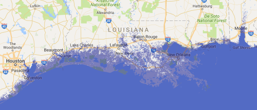 Louisiana Coast after Seven Meter Sea-Level Rise/Geology.com
And hence lies the problem of persuading viewers of climate change’s actuality, and of the need for far more convincing–although not more detailed–maps of climate change. Even in the best maps of future shorelines, the scenarios of global warming and climate change are removed from the informational content viewers expect, dismissing their dynamic models as creations, created by manufacturing a false continuity, and even as based on presuppositions many reject. By dismissing the problems they raise–even if the outright flooding of the Sacramento Valley from Yuba City to Manteca that a twenty meter rise in sea level would bring would drastically alter the farming landscape and San Jose–the way maps seek to speak truth to power seems silenced, at least temporarily.
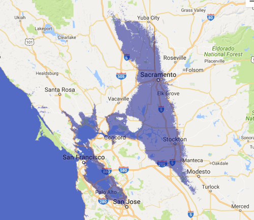 Sacramento Valley with Twenty Meter Sea-Level Rise
While powerful projections of the impact of variable levels of potential sea-level rise, such maps may elide or fail to clarify the mechanics of the anthropogenic origins of sea-level rise, or prepare the viewer adequately of the contingency of different possibilities of sea-level rise in dangerously low-lying regions that are particularly vulnerable to a rise in ocean levels.
Hence, the importance of NOAA’s valuable mapping tool to visualize the impact of climate change on coastal communities–although the focus on inhabited areas renders this impact mostly in terms of the lens of property loss along the shore.
Data maps try to embody climate change, by mapping of global waters, ice-density, and soil moisture. But they are dismissed as if they only embodied interests–rather than measure risks or command attention as marking the end of coasts as fixed separations of land and sea. Indeed, the target set at the Paris Accords to limit the current rise in global temperatures to but 2 C–and to hope for a rise of only 1.5 degrees–is perhaps best mapped to embody the dangers of shifting the increasingly uncertain boundaries of land and sea in crystal clear ways. Yet far more effective as arguments than such global maps of planetary warming or the data overloads that track the consequences of polar melting, local maps of the shifting boundary between land and sea offer the most convincing demonstration of its effects that we can grasp–affirming, as it were, the local knowledge of climate change in its global glory, and not an abstraction whose complex causation is hard to grasp. Is there a better way to tie the local to the complex global processes of climate change, outside of the increasingly banal–if widely viewed–idiom of the raster of a weather map?

Waves of King Tide in San Francisco’s Embarcadero/Burrito Justice
The complexity of mapping climate change is particularly difficult as a persuasive tool. Perhaps because we have become increasingly familiar with and inured to the colorized saturated rasters of weather maps by whose glosses we are regularly encounter as dense explications emanating from monitors and television screens, the colorful maps of future scenarios of climate change are almost emptied of scientific authority to communicate the complex causation of global waring; the odd familiarity of such maps may make them far less scary than they demand than possible alternatives that can be classified as theories, on which the journey is out or models that might play out in other ways.
The terrifying legitimacy granted to radical skepticism of climate change deniers–who cast their content as but a theory, and treat them as massaged images, rather than actual records–may reveal the problems of making a global argument in maps. Indeed, their power lies in relating the local and particular to the universal, as much as in their abilities for total synthesis. It may be that the deeply disempowering effect of such maps that seem far removed from human agency can become part of their weakness–indeed, their symbolic kinship to the colorized rasters of weather maps overwhelm the differences between charting cold fronts from Canada or storms from the Caribbean and permanent climate change. It’s as if the cognitive difficulties of tying their colorized content to consequences of human agency or the impact of carbon emissions provides cover for admitting that the massive changes in world climate are predominantly man-made. If so, the importance of tying the local to such global maps of climate change is of increasing rhetorical importance.
In an age when we have become accustomed to converting meteorological observations into a spectator sport, we seem particularly ill-prepared to adopt less passive positions in relation to global warming, or to process maps of climate change, as spectators of the weather even as the World Meteorological Organization found 2011-2015 the hottest five-year span in the existing historical record, and expressed concern about clear danger of the increased rising of sea levels resulting from the rapid rate of the melting of arctic polar ice, and of outsized Antarctic glaciers–whose mass stands not only to decline, but whose diminishment lessen their contribution to the cooling by the reflection solar light: the prospect of accelerating rates of polar melting and sea-level rise stands to create the warmest year on record, the human contribution to which climate change “deniers” seem apocalyptically destined to increase further with potentially catastrophic effects to be effectively embodied in maps in ways that their global data on temperature change must be more closely tied to its local impacts.

Yet the symbolic format of maps don’t best allow us to interpret the scope of such change.

Remote sensing–and climate modelling–almost inevitably echoes the conventions of weather maps. Such maps are constructed by similar material practices of organizing data, but embody quite different set of processes of environmental change, and indeed address their audiences in different ways as spectators, precisely by their contingency. In ways that echo how data is increasingly seen as a form of authorship, climate change deniers voice skepticism about scientists’ presentations, contesting the mapping of evidence of climate change as if to suggest their contingency: as if the input that shape raster images was only making a set of heuristic or theoretical claims of the moment, rather than suggestive of deep trends. Yet the fuzzy coastlines of the continent that reveals the vulnerability of the coast to saltwater incursion or ocean pollution suggest the sort of picture of the porous nature of coastlines as permeable boundaries that will be increasingly common in the continental United States. And while not measuring the consequence of climate change, the map may be salutary to habituate us to the growing pounding of shorelines, coastal flooding and increasingly common disturbances of ecotonal equilibria climate change seems destined to create, but which we are only learning to engage viewers effectively in maps–starting from maps of just how vulnerable the coasts of the nation are to saltwater invasion (here in violet) or pollution from the land (cobalt blue).
To be sure, the dangers of saltwater invasions produce the destruction of riverine ecosystems in many areas, from the Florida panhandle to Louisiana bayoux to the San Francisco Delta and beyond, but the relative abstraction of rendering invasiveness by violet blobs makes it difficult to perceive its consequences with sufficient alarm. For as coastal sea levels stand to grow further–beyond the eight inches that they have risen in the past century–the vulnerability of the land to the sea is in need of mapping in local detail in ways to make sense of the local narratives of climate change.
The Ohio State University/NASA-JPL/Caltech
Sea level rise has already created resulted in an unprecedented growth of coastal flooding–significantly exacerbated during king tides, as sea level has risen over the century by some eight inches. We might better track the increased coastal permeability to extreme floods, that have become far more pronounced in the sloping shores of the Atlantic coasts, in ways that alter landlubbers’ relation to the sea that increasingly approaches their businesses, properties, and residences, and dramatically alters coastal habitats in ways we are only beginning to come to terms.
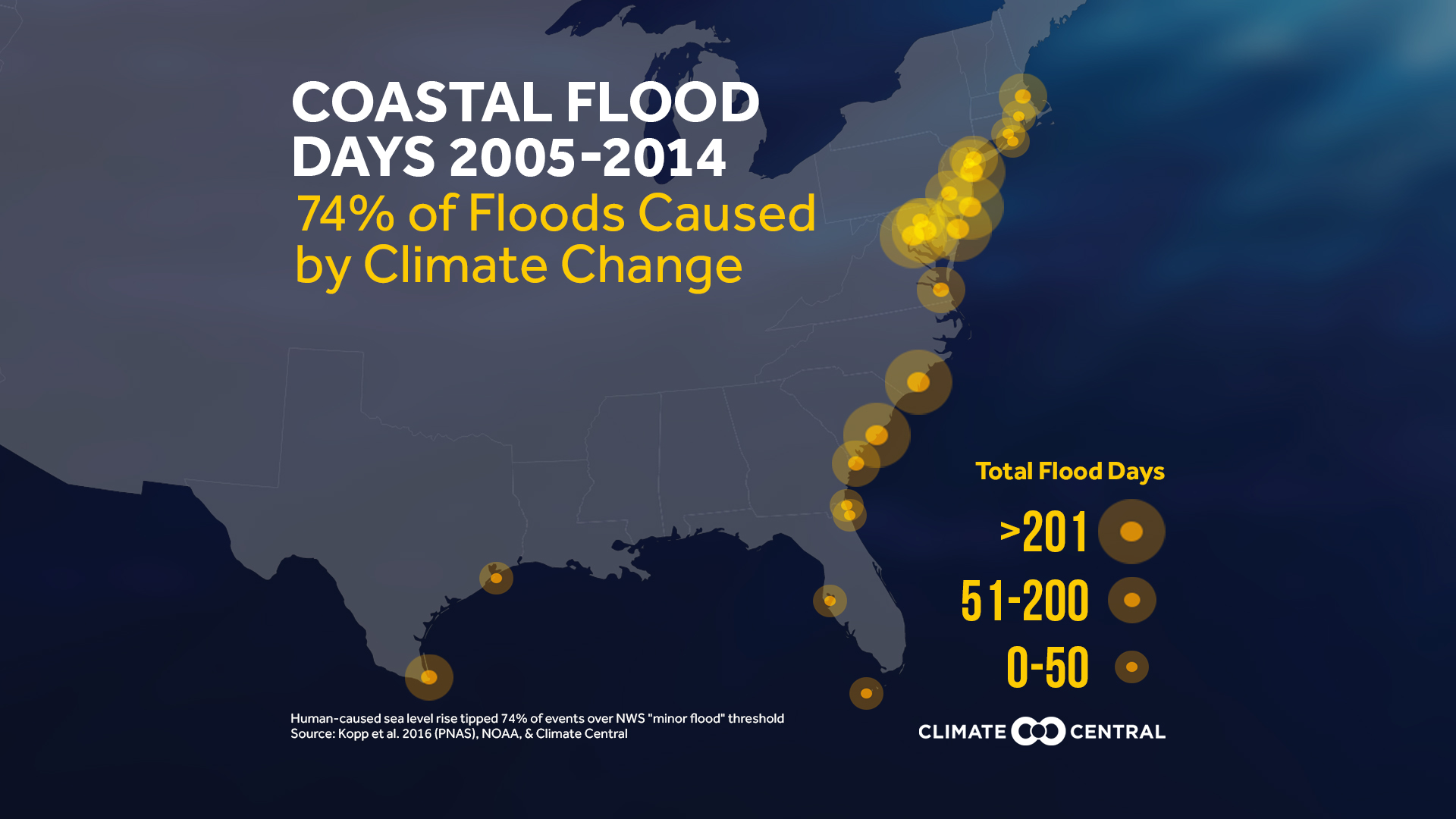
Climate Central: Coastal Flooding on Atlantic Seaboard
8. Such cartographical embodiments are perhaps the clearest records of the effects of increased in temperature that are undeniably man-made, but the relation of the local to the inexorable rises of temperature that we’ve witnessed in the past thirty-five years have been less clearly concretized for many.

People once feared what lay beyond their village, down the road or across a forest; maps of the local knowledge of the effects of global warming is particularly powerful in communicating the proximity of fear. For as digitized maps of the United States are generated and proliferate online with unprecedented ubiquity, perhaps the scariest images we encounter are models of impending environmental uncertainties whose neon rasters intimate alternative scenarios of climate catastrophe that are indeed lying close at hand. And it is perhaps for the impact of the locally based knowledge of global warming–a point to which this post returns at its close–that the “Since the Paris [climate] agreement, the greatest level of action on climate reduction is coming at the state, provincial, and municipal level,” according to Ontario’s Environment Minister, precisely because the national level is both unwieldy disproportionate, and that climate change is most clearly concretized on a local level: maps of climate change have their impact on immediate settings and practices, not policy-level decision, in ways that might give heart to those who, faced with the preparations of a future Trump administration to roll back protections of the environment on a federal level, and affirm the potentially vital role of subnational jurisdictions to limit local emissions and engage in practices of cap and trade.
Currently increasing fears of silencing or reducing gathered data on climate change among many scientists–collectively scrambling to copy earth observations that have charted the changing atmosphere of the planet’s climate, pose the problem of keeping data of earth observations from space alive for future generations, and indeed converting them to readable and persuasive form as a record of the dangers of climate change. The very global maps that seek to persuade viewers of climate change are perhaps too daunting in their complexity–and removed from experience–to communicate the effects of climate change. Maps as the above are not of climate change per se, but suggest the increased fluidity of our shorelines in an era of increasingly disruptive coastal flooding, impending drought, destroyed low-lying habitat and ocean pollution from land erosion that leaches and runoff containing nitrogen fertilizers, pesticides, sewage and industrial wastes. To map the complexity of climate flows, we increasingly depend on satellite-based remote sensing to create a coherent picture of the increasingly ecotonal equilibria of land and sea.

Remotely sensed maps rack and model climate change globally and in the United States have come under attack for forecasting of temperature rise, global melting, and scenarios of climate-related disasters.
 IOP Science/Ben Strauss et al. (2012)
8. Cast as maps, sensed data offers models of the risk of climate change in potent persuasive records of considerable elegance; despite the immense complexity of the physics of such changes, the continuous sensing of air temperature and oceanic extent capture the essence of causation webs whose continuity could not be otherwise grasped. The propositions of maps of climate change have come squarely within the crosshairs of the climate change “skeptics” who have been charged to lead the Trump transition team who’s eek to exclude the Earth Sciences program from the future activities of NASA–such as Christopher Shank–who hope to eliminate “heavily politicized” programs of remotely-sensed climate data from NASA’s research aims. Rather than being a failure of mapping, the success of such maps have placed earth-observation is in the sights of the Trump’s circle, who seemingly seek to avoid all contractors who attended negotiations for the the Paris Agreement, developed metrics for projecting the social costs of carbon emissions for the Department of Energy, or trusted empirical climate science.
The decision to go after such maps seems like nothing less than a form of cartographical bullying. To be sure, Trump’s interest in doing so may rest in a rejection of the notion of a global “carbon budget“–a concept that emerged over fifteen years ago, as scientists began to calculate the impact of burning fossil fuels and their relation to temperature change. If global competition offers Trump and his nominees a primary lens on the world–indeed, China has surpassed the United States in carbon output, and Japan’s carbon output grows–who paint the budget as a national restraint, the registration of climate change data provides a basis to judge its extent, rather than a basis to restrict the use of oil and coal that threaten the climate–and climate monitoring is misleadingly tied to limiting emissions of power plants, automobile driving, airplane fuel, or industry and holding them accountable to the environmental consequences of sanctioning the unrestrained burning of fossil fuels.
For such complex changes demand to be embodied in maps that better process the dangerous eventuality of sea-level rise and its consequences–it only to try to stop its occurrence or create more resilient responses to climate change. Even in an age of big data, much the world depends on the scientific accuracy and continuity of NASA satellite feeds. Although the rising of the shores are widely perceived at first hand, the value of the continuous collection of data of earth-based observation offers the best and clearest tracking of surface temperature, ocean extent, groundwater and polar ice, all threaten to be silenced by government fiat: the familiar color-saturated images that map concentrations of heat-trapping greenhouse gasses in the atmosphere have been long systematically discredited as propaganda by the extractive fuel industry to the extent that the very program for their production may be defunded, seeking to kill the medium of the message. (After an adviser to the Trump transition hoped to eliminate NASA’s earth science programs, an angry governor of California vowed the state would launch “its own damn satellite[s]” to monitor its own oceans, coastal erosion, fires and air.)
The dangers of defunding climate research–a program of NASA whose budge expanded to $2 billion annually, and ranges from observation of atmospheric temperatures to polar ice thickness–would foreclose the most accurate assessment of global temperature change and calibrations of environmental change to model future climate on a global scale, and the embodying of climate change in maps. The anticipated disruption of the continuity of climate data collected over decades reflects a Trump administration staffed by climate change deniers who discount understanding trends in atmospheric temperatures. Trump’s transition team indeed distributed a lengthy questionnaire of McCarthyist tenor quizzing members of the US Department of Energy to describe their trust of empirical records of climate change, involvement in “efforts to limit carbon emissions,” and experience of measuring carbon output or attendance of climate change conferences sponsored by the United Nations “in the last five years,” with a persistence that barely cloaks an intense animosity to research, and suggests an interest in eliminating experts of climate change for their alleged bias.
The eery undercurrent of such questions does not question the accuracy of remotely sensed observations, but suggests an outright rejection of staking opinions about ocean changes, as if to silence the discussion of climate change by the United States Government and to intimidate the ownership of evidence within a scientific community–the practice of such “guerrilla archiving” to save scientific data from state censorship responds to an unprecedented arrogance of making reality conform to one’s own models. Even before the linguistic new order of “climate contrarians” eager to alter climate change policies of the Environmental Protection Agency had strenuously advocated, the plans to “undo the EPA power plant regs” by Myron Bell, whose Cooler Heads Coalition is “focused on dispelling the myths of global warming by exposing flawed economic, scientific, and risk analysis,” sees any climate policy as a constraint on civil action and views climate science as imperiling limited government and constraints on private property. (Ebell has dismissed the scientific efforts that underpin these visualizations as created by “a lot of third-, fourth- and fifth-rate scientists [who] have gotten a long ways” deceiving the public; the ability to pull the plug from an onslaught of such satellite-generated imagery that depicts the dangers of climate change in detail seems too tempting, and the consequences of doing so too terrifying to believe.) Despite the attention to our national borders during the 2016 US Presidential election, challenges to our shorelines, coasts, and floodplains went almost ignored–less time was devoted in Presidential debates to climate change or energy in 2016 than was merited; the subject absent from most any Presidential debates since Al Gore ran for the Presidency. The issue has been unfairly marginalized. The dismissal of climate science as “politicized science” is not only unprecedented but perpetuates disinformation of assertions man-made climate change and global warming are but a hoax attributed to elites, and foisted on the nation–an argument without a clear narrative, but long advanced by the industry of extractive fuels.
9. The misreading of the politics of climate change–and the maps of our shores–inverts more cautious and less alarmist narratives of possibly modulating carbon emissions. There is almost a clear suggestion that if not to paint climate scientists as pursuing a hidden agenda as if were un-American. Indeed, the feared disruption of the continuity of climate data collected over decades in an administration staffed by climate change deniers would discount recent gains in the measurement and understanding of global trends in changing atmospheric temperatures that would threaten a real loss of continuity in climate science.
President Elect Donald J. Trump persists to allege that “nobody really knows” if climate change is “real” in deceptively dangerous ways, perpetuating a dangerous message of climate change denial: in recent days, Trump has cast the authority of climate change models within a message that is “job killing,” “terrible idea,” and in fact only a “hoax.” Indeed, there almost seems a particular pushback to the extent to which the increasingly elegant interactive features of climate maps have offered viewers the ability to envision alternate outcomes, emphasizing contingency as much as naturalizing jurisdictions as stable, and framing supra-national questions that demand collective action beyond anything like national frontiers in ways that seem to undercut the logic and vision of a program designed to put “America First.” The resuscitation of plans to cut NASA’s research budget into climate science, since “most of it is a bunch of bunk.” Tabling climate monitoring of global warming to which the United States has committed would undercut any serious public discussion of climate change: indeed, a focus on deep space would funnel federal funds to engineering firms and public-private partnerships. Yet such broad redirecting of federal monies to defense contractors–such as Lockheed Martin, Raytheon, Boeing and Northrop Grumman–in place of funding environmental monitoring that would be a huge victory of a military-industrial complex long waiting to regain an upper hand despite increasingly pressing environmental concerns.
Doing so suggests a weirdly topophilic localism based in isolationism, removed from the nature of the spatial complexity of climate change. The creation of impressively persuasive rhetorical power interactive maps boast surely makes them especially effective tools to dramatize alternative scenarios of climate change and of the scale of anthropogenic impact on the inhabited world and targets. For they are powerfully provocative rebukes to the obstinacy of climate change denial. To interrupt collecting uch data could bolster the discrediting of climate science on global warming and help to raise questions about the credibility of sea-level rise–minimizing the value of maps based on continuous data and the mapping of trends from remote sensing satellites–from forest fires to temperature change and ice thinning. Hence, the frantic downloading of government-funded climate observations to private non-government servers for public interest lest it be lost to future scientists to map and document a continuous record of climate change–before, as the deputy director of the Union of Concerned Scientists’ Center for Science and Democracy put it, “those who want to dismantle federal climate change research programs storm the castle“–and blur the extent of man-made climate change.
Is the best way to combat these threats to produce maps of climate change that more effectively link the local and global–and affirm the possibilities and extreme importance of the locally based knowledge of climate change? Whereas sophisticated and detailed images were created to offer forms of judgement for specialized scientific communities, and to generate support for reducing national emissions, the elimination of indispensable criteria for judging a rapidly changing climate and the effects of man-made global pollution or ocean acidification rests on their being recast as being polemic distortions to justify federal over-reach–as if elites wanted to oppose the interests of the nation. Indeed, in ways that seem to sit with the apocalyptic populism that coasted Trump to an electoral victory, the erasure of such a mapping of climate change seems all too easy to end, redirecting NASA’s budget to deep space exploration, would replace environmental monitoring with a massive gift to defense contractors–old Republican clients of the military-industrial complex such as Lockheed Martin, Raytheon, Boeing and Northrop Grumman–as well as to decimate a scientific program. The victory of a military-industrial complex long hoping to regain an upper hand would come at a huge cost to increasingly pressing environmental concerns, funneling federal funds to engineering firms and public-private partnerships above the considerable technologies developed to make climate change more legible.
10. The feared erasure of a detailed map of climate change and the disappearance of a comprehensive map of climate change is real. For any limiting of decades of government data would effectively compromise a picture of climate change would allow members of the incoming administration who deny climate change as man-made–despite agreement of 97% of climate scientists that accelerated global warming it is. For in the name of a false sense of populism, and even as the collation of mean temperatures in the United States increasingly diverged from average historical records,

–with a rise in unexpected flooding, relative sea-level rise, and ice-thinning, the defunding of remote sensing would disrupt the feed of data maps of climate change and interrupt the monitoring of the historical continuity among datasets that provides the most powerful means to formulate historical trends in sea-level rise, aridity of soil, and polar melting can we register the complexity of climate change.
Indeed, the ways that landscape, climate maps, and art intersect might deserve to be rethought at the moment when the completeness of such maps based on remote monitoring has come under attack. For despite the tendency to meld such meld such hypothetical scenarios into apocalyptic thought that includes viral pandemics, radiation leakage disasters, bolide impacts from asteroids, or other impending catastrophes, the human-made nature of climate change is oddly implicitly denied. Despite the range of evidence of increased temperatures, drought, unnatural flooding and polar melting, resistance to acknowledging or responding to climate change has grown with resistance to mapping. But the value of these maps only begins to capture the dynamics that global warming and sea-level rise pose to our shores unless carbon emissions are decreased.
Geographic distributions of greenhouse gas emissions across the nation have sharply and dramatically increased over previous generations, in ways that make compelling maps. Despite the scary density of self-reported emissions of greenhouse gases in the lower forty-eight–here depicted in a bubble mapping of concentrations of metric tons of carbon dioxide emitted by all sectors of industry and consumption which suggest its reflection of the most inhabited areas of the United States, but also, notably, of its agricultural centers:
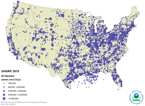
The heat islands of many urban centers in the United States are small greenhouses of accelerating temperatures–often tied to carbon emissions.
Yet the greatest index of climate change rests in sea-level rise brought by arctic melting. Indeed, the numbers of coastal flooding, resulting from sea-level rise, has progressed at an alarmingly rapid rate, far beyond earlier eras–that makes the continuity of local observations crucial to isolate climate change that is generated by human activity. If sea-level rise due to current global warming has doubled the risk of extreme coastal flooding since 1880,

the risk will easily triple across the lower forty-eight with continued sea level rise.
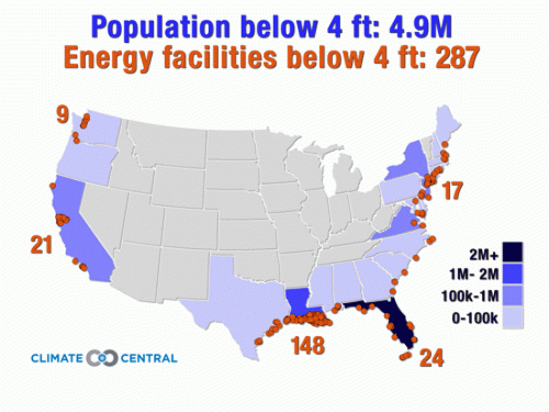 (2012)
But the geography of climate change is embedded in a topography of complex causation webs and increased uncertainty, without much evident continuity in maps alone. Despite the flushing in to the atmosphere of increasing amounts of metric tons of carbon dioxide, methane, or nitrous oxide and fluoridated gas emissions circulate, such a point-based map can hardly communicate the drifting of such gasses across the globe, with a continuity far more difficult to process cognitively, whose wind-blown diffusion is mapped not by points but rasters to foreground their accumulation and concentration, as they circulate driven by wind currents, trapping of heat in different areas best detected and tracked by remotely sensed observations to reveal the global impact of heat-trapping gasses able too e placed in a global context, rather than a local one–a problem of synthesis for which satellite observation and data registration is particularly crucial–even if they are taken as a form of scientific propaganda designed to hamper industries through undue regulations.
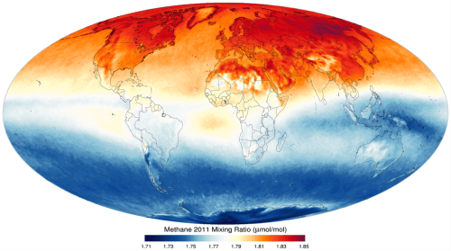
Temperature rise over time reveals uneven continuity, but can be chronologically charted over a longue durée; temperature changes have historically grown in the global climate during World War II above atmospheric concentrations of 325 ppm, escalating dramatically in recent decades as a consequence of massive consumption of fuel throughout most of the globe in concert with extensive deforestation–underscoring the impossibility of processing any geographic distribution of greenhouse gasses without a chart of historical levels of emissions, and the need for continuing to register global datasets.
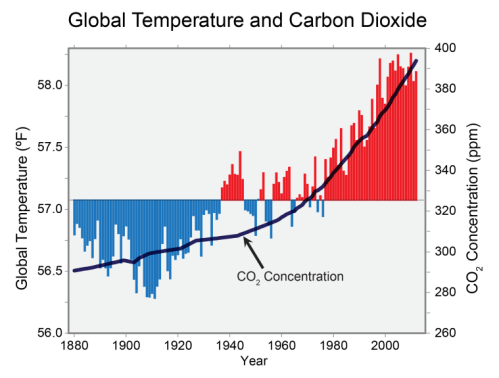
And the acceleration of such carbon gas emissions in recent years has been so striking that projected soil moisture for the future United States of 2095, according to a recent NASA study, assuming no restraints on carbon emissions, with our future bringing the “dust-bowlification” where the southwestern United States and central plains is beset by megadroughts by the century’s end in their map of local soil moisture, due both to lack of precipitation and soil evaporation, and a continuing growth of carbon emission levels.

NASA Goddard Flight Center/Climate Progress (2015)
–and a grimmer global picture that models the effects of consistently rising global carbon emissions on a global level by 2080-99, using a Palmer Drought Sensitivity Index including lessened rainfall and decreased plant and ground evaporation.
Cook, “Global Warming and 21st century Drying”
But the projection of processes of global drying out, disastrous for food production and agriculture as well as for species, finds its counterpart in the accelerated warming of oceans that produces sea-level rise–particularly evident when remote observations are placed in relation to a pre-industrial dataset.
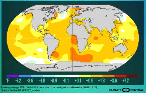
11. To the extent that maps present is based on actual records of earth observation and far from a simulation, the measurement of global climate change and surface temperature rises seem to encounter resistance. Perhaps the topophilic nature of most people-their identification with place has encouraged an outsized place of that place in their spatial imaginary–and the remove of place from a model of global climate change.
Remote sensing offers tools for tracking temperature and modeling climate change far more accurately than earth-based measurements, as does remotely sensing and synthesizing arctic ice-melting and declining water presence in the ground. Despite the preponderance of evidence in maps of man-made nature of such changes, the resistance to accepting monitoring of temperature change is an almost cognitive refusal to continue to process or calibrate climate change–even as the global temperatures in January 2016 far exceeded earlier years since temperatures were first accurately recorded.
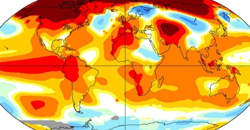 NASA/Temperature Anomalies for January, 2016
For both projections and maps of carbon emissions, sea-level rise, increasingly unnatural coastal flooding and drought have been dismissed as doctored hoaxes, based on small samples and as hypotheticals, in ways that undermine their persuasive value. Despite the importance of such maps to explain climate change, the widespread dismissal of them as deceitful attributions of temperature changes or the consequences of continued carbon emissions to human agency needs to be confronted, especially because the incoming Trump administration has promised to roll back climate protections as a first act.
The role of local maps are perhaps particularly vital here to spur local action on climate change. Although the United States is not yet nearly as vulnerable to extreme droughts, floods, and temperatures as many areas, we are beginning to perceive changes to our shores and sea-levels, and as we do we may be feeling the first localized impacts of climate change–and come to terms with the strikingly localized denial of the existence climate change risk or its man-made nature in the United States. Even as observations of rising temperatures are evident across much of the United States in recent years, with clear consequences on crops, irrigation, and land moisture,
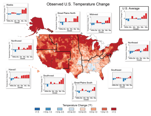
an almost atavistic insistence on the impermeability of our boundaries have left many convinced of the stability of our shores.
Mapping the increased instability of our shores–and the greater threats of their greater instability to the nation, rather than the guarding of our national frontiers–is a consequence of the accelerated concentration of greenhouse gases in the atmosphere far exceeding naturally occurring levels–a concentration of “greenhouse gasses” on track to increase sea-levels considerably by 2025, and to double that increase by 2100 if carbon emissions are not stopped. We might begin by mapping the permeable nature of our coasts, and the spaces, species, and habitats that climate change stands to compromise, indeed, as a way to understand the local impact of climate change, and the compromising of the “safe spaces” of the shores in a world of accelerated climate change–and calling for a different sense of spatial geography. It is not surprising that coastal regions of the United States are the most ready to accept man-made climate change–those living in Hawaii, California, and Massachusetts are most ready to attribute climate change to human actions–the power of maps to convince non-coastal states of the dangerous complexity of climate change’s cascading effects are perhaps most able to be staked through how remotely sensed maps of the dangers climate change map the danger sea-level poses to our coasts. Yet recent studies in Advances in Political Psychology suggest that even the more Republicans know about climate change and science, and are familiar with the complex causation of global warming and climate change, the less they believe it.
12. Can maps offer a needed and important counterweight to such deniers?
Non-profit cartographers have tried. But in the matter that the denial of evolution seems to grow as religious people learn more natural sciences, the persistence of the denial of climate change appear as constitutive parts of a conservative agenda–as if acknowledging climate change was linked to endorsing regulation, and denying climate change a pillar of support of an unregulated free market, even in the face of experiential evidence of climate change. The need for maps to stake a counter-argument, and to embody the local consequences of climate change beyond its denial–here represented by the denial of elected representatives of the evidence of climate change as of the current year.

For the open denial by political representatives of local states in the existence of man-made climate change–even in areas such as Florida, South Carolina, and New Jersey, if not in Louisiana–suggests the level of local denial and disinformation about global warming, and the difficulty of local legislatures in resisting impending regulatory changes.
The map suggests the important educational role of maps that document and embody climate change and the increasingly permeability of the nation’s coasts–and the alternate futures that would be created by continued sea-level rise, and the increased importance of creating a visually convincing interface in climate change maps. The question of how best to generate convincing maps of the relation between man-made emissions and climate change remains of increasing importance in a potential era of cartographical silencing of climate observation. Aggregate maps of the global rates of the emission of greenhouse gases present an image indeed overly abstracted from space–as is, perhaps, a danger of all maps–whether in an interface of spatial data of aggregate emission of greenhouse gasses from fuel combustion in a sterile Google Maps template–
–or in the cumulative register of the increase of total greenhouse gas emissions across the globe from 1990 to 2014, whose emissions and removal of greenhouse gasses can be viewed in aggregate by country, to better understand an international framework for negotiation–
–or by warping the globe we can reveal the proportional range of carbon emissions, either actually or historically, to accentuate their disproportionate distribution of both–and the particularly self-serving ways that Americans might deny the expansion of carbon emissions as having an effect on accelerated global climate change:
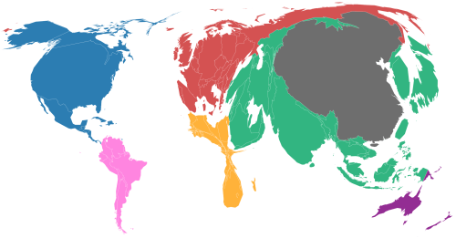
Carbon Map: Continents Resized by Current Emissions of Greenhouse Gasses
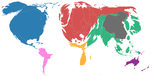 Carbon Map: Cumulative Emissions of Greenhouse Gasses, Sized by Continent
These dramatic increases in carbon emissions must be mapped onto human agency in ways that are completely convincing, if one is not able to map or model such emissions onto actual calibrations of climate change, in ways that might concretize the rates of their impact on our shores, climate, and species. Indeed, the new image of the nation provided by remotely sensed climate maps promise to register current changes in levels of trapped greenhouse gasses, polar and glacial melting, and sea-level rise to speak truth to and take stock of how rapidly our planet has changed as we are poised at multiple “tipping points”, where a even a small change in temperature can put us in a self-fuelling spiral of unstoppable consequences of accelerated temperature rise. How much methane will be released that is trapped in the melting permafrost and in sea-beds in a warming ocean, and, if some or all of that methane is released, what effect will it have on the planet?
The consequences of risks of climate change are notably disproportionate on both agricultural production, as we have already seen, and economy, as well as living standards. The resizing of continents by regional risk of sea-level rise argues for the pronouncedly limited risk the United States seems to face relative to the rest of the world–
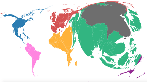 Carbon Map: Global Risk of Sea-Level Rise
–and the need for a more powerful embodiment as a risk through maps. Although the question of outsized responsibility of richer areas of the world for greenhouse gasses emission by their distinctly outsized patterns of consumption is fairly clear–
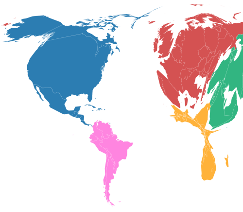 Carbon Map: CO₂ Emitted from Goods/Services Consumed
–reluctance to accept the risks of the diffusion of greenhouse gasses into the atmosphere of the planet is pronounced. Ever so eerily, those areas most under threat of sea-level rise stand in inverse relation to areas of carbon production through patterns of consumption.
 Carbon Map: Local Risk of Sea-Level Rise
Remotely sensed observations of temperature and moisture in croplands and mountains is increasingly valuable to create a comprehensive model that is empirically based, and to disentangle the disproportionate nature of these risks, and the pace of their acceleration through an accurate tracking not only of polar ice-thickness but sea-level rise, and of the shifting relations between land and water and their consequences on a global climate.
13. The distribution of greenhouse gas emissions can be usefully combined with historical measurements or data to create a retrospective view of potential climate change. Such maps can suggest the terrifying fluidity in quite compelling ways. Although many projections are of necessity complex simulations, the painstaking nature of their creation reflect a need to communicate the fluid relation between water and land convincingly–and continue to map the level of water presence in soil, oceanic change, and polar melting in relation to man-made changes in the environment of the world–to try to concretize the consequences of climate change in ways that have considerable teeth.
Do the constituents of Donald Trump believe that he is able to combat the inevitability of climate change as a demigod, removed from natural processes of causation? For the force of such maps of coastal change provide the best possible response to the continued stance that climate change is a hoax. Before claims of an absence of scientific consensus, remotely sensed maps provide the clearest documentation of the consequences of man-made global change–although their construction has been dismissed. And while the man now calling himself “President Elect” claims being committed to “studying” Climate Change in vague terms, the doublespeak is apparent: his insistence “nobody really knows” as to its anthropogenic causation capture the feelings of many supporters in the southern and midwestern United States. The distribution of trust in man-made climate change almost mirrors his frequent stirring up of crowds on the campaign trail by taunting questions of “Who believes in global warming?,” actively discrediting climate science and linking it to federal regulations that cost Americans local jobs and American productivity. Concern about climate change–and trust in human causation of global warming–have long divided along party lines, with Democrats agreeing there is “solid evidence” of global warming due to human activities including the burning of fossil fuels and but 20% of Republicans in accord, 97% of climate scientists strongly agree that accelerated global warming is man-made. The geographic distributions of such convictions may reflect levels of access to education and science, however, as well as coastal experiential confirmation of the persistence of climate change.
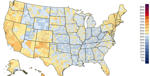
The Percentage of County Populations Believing Climate Change is Man-Made
Yale/Climate Change Communication (2014)
Yet the issue of climate change, if not receiving much air-time in the recent election, underlay much of its rhetoric–and it is to some extent unsurprising that the EPA regulations of a Trump administration would not only be far more less stringent on emissions. But the decision to defund activities of earth observation within the budget of NASA–and to curtail remote sensing of the earth’s atmosphere that have provided, through NOAA, maps of the levels of ocean change, carbon emissions, and polar melting for many world-wide. The proposed changed policy and funding concretizes a blanket denial of climate change, and seems designed to eradicate grounds for regulation or, indeed, for the public persuasion of the impending dangers of climate change.
12. Team Trump’s sustained animosity to tools of satellite monitoring of the world’s climate may indicate their awareness of a need to silence cartographical documentation of the shifting nature of our shorelines–long suggested by NOAA and NASA satellites. For by targeting of projections documenting their increased fragility in an era of warmer temperatures and climate change, they challenge one of the central persuasive tools of providing more compelling evidence of climate change, and indeed keeping a running record of changes in the global climate in the very interconnected ways needed to make a case for slowing carbon emissions and the acceleration of global climate change. Even the rise of just beyond two degrees centigrade that could be achieved only with a substantive decrease in carbon emissions per capita of 8-9% among the signers of the Paris Accords–8% by 2025 and 9% by 2030–could the projected temperature rise of 2.7 °C increase be prevented, and the consequent melting of polar ice prevented whose consequences have been so widely shown in various scenarios.
For in the headwinds of the 2016 US Presidential election, a deep hatred of educated elites as climate scientists and of those associated with universities among uneducated declines seem to have promoted a logic of not funding climate investigation,–undoubtedly fed by an anger as well as a resentment at imposingtop-down restraints based on “know better” rhetoric of apparent condescension that has become emblematized by climate maps. For the discontent about the uneven nature of education in a neoliberal society seems to have encouraged a widespread rejection of the dangers of climate change, and indeed of the notion that we are condemned to face the dangers of global warming based on the behavior of industrialized nations and the concentration of greenhouse gases created by the burning of fossil fuels, and of the super-national accords suggested by the Intergovernmental Panel on Climate Change to prevent the increased atmospheric warming that have led already to just under a degree change in global temperature since late nineteenth-century industrialization. At a time when we are poised at a growth of 1-2 °C increase would lead to a sea-level rise of 24–30 cm by 2065 and 40–63 cm by 2100 relative to sea levels from 1986–2005, in ways that would create a cascading of heat-trapped gasses creating increasing acceleration of polar melting, sea-level rise, coastal flooding and drying out of lands. While the rejection of such projections is often based on the first-hand knowledge of locations, even the rise of sea levels across the United States that NOAA has detected, even if evidence is mixed, suggests considerable coastal change in sea level variations most dramatic where shores are flatter.

Perhaps it would be far more helpful to conceive of our shores as far more fluid than they have been represented in the past-and for the rasters of climate change maps to register the dangers of their continued compromise.
14. The complex relation of carbon emissions to the causation of climate change–whose mechanics do not only imply “warming” and after being semantically re-presented as “climate change” have often increased skepticism among many–have led its mapping to be rejected and mocked when the data is displayed in rasters. Such rather alien maps suggest a spatial economy less easily understood as linked to pronounced heat waves, concentrated torrential rains, stronger storms, wildfires, less snow, and lower soil moisture and envirotranspiration, as well as warmer oceans. Projections based on simulations of alternate climate scenarios provide compellingly cautionary images of alternate futures we might focus on for their need to preserve a global purview, and to suggest the complexity of climate change. Maps of intense reds, swirling carbon emissions, apocalyptic ochres and crimsons only seem to be displaced from human agency for many, and dismissed as propaganda concealing other interests.
Have such maps been too easily elided with the views of experts, whose agendas are seen as removed from those of most Americans? If climate change is a set of processes of a complexity in causation only fully grasped by few specialized experts, its cascading relations are truly difficult to concretize in persuasive terms in maps. The demands for global coverage in maps of climate change may result in a cartographic quandary of remove from local explanations of the consequences of climate change, that remove them from viewers: raster-based maps register shifts in increasing compelling ways and attention to be directed to the fluidity of shores and environmental features of our topography. Indeed, the visualizations that of such a global phenomenon on local levels need to extend to accurately represent the instability of shores, soil moisture, ice-extent, ice-thickness, and crop vitality and health in remarkably compelling ways to set new standards for the persuasiveness of the map. For the mapping of climate change needs to reveal and help process the new spatial economies that are potentially quite challenging to understand–not least because they are emblematic of the technocratic and perhaps over-educated managerial classes of America–whose commitment to the nation is more widely questioned and suspect, for the very reason that their sympathies are more removed from the immediate interests of the working class.
The maps of projections of increased aridity are, of course, based on the precedent of a history of increasing warming and aridity in the western United States, and is in this sense closely tied to the experience of a part of the country. But when pictured in isolation from a sense of environmental complexity, the dangers of a greater number of high “degree days” seem overly abstracted from experience, and call into question what the model that leads to such a conclusion–a model hidden in the map, to some eyes making it more suspect–conceals, and its deceptive indication of anthropogenic change.
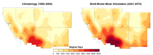
The picture of increasing aridity is of course incomplete with a focus only on land–without inclusion of receding ice sheets, sea-level rise, and ocean acidification. Yet the sustained work of NASA satellites’ remote measurements in mappings scenarios of the global climate changes we might expect due to increased greenhouse gas emission as early as 2100 will provide a basis to cope with the warming planet that lies with little doubt on our horizon–yet the problem of starting to make such a map immediate to its observers has been made increasingly pressing by the last presidential election, when increasing contempt was voiced by Trump of Barack Obama’s commitment to the Paris Agreement, provoking doubts of continuing it,–or even employing a similar scientific community of climate observation that the Obama administration promoted in its Departments of Energy and EPA.
The contest between on-the-ground populism and the elevated views of a planet defined by rasters of its changing CO2 concentration could not be clearer.

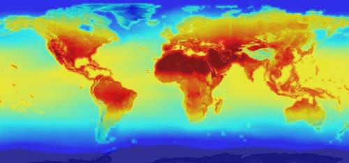 Projected Global Temperature Change by 2100/NASA
15. Yet the persuasive power of maps of climate change is considerable. Although the bright neon colors of the rasters in most images of climate change oddly suggest denaturalized images of the geopolitical maps of nations, they trace changes in temperature and precipitation and landwater that spread across, around, and beside boundaries to suggest the global stakes of the problem. We might consider how to make them more real for observers.
The absence of any points in the map may show only a vague sense of presence–and undermine the sense of territorial presence in most maps. That is perhaps their point,since the propositions that they make are global in nature, an have to be understood as a new relation between the local and global. Whereas land maps were once primarily seen as tools of government and governance, and portrayed as instruments and records of state authority: the modernization of maps is closely tied, after all, to notions of jurisdictional sovereignty and provided instruments for the administrative state. But the questions of how to make maps for a broader audience seems particularly important if their are to retain and gain greater persuasive power. Indeed, the unclear frontiers of climate maps–and maps that show climactic change–are striking because the tools to map shifts and accelerating changes challenge notions of geographic stability, even if they allow us to examine, evaluate and judge the implications of climate change across the inhabited world.
The daily projections of global climate change seem a service to the world that is increasingly needed, both accounting for the status of the United States remains the second largest global emitter of CO2–and the largest national, and second-highest per capita emitter of carbon dioxide–as all as the greatest historical producer of CO2 emissions worldwide.

The prominence of how the United States is altering the world’s climate seems all too clear, but is barely recognized in our national political debate–and was all too dangerously elided in the past presidential election, where climate change played a far smaller role in debates about Presidential leadership than was warranted, even if it no doubt provided a logic that directed much of the funding for the Republican team as a whole. Indeed, the absence of clear ethics in accounting for this contribution seems a form of denial in danger of being continued with the prominent place of climate change denial among the incoming administration, should Trump claim the presidency. Indeed, not for no reason did over 300 scientists warn over Trump’s climate change stance at the time of the Republican convention, perceive the difficulties in electing a man who went against scientific consensus at a delicate time of negotiating climate policy.
And the absence of a strong feelings about the phenomenon of climate change–even if it remains, as President Obama has tried to educate the nation, a prime danger that faces our nation and the world–suggests that a clear story or narrative about that danger remains to be told, despite the wealth of resources at our disposal For a large expanse of the nation–and perhaps not coincidentally an expanse that was particularly receptive to Trump’s open climate change denial message. For in casting Barack Obama and the Democrats as anti-coal, he has treated climate change as but an emblem of globalization that allowed the United States to be regulated by international bodies. The rhetorical association of climate change to a lack of individual security and the vicissitudes of currents of global flows of capital and a compromising of America–even if it also suggests a terrifying gap in educational divides and a broken promise to much of the nation and maps a yawning gap in local empowerment.
Yale Environmental Studies–Climate Change Communication Center (2014)
The lack of purchase that climate change or global warming has seems tied to the lack of ability to embody its dangers to much of America, and to paint a picture of its consequences. If a large number of Americans–here shown by increased redness in the same ramp–believe that the government should regulate the carbon emission–
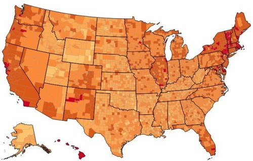
Yale Environmental Studies–Climate Change Communication Center (2014)
–vast expanses of the country that are not located on the coasts simply do not.
The suggestion of Scott Pruitt, who Trump has named to direct the EPA, that debate exists on the scientific basis for climate change–Pruitt recently chided scientific communities for an imagined lack of consensus, arguing“Scientists continue to disagree about the degree and extent of global warming and its connection to the actions of mankind“–laces doubts in the documentation of the extent to which anthropogenic changes in climate have created environmental hazards globally. It is not a surprise that the data underlying climate maps are targeted since they embody this change, as if to deny the prominent place of the United States as the second greatest emitter of CO2–and in per capita carbon emissions–making participation the participation of the United States in the Paris Climate Accord crucial to limit global temperature rise to 2 degrees C above pre-industrial levels–
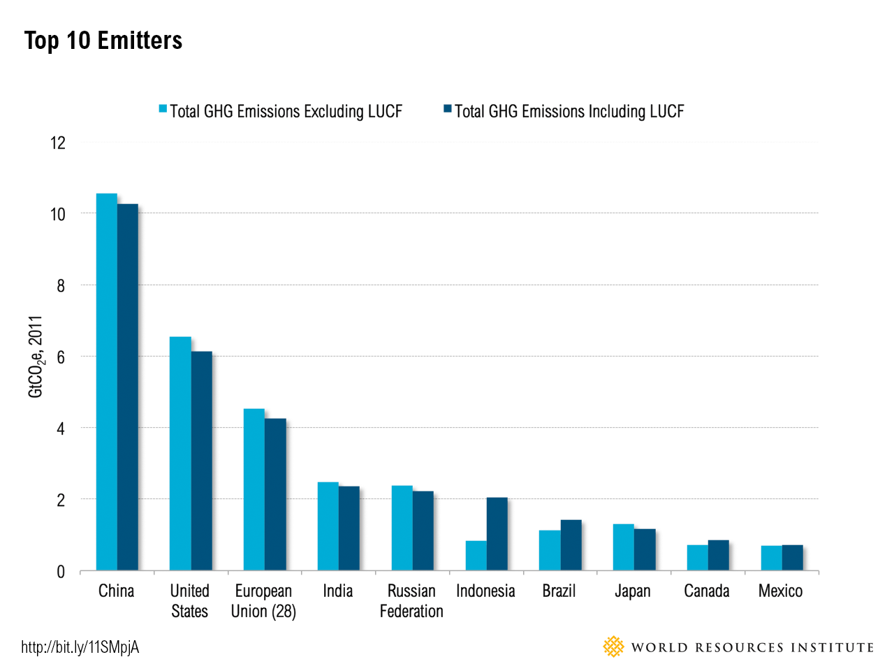
16. Is the apparent abstraction of rendering climate change part of the problem?
Maps that link real-time levels of greenhouse gasses to their geographic impact-and offer the clearest indices of the local impact global climate change, concretizing the extent of anthropogenic climate change, by revealing the possible dangers of the effects of emissions on the increasingly fluid shifting relations between land and sea. For maps that chart propose to direct attention to the effects of climate change on the levels of oceans and the entrance of melting ice sheets into the sea. If such maps offer a comprehensive rebuttal to such assertions of scientific dissensus, their production–and indeed the documentation of NASA earth observation, stand to be curtailed to cease to produce the very sort of graphic documentation that gathered support for the climate regulations of the long-negotiated Paris Accords. The proposed defunding of NASA’s Earth Sciences division is misleadingly represented as only a budgetary question, for support for ending the Earth Observing System that has gathered the very data that substantiated climate change–from shoreline change to groundwater levels to thresholds of glacial melting and ice density–would occasion a sort of cartographical silencing that is difficult to comprehend. Cutting of the production and dissemination of such earth observations from NASA seems designed to bolster a skepticism about climate change science.
To claim such a default position ignores the considerable historical dominance of CO2 emissions from the United States over time, whose absence of ethics might well make one consider the considerable interests in refusing to tie them to climate change.
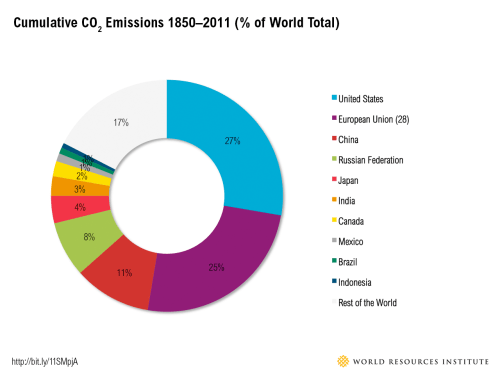
Although the deep spray-paint like colors of the rasters in most images of climate change suggest denaturalized images of the geopolitical maps of nations, they trace changes in temperature and precipitation and landwater that spread across, around, and beside boundaries to suggest the global stakes of the problem. The absence of any points in the map may show only a vague sense of presence–and undermine the sense of territorial presence in most maps. But that is perhaps their point, since the propositions that they make are global in nature, an have to be understood as a new relation between the local and global. Whereas land maps were once primarily seen as tools of government and governance, and portrayed as instruments and records of state authority: the modernization of maps is closely tied, after all, to notions of jurisdictional sovereignty and provided instruments for the administrative state. Yet the unclear frontiers of climate maps–and maps that show climactic change–are striking because the tools to map shifts and accelerating changes challenge notions of geographic stability, even if they allow us to examine, evaluate and judge the implications of climate change across the inhabited world.
Whereas we often map the shore as a straight line dividing land and see, the economy of space in remotely sensed maps dramatically change; the mutability of shores and instability of coastal regions suggest a new economy of space. The continuous rasters that map climactic change–rather than point data– propose that we look at and focus on the increasing instability of shores in continuous fashion, in ways that render a real-world environmental change not only inconvenient and uncomfortable since these changes are so dangerously widespread. The very changes particularly difficult to comprehend in the abstract gain concrete local particularity as the synthesis of data from satellite-based remote sensing shapes information about climate, oceans, and atmosphere to embody the hydra-headed phenomenon of climate in change, and image its anthropogenic origins. For the rise of temperature change is able, with the global decline of envirotranspiration since 1998 due to declining rainfall, and a consequent lower soil moisture and groundwater, reflected in the startling lessening of soil moisture United States over the period 1998-2010 based on datasets from multiple satellites:

2012: Evaluating global trends (1988–2010) in harmonized multi-satellite surface soil moisture. Geophysical Research Letters, 39, URL
With the assumption of continued carbon emissions, and the release of greenhouse gases that continue to trap heat across the United States as within the world, the decline of snow, ocean runoff, and soil moisture are projected to decrease in ways that give a new meaning to the term of the “Arid Region of the United States” long ago mapped by John Wesley Powell:

The drying out of landscape, and the parallel rise of temperatures and sea-level that are the result of polar melting stand to redefine the landscape of the American west, and of much of the globe. Yet the clear tendency of many in Trump’s circle so far is to view such maps as part of an agenda of government regulation, and control. And even if Trump has run for President on the principle of controlling porous borders to block illegal immigrants from entering the country where, he argues, they continue criminal behavior, undercut jobs, and benefit from a far more generous welfare system, the less than two minutes of attention to climate change in the 2016 Presidential debates–and only by Hillary Clinton–it was absent from the 2012 debates, suggesting not only a lack of attention to climate change as an of Presidential attention or control, but that it’s not a debate Americans want to hear. Republicans may be concerned about Islamic terrorism against Americans, but the dangers to our nation from such attacks pale before the potential risks of climate change, despite the absence of a narrative for climate change that turns on its mitigation.
The audiences for such maps are however world-wide, and while perhaps the translation of the mapping of climate change narratives to a broader idiom demands the attention of data visualizers, the presence of a discussion of climate change may be less active because its very inevitability has been presented so ominously–and at such a remove from human agency– in maps. The continued production of such advanced tools of earth observation to gauge increased anomalies of temperature and the potential risks of increased sea-level rise on in strikingly local terms, which have the power to play a larger role in discussion of global climate change in the United States–an issue that about half Americans have begun to express concern about, more than in eight years; even if the number of Americans who see the chance climate change will threaten their lives is, while the greatest since the poll was begun in 1997, still less than half–just 41%. The credibility of climate change as an issue that confronted voters–or was real to them–was quite varied in 2014, even if a majority believed that global warming was occurring.
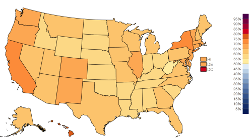
Americans believing in current climate change/Yale Project on Climate Change Communication (2014)
The question shifts if one asks, however, when Americans were asked about the relation of climate change and human activities, which remains a crucial leap for many, and reflects a readiness to dismiss existing controls on emissions as those proposed in the Paris Accords:
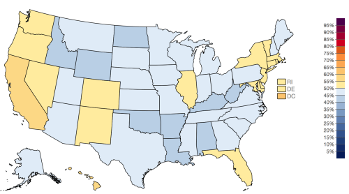
American Adults who Believe Cimate Change Caused by Human Activities (2014)
While similar, the slightly and importantly different map of those worried about global warming, which notably registered with a larger number in the south back in 2014, and can seem only to have risen as temperatures have risen, even if they may have felt that the propositions at stake in maps of climate change didn’t convince them of the contribution of human activities to climate change.
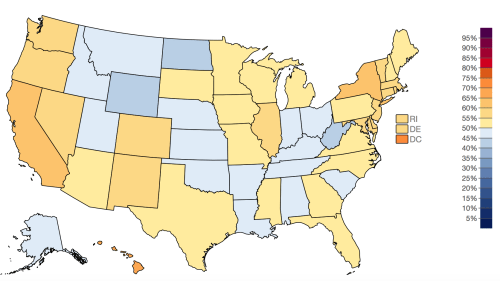
Americans Adults who Expressed Worries about Global Warming (2014)
Perhaps one would do well to examine the consequences of how maps stake propositions, and the need for more maps of climate change and sea-level rise. For combined with historical measurements or data to create a retrospective view of potential climate change, the power of maps, combined with both landscapes and adequate texts, can suggest the extent of the terrifying local consequences of climate change in clearer terms.
Indeed, although climatological simulations provide compellingly cautionary images of alternate future scenarios over time–
–the considerable persuasive power of maps of climate change by such satellite-based measurements demands to be made more pressing to broader audiences in its complexity.
17. The difficulties of creating persuasive maps of climate change is perhaps partly the problem. It is challenging to lack attention to the specific in the global purview and scope of many climate change maps, diminishing their persuasive force–partly because of the distance of their global purview, and partly because of their abstraction as raster-based images of potential future change. The familiarity of the format of weather maps that derive from similar remote monitoring are so broadly broadcast to make their syntax more recognizable than might be anticipated. The readiness with which members of the incoming Trump administration have recast such maps and technologies as tainted by environmental ideologies in hopes to undermine their importance as persuasive communicative tools is a testimony to their power; indeed, the hopes to expand deregulation has placed the production of earth observation maps at the center of budgetary cuts. While their conventions are challenged as suspect fabrications–a “hoax” or “scam” for gullible public–they powerfully organize environmental transformations over time, identifying consequences of man-made carbon emissions in changing our acidifying oceans and super enriched atmosphere.
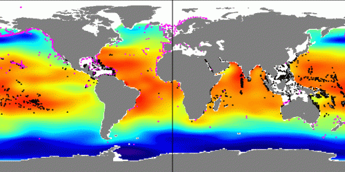
It might make sense to ask whether the apparent erasure of human settlement in such maps, and their cognitive shift from sites of human population or landmasses, itself a site of opposition to their authority by those who deny climate change. For the pixel-based representation of each data cell seems to erase the values of human territoriality, industry and economic exchange, not to mention property values, most familiar in mapping–and indeed that many in the incoming White House seem most readily familiar with. Yet the cognitive shift such raster-based maps provide reveal the very redirection of attention to a new economy of space that has made them such valuable public learning tools. And as much as ending science, the value of these maps as tools to teach about global warming and the dangers of man-made climate change seem to have place them in the budgetary crosshairs.
For climate change denial would be not only the central policy of a Trump administration, if one is to exist. And first and foremost in this operation seems erasing any evidence for it from the map, as if to erase the proposition of climate change. While the denial of climate change is focussed on its human causation, the production of raster maps of climate change have been attacked as the misleading tools of a government bent on regulation, and misled by its convictions.
18. Maps are often a matter of “truth,” or assigning truth claims, but pose problems of grasping complexity. The complexity of describing a coastline or coastal change is targeted by climate change deniers best by affirming the measurement of climate in specific, mapping the dangers of sea-level rise, ocean acidification, or the melting of the thousands of tons of frozen water in the ice sheet covering Greenland. As if in response to the effectiveness of mapping the world’s changing environment, the possible silencing of satellite mapping technologies and capacities is of unprecedented scope, effectively withholding support for the research that produced remotely sensed data maps.
The precision of such maps of blurred edges and impending changes have unsurprisingly led them to be the targets of climate change deniers. Data-based web-maps of climate created from remotely-sensed data offer such convincing illustrations of the c0mplexity of global changes in climate often created by anthropogenic hazards, distilling big data in a single image to orient one to the dynamics of the complexity of climate change that is so difficult to comprehend, and orienting one to the dangers and eventuality of environmental flux over time. Their symbolic economy has no doubt made them targets of opposition. Such images trace the permeability of our natural frontiers–far more persuasively than we can ever map recently invoked fears of cross-border immigration, and concretize pressing issues of climate change all too unjustly neglected in the past Presidential election and one that almost went unmentioned in the 2016 Presidential debates, where in all debates but five minutes and twenty-seven seconds were devoted to discussing climate change–but 2% of the total time–despite the stark differences among the candidates. Yet although the vote was anything but a mandate, the success of the Obama administration in prioritizing environmental issues as a national commitment seems met by a massive revision of national policies standing to be enacted.
In an era that casts the rejection of accords to monitor climate change as a release of constraints that hamper economic growth, the very maps that have documented climate change appear discredited in the “scam” of global warming–falsely attributed to “the Chinese”–as if their production was effectively unpatriotic, and not responsible due diligence. Despite the very effectiveness of communicating the complex patterning of global change, the blame for their deceptive nature–even during what was the hottest year on record–was voiced precisely because they are contrary to extractive industries–and fit a pattern of berating scientists and discrediting their observations–“our GW scientists are stuck in ice“; “GLOBAL WARMING HOAXTERS justify higher taxes“–by championing local observations as more revealing than long-term tendencies and comprehensive maps of broad changes in glacial retreat, sea-level rise, or carbon emissions, that immerse one in a fictive reality of doublespeak.
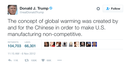

Indeed, while not openly doubting climate change, Trump’s supporters almost seem to be able to be swayed that their candidate, as a demigod, may actually be able to stay climate change, perhaps in the same moment as he restores jobs to coal-mining regions.
The apparent equation of the evidence offered in maps of climate change with the argument for reducing carbon emissions is not surprising. For the maps that illustrate the dangers of sea-level rise have been attacked for bearing the message as an ill-fated messenger: data maps offer valuable guides to imagine the local impact of global changes of complex mechanics and link the local to the global in such particularly effective ways, helping one judge hazards in their complexity–and draw attention to shifting relations between local and global. But the very power of such maps to represent climate change on a global scale have provided such powerful tools that their production has already been endangered. Climate change deniers, unsatisfied with attacking climate science, have come to attack the medium as a message, and cut funding for earth observation. The very effectiveness of such persuasive maps of climate change may also be why they have become so despised as forms of evidence among many who hold positions of a possible future Trump administration.
While the authoritative demagoguery of Donald Trump and his convictions on climate change seem set to destabilize collective action on climate accords, interactive maps can offer more than thorns in the side of the demagogic Donald’s industrial deregulation–if they are understood as a basis for making judgements on the real concrete consequences of climate change. The result of Trump’s presidency is primed to mark a milestone in the willful abandoning of cartographical ability, however, and an abandonment of the sophisticated picture of climate change that remote sensing has achieved. In a “Trump reality,” the very maps that document the complexity of climate change are being demoted from budgetary priorities, and are likely to be defunded and dramatically curtailed. Budgetary reallocation funding from earth-observation research would subtract an important tool to monitor global climate change. Trump’s promise to oil executives to scrap any regulation he sees as “bad for workers or contrary to the national interest” upon taking office–which led to immediate fears of accelerated climate change. Although Trump has qualified his own thinking on climate change by acknowledging in maddeningly vague terms–“I think there is some connectivity. Some, something. It depends on how much.” Trump’s statements since the election betray a lack of clear knowledge he has of climate change. An apparent desire to blanket comprehension of climate change seem to permeate the incoming administration’s advisers, as if to filter the very tools by which the accurate measurement and calibration of climate change is based–and prevent a coherent picture by which to judge growing levels of anthropogenic change.
The consequences of such a broad-based attack on observation-based science is scary. Coupled with an increased attack on environmental protections characteristic of any GOP majority, the recent administration has targeted the role remote of earth-observation that NASA and NOAA have long provided in ways that threaten not only the enforcement of environmental protections than their missions of environmental mapping and observation–a practice which has come to offer an unprecedented global resource from everything from changes in crop production to sea-level rise. And in a Trump administration, not only are CO2 emissions posed to increase, and less done to slow climate change, but the prominent place climate change deniers occupy in the incoming administration seems aimed to discredit the importance of climate change by curtailing such remotely sensed maps that have become among the clearest tools to document and develop broad-based consensus for the need to discuss and direct collective attention to questions of climate change. But the very maps that have gained such increased attention in the Obama years seem to be on the cutting block–as many of the academics and climate scientists are no doubt identified by much of the nation with the out-of-touch coastal elites who are not able to understand the serious grievances of the energy industry–and find the know-better attitudes implicit in the impositions of regulations to be a target of anger.
Indeed, if raster maps of global warming have emerged as critical persuasive tools beyond a scientific community of the dangers posed by increased emissions on global temperatures and climate change–
–the increased mapping of climate change by government agencies such as NASA and NOAA is increasingly under assault.
19. The raster data in the map of the vulnerability of the coastline to saltwater incursion in this post’s header is not directly or explicitly tied to global warming and anthropogenic change, national maps such as the above map of the vulnerability of coasts to ocean pollution (noted by cobalt blue) or saltwater incursion (noted magenta). They code the coastline in ways that offer a start to understand and judge climate change–and the increasing need of detecting global climate change.
 The Ohio State University/NASA-JPL/Caltech
In the rush to deny the very possibility of anthropogenic climate change, and human impact on the environment, would the future EPA risk curtailing the need for oceanographic and climatological records? Maps as the above create needed arguments about the increased absence of stability in the shoreline of much of coastal America, as well as coastal California. For the dangers of increased leaching saltwater across the coastal the United States stretch around the entire perimeter susceptible to major geographical alteration of its character–if such change is most pronouncedly in the San Francisco bay and San Joaquin River and Sacramento estuary, the mouth of the Mississippi and Louisiana bayou, the Florida panhandle, parts of South Carolina and Delaware coast, the image maps a decline in regions formerly fertile, as salty groundwater invades irrigated lands, erasing habitat, and ending commercial vitality. The NASA/JPL map offers a distillation of the initial permeability of our coasts, before sea levels rise, and as such provide an extremely necessary grounds to judge climate change with a coherence that only maps can provide, and that remote sensing provides a way global data is coherently synthesized.
The alarmingly increasing permeability of coasts to saltwater incursion suggest fears that went almost unacknowledged in a Presidential election that focussed on the dangers of human transit across allegedly open borders. But they suggest the need for national security to focus more seriously on climate change, and indeed to conceive of potential future scenarios that aren’t as prominent on the twittersphere. For such maps make change real in a way that are particularly powerful to show vulnerability and change in relation to questions of a truly global character, and indeed to inspire collective action in persuasive ways. For by concretely rendering questions that aren’t easily grasped by many, remotely sourced data maps produced by NASA or NOAA offer alarming if less intentionally alarmist statements of the importance to conceive of climate in terms of complexity, rather than only a battleground of local interests, expanding an array of costs and benefits far beyond the local in particularly dramatic and important ways.
In casting climate maps as a form of visual propaganda for anthropogenic change, eliminating earth-observation from NASA’s new research budget would aim to dismantle the persuasive power of such global maps, and curtail massive programs of remote sensing from satellites that have provided the most accurate indices to understand and judge the extent and accelerating rates of climate change–and provide a basis to dismiss the results of climate scientists to protect free enterprise, if not a strategy to make America Great Again by releasing industries from federal regulations and oversight, rather than a form of planetary stewardship, as if one can obliviously place a familiar red cap atop the planet and blithely proceed with business as usual in a time of dramatically increased environmental hazards, acute habitat alteration and endangering species, and possibilities of cascading effects of environmental pollution–all in the name of rebooting America’s economy.
For in describing the drought as the result of over-regulation, Trump dismissed the extreme vulnerability of agricultural areas in an era of a warming climate as a national concern. He effectively dismissed how we need NOAA data to determine the most responsible federal response to drought, let alone to judge accurately, as we try to trace surface water flow and level of ground and surface water reservoirs–and how such a drought was affirmed within maps such as those provided by LandSat of groundwater depletion and storage across the continental United States–
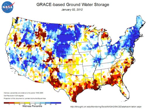
.
or the related measurement of drought, closely tied to the historical register of temperature rise, but presented with far greater attention to its spatial distribution in ways that reflect questions of national security–

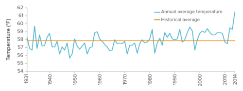 Global Temperature Rise over Time, NOAA
20. Trump reacts to the power of drought maps to orient viewers to areas of exceptional drought in the United States across time in proposing to curtail their production, to deny the distress such maps provoked daily in the attention that they direct to regions of unprecedented drought. His attacks reveal the power of the map as an argument by synthesizing easily legible images. And so, it almost seems, the funding of such maps of water flows from remote sensing are targets the incoming Trump administration, which has promised to end earth sciences surveys. The satellite maps that they have produced prominently include maps of water flux from our coasts or groundwater levels: if climatologists have increasingly adopted advocacy positions based on the alarming measurements of glacial melting, sea-level rise, and rising carbon emissions, alarmed by the depletion of resources and disintegration go the ice sheet, their advocacy has provoked an increasingly desperate denial of such phenomena of climate change as the California drought are cast as scientific fabrications. Landsat maps of groundcover change help determine the health, limits and extent of crops worldwide, but seem placed on the cutting block–precisely because of their efficacy as arguments.
The growing incursion of saltwater in the Sacramento/San Joaquin delta is but one example of the potential consequences of sea-level rise. The retiring of former farmlands will grow, even as irrigation plans in the making in California’s Sacramento/San Joaquin Delta would give water to the Wetlands through long-term water contracts, whose waters are posed to drain to the ocean and divert drinking water in a time of drought and build more reservoirs for farmland. Not mapping the extent of such groundwater changes that have provided a basis to make decisions about water diversion and use is potentially crippling, in a local sense For directing more and more water to agriculture and human uses stands to have devastating impact on the environment–as well as on its wildlife. As saltwater incursions grow across the nation, the failure to map the fluidity of the new ecotones created by rising seas and growing saltwater regions of the nation’s coastal regions–and increasing water deliveries for California agribusiness and the plans to manage federally owned dams, viaducts, and reservoirs across the state, have steep implications on water delivery and distribution in an era of a need for increased vigilance about curtailing water-use.
Candidate Donald Trump’s recent brazen promise to solve the state of California’s drought was extreme in that he argued it was not due to climate change–Califronia’s “water problem . . . is so insane, it is ridiculous, where they’re taking the water and shoving it out to sea,” he sustained. While insisting that the drought was manufactured–and not man-made, less the product of climate change than the pretence for governmental over-reach, Trump had already begun a campaign of disinformation when he visited California to make his case before farming groups. He argued, without grounds, that poor water management practices were to blame for a crisis manufactured by misguided environmental interests– echoing earlier claims of GOP candidate Carly Fiorina. And in dismissing relations of meteorological drought to hydrological drought, and agricultural drought across five years, Trump not only seemed to have failed to grasp the proportions of the problem–or how increasing temperatures have unduly stressed crops–but offered a mystification that seemed to unwrite and overturn what climate science has achieved.
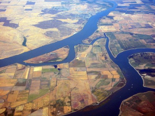 Sacramento/San Joaquin River Delta in California, looking northwest
For the power of maps that have provided persuasive tools of climate tracking or environmental modeling has attracted increased ire from those seeking to relax governmental regulations. Indeed, the imminent diversion of monies from the earth sciences risks erasing such monitoring and promoting business as usual. A specific case of the broader impact of a failure for developing such a broad picture of environmental management and resources may help, focussing on the very question of drought in northern California, where Trump made his outsized claims. For the very danger they raise derives from a fragmentation of the very complex picture of global changes, and respond to specific interests–such as those of almond megafarms or large agribusiness–and a reduction of environmental regulations that once protected smelt, Chinook salmon, and other keystone species in the river from untreated irrigation drainage. Misleadingly equating earth sensing with environmental regulation has removed local issues from a broader or holistic map of water resources in a nation where western drought is increasingly clear: yet the suppression of these maps stand to allow the triumph of larger private interests.
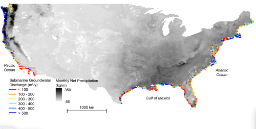 Jet Propulsion Laboratory/NASA
21. To be sure, the persuasive value of such maps seems is threatened by the proposed budgetary reprioritization of NASA’s research budget from Earth Sciences to human space exploration in a Trump administration. The result would be to fragment the image of global climate change or its dangers. Such a reprioritization of human space exploration sounds Kennedy-esque in its patriotism, but deeply deceptive, as they shift investment from needed earth-observation or the judgement of climate instability or the technologies that have been so successfully developed to make climate change more legible.
The fear of such a budgetary reprioritization seems akin to pulling the plug on the very images that help us understand climate change. The hope to shut down the cameras set to grow to $2 billion at a critical moment of warming temperatures and weather disasters seems unconscionable. By not visualizing the complexity of climate change, questions of local judgement are not only muddied, not only limited to cases of removing water from the San Joaquin Delta to Westlands farmers, each acre-foot of whose irrigation could supply a large household with water for over a year, despite its lack of sustainability–yet Trump seems to deny not only the California drought as a “myth of conservationists lacking environmental grounds. As the tools used for mapping of climate change have themselves been cast only as obstructing business interests, their curtailment stands to open the way to a victory of local interests with little broader environmental awareness. The projected shift of funds from “politically correct environmental monitoring” toward space exploration deploys a heroic image only to boost the fortunes of such defense industry giants whose fortunes are already poised to rise sharply in a Trump presidency.
Despite an ongoing pretense of keeping an allegedly “open mind” about climate change, Trump plans to cut what one advisor has called “politically correct environmental monitoring“–as if it were akin to the invasive monitoring of speech by the NSA, and as if the politicization of climate change did not itself originate on the self-christened “alt[ernative] right”–a rebranding of the old right–and was not science. Trump as “President Elect” panders about the issue of climate change by verbal vagueries and logical circles that suggest he is lost at sea: “It’s a very complex subject. I’m not sure anybody is ever going to really know…. they say they have science on one side but then they also have those horrible emails . . .,” he stalls, as if “man-made climate warming theory” described deception and swindle perpetrated by scientists for financial gain. While “Climategate” has been long ago debunked, it still signifies collusion to impose government controls on the nation for the alt right–what Mike Pence once dismissed as “backhanded big-government disguised as do-gooder rhetoric” questioning global warming fifteen years ago by noting CO2 naturally occurred and volcano eruptions created greenhouse gases, disdaining the “quiet expansion of a liberal environmentalist agenda by Bill Clinton and Al Gore that will cost thousands of jobs.” Whatever the case, the maps that were so effectively used by the Obama White House to foreground its commitment to climate change, epitomized by introducing ceilings on emissions for power plants; it seems almost envy that the persuasive visualizations of are being defunded at the source.
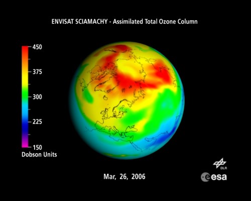
It almost seems Trump truly seems to have no ken of the ocean as an entity, reading recent statements. As a man who made his career in real estate, Trump probably rarely looking beyond his possessions, and maps of temperature change and sea-level rise may never have commanded his attention. Yet mapping dangers of coastal change might call Donald’s attention to what is actually at stake in the drastically declining value of most waterfront properties.
22. The need to map local impacts of climate change provides a model that is all the more convincing and needed in response. Donald Trump’s election at a time when the increased melting in the polar cap is likely to trigger catastrophic “tipping points” toward uncontrollable climate change world-wide even before he actually assumes office–if he does. The eery coincidence of Trump’s electoral victory in a time of crisis in climate change seems to suggest a grounds for stalling the very possibilities of remote sensing of ocean temperatures, ice levels, and snow density that have become the basic metrics for processing the complexity of climate change–whose global impact few can comprehend.
Is there almost something about the aesthetic of this map of the production of greenhouse gases–a map without political boundaries, without sites of human habitation save the swirls that denote local CO2 concentrations, and that implicitly seems to point a finger at the northern hemisphere? The declarative certainty of such alarming maps of greenhouse gases that were prominently included in recent White House media designed to cast to climate change as targets of future budget cuts, recasting the remotely sensed maps as a form of propaganda and not a measure of anthropogenic change. Indeed, the polemic force that maps of growing CO2 concentration had in promoting the Paris Accords as an obligation to future generations–despite the distortions of the terrestrial map–provided a basis for supporting increased environmental regulations and restraints on carbon emissions were seen as tools of misleading the public, not as grounds for shaping and informing collective and shared sense of environmental responsibility.
The current climate-monitoring projects pioneered by NASA work with NOAA, from the recently launched GOES-R satellite or the DSCOVR observatory, which can effectively watch for changes in space weather of danger to electrical grids, devastating forest fires, and diminished freshwater aquifers and soil moisture, of importance to farmers. While the agency’s Sciences Division is expressly non-partisan, the advancing of “understanding of our planet” includes making such data “freely available” tied to Steve Bannon & Co. as shifting national attention from terrorism and a nurturing of mass hysteria and collective anxiety as well as being dismissed as being just “bad science”–despite the increasing acidity revealed in remotely detected pH levels worldwide, and the ability to prevent the waters from changing around our coasts.
The perversity of asserting that the science is faulty seems to resent a perceived moral posturing and superiority that creates obstacles to free markets and work, by invoking a global–and not national–common good, as well perhaps to posit a sense of “climate faith” over spiritual or religious faith in its grimly bracing world-picture that foregrounds uninhabited oceans.

Monitoring for climate change began under President George W. Bush. But providing such data has led to the targeting of Earth Sciences programs as “politically correct” deviations of NASA’s mandate in what we can see of Trump’s world view, echoing recent attacks from Republicans on studying global warming, despite scientific consensus it is man-made. To find a sense of the logic of defunding, one might look at that trumpet of the alt-right, Breitbart, deceptively announcing “Climate change is the biggest scam in the history of the world – a $1.5 trillion-a-year conspiracy against the taxpayer, every cent . . . of which ends in the pockets of the wrong kind of people, none of which goes towards a cause remotely worth funding, all of it a complete and utter waste” in its sensational banner headlines–
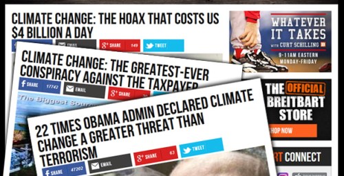
–where Steve Bannon, who will not step down from his place as executive chairman until he begins his work in a Trump White House, is busy assuring readers that his candidate won’t undergo a change in faith–
–much as tauntingly using scare quotation marks on the term “climate change” in multiple columns on the topic that claim to demystify “cynical exploitation of mass crowd hysteria,” as if to undermine the very claims to its science or scientific support. Steve Bannon has adopted the issue of climate change as a personal pet peeve, according to British fellow-skeptic James Delingpole, by which he is particularly eager to shape Trump’s views and pending actions on climate change. Bannon seems to have turned Trump’s attention to it early in the Republican primary, when he pointedly asked whether the Paris Accords presented a coherent response to a greater threat than “Radical Islam,” treating a logical disconnect as common sense as a logical link that seems emblematic of how he seeks to frame the issue of climate change on a purely political spectrum–and rebrand it for the “alt right” movement that seek new ways to affirm national strength. Is this dichotomy in any way constructive–or only designed to trigger a reflexive lacking much logic coherence as a train of thought?
The special place Breitbart has gained among the range of news sources that Trump has retweeted to his followers, even in comparison to such venerable news outlets Fox News, the Washington Examiner, and The Daily Mail—
–suggests the need to pay more close attention to the levels of deceptive disinformation on those environmental regulations associated with climate change attacked by its columnists.
As if designed to attack the prominent place President Obama gave the Clean Power Plan and a commitment to cut climate change, which he called “a greater threat . . . to “future generations” than any other “challenge” to which America was uniquely poised to help solve. Bannon’s cronies seized on the assertions to misleadingly claim Obama elevated climate change above “Radical Islam”–and failed to acknowledge the danger of terrorist threats. Yet the dangers of global warming are perhaps akin to a terrorist threat of our own making, wreaking havoc on our crops, food, infrastructure, and water supplies, as well as public safety. The point of such maps of climate change that register the interconnected levels CO2 in ppm, sea level rise, quantities of melting ice mass, nitrates in the ocean or phytoplankton blooms is to afford a measured point of reflection. Yet attempts to map climate change have been increasingly collectively lambasted as a conspiracy theory or “scam” on Breitbart, and as creating a Potemkin industry of researchers from Potsdam Institute to the University of East Anglia to dedicate tax dollars at a “total annual spend of 1.5 trillion a year” from our tax money under the misguided moral mission of making the world “better” by monies levied through taxes that were “siphoned straight out of taxpayers wallets” and “isn’t going to make the blindest bit of difference.” The folly of climate change–here tied to the wild gesticulations by an increasingly manic Al Gore–was repeatedly invoked by Breitbart in the 2016 Presidential election, as CO2 levels rose above 400 ppm, when multiple “fake news” websites denied scientific evidence of climate change to defuse the consequences of global warming on alt-right sites from SkepticalScience.com to the Koch-funded Heartland Institute. All cast the “moralizing stance” of government as an undue imposition on industry or a deception perpetrated to distract the nation from pressing national security national issues, branding environmental responsibility as a set of constraints against economic expansion of industry, coal, air travel, and agriculture.

The photograph of the animated spokesperson who served as a sort of latter-day evangelist of climate change is shown as blaming multiple culprits for the specious presence of greenhouse gases–including coal plants; air transport; industry–that Gore has become a persistent target of climate change deniers like Myron Ebell, who is posed to take over the reins of the Environmental Protection Agency in a Trump administration–he who accused Gore of representing “forces of darkness” wanting “to turn out the lights all over the world.” Indeed, the prominence of maps of climate change in Gore’s award-winning “An Inconvenient Truth” makes them a target of particular disdain, whose deceptive content is argued to dramatize the extent of climate change in the dynamic maps that remote-sensing has allowed us to create of climate change, and even to present the timetable of global warming, in ways not otherwise able to be understood.
Given the range of information synthesized in such maps, Trump famously offered an ad hominem attack on the former Vice President, for perpetrating a scam, based on Trump’s experience at the Trump National Golf Course in Westchester, NY: he assured his audience that “the coldest winter ever recorded, with snow setting record levels up and down the coast,” and called the Swedish Academy’s recognition of Gore’s environmental efforts as just another scam of the sort perpetrated by maps: “the Nobel committee should take the Nobel Prize back from Al Gore…Gore wants us to clean up our factories and plants in order to protect us from global warming, when China and other countries couldn’t care less. It would make us totally uncompetitive in the manufacturing world; and China, Japan and India are laughing at America’s stupidity.” The insistence that climate change was a concept that was designed to curb industrial productivity has become a talking point of Trump’s throughout his most recent Presidential campaign.
The iconic image of the remotely sensed map of Antarctic Warming before which Gore addressed the public in An Inconvenient Truth made it something of an emblem of global warming. Have the techniques and projects of remote sensing been rejected as the same map–which offers the very comprehensive mode of mapping that the Westchester Golf Course fails to provide–has become an avatar of environmentalism if not globalization?
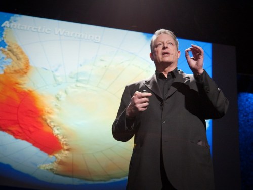
The economy of the distribution of anthropogenic emissions in the atmosphere is admittedly difficult to grasp for some, and makes claims for agency that are challenging to decipher. But the desire to recast them as fictional fabrications, and discrediting their observations is akin to the faked moon landing. But the almost emblematic importance of the map as an argument for the need to regulate CO2 emissions has placed remote sensing by NASA and NOAA in the cross-hairs of climate change deniers–and its place in the 2016 election was central from the place of burning coal to outfitting power plants with the means needed to capture and store the CO2 that threatens to spread across the sky. By effectively turning off the cameras, the persuasive role of maps will be curtailed, but the consequences of environmental policy that are not addressed.
Such a tendency seems second nature for skeptics who cite Michael Oakeshott among their primary formative influences. For the maps–rather than the arguments or evidence behind them–are discredited in order to be cast as a misuse of federal funds by those frustrated by their authority as a means of scientific communication.
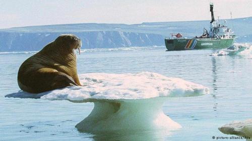
23. Although such maps are often color-enhanced to add to their clarify, they are created for greater clarity. If these results are critiqued or claimed to be unmasked as values-laden representations, whose coloration is designed to bolster increased claims for government oversight, rather than anthropogenic changes, the pressing questions that they raise about the involvement of human agency in climate change are to the point. It is perverse that the increasingly vicious and apparently compulsive twitterwar Trump declared, Don Quixote-like, against climate change, is premised on championing local experience of weather–rather than the comprehensive registers of climate change remotely sensed maps are able to so compellingly synthesize display. (In so doing so, he seems to echo the unfounded assertions of a Nobel prize winner in physics from Albany, NY, Iver Giaver, who came up with the rather incredible logic comparing a year-round spread of air-temperature of “roughly an 80 K difference between summer and winter at some time, . . . would you think that a 0.8 degree average on the Earth makes any difference to the climate in Albany? Is that sensible to you?” Yet a global map of projected temperatures maps local consequences of ongoing trends in climate change to show such a change presents a cascade of effects.
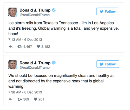
It is admittedly hard to imagine the details that are communicated in data maps of the rapid sorts of climate change that are occurring on the polar regions, offered by remote sensing, which were so helpful to grasp the complex processes of climate change, easily dismissed as “bad science” on Brietbart‘s angry megaphone. Indeed, such calls seek to destabilize the authority of the very maps that document global warming that is documented by NASA data, from maps of temperature change–


–ocean acidification that increase with growing CO2 emissions caused by humans since 2005–

to remote sensing of ice-thickness through 2015–

–to local rates of melting in Greenland’s ice sheet, as icebergs hiving off from the landmass contributes to global sea level rise–measured below from satellite-derived measurements of the decadal decrease in its mass–and stand to unearth the range of radioactive waste stored under its ice sheet at Camp Century. (The melting of 1 Gt of changed mass from its melting surface produces a cubic km of water around the world; 100 Gt translates into the rising of global sea level by .28 mm.)


24. Is aesthetic unease of such maps that they register changes attributed to man-made behavior, disrupting the idea of an earth to man to conduct commerce and produce with complete free will? The implicit curbs or restrictions seem particularly toxic to Breitbart columnists, as well as to industrialists, precisely because they suggest an occasion to take stock of a world map that is no longer a blank slate, but which human activity is changing–a topic that seems inherently suspect to many.
Intentionally relinquishing any perspective on the anthropogenic alterations of climate change willfully abandons analytic cartographical tools and perspectives as if to embrace, ostrich-like, terrain view as an adequate descriptive register.

As much as the wonderfully data-rich maps developed from remote sensing data provide a basis to comprehend the geographical distribution of changes in climate conditions in their spatial distribution. Such cartographical renderings powerfully force us to confront the reality of climate change in ways that can combines polemic rebuttal by convincingly asserting an alternate world-view that gain a distinctly new coloration of invective in the Age of Trump. Indeed, by directing attention to the shore as an ecotone–an intersection of land and water, and the fluidity of what one thought were fixed lines–invites one to observe one’s own relation to space, rather than to frame it as a static unit, and define one’s relation to its future change. Rather than map places or geopolitical units, the NASA maps of coastal exchange use data to help focus our attention on the mutability of the landscapes in which we live and their increased vulnerability in ways that the maps of alternate scenarios of global warming considerably expand into possible future worlds.
25. If the map classically emerged as a record of the “inhabited world” or ecumene, these maps effectively elevate pressing and compelling questions about the possibilities of the world’s future habitability–and the possibilities of human agency before such potentially irreversible global change with temperature rise. And interactive web-maps document climate change in ways first fashioned to foreground possibilities of agency before the behemoth of climate change, convincingly concretizing consequences of the melting poles and rising sea-levels from which there is no clear possibility of turning back. For whereas historical inquiry has examined the map as facilitating state power and local administration, maps that illuminate ecotones seem distinctly post-territorial maps of environmental change: in inviting the viewer to measure the levels of exchange across natural boundaries and define their relations to them, such maps create a stance of environmental critique of much stability and elegance in their interactive format and design, by amassing and assembling big data in particularly convincing ways. For the very reason that they digest a comprehensive detailed image in which one can visualize the extent of specific impacts of climate change on familiar regions, providing a less apocalyptic but effective narrative of one’s relation to global pollution caused by humans or industry, and to the possible alternatives of climate change, putting complex question of climate change at comprehensible scale.
Remote sensing of the changes in oceanic shores, and the leaching of water by underground streams and can help measure fluctuations in the shores to often shown as stable lines, and a form of critical cartography to try to grasp the instability of globalized climate change. We think the shorelines of the nation are stable, but maps show that they are not: the range of water that cross the shores in underground transfers is not only sizable, but rarely tracked in maps–yet largely find the healthiness of our coastal oceans, and the habitats they create, as some 15 billion tons of water cross the shore in underground networks, rarely mapped, and invisible to the naked eye, each year. If that is less than 1% of what coastal rivers deliver to the sea, it is saturated with more nutrients than river water, if also with runoff from fertilized lands and agricultural areas, moving in a matrix of hidden runoff that Cedric David of the Jet Propulsion Laboratory has begun to explain. Driven by rain variability–lovingly rendered here in a water-color like data map–the levels of rich discharge noted in deep blue and green offer a sense of areas of the shore that are particularly rich with subterranean exchanges of water along our ocean coasts: rather than map the coast as a straight line, we would do better to understand the coast as a vulnerable and porous boundary. Remote sensing data allows us to better view the North American continent as a monotone watercolor of greys that bleed to black as a way to register heavier rainfall, we are invited to discern how concentrations of increased groundwater discharge responds to increased precipitation– and, indeed, the implications of decreased discharge on the coastal oceans, whose coasts are so often figured by a flat blue misleadingly distinctly separate from the continent.

Jet Propulsion Laboratory/NASA
The composite of precipitation and water discharge in the lower forty eight foregrounds the extreme porosity of shores in regions of heavy rain. Its apparent muddying of a land-sea divide clarifies understanding of the discharge to the ocean of water and pollution than a focus on individual rivers, and a less defined way to understand the problems of exchanges through our shores, by making visible the hidden underground water that enters the ocean. The high effluence of waters in areas defined by greater rainfall, from the northwest Pacific to the areas of the Gulf of Mexico, are nicely rendered in such a monotone watercolor, creating increased groundwater on shores noted in cobalt blue.

 Jet Propulsion Laboratory/NASA
Perhaps more disturbingly, JPL also measured the range of coastal areas susceptible to an influx of saltwater from the oceans suggest the considerable range of exchange across the shore–and the potential dangers to shoreline habitats, here keyed in areas of magenta: the shore is not a line, but is a site of porous exchange, and an ecotone especially important, Rachel Carson long ago noted, to the generation of life and biodiversity, and increasingly vulnerable to salting. If the coast is a particularly important liminal zone, it is also a zone suitable to reflect on the well-being of life on the planet: despite repeated claims that “we need more research” about climate change that dodge and deny human involvement in shifts from the impending sea-level rise and shrinking shores so clearly mapped in Climate Central’s Surging Seas, as well as the growing vulnerability of coasts to saltwater incursions have already begun to impact coastal habitat and environments nationwide.
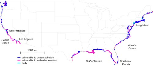 The Ohio State University/NASA-JPL/Caltech
The increased vulnerability of saltwater incursions along much of the Gulf of Mexico in the southern states suggest a picture of increasing alteration between saltwater invasion and ocean pollution coincides with the rise of “red tides” and a coastline that seems less and less of a viable habitat along the Gulf of Mexico, creating a particularly unstable shoreline climate change threatens to rewrite.

The Ohio State University/NASA-JPL/Caltech
Indeed, the permeability of the shoreline as a site of transit is foregrounded by violet patches marking of incursions of saltwater, whose effects on habitat are so baneful in the Everglades, Louisiana’s coast, and the mouth of the lower Mississippi–as well as Southern California and parts of the east coast. The map suggests an increasing invasiveness of saltwater whose effects are only going to increase with global warming and climate change, in ways that suggest a hugely revised notion of habitat as well as vegetation cover, as well as coastal vulnerability. Increasing king tides, and coastline vulnerable to saltwater invasion, radically revises the habitat of the shores and often extends far inland–and even help visualize the potential sea-level rise across the region. Coastal vulnerability in areas of coastal Louisiana would be directly tied to alternate scenarios of temperature change and sea-level rise: the loss of wetlands or barrier islands that greater temperature rise would bring, assuming constant river discharge of sediment loads and precipitation, would dramatically change with a 0.6 inch and 31.5 inch sea-level rise between 2010 and 2060:
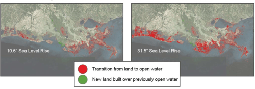
26. The zoomable visualizations created for Climate Central in Surging Seas offer the opportunity to view the possible consequences of unchecked pollution along the national coasts, and nicely restore a possible sense of human agency to limit the consequences of coastal change distorted by the intentional obfuscations of climate change deniers–once a rather marginal contingent that has gained a new platform for public deception in the incoming administration. One can’t still believe that such a platform of backing away from global climate accords such as that achieved in the 2015 Climate Change Conference held in Paris, but its repudiation seems increasingly inevitable. And in the need to bolster support for climate change and global warming in maps widely promoted on social media from the White House grew, attempting to promote limitations on power plants’ carbon emissions and awareness of global climate change. Indeed, the expansion of action on climate change by the Obama administration led to a coalescing of interests in a range of dynamic maps depicting alternate climate change scenarios.
For the interactive Surging Seas offer the possibility to imagine the degrees of shoreline alteration the would shifts attention from the amorphous questions of global change to instances of impending sea-level rise in specific places and regions, as if to concretely render alternate scenarios in ways one can easily position oneself. Which is precisely the point of the map’s persuasive design of inviting us to consider shoreline loss.
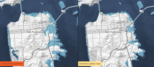 Surging Seas: Mapping Choices: San Francisco
For Surging Seas invites its users to try to envision alternate scenarios of global vulnerability that the denial of climate change has repressed, and clouded by confusing assertions of the questionable nature of science, and the skepticism of projections that impose curbs on carbon emissions that Donald J. Trump has given broad currency in his Presidential campaign. Indeed, the open deception of Trump’s scrapping of the Paris Accords seems better seen as a volitional attempt to guarantee the irreversible consequences of climate change, flood the coast, and create a scenario of potentially disastrous consequences.
The mapping of the several alternative outcomes for cutting emissions that go further than the pledges in the Paris Accord would produce a definite rise in ocean waters that would have a considerable impact on the shores of the country and property and productivity of coastal cities, in ways we can project in maps of Climate Central’s Surging Seas, which concretize the vulnerability we might to well to feel in Charleston, S.C. or in other locations. While the first scenario asks us to orient ourselves to the alteration of the inhabited world at one scale, with sea-level shown after some limiting of carbon emission.
 Benjamin Strauss/Climate Central
–we can compare ocean rise to a second and third scenario resulting from the more expansive melting of polar ice in Antarctica–and the huge reduction of shorelines that would result, as estuaries and rivers over flood their banks in ways that render obsolete notions of “bankfullness” or the baneful edge, by which we once understood river ecology, and effectively ask us which option of a dramatically compromised notion of river banks we want to accept.
 Benjamin Strauss/Climate Central
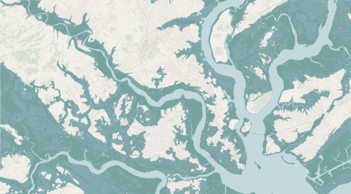 Benjamin Strauss/Climate Central: possible future shorelines of Charleston, S.C.
The extent of such almost inevitable incursions into the coastlines of the United States are particularly striking when they create a sense of an actual archipelago across much of the coastal states on the eastern coast of the country, including the eventual inundation of the very properties in Trump’s prime resort, Mar-a-Lago, which would be largely obliterated from the beach after a sea-level rise of just six feet. Trump’s readiness to construct a sea wall in the golf club that he owns in Ireland reveals a readiness to protect his properties from the dangers of “an increase in sea level rise” and “more frequent storm events” that he cast in the conditional–“If the predictions of an increase in sea level rise as a result of global warming prove correct,” allowing that “it could reasonably be expected that the rate of sea level rise might become twice of that presently occurring.” The situation of Mar-a-Lago would be destined to –and its size reduced by two-thirds–as the result of a similar rise, although Trump seems less ready to acknowledge the possibility.
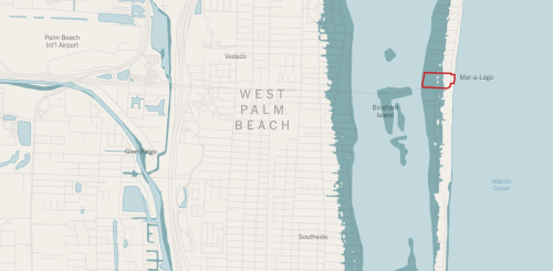
Surging Seas invites to better view the consequences of unconstrained growth of anthropogenic pollution–against the possibility of curtailing shoreline loss with carbon cuts–effectively a crystal ball that present alternate potential future scenarios of the extremely complex process of global climate change we are otherwise without ant tools to comprehend, and which a Trump presidency increasingly seems to compel us to turn the other eye through the irresponsible wishful thinking of denial–as one can imagine exactly what sort of future we might want to consider being able to live with–and asks us to imagine exactly what would be lost, block by block and neighborhood by neighborhood as cities would face the alternative possibility of literally going underwater: rather than see climate change as a subliminal or notional threat, the rendering of possible occurrences in Surging Seas model allows one to envision alternative outcomes.

 Choices–Climate Central: Miami Beach
The disappearance of the shoreline is rendered in greater detail through the elimination of much of the sandy beach ind the possible alternative futures we face in the interactive site, which asks us to digest alternative outcomes of climate change in ways that we might otherwise not be able to realize or fully imagine.
 Choices–Climate Central: Miami Beach
The vulnerability of the coastal zones is widely understood through climate change and sea level rise, but saltwater invasiveness is a striking parallel change that would alter the landscape of the coastline as we know it as a biotic habitat.
27. The concentration along the coasts of population in the North America is not only particularly pronounced–giving rise to the possibility of local or regional responses of jurisdictions familiar with the issues and dangers of climate change in the United States, from New York and the eastern seaboard to California, able to continue climate accords–despite Donald Trump’s pledge to withdraw from the Paris Accords and vow to scrap any regulation he sees as “bad for workers or contrary to the national interest” upon taking office before oil executives–which led to immediate fears of accelerated climate change. Although Trump has qualified his own thinking on climate change by acknowledging in maddeningly vague terms of Trumpspeak–“I think there is some connectivity. Some, something. It depends on how much.“–most of his statements since the election only show a lack of clear knowledge of climate change. Indeed, the wish to blanket comprehension of climate change seem to permeate the incoming Trump administration and its advisers.
The person Trump has tapped to lead the transition for the Environmental Protection Agency, Myron Ebell, has led the charge against attributing global warming to human-generated emissions. One of Trump’s senior adviser, Bob Walker, has gone so far to advocate scrapping NASA’s Earth Science division, or eliminating the climate-related research at the agency, which he has openly dismissed as “politically correct environmental monitoring” and “politicized science,” in keeping with Trump’s assertion “global warming was created by and for the Chinese to make U.S. manufacturing non-competitive,” as if understanding economics and trade as the true bottom line. The decisiveness with which Trump promised to remove the United States from any treaties that constrained workers’ economic production or asked oil and coal companies to constrain their carbon emissions has rightly led to increased consternation about the future of the American ratification of the Paris Climate Accords. Yet what science is not without political implications? Eliminating the remote sensing of temperature, ice, and clouds by satellites prove the most comprehensive and correct registering of the rise of heat-trapping gasses. Walker insists “we need good science to tell us what the reality is” in a confused dismissal of current climate science; Walker has expressed doubt climate change occurs due to carbon emissions, dismissing such conclusions as “a view shared by [only] half the climatologists in the world.” Such a change in policy is itself quite political, as well as politicized, and seems poised to place most climate change research back in the pre-satellite era.
Indeed, many of the maps included in this post derive from the marked expansion of NASA’s Earth science budget during the Obama years, which has grown beyond all of NASA’s other functions, in ways that have validated it as a political target for climate change deniers and Republicans who take its mappings of CO2 concentrations and the water cycle as pointedly partisan. Yet the generation of NASA earth photographs of polar melting in southeastern Greenland provides some of the most compelling portraits of glacial melting that we have, allowing us to chart and represent glacial melting that a Trump administration would want to muzzle, and would be able to reduce dramatically existing abilities to map climate change.
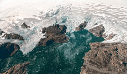 Jeremy Harbeck/AFP/Getty Images
The apparent targeting of abilities to map climate change is tantamount to a form of ‘cartographical silencing’ of unprecedented scale. It turns back on emergent technologies of climate detection and tools of remote sensing that allow us to detect and preserve records of ice melting levels, rising ocean temperatures, and sea level change–as if to subtract scientific evidence for climate change and withhold the very research that produced unfriendly results to extractive industries. And even while Trump seems likely to affirm a conviction for preserving clean water, such platitudes are difficult to reconcile with promises to cut budgets for research voices a clear commitment not only to disregard the Paris Accords, and strip the world from an exact mapping of climate change,– the instruments and techniques used to measure the consequences of global warming.
The promise of coastal communities’ increased sensitivity to climate change rests not only in bringing the Climate Accord into effect before Trump’s inauguration, but the alternative possibility of enforcement by local or regional jurisdictions, sub-national local governments more exposed to dangers of sea-level rise: the coastal exposure of North America to threats of climate change and the danger of further oceanic warming may call for non-state actors from coastal cities to states to help enforce the CO2 reductions that can prevent the feared inevitability of a one degree temperature rise that would have such disastrous consequences for sea-level rise, oceanic expanse and crop production decline. While some 25 million Americans live on the coasts alone, regional policies in the “coastal areas” are less likely to see emissions restraints as less invasive.

Existing levels of sea-level change that have already been experienced through 2014 have shown a significant rise in many regions–especially along the Louisiana coast–dramatically increasing the vulnerability of the Bayou to ocean pollution and saltwater invasion.
The argument runs along the lines that those sites more likely to be sensitive to the potential impacts of climate change at first hand might be more ready and able, even in a broader atmosphere of wide-ranging denial, to work toward the continuation of climate treaties. The coastal communities are undoubtedly exposed to how rising temperatures of oceans absorb much of the world’s increasing heat.
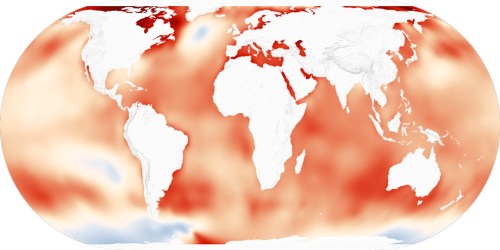
 Rise of Oceans’ Surface Temperatures in 2010s
Any such a global data visualization only makes sense, moreover, when paired beside the sort of temporal chart that will put the pastels indicating warmer coasts in a broader sense of historical context to foreground the extreme nature of current meteorological anomalies:
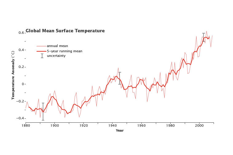
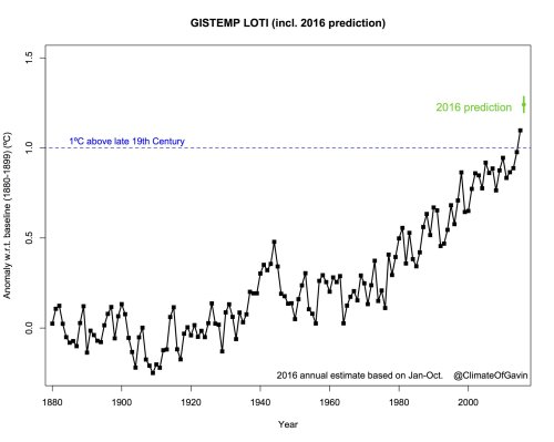
28. The image of such a local response to the global phenomena of climate change is perhaps the most effective, as well as the most strongly felt. Asserting local adherence to the Paris Accords might seem far-fetched, if only as it expands the parties at the negotiating table, the possibilities of local resistance to corrupt governments is inspired, and might offer the clearest means to show local desires–as in the case of the western United States, where a great majority of voters voted Democratic, and Trump received but 35% of the vote in Washington, Oregon and California–the states that occupy a full stretch of the Pacific coastal ocean are committed to reducing the threat of climate change and keeping reductions in carbon emissions–and to resist federal actions to sell off national wilderness, to resist any change in the place of undocumented migrants as members of the community and work force, and resist using high-carbon fuels.
The county-by-county cartogram of electoral results of 2916 as mapped by Mark E. Newman in 2016 show a clear tendency in coastal counties to vote for Clinton that reflects not only urbanization.

Trump allows himself the vaguely meaningless qualification on Climate Change and human agency that “I think there is some connectivity. Some, something. It depends on how much.” While this is not much movement from dismissing climate change as a hoax of the Chinese government, such limping equivocations offer no promise or clear vision of environmental stewardship but a sea of future compromises and muddied visions of climate change has rarely devoted time to consider–especially dispiriting given the extensive research devoted to sea-level rise and climate change.
Although the effectiveness of Donald Trump’s rhetorical appeal to voters’ emotions in the US Presidential race of 2016 can’t be denied–his emotive passions provided a style of self-presentation that particularly appealed to those who feel themselves out of power, dis-empowered by a globalized economy, Trump’s sustained scapegoating of others–migrants, Mexicans, women, and Islam–disguised as policy and politics, has provided a hate-filled rhetoric toxic to democracy, particularly successful in a society where economic inequalities were long unsuccessfully addressed. And the lack of a clear climate policy seems concealed in his intent to boost oil and coal production to “bring back” American jobs. Such assertions placed him firmly among climate change deniers in a terribly irresponsible way–pandering to his audiences as well as promoting an almost abusive form of economic wish-fulfillment.
Indeed, the relatively low numbers of American adults prepared to tie climate change and global warming to human activities in states where Trump was successful as a candidate is particularly striking–even if low numbers of those who accepted the anthropogenic nature of global warming and climate change in 2014 was not a clear predictor of voting for Trump, it was surprisingly in line with a Trump victory map–and the insistence that Trump made on the status of global warming as a “hoax” when it came to limiting carbon emissions gained considerable traction in much of the flyover zone, even if coastal elites may have raised their shoulders in incredulity at his pronouncements as utterly irresponsible.
But this doesn’t mean that local voices about an issue as sensitive as the environment and consequential as global warming and environmental stewardship can be credibly denied and erased. The importance of including areas that also rejected this rhetoric–as Colorado or Nevada–might compellingly create an even clearer bulwark against the danger of retrograde environmental policies: a template might be offered in the Canadian decision to ratify the climate accords agreed to in Paris, and to reduce carbon emissions by phasing out all coal-fired electricity production by 2030, lowering greenhouse gas emissions to match the Paris Accords of limiting temperature below two degrees Celsius above pre-industrial levels. Although secession from the country of one of the wealthiest sectors for the reason that it disapproves of the voting of the center of the country is not so excusable (or practical), the creation of a shared Climate Compact that echoed the “Western Union” proposed by Chris Kutz to defend local environmental and regional progressive domestic interests against the environmental retreat Trump may threaten. The notion is not that far from the current Western Climate Initiative that commits western states with eleven Canadian jurisdictions to limiting greenhouse gas emissions and committing to an emissions trading program–an agreement first created by governors of California, Oregon and Washington in 2003, who created the West Coast Global Warming Initiative, mirrored in 2006 in the Southwest Climate Change Initiative of Arizona and New Mexico, and which expanded 2007-11 to include Canadian provinces.
29. But the “Western Union” is of a distinctly coastal configuration, and perhaps for a reason that goes beyond emissions trading.
 The Formulation of a Supra-State “Western Union” Proposed by Chris Kutz
Given the disproportionate rise of coal industries in western states like Colorado, where the expansion of large-scale strip mining from the early 1990s seems to have replaced coal mining in Virginia and the southern United States–a massive shift in the spatial extraction of coal less based in geography than the rise of mountaintop clearance.
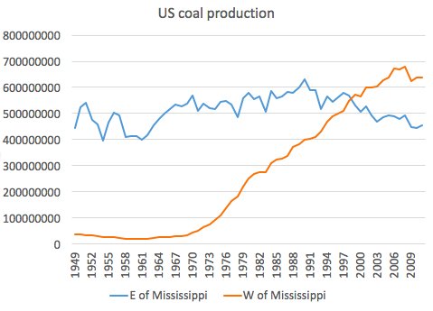
The growth of a western compact that reflects shared political sympathies might be extremely opportune. Could we call it the Expanded California Compact, in honor of the state’s long defense of Marine Protected Areas and national parks? The extent to which the regional economy is vulnerable to climate change suggests a real benefit to such a compact–a question to which the last section of this post returns. To be sure, California already has in place a cap-and-trade policy designed to control carbon emissions, no doubt encouraged by California’s serious ongoing drought that is fueling rampant wildfires as throughout the western states. But the breadth of coastal communities that are increasingly threatened by floods across America should necessitate that a larger number of communities across the country should adopt similar cap-and-trade policies during a Trump administration–


Pingback: Your Monday Morning Collapse | Loki's Revenge