Tag Archives: Google Maps

Local Landscapes in OSM: the Shifting Economy of Mapping Place

A battle-cry of the ages goes out over the internet–Crowdsourced OpenStreetMap Trounces Google Maps!–in a banner New York Times headline so shocking it evokes the battle of David and Goliath of the Information Age.  The battle-cry hinted at the victory of not a company, but of the members of a mapping community who slung myriad shots from the slings of multiple local mappers in Sochi,most of  whom we only know by their monikers, to topple trust in the corporate behemoth’s maps at the same time as the whole world was watching.  And the basis by their cartographical diligence is evident in the juxtaposition of two visuals of the ski runs at Sochi that we’ve been watching on TV, since we can easily contrast it to the terrain on which we’ve already watched so many ski events–and use them to track the skiers whose slalom courses we might was better placed in space.  The on-site demand for maps is so acute that the divergence from the now nearly ubiquitous Google Maps engine is striking, and has caused a bit of a shockwave in the mapping micro-world–“In Sochi, Open Source Maps Beat Google”–as if this was a not-to-be-unnoticed Olympic event, when the “Wikipedia of Maps . . . has bested the corporate giant” at its own game.

The mapping of the Olympic games marked not only a symbolic victory, but a dent in what Adam Fisher aptly terms the “Google Maps-based ecosystem” that has grown out of the widespread reliance of a small and growing sector of the economy on the Google map making machine.  The reliance on map-providers is evidence that even now, in an age of satellite maps and extensive geovisualization, mapping is a marketplace and a business to best orient viewers to an image of the ground in some very interesting ways:  rather than exercising the dominance of organizing “all the world’s information” through a monopoly geo data, fast on the heels of some rather nasty accusations that some yahoos caught using Google IP addresses had set out to vandalize OpenStreetMaps from India, entering false information in their competing images to undermine trust in their accuracy by things from reversing the directionality of one-way streets and altering script in order to dissuade users of expectations for OSM’s accuracy.

As much as an act of random hooliganism, this is a sort of trade-war waged by undermining the credibility of the opposition–a huge change from the days when Google might have sponsored OSM’s annual conference.  Alas, no more, as the two generators of landscapes are at one another’s necks:  at the very time that Google is trumpeted as inevitably on its way to charting a road-map to world domination, cracks in its geo location armor appear.  And the interesting part was, in part, that rather than finding weaknesses or inaccuracies within the many photographs that Google engineers thread together to create a database of terabites that allow us to flip through an apparently seamless photograph of the world, the absences lay in the value of selectivity in labeling the sites, routes, and courses that athletes took, and their exact levels of elevation:  information absent from the outdated photographs Google used in its Earth View.

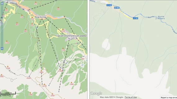
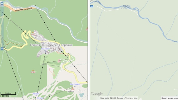
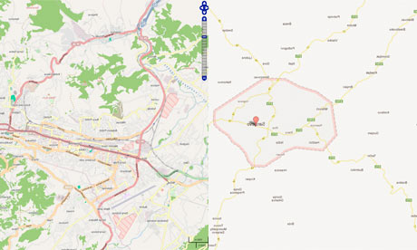
The two media of mapping provide essentially different landscapes–and a different access to the surroundings that they described.  These contrasting visions of landscape are so readily generated by the Map Compare tool designed by Geofabrik, which actively promotes the commercial use of open-sourced maps.  Designed to suggest the difficult selectivity and clarity that the Google offers on the environments it maps, the juxtaposition of the ski runs from the Google Earth view and OSM map are a triumph in the value of embedded signs and measurements of elevation, as well as potential routes of skiing on the slopes of Sochi.

.sochi-ski-satellite

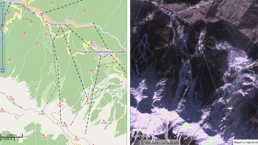
Despite the authority of the Google Map view, the rhetorical power of this juxtaposition between these forms of mapping shows the extent to what Open Source allows in the recently built environment of the Olympic village:  one is immediately struck by the absence of the Skiing Pavilion on the less-often updated Google Maps views, where not only the routes of skiing on the local slopes are less often noted, but the structures built for the Olympics remain entirely absent, and the far limited points for attending to the landscape and its elevation. There is less data in the Google View, even when one goes outside Google Earth.

Indeed, the comparison and turned up many more signs of orientation than the blank spaces of Google Maps which so strikingly recall the “terra incognita” covered by cartouches in early modern maps of the New World or the icy uncharted regions of polar expanse.

ab4561346

Sochi Ski Center Mapped

What seem open areas marked by the faintest of trails or icy frost engage viewers in concrete ways in the OSM maps, raising questions about how they effectively invite us to see, and what constructions that they use to invite us to contemplate space from eight models of the same landscape.  In an age of the huge expansion of Geographic Information Systems and geovisualization, it is amazing not that different modes of mapping circulate–that’s to be expected–but that their contents will continue to be so diverse, or that the very multitude of information that they’re designed to visualize are available in so many competing models.  The ‘Map Compare’ function devised, in ways that recall the classic art history course’s comparison of two slides side by side each other, provide a slippy-screen template to compare any regions with the boast that the open-sourced OSM version will both be more complete and inclusive in its details, and a better commercial model for anyone interested in mapping any city, anywhere, on demand, on account of the multiple modifications OSM users have made.  The story of the more complete coverage of OSM is anything but new, but the recent focus on the demand for better maps in the Olympic games is a great news story, making the lack of information on Google’s map browser comparable to the shoddy quality of the ready-made rudimentary hotels in Sochi in quite potentially embarrassing ways.  Despite the copious Street View detail, Google’s maps of Sarajevo were lacked in the information and visual detail that OpenStreetMap could readily provide to its users.

open-versus-closed

Sarajevo OSM Google

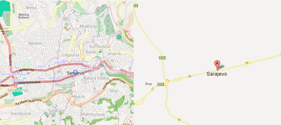
For all the innovation of push-pins mapping cities, Google seems to have neglected the Bosnian and Herzegovinian landscape, and the very elements of regional mapping we need for detailed spatial orientation.   The mapping of green space,  rather than the Olympic village and the architecture of the skiing slopes, that OpenStreetMap provides a distinctly different approach, which makes it more valued so often by hikers or outdoorsfolk, rather than the streamlined images of roads of Google Maps that so often cast geographical surroundings only as lightly colored muted blocks.  Is OSM a more geographically ethical mapping of space, in ways that reflect how its composite character derived from a community of mappers, as much as a collective crowd-sourced medium whose users have championed it as an anti-corporate mapping model of map making?

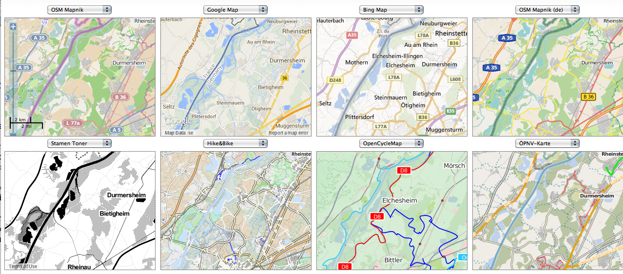
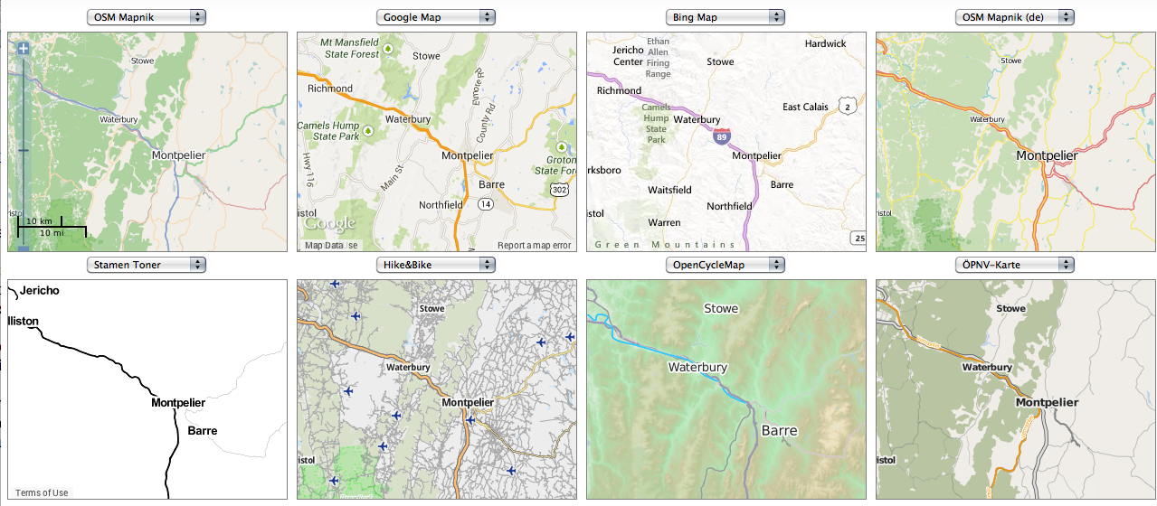
The differences in local mapping are evident in the sextet of views that  Map Compare function offers.  Starting from Geofabrik’s local town, Karlsruhe, which seems the default starting place for Map Compare, one can scan the different levels of information they supply, in a massive time-suck and complex compare-and-contrast exercise, moving a nice view of the area around the town’s central castle, that invites visitors to compare what sort of map they’d rather use to navigate the city’s groundplan and to do so with the grain and detail that best illuminate or shine a light on the fabric of its urban planning:

Central Karlsruhe

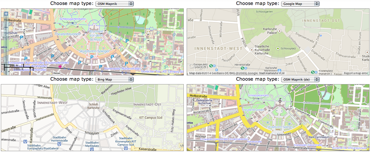
Moving around Karlsruhe, away form the castle, one can compare alternate mapping views, which offer their own alternative glosses on the fabric of urban space, and their own points of entrance to it:

8 Maps Karlsruhe

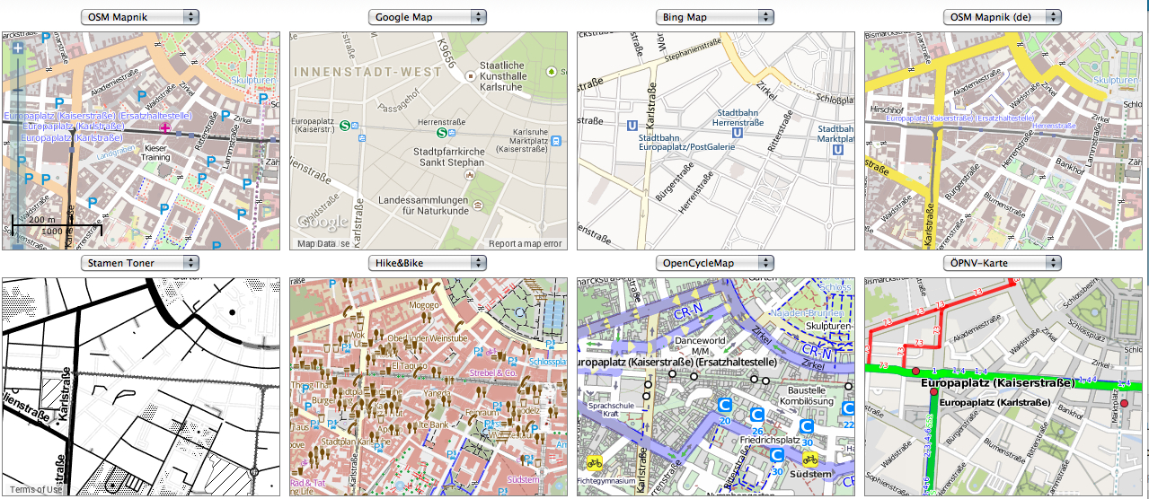
There’s a neat abundance, underscored by a healthy pinch of relativity, in this crowding of a variety of perspectives.  Although there is an association of certainty with the map, each of the above images, using different databases which are often protected by copyright, offer different tags to recognize and navigate exactly the same environments, some focussing on the greenery and paths through it, or the road maps and the presence of the national border near Durmersheim, and others letting the national borderline slip into barely detectable gray.  There is a certain healthiness in this plurality–a plurality underscored, in the case of OpenStreetMap, by the varied contributions individuals have made over time, a la Wikipedia, to its contents.  There is a crossroads at which each stand, between data and design, that reflects an attempt both to give and to parse the most useful information in attractive form, and to create a selective map that give each meaning:  as far as selectivity of its record of urban space, the Stamen Toner map in the lower left gives it the most prominent definition by far:  it is something like a bleached version of a diagram of urban design.  The notation of walking-friendly regions of the city in the “Hike and Bike” map offer something like an index of walkability; the OSM De map, made by local German mappers, provides the clearest model to navigate the network of the largest driving streets in Karlsruhe.

And we can follow each into the nation, at a similarly close scale, toward those regions on the French-German border, near Durmersheim.  The maps foreground the different natures of indicating not only country roads and trails, but the nature of national boundary lines, suggest fairly radically different selective views of the local landscapes.  Are roads more important, or is green space?


8 Veiws Maps of Durmersheim

Or, in a clearer juxtaposed context, closer to home, but with similar concerns for the mapping of green space, contrast the highlighting of lakes, freeways, or greenery of the countryside, which the German OSM details in its lakes and countrysides, whose rather picturesque palette of lakes and greens that contrasts with the blah matte of Google maps, in whose flattened 2D color scheme the lakes stand out, but paths to navigate the landscape are annoyingly muted:

Comparing Info Foregrounded in Mapped Landscapes in Germany

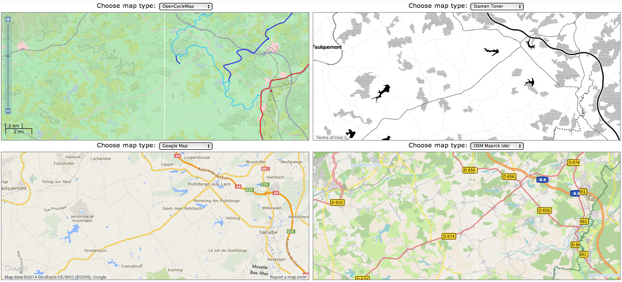
Even if the map in Stamen Toner offers the sharpest contrast, as a strictly road map, the German OSM offers a clearer–or crisper–reading of the autobahn’s highway system and its levels of classification–important to drivers, but mute on Google Maps.  The relatively unprocessed nature of the OSM platform, which after all privileges the local detailing of a landscape in ways that are argued to recover the craftsman like nature of remapping space, albeit in a digital format, and after all process the viewer’s relation to place in ways that champion the individual agency of the locally situated mapper’s techniques.  Rather than deriving form LandSat imagery, even if including the backdrop deriving from Bing to ensure its global coverage, thanks to the new friends it gained at Microsoft, or satellite imagery, the structure of OSM uses a form of illustrator that seek to rehabilitate the familiar values of accuracy and open debate in the creation of a local map:  we are all, OSM users say, digital mappers, and can take back the overdetermined datasets all too often passively read and interpreted via GPS.

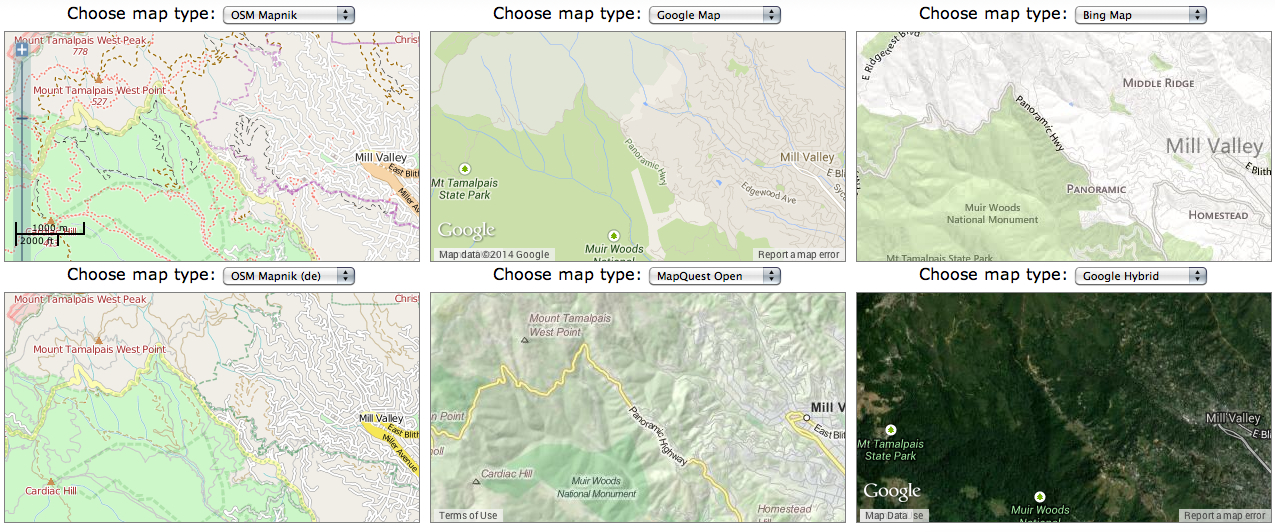
It’s well known that the detail put into the OSM maps offer a less synoptic view point on areas without roads–or where one might be more likely to travel as a pedestrian or hiker on a dirt path.  Close to my home, OSM is widely favored by hikers in National, State or Regional Parks.  Moving to one of the world’s most strikingly beautiful areas, around Mt. Tamalpais in Marin, the pronouncedly different views of space offer distinct ways of negotiating place and terrain, from the relatively blanched Google Map view of the terrain of the State Park to the mock-lithographic topography of MapQuest or Bing to the comprehensive detail of OSM–more busy, for some, but extremely relevant to orient oneself to the world-famous green space:  the density of the trails around Mt. Tamalpais in Marin are perhaps extreme, but this isn’t information that one would want absent from one’s world mapping system (or data) and suggests an erroneously vacant image of the park:  and the absence of points of elevation from most all mapping platforms, even if all GIS data is always “imperfect,” reminds us of the importance of finding criteria of selectivity that are comprehensive enough.

Mt. Tam Visualized

The question of cartographical comprehensiveness in a sense resonates with the perennial fantasy of mapping a complete view of place or region, trumping the difficulties of distortion with which mapmakers have perennially struggled.  But comprehensiveness–or accuracy–is less the point than the filters on data that exist in the structures (and databases) of certain GIS platforms.  Questions of accuracy are relative to the sort of point of view that one wants to measure, to be sure, and elevation points or nature walks might not be relevant to some–or ski runs.  But the features of the landscape surely are, and so are the role of maps as tools by which we attend to those features.  Something of the distinction that French theoreticians like Jean Baudrillard made between media of film and television in relation to the human imaginary seems to offer an apt point of distinction between the collective visualizations of OSM and the muted visuals in Google Maps, derived from LandSat photographs:  there is no trace of the imagined relation to the place or region in the platform, which offers far less of a basis to imagine one’s own relation to the places that it maps.

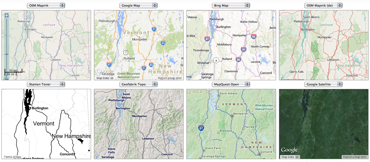
Moving to the greener space of the northeastern United States as a test case, I wanted to examine in some detail the different features of each platform a region that I know well, using the scalable functions of each to zoom into a specific place in the green space of central Vermont.

The distinct landscapes of different mapping media nicely foreground the benefits of Geofabrik’s own Topo map, and the OSM counterparts that suggest even greater detail and differences in the options of roads, paved and unpaved perhaps–for long an important local question–as well as variations of landscape green.  While MapQuest provides some important basic detail here, OSM offers a better view of the greenery and scenery, encrypting more information at a great density, especially in contrast to the generic light greens of Google or Bing.  (Sure, you have the Google Earth function to toggle to, but having a single sheet–either on a screen or paper print out, is an important navigational and orienting tool.)

Map Compare-  Vermont and NH

Moving to a local landscape that I know even better at first-hand, in greenish north-central Vermont, we can alternate among a range of mapped views to foreground or highlight distinct areas of the topography and roads that run through the flattened map:  between the topographic views of a cycle map to the routes of a Hike & Bike, the simple landscapes of an Open Cycle map, or the austere Bing and generic Google Map with its crowding of place names at odd angles, while the OSM offer views of the greenery that few others can beat.
8 Maps Near Montpelier

As we focus on a clustering of lakes further south on the Interstate, scrolling down at a greater scale, the clustering of three lakes offers a specific point to contrast mapping styles and the different data they embody and store, out of which we might focus on the somewhat notorious bridge across the lake that occurs in six of the following eight maps, but which I can confirm exists, a bridge which, while on the other six maps, it’s never noted that one cannot drive across:

Lakes and Ponds near Brookfield VT

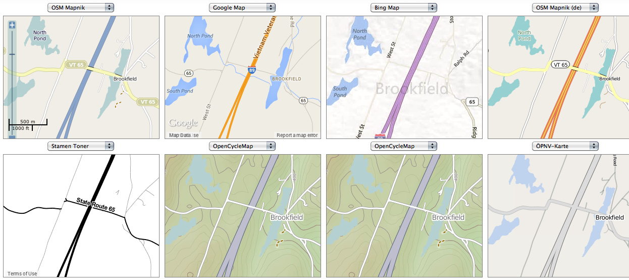
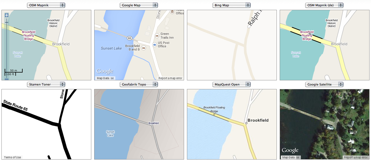
The contrast in mapping styles grows more evident around the smaller town of Brookfield proper, where the variety of map-signs offers a sharpened difference in perspectives on place:  the eight different conventions of noting the interstate are not only surprisingly different in color scheme to differentiate their source, but the mapped data seems surprisingly distinct in these images:  OSM Mapnik suggests a bridge, lined in black, and overpass, but both disappear in Google Map, and in Bing Sunset Lake disappears, while in none of them is the fact that the bridge is wood, floating, but mostly submerged, and closed much of the year to driving noted.  Not only is the coloration and breadth of Interstate 89 distinct in each, but so is the presence–or absence–of the small lake, the old wooden Floating Bridge that cuts across the Sunset Lake, and the foliage that surrounds Brookfield village itself.  But the inability to traverse that Floating Bridge, either in winter, when it is covered by snow, or in summer, since it has been blocked to all but foot traffic, made me smile at the multiple absences in the map engines arrayed below.  And, perhaps as important for motorists, which mapping renders the transformation of paved to unpaved roads?

Map Compare-  Brookfield VT x 8

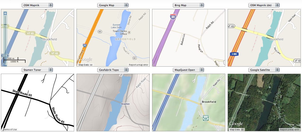
What is the best way for a map engine to engage its viewers?  A slightly tweaked variety in another grouping of maps of the entrance to the floating bridge one can’t traverse by car, at magnified scope, suggests the range of arranging information in only one small intersection, and the need to constantly compare mapping forms for their different level of detail:  from the differences among dirt and paved roads, to the range of topographic detail, to the view that the so-called Floating Bridge is in fact perpetually sinking in Brookfield, VT.  At the end, it will all depend on what we want to see in maps, and the array is simply and increasingly boggling.


Dirt v. Paved in Brookfield VT x 8

For while Google has gobbled upwards of six million miles of streets for Street View, the interest in offering an accurate survey of the land surrounding seems to have eluded, as the aim of completing a complete set of photographs of place–as if to seduce us to allowing Google to maintain a system of location-awareness through it–may be removed from what we want to see when we trust the selectivity of the map. For a generation weaned on video, and gratified by the dazzling display of visuals, the sunny streets of Street View and panorama of Google Earth may be enough eye candy for some, but the need for selective filters and for improving semantic legibility in maps might well lead the best maps to be those that are most carefully iteratively refined.

Leave a comment

Filed under Compare Map, GIS, Google IP

Empire of All You Can Survey

In writing on Google Maps’ ambitions to map the world, Adam Fisher invokes Jorge Luis Borges‘ one-paragraph fable of how the Cartographers Guild “struck a Map of the Empire” at a 1:1 scale with its entirety, “On Exactitude in Science.”   Fisher evokes it in comparison to the massive collation of geographical coordinates in the virtual map Google Earth and Google’s project of remapping the world:  and although he does not note this, in Borges’ story, the map “which coincided point for point” with the empire is abandoned by generations “not so fond of the Study of Cartography as their Forebears.”

The map of the imperial cartographers Borges described stand as something of a reductio–or perhaps extensioad absurdam of the very sort of large-scale mapping that was first adopted in the English Ordnance Survey–a large-scale project of highly detailed national mapping begun in 1791 prototypically English in its character, ambition and scope.  What might be the largest (and longest lasting) mapping project ever undertaken might be worth some retrospective comparison.  The ambitious project of the Ordnance Survey of offering a highly detailed national map of six inches to the mile–since the 1950s, continuing at a scale of 1:10,000–set something of a standard for protecting the nation.  Originally aimed for one inch to 1000 yards (1:36,000), its framework was set by the Principal Triangulation of Great Britain (1783–1853), but its product served to record a legible record of all British lands.  The aim of the Ordnance Survey was to create a comprehensive record of Britain for ready consultation for defense against potential (French) invaders, and the instantiation of mapping of the nation has long been tied to military ends, whose tabulation of an exact correspondence to place provided an account of national resources and needs.  Borges’ evocation at the end of his tale of the continued presence of shreds of the paper map in remote deserts of the empire that he described is so very apposite because of how the comprehensive map-weaving in Google Earth renders any state-run project of paper mapping as so antiquated to be unrecognizable–and leaving any in shreds–although what the massive and glorious project reveals about map reading might be better explored.

The global map of Google assembles is of a qualitatively other order:   for one, it is an interactive exercise of letting the consumer decide what to map, or providing a selective map for their preferences or needs.  But more broadly, it is mapping for world-domination of the market for maps, which has no clear end-product.  And not only the market:  the interactive nature of Google Maps aims to make it inseparably fused to the minds of its users, suggests Michael Jones, chief technology officer at Google and co-founder of Keyhole, one of the first companies to offer online satellite views  suggests in a nice interview with James Fallows in the Atlantic.  For Jones, Google Maps  provide an “extra-smartness” due to their ready availability as interactive media,  effectively ramping up everyone’s IQ by 20 points and working toward offering a “continuous stream of guidance and information.”  Most users have so internalized the interactive map, the founder of Keyhole argues, that “they get so upset if the tools are inaccurate or let them down:  they feel like a fifth of their brain has been taken out.”  The aim is not to unfold Google Earth over a territory, but situate the map’s readability in our heads:  after 6,000-10,000 years, we’ve turned a bend and mapping has become both interactive and personal, or there is far less of a boundary between the personal and the map.

The map is no longer static, but both only and constantly being framed in an interactive fashion.  As well as change the nature of maps, it alters the nature of map readership in profoundly interesting ways, because of how it organizes and translates data into a new sort of platform.  Unlike a project of mapping national coherence, seems designed to offer a model for marketing maps that includes the ability to toggle directly into a visible record of place–“Street View”–that includes the now-familiar tagging of addresses, locations, and monuments that seemed once to be the semantic dominion of Facebook.  We can now see everything in the map, at incredibly high resolution, so we can prepare for trips of business, commerce, or pleasure by taking a look at the always-sunny record of the topography of wherever we might be heading when relying on Google’s Street View to take us there.

Whereas Borges described how the remnants of that hugely expansive paper map once coextensive with the empire that the cartographers created as lying only in the outlying deserts, Google hopes to overturn the notion of the paper map itself–leaving it shredded, or rather recycled–with everyone pulling up maps of their own on the screens of Android smart phones.  (Think of the cache of searched maps that one leaves, as a sort of paper trail, complete with search history and places navigated:  such information is not stored, Google says, but would give a veritable system of surveillance that the NSA must be eager to get its hands on, no matter what the recent ruling of Judge Richard J. Leon’s recent rebuke of mass surveillance practices, by questioning their violation of constitutional rights–no matter how ill-fated their attempt to mine big data to geo-locate global populations.  The “personalization” of the map as an interactive medium is widely seen as a surpassing of its static medium and becoming a web interface, introducing functions of zooming, panning, and rotating 360 degrees on a pin, qualitatively unlike a road atlas and even threatening to dethrone the TripTik.  For the “view” that Google aims to synthesize, linking the technologies of Keyhole and Google Earth and creates its illusion of continuity by how the alchemy of how digitized photography seamlessly melds images tagged with exact geographic coordinates.

The excitement of translating global meridians as a scheme of reference are gone, as are the excitement of working from a single base-line, to be extended outwards by triangulation, that so distinguished the Principal Triangulation and its American emulator, the Point of Beginning–a starting point of the calculation of rectangular land-surveying that took on somewhat suitable evangelical tones for the New World, after the Royal Society tracked the Mason-Dixon line.  For the mapping of the territory of the US shaped the configuration of states from the ascertaining of the base-line that determined the rectangular surveying of the United States further West–


map_point_of_beginning


One thinks of a similar line not at the Continental Divide, but the line surveyed dividing the continents of Asia and Europe at a precise point in Russian lands–a point that was cause for continued debate from the time of Catherine the Great as to the European location of Russia’s capital cities, viewed from a train on the way from Yekaterinberg to Vladimir, one encounters a simple obelisk to note the division.


obelisk:  Europe is to the left!Derek Low


The stem division is inscribed along this frontier in monumental form at multiple sites, or in elegantly neorealist terms at another site, similarly in a wilderness, as if a monument that few would view until they arrived to see it or passed by:


p1030748


These material markers use statuary monumentality to remind passersby of the definitive nature of the line between continents that they traverse.

Google Maps (and Google Earth) is less concerned to create a correspondence within the conventions of maps to order space within a nation than to create a map outside sovereign bounds.  If there is a clear spatial marking of the “Point of Beginning” where the survey that determined state lines and lots drawn east of the Mississippi, the folks at Google have no interest to place a place where their mapping project begins; the premium is rather to capture all the points of view so accessible a mouse-click away.  There will be no reason or interest to mark an actual boundary line, was the case on the centenary of determining the boundary of 1786:   the marker celebrated the triumph of the conventions of the cartographical line in ways that Google won’t ever need to do, since their world mapping is entirely virtual, dispensing with or downplaying conventions like map-signs.


Beginning_Point_of_the_U.S._Public_Land_Survey_Ohio


When Google maps, there is no need for mere monuments–or the practice of verifying base-lines.  The empire of the visible that Google aims to construct is animated by the indexing of digital photographs that can be reassembled at the viewer’s will; Google will offer them upon demand.  The paradox is that little actual measurement is expected, but rather that lines of data flow must be secured:  programs can synthesize the photographs that are uploaded into Google’s Street View or Google Earth, and provide a way of moving from the street map to a representation of what it looks like to be outside the map–allowing one to toggle between “Map,” “Terrain,” and “Street-View”–the holy trinity of their App–to immerse oneself in the map wherever one is, without any need for future surveys, and in ways that show to all who care the skeletal nature of a simple map.  The map is dead, in the sense of a drawn map whose conventions are about translation, but long live the map as a visual record!

There is something like a back-end move in Street View, or Google Earth, as the photograph (or a million digital photographs, seamlessly woven together) substitutes for and comes to replace the map.  The symbolization of space in a street plan or road-map becomes a heuristic device for exploration, in ways that is only a hollow echo of the photographs synthesized in Street View, which are so much more satisfyingly real:  the innovation of the satellite views of Keyhole, acquired by Google and the basis for Google Earth, allows the direct proximity for viewing place, and exploring space, that seems to go through the other side of the map itself, or be a proxy mirror on what the map maps.  Google began its quest to assemble the world on the slippy screen by downloading–or purchasing–the newly declassified LandSat satellite photographs of the world’s surface, and by purchasing and synthesizing the U.S.G.S. surveys of our nation’s road maps:  little was newly mapped here, but the world was newly mapped, in the sense that it was now made available to a larger audience than it had ever been mapped for.  The empire of map-signs did not live long, however, because the unique marketing vehicle of Street View, which set Google Maps off from others, afforded viewers something more palpable and immediate (and more gratifying) than a mere map, and whose skeletal form is revealed by toggling among alternative views:  the map as the ultimate eye-candy and as the vehicle of voyeurism, where one wouldn’t have to be content with lines on a piece of paper, but could gloriously pan around and, yes, turn one’s attention to a perpetually sunny record of whatever one wanted to see.  (“Keyhole” technology all too appropriately allowed the very zooming into high-resolution satellite views of Earth that Google now provides, as if to engage the voyeuristic interest in reading maps that the static map did not allow, and has become central to the interactivity of Google Earth.)

Why would one chose to go back to the map, or explore the map as a medium in itself?  In a neat slight of hand, there suddenly is no map, in the sense that the map is trumped as the primary register of negotiating with place, and one can suddenly see through it.  The question then becomes less a map that is co-extensive with the world, but an image-mine that dispenses with the need to make any maps.  Sure, Google is going around and checking the relations of roads and one-way turns on their road maps.   The end of doing so is to create for its users a point of view that never needs to be redefined:  much as Denis Cosgrove argued the point of view of medieval maps was often understood as the eye of God, Google Maps provides a point of view somewhat like a Leibnizian eye of a God ever-present everywhere.   OpenStreetMap is often cast as a competitor to Google Maps, is pushing in the quite contrary direction not only in the open-ness of its A.P.I., but in preserving continued relevance for the map as a collective compilation of data and meaning–and preserving both the activity of transcription we all call mapping, but is always also mapping to help us better figure out our relation to how we occupy spatial expanse.  For as much as Google Earth might be seen as the modern corollary to “the Art of Cartography attained such Perfection that the map of a single Province occupied the entirety of a City” in Borges’ story, geo-caching Street View images in Google Earth suggests another parable.  Much as Yertle the Turtle, King of the Pond, proudly proclaimed himself Emperor of All He Could See, until Mack burped, Google feeds our inner Yertles, more than maps the spaces we occupy.

While the evocation of The Principal Triangulation of Great Britain may seem odd, the massive project of data collation set a standard that has long driven our notion of the land-map.  Google Maps creates a persuasive illusion of totality of the visible world that often does not map human networks or their environmental consequences, and which may leave us blind to them even as it champions map-reading as something like a spectator sport.  Google Earth’s dominance as a medium raises questions about what other sorts of networks are left unmapped, or what other methods of dynamic mapping might represent social networks, but that are less clearly revealed in its maps–or are obscured–in the seamlessly knit sunlit world that we track in the slippy maps of the open screens of our androids and other Google Earth browsers.

1 Comment

Filed under Google, Google Earth, Google Maps, Keyhole, OpenStreetMaps (OSM), Principal Triangulation of Great Britain

The Map is Dead–Long Live the Map!

Participants at the symposium Mapping and Its Discontents debated the benefits of the near-ubiquity of uniform mapping systems sponsored and orchestrated by Google in our lives.  Many of the wonderful papers tried to suggest the benefits that mapping served as alternate ways of making visible the unseen and giving voice to the silenced–but did so with deep skepticism of the dominance of Google Map’s blandly undifferentiated surface, both as a sort of collective erasure of knowledge, and a sinister synthesis of gathering meaning about individuals’ consumption habits.  In this somewhat hopeful symposium, whose speakers urged the audience to go forth and map, Denis Wood offered a skeptical history of mapping as a form of art, focussing less on its craft than on the contexts in which it was read and exchanged–and the historical “explosions” of map making as a tool of state-making.

Although Scott McCloud does trace comics back through cave paintings and the Bayeux tapestry, something we recognize as a comic book it to printing and mass-production of paper in the mid-nineteenth century, the printed ephemera Alan Aldridge and George Perry first identified as antecedents to  the sort of fantastic album art he produced, we don’t see much we would recognize as a map until printing, Wood argues–and that the fifteenth century is a good place to start the history of maps.  But rather than peg the map to the material practices of the production of information, the ways of embodying information and need to embody networks of spatial organization reflect the new need of an emerging modern nation-state–as well, he might add, though he omitted it yesterday, the need to straighten out clear bounds of contact and digest the discovery of new worlds.  (One might object that rather than leave this entity of the “state” so monolithic, dual origins of causation can be seen in the Renaissance, both as a period of contact with new worlds and that gave currency to the creation of newly imagined worlds–the “other Green world” of Harry Berger–as joint ground in the poetics of making, reading, and reproducing the map.)

As longtime interrogator of the power of maps and enfant terrible of the cartographical establishment, Wood’s opening salvo called attention to how print helped differentiate the standardization of shared practice of mapping space from the genealogy, charter, systems of notation, almanacs, calendars, or rolls, maps served to conjure the state to existence in its graphic performance–and to conjure the state, in ways repeated in histories of Japan, Siam, and the United States, as Elizabeth Berry, Thongchai Winichakul, and Martin Bruckner have shown, as a natural object, when it was not before.  Any attempt to naturalize the map either as a depiction of the world’s surface or universalize its documentary function, he noted, including the celebration of the recent democratization of mapping skills that seem to dislodge authority from the map’s form, passes over the map’s role in the state and state formation as a form of spatial intelligence and spatial intelligibility.

We might do well to look for origins, Wood proffered, by asking exactly when it became a slur on a civilization that it does not use maps–or couldn’t read them.  The question was enticing because of how it raised questions of the ties of map making less as an instrumental tool of dominance over space, than a standard of civilization and knowledge–a standard of the sort that Graham Greene evoked in his postwar visit to Liberia, Journey without Maps (1949).  Although Greene’s visit to the colonial outpost was certainly a product of Africa’s partial colonization by European industry, and the end of English empire, his account reflects Wood’s point that maps exists only where social relations call for them exist:  that where talk serves, maps are rare; but that when talk becomes inadequate, alternative graphic forms of communications develop within the state–of which the map plays a central role.  Greene beautifully if parsimoniously evoked the elderly toothless man with whom he shared a boat ride at the end of his 1946 journey who suddenly approached him with a piece of pressing news:  “‘Do you know that in Monrovia they have a map of the whole of Liberia?  I’m going there to see it.  It is in the possession of a family called Anderson.  They have had it for years,'” he says wonderingly, suggesting amazement at the foreign family of colonizers who possess a map of the entire country in which he lives.  “‘Sinoe is marked on it,'” he continues, “‘and Grand Bassa and Cape Palmas,'” repeating what he has been told by others, but never having seen a map of his entire land.  The encounter might well have been invented by Greene, but created a topos for the encounter between the map-literate and native that presumed an eagerness for encountering a map–the map seems a sort of lodestone–that might be either a western fantasy or a deeper discovery of a land where, absent the myth of colonial organization, the residents don’t know maps, or an illustration of deep ties of mapping to the civilizing process delineated by Norbert Elias.

Printing allowed the map to penetrate the lives of people about 1500, unlike other forms of data-keeping:  for the creation of a map that penetrated the lives of ordinary people and readers effectively under-wrote social relations of power in very concrete, linking territory to other things in ways that advanced the making of maps and shifted the role of mapping as an enterprise:  we count only a few thousand maps prior the growth of the nation, but an explosion of the production of maps in the sixteenth and seventeenth century occurred of the sorts of which was never known, and parallels the map’s entry into individuals’ lives to a degree that never occurred earlier–a notion, as Wood long ago argued, of “map-literacy.”

Nations were indisputably the new arenas of this move to mapping, unlike the printed maps that were widely sold in Italian city-states or the Netherlands.  Earlier maps such as cosmological charts, star maps, or property charts of the Babylonian period or in Japan and England had legal purposes, but quite different from large-scale graphic property function in varied places around the world, and without participating in a map-making tradition in projects such as the mapping efforts of Phillip II to create detailed records of imperial possessions in the Mediterranean, or the huge map making projects of Louis XIV and Colbert that are tied directly to the state and to the material recreation of state sovereignty.  (Of course, this raises the question as to why maps first emerged as forms for advancing epistemic claims and embodying places in areas that were less clear as examples of the modern state, like Italian city-states or sites without empires like the Netherlands or whether the imaginative ends of mapping can be separated from their administrative ends.  Wood sees them as being as tightly tied as the sides of the same Moebius strip.)

It is in this arena of the state, Wood forcefully argued, that we can see the inauguration of modern topographical functions from real estate, to prisons, to cellphone use, to voting practices, to states rights, to a point at which we can’t consider life without maps.  The date 1500, far from being one of convenience, is something like a benchmark or velocity point for the new roles that maps began to play and that they continued to assume today–a point of no return, as it were, of the sort Ian Hacking drew to mark the emergence of probability at the date 1660.  Only after 1500, or in later periods, did mapping emerge as a way of life, Wood insisted:  if some fourteenth-century monks drew plans of their monastery, the idea was not widely or even narrowly pursued as a basis for collating evidence, or followed up on in ways that reflect the multiple functions maps came to assume.  There is a bit of utopianism here:  whereas human societies didn’t need maps, and got on well without them before 1200, he argued, noting rights and properties’ specific attributes in other ways,  the map’s discourse-function failed to develop itself as a means to exploit strategic resources and to have operable use and currency.  While he recognized the evidence of the creation of maps in Song-era China within select parts of well-established bureaucracies, only later did maps gain a large discourse-function of operability.   This may be a bit of a slippery logic, but argues that the “map” had new meaning at a certain point as an object of exchange, and that no properties inherent to its design exist save as such an object of exchange.  So much for its formal attributes.

Wood marked the birth of the map that is now perhaps dead  at this sort of a watershed:  in 1400, few used maps; by 1600, maps became inseparable from social functions in a global context that is itself only beginning to be mapped.  The abundance of eighteenth-century maps in China, or in the seventeenth century in Japan, and in Vietnam from the 15th and 16th century, and Mesoamerican and Malay maps in 16th century, are traditions that inaugurated in the early modern state.  Indeed, there is a weight of evidence to shift this change in the growth of European knowledge, and it reflects a massive rise of needs for map making to ensure border control, water management, land reclamation, military needs that just exploded with the state.  If even in Florence, Italy few maps exist from before 1565, Florentine, Neapolitan and Milanese mapping projects all exploded in the sixteenth and seventeenth centuries, as they did in seventeenth century Japan, when thousands of government maps issue in Japan, and maps served to perform the form of statehood.  

What changed, Wood argues,  was that then new political structure of impersonal construction demanded new forms for its embodiment, and gained a propositional function that was absent from earlier map making traditions–a propositional function that was necessitated and called into creation by the state.  He recalled how Martin Bruckner showed how the image of the national map of the United States staked the proposition that there could be a tenable unity among this expansive nation, much as imperial maps of Britain tried to persuade readers on both sides of continent of imperial possession of north american content, as an artifact of state–both of these cases illustrate the new tangibility that the map assumed as a means of calling the expansive relation of the state into existence by the graphic performance of statehood that was newly enacted in the printed map, and which the map served to make legible.  As Thongchai has shown in his work on Siam, maps served to produce the very “geobodies” that become totemic through the map’s presentation of the state, creating a sense of unity not familiar to many, but able to normatize a nascent polity, and to instruct countless participants in the construction of our country–even without a clear idea of citizenship.  The skill of state apparatus lay in bringing routine of state practices to a larger audience, as Valerie Kivelson argues in Russia, down to a lower level of reading–as the map served, both in Japan and elsewhere, multiple function to against the images of other states and other imaginative constructions.  Identical patterns of map-use can be found in these cultures, and, not surprisingly, in the post-WWII state of Israel, founded in part by European Jews:  in each place, maps affirm the state, the state affirms the map, summoning unity from . . . chaos.

The medium of the map and its power as a form of synthesis arises as a new form of narration when other forms of narrative do not suffice–it is both the master-narrative and originary myth of the modern state.  And, indeed, maps have become so powerful to bring objects into being in concrete terms, that it would be impossible to discuss otherwise in a multitude of ways–from the nation to the distribution of electoral politics to the spread of fires to the ozone hole to El Nino.


Footprints of Actively Burning Fires--Google Map

Ozone Loss Map


The credence that maps create by linking subjects of propositions to a specific code enables these new subjects to be discussed, and in linking subjects of propositions like the state to the code inherent in mapping, and to real relations in the world, maps can come to signify the world, and networks of causation within it, as well as prospective statements for its future.  As Wood wrote in an earlier context, “Insisting that something is there is a powerful way of insisting that something is.  Mapped things–no matter how conceptually daunting–possess such extraordinary credibility because they’re capable of propelling into popular discourse abstruse abstractions:  high-pressure cells, El Nino, seafloor spreading, thermohaline circulation.”  Or global warming, or the the expanding ozone hole, earthquake swarms, or the global threats of desertification of arable land.  These curious abstractions enter public debate as concrete terms, if never clearly grasped, based on their cartographical realization.  It is, of course, only because of maps that these very issues can become contentious foci of public debate.


Tracing Sandy--Time Map

Prognosticating hurricane_sandy_map


The map serves double-duty a representation or a cloak, Wood makes clear.  Its two-fold duties are so effective to make creative practices of map making disappear, to make states affirm their role as real things of nature–even as maps obscured their own existence in the reasons of the state itself.   And if it’s hard to imagine that these artifacts as nations or concepts like ozone could come into creation, without the creative functions of the map, the wonder of the map is to link subjects of proposition signified (State) with signifiers constituted by their code–and to signify the world.  This might explain their clear currency as a form of realizing the make-believe, or fantastic, with a sense of actual concreteness by delineating a credible topography with which we can visually interact–especially while reading a text, and in whose creation we can indeed vicariously share, so powerfully creative do they affect their readers.

The use of maps to lend credence to propositions in the early modern world led them to embody abstractions from the map of “Utopia” Thomas More pointedly included in his dialogue of the same name, the maps of emotions Mme. de Scudery devised as Cartes de Tendre, or Jonathan Swift’s maps of Lilliput and Blefescu or Gunniland in his “proposal for correcting modern maps,” or–and here we leap centuries–modern ancestors such as Stevenson’s Treasure Island, whose fantastic claims to embodiment in maps extend all the way up to map of Middle Earth–and to those Christopher Tolkein subsequently expanded–whose publication and currency, he argued, led anyone with a computer software applications to make maps from Grand Theft Auto to map art, as map is congenial subject of exhibition.

More Utopia Map

220px-Moll_-_Map_of_Lilliput

Carte de Tendre

But are not these maps playful inversions of the operative roles of maps as tools of state–orchestrated by figures with close state roles, as More and Swift?  The role of middle-range cartographers from E.H. Shepherd to Christopher Tolkein to Jules Feiffer, to trace one genealogy, seems quite distinct.

phantom-tollbooth-map


Is the state’s stranglehold on cartography at last weakening, much as Wood asserts, even with the diffusion of mapping platforms and the availability of digital mapping tools?  Wood detects a twilight of the age of the paper map as leading to an end of the dominant role that maps of states once enjoyed as vehicles to view boundaries and confines of state possession and areas of juridical control.  This does not mean that maps are less used by the state.  But that the map is less the gripping tool of engagement whose history he has traced since circa 1500, the magic date from which maps were, he argued, so instrumental in conjuring the subject of the state and so successful in naturalizing its truth claims as part of our world.  This may be curious, because of the proliferation of digitized maps that defines potentially unwieldy concepts–global warming; the ozone hole; hurricane Sandy’s path; plankton algae bloom distributions–that can be latched onto in public debate and, occasionally, grasped.  Or, on a humanitarian level, the sort of crowd-sourced map of deaths in Syria’s civil wars, legibly tracking a succinct geographic table of the distributions of killings, rapes, revenges, and poisonings or the humanitarian disasters of the Syrian refugees whose number has far surpassed two million.

Crowd-Sourced Mapping of killings, rapes, revenges and poisoning

Syriatracker

Syrian Refugee Crisis


We can also distinguish better and worse attempts to map  tragic humanitarian disasters among these visualizations.

One may, indeed, ask what constitutes the state today–and try to map it–or try to define to the widespread distribution of mapping functions within states.  Wood presented the insanely rising prices of old maps sold at auctions today as making something of a mockery of the idea that states so monopolizes the use of maps that it cannot but illustrate state functions.  But are not these maps, now evacuated of meaning and illusions of power, disquietingly assuming a role, retrospectively, as images of a world where power worked differently, or of an age when the design of maps was performed with such due diligence and care?

But Wood is perhaps too happy to say goodbye to the map.  If this grammar is not that much less operative, is it true that the state’s stranglehold on cartography is now weakening or has weakened?  Or that cartography–and the illusion of the map–has outlived its function as a basis to visualize the nation?  Wood doesn’t find that the state can any longer repeat the trick of naturalizing its own presence through the operations of naturalizing with GIS tools, partly because of their lack of similar persuasive skills.  But if it may be argued that the state has no need for the same truth-claims any more, as they are, somehow, finding themselves to be outdated, that doesn’t mean that the collective power of mapping does not exist outside the purview of the state, and as an activity of resistance and calling into being new information, as several other papers delivered at the same conference by Annette Kim and Rebecca Solnit showed.

But although maps arose in needs of nation state to take on form, and organize its interests, rather than seeing some sort of triumphalism continuing in the use of maps to shore up the nation-state, from Raleigh, NC, Wood doesn’t see the map as doing that good a job even as a tool of surveillance.  And he sees the use of maps to call attention to historical practices, and even to restore historical landscapes, as well as address issues of social justice, as marginal to the disappearance of the map as a tool of state control.  The declining efficacy of the sort of operations that maps were able to accomplish, he notes, seem to have contributed–notwithstanding the omnipresence of maps in our lives–to its declining authority, more than a ‘democratization of mapping’ can be celebrated. But as the functions of state-power also seem to be less clearly visualized–and preserved–by means of maps in an increasingly interdependent world where the concept of the boundaries of a map have less meaning as fabricating a category or signifier out of whole cloth, perhaps the map would enjoy new versatility as a tool outside the rubric of the state that so long sponsored it.

If one can talk about a geohumanities that extends beyond those with digital expertise, who engage in studying and producing the culture, that would depend on understanding of ‘map making’ not only as a practice, but as a verb engages other contexts, and a verb that offers something like a grammar in conversation that is specific to the map as an object, distinct from other accumulations of evidence, as well as appreciating the role of mapping as an art.  If in an age of such widespread collations and ordering of evidence, the paper map–and the official map–is somehow rendered obsolete, even as multiple maps continue to wage authority in ordering our lives.  But the ubiquity of Google Maps can be resisted, if only by making its origins better known, and its the limits of its practices evident.  To be seduced by their objectivity is surely to ignore the continued power that maps still have.  If maps continue to offer such a pleasurable area of exploration in Grand Theft Auto and other media, it seems likely that personal meanings maps afford provide not just diversions in the esthetics of map making, but appropriations of an all too familiar authoritative form to define boundaries of inclusion and exclusion, trace networks of meaning, and give stability to collective entities, even in the age of the slippy maps fabricated by Google that convert declassified satellite photographs to easily downloadable tiles.

Wood’s prognostication of the death of the map seems premature.  Perhaps we, as consumers of digitized information, pay attention to its grounding in geographic reality and its operations, and are also less susceptible to the sequestered codes contained within maps, or the truth claims of a single map’s persuasive form.   Perhaps the map’s near-ubiquity cannot but decrease its authority.  But we do seem to stand at the brink of a future where mapping is ever-present as a form of surveillance; perhaps a society in which power has learned to work in new ways, unmoored from maps to define power and realize or recognize its bounds, but has adopted mapping forms as dispersive ways to organize power claims.  But in this society, maps can gain new power as media to realize networks of which too few seem aware.

Wood suggests that the map is dead, perhaps, as a useful tool of conversion in the arena of state.  If the act of mapping seems less clearly situated in the arena of the state, or less dominated by the state, this does not mean that maps are media that don’t still mystify relations of power.  And if the leaks of Edward Snowden have shown that the state is surveilling us to a far greater extent than ever imagined was the case, Wood found little evidence that that has made so much of a difference, or that that helps states do much of a better job.  The query cannot but arise in response:  did the map ever do that much of a functional job, or only a basis for imagining a state that performed its functions well?  Long live the map, perhaps as a form of counter-mapping.

Leave a comment

Filed under Google Maps, infographics, mapping state interests, maps and state formation, newsmaps

Mapping Commute Routes across California in Pneumatic Tubes

Before Captain James T. Kirk ordered Agent Sulu to place the engines of the USS Enterprise on warp speed  to go boldly to regions of the universe no man had gone before, in 1951 Isaac Asimov described Gaal Dornick waiting nervously for a Jump through hyper-space to visit Hari Seldon on Trantor.  Dornick waited for his first ride on “the only practical method of traveling between the stars” through “hyper-space, that unimaginable region that was neither space nor time, matter nor energy, something or nothing, [by which] one could traverse the length of the Galaxy in the interval between two neighboring instants of time,” in ways that seem to prefigure Kirk ordering Scotty to place engines on “warp speed ahead” from his comfortable console on the Enterprise.  Placing engines on “warp speed” was not only adopted as a mantra by Elon Musk, but offering a promise to move the nation into warp speed on a new sense of transit, where space will be conquered in neo-imperialist fashion as a benefit of the free market, public interest be damned. “People,” Musk has pronounced publicly, “like individualized transport, that goes where you want, when you want,” rather than a public service network of routes, a private transit system far preferable to the vision of “cram[ming] people in the subway,” rooted in an image of the frictionless world.

Musk once was–and no doubt still is–a big fan of Asimov’s Foundation Trilogy (1951), a classic of the  and he’s offered Californians the prospect of something of a hyperspace-trip along California’s Central Valley in the futuristic Hyperloop.  And now the tubes Musk seems to treat as a viable route for futuristic transit, some forty-five years after the unveiling of the pioneering long-planned 3.8 mile Trans-bay Tube and 3 mile bore vehicular tunnels of BART–the Bay Area Rapid Transit system–in September, 1972, that were among the longest in the nation, the most comfortable in its cushioned seating, and the most futuristic of its time, linking the region of the Bay Area as a single unit as a potential for its future growth. Yet if the BART provided an early icon promoting the Bay Area as a hub offering access to residents across an expansive commute–

The original BART map
Original BART Map (1972)

–the promise of shrinking commute times across cities seemed the main aim of Musk’s promotion of the Hyperloop. Its actual intention was to torpedo high-speed rail as an option, using social media to lobby behind the scenes in the court of “public opinion” if not to go behind the state legislature, touting an unbuilt project as a way to stack the cards against public transit.

The notion that Musk, a developer of niche battery-powered vehicles for an exclusive market, using mineral-intensive lithium and cobalt batteries, should be an advocate for rethinking public transit was immediately problematic and questionable, let alone an advocate of safe transit, as a man who has mislead the nation about the safety of its Autopilot system, boosted as the future of self-driving cars, in quite misleading ways–“All you will need to do is get in and tell your car where to go,” the prospective buyers of the car are assured, and even “if you don’t say anything, your car will look at your calendar and take you there as the presumed destination,” boasting of interface abilities of its  Autopilot and Full Self-Driving Features included in Tesla cars with a boosterism worthy of its name of its adopted name. The promise of personalized transit that Musk has long rooted his vision presumes a specific notion of pleasure promising to “increase the happiness of both drivers and mass transit users” in the name of efficiency, and innovation, but rethinks the basic tenets of public transit in ways that meet the aggregate needs of individuals, not of the collective community.

Nikolai Tesla is the namesake of Musk’s company, and was uncoincidentally the false prophet or messiah of electricity. Musk must relish Tesla’s own quite relentless promotion of the bounty of limitless free electricity as well as AC current has been appropriated by Musk to assume his own direct descent from the cult of the Serbian inventor whose work is often tied to robotics, laser, radio, and even x-rays in a relentlessly hagiographic fashion that have promised to spread by association to those who buy Musk’s costly cars, and if vicariously place themselves on the vanguard of electricity-based transportation akin to how Nikolai Tesla’s patents allowed George Westinghouse to introduce the most effective and economic distribution of electric power in America by polyphase current–the most effective means for powering electrical motors–a mantle Musk has channeled in Tesla Model 3’s very own “three-stage” charging stations.  

Musk’s plans for the Hyperloop seemed an expand on the promotion of plans for BART as a modern linkage of the expanding East Bay into an economic unit, the promotion of Hyperloop seemed destine to disrupt the highway system, as well, we have recently learned, render obsolete not only earlier mass transit systems but needed high-speed rail systems in California. Musk has become increasingly aware of the pleasure of creating seismic earthquakes on social media, and the hint of a Hyperloop seemed able to materialize inverted the vision of consolidating Bay Area transit systems that BART aimed to achieve in the 1970s,–

First Proposed BART Transit Map/UC Berkeley, Dept. of Geography

Original BART Map (1972)

–and has been a recognizable model for the future development of integrated mass transit today, in the imagined expansion of Bay Area Rapid Transit reaching by 2050 into Marin (purple line) and Silicon Valley.

Adan Susanek, Bay Area 2050: BART Metro Map and Consolidated Transit Systems (2016)

In place of such an interconnected web, the Hyperloop Musk has recently proposed is a swift, single line. Its promise of transit from San Francisco to los Angeles recalls Asimov’s classic description of a frictionless trip to Hari Seldon, as much as one across California. As much as a serious proposal, it is a promotion better understood as a byproduct of artifacts and ideas generated at Tesla motors, to recast the commute from San Francisco to Los Angeles along airtight aluminum tubes.  Musk first mapped his new mode of travel along hermetically sealed pressurized tubes in ways that reflect the idealized esthetic Google Maps afford of the Golden State as a region removed from any fears of natural disaster, earthquake tremors, or flooding: the overlay of a yellow path of travel let Musk spin a fantasy of real high-speed travel out on Google Maps template, removed from the risk of earthquakes on the Hayward fault or rainy seasons that would dim its solar-powered engines.   It is an innovation similar to that Mush has sold to all those ready to cough up the cash to shift into warp speed collectively, by buying a Tesla, or booking travel to other planets on Space X.

Musk has since confessed to his biographer Ashlee Vance, Patricia Marx has revealed, the alleged proposal for the Hyperloop literally on the back of a napkin was a media stunt to get California legislators to scrap their own future plans for high-speed rail in the state. Musk had never intended to actually build the imagined utopia of mass transit via pneumatic tubes, but to torpedo public plans to expand mass-transit. The voluble libertarian inventor was hardly a fan of mass transit–he deemed it but a “pain in the ass”–but offering America collectively the promise of shifting into warp speed. Although Musk plans on constructing multiple similar networks of bored holes in major cities by his Boring Company that he promises are able to carry “pods” of passengers along electric “skates” at up to 150 mph, including a hyper loop between Washington, DC and New York City, as well as a tunnel network in Los Angeles, he feels public transit in fact “sucks,” and asked “Why do you want to get on something with a lot of other people . . . like a bunch of random strangers, one of whom might be a serial killer.” Indeed, the prospect of such pods promise the ideal of space-age travel that is familiar from 1950’s pulps, more than engineering books or public benefit. The promise was for us to be as hermetically sealed apart from reality as the hero of pulps of the Cold War era. Is this the vision of the future we want?

February, 1953

For Musk has repeatedly decried mass transit is but a distasteful immersion of one’s self among a crowd of unsavory individuals, and the individualized futuristic “pods” he proposes follow rather a technocratic vision of longtermism based in fact on the dreams of Nazi engineer Werner von Braun, a prophet of space travel, and Asimov’s Foundation series itself. The relic of the Hyperloop seems a libertarian spiking of actual plans to expand public transit, by a Neo-colonial project of exploiting “space” and the “future utopia” more tied to megalomania and the false security of oracular prediction compared by Kim Stanley Robinson dismissed as at base just a “story” with rotes not in actual engineering or transit problems, but “the 1920s science-fiction cliché of the boy who builds a rocket to the moon in his backyard, combined with the Wernher von Braun plan, as described in the Disney TV programs of the 1950s.” The image of an antiseptic sealed barrier to prevent a bubble of oxygen for white boys colonizing Mars was a stock image of fantasy literature for many kids sporting a haircut eerily similar to Musk’s own today.

1955


The plan was a way to entice attention to his own abilities to solve the transit problems that plague California as a state, and a vainglorious promotion of how a single company might resolve free from local community input. Robinson lambasted Musk’s hope SPACE-X could promise one-way missions to Mars at a cost of $100,000 to $200,000 per ticket not only as “not believable, which makes it a hard exercise to think about further,” but self-indulgent exercises promoting travel to Mars as a single-company effort, the undermining of a state transit system with a single proposal from Silicon Valley suggested a similar Great Man idea of history, by again pedaling the myth of the futuristic fantastic visions once pedaled by Nikolai Tesla himself and his patents and his vision of a liberating future consisting in free electricity for all.

The map projects an image that obscures questions about how the cars would manage those turns at such high speeds, even as it seeks to conjure the promise of such high-speed travel.  The immediate media stir around the recently tweeted prototype of the Hyperloop makes the prospect of traveling in a vacuum actually all far more concrete.  Planned to run through Quay Valley, a town to be built along Highway 5, midway between LA and San Francisco, to be built with Oerlikon Leybold Vacuum, who helped craft the large hadron collider at CERN in Geneva, capsules flying through vacuum tubes across the state were promised last year, and the cross between a Concorde and air hockey table may have arrived in an actual prototype tested in California over a shorter geographical stretch.

Musk tube take off!
Hyperoop SF-LA

The pioneering tube of high-speed transit would suggest one of the “greenest” travel options in the state. Rather than make the drive down that expanse, or the airplane trip on which Musk may have doodled a map of the idea on a napkin, one commutes in the Hyperloop driven by a fan on its nose that sucks in pressurized air in the aluminum tube in which it is suspended, pushing air beneath and behind it like a hydrofoil, as one speeds in a vessel through the Central Valley past the many cars that travel on I-5:  indeed, the proposed placement of the track of the Hyperloop beside the interstate allows its very structure to offer something of a standing advertisement for speedy velo-commuting.

Although Musk has yet to attract the investors or engineers to build the project along Highway 5 without disturbance to surrounding croplands on aluminum-encased rails on pylons, he promises that its economical construction would soon be able to shuttle seated passengers along on a cushion of air, in cars powered exclusively by fan that runs on batteries powered by solar energy that would rest on the roofs of its reinforced tubes.  To be sure, the Hyperloop offers a radical updating of the sort of proposed transit solutions to link the two metropoles, including the “Sleepbus” equipped with oddly analogous pods, but promising to do the same distance overnight in old-style automotive style fueled by gasoline:

sleepbus-1

In the face of such an outdated (if funky) alternative of overnight transit in an old Volvo bus for $48, Musk advocated his speculative plan as a radical re-imagining of public transit corridors.

It offers evidence of his interest in thinking ahead of the curve for the benefit of the state in which he works.  Musk proposed this vision primarily as an alternative to plans for implementing high-speed rail in California proposed by Governor Jerry Brown.   He couched the proposal as an illustration of an illustration of his public-spirited commitments:  rather than spending the 68 billion dollar price tag on rail to be completed in 2029, Musk promises a commute time from San Francisco to LA in under half an hour, if you’ll just buy his batteries and plan and follow him in the scrapping of all existing public rail systems in the US.  Although the pragmatics of the proposal have all to be mapped out in further detail, his 57-page spec sheet PDF Musk manages, with the help of Google Maps, to flesh out the practicalities with an urgency that makes one wonder why no one every thought of this model for moving through space before–that seems designed primarily to hold skeptics temporarily at bay, and meet the building anticipation for Musk’s plans for a “fifth mode” of transport.  It is amazing that his proposal manages to resolve so many issues, and present itself as a significantly lower-cost alternative to high-speed rail, and even makes one question how “high-speed” the quite expensive rail system would actually be.

In providing commuters with a cabin that is “specifically designed with passenger safety and comfort in mind,” Musk’s plans caters to the jet-set who probably wouldn’t even want to drive.  It’s rather something of an alternative to the airplane.  Musk envisions Hyperloop as the travel of the future, whose construction would be far less costly than a rail system, and directly linked to renewable solar energy.  Since the Hyperloop also evidences of Musk’s commitment to the public good, it is odd that it also undermines recent attempts to create a useful means of public transit that would reduce both air pollution, gas use, and highway-crowding in California.  Musk’s antagonistic presentation of the “bullet train [as] both one of the most expensive per mile and one of the slowest in the world” seeks to use engines created by Tesla to offer a “fifth mode” of public transit able to reach supersonic speeds driven by an electric compressor fan, charged by photovoltaic cells perched on above its path.  Its DeLorean-like doors, like the “Falcon Wings” of the Tesla XTesla X, seductively open to invite passengers to hop on in for the ride . . .

0812_Hyperloop_605

The map for the route is not that different from Highway 5 itself, whose path it follows, but the conceptual mapping of travel through space is decidedly futuristic in tone, boasting traveling speed not beyond light but above 700 miles per hour, allowing something of a Jump between the two not so neighboring cities in California akin to an air hockey table on skiis, which he promised “would generate  far in excess of the energy needed to operate” and whose energy could be stored in the form of compressed air itself.  Told with the urgency that one might associate with the inventor Nikola Tesla himself, the basic diagram of the Hyperloop is devoid of any actual spatial placement–still waiting for its engineer to actually map.

Hyperloop Diagram

The ‘conceptual diagram’ is wonderfully futuristic vision that has been beautifully sketched as a sleek object of a consumer’s fantasy for an aerodynamic car running on skis, more than clearly mapped as a means of transit, whose propulsion system allows it to accelerate quickly to 300 miles per hour before reaching 760 mph by a linear induction motor, making the trip last but 35 minutes:

Musk Engines

Needless to say, the linear induction motor has already been built by Tesla motors, and the solar generators on the roof of the tube use cels from Musk’s own SolarCity company; but mapped on Google Maps to follow I-5, the route becomes a reality, and that huge stretch of Highway 5 that no one really likes to drive on is reduced to a route   the Hyperloop passenger barely registerd as s/he was sucked past:

Hyperloop on I-5

The pneumatic tube isolates commuters from the travel experience, shuttling them from LA into San Francisco in ways that seem perfectly synchronized with the excitement over the new Bay Bridge, whose own futuristic and streamlined design it seems to leave in the dust.

Hyperloop in Bay Area

Granted, we do need to update the systems of public transit that are woefully underfunded and often outdated in the United States.  The existing options are mapped in the below illustration, brought to us by radical cartography‘s own Bill Rankin, comparing the layouts and expanse served by systems of urban mass transit:  the great majority of these mass transit systems follow a simple hub-and-spoke design of regional commutes seem diminished insects once placed beside  the grandiose vision of futuristic streamlined jetting between metropoles of the sort that Musk envisions, raising some questions about the efficiency of Musk’s futuristic system.

URBAN MASS TRANSIT SYSTEMS NORTH AMERICA Rankin

The ways of viewing the city as a self-contained unit is not necessarily a canvass broad enough for spatial travel to accommodate urban growth.  

The limited efficiency of our rail corridors, which aside from the Northeast get low scores–and are in need of massive structural updates–moreover seem retrograde when compared to the system Musk sketched.

rail map scored corridors

Musk, to be fair, advocates an eventual state-wide expansion that would be a virtual state-wide redesigning of the rail system into a range of spin-off Hyperloop stations:  “give me a map,” Tamburlaine said, weary of further battle, “[and] then let me see/ how much is left for me to conquer all the world”–or, in the case of Musk, all the state of California.

larger rout Hyperloop

But Musk doesn’t offer a system of mass transit, but something more like a transit for the haves, and elite type of shuttle that can be experienced by those whose time is worth the public investment on a project that would best serve them.  While he of course isn’t explicit about the audience he is addressing, it is pretty much the same as those to whom he is selling a Tesla S for a $70,000 cash payment–some of which can be recouped through electric vehicle tax incentives, and a monthly saving in energy costs–not the prospective audience, in short, as Amtrak.

And maybe–just maybe–Musk’s futuristic Hyperloop isn’t really so future-oriented after all, but more of a projection of Musk’s own fantasy, designed while scribbled on a napkin while flying from Los Angeles to Menlo Park.  It is striking that the notion of a phasing in of plans for high-speed rail is a plan mapped that has been mapped by the Regional Plan Association America 2050, was premised upon the belief that rail can sustain and facilitate regional economies’ growth in crucial ways, and should be built around them in order to foster their growth.

Phase 2 America 2050

Eventually, the Regional Plan Association envisions a Trans-National Network to connect “megaregions” sharing natural resources and ecosystems–as well as interests–by new corridors to foster their inter-related economic systems:

Trans-America Network 2050

Musk’s plotting of a travel corridor by Google Maps software seems a quick reality, even if one that has come in for some ridicule on late-night TV, that might be mostly for folks who jet-set between two cities on the California coast.  The “reality” of his Google Maps reconstruction of a state-wide system, positioned itself to replace the very cars that his company produces, but is also a pretty darn exclusive ride.  To be sure, Musk invites open feedback and contributions to his design from anyone at hyperlink@telamotors.com.  

But the devil seems, as always, to be lying in its quite murky details:  plans call for “Building the energy storage element out of the same lithium ion cells available in the Tesla Model S is economical,” he assures us on page 38 of the spec sheet for the Hyperloop, using the very supercharger batteries which, he promises, “directly connected to the HVDC bus, eliminating the need for an additional DC/DC converter to connect it to the propulsion system,” provide the linear accelerator with sufficient propulsive energy to accelerate to supersonic speeds, allowing one effectively to ski from Los Angeles to Norcal, or ski back to Bakersfield.  While cool as hell, the axial model of this coastal shuttle suggests few possibilities for expansion to the hinterland, or obstacles form the environment–like earthquakes.   (Musk likes comparing the Hyperloop by comparing it to a cross between the Concorde and an air hockey game, a colorful simile, probably to give the concept a populist appeal; but this is an air hockey game on fixed and tracks.)

But the deeper question behind the funding of the system of Hyperloop may be the degree to which San Francisco and Los Angeles will ever come to constitute a single economy:  the forecasting of a map of national megaregions suggests it may in fact not be one, and provides a picture of the megaregions it wants to link.

Emerging Megaregions

The scheme that Musk floated is not attentive to the clusters of economics, but incarnates the very aesthetic of the Google Map.  Indeed, as a scheme of travel, it perpetuates a means by which one can move through a landscape without registering its existence, and removing space from travel, much as Google Maps isolate place from environment, in a new form of transit whose focus adopts the passenger’s perspective of space, rather than the expanse through which s/he travels, or the impact of building these rails on surrounding farmlands or their potential impact.  In removing the schematic map of rail destinations from any external or material constraints by the dream of frictionless travel in an air-bearing suspension system, Musk maps an argument to channel public monies to a system which awaits its designers and engineers–or at least to plan on doing so to bolster shares of Tesla (NASDAQ:  TSLA) to robustness on Wall Street.

Some concern about Musk’s eagerness about the project encountered has been directed to the far greater price tag it would probably involve, as well as its earthquake-safety, and skepticism about the entire question of whether “the thing would actually work.”  Perhaps the deeper question is whether the state of California–and indeed the coast of that state–provides the sort of economic hub that needs to be connected.  The fantasy that it does seems to grow out of the maps that so prominently convince readers’ of the reality in Musk’s elegant spec sheet.  

These maps suggest yet another way maps generate ways of thinking of and considering space without reflecting on its occupation:  how hard would it be, after all, to travel down the Interstate to not be confined to cars, without having the distractions of the farmland that lies between, and the smell of all those cows?

Hyperloop-Elon-Musk-Train-e1432304356542-980x580.jpgHyperloop concept art from HTT

4 Comments

Filed under California, earthquake risk, Elon Musk, Hyperloop, public transportation

Targeting Sites of Attack in Syria


Syria, for now, remains on the map.  But in the course of over two years civil war aged across Syria, the government of Bashar al-Assad has stock-piled chemical weapons as a last line of security in multiple sites.   President Barack Obama’s administration has made use of chemical weapons against Syria’s population a justification for military attacks against or intervention in the country.  But the prominence given to drawing this “red line” on the use of such weapons neglects to assess the pragmatic results of any intervention, and the nature of what form on-the-ground intervention in the relatively shifting state would take–or what ends such military actions would be able to serve.

The direction of the situation is not good, to be sure. The number of Syrians reported killed, abducted, gassed, or poisoned during the civil war over the past two and a half years, tabulated by Syriatracker, clearly centers the focus of violence around its capital city, Damascus, and is probably vastly under-reported:


Syria Tracker- Missing, Killed, Arrested

The on-the ground situation is more complex than this map of reported violence:  especially if one looks at the disparate groups that have independently continued (or sustained) the ongoing rebellion against the Syrian government, or, even more strikingly, at the huge number of internally displaced Syrians, a number greater than anywhere else in the world; and the  number of Internally Displaced People is difficult to count; estimates are 4.25 million–almost 1 in 5 Syrians.  The consequences of this displacement are impossible to map.


The situation on the ground has provoked this displacement through the fragmenting of the Rebellion into multiple fronts.    An important and informative interactive Al Jazeera map of groups in the Syrian rebellion provides a far more complex measure of divisions among rebellious groups that have attracted different financial and military backing to overthrow Assad also challenging to map:  rebels on different fronts include the large Northern Front near Damascus to Aleppo Front, Idlib Front, and Eastern Front, some in uneasy relations to one another, and is worth examining in depth at its website, in order to understand the mosaic of divisions in a landscape whose sectors are often pointlessly divided between “rebel-held” and those where Assad is dominant:

Mapping Interactive Map of Syrian Opposition
Al Jazeera English

The above image of the fragmented nature of local control, and the independence of each group from one another, suggests the difficulty of defining a clear point of entrance and reveals the nature of ‘proxy war’ that has expanded over two years since the Arab spring, as the response to the Arab Spring of April 2011 that challenged the Assad dictatorship were almost randomly attacked by a violent militaristic security forces that echoed the violent tactics of Bashar’s father, firing live bullets into crowds of protestors and unarmed civilians, killing many innocent children, in acts of carnage and terror documented by Human Rights Watch as killing 587 civilians and over 250 children that emulated the theatrical mass-assassinations orchestrated against Syrians by his father, Haifez al-Assad.  The repressive violence of these events, before civil war, increased the range of foreign bankrolling independent factions of rebellion, which is misleadingly cast as uniform by a map of anti-government forces as the below two-color map devised for Max Fisher of the Washington Post, which borders on intentional political disinformation:

syriaForMax-2


Despite using a uniform color to denote “rebel presence” as a single, uniform beige to mask divisions within “rebel presence” and the numerous individual deals that the Assad regime might make within them–and mask the actual of what David Brooks and others correctly identify as a “proxy war” between Russian planes flying from Iran over the nation, Hezbollah present in Syria, and with multiple “combustion point for further waves of violence.”   The war is, in fact, not properly “civil” at all, so much as a broader war for the realignment of Middle East politics–and despite the attempts of previous administrations to involve rebel groups within the negotiation, the readiness with which the Trump administration seems more ready to strike–or threaten to strike?–from the eastern Mediterranean, Persian Gulf, and Red Sea–with less attention to the ethnic composition of Syria, than its own show of strength.


image.png


We have been particularly ill-served to understand the nature of this “proxy war” by the reductionist attempt to map ethnic diversities in Syria as if they revealed an internal fragmentation of a nation that is being driven apart by exterior forces.  Such a map implies that the many sectarian divisions masked by the creation of the Syria’s borders account for instabilities among rebel groups, as if they are inherent in a multi-ethnic state as an amalgam of faiths destined to implode, regardless of the brutality of the two generations of the Assad regime:

Levant_Ethnicity_lg-smaller1-zoom

Yet the divided nature of the country lies in part in the improvised nature of resistance to a totalitarian regime, and the culture of violence that has been normalized within the Assad regime and within Assad’s security forces–the notorious Air Force Intelligence (إدارة المخابرات الجوية‎), whose ties to chemical weaponry have been substantiated in the recent past.

The drawing of stark divisions between areas controlled by different fronts and subject to government control obscure the near impossibility of drawing these lines of distinction along clear territorial boundary lines–and prepare a deceptively simple image of Syria’s future.  One BBC news-map helpfully re-dimensions the local conflict, mapping government positions toward the coast and eastern cities, around holdouts and temporary redoubts of rebel resistance–although clear mapping of their division is difficult given the shifting landscape of alliances and lines of territorial defence among highly mobile guerrilla forces, who often tactically withdraw, rather than face military engagement, but can’t map the shifting lines of opposition or control–or the relations between the fronts that are themselves supported by different constituencies in a patchwork of strongholds:

Mapping Syrian Conflict BBCBBC/Syria Needs Analysis Project


The map poses deep questions of what intervention would mean without a clear map even available to be read.  They also reveal how much the debate about war is being waged not only in words, but maps.  The focus of global attention is not only on the violence that has divided the country for over two years, to be sure, or the humanitarian disasters created by the many refugee camps on Syria’s borders, but allegations of the use of chemical weapons.  Yet the mapping of Syria’s disasters and composition are central to any discussion of military intervention.

And we now have a map of where strikes might be directed against air force bases and sites of chemical production, courtesy Foreign Policy magazine, which uses a Google Maps template to mark the storehouses of potential chemical factories and air bases targeted as primary sites of missile attack:

Air Bases and Chemical Sites in Syria


What sort of a vision of Syria as a country does it describe?  The visually striking deployment of skulls-and-crossbones icons to designate locations of plants that produce chemical weapons is scary, and so much so that it almost evokes incursions by pirates along the Mediterranean coast–as much as sites of chemical weapons.  (Of course, such sites would not in themselves be targeted, but the decision to avoid them depends on the accuracy of military intelligence; the decision to target all pharmaceutical factories also poses a  future crisis for already over-crowded Syrian hospitals.)  But it suggests a rather blunt map of the notion of military intervention, and reveals the difficulty of projecting a limited surgical strike against selective sites that are removed from the Syrian population.

In the light of the relative military success of the long-distance bombing strikes into Algeria, it seems tempting and morally compelling option to end the violence and self-evident terror of gas attacks by unseating the Assad tyranny, or by providing Syria with a clear warning–although what it would warn we are not sure–against purposefully deploying chemical agents against its citizens.

The map raises many questions by marking so many facilities along Syria’s Mediterranean coast.  It makes one wonder how such a map became so easy to reconstruct–and the wisdom of allowing such a plan of attack to be rendered public on the internet.  For the map suggests that strikes can be easily launched, in a sort of war conducted from aircraft carriers at a distance against Iran’s close ally, firing Tomahawk cruise missiles at them from American warships moved to the eastern Mediterranean–although it’s relatively easy construction has led many to openly wonder why such a detailed range of options would be publicly leaked by the White House in such detail, even indicating the targets of a strike of one to two days against fifty specific sites.  (Reuters found redeployment of many key army, air force, and security headquarters buildings in central Damascus that might attract U.S. cruise missiles, and poison storehouses, if not sites of production, could be moved.)  Would it be worth the potential danger of hitting a storehouse of sarin or FX?

Targeting chemical factories, moreover, does not address the likely existence of available chemical arms–although attacks render their release more likely. Every chemical plant is not the producer of sarin and mustard gas.  In imagining the raids on the air-bases and potential sites of chemical weapons, the map takes advantage of a registry compiled by the  Nuclear Threat Initiative locating where weapons are either manufactured or stored.  Yet despite the offensiveness of chemical gasses, their repellent nature, and their close historical association with threats or attacks of terrorism, what sort of counter-attack on the Syrian population the government would unleash as a response to the attack is not clear.  The attempt to paralyze Syrian aircraft who might attempt to deliver them seems worthy, but the bombing of potential plants risky at best. Bombing sites of chemical production doesn’t sound like that great an idea after all, however, since this would most likely disperse the very gasses that they contain–with more dangerous effects than the uses of Sarin or FX against the Syrian population–if such targeting would of course not be intentional.

The incommensurable relation between an air-raid or selective missile strike with storage-sites of chemical weapons has led several to question the value of such attacks, even after knowledge that the government may have intentionally used poison gas against its own citizens.  There is a small likelihood of eradicating more than a small portion of stockpiled chemical weapons in the country, since, unlike biological weapons, most probably will only be widely dispersed by such a blast–and conceivably hurt civilians as they more widely and rapidly disperse, considerably raising the bar for “collateral damage.”

How any such sort of attack will change “action on the ground”–and the questions of what military strike can alter the humanitarian and moral disaster that Syria has already become–remind us of the pressing need to have a clearer map of the action on the ground than a Google Map can reveal, as we examine consequences of a “limited air strike” beyond the hope to cripple the Syrian airforce or discourage the terrifying possibility of further use of poisonous gas against an opposition–and ask if a “limited air strike” is possible in this complex geopolitical microclimate.

Lastly, the mapping of clear targets and divisions within Syria’s boundaries obscures a hidden–but important–map of refugees on the borders of the country.  As well as having internally displaced millions, the fragmentation of fronts in the country have created a growing humanitarian crisis in camps on Syria’s borders, and the 3.5 million refugees who are estimated to leave the country by the end of 2013 for neighboring regions, further fragmenting and dispersing the country’s population:


map refugees Syria by 2013 3.5 mill


Color-coded according to the largest number of Syrian refugees received in each country, we range from deep purple in Lebanon (more than half a million refugees dwell), and just less than half a million are in Jordan and Turkey, and smaller numbers in Iraq and Egypt  – 161,879 and 75,456.  This alternative geopolitical map serves as a negative view of the strategic relations between he nations.  It also poses a problem of how each of these countries respond to the crisis:  such a data-visualization fails to render the different immediate challenges of each refugee family, their poverty, and their amassing on the borders of each region, rather than throughout the country.  For this is a humanitarian disaster waiting to be mapped.

Given the difficulty in mapping the multiple divisions within the country into rebel and government forces, and the crises of internal and external displacement of Syria’s population, we must resist seeing mapping clear targets of attack.  The maps of clear divisions in the country as a clear opposition of forces are distorting filters that are more distracting than they are informative, with overly neat and tidy boundary lines.  The complex conflicting rebel factions supported by backers, and the sort of power vacuum that would be created by significant and serious destablization of the country or desperate responses (or the shifting of responsibility) that strikes against the country’s remaining inhabitants might trigger.

Syria’s conflict of course exists not only as a map of frontiers and inhabitants.  Worldwide, it should be remembered, there remains significant opposition to military intervention, charted by Mona Chalabi and Charlotte Henry in the The Guardian’s datablog–not only because of longstanding alliances between Iran and Syria, or Syria and Russia, but exceedingly complex questions of what ends intervention would accomplish–and what outcomes it would produce, as well as how it would be sustained.


Condemnation of Intervention


Viewing the conflict in Syria not only through the lenses of national alliances, but by what can be best mapped on the ground, must become more central to US foreign policy objectives.  We cannot “chastise” or “wound” the Assad regime without realizing that we may wound the country, or erase it from the map.

All too easily, from the point of the United States, at least, we risk viewing the conflict either too much on the micro level, or at a remove of the capacity of bomb strikes, paying far less attention to the delicate nature of the situation on the ground.  Indeed, the faux apocalyptic tenor of some maps of imminent war that is tragically advanced by right-wing bloggers, that strip the power of cruise missile strikes from their context–


image


–suggests a removed image of the ability to launch air strikes against a nation at a remove from the ground, and an ability to “target” strikes–the illusion of GPS–at a single dot, without registering the huge impact such strikes would have on a country and is inhabitants.  In an era of shooting first and asking questions later, by 2017 we use maps to fire from the hundred and five missiles on Assad’s “chemical weapons facilities” as “surgical strikes” by tools able to pinpoint chemical weapons storage and research facilities outside Syrian cities, as if they have a fixed non-human target to eliminate.


APTOPIX_Syria_US_88463-cf2b5
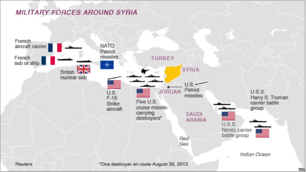
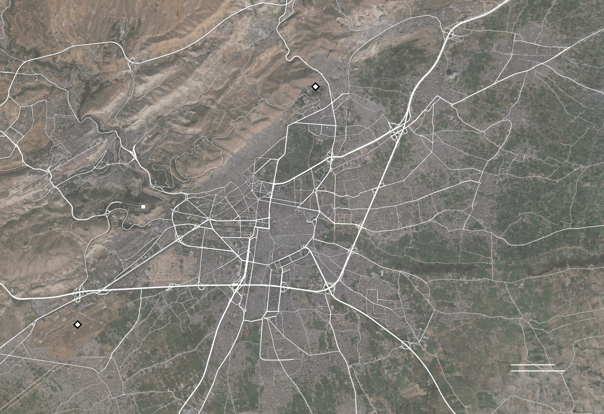
Targeting of Syrian Capital on April 14, 2018/Hassan Ammar/API


Can the promise of mapping with such precision inflate a sense of the ability to intervene from a remove, targeting targets outside Damascus as the Barzah Research and Development Center, or the Him Shinshar complex outside Homs, without terrorizing the Presidential Palace, and without worrying that such armed interventions will not eventually escalate, as they dramatically change the experience on the ground?


image.png

8 Comments

Filed under Mapping Chemical Weapons, mapping ethnic groups, newsmaps, Syrian Civil War