The impacts of radical over-specialization of agricultural lands in the United States on our food supplies is only beginning to be mapped with the critical eye that it deserves. With the intense expansion of ‘mega-farms’ jumping some 20% just in the years 2005-7, their expansion of subsidies, and an intensification of the quarter of vegetable production for animal feed, the notion of agricultural stewardship has been replaced by an artificial market and explosion of selective crops. Is the notion of an agrarian space indeed itself a casualty of this new use of farming in a land of the death of the family farm? Is this the end of an ideal of cultivable space, or does it push us to seek to imagine a new relation to the land? It is indeed striking that until fairly recently, the ancient term ecumene or oikumene described the inhabited (or inhabitable) world with reference to those lands able to be used for agriculture or pasturage.
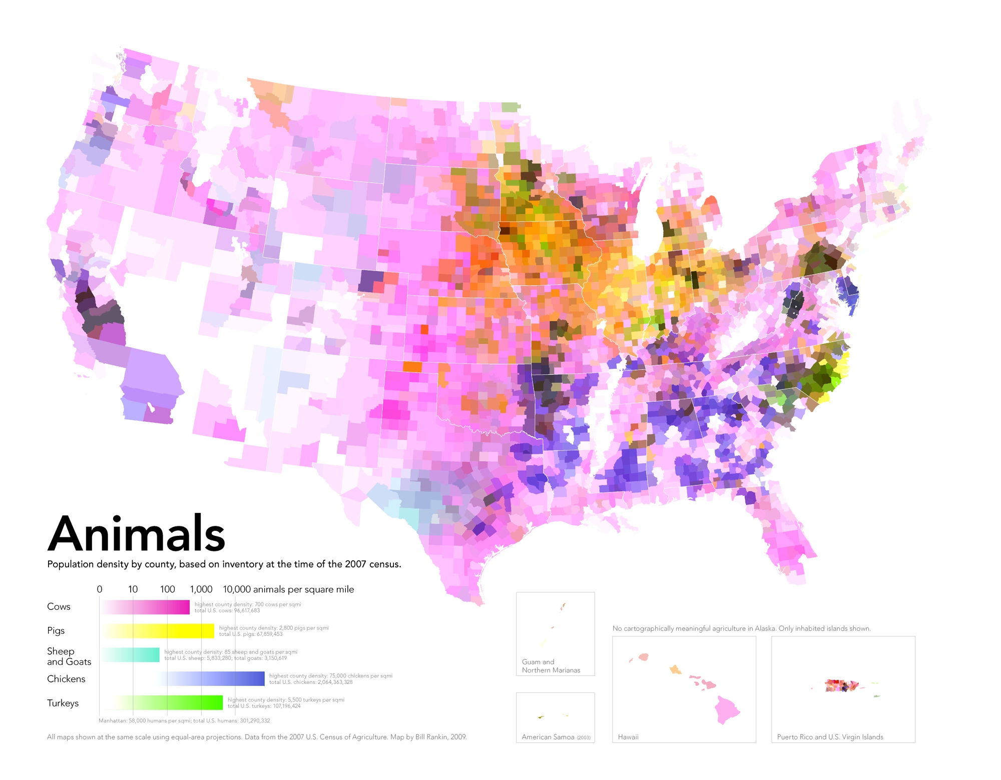
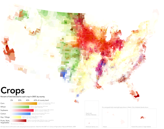
The extreme “specialization of the agrarian landscape” William Rankin recently mapped offers visualization of data from the 2007 Census of US Agriculture: the maps charts variations in crops and animal pasturage in each county of the country, each of which are colored by the gradations of four to five major crops or farmed livestock in the United States. The selectivity of farmland use it reveals captures the effects of this expansion and maps the consequence of that dramatic expansion of mega-farming in the Bush presidency of those years, in response to selective subsidies of corn and soy: the color-coding of individual crops provide a snapshot of the proportion of land devoted to each subsidized crop (soy; wheat; corn; cotton; vegetables and fruits or nuts) that raise to raise big questions about our limited foodscape and suggest the degree to which farm subsidies inform land-use in desirable ways.
Even more striking than the limited regions of land used for farming in Rankin’s data visualization is the creation of the zones of land dedicated to wheat, soybeans, silage and corn that rarely if at all overlap, where over 50% of county land is dedicated to soy, a solid 40+% is dedicated to wheat, or over 60% to corn. This is not only a map of agrarian distributions, but a the creation of a new attitude to agricultural space: indeed, Rankin’s map helps us see the distribution of croplands in the country less as something that occurs on a flat surface, but in itself creates a new familiarity with space, and a relation of our food supplies to space, as much as a form of “geographic” knowledge of how events occur on the map. For the sequence of maps chart a shift in the American foodscape, where we revise how we imagine agricultural space, and as creating a new notion of our agrarian space, rather than as changes that can be mapped or occur on the two-dimensional distribution of mapped space.
Rankin’s set of three maps of the national foodscape are not historical per se, but suggest a metageographical narrative of how attitudes to land have changed in their spectrum of such scattered colors. They chart an extraordinary degree of remove from local intake, distribution or demand. The distortion in this agrarian landscape is of course enabled by a huge transport industry, moving the wheat grown in the central band of the US from Iowa or Nebraska to Oklahoma, corn from Wisconsin to Iowa, to the soybeans so densely grown across South Dakota and Iowa to Indiana and Ohio. Although continuity and coherence as the central properties of terrestrial maps, an absence of continuity in the concentrations of crop cultivation suggest a skewed relation to the land–the maps undermine the very notions of continuity and coherence that defined maps of national territories–using maps to raise questions about food supplies. All the silage in across the Eastern seaboard in the country seems to derive from the local profitability of livestock products, show a nation almost drained of agricultural productivity, and relocates fruits and vegetables to ribbons on both coasts.
The consequent de-coupling of food markets from growing habits inverts Thomas Jefferson’s ideal of a yeoman farmer who planted crops for his own needs, out of the conviction that those “who labor in the earth are the chosen people by God.” The Jeffersonian ideal of stewardship,rooted in a contractual relation of a responsible servicing of the land, rested on “good practices” of land management through rational skills of crop rotation, terracing to prevent soil erosion, promoting the diversification of varied crops, and surveying of land, from advocating a regular seven-year cycle of regular crop rotation that follow corn and wheat with a variety of crops, including turnips, clover, vetch and buckwheat. He pioneered innovations that would increase the conservation of resources as well as crop yeild, including deep contour plowing, turning the ground far beneath the topsoil, and terracing to prevent soil erosion. And his quest for variety and diversity for the agriculturalist no doubt encouraged him to introduce eggplants, brussels sprouts, rice, chestnuts, cauliflower, nuts and olive plants to the country–Jefferson imported 170 different fruits and 330 vegetables in the period from 1767 to 1824 to diversify the nation’s agriculture. Jefferson was vigilant in advocacy of agricultural stewardship and famously wrote Washington with dismay in 1793 that “we can buy an acre of new land cheaper than we can manure an old one.”
William Rankin’s three data visualizations map the remove of what we eat from where we grow, or where we grow and what food we buy, suggests the imposition of an artificial remove of growing and husbandry from urban life–creating a gap between the country and the city so great that we cannot say where the country is. In mapping the geographical remove of crops from cities–and of cultivation and animal husbandry from centers of population, Rankin has charted the results of a dysfunctional division of land-use, in which the map transforms the territory, and almost precedes it, as the areas zoned for harvesting by agribusiness divorce local needs of populations from the large-scale farming and animal husbandry, not only fostering a lack of a uniform food-harvesting mosaic, but a super-regional specialization, as this map of the crops that are grown in individual counties reveal: the disorienting nature of individual to food, and individual to agriculture, that results removes the production of crops from local demand or a topography of need. Indeed, there seems little clear integration of the sites of growing vegetables or crops to a national market in local terms, as questions of national demand and pricing drive the redistribution of crops into what seem “hot-spots” of production, whose intensity of cultivation tries to keep up with the national need with an intensity that their concentration is unable to effectively sustain in the future.
The pronounced discontinuities in the maps of food specialization reveal a deep disconnect between food production and consumption, and the limited understanding of how reliant we’ve become on an unequally pronounced distribution of such basic needs as growing crops or raising chickens.
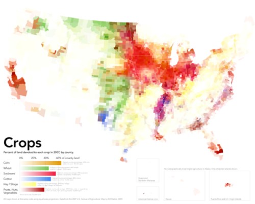
In this map, Jefferson seems to meet Baudrillard: the maps does not simulate a world of rending to the land with clear coherence, uniformity, or indeed boundaries, but visualizes a range of databases that reveal the imbalance by which we try to create the illusion of a land of plenty in an era of few farms. This map undermines the security of a healthy nation, beyond reconsidering the pathways or quality of food, to force one to ask how the foodstuffs produced in these spaces could be high quality. Reading the map will salutarily ward of any temptation to naturalize this self-evidently artificial division of land-use, or naturalize the imbalances of select crops in regions– the six colors used in the map are, indeed, almost always distinct from one another in the above map charting variations in degrees of crop specialization. The map is a metadata visualization, and absence of any attention to continuity in the agrarian structuring of the land, disrupts the continuity of the iconic image of the map.
Like Jasper Johns’ 1961 Map, which re-inscribes the encaustic splattering of primary colors that distance the map from its iconic status: the surface of Rankin’s maps distance observers from the nation, rendering unrecognizable the form of the territory, abstracting the surface of the map by revealing an uneven uniformity instead of a united whole and focussing attention on the unwarranted density of selective agricultural concentration on specific crops.

If maps don’t define and distinguish national sovereignty, but are a range of widely diffused simulations, we need an actively deconstructive map to assemble our disjointed foodscapes. The dramatic isolation of foci of planting of wheat, soy, and three intense pockets of cotton, the absence of vegetables from most crops across the nation is a reminder of the separation of how we inhabit the nation from agrarian land-use: citizenship is disconnected from stewardship, or the illusion of stewardship is no longer possible to perpetuate in relation to the land that no longer exists as a coherent territorial entity. The remove of crops from local use, and the injection of subsidies to promote specific crops in Midwestern states, but also in the Northwest and South, created intense pockets of over-intensification that with the growth of megafarms has produced, despite the temperate nature of the continent.

Perhaps these distortions of agrarian landscapes is an effect of the markets being driven by international prices, or if a radical specialization is striking for its remove from what we eat, even if not all have heads of leafy lettuce and arugula salads on their tables: crops like wheat and soy are farmed in mass in select places for massive milling and repackaging; local food needs are met by importing across the nation, if not scattered boutique farms or “farmers’ markets” that are not run by farmers but franchised, or run by men who drive hundreds of miles with diesel gas in order to perpetuate the illusion of a close relation to the fruits of the land to folks living on asphalt pavement and tar. We use food to create our own illusions, drawing from mythologies of agrarian responsibility that history provides.
Thomas Jefferson rooted democracy in the relation of the citizen-farmer and his land, metaphorically equating that relation to the fabric of the nation: “the greatest service rendered any country is to add a useful plant to its culture,” he argued, equating individual agricultural stewardship as a “service to the nation” that is “worth more to them than all the victories of all the most splendid pages of their histories.” When Jefferson preached the gospel of the agriculturalist, farmers were central to a nation’s needs both for feeding the nation and as stewards of the nation’s agrarian wealth, rather than white-color workers or professionals. And so he valued agriculturalists’ expertise in crop rotation, fertilizers, and agronomy as remedies to the perils of land-abuse and erosion of lands, and located the preservation of the wealth in the countryside and the value of good, arable land. The concern that led Jefferson to increase the diversification of vegetables as fundamental to the nation’s health led the horticulturist Luther Burbank in the early twentieth century to perfect crops able to sustain disease and blight, by hybridizing fruits, vegetables, and legumes by cross-pollination in strains of increased tolerance–if not genetic diversity.
When Burbank redefined performance of crops by their productivity and survival rates, he redefined plants and vegetables as a malleable resource subservient to man, though without encouraging an over-specialization similar to what we see in today’s foodscape. Burbank’s shift in the significance of the vegetable in the world underlies, in some fashion, the metageography of the current over-specialization spatial distribution of crops Rankin maps, as it removed proximity of the place of cultivation from the growing of crops, and removed crops from the local market place. Rankin’s beautifully detailed land-use maps chart the radically uneven nature of the specialization of our agrarian landscape’s distinct fracture lines. To judge by the deep pockets of specialization in Rankin’s maps by the variations in anima populations in individual counties, the thinning of farms extends not only over the deserts, but across most populated regions. This over-mapping of different types of husbandry reveals a virtual segregation of chicken, sheep, and cattle, with other areas left curiously blank, in need as much of importing foodstuffs across county lines, despite the thin distribution of cows for pasture, and a large welling across the midwest and southern Eastern seaboard of pigs.
The image suggests a set of deep imbalances and a surprising disconnect between areas and a patchwork redistricting to meet and accommodate national demand in specific regions. The thin distributions of light violet colors conceals pockets of intense specialization with a clustering of pigs and turkeys, but suggests the extremely rare grouping of a variety of meats by mapping the ranges of density in practices of animal husbandry across the nation.
 Together with other maps which were solicited and edited by Darin Jensen in FOOD: An Atlas, a project broadly discussed in two earlier blogposts, Rankin’s metageography is oriented to imagining relations between food and the land. The maps discussed in earlier blogs were data visualizations, and less informed by GIS, and bore the trace of the cartographer’s hand. But this map is in no ways removed from being an intervention on cartography as an art, if it is based on “big data” as a structural metadata visualization of variations in local databases.
The data distribution of crops, animal livestock, and the profits of farming registered in the Census of Agriculture reveals not only strikingly constrained areas for active agriculture, but the geographic remove at which farming stands from food needs. It presents a clear-eyed critical view of the benefits of locally sourcing food by inviting us to shift our relation to the currently lopsided nature of national practices of cultivated space, but also suggests the distorted nature of food map created by the limited intense cultivation of crops and husbandry of animals in select areas. I’m interested in both the maps and the questions of human geography that the distribution of food in them raises: during the growth of agribusiness and consequent pronounced localization of livestock, slaughterhouses, and tending of animals, and map an increased remove from the sources of our food. With a lack of available local food, indeed, food is not only less nutritious, but removed from place in the manner that Jefferson had insisted. In such a landscape of specialization, “No major city could ever source all of its food from local farms–not even those close to major agricultural areas.” Not only are few farms profitable, but those areas farmed are farmed with an intensity of agribusinesses more market-driven than linked to local economies.
Indeed, the apparently unprecedented concentration of mono-crops–wheat and soybeans; corn; cotton–creates a disjointed landscape both removed from local needs and plugged into a national (and international) market and in which much feed goes to livestock–though, as we’ll see, in which livestock is not so profitable. This maps reflect on the consequences of how constrained farmlands shape a collective geography that leaves consumption curiously disconnected from production, which faces markets that the individual farmer cannot understand, and indeed are more subject to international prices and agricultural protectionism than to actual needs. The regional saturation of essentially businesses of food production reflects not only a death of local agrarian farms, but the impossibility of local crop variation in a landscape of regional concentration for foreign markets, animal feed, and available land.
These attitudes might change, if we accept how Rankin’s radical cartographies reveal the narrow divisions we’ve imposed on our agrarian landscape. But they delineate deep challenges of our national foodscape from even Burbank’s era of a range of resistant potatoes, peas, corn, and various pitted-fruits, including plums. No longer does agricultural needs of a territory shape the contents of the foodscape, and maps lose their reference to a fixed territory, but map a disconnect: Baudrillard would note that the notion of a territory does not in fact survive the map. The map might suggests some links between our distorted agrarian landscape to the political landscape, and not only in the government subsidies that many crops receive to grow at a distance from urban populations, or the diversion of water to allows intense crop cultivation of regions like the central valley. From a nation of farmer-citizens in a Jeffersonian mold, our “red” v. “blue” state electoral topography may mask deeply market-driven divisions in agrarian resources.
The data visualizations suggests the little attention we dedicated as a society to the role of land to food, or to the path from farm to table; the intense cultivation of crops, vegetables, and pastured meat to restricted pockets of the country practically ensures the remove of our food from a provenance or site of origin. Rankin’s maps provoke us to map our own individual relations to the origins of our food, and trace their path back from sites of cultivation to our tables. His maps delineate the broader challenges of our national foodscape; maps may enjoy limited authority or exclusive purchase to represent or contain such abstractions as the nation, state, or nationality, but provide a way to disrupt a world of simulations, where the territory does not precede the map. Jean Baudrillard famously asked pointedly whether the nation’s authority can survive that of the map: the coherence of the United States as a food-producing nation can’t easily functionally survive the unsustainable practices agribusiness has dictated, even if the market can sustain it for now.
The objective disassembly of a national space raises questions of the compatibility of current practices of land use are even compatible with a national space. Indeed, rather than map the relation of food to population, one could argue that the map mirrors one of uneven agricultural subsidies, as much as food demand or land cost, and illustrates the bloated landscape those subsidies are creating in place of agricutlural variety:

This can also be illustrated in relation to animal husbandry by mapping the local density of factory farms across the nation:

Rankin’s maps are of land-use reveal the effects of such subsidies for large farms in their “disjointed and lumpy space[s] of specialization;” they reveal a surface of farming where “few areas where different commodities are grown side by side” and radical concentration of cattle and livestock in specific areas, despite their thin distribution in the country as a whole. The rather lopsided topography of sourcing meat and centering husbandry in massive compound farms suggests a sort of anonymity of their origins, less than healthy and less than nutritious, and suggests a mental familiarity with erasing the origin of foods, rather than considering the relation of food as a “good.” The economic intense over-specialization to some extent ensures the virtual anonymity of paths most foods take from where they grow to the table or the supermarket aisle. This notion of food whose path from farm to table is devoid of specificity raises questions about as knowledge of the ability to distinguish food, as well as how its freshness is radically reduced in a system reliant upon quick transport.
As agribusiness replaces the good household practices of individual agriculturalist moving foods from limited sectors of over-cultivation, subsidies define circumscribed areas of crops and animals–here mapped by the specialization of crops or the density of livestock in each county–and limit their profitability. With the exception of some crops in the Midwest located near to cities or towns, in fact, a radical concentration of agriculture removes the individual’s dining room table from growing practices. Take, for example, the location of soybeans, marked by red, in some regions of the Midwest, that define a relation to the commodity outside the food that is actually consumed:

The dramatic disruption between farms to urban foods and divide between local food-supplies and consumers to reveal a deep shift in our connection to the land.
While fundamentally data constructions, these maps give new sense to the materiality of the map, by providing a visualization not of expanse but suggesting some of the ill-effects of our own division of land-use. Lest we naturalize the divisions created by this specialization of land-use, they map the stark divisions of the origins of the food we eat poses compelling (and pressing) questions about the best way we might provide nutritious food to urban populations, and if we can economically sustain the current landscape of intense specialization of agricultural work. One irony of this division of the agrarian functions is the illusion we are healthy to invest one or two crops to one expansive region. Indeed, this illusion masks dangers in segregating crops in the landscape and a fracturing of our relation to our food. The widespread naturalization of one state or region as the center of corn or wheat, potatoes, vegetables, nuts, or cheese conceals an implicit consent to the current culture of specialization has segregated the production of meats, wheat, corn, cotton or grains in only place, in ways that effectively naturalize an impoverished practice of agricultural rotation: by imagining certain states as lands of corn, wheat, or soy–as if crops were indigenous to a landscape–that erases the natural variety of an ecosystem by rendering it unrecognizable.
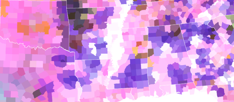
No clear sense of a landscape that provides nourishment for the nation remains, as agricultural “space” is itself dismantled as a uniform concept in relation to the nation. Rankin’s cartographies map the extreme variations in the dedication of land to the intense cultivation of foods, plant and animal, and we might re-examine the silent segregation of an agrarian landscape through its consequent perils. The database from the USDA that he has used reveal a concentration on crop monocultures and an agrarian centralization, à la Charles Taylor, of crop production. Hopefully, we can use them to take stock of whether this is healthiest way to feed our cities and urban populations–to segregate or actually remove most cropland from sites of urban population. As agribusinesses have concentrated the cultivation of wheat in a band in the central states stretching in regions colored bright green, corn and soybeans in the yellow and red northern midwest, and fruits and nuts, the result is an increase in the remove from which our cities are nourished. Populations stand at a remove not only from the sources of food, but of the most nutritious choices of food.
The high degree of scary fragmentation of US agriculture reveals a heightened specialization of food-sources between corn, wheat, soy, and nuts or vegetables. The isolation of pockets of food production reveal an intensity of artificial over-specialization often removed from a national demand: the segregation of centers dedicated to agricultural production from centers of urban life suggests a divide between city and farm. Even more significantly, perhaps, than the divide mapped in electoral-map chloropleths between ‘red’ and ‘blue’ states, the severely localized distribution of crops maps a huge divide in expectations among Americans for freshly grown food possible of being sustained, and to the landscape of food-availability; while the food landscape cannot provide a deterministic explanation of party affiliation or patterns of registration, the distribution may map populations’ selective distribution in areas with greater access to locally grown food supplies–or their resistance to the remove and distance from crops and an agrarian economy.
That is no doubt perhaps overly optimistic, given the huge role of agribusiness in structuring the landscape of food use, together with the subsidies of foods that they receive: the monocrop concentration of corn, wheat or soybeans is conducive to bulk harvesting for sugars or bread, and shipping, if not to their redistribution from select centers of packaging.
But the sad (unhealthy) result is a remove of most populations, or at least huge proportions of them, from the sources of their food. The existence of such a selective resettlement is less clear than the dysfunctional image it suggests of a fractured relation to the agrarian landscape about which it’s hard to wax poetic. The rare concentration of fruits, nuts and vegetables in California, densest in the Central Valley and farmlands of Northern California, are the only dense areas of their dense cultivation, save Southern Florida, based less on climate or topography than on their remove from coastal cities, and seem to provide the only dense region of vegetable harvesting in much of the nation.

How can one imagine this disjuncture of agrarian space from the national space? The classical poet Virgil idealized the relation of Rome to its landscape and countryside in the era of Augustus, providing a topos of the idealization of landscape’s tranquility as the result of harmonious good government. And it’s helpful to cite Virgil’s praise of the wealth of agrarian diversity in the Italian peninsula, too, because they provided a model of the metaphorical cultivation of a proto-national space. When one looks at Rankin’s weird maps of a disrupted foodscape, where over half the country is without crops and blank whitespace; they’re as removed from Virgil’s bucolic agrarian ideal as they are from Jefferson’s–indeed, those two are far closer to one another than we can see in how we’ve divided the nation into zones of soybeans, silage, and wheat that only occasionally overlap. There’s a huge contrast the dissonances in the food landscapes that Rankin mapped above to Virgil’s famous encomia of the productivity of the Italic landscape in his Augustan Georgics, where he evoked the transformation of a rocky Italic landscape through the benefit of Senatorial edicts and decrees to a land of “abundantly growing crops” and “sacred home of the olive groves,” now dotted with “many wondrous cities,/That so much toil has built” whose crops were “abundantly rich;” the land, tended by the best techniques of animal husbandry and of agricultural practices, provided the ground to cultivate wheat, barley, spelt and vetch in alteration with Egyptian lentils “in accordance with the Gods.”
That bucolic image of the productivity of the land that is fostered by Senatorial decrees and oversight of a diverse but homogenous space stand in sharp contrast to the segmentation of pockets of subsidized divisions in an agrarian landscape subject to intense monocultivation that is to large extent both largely sponsored by agribusiness, and largely removed urban areas or demand. Tending the Italic landscape drove wealth to the “tot egregias urbes,” so remarkably diverse and bountiful, of the recently united peninsula Augustus ruled–and whose relative riches outshone any other region in the world. The current landscape of specialization has so narrowly concentrated to focus agrarian productivity into scattered agrarian blocks of a zoned farming industry that dramatically disconnected itself from urban areas–and reveals a disconnect of city and farm so stark one could scarcely imagine a tie between the two.
Agrarian diversity? Well, the new space is just complicated to manage or understand. We know it’s unwise to concentrate corn and wheat in one area with soybeans, as if they were a large monocrop, because this exposes them to disease; the concentration of fruit and nuts in pockets of the entire country is even more irrational. The placement of production of crops at a remove from populations produces less nutritious food, and generates more waste. Equally difficult to sustain is the containment concentrations of livestock animals in select pockets of beef for slaughter, whose concentration is likewise removed from areas of urban concentration. Despite small areas of cows lightly scattered for use in pasture for milking across most of the country, concentrated centers of butchery define the country’s food map. Something like one-third of arable crops are given to land animals, but the segregation of high-density livestock farming from local agriculture suggest a challenging foodscape which might be considered more creatively, even if there is never much animal harvesting in the desert:
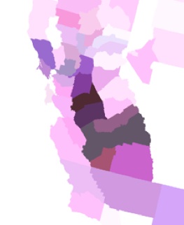
Drive down Highway 5 to Los Angeles past centers of slaughter and beef production. The extreme variation is stunning when one approaches the cattle farms in California’s Central Valley, and even more scary is how characteristic this is in our agrarian landscape, rather than an extreme fragmentation of land-use for livestock:

Consider the localization of livestock in deep purple gradations in Rankin’s chlorpleth reveal a national segregation of zones of butchery limiting availability of freshly butchered meat:

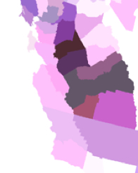
What does this say about our relation to space? Let’s look at the crazy topography of intense pockets of “cattle compounds” and “chicken farming” that might not be called husbandry which make a broad mosaic of meat processing centers in the poorer counties of the American South:

This snippet is barely recognizable as a map, of course, or a record of space. Remember the pretty staggering numbers that the deep purples reveal in this key:

Mass-farming of course unprecedentedly removes food from its consumer, and removes the very idea that this need not be the case. The inhumanity of concentrating chickens in the Southern United States is one concern; the remove of chicken farms from urban areas or human consumption is poignant: it finds counterparts in the chicken-farms of the Central Valley and Imperial Valley in California, which are something like a hub in the West Coast save from those in the northwest. But at their highest points of concentration, we have managed to concentrate an amazing 70,000/sq mile. (Cattle are densest in the Midwest, where we find 700 cows/sq mile at the densest parts; fewer turkeys are raised, but the greatest concentrations of 5,500/sq mile seems downright unhealthy.) Leaving aside ethical morality, the map posits questions of food safety: intense centralization of animals and consequently of feed supplies increase risks of contamination as well as exposing them to greater threats of disease. With the trends to global warming, the dangers of locating agriculture in fixed areas of intense over-cultivation are even more pronounced.
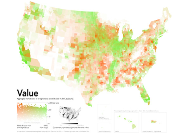
Such data visualizations offer a database which easily slips from the eye. While these maps don’t overlap, they suggest a joint-access data visualization that might offer a useful planning device. They reveal mono-crop cultivation and intense concentration of the value of animal or agricultural products that impoverish the project of agriculture in much of the country and seem to reduce the value of either crops or the production of animal products in most US counties in the absence of their intensification. More striking, perhaps, is the small degree which farming maps to value across the entire nation, uniting both animal and vegetable products, and the huge wholes of agricultural profitability in over one-third of the nation. We supplement these gaps through the massive importation of foods, vegetables, and produced foods. But the fact that it is rare for vegetable-growing to bring in a profit through most of the northeast suggests a topography of agriculture that few wold suspect; the profits are limited to the rich green areas dominated by the crops of soybeans and corn, as well as wheat, that are similarly scarily removed from many population centers. Despite the comforting green that leeches down the path of the Mississippi River, ; meat seems only profitable in Oklahoma and parts of the old South, sites of large concentrations of cattle- and chicken-farming.

The washed-out nature of large areas of this map suggests the low aggregate market value of product made in those regions; there is a surprising density in few counties where animal products provide profitable earnings. This is, to be sure, but one sector of the economy; but it maps an important one: the divides Rankin maps not only poses questions of how we see our land, or use resources but of how we imagine the remove of farmed land to a vital urban space–and indeed how economically removed agrarian practices have become from urban consumers across most of America.

The lopsided geography of land value creates an uneven distribution we all tacitly know but don’t acknowledge. It is also a basis of land-use that is not economically sustainable. One take away from Rankin’s series of visualizations of the discrepant distribution of agriculture is that at a time when we dedicate increasing attention to the construction and planning of urban space, rural agriculture might be better planned in concert with urban concentrations, and not only for reasons of health but as a matter of public policy. We often need a map to reveal the artificial nature of what we naturalize. All three data visualizations suggest that we’ve left agriculture to market forces alone, in ways that might not plan for future development; imagine the maps as overlapping public access databases we might use to orient ourselves not only to space, but to a more sustainable relation to the agrarian use of the land. The needs for such a shift in orientation are not only for health, but economic: it’s not possible to prognosticate from a map, but we can use the visualizations to raise questions about what would be the effects of climate change on districting agricultural land-use to specific sectors and types of crops; the concentration of corn strains in one area, moreover, raises possibilities of adverse influences in the food chain of GMO strains, much as the concentration of both animal livestock feeding raises specters of tainted meat supplies.
The limitations and constraints of agribusiness are imposing, if familiar. There has been some local pushback. Discomfort with these constraints undoubtedly informs the recent retrenchment of urban gardening and even urban rooftop gardening across the urban United States. Much as the growth of farmers markets may have encouraged or initiated widespread interest in centers of urban agricultural use within an urban landscape, as if to react to the marked remove of food-availability–as much as fresh food–from urban space, and the poor nutritional qualities of food that result.
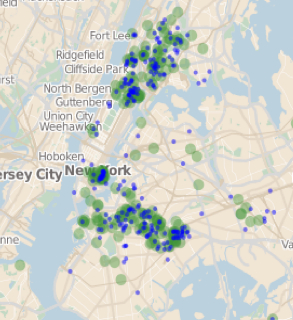
What can we make of the local attempts to bridge the town and the country, either in the preserves of the new spaces in cities created at farmers’ markets, or the growth of urban agriculture? I’ve gestured to the attempts to map both in Oakland in
some previous posts. Around New York City, a previously isolated urban space is surprisingly permeated by active green space. The Parks Department in fact only owns less than half of the almost 500 community gardens
measured by GROW NYC and Green Thumb in 2009, with sites to volunteer noted in blue beside
urban greenspaces:
How many are open to cultivation? Over 20% of those highlighted in yellow are dedicated to edible plants:
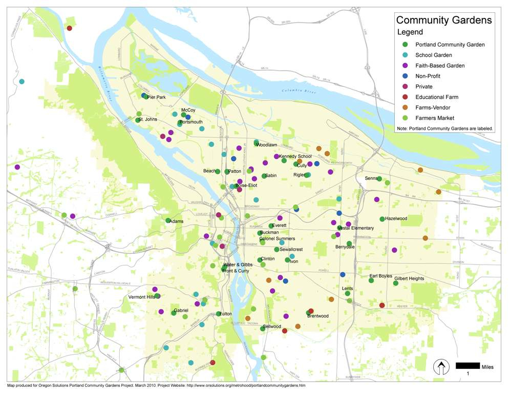
Or the similar emergence of community gardens in Portland:
The growth of San Francisco’s roof-top gardens, which was so quick in 2008-11 that the city changed its entire zoning code to permit urban agriculture from expanding in all neighborhoods of the city, led to a Renaissance of urban gardening, despite the relatively close access of the neighborhood and city to fresh food markets, not to mention an insatiable demand for local food:

Mapping the economy of rural-urban relations is a big project for the future, but perhaps it is even more difficult to plan to do so given the investment in a model of land-use that cannot yeild many positive long-term returns.


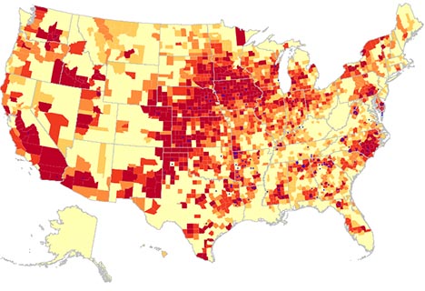
 There is clearly a culture of overeating waiting to be mapped. But one cannot say the map has a clear cultural origin–so much is it rooted in food purveyors, and a food network of factory farms, as much as economy. Obesity was recently mapped in 2010 by the World Health Organization for both men and women, in ways surely reflect the local economy, but also show a resistance to obesity, if we can call it that, in areas as Irish or Frenchmen, although lack of food in Afghanistan contributed to limit average male BMI in that war-zone.


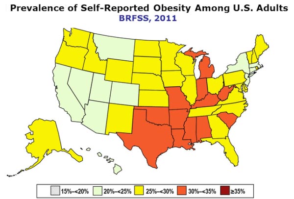
 The infographic maps unsurprisingly onto the CDC’s mapping of 2010 obesity trends provides a striking picture of the spatial concentration of the obese.