
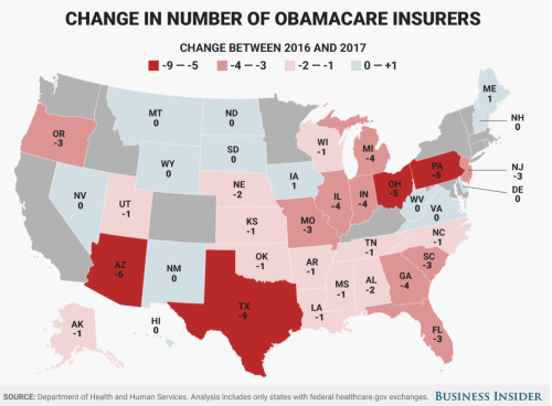
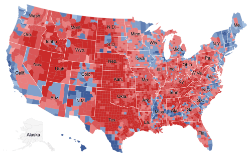
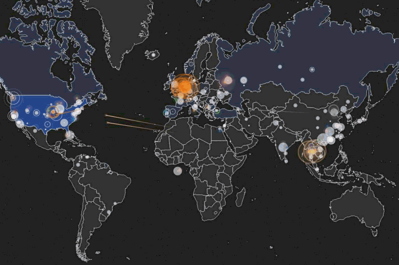
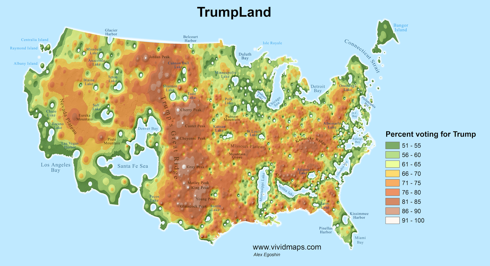
The bulbous, bloated cartogram meant to render the prospective withdrawal of insurers from individual health-care exchanges under the Affordable Care Act in its deepest colors foregrounded the concentration of a reduced insurance market in rural areas. The image of a nation seething over, and the ground boiling over as if with discontent, cartogram, distorted “red” and “blue” states alike, but seemed evidence of the ways that the Affordable Care Act warped the even playing field in the United States–as if that ever existed, and could be expected to exist today. But it might be taken as an emblem of the deep anger and resentment that many areas of the United States felt toward what was labeled “Obamacare,” and the regional markets left with but one insurer–and an inevitable feared rise in their insurance premiums–in the health insurance markets that the Affordable Care Act would create.
The designers of the cartogram warped to counties’ population almost aptly if inevitably rendered the country as boiling over with anger: it seemed to render a powerful emblem to justify if not inspire broad indignancy about the apparently uneven consequences of mandated insurance exchanges which it argued the less populated–and poorer–areas of the country would be stuck with, as a distillation of social injustice. For the cartogram captured what its designers argued was the distorted market for health insurance which people on the coasts had designed as destined to shut out large areas of the country shaded in lighter colors–and prevalently light pink. But the prediction of a contraction of providers that undergirds this ominous scenario, as we now know, didn’t come about at all,–even if the strong passions provoked by the fight over health care did leave the country boiling over with anger and indignancy widely felt to be objectively justified.


It can be quite forcefully argued that health care deserves to be regarded as a democratic right–democratic with a “small ‘d,'” in the sense of an egalitarian right, even though debates about access to health insurance are increasingly cast in politically partisan terms. Although access to insurance exchanges are increasingly treated as a question less of a right than the reflection of a political position, the proposition of guaranteeing health coverage is rejected by champions of the marketplace and its benefits, who argue that its falsity undermines a free market. As a result, in part, health-care exchanges are increasingly mapped in terms that might well be mistaken for political partisan divisions within the fabric of the nation. Indeed, the sharp, flat blues, reds, and deep carmine of different regions suggest the hopes and difficulties of providing a uniform insurance plan for a nation of radically different numbers of insured, facing the hope to provide more with coverage in a way that may seem to tilt against the open nature of the marketplace.

But democratic rights include not only political participation but due rights to certain benefits that accord undeniable liberties. And although liberties which were not defined as including health care in the eighteenth century, leading many strict constructionists to view health insurance as an excessive presence of the state in individual lives, the range of liberties have expanded to-liberties to education, or to health, or protect against race-based, ethnic, or sex-based discrimination–revealing the broadening scope of understanding liberties, and might be mapped into the fabric of the nation as an individual rights, and a basis for ensuring greater egalitarianism–and social equality–as a right.
Back in 2013, of course, the institution of health-care exchanges set up a new landscape of the Patient Protection and Affordable Care Act–the Affordable Care Act or simply ACA–allowing most Americans to buy insurance on government-run exchanges (or marketplaces) to have access to health care that they were often lacking in all fifty states, creating the reign of designing data vis of Obamacare exchanges often subsidized by the government for those eligible, to make it available to all, in ways that created some thirty-six exchanges run with the federal government, as states ran the others alone–creating the odd scenario that more enrollees came from red states, where they were run largely by the federal government.

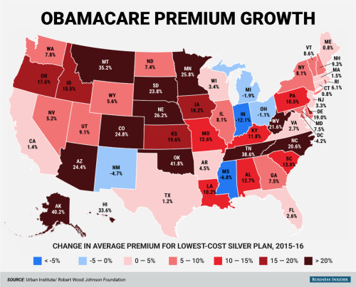
But this was not widely accepted, and the rejection of the promise of what is now widely labeled Obamacare reflect the deep divides that its opponents argue the government mandate for buying insurance policies will impose on the nation. The online popularity of recent projections of a constriction of health insurance options for most counties of the nation that were proposed as recently as the spring of 2017 seemed to reveal the deep dishonesty in the proposals of the Affordable Care Act to level the playing field. And although the capital of health care as a good to the nation demands to be mapped, the difficulty of parsing the ACA independently of the name of Barack Obama reflect the unfortunate polemic level of debate about seeing adequate health insurance as a right of all–even as fear of losing health insurance dramatically rose across the nation, and the fears of rising premiums posed by its mandates were widely stoked by data visualizations suggesting widespread abandonment of insurance exchanges.
The data visualization–which almost amounts to a tool of outright propaganda–uses flat carmine to blanket the real improvements in numbers of the uninsured. The presentation of an apparent distortion of the market is confirmed by declining insurance policies available on Obamacare exchanges, as its accompanying text assures readers that the real people to benefit from “marketplace enrollment” was the “private health insurance industry” who gained $90 billion in premiums, greatly profiting “publicly traded insurance companies”–distorting meanings of “public” and “private” as if to imply the dystopian nature of health exchanges that benefit coastal states alone. The map of possible changes in rates of premiums were even more striking, and was presented as evidence of poor policy planning, as well as signs of a grim “slow motion death spiral”–a strategic choice of term suggesting the poor level of health-care it provided, and organically faulty nature of its establishment, but alienating the numbers of premium growth from individuals covered.

The familiar series of sequential images forecasting the mass exit of insurers from exchanges over a period of four years of the adoption of Obamacare stand at odds with the fears of losing health care and the defense of health care as a right, as well as a national system of insurance. And despite an onslaught of maps ostensibly demonstrating the ever-narrowing options for individuals as available insurers in state-based exchanges dry up; they convey an imaginary future in which few counties with “active markets” of four or more alternatives–apparently compromising the rights of many Americans.

Bloomberg Graphics/2017 Health Insurer Exits (projected)
Indeed, the image of rapidly dwindling options faced by Americans that such data visualizations claim to be based on data from HealthCare.gov. seem to suggest a focus on individuals. But the broad brush strokes leave little to the imagination and present an ominous emptying of choice that seems designed to induce panic. The images are executed with great dramatic effect, but little sense of cartographic skill–they presented a dire picture in which four options would be only available to residents of eight to ten states by 2017, calling into question the ability of much of rural America to remain insured. The images of rural abandonment by health care exchanges were particularly powerful, so absolute in their predictions as if to afford little room for interpretation
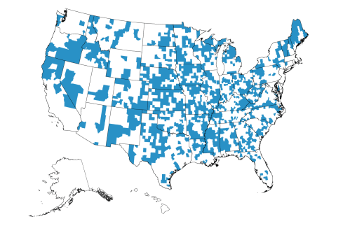
Yet the projections, for all their power, stand at variance with reality. There will be, we now know, in fact no Obamacare marketplaces that remain at risk of being without insurers in 2018, as of August 24, 2017–
–and but a smattering of counties that were at risk for being without any insurers:

In short, the disruption of the narrative of a dwindling of insurance options has been, after the failure to repeal the ACA, dramatically disrupted. Even while acknowledging that there was a record low of uninsured in America after the American Care Act was adopted in “Obamacare marketplaces”–a coded term if there ever was one, loaded with disparagement–data visualization were crafted to predict deteriorating coverage options deteriorated in the months ahead in many rural states of apparent objectivity; hastily created maps, at an odd angle to reality, suggested that as much as over a fifth of all federally run marketplaces–predominantly in rural areas–were with only one insurer.
The alleged “bolting” of insurers from such marketplaces were predicted to leave areas like eastern Tennessee without any insurers, like, perhaps, southern Georgia, much of Colorado, almost all of Iowa, many counties in Ohio, and large numbers of Virginians, as Aetna, Wellmark, and Anthem were predicted to “bolt” from the exchanges, leaving those Obamacare “customers” high and dry. The argument of the abandonment of rural America was particularly grim. But as the projections of the “bolting” of insurers fail to acknowledge the sparsely populated nature of many rural areas, the story that they tell of magnifies the poorly managed nature of the marketplace, obscuring the benefits or rights to health care–and the reduction of the number of uninsured across America– that the ACA has managed to create. By privileging the size of largely unihabited regions of the midwest, maps of uninsured counties presented a decidedly skewed picture of enrollment, where the square miles covered by insurers projected to participate in health exchanges seemed to outweigh those where insurers participated, irrespective of the sizes of inhabitants. It is perhaps no surprise that support for Trump’s candidacy did not correlate with support for the ACA–

We focus on individuals to measure popularity for the support for health care reforms across the country. Although many have recently entertained sustained interactive levels of introspection about where Americans supported the Affordable Care Act in the months that preceded the election, pouring over the support for the ACA through county-by-county lenses that made sense pretty much only in how they might translate into votes.
While moving toward the acknowledgement of health care as a right is independent from such measurement of support for the ACA, the low support for the act in sparsely populated areas intensifies as one moved to less populated areas, by and large, to suggest poor penetration of exchanges into much of the nation–and the distance of health care from what seemed in square miles a quite considerable geographic area. Resistance to the ACA however reflects a rejection of the broad classification of health care as a right–or to even start to affirm it as one nation. The division of the country, while reflecting the red state/blue state map in many ways, suggest pockets of counties with strong support for the ACA in a surprising range of the south, southwest, and other regions–across the divide between red states and blue. Haystack’s micro targeting models estimated just under 98,943,000 ACA supporters nationwide–wondering how the electorate would parse on such a push-button issue. And, indeed, the Senate Republicans were quick to issue a somber grey data visualization that affirmed a clearcut divide suggestive of the status of yellow- or red-alert in areas “abandoned” by Obamacare– in an openly partisan moment, undoubtedly funded by tax dollars.

 U.S. Senate Republican Policy Committee
If over a third of the nation, colored an arresting yellow, seem to flounder in facing monopolies of insurance in the image that the Republican Policy Committee in the United States Senate designed for public consumption, who seem to have sought to raise a yellow- or red-alert for subscribers of Obamacare being abandoned, the map foreground a divide in deeply partisan ways, failing to note persistently steep inequalities among uninsured across the states, and the difficulties to attract insurers to markets in equal numbers, particularly in regions where up to a fifth remained uninsured in 2001-3.
Despite some questions of whether Republicans would be “alienating their own voters” didn’t affect the results of 2016 congressional elections. But the power of the continued threat of a coming “implosion” of exchanges that upset the level playing field as an inevitable occurrence was successfully manufactured in projections of insurance markets that peddled groundless prognostications as if they were objective fact: they successfully mobilized fears of the ability to avoid or precipitate a coming crisis by making it concretely manifest for viewers, pushing many to question the benefits that the extension of the ACA would actually bring–and to see it as a promise that would not be able to guarantee continued coverage or familiar premiums, and indeed to be engineered by the coastal elites and insurance companies that so much of the country has already come to distrust. For the data visualizations that projected the uneven playing field that exchanges would create cast a divided commonwealth as a result of the limited choices restrictive options of health insurance many Americans would face. These visualizations raised significant alarms bout the fate of Obamacare–and the specter of its undemocratic nature raised questions of what it provided to the country, or what future it might bright–that were deployed in particularly effective ways.
Flat colors of a data visualization communicate as many falsehoods about its actual relation to people as Trump’s favored declamation of Obamacare “very, very bad insurance.” They obscure satisfaction ratse of over 75% among those enrolled in plans, and of almost 90% in public Medicaid programs for the poor. Rather, the picture of an implosion of insurance markets garnered ungrounded trust, and became demonized as but “a first step” toward what he presented as the apocalyptic scenario in which the “government basically rules everything”–a fear of the implosion of a free market–ignoring that the American Care Act is premised on encouraging competition among medical insurers. Yet the image of such an implosion or collapse perpetuated in data visualizations of crude colors was something that was manufactured in projections that masqueraded as objectively designed maps. In charting decreasing insurer participation in exchanges as actualities, data visualizations seem designed to stoke uncertainty about the future viability of health insurance markets in America. Yet the uninhabited nature of this landscape of counties–a metric that makes sense only really as a convention of electoral politics, rather than health care or even of individuals residing in different parts of the country, is starkly removed from health care save in terms of how it might translate into a political choice.
The rhetoric of these “maps” uses projections cover the individuals who benefit from medical care. They encourage voters to feel slighted in new medical marketplaces, and ask them to chose a future–without considering metrics of coverage or the relative quality of medical care. They serve to map a landscape of fear, encouraging fears of growing premiums and less choice among voters in what is painted as a compromised medical marketplace.
1. Construing health-care as part of a democratic system has been understood in surprisingly partisan terms. Some would restrict liberties to participation a marketplace, by adopting and privileging the market as a primary metaphor if not end of civil society: the success of such a distinction has lead to a broad and striking demonization of its mandate, rather than the policies of the health care law signed in 2010–the Affordable Care Act–which as a law has consistently received far less opposition than the change in health insurance provision that mentions President Obama’s name. The divide in perceptions seems to have been broadened considerably by recent visualizations that project the future market for health care, or project the numbers of insurance carriers available in exchanges, the colors of the availability of carriers overwhelms the presence of individuals, and reveal the new markets that the Affordable Care Act (or ACA) created as if it were an uneven playing field for all Americans.
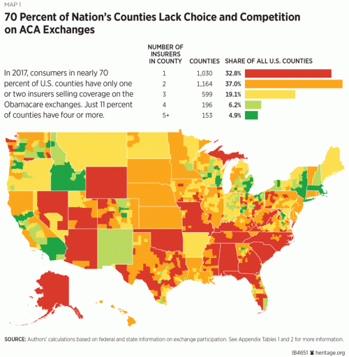
Indeed, as recently as June 2017 and during the Trump-Clinton campaign, media outlets and websites trumpeted “maps” or “a map” as evidence of the uneven playing fields that the ACA would bring in the country and the restrictive options that were increasingly identified with “Obamacare,” as if it were something different from the health policies that increasing numbers of Americans had enrolled in, but rather a specter of higher premiums, fewer rights, and new restrictions on providers if not health policies that could not be trusted, in ways that continued a drumbeat of visualizations predicting coming imbalances for those enrolled in Obamacare to insurance carriers or to a competitive marketplace–if not rob them of access to insurers–concretizing what Donald Trump cannily called “the broken promise” of Obamacare, as some 2.4 million “customers of Obamacare” would be with but one insurer to select in the coming year. Health officials in the Trump administration issued a “new map showing in full color how many counties in the United States could have zero or just one insurer selling Obamacare health plans in 2018” as if to provide confirmation of the poor deal that was offered the nation; the data vis produced by the folks at the Heritage Foundation was accompanied by an announcement that, in case any one missed the point, insurance exchanges in 2017 would feature ” a major decrease in competition and choice” (italics added) that exposed the deep failure of the ACA to promote competition as promised:
\
 Heritage Foundation (January 30, 2017)
The absence of competition left some state, the not unsubtle point was made, that were neglected by the insurance companies that had promoted the ACA:

The stark contrasts of the data visualization were a rallying cry for a public campaign for the repeal of the Affordable Care Act, designed to activate the red states that were shown to be the largest losers of the insurance exchanges Obamacare created. The map released shortly after the inauguration in a push to confirm the repeal of Obamacare, showed almost all counties in the southern United States with but one insurer–as almost a third of the counties in the nation–but not the population by any means. In the rhetoric of an earlier map that described how “large of swaths of yellow cover a number of Southern and Midwestern states, all of Alaska, and elsewhere indicating counties . . . are projected as of now to have just one insurer selling individual plans next year,” the images of a restriction of opportunities to buy health insurance was alerted, with areas with but one insurer appropriately colored red, as if to convey danger.
The slightly different visualization from June that accompanied this projected danger suggested that some counties–colored red again–would strip residents enrolled in Obamacare from any insurer for those enrolled in Obamacare–this time in “a new map showing in full color how many counties in the United States could have zero or just one insurer selling Obamacare health plans in 2018“:

The fear that such maps stoked of an imbalance that cut into the insurance options of many as far as health goes suggested a lack of care and a lack of coverage that suggested a deep disinterest of almost a third of the nation, but did so with little actual grounds. Those sparsely populated regions loose out in the new marketplace that Obamacare seemed to threaten to impose–even if the Affordable Care Act was created to extend health insurance across the nation:
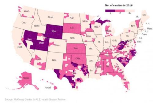
McKinsey Center for U.S. Health System Reform (August 26, 2017)
Such deep divides within the United States that cut against equal access to health insurance was of course what Obamacare was introduced to prevent, but the exchanges in the less populated states were indeed slow to attract insurers. However, the terrifying fear of a subtraction of any guarantees of well-being and a level playing field that these projections promote–they are hardly really data visualizations, if they resemble maps–seem as good a definition and a metaphor of undemocratic policies, and a metaphor for the restricted roles people are given a crucial say in the policies and decisions that most affect their lives. Although the sentiments for including health care as a right has become to a deep divide in the nation, the disadvantages that the initial introduction of the exchanges were cautioned to bring to peoples’ lives and policies were immediately striking.
And the recent success of mapping the actual resurgence of insurers’ involvement in many exchanges in counties nationwide reminds us of–and asks us to reconsider–the deceptive nature of their claims. Indeed, as recently as June, 2017, media sources presented “a map” or a set of maps as evidence of the imbalances that the previous administration had failed to foresee, or willfully imposed on the nation.
1. The negative benefits to all of health-care being a restrictive good are pretty clearly evident: healthcare should not be seen as a commodity alone, existing on an open marketplace. Given the clear negative pressures of lowering access to health care to society, the gleeful prediction by President Trump that Obamacare–as Trump calls the Affordable Care Act (ACA)-, as if it were just not American to promise health care to all–would be implode because of e lack of plans available on exchanges in much of the country thankfully seems untrue. Indeed, the failure to repeal the ACA by the United States Senate–a failure that seems to have sent a shudder of initial convulsions within the Trump administration, and within Donald J. Trump’s sense of his hold on the Presidency, has led insurers to return to the many counties where they had in previous months left, provided all but one of the counties that seemed to have no clear options in the Obamacare exchanges–and that now-President Trump’s declarations of Obamacare’s demise were quite premature. Although the graphics of health insurance providers that were available to residents in local exchanges under the Affordable Care Act seemed truly badly served in much of the nation by early 2017–when many of the counties not on the coasts or in coastal states seemed to suffer from a gap in options, as was true even shortly before the 2016 Presidential election in surprisingly effective ways.
As soon as the future markets for insurance were mapped and the maps were released, the revelation of apparent gaps and “dwindling in surname choices” and egregious absences in covering the nation’s populations seemed to show up the falsity of past promises. The maps gained a polemic authority of their own, confirming lingering suspicions about the poor fit of “Obamacare” to the nation, and providing fodder for raising alarms about the inequitable nature of the exchanges that emerged in different states and counties. For they seemed to reveal an apparent abandonment of the majority of the country by the coastal elites of California Massachusetts, New York, Chicago and Washington D.C.: indeed, it triggered a sense of the abandonment of the nation by coastal elites. The very story that was told about Hillary Clinton and the Democrats in many circles were being repeated in the Presidential campaign were used to lace increasing suspicion about the emergence of fair marketplaces in future years.

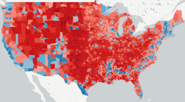
County-Level Data on Insurance Providers under ACA/AP (October, 2016)
The deep brown nature of the map didn’t reveal the restrictive choices of insurers, but muddied the picture of the nation, as if throwing into relief a plurality of counties that existed on a higher plateaux of health care, and left behind the rest. The visualization suggests that a sombre picture of health-care had emerged before the Senate failed to dismantle Obamacare, light tans suggesting the greatest gaps in low-lying lands of few insurance options, and markets where sufficient variability would not bring lower costs. In those regions, the widespread “lack of choice” appeared so evident in dismaying gaps across the nation, where the departure of insurers from a market seemed that had been seen to rise in 2015 and 2016 had started to fall precipitously, raising the fears of rising premiums. Several entire states–deep red states, as it happens, like Alabama, South Carolina, Oklahoma, and Wyoming–had only one participating insurer across the entire state, suggesting gaps in the health plan that claimed to be engineered to offer choice.
The mapping of these projections seemed to make manifest the deepest fears of inequality and an unloved playing field, which data visualizations like the above seemed to expose–while dying the projected nature of its claim that insurers’ “departure” had already occurred. Yet the residents of all counties in the United States but one will be able to purchase an Obamacare plan in the coming year in actuality–the fifth year and enrollment cycle of Obamacare insurance markets, has brought successful expansion, with increasing coverage is provided by insurers across the United States may be even effect a new acceptance of health care as a right. For despite widely stoked fears of drying out health insurance markets projected in deceptive data visualizations with such particularly alarming effects.
Just a mere two months ago, it was predicted that forty-seven counties would have absolutely no insurers by 2018, and that residents of greater than a thousand counties–and up to 1,200– would be left “bare”–hight and dry–with access to but one insurer in their exchanges. The alleged analysis of the impending “collapse” of insurer participation nationwide showed an image of “projected insurer participation” as if they described an actuality of declining participation that had effectively fractured the nation–lending currency to pronouncements that struck fear into many voters.


Despite the manipulative nature of these data visualizations, the recent resilience of markets after election, and specifically the failure to repeal Obamacare, has responded in ways that stand to change.
2. But the picture was indelible when it was framed, forged in the sharp colors of data visualizations which arrived with regularity at the same time as maps of projections of the Presidential election dominated social media and the press. They created a terrifying image of a divided nation, destroyed by the all but inevitable impending “collapse of Obamacare ‘coverage’ in 2017” as revealed in “stunning maps” released in the late summer during the Presidential election, as if they were the hidden understory of national divisions that some candidates just didn’t get. These visualizations allegedly revealed divisions of the nation in ways that must have spooked many, weren’t being addressed by the White House or health care officials, and seemed to signal an era’s end–touting “Higher Costs and Fewer Choices for Obamacare Customers in 2017.” The below-the-radar war of data visualization for national attention suggested nothing less than the erosion of the union that was tied to the encouragement of insurance exchanges.
Such data visualization worked their magic, triggering narratives of abandonment and appearing to reveal an isolation of several of the poorer parts of the nation that set of alarms about the increased division of a nation and an uneven playing field that the Affordable Care Act–now demonized by the name “Obamacare” to distance itself from the actual legislation–that revealed the apparent absence of competition in “stunning” ways. For by depicting the “epic collapse” of a system that in fact seemed to be give greater stability to a projection and make it manifest as reality. The magic of the data visualization was that they purported to reveal an actuality the Obama administration seemed to deny as if it were an actuality that denied options to many Americans. And although the spread of the one-carrier-ounties across much of the “heartland” seemed confirmation, for many Republicans, of an abandonment of the mythic heartland of Trump voters, which pulled from Iowa to New Mexico to West Virginia for Appalachia for Trump–the complexion of where insurance is available.
The alleged objectivity of the visualization left many with breath held, as “stunning maps” released during the heat of the Presidential election in late summer prophesied an impending “collapse of Obamacare ‘coverage’ in 2017” as an all but inevitable reality.
 McKinsey Center for U.S. Health System Reform
Data visualizations of jarring color selections suggest the discontinuity in a system of health care, using the not necessarily clear metric of the existence of a range of carriers. The notion of the medical marketplace that such competition was supposed to create however realized clear gaps with the counties in violet, whose disarming continuities suggested pockets of the nation that were unfairly left behind, and others in pink that seemed to be similarly compromised in the notion of options or choice their inhabitants were offered. But the alarmist cartographies were extremely effective in tellign of a story of those regions that were left out–not only Kansas, but Wyoming, West Virginia, and stretches of North Carolina, South Dakota and Michigan. The maps spoke to many.
The deeper debate about health care as a right demand to be examined in far greater detail than the polemic nature of such visualizations allowed. And the recent resurgence of insurers in almost all counties of the nation provides a good occasion to do so. It’s not a secret that the difficulty of construing health-care as a democratic right has also been rejected by many,–who would restrict liberties to participation a marketplace. In doing so, they adopt the market as a primary metaphor if not end of civil society–and view any tampering with the health care market as undue governmental meddling. Yet the guarantees of well-being and a level playing field seem as good a definition of what is democratic as any, as it affords a needed means to allow people to have greater say in policies and decisions that most affect their lives. And sentiments for including health care as a right has however come to be one of the deeper divides in the nation. And the recent success of mapping the real resurgence of insurers’ involvement in many exchanges in counties nationwide reminds us of–and asks us to reconsider–the deceptive nature of their claims about the narrative of the impending collapse of Obamacare that many data visualizations of the nation relentlessly advanced, with minimal questioning or interrogation, and the how the image of the nation they suggest may explain public understandings of health care as a democratic right.
But since the negative benefits to all of health-care being a restrictive good are pretty clearly evident, healthcare should not be seen as a commodity alone, existing on an open marketplace alone. Given the clear negative pressures of lowering access to health care to society, the gleeful prediction by President Trump that Obamacare–as Trump calls the Affordable Care Act (ACA), as if it were just not American to promise health care to all–would be implode because of e lack of plans available on exchanges in much of the country thankfully seems untrue. Indeed, the failure to repeal the ACA by the United States Senate–a failure that seems to have sent a shudder of poor guidance and convulsions within the Trump administration, and within Donald J. Trump’s sense of his hold on the Presidency, has led insurers to <em>return</em> to the many counties where they had in previous months left, provided all but one of the counties that seemed to have no clear options in the Obamacare exchanges have gained them.
3. Trump’s declarations of Obamacare’s demise were indeed quite premature. Although the graphics of health insurance providers that were available to residents in local exchanges under the Affordable Care Act seemed truly badly served in much of the nation by early 2017–when many of the counties not on the coasts or in coastal states seemed to suffer from a gap in available options, as was true even shortly before the 2016 Presidential election in surprisingly effective ways. The sentiment of a curtailing of options–and of choice, that elusive and so malleable term–became something of a battle-cry against the ACA, which redefined how it was portrayed and cast as an imposition that failed to meet health needs, but whose premiums were substantially more.
If one might say, with poet Elizabeth Bishop, that “more delicate than the historians’ are the mapmaker’s colors,” unlike the color-choices by which cartographers define land and sea as areas viewers can inhabit and read, the stark colors of the data visualization suggest clearcut differences and decisive results–too often just to stark to be lent the credibility that they seek. Bishop linked the art and science of the cartographer and the art of poetry, in her first published poem, written when staring at a framed map of the North Atlantic that lay under glass as she was ill. In tracing the mapped waters, and the land that lies beneath the water in maps, shadowed in green, she admired the transformative nature of the cartographer’s art and the expressive license of defining land and sea, and the edges of sandy shelves, as allowing the cartographer to create an aesthetic object able to engage the viewer’s fantasy, through the delicacy of color choices: the stark, flat tones of the above data visualization–whose colors are all too strict and edges overly severe–work best to create oppositions and manufacture absolutes that offer little distance on the world, or clear purchase on it.
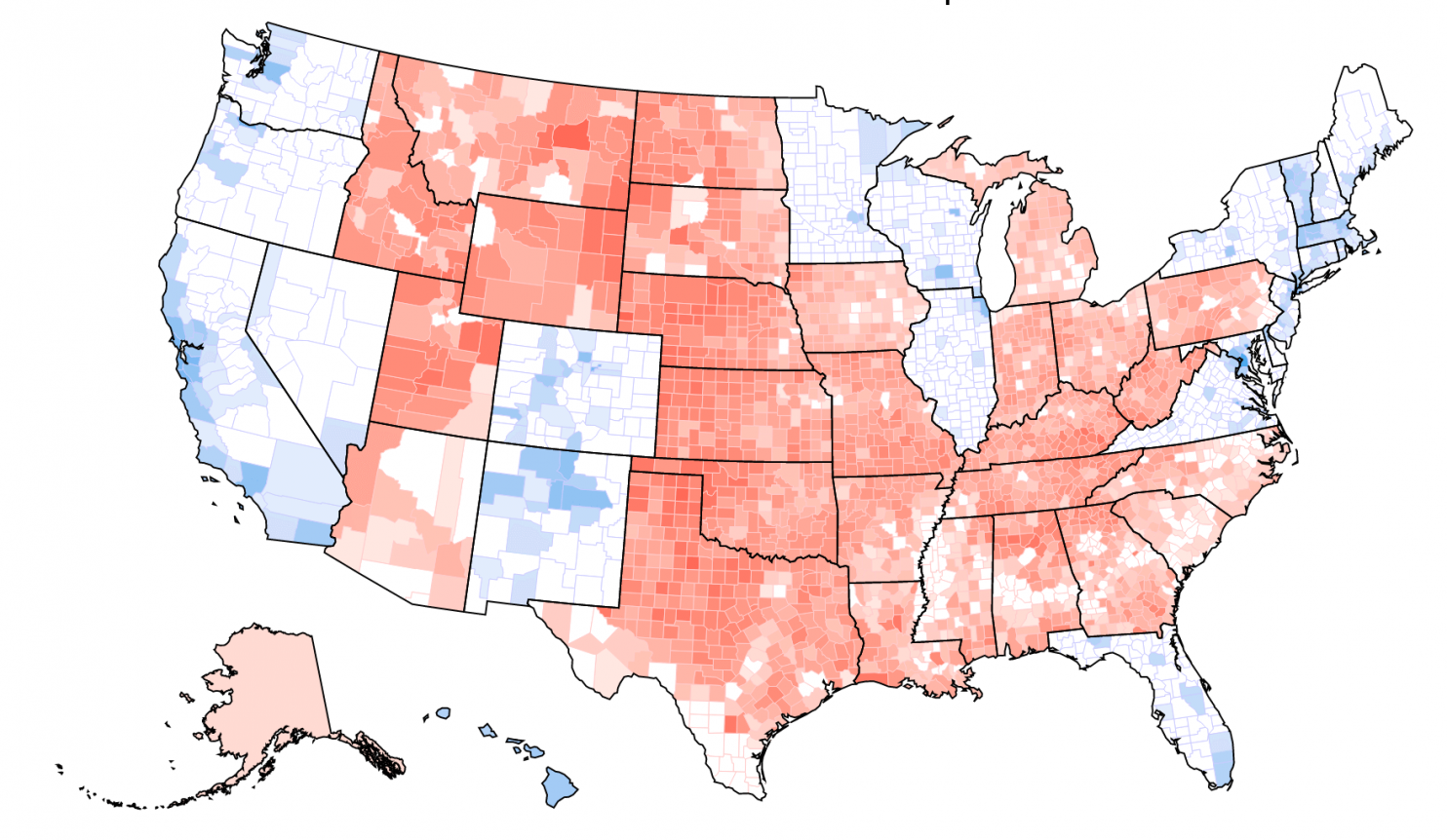
The colors chosen by the cartographer, if at odds with the actuality of the ordering of the land, cannot compare to how the translation of the edges of insured and uninsured are erased in the clear contrasts that compress the actual contours of health care. If Bishop contrasted the reality claims of the historian to the artifice of the map-maker, whose creations appear arbitrary, but reveal actual complexities, as allowing possibilities for the contemplation of the world. But rather than presenting an authoritative version of the world, the human measure of a carefully made map, and the invention it offered as an angle at which to examine the world absent from many visualizations, which privilege a single actuality as sufficiently authoritative to orient viewers to the world along a single narrative–and not preserving a human scale to do so. The deceptive nature with which data visualizations foretold collapsing insurance choices in the Affordable Care Act presented a false reality. about health insurance exchanges, in short, by creating alarming contrasts between sharp colors in maps that offered no opening for interpretation. In contrast, maps of the actual numbers of those without health insurance reveals a landscape of much more complex edges and shadows, as well as deep divides, demanding to be moused over in detail for their interactive experience, if only to come to terms with the changed life experiences of those in many states, as from 2013-16, as the constantly shrinking number of uninsured grew nation wide in ways that attest to the increasing health of the nation–if with considerable numbers of uninsured remaining in may exchanges:

In contrast, the almost uninhabited landscapes bereft of insurers that data visualizations depict to suggest a narrowing marketplaces and dwindling options of Americans offers an image less about “health”–our about our health as a nation–than the problems of creating continuity among the insurance exchanges that underwrite the insurance marketplace. The lack of perspective that they offer on the residents of each county and of our country–and the forced viewing of “health” in terms of insurance companies which participate in exchanges, suggest what more contemporary poet, Claudia Rankine, called the particularly contentious meaning of “health” today in the United States: at a time when “Affordable Care Act” is seen as something different from “Obamacare” by most Americans, who want the affordability of health care but suspect the inequality of “Obamacare”–whose repeal Trump declared his first order of business as President. “We heard health care and we thought public option/we thought reaching across the street across the lines,/ across the aisle was the manifestation of not a red state/ not a blue state but these united states we thought,” Rankine wrote with assurance of a new landscape of health insurance, “we could be sure of ourselves in this one way sure/of our human element our basic decency.”
But the increased decency of providing more Americans with adequate health care, “a kind of human kind of union we were ready to check-up,” as Rankine wrote, in the belief that “in this one way we were ready/to care for each other we were ready to see/our range of possibilities as a precious commodity,” was distorted in a map that focussed on the marketplaces of insurance options that Obamacare–the Affordable Care Act–sought to create. If in this nation “despite being founded on genocide and sustained by slavery/in God’s country we thought we were ready/to see sanity inside the humanity,” the humanity of health care seems sadly obscured in the exclusive focus of data visualizations that focus on providers absent from the marketplace.
4. It is rather terrifying that the alleged objectivity and authority of such data visualizations were arrogated to make a point that disguised their nature as projections and roles as arguments. While doing so is tantamount to disinformation, claiming predictive value as declarative statements which has since proved to be without any merit. For not only did they distort the question of coverage by ignoring that the areas where three or more carriers would be options were most populated–where the best job had been done informing patients of their options to enroll in policies, and also where far better medical coverage existed for Americans in previous years–but the alarms that they sounded were ungrounded, although the image of two coasts and a well-off midwest that suddenly left large parts of the nation in the lurch effectively tapped into deep suspicions and uncertainty.
Rankine persuasively hypothesized–and elsewhere actively protested–the deeply ingrained racism that motivated a nation ready to distinguish between “Obamacare” and the “Affordable Care Act”–valuing the affordability of health insurance, but suspicious of the insurance labeled by the name of Trump’s predecessor. The motivations for suspicions about “Obamacare” as a tampering with the free market of health providers is unclear, but it undermines the interest in our understanding of the preciousness of health care as a right. Yet the humanity of health care seems sadly forgotten by the shift from a topography of individuals insured to a topography of the marketplace. Although Trump seemed to think he had fired Obamacare from the country by declaring it “dead,” and just destined to implode, the markets revealed themselves to have been set up with considerable resilience, despite deeply troubling glitches in its roll out; if more than eighty counties earlier risked offering no options to enrollees, insurers returned overwhelmingly, where they were able, especially when already strongly present in the marketplaces, despite the threat from President Trump to pull federal subsidies.
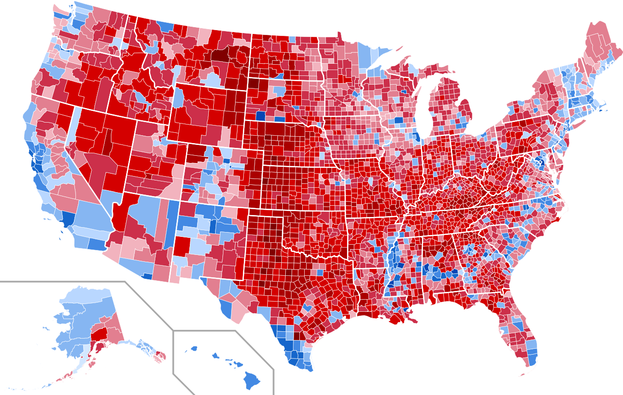
The presence of mapping future markets for insurance were released with claims to show of apparent gaps, “dwindling insurance choices,” and egregious absences in covering the nation’s populations. They seemed to show up the past promises of the President to preserve choices for Americans to adopt a health plan that suit them best, and portray them as undue impositions on the marketplace. The projections acquired a polemic authority, as if confirming lingering suspicions about the poor fit of “Obamacare” to the nation, by providing fodder for raising alarms about the inequitable nature of exchanges in different counties and even in different states. They seemed to confirm a feared narrative of the abandonment of the much of the country: indeed, many popular data visualizations triggered a sense of the abandonment of the nation by coastal elites in New York, California, and Washington DC, in particular in Arizona, Oklahoma, Texas, Colorado, Missouri and the Deep South, as well as parts of Michigan. They confirmed the very story told about Hillary Clinton and the Democrats repeated in the Presidential campaign as if to lace suspicion about the emergence of fair marketplaces in future years.

County-Level Data on Insurance Providers under ACA/AP (October, 2016)
The particularly grim picture that they offered came in for little criticism or rebuttal. But the data visualizations describe landscapes that are curiously depopulated, even as they present a sobering picture to suggest the withdrawal of insurers from medical exchanges. The map implies an absence of interest in much of America by the very insurers who claimed to have sponsored the new marketplaces–but had only concentrated on the most profitable regions. Its implications one of the abandonment of many of the rural areas of the country–the less densely populated–although the greatest success of such exchanges in densely populated urban areas that were liberal-leaning is no secret, they imply an absence of interest in less populated areas of the nation. The implicit message that little attention was paid to the rural areas was underlined through the strategic colors of the data visualization, which seems to suggest a relief map of areas that would suffer higher premiums: audiences in much of the country were convinced that they just had it worse in the projections all too often portrayed as eventualities that the nation would stand to suffer. The tan colors that suggest diminished choices of medical insurance muddied the picture of the nation, throwing into relief a plurality of counties that existed on a higher plateaux of health care, and left behind the rest.
The visualization suggests that a sombre picture of health-care had emerged before the Senate failed to dismantle Obamacare, light tans suggesting the greatest gaps in low-lying lands of few insurance options, and markets where sufficient variability would not bring lower costs. In those regions, the widespread “lack of choice” that appeared evident in dismaying gaps across the nation, where the departure of insurers from a market seemed that had been seen to rise in 2015 and 2016 had started to fall precipitously, raising the fears of rising premiums. Several entire states–deep red states, as it happens, like Alabama, South Carolina, Oklahoma, and Wyoming–had only one participating insurer across the entire state, suggesting gaps in the health plan that claimed to be engineered to offer choice.
Such premature projections seemed to make manifest the deepest fears of inequality and an unloved playing field, and invested themselves with an objective authority of exposing an uneven system that was indeed rigged–denying the projected nature of its claim that insurers’ “departure” had already occurred. Yet residents of all counties in the United States but one will in fact be able to purchase an Obamacare plan in the coming year in actuality–the fifth year and enrollment cycle of Obamacare insurance markets, has brought successful expansion, with increasing coverage is provided by insurers across the United States may be even effect acceptance of health care as a right. For despite widely stoked fears of drying out health insurance markets projected in deceptive data visualizations with such particularly alarming effects.
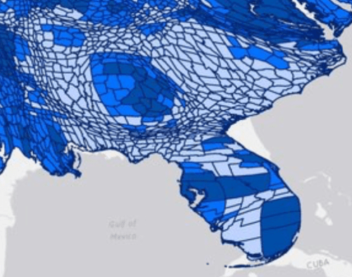
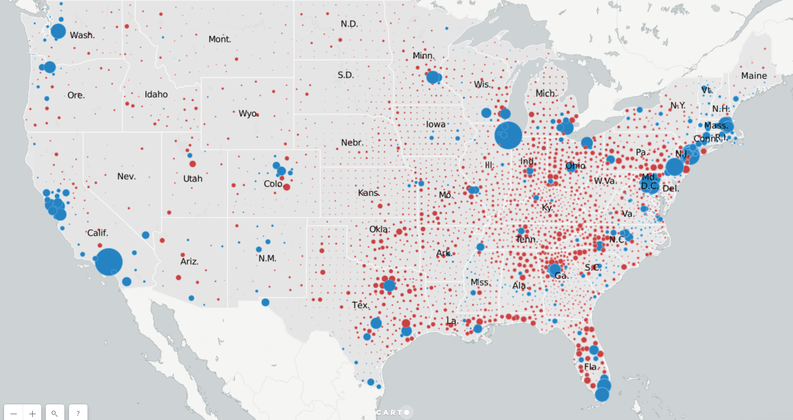
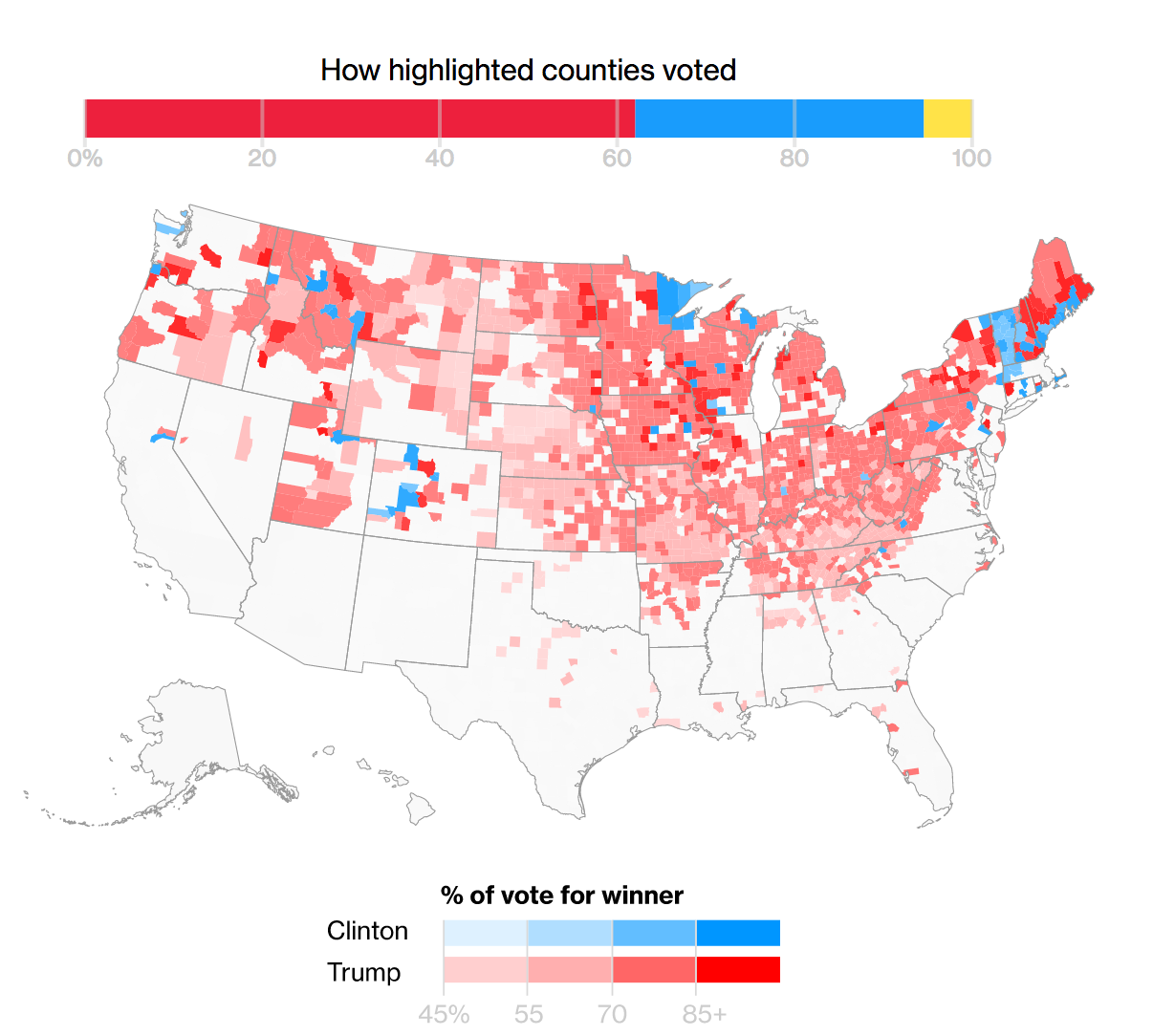
2. To better grapple with the readiness of insurers to fill the health-care marketplace, the stunning maps of the presence of insurers who have made health-care policies available demands to be examined through a red state-blue state optic. For eve if the aversion of Republican-leaning regions in the United States to providing alternatives to health care insurers creates a deep divide concentrated in much of the south, prairie, and southwest, where only 1-2 insurers exist, and despite uneven nature of conditions conducive to access to health services that guarantee well-being–and presumably happiness–the markets have grown.

If the divide looks harsh anyway for many rural areas, the red/blue divides cannot reflect the actual availability of health providers to Americans. Since the notion of the division of the distribution of insurance markets by counties seemed suspect anyway, given the sparser population of many of these states, a more accurate picture of national coverage is offered by a simple proportional warping of the odd division of the electorate by the “county”–an outdated geographical unit if there ever was one. The mapped that warped counties by their relative populations reveals an even sharper picture of the actually improving state of availability of insurers–the fewer residents of many of the just-one-insurer regions of the south and indeed midwest shrink, to confirm the growing success of the selection of insurance providers by the ACA, despite some obviously problematic and important to address gaps in coverage.
It is striking that these very gaps mirror with a terrifyingly clear correlation both dial-up speeds and broadband technology, as well as intractable bottom-line problems like gaps in the availability of health-care services in rural areas.


Rural Health Information Hub, December 2016
5. Abandoning the red/blue divisions, which are taken by the elected governor, we see an even healthier division of the nation, at least in terms of the regions that provide their residents with something like a reasonable variety of possible health care insurers, with large areas of the most populated areas having three potential insurers, rather than insurance markets imploding at all, despite the clear gaps that it reveals in what seem more underpopulated areas–and, quite strikingly, the absence of broadband that would make it easier to enroll for insurance online.
 Harold Pollack and Todd Stubble
 National Broadband Map, June 2014 (not updated since)
These gaps reveal a division of much of America into two regions–no doubt conducive between two expectations of health care or medical provision. Most southern states indeed had far fewer insurers–left “bare” with but one provider, despite the low populations of such rural regions being just less conducive to insurance markets, and revealing an uneven playing field long preceding the passage of the Affordable Care Act–
 Harold Pollack/HealthInsurance.org
 Harold Pollack and Todd Schuble
The area is not only medically underserved, but suggests a “Southern Problem” having far less to do with Obamacare than with the disproportionate topography of medicine and indeed of those without health-care, but creating many counties including large stretches of chronic undeserved populations.
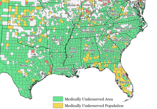
Such maps and data visualizations only suggest a need to appreciate and fathom the deeply compromised liberties in areas with few health insurance providers, where insurers haven’t reached clear markets, that not only overlap with many of the more chronically uninsured areas and populations, but with areas of the a terrifying number of uninsured–folks who have decided or been forced to do without health insurance, and where going without health insurance becomes an accepted acceptable alternative, unlike in many regions of the country,

which often echoed the very regions of greatest vulnerability in the nation–counties that to be sure often reached out to Trump as a savior for their deep discontent.


2. The increasing variety of insurance options for much of the nation raises questions about the persistence of a deep inequality–undemocratic for many–in those pockets coinciding with denser votes for Trump, in a normalized choropleth, and more hospitable to an argument of revising current options of health care–and viewing the Affordable Care Act as an imposition of the federal government.
There are interesting overlaps on those areas where Trump out-performed previous Republican candidates, notably in Florida’s panhandle and less densely populous counties in the deep south; southern Texas; and Appalachia.
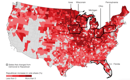
The odd reluctance of these areas to attract anything like a range of possible insurers in lower income areas of low-density where Republicans have recently performed well.

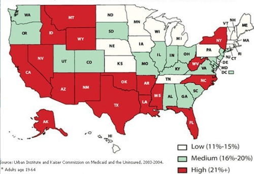
They reflect the difficult problem of distinct notions of liberty and rights in the country, corresponding to areas where the civilian population was long underinsured, often by upwards of 15%, and where shortages of health-providers–even if not as readily available in county-level data–are strikingly revealed in a state-by-state survey: states like Georgia, Mississippi, Arkansas, New Mexico, Nevada and Texas remained significantly below the national average for primary care physicians in 2012, suggesting regions where there were less developed expectations for attaining health care coverage.
Increased numbers of uninsured exist in many of the same states are, to recap, unsurprisingly located in some of the same regions–which are less likely to vote for representatives who advocate the belief in health care as a right, and perhaps seeing it as able to be outweighed in importance by an argument of states’ “rights,” even if this discourse is designed to deny health insurance.
It seems a cruel irony in an era of globalization that the majority of those doctors or members of the healthcare force serving areas of the United States that were most in need, and who see some 14 millions patients every year, were from Iran, Libya, Somalia, Sudan, Syria, or Yemen–citizens of countries included in Trump’s Muslim Ban. (In other words, these immigrant doctors are filling the increasingly pronounced gap that exists among medical providers in the United States–and getting the job done.) If medically underserved areas occur in almost every state in the country, the preponderance of medically underserved populations concentrated in less populated areas–as the southwest, southern states, and parts of the Midwest seems to have attracted foreign doctors–and had already led bills to be sponsored to allow Medicare to reimburse pharmacists directly in those communities, to acknowledge the absence of medical services needed by Medicare beneficiaries, to allow clinical pharmacists to work in medical care settings as a health provider.
 See interactive version of this map here, at the Immigrant Doctors Project
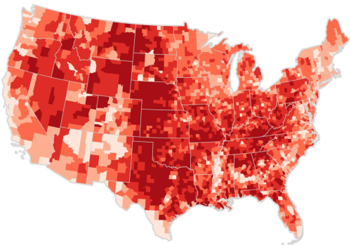
The map has some striking overlaps with those regions of rural America that are losing population, although it should be kept tin mind that the above map, which used data from Doximity to suggest the commenting zones for the number of doctors in the United States may distort by expanding the zones of providing services beyond that which physicians actually serve most actively:
:
 Rural Communities Losing Populations, United States of America
The elevation of the pharmacist to a medical provider may raise ethical questions. But the existence of hight concentrations of medical physicians from the very countries that were targeted by the so-called “Muslim Ban” that Trump championed had the effect of allowing a crucial degree of medical assistance to reach Americans–although the apparent intent of Trump’s legislation would have been to restrict their abilities to return home freely to visit their families, and compromise the proportion of doctors on call in the cities where they are most concentrated–in Toledo, Cleveland, and Dayton, Ohio as well as Detroit MI.

Such pronounced concentrations of physicians which were mapped online in readily seaarchable formats by the Immigrant Doctors Project provide powerful tools to view how the markets for physicians’ skills meets the needs of a marketplace, to be sure, if one recalls the huge numbers of medically underserved counties. But this is not a marketplace that would be easily filled by our current medical system, or the health-care industries that service more rural or poorer areas.


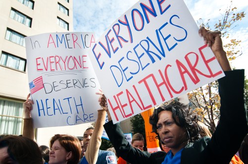
 Al Drago/New York Times


