D3 images, or data-driven maps, shift with the content that they seek to display. They in other words provide tools of spatial analysis unlike static maps or terrestrial projections: for rather than reflecting or arranging data in a static form, by analogy to a window, such maps reveal the changing data that drives their design. Such maps lend themselves in timely ways as tools able to chart a changeable terrain–or the shifting configuration of a distribution–which often are tied to data feeds, rather than employing a fixed dataset.
Since D3 maps are often able to take advantage of their mutable forms by being incorporating new data, using it to determine the rendering of a shifting actual space or set of inter-relations. So the mapping growth of population in the world’s countries is a classic example of a D3 tools of visualization, determined by the growth of residents in each country: although the base-map of the recent simulation of world birth/death rates by software developer Brad Lyon is a familiar grey projection of the continents, the constant data feed that shapes the map, locating individual births and death in specific places, and tabulating the greatest numbers of births in individual countries, is also a visualization of Tobler’s first Law of Geography: that “Everything is related to everything else, but near things are more related to distant things.” For the changes in global population are understood in the unit of the entire inhabited earth in this very catholic map, rather than as able to be confined to the borders of individual countries.
Among the benefits of using D3 visualizations to chart the rhythms and rates of births and deaths is a channelling of immense amount of information that is both a tremendous ramping up of cartographical omniscience that the viewer can often barely process or register in its totality–for the edges or contours of the map can be changing constantly, rather than the map being designed to reflect a stable dataset. The popular new map of changing numbers of birth and deaths in the global population provides a neat visual example of using maps to geo-tagged births and deaths to part of a nation, offering, in either simple screen or beta-version simulation, something that would not be possible in a static or simple paper map. In a visualization of the drumroll of births and deaths, the resulting map creates a record of the inhabited world that is “eerily omniscient” as James Hamblin aptly put it in The Atlantic, and God-like in its observation of births and deaths everywhere: as the map’s odometer-like upper panel trucks past the 7 billion, 93 million mark, we are asked to face the challenges of comprehending on individual terms what truly approaches, if only asymptotically, something close to a God-like perspective on mankind.
By visualizing an approximate record of “world births and deaths in real-time,” in a map that extends to its literal meaning the notion of the “inhabited world,” the content of this map challenges not the borders of maps, as do so many D3 projections, but the viewer’s own boundary of self, or the meaning of this endless tabulation of the appearance and disappearance of lives on the planet and the regions of their greatest increase. This single frame of the ongoing graphic portraying a record of world populations over the globe’s surface, in what might be called, with more than a wink, a truly existential map of the place of humanity in the world:
Never mind that the countries are only light grey outlines, and the subject of geography is secondary to the map’s shifting contents. At issue is not how we inhabit the space, and not the centers of population or their distribution, but a statistical ping of each birth and a death that can be easily geo-located, blips of text that overwhelm and even detract attention from a grey base-map that seems to recede below each announcement, until they entirely bury the map, no doubt as our population will bury our world if its numbers proceed to grow by a further 44 percent by 2050.
There is no need to ask where these people will live or how they will be fed in this visualization: we can wonder that all we like as the number of births proceed unimpeded, always far in the lead of the counting off of individually tragic deaths. But in their collectivity, the amassing of these numbers is difficult to comprehend or register–and not only because of the relative objectivity of the simulation. As one looks at the data visualization and the so rapidly increasing numbers of its statistical simulation, it starts to become evident that the perspective it offers is just not tenable for a viewer to start to process; its numbers perform an odd if awesome balancing act between concrete actuality and abstraction impossible to really comprehend, and we wonder where this data flow derives, as its ticker-tape pop-ups jerkily transport us to half-familiar or unfamiliar cities as it notches population growth, and the map is buried by textual banners–much as their viewer is buried by an unweildly surplus of information.
Software developer Brad Lyon used some ideas and concepts of Mike Bostock’s D3 maps in order to create a real-time register of births and deaths worldwide–or a simulation of them–that the viewer could gape at in wonder, and view almost as the objective correlative of the bulging population of the world. As was recently reported in The Atlantic, this digitize simulation charts the contours of the inhabited world, expanding the use Lyons made of United States Census data in his popular simulation map, designed with Bill Sneebold, to create a visual readable interactive map of the country’s population.
The overwhelming effect is immeasurably more dizzying than looking at a paper or static map. But perhaps this also conveys some share of the immensity that must have overwhelmed classical viewers, unlikely to have ever been able to process information of far-off lands, in early images of the classical concept of the bounded ecumene. The cartographical canvas is both familiar and disorienting, if only because of the size at which every birth and death appears, generating banner toponyms rapid-fire progression that one can allow oneself to imagine reflects the actual swelling of population numbers across the world in real time. The immensity with which the momentary geo-markings of this tally invests new claims in a pretty standard projection of the planisphere; highlighting specific places in what almost seems a random-generator makes its surface a field that is entirely disorienting in its surplus of detail: as soon as one finds ‘news’ of a death here, in Khasakstan, there is a birth in Bolivia, and two more in Punje, so that numbers Starting from the very moment that you open it up, and continuing until the screen becomes completely illegible as ticker tape birth and death announcements utterly obscure its surface–
or until you get in a hazy-headed stupor and realize that you’ve been watching the register doing its’ job for too long, and just have to leave the room since you can’t really keep up with all this–is an real-time image of the inhabited world, and a reminder we may have just have access to too much data.
The visual register in the screen image not only announces each and every birth and death with a punctual precision that is always eery, but keeps a tally of the totals and their distributions in each country, and they all cause one to be reminded relentlessly that births always outstrip deaths.
In ways that mapping the boundaries of mapping the world challenges the boundaries of self, the popping of up sites of individual birth and death on the simulation, which occurs below a population counter of the high velocity of our course of global overcrowding, the map is mind-blowing because it challenges the boundaries of what the viewer can hold in her or his head, as much as because of its terrestrial coverage–there is a sort of hortatory “look here!” “no, here!” “here goes again!”–that calls one’s eye back to the day-to-day nature of lived experience that is so often outside the horizon of maps, and rooting them in an ostensibly exact record of the transit of time: from 5:10:26 p.m. to about 5:30 on October 30, births occurred at a rate of 4.2 per second, as 4,210 lives began, a large number (about a sixth) in India and a fourth in India and China, compared to 1,879 reported deaths during the same interval: the explosion of population is captured nicely in that chunk of less than twenty minutes.
And indeed it seems, at first, that the number of births in China and India dominate the map overwhelmingly, as they also form by far the greatest percentage of births world-wide, according to the data feed, as text appears that clutters the expanse of the terrestrial world, as if to provide a dizzying counter-map to the stability of terrestrial contours, that will eventually obliterate the map itself:
But then one realizes that this is a conceit of the format of the map, or its display of geo-tags, which oddly cluster over the area of Eurasia as they are generated by incoming data, even if they are from cities in the midwest of the United States.
Of course, it’s not like you never knew that folks were regularly born and died in this world, even in places that you’d never been or will ever visit, but this almost “odometric perspective” of individual lives clicking by, new ones popping up in places and others vanishing elsewhere, could either be a Buddhist envisioning of the ephemerality of being or a worrying sign of just how quickly things are crowding up.
The post-modernity of this form of D3 mapping takes the ancient idea of the expanse of the ecumene, but turns it on its head: the population takes over, swallows, and erases whatever qualitative content was on the map, as the base-map starts descends to irrelevance, and, illegible, is unable to offer us any bearings at all. As much as offering a material subject, the D3 map unwittingly charts the ephemerality of the ecumene.
Maps have long been described or conceived as windows–analogous in ways to pictorial perspective–that invite viewers to look into a space in new ways. But both word maps as the above, made of the names of Oakland’s almost 150 different neighborhoods, or more statistically derived data visualizations of the city are mirrors that present a less homogeneous or continuous image of the city that we want to see: if the roughly type-set image above suggest a make-do approach of the somewhat scruffy post-industrial port city with big loading docks, but erase its dirt or drastically depressed areas with lively type.
Data visualizations offer mirrors of the city’s inhabitants and shifting neighborhoods that are both dependent on the source-data that they use, and how they obtained it, but also on the dynamic layers that digital mapping allows us to place as overlays on the base-map of the city’s mountains and shores. While these maps are only as good as the data that they use, they reflect back some of the divisions in the city that we might not otherwise notice or want to see.
And while not based in prose in the same manner as the Ozan Berke’s word-map that nicely knit together the city’s 146 vastly different neighborhoods, they offer ways of reading the city’s multiple divides. The increased data that is available from Open Oakland and other sources will doubtless offer further–and far more refined–images of the city’s deep differences and their bridging, and can serve as better and more detailed maps of its populations. But in the meantime, the sorts of mirrors these maps offer can also provide ways to imagine paths toward a future for Oakland, and better understand ways forward in its public policies. Many of them draw from the American Community Survey, created by the US Census and discussed in earlier posts, but all seek to focus attention on the city and to serve, as mirrors, to show differently refracted visions of its divides, in the hope that few distort Oakland’s diverse populations.
A famous image of the distinctly uneven distributions of Oakland’s inhabitants is clear in a recent mashup of maps of the Bay Area Rapid Transit system’s public transport map–or, more simply, BART map–with the very zip codes that the American Community Survey mapped, which offers a condensation of the remarkable disparities and differences between income, education, child health and life expectancy at separate stations on the same public transport lines:
While, to be sure, the system includes suburbs such as Walnut Creek or Fremont, its focus on the East Bay immediately indicates the deep divisions in a city where a BART stop can take one between areas of over ten years difference in life expectancy, and two more stops down either line sees life expectancy rise by seven or eight years once again. The huge rise in childhood hospitalizations because of asthma in the City Center–far greater than in Fruitvale–suggests the unique pollution habits of a city whose air quality is still shaped by its proximity to a port.
The image of the diverse city whose neighborhoods are bound together as one unit starts to reveal fissures when one examines its ethnic and voting distribution at a somewhat finer grain, adding to the historical variations in the picture of the city summarized and surveyed in an earlier post. The problem of mapping those populations adequately, both to reveal the ongoing inequalities and spatial injustice within the city, is not inherent in the city’s structure or divisions, but something that compels visualization in a myriad of ways, and in which we can look for different understandings of the shifting nature of the city’s socioeconomic (and sociocultural) divides. As well as mapping the lay of the land, mapping the habitation of space creates even more of a “mirror” on the organization of th eplace.
The census mosaic only shows part of the inhabitants’ picture. Indeed, perhaps a “racial dot” map can be rehabilitated, rendering one dot/twenty-five people, to create a rough distribution Bay Area-wide that respects the looser definition of “neighborhoods,” and does not impose strict racial segregation, as in this image by Eric Fischer, using red dots representing whites, blue representing blacks, green representing Asian and orange Latino populations, in trying to prevent overlapping and blending of color-points, and better to define neighborhoods as an ethnic or racial enclave:
Fischer seeks to respect Bill Rankin’s cautionary words that boundaries of neighborhoods are never so stark as on informational graphics, and that a cartographical index of one dot for twenty-five people is better able to allow “transitions also [to] take place [registered] through gradients and gaps” in the map’s surface, suggesting an urban geography without clear boundary lines, clear spatial differentials clearly emerge across the neighborhoods of Oakland, CA:
And while the city was once historically predominantly black, or African American, in its population, one still found clearly define enclaves of blacks that are, sadly, starkly isolated in census blocks, based on results of the 2005-9 U.S. Census:
One can map, in relation to the racial composition of the city, the relative percentages of kids in public schools, one index of its community, and the stark dividing lines created by some of its highways and major roads, which divide the regions of the hills from the flats, where few kids attend private schools.
This is given much further definition by the map of those who have completed high school, already used in in my earlier post in a slightly different version, which suggests a chasm between cultures of neighborhood far deeper than race alone.
Perhaps the starkest underpinnings of this cultural divide is a map using the 2010 Census to define an ESRI visualization, of the city’s divide in income levels in the city and outlying areas:
Which one can zoom into for the City of Oakland, revealing a clearer divide in incomes around Highway 24, still using Census Blocks, that again reveals some intermingling albeit with sharp divergences in Oakland that stand in sharp contrast to the larger Bay area:
To track a deep change in the population of the city that occurred in only recent years, Pietro Calogero tracked racial displacement from many neighborhoods that illuminate this divide in incomes, around the aftermath o California’s housing crisis. The map of foreclosed real estate in west and southeast Oakland, the former “industrial areas,” which stand in sharp contrast to wealthier areas in the hills, to illuminate an economic ravaging of the city that shows up in no other way in a simple map–and indeed masks innumerable individual stories of foreclosure and moving out:
Although perhaps the map of foreclosed houses is difficult to tie to race, Calogero comes closest to revealing stories with a map in choosing to map how African American families were in fact disproportionately effected by foreclosures, and how former African American neighborhoods were gutted from the inside out as residence became unsustainable:
The effective narrative of racial displacement that these dynamic maps isolate and present is not only compelling, but raises questions of social justice–and perhaps of social justice and urban mapping. Despite the broad interpretation of displacement, both when occupied by owner or purchased as an investment, the clear overlap between categories of race and foreclosure seems not only unjust, but a deep crisis, underscoring and mirroring the deep segregation that continues in so many American cities.
And the repercussions of this sort of segregation are evident in the apparent disenfranchisement of despair, revealed in this simple map of voter participation that Ofurhe Igbinedion so astutely thought to create from Alameda County electoral data, which shows a valley of voter absenteeism in an area where the 2010 voting held low potential or positive prospect:
(Igbinedion’s striking–and dismaying–map, reduced in size above, may be viewed in far greater detail here, and will be posted in full with a commentary at http://www.infoalamedacounty.org).
The huge fall-off in turnout among the same population of a territory of disclosure suggests a political disconnect scary in its dimensions, if sadly typical for most American inner cities. But the cavities of voter turnout in an election for which turnout was itself particularly high–or just short of 75% (74.52%)–suggests a sense of a politics of abandonment. What, indeed, did the election accomplish for a large percentage of the city? What resonance did the candidates even hold, or could they hold? The topography of disenfranchisement is arresting if not puncturing of a vision of a city united in its neighborhoods, and sort of undoes the unity of its own mapping of continuity.
It is a sort of inversion of density. Mapping the density of population in Oakland by census blocks reveals not only clear neighborhood divides but a uniquely geographic dispersal of demographics, most dense between the freeways and thinning out to the hills and the flats:
There may be real reasons for not living by the shore below the freeway: the area is not only late-industrial, but the ships spewing sulfur dioxide and pollutants exceeding standards for vehicles that are registered in the United States create a spew of particulate matter over the downtown area not confined to West Oakland, but reaching in to Chinatown, Emeryville and the Downtown area, areas downwind of the port, in this truly terrifying map, posted in 2013 by Sarah Brady and Alfred Twu, and charting the sulfur dioxide and particulate emissions of ships, using the Port of Oakland Emissions Inventory:
The map reveals regions with air pollution up to 10 times the national average a couple of miles from the port, but whose effects increase risks of cancer and asthma extending twenty miles inland, creating a poorly-known map of particulate matter as an argument to raise pollution standards in Oakland’s port. Notwithstanding the much-vaunted clean-up of the Port of Oakland, which were aimed primarily at legal safeguards at the level of diesel particulate emissions–emissions that have been largely blamed for sever respiratory problems among local residents–which have indeed decreased from 261 tons to some 77 tons in seven years. (If this was a reduction of 70%, the stated goal of the Port is to further reduce the emissions by 80% by 2020; since July 2009, ships have been required to use low-sulfur fuels within twenty-five miles of the coast, however, and the sulfur-dioxide emissions tied to asthma are not likely to decrease.). And a clearer drilling down of this data–for long, but one station for monitoring air quality even exiusted in Oakland, on Grand Avenue and Poplar, revealing how a stream of heavy trucks with diesel engines that power through the industrial region, and emit particulate matter to Chinatown and Fruitvale:
The data visualization of micrograms of particulate matter per cubic m suggests how much this “tale of two freeways” needs to be examined in detail, and how many questions of environmental justice that the unregulated emission of particulate matter deisel engines disseminates across urban streets: the citizen science group West Oakland Environmental Indicators Project (WOEIP) is currently engaged in a more detailed study and analysis of West Oakland air quality which the Environmental Defense Fund has helped fund, and they will parrtner with UC Berkeley, to create a clearer distribution of particulate matter of different levels–including ultra fine particulate that can cross the blood/brain barrier–in different regions, with special attention to the possible impact of ultra fine in the exhaust entering West Oakland and other neighborhoods from the 880 freeway and McArthur Maze–emitting some 22 known carcinogens in the urban environment. Both traffic arteries move dangerously high levels of particulate matter through sensitive communities including schools, hospitals, clinics, and childcare centers, in what Emeryville City Council members have come to call a “Carpocalypse.”
Despite the suspiciously long silencing of interrogating the clear environmental quandaries of living near freeways, and silence about the impact of the heavy trucking tied to the Port of Oakland on the nearby poorer industrial neighborhood, would the release of such an array of carcinogenic matter be tolerated in other neighborhoods? The demand to use the rail lines to transport coal through Oakland’s Emeryville and West Oakland to the revitalized Port could be placed on the back burner of future city planners and cargo terminal directors in decisive fashion if levels of particulate matter to which residents are exposed is found to reveal: although the Oakland City Council barred proposed handling and storage of coal and petroleum coke at the Port for Oakland Bulk and Oversized Terminal LLC at a parcel the Army abandoned in 1999 that is new the harbor, a ban supported strongly by the Sierra Club and San Francisco Baykeeper. (Any port workers with prolonged exposure would be exposed to even greater health risks.)
The ban is argued to constrain foreign and interstate commerce on which the Port depends, and the city cannot regulate or restrict; coal transit was only banned after the land parcel was purchased and local jurisdiction over rail-borne coal shipments are unclear, despite its potentially aggravating environmental effects: the city has only lost the suit, indeed, as the effects of coal trains have not been studied as a vector of air pollution, despite fears that coal dust could blow off the open-topped cars able to lose up to one ton of dust between mines and port, and release 60,000 pounds of toxic fine particulate matter, on top of the diesel fumes emitted by their locomotives.
Can maps prove that the open-air transport of coal, designed for export, indeed pose a significant public health danger for Oakland residents? Although adding further diesel fumes and coal dust to Bay Area air–especially the dust of bitumenous coal mined in Utah, which has been encouraged by the Trump administration, lifting restrictions on strip mining and extraction of coal that would travel through Oakland, for which the Utah Transportation Commission has been instrumental in negotiating export rights at Oakland’s terminal, without any consultation or contributions of Oakland city council or residents–in April 2015, or before the first hearings in Oakland to study the health effects of the transport of coal and coke, and a broad–over three quarters of Oaklanders–opposition to the transport of coal on railway lines increasingly close to city residences cheek by jowl and often running along I-880–adding significantly to already dangerous levels of particulate matter by diesel engines and open-air cars bearing coal to the Port of Oakland that is in many ways emblematic of the city’s old industrial zone. After a downturn in Utah coal production in 2009, and hopes located the expansion of opening new areas of mining and new mines in 2011, opening the former Grand Staircase Escalante National Monument was long on the front burner of the coal industry–long before Trump told supporters in Salt Lake that “very distant bureaucrats . . . don’t know your land, truly, and don’t care for your land like you do,” and technically oened the regions to coal extraction–even if few corporations have undertaken to negotiate with the BLM for exploring old mines to operate in coalfields that the state had mapped, as if to entice speculation back in 2008.
Although local jurisdictions are with limited authority over the goods shipped by rail companies like BNSF, but do have authority over marine export. However, most existing studies on coal transport examine different grades of coal through rural areas and populations,–not large cities already possessing dangerously high levels of particulate matter that are densely inhabited. (Oakland has in response terminated construction on the old Army base, but is currently faces suit again.). The question of rail lines that would carry coal-bearing freight in close proximity to schools, churches, parks, and residences in downtown Oakland–a site of commercial revitalization–may raise attention to environmental hazards that West Oakland would even face far more.
OSM map of Rail Lines and I-880 near Port of Oakland CA
The data visualization of micrograms of particulate matter per cubic m suggests how much this “tale of two freeways” needs to be examined in detail, and how many questions of environmental justice that the unregulated emission of particulate matter deisel engines disseminates across urban streets: the citizen science group Woing its own study of West Oakland air quality in partnership with UC Berkeley, with funding from EDF, to create a better visualization of how environmental toxins are released in high-traffic corridors, and create new demand for remediation and social justice.
It’s not uncommon to value (and inhabit) property away from the shoreline. Examining relations between elevation and population density in the wake of the shifting consciousness of the relation between water-elevation and land-use after Hurricane Sandy, Stephen von Worley offered the following interesting alternative visualization mapping elevation and population density on a spectrum moving from white to yellow to orange to blue, to show the sharp divide between hills and flats in the East Bay:
A nice register of how this space is actually used or perceived, and, equally important, moved through, based on a collation of the adjustments to Open Street Maps of the city, suggests the well-travelled nature of Oakland’s major arteries and downtown roads. How might this be registered in the surface of the map? is a question that is nicely resolved in this map of Oakland’s self-mapping of its major roadways.
Alan McConchie–Stamen design
The Open Street Map view of Oakland, rendered so distinctively by Alan McConchie, tells a perfect story of the inhabitation of Oakland’s space by its routes of mobility, recalling the sort of GPS-derived maps increasingly common from artists like Jeremy Wood, who practiced “drawing with GPS” as a line of work: it would be interesting to be able to map street-use at different times of the day, if possible, though deriving data of the abandonment of downtown Oakland when dark is undoubtedly difficult.
The divergence of nighttime and daytime is evoked, if not measured, in Michal Migurski’s brilliant layering of a “heat map” of crime–based on police visits per unit of time–over an OSM template, both layered with a semitransparent streets that interact smoothly with the underlaid data; the combination of layers effectively allowed Migurski to adapt a heat-map of crime to downtown Oakland, using police visits per unit of time as a metric as part of his active and for its time particularly innovative Oakland Crimespotting, in the hope that the HeatMap APIs won’t obscure either context or specifics, and provide a legible text.
One could argue that this mapping of hot-spots excessively illuminates those areas of BART stops, where more police calls would tend to occur–and, in the case of 12th street and downtown, more street folks congregate. But the increased number of calls provides a basis to register local attention to crime and property protection, or how the city sees itself.
And how Oakland maps its own crime, or tends to monitor its own possessions, is foregrounded in this striking map of the downtown density of security cameras, often placed in response to fears as much as evidence. This final map of the installation of security cameras downtown points up the increased anxieties of its safety, almost in response to and the perceived need to monitor public life, and registers the odd dynamic of a downtown business zone that has few residents, and whose topography of suspicion vastly changes as one moves from daytime into night–when downtown is increasingly abandoned by workers or street populations.
We’re clearly fascinated by the different images of the city’s different composition and divides, and in understanding how best to work within them, or to heal them as best we can. The mapping of security cameras–if focussed in the downtown area–reveals a sense of deep divides, and a perceived in security, no doubt partly voiced as inadequate police coverage among businesses, as much as the city’s residents. This map, also a mirror, in part doubtlessly contributes to the image Oakland projects, an image that is underscored by deep divide Eric Fischer revealed in his remarkable ‘Bay Area’ map of photographs uploaded by “tourists” v. “locals,” red v. blue, in a database that charts a tale of the visual interest of two cities:
There are many other, more positive maps of the city’s populations, no doubt, and other mirrors that reveal great changes in the city’s diverse communities. But only by understanding the lay of the land, as it were, and situation of these communities, can we hope to understand the unique challenges that the city faces.
The ambitious investment by a generous benefactor of a whopping $34 million in Oakland’s job-training and education efforts in the summer of 2015 may be the start of a broader investment in what the city has to offer. The distribution of needed resources by the San Francisco Foundation seems both brave and smartly apportioned: the decision to focus on specific neighborhoods, and improve the access of those regions to both in-school training and potentially productive housing to public health and from public instruction to community arts groups seems a good one, and breaks down along lines that the city could use, with East Oakland getting an important and much-needed injection:
If many public services are lacking in Oakland–and the poor fit between local economy and job-training has been endemic to much of the city–this seems at least to be a fortunate and very well-intentioned start.
The huge impact on introducing training and resources for early childhood education, trauma and health specialities, and, in part, conflict resolution, provides an important start to break from the deep divisions that have long been present in public education, and the lack of needed resources for many public schools not located in neighborhoods that are able to subsidize or assist needed programs.
Has racism reared its ugly head in the debate over healthcare? Dr. Atul Gawande likened attempts of conservatives to reject health care exchanges as “advice that no responsible parent would ever give to a child.” For it seems a deeply obstructionist tactic that recalls in so many senses the resistance to integrating schools after Brown v. Board of Education under the misnomer “freedom of choice.” Gawande noted with real disbelief that courts had to intervene to prevent such retroactive obstructions, much as the Voting Rights Act had been designed to allow courts to intervene in obstructions of the right to vote in similar regions. While Gawande was not alone in finding that the mantra “defund Obamacare” tsponsored by “almost exclusively white members” elected to represent “bright red districts” to be fueled by racist hatred or be a cover for deeply racist fears, or be a cover for the sense that poorer parts of the society should not be covered by the wealthier, or by the middle class–and a deep dissatisfaction of the apparent redistribution of wealth that this created, as if this constituted an unwanted interference of the government in individual choice.
Not only do we live in a landscape of quite jarring disproportions of health-care and access to health providers, but of deeply disturbing shifts in life expectancies, that undoubtedly are influenced by a truly terrifyingly inequality in access to health care–which may offer the sort of data visualization from which to begin debate on health care.
Filtered by a color ramp that less sharply conveys sharp ruptures, the inequities between in life expectancy among individual counties suggests some quite sharp differences that are apparent in the landscape whose populations we may have decided that we’re less interested in working to ensure of up to a decade:
The sharper and perhaps more surprising decline of women’s life expectancy during the decade between 1997 and 2007–the first time of such widespread setbacks in longevity in recent memory–betrays a shockingly similar concentration throughout Oklahoma and Kentucky and West Virginia, as well as Nevada, that mirrors the discontinuity in life expectancy nation-wide to the above snapshot, in ways that might suggest a health crisis, and may well mirror the doubling of those classified as obese between 1980 and 2010–and something as simple as widespread dietary change, as well as habits like smoking, contributing to high blood pressure and obesity in an almost national epidemic. The dismay with which Dr. Christopher Murray, direction of the Institute for Health Metrics and Evaluation at the University of Washington, noted in 2011 that “there are just lots of places where things are getting worse” seems echoed in the infographics above and below, where the sharp discrepancies of an unexpected decline in health and life expectancy mirrors the increasing inequality and economic divide in America, in ways that seem to distinguish the United States, according to the chair of a 2011 National Academies panel on life expectancies, unlike other countries, that effectively pegs health care to income levels. The decline of life expectancies in Appalachia and the Deep South is not, perhaps, surprising, but speaks to a bizarre division of the nation, especially as many welathier coastal areas in California and the Northeast, as well as Florida, have seen a rise in life expectancy of both women and men.
The absence of similar geographic disparities in life expectancy on a very local if not granular level is absent from Great Britain, Canada and Japan, but suggests the growing demographics of inequity that threaten to be only reinforced by the absence of a comprehensive plan for national health care. It is a terrifying truth that the majority of poor uninsured reside in 114 of 3,000 counties in the nation, of which 52–just under half–have actually adopted or imposed increasing obstacles to access to adequate national health care for their residents as an unwanted federal intervention.
Such discrepancies are not new, and are readily visible in the US Census, a precious record of national discrepancies and continuities that is now increasingly important to determine the allocation of public resources. But they were strikingly similar in 2012, in ways deserving to send a shock through the nation because of the inequities it exposed:
Kelly Johnston, University of Virginia Library Scholars’ Lab (2011)
The historical decline in life expectancies particularly among rural America–a region that even when adjusted for race shows a huge historical divide that demands drilling down very deeply, as it cannot be reduced to a single cause.
Given the extent of these painful discrepancies, it is telling that almost half of the counties with uninsured populations lie in states that have not accepted the expansion of health care under the Affordable Care Act: from Texas to South Carolina, state legislatures have created obstacles to its adoption or implementation, rejecting funds needed to expand Medicaid programs–as have twenty-five states–or even to sponsor health exchanges in their states to make programs available as options for health insurance through the Affordable Care Act. Both such runarounds do disservice to their populations, as are the attempts of other states to limit the possibilities of access to health-care “navigators” who assist people with enrolling at local health-care centers: states have independently set up obstacles mandating criminal background checks, fees, exams, or additional course work to sabotage folks from selecting health insurance, and in so doing perversely perpetuate the gaping pockets of inequalities in the current status quo which a map divided by the percentage of populations receiving Supplemental Nutrition Assistance Programs (SNAP)–one important indexed of the uninsured–reveals.
The divides within the southern states of America, where a consistently large proportion of the numbers of uninsured reside, suggests something link a deep valley deeply entrenched within the national landscape but rarely appreciated or explicitly mapped. When Sabrina Tavernise and Robet Gebeloff examined the results by mapping the refusal to accept an expansion of insurance or even Medicaid against census numbers of poor and uninsured in The New York Times; the coincidence between lack of insurance with refusals of government funds for health care was so frightening that it merited a follow-up editorial on the injustice of blocking health reform–asking how we can accept placing at risk the most vulnerable in our society, including uninsured single mothers, children living below the poverty line, and uninsured low-wage earners, according to data also coming from the Kaiser Foundation.
As the Times noted, this includes all the Deep South save Arkansas. The twenty-six states, whose governors or legislatures have intentionally hampered the implementation of the Affordable Care Act, have seceded from federal health care reform, by taking advantage of the Supreme Court’s decision that the expansion of health reform was optional, and not able to be federally mandated.
It scarily mirrors the states whose populations of uninsured exceed 8% of their total populations, or where suffering from poverty and inadequate heath care is most intense:
To be sure, much of the arguments against the ACA are rooted in the fear that the act will be a nail in the coffin of the United States as we know it and lead to an insurmountable increase of national debt: but the paranoiac fear that its perpetration is so short-sighted that it is intended to prevent a return to smaller government has deeper roots.
The depth of local opposition to the ACA follows a deeply disturbing map of national disparities. Indeed, the refusal to implement the law reflects disturbing ties to the sort of census data on large numbers of African American populations, if one compares the distribution of this refusal to the one-to-one mapping of our population provided in the “Racial Dot Map” designed by the statistical demographer Dustin Cable, who used data of racial populations across national census blocks as measured in the 2010 Census to provide a “snapshot” of the national population. The map assigns each inhabitant a single dot, colored by a collapsed category of racial self-identification. Mapping the same data on racial classification alone, using a more simplified classification of racial identity than the census itself, reveals an eery echo of deep segregation among those regions rebuffing the plan for national health care:
The disturbing nature of this coincidence, while not measuring to poverty or to low wage earnings, reveal a scary image of the very regions that are ready to spurn federal assistance for the uninsured members of their populations.
Indeed, a focus on the Deep South in Cable’s map, here presented with place-names to render it more legible, reminds us of the relatively clear boundaries in many of these regions among areas which are populated by “whites” or by “Blacks” and “Hispanics”, and a focus on the Deep South reveals the striking nature of the lack of integration in counties that single-mindedly stubbornly refused to expand health care.
There are, to be sure, serious criticisms that can be leveled against the categories retained by the census or instantiated within Cable’s map. But the esthetically appealing rendering of census data in the Racial Dot Map reveals some deep divides in our nation’s fabric which may well lie at the heart of the refusal of accepting a mandate for health insurance, even though the refusal is regularly framed as an issue of states’ rights or resistance to federally imposed exchanges of health care.
Indeed, even when stripped of place-names, the distributions that the demographer Cable extracted from the data in 2010 Census blocks creates something of a graphic counter-prompt to the assertion of states’ rights that justifies for such recalcitrant and obstructionist refusing to expand health care:
Although the Racial Dot Map is not an exact tool, and randomly redistributes an average of individual color points within census blocks, we might compare the gross level of integration, which only generalize racial characteristics of a population, to urban areas on the Eastern seaboard:
While gross data, and hardly refined as an image of how we live, the contrast with the clearly segregated boundaries of isolated cities suggest a topography of not only racial, but social distancing, and one in which one might imagine anger directed toward the devotion of federal monies to those in need.
Of course, the story is not all bad–even if the crafty recalcitrance of these twenty-six states threatens to erode its ability to reach the most needy among us. For the profiles of counties within states that have accepted the expansion of course contain uninsured who can be expected to benefit greatly from it–most notably in Arkansas, the one state in the Deep South to accept the ACA–and New Mexico, as well as the more rural areas of California’s central valley, rural Virginia, and the Northwest.
The government shutdown from the start of the fiscal year has prevented many Americans from enrolling for health care online, as was long expected to be possible. Many will, as a result, rely on filling out paper long forms when seeking to enroll in the program most suitable to them. But the government shutdown may be a smokescreen meant to cover the obstructionism that the expansion of healthcare, as well as a tactic to delay its final implementation–both since the attention to shutdown has absorbed the 24 hour news cycle, and detracts attention from obstacles to the ACA’s effective implementation. The shutdown seems to appeal not only as a stunt, but as a final line of resistance to providing universal health care, for a contingent convinced that it will be actually impossible to repeal “Obamacare” once it is enacted and goes into effect.
The mean-spirited nature of this obstructionism is revealed once one examines who will be hurt by a refusal to put the ACA into full effect. Indeed, a state-by-state examination of the distribution of non-elderly uninsured across the nation offers a somewhat terrifying profile of troughs of national inequities with which we have yet to contend. Take, for example, the deep pockets of an absence of insurance among populations in South Carolina:
Or, even more scarily, perhaps, the deep trough in much of central Florida and the panhandle:
While the entire state suggests a massive picture of uninsured, the central region is dominated by huge numbers of uninsured, which the governor stubbornly refuses federal insurance:
An even more grave disparity of access to health care is revealed in Alabama as a belt across its more rural areas:
The divisions in Arkansas are almost a belt around Little Rock:
Or a dismaying divide within the rural areas of Georgia, where Atlanta seems something like an island of access to insurance only in its best neighborhoods, but swamp-like regions of uninsured spread out at its northwest and southeastern edges:
And, in a particularly terrifyingly unethical mosaic, the disparities between rural and urban Texas appear particularly strikingly stark, and reveal a deeply historical artifact of income disparities and economic livelihoods across the state:
One could continue almost ad infinitum, covering the ground of the United States as if it were a map coextensive with the nation, but one doesn’t have to struggle much to grasp the depth of disparities and the dangerousness of perpetuating such deep divides in access to adequate health care.
When one speaks of two nations in America, divides between red states and blue states mask the depth of divisions between the uninsured and insured, and reveal the increasing difficulty of the blindness of one population to the other. Discounting populations whose lack of adequate health insurance is, in essence, naturalized as part of the status quo may provide the clearest illustration of the persistence of racism in America.
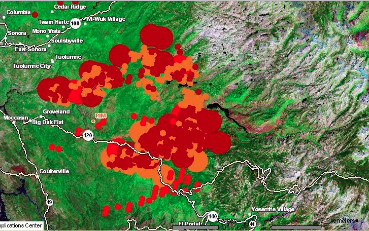
The enormously destructive spread during the summer of 2013 of a wildfire that began just outside Yosemite National Park, as an illegal fire begun by a hunter spread to consume almost 5,000 acres of protected lands. The scope of its spread challenges skills of mapping, and raises questions of managing wilderness and containing wind-driven flames. Even at a distance of three years, the costs of the unmanageably rapid spread of fires is visible in the charred remains of burnt trees that stand, as carbonated sentinels, along the highways one is likely to enter Yosemite Valley. They are reminders of the fire that began in the nearby Stanislaus National Forest and raged uncontrollably over weeks, consuming almost 260,000 acres of protected lands in the Sierra Nevada over two months. Even today, expanses of scorched areas with limited green after-growth mutely pose the sort of questions we are compelled to return to maps to resolve, but that current techniques seem inadequate to resolve by imposing layers over a terrestrial base-map.
The mapping of fires is both a cutting edge technology of interactive web mapping, able to track progress, intensity, and rates of evacuation from burning lands with local burn rates with a degree of GPS precision able to synthesize a greater range of data about fires than we have earlier had at our control. But are the maps of fires effective measurements of the scale of destruction or even the pathways of communication of dangers from fire–a danger increased with the growing number of unsupervised fires in wilderness areas where many homeless are increasingly based, and adequate resources not dedicated–and the spread of fire is simply not able to be that easily mapped.
The steep costs of such fires are not only unable to be comprehended, but so is their scale. If we map fires to better understand their spread–and the speed at which they travel, as well as the violence of their impact on protected terrain–The cost of this inability to chart the rapid spread of the fire suggest the difficulty to grasp the immensity of the costs of its current danger to the Eastern Sierras–a monumental expanse whose protection constitutes among the most valuable of America’s assets–both the difficulty of charting the ferocity by which fires threaten to destroy, the need for their prevention, and indeed the costs of failing to conceptualize the destructive costs of fires’ containment. For if the charred remains of dead redwoods and sequoia suggest the unstoppable progress of the fire in the hot summer of 2013, they remind us that increased summer heat threaten to incredibly steep costs and pose future challenges for mapping the spread of firespace.
The terrifying rapidity with which the 2013 forest fire spread to become the largest-ever fire in recorded memory in the Sierra Nevada mountains posed such difficulty to be controlled from the middle of August that demanded to be mapped, but its expansion challenged the adequacy of mapping tools. The fire not only led to evacuations from the park as it extended into northwestern Yosemite, and to call for increased numbers of forepeople to control the blaze, as its shifting distribution and spread pressed so many firefighters into active duty to contain its growth, by both representing and masking its causes for and proportions and the difficulty of controlling its spread.
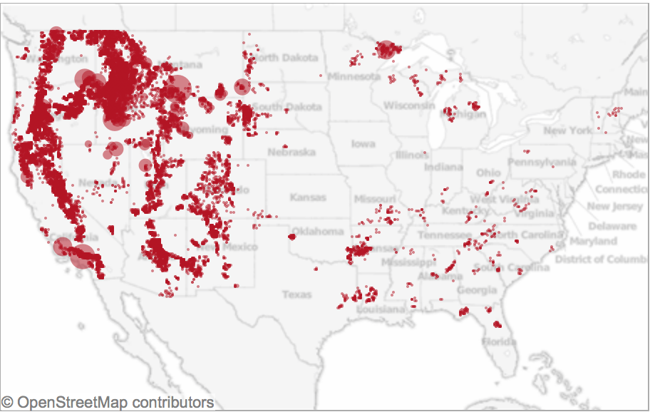
For although a number of fires occur yearly in Yosemite Park–either by lightning strikes, unattended campfires, or lapses of attentiveness, the specificity of the 2013 rim fires’ spread was due not only to its expanse, or proximity to Hetch Hetchy Reservoir, but to the winds that drove it, which distinguished it from other fires that are more easily controlled. For the rapidity of the spread of the fire distinguish it from the range of wildfires along the west coast that Ben Jones, using government data, mapped from 2002-2012 in Tableau.
Whereas most of the fires that occur in the western part of the country were during the summer months, and most were caused as a result of lightning strikes, the vast majority were less than a quarter acre in size–and only a handful (one hundred and fifty-eight in a decade) exceeded 5,000 acres. The fire of 2013 consumed over 250,000 acres, making it a striking challenge and almost unique case to map its geography and spread–and providing an almost predictable worst-case scenario given the radical reception of the snow-pack in the Sierras that year–a decline that has only continued in recent years.
Yosemite Conservancy–Snow Pack around Half Dome
Much as the weather systems in the Valley and mountains are notoriously difficult to forecast or record, the winds–like the swaying of the slender Lodgepole pines, among the first to move into a burned environment, or the increasing density of trees across the Sierra Nevada, or the density of old-growth trees as the Douglas fir or Ponderosa pines that fill Stanislaus and Tuolomne counties, and run into the confines of Yosemite outside which they lie. And yet we are compelled to turn to the maps that so elegantly charted the troubling progress of the fire over a sequence of days, drawing out the progress of forest burning over weeks, even as we were fed new maps daily, together with weekly composites, of the progress from which we were perforce geographically removed. Watching and mapping the spread of the fire became increasingly dramatic and compelling precisely because of the difficulty with which it was contained–as if the fire resisted the abilities for synthesizing and bounding its own spread as it rushed in high winds across tree tops, breaching the boundaries of roads and approaching areas of denser settlement.
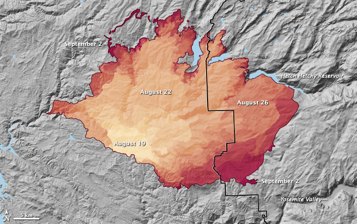
Spread of the Rim Fire from August 19 to September 2, 2013, as reported on InciWeb. Credit: NASA Earth Observatory
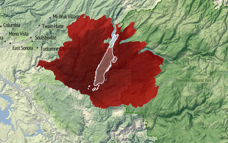
After consuming over 257,000 acres, the Rime Fire is 92% contained–two giant sequoia groves preserved–and trapped in a fixed perimeter at a low intensity, and the number of fire-fighters down from over 4,500 to 287. But the rapid expansion of the fire raises questions of containment, continuity, and scale beyond the categories we can most easily comprehend–say of cities such as Manhattan island, here trapped in the red expanse of blazes, or Berlin–images that adopt the familiar format of territorial maps. For while these images effectively communicate the size of the region to which the blaze expanded, they also create a false equation by which to understand its origins, spread, or possibilities for its eventual containment.
But such mapping of expanse provides little communication of the nature of its human causation, or of the difficulty in the reversal of its spread, while they impress its expanse. The values of measurement, scale, and proportionality which determine the construction of maps provide less value as criteria to map a fire that is able to leap from the underbrush to branches and the crowns of red pines, sugar pines, cedar, ponderosa pine and Douglas fir–among which fire travels in ways less understood by metaphors of terrestrial continuity, whose rapid expansion is facilitated and fed by decades of neglect at thinning forests on the park’s perimeter on account of substantial reductions of funding for adequate preventive firefighting by controlled burns of underbrush. (And the consequences of such reductions will be felt further by drought and higher, where the temperatures in the western United States bound to increase fire frequency by drying and warming landscapes.)
The result created something of a tinderbox in the Stanislaus forest, where the extensive undergrowth helped to ignite the fourth largest forest wildfire in California since 1932–a blaze that only slowed as it met far less underbrush in Yosemite National Park itself, where it also encountered far less dead wood, overgrown forests, and debris on the forest floor.
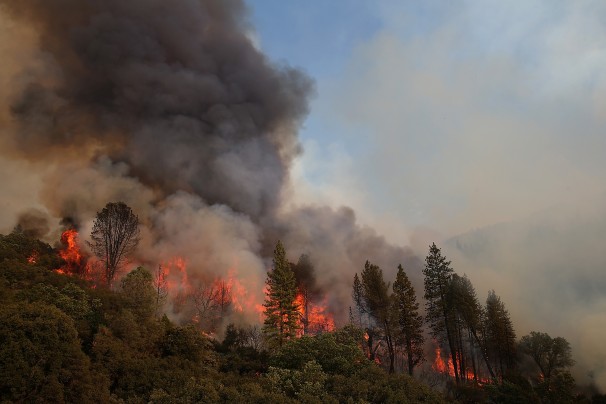
Justin Sullivan/Getty Images
If the terrestrial map provides a poor visual metaphor for the communication and progress of the fire, maps also provide limited tools to understand the dynamics of fire containment. To speak of “footprints of actively burning fires” in Yosemite Park not only misleads. It mis-represents the abilities for the fire’s containment and impending danger of its astounding spread from a small canyon in the Stanislaus Forest. Unlike the image implied by a single ‘footprint’ of clearly defined bounds, multiple fires that have spread from Yosemite Park’s rim into the park itself in ways that cannot a single block or region, as is by now increasingly evident with the spread of the fire Labor Day weekend into the San Joaquin valley and the spread of smoke into the Valley itself, obscuring the very views for which the park has been so long known with dense smoke and leaving a burning smell in the National Park that has not only symbolic resonances as a region of protected wilderness, but is a historic example of the protection of a preserve of wildlife and old forest growth. It is difficult to register the destruction of space and place watching the spread of the fire’s leading edge over several weeks on an animated map of its almost unstoppable progression: http://gu.com/p/3tgff/tw.
To be sure, the historical spread of fires in the park due to lightning strikes can be understood as a process of forest management, as Kate Wilkin has shown by using color-coded polygons to trace the quilt-like nature of historical fires in the mixed conifer forest in Illilouette Creek Basin in the Upper Yosemite wilderness.
The quilt-like nature of historical forest fires in the park however contrast to the immediate ways that we map the progression of a fire. The mapping of the expanse of a fire that crosses roads, boundaries, and other mapped lines poses problems that are not only cartographical in nature, but address the effectiveness of communicating the fire’s spread to the interested public–and the danger future wildfires pose. The demand for compiling an updated image of the fire’s progress in the hopes to capture the destructive phenomenon that raged for several weeks and consumed an expanse of over 350 square miles–almost 100 of which lie in the boundaries of Yosemite National Park–and which threatens to overwhelm and destroy its precious landscape. For most maps fail to embody the fire’s own contours, causes or impending expanse.
Repeated re-use of the “footprint map” of the fires in media outlets minimize the facts of its spread or existence of a clear perimeter around the “rim” fire by confining it to a fixed area, in ways that the animated map recapitulates in mapping the gradual if jerky expansion of an ink-stained red expanse to fill nearby canyons and valleys as it comes to border and surround the Hetch Hetchy reservoir itself. Indeed, much of the fire that has burned in the Stanislaus Forest has remained off the radar–though this has been where most of the burning has occurred–given the dominant media focus devoted to Yosemite Park’s wilderness–and the region’s iconic status as protected wilderness in the national imagination: indeed, the fire is more compelling than the fourteen active or contained fires in the state that are mapped on the California State Fire Map by transposing CAL FIRE data to a Google Map of the region, replacing the usual pinpricks by swirls of red flames to denote alive fires, and white flames to denote those “contained.” A “contained fire,” in this iconography, commands less visual attention, if not being discounted–despite the map’s benefits viewers, the remove of its map signs from the landscape they are overlaid is a particularly perilous way to foster public discussion about fire dangers.
The moral failure of abdicating abilities of creative mapping to communicate the process or movement of fires has severe implications for our ability to appreciate, understand, and combat their spread–especially in the benign construction of the containment of a fire’s spread. Similarly, notwithstanding the intent to try to map the entirety of the area engulfed by flames, the mutable areas engulfed by fires and the discrete paths of its travel, and the travel of smoke or ash, are masked and left silent in the mapping of its “footprint.” Unlike the “footprint” of a building, house or complex, indeed, the fire resists definition by boundaries, or to be easily controlled, although that image has been repeated in new stories about the “rim fire” that cannot be safely contained, as if to quell fears of the difficulty of drawing boundaries around its recently expanding brushfires that threaten greater destruction of the oak, pine, and older growth trees in the park’s upper reaches. The 94 square miles of national wilderness consumed by fire in northern Yosemite over Labor Day weekend, up from only 74 square miles the previous day, have been unable to be contained because dense smoke obscures aircraft visibility sufficiently to obscure pilots who might otherwise drop water to contain the blaze, although they have since begun to fly once more as of September 1.
The difficulty to map changing nature of the fire–and the limits on firemen’s ability to control it–need to be better registered and more effectively communicated if it is to be adequately described. For even if it is tempting to isolate the burning region as removed from the most-visited destinations in the park or locations of many campsites, the failure to map the fire both conceptually seems an obstacle in clarifying its dynamic–or even the plurality of fires that have begun to burn. Given the small portion of the fire controlled, which grew quite slowly from 2% to 9%, given its poor accessibility, and, only more recently, to 12% and 15%–as if the doubling of the percentage under control could match the expansion of the wildfire, its mapping might better reveal the obstacles to control its spread, indeed, rather than process a set region or place that has been evacuated of inhabitants. It’s unclear, in short, how maps of the fire process the disaster’s scope or meaningfully present the relation of firefighters to it: if not negligible, the relatively minuscule share of controlling its rapidly growing expanse rely on Google Maps to chart the fire’s expanse in relation to human habitations or sites of evacuation in problematic ways; maps of the fire’s perimeter and coverage inadequately represent the disaster’s situation or dimensions, and their re-use in most newspaper and media outlets confuse the fire as a human event–or an event that impacts human settlements–even though it surely does in part. But the result is to confuse the object of the map, and the nature of the fire with its threat to residences near to or in the park, and the drama of resettlement outside the most threatened region.
August 24, 2013 map of closures and evacuations in park
Map the US Forest Service website, August 24, 2013
For the impact of the fire is surely its destruction of a habitat long preserved and sanctioned for wildlife in the Sierra: a map of its relation to sites of human evacuation suggest only a small part of its impact in an area long preserved from settlement, by privileging areas from which residents have been asked to relocate or withdraw–and fatally confuses or misrepresents the nature of the fire by privileging its relation to human settlements and sites of evacuation, as if that would magnify its dangers. The dryness in the forests that have contributed to their spread remain unmapped in such schematic projections, as are the currents of high winds that facilitate its spread, as the fire remains a block to be combatted and confined–its flickering boundaries in most maps of the region are a reminder of its extremely rapid spread. The inadequate nature of abilities to map its rapid spread inside the borders of Yosemite Park, or to control its rapid progress in the back-country just four miles away from Hetch Hetchy Reservoir, and then at the reservoir, posed deep questions of how to map the growth of and control over the fire, and the ways that maps of fire communicate a convincing relation to its spread by demarcating a fixed perimeter in red–or shading the entire firespace in red.
This is not to say that there is an absence of maps of the fire’s spread, but that they are–in general–absent form the news cycle, in its search to provide an up-to-date snapshots of the fire’s progress and the impact that it is having on human settlements. The spread of the fire from a canyon in the Stanislaus Forest provides a compelling image of the spread in high heat with prevailing winds, moving in jumps from the upper branches of trees as well as passing along the dried out underbrush. But few, as below, use an informative backdrop of the potential for fire-risk to plot the fire’s widening perimeter, compiling data of fire progression over the weeks of August 17-28 by GIS software to orient viewers to the fire’s rapid expansion and to the dangers of the fire’s further spread:
The powerful overlaps of data in the Esri map that integrates wildfire potential in the region with the fire’s spread uses layering of data to create a dynamic surface to map fire progression. In sharp contrast, images deriving from Google Map templates place pastel pinpricks to individuate sites of evacuation in the parks in a field of green, as if to allow us to read the spread of the fire a human story in a far more static map–relinquishing responsibility to map the spread of the fire. More than providing actual or precise information, the maps are removed from the fact of the fire–which is oddly absent from them, as is the nature of the fire’s rapid spread. The presence of the fire is even muted by the placidly pale iconic markers that Google Maps employ–periwinkle markers and a light green screen–seem antithetical to the violence of the very fire it charts, or the brush, oak, and pine that fuel its continuing spread. One would not know that the fire has been burning for more than a week, or that it was in danger of consuming some 225 square miles, and could easily send out sparks a mile and half beyond its current perimeter. As the rim fire in Tuolumne County, CA has expanded far beyond 150,000 acres–four times the size of San Francisco–little help or solutions seems to materialize for its extinction, even as huge amounts of flame retardant and water are dropped over the region by fixed-wing tankers. More recent visualizations of the fire incorporate the icon of an isolated yellow flame in a map of evacuations, closures, and shelters for evacuated outside the rim’s periphery.
But attempts to chart the huge damage of wildfires in terrain maps of the “rough footprints of actively burning fires” can barely communicate the progress of its destruction. From a small canyon fire, the brush fire has consumed oaks, pine, and threatened giant Sequoia trees, in what might be the largest recorded wildfire in California history: it resists being mapped. In fact, rather than being contained, in other words, the problem of mapping a fire never more than 7% contained has not been confronted by the news agencies that pretend to map its spread. The stop-action image of a bounded range of danger suggests an almost wishful level of control over a fire that has increased in size by over 10% each day, the slow growth of the proportion of its containment from 5% to 2%, back to 7% and then to 15%, if comforting, seem less statistically meaningful–especially with at least fifteen more days expected until the fire is contained in mid-September. How much more likely is the lack of control only to grow as it expands?
The map is mute on these questions, or barely registers a response. More problematically, the maps “lie” in drawing clearly demarcated boundaries of control for the viewer, to use Mark Monmonier’s phrase in How to Lie with Maps, reducing the multiple effects of the raging fires to an entity mapped only in relation to settlement–despite its far larger destruction of the wild–erases how the fire has transformed the land. An early image from the Los Angeles Timesconfined itself to highlighting spot fires in the perimeter that was threatened seemed to conceal the fire’s rapid spread in almost every direction of wilderness in the National Park as much as they illustrate its danger zones:
If all maps are translations, the ability to translate how fires have spread from a small brush-fire of some 400 square feet in a remote canyon of the Stanislaus forest to consume over 250 square miles challenges the ability of any map. The distribution of fires on August 23 was already less circumscribed, as the rim fire seems to have rapidly expanded along the mountain tops, light orange clouds providing evidence of recent burning. Shifting mapping to a terrain-view, and measuring fire activity, raises an entirely different set of dangers, in this map of August 23, if the ring of fire still seems limited to the rim, and only vaguely suggesting the danger of its spread and the limits of being at best only 5-8% contained for several days, if containment has grown to 20%:
Indeed, the map conceals the lack of much of a strategy to deal with a blaze that has become increasingly difficult to contain save by letting it burn itself out. While the map of boundary lines lain over a landscape map is removed from the nature of the fire’s progress, the recent perimeter of fire is oddly removed from the fire’s effects in comparison to the map of its progressive expansion from Stanislaus Forest to the border of the National Park.
A more recent map, including a further array of MODIS satellite-sensed thermal hotspots and active fires in an Esri overlay map provides a more realistic, if substantially scarier, image of its evolution as a growing heat source–the practical problems of mapping the fire’s expanse to an entire shore of Hetch Hetchy Reservoir also suggest the steep challenges of its containment.
One of the deepest worry of many in reaction to the maps is of course the relation of the fire to the landscape. The fire of course threatens the region of wilderness that the park was dedicated to preserve–a nationally sanctioned wilderness within Yosemite park whose pristine old-growth forests that have been enshrined in our collective memory within a long tradition of American photography. The mythic photography of Yosemite’s wilderness was nicely undermined in Roger Minnick’s famous 1980 color chromogenic print of a visitor contemplating the Valley’s glacial waterfalls from Inspiration Point–her hair pinned up within a kerchief of its prominent sites. Despite the touristic appeal of the region, the image of the natural splendor of sheer rock cliffs, waterfalls and trees remains a central to the American imagination of wilderness.
Some maps distance worries of natural destruction by placing the National Park at a reassuring distance from the raging fires, accentuating the fire’s distance from the Valley, and the old-growth regions of giant Sequoia–mapping the expanse of the park in relation to the more delimited region fires have spread, as if distinguishing the smaller bounded region that is burning from a much larger whole, as in this fairly uninformative map that seems to separate the fire from the park, which is silent about the pathways of the fire’s spread or expansion.
Yet as the fire spreads, even at 20% contained, the threat of particulate matter entering the drinking water that the reservoir supplies is not over. Meanwhile, the older trees and considerable biodiversity that provided a rallying cry for the Park’s creation from the 1890s are now threatened, as, continuing the military metaphor of combatting the fire, the San Francisco Chronicle has asked if the giant Sequoia have “finally met their match,” as if preparing to say goodbye to the oldest trees in the park that Roosevelt loved–and that have lived in the park for over 1,000 years. The maps disseminated in the news do not often register the lack of rainfall in the region, often noted by some commentators on the fire but crucial to comprehend both its spread and the challenges of extinguishing the wildfire. Fires are not that uncommon in the state, or Northern California’s forests and parks, based on national climactic data; but if fire-risk is widely measured and announced, maps give immediacy to that risk: over 400 square miles of forest fires are being combatted across the state by over 9,000 men and women. While the map may minimize the expanse of the Yosemite fire and its , and risks naturalizing the spread of fires across the state, a map of the eight fires currently burning in Northern California reminds us of the constraints by which they would be adequately able to be controlled.
The multiple sites of wildfires, and the muting of the dangerous phenomenon by abstract icons, do remove relative the experience of the fire and its danger. But the image of the designated area of wilderness perhaps most feared to be threatened and violated by this year’s out-of-control rim fire–the fear of whose loss may be tragically prefigured by the emblematic loss by incineration of Berkeley’s Tuolumne Family Camp outside the park, whose buildings and trees were obliterated by fire on the weekend of August 25, having served campers since 1925. The burning was commemorated in a recent public vigil in the city of Berkeley, CA, a poignant expression of loss amidst mind-numbing procession of images of flames. For the symbolic nature of burning in a pristine region of wilderness, less accessible by roads and less able to be travelled by vehicles, lies at a base of the many anxieties about the forest fire in the news. Indeed, the sanctioned nature of the Yosemite Wilderness as distinct from a simple National Forest, and existing with its own decorum of wildlife conservation, and a relative minimizing of human garbage or refuse, and of power vehicles, is a preserve of wilderness region whose loss would be even more incalculable:
The demarcation of “wilderness” may seem obtuse, either as a designation in need of designating (in order to be protected). But it reflects how few areas of wilderness exist: the mythic pristine nature of the region, and the danger that its very inaccessibility poses to fire control, combined with the danger of fires to the densely forested area, filled with dry, dead wood as well as underbrush, making the fires so difficult to contain by firefighters or equipment, and suggesting something of an inevitable narrative of loss and destruction that works toward its tragic denouement. A significant part both of the compulsion and oddity of attempts to map the fire’s spread is the very contingent nature of any mapping of wildfires, and the fact that one is mapping something that is difficult to contain–as opposed to containing an image of nature readily comprehended in a map. The purportedly unforeseen velocity with which the fire spread of course make difficult any single capture of events within a map difficult–and even more difficult than mapping lines of military engagement and war. Metaphorically mapping the fire as engagements on a line of combat begs questions of how the fires might ever be contained–save by burn-out fires that attempt to stave the fire’s spread by controlled burns, downwind of the larger fires, between the perimeter of the main fire and a line of control.
Jae C. Hong / AP
These fires raise questions of the dangers of identifying the fire as a single entity in need of monitoring or control. What is being mapped in a plot of burning trees, when fires in the upper branches notoriously jump from tree to tree, in ways difficult, or extremely challenging, to control from the ground? Should one map vectors of transmission, and intensity of heat, as well as location? Or the high winds that now threaten to carry the fire further north into the park? These are aspects that seem to challenge the conventional newspaper maps that use Google Maps templates to locate the fires–and are difficult to digest because they effectively rhetorically diminished potential impact of a fire that would so rapidly spread, even in trying to map it to discreet locations in space that have been identified as dangerous to human populations, obscuring the nature of the burning across the region.
These maps diminish the danger of the fire in a sense, by omitting the extent to which the extraordinary dryness of the region will only lead the fire to spread rapidly. What is the way, one must ask, that fires travel or “know” space, or what sort of continuity exists for fires that the notion of a mapping of terrestrial continuity fail to show or reveal? The question of the further igniting of fires, or the time-indexed travel of fires, is a bit more challenging to read, but far more informative as a model to understand the problems of how it can be combatted or contained, and the manner that it threatens to impinge on the so-called “green perimeter” of the forest itself–even minimizing the fragility of the perimeter that is shown as if it were a fixed line. More importantly, perhaps, they shunt aside questions of how the fire would be contained and provide limited public understanding of the disaster, by perpetuating the image of a contained disaster, even as banner headlines scream about the rapidity of its expansion in the air in a region that has long been parched without rain, and whose high risks for fire were long noted. This map, of August 23, provides a view of the initial spread on Friday, based on the US Forest Service’s Remote Sensing Applications Center (RSAC), based on the analysis of spectral bands in satellite imagery of areas with expanded wildfires better to visualize local variations in the intensity and spread of fires in expansive regions as Yosemite National Park:
And reveals its approach to Hetch Hetchy’s shores, and rapid spread to the center of the rim–and the set of consequent dangers to water supplies minimized in recent news reports of Monday, August 26:
The spread is evident from the intensity with which wildfires spread during the previous day:
The value of this map, of course, is a primary concern with mapping the fire’s spread, then situated within the human settlement of the area, but using map conventions to fit the unique characteristics by which they fire spreads. Already one can see the stark spread of the fire over an entire region, and the relative impossibility of containing the inevitable inward spread of the fire from the rim, toward what seems an inferno of dense pine and oak, as well as burning overhead threatened giant Sequoia trees and redwoods.
Although the techniques specific to active fire maps are widely used specific to the Dept. of Forestry, a panicked tweet urgently worried that the fire’s spread had been minimized (and inadequately mapped) to reduce the extent of the fire by August 25, as if the spread of the fire toward the end of had been suppressed–and the proximity it seems to have gained to the Valley and to Yosemite Village.
The influx of large numbers of fire fighters from other states helped contain the fire, by last count, some 15%, a statistic that might mitigate its current spread. But little has been said in the media–until quite recently, and then only in select places–about the relation of this fire’s spread to a Congress that depleted needed funds for fire-fighting abilities or fire-suppression technologies. If a casuality of the 24-hour news cycle, the budget cuts come not only from fiscal irresponsibility but a reluctance fueled by stubborn refusal of climate change deniers to recognize that the forests have become increasingly flammable, as water as diminished in such areas as the region of the High Sierra. Even as the fire rages, the US Dept. of Agriculture mandated a spending freeze on forest restoration programs and firefighting budgets to help maintain fire awareness at high levels, although the Dept. of Forestry has spent more than a billion dollars on fires suppression this year, and 1.9 billion the previous year. This may well be the unspoken story lying within the story, and the one whose effects are still waiting, tragically, to be adequately mapped.
The drastic reduction in the Sierra’s snowpack has continued to raise alarms, but all too little has been done to contain or prepare for the need to contain wilderness fires, or the potential losses of nationally protected landscapes they risk destroying.
Reduced Snow Pack in the Sierra Nevada Mountains in August, 2014
Mortality is mapped to gain a grasp of geographical distributions of illnesses over space. The mapping of death helps to embody the pathways of disease, and allow us to see otherwise inapparent vectors of transmission, which have historically provided crucial ways to assign meanings to a disease’s effects and pathways. In ways, the map manufactures and embodies the pathways of a disease’s infectious spread: the rise of deaths in the borderland between the United States and Mexico can only be mapped as a dereliction of national responsibility that charts an erosion of civil and moral codes. The recent erosion of civil law and attacks on immigration law conceal a longstanding withdrawal of responsibility along the border, opening the way to creating the borderland as a military jurisdiction—rather of civil law.
We have long mapped diseases to grapple with their causation. Even before the bacillus of a disease might be known or seen, the founder of modern epidemiology, John Snow, critiqued miasmatic theories of contagion by mapping the distribution with which cholera spread across London neighborhoods during the 1854 London epidemic, visualizing the disease as a social network of contagion by a dot map of neighborhood outbreaks that used a dot map to as proof that “nearly all the deaths had taken place within a short distance of the [Broad Street] pump” whose water was a vector of transmission. The distribution of mortality around public fountains provided a basis to demonstrate vectors of contagion for Dr. Snow, and by mapping all deaths from cholera to have occurred in recent years in relation to one pump on Broad Street in relation to London’s thirteen city wells by a voronoi diagram.
By locating each and plotting the distribution of deaths from cholera in the city in relation to the significant incidence of deaths form cholera near specific street-pumps revealed a way to grasp infectious transmission from the Broad Street pump that embodied a new notion of contagious diseases that challenged miasmatic transmission—making for the first time a clear spatial argument about how disease existed and moved in an urban environment, and presented a second map, with clearly traced polygons to indicate routes of transmission to the local parish showing routes of walking by which the disease was transmitted—using the recent mapped deaths from cholera in London Edmund Cooper tabulated—
—in hopes to encourage a level of civic engage about the origins of cholera infections that had plagued Londoner’s for twenty eras in the city’s fabric.
The source of deadly infections that this famous data visualization revealed suggests the communication of fatalities by a clustering that indicated clear routes of the spatial communication of a viral infection, focused on a large subset of deaths in close vicinity to the Broad Street pump, even without bacteriological or microscopic evidence.
The exact distribution Snow organized contrast to the terrifying distributions of the deaths of migrants seeking passage across the border, which resists any extraction of an explanatory framework or conclusion, but raises questions about the inhumanity of the terrain we have created.
Dot maps of migrant deaths follow no such clear distribution, and has no sense of transmission form a single site. It forces us to acknowledge the deep problems of the criminalization of immigration on the Mexican-US frontier by charging its human costs. The sites of mortality from hunger and thirst are tragically dispersed over a far great undefined space, but embody the human costs of existing border policy, even a decade before Donald J. Trump used the management of the southwestern border as a campaign talking point to pole vault into public politics.
No similar diagrams can be drawn to elucidate the range of dead bodies discovered in the desert of migrants who were attempting transit into the United States for better homes: can one better explain their deaths b a virtual miasma of cruelty that fills the air of the border zone. Their deaths were caused by dehydration and starvation, as well as cold, but suggest nothing so much as a miasma of neglect. The distribution of deaths of migrants in the Organ Pipe Cactus National Monument, adjacent Cabeza Prieta National Wildlife Reserve, and O’Odham Reservation already illustrated a dereliction of national responsibilities.
The map is a deeply tragic reminder of the loss of life that is forgotten in the dry expanses of these deserts where the border, such as it is, lies, and the distinctly disturbing regime of a lack of interest or care for human fate that—even with the mortality of children in detention camps at the border—still can stretch incredulity at the evidence it offers of a large theater of cruelty. They recall the denial of burial to the bodies of enemies in the ancient world, left as prey to dogs and vultures: the Enlightenment jurist Giambattista Vico faced considerable difficulty explaining to his readers that there was a time when the bodies of anyone was left unburied in an earlier age in his Scienza Nuova, “an inhuman custom—so contrary to what the writers on natural law of all people’s claim to have been practiced among any nation— . . . which [once] prevailed among the barbarous peoples of Ancient Greece,” described in Homer’s Iliad, and at which he marveled as “crude, coarse, wild, savage, volatile, unreasonable and unreasonably obstinate . . . and foolish unreasonable customs,” far removed from his own age and from the imagination of his readers, so “discordant” was it with our own civil age. Yet the unburied dead whose bodies have been located in states of extreme decomposition along this border zone reveal a discordant reminder of the return of such an inhuman custom on the borders—and within the borders—of what we consider is a region that is distinguished and administered by civil laws. Whether this region can be rightly considered a region of lawfulness or civility seems to be raised and put on the front burner by the discovery and attempted identification of the human remains discovered lying in the desert, often dramatically decomposed, of migrants’ bodies dating from the administration of George W. Bush.
If Vico could scarce imagine the barbarity of leaving bodies exposed to the elements even in war—and the spectacular cruelty of the dragging of the body of Hector around the perimeter of Troy three times—among those who “were held to have spread humanity across the world,” given the sheer physical disgust of leaving the body unburied, and given that “all gentle nations certainly concur that souls [of the unburied] remain restlessly on earth, wandering around their buried bodies,” from Guinea to Peru to Mexico to Virginia to New England to Siam, the readiness of Christians to leave the dead unburied by the border, if not intentionally, haunts the border region with its own inhumanity. The violence of this early heroic age was before the age of laws of nations, for Vico, and belonged to the age of “violent and impious men who dared to enter the cultivated fields [] in pursuit of the weak who had fled thither to escape them,” and belonged to “the vulgar customs of the barbarous Greece” of Homer’s day, and adequate burial in fact constituted one of the three institutions of human society—with marriage and religion—in ways that betray the huge remove of a heroic era, which incredibly lacked burial customs or rites, from our own.
Yet the abandonment of unburied bodies has returned in the no-man’s land of the US-Mexico borderland, where the abandoned bodies of would-be migrants fall between governing bodies and accepted customs. Migrants that were stopped during the course of their attempts to reach a new life in the US were clustered at a distance from the border but reveal the amazing distances many undocumented migrants travel before they collapse, without food, and most often out thirst and dehydration–leaving them exposed as “prey to dogs and vultures” in the very horrifying ways that Vico was so horrified. The recent spatial distribution of such abandoned cadavers and corpses, left without any rites of burial, force the viewer to scrutinize its mute surface of dots against a deceptively pastel base map as if they might magically be able to glean or recuperate the silent, forever-lost stories of migrants who lost their lives attempting to cross the border, and the stories of whose travails and travels can never be told. The ends of their lives, reduced to the finality of a bright red circular dot in the data visualization, out of scale, arrests attention but is disarmingly and alarmingly flat, resistant to any further narrative or even identifiable name. Over 2,000 dead migrants whose bodies were retrieved at a significant distance from the border suggest their desperation to make their way across the border by clandestine routes, and the extreme climactic difficulties that they face, with few adequate provisions for crossing deserts whose expanse they feel forced to travel to search for jobs–risking their lives to do so.
Ex Voto painted to express thanks forsuccessful crossing of the Rio Grande
If the many migrant deaths of those attempting to cross the border between the United States and Mexico are often expressed by crosses that are hung on sections of the fragmentary “border wall,”—
—the precise distribution of the dead in sites of their death is rarely preserved in public memory, and the archive of dead migrants who did not survive passage is rarely assembled as a geospatial record.
The number of the dead remains but a fraction of those who have actually died attempting to travel north, leaving detritus and lost objects in their wake that only beg deciphering as images. For although their overlap suggest something like a clustering that might belong to an external infective agent, the alarming nature of the red points call attention to the human costs–and the anonymity of lives lost–that are the victims of the intense dangers of border-crossing that migrants accept and undergo, who we have forced to accept and risks of dehydration, heat stroke, hyperthermia, and starvation which have killed them.
If the deaths of those attempting to cross the border will probably never be know with precision—and is often lost to oblivion—the recovery of human remains affords a grim picture of the actuality of recovering the dead, and the attempts to name, identify, commemorate and memorialize their fates as well as prevent the loss of their identities, despite the jarringly abstract geospatial symbology of this map, and the minuscule proportion of those remained that have been so far identified.
This project of memory and memorialization, echoing the imagery of northward passage in the famous Underground Railroad taken by fugitive slaves taught to recognize the handle of the Big Dipper to follow the North Star to find their path to freedom, “Follow the Drinking Gourd,” the symbol of the constellation has been adopted by the Humane Borders organization which has identified remains and sought to allow them offer needed geospatial assistance to migrants in their search to find a path north.
We read more maps than ever before, and rely on maps to process and embody information that seems increasingly intangible by nature. But we define coherence in maps all too readily, without the skepticism that might be offered by an ethics of reading maps that we all to readily consult and devour. Paradoxically, the map, which long established a centering means to understand geographical information, has become regarded uncritically. As we rely on maps to organize our changing relation to space, do we need to be more conscious of how they preset information? While it is meant to be entertaining, this blog examines the construction of map as an argument, and proposition, to explore what the ethics of mapping might be. It's a labor of love; any support readers can offer is appreciated!


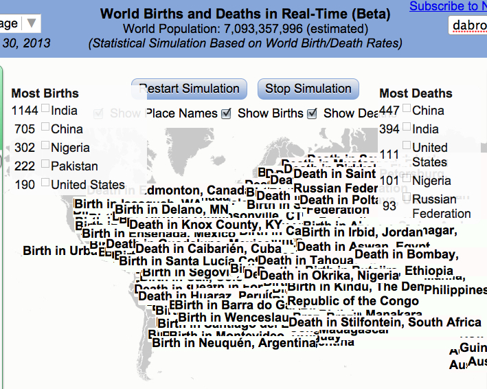
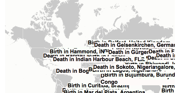
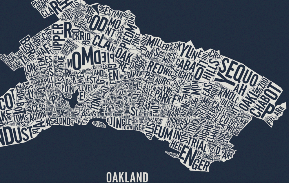
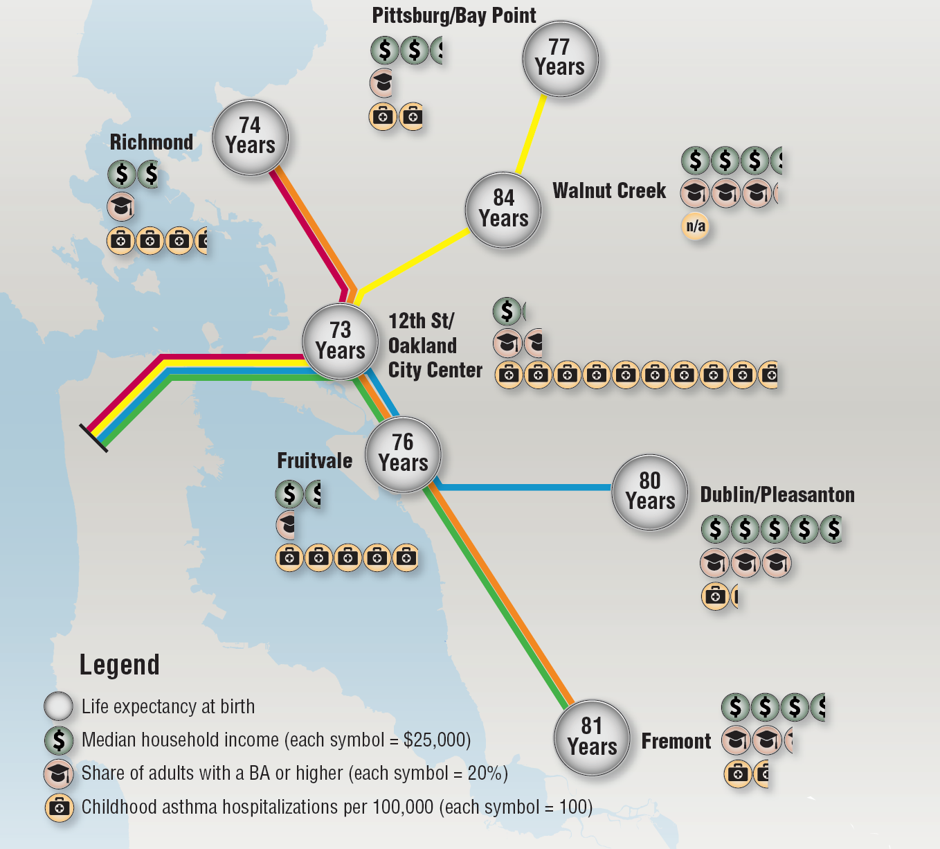

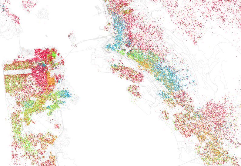
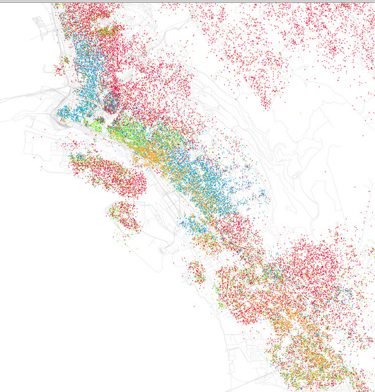
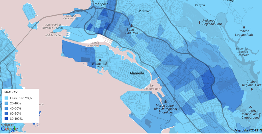
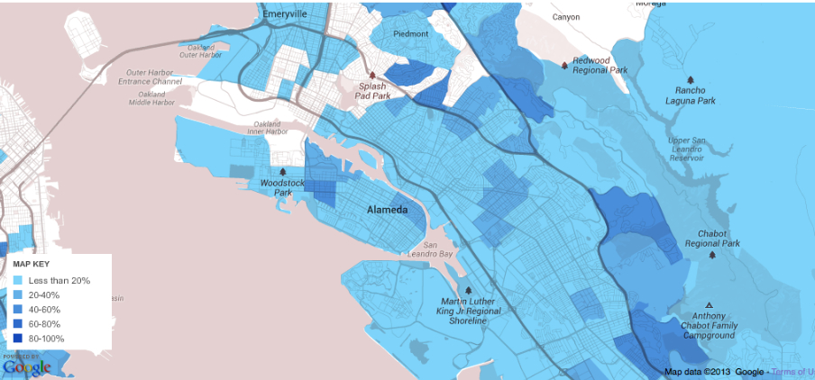
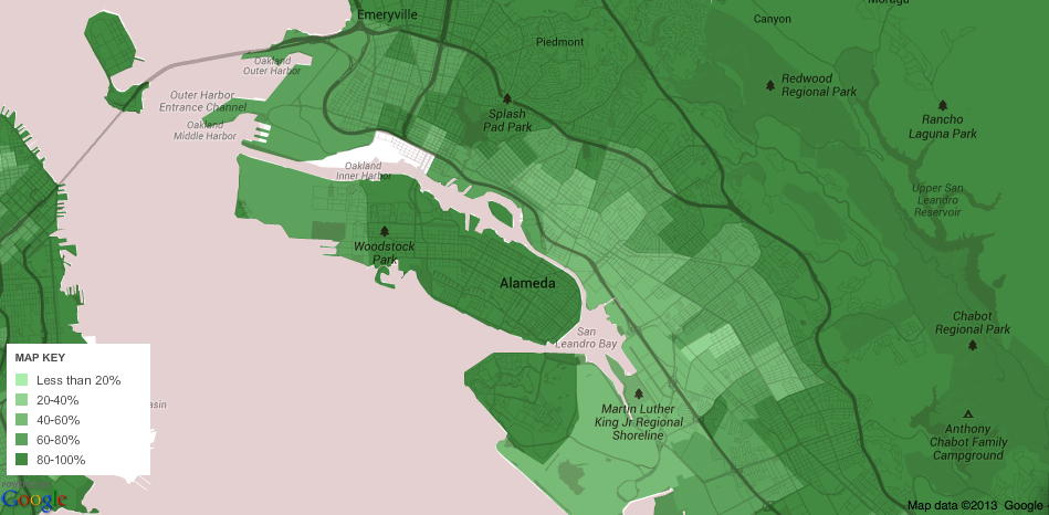
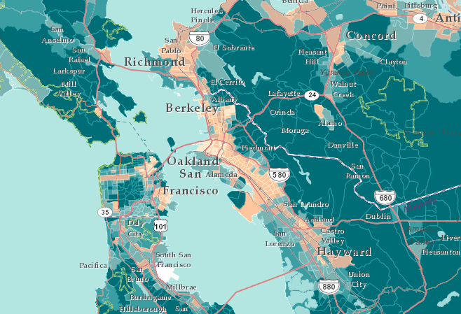
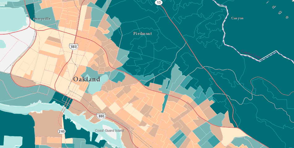
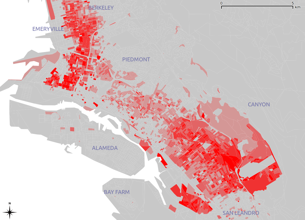
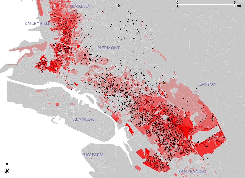
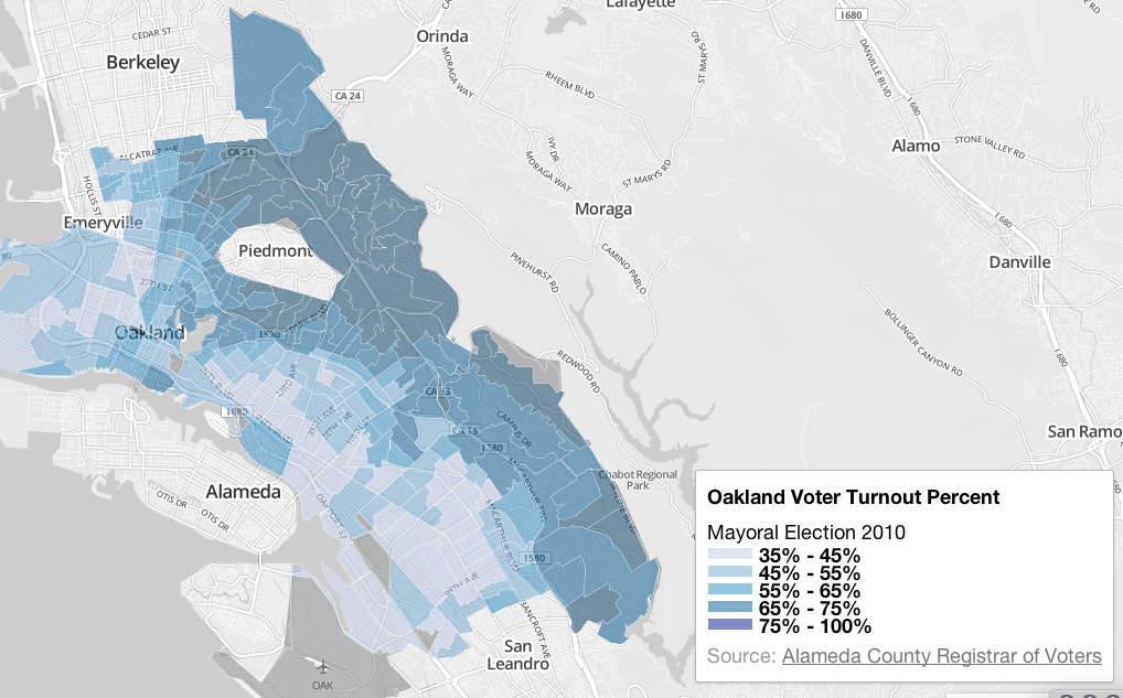

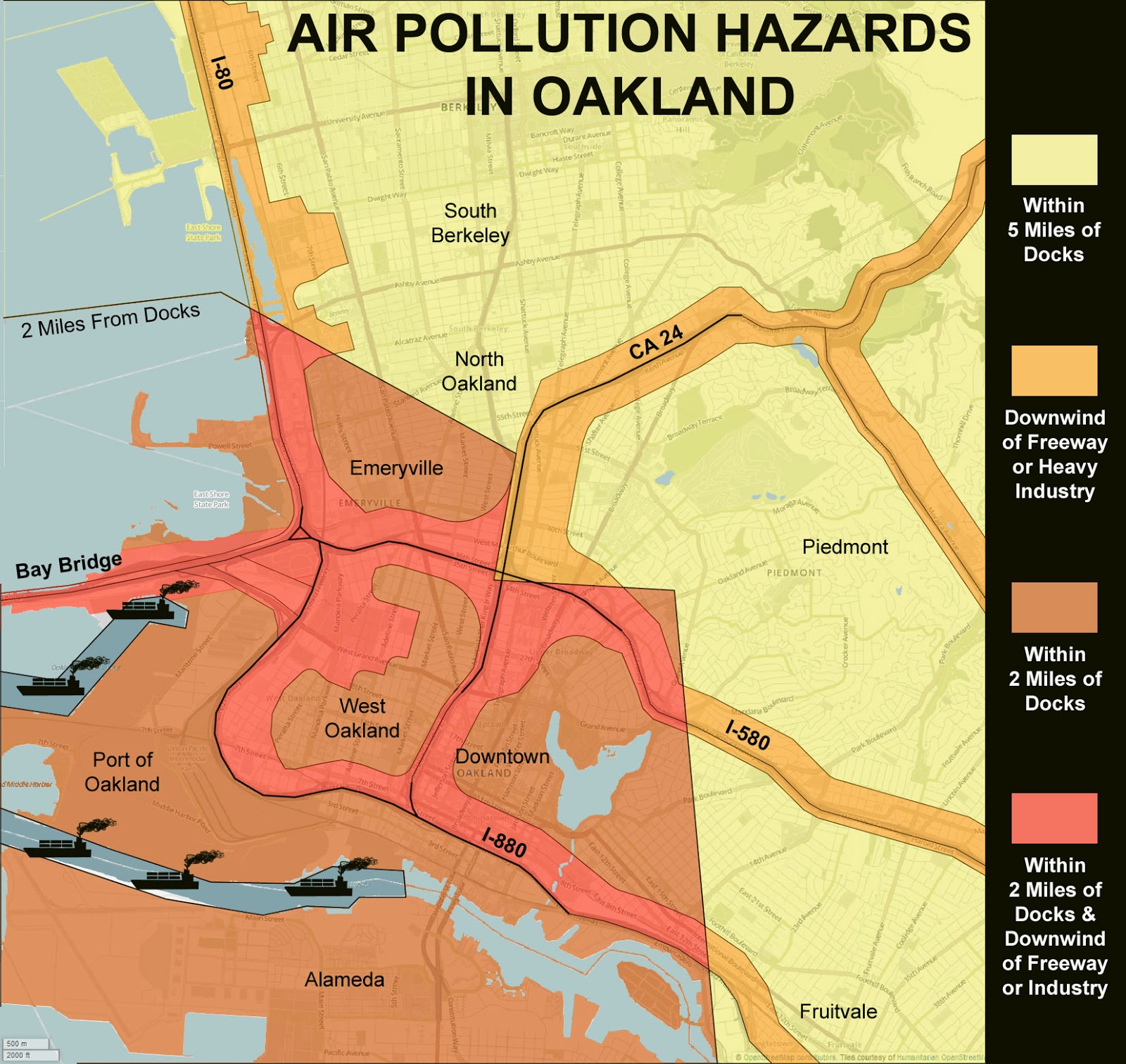
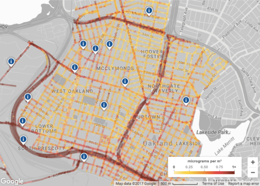
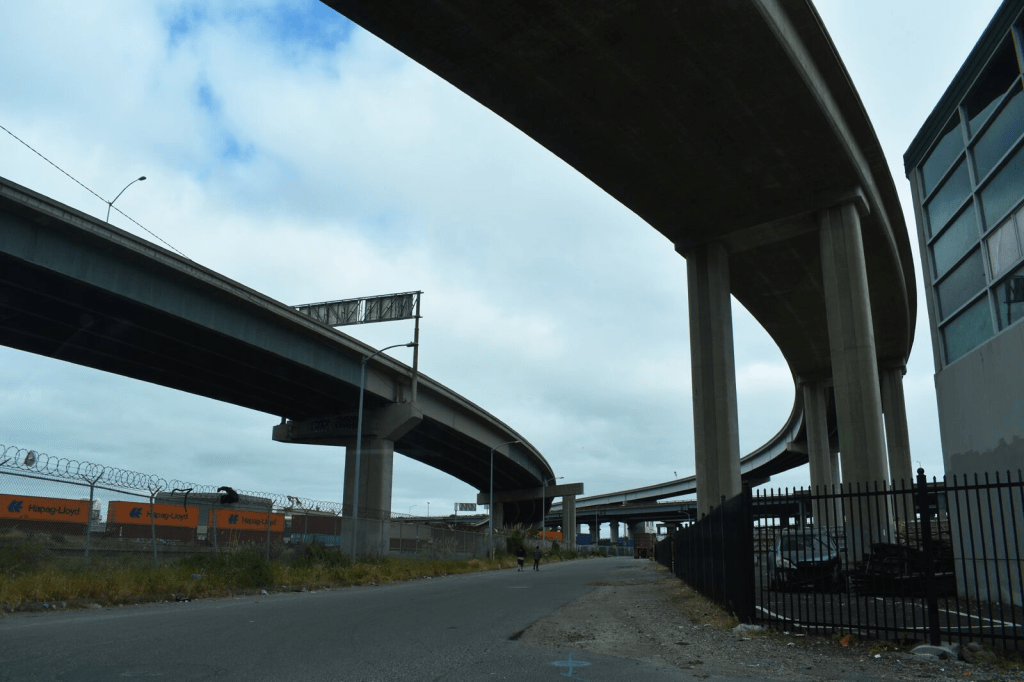

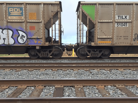
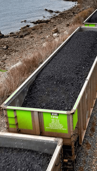
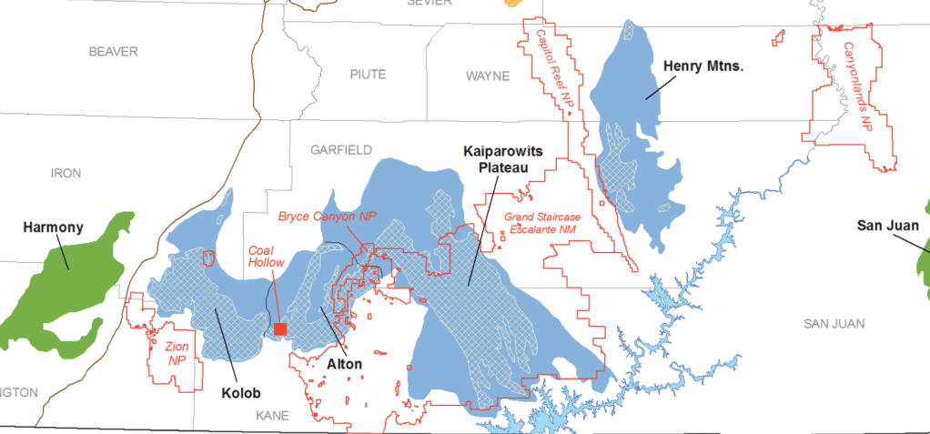
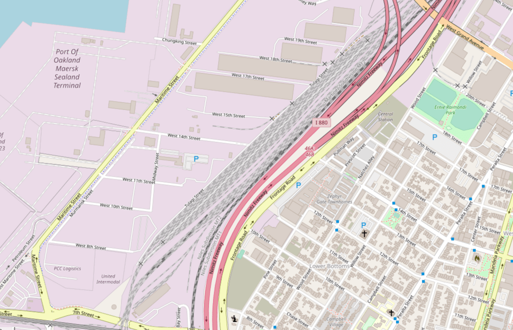
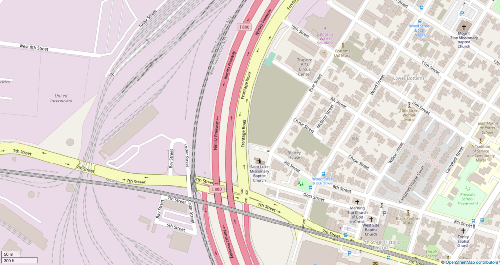
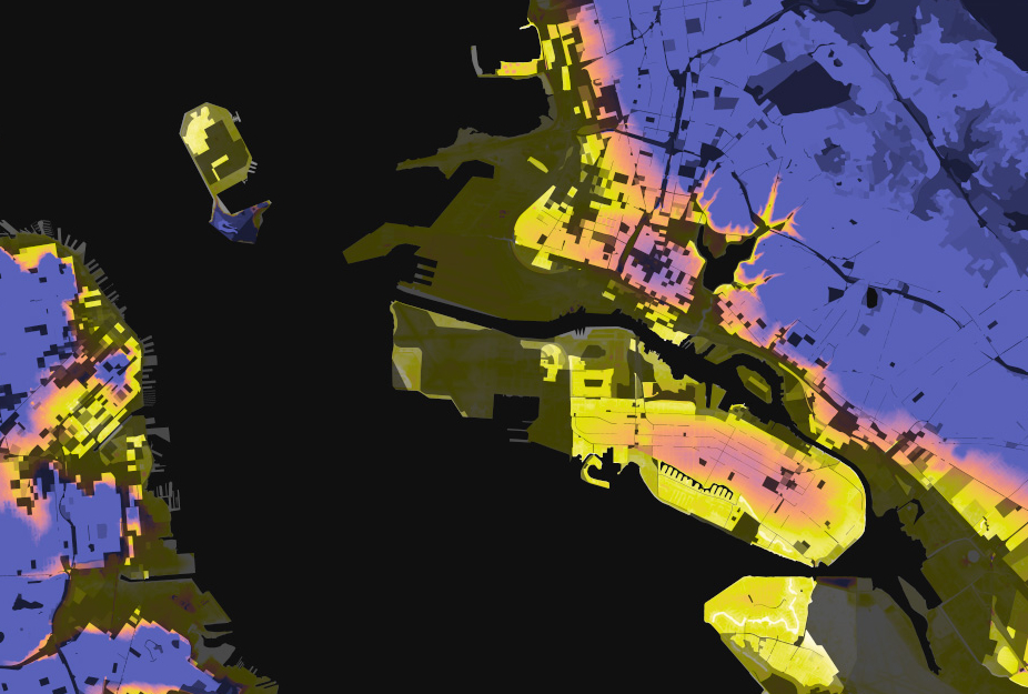
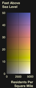
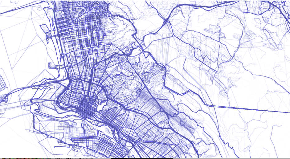
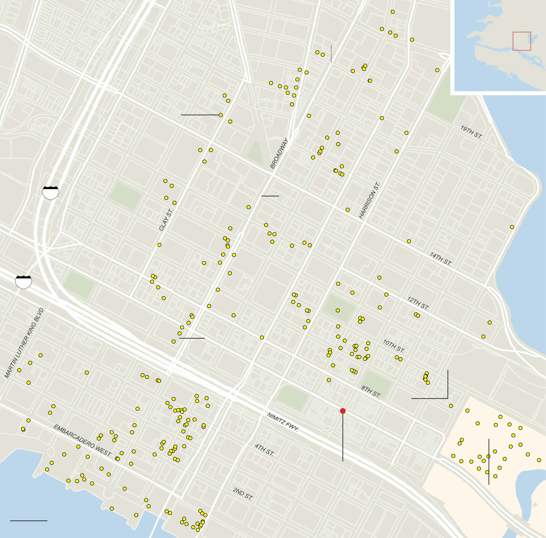
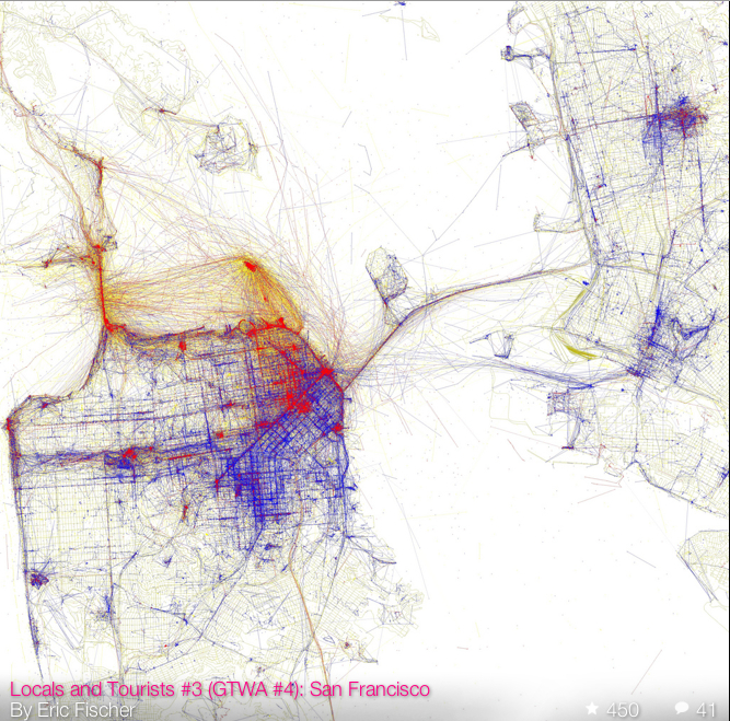
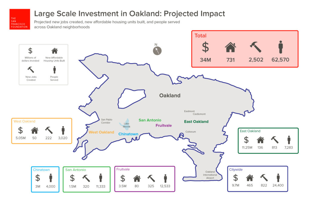
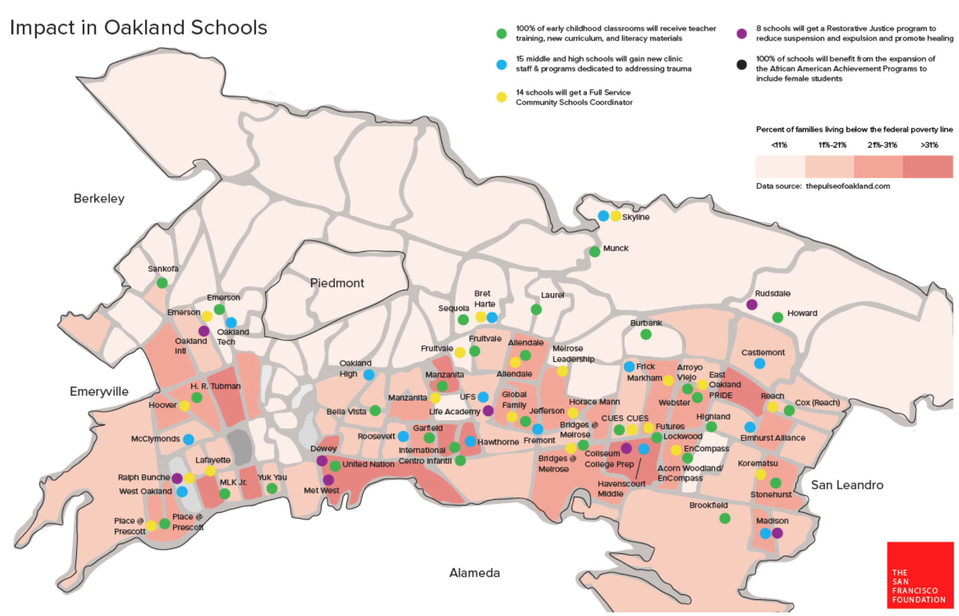


 Kelly Johnston, University of Virginia Library


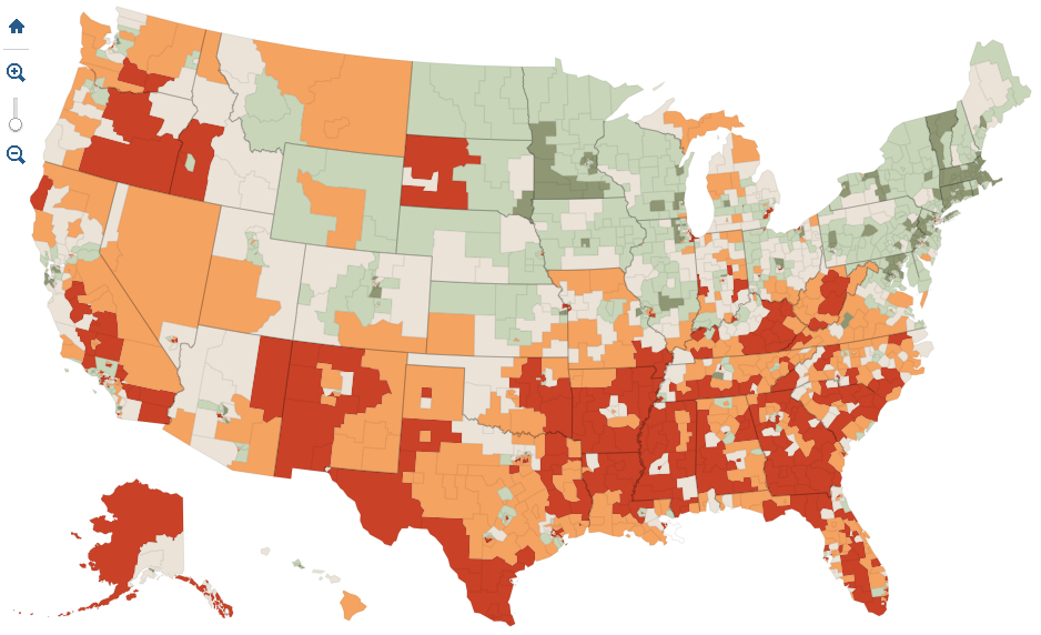
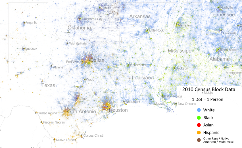


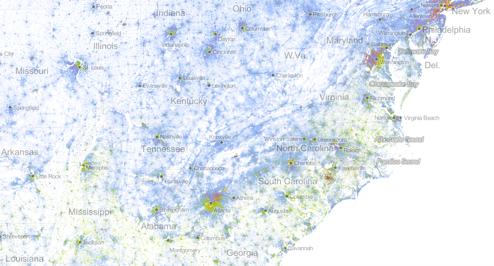
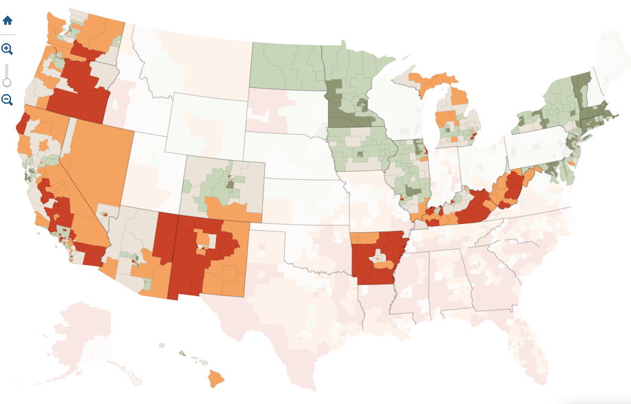


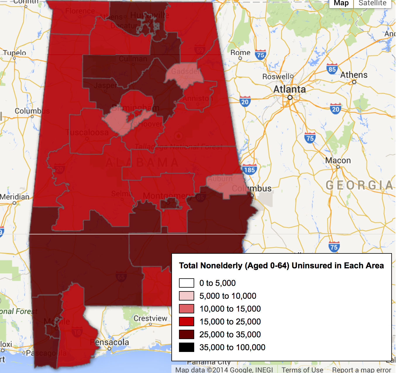

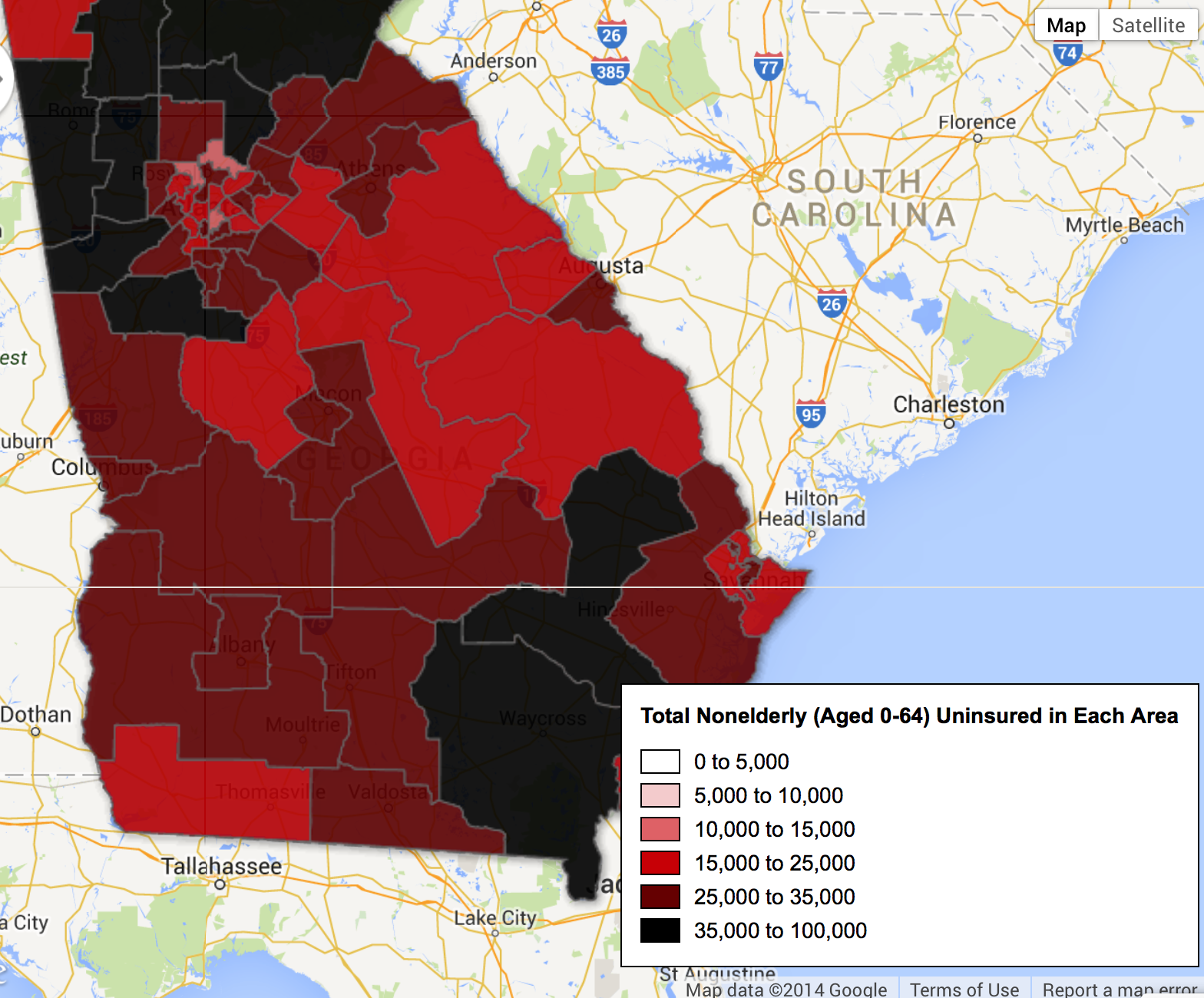
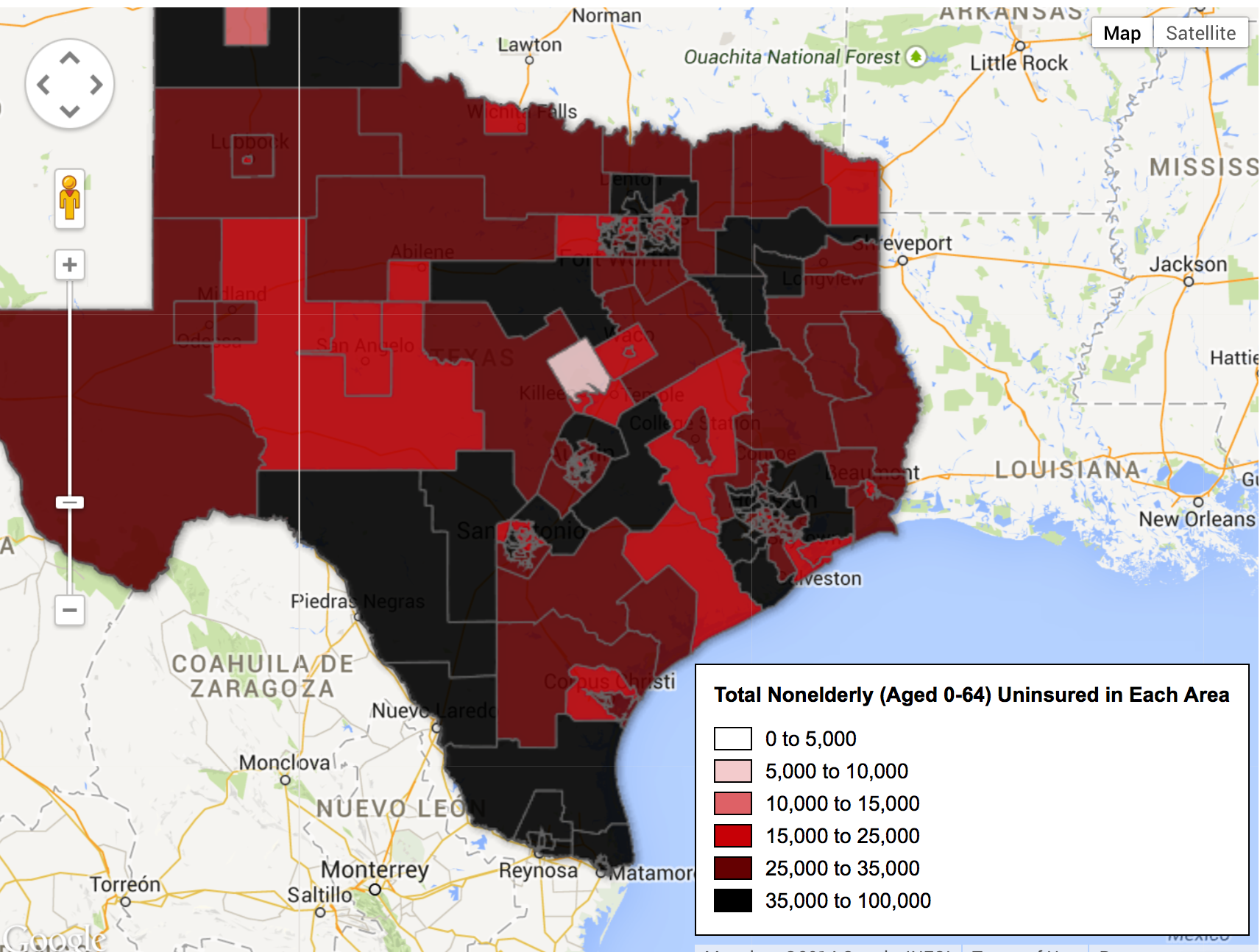

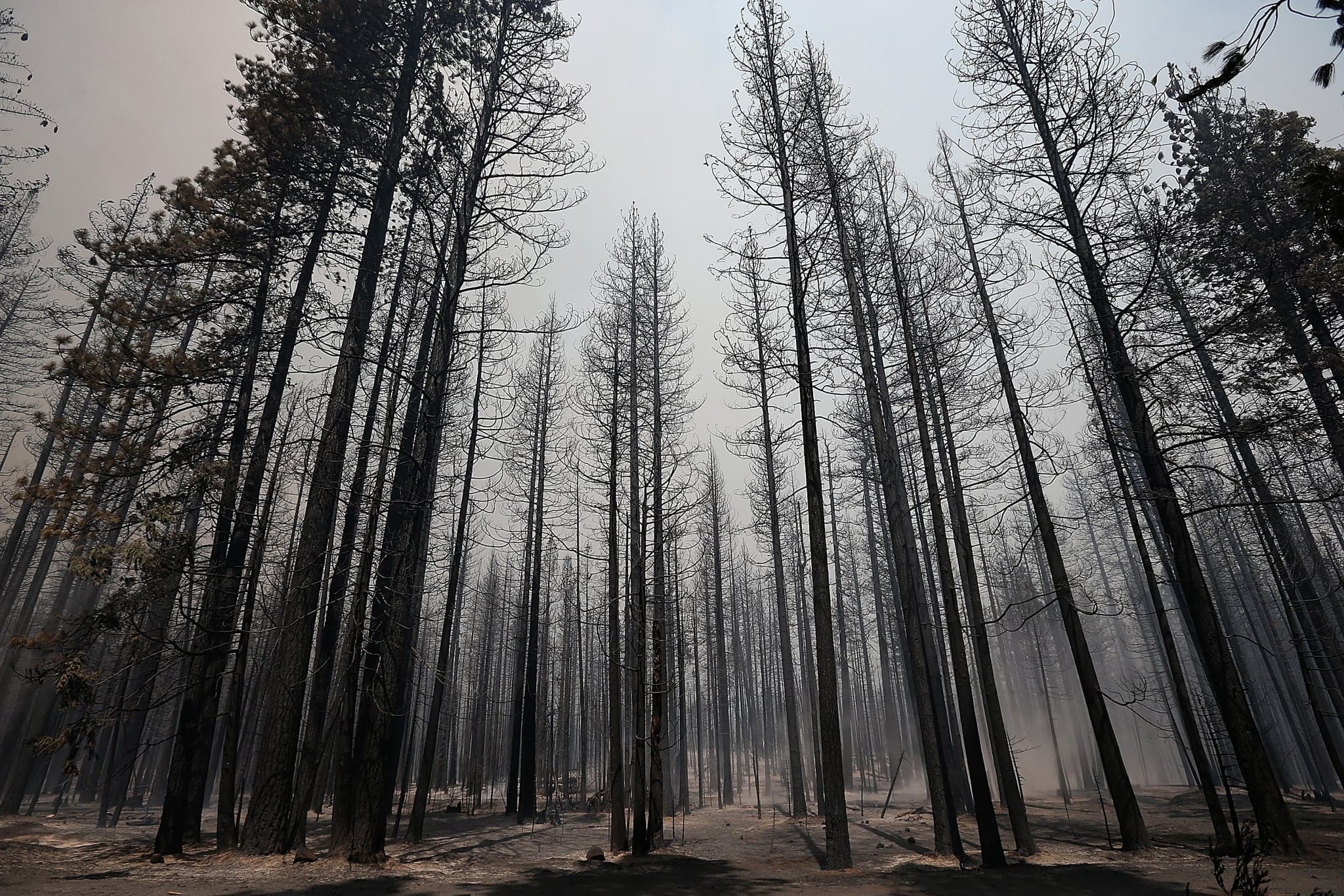 Burnt Trees Shortly after Rimfire