The Natures of San Francisco

A man in the city,” wrote American novelist William Gass, “has no natural thing by which to measure himself.” Self-measurement may be increasingly difficult in an age of global warming. We are with less of a rudder than in the past. But we realize the need for a preserving a close relation to nature, and indeed doing so for biophilic ends. At the time Gass wrote, in the middle of the past century, he disdained the built environment of east coast cities with the wry eye of a midwesterner, even before urban sprawl. The United States was still–as it is now–distinguished by the highest per capita urban areas of any industrialized nation. And the increased overpaying across the west, and bloating of cities that lack edges with wildlife, and indeed only spread into urban walls, means the hope of ‘fronting’ nature, or of imagining a living edge of the end of the city, seems as unknown and as foreign to many urban areas than it has ever been in human history. Even in the most densely populated of American cities, where parks have been built to preserve natural preserves of habitat and recognizable sites of ‘access to nature’ in an increasingly paved world of increasingly hard edges, the concerted belief in the possibility of fostering ‘natural preserves’ in urban ecosystems has endured–

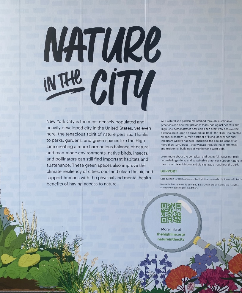
Nature in the City/The High Line, New York City

–promising the preserve of ‘a harmonious balance of natural and man-made environments,’ however distant such a balance seems in an already densely overbuilt environment. But preserving of such contact with reduced wilds provide a sense of hope and indeed a space we might confront where, with Thoreau, to preserve the wild as a site for our rebirth. Whilehopes for fostering ‘native’ species of birds, insects, and pollinators is deeply ethical, the hopes of preserving nature in the city, one worries, has arrived rather late in the game, and after the nickel has dropped. But it is no less urgent, as a process and project for inviting us to remap how our cities are both built and lived–even as the remove of a cabin in the woods that Walden helped perpetuate and foster is receding in the present more than at any time in memory.

The dangers of urban sprawl in northern California have created a crisis in diminished habitat, and left little space for preservation of the wild, many seek to protect more areas of livable space by securing environments fast-disappearing across the state. And while one of the biggest efforts of San Francisco was to try replacing the concrete streets of the city with strings of fast-growing Mexican fantail palms, in hopes to create a stereotypic landscape of southern California that have filled the national consciousness in the 1920s and 1930s, spending an unprecedented $1.9 million on boosting the beautification of San Francisco after the 1989 earthquake Brough a drop in tourism–in a little noted aftermath–by working to plant palms along the Embarcadero bay and major urban thoroughfares to correct an unwanted drop in tourism to the city–

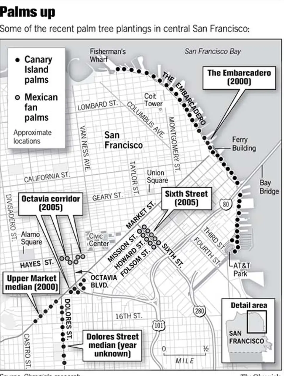
Palms Planted in Downtown San Francisco since 1989/SF GATE

–the dialectic between needed greenspace and environmental niches of vital habitat that create pressing questions beyond urban beautification, but get at deep problems of urban livability.

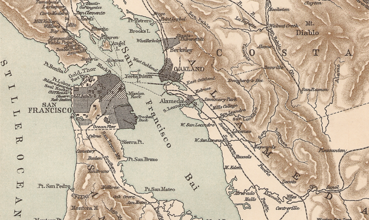
But the need to map our relation to nature has never been more at a premium, and we try to map scores of livability of urban environments in hopes to try to find a connection to nature that is increasingly severed. San Francisco possesses one of the largest municipally managed parks in the nation–over 127 acres–with the slightly larger Park Presidio, a reclaimed military base now a national park. The interplay of nature in the city lies far beyond its parks, but measuring one’s relation to nature are at a premium as the Bay Area is increasingly thought of as far to overbuilt than in the past. If the presence of nature in the city is more elusive, it is more urgently in need of preservation for its residents, and the achievement of the recent non-profit Nature in the City demands to be celebrated as a significant mapping event.

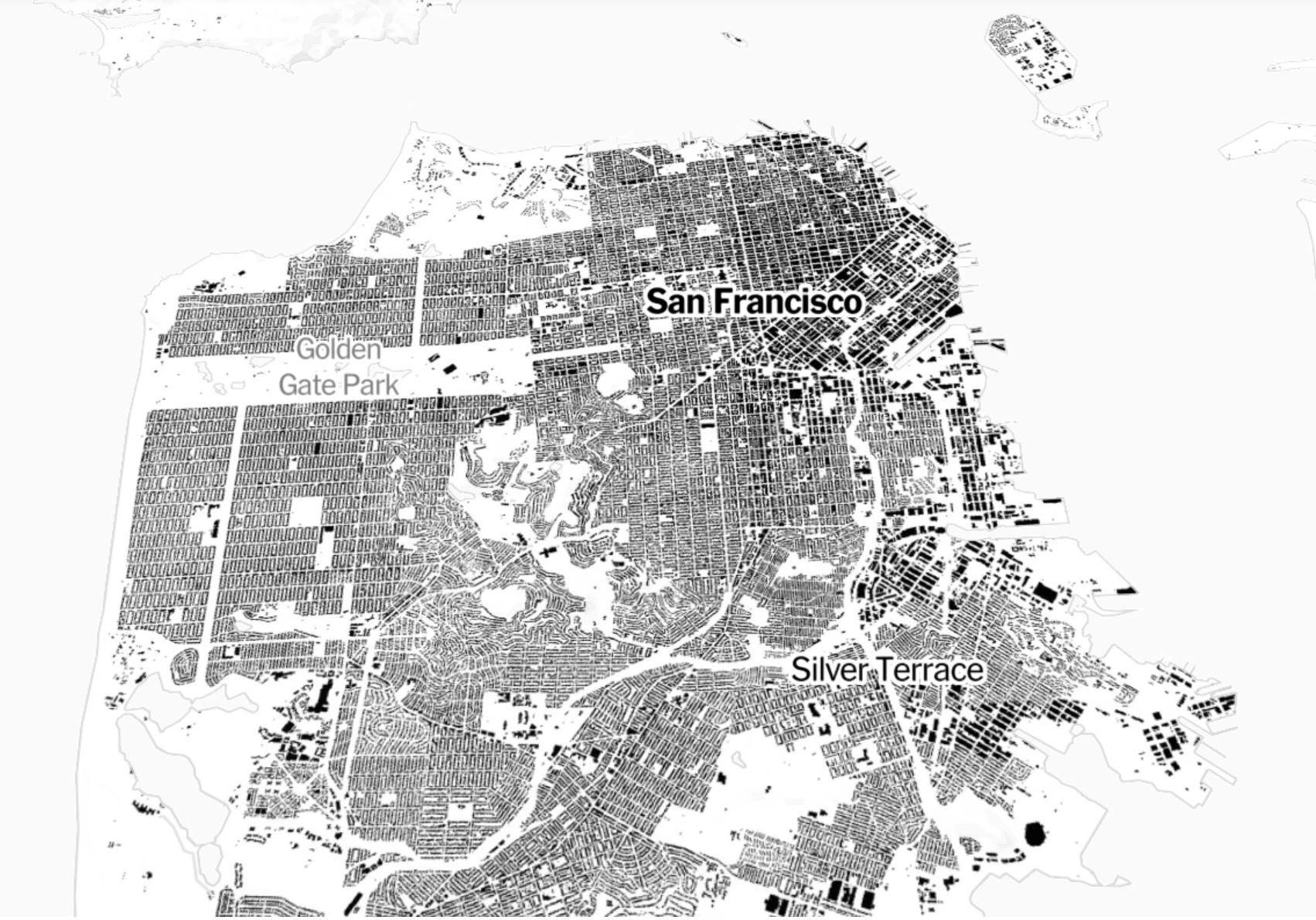
The region around San Francisco is to somewhat unique in offering views of the urbanized downtown from many vantage points and prospects that situate it in nature, against the shores of the Bay or mountains of the peninsula and more rural areas like Marin, as its development offers a test case in the intensification of urbanism and overbuilding increasingly fragmenting wildlife habitat. There is a danger endemic to satellite maps of foregrounding the structures of the built world, rather than habitat, that suggests a cartographic remove of vertiginous danger:, curtailing cognitive interaction with space, as in the machine-read maps of building footprints, “Every Building in the United States,” situating Bay Area buildings as archeological ruins of a Baedecker to a future San Francisco, outside the topographic situation of built space in an area imagined as embedded in natural surroundings. But the absence of life in this overbuilt Bay Area, which maps each building by black, irrespective of height or foundation, recording an anthropogenic legacy via an analysis of satellite imagery converted by Microsoft engineers to a nation-wide dataset, rather than road maps to enable everyone to boost their built built environment as if Robert Moses promoting built space.

An Over-Built Bay Area?

But the building outlines of these maps chart the fragmentation of habitat in what was once a site of wildlife. The map poses problems of defining the “wild”–beyond the tropical cherry-headed conures who have escaped from captivity to be celebrated “wild parrots of Telegraph Hill.” The parakeets that fact span the city from the Ferry Building to Brisbane gained local dominance as flocks of urban parrots nesting in the city from 1911, but recent recognition as the city’s “official animal” poses questions of their designation as wild, despite the seemingly distinctive dialect of their animated cries in the evening in urban parks. San Francisco’s feral parrots were designated as “wild” in the 2005 film by self-designated local expert in parrots, Mark Bittner. Since then, many have naturalized the communities of red-masked parakeets in urban ecosystems to which they are not native in California–not only in San Francisco but Menlo Park, Palo Alto and Sunnyvale–and since 1997 in San Diego, reflecting the massive importation of exotic birds since the 1980s: the feral population of neotropical birds gained a toehold in coastal environments since upwards of 26,000 parakeets were imported to United States from 1980-1985 as exotic pets. The feral ancestors of escaped pets colonized anthropogenic habitats’ open arboreal canopies, colonizing habitat abroad by a species nearly endangered in Ecuador and northwestern Peru, whose local pet trade combined with habitat loss, in a paradox of globalization, to send parkeets from tropical to urban habitats.

Prominently audible and visible at sunrise and in the evening, the growth of invasive populations in several city parks have encouraged designating the progeny of imported exotic pets as local wildlife attractions. But this designation begs the relation between nature and urban environment: as relatively recent arrivals, the non-indigenous feral cherry-headed conures are local icons, rather Han seen as invasive, despite their remove from the regional ecosystem, living off flowering trees they adopted as roosts from Coit Tower and Upper Fort Mason from February to October, but native to deciduous forests and jungles in southeastern Ecuador and northern Peru, if often migrating to suburban forests after having escaped captivity, if long popular caged birds introduced in Spain, The colorful local presence of over three hundred roosting in the Bay Area encouraged sympathies as charismatic species, but the parasitic presence of birds escaped from pet shops or released by past owners may mask the actual vibrancy of habitat of the dynamic region in which the parrots can inserted themselves as urban interlopers, winning the protection of many local residents seeking to nurture the exotic birds as colorful splashes in an increasingly overbuilt space.

The recent map of urban habitats of the enterprising non-profit Nature in the City is dedicated to the conservation of a new attitude toward urban space, using mapping technologies and artistic practice. It seeks to orient readers to the charismatic species that occupy the city’s greenspace. If the heroic couplets of Vladimir Nabokov’s murder mystery, Pale Fire, staked a mystery of modernity channeling “the shadow of the waxwing slain/By the false azure in the windowpane,” the reflective surfaces of urban buildings create the illusion of open skies even as they interrupt the open spaces of nature on whose reflection the noble bird is a victim of apparent suicide. That bird, an American term for the bird used in the royal crest of a fictional kingdom of “Nova Zembla,” derived from an island called Novaya Zemlya, or “New World,” an archipelago in the arctic in the Barents Sea, was mourned by the emigré author in exile, as the double of Nabokov himself. Can we use datasets to devise a more humane account of the shrinking greenspace habitat, seemingly soon to disappear not only in America, but in its expanding urban regions?

If the first tallies of birds in North America began in December, 1900, instigated by the curator of birds at New York’s Museum of Natural History, the census came to offer a basis for the first scientific count of birds in Canada, the United States, Latin America, the Caribbean and Pacific Islands. The recent iteration has totaled an avian brood of 40 million, of 2,380 species, contracting in size after losing some three billion birds since 1970 in North America. If the count postdated fears Rachel Carson voiced in Silent Spring, it also stimulated the concern. Some visitors to New York may smirk at designated”habitat restoration” in Central Park, but the park’s meandering paths offer humans an exposure to birdsong of sparrows and jays absent from most built space in the urban grid. Do we not need a better maps of relations to nature, in an era of overbuilding where most maps leave us purblind to an anthropocentric record of anthropogenic change?

The ever- increasing of habitat fragmentation poses, with invasive species, and anthropogenic toxins, environmental challenges that make it ethically incumbent for urbanists to foster viable habitat in the expansive urbanized regions of North America. For habitat is compromised by laissez faire building, ifunregulated pesticides on avian life that led Carson to be so concerned for the birds inhabiting orchards whose springtime voices were threatened to be silenced have diminished years ago. The importance of strengthening the habitat of birds, mammals, fish, and insects may make them more resilient, and the hope to “green” our increasingly over-paved urban spaces offers and important response to the increased absence of greenspace accessible to most Americans. The lack of access to the wild, or wilderness, may have led locals seeking contact to nature to devote such misplaced attention to feral parrots, seeking a sense of the wild that the city lacks.

hTis is not only a question of improving urban environment for city dwellers. The compelling notion, recently voiced on WaPo’s Climate Lab, of imagining American cities as ongoing science experiments to provide and afford access to natural habitat, as much as lived communities of human animals alone, is powerful. If the city of New York has lead Central Park Conservancy to promote preservation of its 843-acres as a “backyard of the city” for all residents, in need of habitat restoration, many links that have longed tied the San Francisco Bay Area to surrounding ocean and inland ecosystem offer broad possibilities for mapping to remediate habitat across its built space.

It is based on using the big data of new datasets as metrics to map urban space as offering space that might double as resilient habitat in an age we are threatened by habitat loss and invasive species. Rather than mapping demography or housing density of human residents, interest has grown in measuring healthy tree canopy, access to parks, and diverse plant and animal life in concrete terms, as much as in abstract metrics, to diagnose the health of our urban surroundings in the United States. If much attention has focussed on city-dwellers access to open space, parks, and living ecosystems by which we are increasingly apprehensive of being walled off. As nearly ninety percent of Americans live in cities, nearly ten percent more than when Joni Mitchell the uneven economic exchange by which “we’d paved Paradise” for the sake of putting up a parking lot, the pressing questions of public health, salubrity, and mental wellness led NatureQuant to score zip codes in America by plotting their population density against tabulated “nature scores” of a Zillow-esque exercise of urban real estate, reassessing the “value” of living in urban spaces by an index.

NatureQuant’s Metric Analysis of the Relative Healthiness of Cities (NatureScore) against Population

The quantifying of a city’s healthiness from an anthropocentric point of view may, however, miss the point. For the perils that are faced by many species in an increasingly overpaid world mean that we would do well to attend not only to the healthiness of urban spaces for humans, but the mitigation of the effective fragmentation of natural environments and spaces that the massive if not hypertrophic growth of urban environments in the United States. While much of the Bay Area is now classified as protected habitat, especially along its shoreline and ocean coast, the expanding urbanized agglomerations of “urban regions” in San Francisco, as well as other cities, have made it less of a “green” space than it once was, and make it hard to map the livability of the city habitat it offers–it is suspiciously nearer New York, increasingly, than Washington, D.C.

The growth of megacities and expansive urban agglomerations are not only not good for us, but these new urbanized regions, form the BosWash area spanning much of the eastern seaboard to the metro area of New York City, the largest metro area in the United States, the highway-linked expanse of Los Angeles, Anaheim, and Long Beach, or the smaller of the upwards of 2,600 “urban areas” of housing density as much as agglomerations were identified in the 2020 U.S. Census to denote the increased density in which we live. These larger urban areas pose questions for wildlife, or for the existence of habitat–as much as wildland–and questions of maintaining habitat in an era of increasing overpaving. The miasmatic urban areas spread on the eastern seaboard states.of New York, New Jersey, Delaware, and Maryland are a major fragmentation to habitat–

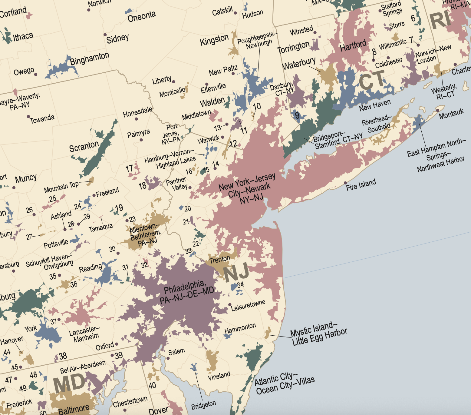
Urban Areas in United States/2020 US Census

–echoed in the even greater shift in the Bay Area and nearby localities of a density of populations greater than 10,000 that have increasingly impacted the ecologies and ecological habitat of the region that have interrupted the coastal areas, wetlands, and tidal zones that ring the Bay, itself increasingly surrounded or hemmed in by urban agglomerations that endanger habitat, as entities now known as Urban Areas, not cities, merge and slide into one another, paved tracts of urbanized land with no clear borders or bounds, as needs for interconnection trumps corridors of wildlife.

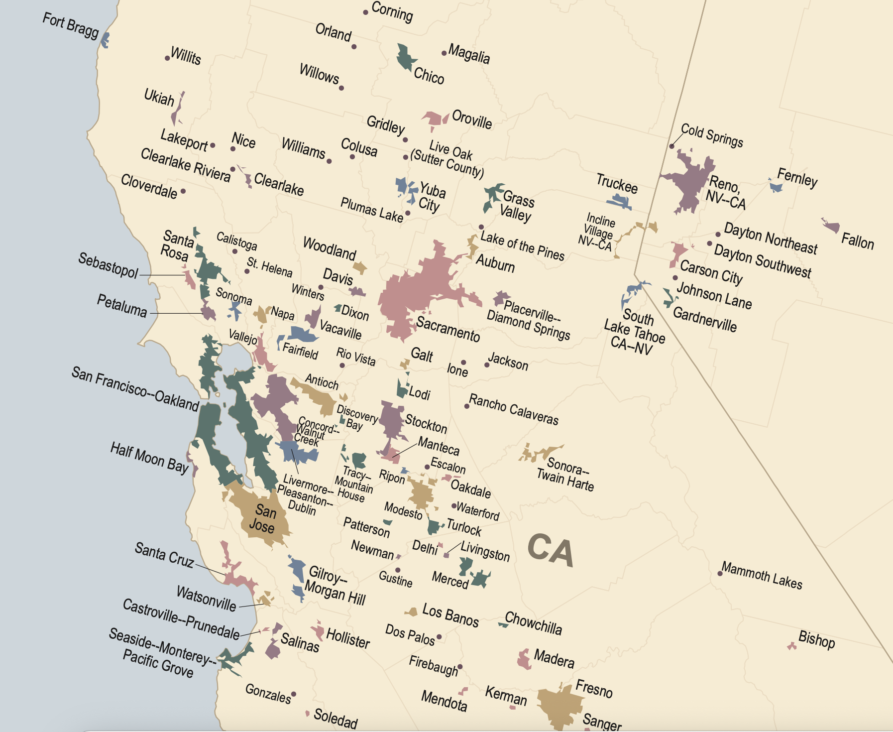
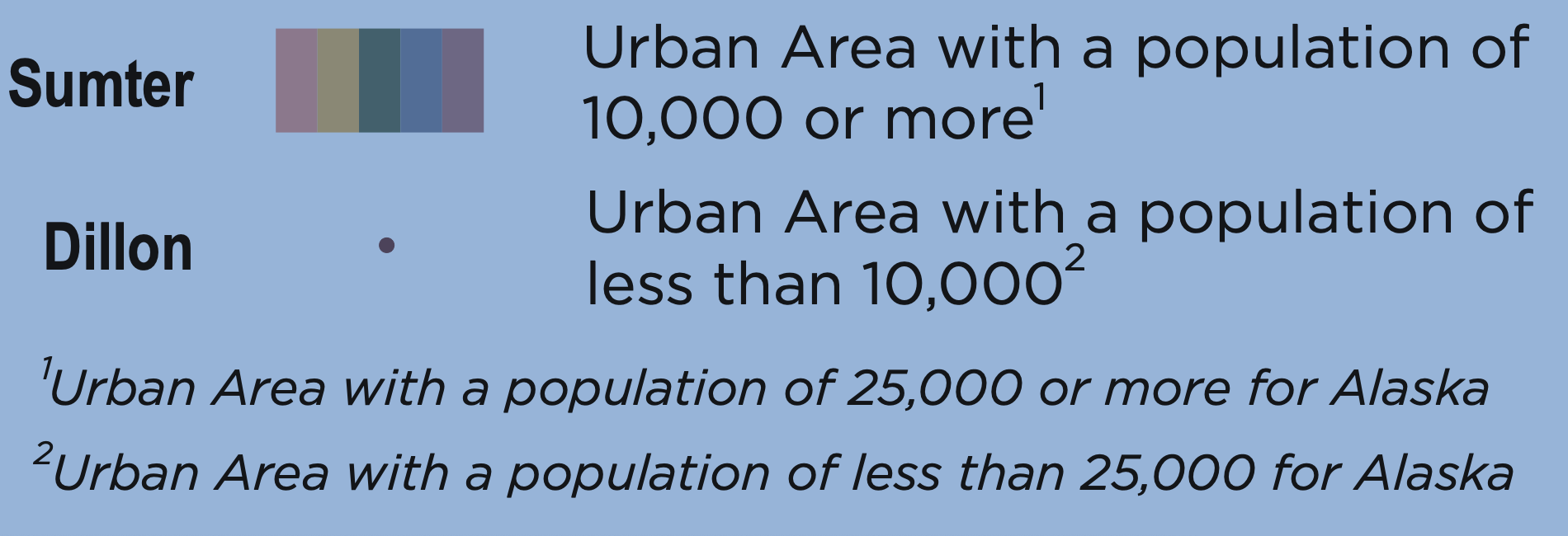
Urban Areas per 2020 U.S. Census of Areas of 10,000 or More

In the years leading up to the 2020 Census, the region was pervaded by deep anxiety, indeed, about the restriction of corridors for habitat and wildlife that have long distinguished the region, a contraction of habitat corridors that have become increasingly sensitive to many residents, in need of making their own reaction to nature, and indeed to map proactively to preserve the wildlife corridors. If wildlife corridors and shorebirds’ roosting places of shorebirds have been disrupted in the Bay Area, the massive urban regions that spread along the coastal southlands hardly provide a comforting contrast–San Diego seems to have spread to Santa Barbara–

Urban Regions in Southern California Coast

–but open space increasingly contracting across the nation, hemming in and fragmenting habitat as never before. If the greater population of Los Angeles’–3,795, 936 and approaching four million despite the threat of apocalyptic fires–exceeds all but ten states of the union, the crisis in political representation that this leaves the nation pales before the crisis of cartographic representation of a focus on built space, rather than on the dangerous abandon of curtailed habitat. If we map our own presence, we anthropocentrically map the anthropogenic world as if for posterity by building footprints and built space. Is this the most healthy map we can imagine to orient ourselves to the changing world?

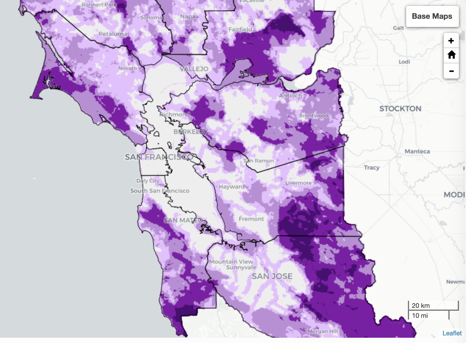
The attempt to create an interconnected network of transit roads comes at the costs of the access to nature and the habitat and migration patterns of much of North America. The mapping attempts to register habitat in San Francisco led a nonprofit, Nature in the City, to re-map the habitat corridors remaining in the city as a way of taking stock of this contraction by 2017, faced by the problem of the integrity of habitat in the city that has long defined by its relation to the wild and wild coast.

Urban Regions Nationwide in 2020 US Census

The moment of introspection or cartographic self-reflection is a worthy counter-map to the urban regions that the U.S. Census acknowledged,–and an anticipation of the need to affirm the existence of habitat in San Francisco. Habitat is too often overlooked, as the urban agglomeration of the Bay Area grows. If San Francisco was long a predominantly green city, majestically bounded as it is by the Bay and Pacific Ocean, dotted with parks and green space, although its development has been confined by faultiness, as much as by environmental strictures on urban growth and neighborhood improvement associations. He wasn’t talking about San Francisco, of course, which was long seen as a city amidst nature–as this print of a glass plate negative of c. 1910 from Marin’s Mt. Tamalpais looking East shows Marin’s shoreline a watershed of winding rivers and streams that fed the bay–

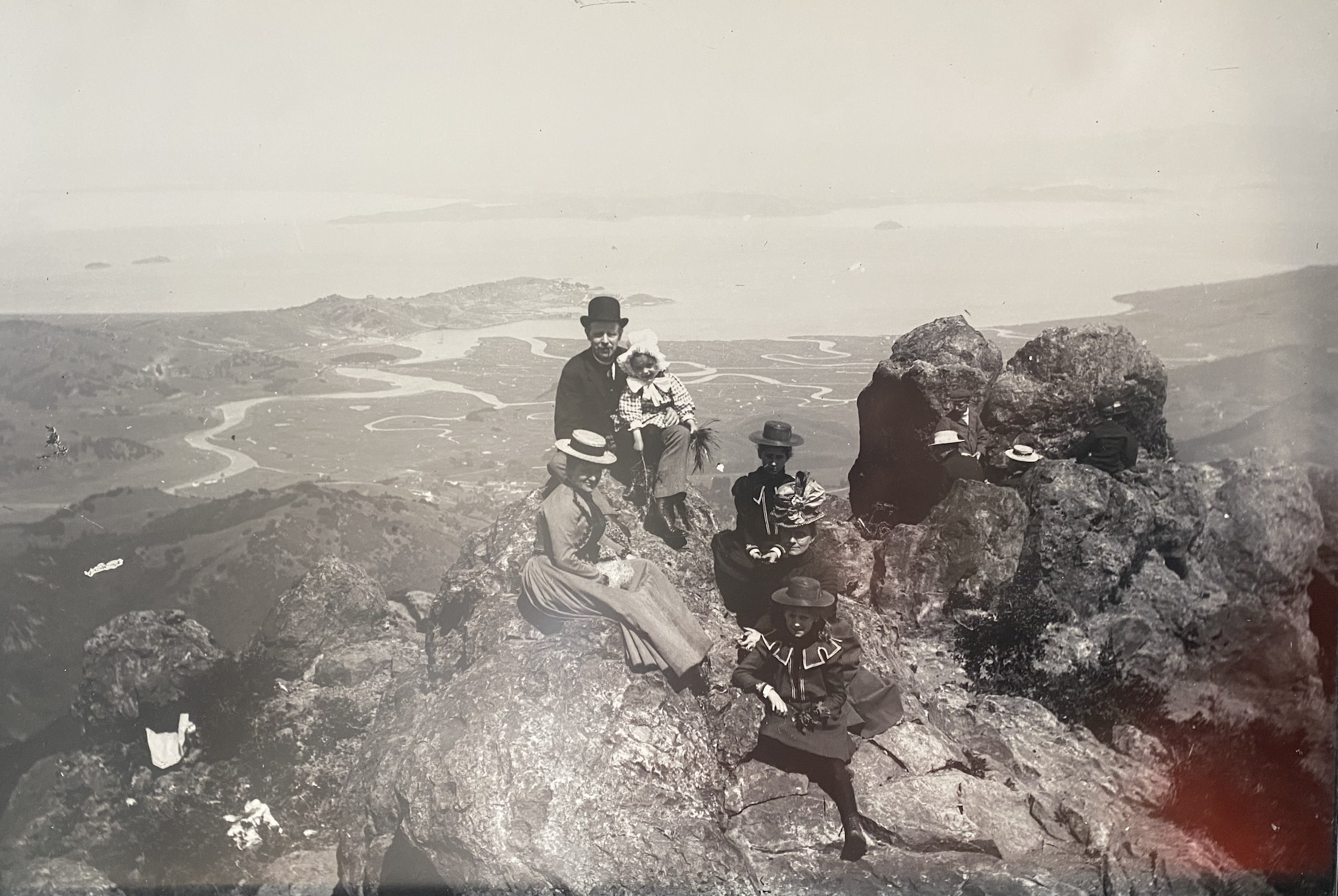
–before the Bay Areas wetlands were radically redefined by landfill to increase housing along the coastal shore, dense fogbanks left Angel Island barely visible in the bay from Mt. Tam, suggesting a habitat now lost of winding estuaries. The shifting of the current habitat over the past century raises problem of preserving pathways of habitat in urban life is pressing for expanding cities, increasingly paved and welcoming with garbage urban interlopers as crows, rodents, and stray animals, and the dogs invited in as companions and guests. Increasing visibility of murders of crows in urban skies suggest an actual invasion of flocks invading parks in downtown San Francisco and Oakland, larger that ever populations dominating and consequently compromising habitat, even if it looks the same: as the population of crows in Oakland unprecedentedly doubled from 2021 to 2022, after reaching a high the previous year, San Francisco birders counted count a record 2600 in one day in 2024, so teeming with roosts to be renamed San Franciscrow. As populations of corvids fill the streets and telephone wires for reasons form climate to increased garbage, one may increasingly lament the increased decline of habitat due to paved space and climate change,–and less often exult hearing the loud screech of year-round native residents as the California scrub-jay seek to reclaim its territory in remaining East Bay trees from the larger invasive corvids.

Ever-expanding urban regions raise pressing questions of islands of greenery and clusters of trees and open spaces in cities, often overlooked in the earlier mapping of expanding urban space. In contrast, the mapping of routes in which nature can continue to inhabit our cities is not only of ecological interest, but central to making our own urban spaces more biophilic, –friendly to residents beyond our own species–while we can, preserving and enriching open space on the margins of cities, in the face of the continued over-development and impermeable ground soil. To encourage habitat beyond back yards and parks, we need scaffoldings in built space all too often overlooked. We must consider habitat for wildlife beyond enclaves for the appreciation of human residents, available for the aesthetics of posed photos or instagram posts, or contact with the wild, but increased attentiveness to how we situate ourselves in nature, to try to rectify the rapid pressures of urban space, restoring imperiled habitat in urban areas of increasing density, where area of woodlands, fields, flowering trees, and open space remain at a premium, and most of our mapping tools have failed to register the scale of its loss.

For many years, building has disembodied islands of habitat in cities, leaving questions of the preservation of interconnected nature of throughways and linked passageways in the city of San Francisco is increasingly of concern. Even in the city by the Bay, between Bay and Ocean, the areas of viable habitat have shrunk, and stand to shrink more due to climate. We can only hope to foster and nurture such open space–shifting, even in and on the edges of cities, our perspective from urban residents, to nurturing space for and relation to nature that cities are able to accommodate, a question of cohabitation that is especially evident where the proximity to nature once existed in real terms–both on the wetlands of the Bay, but in urban space. The data tools to trace such habitat must be sensitive to the demands of species that we want to recognize, and to preserve areas for them to flourish, meshing a qualitative and quantitative view of cities, but also trying to consider the marginalization of habitat that is the inevitable consequence of the expanse of urban area. And notwithstanding the limits of LiDAr tools as to track remaining greenspace in cities by its disembodied data, the Nature in the City project uses the open areas of urban space to track the habitat that allows some species to continue to flourish by the bay, in hopes to reembody the vitality of built space.

The map is, to be sure, limited in foregrounding the dangers of invasive species encroaching in the tidal marshes of much of the Bay, as the green spartina that has filled local wetlands across over 70,000 acres of the bayshore lands, only recently restored, or the city, filled with increasing crows and seagulls. But in tracking charismatic species of the region, it hopes to orient readers to habitat pathways remaining urban space, inviting them to dedicate their own attention to their survival and pose pressing questions of what sort of city we want to live–and how we can continue to preserve nature in urban space, hoping to integrate where nature survives in San. Francisco’s urban space, and not only purely aesthetic sensibilities. It was ask us to consider the real reasons of the need to preserve art and cartography, integrating the qualitative records of urban environments and quantitative records of the ever-expanding outlines of built space, the maps is also a chart of the survival of habitat in our increasingly unwieldily urban regions. And if we decreasingly see the native scrub-jay calling in local trees to stake out its own territory encroached by invasive corvids, the preservation of islands of habitat trace important forms of resistance to paved expanse.

1. One real (cartographic) aspiration is to situate ourselves in a world to understand our relation to it, as the Bay Area’s paved sprawl became mapped by 2015 as a loci of traffic for commuting, more than a lived surface, dominated by commute routes of impermeable surfaces. The Bay Area has indeed become a mega-commuting area, a metro of some 7.5 million, almost as large as the 8.258 million in the five borough of New York City, the extent of whose commuting may suggest the primary nature of connectivity of paved roads, rather than spaces of animal habitat.

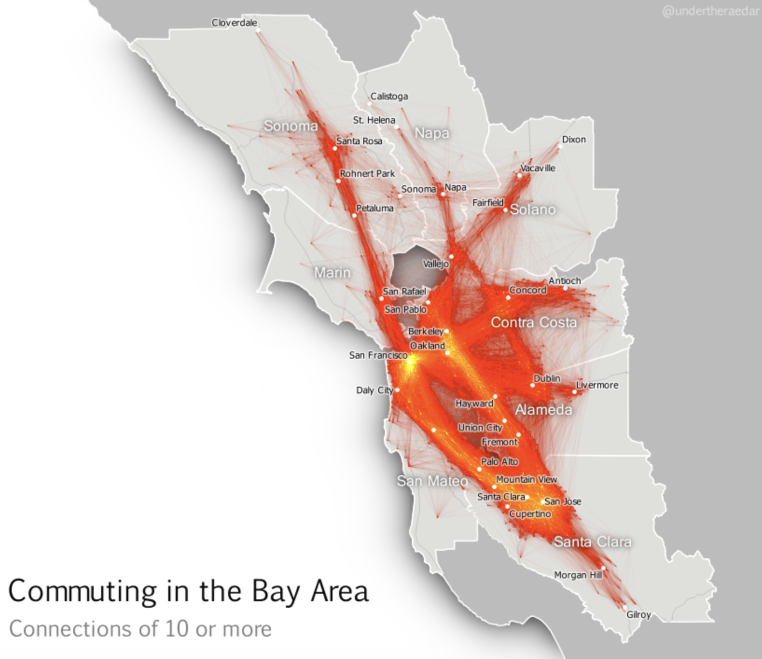
AlisCommuting in the Bay Area, 2015/Alisdair Rae

Far more likely is it to see the migrations of animals from an Aristotelian perspective in which animals are non-thinking actors, the commuter interconnections allowed on paved surfaces and public transit offering a primary nature of interconnection by which the Bay Area is immediately understood as a coherent unit. The abundant environmental datapoints on San Francisco’s actual animal habitat provides a possibility of mapping the continued presence of natural wildlife the city is permeated. The remapping of San Francisco’s actual nature provides, it is hoped, maps to help appreciate and even preserve the connections of animal habitat that have survived the Bay Area’s expanding footprint of impermeable ground cover, even if paving has pushed the presence of nature farther away from the primary lines of commuting, the hope is that the interstices of the natural world might still be able to survive. Indeed, the securing of interconnections and passage ways for nature is needed to ensure the continued vitality of urban areas as habitats, and prevent the further fragmentation or division of spaces wildlife is. able to exist and flourish.

If we imagine interconnections of the Bay Area by analogy to transportation infrastructure, we might approach a deeper understanding of the migration patterns and natural presence that continues amidst the growth of ground impermeability and urban footprints that changed the ground cover and distance from the rocky outcroppings on which this family is elegantly paused on what seems a weekend jaunt. Any deep dive into San Francisco’s tie to nature, after all, starts from he sea–some fifty daily ferries by the 1930s, shuttling fifty to sixty million passengers transbay yearly, a quarter of a million being ferried daily to make landfall at the Ferry Building from hundred and seventy ferries, or traveling along the ferries that used to carry drivers on the first transcontinental motorway across the nation, the Lincoln Highway, and ferry them from the end of the Berkeley Pier that jutted into the Bay.

The deep structures of Bay Area before the Bay Bridge and Golden Gate reshaped webs of transbay travel, and to reconnect to urban ecology. Not only for reasons of public transit did Lewis Mumford bemoan the foreclosure of a relation to the rich ecosystem on the bay waters the Bay Area accepted in budding a bridge linking Oakland and San Francisco, which sent “a once unnecessary volume of private traffic between them, at a great expense in expressway building and at a great waste in time and tension, spent crawling through rush-hour congestion.” The volume precipitated a demise of past public transit webs, hardly resolved by the tunneling of the Bay Area Rapid Transit, but present in the old postcards that preserve the deep blues of the urban skyline in ways we hardly see at times from a bays whose coasts are spanned by three expansive anchored suspension bridges.

Cross-Bay Ferry Transit in San Francisco Bay and Ferry Building, Post Card sent 1930

But we have hardly begun to map the compromise not only of our relations to the huge range of avian life that the bay supports, and the range of birds who arrive from land, but the support that the Bay still offers marine life that leads whales and dolphins to enter the bay. These spaces are increasingly important to map, and map from the prospective of the collective intelligence of species, as much as the urban footprint of the city’s built space. This is true given the precious nature of the proximity to the wild spaces of oceanic expanse. and the interconnectivity that for so long distinguished the Bay Are from other urban areas. As ecologist Hugh Warwick notes, at a time we are facing an unprecedented fragmentation of habitat, it is incumbent to preserve spaces for interconnection crucial to species in an era when the world, increasingly shaped in unavoidable ways by the near-ubiquity of human presence, isolating islands of habitat to deleterious effects.

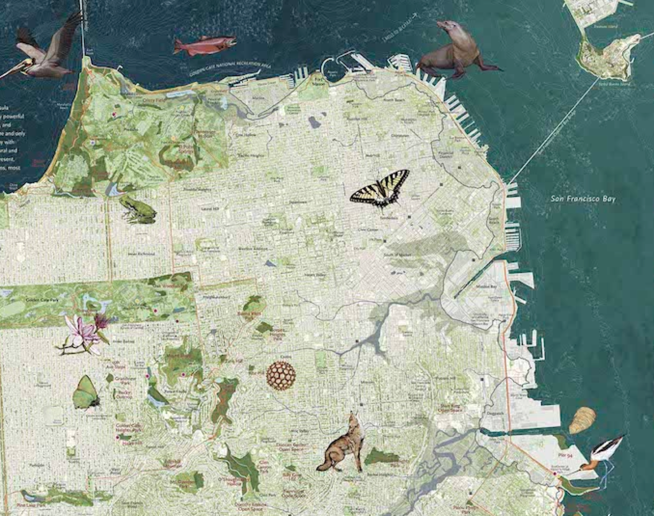
We move farther from the water of San Francisco Bay today, but the data maps of the access to lived habitats both onshore and offshore around the Bay in the mapping project Nature in the City began in 2005, and is currently available with enhanced LiDAR data in its third edition, to map the benefit of tracking and preserving habitat in an overbuilt world of increasing human footprint. The map has the uncanny and needed ability to focuss attention on we do daily, noting trails, natural scenery, and habitat as well as charismatic species to help cultivate our relation to a natural surroundings. And if this blogpost may seem unduly long, it arose from a deep appreciation of how the map seeks to offers a refreshing reorientation to our urban spaces, speaking to possibilities of preserving the access to nature and habitat cities might be able to offer. As we face the danger of a vision of the city whose homeless request seeded bagels to feed to birds, it is strong testament to the importance of preserving some access to “nature” among the people who live on the city’s streets, and seem to be starving for it on a level with their own daily bread. Isn’t the problem of how to make our cities more appealing and nourishing part of what increasing study of urban ecology and preservation of urban habitat about? Isn’t the problem that the collective knowledge by which species return–from migrating birds to other wildlife pressed out of their earlier ecological niches–in maps whose edges, polygons, and datapoints are increasingly defined in exclusively anthropocentric terms? The cover of Nature in the City’s third edition shifts attention from the built city to the edges of the city’s place in nature, magnifying the habitat and flora and fauna, foregrounding the residents and natural topography of what many see only as a built space.

Nature in the City, cover of third edition (2018)

We have of course only recently been determined to map urban health in new ways by access to nature in credible ways. Although the pleasures of open-air transit across bay waters gleaned in from tinted postcards, that suggest the more expansive skies and seas of a century ago, suggest both a more open “sky line” and far more intimate relation to bay waters, an point of departure to take stock on the persistent presence of nature in the city by the bay, and indeed to consider the different notion of its inter-connection, and why these interconnections are so important to cultivate, experience, and continue to preserve–not only in its rich shorelines but the dynamic vitality of its shores, parks, and the survival of its still rather plentiful unpaved areas, by focussing on the charismatic species that fill the urban space, whose habitat we may risk overlooking. Despite the limits of LiDAR sensing, the green spaces of the base map for this map suggest the areas of vital habitat that survive in the city, and the wildlife corridors they create, as if to undo the anthropogenic focus of most maps on built space. If that space was, uncannily, and unintentionally if with some surprise rediscovered in the pandemic, as increasingly audible birdsong filled many of the parks with the receding of much anthropogenic noise, the map offered a template to reorient ourselves to urban life and to take another look at built space.

Nature in the City Map (2018)

We often sense nature only through the calls of owls and morning doves, and increasing number of families of crows searching for food, is there not a therapeutic benefit of trying to map the relation to natural habitats across the ever-expanding ecological footprint of urban space, even as so many commuters daily drive to and around San Francisco in our cars, more than by foot? Even if the massive freeway once designed to run along the bay was cancelled, only by mapping the resilience of a relation to nature can we take stock of the rich biodiversity that exists in the city, in hopes to cultivate it both on the ground and in our minds. And if the wildlife that is increasingly mapped in the city have been mapped to suggest the fragile nature of its relation to the wild, it also shows the continued porous natural presence in the city, encouraged by parklets, green spaces, large open fields, and a connection to the water on three sides.

The place of nature of San Francisco may have constricted, but cartographers have recently realized its importance to map. If measurement has been outsourced to numerous devices–from not only height and weight, but caloric intake, income, carbon footprint, and racial identity, the mapping of the proximity between nature and the city in the Bay Area is concentrated in San Francisco, bound by beaches, hills, and habitat. As a Midwesterner, Gass was aghast at what passed as “nature” for city-dwellers, marveling dryly at their lack of consciousness at their reduced collective relation to a natural world: “Nothing can live and remain free where he resides but the pigeon, starling, sparrow, spider, cockroach, mouse, moth, fly and weed, and he laments the existence of even these and makes his plans to poison them,” Gass writes with the relish of his perspective, before adding onto the jeremiad his final punch: “His parks are potted plants.” The reservoirs of green that interrupt the urban footprint of San Francisco are hardly afford a coherent ecosystem, but relations of urban and rural that animate so many west coast cities have made it urgent to remap relations of “urban” and “rural” that were once clear dichotomies, pushed by the increased absence of open spaces that once surrounded cities like Portland, Seattle, or San Francisco.

2. The natural residents of San Francisco do not include rats (who arrived in the United States only in the 1800s), if it is the second-most infested in the state, crows, residing in in the Bay Area since the 1870s, if only recently did birders count 2,300 in but one day, creating a cacophony of squawks from big murders that conjure Alfred Hitchcock in city trees, or other opportunistic foragers as the seagulls, but the city’s infrastructure accommodates a considerable wild. If the squabbles of western seagulls in San Francisco may harass the pelicans, the territorial birds and rodents are rarely countered as protected or sensitive among the large numbers of declining species many have hoped to encourage in urban habitat. As even population of the American Crow is in decline, we are caught in multiple catastrophic states that have been released upon the world, of which the declining avian population of the nation is a bellwether.

Even as gull populations decline in San Francisco–from the ring-billed to the western gull, if not the California–with the American Crow, Avocet, Cliff Swallow, Willet, and Forster’s Tern, the niches of wildlife habitat that the city offers is especially important to preserve, as essential grasslands and wetlands are being lost to development. Even as not only bird watchers hundreds of murders of increasingly ubiquitous crows are descending on the Bay Area, more than other bird populations, as other American urban environments, amidst the massive incursions of corvids, bird populations in green spaces offer a valued ways of sighting nature in the face of the startling declines of American crows, starlings, song sparrows, willets, avocets and wigeons in San Francisco. The sight of corvid populations seeming to swarm trees, telephone wires, and church steeples appears so aggressive to be straight outta Hitchcock, an arrival so massive to intimate deep disturbances of anthropogenic worlds, as cries of sizable populations of urban scavengers stake claim to streets, telephone wires to the apparent exclusion of other, smaller, avian species, making permanent claims on urban space. Only occasionally does one hear the indigenous scrub-jay, atop its own tree branches, screech as if to stake out its own claims to territory in the face of other corvids.

Robert Alexander

Indeed, if the Golden Gate Natural Recreational Area, a Marin-based park that hosts two thousand plant and animal species over nineteen distinct ecosystems shares the largest boundary with an urban environment of any national park, the focus on conservation that brought together what has been heralded as a “new urban park” was created by cobbling together public and private lands that redefined the value and relation of the constellation of interconnected parks to urban space that presents a compelling model for a new urban park” outside of the growing city, and a new relation of nature to the city than Gass experienced. Awareness of the biophilic needs of urban inhabitants for contact with urban greenspace, that has prompted active redesign urban environments in an increasingly overpaved world. Recent evidence on the benefits by which greenspace reduces stress and mental illness makes the question urgent. And the recent mapping the presence of “nature” in the city’s urban environment cannot be reduced to parks alone. Biophilia is not just the self-congratulatory boost from the mutual admiration society of dog-owners, eager for inter-species contact, but a sense of creating habitat for other animals, an inter-species appreciation of occupying space. And perhaps our opportunities for creating wildlife habitat is increasingly important in an era of increased anthropogenic change.

As our contact with nature and the natural is endangered or at risk of deterioration, the perspectives that open space around San Francisco offer on the ravines of built space make the case for remapping urban space and open space that the nonprofit group Nature in the City rendered in their 2017 map, as a necessary and important counter-map to the data maps that privilege the permanence of built space or the expanse of built space or its human density, but how habitats intermingle with the built environment of a city like San Francisco, shifting a tacit prioritization implicit in all maps. San Francisco is, of course, the beneficiary of the huge area of the nearby Sacramento Delta, through which over 40% of run-off from the Sierras have long flown, bringing with them sediment from the mountains that flows to the sea, creating alluvial deposits that have made it a nexus for fifty mammal and fish species, from salmon to striped bass to sturgeon to steelhead trout and endangered smelt, and a stop on the Pacific flyaway from Canadian geese to sandhill cranes, and a habitat for over two hundred bird species, twenty reptiles and amphibians, attracted by sediment-rich marshes of the watershed’s historic wetlands and open lands. Can we map their presence in the city nearby? Or do we not have to do so better than in the past?

If the threat of habitat loss is ranked by the UN Convention on Biological Diversity as among the greatest of threats to biodiversity, along with invasive species, climate change, and pollution, a map of remaining pathways and corridors of habitat in cities like San Francisco provides among the most relevant of orienting benchmarks for our time.

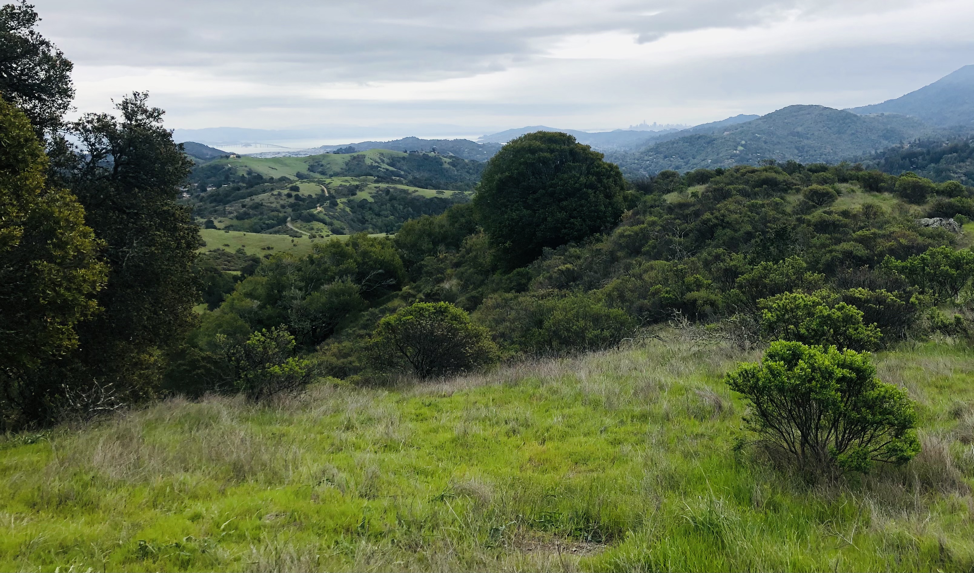
1. The recession of the “city” in their recent 2D map–just barely visible as a skyline a full three quarters across the view form Loma Alta Open space, in Marin–the Nature in the City map inverts the equation, by asking us to view the city in its relation to surrounding habitat that still presents a living ecosystem that enters the city’s paved streets.

San Rafael Bridge and San Francisco Skyline Seen from Loma Alta Open Space, Marin CA

Long before politicians railed against cities, asking where the heart of the nation’s heart lay, this icy put-down summoned the identity of the interior to dismiss the paltriness of urban parks as poor replacements for the nature world. But the if the built centers of San Francisco have grown in recent years–both in its downtown skyline and neighboring Oakland–as any departing airplane can see–the maps we make of our changing cities demand we attend to how they invite us to explore and navigate urban space in all its dimensions–including the role of the city as an ecosystem, as much as a built structure.

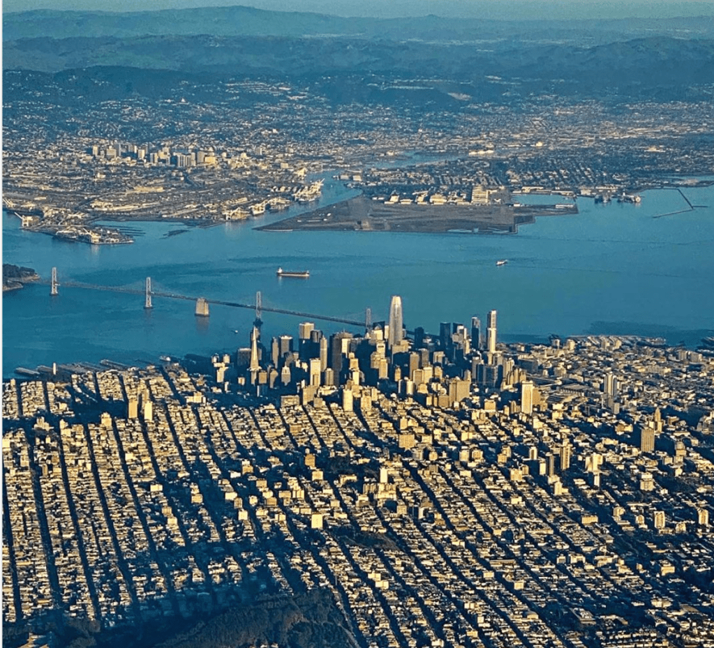
We bristle in San Francisco at the dismissal of our built environment, or verticality as a measure of cosmopolitan urbanism. From the seat of the departing plane, one might forget that the city not only borders significant greenspace across the Bay, but that San Francisco and the East Bay are living habitats–if ncreasingly sensitive as a site of potential habitat loss. Greenspace demands preservation as an ecology that many city-dwellers often fail to note.

As increasingly mindful outfits like the Nature Conservancy seek to preserve a public consciousness of the need to mitigate incursions of urban areas into the urban greenspace, we might ask not only how to convince public planners and developers to be more conscious of such incursions–and the serious problems that they create for fire, as well as compromising ecology and habitat. While the most rigorous conservation plan. based on the Bay Area “Greenprint”–to be extended to all California–calls attention tot nearby critical ecosystems demanding protection by a”Mitigation Wizard” from the sightings of the most at risk species’ to stress the sensitivity of their habitats–

–the intersection it creates between habitat and potential extra-urban growth is designed to better help us negotiate the futures that the Bay Area might meet. Tracking the density of species in critical ecosystems lying in proximity to the Bay Area’s urban agglomeration, different levels or criteria of conservation can be entered against current natural science observations of sensitive habitats of up to one hundred species around San Francisco’s wetlands, forests, and grasslands that can create a dialogue between areas ecological sensitivity in close proximity to urban growth. The hope is to offer a baseline for mitigating the effects of urban growth–and to elevate those concerns to a level comparable to the attention to property that is increasingly seen as vulnerable to sea-level rise, the aridity, fire risk or soil subsidence as consequences of warming and temperature rise, acknowledging local ecosystem integrity as consequences of anthropogenic change.

Continue reading

1 Comment

Filed under Bay Area, data visualization, environmental geography, San Francisco, urban ecology

Russian Blues

The projected map was a subliminal reminder of the stakes of the speech Vladimir Putin delivered to the Federal Assembly.

For all its modern appearance, the glowing map of the Russian Federation that recalling a backlit screen, seemed an updating  of Soviet-style theatricality and state spectacles.  As if in a new theater of state, the map of a magnified Russia seemed to cascade over a series of scrims that framed Putin’s head during the annual State of the Nation address, which he had moved to weeks before he stood for reelection to a fourth term from its traditional date.  Putin was projected to win the election, but projecting the map under which he stood identified him as a spokesman for Russia, and identified his plans with the future of Russia–


Map crisper curved


–and allowed him to present a “State of the Nation” that projected the future global dominance he foresaw of Russia within the world, and allowed him to present an argument of protecting the boundaries of Russia, and the Russian Federation, even in an era when boundaries and the mapping of boundary lines are not only contested but increasingly without clear meaning.  Putin’s involvement in aggressive actions beyond the borders of the Russian Federation–whether in the American elections, as all but certain, if of unclear scope; the invasion of Crimea and Ukraine; or in the elections of Brexit and Hungary, or poisoning of Russians in other countries, all distracted national bounds.  But all were presented, in a cartographic sleight of hand, as a vision of Russia as a state of the twenty-first century.  If our current maps no longer follow the “jigsaw puzzle” of the map that the icon of the luminescent map recalled, and the global reach of Russia’s missiles that he claimed could not be intercepted.


Russian Missiles


Remapping the Russian Federation was the central take-away from Putin’s speech to the Duma–even while allowing that “we have many problems in Russia” with twenty million Russians living below the poverty line, described the need to “transform infrastructure” and claimed that Russia faced a significant turning point in its history, which would alter its relation to space.  Indeed, the argument that Russia “had caught up” with the mapping systems that were used by the American military since the 2003 Iraq War–one of the first international conflicts that Putin had encountered as President of the Russian Federation–and suggested the lack of clear limits to frontiers, or anti-missile rockets to the global scope of a new generation of nuclear-power Russian ICBM’s.  A statement of the resurgence of Russia–and a renewed defense of the foreign policy of the Russian Federation–all but erased or whitewashed Russian military presence in Georgia, Ukraine, and Crimea, presenting the arrival of Russia on a global stage through an awesome holographic map.

The map offered something of a “warrant” or guarantee of the arrival of the Russian Federation on a global stage, and provided viewers a reassuring image of Russia’s prominence on the global map, despite the fairly dire state of domestic affairs and the limited plans for expanding national employment or social welfare.  The value of the map, mesmerizing in its illustration of the entirety of the Russian Federation, provided an illustration of foreign policy and argument of expanded powers of global intervention, by which Putin, former head of state security, sought to suggest its arrival as a ‘strong state’ despite the historical challenges and setbacks of earlier regimes, and what Putin has long seen as “the greatest geopolitical catastrophe of the century,” the break-up of the Soviet Union.  The map met the need to bolster Russian self-esteem, and indeed identifying esteem with the territorial protection of “Russian rights,” irrespective of the boundaries that were drawn or existed on other maps.  For while erasing Russian intervention in Chechnya, Georgia, Crimea, Kyrgyzstan, and Ukraine, the map sought to project an image of the consolidation of Russian abilities for “global governance” as an extension of Russian sovereignty.

It is striking that the map was a reflection of the manner in which Putin had long understood or seen the invasion of Iraq in 2003 as an extension of American claims to sovereignty, in violation of international law, and the new image he wanted to create of Russia’s similar abilities to ignore national boundaries and boundary lines.


Putin weapon launchVideo grab from RU-RTR Russian television (via AP), Thursday, March 1, 2018, allegedly portraying Russia’s firing of a nuclear-powered intercontinental missile

The map affirmed the arrival of a new consensus in the Russian states and ethnic republics–members of which were assembled before him–to recognize the arrival of a new role that Russia could occupy and would occupy in the global map.  Indeed, the made-for-television map of the Russian Federation suggested the new relation between local and global–and of Russian sovereignty and international abilities for “global governance” that would be guaranteed by an expanded arsenal of nuclear weapons, in ways that demonstrated the expansive reach of Putin’s Russia far beyond its boundaries, in ways that would upstage the American use of GPS in the Iraq War, and the precedent that that war set, in Putin’s mind, for flouting international law in the assertion of American sovereignty–despite the multiple logical problems that were avoided in making such a claim.  But it seems that much as George W. Bush’s headstrong rhetoric of fighting “terrorism” was adopted wholesale by Putin in subsequent violations of the sovereign rights of Ukraine, Crimea, or Syria–and the justifications for defense of Russian interests as the same as sovereign grounds.
made for TV maps.png
The broadcasting of Russia’s possession of a new generation of intercontinental ballistic missiles, unable to be intercepted, as well as designed to frighten the United States or a feign to enter into an arms race, were presented as the basis for illustrating the lack of Russia’s need to respect any cartographic lines or continental divides.

1.  The pre-election State of the Union address, as if a continuation of the diatribe Putin launched against the West for “trying to remake the whole world” unilaterally and in accord with its own interests, provided a broadside of the determination of Russia to defend its own interests, rather than seeking through military invasion or moving of its troops across borders to “reinstate some sort of empire.”  But his discussion of how “turning points” in history determined the foundation of cities in Russia and its relation to “space” seem on the point–and a bit of pointed positioning in regard to Russia’s future positioning on a geopolitical map.

As if to respond to the ion, Putin focussed most theatrically on its development of “invincible missiles” and nuclear-powered arms as defensive weapons in a two-hour address before a packed hall that was punctuated by repeated ovations and applause.  He  omitted any mention of Russian presence abroad, but focussed attention on the Russian nation as able to protect its allies adequately and preserve its place in a “rapidly changing” world where some states were bound to decay if they did not keep up with the pace of change.  As an almost entirely male audience uneasily awaited Putin, turning in their seats, greeting each other, staring ahead stonily or smirking and nervously straightening blue ties.  All faced the glowing blue map projected above an empty stage in the new venue, as if into their minds, as if in preparation for how Putin would remind them of the problems of charting Russia’s future course, even as they may have been most satisfied with the unprecedented foreign influence Putin had achieved in much of Europe, Hungary, England, and the United States.  When Putin took stage with triumphal music, describing how the “significance of our choices, and the significance of every step we take . . . [will] define the future of our country for decades,” and a new time for Russia to “develop new cities and conquer space” after maintaining the unity of the federated nation and its stability in the face of great social and economic difficulties but still faces the danger of “undermining [its] sovereignty.”


Map crisper curved


Projected onto multiple scrims, the glowing image of the Russian Federation lit by glowing centers of population echoed Putin’s discussion of stability, and the need to affirm the “self-fulfillment” of all Russians and their welfare through new economic policies, which he assured them had nothing to do with the upcoming elections, but cautioned that the failure to create technological changes would lead to potential erosion of its sovereignty despite its huge potential.

The glowing national map dominated the room overwhelmingly in which the three-term President spoke, describing the as he aimed to win an election to continue his Presidency through 2024, and convince all Russians of his leadership of the nation.  Below the map, unsmiling, Putin solemnly addressed the nation as if he were its architect and the protector of its bounds; indeed, the projection of the fixed bounds of the Russian Federation onto a set of screens behind him seemed to celebrate its continued power vitality after three terms of Putin’s presidency, even as he recited fairly grim statistics about the state of the national economy.  Describing the need to enhance its civil society and democratic traditions, Putin raised the prospect of once again “lagging behind” other nations, its body politic undermined by a chronic disease, and define Russia’s future, if its modernization was not affirmed in the face of .  The continued coherence of the nation reminded viewers that, notwithstanding threats of dissolution after the fall of the Soviet Union two decades ago, and a reduced GDP and natural resources, the Russian state was back.

The map of Russia was projected in isolation from the world, but the image that resembled a back-lit glowing screen became a basis for projecting the power Russia had regained on a global stage.  Rather than imitating the graphics of a paper map, the iridescent blues, splotched with centers of population, called attention to the permanence of the Russian Federation’s borders and affirmed its new place in the world.  The bounds of Russia were protected, the triumphalist image implied, but the place of Russia on the world stage was implicitly affirmed even if it was shown in isolation:  rather than showing people, or including any place-names, the map magnified the idea of Russia, and its futuristic projection suggested the continued power of Putin to transport the nation to modernity, its boundaries protected and affirmed and its defense of allies acknowledged.  While Putin had recently accused the United States of triumphalism, insisting that Russia was indeed “self-sufficient” and denying Russia was “encroaching on its neighbors” as “groundless,” he seems to have relished a new triumphalism, and famously continued to present the invincible military weapons Russia had developed–lasers, ICBM’s, which, nuclear torpedoes, and nuclear-powered cruise missiles–which, while not revealed “for obvious reasons” would definitively displaced the United States from a position of global power and could penetrate US Defense Systems with ease..


Video in State of Union address.png

Continue reading

1 Comment

Filed under geopolitics, globalism, nuclear strikes, Russia, Russian Federation

The Revenge of the Infographic?

Long before Barack Obama was a candidate for President of the United States, he took time to chastise the nation about the tyranny of the infographic that divided the nation.  Obama used the occasion of his endorsement of John Kerry’s nomination at the Democratic convention in Chicago to remind the nation of the danger of presuming the divide red states from blue states by the clear chromatic fashion that already increasingly increasingly filtered electoral maps of the United States, and has since come to haunt us in the Trump victory of 2016.  And if we were energized by the notion of “swing states” that might be shifted to the Democratic column back in 2012 and 2008 that increased the involvement and political participation of many in the electoral grid, the resurgent immobility of the electoral map divided between what seem to be continuous regions parsed into “red states” and “blue states”–

electoral-trump

–as if it were permanent divide as well as a fluid choropleth that refracted the spectrum of the American flag.  Indeed, the stability of the fractured electoral divide invest a sense of permanence as an electoral landscape, as the two-color infographic seems to have crept into our unconscious:  while it may be a proxy for an urban-rural distinction that has been championed both by the Trump campaign and as a dominant gloss of the infographic, has the divide invaded our consciousness in ways we are able to gain little distance?

America was, after all, once collectively energized at the prospect of tilting against the inevitability of a red-blue divide in the nation.  If Barack Obama sought to chasten readers of infographics in order to breath life into Kerry’s 2004 nomination as Democratic candidate for the United States presidency, his words were not only energizing, but prophetic of his own candidacy.  For they articulated the possibility of transcending electoral divides as a touchstone of his campaign strategy, foreshadowing Obama’s later electoral success.  And when we hear Donald Trump’s celebration of the “heartland” as the ‘Real America’ as if it might be searched for and found on the map, somewhere far away from “coastal elites” or intellectuals, it serves to conceal Trump’s truly narrow electoral victory by articulating a “real America” with which we on the coasts lost touch.  The spate of much-publicized post-election pilgrimages into the “heartland” by Mark Zuckerberg as self-defined coastal elites sought to find”normal America” needs to be rethought:  it seems to project a creation of the very infographics we’ve long consumed to understand democracy, or as a surrogate for democratic elections, more than a real place.  For where we find “the real America” alleged in so many maps in the contiguous sea of red–

348px-ElectoralCollege2016.svg

–we have recently found that the red is both far more fractured, and even often echoes the very sort of “news deserts” that are associated with the dominance of local news in media markets dominated by the Sinclair Broadcast Group, whose dissemination of a right-wing agenda to the televisions of 40% of Americans seems to have increased polarization in the last election.  The decline of local press–and the absence of paper newspapers–seem in another reminder of how the end of the local reporting poses deep dangers to our democracy–and invites unpredicted sorts of vulnerabilities.

Pearson Brodcast.png

Vox, using dSinclair Broadcasting Group data cross-checked with Nielsen; darker areas denote where Sinclair runs more than one station

The divide between red and blue masks the dominant place of far more determining sites of constituencies that are more up for grabs–and my determine the election as extra-urban areas that are demographically distinct, and difficult to cast as blue or red.  The refusal to divide the nation into red and blue states, an increasingly meaningless unit, opened the possibility for change that the dominance of infographics in mediating and reframing our democracy has militated against.

Back when Obama energized the convention by reassuring the nation as well as delegates who had assembled in Chicago that, despite the evidence of infographics, the fissures of a fractured body politic that many maps continued to project were not destined to divide the nation:  “We’re not red states and blue states; we’re all Americans,” Obama urged, “standing up together for the red, white and blue,” even if we were powerfully represented as contentious factions on electoral maps.  The reservations that Obama expressed was compelling as an alternative vision of national unity; it in a sense under-wrote the mantra of “Hope” for a new way of seeing the nation, although this division seemed to return with a vengeance in 2016, as if it haunts the nation.

348px-ElectoralCollege2016.svg

The divide was, perversely, as powerful back in 2004, back when Obama first chastised the nation so firmly for having adopted the divide as inevitable.  So rhetorically powerful was the visual image of national unity as a rebuke to the fracturing of the map to announce Obama’s oratorical eloquence to the nation.  It seemed a healing balm for a riven republic, even as the 2004 election, despite its clarity of divisions by state, trumpeted in a powerful infographic that suggested isolated bodies of blue set apart form an apparently alienated flyover country that blared bright red indignantly–

6a00d834515edc69e200e54f4593618834-800wi

USA Today/BeldarBlog

–in ways that were echoed if not accentuated in the county-by-county breakdown that USA Today issued the day after, and the way Bush dominated what have been called the “battle-ground” states–then Arkansas, Florida, Minnesota, Missouri, New Hampshire, New Mexico, Nevada, Ohio, West Virginia, Pennsylvania–as he did nationwide, even if the distribution didn’t break down at all so smoothly along state “lines”–

Mark Newman Red:Blue ma2004countymap-final2.png

–to muster the bulk of electoral votes out of the hands of California, Illinois and New York and served to create a solid electoral alliance all the better able to isolate Texas.

The “real America” might well lie in the edges of the blue and red, or the “purple” counties where political debate needs to be foster and occur.  Indeed, the image of divisiveness haunted the political imaginary of the nation so much the nation may have yearned for imagining a new collectivity by 2008.  Despite the fragmenting of the electoral map that occurred in 2004, where states seemed to vote red in their entirety, it might be noted that the same map could be resolved, in a district-by-district image of magnitudes, in a far more complex picture of the deeper red areas perhaps aligning more clearly with states than the more selective distribution of the strongest Democratic voters concentrated in regions voting Democratic–the “blue”–

The_2004_Presidential_Election_in_the_United_States,_Results_by_Congressional_District

–that is echoed in the far more complex county-by-county picture of 2016, whose shadings are much more telling of political truths:  despite the image of a “heartland” or a true America that is red, many of the areas that seem deep red on the electoral map are indeed light pink or shaded, and suggest that these areas–the less polarized–might be the “real” America much more than the deep red areas, which seem in fact the most remote.

2000px-United_States_presidential_election_results_by_county,_2016.svg.png

The fracturing of the electoral map by manipulating media was not new to such outlets as Sinclair Broadcasting Group:  Trump turned to the Sinclair Broadcasting Group, noted Media Matters, for interviews to reach a broader demographic, using a group notorious for revealing their boosterism for conservative causes, from ordering stations in 2004 to run anti-John Kerry segments over normal programming over the country–

image.png

–using 173 television stations in 81 markets along “180 program streams” in 51 markets:

image.pngGray Television Group Station Map

–as Trump sought to eat into Hillary Clinton’s midsummer lead in national polls, by speaking to voting markets in newly “purple” regions as Iowa, Michigan, Wisconsin, Florida, Colorado, and West Virginia, to circumnavigate traditional media outlets.  We would do well to remember that, in ways that raised raised eyebrows for some, that by November 8, 2016, areas like Iowa, Ohio, North Dakota and Arizona were suddenly shifting pink–as would Florida and North Carolina, suddenly an increasingly light blue.

November 7 projections 538png.png

1. There was a time when the red state/blue state divide was not so powerful in our minds.  The power of such an image of electoral unity was already so ingrained in 2004 that its rejection provided more than a powerful rhetorical image for the man who would be elected President in 2008.  The image of a nation that departed from a fractured infographic became central, in many ways, to Obama’s campaign, and a powerful image of a new political future.  Obama recalled the problematic nature of the chromatic division in his own campaigns several times, most famously, perhaps, to rebuke the danger of returning to a chromatic divide in 2012.  In the heat of the Presidential campaign for his second term, President Obama redeployed the refrain in a tweet simply asserting that “There are no red states and blue states, just the United States,” as if to dispatch or denaturalize the splintered red state-blue geography that haunted our diet of infographics in Presidential campaigns.   When Obama penned the figure of speech in 2004, before addressing the Democratic Convention in Chicago, John Kerry so quickly recognized its rhetorical power that he asked to adopt the image in delivering his acceptance of the 2004 nomination, although we’ll always remember it as Obama’s.

State Senator Obama warned somewhat prophetically of the difficulties implicit in any national mapping that ran against national interests; the junior Senator from Illinois took pundits to task for presenting a picture of the nation that served only “to slice and dice our country into red states and blue states–red states for Republicans, blue states for Democrats.”  Obama called out the two-color maps as perpetuating a harmful vision, apt to diminish voters’ sense of their ability to effect political change, and diminishing voters’ agency, by inscribing the voting patterns in a static map that fractured the nation into blocks of like-mindedness as if to portray electoral results as predetermined and not contingent.  (The notion of “swing-states” would only emerge as a way to challenge the authority of this two-color map, of course, during Obama’s own 2008 candidacy.)

But the divides that we have come to perpetuate again in the 2016 Presidential election may suggest that the divides were less starkly drawn between red and blue district than Daily Kos Elections calculations suggest, which shows the dissonance between the map of congressional districts were poor vehicles to mediate the popular vote:  for a map of districts distorts geography; the increased crowding of the population in districts that vote “blue.”  Yet can the divide in the nation in fact be best understood by continuing to contemplate this fracturing, and not attending to the sites of smaller electoral margins–where the decision occurs, or at least which create a sense of tipping points, where the truly consequential electoral decisions seem to be increasingly made?  Obama’s caution not to be seduced by slicing and dicing the country seems particularly perceptive, and suggests the danger of trusting a chromatic divide of the country.

districts 2014.png

Xenocrypt

2.  Obama’s phrase has gained a quite surprising second life in the recent unpacking of how the electoral outcome of the election was sought to be strategically manipulated through the manufacture of a clearer red-blue divide through the voting patterns of purple states.  What were words of caution have gained a new concrete sense after the indictments released by Robert S. Mueller III have revealed outside interest in sharpening contrasts in the electoral map in the 2016 Presidential race, that suggests that the infographic has indeed gained an upper hand in the electoral process in even more dangerous ways than Obama had described.

It’s indeed pretty hard to see the United States divided into “red” and “blue” states, isolated from the world, in the same way again, as if each state shaded pink, light blue or strong red and dark blue in complete autonomy, showing their political temperatures in isolation of from the outside world.  Indeed, although the 2014 House of Representative race was striking for its salmon pinkness–and the deep red of the US-Mexico border, as well as Iowa, such colors are increasingly difficult to be seen as self-contained or removed from the larger world.

2014 House of Representatives Mid-Term Election 

Back when Senator Barack Obama so eloquently endorsed John Kerry as a presidential candidate, his admonition–or quite gentle–scolding struck such a chord not only as an effective image of patriotic identity, and not a reality check.  But the powerful phrasing became a theme of his campaign, and it was unsurprising when Obama returned to it in his 2008 victory speech in Grant Park, and welcomed the good news of what seemed a remapping of the United States, and he took the time to congratulate American voters for having “sent a message to the world that we have never been just . . .  a collection of red states and blue states” and which confirmed that, appearances to the contrary, we “are, and will always be, the United States of America.”  The words had reverberated in many ears with a sense of freshness, from when they were first uttered, as if seeking to disabuse television audiences of the image that had haunted the nation from before the 2000 election, but which had stuck uncomfortably in the background of the nation’s cerebral cortex, creating an image of sharp divisions,–even if those divisions were far less clear on the ground even in 2004, as Obama had suggested–but full of chromatic variations, even when they appeared entrenched, with some eighteen to twenty states mapped in varied shades of purple.  The blurred nature of this dive into voting habits as much as patterns suggests a point-value to political preferences that is misleading, but as a snapshot of the body politic, it suggests diagnostic tool that was valued in altering electoral outcomes as much as the image of individual agency that Bascom Guffin worked to create, using the concept that political scientist Robert Vanderbei had in fact developed for the 2004 Presidential race.  For the map suggested the actuality of the more complicated chromatic divides that Obama had then recently described.

purple_nationBascom Guffin, “Purple Nation”

Yet the dynamic of the purple regions seems to have been increasingly changed by the emergence in many places of “news deserts”–sites of no or only one local newspaper–in a phenomenon that is increasingly internet-driven, and reinforced by the growing number of news deserts across the nation.  As mapped in interactive form on Carto to reveal the spaces afflicted by the least local news sources–counties with no or one local newspaper, zero suggested by the lightest pink or one by salmon–

News Deserts--light pink = zero newpapers; salmon = 1.pngColumbia Journalism review/C. Chisolm

–the holes within the information network of much of the nation can be observed that intersect with once purple areas in striking ways, and the hollowing out of a news community in both rural and some urban areas.  The growth of “media deserts” up to 2014 mirror the end of Obama’s second term, and the growth of an alt right movement that has gained an increasingly dominant voice in the American political landscape, where the diminution of local news sources has altered the nature of public opinion have left increasing swaths of the nation dependent on online news sources, altering the information economy in decisive ways that helped allow red/blue cleavages to grow, and polarizing news agencies to reach a larger and more decisive constituency.

420005_1_En_14_Fig2_HTML

Even more compellingly, it suggests the end of an economy of local news over much of the nation.  huge gaping holes have widened to leave the nation like a hunk of Swiss cheese, in the southwest, modest, and northwest, as the outbreak of three wobbly but hovering blobs over the nation–including the southwestern border, whose hollowing has left them increasingly susceptible and open to both greater malleability and less reporting of the local consequences of issues of national debate.  In this setting, it is no surprise, perhaps, that internet-driven concerns about immigration, crime, and terrorist threats have been stoked and enflamed with greater ease–and populations most easily subject to outside interference because they lacked the resilience of local news.  In what almost seems a free speech violation, and a difficulty of generating public debate, the growing holes of such news deserts–which, much as it would deprive epidemiologists of needed tools to measure local rates of the growth of infectious disease or influenza–create barriers to assess the local impact of issues exclusively cast in national terms?  Is a decline of local reporting indicative of a qualitative change in the nature of communities, now more likely to adopt oppositional agendas rather than articulate their own?  Or is the rise of “news deserts” congruent with the increase in broadcast news that casts both global policy and national politics in increasingly oppositional terms?

Public-health-and-local-media-1024x576.pngDom Smith/Stat News

The expansion of such “news deserts” where no or only one source of news exists, according to the American Alliance for Audited Media.  AAUM measured the number of papers that reached at least 1% of each county, and haven’t converted to an exclusively digital form, as a proxy for the decline of news publications, and the increasing reliance on non-local media; while a focus on newspapers is questionable in an era of the dominance of television and on-line news, the hope to measure and map the reduction of local media within issues about issues of national consequence suggested the distinct shift in public debate.  Indeed, shuttering many smaller news publications, both urban and suburban, deprive communities of a local voice in events that seem to spin far beyond the local in increasingly challenging ways, and place global issues–undocumented immigrants; terrorist threats; refugees–in relation to local concerns in ways both challenging and difficult to grasp.

one to two souresColumbia Journalism Review–light pink without local news sources; salmon with one

Considered another ways, the near-absence of non-profit news sources outside of metro areas, and few sources of information were available in small towns, and indeed outside the coasts–understanding the “news desert” as an absence of non-profit news, a dearth felt nationwide save in several cities as Denver, Austin, New Orleans, Madison, and Minneapolis–and to consider the different information markets that exist in much of the nation where Trump performed so stunningly.

32

Each graphic invites us to examine the category and meaning of the ‘news desert,’ a term by no means clearly defined in an era of online news.  Is the fear that a common concern of news media that may itself loose analytic force?   Thomas Jefferson insisted that “The cornerstone of democracy rests on the foundation of an educated electorate,” but the expansion of areas without local news venues or voices, or meaningful political endorsements, suggests not only a dangerous remove from national issues, but a vulnerability to external threats in an age where most get their news online and through Facebook feeds–and the expansion of online news threatens to make it impossible for all to feel themselves able to stay informed.

news deserts.pngDom Smith/Stat News

The gaping holes in the above GIF suggests a growing eating out of public opinion.  The hugely successful appeal of Trump’s candidacy in areas of relatively low news presence is not a surprise.  Trump was himself quite acutely aware “I doubt I would be here if it weren’t for social media, to be honest with you,” as he told FOX Business Network as the election approached.  Trump’s avoidance of the mainstream media was notorious, although the success with which this became a strategy blindsided many.  But the sectarian–if not almost Manichean–divisions between red states and blue have been fostered and promoted by a decline in non-partisan or non-profit news sources.  And in a new range of articles on the increasingly partisan news offices at FOX or Sinclair Broadcasting, which reaches 39 percent of households in the country before its pending merger with Tribune Media.  Sinclair’s strategy of integrating national messages with local news suggests particularly dangerous ways of masquerading as local news–and driving fear in increasingly oppositional ways, accentuating the blue/red infographic in ways that were not even on Obama’s radar, although he perceptively sensed the divide emanated from screens more than it existed on the ground.

3.  The increasingly oppositional divisions are not evident in a stark division of political preference and allegiance within the current national map, and enabled a targeting of the parsing of populations and festering of divides.  Indeed, the success of the Trump team may lie in the address of the purplest populations of the nation, in which the success of the Trump vote can be mapped in what seems an inverse relation to printed news subscriptions:  ‘news deserts’ provided a crucial core constituency for Trump’s success, or at least correlate strongly, if one takes the shaky database of newspaper subscriptions that has been provided by the Alliance for Audited Media–an admittedly incomplete dataset whose questionable focus on subscriptions to local newspapers–not really adequate as a proxy for “news deserts” in an age of television and national news, but perhaps suggestive of the power of the local editorial endorsement–even if the description of “traditional news outlets” remains a questionable metric for access to news information.

Politico Deserts.pngLimited Subscriptions to Local Newspapers in America 

The growth of online news seems to have removed regions of the south and northwest from the figure of the local newspaper reporter.  Such a divide echoes the rural/urban divide, and may indicate the remove of much of the polity from public opinion, and a deep-set resistance to opinions broadcast from both coasts during the election seems rooted in the erosion of news communities in ways that demand to be mapped.  The growth of venues such as Sinclair Broadcasting provided ways of growing this divide–or fissure–through a virtual stranglehold on news sources in many sites.

4.  Obama successfully downplayed deep differences between red states and blue states by more than powerful and affecting rhetorical device.  His bridging of a chromatic divide was not only stirring not only to those in cities, but comforting in small towns.  By 2008, Obama’s audience were happy to accept as an invitation as his own coinage, and take it as an invitation to put aside animosity across electoral divides.  But the very notion of such a blue state-red state divide–and the prominence in such a divide of the purple–has recently gained new meaning and relevance in Robert S. Mueller III’s recent indictment charging thirteen Russians of waging information wars during the election.  For the Russians who were identified as arriving from 2014 aimed to splinter existing political divides by fostering increased dissensus and distrust in the political system in the “purple” states as those where the election of 2016 could be most effectively swung.  Indeed, the very vulnerability of the political imaginary that foregrounded a red state-blue state divide for the global image of American politics made something of an unforeseen return, when it was announced that the Russian operatives who had toured several states to conduct something of a political ethnography of the abilities to create greater political divisions and distrust in the political system focussed on the sensitivity of “purple states” as sites to increase and exploit existing political divides, and create increased political tensions in the United States through the results of its elections.

Taking the occasion of the 2016 Presidential election as an occasion to increase political distrust, and for slicing and dicing the nation For the targeting of what were described as “purple states,” in an unforessen appropriation of maps of a less polarized “Purple America” made after the divisive presidential election of 2000, by political scientist Robert J. Vanderbei .  The new visualization was widely adopted by the news media as a dynamic form of infographic, using colors exclusively to communicate the political temperature of Americans.  Yet the image gained a new second life as it provided a ground-plan for planting social media interventions, Special Counsel Mueller’s indictment reveals that the figure of speech, as well as a concrete metaphor, served to target disrupting political consensus from 2014.   Indeed, “purple America” provided not only a target for winning over the electorate for both political parties, but a target for disrupting consensus evident as much from outside of the United States as from within.

If purple can come to seem a sign of vulnerability, this is in large part because of the possibilities of warping through the electoral college produces clear divides, but which indeed offers a sense of stability–affirming a sense of continuities all too easily disrupted by the dogmatic prism of a red state/blue state electoral map, with a brightest red–actually pink–in the Texas panhandle and Dakotas, but the nation is decisively mottled; even in the divisive 2004 electoral map, “red” only dominated Wyoming, Utah, and Idaho, and redness was evident in blue states, as bluenesses in reds.  Drilling down so far is not, in many cases, an adequate picture of the political process, but offers a counter-map to the electoral map, that reflects a sense of cartographical insufficiency.

PurpleStates.jpgEmmie Mears, “These Purples States of America”

Emmie Mears’ deeper dive into the data is a striking photoshop map and suggests an even greater expanse of purple.  The contiguity of purple shades that run the vast extent of the nation pointedly challenged the polarities shared by pundits, and reveals, even in the 2016 Presidential race, a widespread admixture of voting tendencies.  Although Obama’s stirring image of overcoming political divides is often retrospectively cast as pandering to patriotism, it increasingly seems an accurate prognosis of a problem waiting to happen.  While Mears’ visualization was intended to affirm the plurality of political opinions, to undo the tension of oppositional confrontation that was generated already in the nightly news, the danger of adopting such a syntax of a census–familiar from the Dustin Cable’s Racial Dot map or the American Community Survey, which show both diversity and stark lines of ethnicity, education, and income, the danger of the vesting of political preference as a question of character–and not a selection in a given time and place–of course dilutes the representational institutions, and poses the problem of whether a two-party system can ever be able to refract our political diversity.

But it also suggests the broad openings for undermining that consensus, as the recent indictment of thirteen Russians who conducted preparatory ethnography as they planned a long-term project of disrupting American political consensus that would intersect in unforeseen ways with the candidacy of Donald Trump–a long-time fringe candidate, whose ascendancy to the oval office had been represented as an unsavory alternate future in Doonesbury, but whose own deep hunger for approval, recognition, and adulation seems to have created a tenacity to court  audiences without much attention to the public good.  Whether or not Trump shared the vision of the electoral map as ripe for exploitation, although his own deep attachment to the two-color outcome of the electoral map hints at how overjoyed he was with the results, the echo chamber of social media certainly helped dilute the deep purpleness of America that political scientists had mapped.

5.  If it’s the case that Trump proudly selected a framed map of the distorted division of electoral votes in the White House as one of the first images to be displayed to visitors, he certainly took deep satisfaction at the outcome  which was in part the result of targeting public opinion in divisive ways, even if many of the most powerful and divisive images that announced his campaign promises to the public seem to have derived from suspiciously identified social media sources.  The gap in population density between flatland of the regions of “red America” is thrown into a relief in a prism map that offers a county-results in a tiltable 3-D electoral map between counties voting Trump from those voting Clinton, a gap evident in economic integration, education, and lifestyle, that reminds us of the gap in media coverage increasingly centered in cities; but if it corrects the distorted flatland of an electoral map,  it surely exaggerates that yawning gap, as its blue/red dichotomy erased the purple nature of so many counties where social media news feeds helped worked to fill that gap, allowing Facebook feeds to play an increased role in forming a surrogate public opinion that could effectively intensify existing political divides, so that they appear even more extreme that in previous elections with the sort of “political intensity” that indicted Russians planned to foment.  Did the extension of first amendment Free Speech laws to cover data-driven bots and platforms designed to work by keeping viewers engaged help  expand the blue/red divisions that we’ve come to accept in the electoral map?

clintontrump

County-level Margins of Victory legend.pngBlueshift

Indeed, the current rash of twitterbots that issued viral memes from #ReleasetheMemo to #Guncontrolnow and #Parklandshooting that hail from Russia–if not St. Petersburg–need to be held to different standards than First amendment rights, but under if seen as speech acts, protected First amendment, although originating in foreign lands, they are able to gain a pressing reality in our politics for their consumers and followers.  The shape of such activity seems especially prominent in creating an apparent groundswell of the alt Right in the last election.  When Mueller’s indictment forced social media giant Twitter was forced to purge thousands of newly suspected automated bots posting from overseas that Twitter’s legal division had seen as protected by Free Speech, deleting 50,000 accounts linked to Russian bots created such sudden drops in the numbers of the followers of figures like white nationalist Richard Spencer or long-time Trump promoter Bill Mitchell that they were suspected as victims of a purge of followers of the alt right.  If the move provoked cries of censorship, we were reminded how much twitter shaped the election in the valleys of areas colored red, where a third of pro-Trump tweets among over a million tweets issued by automated bots, and pro-Trump rallies belying his lower standings in most polls save on Facebook, as millions of bots nudged the geography of the map from behind the scenes through an unforseen barrage of propagandistic images and texts that directed the mental attention of a Durkheimian collective.

Many images displayed by accounts suspected of originating overseas, as of the platform ‘Secured Borders,’ create a quite viscerally striking image of the very geopolitical imaginary that the Trump campaign openly promoted.  But if they echo Trump’s rhetoric, the deeply offensive images identifying migrants as vermin, as if to deny them of legal rights, derive from a right-wing imaginary already current in central Europe, as other images used in Trump’s political commercials, showing hoards of immigrants racing across border, and  betray historical roots in Nazi visual propaganda.  These images created a geographical imaginary rooted in fear, indeed, and promote a geopolitical imaginary–a divide made visibly clear in cartoonish ways in the contrast between the barren lands to one side of the wall and the green lands across it, where the suited Father Figure Donald Trump stands wearing his red tie and flag pin, in a new and creepy image of the defender of the nation–as if to protect the greenness of its grass.  (The creepy smile and richly solid comb over look so little like our supposed President, it is quite oddly designed, if replete with visual triggers, and its hortatory text lacking a comma, its limited punctuation seeming poorly proofread.)

Secured Borders: immigrant as vermin?

Vermin.png

6.  Such a reality seems to heighten not only the “political intensity” but heighten divides along what we map in red/blue terms, despite the limited explanatory power of an electoral flatland’s gaps between blue peaks of populated centers and the far redder expanses. Even after refining the flat electoral map, by adopting opacities to render margins of victory, retaining a contrast designed to foreground sharp differences fails to register the range of purple regions that turned red, driven toward an intensity of political involvement or disaffection by memes of social media still protected as “free” speech.

The issue is not only, moreover, the troll accounts that were tied to a Russian “troll factory” outside of St. Petersburg, Russia.  For the so-called ‘factories’ that mined images designed to provoke visceral responses that would trump reflection released a steady feed of fake news, based on innuendo and insinuation as well as outright slander and attack, that polluted the global media, as they were actively retweeted by the Washington Post, Jack Dorsey, CNN’s Jake Tapper, to fed an information ecosystem that was waiting to be poisoned, as some 3,000 global news outlets inadvertently included tweets originating from confirmed Kremlin-linked troll accounts in upwards of 11,000 “news” articles as the 2016 Presidential election approached, based on an analysis of over 2,700 Twitter handles confirmed to be linked by Twitter to the Internet Research Agency, a group tied to Russian intelligence–including David Duke (@DrDavidDuke), Sen. John Coryn (@JohnCornyn), Kellyanne Conway (@KellyannePolls), FOX News host Sean Hannity (@seanhannity), Brad Parscale (@parscale), Anthony Scaramucci (@Scaramucci), former White House press secretary Sean Spicer (@seanspicer), and Sen. Ted Cruz (@tedcruz)–in ways that transformed Twitter into a tool of information war.  By targeting audiences by zip-code, education, and wealth, raising the specter of those who “come to our country to change our traditions,” and increasing the fear and specter of unwanted refugees.

Meltwater

Tweets on new issues of 2016, from illegal immigration to voter fraud, circulated from Russian plants–in cringe-inducing claims such as “If Hillary wins, she will amnesty 30+ million illegal aliens and Republicans will never win an election again”, or “#VoterFraud by counting tens of thousands ineligible mail-ins for Hillary votes being reported in Broward County FL”–mirrored the fears of a “rigged” system and election that Trump had repeatedly conjured, and created a new meme in American political discourse that increased skepticism about the political process.

The overlap between many purple regions and regions with distinct patterns of consuming news in print or online media would have only magnified the divides where social media platforms spread disinformation–that infamous “fake news”–to gain a purchase as real in our political system.  Even if the possibility of infection by viral posts can’t yet be traced or measured with certainty as a map, the disinformation moved by bots or “troll factories” created a pitched battle of electoral intensity, that was staged around electoral votes or at least along fomenting clearly defined geographic/regional divides that Russians charged with visiting states in the United States to gain a sense of their ability to exploit a divided political landscape didn’t even need to travel to America to apprehend, as infographics clearly served as a readily available primer on how best to foment increased divisions.  Indeed, even by creating a distracting static whose constant beat eroded dialogue or trust, from internet accusations of the murder of Justice Antonin Scalia, deep distrust of naming a successor, and a year-long vacancy of his seat, as Mitch McConnell forced the sort of divisive deadlock only able to intensify political opposition.  (While the diffusion of the demand among Republicans began from McConnell’s quick tweet incited a sort of collective resistance, issued hours after Scalia expired in Texas, and lent broad currency to the numerous questions about conspiracies of the nature of his death that circulated online.  The  false populism in many ways echoed Trumpism, issued an hour after Scalia was confirmed as dead, and generated disruptive memes on social media–“OMG They killed Scalia” “I hope an autopsy is done to make sure Obama didn’t have him killed”– which supported an unprecedented, as Glenn Thrush and Burgess Everett reminded us, “rebuke of President Obama’s authority” and “categorical rejection of anyone Obama chose to nominate,” irrespective of their merits, to disrupted trust in political consensus during the Republican and Democratic primaries.  (Was it a surprise that McConnell, the senior senator from deep red Kentucky, playing the part of a disruptor, in late August single-handedly blocked bipartisan decisions to alert the American public to FBI reports of Russia’s unwanted involvement in the presidential election, from staging cyberattacks to ties to the campaign of Donald J. Trump?)

The entrance of this gambit within the context of the political election indeed led all Republican nominees to adopt the issue that drove a wedge between red and blue states and their respective media outlets, in what was cast as a rebuke to President Obama’s lack of respect for the institution of Congress to pursue “his personal agenda.”  A yawning gap between red and blue counties reveals the disconnect in our social fabric but of the consumption of news, and sources of opinion, about which the “troll factory” charged with launching disruptive messages into America’s Presidential election from St. Petersburg were able to play a disproportionately outsized role.  The divide was plain in this 2013 map of print news consumption, where yellow shows the swath of land getting news principally from USA Today, a year later by online outlets Huffington Post and TMZ, where the investment in social media may have had particularly pronounced leverage.  And in a period of increased attachment to divisive news sources that intensified an absence of dialogue between political parties, the expansion of divisive posts on social media platforms helped to undermine civic discourse.

7.  When Jared Kushner openly boasted that his father-in-law Donald was able to secure a deal with one of the largest media broadcasters in the United States–the Sinclair Broadcasting Group to ensure superior media coverage, and presumably promote attack ads, he suggested that the Trump team was on board in broadcasting their message to purple states within the political map–targeting a similar audience than that reflected in the yellow expanse below of states that were the most apt to share news stories in 2013–areas that already ran pretty red.

print-news-consumption-2013Media Map Showing Most Shared News in Each State (2013)

tumblr_inline_mu3vemRap61r62coc

The metaphorical trolling of the country that foreground the imminent threat terrorists pose to the nation, raise suspicions about Barack Obama’s or Hilary Clinton’s motivations for being President and ties to suspicious organizations, by the same Sinclair Broadcasting Group.  In ways that recall the media attack ads manufactured abroad, news segments ran on the dangers that immigration poses across the nation’s southern border from anchors of chains of local news stations owned by Sinclair Broadcast Group, a media conglomerate which regularly issues “must-run” segments of news to its 173 affiliates, whose involvement in local news markets is now posed to enter urban areas–and making the news corporation the largest in the nation, with 233 stations.  Did the news group offer a disinformation of its own, now seemingly only poised to grow into an urban market with its acquisition of Tribune media?

Would this expand the map’s red?

KXQuekP.png

The splitting of news constituencies reached by the Sinclair Group along an urban/rural divide that reflects the Trump’s “heartland” has been noted, and since 2013 offered a basis for “managing” a constellation of stations that worked around FCC regulations on media consolidation that are intended to promote local news diversity.  The lack of diversity in the 38% of households that they reached–now posed to reach 72%–already offered a powerful megaphone for addressing residents in “purple” states–in the Midwest, West, and Southwest–and mirror the “gaping holes” of news deserts, where local news sources are increasingly absent.

sinclair1Technical.ly

It is not surprising to see Trump’s FCC to take steps that actively aided the expansion of Sinclair media into American households by merging with Tribune Media, by adopting a loophole that once pertains to UHF broadcasting–and is long technologically obsolete–to allow low-budget stations to grow, thereby allowing it to grow beyond the ceiling of 39% of a national audience to diffuse a fairly reactionary message if one maps its media footprint in ways that would allow it to address more than 39% of its existing market.

sinclair_area-Artboard_4_copy

Politico mapped existing Sinclair stations against their media footprint

8.  Although it was habitual to take what seems Obama’s fondness for the phrase as a sense of its particular rhetorical effectiveness, a more charitable interpretation of his attachment to the phrase might be intimations of the deeply corrosive nature of the metaphorical divide of the nation.  The image of an electoral divide perpetuated by pollsters and pundits was shown to haunt the nation not only in the 2016 Presidential election but, as we have heard in the recent expansive indictment that Mueller issued accusing Russian operatives who travelled the United States seeking strategies to sew discord “in the U.S. political system” from 2014.  Traveling in Colorado, New Mexico, Michigan, Illinois, Texas, they defined their mission as  oriented along that very divide.  Defendants Mssrs. Krylova, Bogacheva, and Bovda were charged with conspiracy for not disclosing the motivations of their travels in the United States posing as tourists, developed the idea of targeting “purple states” as sites to foment the greatest divisions–seeking to “create ‘political intensity through supporting radical groups” and transform fictitious personas into “leaders of ‘public opinion’ in the United States” by hundreds of social media account.  While traveling in America a “real U.S. person” advised that they

should focus their
activities on "purple states" like Colorado, Virginia & Florida.

–and the principle of “targeting ‘purple states'” returned in later months as a ground-plan to disrupt the election, and sew a deeper sense of distrust within our democracy.  Even if the term “purple states” that emerged as sites of targeting may not have been seen as sites where social media platforms could have substantially increased authority, the success of increasing divisiveness readily responded to stark divisions on the map.

The parlance learned in the United States was shaped in the media sphere to enlarge factional divides, if the notion of “Purple America” had been born to give complexity to a blue state versus red state divide.  Avatars on fictitious social media accounts used the categories of political scientists to amplify existing prejudices from troll factories in St. Petersburg, often pedaling prejudices that gained greater reality in what seemed public opinion as the election approached.  The “information warfare” waged on social media that was an odd spin on globalization, that kicked into gear with racial prejudice channeled by Russian hipsters working round the clock in twelve-hour shifts from a designated “Facebook department” in Taylorist fashion within a “troll factory”:  the surprising success of targeting voters in the United States was based on extensive mapping of political divisions, and a design to exploit them through social media.  Were the addictive apparatus of a medium that seeks to command the attention of observers part of the plan?

Such images, texts, comments, and posts designed to stoke divisions were based on ventriloquizing Americans, but pushing the envelope on the standards of address:   in a scene straight of Adam Smith’s pin-making factories, the web of disinformation that was spun from Americans’ social media fabric extended not only what seemed to the Russian who created them incredibly “believed [to be] written by their own people,” and even worked directly with the Trump campaign to coordinate rallies in purple states like Florida.  If Trump didn’t detect that the divisiveness Russian trolls devised on Facebook feeds incriminated his campaign, because Mueller did not reveal direct ties between the desire of the Internet Research Agency to sew disinformation and division was distant from his own campaign–“Obama was President up do, and beyond, the 2016 election.  So why didn’t he do something about Russian meddling?”–what Trump confidently imagined to be a wellspring of popular support for his candidacy may well only have intersect with the more successful than anticipated adoption of the Russian trolls’ stories in Facebook platforms that created the intense emotional involvement which drove an under-the-radar aspect to the campaign, from images linking Hillary Clinton to Satanism to targeted voter suppression to diffusing enthusiasm by openly promoting third-party candidates as effective protest votes.

Indeed, Facebook and Twitter did the heavy lifting of ensuring that trolling from St. Petersburg were sent out across America, and to effectively mask the diffusion of messages along various social networking platforms to create something like an inadequate surrogate for public opinion–even as Facebook was foreign to Russian social networking when the Internet Research Agency was begun in 2014.

world-map-social-networks-dec-2014

The Internet Research Agency, perhaps an acronymic pun on the Irish Republican Army, worked to foment what seemed a similar faith-based war by manipulating styled prejudices to “spread distrust” to online communities they had infiltrated, warning of misleading “hype and hatred . . . forcing Blacks to vote for Killary” to “Woke Blacks” Instagram accounts in October 2016–weeks before the election–and adding “we would surely be better off without voting AT ALL” than cast a vote for the Democratic candidate.  As well as  unleashing an unprecedented epidemic of trolling, the St. Petersburg “troll factory” staffed by 900 employees posted over thousand times each week at the height of the election from over one hundred Facebook, Twitter, and Instagram accounts, in ways that magnified the rifts in the isolated filter bubbles had previously existed in order to turn them against one another.  When Eli Pariser in 2011 coined the phrase to describe the dangers of isolating information ecosystems in selective news feeds forming virtual echo chambers of false comfort in an insulated information bubble,

atomization.png

the tools of social media sites enabled the splintering to actual communities in an almost mechanical fashion of cause and effect, as if sending ripples able to create the sort of electoral disruption in strategic ways.  In doing so, they mirror the very danger of which President Obama in his final public speech cautioned against “retreat into our own social media feeds” as rendering Americans uncritical information consumers [who] start accepting information, whether its true or not, that fits our opinions, instead of basing our opinions on evidence that is out there.”  The warning delivered after the election of Donald Trump and delivered in Chicago saw Obama trying to move out of the bubble, and was delivered near to where his 2008 victory speech celebrating an America able to transcend its image as a nation divided between red states and blue states.  But the bubbles in which selective calls to not go to the polls or demonize the Democratic candidate were launched as narratives may have made them difficult to detect or counteract.

The sort of fragmentation that troll factories Mueller has charged were orchestrated from abroad are described as being planned after reconnaissance in the United States.  The same divides, it is important to remember, could have been as easily gleaned online.  And even if trips to the United States are described as developed by operatives traveling to the United States to discover, much the same sort of prejudice pedaled in postings crafted in St. Petersburg to disrupt the Presidential election based on a fractured public politics could have been gleaned form an infographic.  The disruptiveness of disinformation created feedback loops that only mimicked oppositional racism as much as it mimicked back prejudices observed in ethnographic study of American social media Facebook groups.

Indeed, the stories of Russian hipsters working twelve-hour days on posting divisive comments on Facebook from 2014-16 in St Petersburg, posing as Americans, and required to write an essay in English on Hillary Clinton to determine whether they were suitable for the job, suggests just how invested the foreign government was in addressing social media to purple states to influence the election’s outcome, and doing their best to dissuade blacks and other minorities from supporting Hilary Clinton, despite an overall eligible voting population that was more racially and ethnically diverse than ever, according to Pew Research, but for the first time blacks declined as a share of voters since 2004.   Black voters were not only among the “three major voter suppression operations” Trump advisors worked to lower turn-out, with white liberals and young women, but one of the most successful efforts seemingly tied to Trump’s director of data digital operation in his San Antonio headquarters, Brad Parscale, whose nightly electoral simulations seemed aimed at providing a basis for to partly its data into a new news organization, mirrors techniques of turnout suppression adopted by destabilizing social media divides.  Facebook accounts such as the “Blacktivist” page that urged that voting for Jill Stein–a candidate with close ties to Russia–was “not a wasted vote,” clearly recycled historical images of African-American nationalism and solidarity, in hopes to decrease voter turn-out in Maryland.  The use of the emblem may seek to re-engineer the energy of black voters for past Democratic Presidential victories, and to scare others who might see it.  With other accounts openly urging Muslim voters to boycott the election, the goal was to dilute and splinter the very coalitions that the Clinton campaign assembled by sowing distrust–and indeed, to exploit social media by triggering a clear emotional response, more than making an argument.

495E9D0100000578-0-image-a-13_1519024685201.jpg

The studies of social media patterns that began from at least 2014, which were, as if by coincidence, marked by huge Republican gains in Senate and House under a banner of the most angry national midterm elections to be directed against a sitting President, was effectively amplified with the encouragement and traction that the bitterness of 2014 elections had set across the southern states and deep south, southwestern Texas along the US-Mexico border, and in formerly ‘blue’ or ‘purple’ states–creating a particularly obstructionist House of Representatives that succeeded to obstruct so any of the policies President Obama sought to pursue in his final two years.

600px-US_House_2014.svg

National results of the 2014 House races, showing Republican gains in bright red

9.  The proliferation of robo-posts seeking to foster divisiveness upped the ante far more than Sinclair Broadcasting, but the two seem to have mutually reinforced one another–if not using strikingly similar tactics.  The divisiveness continued by injecting increasingly radicalized terms of political debate, and even fundamentalist notions of apocalypticism, that seemed foreign to American political debate, depicting Hillary Clinton as increasingly satanic and promoting open borders, promoting division and distrust around bizarre social media memes.  The offensive cartoonish images promoted by the IRA-sponsored “Secured Borders” borders account, designed to appeal to Trump’s supporters and introducing an icon of his campaign, resembled the icon of the United States Border Patrol to create an image that not only recalled its official insignia–

–but did so to link a specific presidential candidate to patriotism in extreme ways, celebrating the at of rejecting refugees and asylum-seekers and increasing border protection as a need for national protection, creating a false equivalence if there ever was one, and straining any logical linkages.  (The conceit of “liking” advocating political isolationism is a bizarre mashup of Facebook’s prescriptive language of immediate unconsidered emotional reaction and a political position with all too dangerous political consequences.  Was the irony of using social media to raise questions of border protection not ever perceived?  or was the idea to root the image of a tough border so deeply in one’s mind, that one didn’t think that clearly about its politics, consequences or implications?)

Rusian FB ad for Secrured Borders.png

Indeed, an ethnographic study of Facebook groups might target alone groups living on the southern border, Christian fundamentalists, white supremacists and Black Lives Matter as potential groups to manipulate to stoke divisiveness on partisan lines, and sow disorder on the performance of a two-party system by gaming electoral geography.  There is hope in puncturing the filter-bubbles of Facebook groups, however, by the increased calling out of the need for resolve on a true issue–gun control–too regularly and dismissively side-lined by the staged political debates that were shared in posts, and which seems, if only because of the strength of its blunt actuality, to puncture social media with an urgency that can’t be denied.

10.  The decision to direct a social media focus on purple states as sites where divides would stand the greatest chance to disrupt or even to tweak the electoral results reveals a bizarre recycling of what was designed as a classificatory map to increase divisions, and gave a distinctly new ideological flavor and torque to the left-wing concepts of swing states that were so successfully promoted within the 2008 Obama campaign.  By recycling attention-getting image of chromatic divides developed for television audiences, purple states emerged as targets for online spooking, and Facebook aggregation gained traction around affective ideas like casting the color red was a form of patriotism.

But the notion of pressing advantages on social media in states purple, but maybe able to be nudged Republican, provided the deepest rationale for division.  Defendants, posing as members of the group “Being Patriotic,” under the guise of that patriotism offered the idea of pressing their advantage by the notion of a wedge in purple states.  The defendants offered in emails, “we’ve got an idea.  Florida is still a purple state and we need to paint it red.  If we lose Florida, we lose America.  We can’t let it happen, right?  What about organizing a YUGE pro-Trump flash mob in every Florida town?” on August 2, 2106, and offered, “We clearly understand that the elections winner will be predestined [sic] by purple states.”  While not brilliant as strategy, as a selective basis to sew distrust and disorder in one of the most over-polled elections ever, where we watched the results of multiple daily polls as if to deliver the odds on horse races, tweaking the electoral map toward a new color combination was enough.

The “purple” region gained the most striking new sense as sites of information warfare in the United States over a period of years–in ways that might be detached from the actual campaign.  The figure of speech born of data visualizations gained a newfound torque as a form of divisiveness, and the chromatic metaphor operative force, as “focusing on purple states such as Florida” became, for the fictional identity “Josh Hamilton,” a strategy proposed by a false grassroots efforts that was communicated to Trump campaign officials.  White most tracks were concealed, a few were not.  And although the Trump campaign didn’t need to be advised, necessarily, “to focus on ‘purple’ states like Colorado, Virginia, and Florida,” the targeting of areas where there didn’t seem a clear polarity promised to create a far starker one.   But Russian use of a language of infographics served to materialize, in a starkly divided map, existing fault-lines that one needed only to exploit, push apart, and throw into relief to engineer a surprising electoral result, using images that recovered more subtly shaded areas where blue met red as tools that were able to be exploited to show the world a far more bitterly divided United States, as if even raising the specter of a deep red region could sow considerable distrust in a Democratic system, or just vacate whatever appeal its constitutional rights held in Russia and Central Europe.

countymappurple512

New York Times:  2016 United States presidential election results by county 

The organizing of false grassroots efforts according to the Mueller indictment not only to organize rallies that would “focus on purple states,” but to create a divide in doing so that best exploited divisions in our electoral maps.  Indeed, the notion of such a divide that had been picked up by Nate Silver and across the art of political forecasting was not something that would have had to come from any sort of special informant, being in the air of 2016 and widely broadcast on the airwaves, as the “Purple America” coined right after the divisive presidential election of 2000, by Vanderbei, as a way to come to terms with starkness of the opposition between Bush v. Gore; Vanderbei recast what seemed a polarity in the context of a variety of political opinion, leading to articles after 2004 to insist that America is not divided into sub-nations, or on the brink of a second Civil War, and continued to map the mutation of purple America in future elections.

11.  The conceit of Purple America rescued to some extent the simplified opposition implied by a chromatic divide between red v. blue.  Articles ran entitled “Most Americans live in Purple America, not Red or Blue America” rather than in a blue or red state, created a sense of consensus and diversity, befitting a democracy, but the yawning gaps in areas of intense redness meant that purpleness provided a language of opportunity for those seeking to grow division and craft heightened political dissensus.  Vanderbei offered the original “Purple America” to help refine a clearer statistical image of the dynamics hidden between the political polarization of a body politic, and to give greater agency to a varied range of political opinions in most states.  By embodying a red flyover zone, or a blueing of the coasts, the intention was to encourage a deeper dive into the national vote, as well as to retire the tired glossing of the electoral map:  the bridging of a division that Obama would make in his speech in support of John Kerry’s Presidential candidacy fenced the hegemony of a similar symbolic divide, and cast it as at its root dangerous to democracy.

PurpleAmerica2000

Purple America (2000)

But it didn’t remain there.  The migration of a language designed for a broad market of TV news infographics to a language of political operatives interested in subverting the democratic process is perhaps instructive.  The map was perhaps replayed in the media as it contained sufficient dramatic tension to foreground problems of crafting political consensus, as if social policies and political opinions were identified with an area in the country, and as if every issue in the political platform was fundamentally designed to capture a divisive issue of political debate–around abortion, social security, gun control, climate change or global warming, environmental regulation, and monetary policy or fiscal restraint–whereas the options on the table were not, in fact, that divergent.

The maps however naturalized the divisions, and, paradoxically, left them open to be exploited, perhaps not so much since we were fractured into filter bubbles as because pundits wanted to create the necessary degree of dramatic tension, and to craft and foreground the dramatic arc of an election season, as if the notion of a ground-plan and an electoral strategy could be portrayed and represented as a military as much as a political one.  The guiding metaphor of divisiveness and division that was foregrounded in this map–as if blocks of population existed with one preference, despite the subtler variations in voting, despite the blue/red divide imposed by majority victory–

Mark Newman Red:Blue ma.png

–even if such a decision, a sort of hold-over from a pre-parliamentary languages of democracy, that privileged the notion of a ruling party in a quasi-monarchical way, obscured the variations once one drilled down into voting patterns–

votes- red v blue, by county and interest level

–but obscured the huge number of “ghost votes” across the less inhabited areas, where isolated communities, suspended outside of the metropoles, were magnified in an electoral college that robustly enhanced their political voice in ways bluntly reflected by the flatness of the two-color map in stubborn wasy.  But as Chris Howard, inspired by the blended voting maps created by Robert J. Vanderbei of the 2012 election that showed purple America, and the cartograms of Mark Newman, transparencies could capture the magnification of political voices of low-density in the electoral map, in ways that might have suggested the potential for electoral disruption to those seeking to do so–even if such a perverse reading of the language of infographics was hard to imagine.

howardmap

The graphic language, migrating from electoral processes to the nightly news, may have provided a basis for newscasters to naturalize a drama of political  contestation, more than conversation.  Whereas we are increasingly talking not of “states” that suggest the fragmentation of the union, we live in an increasing economic divide largely oriented not along pitched lines of battle, but by urban/rural divisions, if the divide is belied in the flat pasteurization of space of electoral maps.  The growth of megacities across America have raised multiple divisions electoral maps fail to capture, with its fundamental insistence on the county as a unit of voting, despite the increasing evacuation of its meaning as a unit of political representation.  But as a metaphor, or master-trope, the fracturing of states was something of an invitation to a foreign nation to seize up and try to pry apart, however, as French cartographer Luc Guillmot showed in an alternative cartogram, sized by votes in red states in the so-called heartland of the midwest, in the manner of Ben Hennig’s cartograms.

deep-blue-cities-hennig

But President Obama’s own words come back to haunt us.  In the electoral maps for the 2016, indeed, the masking of gradations of division produced the sense of a democratic result we were bound to accept–

2016_presidential_election,_results_by_congressional_district_(popular_vote_margin).svg.png

–even if it brought an intensified red that was really clinched at the margins, or in Texas, Florida, Michigan and Virginia, but whose deep red “heartland” created the sense for the victor that he was indeed recognized by the “real Americans” he so desired to court.  Trump was so taken with the electoral map to have it framed, and has been so personally obsessed with imagining the scale of his supposed victory to be present in the intensity of the square mileage of red hued states to take a truly personal offense at the idea that voters swayed by Facebook pages and Instagram groups are seen as diminishing the status of his victory, and an election he imagines a total victory he pulled off by bravado, and dismiss concern of dangerous effects of foreign disturbances of the voting process.

12.  Widespread exploitation of such divisions, and indeed the language of opposition, subverted the democratic process by a vision of polarization that maps reinforced.   And by exploiting that narrow margin of purple states of the nation, local consensus was ready to be flipped, and precedents of civility overturned.  By stoking an an enthusiasm that few saw as even in reach on the eve of electoral night, America seemed to fall into two camps, but with the electoral collect staying clearly in Clinton’s camp.  (The hold on the lighter blue states like Florida and North Carolina were tenuous, however, and the loss in Colorado, Wisconsin, Michigan and Pennsylvania tipped the scales.)

If the blue states seem able to hug the red core to prevent it overflowing to both coasts, the glare of the divisions between blue and red states was so starkly naturalized to masquerade the extent to which flipping purple states would in fact flip much more of the nation red, and alter the outcome of the electoral count in ways that renders the flat dichotomy of a two-color prediction irrelevant.  The flipping of purple and pink states upset the predictive power of a map, but did so in ways that seem only to have reinstated the logic of the divided nation we have created in our infographics which may, in the end run, do far less to inform.

Cahnc of Wining.png

The fact stubbornly remains that it wouldn’t involve that much demographic science or pinpoint precision polling to know that enough pressure in the purple states could create a crisis in consensus enough to blur the outcome of the vote.  But we clearly can’t go back again to seeing the national shores as creating a red/blue divide that is taking the current temperature of public opinion in each state, in isolation from the rest of the world.

2 Comments

Filed under 2016 US Presidential Election, Donald Trump, electoral maps, News Maps, Presidential Elections

Fruitvale Station

The screen maps on BART today offer a curtailed view of routes across the Bay Area, in the guise of a personal Apple Watch for each traveler, but also reveal a curtailed or purblind sense of how we move through space. We do so, in other words, with less attention to the unhoused, or housing inequality that stigmatizes the reaction, and as if we were on retrograde TripTiks of public transit without the lay of the land.

In contrast, this maps offers little sense of intervention in space, or adoption of the authoritative route of Bay Area transit. When I took public transit to a legal clinic near Fruitvale Station several years ago, hoping for help to contest an eviction notice my family and I had received this past January, I felt a growing sense of entering a new social topography that I didn’t often see–and not only because it was the first time I had experienced eviction or anticipated a legal confrontation with my landlord.  The oppositional landscape of the gentrifying city was immediate, but was most vividly concretized by seeing the altered transit map in the car I took to a legal aid office–where the name for the station I was headed was covered by a decal (in a glorious act of cartographic resistance) that renamed the station after Oscar Grant, who had been shot on its platform after taking part in New Years Eve celebration in 2009, by a white BART officer.  

The decal placed on the urban transit map  in the header to this post served to reorient the viewer to an urban landscape that had been changed by cycles of gentrification, many of which had propelled so many residents to the urban periphery in Oakland. Indeed, the city has created a new sense of the suburbanization of many neighborhoods erasing the presence of former inhabitants, it seems to engage the social geography of the city, and the guerilla-style renaming of the station served as more than a marker and a reminder of a past that resisted urban exclusion, or resisted the dynamics of urban change in a city where I suddenly noticed my own precareity on the way to my appointment with legal aid.

There was some comfort in the decal affixed to the wall of the car. It created a chasm in the landscape in that BART car, in some way echoing the huge urban rioting and unrest following the killing of a twenty-two year old in the city–rioting that recalled the uprisings in urban America after the assassination of Martin Luther King. Jr., when the army was called in to northwest Washington, DC to avert social catastrophe. The memory was still so hard to negotiate that only a decade after the event did BART’s Board of Directors name a road near the station after Oscar Grant, an alley between 33rd and 35th avenues, to mark that unnecessary death.  Rather selfishly, or out of fear, I was not thinking about the tragedy of his killing so much as the shifting landscape of Oakland and my relation to it.

The changes of rapid gentrification are beginning to be mapped by the Anti-Eviction Project, whose maps chart trace the residues of renters’ place in Oakland’s housing market.  The decal oriented me to the changing urban landscape of Oakland, and served as a reminder of the precareity of urban residents as cycles of gentrification forced many living near Fruitvale Station itself, to relocate, recording something like a residue of displacement, that echoed the adoption of a tree as the new urban icon, suggesting a suburbanization of much of urban space, known now for farmers markets and the “unseeing” of many of its earlier residents, and erased much of its urban past–and indeed erased their faces.

A sense of presence was announced with clear resistance in that sticker, commemorating the shooting of Grant, a young twenty-two year old whose shooting provoked a level of rioting and looting that was reminiscent of the rioting in America cities after the assassination of Martin Luther King, Jr, catastrophic disruptions that led to the army to restore security, was, to be sure, a protest against racial inequality and overt racism of the BART officer.  But the sense of instability that it registered in the transit map arrested me as a new site of orientation on a rapidly disappearing past, and as it somehow became an anchor or point of stability that orient me in the changing urban space, increasingly fluid and unsure, where I’d received an eviction notice in 2018.

The effect of cycles of gentrification–if not its engines–are evident in maps of the unlawful detainers served in the city in the past decade, and instability of the urban landscape that this has created.  Visualizations of massive displacement of renters in the Bay Area chart escalating evictions in amped up real estate markets.  The result is  suggests of the changing nature of the commons or of public space over the past decade, as Oakland emerged as a prime site of private residence and rapacious landlords, and the city became something of a microcosm of the heightened pressures that the Bay Area experienced.  The contracting commons is hardly able to be captured in point data.  But a map of unlawful detainers issued across the city suggests  the nature of the earth change, a swarm of ladybugs or less prosaic leeches feeding on the city’s neighborhoods, and ingesting its vitality:  the arrival of predators that occasion such unlawful detainers suggest that the economy of home ownership nourish a form of master-slave relations.  For across neighborhoods of radically different income levels, the shifting populations that have filled housing markets are mirrored by an ethnically shifting neighborhood, and a lowering of economic diversity.    Even in the cordoned off area of North Oakland where I lived, the invasion of unlawful detainers had been felt not only from afar, but within what was a formerly African American neighborhood where home sales approached and far surpassed $1,200,000 for a two bedroom.

.

ladybug crowd.png

The extraordinary density appeared to track the outbreak of an epidemic or urban virus, the embodiment of the affliction of the city by landlord evictions mapped from 2005-15 seeming to be spread in strikingly uniform manner from North Oakland, where I lived, to Fruitvale in an evil effervescence or infestation of increasing gentrification and displacement of long-term residents.

Alameda Evictions

Over the previous years, I had only watched largely through maps at how evictions had transformed much of the East Bay–an area already fractured with strong social divisions–and the Bay Area at large.  But the foreclosure landscape that had transformed the Bay Area was something I hadn’t seen at first hand, but had suddenly become disorienting after receiving a 60-day notice to vacate the premises of what was my family home for almost fifteen years.

Unlawful Detainer Notices Filed, 2005-15

The surprise news had left us facing a legal landscape little familiar, but increasingly ready to reach out to social services with which we’d had no familiarity, and to face a landscape of landlord evictions that has been the byproduct of rising property values across the East Bay.  And so the ride to the social services non-profits that are congregated around Fruitvale Station, a community that has long been of special resilience, seemed the only hope we had of legal redress.  And the remapping of that station–where I headed on public transit–by renaming the station in gesture to a decade-old event piercingly revealed the unstable ground of social justice in Oakland, and made me feel better than since we were first served notice.  The alternate embodiment of that map, created by a decal, seemed a powerful gesture of resistance as BART approached Fruitvale Station, and I reflexively looked from the map to the panel that hung above the BART platform a few times.

east bay

Although my dispute with my landlord was resolved, if quite contentiously, the sixty-day move-out notice concretized the economic pressures that have rewritten Oakland communities, and the deep disparities between landlords and renters–and the increasingly adversarial roles of landlords and predatory buyers of buildings in the face of the promise of greater rents– reminded one of the possibilities of legal contestation or assertion of renters’ rights for many in a city where I’d been tensely aware how rents had increased immensely and property revaluations was actively pressing populations on something of forced migration to far flung suburbia from Modesto to Visalia to Fresno to southern California.  Arriving at Fruitvale Station to avail myself of public services was entering, if temporarily, into the unknown landscape of the disenfranchised.

Continue reading

5 Comments

Filed under Bay Area, counter-map, mapping BART, mapping place, Oakland

National Security and Personal Bests

Was it only a coincidence that on the eve President Donald Trump boasted in his State of the Union address of an era “we no longer tell our enemies our plans” that the release of a live global heatmap pinpointed the location of U.S. military installations?  The release by Strava Labs of a spectacular heatmap that celebrated the routes where folks exercise worldwide suggested the flows of itineraries of physical exercise by running, biking, or skiing in stunning lines to reflect increased intensity, that appeared as if engraved on a dark OSM base map.  Indeed, the open nature of the data on military positions offered to any viewer of the heatmap seems as pernicious as culling of internet use long engaged in by the NSA, but for the state–as well as for the safety of soldiers who share their location, or fail to use security settings, as they exercise while completing military service abroad. Is this approaching a new level not only of broadcasting plans to an enemy, but failing to protect military positions in internationally sensitive zones?

While the map had been around for several years, its detailed update was so much more comprehensive than the 2015 version included–and was released in a time when internet observers scrutinize data visualizations.  The updated heatmap was a big deal for how it illuminated the world in a ways that few had seen, both in its own architecture of a spectacular network of athletes that reflected its expanded use, and the huge data included in aggregated routes for training, but illuminating clear divides between its users; but it gained even more attention foregrounding the presence of isolated groups of athletic performance abroad with an eery precision and legibility that quickly raised concerns reminiscent of the scale of unwanted intruding or monitoring of physical actives, even in an app that based its appeal in the data density of tracking it provided.  While promising individual privacy or anonymity, the benefits promised by the fitness app seemed almost a runaround of the appeal of PGP, Tor, and Privacy Badger that promised a degree of privacy by encrypting data from online trackers and privacy self-defense; rather than ensure the anonymization of the internet connections, however, the platform posted patterns of use whose legibility did not violate individual privacy, so much as state secrets.  Indeed, the surprising effects of how the Strava app made individuals suddenly legible so that they popped out of darker regions was perhaps the most striking finding of the global heatmap, as it illuminated stark discontinuities.

The newly and vastly amplified dataset included zoom functions of much greater specificity:  so richly detailed Strava was charged with betraying once secret locations of U.S. military worldwide, even if unknowingly, and creating a data vulnerability for the nation the would have global effects.  The heatmap made stunningly visible rasterized images of the aggregate activity of those sharing their locations that it gained unwanted degree of publicity months after it went live in November, 2017, for revealing the actual location and global military presence of American soldiers tracking their exercise and sharing geodata–including American and European soldiers stationed in the Middle East and Africa, and even in South Korea.  Although the California-based fitness app rendered space that seemed to celebrate the extent and intensity of physical exercise in encomiastic ways, as if the app succeeded in motivating invigorating exploration of space, and tracking one’s activity that guaranteed anonymity by blending data of its users in brightly lit zones, as for the Bay Area–


Bay Area.png


–the image that had clear implications of announcing its near-global adoption registered in the more isolated circumstances that many members of the American military increasingly find themselves.  The data set that Strava celebrated in November, 2017 as “beautiful data” on the athletic playgrounds of the world took an unexpected turn within months, as Strava came to remind all military users to opt out of sharing their geodata on the zoomable global heatmap, that aggregated shared geodata, lest secret locations of a global American military presence that extended to the Middle East and Africa be inadvertently revealed.  Whereas the California fitness app wanted to celebrate its global presence, the map revealed the spread of secret bases of the U.S. military in a globalized world.  The map of all users sharing geodata with the app were not intended to be personalized, but the global heatmap showed bright spots of soldiers stationed in several war zones.

The narrative in which the map was seen changed, in other words, as it became not a data dump of athletic performance across the world, that was able to measure and celebrated individual endurance,  but a narrative of hidden military and intelligence locations, tagging CIA operatives and overseas advisors by indelibly illuminating their exercise routes in a field of war in ways that seemed to foretell the end of military secrets in a world of widespread data-sharing. And Strava Labs for their part probably didn’t exactly help the problem when they took time to assure the public that they indeed “take the safety of our community seriously and are committed to work with military and governmental authorities to correct any sensitive areas that appear” in the web-maps,” as if to assure audiences they privileged the public interest and public safety of their users.  (But as much as addressing public safety in terms of operational security, Strava’s public statements were limited to caring for the community of users of the app, more than actual states.  The disjunction reveals very much:  when Strava labs saw their “users” or customers as the prime audience to which they were faithful, they indeed suggested that they held an obligation to users outside of loyalty to any nation-state, and indeed celebrated the geographical distribution of their own community across national frontiers.)  Indeed, the app’s heatmap disrespected national frontiers, by suggesting an alternate space of exercise that was believed and treated as it had nothing political in it.

In contrast, the landscape that American President Donald Trump presented in his first chest-thumping first State of the Union returned to the restoration of American security seemed incredibly to deny the consequences of recent availability of military geodata and indeed military base locations, in announcing that in his watch, we “no longer tell .  our enemies our plans.  For whereas President Trump boasted the return to an era of national security and guarded military secrets, the app broadcast a pinpoint record of the global dispersion of American troops, military consultants, and CIA “black” sites and annexes.  Indeed, for all the vaunted expansion of the U.S. military budget, the increased vulnerability of special operations forces has been something that the United States has poorly prepared for, although the release of the heat map prompted Gen. Jim Mattis to undertake a review of all use of social media devices within the military, so shocked was the news of the ability to plot geographical location by the exercise app. If the activities tracked and monitored in the hugely popular fitness app suggested a world taking better care for their patterns of exercise, it revealed scary patterns as a proxy to chart American presence that map the recent global expansion of the United States military in the beauty of its global picture across incandescently illuminated streams–


merlin_133062485_46769171-6f83-4438-945b-58567a1220c4-master768


–as when one zoomed down to those running in Kabul, and geolocated the movement in ways that betrayed military footprint from intelligence personnel to foreign operatives to contractors overseas.  The data harvested on its platform appears to endanger American national security–and offers new ways to combine with information culled from social media–as it seems to pinpoint the bases around which military take their daily runs.


Strava sites?
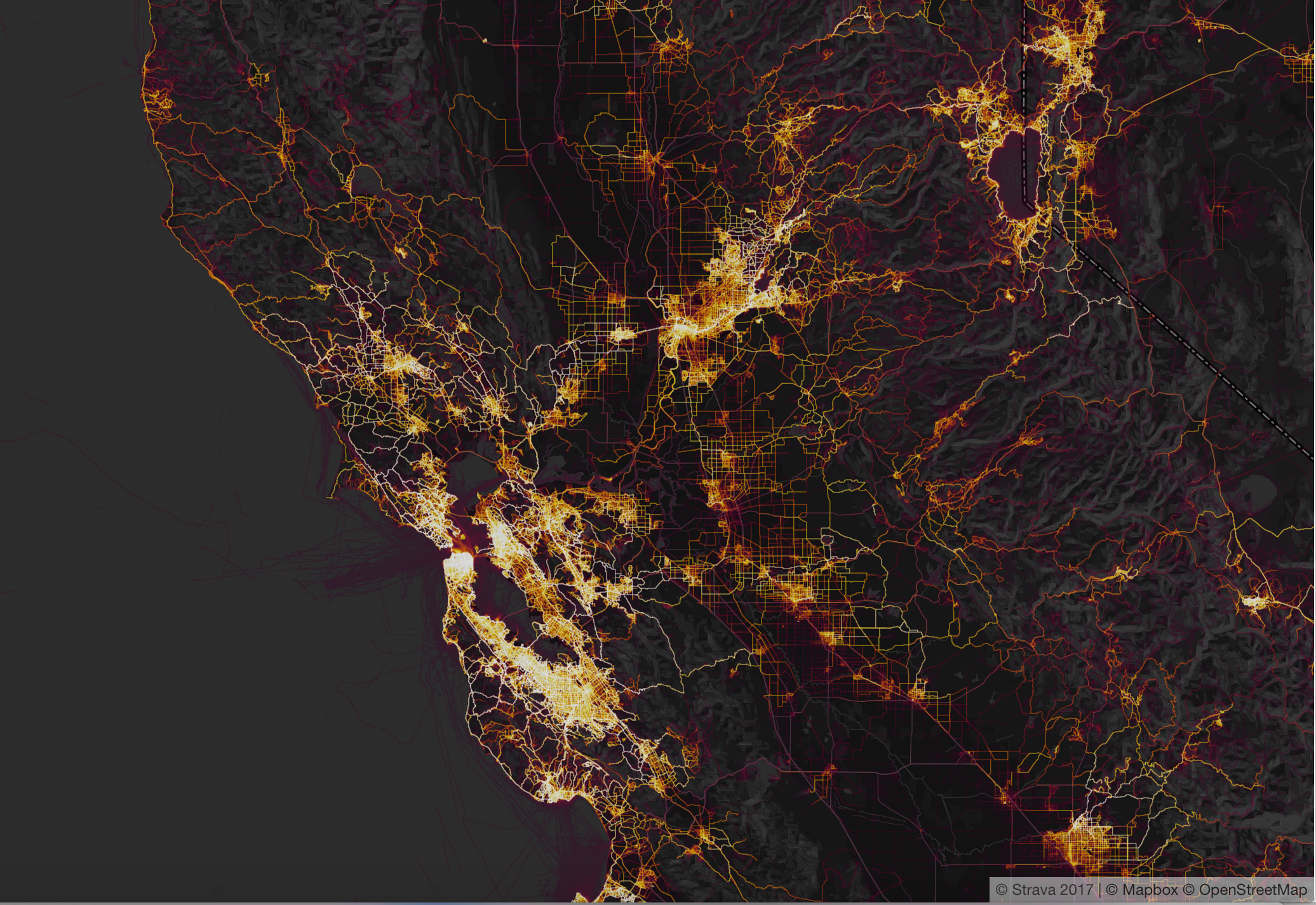
Strava heatmap, Kabul
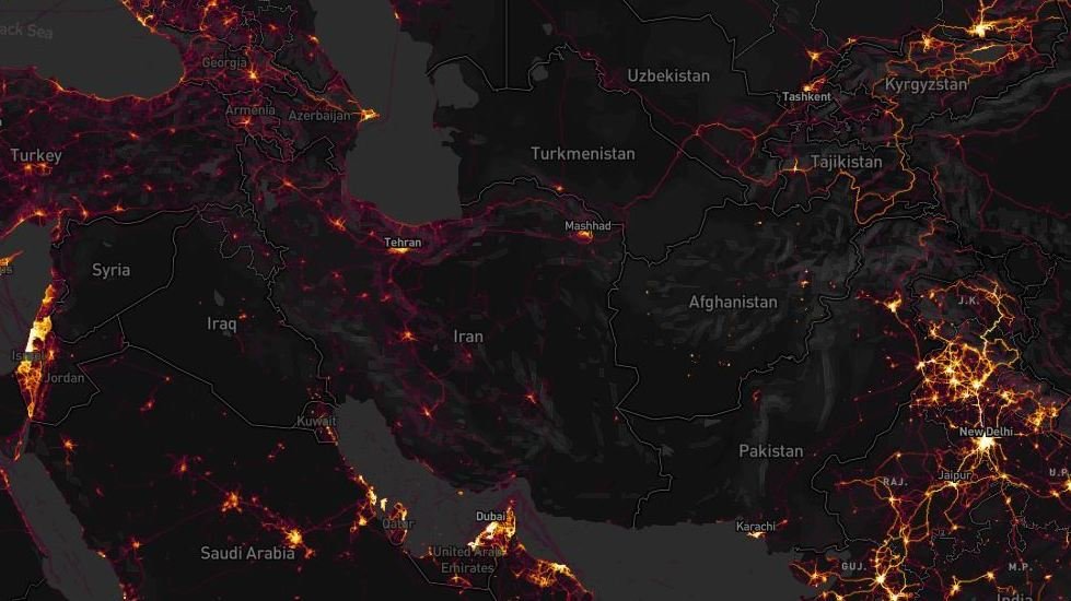
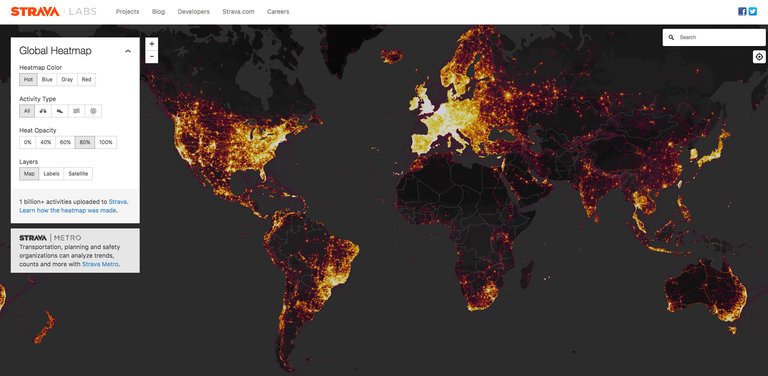
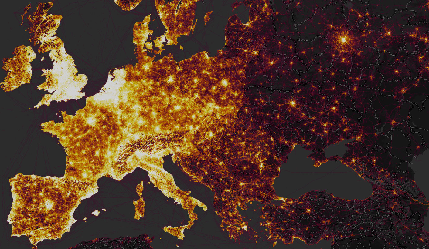
 

The recognition of the scale of personal tracking by soldiers sharing data on exercise apps grew as one exploited the heatmap’s scalability, and examined areas in which few locals were using it–or had access to the First World problem of registering how many miles one ran.  While the data was not only sourced from Americans, the anonymity of the aggregate map–which can be viewed in multiple shades–provided an image of ghostly presence that seemed particularly apt to describe concerns of security and suggest an aura of revealing secret knowledge.  The cool factor of the Strava map lit up the hidden knowledge that echoed the longstanding surveillance of the communication records of Americans in the bulk data collection that the Patriot Act allowed, although now the dragnet on data use was being done by private enterprise, suggesting an odd public-private sharing of technology, as what had been viewed as a domestic market suddenly gained new uses on an international front.  The poor data security of U.S. forces abroad reminded us that we are by no means the only actor collecting bulk data, but also the scale of digital dust that we all create as we entrust information about our geographical locations to companies even when they promote the value of doing so to be salutary.

Multiple accusatory narratives quickly spun about whether the release of the new global heatmap by Strava Labs constituted a breach in national security.  The soundbite from the State of the Union proclaiming a “new era” described changed conditions by referencing Gen. Michael Flynn’s charge, first raised during the 2016 Presidential campaign on national television news,  that the United States had sadly become “the best enemies in the world” during the Obama years, as he attacked the government of which he had been part for being itself complicit in how “our enemies love when we telegraph what we’re doing” by not maintaining secrecy in our military plans.  Flynn’s assertion became something of a meme in the campaign trail.  And President Trump sought to reference the fear of such changes of a past undermining national authority abroad when he claimed to bring closure to lax security, choosing to message that the loopholes that existed were now closed, and respect had been achieved.  The fictionalized imaginary landscape seemed to distract America from danger or unemployment in celebrating its arrival in a better economic place.  The message seemed as imaginary as the landscape of an employed America, which had arrived in a better economic and place.

General Flynn’s metaphor of telegraphing was even then quaintly outdated, as if from a different media world.  But the allegation that had become a meme on alt right social media during the campaign to discredit military competence, gaining new traction as data security became increasingly a subject of national and international news.  Since President, despite having quickly issued one of executive orders that he has been so fond of signing on cybersecurity, Trump has in fact been openly criticized for a lack of vision or of leadership in addressing  national vulnerabilities in cybersecurity.  As President, Trump has preferred to pay lip service in the executive order, by far his preferred medium of public communication, to the growing frustration of a number of cybersecurity advisors who resigned before clarifying best practices of grid security.   Broad sharing of geodata by military and intelligence raised red flags of security compromises; it would, perhaps, be better raise a clarion call about our unending readiness to aggregate and be aggregated, and the unforeseen risks of sharing data.

The patterns of tracking exercise–biking, running, swimming, windsurfing–created striking pictures in aggregate, reflecting the collective comparisons of routes and itineraries, and showing a terrain vibrant with activity.  But while the app did not specialize in tracking individual performance or local movements, the new context of many apps transformed foreign counties where military travelled to sites where their data sharing stood out.  The sense of accessing the platform was so second nature to American soldiers moved across space, in fact, ignorant of the platform on which it was aggregated and its effects–or the audiences before who it was broadcast and displayed.  The ability to detect bright spots of athletic engagement around American bases, military camps, and CIA outposts suggested an unwanted form of data-sharing, RT television newscasters proclaimed with undisguised pleasure at the ease with which soldiers could be observed in different locations across the Middle East, from Saudi Arabia to Afghanistan, to Pakistan, and crowed that Americans are so unwary about being surveilled so as to provide evidence willingly of their own global footprint’s size.


strava-map_wide-4720f2504724cf08515aa5302bb39b6e2dedea46-s1600-c85


It’s striking that government secrecy has become a public hallmark of the Trump administration.  But if Trump wanted to inaugurate the start of a fictional landscape of securing state secrets in his first State of the Union address, his words were pronounced with no acknowledgement of the release of the heatmap and the concerns of leaking security operations.  The map that Strava labs designed to celebrate the global extension of a triumphal image of the expansion of exercise in a triumphal image appeared in new guise as the latest example of breached military security secrets–suddenly made apparent at high resolution when one zoomed in at greater scale to Syria, Somalia, Niger, or Afghanistan, and even seem to be able to track the local movement of troops in active areas of war, and not only identify those bases, airfields, and secret annexes, but map their outlines that corresponded to the laps that soldiers seem to have run regularly around their perimeter while sharing their geodata publicly, or with the app.  While the app was designed to broadcast one’s personal best, as well as log one’s heart rate, sleep patterns, and performance (personal data which remained private), it collated in aggregate the patterns of activity across national borders.

For its part, Strava had only boasted it could “create the ultimate map of athlete playgrounds” by rendering “Strava’s global network of athletes” in a stunning heatmap from directly uploaded data.  If there was a sense that the “visualization of Strava’s global network of athletes” described a self-selected community, the beauty of the data set created from 13 trillion data points provided a new sense of exercise space, as if it sketched a record in aggregate of individual endurance, or a collective rendering of folks achieving personal bests.  But the illuminated “maps” of the global network of those exercising and the distribution of US military bases and sites of secret involvement raises complex issues of data-sharing, and the shock at the intersection of leisure space and military secrets–somewhat akin to the stern warning military commanders issued to years ago about using Pokemon Go! in restricted areas of military bases, mapping a comprehensive global map of military over-extension is an odd artifact of globalization.  And it was odd to see RT seize on this issue, as a way of describing the presence of the actors they id’d as “Uncle Sam” to suggest how zooming in on the global map revealed the reach of the United States in Afghanistan or Syria, as if playing a computerized game to see where clusters of forces might be illuminated, as if to exploit fears of revealing military secrets through geolocated data.

The story was pitched on RT suggested a market-driven surveillance network of which the Americans were themselves the dupes.  In its own spin on the story, RT reported of the leaks with glee, for rather than arriving from hackers, or Russian-sponsored hacking groups, military security was compromised by the very tracking devices, it was argued, that soldiers, military intelligence, and CIA officers wore.


By imposing outlines of national maps on the dynamic rasters of the web map that Strava released, the position of military forces or advisors indeed seemed able to be roughly revealed as military secrets by zooming into locations, much as RT announcers asserted, as if the “bracelets” of fitbits provided tools to geolocate soldiers as if they were manacles, reminiscent of the ankle bracelets given to many parolees, sex offenders, or prisoners, by using a GPS tracking system to monitor released inmates all the better to monitor their acitivities, in a practice that has only grown in response to overcrowding conditions in many federal and state prisons–GPS tracking systems were billed as able to save prisons up to $9,500 per inmate, or up to $25 a day; but rather than provide tools to surveil non-violent offenders, the effective monitoring of military bases and what seem CIA field stations provided a multiple security vulnerabilities of unprecedented scale.

But the real story may have been how so much data was available not only for state eyes, but for a broader public:  in an age where surveillance by the state is extending farther than ever before, and when we need, in the words of Laura Poitras, “a practical and metaphorical road map for navigating the post-9/11 landscape,” the maps of Strava have shifted the landscape of surveillance far from the state, and deflected it onto the internet.  For the far greater geographical precision and detail of a diverse user group may prefigure the future of data sharing–and the increased vulnerabilities that it creates.  The live data map broadcast not only an image of global divides, but of the striking patterns of the aggregation of geodata that reminded us of  the pressing problem of data vulnerability in the military’s extended network of secret military bases and dark sites.  Indeed, when a student at the Australian National University in Canberra, Nathan Russer, first noted that the Strata search engine created an Op-Sec catastrophe for leaking locations of US military patrols and bases, his observations unleashed a storm of pattern analysis and fears of compromised national security.  It indeed seems that the vaunted agility that allowed American forces to deploy in much of the world could now be readily observed, as we zoom into specific sites of potential military involvement to uncover the presence of Americans and assess the degree of involvement in different sites, as well as the motion through individual sites of conflict.  The spectral map that results suggests something quite close to surveillance–at time, one can scrape the place of individual users form the app’s web map–but that is dislodged from the state.

The notion of a private outsourcing of data surveillance to the public sphere is hardly new.  One can think, immediately, of Facebook’s algorithms or personal data-harvesting or those of search engines.  Although the U.S. Department of Defense has urged all active military abroad to limit their active presence in online social media, no matter where they are stationed, the news reminded us yet again of an increased intersection between political space and social media, even if this time the intersection seems more shaped like a Moebius strip.  The divisions within a global geographic visualization of Strava’s users reminded one of a usage landscape that suggested a striking degree of continuity with the Cold War–with an expanded iron curtain, save in scattered metropoles–whose stark spatial division reminded us of the different sort of lifestyles that public posts of athletic performance reveals.  As much as showing a greater openness, the heat map suggests a far greater willingness of posting on social media use:  the intersection suggests a different familiarity with space, and a proprietary value to the internet.’


strava1Strava Labs


Indeed, in only a few months to notice how American soldiers’ presence in coalition military sites suddenly popped out in the darker spaces of the Syrian Civil War, where different theaters of action of coalition forces that include American soldiers are revealed, and panning back to other theaters can indeed revealed the global presence of U.S. military and intelligence.  Against a dark field, the erasure of any sense of national frontiers in the Strata labs data map suggests the permeability of much of the world not only by interactive technologies but by the isolated groups of soldiers who deal with the stress of deployment by bike rides and runs while they are stationed in Afghanistan.


Runing In Kabul


Although the fitness app saw its aggregation as registering geodata in the relatively apolitical space of physical exercise, fears of political and national security repercussions ran pretty high.  Indeed, the tracking of running laps, cycling, and daily exercise routines revealed U.S. military bases in Syria so clearly that it proved a basis to locate and orient oneself to an archipelago of U.S. military activity abroad in the global heat map, and lit up American presence in Mosul, Tanff, north of Bagdad and around Raqqa, providing a historical map able to pinpoint airfields, outposts, and secret stations in the war against the Islamic State.  Security analysts like Tobias Schneider argued they helped track the movements and locations of troops and even extract information on individual soldiers.  In place of an image of the global contagion of tracking exercise, the patterns of performance provided a way to look at the micro-climates of exercise on a scaling that were not otherwise evident in the arcs of the impressive global heatmap.

Sissela Bok classically noted the ways that secrecy and privacy overlap and are linked in some collective groups, as the military, but the absence of privacy or secrecy on much of the Strava Labs heatmap raised questions of the increasing difficulties to maintain a sense of secrecy or privacy in an age of geographically growing war.  In an age when more and more are living under surveillance, and indeed when the surveillance of subjects has only begun to gain attention as a fact of life, the fear of broadcasting an effective surveillance of exercising soldiers seems particularly ironic–or careless.  The practices of secrecy were more than lax.  For the United States military has in fact, quite vigorously promoted Fitbit flex trackers among pilot programs at U.S. bases to lose calories, and provided devices that measure steps walked, calories burned, and health sleep as part of its Performance Triad;  Fitbit trackers were provided as part of a pilot fitness program from 2013 with few issues raised about security, and placing restrictions on American soldiers’ use of mobile phones, peripherals, or wearable technologies would limit military volunteers.  (The Pentagon has in all distributed 2,500 Fitbits as part of its anti-obesity program, in more flexible wearable form, without thinking of the information that they broadcast.)  Yet soon after the map appeared, folks noted on Twitter with irony that “Someone forgot to turn off their Fitbit,” and it became a refrain on social media by late January, as the image that tracked American military outposts not only in Kabul, but in the Sahel, Somalia, Syria and Niger all popped out of a global map–embodying the very outlines of the camps around which military run.  ‘

Although the U.S. National Counterintelligence and Security Center informed the intelligence community of dangers of being tagged by “social media postings,” the imagined privacy of exercising soldiers is far less closely monitored than should be the case–resulting in a lack of clear vigilance about publishing Strava data.


Runing In Kabul.png
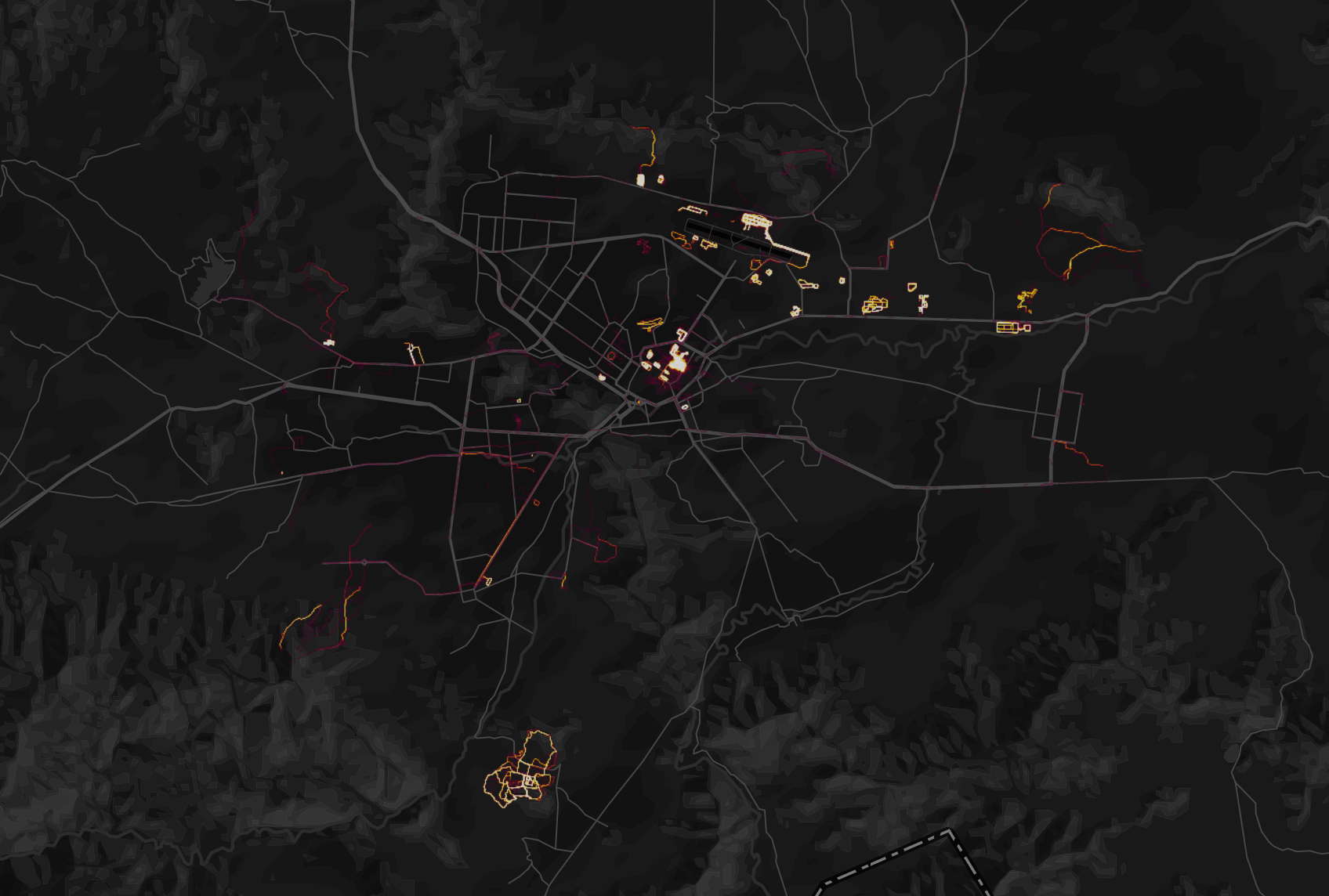
Kabul, Afghanistan, in Strava Labs global heatmap


The heat map so strongly lluminated itineraries users ran, biked, or skied, tracked in incandescently illuminated streams, and even zoom in on specific locations, where they stand out from considerably darker zones of low use of the app, that some national security officials wanted the app to take time to take the maps offline so that they could be scrubbed; worries grew that one could even to scrape the itineraries of individual soldiers who exercise on military service in the heatmaps.

But the two fold ways of reading of the map’s surface suggest that their contents were difficult to free.  The same map celebrating the app’s global use revealed deep discrepancies between the brightly illuminated areas of high-use and data input and its dark zones.  Data mapped on Strava’s website also seems to enable one to id the soldiers using the Strava app with far greater certainty than foreign governments or non-state actors had before, in ways that would create multiple potentially embarrassing problems of delicate foreign relations.  While in part the fear may have derived from the hugeness of the dataset, the fear of being compromised by data raised an increased sense of emergency of a security being risked, and fears of national vulnerability.  Partly this was because of the huge scale of geospatial data.  The updated version of the heatmap issued by Strava Labs illuminated the world in a way that few had seen, and not only because of its greater specificity:  Strava had doubled its resolution, rasterizing all activity and data directly uploaded, and optimizing rasters to ensure a far richer and more beautiful visualization, along glowing lines to reflect intensity of use that looked as if they were in fact vectors.  It made its data points quite beautiful, stretching them into bright lines, eliminating noise and static to create a super smooth image that almost seems to update the Jane Jacobs’ notions of public space and its common access–and the definition of spaces for exercise.

To some extent, the highlighting that the app did of common routes of exercise seem to mirrored the metric of walkability, the measurement of active transportation forms like walking and biking and stood as a surrogate for environmental quality.  The fitness map improved on the walkscore or its cosmopolitan variants, by involving its users to create a new map of exercising space.  The abilities to foreground individual and collective athletic performance in a readily accessible map provided what must be admitted is a pretty privileged view of the world; but the self-mapped community it revealed gained a new context just two months after it went live, as the map drew attention to the patterns it revealed of using an app to track one’s activities, as much as register work-out trails.


San Fran Strava dataset  
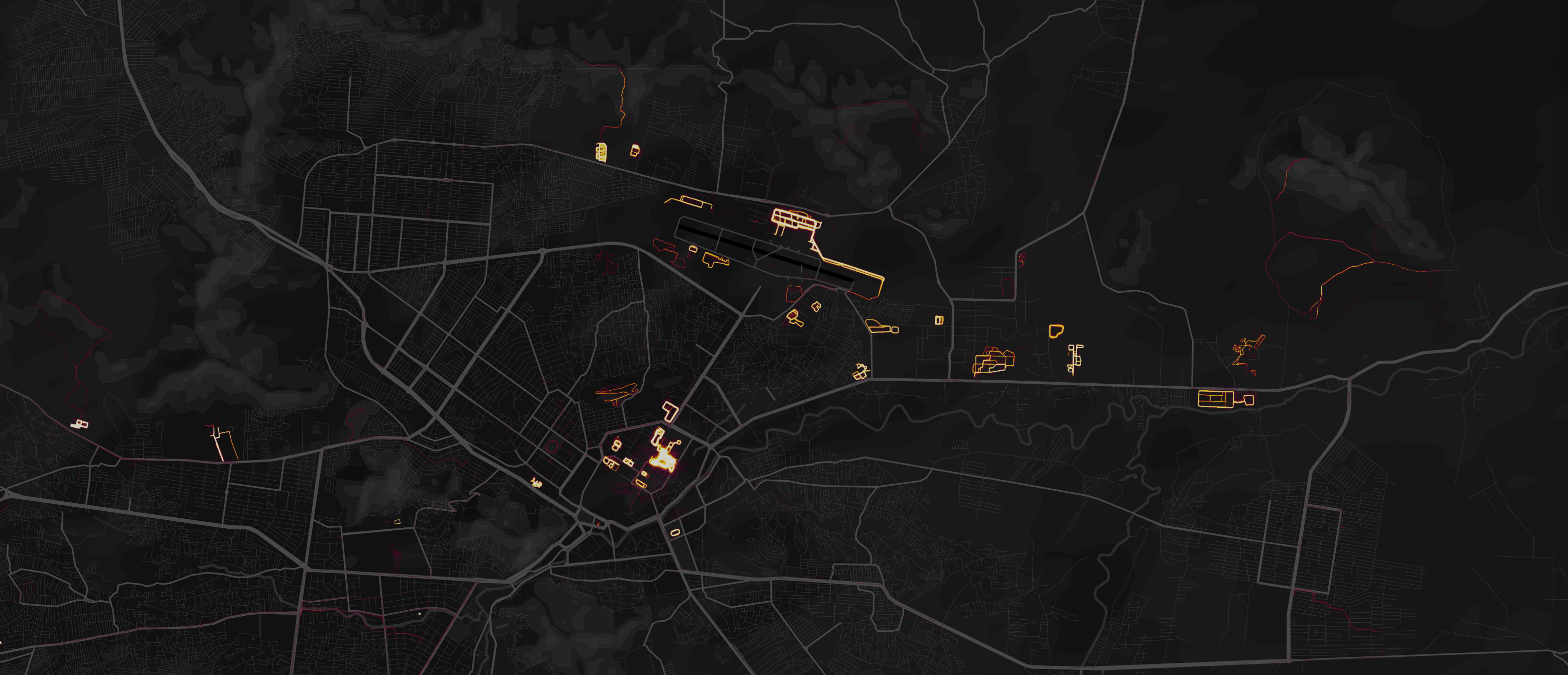
San Francisco in Strava Labs Heatmap


The new map attracted attention not only for the fitness crowd, a self-selecting demographic, in short, but as an interesting extension of the beauty and the huge amount of datasets it uploaded and digested in a highly legible form:  indeed the legibility of the data that was able to be regularly updated online suggested a new form of consensual surveillance.  The data-rich expansion of what was the first update to the global heat map of users that Strava Labs issued since 2015 encoded over six time more data, and promised a degree of precision that was never even imagined before, notably including correction for GPS distortions and possibilities of new privacy settings, in ways that amplified its ability to be seen as a tracking device most notably in those areas where the aggregate of Strava users was not so dense, first of all those military sites where American military and operatives were stationed and perhaps secretly engaged, but gave little thought to the day sharing app installed on their Fitbits or iPhones, and may even have seen the data-sharing function as a source of comfort of belonging to a larger exercise community.

Continue reading

1 Comment

Filed under data aggregation, data maps, data visualization, information economy, state secrets