Encoding Narratives in Maps

In surveying artists’ maps at the recent symposium “Mapping and its Discontents,” Katherine Harmon celebrated how “creative cartographies” oriented viewers to a narrative about place.  If most of the presentations made viewers re-think the nature of map making as an art and science, Harmon’s attention to how the art of mapping create narratives about place at the symposium sponsored by UC Berkeley’s College of Environmental Design suggest the inadequacy of separating  “cartography” and “art” by examining the map as an art of orientation–by how maps invite viewers relate lived space to the space that they create.  In a symposium that raised questions about the seductiveness of the ability of how better-defined datasets can make maps that better capture processes we want to describe, it was refreshing to shift focus to how cartographical arts register an individual relation to place.  Indeed, if several papers in the symposium struggled over how to bridge map and narrative–do we need to depend less on maps?  to be seduced less by its promises of truth?–each artist returns to the dialogic relation map instill between viewers by orienting viewers to their content in ways that pose questions about the lack of personal detail in an undifferentiated record of space.

In a sense, the survey of artists’ maps on which Harmon organized and explored exposed the artistic values in which all cartographical practices are embedded.  But they also pointed up the narrative ends to which cartographical forms were so particularly suited as joint representations and explorations of space.  All maps engage their readers’ appetite for knowing a place, and even revise it, by creating a relation–a “map”–between personal knowledge and the residue of collective knowledge distributed in the design of their surface.  The narrative possibilities for registering personal knowledge of space are particularly inviting in such an ostensibly objective framework of geographical denotation:  Harmon called attention to the particularly eloquent transformation or adaptation of how the framework of mapping offers both a compelling and legible text by the forms of “deep mapping” that technology now allows–and the expressive form for deeply personal narratives they offer even as they threaten to lose specific details in the very process of generalizing a record of a uniform space.

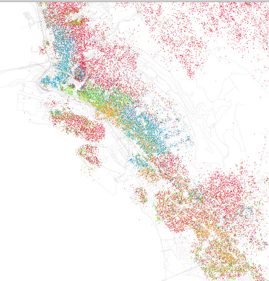
In an age where we are deluged by maps in all sectors of life, the tracing of these artistic strategies of mapping seems a recuperation of maps as orienting tools and arts of orientation, and this post surveys some of the maps that she presented, some known from other works, as serving to orient viewers in a practice of mapping that is often too removed or alienated from individual experience.  For the ways that cartography can serve as a practice for engaging our different understandings of space in particularly inventive ways maps both feed cognitive by orienting viewers to place in revisionary (and potentially liberating) ways–by engaging viewers n how they uncover meanings about spaces one already thought one knew or believed to have been recorded in existing maps, by creating dialogue about spatial relations as much as to generalize a record of space.

Harmon’s presentation showed less interest in how to tell stories in a map than in using mapping to register personal familiarity with place, by orienting viewers to the multiple personal networks in a mapped social space.  The “creative cartographies” recuperate the artistic basis of mapping as arts of individual and collective orientation that exploited the structure of synthesizing spatial knowledge in a combination of ways.  The narratives each cartographer creatively located in maps exploit the innate curiosity maps invite by orienting viewers.  Harmon distinguished the narratives that several maps create; the “creative cartographers” all draw connections between the specificity of individual narratives plotted in maps and their structural designs.  If the “discontents” of mapping lay in the anonymity of the maps of public space that were universalized for their readers in many digitized mapping projects and by government planning agencies from Rio di Janiero to Beijing to Ho Chi Minh city to Zagreb to the Google Earth platform, creative cartographers exploit the inventiveness invitations of maps place oneself in space by the power of making meaningful cartographical spaces by balancing them with a personal reading of place.

Harmon invited the symposium to follow how creative maps buck the conceit of large data samples to inscribe maps with the personal meaning from a particular perspective–and in so doing, turn the abstracted nature of cartographical practice on its head, reminding us how such “scientific” practices are embedded in a discourse on the arts.  Indeed, as they engaged scientific practices of cartography, they adopted the tools of mapping in as tools to chart a distinctively individual relation to a known space, rather than a universalized one–or, rather, they novelistically use the format of map-making to universalize the particular situated perception of space that maps rarely include or note.

Harmon emphasized in her own visually stunning and compelling presentation the narrative content in these creative maps as setting into space individual stories about space that pointedly contrast with the de-personalized map and emphasized their own personal knowledge.  She showed a set of creative cartographies that exist in a dialogic relation to our own knowledge of a place, moreover, and, more deeply, out knowledge of objective–as well as subjective–renderings of it, making creative maps particularly neat ways of opening up new perspectives on a space that fence in interesting ways with our own.  Indeed, maps have a unique power to illuminate the relation between our story and our surroundings, as much as to tell stories of their own about how we understand place.

The cognitive webs of connections that maps both embody and render visible and concrete have the effect of never seeing ourselves as isolated.  They rather allow us to map our place in a set of other stories and narratives about place, in ways that are deeply social as well as rooted individual cognition.  And perhaps the most problematic subject of mapping such an individual narrative–or restoring its centrality–is in as frequently a re-mappped event as the September 11 tragedy, whose multiple mapping has accreted more meaning on the event–as if it needed this injection–to erase its personal narratives, and imposed meanings on the event that have almost obliterated our memories of its occurrence, and our relation to its immense tragedy.

It is interesting how she began from 9/11–an event that illustrated the tyranny of the map in the public imagination, and a touchstone for how a local event effectively mapped a geopolitical relationship to the world, albeit a quite distorting one.  The event is not only ripe for re-mapping, but demanded a resourcefulness in using mapping forms to forge new networks of meaning in an over-rehearsed geographic conceit.  The artist Karin Shneider effectively re-mapped our cognitive understanding of events of 9/11–and the cognitive space of the twin towers–that  re-framed memory of their destruction and the death of their unfortunate occupants in plate-glass maps inscribed with the commuter routes those who were tragically killed had taken on that morning as they arrived at work.  The sounds of breaking plate-glass were inseparable for many observers of the twin towers’ collapse on September 11.  In Shneider’s commemorative map, individualized etched glass plates restore both the fragility of their lives, and the integrity of each life that overlapped that day, providing a commemorative cognitive map of the event that viewers to consider how the event tied these lives together so tragically, tracing the routes each took to remind us of the voyages each performed that day.   The set of maps commemorate the deaths of some 2,752 individuals by distilling the circumstances of their spatial intersection, giving specificity to that over-photographed and documented event by emphasizing their now unrecoverable perspectives with the evocation of personal letters or diary entries, so unlike the opacity we usually identify with maps, inviting us to see through their commutes to remember the loss of individual life.  The map of approaches to a final intersection replaces the all too familiar rendering of collision courses of two airplanes on September 11.


9:11 flight paths mapped


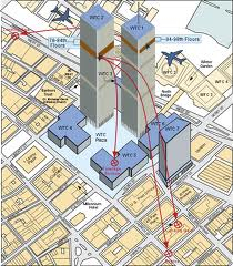
Shneider’s composite of overlapping maps remind us of the very difficulty of recuperating individual narratives in such an over-narrated event–mapping the mess of lives that intersected fortuitously that morning, and which will no longer be with us.  They reframe an event too often framed as a war on “terrorism,” “clash of civilizations,” or a sign of barbarity and civilization in distorting and exploitative ways, moreover, giving transparence to the very surface of the map.  The absence of a one narrative that unites these paths is, indeed, a great part of the effectiveness of capturing such multiple individual itineraries within one map.

The decided lack of spatial narrative–but a snapshot summary of the lives that intersected on that day in early September–is evident in a quite different map that, oddly, interestingly emphasized the international origins of those who lost lives that day, perhaps in an attempt to remove its violence from a narrative of opposition, and disturbingly cast the loss of lives in terms of the quite different-order abstraction of individual nations:


wtc world map flags

That map’s argument is disquieting because of how it erases individuality.

Mapping can be a clarification of such tragedy, however.  The far more delicate set of superimposed plate-glass maps Harmon described stands in contrast to the anonymity of this map, or the very disembodied and abstracted map of the routes that these hijacked planes took, by inscribing their paths at a complete remove from individual lives.  Indeed, even the inscription of names of those killed in the event at the site itself on a granite plaque, evocative of the Vietnam Veteran’s Memorial, oddly strips them of individuality–unlike how the reflecting stone surface of the Vietnam War Memorial designed by Maya Lin invites viewers to touch individual names on its surface, as if to try to map abruptly curtailed lives.


VVM-TouchWall


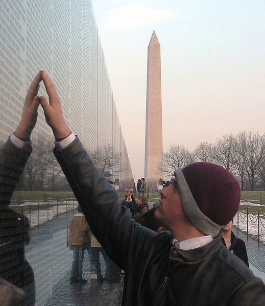
The inscription of the names of the dead of 9/11, unlike Maya Lin’s monument, offers no attempt to embody the event–or to express the multiplicity of narratives that that event so tragically condensed.

At another extreme of mapping the 9/11 tragedy lies the grotesque dis-humanized blood-flecked map, so sensationally printed by the New York Post, allegedly based on a map fire-fighters compiled of human remains, as a broadside intended to vilify plans to construct a mosque nearby the site–a map so shockingly dispersive in its energies that rather than embodying the 2,752 deaths it seems to chart, aggressively alarms its viewer with an explosion of meaning impossible to process save by recoiling in horror from its tabulation of human remains near the scene of impact:

Blood-specked map WTC

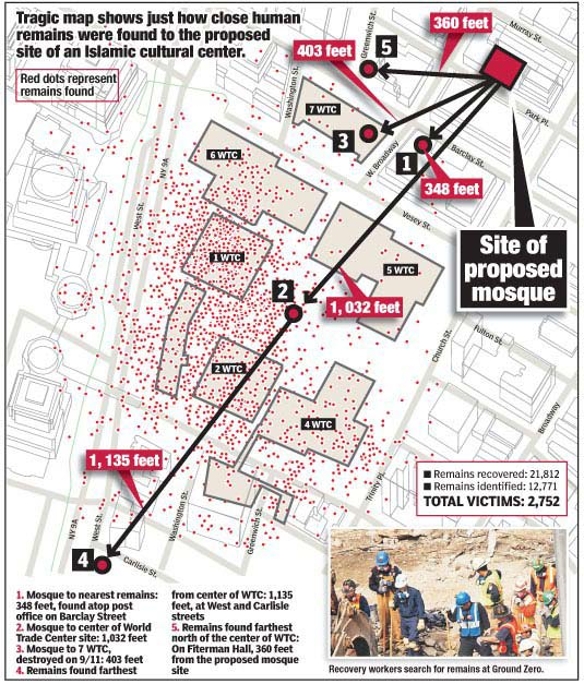
For if the violently voyeuristic map seeks to dignify the site’s sanctity by delineating the violent loss of life, its superfluity of meaning is something of a recapitulation of violence, attempting to shock the viewer as does the inset photography, by providing some access to the history of the event.

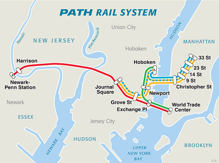
Scheider’s creative cartography also stands in eloquent counterpoint to the abstract cartography of that emptiest of maps, of PATH commuter routes, which she adopts as something of a basis to trace a palimpsest of commutes:


PATH_system_map


The problem of how maps evoke or shift a familiar narrative motivates the inventive ways itineraries are combined with maps to upend their abstraction, or the spatial oppositions that they create and reify.  Daniel Zeller recuperated the itinerary as a unit of spatial knowledge in imagined maps linking two sites of worship in two different religions by imagining their proximity, and almost delineating an imagined route of pilgrimage that might link their footprints.  Zeller used his deep study of topographic maps and satellite imagery to forge an imagined spatial tie between the Vatican and Masjid al-Haram, the mosque at Mecca, as if to bridge ties between two sites removed from one another in such popular and political discourse alike, by connecting them as if on an individual footpath.  By tracing the footprint of each in graphite, and imagining a windy route of pilgrimage that might actually connect them in “Vatican/al Haram,” using the extreme precision to actively embody and create real spatial ties–


Vatican:Al Haram


–with attentiveness to precision evident in this detail of the links he creatively mapped between both houses of worship.
Zeller Vat al Haram--detail

Departing from digital simulations that often create information overload,  Zeller’s craft-like remapping places with the symbolic continuity that maps create to all too improbably link two sites so often separately segregated in the global imagination.

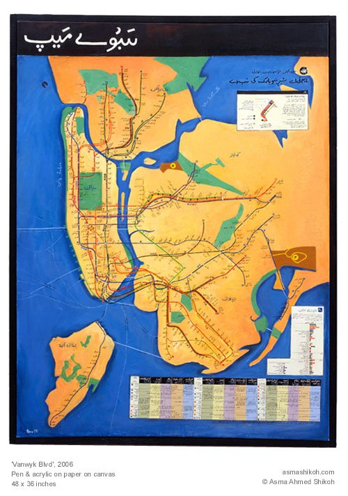
Bridging divides through a pathway that itself unites or crosses cultures is the theme of Asma Ahmed Shikoh’s beautiful acrylic “Van Wyck Boulevard,” part of her project “Home.”  Shikoh’s art maps her status as a Pakistani artist trained in Karachi who moved to New York:  “Home” brilliantly reclaimed the craft traditions of mapping, recasting the NYC subway map as an Urdu manuscript and within a geometrical design borrowed from the Islamic Al Hambra, in Spain, to reexamine its functional status, and its role as an icon of urban belonging at the same time as mapping a Muslim diaspora–precisely by casting the map of the path of the MTA’s “F” line that took her to her first home in the city.  Shikoh reconfigured the map in a painted form of distinct coloration, engaging its form as well as using language as a tool to assert my identity and make the new place my own.”   The widely reproduced and iconic subway map served as a template to assert and recreate the familiar embodiment of the subway lines as a constellation of meaning invested with a narrative intent that the location of stations on this diagram rarely possesses: only by  “transliterating every stop, was painstaking, repetitive, and yet therapeutic for a newcomer” that traced a narrative through a process of remapping and making the city her own– using the subway map to transcend the increasing construction of a dichotomous divide between East and West, and re-center her identity (and immigrant identity) in the mobile paths of New York City’s subways.

Van Wyck Blvd


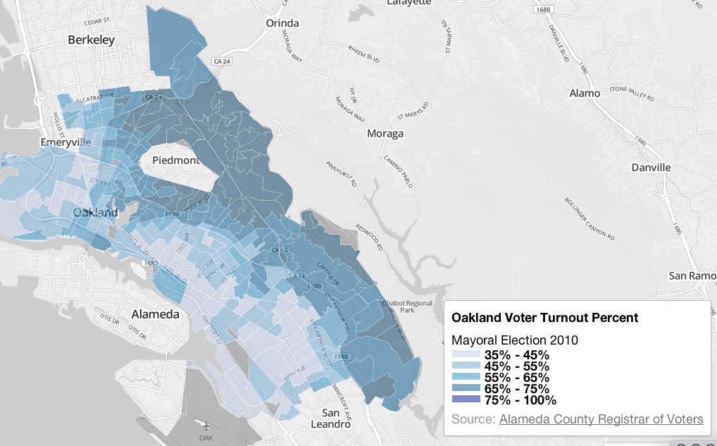
Cross-generational mobility was mapped through the shifting degrees of access or familiarity with space across generations in a map of the town of Sheffield, Harmon noted, when Dr. William Bird traced i the limits of known space created across generations living on an aerial view of the city that redefines the mapping of “city limits.”  The chart of the boundaries of a “known world” where children were entitled to walk unaccompanied in Sheffield provides a far more general (and very poignant) map of a demographic group’s relation to space, investing the map with particular narrative and expressive properties beyond that of a spatial register.

How Children Lost the Right to Roam in Four Generations (2007) employs the format of aerial photography to map the ambits at which children were allowed to walk on their own in the same neighborhood in one family.  The result of comparing the increasingly restricted spaces parents tolerated wondering illustrates and documents the daramatic contraction of the consderable freedom eight year old George Thomas enjoyed in 1926 in Sheffield.  His parents, not able to afford the tram’s fare, let him to walk six miles to fish on his own.  The erosion of the English commons is a trope of the enclosures of the early nineteenth century, and the lack of urban exploration a more contemporary concern for city-dwellers who find their children less adventurous in making the out of doors their own.  But the more recent specificity of Bird’s roaming map shows the harrowing circumscription of space up to the present:  George’s great-grandson Edward, on a tether of some 300 yards, and with few liberties to roam at will unsupervised, possessed less of a spatial narrative of his relation to the far more industrialized region of Sheffield today, as his mother’s was far diminished from that of his Grandfather Jack or the wide range of space George was trusted to personally navigate.  The narrative of a restricting relation of the person to space in mapped by the narrowing boundary lines in Sheffield:


How Children Lost the Right to Roam


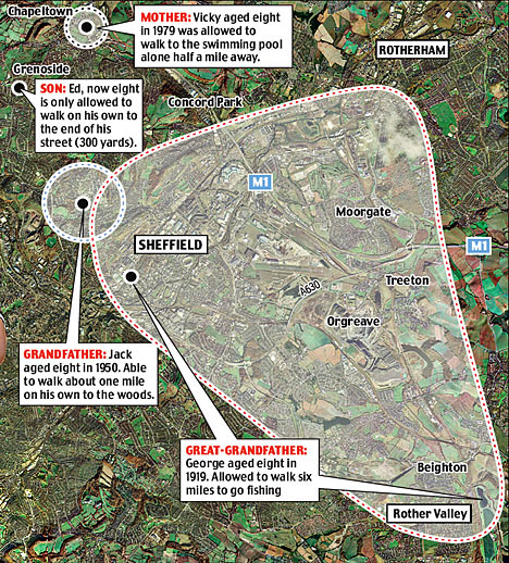
As much as describe the changes in Sheffield’s geography and the story of its expanding industrialization, the map presents a strikingly local microhistory which echoes and encapsulates frequently expressed concerns about the lack of exploring a safe urban space.

It was made in the capacity as health officer to Natural England, to substantiate a concern for Bird’s belief in the benefits access to grassy areas, ponds, and trees brought to kid’s behavior and school work, and question the healthiness of the narrowing relations of space from George, his son Jack, his daughter Vicki and the eight-year-old Ed.  The creativity of these practices of cartography bucks basing maps on their synthesis of a large data sample, by questioning how maps can be creatively rooted in a narrative of individual experience, even in ways that preserve their value as a collective register of the experience of space–and how a Google Maps template might be distinctly personalized as a record of spatial knowledge.

Discontents with Google Earth maps lie precisely in the deeply problematic recuperation of a cartographical art that they perpetuate for their users.  And so Jeff Sisson focussed on the spatial meanings and consequences of the threatened disappearance of the Bodega as an institution and anchor to urban communities in New York by crafting an interactive Bodega Map within the city’s expanse.  In charting the survival of a store central to communities across different neighborhoods, the map almost anticipated the recent turn against Mayor Michael Bloomberg’s New York that the recent De Blasio victory seems to portend.  In tracing the footprint of the institution of the Bodega, Sisson selects stores pressed out of existence in the absence of rent control for shops in the city’s expansive real estate market, and provide evidence of a vanishing urban culture of diversity.

Sisson’s website invites all visitors to place Bodegas in local neighborhoods to elevate the individual discovery of a community store, in an exercise of collective crowd-sourced participatory mapping that displaces the archipelagic city’s usual contour lines by rather trying to map the local meanings of these distinctive and useful stores within local communities, in ways that invite one to insert one’s narrative connection to the colorful local Bodega so long an urban fixture situated at odd street-corners, combining such mapping resources as Google Earth, Google Maps, and Flickr snapshots of facades and marquees of individual family run stores.

Bodega Map

gkjarvis


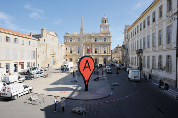
The project “Mapping Bodegas” tracks processes of micro-urbanism, by marking sites of interaction and stages to which communities respond, to reflects on the danger of their erasure from the city’s map and its neighborhoods, as well as to preserve meaningful “hot-spots” of collective memory within outlines of the specific neighborhoods they nourished.  This infusion of narrative content is, to be sure, one reaction or response to the universalized abstraction of an anodynely marked places of interest in the space of Google maps, with something approaching a zero-degree of the denotative signs of registering affect or place.  It is in reaction to this lack of narrative that Adam Bartholl staged his public sculpture “Map,” creatively appropriated the blandly uniform “inverted tears” of a Google map push pins by placing these physical objects in the very center of Arles–on the hexadecimal longitude and latitude GoogleEarth uses to denote Arles.

The discontent with the abstraction of our knowledge of place in Google Earth led Adam Bartholl to remind us of the increased distance between iconic cartographical markers Google employs so blithely in its tiles and knowledge of places they denote.  By the co-option or appropriation of the sign of place in geolocation practices in the public square of Arles, Harmon argued, Bartholl reminded us how the marker shapes (and fails to capture) our sense of place, as we use it to make our narratives of travel:  by placing a larger than life physical embodiment of such a dayglo pushpin in the exact center of Arles’ public square on the altitude and longitude where it occurs in Google Earth, Bartholl asked us to confront a physical embodiment of a sign we too often internalize without interrogating its affectless muteness as a sign as itself a denaturing of place.


map-arles-2-600

map-arles-1-600

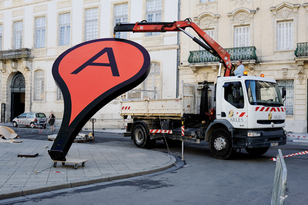
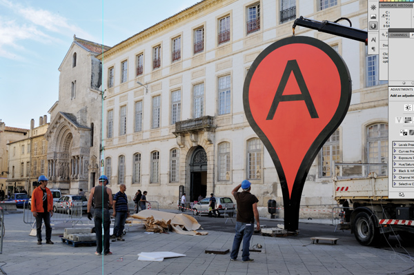
Arles?  It happened right here . . .

map-arles-3-600

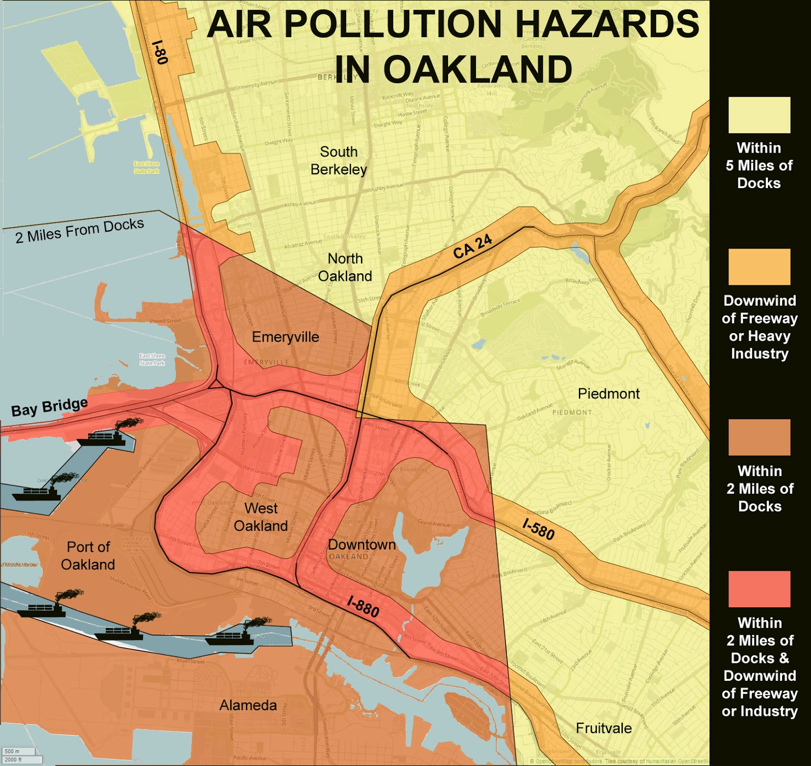
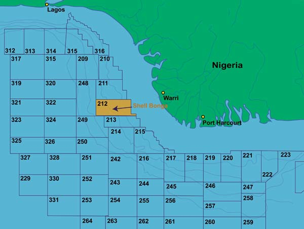
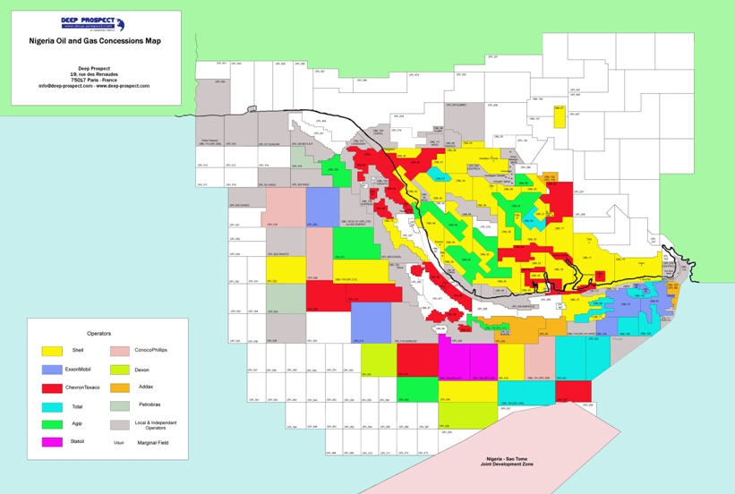
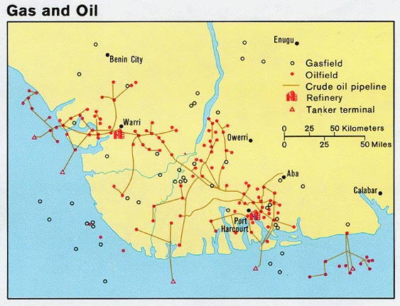
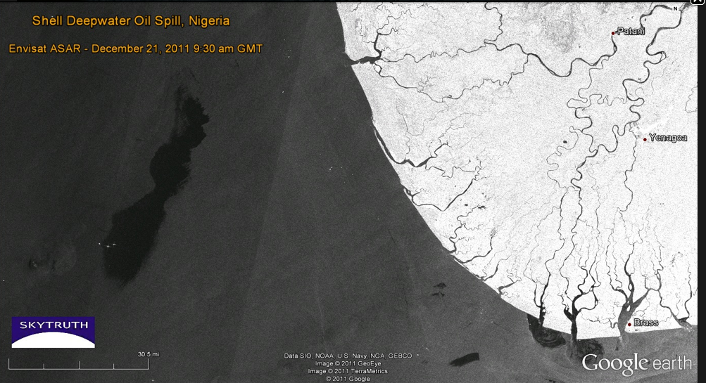
On a more political level of the silences concealed in many maps, and the environmental consequences of these silences, Harmon turned to the failures of mapping ecological disasters of Bonga oil spill and  transformation of the Niger delta.  What are the limits of Google maps in tracking the multiple levels of ecological disaster within the Delta, seat to a preserve of some 600 million barrels of recoverable oil mapped in 2001, but whose mapping silenced the complex narrative of regional toxic pollution that has spun out around those platforms and oil rigs.

bonga3


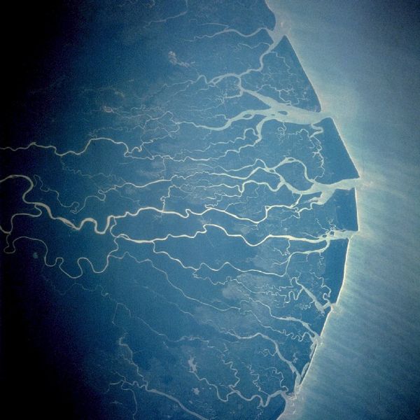
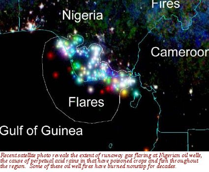
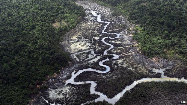
The delta, an oil-rich area long plagued by irresponsible levels of annual oil spillage greater than in the Gulf of Mexico Deepwater Horizon disaster of 2010, is a site of widespread flares on rigs, and, as a very poor area where oil was found close to the surface, of dirty DIY oil refining and extraction have created deep-set ecological disasters through the Delta–over 7,000 spills from 1970 to 2000, some spewing at least 9 million barrels of crude into wetlands that sustain millions of local trades from fishing to agriculture, and where consistently poor clean-up of spills have eroded increasingly fragile local communities and economies in an image that, viewed from space, appears both ecologically fragile and remarkably pristine.


600px-STS61C-42-72

How to map the devastating ravages to the local environment, whose production the Nigerian government is economically dependent, is particularly problematic since the oil-rich delta is the source of 90% of the country’s foreign earnings.  Regular under-reporting of spills by NOSDRA–the Nigerian Oil Spill Detection and Response Agency–to keep in line with corporate claims led to a failure to register the escape of up to 60,000 barrels of oil in 2011  from one Floating Production Storage and Offloading Facility at the Niger delta’s mouth by Shell oil (Nigeria’s major client) in Bonga, or 1979 spill of 570,000 barrels of crude, also by Royal Shell–eroding the environment all up the Delta, by the devastating toxic effects of acid rain that are only starting to be mapped–from the ruin of coastal livelihoods and fisheries to deadening formerly plentiful fields of kola nuts.

How to map or embody the narrative of the destruction of an ecosystem?  This time-lapse map seems as disembodied as Vassily Kandinsky’s “Einige Krise,” but charted decade-long oil flares in surrounding coastal waters spewing crude into the air, in color-coded fashion since the expansion of oil drilling in the Deepwater Bonga project since 1993–blue from 1995; green 2000; red 2006–as the outlines of an ecological disaster since deepwater drilling began–and whose mapping almost defies narrative:

nigerian_satellite_photos

Several Circles


If the agglomeration of colored dots in this time-lapse map suggests pattern, the distribution mirrors the division of the Delta and surrounding waters by prospecting leases for locally administered oil fields since 1993, but only starts to map the disastrous consequences for the environment of this massive release of crude into the ecosystem and its local economy:


Deep Prospect Nigeria Oil and Gas Concessions Map - Deep-Prospect

While the slick produced at Deepwater was not at first mapped, it occurred on a 2011 Google Earth view charting oil slick on the ocean’s surface:

Bonga Bongo Delta in Niger Delta-Nnimmo


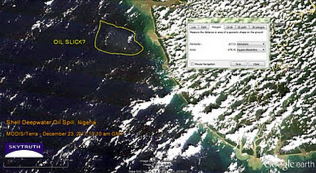
This map provided one of the few media sources documenting the Bonga spill not provided by Royal Shell Oil itself.  Indeed, it only starts to track the implications of the spills, fires, and leaks in the Delta that constitute the largest wetlands in all Africa rich with swamps, estuaries, rivers and streams, and can only suggest the extent to which forests and mangroves are being polluted by spills from a network of pipelines, acid rain, and water-borne or rain-borne oil slick–rain regularly returns drops of crude oil to formerly fertile region–where oil is relatively close to the surface has led to a distortion of the environmental perils of oil extraction–and over one thousand abandoned oil spill sites in the over-drilled Delta, with huge environmental consequences–often blamed on the ships that regularly illegally siphon crude from the pipelines that criss-cross the delta.


nigeria_gas_1979


Google Earth views used by Sky Truth to map the 2011 Shell Deepwater spill barely chart the environmental devastation on the Delta rivers.   The map that almost leaves one speechless in how the beauty of its sinuous detail chart the slicks of oil that have contaminated a once-healthy delta’s agricultural wealth; this NOAA aerial photography created by the United States Navy rebut the oil multinational’s silence as to the spill’s scope or devastating consequences, whose silences have only recently been targets of international blame, and obscured some 474 spills in one area during 2012 alone.  Perhaps  the recent expansion of Nigerian crowd-sourced mapping projects may shift these cartographical silences, but the burden for mapping the disaster has not been met.


Deepwater Spill Nigeria

Shell Deepwater Spill

_70948662_3fb361eb-02d8-417c-aeaa-1e42c23e8ef4


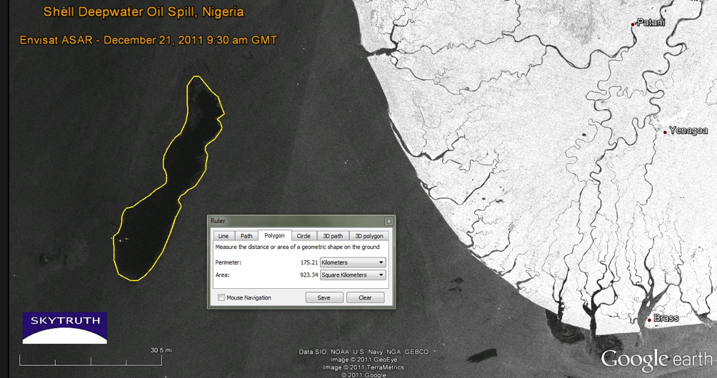
The narratives that these aerial image of considerable beauty recover present a counter-narrative to that of the corporations that distanced themselves from the Bonga spill, and perhaps a case of maps speaking truth to authority.  These maps begin to tell a story of the transformation of the land–and the destruction of the environment they map.  These maps foreground new narratives about the Google Earth format that invite a broader story to be told about the event, and to fill the silence of Shell’s official narrative about the quantity or causes for the massive spill–and the blanket denial that any of the oil ever reached the coastline, and all barrels were successfully dispersed in the ocean waters, and seek “unconditional license to contain and disperse the Bonga oil spill” itself.  Without these Google maps, Shell Oil would have retained a monopoly about the production of truth about the devastating Bonga spill.


Sleipner A


Can a narrative emerge of this event from the perspective of those who dwell in the Delta, to capture the consequences of the toxic transformation of the land they live and work in, or those for its non-human inhabitants?

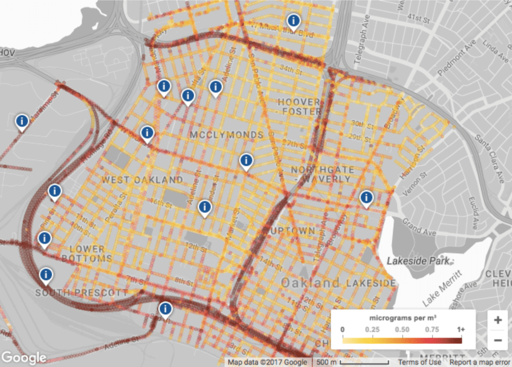
Some semantic possibilities of expanding the ecological narrative of place were suggested in the tracking of growth of Chesapeake Bay grasses,  in a mapping project using data to track changes in the growth and density of grasses around the largest estuary in the United States particularly illustrative of the subtleties of overlaps to achieve the sort of deep mapping that Google Earth would not allow.  The Stamen interactive map frames a unique narrative of the restoration of the estuary ecosystem incorporating data from over forty years across some forty years, redirecting data to create an image of where the estuary might later develop:  the time-sensitive visualization of data about salinity, water-temperature and bathymetry with the restorations of bay grasses who are the subject of this narrative of ecological restoration, to offer a powerful–and positive–interactive map about the local recuperation of environmental health, by synthesizing a wide range of data from the EPA officials and local institutions about an area to reverse effects of chemical pollutants on wildlife and grasslands that viewers can read or virtually explore as unfolding over time, in ways that press against the technological boundaries of cartography as an art.


Chesapeake Bay Program


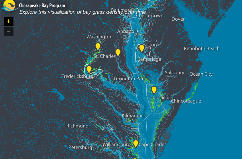
If this graphic visualization of the watershed appears a document only of the growth of grasses, as we unpack the map we realize the expanse of the effects of the possibly narratives of human interventions in the landscape that it presents–both on the ecosystem of the estuary and to possibilities of our future relation to that very dynamic environmental space–a space we better know through our more multi-leveled representations of it.

The art of registering knowledge of place has expanded to comprehend new personal individual narratives of fine grain by a GPS revision of the Google Map view of a city.  Indeed, the maps of Christian Nolde and Ingrid Burrington both seek to recuperate the density of specific narratives of encounters in urban space that echo and engage the emerging forms of mapping by which Google seeks to plot points of interest for its users on the maps of cities that they visit, so that they might include selected points of interest, sites of beauty to visit, or local stores and commercial districts of interest judging by one’s web history.  Both Nolde and Burrington used GPS to create a synthesis of these individualized maps of the city in ways that anticipated the announcement of Google’s plans.

Christian Nolde employed GPS technologies to register of feelings related to place in his emotional map of San Francisco (2007), created during a tenure at Northern Exposure.  After collecting on data gathered by a galvanic skin response by which participants’ physiological responses, he keyed them to places that he transposed to a GPS map of the city’s locations, as if to trace itineraries in a city usually mapped by city blocks or along district lines.  The maps seeks to register responses to a location or geographic environment on individual emotions, in a sort of counter-map synthesized individual responses into something like an encounter with places of specific individual resonance in the city, in a record “visualizing the emotional space of the city” by objectively tracing an alternate topography in 2007.


Emotional Map SF


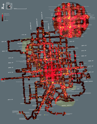
This map has a texture of accommodating the individual storyline or narrative that makes its reading an active part of its enjoyment, by engaging individual storylines in a dazzling if fragmentary novelistic detail, challenging the legibility of the map’s surface of significant local depth for readers who can take the time to delve into the map to read the actions that its maker associated with a specific place, but which would be ‘overlooked’ by scanning the broader path of his itineraries across the city:


detail SF emotion map

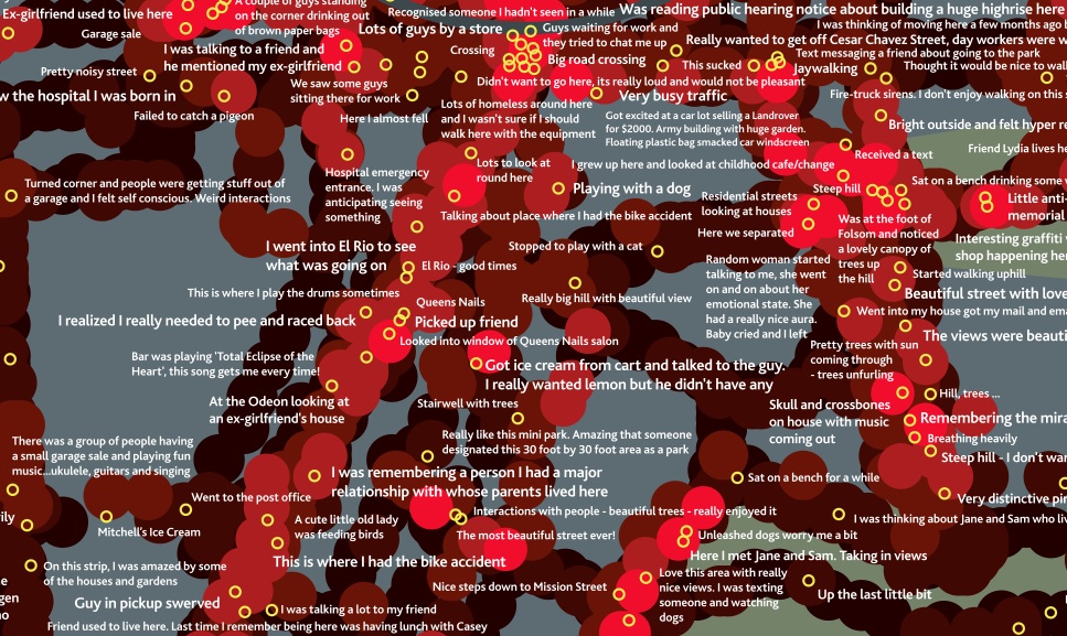
GPS was used, in other words, to contextualize multiple narrative fragments in a composite view of the emotional significance of urban space  by tracing if a residue of collective emotions on its surface.  The completed artifact combines multiple spaces of reading, augmenting the notions of position that he noted in GPS at specific way stations by his own transient or apparently ephemeral personal reaction to the city at a specific place–“beautiful street with lovely houses”; “went into my house and got my mail”; “This is where I had the bike accident”; “i was remembering a person I had a major relationship with whose parents lived here”–that foreground the personal in ways GPS cannot alone register.

The practice of GPS creates a synthesis of discrete meanings rarely associated with geospatial mapping, and puts a premium on emotional or associative precision, as much as the abstraction of terrestrial locations.  A similar desire to base a map on personal narratives to record the city as an emotive space led Ingrid Burrington to take data from Craig’s List “missed connections” as the data to reveal a hidden distribution of the desire for half-glimpsed connections in her “Loneliness Map” (2009-11), included in an earlier exhibit of personal maps Harmon earlier curated.

The map’s unique pinpoint form focusses observers’ attention on mini-moments of “missed connections” in the course of the day against a map of physical topography and street intersections, as if to present the variations among missed connections as an emotional terrain or urban psychogeography, creating a new sense of reading mapped data to register a notion first used by situationists such as Guy Debord.


burrington-ingrid-online-image-main

Burrington--Missed Connections


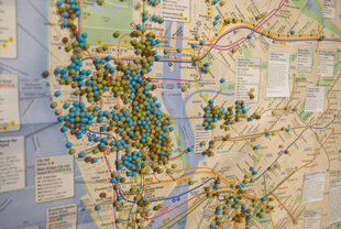
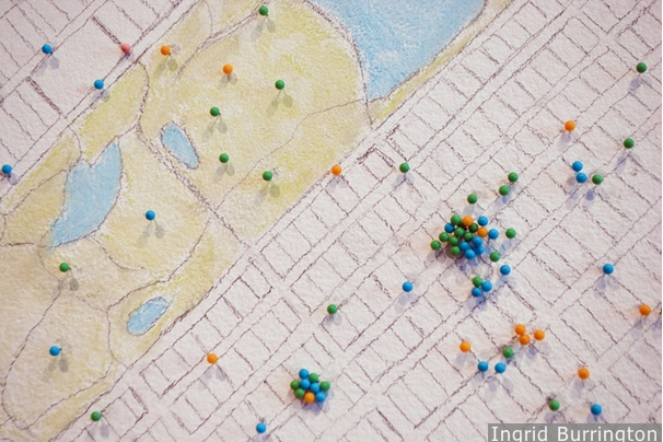
Such collected ‘mini-moments’ trump the topography of the city, tracking personal attachment to selective moments in urban space as more meaningful than the mapping of the outlines of its streets that create a new experience of reading the map’s surface.  They recall the Mappiness (LSE) smartphone app, which disrupts the relative abstraction of space in a GPS framework by registering our own states of happiness on a map.

The map becomes a site to register individual travels through the city in a collective document, or a capacious holder of narratives, as tangible with resonance as any map might ever be.  And the very tangibility of this record of encounter that maps allow, even with limited qualitative content, suggest the underlying basis of cartography as an art.

1 Comment

Filed under 9/11, Art and Cartography, Chesapeake Bay, Google Earth, Google Maps, Guy Debord, Jeff Sisson, Karin Shneider, Katherine Harmon, Mapiness, Mapping and its Discontents, Mapping Bonga deepwater drilling, Masjid al-Haram, Niger Delta, Stamen design

The Map is Dead–Long Live the Map!

Participants at the symposium Mapping and Its Discontents debated the benefits of the near-ubiquity of uniform mapping systems sponsored and orchestrated by Google in our lives.  Many of the wonderful papers tried to suggest the benefits that mapping served as alternate ways of making visible the unseen and giving voice to the silenced–but did so with deep skepticism of the dominance of Google Map’s blandly undifferentiated surface, both as a sort of collective erasure of knowledge, and a sinister synthesis of gathering meaning about individuals’ consumption habits.  In this somewhat hopeful symposium, whose speakers urged the audience to go forth and map, Denis Wood offered a skeptical history of mapping as a form of art, focussing less on its craft than on the contexts in which it was read and exchanged–and the historical “explosions” of map making as a tool of state-making.

Although Scott McCloud does trace comics back through cave paintings and the Bayeux tapestry, something we recognize as a comic book it to printing and mass-production of paper in the mid-nineteenth century, the printed ephemera Alan Aldridge and George Perry first identified as antecedents to  the sort of fantastic album art he produced, we don’t see much we would recognize as a map until printing, Wood argues–and that the fifteenth century is a good place to start the history of maps.  But rather than peg the map to the material practices of the production of information, the ways of embodying information and need to embody networks of spatial organization reflect the new need of an emerging modern nation-state–as well, he might add, though he omitted it yesterday, the need to straighten out clear bounds of contact and digest the discovery of new worlds.  (One might object that rather than leave this entity of the “state” so monolithic, dual origins of causation can be seen in the Renaissance, both as a period of contact with new worlds and that gave currency to the creation of newly imagined worlds–the “other Green world” of Harry Berger–as joint ground in the poetics of making, reading, and reproducing the map.)

As longtime interrogator of the power of maps and enfant terrible of the cartographical establishment, Wood’s opening salvo called attention to how print helped differentiate the standardization of shared practice of mapping space from the genealogy, charter, systems of notation, almanacs, calendars, or rolls, maps served to conjure the state to existence in its graphic performance–and to conjure the state, in ways repeated in histories of Japan, Siam, and the United States, as Elizabeth Berry, Thongchai Winichakul, and Martin Bruckner have shown, as a natural object, when it was not before.  Any attempt to naturalize the map either as a depiction of the world’s surface or universalize its documentary function, he noted, including the celebration of the recent democratization of mapping skills that seem to dislodge authority from the map’s form, passes over the map’s role in the state and state formation as a form of spatial intelligence and spatial intelligibility.

We might do well to look for origins, Wood proffered, by asking exactly when it became a slur on a civilization that it does not use maps–or couldn’t read them.  The question was enticing because of how it raised questions of the ties of map making less as an instrumental tool of dominance over space, than a standard of civilization and knowledge–a standard of the sort that Graham Greene evoked in his postwar visit to Liberia, Journey without Maps (1949).  Although Greene’s visit to the colonial outpost was certainly a product of Africa’s partial colonization by European industry, and the end of English empire, his account reflects Wood’s point that maps exists only where social relations call for them exist:  that where talk serves, maps are rare; but that when talk becomes inadequate, alternative graphic forms of communications develop within the state–of which the map plays a central role.  Greene beautifully if parsimoniously evoked the elderly toothless man with whom he shared a boat ride at the end of his 1946 journey who suddenly approached him with a piece of pressing news:  “‘Do you know that in Monrovia they have a map of the whole of Liberia?  I’m going there to see it.  It is in the possession of a family called Anderson.  They have had it for years,'” he says wonderingly, suggesting amazement at the foreign family of colonizers who possess a map of the entire country in which he lives.  “‘Sinoe is marked on it,'” he continues, “‘and Grand Bassa and Cape Palmas,'” repeating what he has been told by others, but never having seen a map of his entire land.  The encounter might well have been invented by Greene, but created a topos for the encounter between the map-literate and native that presumed an eagerness for encountering a map–the map seems a sort of lodestone–that might be either a western fantasy or a deeper discovery of a land where, absent the myth of colonial organization, the residents don’t know maps, or an illustration of deep ties of mapping to the civilizing process delineated by Norbert Elias.

Printing allowed the map to penetrate the lives of people about 1500, unlike other forms of data-keeping:  for the creation of a map that penetrated the lives of ordinary people and readers effectively under-wrote social relations of power in very concrete, linking territory to other things in ways that advanced the making of maps and shifted the role of mapping as an enterprise:  we count only a few thousand maps prior the growth of the nation, but an explosion of the production of maps in the sixteenth and seventeenth century occurred of the sorts of which was never known, and parallels the map’s entry into individuals’ lives to a degree that never occurred earlier–a notion, as Wood long ago argued, of “map-literacy.”

Nations were indisputably the new arenas of this move to mapping, unlike the printed maps that were widely sold in Italian city-states or the Netherlands.  Earlier maps such as cosmological charts, star maps, or property charts of the Babylonian period or in Japan and England had legal purposes, but quite different from large-scale graphic property function in varied places around the world, and without participating in a map-making tradition in projects such as the mapping efforts of Phillip II to create detailed records of imperial possessions in the Mediterranean, or the huge map making projects of Louis XIV and Colbert that are tied directly to the state and to the material recreation of state sovereignty.  (Of course, this raises the question as to why maps first emerged as forms for advancing epistemic claims and embodying places in areas that were less clear as examples of the modern state, like Italian city-states or sites without empires like the Netherlands or whether the imaginative ends of mapping can be separated from their administrative ends.  Wood sees them as being as tightly tied as the sides of the same Moebius strip.)

It is in this arena of the state, Wood forcefully argued, that we can see the inauguration of modern topographical functions from real estate, to prisons, to cellphone use, to voting practices, to states rights, to a point at which we can’t consider life without maps.  The date 1500, far from being one of convenience, is something like a benchmark or velocity point for the new roles that maps began to play and that they continued to assume today–a point of no return, as it were, of the sort Ian Hacking drew to mark the emergence of probability at the date 1660.  Only after 1500, or in later periods, did mapping emerge as a way of life, Wood insisted:  if some fourteenth-century monks drew plans of their monastery, the idea was not widely or even narrowly pursued as a basis for collating evidence, or followed up on in ways that reflect the multiple functions maps came to assume.  There is a bit of utopianism here:  whereas human societies didn’t need maps, and got on well without them before 1200, he argued, noting rights and properties’ specific attributes in other ways,  the map’s discourse-function failed to develop itself as a means to exploit strategic resources and to have operable use and currency.  While he recognized the evidence of the creation of maps in Song-era China within select parts of well-established bureaucracies, only later did maps gain a large discourse-function of operability.   This may be a bit of a slippery logic, but argues that the “map” had new meaning at a certain point as an object of exchange, and that no properties inherent to its design exist save as such an object of exchange.  So much for its formal attributes.

Wood marked the birth of the map that is now perhaps dead  at this sort of a watershed:  in 1400, few used maps; by 1600, maps became inseparable from social functions in a global context that is itself only beginning to be mapped.  The abundance of eighteenth-century maps in China, or in the seventeenth century in Japan, and in Vietnam from the 15th and 16th century, and Mesoamerican and Malay maps in 16th century, are traditions that inaugurated in the early modern state.  Indeed, there is a weight of evidence to shift this change in the growth of European knowledge, and it reflects a massive rise of needs for map making to ensure border control, water management, land reclamation, military needs that just exploded with the state.  If even in Florence, Italy few maps exist from before 1565, Florentine, Neapolitan and Milanese mapping projects all exploded in the sixteenth and seventeenth centuries, as they did in seventeenth century Japan, when thousands of government maps issue in Japan, and maps served to perform the form of statehood.  

What changed, Wood argues,  was that then new political structure of impersonal construction demanded new forms for its embodiment, and gained a propositional function that was absent from earlier map making traditions–a propositional function that was necessitated and called into creation by the state.  He recalled how Martin Bruckner showed how the image of the national map of the United States staked the proposition that there could be a tenable unity among this expansive nation, much as imperial maps of Britain tried to persuade readers on both sides of continent of imperial possession of north american content, as an artifact of state–both of these cases illustrate the new tangibility that the map assumed as a means of calling the expansive relation of the state into existence by the graphic performance of statehood that was newly enacted in the printed map, and which the map served to make legible.  As Thongchai has shown in his work on Siam, maps served to produce the very “geobodies” that become totemic through the map’s presentation of the state, creating a sense of unity not familiar to many, but able to normatize a nascent polity, and to instruct countless participants in the construction of our country–even without a clear idea of citizenship.  The skill of state apparatus lay in bringing routine of state practices to a larger audience, as Valerie Kivelson argues in Russia, down to a lower level of reading–as the map served, both in Japan and elsewhere, multiple function to against the images of other states and other imaginative constructions.  Identical patterns of map-use can be found in these cultures, and, not surprisingly, in the post-WWII state of Israel, founded in part by European Jews:  in each place, maps affirm the state, the state affirms the map, summoning unity from . . . chaos.

The medium of the map and its power as a form of synthesis arises as a new form of narration when other forms of narrative do not suffice–it is both the master-narrative and originary myth of the modern state.  And, indeed, maps have become so powerful to bring objects into being in concrete terms, that it would be impossible to discuss otherwise in a multitude of ways–from the nation to the distribution of electoral politics to the spread of fires to the ozone hole to El Nino.


Footprints of Actively Burning Fires--Google Map

Ozone Loss Map


The credence that maps create by linking subjects of propositions to a specific code enables these new subjects to be discussed, and in linking subjects of propositions like the state to the code inherent in mapping, and to real relations in the world, maps can come to signify the world, and networks of causation within it, as well as prospective statements for its future.  As Wood wrote in an earlier context, “Insisting that something is there is a powerful way of insisting that something is.  Mapped things–no matter how conceptually daunting–possess such extraordinary credibility because they’re capable of propelling into popular discourse abstruse abstractions:  high-pressure cells, El Nino, seafloor spreading, thermohaline circulation.”  Or global warming, or the the expanding ozone hole, earthquake swarms, or the global threats of desertification of arable land.  These curious abstractions enter public debate as concrete terms, if never clearly grasped, based on their cartographical realization.  It is, of course, only because of maps that these very issues can become contentious foci of public debate.


Tracing Sandy--Time Map

Prognosticating hurricane_sandy_map


The map serves double-duty a representation or a cloak, Wood makes clear.  Its two-fold duties are so effective to make creative practices of map making disappear, to make states affirm their role as real things of nature–even as maps obscured their own existence in the reasons of the state itself.   And if it’s hard to imagine that these artifacts as nations or concepts like ozone could come into creation, without the creative functions of the map, the wonder of the map is to link subjects of proposition signified (State) with signifiers constituted by their code–and to signify the world.  This might explain their clear currency as a form of realizing the make-believe, or fantastic, with a sense of actual concreteness by delineating a credible topography with which we can visually interact–especially while reading a text, and in whose creation we can indeed vicariously share, so powerfully creative do they affect their readers.

The use of maps to lend credence to propositions in the early modern world led them to embody abstractions from the map of “Utopia” Thomas More pointedly included in his dialogue of the same name, the maps of emotions Mme. de Scudery devised as Cartes de Tendre, or Jonathan Swift’s maps of Lilliput and Blefescu or Gunniland in his “proposal for correcting modern maps,” or–and here we leap centuries–modern ancestors such as Stevenson’s Treasure Island, whose fantastic claims to embodiment in maps extend all the way up to map of Middle Earth–and to those Christopher Tolkein subsequently expanded–whose publication and currency, he argued, led anyone with a computer software applications to make maps from Grand Theft Auto to map art, as map is congenial subject of exhibition.

More Utopia Map

220px-Moll_-_Map_of_Lilliput

Carte de Tendre

But are not these maps playful inversions of the operative roles of maps as tools of state–orchestrated by figures with close state roles, as More and Swift?  The role of middle-range cartographers from E.H. Shepherd to Christopher Tolkein to Jules Feiffer, to trace one genealogy, seems quite distinct.

phantom-tollbooth-map


Is the state’s stranglehold on cartography at last weakening, much as Wood asserts, even with the diffusion of mapping platforms and the availability of digital mapping tools?  Wood detects a twilight of the age of the paper map as leading to an end of the dominant role that maps of states once enjoyed as vehicles to view boundaries and confines of state possession and areas of juridical control.  This does not mean that maps are less used by the state.  But that the map is less the gripping tool of engagement whose history he has traced since circa 1500, the magic date from which maps were, he argued, so instrumental in conjuring the subject of the state and so successful in naturalizing its truth claims as part of our world.  This may be curious, because of the proliferation of digitized maps that defines potentially unwieldy concepts–global warming; the ozone hole; hurricane Sandy’s path; plankton algae bloom distributions–that can be latched onto in public debate and, occasionally, grasped.  Or, on a humanitarian level, the sort of crowd-sourced map of deaths in Syria’s civil wars, legibly tracking a succinct geographic table of the distributions of killings, rapes, revenges, and poisonings or the humanitarian disasters of the Syrian refugees whose number has far surpassed two million.

Crowd-Sourced Mapping of killings, rapes, revenges and poisoning

Syriatracker

Syrian Refugee Crisis


We can also distinguish better and worse attempts to map  tragic humanitarian disasters among these visualizations.

One may, indeed, ask what constitutes the state today–and try to map it–or try to define to the widespread distribution of mapping functions within states.  Wood presented the insanely rising prices of old maps sold at auctions today as making something of a mockery of the idea that states so monopolizes the use of maps that it cannot but illustrate state functions.  But are not these maps, now evacuated of meaning and illusions of power, disquietingly assuming a role, retrospectively, as images of a world where power worked differently, or of an age when the design of maps was performed with such due diligence and care?

But Wood is perhaps too happy to say goodbye to the map.  If this grammar is not that much less operative, is it true that the state’s stranglehold on cartography is now weakening or has weakened?  Or that cartography–and the illusion of the map–has outlived its function as a basis to visualize the nation?  Wood doesn’t find that the state can any longer repeat the trick of naturalizing its own presence through the operations of naturalizing with GIS tools, partly because of their lack of similar persuasive skills.  But if it may be argued that the state has no need for the same truth-claims any more, as they are, somehow, finding themselves to be outdated, that doesn’t mean that the collective power of mapping does not exist outside the purview of the state, and as an activity of resistance and calling into being new information, as several other papers delivered at the same conference by Annette Kim and Rebecca Solnit showed.

But although maps arose in needs of nation state to take on form, and organize its interests, rather than seeing some sort of triumphalism continuing in the use of maps to shore up the nation-state, from Raleigh, NC, Wood doesn’t see the map as doing that good a job even as a tool of surveillance.  And he sees the use of maps to call attention to historical practices, and even to restore historical landscapes, as well as address issues of social justice, as marginal to the disappearance of the map as a tool of state control.  The declining efficacy of the sort of operations that maps were able to accomplish, he notes, seem to have contributed–notwithstanding the omnipresence of maps in our lives–to its declining authority, more than a ‘democratization of mapping’ can be celebrated. But as the functions of state-power also seem to be less clearly visualized–and preserved–by means of maps in an increasingly interdependent world where the concept of the boundaries of a map have less meaning as fabricating a category or signifier out of whole cloth, perhaps the map would enjoy new versatility as a tool outside the rubric of the state that so long sponsored it.

If one can talk about a geohumanities that extends beyond those with digital expertise, who engage in studying and producing the culture, that would depend on understanding of ‘map making’ not only as a practice, but as a verb engages other contexts, and a verb that offers something like a grammar in conversation that is specific to the map as an object, distinct from other accumulations of evidence, as well as appreciating the role of mapping as an art.  If in an age of such widespread collations and ordering of evidence, the paper map–and the official map–is somehow rendered obsolete, even as multiple maps continue to wage authority in ordering our lives.  But the ubiquity of Google Maps can be resisted, if only by making its origins better known, and its the limits of its practices evident.  To be seduced by their objectivity is surely to ignore the continued power that maps still have.  If maps continue to offer such a pleasurable area of exploration in Grand Theft Auto and other media, it seems likely that personal meanings maps afford provide not just diversions in the esthetics of map making, but appropriations of an all too familiar authoritative form to define boundaries of inclusion and exclusion, trace networks of meaning, and give stability to collective entities, even in the age of the slippy maps fabricated by Google that convert declassified satellite photographs to easily downloadable tiles.

Wood’s prognostication of the death of the map seems premature.  Perhaps we, as consumers of digitized information, pay attention to its grounding in geographic reality and its operations, and are also less susceptible to the sequestered codes contained within maps, or the truth claims of a single map’s persuasive form.   Perhaps the map’s near-ubiquity cannot but decrease its authority.  But we do seem to stand at the brink of a future where mapping is ever-present as a form of surveillance; perhaps a society in which power has learned to work in new ways, unmoored from maps to define power and realize or recognize its bounds, but has adopted mapping forms as dispersive ways to organize power claims.  But in this society, maps can gain new power as media to realize networks of which too few seem aware.

Wood suggests that the map is dead, perhaps, as a useful tool of conversion in the arena of state.  If the act of mapping seems less clearly situated in the arena of the state, or less dominated by the state, this does not mean that maps are media that don’t still mystify relations of power.  And if the leaks of Edward Snowden have shown that the state is surveilling us to a far greater extent than ever imagined was the case, Wood found little evidence that that has made so much of a difference, or that that helps states do much of a better job.  The query cannot but arise in response:  did the map ever do that much of a functional job, or only a basis for imagining a state that performed its functions well?  Long live the map, perhaps as a form of counter-mapping.

Leave a comment

Filed under Google Maps, infographics, mapping state interests, maps and state formation, newsmaps

D3 Maps the Filling-Up World

D3 images, or data-driven maps, shift with the content that they seek to display.  They in other words provide tools of spatial analysis unlike static maps or terrestrial projections:  for rather than reflecting or arranging data in a static form, by analogy to a window, such maps reveal the changing data that drives their design.  Such maps lend themselves in timely ways as tools able to chart a changeable terrain–or the shifting configuration of a distribution–which often are tied to data feeds, rather than employing a fixed dataset.

Since D3 maps are often able to take advantage of their mutable forms by being incorporating new data, using it to determine the rendering of a shifting actual space or set of inter-relations.  So the mapping growth of population in the world’s countries is a classic example of a D3 tools of visualization, determined by the growth of residents in each country:  although the base-map of the recent simulation of world birth/death rates by software developer Brad Lyon is a familiar grey projection of the continents, the constant data feed that shapes the map, locating individual births and death in specific places, and tabulating the greatest numbers of births in individual countries, is also a visualization of Tobler’s first Law of Geography:  that “Everything is related to everything else, but near things are more related to distant things.”  For the changes in global population are understood in the unit of the entire inhabited earth in this very catholic map, rather than as able to be confined to the borders of individual countries.

Among the benefits of using D3 visualizations to chart the rhythms and rates of births and deaths is a channelling of immense amount of information that is both a tremendous ramping up of cartographical omniscience that the viewer can often barely process or register in its totality–for the edges or contours of the map can be changing constantly, rather than the map being designed to reflect a stable dataset.  The popular new map of changing numbers of birth and deaths in the global population provides a neat visual example of using maps to geo-tagged births and deaths to part of a nation, offering, in either simple screen or beta-version simulation, something that would not be possible in a static or simple paper map.  In a visualization of the drumroll of births and deaths, the resulting map creates a record of the inhabited world that is “eerily omniscient” as James Hamblin aptly put it in The Atlantic, and God-like in its observation of births and deaths everywhere:  as the map’s odometer-like upper panel trucks past the 7 billion, 93 million mark, we are asked to face the challenges of comprehending on individual terms what truly approaches, if only asymptotically, something close to a God-like perspective on mankind.

By visualizing an approximate record of “world births and deaths in real-time,” in a map that extends to its literal meaning the notion of the “inhabited world,” the content of this map challenges not the borders of maps, as do so many D3 projections, but the viewer’s own boundary of self, or the meaning of this endless tabulation of the appearance and disappearance of lives on the planet and the regions of their greatest increase.  This single frame of the ongoing graphic portraying a record of world populations over the globe’s surface, in what might be called, with more than a wink, a truly existential map of the place of humanity in the world:


Visualizing Birth and Death world Wide at 5-27 Oct 30 2013


Never mind that the countries are only light grey outlines, and the subject of geography is secondary to the map’s shifting contents.  At issue is not how we inhabit the space, and not the centers of population or their distribution, but a statistical ping of each birth and a death that can be easily geo-located, blips of text that overwhelm and even detract attention from a grey base-map that seems to recede below each announcement, until they entirely bury the map, no doubt as our population will bury our world if its numbers proceed to grow by a further 44 percent by 2050.

There is no need to ask where these people will live or how they will be fed in this visualization:  we can wonder that all we like as the number of births proceed unimpeded, always far in the lead of the counting off of individually tragic deaths.  But in their collectivity, the amassing of these numbers is difficult to comprehend or register–and not only because of the relative objectivity of the simulation.   As one looks at the data visualization and the so rapidly increasing numbers of its statistical simulation, it starts to become evident that the perspective it offers is just not tenable for a viewer to start to process; its numbers perform an odd if awesome balancing act between concrete actuality and abstraction impossible to really comprehend, and we wonder where this data flow derives, as its ticker-tape pop-ups jerkily transport us to half-familiar or unfamiliar cities as it notches population growth, and the map is buried by textual banners–much as their viewer is buried by an unweildly surplus of information.

Software developer Brad Lyon used some ideas and concepts of Mike Bostock’s D3 maps in order to create a real-time register of births and deaths worldwide–or a simulation of them–that the viewer could gape at in wonder, and view almost as the objective correlative of the bulging population of the world.  As was recently reported in The Atlantic, this digitize simulation charts the contours of the inhabited world, expanding the use Lyons made of United States Census data in his popular simulation map, designed with Bill Sneebold, to create a  visual readable interactive map of the country’s population.

The overwhelming effect is immeasurably more dizzying than looking at a paper or static map.  But perhaps this also conveys some share of the immensity that must have overwhelmed classical viewers, unlikely to have ever been able to process information of far-off lands, in early images of the classical concept of the bounded ecumene.  The cartographical canvas is both familiar and  disorienting, if only because of the size at which every birth and death appears, generating banner toponyms rapid-fire progression that one can allow oneself to imagine reflects the actual swelling of population numbers across the world in real time.  The immensity with which the momentary geo-markings of this tally invests new claims in a pretty standard projection of the planisphere; highlighting specific places in what almost seems a random-generator makes its surface a field that is entirely disorienting in its surplus of detail:  as soon as one finds ‘news’ of a death here, in Khasakstan, there is a birth in Bolivia, and two more in Punje, so that numbers  Starting from the very moment that you open it up, and continuing until the screen becomes completely illegible as ticker tape birth and death announcements utterly obscure its surface–


10;24 to 10;53--Oct 30

or until you get in a hazy-headed stupor and realize that you’ve been watching the register doing its’ job for too long, and just have to leave the room since you can’t really keep up with all this–is an real-time image of the inhabited world, and a reminder we may have just have access to too much data.

The visual register in the screen image not only announces each and every birth and death with a punctual precision that is always eery, but keeps a tally of the totals and their distributions in each country, and they all cause one to be reminded relentlessly that births always outstrip deaths.

Visualizing Birth and Death world Wide at 5-27 Oct 30 2013


In ways that mapping the boundaries of mapping the world challenges the boundaries of self, the popping of up sites of individual birth and death on the simulation, which occurs below a population counter of the high velocity of our course of global overcrowding, the map is mind-blowing because it challenges the boundaries of what the viewer can hold in her or his head, as much as because of its terrestrial coverage–there is a sort of hortatory “look here!” “no, here!” “here goes again!”–that calls one’s eye back to the day-to-day nature of lived experience that is so often outside the horizon of maps, and rooting them in an ostensibly exact record of the transit of time:  from 5:10:26 p.m. to about 5:30 on October 30, births occurred at a rate of 4.2 per second, as 4,210 lives began, a large number (about a sixth) in India and a fourth in India and China, compared to 1,879 reported deaths during the same interval:  the explosion of population is captured nicely in that chunk of less than twenty minutes.


Visualizing Birth and Death world Wide at 5-27 Oct 30 2013


And indeed it seems, at first, that the number of births in China and India dominate the map overwhelmingly, as they also  form by far the greatest percentage of births world-wide, according to the data feed, as text appears that clutters the expanse of the terrestrial world, as if to provide a dizzying counter-map to the stability of terrestrial contours, that will eventually obliterate the map itself:


Births and Deaths in Asia?


But then one realizes that this is a conceit of the format of the map, or its display of geo-tags, which oddly cluster over the area of Eurasia as they are generated by incoming data, even if they are from cities in the midwest of the United States.

Of course, it’s not like you never knew that folks were regularly born and died in this world, even in places that you’d never been or will ever visit, but this almost “odometric  perspective” of individual lives clicking by, new ones popping up in places and others vanishing elsewhere, could either be a Buddhist envisioning of the ephemerality of being or a worrying sign of just how quickly things are crowding up.

Take a look at the beta version in Google Drive:

https://googledrive.com/host/0B2GQktu-wcTicEI5VUZaYnM1emM/

The post-modernity of this form of D3 mapping takes the ancient idea of the expanse of the ecumene, but turns it on its head:  the population takes over, swallows, and erases whatever qualitative content was on the map, as the base-map starts descends to irrelevance, and, illegible, is unable to offer us any bearings at all.  As much as offering a material subject, the D3 map unwittingly charts the ephemerality of the ecumene.

Leave a comment

Filed under data driven maps, data visualization, Google Drive, Interactive Maps, mapping population, mapping the populated world, Mike Bostock, terrestrial cartography

Data Creep

The relative onslaught of poor data visualizations so plaguing much of the news media may derive from a hope to attract new audiences as budgets shrink and bureaus decline:  by boiling down a “story” by dispensing with those bothersome words, they seek to make immediate impact on an audience by a powerful (and eye-catching) graphic.  Based on the self-reported responses to the “Big Five” personality test questionnaire that was developed in the 1970s, but recently used to aggregate responses via Facebook, which posits “five dimensions of personality” to distinguish personality types, based on the odd belief that, rather than reflecting individual character, one could detect “different regions of the U.S. have different personalities.” The self-reported rankings of attitude (curiosity, energy-level, tenseness, quarrelsomeness, forgiveness), efficiency (reliability, laziness, perseverance, efficiency), and character (shyness, moodiness, distractibility, sociability, rudeness) are values with little possible quantifiable relationship among themselves, which translate into a data-distributions of limited legibility or credibility after they’ve crept into a map.  Projected onto a map the colorful choropleth offers a “mood-ring for the nation” whose choice of hues communicates little intuitively:

state-map-personality-test

Unimaginative data overlays like this  lie somewhere between video games, a MacPaint program, and an adult coloring book approached with Prismacolor markers–more a diagram than a map, they serve to carve the nation into clear blocks as if this would clarify anything about national unity or collective networks:  such visualizations take pride in how they disrupt continuity in a search for a narrative about the national divides that are revealed in our political process, and do so with varying degrees of precision.   Their production seems to be driven creep of data into overlays atop base maps, as if to awkwardly digest the familiarity with data–and make all feel like they have access to truly “big data”–by using an image of the nation to bequeath authority even to miniscule data samplings by treating them as images able to visualize datasets:  this is an insidious format makes us thirsty for more of the same, as we seek to grasp divides and parse divisions with the apparent exactitude of a surgical scalpel.

The recently widely retweeted but fairly facetious map of “America’s Moods”, an interactive graphic mapping emotions titled “America’s Mood Map,” has circulated online with considerable popularity but is able to be blamed on Time magazine’s website.  The data visualization has just the right mixture of declarative insouciance and light-heartedness make it a meme and bane of online journalism, and a typical illustration of this dilemma.  The distribution of data that results deflect scrutiny from the very data that they’re employed to embody.  The interactive blocks of color in what seems a choropleth distribution are a bit compelling, until one asks what state-lines have to do with emotions after all, or if this just was a nifty way of converting data to visual form.

What sort of embodiment of data is going on here, one might well wonder, and question what the mosaic of colors communicate or signify.  Not to mention the map’s confusion of a question of individual psychology and gross geographic regions–especially such abstractly construed categories as the legal boundaries of forty-eight individual states’ authority in our nation’s union.

The interactive ‘map’ demonstrates the recent discovery that responses to the great American greeting, “How you doing?,” differ starkly across state lines in the lower forty-eight:  if in benign fashion, the result proclaims divisions and splintering that trump the continuity of territorial maps, and perhaps map an explanation for all the differences we already know.


America's Mood Map


Why “friendliness” is signified by red, “temperamental and uninhibited” by blue is as problematic as the lack of any continuity among these personality types, and the relative subjectivity of judgment:  it turns out that these are self-classifications, anyway, rather than determined by objective criteria–as if values like these could be objectively assessed.

The lack of material references in such ‘maps’ almost winks to viewers not to take them too seriously.  Yet the relative ease of converting statistics into overlays on base-maps in web-based formats, seems the rationale for their popularity as interactive media in on-line news publications.   Forget the actual map that orients its viewer to the lay of the land:  this is immersion in the map as interactive data environment.

The deepest difficulty of this data visualization may lie in how it confounds the empiricism of a map with pretty relative–and pretty vaguely construed–psychological categories. Although Time magazine science editor Jeffrey Kluger seems to have fun downplaying is meaning at the same time as he promotes it, “America’s Mood Map” is the most popular in the section “Science and Space” among readers of Time this past week, and a success by journalistic standards, is the interactive map of emotions across the United States, across which one can glide one’s cursor to reveal a virtual version (and modernization) of the early modern Carte de Tendre over which you can mouse about to find a place that “matches your personality”:  but rather than visualize material renderings of feelings or emotions, as that topography of amorous practices, the imaginary topography over which we mouse to find the ranks of each state’s inhabitants reveals clear divides rather than a detailed qualitative record.  Data has crept into this map’s bright mosaic of colors can’t help but engage other data-vis maps, with which its full-spectrum color schema stands in such stark contrast.


Moood Map of US

Although the color blocks are arranged in something like a spectrum of friendliness to temperamental, the actual values on which they are based provides something of a map of mental constitutions, as much as emotions, and one can range of neurotic to extroverted, with open-ness thrown into the mix.  The explorer of the map can find themselves, for example, in “agreeable, conscientious and open Tennessee;” we all know a few who fit the description:


Conscientious Tenessee


The ranking of each state surely increased its popularity, as the map becomes yet another tabulation of characteristics after one mouses around a bit on its surface.  California, predictably, is both relaxed and open (#2 nation wide!) and low in neurotics (#43; agreeable Utah lies at the bottom of the heap at #49), and New Yorkers are temperamental but ranked as among the most open (#3).  (Such classifications based on a sampling of 30,000 must conceal the detailed nature of the questionnaire.) Who would have thought that largely rural Wisconsin, a state with one large city, possessed the most extroverted population in the country? Or that Maine stood near the nation-wise apex of neuroticism?  New York gets pretty low marks for “agreeableness,” whatever that means (#48 in the nation), if it is also pretty high in “openness.”

There might be some problems with the data pool.  Perhaps the map’s very lack of materiality makes it difficult take seriously, even if the pleasure of using moods to divide the country seems a relief from dividing the nation by ideological divisions.  (The next step that this map seems to invite is no doubt for carto-data-crunchers or map-readers to map the moods of the nation onto those political divisions:  how better to easily explain the ideological divisions that grip our media on the eve of the Affordable Care Act and the morning after the Government Shutdown?)   Indeed, the interest in the “mood map” among Time‘s readers might been generated in part by hits from all those readers, long subjugated to an onslaught of data visualizations, who want to explore their own states in the mirror of their own states of mind or who want to try to map the now-tacit maps of national division onto the far more innocuous (and un-ideological) question of moods.  Indeed, this stepping out of the recently emerged graphic lexicon of ideological division and splintering is somehow reassuring, as, much as the article announced, maybe its mistake  this country “features the word United in its name,” since “we splinter along fault lines of income, education, religion, race, hyphenated origin, age and politics.”

Maybe it does really all boil down to constitution and emotions, all those earlier data distributions be damned.  The end-product is something of a polemic rebuttal to the authority of earlier data visualizations in the news, to be sure, of a very tongue-in-cheek sort of very, very muted irony.  The text’s injunction to find where you belong in the map–by your mood, not by where you actually are–invites you to glide your mouse over a map with the authority of a spatial distribution of the rainbow colors of a mood ring, in a pretty abstracted state of mind, so unlike the ways in which, say, a detailed topographical map registers the measurement of physical elevations by exquisitely exact orographical detail.

The survey employed was based on a sample of under 30,000 respondents, but passes itself off as a pretext for self-examination or -understanding, complete with the assurance that results won’t be reported or stored by Time is respectful of your privacy (perhaps to marketers of antidepressants?).  Whether it is able to map such stark divisions of “mood”-tendency beyond statistical error is unclear, although the almost spectroscopic division of the nation into stereotypes seems somewhat persuasive:  the center of the country, if not so large a swath as the “red-states” of Bush years, is proudly “conventional and friendly,” unlike the creative types on both coasts:  the mapmakers permit little constitutional overlap among these categories, or multiple combinations of them, so much as render one of the three criteria for each state, and allow little overlap among them; the cartographical “paratext” to the map placed above its panels invite its readers to take a short test so that one might place your personal constitution where it really belongs, and suggests that these three metrics are rigidly exclusive from one another.


Moood Map of US

The result is a new portrait of the dis-united states, several of which are already in widely circulation–and some even so widely internalized as ideological divides that one can’t make associations between this “map” of emotions to more familiar political and social divisions.  The data visualization may be taken as a pretty light-hearted response to our dramatically increased geographical mobility, or our obsession with data-visualization maps.  But Kluger and co-author Chris Wilson use the data of fellow-American Jason Rentfrow, obtained at Cambridge by a multinational think-tank created data by a psychological survey of their own device, and the map is presented in the rubric of the “Science” section of the magazine’s website.  The data that was used to inform the visualization, under the name of science, claims to reflect the salient divisions of what “for a country that features the word United so prominently in its name, the U.S. is a pretty fractious place,” as if it might be a more credible set of criteria to ascertain relative depths of fractiousness and their causes–despite its odd metric for measuring “emotional” divisions.

And its interactive features create at least half of the fun for its readers.  The notion of locating diversity in our moods is a lot more appealing than finding it elsewhere; the mirror of the interactive map is no doubt a partial reason for its popularity.  Indeed the invitation to guide oneself to one’s own and one’s nation’s emotions might be hard to pass up, if it suggests quite a lack of complexity in the terrain revealed by introspection, which seems, here, to be equivalent to the completion of a modular form, rather than offering a topography that might be worthy of future qualitative detail.

There is a more authoritative, and perhaps more familiar, map of which the map dissected above might be called the comic repetition.  The study of state-specific variations in happiness (one emotion–that’s a better concept already) was the result of a study based at UVM of geotagged tweets, published in the online journal PLoS ONE, whose tabulators ranked over 10,000 words on a graduated scale to score some millions of tweets across the country, irrespective of their context, to reveal significant differences in sadness and happiness across the nation, perhaps better translating what might be called a set of emotional divides:


Happiness Score in One Map


Indeed, the clear “sadness belt” marked so appropriately in such sombre black hues, and casting a deep shadow over our southern states which curls up to the economically depressed areas of the midwest, suggest something like a meaningful map, with the noting of neat exceptions of particularly happy cities, Asheville and Green Bay.   The weighing of these cities as exceptions lends a credence to the overall distribution of tweets the researchers collated in their data visualization, and the depth of data on which they relied.  The substantive study collated tweets over several years, even tracing computable variations in daily happiness averages that could be mapped to contemporary events, creating a set of stunning data visualizations in this “hedonometric” visualization from 2008 to the present whose units of days are suitably color-coded for weekday, allowing one to register how daily variations are effected by workdays and weekends.  The “hedonometer” seeks to provide the most accurately parsed chart of “happiness” based on daily counts of the tweeted words of happiness–the most common five words of happiness used each day suddenly appear when the day is hovered over.  The  graph is great fun to investigate, and can be tied to news events that impacted the nation’s overall index, from the Newtown shootings to inauguration days or holidays:  note the nation-wide spike on events like Christmas, which, since we still seem to all celebrate or at least note in some fashion, always reliable produces incalculable tweets.

If the first map from Time is a descendant and comedic successor to the UVM map of happiest states, both seem to rehabilitate the paper map in digital form as something like a response to the need for a “GPS for the soul,” an unfortunate mash-up if there ever was one.  Such maps exist in the big data-visualization echo chamber that has dominated our abilities to envision our country.  This echo chamber has existed ever since we came to believe that the country could be meaningfully cut up in meaningful ways for ready consumption.  If it could lie in the easy access to maps and data visualizations, it seems to respond to an unquenchable the thirst for images explaining regional differences that underly such a dichotomously divided status quo, since the division has roots that cannot be purely ideological in nature.

The single spectre that haunts the rise of even the most banal of data visualizations in media news in recent years may be maps of electoral results, especially from the Bush-Kerry 2004 election, in which that large red expanse of the middle of the country created a contrast to a close electoral contest of 296 to 242, which could have been upset by a single state.

Bush 296 - Kerry 242

The map haunted because it was almost repeated in 2008, with a key variation, only to be beaten back in recent years.

Obama:Biden McCain:Palin

These images seem to be seared into viewers’ minds, or at least into the unconscious of data visualizers.  Data of all sorts has since seeped into the map of the contiguous forty-eight.

Of course, the mother of all data-visualization maps is the most spectral, which still resonates with what some still consider the death-toll of democracy that at least one justice has come to regret:


ElectoralCollege2000


The contrast between that map and the popular vote led to something of a polemic exchange that was based on peering into data visualization maps to parse the vote, we might have forgotten, that familiarized everyone with data distributions:


County by County Bush v. Gore


The mapping of the country’s population has gained increased symbolic currency as a sort of transparent rendering of national opinions, only dreamed of in the early days of NORC’s General Social Survey, and far more easily visualized.  The creeping of data into such visualizations of the nation as “America’s Mood Map” has, after all, lent new authority to a visualization both more colorful and less depressing than the dichotomous division of the nation into “Red” and “Blue” states of almost Manichean terms.

And they are also much, much less depressing than the sort of heavy-handed Google Map divisions of the country into those regions that are ready to relinquish pre-K funding or subsidies, an idea that seems to undermine our national interest, as well as of those states that refuse the expansion of Medicaid, all in the name of undue federal influence.  To start with the first, we can view it two ways in news media, but both ways to illustrate the difficulty of ever arriving at consensus:  the below interactive (and informative) map that explores the educational opportunities in the Southern states of the US illuminates differences in pre-K funding (click on the above to explore funding changes in each state from 2009 to 2011, since the color-scheme is not self-evident).


SATELLITE VIEW-PRE-K FUNDING CITS


Below is a far more austere and stark way to visualize the data on how low many states rank kids less than four years of age, in which depression about care for pre-schools increases for the viewer in inverse relation to darkening of states’ hues.

PRE-K US 2005

In the colors of the data visualization blender, where data undermines map, there seems no consensus at all, and a pronounced fraying of the country’s diverse demographic.

One can always cut up the country in different ways, and the preferred way seems less based on splinters than blocks.  But some of the choropleths are striking and scary, as the refusal to expand health subsidies in the American Care Act, to which we’ll return.  The proliferation of these visualizations of difference may arise from the rise of the mythic “sea of red” in the general election of 2000 election through the Obama victory of 2008 may have left us barraged by the cutting up of the nation into camps.  The rise of new data visualizations seek to address these divides, but often seem to lie in the data visualization echo-chamber–as in the case of the “map of emotions”–as much as

But then there are those who reject either the Common Core standards or Affordable Care Act alike as forms of undue federal interference.


REJECTING COMMON CORE


Rejection of the ACA reveals a similar fragmentation, despite some serious number-crunching that went on to illustrate the high proportion of poor, uninsured and low wage-earning residents in may those very same blocks of states:


legend- Poor and Uninsured Americans

8% poor and uninsured

This is an odd echo, as I’ve elsewhere noted, between the very regions which outright refuse government expansion of Medicare and those with lack of insurance and large numbers of low-wage earners and some of the same states that refused to accept clearance by the Dept. of Justice before they changed voting procedures as an instance of undue federal interference.


Clearance Required


It’s nicer just to think that it all boils down to individual moods, which the scientific status of ““America’s Mood Map” nicely parse along clearly defined state-lines–even if its end results may have the scientific status of a mood-ring.  The chromatic variations are at least attractive, and able to be read easily, removed from political dissensus.  And it’s certainly more fun to imagine that we might be able to find a sense of constitutional differences inherent in the atmosphere of a region, and mirrored in lines of state sovereignty, that somehow miraculously reflect an almost Hippocratic sensibility of the shifting humoral constitutions of residents of different climates, rather than political or sociocultural (and socio-economic) differences.

But it’s hard to make any sense of the visualization, largely since the very values that it depicts do not lie on a continuum in the manner of most polls or degrees of gradual difference, but seem qualitatively distinct, and even, often, judgment calls.  The state-by-state map of personal constitutions hearkens back to an early modern notion of how place and season inform the humors, or regional climates color the mind.

It is perhaps not a far stretch to include a data visualization of a state-by-state map of obesity trends (and no doubt diet)–


OBESITY 2010–although such a map seems to isolate the deep south and its southern neighbors from Texarkana to New Mexico.

A vague overlap of data seems to exist similarly sized region, sadly, is plagued by lack of completing High School–although this has little relation to body-size, and there is little evidence of a relation between them, even if it does speak to the difficulty of valuing educational reforms like Common Core.

The difficulties created by “inadequate education” does seem to divide the country, however, as this choropleth reveals, and not only among those able to complete High School, but even in those who, having completed High School education, were not allowed to be part of the Army corps–a truly shocking statistic that effectively does divide the nation.


GRADUATION OF HS


Perhaps the only visualization that communicates unity is one of  cell-phone coverage, which customers, after all, desire–


Verizon-4G-LTE-Map-e1370794274644-540x327


By way of contrast, and a lightening of humors in how our country sees itself, “America’s Mood Map” shows a diversity around that one red block at its center, oddly located at Iowa–and whose deep red oddly seems to signify conventionality and friendliness–a quality the color does not suggest.

America's Mood Map

Other blocks of states are similarly lumped in oddly generic categories of states of mind–states of mind with limited relation to one another.  Hence, California, following, perhaps, conventional stereotype, is both open (if not that extroverted at all, particularly), and the among the least neurotic of the entire bunch.


Open and Un-neurotic California


In the most charitable reading permitted by the aggregation of data, the map would be an exercise in empathetic understanding of one’s neighbors limitations.   If one can permits an excursus, contrast it to the varied topography in the historic early modern “Carte de Tendre,” whose richly varied landscape suggests dangerous sites of delay or lack of clarity that the unaware and unsuspecting traveler may chance across by means of its locally detailed variations.


Carte de Tendre


These elegant enterprising travelers with cockades are gallant explorers of the outdoors, of course, rather than perched behind their screens.  Both the material and metaphorical nature of the data-visualization map are absent:  for in these cartographical transpositions, the data poses irreconcilable and absolute divides, and blocks any consensus from emerging.

“America’s Mood Map” is an artifact that serves as something of a mirror to make sense of our divided polity.  If one can given it a generous reading as an amusement, however, it may merit being taken seriously.  The eerily radical conceit of the data-visualization is not only that we are not “United” at all, but that one can naturalize states’ rights arguments in the radically different constitutions of their inhabitants, as if separate nations:  hence, conscientious Tennessee lies beside irascible Kentucky; open New York nearby to closed New Hampshire, and far from neurotic Maine; agreeable and conscientious North Carolina beside a Virginia that lags behind in both categories.  The authority that data is conceded in this visualization in fact erases mappable divides between rural and urban differences, socioeconomic distinctions, and patterns of wealth or any qualitative detail, taking the blocks of the electoral college as something like a national phrenological map.  The notion of an absolute difference in constitution as lying in direct relation to those state boundaries creates a particularly insidious illusion of differences that essentializes state lines–rather than following the idea of national character–that echoes one of the deepest presuppositions of what might be called Tea Party doctrine.  For the diversity depicted in data visualizations is always one engraved in hues of essentialization, rooting regions dispositions as fixed in a spectrum as different wavelengths, and empties the map of any continuity or local detail with those flat color blocks of distinctly defined individual “moods.”

How are you feeling?

Leave a comment

Filed under America, America's Mood Map, Care de tendre, choropleth maps, data visualizations, Google Maps, Hippocrates, Hippocratic humors, Jeffrey Kluger, MacPaint, mapping national divides, pre-K funding, Red states v. Blue States, Tea Party, Twitter map

More Better Mapping of Oakland’s Populations

OAKLAND

Maps have long been described or conceived as windows–analogous in ways to pictorial perspective–that invite viewers to look into a space in new ways.  But both word maps as the above, made of the names of Oakland’s almost 150 different neighborhoods, or more statistically derived data visualizations of the city are mirrors that present a less homogeneous or continuous image of the city that we want to see:  if the roughly type-set image above suggest a make-do approach of the somewhat scruffy post-industrial port city with big loading docks, but erase its dirt or drastically depressed areas with lively type.

Data visualizations offer mirrors of the city’s inhabitants and shifting neighborhoods that are both dependent on the source-data that they use, and how they obtained it, but also on the dynamic layers that digital mapping allows us to place as overlays on the base-map of the city’s mountains and shores.  While these maps are only as good as the data that they use, they reflect back some of the divisions in the city that we might not otherwise notice or want to see.

And while not based in prose in the same manner as the Ozan Berke’s word-map that nicely knit together the city’s 146 vastly different neighborhoods, they offer ways of reading the city’s multiple divides.  The increased data that is available from Open Oakland and other sources will doubtless offer further–and far more refined–images of the city’s deep differences and their bridging, and can serve as better and more detailed maps of its populations.  But in the meantime, the sorts of mirrors these maps offer can also provide ways to imagine paths toward a future for Oakland, and better understand ways forward in its public policies.  Many of them draw from the American Community Survey, created by the US Census and discussed in earlier posts, but all seek to focus attention on the city and to serve, as mirrors, to show differently refracted visions of its divides, in the hope that few distort Oakland’s diverse populations.

A famous image of the distinctly uneven distributions of Oakland’s inhabitants is clear in a recent mashup of maps of the Bay Area Rapid Transit system’s public transport map–or, more simply, BART map–with the very zip codes that the American Community Survey mapped, which offers a condensation of the remarkable disparities and differences between income, education, child health and life expectancy at separate stations on the same public transport lines:

BART Health Map:Life Expectancy at BART stops

While, to be sure, the system includes suburbs such as Walnut Creek or Fremont, its focus on the East Bay  immediately indicates the deep divisions in a city where a BART stop can take one between areas of over ten years difference in life expectancy, and two more stops down either line sees life expectancy rise by seven or eight years once again.  The huge rise in childhood hospitalizations because of asthma in the City Center–far greater than in Fruitvale–suggests the unique pollution habits of a city whose air quality is still shaped by its proximity to a port.

The image of the diverse city whose neighborhoods are bound together as one unit starts to reveal fissures when one examines its ethnic and voting distribution at a somewhat finer grain, adding to the historical variations in the picture of the city summarized and surveyed in an earlier post.  The problem of mapping those populations adequately, both to reveal the ongoing inequalities and spatial injustice within the city, is not inherent in the city’s structure or divisions, but something that compels visualization in a myriad of ways, and in which we can look for different understandings of the shifting nature of the city’s socioeconomic (and sociocultural) divides.  As well as mapping the lay of the land, mapping the habitation of space creates even more of a “mirror” on the organization of th eplace.

Census_Mosaic

The census mosaic only shows part of the inhabitants’ picture.  Indeed, perhaps a “racial dot” map can be rehabilitated, rendering one dot/twenty-five people, to create a rough distribution Bay Area-wide that respects the looser definition of “neighborhoods,” and does not impose strict racial segregation, as in this image by Eric Fischer, using red dots representing whites, blue representing blacks, green representing Asian and orange Latino populations, in trying to prevent  overlapping and blending of color-points,  and better to define neighborhoods as an ethnic or racial enclave:

Racial Map SF--25:dot Eric Fischer
Oakland Alone--Fischer

Fischer seeks to respect Bill Rankin’s cautionary words that boundaries of neighborhoods are never so stark as on informational graphics, and that a cartographical index of one dot for twenty-five people is better able to allow “transitions also [to] take place [registered] through gradients and gaps” in the map’s surface, suggesting an urban geography without clear boundary lines, clear spatial differentials clearly emerge across the neighborhoods of Oakland, CA:

And while the city was once historically predominantly black, or African American, in its population, one still found clearly define enclaves of blacks that are, sadly, starkly isolated in census blocks, based on results of the 2005-9 U.S. Census:

2005-2009 % Afr Am Oakland

One can map, in relation to the racial composition of the city, the relative percentages of kids in public schools, one index of its community, and the stark dividing lines created by some of its highways and major roads, which divide the regions of the hills from the flats, where few kids attend private schools.

Elementary School Kids in Private Schools

This is given much further definition by the map of those who have completed high school, already used in in my earlier post in a slightly different version, which suggests a chasm between cultures of neighborhood far deeper than race alone.

High School Graduation

Perhaps the starkest underpinnings of this cultural divide is a map using the 2010 Census to define an ESRI visualization, of the city’s divide in income levels in the city and outlying areas:

oakland's Income in bay Area

Which one can zoom into for the City of Oakland, revealing a clearer divide in incomes around  Highway 24, still using Census Blocks, that again reveals some intermingling albeit with sharp divergences in Oakland that stand in sharp contrast to the larger Bay area:

Median household Income East Bay-Oakland in it

To track a deep change in the population of the city that occurred in only recent years,  Pietro Calogero tracked racial displacement from many neighborhoods that illuminate this divide in incomes, around the aftermath o California’s housing crisis.  The map of foreclosed real estate in west and southeast Oakland, the former “industrial areas,” which stand in sharp contrast to wealthier areas in the hills, to illuminate an economic ravaging of the city that shows up in no other way in a simple map–and indeed masks innumerable individual stories of foreclosure and moving out:

Foreclosures OAK

Although perhaps the map of foreclosed houses is difficult to tie to race, Calogero comes closest to revealing stories with a map in choosing to map how African American families were in fact disproportionately effected by foreclosures, and how former African American neighborhoods were gutted from the inside out as residence became unsustainable:

African Americans and Foreclosure in Oakland

The effective narrative of racial displacement that these dynamic maps isolate and present is not only compelling, but raises questions of social justice–and perhaps of social justice and urban mapping.   Despite the broad interpretation of displacement, both when occupied by owner or purchased as an investment, the clear overlap between categories of race and foreclosure seems not only unjust, but a deep crisis, underscoring and mirroring the deep segregation that continues in so many American cities.

And the repercussions of this sort of segregation are evident in the apparent disenfranchisement of despair, revealed in this simple map of voter participation that Ofurhe Igbinedion so astutely thought to create from Alameda County electoral data, which shows a valley of voter absenteeism in an area where the 2010 voting held low potential or positive prospect:

Oakland Voter Turnout

(Igbinedion’s striking–and dismaying–map, reduced in size above, may be viewed in far greater detail here, and will be posted in full with a commentary at http://www.infoalamedacounty.org).

The huge fall-off in turnout among the same population of a territory of disclosure suggests a political disconnect scary in its dimensions, if sadly typical for most American inner cities.  But the cavities of voter turnout in an election for which turnout was itself particularly high–or just short of 75% (74.52%)–suggests a sense of a politics of abandonment.  What, indeed, did the election accomplish for a large percentage of the city?   What resonance did the candidates even hold, or could they hold?  The topography of disenfranchisement is arresting if not puncturing of a vision of a city united in its neighborhoods, and sort of undoes the unity of its own mapping of continuity.

It is a sort of inversion of density.  Mapping the density of population in Oakland by census blocks reveals not only clear neighborhood divides but a uniquely geographic dispersal of demographics, most dense between the freeways and thinning out to the hills and the flats:

Oak Pop Density

There may be real reasons for not living by the shore below the freeway:  the area is not only late-industrial, but the ships spewing sulfur dioxide and pollutants exceeding standards for vehicles that are registered in the United States create a spew of particulate matter over the downtown area not confined to West Oakland, but reaching in to Chinatown, Emeryville and the Downtown area, areas downwind of the port, in this truly terrifying map, posted in 2013 by Sarah Brady and Alfred Twu, and charting the sulfur dioxide and particulate emissions of ships, using the Port of Oakland Emissions Inventory:

oakland-port-and-highway-air-pollution-map

The map reveals regions with air pollution up to 10 times the national average a couple of miles from the port, but whose effects increase risks of cancer and asthma extending twenty miles inland, creating a poorly-known map of particulate matter as an argument to raise pollution standards in Oakland’s port.  Notwithstanding the much-vaunted clean-up of the Port of Oakland, which were aimed primarily at legal safeguards at the level of diesel particulate emissions–emissions that have been largely blamed for sever respiratory problems among local residents–which have indeed decreased from 261 tons to some 77 tons in seven years. (If this was a reduction of 70%, the stated goal of the Port is to further reduce the emissions by 80% by 2020; since July 2009, ships have been required to use low-sulfur fuels within twenty-five miles of the coast, however, and the sulfur-dioxide emissions tied to asthma are not likely to decrease.). And a clearer drilling down of this data–for long, but one station for monitoring air quality even exiusted in Oakland, on Grand Avenue and Poplar, revealing how a stream of heavy trucks with diesel engines that power through the industrial region, and emit particulate matter to Chinatown and Fruitvale:

tHoodline via Google

The data visualization of micrograms of particulate matter per cubic m suggests how much this “tale of two freeways” needs to be examined in detail, and how many questions of environmental justice that the unregulated emission of particulate matter deisel engines disseminates across urban streets: the citizen science group  West Oakland Environmental Indicators Project (WOEIP) is currently engaged in a more detailed study and analysis of West Oakland air quality which the Environmental Defense Fund has helped fund, and they will parrtner with UC Berkeley, to create a clearer distribution of particulate matter of different levels–including ultra fine particulate that can cross the blood/brain barrier–in different regions, with special attention to the possible impact of ultra fine in the exhaust entering West Oakland and other neighborhoods from the 880 freeway and McArthur Maze–emitting some 22 known carcinogens in the urban environment. Both traffic arteries move dangerously high levels of particulate matter through sensitive communities including schools, hospitals, clinics, and childcare centers, in what Emeryville City Council members have come to call a “Carpocalypse.”

MacArthur Maze/Bella Nathan

Despite the suspiciously long silencing of interrogating the clear environmental quandaries of living near freeways, and silence about the impact of the heavy trucking tied to the Port of Oakland on the nearby poorer industrial neighborhood, would the release of such an array of carcinogenic matter be tolerated in other neighborhoods? The demand to use the rail lines to transport coal through Oakland’s Emeryville and West Oakland to the revitalized Port could be placed on the back burner of future city planners and cargo terminal directors in decisive fashion if levels of particulate matter to which residents are exposed is found to reveal: although the Oakland City Council barred proposed handling and storage of coal and petroleum coke at the Port for Oakland Bulk and Oversized Terminal LLC at a parcel the Army abandoned in 1999 that is new the harbor, a ban supported strongly by the Sierra Club and San Francisco Baykeeper. (Any port workers with prolonged exposure would be exposed to even greater health risks.)

The ban is argued to constrain foreign and interstate commerce on which the Port depends, and the city cannot regulate or restrict; coal transit was only banned after the land parcel was purchased and local jurisdiction over rail-borne coal shipments are unclear, despite its potentially aggravating environmental effects: the city has only lost the suit, indeed, as the effects of coal trains have not been studied as a vector of air pollution, despite fears that coal dust could blow off the open-topped cars able to lose up to one ton of dust between mines and port, and release 60,000 pounds of toxic fine particulate matter, on top of the diesel fumes emitted by their locomotives.

Can maps prove that the open-air transport of coal, designed for export, indeed pose a significant public health danger for Oakland residents? Although adding further diesel fumes and coal dust to Bay Area air–especially the dust of bitumenous coal mined in Utah, which has been encouraged by the Trump administration, lifting restrictions on strip mining and extraction of coal that would travel through Oakland, for which the Utah Transportation Commission has been instrumental in negotiating export rights at Oakland’s terminal, without any consultation or contributions of Oakland city council or residents–in April 2015, or before the first hearings in Oakland to study the health effects of the transport of coal and coke, and a broad–over three quarters of Oaklanders–opposition to the transport of coal on railway lines increasingly close to city residences cheek by jowl and often running along I-880–adding significantly to already dangerous levels of particulate matter by diesel engines and open-air cars bearing coal to the Port of Oakland that is in many ways emblematic of the city’s old industrial zone. After a downturn in Utah coal production in 2009, and hopes located the expansion of opening new areas of mining and new mines in 2011, opening the former Grand Staircase Escalante National Monument was long on the front burner of the coal industry–long before Trump told supporters in Salt Lake that “very distant bureaucrats . . . don’t know your land, truly, and don’t care for your land like you do,” and technically oened the regions to coal extraction–even if few corporations have undertaken to negotiate with the BLM for exploring old mines to operate in coalfields that the state had mapped, as if to entice speculation back in 2008.

Utah, Annual Review and Forecast, Coal Production and Distribtuion

Although local jurisdictions are with limited authority over the goods shipped by rail companies like BNSF, but do have authority over marine export. However, most existing studies on coal transport examine different grades of coal through rural areas and populations,–not large cities already possessing dangerously high levels of particulate matter that are densely inhabited. (Oakland has in response terminated construction on the old Army base, but is currently faces suit again.). The question of rail lines that would carry coal-bearing freight in close proximity to schools, churches, parks, and residences in downtown Oakland–a site of commercial revitalization–may raise attention to environmental hazards that West Oakland would even face far more.

OSM map of Rail Lines and I-880 near Port of Oakland CA

The data visualization of micrograms of particulate matter per cubic m suggests how much this “tale of two freeways” needs to be examined in detail, and how many questions of environmental justice that the unregulated emission of particulate matter deisel engines disseminates across urban streets: the citizen science group Woing its own study of West Oakland air quality in partnership with UC Berkeley, with funding from EDF, to create a better visualization of how environmental toxins are released in high-traffic corridors, and create new demand for remediation and social justice.

It’s not uncommon to value (and inhabit) property away from the shoreline.  Examining relations between elevation and population density in the wake of the shifting consciousness of the relation between water-elevation and land-use after Hurricane Sandy, Stephen von Worley offered the following interesting alternative visualization mapping elevation and population density on a spectrum moving from white to yellow to orange to blue, to show the sharp divide between hills and flats in the East Bay:

Stephen Whorley, Elevation and Poopulation Density (2010)
scale von whorley

A nice register of how this space is actually used or perceived, and, equally important, moved through, based on a collation of the adjustments to Open Street Maps of the city, suggests the well-travelled nature of Oakland’s major arteries and downtown roads.   How might this be registered in the surface of the map? is a question that is nicely resolved in this map of Oakland’s self-mapping of its major roadways.

Oakland, McConchie-every line, every point- Oakland

Alan McConchie–Stamen design

The Open Street Map view of Oakland, rendered so distinctively by Alan McConchie, tells a perfect story of the inhabitation of Oakland’s space by its routes of mobility, recalling the sort of GPS-derived maps increasingly common from artists like Jeremy Wood, who practiced “drawing with GPS” as a line of work:  it would be interesting to be able to map street-use at different times of the day, if possible, though deriving data of the abandonment of downtown Oakland when dark is undoubtedly difficult.

The divergence of nighttime and daytime is evoked, if not measured, in Michal Migurski’s brilliant layering of a “heat map” of crime–based on police visits per unit of time–over an OSM template, both layered with a semitransparent streets that interact smoothly with the underlaid data; the combination of layers effectively allowed Migurski to adapt a heat-map of crime to downtown Oakland, using police visits per unit of time as a metric as part of his active and for its time particularly innovative Oakland Crimespotting, in the hope that the HeatMap APIs won’t obscure either context or specifics, and provide a legible text.

map-13

One could argue that this mapping of hot-spots excessively illuminates those areas of BART stops, where more police calls would tend to occur–and, in the case of 12th street and downtown, more street folks congregate.  But the increased number of calls provides a basis to register local attention to crime and property protection, or how the city sees itself.

WATCHING Oakland

And how Oakland maps its own crime, or tends to monitor its own possessions, is foregrounded in this striking map of the downtown density of security cameras, often placed in response to fears as much as evidence.  This final map of the installation of security cameras downtown points up the increased anxieties of its safety, almost in response to and the perceived need to monitor public life, and registers the odd dynamic of a downtown business zone that has few residents, and whose topography of suspicion vastly changes as one moves from daytime into night–when downtown is increasingly abandoned by workers or street populations.

We’re clearly fascinated by the different images of the city’s different composition and divides, and in understanding how best to work within them, or to heal them as best we can. The mapping of security cameras–if focussed in the downtown area–reveals a sense of deep divides, and a perceived in security, no doubt partly voiced as inadequate police coverage among businesses, as much as the city’s residents.  This map, also a mirror, in part doubtlessly contributes to the image Oakland projects, an image that is underscored by deep divide Eric Fischer revealed in his remarkable ‘Bay Area’ map of photographs uploaded by “tourists” v. “locals,” red v. blue, in a database that charts a tale of the visual interest of two cities:

Eric Fischer- Locals v non-Locals in SF:Oak

There are many other, more positive maps of the city’s populations, no doubt, and other mirrors that reveal great changes in the city’s diverse communities.  But only by understanding the lay of the land, as it were, and situation of these communities, can we hope to understand the unique challenges that the city faces.

The ambitious investment by a generous benefactor of a whopping $34 million in Oakland’s job-training and education efforts in the summer of 2015 may be the start of a broader investment in what the city has to offer.  The distribution of needed resources by the San Francisco Foundation seems both brave and smartly apportioned:  the decision to focus on specific neighborhoods, and improve the access of those regions to both in-school training and potentially productive housing to public health and from public instruction to community arts groups seems a good one, and breaks down along lines that the city could use, with East Oakland getting an important and much-needed injection:

OaklandOpportunityImpactOverview-1024x663

If many public services are lacking in Oakland–and the poor fit between local economy and job-training has been endemic to much of the city–this seems at least to be a fortunate and very well-intentioned start.

The huge impact on introducing training and resources for early childhood education, trauma and health specialities, and, in part, conflict resolution, provides an important start to break from the deep divisions that have long been present in public education, and the lack of needed resources for many public schools not located in neighborhoods that are able to subsidize or assist needed programs.

Impact on Oak Schools

2 Comments

Filed under city maps, data visualization, environmental footprint, Oakland, urban racial divisions