Mortality is mapped to gain a grasp of geographical distributions of illnesses over space. The mapping of death helps to embody the pathways of disease, and allow us to see otherwise inapparent vectors of transmission, which have historically provided crucial ways to assign meanings to a disease’s effects and pathways. In ways, the map manufactures and embodies the pathways of a disease’s infectious spread: the rise of deaths in the borderland between the United States and Mexico can only be mapped as a dereliction of national responsibility that charts an erosion of civil and moral codes. The recent erosion of civil law and attacks on immigration law conceal a longstanding withdrawal of responsibility along the border, opening the way to creating the borderland as a military jurisdiction—rather of civil law.
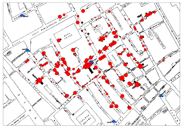
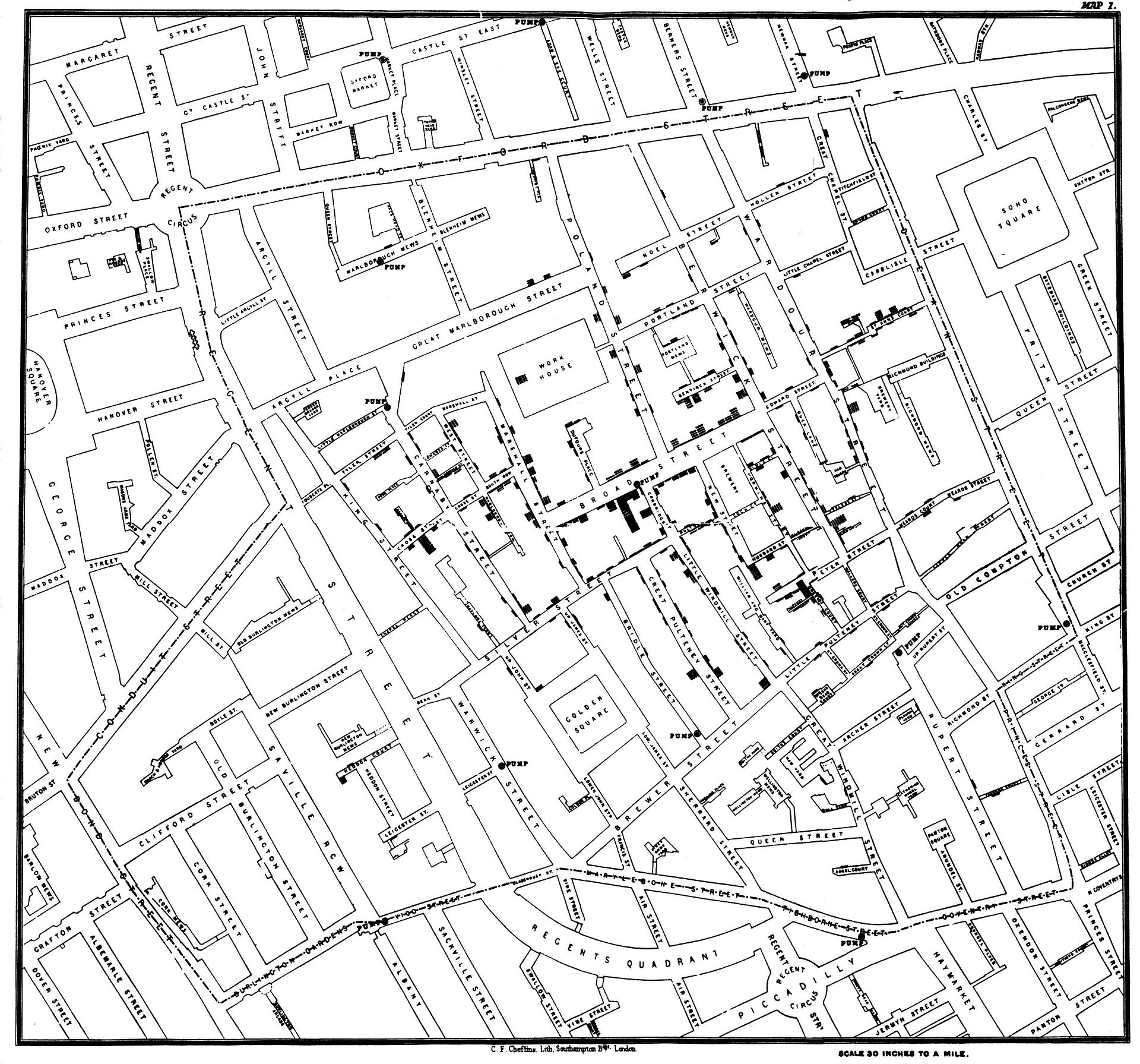
We have long mapped diseases to grapple with their causation. Even before the bacillus of a disease might be known or seen, the founder of modern epidemiology, John Snow, critiqued miasmatic theories of contagion by mapping the distribution with which cholera spread across London neighborhoods during the 1854 London epidemic, visualizing the disease as a social network of contagion by a dot map of neighborhood outbreaks that used a dot map to as proof that “nearly all the deaths had taken place within a short distance of the [Broad Street] pump” whose water was a vector of transmission. The distribution of mortality around public fountains provided a basis to demonstrate vectors of contagion for Dr. Snow, and by mapping all deaths from cholera to have occurred in recent years in relation to one pump on Broad Street in relation to London’s thirteen city wells by a voronoi diagram.
By locating each and plotting the distribution of deaths from cholera in the city in relation to the significant incidence of deaths form cholera near specific street-pumps revealed a way to grasp infectious transmission from the Broad Street pump that embodied a new notion of contagious diseases that challenged miasmatic transmission—making for the first time a clear spatial argument about how disease existed and moved in an urban environment, and presented a second map, with clearly traced polygons to indicate routes of transmission to the local parish showing routes of walking by which the disease was transmitted—using the recent mapped deaths from cholera in London Edmund Cooper tabulated—
—in hopes to encourage a level of civic engage about the origins of cholera infections that had plagued Londoner’s for twenty eras in the city’s fabric.
The source of deadly infections that this famous data visualization revealed suggests the communication of fatalities by a clustering that indicated clear routes of the spatial communication of a viral infection, focused on a large subset of deaths in close vicinity to the Broad Street pump, even without bacteriological or microscopic evidence.
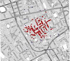
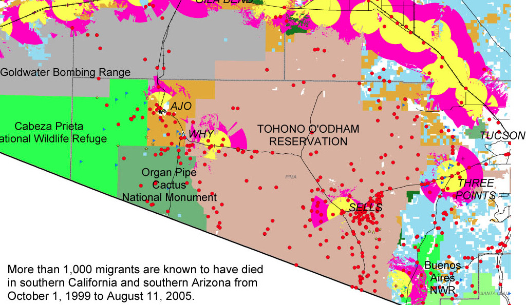
The exact distribution Snow organized contrast to the terrifying distributions of the deaths of migrants seeking passage across the border, which resists any extraction of an explanatory framework or conclusion, but raises questions about the inhumanity of the terrain we have created.
Dot maps of migrant deaths follow no such clear distribution, and has no sense of transmission form a single site. It forces us to acknowledge the deep problems of the criminalization of immigration on the Mexican-US frontier by charging its human costs. The sites of mortality from hunger and thirst are tragically dispersed over a far great undefined space, but embody the human costs of existing border policy, even a decade before Donald J. Trump used the management of the southwestern border as a campaign talking point to pole vault into public politics.
No similar diagrams can be drawn to elucidate the range of dead bodies discovered in the desert of migrants who were attempting transit into the United States for better homes: can one better explain their deaths b a virtual miasma of cruelty that fills the air of the border zone. Their deaths were caused by dehydration and starvation, as well as cold, but suggest nothing so much as a miasma of neglect. The distribution of deaths of migrants in the Organ Pipe Cactus National Monument, adjacent Cabeza Prieta National Wildlife Reserve, and O’Odham Reservation already illustrated a dereliction of national responsibilities.
The map is a deeply tragic reminder of the loss of life that is forgotten in the dry expanses of these deserts where the border, such as it is, lies, and the distinctly disturbing regime of a lack of interest or care for human fate that—even with the mortality of children in detention camps at the border—still can stretch incredulity at the evidence it offers of a large theater of cruelty. They recall the denial of burial to the bodies of enemies in the ancient world, left as prey to dogs and vultures: the Enlightenment jurist Giambattista Vico faced considerable difficulty explaining to his readers that there was a time when the bodies of anyone was left unburied in an earlier age in his Scienza Nuova, “an inhuman custom—so contrary to what the writers on natural law of all people’s claim to have been practiced among any nation— . . . which [once] prevailed among the barbarous peoples of Ancient Greece,” described in Homer’s Iliad, and at which he marveled as “crude, coarse, wild, savage, volatile, unreasonable and unreasonably obstinate . . . and foolish unreasonable customs,” far removed from his own age and from the imagination of his readers, so “discordant” was it with our own civil age. Yet the unburied dead whose bodies have been located in states of extreme decomposition along this border zone reveal a discordant reminder of the return of such an inhuman custom on the borders—and within the borders—of what we consider is a region that is distinguished and administered by civil laws. Whether this region can be rightly considered a region of lawfulness or civility seems to be raised and put on the front burner by the discovery and attempted identification of the human remains discovered lying in the desert, often dramatically decomposed, of migrants’ bodies dating from the administration of George W. Bush.
If Vico could scarce imagine the barbarity of leaving bodies exposed to the elements even in war—and the spectacular cruelty of the dragging of the body of Hector around the perimeter of Troy three times—among those who “were held to have spread humanity across the world,” given the sheer physical disgust of leaving the body unburied, and given that “all gentle nations certainly concur that souls [of the unburied] remain restlessly on earth, wandering around their buried bodies,” from Guinea to Peru to Mexico to Virginia to New England to Siam, the readiness of Christians to leave the dead unburied by the border, if not intentionally, haunts the border region with its own inhumanity. The violence of this early heroic age was before the age of laws of nations, for Vico, and belonged to the age of “violent and impious men who dared to enter the cultivated fields [] in pursuit of the weak who had fled thither to escape them,” and belonged to “the vulgar customs of the barbarous Greece” of Homer’s day, and adequate burial in fact constituted one of the three institutions of human society—with marriage and religion—in ways that betray the huge remove of a heroic era, which incredibly lacked burial customs or rites, from our own.
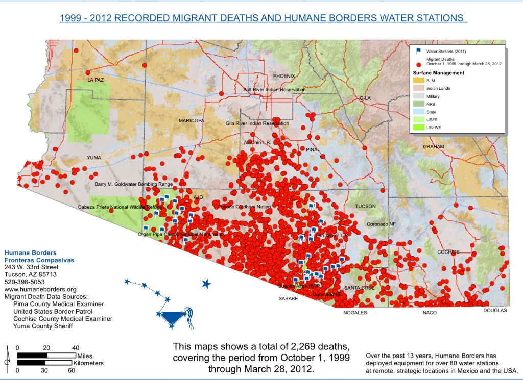
Yet the abandonment of unburied bodies has returned in the no-man’s land of the US-Mexico borderland, where the abandoned bodies of would-be migrants fall between governing bodies and accepted customs. Migrants that were stopped during the course of their attempts to reach a new life in the US were clustered at a distance from the border but reveal the amazing distances many undocumented migrants travel before they collapse, without food, and most often out thirst and dehydration–leaving them exposed as “prey to dogs and vultures” in the very horrifying ways that Vico was so horrified. The recent spatial distribution of such abandoned cadavers and corpses, left without any rites of burial, force the viewer to scrutinize its mute surface of dots against a deceptively pastel base map as if they might magically be able to glean or recuperate the silent, forever-lost stories of migrants who lost their lives attempting to cross the border, and the stories of whose travails and travels can never be told. The ends of their lives, reduced to the finality of a bright red circular dot in the data visualization, out of scale, arrests attention but is disarmingly and alarmingly flat, resistant to any further narrative or even identifiable name. Over 2,000 dead migrants whose bodies were retrieved at a significant distance from the border suggest their desperation to make their way across the border by clandestine routes, and the extreme climactic difficulties that they face, with few adequate provisions for crossing deserts whose expanse they feel forced to travel to search for jobs–risking their lives to do so.
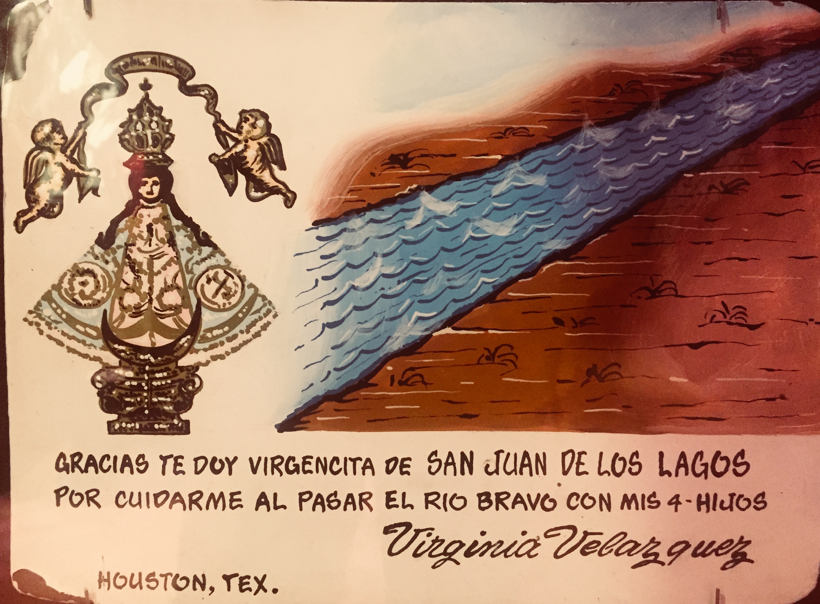
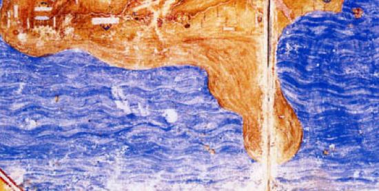
Ex Voto painted to express thanks forsuccessful crossing of the Rio Grande
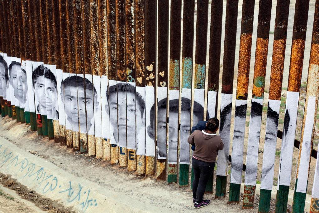
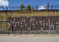
If the many migrant deaths of those attempting to cross the border between the United States and Mexico are often expressed by crosses that are hung on sections of the fragmentary “border wall,”—
—the precise distribution of the dead in sites of their death is rarely preserved in public memory, and the archive of dead migrants who did not survive passage is rarely assembled as a geospatial record.
The number of the dead remains but a fraction of those who have actually died attempting to travel north, leaving detritus and lost objects in their wake that only beg deciphering as images. For although their overlap suggest something like a clustering that might belong to an external infective agent, the alarming nature of the red points call attention to the human costs–and the anonymity of lives lost–that are the victims of the intense dangers of border-crossing that migrants accept and undergo, who we have forced to accept and risks of dehydration, heat stroke, hyperthermia, and starvation which have killed them.
If the deaths of those attempting to cross the border will probably never be know with precision—and is often lost to oblivion—the recovery of human remains affords a grim picture of the actuality of recovering the dead, and the attempts to name, identify, commemorate and memorialize their fates as well as prevent the loss of their identities, despite the jarringly abstract geospatial symbology of this map, and the minuscule proportion of those remained that have been so far identified.
This project of memory and memorialization, echoing the imagery of northward passage in the famous Underground Railroad taken by fugitive slaves taught to recognize the handle of the Big Dipper to follow the North Star to find their path to freedom, “Follow the Drinking Gourd,” the symbol of the constellation has been adopted by the Humane Borders organization which has identified remains and sought to allow them offer needed geospatial assistance to migrants in their search to find a path north.
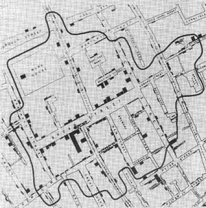
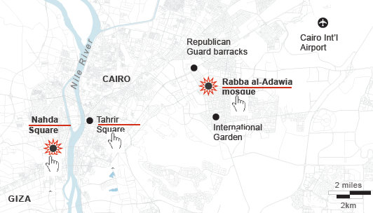
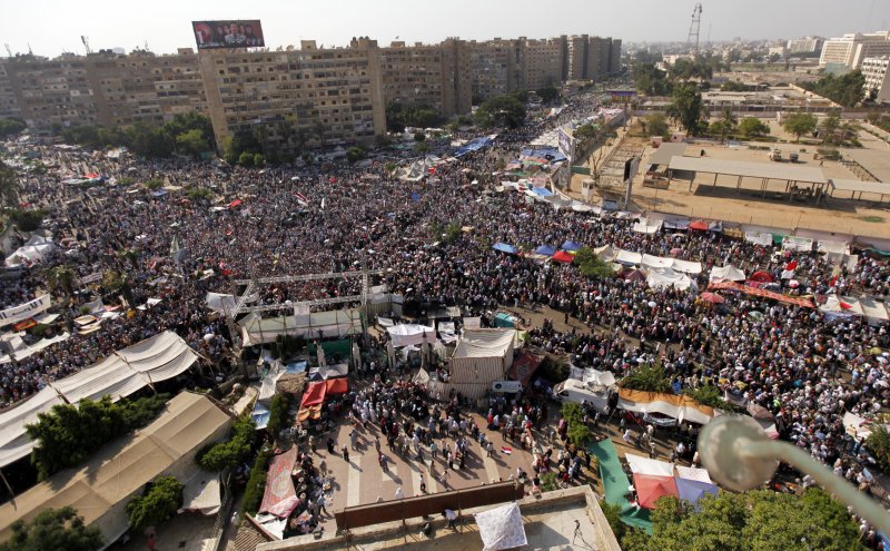
With an overwhelming display of strength usually reserved for clearing Palestinian settlers from villages in the Sinai or Gaza, Egyptian police forces descended at 7 a.m. on the sit-in at Nasr Villages’s Raba’a al Adawiya Square, near to the Raba’a al Adawiya mosque in Nasr City; indoor viewers watched non-stop footage on their television sets. Attempts to map the site have been oddly silent about the crackdown as an erasure of both a physical site of congregation and a symbolic site of open congregation, whose symbolism was tied not only to the mosque but to its autonomy–and less clear on how the symbolic connotations of the site mapped onto its destruction, for all the photos of both carnage and charred remains.
The demonstrations had been themselves some sort of micro-city, a testament to the organizational abilities of the Muslim Brotherhood, with entrances, checkpoints, and security committees. Other sites to register protest emerged, but were more easily cleared because, unlike the Raba’a Square, they were far less open or established, and less clearly defensible, leaving the two largest sites of demonstration at the university in downtown Cairo and at the mosque; protesters congregated at the mosque from June 28, or before the Constitution was suspended on July 3, which became the epicenter of protest; after government demands to end sit-ins August 11, the Raba’a sit-in dramatically grew.
The site of the “camp” itself, however, six miles in proximity to Tahrir square on an intersection of two-way streets beside a mosque, occupied a substantial chunk of civic space:
There was an initial attempt to map the “Morsi Sit-In” on the Al Jazeera network, as if to reaffirm its size. But the template of Google Maps can hardly come to terms with the mini-city created by the organization of entrances and check-points around the mosque, let alone the violent nature of the eradication of protestors–steamrolling the place, dispersing protestors by fire and tear gas canisters, and violating the site of the mosque. The occupation grew around the traffic hub of El-Nasr road, around the hub or nerve-site of the mosque itself, that convey its breadth and “infrastructure” as a movement. The map’s red dots of settlements are densest around the mosque, and define the ring around the neighborhood that had been surrounded with entry points before the order was given for army soldiers and police to move in, firing tear gas canisters to disperse the crowd and advancing into the square, where fires burned as police reportedly arrested more Muslim Brotherhood leaders as well as protesters who occupied the square, and entered the mosque itself: encampments burnt, the barricades surrounding the mosque destroyed, officers fired live ammunition as well as rubber bullets on retreating demonstrators, and protestors burnt tires around the last space the Islamic Brotherhood held in Cairo.
But the intersection of El Nasr Road in Rabaa al Adawiya functioned as a vital and living site in ways difficult to map without bodies.
The entrance of armored bulldozers on August 14 seems to have intentionally obliterated any trace of the occupation of the square, where settlements had sizeably increased from August 11, killing upwards of upwards of 623 and wounding thousands. Since vouching two months ago to protect Mohammed Morsi’s presidency “with soul and blood,” the protestors in Nasr City equated their occupation of the Cairo square with the occupation of Tahrir Square, a site earlier filled with anti-Morsi protestors, but the initial site of and platform for anti-Mubarak protests: Morsi supporters by the mosque promised sought to rest the voice from those in Tahrir who had called on him to leave in late June. The protestors who have settled in the square have created a sort of miniature city, much as Tahrir Square had been, as a public space, complete with tents, lavatories, improvised kitchens, and even dormitories, giving it a clearly contestatory role in the city’s geography–now cleared of inhabitants, save improvised clinics, hospitals, and improvised morgues. If Tahrir provided a sort of voice of the nation that call for Mubarrak’s resignation, and later for the end of the Morsi government, Raba’a seems something like a counter-voice of public debate: the occupiers refused to leave until those at Tahrir disbanded. While the al Adawiya mosque had been a site of site of assembly and congregation of the dissolved Shura Council–planning to convene its opening session from July 21, a site of a shadow government of Islam from July 21, in response to the disbanding of the Shura as a legal body. (Although press coverage has focussed on the mosque, it has ignored the dual function of the mosque as an alternate site of governance.) The mosque is now in ruins; the Al-Imam mosque also in Nasr City an impromptu morgue.
The territory around the mosque and the building was a focus of military aggression by Egyptian troops, as if the site of meeting needed to be obliterated from cultural memory. The response to the sit-in in Raba’a reveals it to be as politicized a territory defined by streets as the Parisian barricades, where every inch was contested. The government’s prime charge was ostensibly that they had come to obstruct traffic at a busy intersection in Cairo, and obstructions had to be cleared from the site. But the mass arrest of protestors and the violence of the response to clear the square, evident in the below photographs, suggest that a decision to obliterate any sign of their presence was the symbolic capital of Muslims in the city. The notion of obstructions to traffic was not only a pretense, but a metaphor for how the Generals felt about the protest.
Indeed, to feign to hear to other voice within the demands than a traffic obstruction is belied by the extent of any material remains of the tents, houses, and dormitories that existed there, as if to erase them from a historical record as well as to preserve their control over a divided urban space.
Mohammed Abdel Moneim/AFP/Getty
Detention of demonstrators near Raba’a al-Adawiya mosque. AFP/STR/Getty
AP/Ahmed Gomaa
Was the site of the mosque the target of such destruction? And after the fires at the Square, the mosque itself was burned, its sides were charred by smoke and interior demolished, as if to destroy the symbolic center of the protest itself that had provided shelter and refuge for debate from June: after armed forces dispersed attempted to continue the sit-in in Moustafa Mahmoud Square in Giza, subsequently to the dispersal in Raba’a, protests marches have been organized in response from some thirty Giza and Cairo mosques to Ramses Square.
REUTERS/Mohamed Abd El Ghany
As violence spread into other neighborhoods in Cairo and to cities throughout the country, with churches and government buildings desecrated or destroyed, Egypt’s government declared a thirty-day state of emergency, and a curfew. The next day, the deployment of armored vehicles around Tahrir Square the next day seemed designed to prevent the capture of another stage of public visibility. Soldiers also stand guard over the ruins of the mosque where the protests began.
Bryan Denton for The New York Times
The square in Raba’a was filled with crowds from early July, according to Business Insider:
The site of the mosque and the center of the protest is now being swept clean, the crowds long scattered and dispersed. The violence has spread to other neighborhoods and cities that might not be able to be clearly mapped, after troops violated the significance and integrity of the square.
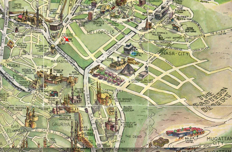
One might remember that a very different, if antiquated, image of the integration of mosques within the skyline of Nasr City, Heliopolis, and the surrounding neighborhood:
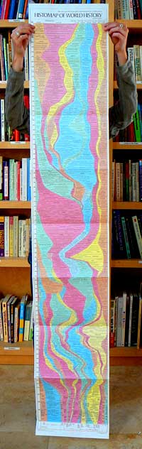
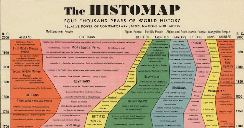
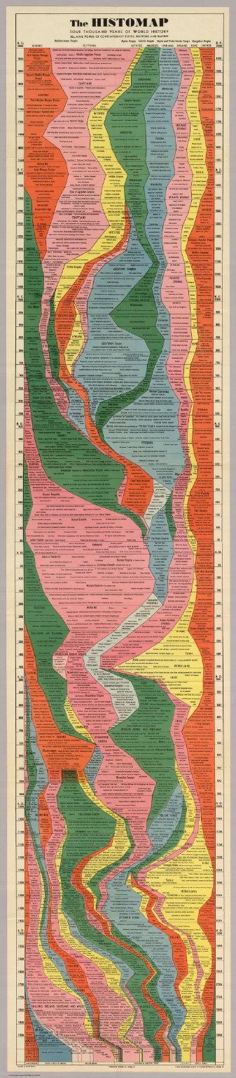
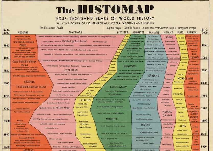
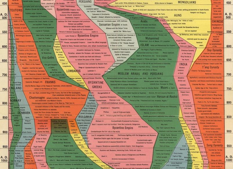
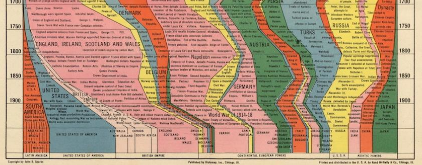
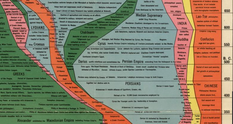
Not to be confused with the “historeme,” the ‘smallest unit of historiographic fact’ or narrative event in its singularity, the Histomap Rand McNally first printed in 1931 offers readers an assembly of singularities in color streams that, when fully unfolded, expands to five feet.
One would assume the map effaces singularities or any singular historical narrative–the selective condensation of information to an image five feet in length in the Histomap can’t be beat for charting a balance of power among world cultures, reifying the state and racial difference as the metric by which to map world history.
Convenience and efficiency are both premiums in its design. As other early twentieth-century compendia of knowledge, the map glories in positivist presumptions of mappability: rather than offering narrative, the map offers the inverse, apparently obliterating any local meanings: it homogenizes four thousand years not by relinquishing narrative structures, but using a racial rubric to map states’ “relative power.”
The synthesis is not disinterested, of course, or as empyrean as John B. Sparks might have believed–or the publishers who sold it as dramatizing “the great adventure of mankind” so that it can be perceived at a glance, in a form that is clear, vivid, and shorn of elaboration.”
The metaphor of relations among world powers offers an optic for Sparks to digest world history by mapping “relative power of contemporary states, nations, and empires” among “Mediterranean Peoples,” “Alpine Peoples,” “Semitic Peoples” and “Mongolian Peoples” before such a conceptual model in fact existed, presenting unique streams of racial difference as objective and disinterested as a five-color map.
And readily represented. Comparisons between cultures’ relative prominence provides coherence to order and organization of global history. With lists of events and names disembedded and re-synthesized in a fabricated whole–and all recorded time rendered consultable on the indices of a regular and uniform timeline–the wall-chart maps a gloriously abstracted vision of time and space, in ways that demands the sort of intensive reading that is far less easily digested than Sparks probably hoped.
It’s hard to know what’s not to like about an “actual picture of the march of civilization, from the mud huts of the ancients thru the monarchistic glamour of the middle ages to the living panorama of life in present day America”–with its claims to orient yourself to the inevitable progress of world civilization to your doorstep–except pretty much everything. The assurance with which it charts streams of empire would be reassuring–were it not for the many blind-spots in this “actual picture of the march of civilization.”
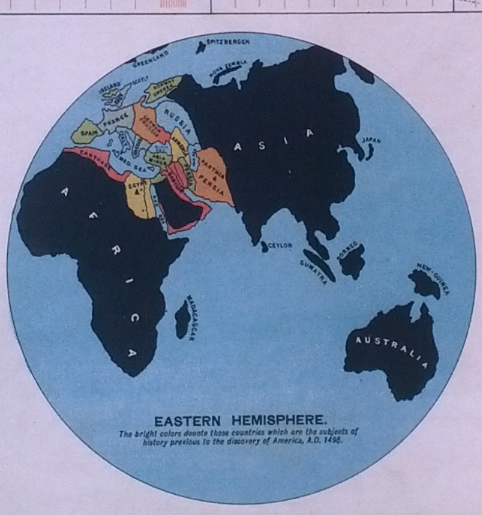
The genre of “historia mundi” had many competitors, including Edward Hull’s picto-cartographic 1890 Wall Chart of World History, which began from the Garden of Eden and “The Settlements and Races of Noah’s Descendants” from the Book of Genesis, in the fashion of a medieval European world chronicle, placing lineages of generational descent above panels mapping Ancient Egypt, the Persian Kingdom, the Seleucids, and conquests of Alexander the Great.
The dense text of its synoptic information overload that demands being read with magnifying glass in hand–
but neglects most all the Eastern Hemisphere before the discovery of America, and drops the Western, using “bright colors [to] denote those countries which are the subjects of world history prior to the discovery of America, AD 1498.”
Sparks devised the Histomap as both more ecumenical and empyrean in its economic individuation of purified vision of history, and more global. Its color-keyed streams are readily comprehensible consultation of the lay reader, but the green dust jacket assured prospective they would be overwhelmed by “the fresh realization of the very recent insignificant contribution to history of those we are accustomed to call great men,” as the map would leave them “enthralled.”
Starting from the Minoans and the Settlement of the Nile Delta, this occidentalist condensation of some four-thousand years “relative powers of contemporary states, nations, and empires,” is the distillation of an era of state-building–a narrative to which it accommodates the dynastic division of time among the Egyptians Ammorites, and Chinese, to digest their otherness in a river of time. By erasing the Neolithic, as it were, the streams contemporaneously arise, like Athena from Zeus’ head, with the force of a declarative statement.
Each stream is distinctly separate, and as one wanes another takes its place to expand, in the uniform frame of mankind:
Geography (as globalism) is a big casualty in this visualization of time, indeed, as one stream–here the Roman–comes to fill the viewer’s field of vision from around 150 BC, as it fills not only the historical record, but the balance of world powers. Although this was long before the notion of such a balance existed or was understood, this was the optic in which Sparks so skillfully visualized a universal history, and, more to the point, made sense to lay readers of the 1920s and 30s.
The notion of a balance of actual power is never explicitly defined, but informs the role of responsible custodian of world civilization–the frame or the tacit rubric of the flowchart. This maps with the medieval blip of the Arab World before 1000 AD, or until the Byzantines, Franks, and Holy Roman Empire get their act together as European culture’s weighty forbears–
–a role that, after 1700, England temporarily occupies. But, in the end, there is a sense of “sic transit,” as Anglophones and their satellites, from the United States to Europe and South America, confidently hold the lion’s share of three-quarters of the spectrum of world history–and Rand McNally still offers what it now calls the “Time Chart” of world history, suggesting the vision’s considerable success.
Buddha, Confucius and Lao Tse are situated in relatively thin currents of color beside the ballooning of the Median Supremacy, after which bulge the Greeks, culminating in the in Alexander the Great’s fairly sui generisempire, all of which normatized to the convenient dimensions of a synoptic flowchart that unfolds over five feet.
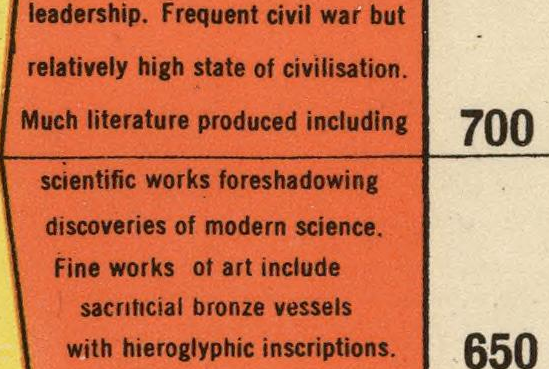
I love this particular soundbyte on post-Confucian China:
Every culture makes its own maps; most maps are made for the cultures who read them. It would be a neat exercise to map geographic coverage in these historical condensations over time, along, perhaps, with contemporary encyclopedia. Or even to take a purely visual example, the logo of the Heilbrunn Timeline of Art History does well to juxtapose material evidence from historical periods with a nod to social issues and a changing ArtStor cast of characters, although ones who are similarly not situated in a geographic space.
It’s not easy to detect how workshops transmitted protocols of mapping or the content of maps before authoritative practices for recording geographic knowledge Partly because of the difficulty to describe the transmission of knowledge in manuscript maps, and partly because of the foreign nature of terrestrial continuity in these maps, historians have tied the techniques of engraving with an ability to delineate and effectively demonstrate a geographic space that viewers could process and comprehend. Tools of engraving afforded a flexible graphic syntax to represent the discoveries of the New World and diffuse the Ptolemaic models of mapping expanse on a uniformly bounded graticule of parallels and meridians from the early sixteenth century, but had earlier afforded a systematic symbolic structure to organize the terrestrial world. Manuscript world maps based on Ptolemaic cartographical models vaunted their ability to orient viewers on the indices that embodied a continuous bounded expanse. Yet the inventive abilities associated with the uniform graticule of parallels and meridians gained such demonstrative force in ways that were informed by a rich Mediterranean tradition of nautical charts, often discounted because of the association of engraved maps and modernity.
Yet the nautical charts were adapted in experimental ways as a foundation for assembling a record of terrestrial expanse. Indeed, charts first registered shifting knowledge of the inhabited world, and a means to symbolize the expanse of an inhabited world: indeed, the genre of nautical charting first described the inhabited world–the “ecumene“–as a format able to represent and indeed process the settlement of a terrestrial expanse greater than most viewers could imagine.
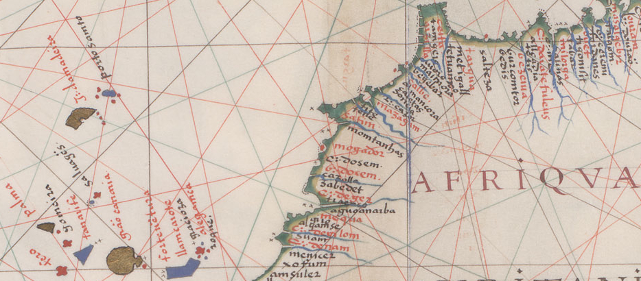
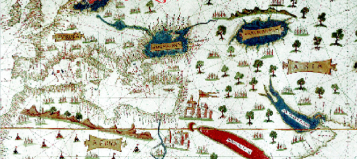
This small “world map” illuminated in Florence about 1490 was been described by Peter Barber as one of a critical map in world history because of how it registered Portuguese travels around the Cape of Good Hope in 1488, and expanded the distance from Lisbon to the coast of China to 230°–expanding its share of the inhabited globe.
Yet rather than use spatial conventions for transcribing expanse, this small map, adapted the conventions of nautical charts to do so–conventions that note coastal ports, promontories, estuaries, or coastal cities to map the settled world, rather than chart routes of travel. But this small map, revising Ptolemaic cartographical dogma to accommodate Portuguese descriptions of Africa’s coast after Bartholomew Diaz’s rounding of what became known as the Cape of Good Hope, seems less designed for orientation than it envisions a comprehensive coverage of the earth’s surface in the reduced format of a sheet about 200 by 120 cm.: its elegant coloration suggests the reduction of a tradition of globe-making; indeed, Martellus includes the newly mapped Cape as violating its lower ornamental frame, as if boasting about its greater comprehensiveness as a record of the known world’s surface; ports on the southern tip of Africa, way stations for sailors to southeast Asia, expand the world beyond a classical frame of knowledge.
Although the map is taken as evidence of its suggestion of a maritime route to the East that may have reached Columbus, who would have been encouraged by its apparent expansion of Eurasia to 230°, beyond earlier world-maps and beyond its actual size. Although the map includes no graticule, a decidedly later map by the same cartographer with a coordinate grid also expanded the coast of Africa beyond the parameters of its frame, as if seeking to accommodate nautical information in an existing format:
Neither map tells us much directly about practices of mapping, but both raise questions about how nautical charts were adapted in deluxe manuscript world maps and about practices of transferring coastal locations in charts to terrestrial maps: the first smaller image is perhaps more decorative or emblematic, and reveals minimal attention to islands or ocean expanse beyond Eurasia, but it similarly works to shape provisional knowledge of the terrestrial globe from heterogeneous sources.
The development of a uniform graticule of parallels and meridians would be privileged as a graphical form to chart the uniformity of terrestrial expanse. But its adoption followed sustained experimentation in a tradition of manuscript mapping that is often neglected–but which provided a sort of laboratory for the expansion of a map of the world’s inhabitation, as well as a cartographical craftsmanship in which the mapmaker accommodated information without a set conventions and in makeshift ways. This post returns attention to how the tradition of charting, associated with workshops, improvised forms to illustrate terrestrial expanse, often with minimal use of graticules of Euclidean derivation.
Manuscripts that synthesized nautical charts maps to fashion descriptions of the settlement of an inhabited world, unlike the oceanic expanse and locations of ports that were noted in nautical charts: the material construction of such world maps offer stunning evidence of the plastic nature of mapped knowledge and the modern use of charts, by adopting existing cartographical formats to invest new knowledge-claims in maps, both by compiling a corpus of individual maps and redrawing extant cartographical forms, even though they do not follow such a clear protocol of bounding a uniform distribution of terrestrial expanse in the manner of global projections on a rigorous Ptolemaic model of conformal mapping.
The world map that opened the so-called “Medici atlas“–a sequence of eight maps that suggest aims of encompassing terrestrial expanse–reveals how maps acted as compilations of cartographical forms to experiment with recording terrestrial expanse in the same city where Martellus worked and enjoyed wide popularity.
It’s difficult to know how these sequence of nautical maps in a single codex in Florence’s adopt a Genoese nautical chart to present a new model of map making, revising formats of charting widespread in port cities like Genoa to record sea-routes in order to provide a comprehensive pictorial rendering of inhabited space–the world map included not only the cities Ptolemy noted, but cities mentioned by Marco Polo, the Venetian traveller, as the Delhi Sultinate, and texts of the geographer Ibn Battuta, and charts. It amplified its content through the addition of a sequence of additional maps, also of nautical derivation, of the Italian peninsula before manuscript maps of the Aegean, Black, Adriatic and Caspian Seas, each including cities and the last showing the landlocked closure of the Caspian sea, that oriented viewers to extra-Mediterranean geography with far greater precision than earlier world maps.
As well as revealing interest in the compilation or collation of evidence in maps, its revision of the template of an Africa unable to be circumnavigated and a closed Indian ocean probably responded to considerable interest in late fifteenth-century Genoa in regions of “Africa nondum cognita,” suggesting a clear interest in new working practices of mapmaking. Alexander von Humboldt, who knew the map well, took it as evidence of a medieval knowledge of Africa’s circumnavigation–so difficult was it for him to separate the map from a register of what was known.
Perhaps the expansion of Africa to the Cape of Good Hope was drawn atop the existing map when the true form of Africa was known, or even added to the original chart in ways that emulated later prototypes, and in essence kept the cartographical compilation “up to date”: if the case, suggested by the coloring of the map beyond an inked outline of the continent, it would suggest a new use of the map as a canvas that was altered at the same time as transmitted in fixed protocols or techniques. It would also suggest a process of re-visioning the inhabited world by revising the pictorial content of the map to foreground its descriptive abilities.
Why was the manuscript “atlas” made, what readers did it address, and how did it construe geographical expanse? Did it try to consciously convert the inhabitation of coasts so emphasized in portolan charts to descriptive and representational ends?
Is it representative of the expansion of the tradition of charting to newly communicative ends as a demonstration of worldly settlement? The term “atlas” was devised by Mercator to describe a collection of maps, and its application to this volume of maps is, strictly speaking, anachronistic–the collection of maps are widely referred to by the term used by the Dutch cartographer and engraver Abraham Ortelius, under Mercator’s influence, in 1570 to describe his collection of maps, the Theatrum Orbis Terrarum, as an atlas–the compilation of maps exploited the comparative use of nautical charts to organize a record of cosmographical scope of comprehending the world’s expanse. But the term is appropriate to describe this codex of maps, since it captures the persuasive ends of presenting a sequence of nautical maps of terrestrial expanse to offer claims of complete geographic coverage.
The world maps showing Africa as surrounded by sea predates by almost a century Portuguese circumnavigation of its cape. The distinctive world map in the “Laurentian atlas” clearly suggests the navigability around the continent and passage from the Atlantic ocean to Indian ocean–and considerable knowledge about the shape of Africa for an atlas of eight sheets dated 1351, but probably composed around 1370. It is difficult to judge whether the map was drawn in its current fashion at that date–a time when few sailing maps extended south of Sierra Leone–or whether the original map of a Genoese chart-maker was redrawn, as some have argued, to comprehend later Portuguese nautical discoveries in the Atlantic and Indian Ocean. The African coastline in the map included no toponymy on the coastline below Cape Bojador, the southernmost point of most earlier voyages. Was an earlier chart revised, better to comprehend shifts in terrestrial space, earlier than the Martellus map pictured above, to better incorporate new nautical knowledge by extending the reach of Africa beyond Cape Bojador?
The map designed in the format recalling a chart and without any attempt to include indices of measurement or orientation may reflect the considerable interest in routes of trading to the East independent from land-travel. But also staked broader claims as a “world map” of terrestrial coverage in persuasive ways, evident in how it expanded the known limits of the continent to create a new image of inhabited expanse–using the chart as a canvas in ways that reflected some early fifteenth-century interest in assembling a map of the inhabited world.
In place of the format of a nautical chart, the “world map” suggests a bounded expanse and form of distinctly modern appearance that has often disconcerted several readers. (Charles de la Roncière wondered with bemusement at the prescience “de la forme reelle de l’Afrique avant le periple Portuguais” in the world map.) It seems to have been redrawn in the fifteenth century to incorporate Portuguese discoveries, to register recent discoveries of alternate rendering of Africa’s distinctly modern form, beyond an ink line that the paint conceals. Indeed, no toponyms appear on the map south of Cape Bojador in the Sahara–the southernmost point of most nautical charts–in ways that seem to confirm the imagined form of Africa within the chart. And the prominent location of some of the Canary and the Azores in the Atlantic reveal subsequent alteration of the map on the basis of Portuguese charts, as if to update and revise its original form. The revision of the genre of nautical mapping for new ends of comprehensive terrestrial coverage–in this case, by repainting its very surface–suggests a redesign of familiar formats of charting for new claims of geographic coverage to make a point about terrestrial expanse as the first translations of Ptolemaic treatises advanced a model of cosmographic–as much as cartographical–expertise.
The world map is clearly a compilation of varied forms of knowledge and geographic thought. Despite the vaunted limitations on geographic knowledge of the later middle ages, this mid-fourteenth century world map reveals a striking synthesis of geographical knowledge to illustrate terrestrial expanse. The volume seems to purposely compile existing nautical charts in a single volume, in the manner ofan atlas, to satisfy demand for a record of global comprehensiveness; this map probably drew on Arab sources for its southward extension of eastern Africa down the Muslim Swahili coast. Some emendation of the map is evident, moreover, detectable in the competing hands of an upright humanist script and more straggling cursive east of the Caspian Sea. A nautical chart of Italy immediately follows the world chart in the codex, a map focussing only on its coast to the exclusion of its interior save the most prominent lakes:
This portolan chart suggests, however, a distinctly terrestrial subject, as much as a compilation of sea-routes. And as a synthesis of the sequence of six nautical charts that complete the volume, its collation or compilation of charts is uniquely modern in presenting a comprehensive geographic record. Its comprehensive view of the continent echoes the early fifteenth-century world map of Albertin de Virga, dated 1411-15, whose totalistic content it precedes in its synthesis of nautical charts to depict the inhabited world’s expanse–and which could have offered a model for its emendation–shortly after the first translation of Ptolemy’s manual of world-mapping in Rome. Did Ptolemy’s newly translated treatise prompt such an early synthesis of available mapping forms to describe terrestrial–rather than nautical–expanse?
The newly persuasive nature of assembling nautical charts presented something of a canvas to stake global relations. This world map presented sites for the exchange of meaning, but also a visual laboratory to configure terrestrial space, transferring coastal lines from portolan charts to prepare open spaces of terrestrial expanse to be surveyed.
We often cast nautical charts as both impressive and regressive in contrast to terrestrial maps, because they leave the interior topographies so bare. The inclusion of a more detailed African coast from the beautiful Portuguese Dourado portolan charts of the later sixteenth-century, for example, drafted in Goa around 1570, whose thickly-packed toponyms hug the continent’s north-west coast, listing ports and riverine mouths which seem the only areas able to be mapped or of interest. It leaves the terrestrial interior unknown in ways that recall Joseph Conrad’s alter-ego Marlow, and d his attraction to the unknown African interior in “The Heart of Darkness.”
The chart reveals something of an incommensurability between a known shoreline of coastal settlement and an interior, that was oddly perpetuated through the 19th century, where its limited notion of terrestrial coverage gained colonialist ends. For printed maps of the mapping of continent limited to coastal African ports s to emptiness of the mapped interior–without any acknowledgement of local toponomy–in maps created the sort of “large, empty spaces” Marlow claimed to have seen, in maps “from the latest authorities” drafted in London in 1805, or the Lincoln & Edmonds 1819 map of the continent, both of which might have inspired Marlow’s voyage to Colonel Kurtz:
But if the chart is seen as a conservative force in world mapping, it was also a fertile tradition of its own. Indeed, the notation of parallels and meridians in portolan charts popular from the middle of the sixteenth century in Europe suggests a clear concern in mapping new lands as well as encounters with coasts–much because they fit less clearly with mapmakers’ expertise.
This is evident, to switch subjects of cartographical attention, in the mapped image transmitted in Portuguese portolan charts of the coast of Brazil, similarly striking because of how it foregrounds the remove of coastal cities or hydrographic records of the Amazon from knowledge of inhabitation of the continent’s interior. This nautical chart accommodated the practice of mapping on a graticule of parallels and meridians, even if comparable imaginative license is taken with the topography of the interior.
Indeed, the second of the seventeen maps in this ‘Dourado’ portolan map an interior strikingly similar to the lake on which Sir Walter Ralegh mapped the imagined city of El Dorado on the imaginary Lake Manoa in 1595, as fed by multiple freshwater ingresses; Ralegh’s map reveals less fantasy in projecting the voyage to El Dorado than a recycling of the very sailing charts he consulted in drawing up his plans to sail to Guiana. A comparison suggests the staying power of the tradition of the Spanish and Portuguese nautical charts Ralegh so frequently consulted to plot his ill-fated expedition to an imagined city he detailed for viewers at the very center of his chart:
Ralegh’s re-use of nautical charts created something of a laboratory to assemble the means to envision terrestrial expanse in the early fifteenth century Mediterranean world.
The portolan was, in multiple ways, a particularly versatile and inventive form. It maintained a similar inventiveness across cultures in the Mediterranean, adopted into a tradition of Ottoman mapping through Portuguese prototypes. Much as the ‘Medici atlas’ suggests a new mapping of the oceanic enclosure of Africa, the re-use of nautical charts for cosmographical ends is evident in the below image of world expanse. The map was used to illustrate a Renaissance manuscript of the thirteenth-century cosmographer, lawyer and physicians Al-Qazwini’s “Wonders of Creatures and Strangeness of Beings” [Aǧāʾib al-maḫlūqāt wa-ġarāʾibal-mawǧūdāt], also stored in the Biblioteca Laurenziana. The map below retains conventions like a cinnabar Red Sea sketched below the Holy Land, spider-like lakes and ports crowded inland that seem to perpendicularly hug the shore, the description of tripartite continents of Asia, Europe, and Africa below testify to its terrestrial coverage. Scattered trees, fill unknown lands and almost random rows of mountainous barriers mark the limits of known Africa–an cosmographical record of the inhabited three continents of the world Al-Qazwini had described in the tradition of classical geography, rooted in describing terrestrial inhabitations, rather than climactic zones or schematic spatial divisions–notwithstanding the depiction of a bright crimson Red Sea.
Geography meets cosmography in this world map, deriving from nautical charts. The image of planetary eclipses in the same elegantly illustrated volume suggests a similar cosmographical intent in this deluxe compendium, that echoes the sense of the terrestrial map as a mediation of abstractly purified knowledge, now removed from the craft of the nautical chart-maker’s craft.
The cosmographical scope of the image in the thirteenth-century encyclopedia re-used the format and conventions of nautical charting to make cosmographical claims, similarly to the re-drawing of the Genoese chart in the mid-fifteenth century for making newly comprehensive claims.
Indeed, one can detect something of a similar use of records of nautical charting for cosmographical mapping in the adoption of Portuguese charts in the fragment of a 1513 map that the Atlantic the Ottoman admiral Piri Reis presented to the Ottoman Sultan Selim I in 1517. The fragment discovered in the shelves of an Istanbul’s Topkapi palace in 1929, drawn on gazelle parchment, incorporated four Portuguese portolan charts, eight Ptolemaic maps, and some twenty mappae mundi, according to the admiral’s inscription, in a luxurious map of expansive proportions, of which only the sheet depicting the New World and western Africa survives:
In the decades after its discovery, this map was taken as grounds for grandiose claims about pre-Columban geographic knowledge–claims with limited validity. For Piri, the map’s surface provided a field to combine an image of global expanse in a complete whole. He worked, he tells us “from eight Jaferyas of that kind [e.g., Ptolemaic maps, which he dated to the age of Alexander the Great] and one Arabic map of Hind [India], and “from four newly drawn Portuguese maps which show the countries of Sind [Pakistan], Hind and Çin [China] [all] geometrically drawn, and also from a map drawn by Qulūnbū [Columbus] in the western region” or islands of the new world, so that by “reducing all these maps to one scale this final form was arrived at, so that this map of these lands is regarded by seamen as accurate and as reliable as the accuracy and reliability of the Seven Seas.” He took the testimony of seamen as the standard of trust, but the value of a format “geometrically drawn” suggested both its comprehensive and cosmographical value–a main purpose, no doubt, of the presentation map given as a luxury book to Sultan Selim I–making it all the more quixotic that the director of the palace library, Halil Edhem, handed it over amidst a bundle of discarded materials to Gustav Adolf Deissmann when Deissamn searched for non-Islamic material in the Topkapi. (So suggestive is the map’s situation of islands and accumulation of detailed coastal promontories that it was taken as grounds for a lost “pre-classical” culture of mariners familiar with Antarctica for Charles Hapgood or of the mathematical calculation an azimuthal projections made with active extra-terrestrial assistance by Eric von Däniken from a spaceship located above Cairo; theories that misread the map as an actual projection had little basis, but are nicely rebuked by the cogent case made for its nautical origins on the Turkish 10 million lira banknote.
(The fragment of a lost manuscript map depicted to the left gained such wide traction precisely because of its elegant argument for ordering the known regions of the world.)
The nautical chart provided by its very open-ness a basis to expand a canvas of the inhabited world before conventions of map projection insisted on the world’s bounded nature. The flexibility of the format allowed the assimilation of a varied range of sources and authorities–from Marco Polo to Ibn Battuta, as it were. We can appreciate the open-ness that the re-use of nautical charts as canvases in contrast to the very different nature of the world map in another manuscript of Al Qazwini’s treatise, now in the National Library of Medicine, painted in around 1537 by unknown illuminators in western India. The map is far more schematic–if not traditional–form, removed from the tradition of charting: the image of the world is replete with marine sinuses and undulating rivers that link bubble-like lakes, with a bulbous Horn of Africa pointing to the overlapping waves in the oceanic expanse of the Arabian sea.
The vitality of a manuscript tradition of mapping provided something of a laboratory for the material re-imagining of an earthly space in which increasing physical details were readily inscribed.
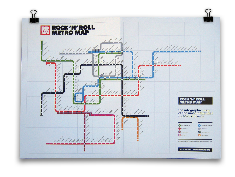
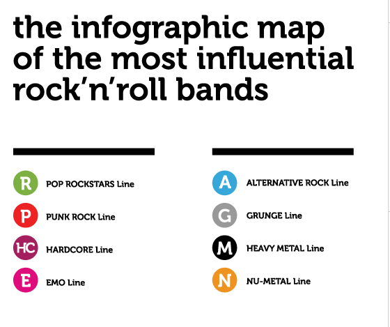
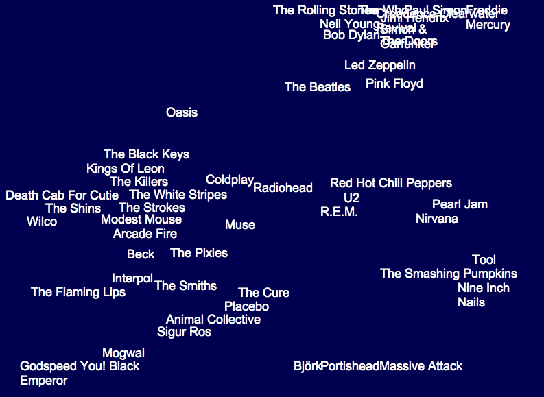
Phrases from “Subterranean Homesick Blues” to “the Velvet Underground” defined a new metaphoric space for Rock music to occupy and create during the nineteen-sixties. It’s no surprise, then, that the London underground map–that icon of Englishness designed by the engineer and draftsman Harry Beck in 1931–has been transposed to define relations among bands with such success in an encyclopedic mapping of genres of rock. By taking the transport map as an inspiration, one can map a network of musical bands and styles, examining both intersections and alternate paths of varied musical groups and the imaginary relationships they have to one each other in easily comprehensible ways. So classic is Beck’s circuit map of the city’s underground that the use of the Tube Map is instantly recognizable as a microcosm of sorting tastes, if an almost ironic analogue of an underground music scene, more rooted in graphic design than sound.
The historic reduction of all surface details in the map, in which Beck accentuated direct routes the tube offered to navigate the city, rather than urban topography, employed a circuit diagram to chart the London subway disregarding geographic relations for a clearly legible network map. The iconic conventions of linkages in an ideal space rather than a geographically correct map, serves well to map musical bands and styles–where Pop Rock intersects with Punk, runs side-by-side with Alternative Rock and intersects every so often with the determined Black Heavy Metal Line–unrooted from geographic reality but graphically displayed in a concise (if blunt) highly readable syntax: as Beck sought to “tidy up” existing maps by “evening out the distance between stations” and “straightening the lines” to “give a needed clarity to exchange information to tube users who were on the go,” the color-coding of its routes created a model for communicating information even when removed from its geographic subject-matter or exact spatial relationships.
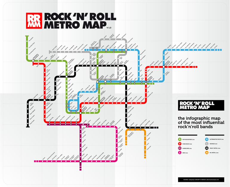
Perhaps the formal nature of the spatial arrangement of bands on maps runs against the very improvisational nature of much of the musicians included in the map. But the exercise of decoding seems to be a way of seeking to make sense of the world of music by cleverly streamlined terms. Many of bands which are included as tube stops by which graphic designer Alberto Antoniazzi’s popular Rock’n’Roll Metro Map foreground groups prominent in London’s music scene. In fact, in its focus on London’s underground, the choice of template for the map reminds us in its stretch of prominent bands from the Beatles and the Who to Depeche Mode, or from the Sex Pistols to Radiohead to Coldplay presents an inevitable British hegemony in selecting the London Underground as its focus, although Spinal Tap lies on the far more American-centric Heavy Metal Black Line.
The nostalgic English-ness of the Beck map just seems something of a sign of the transhistorical centrality of London in the music scene–even if it also suggests the degree to which as “the tube maps masks and distorts realities,” in Ian Russell’s words, its modernist space has “become its own reality, entirely abstracted from the work it ostensibly represents,” as a model–Joe Moran has observed–although it is copyrighted by the London Underground, as was discovered by Simon Patterson to his chagrin. But Patterson’s The Great Bear (1992), an elegant four-color lithograph, shifted Beck’s system of classification as “lines” that indicate Engineers, Philosophers, Journalisms, Footballers, Film Acts, Italian Artists, and Musicians in ways that invite the viewer to detect a method in their order.
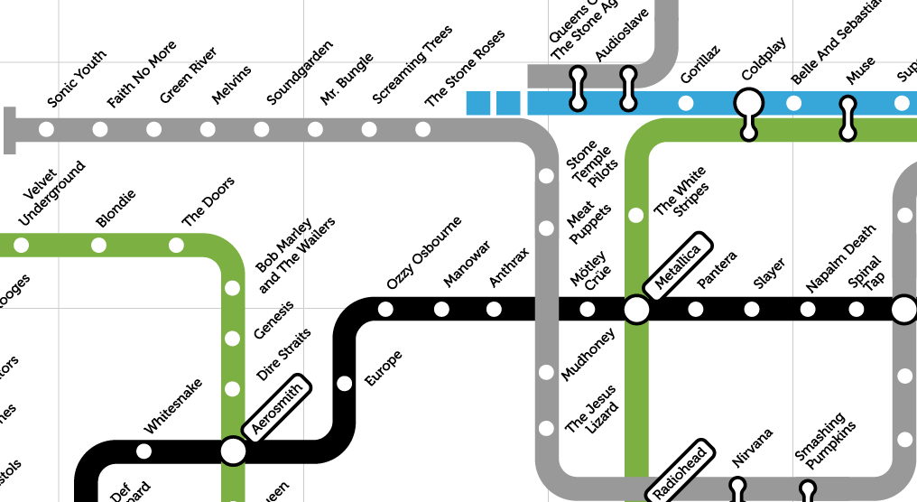
To return to a map rendering legible a more limited network of contemporary music, there is ample sign of time’s passage in the Rock’n’Roll Metro Map, which consigns both the Beatles and Rolling Stones to the end of the Green Line of Pop Rock Stars, with little differentiation, a status they somehow shared with the Beach Boys: to be sure, all are pop, but relationships are just not clearly mapped or continuities appear jarring. Despite the authority of the map’s model, Antoniazzi informs us that if “the map is just a personal vision of the music history of the past decades and not a real visualization of it, that’s because the number of artists and influences are impossible to be visualized in a 100% objective way.”
But it often reads like an index to someone’s CD’s–not too mention being dominated by men. I like how the red line moves from The Stooges to The Dictators, Ramones, Sex Pistols, Clash, Buzzcocks, and Cramps, but relations among them are often unclear or at the border of suggestibility–the transit from The Who through The Eagles to Velvet Underground is quite a jump on the line of Pop, and the placement of the Ska band The Specials at a major intersection between Reggae, Rock, and Pop, and Bjork occupies a major exchange of her own.
The iconic diagram by which Harry F. Beck re-rendered the London Underground in 1931 has become an icon, with as much nostalgic value as evocation of place. Its popularity extends far beyond what Beck imagined, partly due to the appeal of its modernist simplicity and symmetrical organization of rail space: the arrangement of the web of trains in ways that viewers can readily read has acquired that odd function of a map as both a designation of place and an innovative system of arranging meaning. The Rock’n’Roll Metro Map clearly capitalizes on that identification with place, indeed, to remind us of the centrality of London in the global Rock scene–or map the world of rock onto one place as if it were a microcosm of world music, able to sort out the crowded universe of recorded rock.
Map of the Underground (1931)
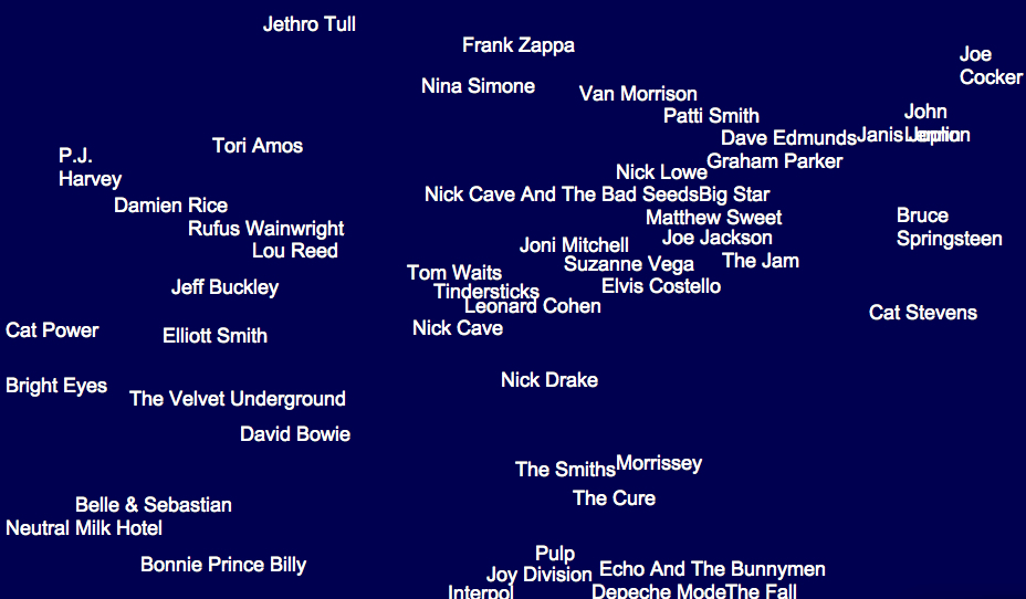
The transposition of stations to bands to those of stations can’t help but remind one of rock critic Dorian Lynskey’s ambitious if somewhat similar mash-up of the tube map and music scene by exploiting links of lines to suggest stylistic breadth of influences, in an attempt “to plot the history of 20th century music on the London Underground map devised by Harry Beck in 1933.” The pretty implausible choice in mapping forms not only worked, but Lynskey’s map gained sufficient cartographical respectability to be sold at the London Transport Museum: for Lynskey, who undertook this with sheets of construction paper and magic markers, in a sort o mental mapping of his personal preferences, the map made sense since “The different character of each line lent itself to a certain genre,” and so Pop, which as the common currency that intersects with everything else, here occupies the Circle line, while classical music, viewed as less influential and occupying its own sphere, was appropriately relegated to the Docklands Light Railway by its creator.
Beck’s distinctive and instantly recognizable graphic design is so iconic its choice seems nostalgic for a time when Rock music seemed located in one place–or had an epicenter of its own–and some coherence and uniformity, in an era when music first started being available online–which may very well even more specifically apply to the recent Rock’n’Roll Metro Map. While one might argue that the map of London as a site of rock music erases the black roots of rock music, bleaching a historical background to foreground contemporary white bands with limited sense of history, using a city that claimed Pop as its own as a site for defining a canon of rock, that casts Little Richard as a stop before Elvis Presley and Jerry Lee Lewis, and James Brown and Screaming’ Jay Hawkins as Lins to Buddy Holly, in a map whose flat surface massages critical questions of difference, appropriation or identity in one interlinked system that can be navigated in ways that undergird the city.
The Music on the Tube Map provides a neat spatialization of the music charts, akin to the personal navigation of the lost space of the record store, but with aims to provide a sense of music history.
Rather than providing a space to explore by flipping through albums, and listening to what the store owner decided to play, the classificatory schema provides an invitation to investigate the “rules” and conventions of its ordering of a sonic space perhaps prompting a sequence of triggers to auditory memories that the reader might synthetically experience, to judge by their own tastes: the very objectivity of the map as a record of space is up for grabs in this clever spatialization of recorded music as elective transportation routes.
The Lynskey map offers may rewards as a neat reading of music history, as well as many of the problems of framing the fluidity of musical performance in the formal integrity of the map, even as it provides opportunities for detailed scrutiny. Say, for one, the cool placement of Michael Jackson near Minnie Ripperton, in a totally different line than Burning Spear, whereas the ska band The Specials are rather brilliantly placed an exchange of Reggae, Rock, and Pop.
There is a broad-ranging Catholicism here, as the tube stops comprehend Jazz and Soul, and extend to Country, Funk, and Electronica, and, despite a focus on the British that seems also at times a bit obscure, there’s a respect for lines of Hip-Hop, DJ’s and the avant-garde in the fifteen lines, including the odd amalgam “Classical and Sound-Tracks.”
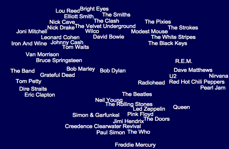
But there are occasions of mapping that could elicit intense debate from some, like placing Bob Dylan as a mere station on the Green Line, diminished by juxtaposition to the Rolling Stones who albeit rightfully occupy a nearby triple exchange:
To be sure, any map of this sort came in for some intense criticism when Lynskey first posted it, pointing to the absence of numerous bands from lines from the Talking Heads to Joy Division, and some oddities, like placing the British modernist Harrison Birtwistle between Terry Riley and Philip Glass. London-obsessed in its fetishization of the Beck map, one commentator on the Guardian blog found it the work of “the most stereotypically self-indulgent Guardian wank I can think of”–the huge labor of organization is impressive, if the obsessiveness of linking the Kinks to Radiohead seems obsessive, and riding from Mahler through Penderecki to Danny Elfman a waste of time.
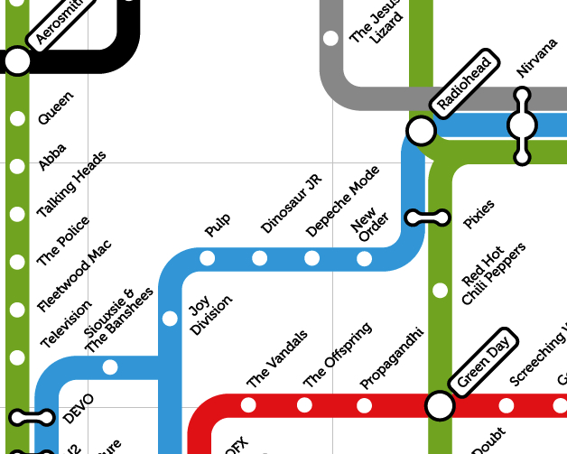
But the intensive sort of map-reading and patriotism with which rock journalist and writer Lynskey blends allows a mental indexing and erudition is less assiduously pursued by Antoniazzi in his Rock’n’Roll Metro Map, or at least in Version 1.1, which seems a bit provincial and a bit more nostalgic in its use of a Tube Map. Anthoniazzi also exploits the clever conceit of placing artists crossing two genres or linking music styles at the intersections of imagined sonic tube-lines, to be sure, if these might be quite different–Radiohead is now a major hub, as is Nirvana, Coldplay, and Green Day, and Antoniazzi’s erased twentieth-century precedents of other musical genres in favor of encyclopedism of a somewhat presentist bend that doesn’t have the historical depth that made Linskey’s exchanges amusing.
Despite Rock’n’Roll map‘s claims to authority, it carries far less of a thesis or explanatory heft than Greil Marcus put into his classic “secret history” of the twentieth century–and not only because the map is a bi tongue-in-cheek as a riff on a popular icon: despite the claims to organize musical bands in the manner of Beck’s iconic map as a vision of the navigation of underground culture, the relations it sketches between bands is necessarily unclear. If the transposition of band-names for the familiar infographic of 1931 offers a surrogate for channel surfing or flipping along the dials of a radio, the place Green Day holds at an intersection between tube lines is clever and even compelling. But we lack orientation as we shuttle from station to station, from The Police to Fleetwood Mac to Television before arriving at the joint tube stop occupied by Devo. More prominent bands stand at prominent exchanges, but the map seems to be about switching out place-names more than a guide: the legend withstanding, it’s hard to read this infographic as an ordering device; and though I like the spirit of the acronyms noted in its legend, it seems to rely even more on the nostalgia of the unity of rock in a single tube map.
Part of the problem is indeed of taking the city as microcosm of the world, or pantheon of rock. There’s something going on here about the primacy of the local or London as a music hub; despite some prominent Americans, the map is English-centered, the category of “the most influential” being dominated by groups canonized into British tastes or top 40 beside such somewhat nostalgic acts as Siouxsie & The Banshees, Depeche Mode, Billy Idol, and Duran Duran.
It’s not that the map doesn’t chart “the most influential rock bands” (as claims its legend) but, rather, that despite there being something in the authority with which any map creates as a network of relations, it’s easy to see that its map’s appeal as being based on that substantial grounds–or even as having a staying power that long in the current music scene. It’s a bit of a memory game, however, that employs the nostalgic format of the Beck map to reconcile earlier with more contemporary bands to place them all on the scene with equal authority.
‘What would it mean to try to map music?’ is a question that’s received a number of responses in multiple blogs, however, of which the unfolded Metro Map is one ancestor–an ancestor that suggests the coming of age of musical bands with a newfound legitimacy, as much as it orients the viewer.
Of course, the map maps London as something of a hub, given that claims of mapping the relations among bands are a bit strained since they overlap on an existing structure–as “alternative Maps of the World superimpos’d upon the more familiar ones.”
Of course there are plenty of counter-maps to the notion of placing London as world music capital–in fact, they proliferate. A map of New York’s musical topography, boasting of its riche, roots composers of a far wider musical discography to image the city as site of inspiration, as much as musical community, without venturing underground:
The 2011 project meant to display the vibrancy of the music scene in one place–Seattle–now migrated online, is a worthy ongoing collation/genealogy of Grunge. The detail of that expansive map, obsessively compiled, suggests one massive problem any mapping of the modern music scene creates, as comprehensiveness and crowding create above 40 linkages among bands, and the size raises serious difficulties of being able to display the map so it can be easily read:
There’s not much sense that this is something one could easily ready, but there is tremendous interest in mapping musical links among bands, using the word “map” to plot genealogies of tastes or clarify one’s tastes in digitized form.
Such “maps” create a memory of musical filiation with a new authority. They reveal a cultural metastasizing of the map in recent times in the media and blogosphere, with but a token sense of orientation–as well as a need for processing a huge discography backlog, now demanding explication, elucidation (lest it be forgotten or misunderstood). The map offers something of a clarification both in relation to a burgeoning of musical tastes and styles, sometimes in the hopes of locating music in its geographic setting, or, vice-versa, playing with the remove of music from place.
But is this a cultural studies prostitution of word usage?
That increased remove of music from place is indeed real, and not only market-driven, given the widespread sharing and migration of sound-files. The phenomenon of mapping tastes cannot be said to reflect a simple geographic distinction, moreover, of urban v. rural– at least not in terms of consumption in markets according to this infographic, which Ben Sisario shared, that reveals the huge markets for Country music in both New York and Los Angeles–two huge sites of the music trade, true, but also a testament to the way tastes trump place:
So what does a music map map, and why do we want to map sound? Apart from the interest in mapping genealogies, for a sort of closet erudition and appreciation of music history as well as of the record collections in your imagination or on your wall, the map is a way of investing fixity to the sounds you like, offering not only a library, but illuminating existing relations in a coherent landscape you can survey.
Taking another approach to the phenomenon of mapping music, one might ask how much the 2011 map of Seattle bands so masterfully designed by Rachel Ratner, Keith Whiteman, Golf Sinteppadon is about making a legible map to boast their own expertise in understanding an especially dynamic local music scene.
That maybe doesn’t really matter, given the adoption of the language of “map” as a sort of meme in graphic design–there must be a reason why the notion of mapping has interest here, and it seems to have to do with both a search for legitimacy and authority, as much as a need for clarification, as well as a sort of archiving of the unmapped nature of online music, now removed from the social forums that defined the listening of music since the eighteenth century–the availability of a huge range of music and “if you liked this, try . . . ” algorithms. The self-made ‘Seattle Map’ is after all something like a web, linking bands in up to 30 or 40 connections, of considerable complexity:
The stunning ability to create online algorithms of taste, similar to those used by Spotify or other music providers, has encouraged the graphic visualization of a burgeoning of bands and music that is available online. Part of the problem is selectivity, of course: if we have 80, 000 artists, mapping them creates the question of how comprehensive we have to be, and if we can even create something like a unified map at all, or will require a map as large as a city to record it all.
A focus on smaller sets of relations might be a good way of mapping around central nodes, although this is a fragmentary way of mapping or a fragmentary mapping exercise. The result is more often a sort of sketch, both of influences and commonalities, if one imagines musical “neighbors” in the manner Paul Lamere has:
This makes some sense, although it is approaches a relativistic notion of a map, re-centered in relation to questions of proximity–a useful way of mapping music, given the limited correspondence of taste to place, even if one would like to integrate–or map–the two, even if only in maps of local musical scenes. Relational maps of performing artists are increasingly popular symbolic tools, however, if only as forms of propositions. These “RAMA”–Relational Artists’ Maps provides a way to interact with large amounts of musical data as in the stemma of classical philologists, but which overlie its branches of relations on genres to map the categorical terrain into which new bands migrate in imaginative ways:
If all maps are propositions, this diagram fits the bill perfectly, moving beyond stylistic affinities to suggest the mapping of sound as a soundscape or interrelated terrain.
There are clear benefits of mapping musical style. Paul Lemere has created on his inventive blog Music Machinery something like a generational genealogy of musical style, mapping not only musical space but what he calls the “artist’s space,” clarifying the questions of influence culled from listening to music ranging from a fan’s fifty years of listening in a tree-like graph of influence of the family of the Beatles that respects the space of each individual artist as musician:
Although any map projects subjective preference onto the world, the practice of online mapping musical styles you prefer should not be discounted as purely a map based on individual taste. The System of Gnod features a website, ostensibly developed to “help” visitors find music that they like on the basis of a set of hidden algorithms, interactively, situating themselves on an interactive “Music Map” so as to generate a “map” that places any musician, band, or signer in a map designed to reflect one’s preferences with some degree of definitiveness or certitude: selection of the name of one artist generates a word map that one is invited to pore over with interest as a die-hard fan. The website conjures up a slew of related bands in a word cloud that places the relation to the artist alone to clarify something about one’s tastes, as much as the nature of the music scene or the models of the musician. Part of the coolest part of the maps that this site generates is the swirling around of parts of the word clouds that it generates, as varied lines of relations are busy assuming a distinct onscreen pattern that responds to the value the user enters.
The “Map of Music” is so relative that each frame possesses an extreme absence of continuity (or logical consistency, some would say) by privileging of subjective impressions over anything like objective ends, despite the authority of its word maps. This is perhaps evident in the cloud generated for “Bob Dylan,” which Greil Marcus might select if he ever used this site even though that’s something I can’t imagine: directional orientation means little compared to relative proximity to the artist we see in this map. There’s a sense of likely coteries are created in the clusters that surround Dylan’s name in “his” word cloud–is Bob Marley really closest to Dylan, or is he usually found in an entirely separate aisle of the record store of one’s mind–and even musical categorization–in the record store? And is placing Freddy Mercury on the margins of the map only meant to convey distance, rather than a sense of relatedness?
The “Map of Music” is so relative that each frame possesses an extreme absence of continuity (or logical consistency, some would say) by privileging of subjective impressions over anything like objective ends, despite the authority of its word maps. This is perhaps evident in the cloud generated for “Bob Dylan,” which Greil Marcus might select if he ever used this site even though that’s something I can’t imagine: directional orientation means little compared to relative proximity to the artist we see in this map. There’s a sense of likely coteries are created in the clusters that surround Dylan’s name in “his” word cloud–is Bob Marley really closest to Dylan, or is he usually found in an entirely separate aisle of the record store of one’s mind–and even musical categorization–in the record store? And is placing Freddy Mercury on the margins of the map only meant to convey distance, rather than a sense of relatedness?
And if one maps Radiohead, shown above as adjacent to Bob Dylan, Dylan is suddenly more remote from them than Led Zeppelin, complicating the matter about how one can use this as a way of ordering information instead of negotiating taste:
If one attempts to locate “Bob Dylan” in the word clouds that correspond to Van Morrison, Leonard Cohen, and George Harrison–all musicians who appear in Dylan’s word cloud and are plausibly linked to his work for multiple reasons–it’s striking that he doesn’t appear. Although Bruce Springsteen reliably does and The Band make a show in some, these maps boast being both discontinuous and distinct. (Maybe I don’t know Dylan so well, though.)
And The Band, typical of a whole bunch of 70’s white guys, seems to be a category that Dylan has transcended, even if Tom Waits and the Talking Heads are on the peripheries of.
Let’s not get lost in these maps–a quality that makes them maps, I suppose. But I did, however, find this map of The Clash pretty entrancing, but perhaps because it managed to vividly remind me of my High School:
This is something more than a word cloud in this “map,” since it creates a sort of sonic territory of the imagination. But the process of mapping Music on this site is a bit more of an indulgence of fandom, than a predictor of taste, and might not be worth the term map unless preceded by “preference.”
And what of relations to place, to ask the obvious? An entertaining (and possibly quite profitable) map could be created of the lists of performers in the New York subway. It would probably sell briskly, especially to foreign tourists looking for how to experience the city at low cost.
A creative tweaking of the notion of a “music map” translates maps to formal media of the musical, as in this adoption of the NYC Subway Map, designed by Google programmer Alexander Chen.
There is a sense in which all maps of music run against the Romantic idea of music as the transcendent, giving sounds an objective location by placing them on the map. Chen imaginatively created an animated version of a classic map of the New York Subway system of 1971, and then overlayed the intersection of subway lines with the plucking of viola strings so that the assembly of the map created a local sort of music of its own. The animated video also exists as well in a real-time version even more compelling, since it is generated by the departure of actual subway trains, and is also far more aesthetically appealing. Chen employs the elegant iconography of the historic 1972 modernist mapping of Massimo Vignelli, which formed part of an overhaul of the all subway signage’s graphical design.
Vignelli’s quite modernistic mapping individuated subway line’s paths by bright color lines in the 1970s, illustrating their respective routes by corresponding colors to transform the historical sedimentation of a tangled web into an emblem of timeless clarity–in the way that a map is supposed to do–and then gives it music of its own:
This remaking of this iconic route-map–an icon of design, to be sure, even if, as Aaron Rutkoff noted, “New York City’s subway system has never had just one map” and “beyond the officially approved version, there’s a long tradition of rogue adaptations”–respects the graphic elegance and beauty of the map to make music of its own.
The question of how to map music creatively beyond genealogies may also have generated such burgeoning attention to music maps online. Something like this seems to go on in Laura Cantrell’s map of subway routes in New York, using a modern version of the iconic map with her own soundtrack, in something more like an app, launching songs along subway lines that intersect with her own chosen sites of influence, each song an imagined itinerary of its own.
Perhaps it’s only fitting, in an era of found sounds and sound studies, to launch a map that attends to the sounds of those tub states themselves, with the help of the clever and enterprising London Sound Survey, that mediates recordings of the different and distinct soundscapes of some fifty-five of the expanding network’s two hundred and seventy five stations, in the aptly titled immersive virtual map, The Next Station, focussing less on music than on piercing screeches, drips of underground water, and crowds moving on the Tube itself. Gathered by a team of ninety five sound artists equipped with state of the art recording tools, heavy metal gets a new spin in the metal on metal sounds of the interior of the underground and counterpoint of trains’ rumbles beneath the city, in ways that create the sensorium that the smooth lines of the infographic is purified of, preserving the sounds of the whirring wheels of moving down tunnels, jostling, descending or ascending stairs, and screeching halts in ways that transport users to the sensorium of the subway tubelike itself. The pushpins of stations that can be clicked as portals to parts of the London Underground Tube stations is a part of the Cities & Memory, a bold venture of “remixing the world, one sound at a time,” a project now with new purpose in the #StayHome sounds that have gained unforeseen meaning as sites of attachment in the coronavirus lockdown.
Now expanded to a set of portals to most all of Europe, with over 750 artists across 100 countries that has mixed some 4,000 sounds, the web-based art form extends the fiction of an aural portal at the center of Ray Bradbury’s 1950 story, “The Window,” of a dying elderly Colonel who, rooted in one room and dependent on a desire to escape his own displacement, finds comfort only in the sonic transport of “long distance.” His slow days are distinguished by a daily call to persuade his friend Jorge he knew in Mexico City not to talk to him, but ask him to lay the receiver on his window-sill to allow him to hear the vital street sounds that transport him to a lost past of rich memory. So rich are the memories, indeed, that the attending nurse forbids Colonel Freeleigh to continue the technological work-around offers a solution to the isolation of old age, troubled by the heightened pulse of the Colonel as he hears these removed lost sounds, removing the new reality of dependence on others by bathing himself within the bustling street sounds of Mexico City, reaching for the phone to be reminded of his youth by seeking sounds that remove him from the oppression of declining health.
While the recreation of the alternative aural points of access to worlds engineered by the folks at Cities & Memory is of course directed not to only to the sick or disempowered, the promise it offers of transportation from the isolation of sheltering in place or “Lockdown” offers a new ability to access the spaces to which we suddenly find ourselves with less access by a collaborative map of global sounds, akin to podcasts of removed places, that offers the chance to refamiliarize ourselves with places we might feel increasingly removed, as a terrain we can access by a multitude of sound portals, each offering new immediacy that might make our own pulse race.
We read more maps than ever before, and rely on maps to process and embody information that seems increasingly intangible by nature. But we define coherence in maps all too readily, without the skepticism that might be offered by an ethics of reading maps that we all to readily consult and devour. Paradoxically, the map, which long established a centering means to understand geographical information, has become regarded uncritically. As we rely on maps to organize our changing relation to space, do we need to be more conscious of how they preset information? While it is meant to be entertaining, this blog examines the construction of map as an argument, and proposition, to explore what the ethics of mapping might be. It's a labor of love; any support readers can offer is appreciated!