Tag Archives: GPS

Cabstopping: Data Visualization and the Re-Mapping of Urban Space

Data visualizations often employ maps to make their point, and organize an effective argument that will engage their audience:  when we see data embodied in a map, and are best engaged in its interpretation.  The alchemy of the data visualization is a magic way to throw the map’s content into multiple dimensions:  data visualizations offer plastic forms of mapping to illustrate the way we fill and occupy space, transforming the mechanics of mapping specifically intended to track the stability (and meaning) of constructions of place, and orient us to different perspectives on how we move through space.  We can better understand the ways links can be drawn about data in clear synoptic terms, and reassured by the act of discovering new patterns in a readily recognizable form.  In describing the spatial distribution of an attitude or affinity, maps are readily consumed.  But they are also cognitive tools to process shifting notions of place:  the sleek tapering negative lines in the above visualization of San Francisco’s cab traffic offers a dynamic model to examine how GPS changes relations between cities’ center and margins.

Data visualizations are not present in the recently published primer “Make Map Art” invites us to adopt traditional cartographical tools as helpful strategies to “creatively illustrate your world.”  Mapping has long been rooted in the world of graphic design.  But the siblings Sue Swindell and Nate Padavick’s Map Art invite readers to embrace the diffusion of mapping as a form of making in the service of self-expression in this lovely book–whose championing of the hand-made map seems a counter-strategy to the near-ubiquity of Google Maps on hand-held screens and maps in evites, embedded in social media, that direct us to a destination.   The toolkit offered readers of Make Map Art invites us to adopt tools and forms of maps not only as orienting tools but instruments of “creative illustration” that suggest we rehabilitate forms of mapping as our own tools.  These maps are marketed more as a hobby than a strategy of resistance:  but in their romanticized vision of the self-made map, a sort of trickle-down of the popular resurgence of hand-drawn maps, they neglect the diversity of spatial knowledges in their “creative toolkit” of easily mastered tools of design.  The handsome how-to book offers some twenty projects by which to frame  cartographical interventions in a world already abuzz with maps:  but the forms of mapping 2-D toolkit primarily marketed in stationery shops and bookstores neglect the most interesting ways cartographical design has caught up with how increasingly stark social divides have come to structure quite divergent perceptions of space.

Web-based maps are not included among the toolkit for map-your-life/make-meaning-from-maps they present, since their medium doesn’t fit the niche audience or the Luddite inflection of the book–or the sense that the map, once considered a tool of government, can be a relaxing way to order space in a world where we are all too often confronted or running to consult a handheld screen.  But this might be unfortunate.  For in a culture where we are consulting or faced by screens in  the forms of attentiveness data-driven maps create compelling models for charting our occupation of space and indeed processing our own relation to space in particularly creative ways.  If the screen often provides compelling tools to grasp our increasingly uneven occupation of space to a degree of visual attention unlike–although not foreign to–static maps.  They can show us how we fill space, and how our experience of place is redefined with a rapidity that the static design of a local or regional map has difficulty continuing to fulfill its orienting functions.  We are impoverished by circumscribing our access to a full range of mapping forms.

SF Traffic

In their engaging how-to book of personalized map design, Swindell and Padavick offer a something like a basic toolkit for those eager to respond to fears of being dominated by data.  In designing customized maps, one might resist widespread concern for being regularly mapped by unwanted forms of surveillance, and indeed dominated by the ways in which our lives are regularly mapped.  But Padavick and Swindell don’t push back that hard: they dwell in the cozily utopian idealized spaces that any map invites viewers to inhabit. It’s cool to play with our sense of space and abilities to create forms of personal orientation for ourselves or indulge in returning to cut-and-paste type of social media of material design in a DIY guide for fashioning personalized geographies ready “to be framed and displayed as artwork” to gain new decorative status as personalized cartographies.

Data visualizations, unlike static maps, define the networks of interaction in which we have increasingly become enmeshed, tracing forms of  inhabiting place that are often illuminating of the complexity of navigating place than they are comfortably reassuring.  Map-based data visualizations orient us to the shifting ways we fill space and inhabit our streets, and make interpretive demands on their viewers about how we actually have come to use our space.  For while the formats of maps offer cool tools of spatial orientation that remind us of the favorite streets we love–and how we walk across them–if the alchemy of data visualizations remake maps as especially creative tools of engaging with one’s environment, they process our own relation to a built space in dynamic ways, effectively organizing our orientation to space by revealing contours of divergent perceptions of and access to space in cities–spaces that are now no longer easily mapped by public transport maps, grids of streets, or even schools and social services.  The patterns that data aggregates are particularly valuable as a tool to unpack the changing occupation of urban spaces, from public parks to freeways to avenues, and to interrogate the practical and real boundaries of known space.  And they raise questions, perhaps known to some extent in anecdotal experience, about the increased dependence on GPS to navigate urban space in many drivers of ride-sharing services–from Uber to Lyft–perhaps in distinction from drivers’ familiarity with the automobilistic navigation of city streets.


1.  Maps that derive from big data offer particularly versatile tools, in contrast, to visualize the ways that we inhabit space and, by extension, how we travel through it and make it our own:  much as flows of information or currency or patterns of immigration, data maps show patterns of collective action that is rarely otherwise aggregated, and help us visualize how we inhabit space in dynamic ways.   They present the ability to map a network around both space and place as, indeed, constitutive of both, dispensing with and not adopting a static cartographical frame of reference to describe our relationship to space.  The alchemy of data visualizations allows us to  illustrate shifting relations between urban centers and peripheries in a map, tracking shifts in the nature of mobility in urban space, beyond a physical plant, but embodying how GPS readings tracked each cab across urban space as they move on major arteries, noting not only their positions over time, but indicating patterns of traffic, shifts in density at different times, relative rates of acceleration and different speeds of travel–all to chart how different dynamics by which the aggregate of cab riders’ experiences across urban space, the access to urban space that the self-selected demographic of cab-riders share, and the areas of cities that remain off their maps.

The dynamic results of such data visualizations provide compelling ways to understand the organization of urban space.  And in such lies their attraction for puzzling the existence and resilience of place.  “Cabspotting” at San Francisco’s Exploratorium invites us to track cabs as they carry fares at different rates of speed and acceleration across that city’s thoroughfares.  The data visualization is designed after the pioneering aggregate mapping of cabs in San Francisco’s streets by stamen design’s Shawn Allen and Eric Rodenbeck, displayed in a gallery setting in 2008 at MoMA, and first designed in 2005 by Scott Snibbe, Amy Ballin, and Stamen design.  This “high art” of data visualization was devised as a tool to reveal social, economic, and cultural data about the city in a variety of video platforms, exploiting the ability to download massive amounts of data about city cabs in aggregate that could be graphically condensed to a single image of apparent simplicity that spoke volumes on space use.  “Cabspotting” (2005) created an innovative alternative model of revisiting the city as a permeable and open space that was at the same time structured by economic patterns and social divisions in urban space:  the famous visualization of how people use cabs to inhabit urban space re-envisioned the city’s physical plant in a dynamic data-driven pattern varying trail length in response to cab speed.  Its particular power as a data visualization lies in its tracing of a collective iteration of individual itineraries, whose line thickens as they accelerate, creating an image that asks viewers to cathect to real routes through and across the city–either in an aggregate view as below, or in a real-time film of the routes and speeds on which cabs move.

Cabspotting

We are able to enter into the pathways along which the city plan is traversed and experienced, as well as occupying an Olympian point of view.

The sinuous traces left by the aggregate of cab-fares allow us to watch cabs moving at different velocity and acceleration across the city, to reveal a haunting socioeconomic X-Ray of the city’s space, and pathways within in its streets.  While omitting large areas of poorer regions, from Hunters Point, Bayshore, or Daly City, it illuminates areas in the financial district arrived at with disposable income:  thick lines of rides near the shores show a general acceleration, especially on the Central Freeway, Market St., the James Lick Freeway or the 101 and 280, as well as along the Bay Bridge and out to the Airport, reveal a dense distribution of cab lines filling the city plan that hinges on Market Street.  The absence of a network of freeways built within the city seems to have helped cabs’ circulation, but cabs are limited to a dense occupation of downtown streets.  Indeed, if the sort of freeways and highways were built over and across the space of San Francisco in the way that they were in other cities, perhaps the illumination of that gridded downtown would be less prominent in the Stamen visualization–although one can still discern the 101 or James Lick Freeway and Marina Boulevard leading to Ghirardelli Square in the Stamen map, imagine the shifting spatial spread in a city defined by the proposed arterials which would have rendered the city more navigable, but faced such intense local opposition  that they were never in fact built or got beyond the drawing board.


picture_4


The animation of traffic around San Francisco’s roads and freeways that Cabspotting celebrated the unique space of San Francisco’s streets, removed from a world fearing surveillance.  It also provided a model for processing data from taxis to illustrate the ways we use cabs to inhabit and navigate a city’s streets, emphasizing what routes cabs take and how San Francisco’s urban space is navigated, by taking up the perhaps oxymoronic proposition of surveillance technology as truly inspirational, in Scott Snibbe’s phrase.  The resulting graphic illuminates a hidden geography of how San Francisco is experienced across time in cabs, whose tracks trace a socioeconomically differentiated space in ways that cast the city’s physical plant in a dramatically new lens, where the density of downtown peters out to wisps along those avenues where fewer cabs run their fares:  Cabspotting set a compellingly high bar for data art.

The compelling portrait that emerges from the Stamen visualization offers of primary routes of cab entry generated considerable excitement for a virtual palimpsest of how urban space is navigated by paying customers in a city on a single day.  In ways that privilege specific areas of the downtown, and the larger streets–around the bay near the Embarcadero, down Geary Street, along Mission Ave. or nearby Civic Center, it suggests a living template of the city, noting each cabbie’s trajectory of driving by a white line, and increasing the size of its ghostly white lines by velocity and frequency of cabs.   As a form of GPS-based art, the ghostly image of the city may have shaped Jeremy Wood’s use of GPS in 2009 to track his personal cartography in the Gliclée print “My Ghost”, imaging an overlay of his own itineraries over the span of a year, but Wood’s image lacked the richness of wealth implicit in Stamen design’s data overlay.  Even if it suggested the lack of access of certain areas of London to Wood’s experience of the city, and a wide wandering over a hairy looping of space, the individual migrations through London streets suggests restless  iteration of an individual across city streets, unlike the densely packed social clustering of cabs  concentrated in the downtown San Francisco and accelerating along freeway lines.


my-ghost


The image Snibbe and Rodenbeck designed offered a memorable real-time contours for a city’s urban space that show a far less dispersive wandering around the vagaries of urban byways, and a focussed repetition of routes around a relatively restricted urban grid.  In each of its successive animated time-lapse iterations and real-time rehearsals, the Stamen’s “Cabspotting” re-mapped urban space by tracking the collective aggregate of motion across urban space, using data from embedded GPS data of position, speed and acceleration to remap a strikingly plastic living urban landscape in dynamic–if haunting–ways:  pay-per-fare riders sculpt streams of traffic across its major streets and thoroughfares, rife with cab rides, appear illuminated by the aggregated overlay of rides over time, showing the different rides of the city that were being performed as if to condense a residue of the collective transit through the city around select hubs and thoroughfares of increasing or diminishing traffic.


Stamen Cabs


2.  The wealth of data mediated by GPS measurements allows one “map” space around each of the “lines” that designate cab-rides by relative speed, using red to highlight moments of acceleration at a fixed period, in a time-lapse moving image that traced the matrix of the city’s streets.  In ways that predate but prefigure the current rise of on-demand  smartphone-based apps as Umber or Hailo which aim to displace the local cab economies in most metropoles, the pulsing traffic of animated  tracking of taxi-cabs renders the city’s grid in a wonderfully dynamic way:  Cabspotting serves to delineate clear economic patterns and socioeconomic points about how different folks perceive the same space of the city.  The dense glow of traffic around Union Square of cabs parked, circling, or just stationary reveals a center of commercial congregation.


colored map cabs' speeds


Such tracking of cab-traffic of course may sharply differ in other urban spaces, where centers or commercial districts are more concentrated or differently distributed, and access to space less clearly privilege distinct thoroughfares.   The real-time tracking features of Cabspotting liberated static models of mapping by using GPS to amass data in ways Rodenbeck and Allen could readily visualize in clean lines.  But the “snapshot”-like nature of the Stamen graphic led to some early envy in data visualization, as Kottke and folks on the East coast imagined what a similar data vis of taxi flow for midtown New York would look like, and first obtained the GPS data from taxi trips to create an image of the “vital signs” of where cabbies picked up their fares in the first half of 2009.

The resulting temporal condensation of an animated sequence of cab traffic between January to March, once sped up to suggest something of a regular flow over time  is clearly made to appear synchronized with human cycle of breath, as if to suggest its record of the vitality of the city’s traffic, with fares increasing from 7 am to 8 am, expanding to their highest density in midtown every morning, pausing, and rising again, only to decline in their yellow-hued intensity by nighttime, and leave the city blanched in the early a.m. hours.  (The maps should be looked at by anyone interested in hailing a cab, and as a companion piece to the guide of NYC cab etiquette–asking cabbies “What route do you think fastest?” “instills trust in the driver”, rather than giving directions on where to go–although it is unable to be accessed in real time.)


Densest at midtown #4


This apparently anthropomorphic time-lapsed image created suggests the inexorable daily constriction and dilation of the city’s vascular system, in tempo with the gorging of taxi fares that slowly dissipate, as if in a forced analogy for urban vitality:  the density of fares in midtown suggest clots more than flow, but provided a neat heat-map of city traffic’s frenetic pace. The distinct flow of cab traffic responds to the dense layout of Manhattan, and the saturation of the midtown and lower Manhattan with cab rides that fan up and down its major avenues.  Unlike the smooth flows out of arterials and to the outer edges of San Francisco, the knotted nature of the New York City visualization suggested a rigorous diurnal rhythm of relatively small trips of privatized transport, densest at the city’s midtown hubs, and reaching over to its wealthier east-side avenues.  But while its anthropomorphic form may be stretched as a bridge fusing nature and culture, the map reveals in important ways the individual specificity of taxi patterns within an urban topography, and indeed the specific diurnal fluctuations that define the demand of taxis–fading as we approach uptown above the blip of the 79th street subway lines–and suggest distinct rhythms of distributions and concentrations of demand for cabs that appear across each urban space, focused in midtown below Central Park, along Broadway and Third Avenue, and specific spots in lower Manhattan.


Screen shot 2010-04-05 at 9.05.50 AM Screen shot 2010-04-05 at 9.05.50 AM Screen shot 2010-04-05 at 9.05.50 AM taxi-flow-nyc   taxi-flow-nyc


The specific density of midday midtown reveals a complicated geographical picture a city served by experienced drivers doubtless working in tandem with a sense of its rhythm, best able to gauge the shifting traffic contours of urban avenues.


Densest at Midtown #2


This image, if interesting, has been recently refined in a two-color data visualization that refine the image of how New Yorkers enter and exit from taxis to navigate New York’s urban space.


3.  Eric Fischer re-mapped a specific topography of ‘cabstopping’ by aggregating the range of cab hailings (blue) and destinations (orange) across the city in 2013.  And an even more massive amount of cab data was declassified after Chris Whong and Andrés Monroy used New York City’s Freedom of Information Law to obtain a copy of the taxi records from 2013 they soon published on the web.  The big data of some 187 million geo-located cab-rides inspired transportation visualization guru Fischer to map the aggregate of total rides taxi drivers gave passengers across Manhattan’s particularly packed automotive space, now on Map Box, in a striking visualization of the collective use of cabs across Manhattan.  The map’s strikingly clear block-by-block topography is of striking precision; it illuminates how densely cabs are concentrated in midtown Manhattan and how specifically the vast majority of pick-ups and drop-offs center in specified regions–and how omnipresent are cabs up to Columbia University and 96th on the East:  cab-density, unsurprisingly, is a measure of socio-economic wealth and property value.


Big Mapping NYC Taxi Trips from Open Data


The social topography of the city is balanced by the white skein of veins in midtown that define a special density of cab-use along major traffic arteries.  And it presents one way of mapping a changing configuration of center and periphery across the city. For Fischer, a fan of both crowd-sourced mapping and urban transport system, dissected the data in visually compelling ways by highlighting the starts of taxi rides in blue and the end-points of destinations in orange, a spectrum that allows us to map the topography of collective cab-use around Manhattan, Brooklyn and Queens. The demand for local usage of cabs isn’t divided into analytics, but provides an image of the density of cab-use in an actual topography before folks like Uber or Hailo threaten change its face–and seem to use their own GPS tracking to exploit by a smartphone app to connect passengers with vehicles of hire, provoking some concern about using GPS to charge fares, and adjusting fare rates in relation to the density of traffic flows:  indeed, the apparently clear preference of New Yorkers to use Uber in off-peak hours and geographically removed and less-served locations suggest that Uber might, in New York, be better conceived as complimentary to the apparently engrained services of other cabs.  Are such drivers even more dependent on GPS to discover the relations between fares’ destinations and the cityscape, as well as to find their next pickup?


Uber hand


The data that maps coordinates for the start and end of cab rides provided a way to “map” what places New Yorkers are most likely to hail a cab–perhaps the most difficult places to get a cab, but also no doubt those areas where cab-drivers aware of an increased demand–as local knowledge of cab-riding more informational of urban space than even the most comprehensive transit map–and perhaps augur the life-span of cabs in the age of Uber.  It also offers a readily accessible instance of open data which provides a nice counterpoint to the banality of the Google-Maps-based cityscapes that feature on demand cab-hailing apps:  or the difficulties for the sophisticated software that sets its rates in relation to the hours of increased intensity to offer what an actually accurate image of the urban space in which it promises travel.


Hailo:Uber


But let’s return to the subtlety Fischer’s coding of end points in orange and sites of hailing in blue allows.  The aggregation is so dense that it defines the entire street grid.  Most superficially, a scan of the data visualization he posted shows the hailing of cabs to be clustered on avenues where cabs congregate and course North or South–joins legibility with aesthetics, charting where New Yorkers access and stop cabs to tell us a lot about the navigation of the city’s grid in its crowd-sourcing of automotive itineraries.

For Fischer’s visualization deserves plaudits for elegantly synthesizing an exact visualization of the unique ways that folks use urban space:  of the over a million and a half taxi-rides that were taken in 2013, most concentrated in the cab-mecca of Manhattan, most seem to be taken along the North-South axes of the avenues, somewhat predictably, with a striking density of destinations on almost all of the major streets, often ending along North-South avenues.  Fischer’s map almost illuminates the grid of city streets in ways that tell us considerably amount the range of disposable income available to Manhattanites as well as to most visitors to New York.  The intense activity that the cab occupies as a sort of “second car” and mode of transit suggest a fully served community, if it sacrifices data on speed, acceleration, and delays that might be necessary to really envision drivers’ relative effectiveness.


187 mill Taxi Trips in NYC


4.  Access to this huge data offered a rich vein of data for Fischer, a data artist who often sources huge amounts of information off Twitter, to work characteristic visualization alchemy in a static spectrum to conveys the dynamics of how people move in patterns to organize urban space.  While the image is 2-D, the fading and clustering of its range of illumination invest the Manhattan grid with an illusion of three-dimensionality by using a simple set of primary hues.  Indeed, the phosphorescent blue taxi pick-ups create indelible records of where the cabs were “spotted” and used, although something of a patina in this digital visualization is created by shimmering “GPS-static” in the more densely built skyscrapers of the city, which are odd artifacts of the mechanics of data collection:  as Fischer notes, in certain spots, GPS signals have reflected off buildings’ windows, in ways that add an other (if not welcome) layer of legibility to the map of the city’s space.  (Far crisper contours of cabs’ signals arrive from streets that service the much lower-lying buildings of Brooklyn or other boroughs, even if cab-traffic there is far less intense.) We can read the data visualization to detect the conscious choices of cab drivers to negotiate the flows of urban traffic, even though the image is static, based on the similar clustering of overlays in data.    Although midtown is somewhat filtered beneath  a gauzy layer of interference or blur of GPS-signals’ distortion, as is much of lower Manhattan, reflecting the interference created by urban canyons of clustered skyscrapers that render GPS reception less precise–though we can see the white heat of cabs hailed or congregated at businesses and hotels that serve as sites of conferences and conventions, and detect a temptation to leave rides on East-West streets,as on Central Park South and 57th Street:


Blur of Midtown's White Heat


The data visualization charts the tacit mechanics of the topography of cab use, by using a orange-blue color differentiation to set of regions where destinations dominate cabs hailed or flagged and journeys begun, and where they leave passengers.  We can see a sharp preference to take cabs to destinations on East-West streets, negotiating a topography of traffic that taxi drivers’ familiarities with the different velocity in the white-lit larger avenues control.  In contrast, the specificity of red bulbings of destinations at various crosstown blocks where passengers stopped cabs suggests a specifically situated transportation midtown, even with clear evidence of the blurriness of GPS-interference.  (GPS fixes are also less easily held near LaGuardia airport, as bright red “worms” approach the access roads of terminals, as if to indicate “premature” arrival of a cab stopping before where they were surely headed; a pattern of blue blurs result that seem air-brushed, in comparison to the crisp lines in Cabspotting.)


GPS Fixes near LaGuardia Airport


If the Bay Bridge stood as a beacon of taxi density in the Stamen visualization of San Francisco, La Guardia seems a brightly burning beacon off Manhattan, and the Brooklyn Bridge provides a lighter but indelible tie recording of inter-borough taxi traffic.

The traffic patterns recorded in the visualization reveal a palimpsest that demand interpretation of denser lines of red (where cabs leave folks in the city) and a tool to investigate how city space is used and what neighborhoods visited per annum:


Strats Blue:Ends Orange-BrooklynBridge #2


Red lines are veins across New York City’s Central Park, where one can’t imagine the destinations are actually along the crosstown lanes of traffic that run on paved roads across the park, where tunnels that cabs run through seem to have interrupted the GPS signals as well at 86th street, 81st Street, and 66th:


Veins around park and Mysterious Red Dots


Brightly lit blue lines illuminate 5th Avenue, a street almost always crowded with cabs, and light up both lanes of Broadway, in ways that offer a beautiful visualization of the way we demand to be driven in Manhattan’s urban space and across its street plan that demand to be pored over with a magnifying glass in hand to best interpret its elegant aggregation.  The map can help us create a better navigable urban space–and perhaps respond to the needs for taking cabs in the city–by mapping needs of public transit, and the readiness of customers to use cabs to navigate urban space.  The street plan provides tons of neat points about the nature of collective behavior, as all aggregated data, nicely foregrounded in Fischer’s color scheme:  just as we detect bright blue sites of starting cab-rides near the Brooklyn Bridge, if considerably brighter in Manhattan, and notice bulb-like orange clumps of drop-offs in Dumbo–the downtown municipal buildings are the looming black blocks.


Strats Blue:Ends Orange-BrooklynBridge #2


The blue bulbs at street corners give a more likely (more convenient and better) place to start one’s cab-rides in Manhattan, as our GPS lines bulb out at centers of cab-hailing at intersection in the form of a Q-Tip, suggesting considerable refinement of the data, in spite of the occasional blurred reception of GPS signals:  some corners burn an incandescent blue.


Corners are often Bulbs


5.  The specific transportation needs that taxi cab services supply suggest a distinct manner for negotiating urban space at a pace that public transport can’t provide, and a particularly resilient form of a local economy.  How might this relate to the specifics of the survival of the cab as a viable vehicle and model of transportation (and the regulation under which cabs function)? In an era when GPS’ing pickup locations in the crowded downtown by Uber threatens the cab-drivers who have so long made their livelihood in the city’s streets.  It awaits to see how the density of cab traffic already available in the city will react to the influx of passengers with handhelds.


uber


Indeed, despite the universalizing nature of Uber’s intentions, the app they offer may best function  precisely in those cities and urban areas which fit the traffic patterns specific to San Francisco most closely.  San Francisco, the city where the app was first devised, offers a unique problem of navigation for taxis:  pedestrians and inhabitants both face a scarcity of free cabs and often face the need for long trips from downtown to, say, the Inner or Outer Richmond or Pacific Heights, call cabs over to the East Bay, and are often located at a distance from taxi stands, and where fares might have too much difficulty hailing a cab at later hours.  And where single women who want a secure ride door-to-door make up, it’s been suggested, a major portion of the fares.  (It might be argued, however, that the whole point of Uber was to harvest a huge amount of data that can be plotted by future mapmakers and indeed predict the relative likelihood of destinations across the city in a more sophisticated way than was ever possible.)

But even in San Francisco, it bears noting, the recent introduction of “Pick-Up Points,” or recommendations of specific pick-up locations in mid-2015 suggest a new way of mimicking mobile taxi-stands for their users–as if to acknowledge the difficulty inherent to promising mobility for an urban space that is often by definition clogged.  Although the potential to be anywhere–or assign a driver to appear anywhere–at first distinguished Uber’s provision of crowd-sourced drivers, eerily soon after the suggestion that the rideshare service provide precise locations of where a fare might be best able to draw drivers–and, if not hail a cab, meet one’s driver–the urban maze of U-turns, changing traffic flows, one-way streets and freeway onramps makes it not only more convenient but more enabling to imitate the interactive suggestions made by Lyft, for example, in inviting its users to indicate where they might best meet their ride:

yft

The innovation is not to become less interactive, but to offer a set of coordinates from, for example, a crowded field or region, where one’s ride might otherwise have difficulty locating you, even if that selection may sacrifice the illusion of being anywhere, anytime, and involve some extra footsteps of one’s own:

Suggested Pickup POint UBER


There is some data that demonstrates that the indication of such exact sites of pick-up may allow riders to appear at precise times without creating a situation where drivers would actually compete for fares, and to ensure the illusion of personalized service in a service that in aggregate reveals clear patterns of its own.

The harvesting of data that Uber allows, indeed, makes it a sort of Google for the taxied set, and creates something like a valued dataset that Uber has done its best to exploit.  As Bradley Voytek has noted in a neat on the Uber Blog, in a neat weighted diagraph visualizing the flow of rides from one of San Francisco’s neighborhoods to another, noting the aggregates of rides leaving a neighborhood by a circle of varying size and drawing weighted arcs in the color of the neighborhood of a destination, the flow of Uber rides predominantly originate from South of Market or downtown–the largest point of departure of Uber clients by far.  Almost all the rides originate from the downtown.  This clustering of rides around a single region of the city suggest a restricted range of sites of departure for on-demand rides, and a marked clustering among three neighborhoods from which users predominantly originate–although it should be noted that Voytek used dated data rather than the data Uber now possesses–and offers a larger visualization here.

Rides into neighborhoods Bradley Voytek


Might one decide to map the different topographies of traffic flow across different cities in the hopes of predicting how well Uber offers a fit for the navigation of a distinct urban space?  Even with the increased homogenization of cities, the underlying plans and patterns of local traffic provide some guide to its potential “fit” with local traffic and cab-use. It demands investigation how the market would adjust for Uber to be most complimentary to local needs.  The integration of GPS with a local taxi economy has been recently argued to create an artificial scarcity of taxis squelching competition, but to champion the free market approach runs the risk of setting off shocks in the local economy of providing short-term rides that has developed in the city’s somewhat fragile transportation economy.  For as well as reveal the pathways of negotiating urban canyons of New York, the visualization reveals a delicate local economy in which car-users navigate the available calculus of transportation–a city where few drive the cars they own every day, and despite a relative density of car-ownership in Manhattan and New York City as a whole.

Indeed, many don’t even rely upon cars–despite the incredible density of cars per square mile in the relatively affluent region, according to the data mapped in StreetsBlog LA.


Vehicles:Sq Mile NYC   Vehicles:Sq MileStreetsBlog LA

Viewed another way–vehicles/person–New York City seems relatively low-density, indeed, because of the sharp contrast to outlying “suburban” areas or peripheries:   few cars are used for commutes, and multiple car ownership is quite rare.  Reasons for owning vehicles shift in different social topographies.


Car Ownership in NYC and environs Vehicles:Person StreetsBlog LA

The stark contrast in the regional distribution of statistics of car ownership are striking on the micro-level of Manhattan are indeed evidence of a large commuting culture, where many cars belong to commuters who live in more car-friendly lands outside the five boroughs:

NY-Vehicles-Per-Person   Car Ownership in ManhattanStreetsBlog LA


Although the vast bulk of cab-rides in New York City are based in downtown traffic, where garages are costly and urban street space at a premium, the data visualization reminds us of the continued importance of cab services to negotiate local space.  The relatively subtle tool for moving in a narrow time-window that cabs provide offer an increasingly needed medium to move through and use space that seems unwise to disrupt not only as a way to move the city’s economy, but for the very reason that it is so deeply established of negotiating specific constants of its traffic patterns and laws.  Indeed, the poor ability of GPS or any GIS system to record the shifting pulse and intensities of traffic raises questions of the time which its drivers need to accommodate to actual traffic flows.

If Uber is able to navigate it, best of luck.  Maybe it already has:  but the uncertainty of how markets are currently treating this ride-sharing service suggests that it may have opened the way to far more competitors than it ever foresaw.

Leave a comment

Filed under cabspotting, data visualizations, GPS, GPS devices, mapping city cabs, maps and surveillance, on-demand taxi service, Uber, unwanted surveillance

Are We There Yet? The Plane in the Map

New markets of maps are always emerging, and we seem to have our own interest in making maps for an growingly de-centered globalized world.  But perhaps one of the oddest markets is for the rehabilitation of the itinerary in a globalized age, a rehabilitation that seems not only against the grain but designed to bequeath greater familiarity to a space often felt to shift beneath one’s feet:  where one is as one watches the landscape unfold in the most current flight maps almost undermines the position of the viewer as if to reinforce whatever queasiness one might feel while suspended high above the earth in a crowded flight cabin.

In an attempt to create a sense of individuality in the in-flight experience that seems safely guided by a captain piloting the plane, the in-flight maps omit the range of other planes crowding the airspace of the world, and indeed the possibility that the plane is steered remotely or by an automated program, giving a sense of collective participation in mapping the steady course of the airplane’s flight-path in a proliferating variety of formats.  Whereas airline-based in-flight tracking maps are generated for paying passengers for apparently utilitarian ends, the fairly antiquated medium of spatial representation is compellingly abstract–and often can prove as disorienting as much as orienting.  Increasingly, the tools for envisioning the path of your plane on a Mercator projection–serendipitously fitting in the frames of video screens inset above most tray-tables in Economy flights–which allow us to imagine the global context of airplane flight paths in unique ways.

Wildly out of scale and based on estimated representations of flight paths, the maps displayed behind tray-tables on the backs of seats claim an odd sense of exactitude designed to increase confidence, the maps convince us that we are in good hands, and suggest that once we have entered on our course of air travel we have entered into a unique relation to the land  but also a position of safety, in which we will be safely guided to our eventual destinations.


flying-on-a-mercator-projection


Is it any coincidence that the map is viewed as one has little sensation of moving, and needs to be reminded of progressive trajectory of global motion across it?  The inclusion of a directional set of arrows, resembling an early modern wind rose, atop the rather detailed bathymetry of the ocean floor suggests a reminder of global travel.  If there is a superfluity of detail in mapping the ocean in a ramp of bright iridescent blues, the map also serves somewhat as an invitation to future destinations–


United Flight Paths:GeoNova.png


–that reflect the increased expansion of air travel from a time when plane rides seemed to sketch something like a single transcontinental highway in the air with a few turn-offs:


UAL_Route_Map_1940.jpg


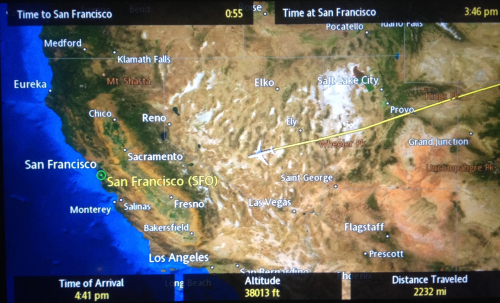
The proliferation of airspace in recent times is well-known.  But less scrutinized or contemplated is the value of retaining or communicating a personalized map of the travel of the individual plane across an empty cloud-free sky, as a distillation of the personal experience of flight.  The disorientation of these personalized maps consulted above tray tables provides the clearest reminder between snatches of sleep or airplane reading that we are indeed in motion at that very moment, providing a register of distance travelled, height, and arrival time as well, in the upper left-hand corner, time remaining in flight–and the depiction of the magnified presence of a plane over the land that lies contracted below, wildly out of scale with the perspective of the plane that moves across its surface.


to-sf


Edward St. Aubyn nicely described the odd nature offered by the constant counterpoint of the disembodied relation to maps for passengers faced with the cartographical options of geolocation in rapid-fire succession.  If the provision of data seems to revel in informative abundance, the information overload easily loses coherence for many viewers, so carefully crafted are the maps to command attention over the short-term, as if to compensated for the limited attention-spans that is assumed of most airplane passengers.  The dizzying disorientation with which the shifting scale of the map, showing a child “their plane hovering near the Irish coast, south of Cork,” suddenly “expanded to show London and Paris and the Bay of Biscay,” only to morph yet again to an “informational feast” that “[at] the next scale included Casablanca and Djibouti and Warsaw” in ways that immediately undermined any comfort  of its color-saturated informational content.  If airline companies may hope to present to its passengers a form of reassurance, the abundance of maps, apparently exulting in the possibilities of representing a course of transit, and as a result communicated “told you everything except the local time on the plane.”  If St. Aubyn sees the superabundance of information on the map as deeply alienating, it is also a reminder of the alienated nature of the in-between space of transit.  For one is in an intermediate place in the plane, which remains outrageously magnified on the map, but also outside of it, moving across time zones with the apparent potential of moving to any place on the map, and indeed eventually moving outside its frame, as one shifts among maps that seem to lack any indices, but hurriedly create or improvise a sense of place as long as we are in the air.

With the crowding of the paths of the airways,  the itineraries overhead are not only an “informational feast,” but a progressive sense of the unfolding of the flight path that one can watch, while seated, from an empyrean point of view, that is truly satisfying to frame not one’s sense of where one is, but of how much flight time remains.  For if the seated passenger is removed from any sense of place, during the course of transit, the map allows one to be a spectator of where one is flying and enlists the most recent mapping graphics to do so, foregrounding the varieties of visual entertainments of map reading while we are in the air compounding the iconography of the cloud cover of a weather map, the remove of the plane from the ground foregrounded by the ridiculously out of scale rendering of the aircraft.


SFO-EWR


The plane is in a sense part of but not part of the map, a sort of talisman that gives us a sense of direction and markers of distance as we are removed from the earth.


Miles to NY


Continue reading

1 Comment

Filed under air travel, airspace, flght maps, flight paths, spatial imaginaries

The Will to Map: GPS and its Discontents

Navigating the necklace of highways that hug the Santa Cruz Mountains beyond San Jose with a GPS map affixed to the windshield, you become both disoriented from the panorama before your eyes and quickly aware of the token roadmap GPS offers.  What is the map on the screen doing in the car and when do we need to look at its content?    The question emerges since it’s not clearly a partner to the voice-directions; the interface between isn’t evident or apparent:  the overlay of data on the terrain graphic of a Google Maps backdrop seems interactive, but shows a route, and not a guide or a means to explore paths of other possible travels.  There’s a need to offer a map in our map-saturated culture–but the map is no longer a clear way to translate familiarity with space to their readers, so much as an added document.

The difficulty of internalizing directions from the onscreen map derives from its limited use to orienting oneself, and is unlike the roadmaps that readers internalize over time.  It is not only ready-made and disposable, but seems to exist to satisfy customer expectations for a visual record more than offer users an actual guide.  It has limited relation to the injunctive directions declaimed by a Siri-like voice, and seems a source of ornament despite an absence of actual visual interest, as if it was designed to meet nostalgia for the visual records of automotive navigation on highways and interstates or for a time when we needed maps.  Some drivers might object to directions from a disembodied voice, instead of someone informed about the topography or terrain.

Without those over-creased highway maps in our glove compartment, one grapples with the minimalist Google Maps graphics before surrendering passively to the intoned directions, still frustrated that we can’t  transpose directions from the map, and conscious of being cognitively challenged, but perhaps pleased to contemplate a landscape of trees overhanging on each side of the mountain roads and to follow a course traced from on high.


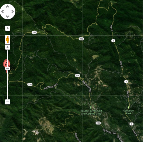
Boulder Creek Map Traffic


The mechanics of the synthesis of a digitized map is of course completely different compilation of meaning.  But it is most striking that the map didn’t need to be there, and wasn’t that likely to be consulted as a navigational tool and of limited use if one strayed off course the curvy roads in the Santa Cruz mountains; if so, we’d be more likely to look at a paper map anyway, for the image provided little easily-consumed information of fine grain about the mountain roads; the verbal directions were so removed from the map as if to devalue the long history and use of maps as autonomous media: rather than provide the purification of spatial experience often attributed to maps, the schematic Mapquest image distances experience so abstracted from an actual route of travel to minimize our sense of reading space.

As well as a shift in how mapped information is synthesized, digitized maps mark a shift in reading terrestrial expanse and reading one’s place in maps, diminishing the relevance of a coordinate system or apprehension of spatial inter-relations.  Whereas the Mapquest route that defined a path of travel, navigation by GPS seems a new relation between map-use and environment.


images-1

The relation to its pixellated surface is rooted in fascination with the image that adjusts on one’s screen synchronized to one’s actual bearings, rather than reading one’s course and the options that it presents.  GPS was not made for wanderers.  The screen notes a route on a formal schema abstracted local terrain, which is replaced by a generic image, its data mediated at a remove from the world as if “flattened” to two dimensions, rather than the sort of surface that invited multiple possibilities.   The map produced on demand places cartography with limited sense of permanence; the personalized nature of the map it creates, as in a service economy, offers an image of terrestrial location that dazzles, but is only commensurate with a specific viewer’s specific needs, and as it is part of a system that provides on-demand maps that can be immediately generated for any global region.

Santa Cruz Mountains

The place of reading a GPS map in a car or a mobile phone is independent from the expectations for both providing and decoding the map.  How maps are read over time offers perspective on how maps address their readers by embodying a relation to space through their synthesis of spatial information.

Such an emphasis is distinct from, say, one on the mathematics by which cartographical projections synthesize data on a uniform graticule or techniques of transferring the curved surface of the world:  one can appreciate these precepts only in a very vague sort of way, similar to ignorance of how GPS generates a map, to read its organization.  As the video by which Google promotes Trekker as a natural extension of a user’s relation to their environment during a walk in the woods.  The mechanics by which the cameras stuffed into a bulky backpack remain both mystified and  outside of the average viewer’s appreciation or ken, but the user is amazed at how the digitized synthesis takes us through a mind-bogglingly detailed record of space.

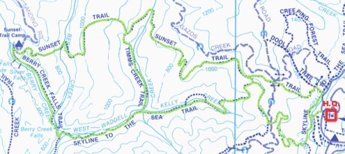
One is awed by the alternative surrogate awesomeness that the map provides of the Grand Canyon.  The data such maps compile for readers implies a very different sort of map-reading from te far smaller-scale trail maps of a similar region which offers clues to travel on foot, rather than car, whose color-coded signs of elevation, trail lines, and symbols of orientation offer a semantic register to decode.

berryvreekfallsmap

The legibility of the above map engages different cognitive skills to decipher our position than the plastic formats of mapping in GPS, which derives from a  dramatically different context of the corporate investment in map making, less dependent on attracting viewers than provide comprehensive access.

Google Earth’s data collection and synthesis is unlike that of the National Geodetic Survey’s mandate to maintain “a consistent coordinate system that defines latitude, longitude, height, scale, gravity, and orientation throughout the United States” for the public, by which “everyone accurately knows where they are and where other things are anytime, anyplace.”  Criteria for mapping are now market-driven and based on providing information for consumers in an explosion of available maps.  Google acquired the digital mapping company Keyhole back in 2004, allegedly when Sergey Brin claims to have been so wowed by digitized maps of bombing Iraq he saw on television.  The digitized satellite maps that Keyhole provided afforded a new way of defining one’s relation to an over-mapped world:  Google’s vice-president, Jonathan Rosenberg, celebrated how the military-grade map-provider used by the Department of Defence was repositioned as it became “a valuable addition to Google’s efforts to organize the world’s information and make it universally accessible and useful,” allowing users to “fly like a superhero from your computer at home to a street corner somewhere in the world–or . . . map a road trip” by tapping information collected via satellite and airplanes through easy-to-use software.  The rhetoric was fulsome as the acquisition was completed: “The sun is shining brightly in Mountain View,” read the press release, describing Keyhole employees as “all smiles” and Google employees as “all open arms,” as the same software used by the US government to track the arrival of smart bombs to Iraq via a multi-terabyte database (and begun by a venture capital firm backed by the CIA) was re-deployed to dramatically expand the wide, wide world of GPS.

Driving through the region near Mountain View, one couldn’t help think of how the removed view on the GPS screen was a diminished share of the mapping tools Google had purchased.  It’s striking that even in 2004, Google felt the need to calm anxieties about the potentially intrusive nature of such satellite technology that would cover the United States, but was energized by the belief it could unseat Time-Warner’s Mapquest–as it has– in providing its users with a far more robust mapping technology to orient themselves.  “It’s not like you are going to be able to read a license plate on a car or see what an individual was doing when a particular image was taken” in ways that would violate their privacy,” Keyhole’s General Manager, John Hanke reassured the public.  The photographs, after all, were from a database generally six to twelve months old, rather than being real time.  But recent indications about intrusive surveillance suggests that such a project might not have been far from the CIA’s mind in funding the project, which Google rolled out as an innovation in both convenience and reach to craft high-tech maps for viewers from satellite views by its powerful search engine.

GPS  situated its customers into a culture already bombarded by images by granting vicarious participation in a Brave New World of digitized maps.  What is striking in the maps is the near-absence not only of textual but semantic content, which are dramatically reduced in its imagery to increase its ready legibility.  The ways maps were understood in specific sites of reading, argues the medievalist Patrick Gauthier Dalché, who examined the questions that readers from Italian humanists, monks, or the readers of marine charts had for maps, and called attention to the ways of reading maps as much as their semantic construction.

Considering the combinations and forms reading practices a printed map engaged opens interesting possibilities to understand relations of text and image in early printed maps whose readership is not known; it documents the cultural translation of mapped information from manuscript to print, and raises questions for the materials of reading we wax nostalgic when using GPS systems.  It is common to compare the shift in mapping space that digital  interfaces allow to the shift from manuscript and print in the European Renaissance, both as an increased legibility of space that maps diffused and the greater circulation of  maps as reproducible engravings.  We might take time to reconsider the different semantic varieties of map-reading print encouraged,  examining how early printed maps ask viewers to engage a representation of expanse to understand them as forms of spatial literacy.


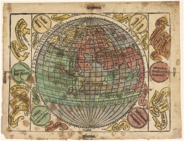
Ptolemaeus Teutsch


Few land-masses are evident to modern viewers of this printed map of apparently spherical form, an early German translation of Ptolemaic precepts that transposes the form and outlines of a manuscript projection. Most likely adapting the semantic forms originating from a Ptolemaic codex its printer or engraver transposed the map onto the gridded surface of a globe to create the illusion of a mathematically derived spherical projection.  Although the spherical projection is but an illusion, the transposition of a Ptolemaic projection to a spherical grid provided a new way to read its place-names:  a few place-names on the surface of this printed map–“Europa,” “Asia,” “Ethiopia,” and a “Mare Indicum.”  Although the map echoed the tripartite organization of mappaemundi, numbers keyed locations to written descriptions unlike the ancient places listed in manuscripts of Ptolemy’s geographic manual:  the names were not only abstractions, but numbers provided tools to gloss a sophisticated primer of geographic knowledge, using Euclidean precepts to render global expanse on a uniform plane.  Readers would have seen the map and its accompanying German text–the map appeared as the fold-out endpaper of a book titled Ptolemaeus Teutsch–as mediating the ancient classical treatise of world-geography to a broader audience than a tradition of learned geography.

The map abstracted expanse as if to address readers familiar with single-line engraving by compacting of terrestrial relations–although it does not seem to have been as successful as a commodity as its printer hoped.  The limited success of the booklet may reflect the extent to which it dramatically and rather drastically condenses geographic data to symbolize measured expanse in a spherical format that imitated how globes prepared a surface for readers to  actively gloss, interpret, and reflect on its symbolization of expanse, and a dynamic tool to render and encode the distribution of worldly expanse.

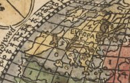
Europa


The reduced size of the engraving encouraged its engraver to use numbers instead of bulky toponyms, in order to create an easily consultable spatial template for placing the known regions on a ruled plane surface which comprehended–and mimicked–the terrestrial globe.


Globe of Ptol Teutsche


If the GPS system made me think of the manner information was processed and distilled on the screen in a passive form of readership, the positioning of place on the globe suggested a combination of tools of single-line engraving and a facility to abstract a geometric record of spatial relations, often tied to a unique exchange between humanist and artists in Nuremberg’s visual culture that printers eagerly exploited to expand the book market.

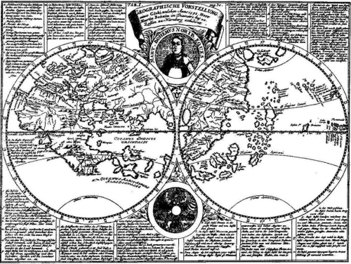
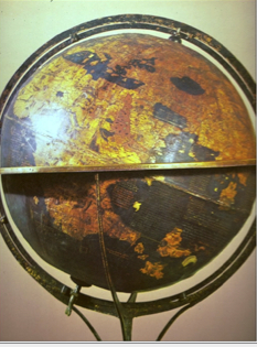
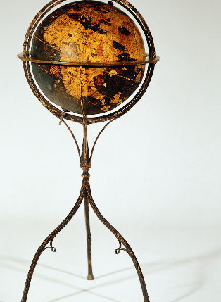
The map recalls its rough contemporary, Martin Behaim’s Globe, celebrated for concretizing a “mental image” of a new relation to space and place in Nuremberg around 1490. Although it omits America,  the globe’s surface assembled an image of oceanic expanse that confirmed Behaim as master of crafting a modern relation to a  legible space from nautical charts circa 1492.


Behaim Vorstellung


This modern recreation of the Behaim globe’s underlying map suggests how the engraved spherical map reflects the status of globes as material records of regional relations, representing terrestrial curvature as much as to measure spatial relationships with precision or provide a guide for travel, and indeed to arrange the disposition of place on a globe.

The engraving reproduced skills of reading the commodity Behaim presented Maximilian I in 1492; it indicated appreciation of the material construction of the globe in imitating the epistemic claims and encyclopedic intent by combining visual and written on its surface, if in far compacted form.


Behaim's Globe


Behaim had earlier sailed with Portuguese vessels for several years, where he gained access to supposedly secret charts, and fashioned the globe from them, working with the painter, woodblock cutter, and printer Georg Glockendon to assimilate an abundant and expressive tradition of written geography even as they embodying expanse in a new form of material media. Earlier  publishers of colored maps for translations of Ptolemy’s ancient Geography unsuccessfully attempted to reach broad audiences; Behaim’s erdapfel provided a  materially impressive way to depict a comprehensive record of the inhabited world; if it exaggerated the world’s oceanic expanse, it  profited from empty oceans to inscribe written accounts of travelers from Marco Polo to Mandeville, in ways readily readable at a reader’s eye-level.

Behaim-Globus


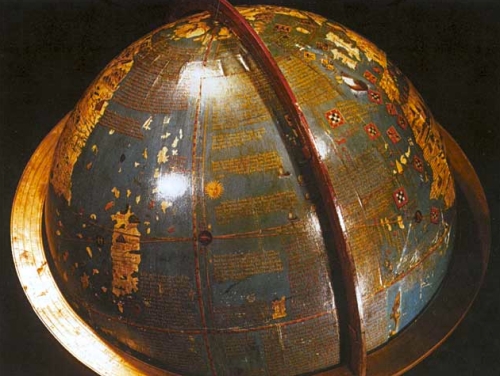
The self-standing globe attempted to replace written geographic media it amply cited in as a materialization of global expanse, as much as completing empty spaces on the map’s surface:  it suggested empty spaces as a way to pique interest among its readers.  Unlike scholarly editions of Ptolemy, the material condensation of Behaim’s erdapfel was a powerful painted media, juxtaposing huge continents with islands that spill across its surface, making less reference to meridians or parallels than texts to orient its audience and invite them to pour over its content.

Globe's Written Surface


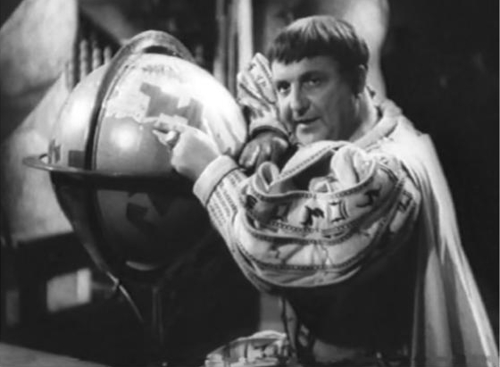
The globe echoes imperial regalia.  Designed for the Holy Roman Emperor Maximilian I, the modernity of the globe is thematized in a 1939 film about Behaim as a man of action, “Das unsterblich Herz,” portraying Behaim as a  precursor to Columbus, and a Germanic figure of modernity (rather than, say, Luther), whose will to map the world and African coast modernized the imperial heritage of Holy Roman Emperors:  no doubt his globe was imagined as something like a precursor to the Third Reich.  The cinematic retelling of how Behaim fashioned a globe of comprehensive coverage for Kaiser Maximilian I glorified the mapmaker’s imperial service.

The master of kraft, roughly contemporary to Columbus, is presented as conscious of the strategic deployment of maps as tools of dominance that broke with the medieval past:  this Behaim recognized the inaccuracy of sundials or timepieces at sea, and his decisive realization of the need for portable clocks enabled him to map the shore of western Africa, filling uncharted regions of the globe on account of his dedicated perseverance.  The film celebrated Behaim as a man of action and genius, representing the globe-maker’s craftwork and the material globe as an icon of modernity.  The Nuremberger’s skilled instrument making is indeed juxtaposed in the film with two other measures or standards of modernity, clocks and ammunition, which define a modern conception of time and finality that fundamentally broke from medieval conceptions of time and space; the globe-maker seems a figure who rises above medieval conceptions of the closure of the world’s confines, if not of the confines of an imperial expanse–if he also seems a bit manic in his vision than one might suppose of the historical Behaim.


Behaim--Unsterblich herz


The historical Behaim is far more complex, and so is his modernity.  Although the film lionizes a globe-maker who epitomized a way of being-in-the-world for its audience, Behaim worked from manuscript nautical charts to make his globe, and if he fashioned the globe was a modern way of interfacing with space by embodying it in concrete form, the globe provided a medium for reading space informed by multiple sources that its surface effectively synthesized.

Modern reconstructions of the globe and close-up photographs demonstrate how the globe creates a legible surface, a site of reading where place and space not primarily mediated  by meridians or parallels, as much as a grandiose modern conceptions.  Islands as those here around Taprobana suggest less of a unified than fragmentary regions for their reader to imagine, haphazardly situated on  the surface of the far-off the unknown shore of Asia, and as incomplete as closed.  Panels of text seem to anticipate the reading of a new notion of expanse, but treat the globe’s surface more as a composed text than a pictorial cartographical record.


Globe's Written Surface


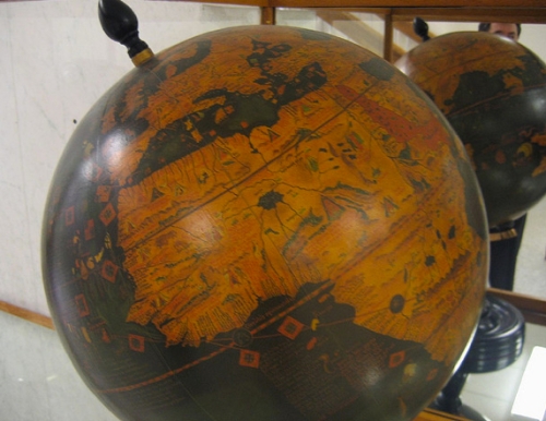
The organization of meaning on the globe was no doubt in many ways understood as a site of writing, as well as a surface on which to trace extensive rivers, discovery lakes, or find move from the landscape to surrounding written texts.  Conceptually familiar sites like the rubicund Red Sea  provided reminders as much as depicting actual oceanic conditions–as is evident in this lovingly crafted modern facsimile of the globe in Alberta (Canada)–as much as a uniformly distributed graticule; the globe reveals the epistemic difficulty of synthesizing nautical and terrestrial maps even as it provides a surface for reading both in relation to one another.


Globe of Behaim- Africa

Interrogating the map as a scene of reading afford a lens to read the map than evaluating it as a purely formal geometric projection of expanse, but as a material interface.  Behaim’s stationary globe and the printed spherical projection both vaunted the map as a form of reading that its printers believed would reach a large audience.

The German translation seems less profitable as a printing enterprise, and survives in but two editions–only one of which includes the map, now stored in the New York Public Library which was discovered and squirreled out of wartime Europe by the book collector Erwin Rosenthal.  But it suggests a new consciousness of the map as a form of reading space, one that might be reproduced in the form of a German-language primer for a large audience of readers.  The preservation of a measurement of terrestrial relations is often argued to have redefined the map as an autonomous register.  But the sense of the globe as a legible space is even more apparent.  It’s not a coincidence that some of the first globes were donated to libraries, synthesizing written information that parallel the growth of early modern libraries; early globe-makers donated terrestrial and celestial globes to the Vatican libraries–still private, but a world-famous repository of manuscripts and codices.  If print was an early information overload in demand of new expertise to process, the globe was both an abundantly copious container of meaning and a particularly modern means for ordering terrestrial expanse.

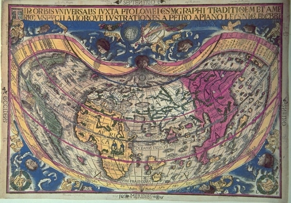
Questions of legibility provided the engine for the reproduction of early modern maps.  Even as lines of parallels and meridians were foregrounded in this map by Peter Appian, amplified by Vespucci’s maps and those to include the Americas, reading a globe-like surface was more important for consumers than being able to trace terrestrial locations, although it clearly vaunted the indexicality of place as a basis to better organize place-names or textual content–which now seems subordinate to the disposition of a mapped expanse within a frame in this image based on Martin Waldseemüller’s 1506 wall map, which first named “America,” vaunting a new ability by which a framed expanse could be read, over which our eyes could skim in super-human ways, much as maps offer the neat trick of both embodying  space and allowing us to escape our own embodiment.


Iuxta Ptolemei Cosmographi Traditionem

It’s difficult to recast maps as other than sites of intensive reading. The digitized screen of GPS seems strangely disembodied because it lacks similar tools of decoding. For rather than a dynamic semantic surface, GPS provides limited visual navigational tools that interface with the viewer, even seeming to diminish its readers cognitive skills by replacing a legible register of space.  That is why the map is hard to replace as a material object or legible register.

Leave a comment

Filed under Google Maps, GPS, GPS maps, Keyhole, Mapquest, Martin Behaim, National Geodetic Survey, Siri, Trekker, user interface

Mapping Worldly Entrances to Hell

We are all perhaps forced carry our very own hells with us,  even keeping their maps and the routes of access to get their  in our heads.   If the location of Hell has been mapped and re-mapped as a personal experience since the Renaissance, defining fixed locations of Hell projects something of a state of mind to the world’s physical geography.  If, to quote Marlowe’s Mephistopheles, “Hell hath no limits, nor is circumscrib’d/ In one self place; but where we are is hell,/ And where hell is, there must we ever be,” the places Hell resides is almost a practice of mapping that reflects a culture’s cartographical imagination, hell has proliferated in the age of genocide on an unknown scale, as the atrocities of Armenia, Cambodia, Argentina, Bosnia, Iraq and Rwanda have created new landscapes from hell that have proliferated in the world as real places of a level of trauma that transcends any normalcy, including the normalcy of a map.  And the appearance of worldly hells over much of the world may have its  rhetorical apotheosis in the fondness Donald Trump had for mapping hell on earth–the cities of America that are now “crime ridden hell holes” and the “hell holes” that are the origin of immigrants who cross the US-America border–even if the hell-hole that might be a prototype was in Guantanamo, not Mexico.’

In antiquity, it was easy for the son of Anchises, Pious Aeneas, founder of Rome,  able”to descend into Avernus” directly since for him “Death’s dark door stands open day and night,” with the dire foreknowledge that “to retrace your steps and get back to upper air,/That is the task, that is the undertaking./Only a few have prevailed.” If it was  possible to be ferried across the River Styx and “to explore the dark abyss/ . . .  in the pathless/Shadowy valleys” where fate had called him, few would know if they would return, as the abyss was not that easy to leave even if one knew the entry-point.    There was a time, lest we forget, when entrances to worldly hells lay confined to the walls of churches, in the threatening death panel paintings of the Last Judgement,–

–or lay safely at the foot of the manuscript pages of Dante’s Inferno–just under the terra fima poetic text–

Inferno manuscript of the Third Quarter of the Fourteen Century, MS. Holkham misc. 48/Courtesy Bodleian Library

At the time of the war of the Holy League against the Turks, the painter El Greco seemed to have outdone Dante, or remapped the landscape of hell one had read in his poems, in new ways, as a precipice toward which Europe was about to hurtle, seen through the gaping mouth of a shark, as a worldly incarnation of the diabolic, that the pact between the Pope, Rulers of France, Spain, and Venice were able to expel from the world, leading troops to beat back the Turks from the Mediterranean, as if to affirm the sacrality of Europe against outsiders.

The maws of hell in El Greco’s terrifying piece, long kept in the Spanish monarch’s personal royal collections, suggested that the monarch had averted hell from entering into the modern world, keeping it at bay in ways that had only grown increasingly problematic and perhaps apparent over the divide of Christianity in the sixteenth century, an era when the jaws of Hell became more broadly apparent across Europe.

El Greco HOly Alliance Hell

shark like maus of hell

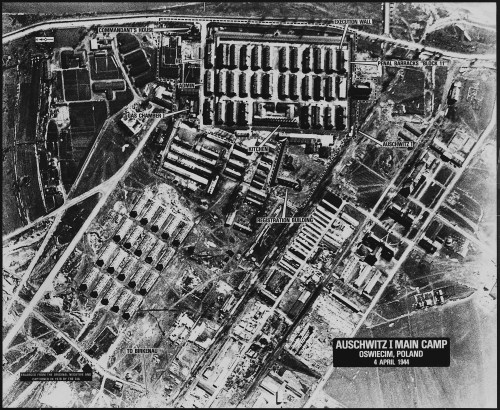
It may be that we carry around our personal hells with us.  But the mapping of worldly entrances to hell came back with a fully secularized vengeance in the Second World War and long before.  For the problems of these atrocities challenges on an ethical and moral scale the commensurability of our conventions of mapping, and with it any commensurability itself.  Perhaps the muted colors and odd grey zones by which earlier concentration camps in the Nazi era suggest that they are zones “off of the map,” indeterminate spaces ringed by green fields, all but exempts them from conventions of mapping, their primitive barracks, gates, transports, mess halls, work fields, ditches and crematoria all outside of “normal” space, and unmapped, left to strain credibility–even if they were viewed from space by reconaissance flights, these spaces and their modern proliferation cannot be adequately morally mapped in ways we know the world.

FARBEN_DWORY

This sense of places out of the normal, hardly part of humanity, has perhaps led to the proliferation of maps of hell online.  The problem of proliferating hells is a one good way to describe modernity.  From Samantha Powers’ attempt to map “problems from Hell”  as eventualities the United States government will be condemned to face to the problems of mapping atrocities that recurred in the terrifying landscapes of Hades, Argentina, worldly hells have proliferated in the world from Nazi concentration camps to sites of disappearing that ask us to map the presence of hell in the world, in a grim geography of devasttion that challenged pallettes and iconography to describe adequately.

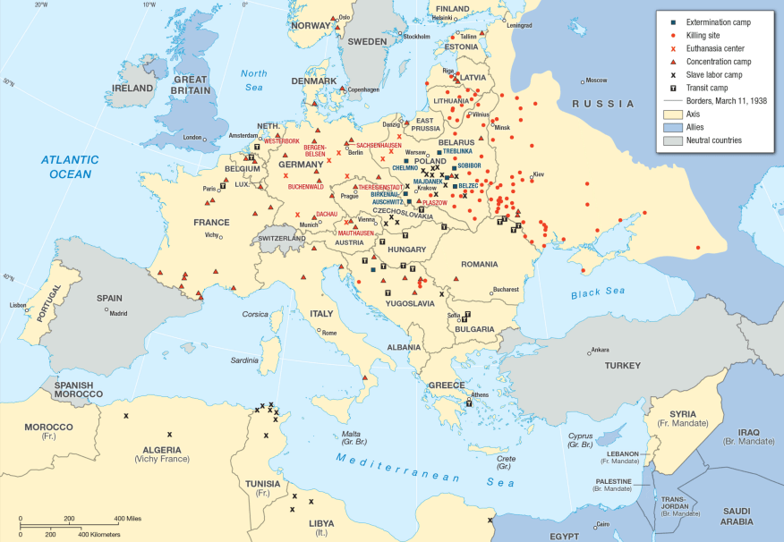
grim geogrqphy of devastationaBefore these maps of spaces of dehumanization and devastation, we are really looking into hellish worlds we had not been able to see before.   But even these dots cannot capture the scale of the hellscapes that emerged for the accelerated loss of life within the industrialization of death that proceeded from Heinrich Himmler’s order of 19 July 1942 stated that unleashed mass-killings from bullets, fire, and gas extermination to fullifll the demand that by the end of December 1942, all Jews, gypsied in Greater Germany be killed, leading to an unprecedented intensity of rates of mass-killings almost impossible to map on paper or by a graph, challenging as the spatial dynamics of the three-month long burst of killings is poorly documented–intentionally–and indicate a terrifying challenge to the world of the data vis that challenges the imagination to even attempt to “map” in the over 40,000 camps of imprisonment and mass-killing that were built between 1933 and 1945, dedicated to imprisonment, forced labor, or mass killing sites dedicated to exterminating Jews, Sinti, Roma, Communists, and so-called “enemies of the state.”

extermination

aau7292-f1

There is a sense of the utter inadequacy of an aerial view–or indeed even Google maps–to map the horrors of sites commensurate to their moral and ethical existence, as if they lay resolutely and stubbornly outside the known world and could not be assimilated to the categories by which we map it.

Landscap

Aerial Reconnoissance Flight over Auschwitz-Birkenau, April 4, 1944 

It’s perhaps not a surprise that every culture seems to have its own notion of Hell but of where the location of hell and its entrance is.  If one can pinpoint and map it in an image of the known world, perhaps one can escape its presence in one’s own mind.  The poet Czeslaw Miłosz wondered, in a very late poem of 2003, “Have we really lost our faith in that other space?/ Have they vanished forever, Heaven and Hell?/ . . . And where will the damned find suitable quarters?” and bemoaned almost tearfully the unimaginable proportions of the “enormity of the loss,” but there is considerable existential comfort in being able to map Hell with security, and indeed to map the intersection between hell and the world that seems normal, as if the presence of Hell demands of expressibility that elicit stubborn difficulties in placing recurring reappearances of Hell on the relative poverty of conventions we use in a global map of human settlement. The problem of mapping hell was perhaps long a part of humanity, as much as the evils of genocide stupefy in their excess, and raise questions of how to map not only people and places but souls in the world.  Mapping hell is, indeed, something of a poetic feat.

Mapping was long about finding a place for the soul in the world, however, as much as ordering spaces or offering way-finding.  You know the lay of the land, and the parts you want to avoid.  As if consciously and quite intentionally one-upping Christopher Marlowe, on seeing the efflux of modern industry afflicting  London, Percy Bysshe Shelley imagined “Hell is a city much like London— A populous and a smoky city,” to comment on the transformation of England; his belief that “It is not necessary to consider Hell and the Devil as supernatural machinery” is uncannily similar to the many maps that pinpoint Hell’s multiple worldly entrances for those eager to read them.  It has long been far more satisfying if one can try to pinpoint the entrance points in informed fashion, using some sort of knowledge or evidence to buttress the choice.  The location of “Hell” or the underworld was, of course, pre-Christian, even if it is now colored by Christian sources; Hell is a pre-Christian mental geography that was mediated by Christianity and its own specific notions of suffering  and remorse, but also is a place that we all know exists, and are eager to find–although not to go there ourselves.  Is it any surprise that the dominance of point-based mapping, with its comprehensive tally of location, raises the fundamental moral question of mapping a common relation to hell?

Perhaps it is a coincidence that the proliferation of hells began with the dominance of new national maps, and new military maps, crafted to enable us to think outside of a national frontiers, created a point-based mapping system like the Universal Transversal Mercator, that raised moral questions of where hell was, and that hell exists in the lives of most modern refugees, who live not only outside the edges of borders, but, as the unhoused, outside of geolocation systems.

But perhaps our current maps, dominated by geodata, force the question of the lack of location of a hell, at the same time as we are seeing a proliferation of global hells, all absent from the point-based maps that we treat as surrogates for reality.  According scripture, Hell is located deep down in the earth, without either geographic specificity and far more figuratively evocative than precise.  Hell is  reality and state of mind for the Gospels and Apocalypse; it is not a precise location:  it is a place where in “outer darkness: there shall be weeping and gnashing of teeth” (Matthew 25:30), whose inhabitants are “in agony in this fire” (Luke 16:24), surrounded by “the devil and his angels” (Matthew 25:41).  The topography of the new camps made little sense in rational mapping systems, but as a vampiric relation to the enslavement of people, before the scale of atrocities could be imagined.

nazi-vampire-1941

The image of perpetual burning, self-consumed bodies has been embellished with extensive pictorial detail as a place of eternal punishment, and a site of the destruction of both body and soul and of unending separation from both; it was based on the Old Testament idea of  “Sheol” as an abode of the dead (Psalm 49:13-14)–or of those with no abode or place to be, but this place with no life was always seen as closely connected to our own.  Hell was deeply spiritual for Dante and in his age–the appeal that we had an informant who had in fact been their to survey its complex topography and descending rings of punishments bore the satisfying sense that we knew where we are in the moral compass of life.  The appeal of Dante’s map of hell is evident in the considerable care and detail which Sandro Botticelli and others used to delineate the space through which where Virgil led Dante and navigated among the inhabitants of hell’s circles–an image popular in the late fifteenth century–that could be examined with some recognition and even more amazement as a site of the afterlife.

Botticelli's Ms Map of Dante's Hell

When Dante’s Florentine editor Girolamo Benivieni’s prepared a printed edition including engraved maps, the portal to Hell was strikingly placed in explicitly modern geographic terms within the terraqueous sublunary world:

Benivieni 1506 Dante's Hell

The deep comfort of this clearly mapped ontology of the afterlife is to some extent preserved today.  Online, we can also navigate this image, thanks to digitization of manuscript images, on one’s very own, and explore the mind-blowing map that Sandro Botticelli drew as if confronting the page from inches away in all its gloriously imagined Dantesque details.  The mapping of Hell has taken off in ways that oddly reflects a pretty secular age; sites of anguish and suffering are, it turns out, still pretty compelling to map in a geographical lens.

Compelling woodcut maps described the topography of the realm of the Dantesque afterlife with exquisite geographic care:

1527_33.wc1.150dpi

Hell was long an individualized affair, and rightly so, the culmination to a balance of sins physical and of mind.  But the mapping of a public geography of hell–entrances to the underworld, now navigated not only but Virgil and Vulcan, or even Percy Jackson, but able to be pinpointed on a map.  There seems to be somewhat of a flourishing of the addition of “Hell”-sites on the web today, in fact, something of a response to the absence of this all-too-concrete state of mind from the reaches of Google Earth–not that some folks haven’t tried.  Perhaps the absence of hell’s location on Google Maps–or how Hell frustrates that portal promising ubiquitous coverage to any user–may have helped generate something like a proliferation  of on-line pseudo-erudition about Hell’s possible locations, and the curiosity that it could be in fact right around the corner in some pretty familiar sites that we can arrive at by our devices.

The appeal of mapping hell–and at looking at the sites where others map hell–is a branch of the Googlish compulsion to provide a total mapping of humanity, as much as a religious ontology, and is reflected in the proliferation of models of Hell that circulate online and provide some sort of satisfaction that we known where we are.

Continue reading

1 Comment

Filed under Apocalypse, Biblical Geography, Global Displacement, Google Earth, Hell

Map-Inspired Madness: Mapping the Great White in the Solitude of Ahab's Cabin

The terrifying search for the whale Moby Dick runs almost vertiginously off the known map.  The absence of bearings are particularly apparent in an era of increased map-printing and the growing claims of map authorship, often insecure of the origins or coherence of their captain’s narrative design.  The quest for the elusive Great White takes readers literally off the map, as The Pequod leads readers off of the map, in frequently disorienting ways; the apparently unreliable narrative carries readers on a quest for Moby-Dick into unknown areas less mapped as the almost  primal site of whale spawning, unknown to most, where the craft, itself adorned with whale bones—“tricking herself forth in the bones of her natural enemies,” bulwarks adorned with sperm whale teeth, rudder made from a whale jaw bone, seems to seek to arrive by human artifice, as if to persuade the whale to reveal itself by charms–or be all too similarly cannibalized by its craft. 

As the voyage progresses across the seas, Ahab descends to madness as he falls into maps in his desire for stability and power.  The book is an epic of consciousness, of Shakespearean scale, and a study in a landscape of psychic interiority.   As if conjuring the character of Ahab, on the final flyleaf of a volume of Shakespeare’s works, Melville echoed the words that Captain Ahab deleriously howls as he mock-sanctifies the harpoon he feels destined to kill Moby Dick.  The devlish incantation sums up his monomaniacal absorption, inverting the sacred ritual of baptism of a Christian soul, “Ego non baptizo te in nomine Patris et/Filii et Spiritus Sancti–sed in nomine/Diaboli”–after which Melville added:  “madness is undefinable” in its hubristic drive for “converse with the Intelligence, Power, the Angel.”   If Melville was raised in the austere Calvinist, learning the catechism in the Dutch Reform Church, taught to  “acquiesce in God’s will, no matter how unjust or cruel it might seem,” without recrimination for the divine plan, Ahab’s attempt to conjure the Great White whale moves not by summoning angels or demons but by conjuring his location on maps, as if to trying to conjure the whale by imprecations, charms and talismans.  The charms, we learn in Chapter 100, begin first and foremost in his obsessive reading of nautical charts and maps. Ahab’s mad drive is no where more unbalanced than on his obsessive poring over maps to reveal the location of the whale, as if he might geolocate his position by latitudes and longitudes. Ahab’s investment of maps with mystical powers is almost a clear echo of the Theurgic magic that Melville saw as the belief in his ability to conjure the whale he so obsessively seeks.

Of course, as Melville would remind us, the map is all in the eye of its reader.  Maps, in contrast, provide a sense of stability to Ishmael, and were the basis of historical orientation to the seas.   ‘It is not down in any map; true places never are,’ Ishmael descriptively evokes the mysterious origins of his fellow sailor and companion, Queequeg, whom he praises as “George Washington cannibalistically developed.”   Queequeg hails from the South Seas, and his unknown origins betrays the fascination of unmapped spaces and the allure of being “off” the map.  The sailors’ concern with mapping places haunting the narrator of the novel obsesses the monomaniacal ship’s captain who leads his ship to the same area of the globe in search of the lone whale he seeks to lead an increasingly wary crew.  Melville wrote with a particular sense of spatiousness in a chapter that first tells the story of the Great White Whale–“Moby-Dick” (Chapter XLI)–poses the question of preserving collective knowledge to gain bearings on the location of the White Whale, that suggests the onset of the first mapped knowledge of whale routes.  If providing pictures of  the specter of the whale from from the point of view of the whale-man, the encounter of ships at sea at the start of the hundredth chapter betrays a  desperation to orient his ship on the high seas, but which the conjurer Ahab invests with devilish properties as if they had the Theurgic properties he so diabolically desired.

At the start of the hundredth chapter of the massive narrative, an obsessive Ahab cries hopefully to crews of a passing English ship monomaniacally—“Ahoy!   Hast thou seen the Great White?”   Ahab cries in biblical syntax in desperation to the approaching English ship’s captain and crew, showing his ivory leg to the ship whose captain barely seems to understand him, but improbably turns out to be his twin, having lost an arm last year to the very same white whale:  in a macabre recognition scene, the ships joined the two disfigured by the same whale clink ivory limbs, arm and leg, bound by both how their lives found new orientation after their encounters with the great white whale.  Ahab has prepared to track the whale’s course on a map, however, and in ways not often historicized in the mapping of whales, a sort of hubristic act in the case of the Great White that Ahab tracks, and yet a cartographic image of location of the great white whale’s course that Ahab seems perversely and maniacally determined to be able to conjure by a map–perhaps an intimation of madness. As much as revealing the hubris of such determination, Melville’s description of Ahab’s madness is historicized, in a telling footnote, in contemporary maps of whale routes, whose potential promise, limits, and benefits he would have known well as a man of the seas.   

While legends of sightings are dispersed among whaling ships “sprinkled over the entire watery circumference” in disorderly fashion, each “pushing their quest along solitary latitudes,” sharing knowledge about whales’ locations was prevented given the “inordinate length of each separate voyage” and “long obstructed the spread through the whole world-wide whaling fleet of the special individualizing tidings concerning Moby Dick.”  The sightings of sperm whales of uncommon magnitude provoked rumors and fears of encounters with the whale, as one might expect, even if they were recored at a fixed time or meridian.  For, Melville reminds us again of the unique space of the open seas, “in maritime life, far more than that of terra firma wild rumors abound, wherever there is any adequate reality for them to cling to;” in the “remotest waters” or “widest watery spaces,” whalemen are subject to “influences all tending to make his fancy pregnant with many a mighty birth.”  

Such an expansion of legends of the White Whale on the open seas contrast to the single-minded focus of Ahab’s tracking of Moby Dick, and the certainty that the Captain possesses of his ability to find Moby Dick on the open seas .  Such a fixation is opaque at the book’s start, but is perhaps most manifest in his obsessive desire to track the individual whale by the sea charts kept in his cabin, to which he retires to read each night, and seem to provide the first point of entrance into his psyche–and what Melville calls his “monomania.”  As the ship moves over the seas, Ahab returns often to his cabin to read charts, maps, and logs, as map-reading becomes a keen emblem of monomaniacal fixation–as the belief that maps will help him track the whale that he is committed to kill.  The maps may magnify the sense of monomania, the psychological diagnosis of an undue expansion of mental attention on one object; if repeated reading the maps serves as an emblem of the growth of his fixation despite the survival of his intellect; trying to pursue the whale on charts seems to serve to focus his vindictiveness, as if materializing how the “White Whale swam before him as the monomaniac incarnation of all this malicious agencies which some deep men feel eating at them, till they are left living with half a heart and half a lung.”  Ahab’s fixation on the yellowed charts he unrolled on his cabin table express the monomaniacal tendencies defined in nineteenth century psychiatry of how an inordinate fixation persists in an otherwise rational mind; the fixation on mapping the course of the whale obsesses his attentive mind.  

Is the hope of locating the White Whale by the rutters of past whaling ships and collation of mapped observations an emblem of nourishing an undue fixation of his pathological preoccupation, despite his apparent ability to reason the possible path of the whale’s path?  The extended narrative of the ongoing quest for Moby Dick on which Ahab leads Pequod that fills the content of the novel becomes a sort of psychic profile of the obsessiveness with which Ahab takes the Pequod, and the novel’s narrator Ishmael, to encounter Moby Dick in the South Seas–the site of whale -spawning where the novel culminates.  The retiring of Ahab to the solitude of his cabin matches his withdrawal into his mind and serves to nurse his preoccupations.  What provides a more gripping image of Ahab’s inner psyche than the obsessive attention that he gives to tracking the White Whale by maps?   Ahab retires to consult log-books and charts to cull sightings of sperm whales that almost substitute for an actual map or rutter–and for the trust that sailors might place in maps and charts to guide the ship.  The problem of locating the whale s underscored by mention of the “wild suggestions” of many ships that have given the whale chase of an “unearthly conceit that “Moby Dick was ubiquitous; . . .  had actually been encountered in opposite latitudes at one and the same instant of time;” if”the secrets of the currents in the seas have never yet been divulged, even to the most erudite research,” Ahab seeks to challenge this sense of ubiquity through his obsessive consultation of charts, by following of the outlines of naval courses.  His intensity comes to transform his very brown and visage into a lined map, tracing out courses, so that his forehead comes to resemble a chart; reading maps with such obsessiveness to track his prey seems to remove Ahab’s single-minded pursuit from any oceanic transit, and from the common good of the ship that he commands.

Ahab’s monomania may seem sui generis.  But it is closely tied to the mapping project of Mathew Fontaine Maury and the contemporary project of collating open data on whale migration in Melville’s time, and the promise of investing legibility in a global space of whale migration.  Even more than the bodily injury of the loss of his leg that left him tormented with visions of the White Whale, the obsessive tracking and persistent consultation of charts and maps with other records manifests the idée fixe by which Captain Ahab is obsessed, and indeed the solitary consultation of these charts while his crew sleeps at night stand for the single-minded madness of tracking one whale on the open seas.  The folly of tracking the White Whale on a map embodies Ahab’s monomaniacal pursuit of a way to track its course by a paper map.   So fully does map-reading come to consume both his mind and his body as he ponders charts every night in his cabin, drawing new lines and courses by pencil, and revising them, “threading a maze of currents and eddies, with a veiew to the more certain accomplishment of that monomaniac though of his soul, so focussed on a map that, in a brilliant image, his tormented face even becomes a map, bearing the traces of the pencil lines traced on the charts, as if the subject of his fixation rises to the surface of his skin, so entirely consumed his mind by the conceit of mapping the course of Moby Dick.  The appearance of these self-inflicted lines as if engraved on Ahab’s brow–Melville’s image–echo the captain’s fixation with obsessively tracing multiple marine courses on the charts he keeps in his cabin; the courses that are so intensely pondered seem to rise to lines inscribed on his own skin as if in as a consequence of the imprint that tracing possible courses  of the leviathan has brought.  

The conceit of the tracking of whales on maps appears an emblem of Ahab’s madness, if it almost echoes contemporary techniques of Global Positioning Systems.  The utter hopelessness of locating one whale in an ocean map seems apparent; Ahab has indeed so often red maps to transform himself into a map hoping to locate Moby Dick, and the conceit of mapping whales has filled his mind.  Yet, as the “hidden ways of the Sperm Whale when beneath the surface remain, in great part, unaccountable to his pursuers, . . . the most curious and contradictory speculations regarding them, especially concerning [how] he transports himself with such vast swiftness to the most widely distant points”    Melville presents the problem of mapping the course of whales as one by which the crazed Captain Ahab is increasingly consumed, pouring over charts in the captain’s cabin, increasingly isolated at a remove from the crew including Queequeg and Ishmael, and the fate of his ship.  Although whalemen by their expert knowledge often came to the conclusion after the White Whale so often escaped their capture “Moby Dick not only ubiquitous, but immortal,” the presumption of mapping the course of the White Whale’s course is perhaps the clearest illustration and emblem of Ahab’s hubris, and monomaniac obsession with tracking the whale above the expert knowledge of his crew, as he “led upon the whale’s white hump as the sum of all the general rage and hate felt by his whole race,” so violently did he come to see personified in the whale that had once torn off his leg all evil in the world, and pit himself against it.  Maps provide Ahab with a basis to nourish and expand the “monomania  in him [that] took its instant rise at the precise time of his bodily dismemberment.”  If such a mania began he returned home, stretched in a hammock on his homeward voyage, swaying in a straitjacket in the rocking boat returning across the tranquil tropics, as “his special lunacy having stormed his general sanity,” he obsessed after returning to Nantucket with the one aim of hunting the White Whale.  Monomania had almost fallen out of favor as a diagnosis by 1850, when Melville wrote, but novelists from Balzac to Bronte adopted the image of mental fixation and unhinged rationality that Ahab’s reading of maps convey.  

Nothing in Mellville’s novel is so great an emblem indicating Captain Ahab’s madness than his obsessive consultation of nautical charts and maps of which he is a jealous custodian, and which provide the basis to nourish his determination to locate Moby Dick.  Maps may feed Ahab’s relentless compulsion to track the White Whale.  Ahab’s obsession with maps reflects contemporary attempts to map the open seas:  indeed, the superstitious value of the leviathan held a special place in the “wild, strange tales of Southern whaling,” and the deep sympathy of whaling men for their prey, who they know far better than those naturalists who have perpetuated false legends of their fierce animosity for humans, from Palsson to Cuvier, distorting the actual awesomenes of pursuing any whale tracking the Great White.  

Ahab’s obsessive reading of maps to track Moby Dick seems a figure for his monomania, but reflects an actual mapping project tracking whales on the open seas, which Melville knew well, and a project of mapping the logs of whaling ships in legible cartographic form.  Ahab’s use of maps to track Moby Dick mirrors the cartographical project of Matthew Fontaine Maury, the nineteenth-century Virginian polymath and early hero of open data, who in 1851 sought to map migratory routes of Sperm and Right whales or the benefit of the whaling economy.   If Melville often consulted histories of arctic searches for Northern Whales published from the 1820s, the appearance of an authoritative map of the courses of whales that Maury had accumulated from ships’ logs provided a model that attempted to impose human reason and fixed continuity on a whale’s migrating itineraries and paths, in order best to predict its actual location.

Ahab’s obsessive hope to track the course of the great white whale Moby Dick in the ship the Pequod may mirror the scope and ambition of M.F. Maury’s project–a project that led to one of the odder maps of marine population and migration that appears below, but which is one of the monuments of open data.   For Melville, however, Ahab’s mania seems driven by the hope the map carried for being  able to track  the course of the great white whale that his prey, and to arrive at the moment of confrontation that will in fact never appear on any map.  For unlike the observations Maury graphically collated, the specificity of Ahab’s tie to Moby Dick is not on the map at all.

Whale Chart 1851Maury’s Whaling Map; Norman B. Leventhal Map Center at the Boston Public Library

Ahab’s self-imposed sequestering on the voyage of the Pequod in his cabin, surrounded by a variety of charts, seems emblematic of his single-minded obsession to track the elusive Moby Dick.  It is emblematic of a uniquely obsessive sort of map-reading emblematic of his particular sort of hubris:  as he will never know the true path of the majestic whale, his study of the map symbolizes a contest between the mapping abilities of man and whale.

The private consultation of the map in the the secret space of the captain’s cabin reveals the sharp contrast between the whale as an innate cartographer who migrated across seas and the knowledge of routes inscribed in lifeless nautical charts, and the inability to plot or plan the intense longing for his confrontation with Moby Dick within the range of observations of all whales by traveling whale ships.  But it also offers an amazing fantasia of the reading maps and nautical maps as if they were guides to habitation, and a reflection on the nature of map-reading and the comprehensive claims of encompassing known space within engraved maps, and specifically of the colored charts of sea routes, whaling and sighted whales that the oceanographer Matthew Fontaine Maury produced in the 1850s compiling nautical logs of whaling ships, after having remapped the coastline of the United States from the geodetic Survey of the Coast by the Swiss Ferdnand Hassler, which had tried to fulfill the Jeffersonian dream of a nation facing two oceans, before joining the Confederate cause.

image.png .

We have little sense of the amassing of data that existed in Ahab’s cabin, so much as the intense relation that the captain develops to his charts.  Melville describes how Ahab retires to his cabin to open “large wrinkled roll of yellowish sea charts, spread them before him on his screwed-down table,” ready to set himself to “intently study the various lines and shadings which there met his eye,” and escape into the paths that they trace.  The memorable episode in Ahab’s own cabin focusses attention on how the captain’s obsessive consultation of the maps, as a sort of emblem of his search to capture the whale in them.   Ahab processed information in the map as best he could, and “with slow but steady pencil trace additional courses over spaces that before were blank,” while consulting log-books of previous voyages and noted sightings of sperm whales in a desperate attempt to locate the migratory path of the white sperm whale Moby Dick–whose own route he so obsessively seeks to understand and on which he fixates so obstinately. The reading activity is isolated and isolation, because the map is essentially mute, a second order of spatial knowledge with which he has no literal traffic or exchange, but becomes a way to wrap himself in further isolation from the mammal that communes with the productive fecund waters of the sea.  “While he himself was marking outlines and courses on the wrinkled charts, some invisible pencil was also tracing lines and courses upon the deeply marked chart of his forehead,” as every night, “in the solitude of his cabin, Ahab thus pondered over his charts, . . . threading a maze of currents and eddys [sic], with a view to the more certain accomplishment of that monomaniac thought of his soul.”

Such a collective map of the sightings of whales is both the focus and talisman of Ahab’s monomaniacal will:  both as the transcription of the paths of hidden submarine itineraries, “with the charts of all four oceans before him,” and the hubris of understanding the concealed migratory course of that noble whale with which he is so obsessed and that has long evaded his search.  For Melville confides that “it might seem an absurdly hopeless task thus to seek out one solitary creature in the unhooped oceans of this planet” to many; “But not so did it seem to Ahab, who knew the set of all tides and currents; thereby calculating the driftings of the sperm whale’s food, which whales were imagined to follow; and, also, calling to mind the regular, ascertained seasons for hunting him in particular latitudes; could arrive at reasonable surmises, almost approaching to certainties, concerning the timeliest day to be upon this or that ground in search of his prey.”  The privacy of the consultation of the tables that allow him to try to read this map, and to establish the position of the whale he seeks, becomes the basis for the captain’s obsessive hope to track the progress of the whale, better to interpret its location.

The intensive reading of ocean charts becomes a site of reading that obsesses Ahab as a means to determine and decipher the logic of its movement stand at odds with the description of the sublime nature of the sperm whale, whose own head cannot even be read without wondering at the majesty of the form of the “head of this Leviathan,” truly “an anomalous creature,” impossible to interpret or decipher, whose imposing grandeur is of such “god-like dignity” to defy human interpretation.  As the wonderfully described problem of the legibility of the “plaited forehead” of the Sperm Whale is a living surface that defies interpretation, inscribed with “innumerable strange devices for [its] emblematical adornment,” following not Euclidean mathematics, but rather “pure nautical mathematics,” the mapping of the course of the whale seems to defy tracking by Euclidean tools also defies reading, much as Melville described the sperm whale’s forehead forms a “mystically carved container,” the lines of whose face defy clear reading, as the “bumps on the head of this Leviathan” is a surface whose interpretation “no Physiognomist or Phrenologist has as yet undertaken,” and would challenge the abilities of Lavater–despite his study of animal faces–or Spurzheim or Gall, suggesting the intractable indecipherability of the whale, but whose “sublime aspect” and “added grandeur” Melville attempted, in the brow in which “mighty god-like dignity” is indeed “inherent” in a brow “plaited with riddles,” presenting Lavater’s mark of genius in the depressed crescent at its middle, in a brow “so amplified . . . you feel the Deity and the dread powers more forcefully than in any other object in living nature.”

As the brow of the leviathan remains challenging to be read, any hope of reading the map of the path it takes seems, despite Ahab’s desire and Maury’s map, Melville appears to assure his readers, as futile as a way locating the actual whale Moby Dick, but becomes an obsessing act of tracing, retracing, and location, that becomes Ahab’s obsessive interpretive project in Melville’s novel.  The fantasy of an ability to harness sperm whale as a medium or vehicle for global travel had appeared in the Currier & Ives satire on the California Gold Rush circa 1849, “California Gold,” that conflated value with the huge “Blower” a ’49er placed in a harness to steer his chunk of gold across the Cape Horn, rendering the prospect of laborious journey to California as a fantasy of the domestication of wild mammal put to use as a private frigate:  while the whale’s course was never to be so predictable the Currier & Ives cartoon suggested the appeal to a broad imaginary, a joke on global travel if not the presumptuousness of circuits around continents.


Continue reading

4 Comments

Filed under American literature, data visualization, Herman Melville, Moby Dick, open data