Tag Archives: military maps

Sneak Attacks?

The anniversary of the bombing of Hiroshima gives one pause as it marks the emergence of a world of remote military strikes conducted by GPS, or on a UTM grid that cast agency at a distance from ethics or ethical choice. One thinks not only of the global cartoons of global expanse that seemed to unroll geopolitical spaces for their American readers, but of the new ethics of point-based precision. For the point-based maps created vertiginously elevated the subjectivity of their readers across the 40,000 maps produced between 1941-45 by the U.S. Army Map Service so as to remove most Americans from all sense of a shared ethical framework of humanity as the first atomic bomb was dropped on the city of Hiroshima.

The framing of military invasion as a game of geospatial dominance discounted the massive incalculable loss of human life in campaigns of prolonged fire-bombing and atomic holocaust. While the American military insisted that radiation burns were but “Tokyo tales,” as the government mole in the New York Times, William Laurence, asserted, due to the levels of radioactivity of the Atom Bomb, the cartoon suggested this was but the latest case of action at a distance, asserting a clear causality between the “invasion” of the city in Hawai’i, recently part of Japan, and the drawing and quartering that the explosive man-made catastrophe. The disembodied head miming words of feigned apology invoke a racist stereotype of a hasty apology delivered in pidgin English, disproportionate to the cascading effects it brought.

The oddness of this cartoon rests in its effective displacement of responsibility for the start of the atomic age. Indeed, the narrative this cartoon bears traces of how this new spherical global space suggested suggested a territorial dominance across the new spaces of air travel: the cartoon that appeared after the atom bombs were dropped on Hiroshima and Nagasaki on August 6, 1945 are particularly striking as it appears to remove any sense of the agency of atomic holocaust; it cast the explosive logic of the atom bomb as a delayed quid pro quo response to the “Jap Sneak Attack” of 1941; it asked readers to consider not the effects or impact of the atom bomb, but, rather evasively, who really was “the Fellow who Lighted the Fuse,” as if he were to blame: before any images of the destruction of both cities was described, the Chicago Tribune included testimony of Enola Gay crew members, hailing from Chicago, as an exclusive, with a discussion of the physics of atomic bombs and a reminder that a number of B-29 bombers were posed for further destructive missions.

The front-page color cartoon hid the explosion of the Atom Bomb over Hiroshima, offering an occluded view on a spherical globe: in colorfully eye-catching attractive Hearst style, the colorful cartoon map was the sole visual documentation of the bomb’s effects, masking the devastation of its impact by the geopolitical logic that led to dropping an atom bomb. The only sense of agency in the cartoon is that poor fellow, his head now rising into the sky, severed from his body, as his bloody knife, patriotic flag for the Empire of Japan, and his military boots and gloves were imagined to be blasted far above the globe’s atmosphere. While the cartoon surely registered the global significance of the dropping of the A Bomb over a densely populated city across the Pacific Ocean, the responsibility for doing so was identified with a racialized floating head, finally severed not only from limbs but militaristic flag that suggested a rising sun of Pacific domination, but was now distastefully merged with a stereotype of obsequiousness that belies militancy. Is the beheaded soldier who once wielded a now shattered sword sorry for the catastrophe of the atom bomb?

Carey Orr, “the Fellow Who Lighted the Fuse,” American Newspaper Repository

In fact, he is apologizing, or is forced to apologize, for similar stereotypical sneakiness of earlier attacking Pearl Harbor. The informed American reading the cartoon recognizes as clearly traceable to dropping the atom bomb, by a link as evident as the arcing flightpath by which Boeing B-29 Superfortress the Enola Gay carried the 9,000 pound Little Boy to drop 26,000,000 pounds of high explosives on Japanese civilians.

The spent match that lies on the “big island” of Hawai’i marks the site of where Japanese bombers attacked an extra-territorial military base, at Pearl Harbor. The map serves to help process the devastating precedent of aerial destruction. And it shifts the destructive impact of the bomb, incongruously, to a palette of a sunset just removed from U.S. territory, where the curling fuse that we can only see as running across the Pacific theater leads to a land lying behind global curvature of the earth, that almost occludes the global significance of introducing the atomic age. The bomb is an illustration of the end of the war by the victory of military mapping, and an affirmation of the fact that the only map is global now. But the ethics of that map are more than problematic. It carries a clear sense of “out of sight, out of mind,” imbuing the deaths of over a hundred thousand Japanese civilians–in an odd mirror reflection of the fears of Japanese attacking United States territory–with a sense of victory, painted as the conclusion to the war that Japanese single-handedly begun. The cartoon is a rather concerted shirking of collective responsibility for immediately killing 70,000 Japanese civilians and killing another 50,000 by radiation poisoning created a precedent of instantaneous mass slaughter. It must be paired with the sustained campaign of military disinformation that William “Atomic Bill” Laurence drove, downplayed any destructive effects of the atomic blast’s radiation levels as purely “Japanese propaganda,” as if to conceal its own efforts to portray the role of radiation in contributing to particularly painful and gruesome deaths.

As U.S. President Harry S. Truman would explain to the world that the delivery of the bomb had released nothing less than “the force from which the sun draws its power . . . against those who had brought war to the Far East,” in an impromptu lesson of nuclear physics, the payload of greater power than 20,000 tons of TNT, describing the bomb in empyrean terms that took one’s eyes off the ground as an act of “harnessing of the basic power of the universe” against the Japanese empire that had taken the rising sun as its emblem and flag, as if he was righting the natural order of the universe by using the sun’s awesome power to right the imbalance of a natural order and to deliver destruction in a purely retributive fashion. If almost a quarter of Americans stated after Japan’s surrender that they would have accepted the destructive explosive powers of more bombs earlier in the war, press dispatches claimed that the bombing would not leave any greater medical injuries than conventional bombs; as mortal effects of the absorption of radiation became clear, Lt. General Leslie Groves, having directed the atom bomb program, affirmed the same logic, enjoining reporters who “did not like the way we ended [the war], to remember who started it.” How many times had Lt. Gen. Grove, observing the same map, had arrived at the conclusion after contemplating the range of air routes the bombers would take, as a way of rationalizing the inhumanity of the event by reducing its devastation to the military logic of quid pro quo retribution for military deaths.

Lt. General Groves Observes Map of Air Routes to Japan
A journalist stands on the former site of a movie theater in Hiroshima, Japan, in September 1945, one month after the United States dropped an atomic bomb on the city.
Journalist Surveys Damage of Hiroshima Bomb, September, 1945/Stanley Troutman

Who, indeed, was making the sneak attack? If the yellow and orange hued pyrocumulus clouds caused by atomic blasts suggested the fireball of a nuclear or atomic explosion, the cartoon clearly referenced not only the explosion that left 200,000 estimated dead in its immediate aftermath, but the fireball of the atomic explosion as a sunset of the Japanese Empire. The first dropping of an atomic bomb on civilian population by the United States–

–was sunset of the Japanese empire, seen from the empyrean perspective of the navigation of aeronautical space that allowed its delivery at precise global coordinates. Did newspaper readers who smiled at the grotesque cartoon vicariously delighting in the ability of precise targeting on geospatial coordinates to target two cities for atomic devastation, without considering the humanity of their civilian inhabitants? Or did it prepare the consumption of the news of the delivery of the payload

To be sure Hearst Newspapers had long promoted the Pacific as a theater of national jingoism in which the Hawai’ian islands were exaggerated as a potential site of struggle, frequently distorted as of defensible American interests; Hearst Newspapers Sunday Section of comics portrayed the contest in cartoons of racist tenor, as an antiquated samurai in full ceremonial armor confronted a spry Uncle Sam.

Windsor McKay, 1913

But the explicit use of a spherical projection to accentuate the aerial targeting of sites of bombing in Japan–and indeed of Japanese civilian populations–was both an assertion of the mastery of the maps that aviators followed in releasing Little Boy and Fat Boy, and a sense of the logic of the spherical projection as the conclusion of World War II. Early in the Pacific theater’s military expansion, to be sure, the Japanese Empire had carefully mapped the island in the paper maps that the imperial army drafted for all its soldiers to hold in fold-out versions in elegant form to foreground specific aerial and marine routes to the islands historically inhabited Japanese famers–

–the mountainous outcropping of islands righted by oceanic waters were remapped as the target of aerial bombers attack in 1941 in ways that the atomic bomb was imagined to respond as an analogous incursion into territorial rights. The results were far more terribly destructive, but seen as cementing the territorial retreat of Japanese empire across the Pacific. To be sure, the attack on the United States Naval Base had killed 2,300 Americans in 1941, when Japanese planes attacked the Mighty Seventh Fleet, sinking twelve ships and destroying the U.S.S. Arizona completely destroyed and capsizing the U.S.S. Oklahoma. But the logic of the global map creates a terrifyingly false equality of quid pro quo, or an eye for an eye, in spatial terms, linking the continuity of the spherical projection that enabled the American bombers to target Hiroshima and Nagasaki as a commensurate response to the 1941 Air Raid. The logic of the globe smooths over the disproportionate scale of the atomic bomb’s deadly payload and the attack on U.S. territory for American newspaper readers.

Yet in ways that are perhaps impossible to map, or to take stock of in its full consequences, the atomic fireball left massive human fatalities and injuries in its immediate radius, far beyond the devastation at the site of impact where buildings were flattened, leaving third degree radiation burns far beyond its alleged target, striking civilians both more violently and more deeper within the logic of war than was ever imagined. As if treating the sinking of the U.S.S. Arizona and capsizing of the U.S.S. Oklahoma as attacks on the actual landlocked states in the territorial United States, the treacherous logic of the continuity of the map’s surface created a false equivalence for cartoon readers that recast the dropping of an atomic bomb as a glorious imperial gesture.

The popular newspaper cartoon for the Hearst Sunday daily provided a rationalization of the explosion in maps that provide a continued basis for reflection on the scope of aerial bombardment, departing from the maps of worldly retreat of Japanese Empire on which American newspapers had focussed and were created by late August 1945 by the U.S. Army Information Branch, as if to justify the impact of one devastating attack.

Japanese Empire from 1895 to 19 August, 1945/Army Transportation Corps, Aug. 27 1945
University of North Texas Libraries

Many cartoons of the atomic bomb dropped by the U.S. Army were explicitly racist or misguidedly celebratory. This famous front-pager made open reference, perhaps fitting Chicago, where Rand McNally was based, as the spherical projection enabled dominance of aerial space and mastery of the virtual space of air strikes: the globe was now not inhabited by people, but a spherical surface over which one flew. And while the sign planted on the unidentified island of Oahu is suggested to be the site of the spent match that started it all, omitting that the 1941 aerial attack was staged on a military base–Pearl Harbor–rather than on a civilian population. The colors of the apocalyptic conflagration are muted, as we see only harm coming to the scattered limbs and bloodied knife of a caricature of the Japanese soldier scattered in a stratosphere.

Continue reading

Leave a comment

Filed under atom bomb, atomic age, geopolitics, Hiroshima, Pearl Harbor

National Security and Personal Bests

Was it only a coincidence that on the eve President Donald Trump boasted in his State of the Union address of an era “we no longer tell our enemies our plans” that the release of a live global heatmap pinpointed the location of U.S. military installations?  The release by Strava Labs of a spectacular heatmap that celebrated the routes where folks exercise worldwide suggested the flows of itineraries of physical exercise by running, biking, or skiing in stunning lines to reflect increased intensity, that appeared as if engraved on a dark OSM base map.  Indeed, the open nature of the data on military positions offered to any viewer of the heatmap seems as pernicious as culling of internet use long engaged in by the NSA, but for the state–as well as for the safety of soldiers who share their location, or fail to use security settings, as they exercise while completing military service abroad. Is this approaching a new level not only of broadcasting plans to an enemy, but failing to protect military positions in internationally sensitive zones?

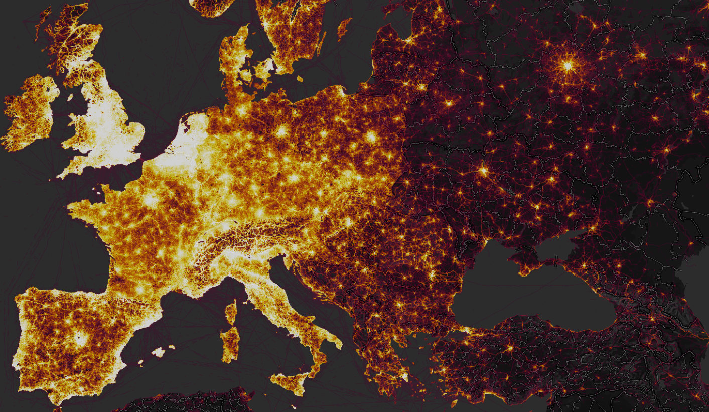
While the map had been around for several years, its detailed update was so much more comprehensive than the 2015 version included–and was released in a time when internet observers scrutinize data visualizations.  The updated heatmap was a big deal for how it illuminated the world in a ways that few had seen, both in its own architecture of a spectacular network of athletes that reflected its expanded use, and the huge data included in aggregated routes for training, but illuminating clear divides between its users; but it gained even more attention foregrounding the presence of isolated groups of athletic performance abroad with an eery precision and legibility that quickly raised concerns reminiscent of the scale of unwanted intruding or monitoring of physical actives, even in an app that based its appeal in the data density of tracking it provided.  While promising individual privacy or anonymity, the benefits promised by the fitness app seemed almost a runaround of the appeal of PGP, Tor, and Privacy Badger that promised a degree of privacy by encrypting data from online trackers and privacy self-defense; rather than ensure the anonymization of the internet connections, however, the platform posted patterns of use whose legibility did not violate individual privacy, so much as state secrets.  Indeed, the surprising effects of how the Strava app made individuals suddenly legible so that they popped out of darker regions was perhaps the most striking finding of the global heatmap, as it illuminated stark discontinuities.

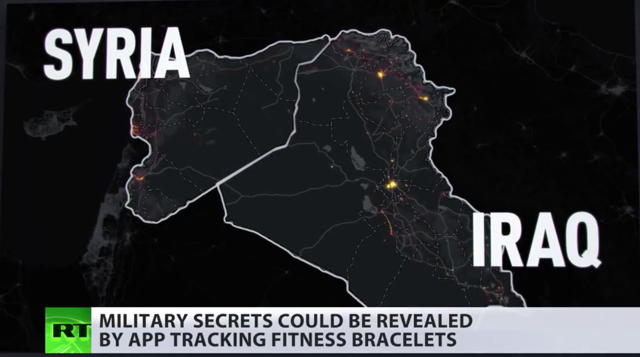
The newly and vastly amplified dataset included zoom functions of much greater specificity:  so richly detailed Strava was charged with betraying once secret locations of U.S. military worldwide, even if unknowingly, and creating a data vulnerability for the nation the would have global effects.  The heatmap made stunningly visible rasterized images of the aggregate activity of those sharing their locations that it gained unwanted degree of publicity months after it went live in November, 2017, for revealing the actual location and global military presence of American soldiers tracking their exercise and sharing geodata–including American and European soldiers stationed in the Middle East and Africa, and even in South Korea.  Although the California-based fitness app rendered space that seemed to celebrate the extent and intensity of physical exercise in encomiastic ways, as if the app succeeded in motivating invigorating exploration of space, and tracking one’s activity that guaranteed anonymity by blending data of its users in brightly lit zones, as for the Bay Area–


Bay Area.png


–the image that had clear implications of announcing its near-global adoption registered in the more isolated circumstances that many members of the American military increasingly find themselves.  The data set that Strava celebrated in November, 2017 as “beautiful data” on the athletic playgrounds of the world took an unexpected turn within months, as Strava came to remind all military users to opt out of sharing their geodata on the zoomable global heatmap, that aggregated shared geodata, lest secret locations of a global American military presence that extended to the Middle East and Africa be inadvertently revealed.  Whereas the California fitness app wanted to celebrate its global presence, the map revealed the spread of secret bases of the U.S. military in a globalized world.  The map of all users sharing geodata with the app were not intended to be personalized, but the global heatmap showed bright spots of soldiers stationed in several war zones.

The narrative in which the map was seen changed, in other words, as it became not a data dump of athletic performance across the world, that was able to measure and celebrated individual endurance,  but a narrative of hidden military and intelligence locations, tagging CIA operatives and overseas advisors by indelibly illuminating their exercise routes in a field of war in ways that seemed to foretell the end of military secrets in a world of widespread data-sharing. And Strava Labs for their part probably didn’t exactly help the problem when they took time to assure the public that they indeed “take the safety of our community seriously and are committed to work with military and governmental authorities to correct any sensitive areas that appear” in the web-maps,” as if to assure audiences they privileged the public interest and public safety of their users.  (But as much as addressing public safety in terms of operational security, Strava’s public statements were limited to caring for the community of users of the app, more than actual states.  The disjunction reveals very much:  when Strava labs saw their “users” or customers as the prime audience to which they were faithful, they indeed suggested that they held an obligation to users outside of loyalty to any nation-state, and indeed celebrated the geographical distribution of their own community across national frontiers.)  Indeed, the app’s heatmap disrespected national frontiers, by suggesting an alternate space of exercise that was believed and treated as it had nothing political in it.

In contrast, the landscape that American President Donald Trump presented in his first chest-thumping first State of the Union returned to the restoration of American security seemed incredibly to deny the consequences of recent availability of military geodata and indeed military base locations, in announcing that in his watch, we “no longer tell .  our enemies our plans.  For whereas President Trump boasted the return to an era of national security and guarded military secrets, the app broadcast a pinpoint record of the global dispersion of American troops, military consultants, and CIA “black” sites and annexes.  Indeed, for all the vaunted expansion of the U.S. military budget, the increased vulnerability of special operations forces has been something that the United States has poorly prepared for, although the release of the heat map prompted Gen. Jim Mattis to undertake a review of all use of social media devices within the military, so shocked was the news of the ability to plot geographical location by the exercise app. If the activities tracked and monitored in the hugely popular fitness app suggested a world taking better care for their patterns of exercise, it revealed scary patterns as a proxy to chart American presence that map the recent global expansion of the United States military in the beauty of its global picture across incandescently illuminated streams–


merlin_133062485_46769171-6f83-4438-945b-58567a1220c4-master768


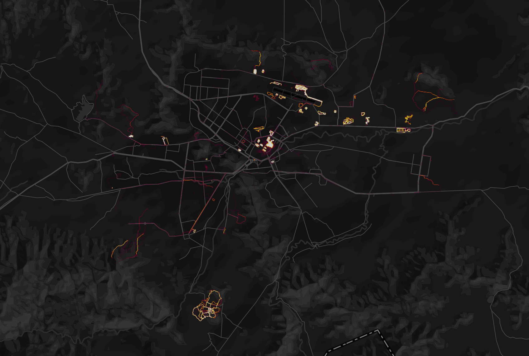
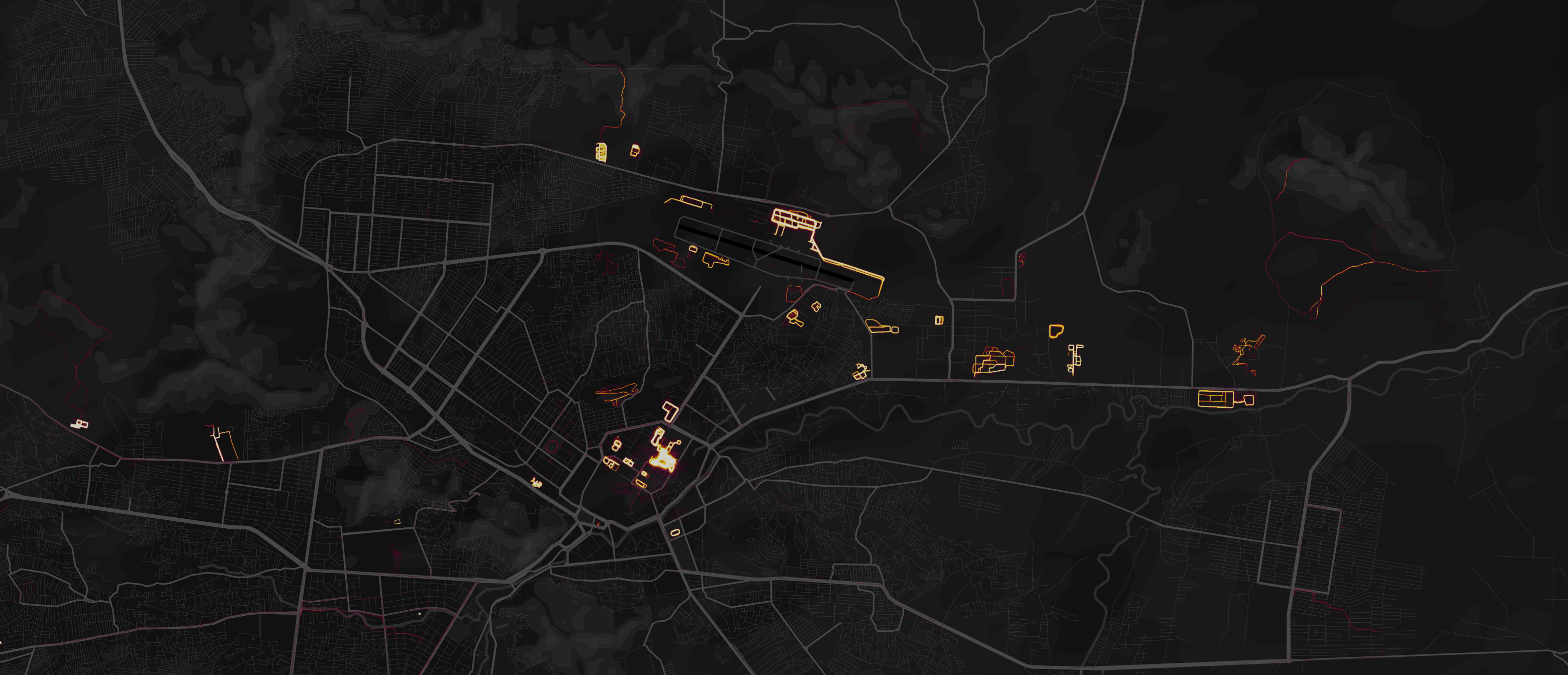
–as when one zoomed down to those running in Kabul, and geolocated the movement in ways that betrayed military footprint from intelligence personnel to foreign operatives to contractors overseas.  The data harvested on its platform appears to endanger American national security–and offers new ways to combine with information culled from social media–as it seems to pinpoint the bases around which military take their daily runs.


Strava sites?Strava heatmap, Kabul


The recognition of the scale of personal tracking by soldiers sharing data on exercise apps grew as one exploited the heatmap’s scalability, and examined areas in which few locals were using it–or had access to the First World problem of registering how many miles one ran.  While the data was not only sourced from Americans, the anonymity of the aggregate map–which can be viewed in multiple shades–provided an image of ghostly presence that seemed particularly apt to describe concerns of security and suggest an aura of revealing secret knowledge.  The cool factor of the Strava map lit up the hidden knowledge that echoed the longstanding surveillance of the communication records of Americans in the bulk data collection that the Patriot Act allowed, although now the dragnet on data use was being done by private enterprise, suggesting an odd public-private sharing of technology, as what had been viewed as a domestic market suddenly gained new uses on an international front.  The poor data security of U.S. forces abroad reminded us that we are by no means the only actor collecting bulk data, but also the scale of digital dust that we all create as we entrust information about our geographical locations to companies even when they promote the value of doing so to be salutary.

Multiple accusatory narratives quickly spun about whether the release of the new global heatmap by Strava Labs constituted a breach in national security.  The soundbite from the State of the Union proclaiming a “new era” described changed conditions by referencing Gen. Michael Flynn’s charge, first raised during the 2016 Presidential campaign on national television news,  that the United States had sadly become “the best enemies in the world” during the Obama years, as he attacked the government of which he had been part for being itself complicit in how “our enemies love when we telegraph what we’re doing” by not maintaining secrecy in our military plans.  Flynn’s assertion became something of a meme in the campaign trail.  And President Trump sought to reference the fear of such changes of a past undermining national authority abroad when he claimed to bring closure to lax security, choosing to message that the loopholes that existed were now closed, and respect had been achieved.  The fictionalized imaginary landscape seemed to distract America from danger or unemployment in celebrating its arrival in a better economic place.  The message seemed as imaginary as the landscape of an employed America, which had arrived in a better economic and place.

General Flynn’s metaphor of telegraphing was even then quaintly outdated, as if from a different media world.  But the allegation that had become a meme on alt right social media during the campaign to discredit military competence, gaining new traction as data security became increasingly a subject of national and international news.  Since President, despite having quickly issued one of executive orders that he has been so fond of signing on cybersecurity, Trump has in fact been openly criticized for a lack of vision or of leadership in addressing  national vulnerabilities in cybersecurity.  As President, Trump has preferred to pay lip service in the executive order, by far his preferred medium of public communication, to the growing frustration of a number of cybersecurity advisors who resigned before clarifying best practices of grid security.   Broad sharing of geodata by military and intelligence raised red flags of security compromises; it would, perhaps, be better raise a clarion call about our unending readiness to aggregate and be aggregated, and the unforeseen risks of sharing data.

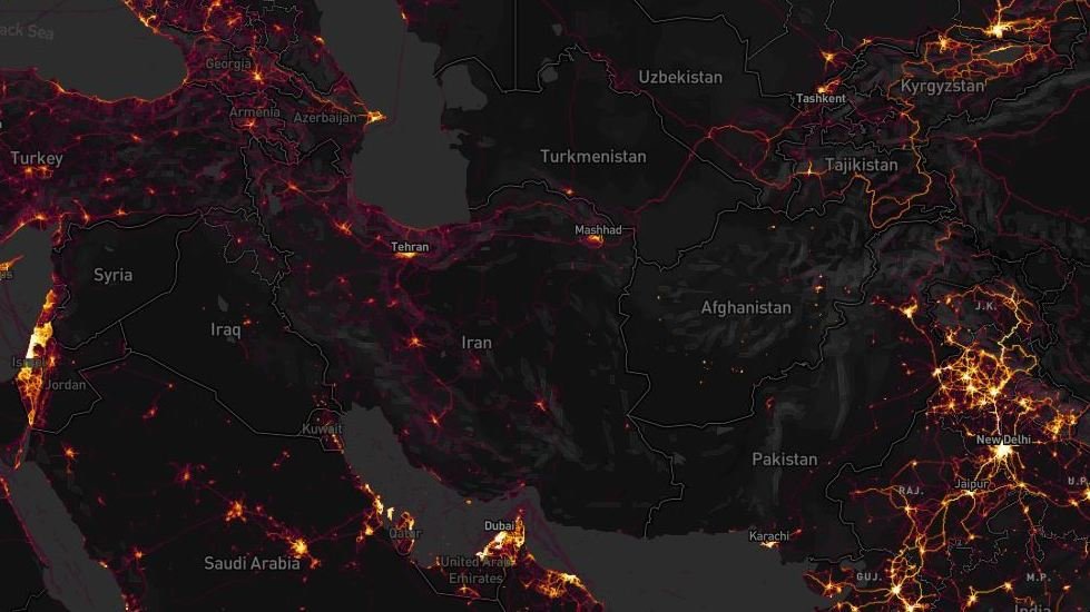
The patterns of tracking exercise–biking, running, swimming, windsurfing–created striking pictures in aggregate, reflecting the collective comparisons of routes and itineraries, and showing a terrain vibrant with activity.  But while the app did not specialize in tracking individual performance or local movements, the new context of many apps transformed foreign counties where military travelled to sites where their data sharing stood out.  The sense of accessing the platform was so second nature to American soldiers moved across space, in fact, ignorant of the platform on which it was aggregated and its effects–or the audiences before who it was broadcast and displayed.  The ability to detect bright spots of athletic engagement around American bases, military camps, and CIA outposts suggested an unwanted form of data-sharing, RT television newscasters proclaimed with undisguised pleasure at the ease with which soldiers could be observed in different locations across the Middle East, from Saudi Arabia to Afghanistan, to Pakistan, and crowed that Americans are so unwary about being surveilled so as to provide evidence willingly of their own global footprint’s size.


strava-map_wide-4720f2504724cf08515aa5302bb39b6e2dedea46-s1600-c85


It’s striking that government secrecy has become a public hallmark of the Trump administration.  But if Trump wanted to inaugurate the start of a fictional landscape of securing state secrets in his first State of the Union address, his words were pronounced with no acknowledgement of the release of the heatmap and the concerns of leaking security operations.  The map that Strava labs designed to celebrate the global extension of a triumphal image of the expansion of exercise in a triumphal image appeared in new guise as the latest example of breached military security secrets–suddenly made apparent at high resolution when one zoomed in at greater scale to Syria, Somalia, Niger, or Afghanistan, and even seem to be able to track the local movement of troops in active areas of war, and not only identify those bases, airfields, and secret annexes, but map their outlines that corresponded to the laps that soldiers seem to have run regularly around their perimeter while sharing their geodata publicly, or with the app.  While the app was designed to broadcast one’s personal best, as well as log one’s heart rate, sleep patterns, and performance (personal data which remained private), it collated in aggregate the patterns of activity across national borders.

For its part, Strava had only boasted it could “create the ultimate map of athlete playgrounds” by rendering “Strava’s global network of athletes” in a stunning heatmap from directly uploaded data.  If there was a sense that the “visualization of Strava’s global network of athletes” described a self-selected community, the beauty of the data set created from 13 trillion data points provided a new sense of exercise space, as if it sketched a record in aggregate of individual endurance, or a collective rendering of folks achieving personal bests.  But the illuminated “maps” of the global network of those exercising and the distribution of US military bases and sites of secret involvement raises complex issues of data-sharing, and the shock at the intersection of leisure space and military secrets–somewhat akin to the stern warning military commanders issued to years ago about using Pokemon Go! in restricted areas of military bases, mapping a comprehensive global map of military over-extension is an odd artifact of globalization.  And it was odd to see RT seize on this issue, as a way of describing the presence of the actors they id’d as “Uncle Sam” to suggest how zooming in on the global map revealed the reach of the United States in Afghanistan or Syria, as if playing a computerized game to see where clusters of forces might be illuminated, as if to exploit fears of revealing military secrets through geolocated data.

The story was pitched on RT suggested a market-driven surveillance network of which the Americans were themselves the dupes.  In its own spin on the story, RT reported of the leaks with glee, for rather than arriving from hackers, or Russian-sponsored hacking groups, military security was compromised by the very tracking devices, it was argued, that soldiers, military intelligence, and CIA officers wore.


By imposing outlines of national maps on the dynamic rasters of the web map that Strava released, the position of military forces or advisors indeed seemed able to be roughly revealed as military secrets by zooming into locations, much as RT announcers asserted, as if the “bracelets” of fitbits provided tools to geolocate soldiers as if they were manacles, reminiscent of the ankle bracelets given to many parolees, sex offenders, or prisoners, by using a GPS tracking system to monitor released inmates all the better to monitor their acitivities, in a practice that has only grown in response to overcrowding conditions in many federal and state prisons–GPS tracking systems were billed as able to save prisons up to $9,500 per inmate, or up to $25 a day; but rather than provide tools to surveil non-violent offenders, the effective monitoring of military bases and what seem CIA field stations provided a multiple security vulnerabilities of unprecedented scale.

But the real story may have been how so much data was available not only for state eyes, but for a broader public:  in an age where surveillance by the state is extending farther than ever before, and when we need, in the words of Laura Poitras, “a practical and metaphorical road map for navigating the post-9/11 landscape,” the maps of Strava have shifted the landscape of surveillance far from the state, and deflected it onto the internet.  For the far greater geographical precision and detail of a diverse user group may prefigure the future of data sharing–and the increased vulnerabilities that it creates.  The live data map broadcast not only an image of global divides, but of the striking patterns of the aggregation of geodata that reminded us of  the pressing problem of data vulnerability in the military’s extended network of secret military bases and dark sites.  Indeed, when a student at the Australian National University in Canberra, Nathan Russer, first noted that the Strata search engine created an Op-Sec catastrophe for leaking locations of US military patrols and bases, his observations unleashed a storm of pattern analysis and fears of compromised national security.  It indeed seems that the vaunted agility that allowed American forces to deploy in much of the world could now be readily observed, as we zoom into specific sites of potential military involvement to uncover the presence of Americans and assess the degree of involvement in different sites, as well as the motion through individual sites of conflict.  The spectral map that results suggests something quite close to surveillance–at time, one can scrape the place of individual users form the app’s web map–but that is dislodged from the state.

The notion of a private outsourcing of data surveillance to the public sphere is hardly new.  One can think, immediately, of Facebook’s algorithms or personal data-harvesting or those of search engines.  Although the U.S. Department of Defense has urged all active military abroad to limit their active presence in online social media, no matter where they are stationed, the news reminded us yet again of an increased intersection between political space and social media, even if this time the intersection seems more shaped like a Moebius strip.  The divisions within a global geographic visualization of Strava’s users reminded one of a usage landscape that suggested a striking degree of continuity with the Cold War–with an expanded iron curtain, save in scattered metropoles–whose stark spatial division reminded us of the different sort of lifestyles that public posts of athletic performance reveals.  As much as showing a greater openness, the heat map suggests a far greater willingness of posting on social media use:  the intersection suggests a different familiarity with space, and a proprietary value to the internet.’
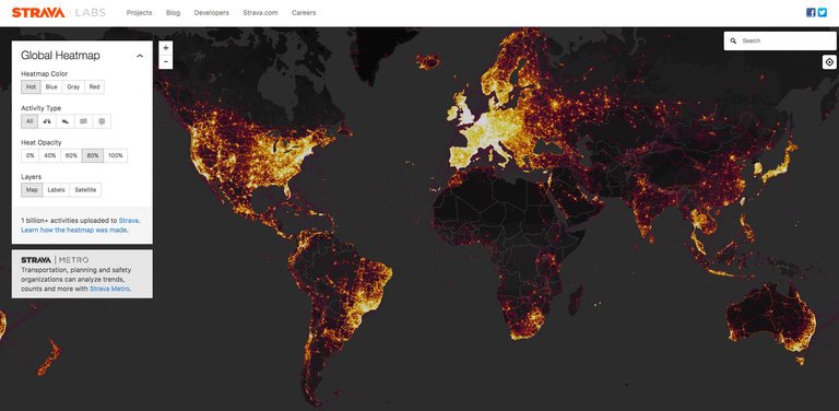
 

strava1Strava Labs


Indeed, in only a few months to notice how American soldiers’ presence in coalition military sites suddenly popped out in the darker spaces of the Syrian Civil War, where different theaters of action of coalition forces that include American soldiers are revealed, and panning back to other theaters can indeed revealed the global presence of U.S. military and intelligence.  Against a dark field, the erasure of any sense of national frontiers in the Strata labs data map suggests the permeability of much of the world not only by interactive technologies but by the isolated groups of soldiers who deal with the stress of deployment by bike rides and runs while they are stationed in Afghanistan.


Runing In Kabul


Although the fitness app saw its aggregation as registering geodata in the relatively apolitical space of physical exercise, fears of political and national security repercussions ran pretty high.  Indeed, the tracking of running laps, cycling, and daily exercise routines revealed U.S. military bases in Syria so clearly that it proved a basis to locate and orient oneself to an archipelago of U.S. military activity abroad in the global heat map, and lit up American presence in Mosul, Tanff, north of Bagdad and around Raqqa, providing a historical map able to pinpoint airfields, outposts, and secret stations in the war against the Islamic State.  Security analysts like Tobias Schneider argued they helped track the movements and locations of troops and even extract information on individual soldiers.  In place of an image of the global contagion of tracking exercise, the patterns of performance provided a way to look at the micro-climates of exercise on a scaling that were not otherwise evident in the arcs of the impressive global heatmap.

Sissela Bok classically noted the ways that secrecy and privacy overlap and are linked in some collective groups, as the military, but the absence of privacy or secrecy on much of the Strava Labs heatmap raised questions of the increasing difficulties to maintain a sense of secrecy or privacy in an age of geographically growing war.  In an age when more and more are living under surveillance, and indeed when the surveillance of subjects has only begun to gain attention as a fact of life, the fear of broadcasting an effective surveillance of exercising soldiers seems particularly ironic–or careless.  The practices of secrecy were more than lax.  For the United States military has in fact, quite vigorously promoted Fitbit flex trackers among pilot programs at U.S. bases to lose calories, and provided devices that measure steps walked, calories burned, and health sleep as part of its Performance Triad;  Fitbit trackers were provided as part of a pilot fitness program from 2013 with few issues raised about security, and placing restrictions on American soldiers’ use of mobile phones, peripherals, or wearable technologies would limit military volunteers.  (The Pentagon has in all distributed 2,500 Fitbits as part of its anti-obesity program, in more flexible wearable form, without thinking of the information that they broadcast.)  Yet soon after the map appeared, folks noted on Twitter with irony that “Someone forgot to turn off their Fitbit,” and it became a refrain on social media by late January, as the image that tracked American military outposts not only in Kabul, but in the Sahel, Somalia, Syria and Niger all popped out of a global map–embodying the very outlines of the camps around which military run.  ‘

Although the U.S. National Counterintelligence and Security Center informed the intelligence community of dangers of being tagged by “social media postings,” the imagined privacy of exercising soldiers is far less closely monitored than should be the case–resulting in a lack of clear vigilance about publishing Strava data.


Runing In Kabul.png
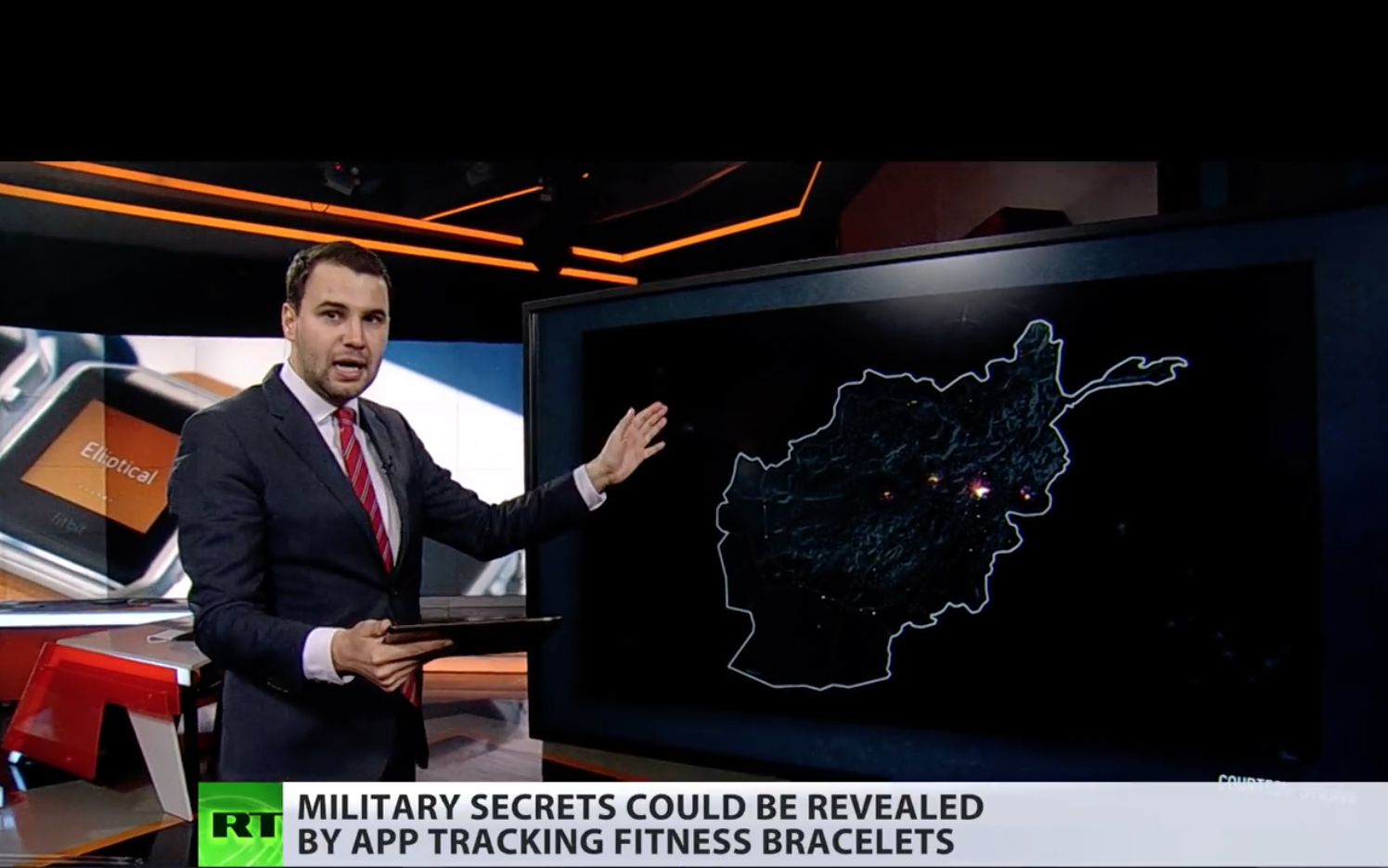
Kabul, Afghanistan, in Strava Labs global heatmap


The heat map so strongly lluminated itineraries users ran, biked, or skied, tracked in incandescently illuminated streams, and even zoom in on specific locations, where they stand out from considerably darker zones of low use of the app, that some national security officials wanted the app to take time to take the maps offline so that they could be scrubbed; worries grew that one could even to scrape the itineraries of individual soldiers who exercise on military service in the heatmaps.

But the two fold ways of reading of the map’s surface suggest that their contents were difficult to free.  The same map celebrating the app’s global use revealed deep discrepancies between the brightly illuminated areas of high-use and data input and its dark zones.  Data mapped on Strava’s website also seems to enable one to id the soldiers using the Strava app with far greater certainty than foreign governments or non-state actors had before, in ways that would create multiple potentially embarrassing problems of delicate foreign relations.  While in part the fear may have derived from the hugeness of the dataset, the fear of being compromised by data raised an increased sense of emergency of a security being risked, and fears of national vulnerability.  Partly this was because of the huge scale of geospatial data.  The updated version of the heatmap issued by Strava Labs illuminated the world in a way that few had seen, and not only because of its greater specificity:  Strava had doubled its resolution, rasterizing all activity and data directly uploaded, and optimizing rasters to ensure a far richer and more beautiful visualization, along glowing lines to reflect intensity of use that looked as if they were in fact vectors.  It made its data points quite beautiful, stretching them into bright lines, eliminating noise and static to create a super smooth image that almost seems to update the Jane Jacobs’ notions of public space and its common access–and the definition of spaces for exercise.

To some extent, the highlighting that the app did of common routes of exercise seem to mirrored the metric of walkability, the measurement of active transportation forms like walking and biking and stood as a surrogate for environmental quality.  The fitness map improved on the walkscore or its cosmopolitan variants, by involving its users to create a new map of exercising space.  The abilities to foreground individual and collective athletic performance in a readily accessible map provided what must be admitted is a pretty privileged view of the world; but the self-mapped community it revealed gained a new context just two months after it went live, as the map drew attention to the patterns it revealed of using an app to track one’s activities, as much as register work-out trails.


San Fran Strava dataset  
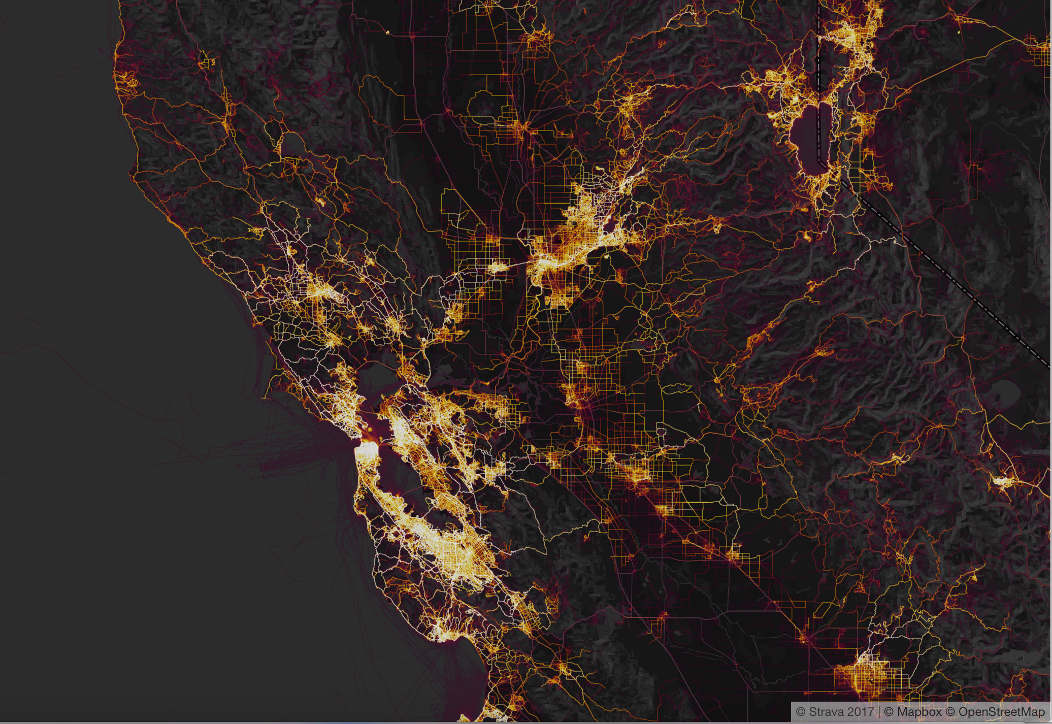
San Francisco in Strava Labs Heatmap


The new map attracted attention not only for the fitness crowd, a self-selecting demographic, in short, but as an interesting extension of the beauty and the huge amount of datasets it uploaded and digested in a highly legible form:  indeed the legibility of the data that was able to be regularly updated online suggested a new form of consensual surveillance.  The data-rich expansion of what was the first update to the global heat map of users that Strava Labs issued since 2015 encoded over six time more data, and promised a degree of precision that was never even imagined before, notably including correction for GPS distortions and possibilities of new privacy settings, in ways that amplified its ability to be seen as a tracking device most notably in those areas where the aggregate of Strava users was not so dense, first of all those military sites where American military and operatives were stationed and perhaps secretly engaged, but gave little thought to the day sharing app installed on their Fitbits or iPhones, and may even have seen the data-sharing function as a source of comfort of belonging to a larger exercise community.

Continue reading

1 Comment

Filed under data aggregation, data maps, data visualization, information economy, state secrets

Mapping Armageddon Again?

The rush to make a graphic point by mistakenly overlaying concentric circles atop a Web Mercator projection helps to render increasing fears of the range of North Korea’s powerful ballistic missiles.  As much as suggest the global import of the confrontation about North Korean missiles through their violent potential to target overseas lands, the effect is to abstract the peculiar stand-ff of a divided country that is a remnant disfigured by the Cold War as if it can be isolated from the division of the peninsula, and viewed as a focus of global attention.  But is the isolation of North Korea that they effectively underscore in such cartographically dramatic terms also not a cause for concern?  How can the intentions of the opaque government of Pyongyang even be understood save in a close focus on the local dynamics of the Korean peninsula?  If North Korea is increasingly effectively a proxy of China–cast as an enabler of the North Korean state, together with Russia–the country is shown, isolated, as if the Democratic Peoples’ Republic of Korea, DPRK, were the last remaining  theater for conducting the cold war in a post-Cold War world.  A familiar geography of generals suddenly migrated to the media as the confrontation with North Korea was begun to be processed in maps.

The current migration of this mapping of a global vision of generals to the media presents a problem of the survival of a mental imaginary, able to compromise the pragmatics of a real problem of international relations in dangerous ways.  For by magnifying the isolation and marginality of the DPRK in relation to the globe, the maps urge us to focus on the risks that the development of intercontinental missiles pose to world peace.  To be sure, they also risk reflecting the very barbed rhetoric of triumphalism and destruction of Pyongyang–a regime that has expressed its eagerness to deliver prophesies of “a merciless sledgehammer blow to U.S. imperialists.”   The threats of Kim Jong-un are especially embodied by the creation and possession of his country, for the first time, of Intercontinental Ballistic Missile, and seems to create a narrative less motivated by actual actors, but a drama of atomic, nuclear, or ICBM strikes that is driven by disembodied geopolitical exigencies in a political theater that we don’t know where it will end, but ramps up an all too familiar cartography of fear.

These maps resurrect and resonate with the invocation of previous threats of war during the Cold War–when the fear of atomic attack was widely diffused by the U.S. Government as a basis to justify an arms race.  Indeed, by rehabilitating a Cold War imaginary of impending conflict able to escalate into nuclear war, maps seem to activate a similar mental imaginary of polarity–albeit disproportionate one, between North Korea and the United States–that reflect one of the few areas in the world where that rhetoric is still alive of identifying the role of the state in promoting nuclear war–leading Kim to praise the “thermonuclear weapon with super explosive power” as made entirely “”by our own efforts and technology and designed to exceed the atomic bomb dropped at Hiroshima.  In this context,  the fear of a “global threat” can be rehabilitated as destabilizing global balances of power.

The first scenario of an attack on the United States–cast in fearful and unresolved terms–was diffused in terrifying detail shortly after the bombing of Hiroshima and Nagasaki in 1945, as if in a surge of guilt, by the emigre Hungarian graphic artist Aleksander Leydenfrost, in a bifold spread that appeared in the extremely popular Life magazine, perhaps asking readers to feel a sense of guilt at the destruction caused by dropping two powerful atomic bombs in the Pacific theater of war, that illustrated a memorandum that the commander of the Air Force in the Pacific Theater, Harold “Hap” Arnold, in a “Report to the Army” he wrote in the late summer of 1945.  Arnold cautioned against the next war as an episode that would last but thirty-six hours, and for which the United States military must begin to prepare itself, if not to confront the unprecedented scale of destruction that the United States landscape–which war had of course not touched, thankfully–must now take time to prepare itself to face.  And the sustained campaign of firebombing Japanese cities after the massive destruction of the second atomic bomb, Fat Man, that was roapped on the port city of Nagasaki unleashed a level of violence that had followed the instant incineration in that city alone of 70,000 had created a landscape of destruction that Leydenfrost’s somber image led Americans to imagine as inflicted on the major cities of the United States, not by the delivery of airborne bombs but the arrival of intercontinental ballistic missiles–what we now call ICBM’s–launched without pilots, akin to German V-2 rockets, but able to reach across the Atlantic, in ways that would redefine what we know as a “theater of war” in globalized terms for the first time.  The nightmare of unmanned missiles, viewed from the empyrean heights above the Pacific, seemed to seek o terrify viewers to suggest how quickly and silently an attack could arrive.


Atom Bombs Descend on US LIFE 1945


The resurrection of what might be called a map designed by generals such as Harold “Hap” Arnold filled a new need to map the power of destruction that the atom bomb unleashed, and represented both a sort of spin as well as a notion of the stewardship of public debate.  Arnold wrote in a context where seemingly responsible “scientific men” were entrusted by the US government to explain to the public the scope of the horrific new power that the atomic bomb unleashed, and to rationalize the devastation of the total destruction of a city destroyed to devastating effects unprecedented in their violence as a decision of the nation, men like James Conant or Vannevar Bush, trusted to create consensus about the use of atomic bombs and the pragmatic basis for atomic policy in a postwar world, at the same time as the popular press quickly predicted the conduct of future wars which minimized all human agency, and perhaps responsibility, by pilotless “robot planes” able to span transoceanic distances and increase the vulnerability of all American cities and industry in the very manner of Japan from a “hail of atomic charges” in 1945.

Leydenfrost’s image, designed for a public announcement of Arnold’s letter, captured this anxiety.   It reveals, in a futuristic manner akin to H.G. Wells or recent science fiction, how close to the surface it was as an image of future destruction, able to be harnessed for clear ends as a narrative of imminent fear, even if one that lacked any clear narrative finality as a story which we could ever see as having clear winners.  The  “revolution in warfare” Conant detected after the destruction of Hiroshima and obliteration of many of the buildings of Nagasaki brought strategies of management of threats in a new global imaginary.  Conant quickly acknowledged that there was no real possibility of defense against such a “surprise attack by atomic bombs,” as he dryly put it.  Yet the government tried to reorient attention to the immediate problem of survival of the fearful eventuality of an atomic attack.  “We are living in a very different world since the explosion of the A-bomb,” Conant began, addressing the problem of what could be done in the event “much of our present civilization” was threatened with extinction.   Conant pondered with incredible detachment pondered how “much of our present civilization” was threatened after Hiroshima and Nagasaki, nd to contemplate ways to save the achievements of the United States against such imminent destruction by buried repositories of microfilm,–as if such a parallel responsibility were adequate to the development of the atom bomb.  In contrast, Arnold’s “Report to the Army” emphasized the need of responding to a remote atomic strike in ways that created an image of vulnerability to missile strikes that quickly burned into our collective unconscious.  Its inheritance might well be reexamined in the light of the fears of global threat of strike from North Korea that has emerged in the very first months of the Presidential administration of Donald J. Trump.

The power of the ICBM warheads that North Korea has developed have, rather eerily, just achieved the level of power of the atom bomb dropped on Hiroshima, enabling exactly the sort of scenario Aleksander Leydenfrost, no doubt with editorial help, was able to so concretely map from a position over the Pacific, which oddly renders North America as an island-like target, as if it could echoe the many flights of United States bombers over Japan.  These unmanned rockets, shot from an unspecified country in Africa where the rocket launchers of a nemesis were placed, described the phantasm of the or mental image of the next stage in warfare, rather than an actual map.  But the concreteness of the map allowed readers to envision the proximity of a potential strike in particularly powerful ways.  And they have been triggered again in the azimuthal equidistant projections that project North Korea at their center, and map the ability of powerful missiles to strike the more populated cities of the United States.

Bull's Eye Range

1. Although graphics that render the potentiality of newly powerful missiles developed by Pyongyang  work to grab viewers’ attention, they draw attention to the danger of North Korea as if from a general’s point of view.  The rush to map the striking range of North Korean missiles, as in the header to this post, often were created by overlays so quickly to perpetuate a sense of a flat earth–particularly embarrassing in an age of web-based maps and spatial tracking.  The egregious mis-mapping of a nuclear threat occasioned a volley of objections to the distortions of maps that foreground their danger, and the innocent position of many who are endangered by their missiles, while mismapping their true range.  In order to come to terms with the global  import of Korea’s generation of ballistic missiles’ of ever greater striking range, web Mercator may irresponsibly effectively shrink the distances missiles travel, with geopolitical consequences, but the mapping of the range of missiles privileges a narrative of overweening nuclear ambitions and aggressive acts that runs the risk of magnifying the military threat posed by Pyongyang, and giving an opportunity for Kim Jong-un to magnify his own sense of grandiosity on a global stage, even in ways that seek to justify the need for a pre-emptive military strike against a North Korean threat.  The focus on the hypothetical expansion of missile range and the eagerness to trumpet the new status of North Korean military as able to launch an intercontinental ballistic missile and nuclear strike–long desired by Pyongyang as a sort of metric of global respectability and renown–is a danger but one that repeated exaggerated mipmapping can only magnify.

For in suggesting the blameless nature of other nations before this threat, they direct focus on the aberrant nature of North Korea and its leaders as needing to be contained, and many indeed justify the importance of a “preventive” pre-emptive nuclear strike.  The maps open a possibility of alternative narratives, some particularly deadly and undesirable in the extreme, of an immediate launch of warheads not only at American military stationed in South Korea, Japan (especially in Okinawa) or Guam but at the United States as as never before.  Indeed, the public statements and postures that Kim Jong-un is “begging for war” seems to map the need for a nuclear confrontation, filled with the frustrated saber-rattling that while “war is never something the United States wants” the “outrageous” testing of a hydrogen bomb only tests its “limited” patience, as North Korea vows its ability to perform a “surprise launch of an ICBM in any place and region at any time,” seeking to prove that “the whole US mainland is within the firing range of DPRK missiles,” as the national news agency KCNA has affirmed.

The recent explosion of a bomb with the explosive power of the atomic bomb dropped on Hiroshima by North Korea on the eve its independence celebration provides an illustration of Kim Jong-un’s leadership, even if it is doubted that what seems a thermonuclear device would be able to be attached to a ballistic missile with any reliability.  But the expansion of maps of intercontinental range in the global press seems to magnify the threat of immanent attack or aggression from North Korea, as if in a presence to justify what would be an utterly irresponsible decision to launch a military exercise of any limited sort.  All too widely reproduced images of the growing range of North Korean missile strikes create an all too real cartography of fear that seem to escalate the danger of a threat and the need for an aggressive military response.

As the actions of Pyongyang have been repeatedly cast as a “global threat” by the Trump administration, from Steven Miller to  Rex Tillerson, provoking not so veiled threats of the need to respond with a “precision strike” missiles into nearby waters off the east coast of the peninsula or to strike at the missile test sites, maps of the n this game shifting estimates of the outermost reaches of NK missile strikes by the Democratic People’s Republic of North Korea have provided something of a basis to reveal exactly what the states of that provocation would be and proof of the global threat that North Korea’s missile pose over the unsuspecting and innocent inhabitants of multiple continents.  Although the outermost reach of the radius of missile firing is openly acknowledged in the BBC graphic below to be not operational, the claims to have created an ICBM able of intercontinental strikes would place North Korean arms far closer to the United States citizens–as well as to United sates troops stationed in South Korea or Guam–in ways that have been a long aspiration of North Korean governments.


The new justifications of nuclear attack in the aftermath of the apparent explosion of a hydrogen bomb by Pyongyang–and the unrestrained bullying of the North Koreans that “they only understand one thing!”–have pushed the problem of military confrontation to the front pages, with Trump warning of the possibility of a “massive military response” and suggesting if not indeed mapping a targeted nuclear strike of North Korea’s nuclear and missiles sites, as if their destruction could occur without any harm to the world.  The threat that Kim Jong-un poses is being cast as a potentially aggressive act–needing to be met with immediate and massive force–even without mapping what his intentions or strategy–as the explosion of a fusion bomb of comparable size to that dropped on Hiroshima is increasingly mapped as a potentially aggressive strike on American cities.  The appearance of these charts in the global media no doubt give huge satisfaction to Kim Jong-un, whose dream of seeing his nation as a global power has been realized, as his country suddenly occupies the position of a major threat that the Soviet Union, no less, had occupied in the Cold War.

Indeed, as President Trump responds to questions of his military intentions with North Korea with a shrug intended to be menacing–“We’ll see!”–in a particularly troubling lack of restraint, he seems to be inviting audiences to map the danger signs emanating from North Korea, rather than to establish the security of his own political restraint, by perpetuating myths of the aggressive nature of North Korea.  As headlines such as “North Korea Raises the Stakes” have repeated since early July, if not from the first announcement of improving missile technology to complete the construction of an actual ICBM–intercontinental missile–of the sort it has long sought, as if to escape its isolated status, even as South Korea cautioned a proclivity for overstatement of achievement of re-entry technologies, the tenor of recent claims that North Korea raises the stakes may have shifted the metaphor of this test of wills from over thought moves in a game of chess to a contest of truth or dare or to a global game of Russian roulette.


2.  Although the maps raise red alarms as they show long-range missiles able to strike the United States, the rush to use a tool plagued with distortions on a global scale is bound to create distortions or suggest the persistence to flat-earth thinking, rather than warp the striking range to acknowledge the spatial distortions of the earth’s surface within theMercator projection.  But the readiness to map the ranges of newly tested missiles–and even missiles in development–suggest a rush to affirm a “direct threat to the United States”–as former CIA analyst Bruce Klingner puts it–that threaten to extend the missile range of missiles in development to beyond 13,000 km, which would place the entire United States within its striking range and endanger all who live in the expanded radius.  In facing such often unsourced if impressive figures deriving from Japanese news outlets or South Korea, the interests of the maps that derive from such figures demand critical review; ties alleged between military contractors and agencies that create such maps not only terrify, but trigger a powerful memory theater of rapid strikes of an increasingly broad array of long-range missiles, reminiscent of a cartography of fear tracking missiles’ arrival in United States territory from the  Cold War.

As North Korea continues to profess  commitment to a nuclear deterrent in the face of American bases in South Korea and Guam, charging “persistent moves to launch a nuclear war on the Korean peninsula,” and indeed the precareity of North Korea to American strikes, many visualizations of the growth based on fired missiles public South Korean statements provide a basis to foreground global tensions with an alleged objectivity that invest missiles’ striking range with an unprecedented of accuracy.  They may lack such accuracy–despite their imminent danger–but the cartography of fear that they create surely seems to escalate their threat and the rapidity of their possible arrival–even if they may well exaggerate the likelihood of their striking range, without noting how operational even the most recent Hwasong-12 medium long-range missile is.


4911e8e09afe2d26cf64865bae00f322-2.png

April 26, 2017


3.  But in mapping the extent of such “striking range” to cover most–or indeed almost all–of the United States, such graphics manufacture an all too real danger by cartographic artifice alone, given the range of missile strikes a reality that they may well not be able to achieve in terms of either atmospheric re-entry or precision targeting, although this is an objection which we surely don’t want to have to test to find out.

The implied danger of provoking such a strike–or allowing such a strike not to be defended against–has in fact undoubtedly interested the Heritage Foundation, a conservative educational institution once prominent in setting the agenda for the nation in the Reagan administration, and now eager to bill itself again as an institution able to “transform America” by being at the forefront of conservative thinking, from the curtailing of “excessive” environmental regulations, to the use of tax reform to “grow” the economy, to the end of universal health insurance, to the distribution of military gear to local police.  The interest of increasing the military budget in the Trump years is promoted through the mapping of an impending and immanent nuclear threat from North Korea–


HeritageNorthKorea.pngFebruary 11 and 16, 2016; December 2, 2016


–that is abstracted from the military presence of the United States in the Korean peninsula, or indeed the political dynamics of the peninsula itself and the region, in particularly dangerous and short-sighted ways.  The notions of a nuclear terror that such images accentuate–ignoring the question of whenter such missiles are perpetuate all too familiar  narratives of the victimhood of those whose lives are endangered by the growing reach of bombs are particularly canny in their use of the objective rhetoric of cartography to make an unsubtle point, and suggest a sense of inevitability in the expanding ranges that North Korean missiles are able to target cities.  The sense of such strikes–and the narratives of inevitability and a needed response that they trigger–have a long history, even if they are meant to describe actualities.  For they have worked to help rationalize such a pre-emptive nuclear strike, as FOX experts speculated if “it may be time for a preemptive strike” if America should “risk Los Angeles,” imagining the waves of regret if a missile approaching the United States should a missile interceptors located at US bases not work in the thirty minutes before it arrives, in a landscape we have seen evoked before.

It did not, in fact, take long at all from the dropping of atomic bombs on Hiroshima and Nagasaki for the General leading the American Air Force to imagine the new landscape of mutually assured destruction that defined the landscape of fear of the Cold War.   Even though intercontinental ballistic missiles did not yet exist, save as imagined threats, or on the drawing board, the vision of strike from atom bombs arriving from overseas was presented an immediate fear to Americans, and enlisted as a compelling basis for justifying the expansion of the post-war military budget–and even equipping the nation with underground silos for storing and firing missiles able to respond to impending missile attacks.  Within months after the destruction of Hiroshima and Nagasaki, when the ICBM’s that haunt the current global landscape–Intercontinental Ballistic Missiles–did not actually exist, save as imagined threats, the powerful images of destruction in what was assured to be a coming “Thirty-Six Hour War” begun by atomic bombs descending on the United States engraved a fearsome image of the danger of the first unprovoked first strike of the atomic age.

The mapping of an atomic threat to the United States invited Americans to envision the possibility of attack.  A similar spatial imaginary seems, indeed, resurgent in the nuclear standoff with North Korea, cannot help but recall the imminent arrival of those arcs of already fired atomic warheads or bombs, which smoothly move toward American cities through the night sky to target an unsuspecting population lying in bed at night, even if the projections of missile ranges of the missiles being tested by the North Korean army and their leader, Kim Jong-un, do not arc so elegantly over a landscape.  The same landscape haunts both images.  If the escalation of tensions between North Korea–N.K.–and the U.S. is mapped to process the threat of the increasing power of rockets carrying nuclear warheads, the maps advance threats of a nuclear strike on the United States in the header to this post that mirror those designed to instill panic and escalate defenses shortly after World War II, and are an odd throwback to the Cold War imaginary.  But it seems to have reignited a Cold War imagery of threatened attacks on cities of North America, all too reminiscent of Cold War maps of missile range strikes.


While it is terrifying to not know the intentions of Pyongyang, or the ever-smiling Kim Jong-un, the image of a Cold War spatial imaginary seems to mediate Donald Trump’s geopolitics, and the increased fear that Trump may not disavow a nuclear first strike, not so long ago condemned by Republicans as revealing liberal naiveté on issues of national defense–even if agreement against first-use of nuclear arms has been broad world-wide and recently won broad endorsement as a needed means of controlling nuclear weapons.  It is important to note that the map of impending missile strikes far more conditioned the United States than the North Korean government’s response.  But the spatial imaginary of missile threats has helped enable a rhetoric of confrontation and saber-rattling that Donald Trump has enjoyed effectively conjuring the threat of an immanent nuclear conflict more than Pyongyang, although the sense that an over-sensitive North Korea was only saber rattling may have been overestimated.  The odd symbolic form used for mapping of the range of NK missiles as a target centered on Pyongyang in public media sources, however, keyed o the Nodong, Taepodong-1, Musudan, and Taepodong-2 missiles, suggests the two-fold message of such maps, even more than the maps from Graphiq, which similarly placed Alaska in rapid striking range.

Bull's Eye Range

Although these maps tend to fail to distinguish clearly between missiles that have been observed or are in development–as most of the ICBM’s capable of striking the United States were believed to be–the range of US military bases within striking distance of NK missiles are both increasingly aggressive, and seem almost desperate attempts to come to terms with the rapid growth of their rockets’ power.   Images that hypothesize the expanded ranges of rockets register the shock of North Korea’s creation of intercontinental missiles and process fears of impending missile strikes from its expanded nuclear arsenal.  Such fears were of course foregrounded in North Korean media’s showcasing of Kim Jong-un’s apparent delight in the use of maps to suggest the range of those missiles he has developed at considerable sacrifices for his country–


kim-jong-un-north-korea-missile-nuclear-icbm-planet-satellite
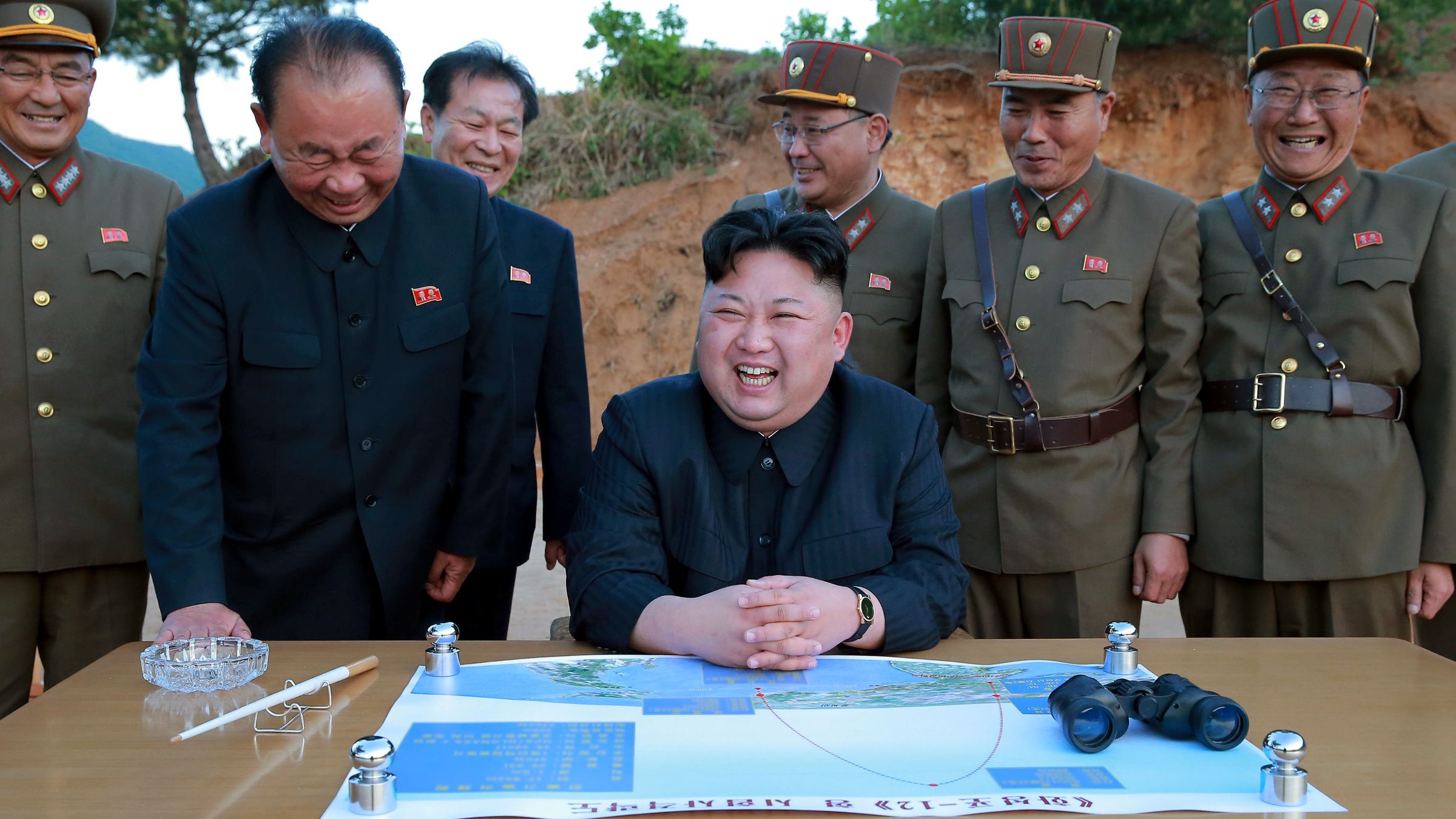
Kim Jong-un studying the flight of the Hwasong-12, which reached an altitude of 1,312 feet Reuters/KCNA  (May 14, 2017)

Continue reading

Leave a comment

Filed under arms control, ballistic missiles, Donald Trump, North Korea, nuclear threat

Finding Aleppo in a War-Torn World

The deep frustration at being able to map the Syrian civil war around Aleppo–combining the actual inability to map the factions in the conflict, and the actual unmappability of the deeply unsettling destabilization of civil society in the five-year civil war which is waged by outside actors, as much as by the Syrian government–has sapped confidence in the ability to negotiate a cease-fire or indeed to find a civil solution to a conflict that has both created an ongoing flow of refugees and destroyed civil society in the region, as well as an equilibrium of power.  And the more we are frustrated in being unable to map the conflict and its descent into inhumane violence, the more violent it has become and the farther removed from being able to exist again as a country.


blog-8


Any theater of war is extremely difficult to endow with coherence in a map–one speaks of the “fog of war” to describe the clouded experience in the confusion of military conflicts.  But the difficulty of gaining purchase on the extent of the destruction of the ancient city of Aleppo that is particularly troubling–and troublingly matched by the difficulty of mapping or imagining the targeting of the city and Aleppo’s inhabitants and the refugees who have left the city.  The failure to describe, document, or respond to the costs in the sustained aerial bombardment in recent months seems an abdication of ethical responsibility before such escalated destruction that almost fails to acknowledge its scope.  The terror of aerial strikes against civilians have led to the targeted destruction of schools and hospitals in the rebel-occupied regions of the city hard to imagine, as a besieged city is isolated from the world.  While we don’t have access to the maps and plans that were used during the sustained engagement of rebel forces in Aleppo, and have rather watched screen-shots of the diminishing areas of the region “held” by “rebel forces” over months, those very images distance us from the human rights tragedies that is occurring on the ground with the dismantling of public health care and social institutions, as if extending so many false possibilities of the tenuous grasp over territory of opposition groups.  With unclear data on suffering, deaths, refugees or destroyed buildings in the encircled city, we map territory as the clearest index of the balance of war, but ignore the scale or scope of its ongoing bombardment and destruction, as the country has not only “gone dark”–


–but the city destroyed under unimaginable sustained assault.


aleppo-sept-2012


News wire sources have tried to “map” the extent of those lines areas held in the heavily bombed city, to be sure, in recent months.  But the absence of clear lines of jurisdiction or control of a battle that is increasingly waged from a move–but shown as if it were a land war–echoes the military divisions of cities in ways that seem incommensurate with the suffering or mischaracterization of the actors of the war, and the lack of limits with which the Assad regime has enlisted foreign help to destroy its former cultural capital and economic hub, as if trying to efface the opposition that it has for so long successfully tarred by their association to ISIS and the Islamic State–and as a media blitz has tried to portray the battle in Aleppo as a fight against ISIS rather than a defining moment in the escalation of military forces against one’s own people by Bashar al-Assad.

Even though the aerial attacks on Aleppo began as early as July 2012, the escalation of attacks by Russian bombers that began to target buildings and humanitarian supplies with intensity from July 2016.  While we were in the midst of the farce of our recent American Presidential election, we have watched maps of the Syrian conflict at an odd remove, depicting the city the city as a multi-colored sectored region, as if a point of stasis in slippy map of sovereignty, as much as a focal point where five different forces seem to lock horns.  The disservice of these opaque colors seem to erase and to be done such a deep disservice with Microsoft Paint.  And as we do so, we can only fail in an attempt to chart the intensification of suffering that is only like to increase in coming months, as the shrinking green lands held by rebel forces have depicted the so-called “situation in Syria” in increasingly disembodied fashion.


syria97410fps.gifThomas Van Linge/Newsweek/@arabthomness


As we watch the layers of colors, trying to map the levels of conflict from an empyrean remove that has echoed the official policy of not putting “boots on the ground,” we fail to account for the destruction of houses, massive departures of residents, targeting of humanitarian assistance and destroyed infrastructure and human services in the city.  The layers with which we discriminate a war-torn city set to conceal terrifying human costs in the rather terrifying palette of pastels in its curious camouflage, as if to hold out hope for an amicable solution, but to erase the destruction of civilian lives, hospitals, residences, or food and needs supplies that tried to arrive in the light green rebel-held areas of the city that suggest an island around the Citadel of Aleppo.


Rif_Aleppo2.svg.pngNovember 1, 2016/Kami888


For the limited information about Aleppo’s continued destruction by aerial attacks as well as bombardments makes the extent of the human costs its destruction increasingly difficult to render with coherence.  This absence of this coherence perhaps leadt some twenty-nine million to be struck by viewing the dazed five-year old Omran Daqneesh and the tragically bloodstained face from which he gazes somewhat stoically and looks at his bloodied hand–as if dazed to be transported from the scenario of violence in which he lived to what seems a setting of sanitized medical care, his blood-stained face contrasting to the clean orange cushions of an emergency ambulance.  The transferal of Omran from the battlefield like context of Aleppo to the emergency health care vehicle show him dazed not only at his change of context, but almost in shock of being in a controlled ambulance in which he sits, if a sign of hope, is also emblematic of the inability or difficulty to bridge the controlled context of medical and clinical care of the Emergency Medical Services and the rubble of the besieged city, almost the negative image of a controlled environment:  the image circulated by Aleppo Media Centre was emblematic of the dissonance between the emergency services and the onslaught of bombs where civilians are targeted daily amidst the rubble of the besieged city, so that the dazed look of poor Omran seems a substitute for our own helpless bewilderment at the war crime of the sustained aerial bombing of Aleppo’s buildings, health care providers, hospitals, and inhabitants.


Screen Shot 2016-11-21 at 11.36.14 AM.png


If the image is manipulative–and difficult to include in yet another post on Aleppo–its power seems to derive from the failure we feel between inability of the child who touches his hand to his head, to take stock of his head injury as he tries to process the loss of his family, after being carried by an emergency worker into the new setting of an ambulance.   The image was so poignant it was shared so widely all over the world on Facebook, as we searched collectively for an emblem of good, of one child rescued from the violence of Aleppo–as nine million Facebook users tried to transcend the broken windows, destroyed buildings, and slim hopes for the survival of Aleppo’s citizens, increasingly targeted in inhumane ways to which we are so unable to respond.

For if there is a lack of any coherent purchase on the city’s destruction on such an unprecedented scale of its bombardment, even for the Syrian Civil War, the saving of one child after his family was lost allowed the survival of a child to exist in the blood-streaked face of the five-year-old Omran Daqneesh that circulated globally on social media seemed finally to locate a “face of the Syrian Civil War” against the city’s dire destruction.  Indeed, the actual improvised settings of health care in eastern Aleppo–


624143740-graphic-content-wounded-syrians-are-seen-on-a-table-in_1-jpg-crop-promo-xlarge2Thaer Mohammed/AFP/Getty Images


–continued as bombs continued to strike the neighborhoods and where the living and dead lay beside one another in emergency rooms that lacked adequate medical supplies.  The absence of medical assistance or facilities, even as Bashar al Assad rejects the last proposal proposed by the United Nations for a local truce that recognized any claims to separate sovereignty of rebel forces, if it was not armed, arguing that it was a violation of “national sovereignty,” seems to have invited an endgame of increased military raids, as the “area held by rebel forces” has shrunk in recent days to a small region curving around the medieval fortified Citadel, sandwiched between advancing regime forces.


nov-1-aleppo


The garishly bloodied face of Omran, the sole survivor of an air strike on his family home in Aleppo’s rebel -held territories, seemed a ghost, but served as a respite from images of the dead, and his transport to an ambulance from the horror of Aleppo seemed a promise of the future.  The image posted by the Aleppo Media Center provided little orientation to the actual struggle, but the apparent shock of the contrast of Omram’s evident transport, his face and T-shirt covered in dirt and blood, to safety offered more than a reprieve from image of dead children:  seated in an ambulance, fingering his bloodied head, his place provided a bizarre juxtaposition of a world of safety and medical supplies who had moved from the bombing of his family’s building in a war-torn city we can barely map.  The arrival of the child into a setting of Western safety almost seemed an image of the precareity of saving a child out of its destruction, and preserved an odd ability of hope even as airstrikes would soon hit four hospitals in east Aleppo, and continue to target civilians.

Continue reading

4 Comments

Filed under Aleppo, data overlays, human rights, Syrian Civil War, Syrian Free Army

Meditating on Europe’s Map: Napoleon in Saint Helena, according to Vincenzo Vela

Even though one can barely detect the differentiation between land and sea from the capital letters labelling the Atlantic Ocean [OCEANO] or Mediterranean [MARE MEDITERRANEO] in the folded map resting across a seated Napoleon Bonaparte’s knees, it’s clear he looks at the topographic map with melancholy.  The look seems a way of looking back on the expansive remapping of Europe in the Age of Empire Napoleon had inaugurated, if also an image that recalls the Emperor’s famed strategic brilliance on the battlefield it is filled with despair, slipping across his legs at his final moment in life.  Does the close attention to the lettering on the map suggest a melancholy relation to the map as territory, and the map as emblem of a lost dynastic dreams?  Leaving the map in a moment of reverie seems a way of saying goodbye to the world that Bonaparte had created.

Napoleon is not looking at a map that marks the advance of troops across Europe.  Rather, this sculpted figure is somewhat lost in a reverie over a map, or finds the map slipping from his command and easy consultation.  Bonaparte’s often imposing figure slouched is hardly studying the map unfolded on his knees, which he holds beneath a clenched fist; as the map almost slips off of his legs, as if to fall to the floor, is he saying goodbye to the transiency of worldly empire?  Or is he contemplate the tiresome set of battles that he once waged across Europe, expanding and defending an now-faded empire?

Napoleon as a young soldier or commander of the Italian Army was often shown with his hands on a colored map, as if tracing his battles and a token of military strategic genius, who planned his attack on detailed maps of terrain where he would engage the enemy–


96b09da7945f69c366f569f8b20b5a3d


116887c5f3d7ab78fac49fac60f1a0da


The iconic value of the map served as a reminder of the European map he had redefined.


219f6b69207975d5ac7586164f4917ef

napmap


In his marble sculpture of the moment of Napoleon’s death, the sculptor Vincenzo Vela captured the melancholy of consciousness of death in Bonaparte’s turning of attention from the map.  His stare out to the viewer, as if ignoring the map lying in his lap, foregrounded his relation to the detailed legibility of the surface of the printed unfolded map of Europe at the moment of death.  The map, in this moment, was less the tool of strategic engagement, but almost slipped off of the knees of a pensively abstracted, slouching Napoleon Bonaparte, as he stared abstractedly and with intensity into space, as if he had already left the earth after being defeated after his surprising return from exile.


ef0cbd583432fe5ee0a8d3d70ad87049


Vela dedicated himself to rendering the map as something like a veil for the psychology of the aging Bonaparte.  Although Napoleon’s eyes are not clearly visible for its viewers, the sculpture captures the distance between the Emperor and the map, and the aging Emperor’s relation to European stage through his meditative reflection on the intent reading of maps in a monumental memorial statue of bronze, cast in Paris, which created a strong sense of the Emperor’s relation to the map and tools of surveying that were prized by the French–long after the cult of the Emperor had passed.

The figure of Napoleon reading a map of Europe was based on a larger marble statue first shown in the Universal Exposition of 1867.  Maps are the only media able to illustrate the sweep of Napoleon’s ambitions and his massive military campaigns:  the famous statistical map of the progress and retreat of the Napoleonic army’s voyage to Moscow lies at the end of a long tradition to process the scope of forces, men, materiel, and logistics in the Empire.  From the massive ambitions for land surveying, epitomized by the project of mapping during the Egyptian campaign, wonderfully studied by Anne Goldlewska, to administer his empire, to the many maps on which he charted military victories and battles, maps were screens for imperial claims in Bonaparte’s empire.  But it also recalls Napoleon’s unique military employment of maps, if it is retrospectively melancholy in its reading of the maps on which his battles were sketched–or the celebratory tricolor maps that, for Joseph Roth, he distributed as Emperor to his soldiers, marked the sites of military victories across half of Europe and the Mediterranean, extending to Egypt.

Maps were, in part, Romantic visions of the new relation of empire to space:  not only was Napoleon well-known to study maps assiduously on the eve of military engagements as tactical aids, noting sites of battles, but purposefully collected a wide range of them in his personal library, which he studied the maps in their specifics.  He made pinpricks in his personal engraved map of the Empire of 1812, lined with silk.


Napoleon's personalMap of French EmpirePierre-Jean Chalencon


The relation of the Emperor to the map is particularly melancholy, and, in a sense, a memory of the imperial title that he lost.  The use of maps that the General Napoleon had repeatedly made to vanquish enemies was a recurrent motif in the legend of the emperor as a strategic genius.

Could it be, one reflects the claim of Bernard Coppens, that a recently discovered blood-stained map, claimed to be the very one that Napoleon used in directing the strategy of his troops at Waterloo, the final battle at which he was defeated, offered evidence that the error transmitted in a map created a crucial error in how French forces approximated the location of Wellington’s troops,leading Napoleon to lose his final battle and disorienting his relation to the battlefield that fateful day, due to an error of the repeated loss of material in hand-printed maps?  If it indeed left him aiming canons in a direction that did not serve his cause, as Coppens argued, the printing error would have left Napoleon suitably disoriented as he tried to grasp his relation to  the battlefield, it is argued.  The conjectural scene evokes how the novelist Joseph Roth depicted he despairing disorientation of Bonaparte’s final days as general in the novel Hundred Days, and the psychic shock of a time when the map suddenly no longer corresponded to the territory.

The theory has encouraged considerable speculation by historians of maps that affirmed their study of the printing process on the vagaries of the mediation of information in the age before universal standardization, and a morality drama that reclaimed the centrality of maps in one of the most famous battles of all time.  The introduction of errors with the printing of an incorrect hand-drawn map reflects links between Napoleon’s use of maps and military genius, and the role of maps in mediating space.   The image of the reliance on an inadequate hand-drawn map introduced into the printed maps he consulted creates a lovely occasion to reflect on the mythology of Napoleon’s consultation of maps to strategize and reflect upon his past victories:


three maps and that consulted by NB at WHand run map and the errors in perpetuated in the printed map that seems used at Waterloo


If the recent claim reflects the reliance on maps as tools of strategy, it condenses the deep trust the Emperor had in maps, but was no doubt also closely tied to the  interest in the historical mapping of empire that Bonaparte and the nineteenth century knew well, and the uses of maps in imagining empire.

The possibility of the map as a key to victory lay in how it offered a new way to imagine strategies of military violence.  Roth describes, in Die Hundred Tage, the crazed emperor, having lost his reclaimed Empire after he had retreated from the lost battle of Waterloo, facing interrupted sleep in the the Elyseé, the very night after his abdication, and turning, engrossed in a set of maps as he even plotted the possibility of an impossible, final victory, suddenly able before his maps to “fathom why he had been so blind,” as “All at once, he felt illuminated as if Grace had come over him and he could guess, better yet know the plans of his enemies; he lured, outwitted, trapped, entangled, beat and destroyed them; the country was finally free, but he continued to drub the enemy, far beyond the frontiers; he had already reached the coast, the English were escaping in their ships to the safe shores of their island . . . ”  The reading of the map is a final refuge, but also the occasion of the greatest nocturnal hallucination, liberated from reality:  “He was not actually reading the map.  He was instead visualizing the actual villages, the hamlets, the roads, the hills, the battlefields, and suddenly all of the beloved comrades of his youth rose up again . . .  He would with the resurrected dead alone.  It would be the greatest battle of his life, the most wonderful, the most brilliant . . . ”


Napoleon's personalMap of French Empire


A new consciousness of mapping a monumentalized relation to expanse perhaps inspired the historical maps of the Roman Empire’s expanse in the historical atlases of the nineteenth century as tools and forms to define the relation of territory to state.  Mentelle and Malte-Brun’s Atlas de la géographie universelle ancienne et modern (Paris 1816) moved (or jumped) between classical antiquity to contemporary geopolitics.   The consciousness of maps as vehicles to explain past empires to audiences created a new imaginative remapping of precursors to the nation state:  A.H. Brué mapped the empire of Alexander the Great, the Roman Empire of Constantine, and ancient Egypt among the maps in his 1822 Atlas universel de géographie physique, politique, et historique, ancienne et moderne; its second edition inserted a map of Charlemagne’s Europe between the ancient world and Europe’s political landscape in 1789.  Despite a growth of historical map making, Christopher Black noted Charles V. Monin’s later 1847-8 Atlas classique de la géographie, ancienne, du Moyen Age, et Moderne included “no maps for the period covering Europe for the period between the tenth century and 1813” (Maps and History, 41).

The gauntlet for comprehensive mapping had in a sense been thrown after Napoleon’s death, by Christian Kruse’s Atlas und Tabellen zur Übersicht der Geschichte aller europäischen Länder und Staaten (Leipzig 1802-18) which used maps to direct readers’ attention to the question of territorial control along clearly defined frontiers across time–a concept more relevant to the nineteenth century than earlier times.  Later historical atlases designed as schoolbooks essentialized the national frontier; as the 1820 Historischer Schulatlas oder Übersicht der algemeinen Weltgeschichte, which effectively distilled world history to fourteen maps, or lavishly produced Historischer Hand-Atlas inculcated students and readers about their relation to the historical formation of national civil space, as well as orienting them to world history.

As the genre of historical atlases had indeed emerged, whose increasing focus emerged as an artifact of the emergence of the modern state, that extended the historical premium that the Emperor placed on the map as a strategic tool:  the epitomy of this cartographical narrative is the expansive Historisch-geographischer Hand-Atlas zur Geschichte der Staaaten Europa’s von Anfang des Mittelalters bis au die neueste Zeit by the retired Bavarian army officer Karl von Spruner, whose third edition of 1880 was expanded by Theodor Menke considerably expanded its first edition of 1846.  The background of this atlas, printed in Gotha, marginalized economic or social topics, in favor of military campaigns, political boundary lines, and the German contribution to world-history as well as the divisions of German-speaking lands.  The bias is apparent in this historical atlas, which took pains to frame historical events from a uniquely German-centered perspective:  the single map of Waterloo emphasized, for example, the contribution of Prussian forces more than of Admiral Nelson’s English fleet.  The background story of its reprinting and expansion was the Franco-Prussian war, of course, which was also the background of Vela’s statue of the defeated Napoleon, left to contemplate a map.

The consciousness of mapping a relation to space, and a local relation to space, is the major source of melancholy in this portrait of the resigned and vanquished Napoleon–immediately bought after it was displayed by Napoleon III.  The revision of the romantic figure in the form of a modern melancholy before the map of Europe is a sort of history of regret or of what was not:  his fist covering the region of the fated march to Moscow and disastrous return in which so many troops either deserted or died, the map suggests a historical map that was not to be, as the unfolded map seems to slide off of his knee, and its reader seems almost aware of the incompleteness of the very dream that it offered.

The bronze copy of the statue shows a Napoleon nodding off, but whose clenched fist suggests the mastery that had finally eluded him, which now appeared located in the map whose well-worn use seems evident from its creases, but which seems to be about to flimsily fall to the ground as if to elude the dying Emperor’s final powers of concentration.


Napoleon Views Europe

(Ben Weider Collection, Napoleon Museum, Montreal)

The monumental statue is striking for the considerable detail that is lavished on the inscription of the map of Europe, however, and the muteness of the register of the printed map, which bears a simple inscription of the political boundary lines of the continent and the difficult terrain over which the French imperial troops had travelled during their bitter loss:


The Map of Europe Nap Holds


What was Napoleon III thinking when he bought it at the very moment that he saw it on display?  He must have recognized the appeal of Vela’s verismo and the sculpture’s evocation of psychological regret, a far cry from the romantic image of Napoleon as world-conqueror.   Now confined to one island, left to contemplate his worldly defeat and what might have been, the statue is something of a modern image of melancholy, as well as something of an anti-historical atlas, as it ran against the grain of the tradition of Spruner’s popular atlases which focussed on distilling history to a sequence of maps of individual states.  The map, declarative and decidedly non-narrative, faces the dying or haggard Emperor in Vela’s “Last Days of Napoleon” as if the encounter between former emperor and map was the primary occupation and obsession of the former emperor’s final days.

2 Comments

Filed under Bonapartism, engraved maps, French Empire, Napoleon Bonaparte, Napoleonic empire