
8. Our current collective fascination with how data visualizations reduce a problem and sum up a status quo seem to find their corollary in how the chromatic division the land are accepted as explanatory tools to decode the politics of our conflicted present. This leads us to valorize images that obscure their historical poverty, and privilege distributions only over the short-term. But if they perpetuate the restricted temporal horizon, in privileging the access to the things as they are like a snapshot of the nation, we privilege the false definitiveness of the spatial distribution of data as if it were transparent or comprehensive–in ways we know it will never be–and promote the notion that the “visualizations” they offer reflect reality in a definitive way.
While we admire the elegant aesthetic of reading the purported clarity of such divisions of space, the thin-ness that they create tease us through the familiarity of other lines of spatial division, which they reify without offering any way to explore. For by substituting the actuality of their findings for a historical reading of the very ways they map space, they focus and limit our attention to the present moment’s actuality–or the superficiality of their snapshots of spatial division. The odd and largely unstated assumption of the latitudinal divide Cohen traced across the country reveals the staying power of a division, an “afterimage” of a political divide and resurrecting the notion of a divided nation. Examining precedents of mapping of fault-lines of national divides place in relief the very historical precedents data visualizations erase and help process reasons for the persistence of a fault-line over time. Detecting the survival of such “after-images” offers an excavation of the historical depth of such spatial divides, and of throwing even the most generic data visualization into a slightly more subtle temporal relief.
The divide traced between northern and southern states traced in an infographic that seems to advertise the “Gas-Tax Latitudinal Divide” offers an invitation to meditate on the longstanding holding power of a map sign, and excavate the transmission of such a stark divide between northern and southern states’ political cultures, and the historical depth of the division that the selective criteria that these infographics foreground, otherwise sacrificed in its transcendent view. Reading the cartographical rhetoric of the “map” of gasoline taxation reveals an after-image of secession that contrasts to the messiness of recent electoral maps. It gains new relief when placed in a historical context of the contested nature of political unity that maps create–or disrupt–in rendering regional unity, as the image that is so readily apprehended as an unfair division of tax burden suggests alternate visions of public space, if not of the daily presence of federal government, which many now seem to which would just go away.
Whether the latitudinal line of southern secession inhabit the Gasoline Tax Map, the data visualization it presents embodies the separatism of a region, whose coherence long erased from national maps. The divide along the 37th parallel, adopted in American law to demarcate the space permitting and sanctioning slavery in the Missouri Compromise that prohibited slavery north of the latitudinal parallel 36°30′ strikingly recurs in tracing lower gasoline taxes across the United States. Certain cartographical signs often seem inscribed upon the land, as if revealing traces that recur in data visualizations at different times. They suggest the survival of such an “afterimage” seem to reveal divisions as if they were rooted in the topography of a place, as if they were “afterimages” of a deeply drawn political divides that have continued to shape the very landscapes they ostensibly describe. Such after-images are far too abstract for cartographical practice, but emerge as familiar fault-lines that can be readily recognized in distributions of datasets: they arrange the land as if it its divisions could independently signify across time.
9. The overly tidy geographical mapping of political polarization to be sure mirrors the divide in vision of government in daily life often reified and naturalized as a dichotomous divide of Red vs. Blue States. We have read the divides of recent presidential elections so often that they seem to be etched into our cerebral cortices after having followed the twists and turns of the 2000 election, dividing states “blue” or “red” in essential ways, but are shocked at how the line of latitude still scars the nation’s political topography. The divides mapped offer less of a metaphorical window or mirror of the territory than a reflection of the after-images of divides or differences that continue to inhabit different practices of political representation across the land, as if to offer a divide along which issues of national significance are still prone fall.
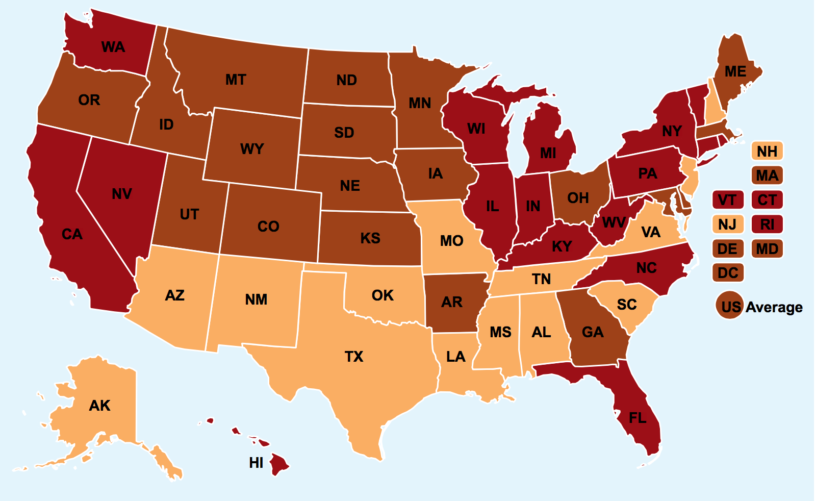
Recent maps of the divide or break between “red” and “blue” states are being dismantled to a certain extent in recent infographics, which trace how migration patterns have partly dissolved the clear lines of distinction in purple states in recent years. But the power with which this color scheme presented tools to trace the changing political landscape of the United States emerged suddenly and quite sharply in American politics and on televised news reports of election-night when in 2000 the NBC graphics department decided to designate a national divide that explained the breakdown of the vote in a presidential election in a seemed a compelling way. The map was popular as it revealed a fractured landscape of electoral preferences, and occasioned continued glossing as being the result of economic interests, a deep social or cultural divide, or difference in lifestyle that would somehow provide a way of understanding the changing political landscape of the country, rather than a purely political divide, in quite definitive terms. For the gas-tax latitudinal divide not only maps questions of taxation; the status of taxing gas taxes maps a region marked by federal suspicion, and reluctance to accept taxation for gasoline.
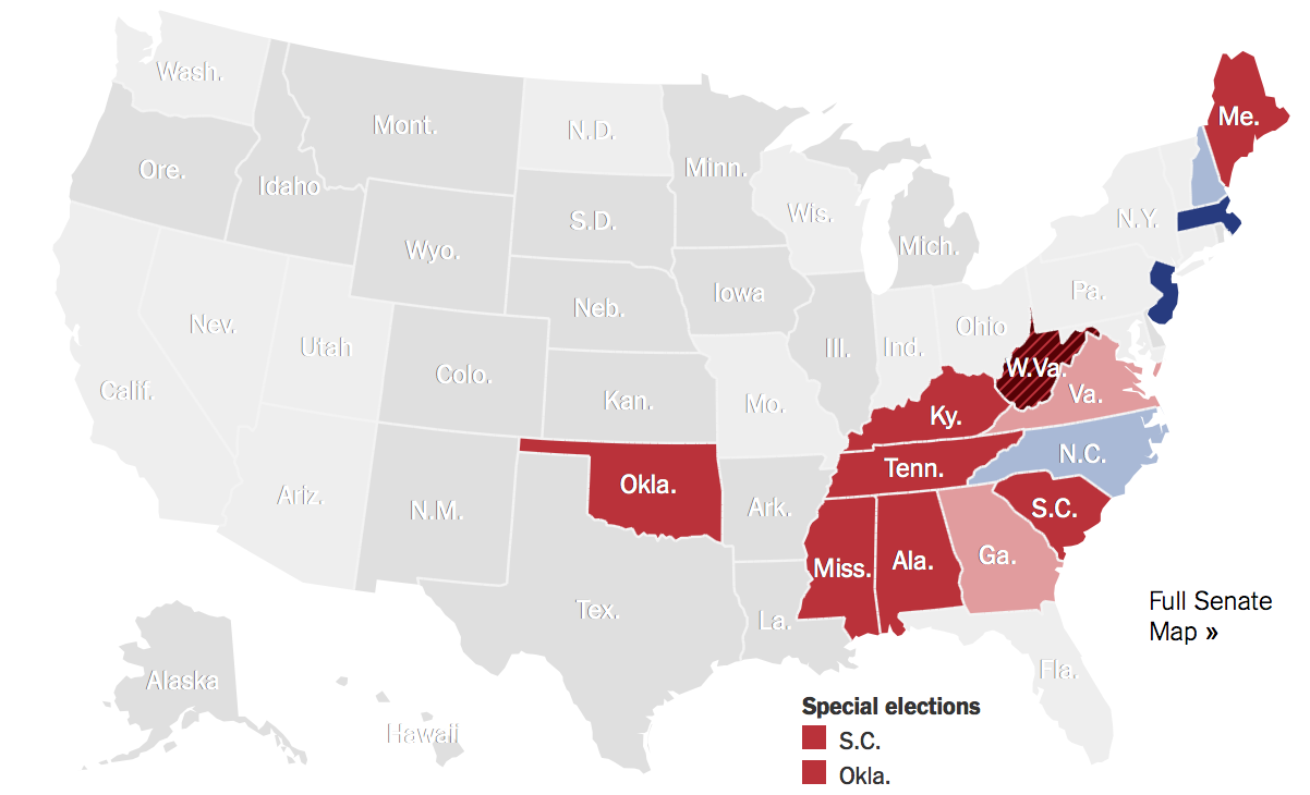
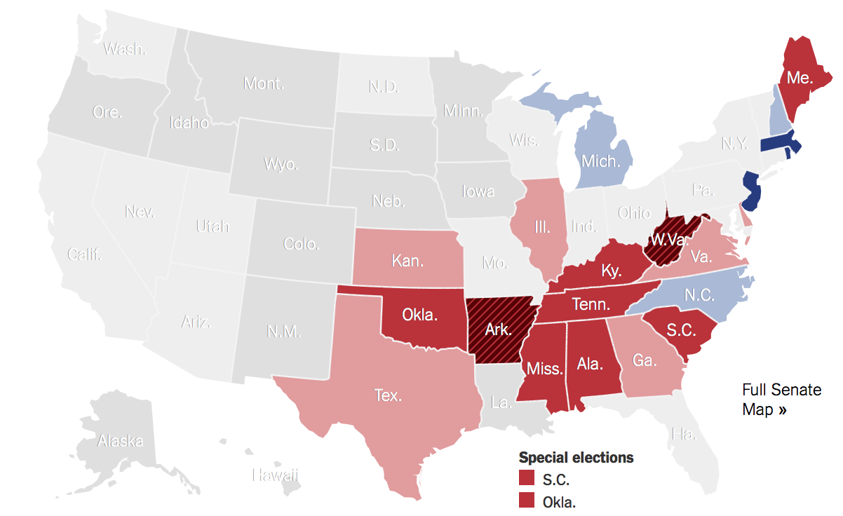
The stark chromatic rift of consensus is rendered all the starker, curiously, in infographics used to process votes in contemporary politics, as if to further naturalize a divide within the nation. Even in map projections of the future composition of the US Congress, such as the interactive projections the website of the New York Times offers readers to ask us to predict how the outcome of mid-term 2014 elections for the US Senate by our own intuitions, we can imagine the break of states along a blue v. red divide. And conceit recurred, most recently, in Election Day 2014, when the red split apart with apparent unity, now including much of the northwest:

New York Times
Is it a coincidence that the problem of race, long suppressed, was resurgent in this election, when a far whiter, and far older, selection of voters made their voices known at the polls.

While the interactive visualization of the balance of power is powerful, the Congress that will assemble from January 2015 will reflect a resurgence of a historical divide separating northern from southern states, and a similar run of red in the northwest. The red that spans the “Gulf States” below recalls a time when electoral politics broke along something like a difference in vision of the nation, of the sort that was already mapped so clearly evident in the resistance to taxing gasoline used as this post’s header from the Exxon-Mobil blog, which begs to be read as bearing information of the very sort such infographics contain.
One of the first infographics ever designed, based on a far more detailed statistical map that tabulated the popular vote by county, was designed by Henry Gannett, then Superintendent of the Census, to process and mend the divide of political polarization after the presidential election of 1880, when states divided over the question of Reconstruction–but when the results of the popular vote revealed a more complex picture, even if one that in large part echoes the Gas-Tax divide.
Library of Congress
This dividing line–and Gannett’s mapping of the central trauma, the war over and the aims of secession no longer sustainable, of reconstruction, mark something of a divide that has haunted the very lines on which the electoral votes across the nation have often continued to divide–a divide that seems to have solidified in political institutions, if one looks at the breakdown of the electoral votes, and how the South voted democratic as a block by 1880, if Rutherford Hayes won votes in 1876 both along the Mississippi and in South Carolina and Florida.

The echo of this divide that has appeared in the recent midterm elections of 2010 suggested the naturalization of a similar break, as Republican candidates ran, on an almost national platform, based on the vilification of the current president, with strikingly analogous results–if “red” now designated a victory for Republican candidates, the sense one gains, looking at the electoral map, is a collective refusal to accept the paralysis in Washington that was blamed on a Democratic president.
The barrage of maps encountered on election night 2014 strikingly replicated the familiar divide that once more divided the nation. In an age of immediate news and cultivation of the snapshot of political preference, many might even bemoan the absence of readily available consolidated results of elections, which are run by individual states, and not the federal government, so habituated are we to making available a synoptic view as if on demand–it is a lament that, with the lack of a single source, the map cannot be readily created and put on view with the immediacy increasingly demanded and required. (The time required for mapping political preferences, albeit dramatically reduced in recent years, to generate data maps of elections even as the results are first reported, has lead us to notice the lack of a national standard for the reporting of electoral results, and leads to the “difficulty” with which different states’ polls close at different times–in another instance of how reality has trouble producing the data visualizations we might otherwise demand.)
New York Times
While Virginia remained “blue” by the end of the night, as Illinois, one did not even need to know, implies the data visualization, a political rationale for how the votes broke along the latitudinal divide. The progression that continued to western states suggest a continuity of opposition to a status quo–or to a President with whom Republicans persistently identified their Democratic opponents, as they tried to make mid-term elections a personal referendum on a President with qualified popularity across much of the Southern half of the country–and those states where the President’s popularity has not that recently plummeted. Although the Republican Party and Tea Party folk tried to treat the mid-terms as something of an imaginary referendum–as if this would validate a shift in the country’s political composition, and could revise the results of the Presidential election of 2012 or repeal of the ACA–the very notion of “running against Obamacare“ (as preposterous as it might seem) evoked a frightening fold along the latitudinal divide.

New York Times
Of course, the mid-term elections assembled perhaps the whitest and the oldest electorate in some time, as resistance to Obama’s presidency mobilized much of the southern vote. And for that 36.6% of those eligible who did vote were excited to vote by the slogan, as much as the idea, of defunding Obamacare–and, for right-wing bloggers, presenting the election as a grounds for a decisive rollback the President’s agenda–and opportunity to re-map a country actually being center-right: as if misconstruing the ‘mid-term’ elections as a midterm examination President Obama had flunked. The divide between states by primary colors of course concealed the fact that an astoundingly low number of the electorate participated–a number that fell below one third of those edible to vote in Missouri, West Virginia, Oklahoma, Mississippi, and Tennessee. It was with considerable presences that CNN’s national correspondent, John King, asked viewers “Do you live in Red America or Blue America?” before a map of the potential results of races in the House of Representatives, earnestly informing the nation, “if you live here, you live in Blue America,” but “if you live here, you live in Red America,” before a map that he claimed simply “says it all.”
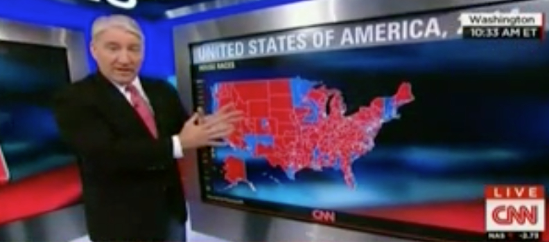
CNN
One can’t attribute low turn out in the election to the finality of the infographic–although this CNN data visualization surely provides less of a mirror or image of the country than John King boasts, and does seem to disenfranchise the members of the television audience to which King speaks, evoking the inevitability of the current complexion of the nation as if it were a medical patient. The limited amount of information the infographic offered viewers, and the limited analysis John King presented, however suggest the dangers of treating the map as if it spoke–or as if it dictated the region from which one was from. For rather than using the map as a performance of the nation, King seems to have relished use of the map as a symbol of national splintering, in the ways that have become increasingly current since the election of 2000, gesticulating as if to fashion a consensus from the division made palpable on the screen behind his hands.
The map of purported voting preferences–this said on account of the quite historically low turnout, skewed to both a whiter and older electorate–has become a bit of a totem for 24-7 news stations, descriptive of a land beset by political paralysis. It was difficult to frame consensus in as during the polarized political opinion in the aftermath of Reconstruction after the Civil War, but there was considerable interest in trying to frame and assess that consensus within national maps, and indeed anxiety about the lack of post-war consensus that would lead to the formation of a government. In 1880, when maps provided such important tools of investing symbolic unity in the relatively recently expanding nation, the map provided a way to create such a symbolic condensation of public opinion that seemed to stand as an icon of representative democracy, although the images have taken on a deeper and more introspective tenor in recent years, as if the voting preferences for different parties provided a reflection–seeing the map as mirror–of what the nature of our nation is. But the polarization of politics at the end of Reconstruction was of course of necessity bridged–if messily, and in ways that created more of a scar of inequality than necessary in the view of some–or attempted to do so, whereas the pseudo-maps that are infographics which we produce or, today, see produced are examples of how maps lie, and how we rely on them to frame our national unity–and to mend the growing gap evident in visualizations of the national electorate. For the notion of mapping national unity goes to the point of peacefully moving past the national divisions of an election, and embodying consensus in the face of a divisive election.
10. If such data visualizations perpetuate a “red” versus “blue” dichotomy that arrests the eye, it obscures areas of grey. Such areas are more evident in a map of Senate races. Although it distorts voters’ preferences–actual voting preferences of the electorate are often effectively silenced or erased by their amalgamation in a single dominant hue– the precursor of modern infographics to which U.S. historian Susan Shulten recently called attention as helping process political polarization shortly after the Civil War creates a far more detailed accounting for local divides on a county-by-county level. Such maps work with considerably greater thin-ness than the colors employed in Gannett’s statistical map. Gannet’s map showed a nation strikingly divided on somewhat similar lines in a similarly polarizing election that was rooted in a clearer political divide, but where the salience of the divide was closely examined. Indeed, the current map manufactures a divide along lines we’ve become a bit overly familiar, as if to present the election as a verdict on the divide between parties and in the nation, although the current divide seems most likely to be less sharply pronounced than that one hundred and thirty five years ago. The greater possibilities for engagement in Gannett’s tabulation of the popular vote, made not on-demand for a news cycle but with the care of hindsight, suggests a far more subtle shading of the country to explore.
Gannett remapped the recently reasserted unity of the country in an attempt to heal–or historicize–how it divided into two camps over the issue of Reconstruction then championed by the Republican party’s platform–and did so in ways that first broached the question of such a political divide. Although in his map, red signifies counties with a majority of Democratic vote, the chromatic construction of the map queried the unity of the nation around the question of its political representation, using the available body to map county by county. (Despite the charges of widespread fraud and poor tallying of votes in the contested 1876 election, in which the winner of the popular vote, Samuel J. Tilden, lost the election, the map was also something of an elegant manifesto of its own of the presidential election’s legitimacy.) In using infographics to process the political polarization of his own day, Gannett first chose red votes to designated counties voting Democratic, and against Reconstruction, shading the surface of the increasingly common map of the United States to distill how political divisions first mapped onto clear geographic lines in the Presidential election of 1880, when the tabulation of national votes was first tabulated with accuracy, as if to compensate for the widespread suppression of votes and gridlock associated with the US Presidential election of 1876.
Gannett rendered the distribution of votes in a qualitatively descriptive elegant fashion, worthy of Nate Silver, to provide an retrospective optic to visualize the political divide in the country in detail. It recognized as a resistance to Reconstruction at a local level that deeply rooted in several southern counties, broadly split along the divide of the Missouri Compromise, in something like a growing scar across the land.
Library of Congress
The map however seems and attempt to process a traumatic moment of which we have lost sight, which demands to be excavated for its own uneven topography because it is such a compelling achievement in revealing a complex engagement with issues–and indeed a varied surface of political debate that impels one to regard it as if it lay at the bottom of a palimpsest, over with later layers of distributions have accrued but can be peeled off, lending something like three-dimensionality to the infographic itself.


Ferguson, MO, not Fergusson, MI. Thanks.
That was an embarrassing error–sorry for not carefully proofreading.