
No region is an island, but divides are defined in ways that create a transmitted insularity along what might be called the Gas-Tax Latitudinal Divide that cuts across the United States, bisecting much of the nation along what almost appears a meridian. Even before the efflorescence of confederate resentment in southern states clear in the 2016 Presidential election, but not at all clearly perceived in recent years, but evident the apparent toleration of the claims of white supremacy and the far right that are rooted in states rights, and, almost perversely, rooted in the limited abolition for slavery and enslavement to expand across territories of the United States titudes north of 36° 30N,–a latitude inherited from the accident of early surveyors’ decision to mark the boundary line between Kentucky and Tennessee.
The latituidinal divide offered both an “objective” basis to extend slavery westward and a fulcrum to guarantee representation of slave-holding and non-slave holding states in the U.S. Congress, a line of apportionment that guaranteed the preservation of local rights of slave-holding, before it marked the secession of the Confederate States of America. The divide has fed a bizarrely enduring discourse on states’ rights in American history that has in many ways colored the complexion of the world, as a repository for the persistence of a reactionary localism in a globalized world, as the initial session of Virginia after Ft. Sumter in the Spring of 1861 was followed quickly by Arkansas, Tennessee, and North Carolina, sectionally dividing the union,–until its disintegration left only the southernmost states defending slavery as an absolute local good.

and Claims made by Confederacy
Long after the practice of enslavement was condemned as sinful by evangelicals, and uprooted in European nations, as was the case by 1848, the inner sanctum of the defense of enslavement lay in the preserve of the CSA–a community-sponsored movement to defend enslavement as a local privilege. Indeed, the depth of memories seem to have been provoked by the stripping of symbols of localism and place like the Confederate flag–the emblem of the separateness of the southern identity–a regional identity perhaps exacerbated by a perceived loss of regional identity and afford continued objects to intrusive federal actions, in a symbolism of nobility that recalls a bend dexter with a bend sinister, and haunts even our most present–and apparently innocuous–as mapping the state of the states in data visualizations parse meaning by blocks whose continuity suggests deeply lying fault lines.

The resistance of localism–and the national drama, indeed, of the attempt to strip the region of its symbol of autonomy–has perhaps not only had a greater impact in how early twenty-first century politics have played out in America, but of the deep presence of the divide of the seceded states across generations. Can the survival of this divide be mapped? Or will it, more likely, continue to haunt the nation, as in the American Petroleum Institute decided to map as a way to lay out ostensively objective record of local variations in gasoline taxes around the country, devised somewhat opportunely in 2014, as the United States was poised to run out of federal money to restore roads, and the chatter on gas taxes rose.


The problem of an alleged discrepancy in tax-rates that the American Petroleum Instituted foregrounded was based on the numbers of cents and decimals–not on percentages, m although the confusion could be excused, viewing the map and its legend without further information, so clearly does it seem to correspond to that blue state-red state divide that has long haunted our social media-saturated spatial imaginaries. If the map was intended to be polemic, and provide fodder to resist calls for calls for raising gas taxes since in counties–the federal tax remaining stable at 18.4 cents/gallon since 1993, the map taps into an ethos of tax revolts by purporting to illustrate an alleged discrepancy in tax-rates along a national fault line.
The divide that the American Petroleum Instituted foregrounded was based on cents and decimals–not on percentages, m although the confusion could be excused, viewing the map and its legend without further information, so clearly does it seem to correspond to that blue state-red state divide that has long haunted our social media-saturated spatial imaginaries. If the map was intended to be polemic, and provide fodder to resist calls for resistance to further hikes in taxes, and suggested the importance of seceding from what it cast, ingeniously in ways, as a sort of necessary secession from higher energy prices–the primary foe of much of the nation, it has seemed for most of the post-Cold War period.

The spectrum of county taxes is indeed much more complicated, revealing that it hardly makes sense to parse in states, although they reflect how some states have passed laws to restrict emissions of dirtier fuels, as gasoline, and have actively sought to do so, in the western states of California, Washington, and Oregon, by placing a larger tax on gallons of gas, in way that “Gas Buddy,” hardly a friend of the American Petroleum Institute, but a data-miner who seeks to give the lowdown on gas prices: the devious color-ramp depicts the bucolic nature of the southern states when it comes to protecting the price of low-cost petroleum for our engines, and the red-hot far west that seems a danger zone that might as well fall off the map.
The website allows one to map in real time, by a color spectrum seeing to affirm that the grass is greener as deeply as you drive into the traditional region of southern states, where the rights to cheap gas seem to be preserved, and the status quo of cheap gas is maintained: the land where cheap gas prices allow fertile fields to bloom, and environmentalism is out-sourced for self-interest, unlike the red-hot far west, of which all drivers should beware.
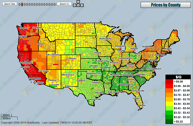
The data vis in other words affirms that GasBuddy is looking out only for our best interests, showing at a glance “the best gas price, anywhere,” at a glance. It’s not surprising GasBuddy is a big friend of Google, and has gotten rid of any state lines, as well as environmental costs, as if to reveal the county-by-county free market of gas prices for his online audience, in ways that increasingly seem to register the deep danger to the wallet posed by driving out west. This is the map of the triumph of the free energy market, embraced as the United States has become the biggest natural gas producers in the world and the top producer of petroleum hydrocarbons since 2013, raising hopes of the growing green for gas guzzlers nationwide, who try to laminate highway maps and interstates over the green fields that get only greener descending the Mississippi as one approaches the Gulf coast.

August 2019

“Prices” here are not based on taxation alone, but “average prices” suggest the significant differences that exist between regions that indeed depend on commercial trucking, and ensuring low-cost convenience stores and supply chains, but have made a decision to prioritize free commerce at the expense of infrastructure and the environment. If it can be credibly argued that many costs of road maintenance, from snow-clearing to cracked asphalt, may not exist in the warmer climes of southern states, and rural roads are often less trafficked, the strong sense of separatism and defense of local privileges shines through the above map of gas prices, which reveals just how modulated the spread of up to a dollar and a half of the cost of gas/gallon are inflected by differences in gas taxes, although these only vary by a spread of about twenty cents.
Rather than be a post about road trips, the Gas-Tax Map provided an opportunity to excavate its layers, and investigate the underlying relations of a deep-seated stakes of states’ rights discourse that seems to underly the polemic visualization, as much as the proximity to offshore refineries in the Gulf of Mexico.

