
6. The two-color maps by which Gannett and Hewes charted the distribution of the electoral vote, county-by-county, across the United States, as shown below, by using red to indicate the persistence of antirepublican sentiment across much of the south. As Gannett and Hewes’ other maps, it demonstrated the new political lay of the land “by graphic method” to unite the “present condition” in a synthetic image: if maps of the nation had been increasingly displayed in classrooms, post offices, railway stations, and shopping centers around 1860, the Gannett maps of the country’s divided electorate reveal what approaches to be monochrome fields that, while showing the persistence of anti-Republican memories linked to secession, in ways that realize the true trauma in the collective memory in the post-war attempts to create a union.


Library of Congress
Employing such a visually arresting shade of carmine red in the map is not only striking. It seems to suggest the persistence of a deep resistance among the local population to integration and what would be called the backlash to efforts of Reconstruction, but also to use red as a pigment to describe national division, and promote a narrative of national dividedness that was a strong carry-over from the Civil War, if not to “map” the memory of slave-holding and the Missouri Compromise in an effectively arresting cartographical format, making a retinal impression on the viewer as well as conveying information. Maps in the color supplement of the Chicago Tribune have been associated with two-color mapping of presidential contests that chart Democratic votes in red in predicting the victory cof William Howard Taft over William Jennings Bryan. That election divided the country in ways reflected in Henry Gannett’s prominent use of “red” to designate the anti-Republican electorate in the Scribners’ 1883 Historical Atlas.
Gannett’s map would, as much as illuminate a national divide, suggest the increasing post-war coherence by which representational government was laboriously but precisely fashioned. The intensity with which the afterimage of Secession made its presence known through successive presidential elections that he and Hewes documented for the 1883 Historical Atlas, and which they followed through the Presidential elections of 1884 and 1888. The maps provided a tool to trace the persistence of an anti-Republican voting block across the south, in which the divide of Secession materialized in new ways as a part of the Republic. These images imprinted an image of a divided nation over time, questioning the map’s performance of the nation–seeming to register the memory of secession and autonomy in the aftermath of Reconstruction, and seem to process the deep trauma of this divide through the widespread resistance to the Republican program of Reconstruction perhaps more effectively offered a way to map the memory of secession, and the lingering trauma of the attempted imposition of Reconstruction across the areas with such deeply rooted racial discrimination in the Southern states.
Popular Vote of 1880 (Library of Congress)
Both the map whose shading reveals the intensity of the popular vote’s distribution and the inset map of electoral votes explicitly capture “afterimages” of southern secession by relying on repeating clear chromatic differences. The divisions came to be incorporated in a performance of the nation’s continued coherence in a government-sanctioned map, and indeed create a tacit narrative about national division that all readers of the map would have retained.
The mapping of shifting distributions of the vote in later years traced the persistence of this after-image and data visualizations of the nation, which continued in 1884–when Gannett mapped the ration of the predominant vote to the total vote, focussing on the density of Democratic votes in pockets below the latitudinal divide–continue to register the attempts to record the integration of the nation, as well as the persistence of a deep divide, as a persistent carmine registers pointedly in South Carolina, Louisiana and Texas, and parts of Alabama.

Popular Vote of 1884 (Library of Congress)
The reuse of the familiar chromatic format from Gannett’s earlier map of distributing the popular vote is clearly dialogic. The attempt to map the totality of the nation in 1888–by which time the carmine block of red-hued anti-Republican votes, long understood as concentrated in the Southern states, had gained a considerable collective density in the Deep South, which shift from rosy pink to carmine on either side of the latitudinal line–with the deeper carmine reserved for South Carolina and Mississippi, and north Carolina and Tennessee and even Alabama fading to a far lighter shade of pink. (The pronounced pockets of deep red in South Carolina and on the lower banks of the Mississippi, suggest,as well as a probable suppression of the black vote, afterimages of Southern independence.)

Popular Vote of 1888 (Library of Congress)
The sequence of maps identified an unconscious “afterimage” that reference the symbolization of unity in the country, but also the pressures that threaten to tear it apart. Using the conceit of an “afterimage” to describe the map serves to illuminate its very historicity–and the way that the map narrates a story of the unity that maps such as that of the Missouri Compromise created, or that the first maps to register southern secession, from Harper’s Magazine in 1861–expressed northern and southern states as two differently shaded entities to frame a crisis in national identity rendered in explicitly cartographical terms. The different shades used to depict regions the initially seceding states that followed South Carolina in early 1861 and join the Confederacy by May precipitated the Civil War–and secession created a fracture line in the country, in which the northern states were shaded deeply in gray. Several “border states” elected to remain in the Union; the Harper’s map displayed their “comparative area” east of the Rockies, etching a spatial division that left an imprint that has been difficult to erase from the land, if often difficult to sharply define–whose after-images can be readily recognized in subsequent maps.

As much as reflect the trauma of secession, to be sure, Gannett’s maps traced the afterimage of secession and the rebuilding of the nation during the trauma of Reconstruction: if Freud argued, in Beyond the Pleasure Principle, that traumatic events, rather than really experienced or fully recognized as they occur, but are consciously processed only after the fact, when they are informally or formally remembered, the recognition of Secession was understood in Reconstruction as voters were asked to participate in a shared political process. In an age when the unity of the continental United States had just been processed, as in the “Washington” that the future Confederate Matthew Fontaine Maury designed shortly before the south’s secession. The map designed to be exhibited in classrooms, rail stations, shopping centers, and in window display cases, symbolizing the nation, was ringed by a ribbon of presidential faces, provided an emblem of sovereign unity, the data visualizations that Hewes and Gannett created offered less a mosaic of states than a mosaic of two divided political parties.

It was a map of an area rich with unsettled local resentments, and of oppositional divides, the likes of which we have, not so oddly, only recently begun to see recurring once again, but were, it feels like, also very much always with us, but just repressed or something that we were just not able to look at or recognize, and ready to suppress. If Gannett’s map seems to knit together these regions, in the “Gas Tax” map on the Exxon blog, the two halves seem to be pried apart once more–without recognizing the trauma of its historical division–in ways that erase the memories that earlier maps so clearly tacitly preserved.
We are of course not new at all to such symbolic prying apart of the nation state. The intensity of the frequencies of colors of like red and blue to designate differences in the map seem to appeal to how color-divides continue to haunt the land. Although “afterimages” of an optical nature are the result of retinal impressions especially intense colors or sudden bursts of light leave in the eye–whether in optometry exams or after staring at sunsets or, less pleasurably, backlit computer screens. Such bursts of light imprint the fovea and leave after-effects, continuing even we close our eyes, in our retinas, that float in apparent day-glo hues that seem suspended in our line of sight, and only fade with time. In the manner that these oddly colored images hover in our field of vision as disembodied forms, removed spatial bearings, mapped events can haunt a place. The scares evident in specific maps can act, superimposed upon space, like scars, capturing divides that continue to haunt data visualizations. Their survival seems an interesting extension of the analogy we draw between maps and vision, even if data visualizations don’t appeal to perceptual models, and are oddly echoed in the strong colors that data visualizations adopt, as if to leave similarly strong afterimages in our minds, despite their relative historical poverty.
7. The existence of such cartographical ‘afterimages’ seems an especially appropriate concept to use to discuss the chromatic divide red v. blue that has materialized the nation’s divide in televised newscasts, soon after the diffusion of color TV became a standard source from which we derive news information. While some of the first maps to use chromatic difference to suggest a divide that haunted the nation–the divide of Secession–did so quite consciously to depict the survival of oppositional polarization in a vision of the nation–here crystallized around the reaction to the continued presence of federal troops in the south and program of Reconstruction–the conceit of recording such an “afterimage” has become more unconscious, and more disruptive. We have read the divides of recent presidential elections so often that they seem to be etched into our cerebral cortices after having followed the twists and turns of the 2000 election, dividing states “blue” or “red” in essential ways, but are shocked at how the line of latitude still scars the nation’s political topography. The divides mapped offer less of a metaphorical window or mirror of the territory than a reflection of the after-images of divides or differences that continue to inhabit different practices of political representation across the land, as if to offer a divide along which issues of national significance are still prone fall.
The use of “red” to reference Republican states is often attributed to Tim Russert‘s political commentary on the aftermath of election night in 2000. The two-color divide gained a symbolic currency as electoral votes were tabulated with continued inconclusiveness, the evidence of alternating colors for political parties in televised electoral results was revealed by Kevin Drum to have lacked clear identification with a party in the color-coded electoral maps shown from Presidential elections 1976–states for Jimmy Carter were mapped “red” in 1976 and 1980, and states voting in majority for Walter Mondale were in 1984; if states voting for George Bush were shown in red in the color televised results of 1988 election, states footing for Clinton were mapped in red in the presidential elections of 1992 and 1996. (Across the border, in Canada, “blue” is claimed by the Conservative party, designating the Liberals as “red”, and New Democratic Party “orange,” though it leans further left.) But although states the voted for Democrats Hubert Humphrey and Ed Muskie in 1968 were colored in red on the nightly news, the Wikipedia electoral maps have retrospectively canonized the identification of red as Republican since the visualization of the results of the presidential election of 2000.
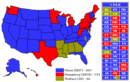
However, the election might be best known in relation to this post for how it revealed a similar division, not to sectorization, on behalf of Wallace’s Independent South-based candidacy, largely viewed on TV in black and white:

But in 2000 the use of red to reference “Republican states” was almost naturalized, and by 2004 the opposition became among the words of the year, so clearly was the visualization embedded in viewers’ minds as something that made common sense. For William Safire, Russert was “the leading popularizer of a blue-Democrat, red-Republican assignment [which soon] took hold nationally”: but Russert was such a huge television personality valued for his skill at both distilling and framing news into bite-sized yet informative, that his adoption lent currency to the division as a compelling symbol, credit for inventing the dismaying division of choreographic unity aside. The image of a chromatically divided country took hold as it crystallized in common use or a collective consciousness, perhaps for the very reason that it makes a single story about the nation so difficult to tell. So dominant is the storyline of division, it is difficult to orient oneself to Gannett’s statistical map and remember that the light azure signifies Republican votes, and the carmine intensity of the south reveals the relative density of a Democratic preference.
While we recognize something like a similar scar looking at the map of levels of gas taxation that break along a familiar latitudinal divide in the header to this post, the survival of the scar of secession is so quickly recognized because of how it disrupts the notion of the map as a performance and representation of the unity of the nation, however, and the ways that images disrupt national unity suggest the death of the map’s primacy as a tool for embodying national identity, and its rise for spatializing a pie chart in potent ways. Of course, the new separatism is quite new, and wasn’t so visible after the results, say, of the Senate elections of 2008, although these were particularly distinctive in their Democratic tilt, despite the quasi-separatist victory of George Wallace in his 1968 presidential candidacy as an Independent:

But the recent resurgence of Southern separatism, even if temporary, makes the map of the 1880 popular vote particularly interesting, as a way of narrating national unity–if not a symbolic restoration of the nation’s symbolic coherence–at a time of apparently increasingly bitter national divides.
An overly familiar latitudinal divide was resurrected in the “Gas Tax Map” first posted on the Exxon-Mobil blog to suggest the steep differences of what drivers pay at the pump. The map does not detail the variations of gas prices per gallon, however, but the taxes that it suggest create a policy of “passing on costs” to drivers. Readers of data visualizations are immediately capitulated into the role of news analysts, who can read the legible national divides rendered in the monolithic blocks of bright colors along which one country breaks. The aesthetic of data visualizations respond to the increasing value on the art of readily putting results at our finger-tips–of a piece with the shrinking horizon of expectations of online news, but also to the condensation they provide that seem to underlie an actual map: they parse the political preferences as filtered through representational democracy, investing regions with contrasting–if not opposing–ideological divides, as if to expose the fault-lines in the democratic state. For they respond to the demand for sources of ready to digest information by arranging the division among voting preferences on not too unfamiliar fracture lines.


Ferguson, MO, not Fergusson, MI. Thanks.
That was an embarrassing error–sorry for not carefully proofreading.