
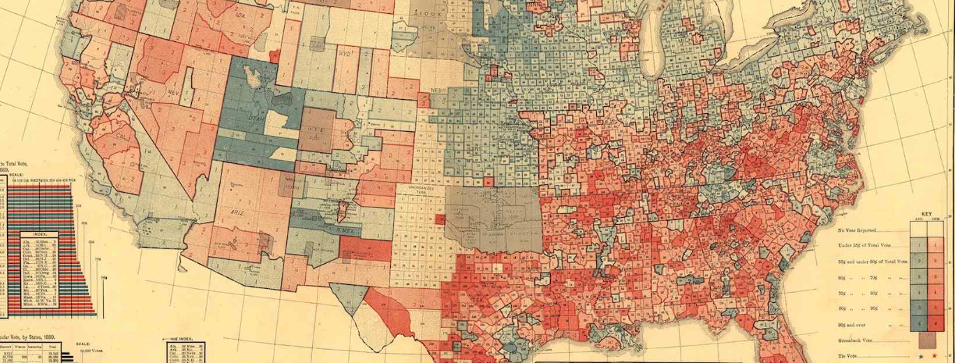
The historical map of the popular vote of the Presidential election of 1880 constituted a resonant moment in which afterimage of the continued divisions could be traced. Even in the wake of the Civil War the terms that Reconstruction throated to dictate to the southern states elicited a degree of collective opposition that revealed the deep divides that continued across the country, and had hardly begun to heal. The divides revealed in Gannett’s political map remind us, in their graduated shades of blue and red, of the divides that were delineated, as if indelibly, and translated in how the “Popular Vote” was distributed. The map offered a far more textured and finely grained visualization of voting preferences county-by-county across each state and territory than had ever existed in its rendering of the polity against a clearly defined projection of longitude and latitude, and in the provision of that data to a large body of readers cannot help but recall the recent popularity of synoptic summaries of recent presidential elections, also colored “red” and “blue” to indicate opposite ends of the spectrum.
The distribution sought to reveal considerably more local messiness than exists in the recent state-by-state colorations of info graphics, only recently contested in maps of more subtle parsings of voting tendencies by political scientists who interrogate electoral behavior more closely than the electoral counts. Even a superficial reading of the lithograph of “Political History” suggests the continued difficulty of overcoming memories of Southern Secession in 1880–although, as the lower right inset map reveals, stark differences were really only revealed as the popular vote was translated to the electoral count. Yet Gannett’s map is compelling since it maps a striking after-image in the distribution of the popular vote that seems to recognize to unique propositional qualities in maps as signifiers, as well as to their power as rendering of big data in close detail. Despite the very different modes of production from the engraved map to the crude datamap to the interactive map, the power of their codes and conventions becomes unmoored in the mind of the map-reader that illuminate the how strongly the map’s representational functions resonate with the representational claims of the state.
Even in our dataphilic age, after-images move across media echoing the divisions first inscribed in print–the earliest ancestor of the infographic exists in the statistical maps of the US Census to map a still imperfect union among the states that seceded from the Union and the Republic, in an early detailed distributions of the popular vote in the presidential election of 1880 as a way to embody the union–and embody, if perhaps unintentionally, the depth of the resistance to the Republican platform designated by deep pockets of rich carmine in those counties that lay below the thirty-seventh parallel. The divide that the abstract line continued to embody both in the years immediately following the failure of southern Secession–which elections of both 1876 and 1880 sought to overcome or as much as possible repair–itself occasioned deep cartographical reflection, even if somewhat papered over in exquisitely detailed remappings of the oppositional divides in the popular vote that Gannett’s office undertook to reveal the continued unity of the nation. Gannett presented his statistical map of the distribution of the popular and electoral vote in a time of political antagonism–it explained the clear victory of the Republican party in a polarized contest–as if to present an argument that unity still existed across the land.
Library of Congress
Even in a time of such heightened political extremism, and when the memory of secession just less than twenty years earlier was still strong in one’s mind, the debate about Reconstruction that were so central in presidential platforms were less a cause for divisiveness, as was readily demonstrated by voting statistics. Gannett was quite clear-headed when he introduced his collection of printed folio-sized maps and diagrams with the promise that they could digest graphically the “dry and difficult” study of statistics by how both form and color provide a manner of “clothing the dry bones of statistics in flesh and blood” by embodying and revealing material continuity among them, in which “features of great importance, hitherto but vaguely comprehended, are made to appear at a glance, . . . so vividly impressed as not to be easily forgotten” (1883).
Such aids, Gannett perceptively realized, not only “make public sentiment and shape public policy” in ways “essential to intelligent and successful government” in any representational democracy, but most especially in the Reconstructionist postwar world. Gannett’s elevation of the medium expanded his role as the Superintendent of the Census to a public portavoce of the state in a sequence of folio maps such as his image of the divided popular vote. The resistance to the alleged interposition of further federal taxes at the pump reflects something of a similar resistance to the mapping of a symbolic unity, which seems at the core of what the visualization in the header to this post seeks to contest. For the unexpected division of the symbolic unity of the United States gets at the heart of the sort of discussion that such infographics seek to begin, if not the local stories that they tell.
15. The distribution of states between the Democratic and new Republican party defined a symbolic divide that was the inheritance of the Civil War and processed the aftermath of southern secession in the polarized political community it traced. Gannett almost acted as an emblem-maker whose vision rooted the evolution of national consensus. But the depth of the division that he traced between recognizable colors–red and blue–provoke winces of recognition. Indeed, the distinctly familiar contours it charts among political environments makes the first infographic used to gloss a Presidential race so striking to readers today.
The organization of the nation by coloring states through the electoral votes that they assigned to each party in the Scribners’ Statistical Atlas (1883) offered informed readers a basis to gloss electoral division that seems a clear precursor of the recent divide between “Blue” and “Red” states, as Schulten has noted, by giving political legibility to the country in a manner few readers had been accustomed to resolve the Secession of the south in the presidential process. Gannett’s statistical map aimed to overcome the depth of the lasting political division–here noting Democratic votes in shades of Red, and Republican votes in shades of Blue–that Gannett himself would have been most happy to compare to the divides that continue to haunt the country one hundred and thirty years hence, but whose very division he pointedly used the map of the popular vote (and of how the electoral process mediated the popular vote) as a cogent means to overcome.

Library of Congress
The elegant infographic–inset in Gannett’s larger map of the popular vote of 1880–distributed electoral results the particularly divisive presidential contest, in which Reconstruction loomed large as if to affirm the integrity and coherence of the United States by the links between regions of slightly varied hues. We can bridge the depth of the historical divide in which the map was designed by the head of the US Census because the sharp divide among electors is so recognizable to the infographics that we consume each recent presidential election that redraw fault-lines over the same form as if they forecast impending fractures: earlier maps become resonant by conjuring divides that echo with unfortunately continuing fractures in the political topography of our own national space that our pundits are so happy and ready to gloss repeatedly. When the far cruder data capture shown in this post’s header also offers an unexpected persistence of afterimages of a past we readily detect in its own spatial analysis as stubborn prompts of the depth of duration of the “after-image” that Gannett’s map renders so indelibly in detail.
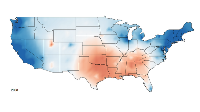
While we could view these maps as screens on which we project our own divides, the recognition the map provokes suggests something more than a mnemonic and more than a harbinger of political modernity and its graphical symbolization. So clearly do some maps reveal the historicity of radical rupture in the past that their delineation of divide seems transmitted in unconscious ways. The Exxon-Mobil gasoline tax map was distributed by the American Petroleum Institute to illustrate the unfair differences in gas prices across the United States, but might be more striking for tracing the continued presence of such an after-image of southern separatism. If earlier maps of southern secession struggle with the wrenching divides of a national space, their continued after-images in later datasets remind us of the echoes that some divides however improbably continue to retain, as they appear as if scars or scratches on the map’s face are suddenly revealed in an X-ray or by application of ultra-violet light, for all its banality of chocolate brown, chestnut and tan.
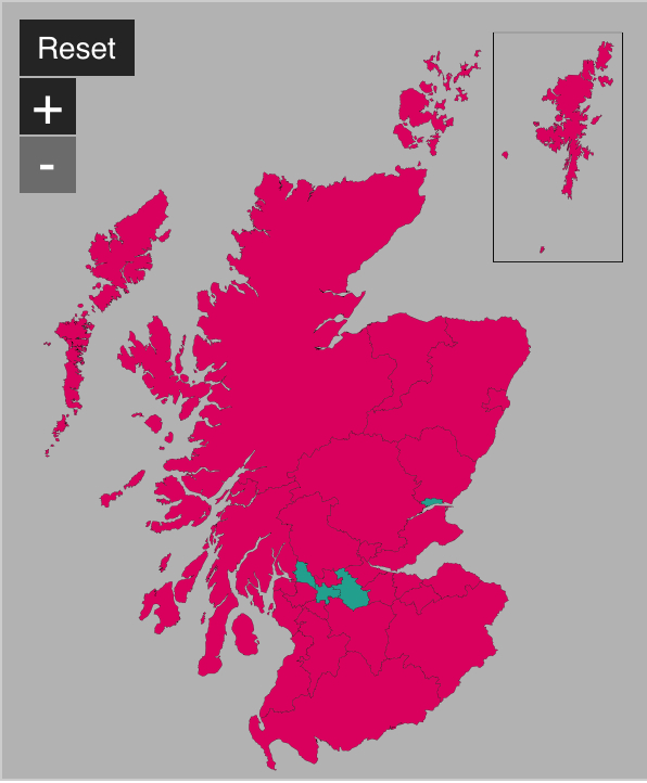
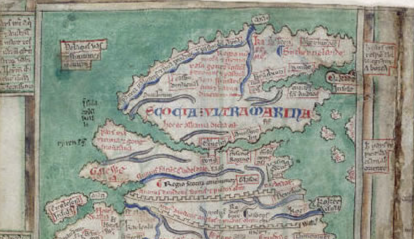
16. For such afterimages reveal the continued unexpected resilience of divides across the topography of political preferences that surprise us by their sudden appearance. The shock they provide reflects how we continue to carve up space in our minds in ways received from cartographical records: to risk a poetical analogy, mapped after-images offer etchings of crises that haunt the landscape, and rhyme with past divides. One example might serve to make the point. The forestalled break of Scotland from the United Kingdom–despite worry about its possibility–carried little sense of the story implied by an earlier after-image or prefigurement, save perhaps Hadrian’s wall or the marine gulf that the thirteenth-century monk Matthew of Paris mapped between England and “Scocia Ultra Marina“: a return to what Scotland was wasn’t clear as an embodiment of the region–for all its untapped potential of oil production–presented little meaning for most ridings’ votes.
British Library
Of course, Matthew of Paris used map signs holding far less currency among contemporary map readers, and drew the map in ways that the “Yes” vote were less ready to exploit since they hardly seem forward looking. But the division he drew that separated Scotland from England and Wales was curiously reiterated, this time as an imagined string of the Cheviot Hills whose westward progression reflected the separateness of Scotland, in Samuel Augustus Mitchell‘s 1860 “County Map of England and Wales, printed and published in Philadelphia on the eve of the U.S. Civil War:

“County Map Of England, And Wales” (Philadelphia, 1860); courtesy Rumsey Cartography Associates
The potential shock of the separation of Scotland from the UK would be something like the reverse of disrupting the memory of a recognized map through the for-now forestalled shock of redrawing the United Kingdom: even folks at Colliers–already familiar with recent redrawing maps of Europe as a whole--have hesitated at dividing a national space of apparent unity that the outline of the United Kingdom has long defined. In the recent 2014 referendum, the complicated and perhaps incomplete defeat of secession might perhaps have turned in part on the lack of convincing maps of separatism–everyone seems to have one–and the limited mobilization that the historical divide summoned–aside from Braveheart, perhaps–in conjuring the unity of mapped space apart from the apparent integrity of the UK. (There seems to have been little possibility in providing or drawing on a map that embodied hopes for to separatism, perhaps, or an “after-image” of the mapping of a prospect of Scots autonomy that the referendum’s supporters would build upon.)
We clearly recognize something like a scar in the map when we watch how levels of gas taxation that break along a familiar latitudinal divide: the scar of secession is quickly recognized in the map, in ways that lead us to map the basis of what motivated resistance to taxes on gasoline, and to ask what the divides that are so present in that map show, aside from the readiness of resistance to taxation. Such cartographical after-images are revealed in ways that are specific to particular maps, and linked to both the sort of stories that the best dataset can show and the graphical coherence that the map provides. to the viewer which offer the possibility to grasp the meaning that the map embodies as a sort of argument about how we divide and understand space–and understand space by dividing it. Tthe Southern Poverty Law Center presented a compelling a “geography of hate” by mapping actual hate groups. The persistence of such advocacy groups grew from “pressing concerns” of collective hatred, from the Kentucky-based IKA–the “Imperial Klans of America”–to the Illinois-based BOK–or “Brotherhood of the Klan.” But if the resulting image could be interpreted as evidence of the persistence such an “after-images,” the persuasiveness of dividing states in the “Hate Map” is, dismayingly, not so compelling as a distribution of a clear political topography that divides the United States: the point is their persistence in our country, but the map blurs the resolution of specific pockets where these groups might be allowed to flourish in a broad range of states, or the relative size of these insidious organizations that perpetuate discontent: the map is a chilling image, but also an unclear reflection, although it is clear how the cresting above forty (terrifying as it is) distinguishes Texas, Georgia, South Carolina, and Florida–as well as California, the loss leader in this metric.

The map appears to isolate regions where hatred finds its focus, but of course can’t be readily mapped onto each region’s residents.
17. The concept of such cartographical “after-images” suggests more of a trace or imprint on than part of its representational functions. The devil lies in the details, or in the extent that the details allow the viewer to enter into the local landscape a map presents: after-images register differences that might be read as a lasting scar left on the land, but are best discerned within the content of subsequent maps.
The scars or “after-images” left by such a political rupture are often most easily decoded and read in immediately subsequent maps–especially maps that turn on such sensitive questions as those of political representation in the immediate wake of the Civil War. The lack of volition specific to after-images make them unlikely metaphors for the highly structured field of the map’s space, but as disembodied forms they compliment the inherited structures of space that are rarely registered in the actual landscape, but as if imprinted on the landscape in ways somehow independent of them, such “afterimages” are registered with surprising clarity in the distribution of the crudest data overlays to the far finer grain of Gannet’s lithograph. If maps offer an alternative way of “seeing” the transmission of divisions imprinted on their surface, they reveal the after-effects of secession by spinning compelling narratives about the division of north and south.
Even the crudest data maps might be aptly described as compelling “afterimages” of the lines secession drew across the land’s expanse, shaping local inhabitants’ view of the nation and national government as much as reflecting them. Gannett’s registration of such dense redouts of anti-Republican animosity transcends mere conviction, but was rooted in reluctance to adopt what is seen as external imposition of civil rights’ policies, and reflects the retention of meaning that existed in the past demarcation of a Confederacy-Union divide. But the recognition of the longitudinal divide among states which refuse the taxation of gasoline constitutes an odd after-image of the secession of southern states, as if an anachronistic echo of self-declared construction of a divide in the political landscape of the twenty-first century.
The concept of the “after-images” appeals more than that of a trace and an imprint on the map’s surface. For rather than being an accomplishment or renewal than it registers the shock that occurred in the status quo, in ways that might the recognized as something of a scar that was left upon the land, but is able to be discerned only through a later map. The afterimage reveals the result of the continuation of a cascade of events in how spatial divides are redrawn whose echoes–to synthetically shift or mix metaphors–continue to reverberate in how we read the landscape that it maps. Instead of being defined in the map, the afterimage emerges from the resonance between maps, and from comparison–and is not able to be reduced convention or line on a map or be mapped, and helps maps empty the relatively abstracted distribution in the divide of local levels of gas-taxation onto an inheritance of political divides.
Library of Congress
The persistence of divide does not reflect only the outline that the image-maker or map-maker created–“fictor cum dicit fingo figuram imponit”– but also track the depth of a difference maps stubbornly reveal. Much as the ghostly remnants of sudden ocular over-stimulation glide, disembodied from spatial coordinates or position in our vision, they offer unlikely metaphors for the collectives registered on a land-map. But as an image of speech they suggest the unconscious ways that narratives of spatial difference are imposed on different ways of inhabiting space–and are imposed by the legal boundaries of difference that were created in the United States from the boundaries in which slave-holding remained permitted from the early nineteenth century, and were indeed defended as a right of the states toward the Confederate south that seceded from the union.
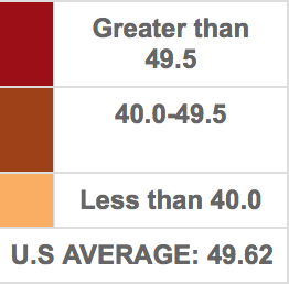
The divide in Gannett’s map of returns in the presidential election of 1880 revealed that Garfield barely won any of the counties in Southern states. In transcribing the results of an election widely perceived as a referendum on Reconstruction, Gannett vaunted the precise tabulation of national votes and the recent coastal survey to create a color-coded record of the distribution of the popular vote by tones of red and blue for the first time, Susan Schulten wrote, to overcome the continued polarization of the post-war electorate in the United States. Although the division of the electorate did not precisely correlate on a county-by-county level, the regions which resisted the Republican candidate (here represented in blue) constituted a shift to increasing crimson in comparison with a pinker–and far more light blue–northern states.

Library of Congress
The division the statistical map reveals across the United States more broadly reflects the complex spectrum of progressive in some southern cities, but reveals dense pockets of
carmine, thanks to Gannett’s innovative graphical choice of gradations of blue and crimson to differentiate electoral preferences in sharp detail.
Library of Congress
How such afterimages emerge may be less specific to their subject, most importantly, but based on how they allow us to navigate the political landscapes that they describe. The most highly structured maps prompt and invite compelling stories about their distributions–whose after-images seem to haunt the political landscape: as much as define the distribution of votes, in other words, Gannett’s “infographic” offers a solution to visualize the fracturing of national politics. The compelling nature of such after-images that are revealed in a sequence of maps is less directly signified by attributes of what is mapped, than characteristics whose significance the viewer recognize as they read, as something like traces or indelible imprints separate from their proper subject. Such persistent afterimages offer narratives that accumulate upon the objectivity of a map.
18. The divide between regions red and blue was not born on televised news reports of election-night, as Athena out of Zeus’ head, but as NBC’s graphics department decided to designate a national divide the compelling map of the popular and electoral vote for president offered a fractured landscape of electoral preferences newly divided. Whether a social or cultural divide, or a difference in lifestyle, the division offered a way to understand something like changed political landscape of the country with George W. Bush’s victory, although the rhetoric of redrawing the political map seems tired. The history of sharp divides between “Red” states and “Blue” states responds not only to a search for meaning in our choreographic collective, but to the frustration of birding these divides within a system of representative government, in ways that would overcome the chromatically essentiallized attributes of any region or location as distinct.
They tellingly employ the patriotic hues from the primary colors–red and blue–not only to visualize either end of the spectrum, but to suggest the continued coherence of the data visualization in a map. There is less intensity strong enough to generate such perceptual after-images in a map, or presume after-images might be expected to exist, given the shifting political landscape of polarization, which suggest something like a search for narratives of differences that is mediated through political institutions process a political space. For the divides that they have imagined have also emerged as far more complex, as elections have created a remapping of finer grain than the results of the electoral college would show. Rather than mapping “blueness” and “redness” to reveal lands divided between Star Bellied Sneetches and Plain Bellied Sneetches, GIS tools, complicating the oppositions of the data visualization. Ways of opening up these divides over time, suggested by the comparison between the after-images Gannett’s map evinced and the image that was echoed, as if it captured either a figural expression and emotional posture of the country.
The attempt at creating an atlas of data visualizations, comparing different paper maps, would extend to a chronological ordering of the shifting spaces of political affiliations that the quadrennial recurrence of presidential elections would allow. The terrestrial geographic map of the United States white carries intense contiguous azures in select spots and a roughly rosy interior, David Sparks found, adopting a uniformity of colors to earlier political parties and mapping how political affiliations shifted over one hundred plus years since the Civil War–or roughly from the time of Gannett’s map. Sparks’ chronologically collapsed isarithmic map of continuous coloration suggests some continuities among voters from 1876 to 2008, if it contains multiple narratives in voting habits by predictable fuzziness in electoral allegiances for most of the country. But the condensation Sparks devised in a video and collective synthesis reveals a proclivity among states below the thirty-seventh parallel, rendered even fuzzier in the synoptic one-minute animated graphic crafted from multiple frames from 1920 to 2008, whose animated choropleth reveals clear preserves of one-party voting, almost as if regions were inhabited by the ghosts of earlier political preferences. And the replication of the latitudinal divide immediately strikes the viewer, despite its almost air-brushed quality:
Many divides in maps are frustratingly opaque as they are read over time, and after-images difficult to discern, but political scientists indulge in this sort of mapping, as if in an attempt to invest historical dimensions to the individual data visualizations. Sparks’ synthesis also interestingly compares, when extended to 2012, to the county-by-county parsing of the Romney-Obama presidential election, in which blue democratic counties spun out in the Southern cities and in the Southwest in ways that broke an earlier landscape of opposition, but which a simple geographic distribution can no longer explain, given the population density of many of the regions of the map in the Northeast and Pacific coast colored blue, a distortion mirrored the unique mosaic of votes in the Midwest and Florida–

-.although a cartogrammic warping of the same election by population reflects the same deeply dyed blue divide of the Northeast, area around Lake Michigan, and West, and an ominous shrinkage of the population of red lands

Mark E. J. Neuman, University of Michigan
The variability of party preferences suggests the irregularity of the blanketing of red states across the interior around 2000–elections which first provoked an actually anomalous red state vs. blue state geography of polarization: voting patterns from 1920 to 2008 chart electoral preference moves like swells across the country in improbable waves that appear driven by a combination of fashion and circumstance, as much as different areas of work or economic relationships of a fixed geography:
But if temporal synthesis muddies topographic variations in the political landscape, mapping regional electoral preference in presidential contests from 1876 to 2008 effectively define loose contours around the South–and the red blur around Salt Lake City–from the blue-leaning industrialized cities in the northeast, Great Lakes, and west. The after-image of Reconstruction extends to the longstanding disenfranchisement of African-American voters, still evident in the recent redistricting of Alabama voters. Despite some shifts, the landscape is recognizable: “after-images” are not shared memories or distinct allegiances transmitted across generations, but rather reveal evidence the continued impact of removed experiences, per their resonance until they might be said to eventually fade from the picture in which they first created such strong stimuli.
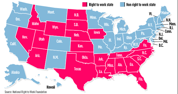
The latitudinal divide that has inscribed itself on the landscape reveals itself best in maps of fine grain–but that in due course diminishes to vanishes, or mutates into new divides. After all, the divide is not linked to the terrain; it is perhaps even best revealed in the truly compelling (and dynamic) Tableau visualization of the 2012 election’s translation to the elector college that Adam McCann created, which creates something like a distinct sea of Red below the very same conceptual divide:

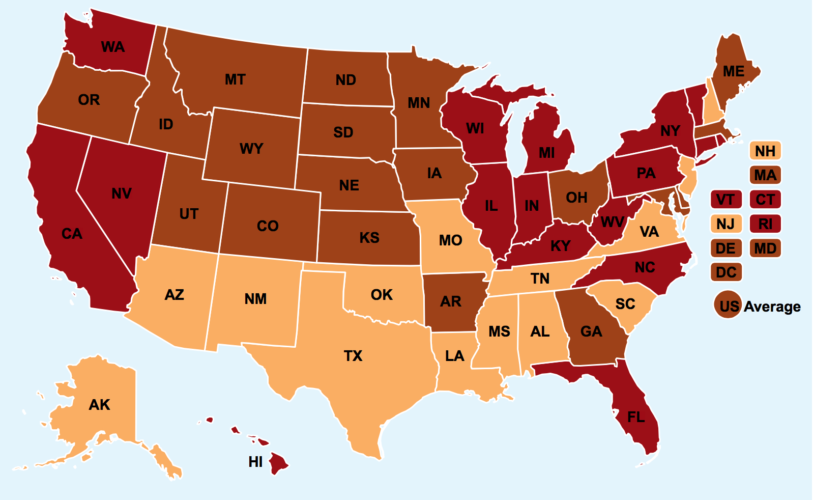
The Tableau map perhaps best reflects the national division emerging among states adopting laws not mandating that employees join unions–seen widely as anti-worker laws with the most pernicious result of endangering pensions and benefits, increasingly adopted (or introduced) as explicitly pro-business measures.

Data-visualizations often intentionally offer distorted oversimplifications to readers, and fabricating divides in space as if they were permanent in nature.


Ferguson, MO, not Fergusson, MI. Thanks.
That was an embarrassing error–sorry for not carefully proofreading.