
One might start from considering what it means to discuss the survival of such a similar divide across the nation. Such broad brush strokes of regional differences, despite clear local variations in tone, suggest an apparently contiguous block of red across the southern states that is eery to recognize. Although the aesthetic contrast between the two data maps is evident, both snapshots suggest the depth of a diachronic division along parallel 36°30′ N, a line along which the country has often folded, despite the flattened nature of the polling data synoptically digested in both images of divides that plague the nation. The divide is echoed as an after image thirty six and half degrees north of the equator in the distribution of levels of gasoline taxation, as if an after-image of a line of political secession has haunted the political landscape of the American south, that appears a unified block of voting red:
Library of Congress (detail)
Such data visualizations reveal a persistent divide or dissonance between the geographic unity of continental United States from their vision of political coherence. Schulten argued that Gannett’s statistical map promoted a new understanding of the country’s division despite its political polarization, and provided a way for readers to struggle with understandings of national unity–in an early antecedent to the aesthetic of the infographic–and breach the historical depth of local or regional political divisions. The images not only created an after-image of secession, but created a powerful surrogate for the relation to the nation, and indeed peacefully progressing to the conclusion of a contested election. It maps the depths of divides absent from the historical flatness–and short-term purview–endemic to the tastes that datamaps both exploit and respond to.
Excavating the “after-image” that lies within an infographic offers a way of investigating the flattening of time that infographics all too often both perpetuate and perform: the conceit of the “afterimage” provides a way to unpack the flatness of an infographic, and offers something of a remedy for the specter of the short-term that haunts most data visualizations–if not a way to investigate the presence of the past that lurks, as if within the map that lies underneath its surface. For whereas infographics foster a reduction of historical perspectives on their interpretation, curtailing the long-term in the pathologically short-term attention span or ingrained “short-termism,” acknowledging after-images offer a way to unpack the false claims of comprehensiveness they promote, excavating the map of political divides that underlie how infographics divide the nation. Detecting after-images provides a way to uncover the historical depth by which such spatial divides formed.
While we’ve often forgotten the above maps, which have only been recently resurrected to the eye of history from the dustbin of data visualizations, the divide traced between northern and southern states in the “Gas-Tax Latitudinal Divide Map” provided in the Exxon-Mobil blog offers an invitation to meditate on the longstanding holding power of a map sign. It might also offer an invitation to excavate the transmission of such a stark divide between northern and southern states’ political cultures, and the historical depth of the division that the selective criteria info graphics foreground, and which are sacrificed in its assumption of an Apollonian transcendent view of the nation-state.
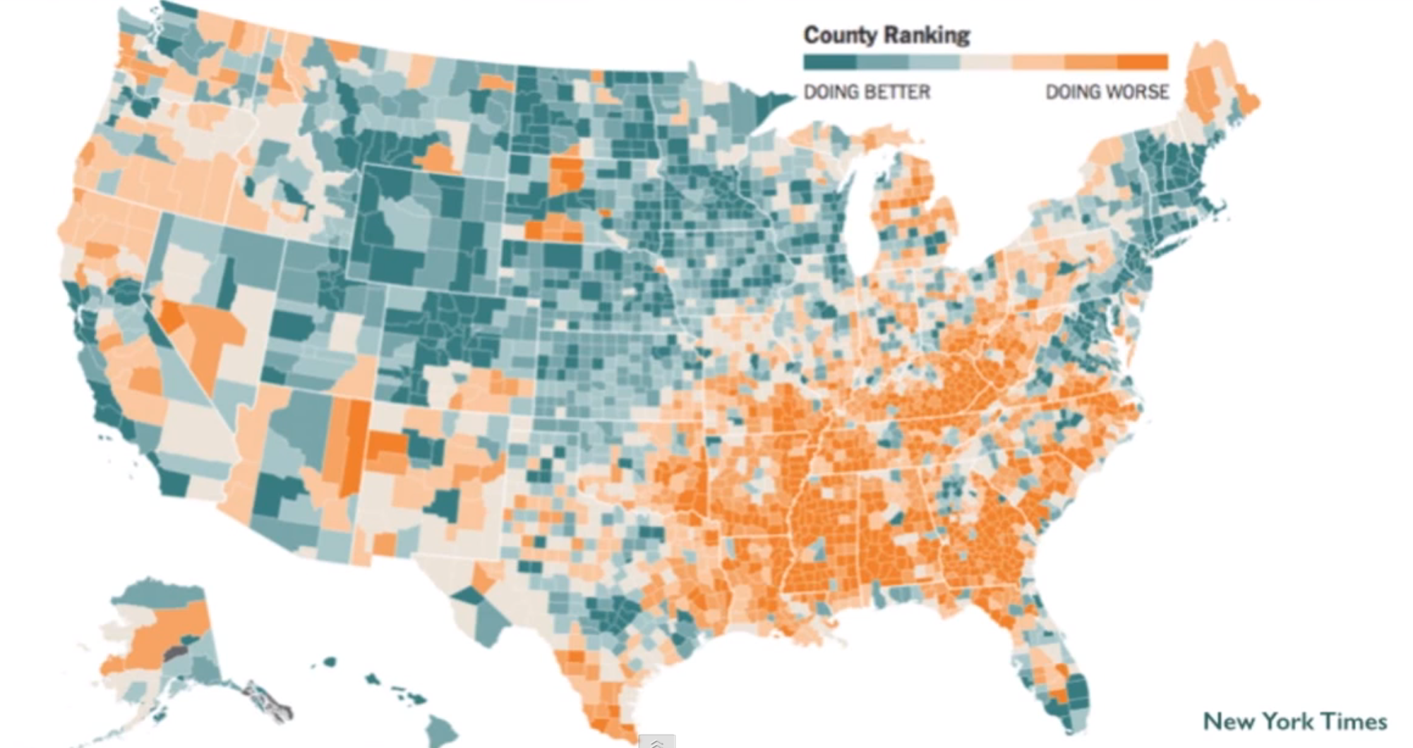
11. The way that data visualizations function as maps in the performance of statehood has been increasingly disrupted in a range of info-graphics. The disruptions such visualizations chart reveal the persistence of poverty across certain areas of the country–a poverty we far too often naturalize, or which is absent from the national maps that we draw and the divides that we emphasize within them. It’s striking that the very divide mapped in the header to this post–the Gasoline-Tax Divide–creates an eye-grabbing continuity across many of the same southern states that jumps out within the contemporary maps of the national distribution of well-being, a county-by-county assessment of QOL (an alternative to GDP, taking a sextet of life-expectancy, income, education, disability, obesity, and unemployment, rather than only a financial metric).
Indeed, the disparities in the Gas Tax might reflect a reluctance to impose taxes on poorer and relatively non-urban areas–and imposing a tax at the pump would cause undue duress. But the weird continuity of orange, even if a snapshot based on present-day statistics and metrics, no doubt conceals the very sort of historical context that the narrow temporal perspective of most infographics tend to erase–even as they structure data by a geographic map or interface.
The above map is less of a descriptive vehicle, to be sure, than a compelling tool to structure data. “It is a cold thing, a map, humorless and dull, born of calipers and a draughtsman’s board,” wrote the twentieth-century pioneering aviatrix Berryl Markham–who rarely relied on them, to judge by her surprise in reaching Newfoundland in her pioneering transatlantic flight. But the infographic is far colder, more stripped of quantitative detail about place, the socio-cultural mosaics evident in data visualizations offer provocations to dig deeper beneath their surface records of the short-term. As if to conceal its relative poverty, employing cartographical outlines to organize data in a transcendent view seems designed to endow the data with apparent objectivity and legitimacy that validate its relevance to the work of imagining a nation. Even the most abstract data visualizations adapt cartographical conventions to frame transcendent views that provoke questions of national unity.
Every so often, the divides revealed in illuminate otherwise hidden divides that haunt a landscape. If the conventions of mapping often naturalizing spatial divisions, data distributions expose deeply drawn divides in how maps work to organize national space. Even as the scientistic claims of mapping has so grown in considerable ways in computer-assisted data visualizations, the transcendent view that they offer conceals–even as it reveals–significant divides that have accumulated over time, and inform the political histories which they work to create. For all the flatness or superficial oversimplification of spatial difference suggested in the three-color snapshots that info-graphics provide, even the crudest divides become palimpsests ready to be excavated and illuminated when they are placed in relation to a long-term.
The romance of detecting such afterimages of southern secession offers a corrective to claims for rendering the division of the status quo that the seductive form of data visualizations as registers of a current inequality in levels of taxation. It might be profitable to read the divide as an echo of the far deeper inequalities that underlie the nation’s terrain, and its bitter-tasting residues. Divisions that underlie the symbolic unity of the lower forty eight are evident elsewhere. They recur, for example, in the different legal cultures of each state, the different attitudes to imprisonment evident in topographies of the widespread mass incarceration of minorities in correctional facilities across so many southern Gulf Coast states, mapped by Elwin Wyly against a backdrop of the share of African American males within that total incarcerated population.

While Wyly’s 2004 map concentrates on a clustering of Federal Prisons, state prisons, military barracks, and larger private correctional facilities and police lockups outside of a national context, it raises clear questions of a culture of incarceration specific to a region of states.
Many of the states that lie below the parallel that defines the “Gas Tax Latitudinal Divide” were slow to abolish the poll tax, as was stipulated in the 24th amendment adopted in 1964–if Texas did not do so until 2009, Virginia, North Carolina, and Alabama were slow to add themselves to the list, and it was never ratified by seven southern states, including Mississippi. And even if the US Supreme Court has recently struck down government oversight of specific states’ election laws as stipulated in the Voting Rights Act, to protect minority disenfranchisement in those regions with ingrained histories of discrimination, the depth of the political divides that define the south are still difficult to map. If an earlier post in this blog described the deep divides of disparities between insured and uninsured Americans that many images of the nation conceal–or fail to illuminate for all the seductiveness of their totality–and asked about the motivations of these blindspots–and large numbers of uninsured across much of southern states from Texas to Florida.

12. The deepest discontent about the representation and concealment of social and cultural divides in infographics lies in the relative absence of local context–or of historical depth–that would offer adequate contextual representations. Even as they vaunt their own authorship, most infographics are hampered by blinders of the short-term. The dilemma of the short-term horizon of infographics so readily produced from the multiple databases daily generated in the twenty-first century haunts the pervasive nature of their use, and especially haunts the necessarily incomplete images of imagined objectivity they offer.
Even as we have come to be suspect of the objectivity of the map, we’ve come to accept the objectivity of the infographic as convenient forms to grasp or process social and political changes, despite the rather insidious erasure of context in their embodiment of a strictly short-term image of opinion, political preference, or social divides. What would it look like to express or imagine a historical perspective on the divides traced on a map, mapping something that was less a statistical snapshot than an image of the relative continuity of deeply drawn divides? For an infographic acquires an illusion of temporal depth when one considers it less as a distribution of inequalities, but an “after-image” of the depth of earlier divides.
If Ferguson, MO is a predominantly African-American as a community, low voter turnout means that not only are its police force mostly white, but so are its elected officials, mayor, local commissions, community groups, and parks board–and indeed, its neighborhoods reflect the persistence of starkly segregated communities that seems typical of such suburbs, according to the American Community Survey of 2010, although Ferguson transformed quickly from a predominantly white suburb to one predominantly identifying African-American. It was in such a strongly segregated sense of space that the unarmed Michael Brown was shot and killed on Canfield Drive off West Florissant, after he allegedly “intimidated” a 240 lb. white policeman and refused to “clear the road.” Brown’s death has sparked a series of protests at the unjust actions of the suburb’s largely white police force–making it the flashpoint of a problem across America. The recognition across America of the injustice of the ruling might lead one to re-evaluate Rand Paul’s mean-spirited observation in Time magazine that “Something is wrong with criminal justice in America.” Paul writes as if the Department of Justice weren’t troubled by the million black faces of those incarcerated in the skyrocketing federal prison which has since 1980 grown by 800%, observing caustically that “The failure of the war on poverty has created a culture of violence” which placed Ferguson police “in a nearly impossible situation.”
But the problems that this population no longer feels served by a system of justice may be the far deeper threat: and the persistence of disenfranchisement creates a deep sense of alienation and indeed a geography of alienation, as much as being created by a culture of violence encouraged by the “war on drugs,” or demanding a reassertion of “moral codes that have slowly eroded and left us empty with despair” and politicians who have betrayed the public trust by encouraging the “poverty trap.” Yet news reports attend to how much marijuana was in Michael Brown’s system, and the inability of police to deal with the violent nature of urban life–as if that would warrant shooting at a man without a gun in a suburban setting. Such pieties as Paul espouses conceal the outsized dangers that all young black men face of twenty-one times to be shot dead by police than white teenagers: a difference between 31 young black men shot per million by police for every 1.5 young white man. Paul is quick to identify the danger for black men as the product of high-crime areas: but the suburban community of Ferguson was hardly a center of crime. Reform of justice might begin from a bigger rethinking of the inequalities of race, indeed, and the geography of alienation that afflict urban and extra-urban areas alike, a geography perpetuated by the mythistory of the South and its perpetuation of segregation.

Renewed violence in the wake of the verdict that did not prosecute Darren Wilson, the officer who shot the unarmed teenager Michael Brown, spurred local and international protest at the miscarriage of clearing the Wilson of wrong-doing, even as many protestors were arrested; a rash of tweets exploded across the nation, most intensely in the Missouri region, the eastern half of the US, and the largest cities on the west coast.

Can we start from recognizing the costs of the deep southern separatism on the ground? Even as President Obama noted “is not just an issue for Ferguson, [but] this is an issue for America” that “there are issues in which the law feels as if it is being applied in a discriminatory fashion” that can’t be “tamped down,” Missouri Governor Jay Nixon, perceiving himself increasingly isolated, called for the National Guard to quell discontent at the failure to convict the officer who had repeatedly shot and killed Brown at point blank range.
13. The atlas that emerges from these of data visualizations reveals traces of the past, to be sure, and deep fractures in the topography of representational democracy that single infographics elide that undergird Ferguson. But attention to the persistence of afterimages might offer ways to read the infographic against its conclusive finality, and might help to contextualize the stories that the infographics tell about the nation, as well as the echo-chamber of the infographic that the repeated symbolization of national divides creates.
At the risk of offering a presentist argument, such a reading might even enrich the cartographical template beneath infographics’ color-enhanced veneer: one should be able to cultivate a skill of cartographical interpretation to better illuminate divides that haunt the data science, and scars not otherwise clearly revealed in their distributions, by noting the traces of an afterimage able to be recognized only within the semantic space of the map that underlies the data distribution, and by which the simplicity of its often overly crisp coloration can be read in greater depth. The cartographic format of data-visualization offers a timeless two-dimensional rendering that vaunts its transparent rendering of divides.
The act of excavating the existence and persistence of afterimages is foreign to actual cartographical practice–or the aura of objectivity that is invested in a map as a comprehensive collation of accurate readings of place. But the premium on dividing space into monochrome blocks seem too clearly borrowed from television screens to qualify as being seen as an actual map meant to orient the viewer to political divides than inventive ways to condense the current electoral habits of the voting class. Excavating afterimages in the blunt medium of the infographic is something of a strategy for reading that seeks to puncture the adoption of apparent objectivity of what might be called a cartographical point of view that national infographics and electoral maps all too often assume for themselves.
Scrutinizing the afterimage that might be present in any map–or data visualization that invoke a map-like objectivity–becomes most apparent when one recognizes something like the embodiment of a spatial divide in map signs that betrays signs of the long-term, which the adoption of the alleged objectivity of a map obscures; as if removed from the subject they chart, the divide documented in the above data vis is not only an objective break in tax levels, but an underlying disruption as an afterimage that invites us to explore, or conduct something like an archeology, of the divide that it traces, and investigate the very opacity of the data visualization as a historical construction.
Even for those not overly familiar with mapping techniques will recognize their signs and conventions as the trigger of a spatial divide seared into our map-reading minds: the recurrence of a clear parallel as the line of the gasoline-tax that has been newly diffused by Exxon-Mobil to document disparities in gas prices across the United States. For it also testifies to a particular powerful afterimage of a continental divide that continue to haunt its political landscape, and indeed the relation of a region to the prospect of national unity–perhaps more deeply than the divides so often drawn so often in recent years between red states and blue states. For it traces a transmitted border of regional separatism as much as tracing a line of the inequality of the imposition of taxes on gasoline that suggests the possibility of lower gas taxes for a select few, rather than anything like a federal policy or situation that federal laws might remedy: the map reflects local refusals of accepting the inequity of further taxes at the pump, rather than it reveals an unequal distribution of tax rates.
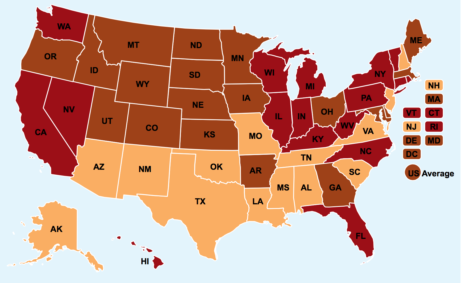
Despite the intent of its corporate promoters to relieve Americans from the apparent shackles of unequal taxation at the gas pump, the graphic unwittingly builds upon a deep distrust of national government even if it seems unconscious of what lies behind the very division that it seems so intent to track and promote in revealing the disparity of the gas tax. (The curtailed short-sightedness of the infographic appeals to the short-term self-interest of the consumer or driver and effaces the historicity of the latitudinal divide.)
14. Data visualizations recall the new discourse-functions such early printed maps claimed, and as “after-images” of the earlier divides they traced. But they also perpetuate them. The after-images we see in the “Gas-Tax Latitudinal Divide” are compelling since they refract the performance of inventing national cohesiveness in maps, and of picturing and re-inventing social unity, as much as frame a “hidden gas tax campaign” of which we have been largely unaware and which needs to be revealed. Even if the map distributed by Exxon-Mobil is intended to reveal the undue impositions of the federal state across the country, it reminds us of the continued fractures of political space maps sought to paper over in rendering a national collective in ways that would fulfill their role as crucial reference points in the performance of statehood. The “national inequalities” it illustrates might be placed within the longstanding resistance in this region to accepting federal presence, or seen as residual resistance to federal presence; but the mapping of resistance to further taxes at the pump are compelling because they suggest a intentionally disrupted performance of statehood. By recuperating the situated nature of the historical production of such images, we can start to challenge the aggressive rhetoric of objectivity they adopt and their short-sighted aims.
It might make more sense to read the context in which data maps work to create the country, rather than how they indicate or present a set of traits transmitted over time. But one cannot fail to be struck by how a split between northern and southern states arrestingly suggests an enduring dividing line of deep historical resonance, as if its cartographical signs could speak across time. The clear divide that the rejection of taxes on gasoline seems to map among state legislature south of the 37th parallel that creates such a strong Gasoline-Tax Divide echoes the line of southern secession in particularly haunting ways. It is striking that the past inhabits the very divides the map describes, as does our own cartographic consciousness of the rift between states created by this cartographical line of longitude that is so familiar. It is as if the unconscious of the mapmaker were rendered or emerged in the “Gas Tax” map, given the clarity with which the dataset reveals a divide that we, as viewers, immediately recognize and are as quickly conscious of it as being long suppressed: as much as offering a window or a mirror on the landscape they describe, recognition of that divide asks us to interpret its content, less by our position in relation to its space than analysts of its continuity with past landscapes, or of how map signs serve to configure our relation to the nation-state.
For all our usual attempts to historicize the map as a document, the distributions of space that reveal the after-image become oddly unmoored from their specific time as the patterns we detect seem so uncannily present: as if unhinged the historical context they were created, we innately recognize the “afterimage” preserved in them, as the scars that seem to be left by other traumatic spatial divides, triggering our own sense of cartographic consciousness of the space. The strong presence of such “after-images” resonate with the presence of the map and map-interpretation in our lives, and recapitulate a tradition where maps consciously came to terms with national divide–and came to occupy a distinctly new set of discourse function oddly repeated in the latitudinal divide of local levels of taxation on gasoline.
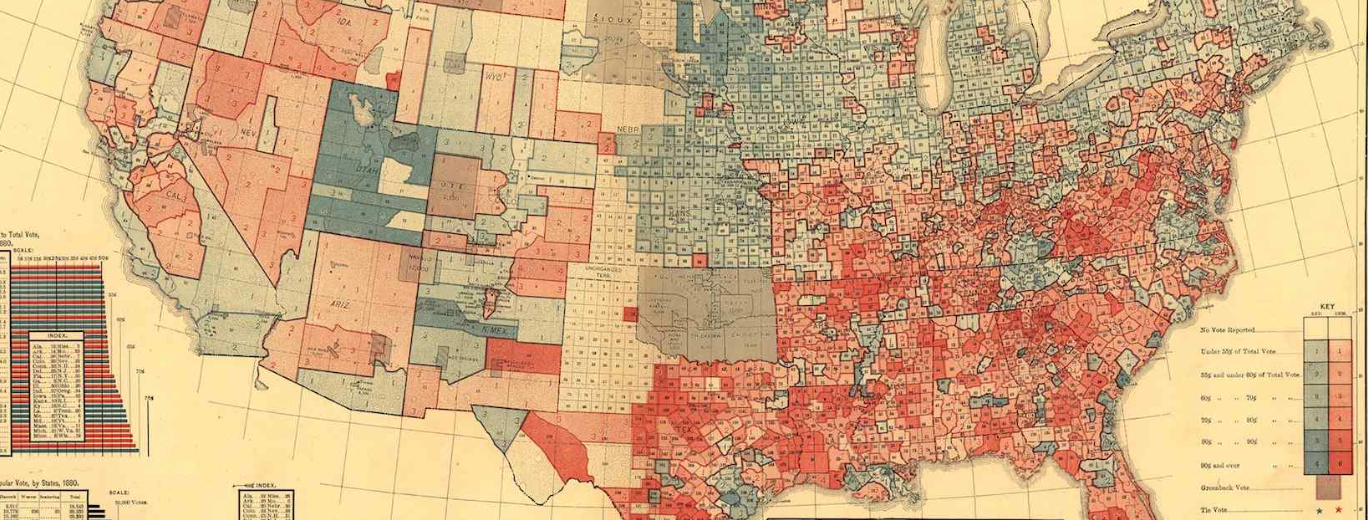
One might hence begin from re-examining the nature of the narratives about national unity that Gannett’s map raises–a question I return in a later post reflecting further on the map’s historical context and legacy–and the ways that maps refigure national identity. The specific political circumstances of Gannett’s map suggest that Gannett used the data available in tabulations of the popular vote at local levels to digest a far more sophisticated and refined picture of the national complexion of the country–or the political complexion of its regions–than the framework afforded by televised infographics that map the results of the elections back onto the country–as if that would reveal actual variations in voting habits, despite the narrow margins of so many elections that the same sort of data visualization so evidently obscures. If the projection of election results in the 1880 election that he labored to create, Gannett used great care to how the map was read by its readers, without a need to respond to insistent demands to provide a record of immediate results. Indeed, rather than suggest that his picture revealed a divide, the use of chromatic differentials in lithography allowed him to create something of a keen record of local variations, no doubt bearing out a keen interest to register the extent of an afterimage of secession in the map of the popular vote, quite unlike the short term visions of most electoral maps on the nightly news, which is only slightly tweaked in the work of political scientists. Because of this attentiveness, it might be beneficial to expand a more detailed reading of how Gannett’s map was sensitive to the persistence of an afterimage of the clear divide between northern and southern states.
The geographically polarized divide emerged in the division of states described in a county-by-county representation of the degree to which the popular vote leaned Democratic or Republican. Schulten powerfully presented Gannett’s early statistical map as the product of an early age of political partisanship, if not a founding moment of political divide, when the resistance to Reconstruction caused southern voters to attempt to reject the Republican platform, in ways that almost reflect a particularly salient latitudinal divide. Indeed, after the 1876 election had been decided by a committee, and apparently against the popular vote, despite widespread accusations of voting suppression, the statistical accuracy of the 1883 map published first in Scribner’s Statistical Atlas revealed how despite the deep carmine coloration of much of the South and indeed the national map, once translated to the electoral college, a difference of “just 7,000” votes which resulted in a “decisive” victory for Garfield–a margin that would hardly mend the national divide.
Library of Congress
The political division that it mapped as “Political History” barely concealed how the charge to manufacture an image of national unity. During the divided era of Reconstruction, as secretary of the US Census, Gannett approached the subject of national unity when he mapped the popular vote in the aftermath of the bitterly contested 1880 election.
The distribution of the vote revealed a predictably haunting cultural divide–as well as a preoccupying way to remap the nation. As a material artifact, Gannett’s map seems removed in time and political culture, but introduced–if in a reverse color scheme–the division between Blue States and Red States to communicate most readily the deeply contested election in a county-by-county rendering of the votes that political parties won. Gannett’s map reveals with considerable immediacy and precision the extent to which the division of slave-holding states adjudicated within the Missouri Compromise left something more than a bitter taste, but a scar, that continued into the aftermath of Reconstruction, hardly ended in the Great Compromise that concluded the election of 1875. The longitudinal parallel that came to define the dividing line of secession for southern states, as had the Missouri Compromise, effectively engraved a legal divide in a sovereign state that create two polities in uneasy balance with one another. The boundary generated a deep after-image in secession that haunted how Gannett considered national unity–both in the war and its aftermath, as mending the uneasy echo of blue versus red states. As much as seeking to “visualize the spatial dynamics of political power” in an icon of political polarization, it processed the legacy of southern secession by affirming the strong after-image, just twenty years secession had been advanced.
For all its similarities to computer-assisted data visualizations, Gannett’s map presents a divided landscape, if one whose color choice is reversed from the polarization by which we area accustomed to divide the country, that is less fractured than united. We’ve grown so accustomed to denote “red” and “blue” states as to naturalize specific political preferences–and even profess shock at a “blue state diaspora” which created purple states, and offset red states’ growth, or describe folks fleeing blue states as if their blueness would be inherited in a naturalized political topography. We naturalize the very coloration of an infographic as if it defined the nation’s political terrain. Gannett’s map not only echoes not only the line of southern secession, but how the first maps of the United States became tools to represent the failure of secession and triumph of union as they “perform[ed] the act of statehood,” in Wood’s terms.
By placing the divides it creates in a deeper historical context of finer grain, Gannett’s map began a genealogy of the data visualization, historian Schulten argued “invented Red and Blue states” as a graphically efficient and persuasive way to process each party’s different levels of support. The antagonistic opposition evident in the popular vote of the 1880 election also recorded a searing and long-lasting national divide whose memory, when scars of blood spilled on the battlefield not far receded, rooted in rejecting an overly intrusive federal presence south of the latitudinal divide–and the centrality that the issue of Reconstruction occupied in Republican platforms in that year. Schulten justly acknowledged how the map offered a new way to understand national divides, by using increased levels of cartographical literacy in the late nineteenth century to create an effective graphic register of national political divides during Reconstruction.


Ferguson, MO, not Fergusson, MI. Thanks.
That was an embarrassing error–sorry for not carefully proofreading.