Java La Grande

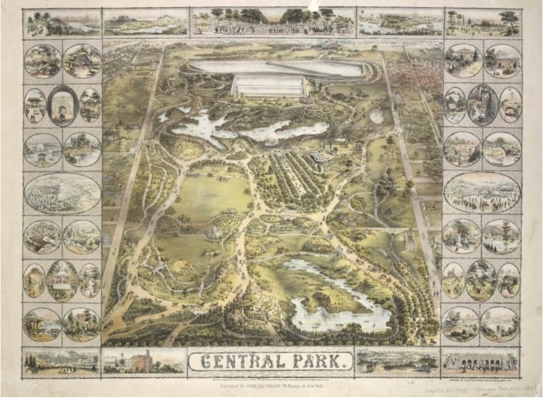
The map “Java La Grande,” an imagined continent that invited close inspection from viewers, gives new meaning to the assertion that the map is the territory.  For although this territory never existed, it was mapped: the medieval construction of the antipodes, a mode to balance the continents, was an artifact of early modern European cartography of considerable duration and lasting power.  When Matteo Ricci mapped the world’s regions in 1607 for his Chinese hosts, his copy of the Ortelian map included a large discussion of “Guinea” as a place not studied or known well by Europeans, and perhaps an independent island or attached to the southern pole–albeit one that was not known to be inhabited, and with which little if any contact had been made.  In this sense, Guinea remained an outlier in the age of discoveries, and a somewhat rare blank spot on Ricci’s global map.


Ricci SE Asia.png


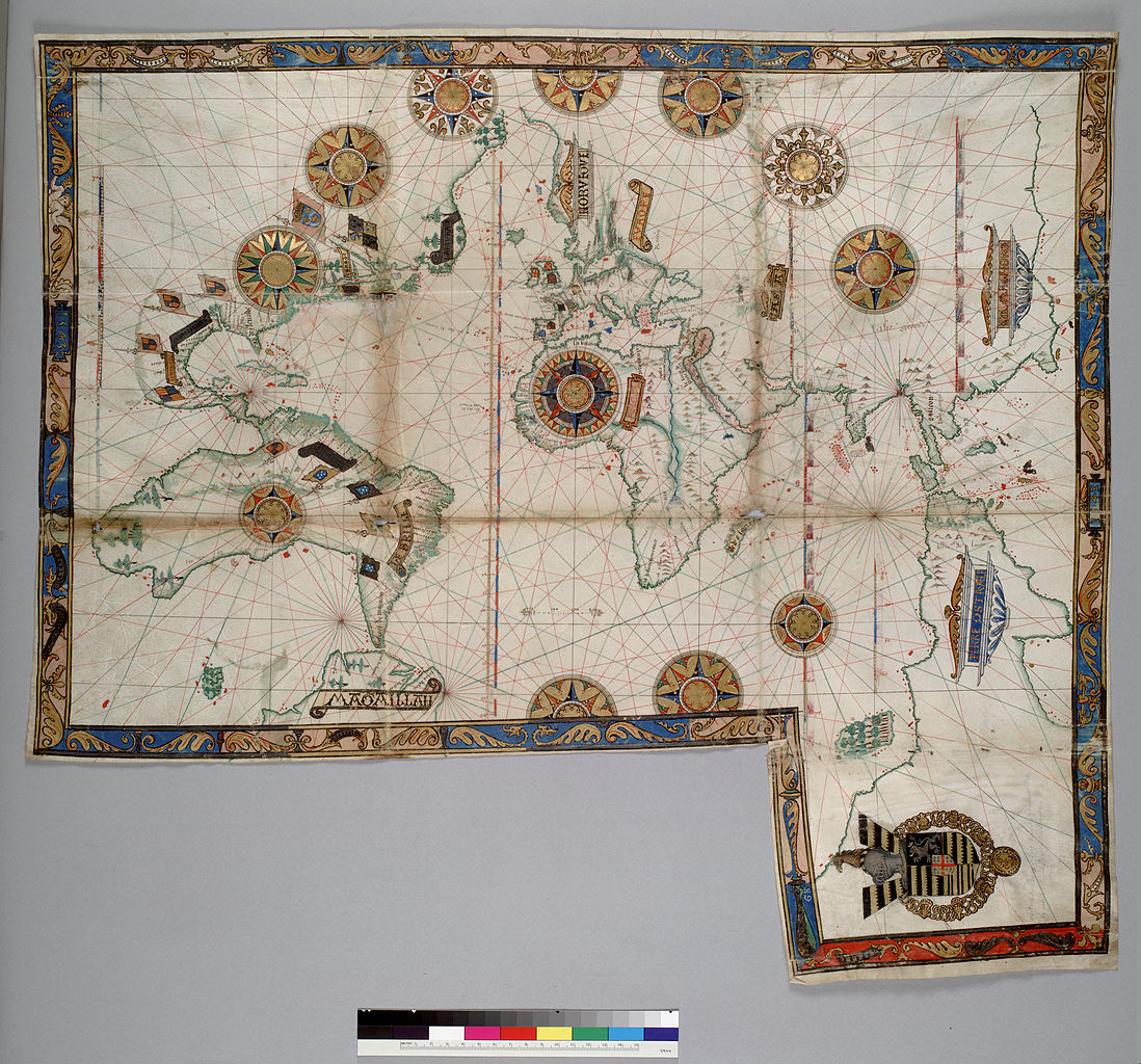
As an artifact with an esteemed cartographical lineage, the image of the continental landmass continued to be mapped into existence by the mid-nineteenth century.  But its appearance in the below chromolithograph of a Renaissance map from the library of baronet Sir Thomas Philips was declared the first map ever recorded of nothing less than the very continent of Australia, as ostensibly witnessed by the Portuguese sailors in the pristine state of nature in which they had allegedly first discovered it.  The map was prized as an image of initial discovery.


1280px-Australia_first_map


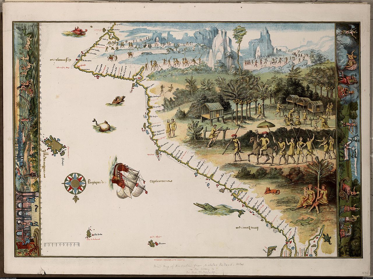
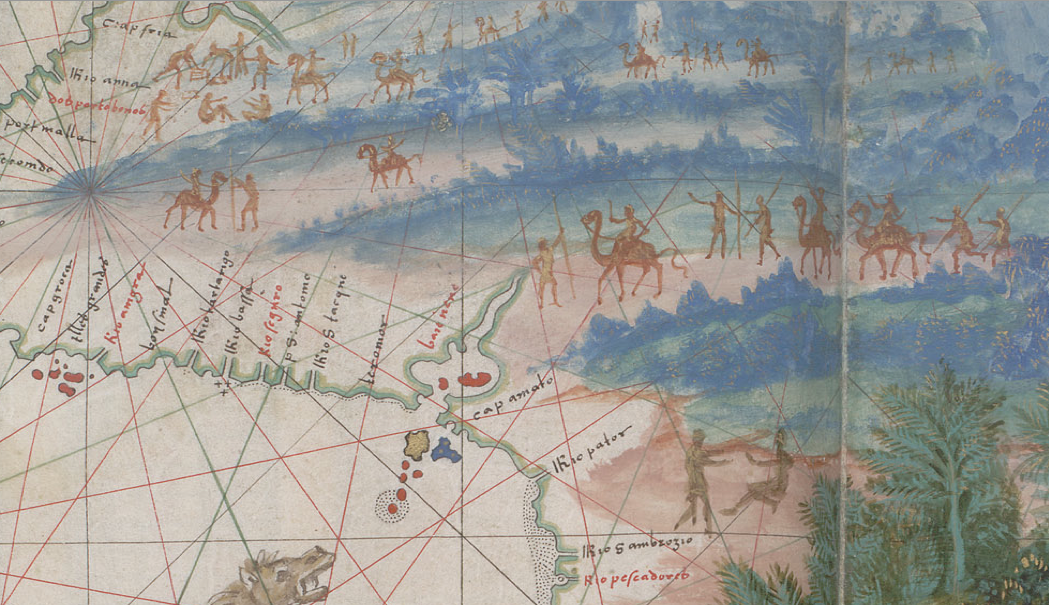
The anonymous artist-cartographer recorded the recession of space in this map, which as it recedes its inhabitants are registered in brownish tracery, foregrounded the idyllic life of this entirely unknown land.  You get the idea of arriving in a region taken as Australia that was the entrance to a landscape of untold wonders in the map of “Java La Grande” designed for Nicolas Vallard’s nautical atlas of 1547 in Dieppe, a center for the diffusion of Portuguese nautical charts for an elite audience of European nobility, reproduced in this 1856 facsimile now stored among the jewels of the Australian National Library.

The pictorial landscape chart was a luxury embellishment of the sorts of rutters that were drawn with artists of local topography.  The material object was prized and promoted by Phillips as a record of the first encounter with the territory of Australia, reproduced with such painstaking care in the mid-nineteenth century  as a chromolithograph from the first baronet’s library when he tried to disperse the Vallard atlas and other early modern books to the British Library, inspiring the reproduction of the map, which he mis-titled “The First Map of Australia,” to promote the value of his collection   The map made for the Vallard atlas by an unknown painter was probably valued because it seems to record an image of Portuguese encounter with the indigenous inhabitants of Australia.  As part of the corpus of Dieppe charts that were, unlike earlier nautical maps, pictorial syntheses Portuguese discoveries of almost ethnographic qualitative richness as depictions of inhabitants for elite audiences, the image has provided a touchstone of a vanished native culture that is particularly powerful as an imagined precursor of the discovery of Australia, valued as an image of imagined contact.  The Vallard map possesses the distinctively attractive qualitative lushness peculiar even to the Dieppe school of which it forms part.

The identification of Australia with the mythical “Java La Grande” is not entirely rooted in geographic fancy.  Java La Grande was described by Marco Polo as the largest island in the world–but reflected some recognition of this unknown landmass that extended to Antarctica, and recurs in the Dieppe maps as a cosmographical idée fixe as not an island, but terra firma:  at the same time as the current-Java was described by geographers of the 1540s, the Dieppe school identified La Grande Jave as an extension of the Antarctic Terra Australis, and it was taken as an early evidence of the southern continent’s early discovery.

The map became taken as the territory.  And so why not preserve this map as a treasure of the collections of the Australian National Library, even if it is a nineteenth-century copy–and quite a faithful one–of a map that represented quite a different imagined land?


350px-Australia_first_map

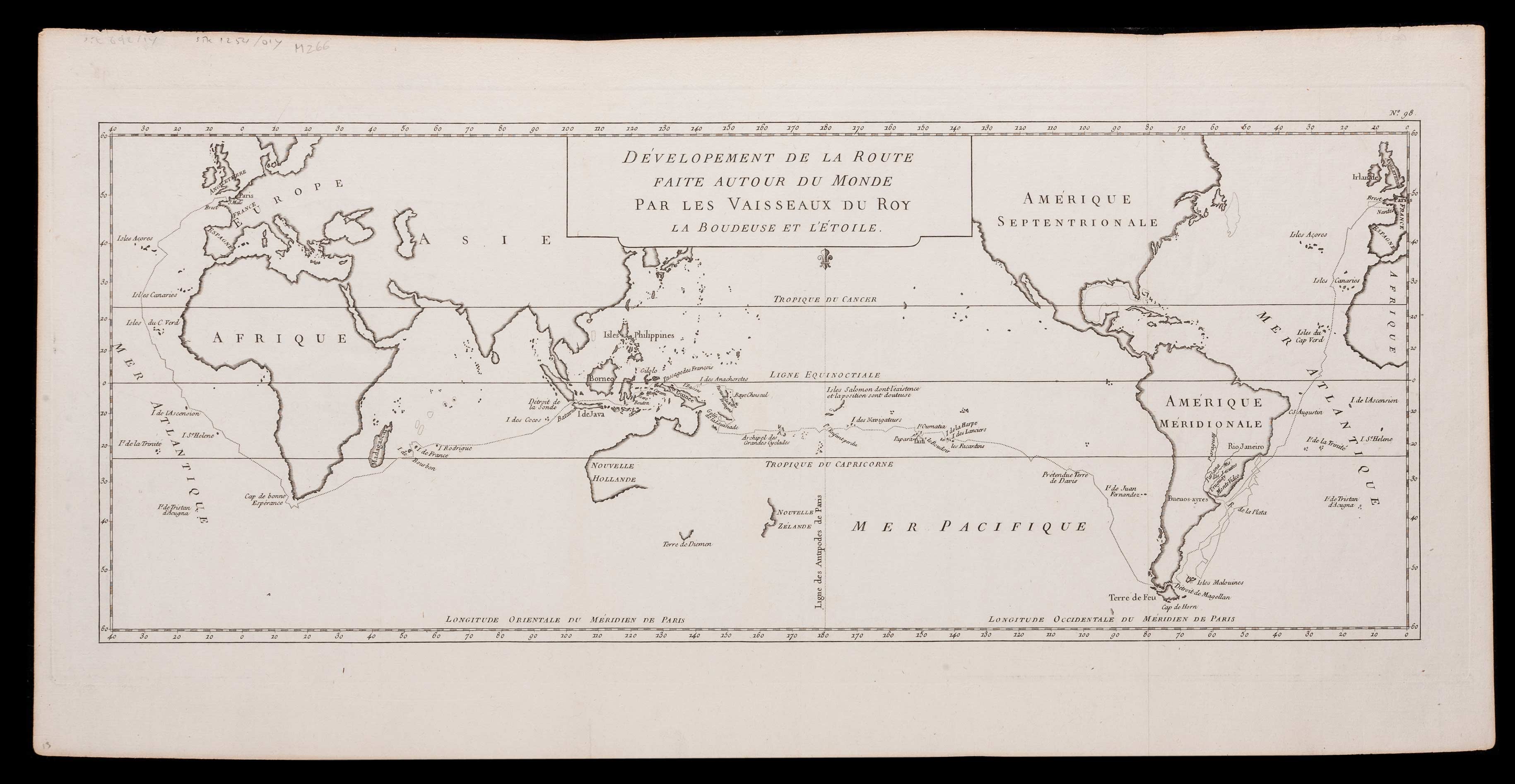
Early identified as the first map made of the continent, this map provided a list of coastal ports that an artist proceeded to fill in with imagined views of inhabitants advancing as if to greet newly arriving visitors with arms literally open in welcoming signs, if not in a ritual procession.  The intensity of play of imagination is evident in contrast to a later 1777 nautical map showing two ships’ circumnavigation of the world under the command of Antoine de Bougainville, whose cartographer constrained himself to parts of the Eastern coast observed with sufficient detail to establish for readers, allowing far more local detail to the as yet unsettled continent, and confined himself to the better-known shorelines of its coast:

CBA-2030-full


Yet what was later prized as the “first map of Australia” is  distinct from a roughly contemporary 1543 chart by Guillaume Brouscon of the same school in Dieppe, who synthesized information from prized Portuguese charts to a new audience of landlocked European nobles.  This earlier map devoted a considerable space to “Java La Grande,”  extending the rectangular format of the engraved global projections later standardized after their printing by Mercator and Ortelius, if already adopted by humanist geographers, and offering far more detailed depictions of the settled interior than nautical charts that confine themselves to coastal towns.  The almost ornamental multiplication of compass roses that proliferate like heraldic crests on this map suggest its ornamental nature in a corpus of maps.

A fair amount of extension of the topos of cartographical invention or the mediation of new discoveries that animated these excited atlases of the late 1540s in Dieppe are reflected the map of Java le Grand among the 56 maps that the nautical sailor and self-styled cosmographer Guillaume le Testu included in his Comosgraphie Universelle, selon les Navigateurs, tant anciens que modernes.  The work’s comprehensive claims derived from its use of a range of Spanish and Portuguese charts together with maps of his own design that synthesized recent maps of the Americas:


481px-Le_Testu_GRANDE_JAVE


He readily presented this map as rife with cartographical invention, as well as following cartographical conventions, as if suggesting the frequent embellishment of persuasive or recognizable detail in maps, more than the license his own achievements in mapping much of the Americas may have merited:  “what I have marked and depicted is only by imagination, and I have not noted or remarked on any of the commodities or incommodities of the place, nor its mountains, rivers or other things; for there has never yet been any man who has made a certain discovery of it.”  The absence of “certain discovery” is an odd juxtaposition with his own discoveries, and the admission of the absence of such “certain discovery ” led to a land that was entitled to be created by the imagination.

The imagined land’s expanse was documented as well in nautical maps limited to shorelines, offering far less qualitative local details than the expanse of its coast, but suggesting in an enticing fashion its expanse, and multiplying elegant compass-roses as if for an excuse to include more gold leaf, as a sophisticated ornamental boundary of decorative motifs:


1098px-Guillaume_Brouscon._World_chart,_which_includes_America_and_a_large_Terra_Java_(Australia)._HM_46._PORTOLAN_ATLAS_and_NAUTICAL_ALMANAC._France,_1543

These abundant cartographical imagery suggested the fascination of imagining how space extended far beyond a situated eye, and a sort of key to processing the extent of that dramatically expanded spatial expanse of the inhabited world.  But for Brouscon, as for le Testu, Java was both a continent of sorts, that extended to the pole, and needed to be accommodated by an extra flap of paper to be contained, but an uninhabited or at least unknown place in the “Terra Austral,” jutting up to Indonesia to reflect geographic tradition and, perhaps, to balance the landmasses distributed elsewhere on the chart:
Java in Brouscon's Map
The addition of far greater detail and qualitative content in the Vallard map developed the notion of the materiality of the map in the Dieppe school.  If we are struck most by its interior, the coastline of Java in the Vallard map suggest a detailed attentiveness to local toponymy, derived from Portuguese sources, of more specific scope, despite the lush detail of its interior, and a playful alteration of inks of different colors to add variety to its form:
java's Coastlines
The considerable local detail depicting something like the discovery of a pre-Adamic life is something of a counterpart to that expansion of the inhabited expanse in early world maps:   the clothes of its inhabitants, cast in somewhat neo-Orientalist garb as following their red-turbaned leader to greet arriving men, are paired with curious dwellings, customs, and styles of work, as well as a uniquely local bestiary and vegetation, as   well as different customs of social life: two figures on the left of this scene almost seem foreign observers, describing what they see:
Dancing Inhabitants.Vaillard


The narwhale rising from the waters just off the coast, shown without regard for the scale of islands or inlets on the coast, paired with a resting bobcat or lynx.  This image of the Eastern coast of Australia is only slightly embellished from Vallard’s original.

It’s been recently suggested that the inventive maps of the Dieppe school fabricated the entire continent out of geographic legends to evoke a potential land for colonization by the French monarch, as in this earlier 1566 Desliens world-map.  Indeed, these deluxe manuscripts reflect the broader interest of the materializing of wealth on the map, and, on the surface, seem to cast Java La Grande as something of the potential equivalent of what the Spaniards found in the Americas.


Nicolas_Desliens_ World Map 1566) with Java


The notion of this fabrication of continent seems absurd, but had confirmation in geographic theory.  Java La Grande is projected as a land of potential conquest and wealth, and is a survival of medieval written geographies that was transposed to a recognizably modern cartographical form, if it antedated the imagined expansive island of Taprobana, identified with Madagascar but often shown as a land of wealth, and in ways moved this target of European interest further East toward the Spice Islands and Indonesia.

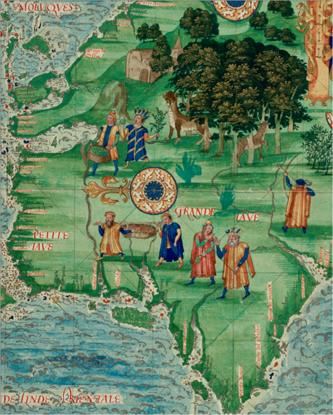
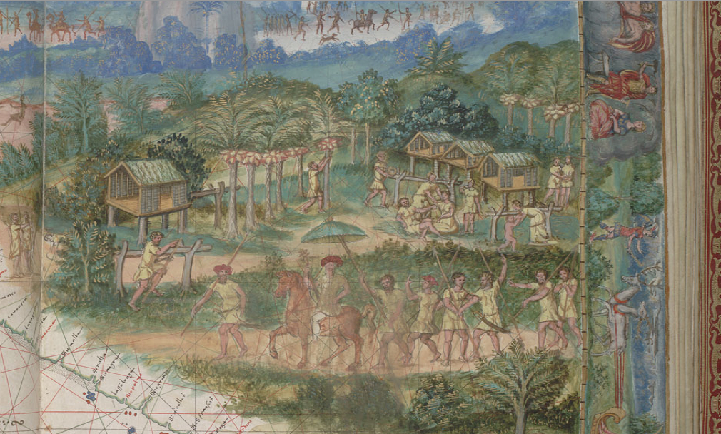
The exquisitely tangible nature of the contents of the Vallard map may give some confirmation to its invention.  The upper register of this first image of the original Vallard atlas, now in the Huntington library, showed the region’s aboriginal inhabitants in a monochrome hues of striking similarity to a cave-painting as proud hunters bearing spears:


Dieppe atlas origianl


The image now held in Canberra is a striking copy of this image of the inhabitants of Java le Grande, which featured its  inhabitants in a procession across the newly mapped land:


horseback procession in Java on horseback


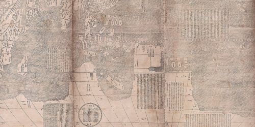
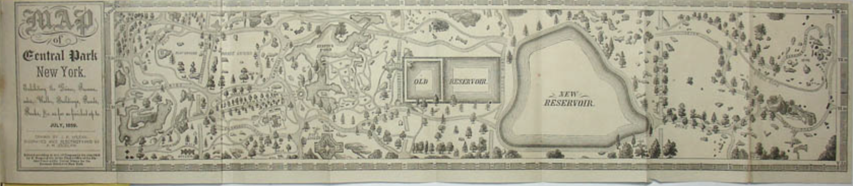
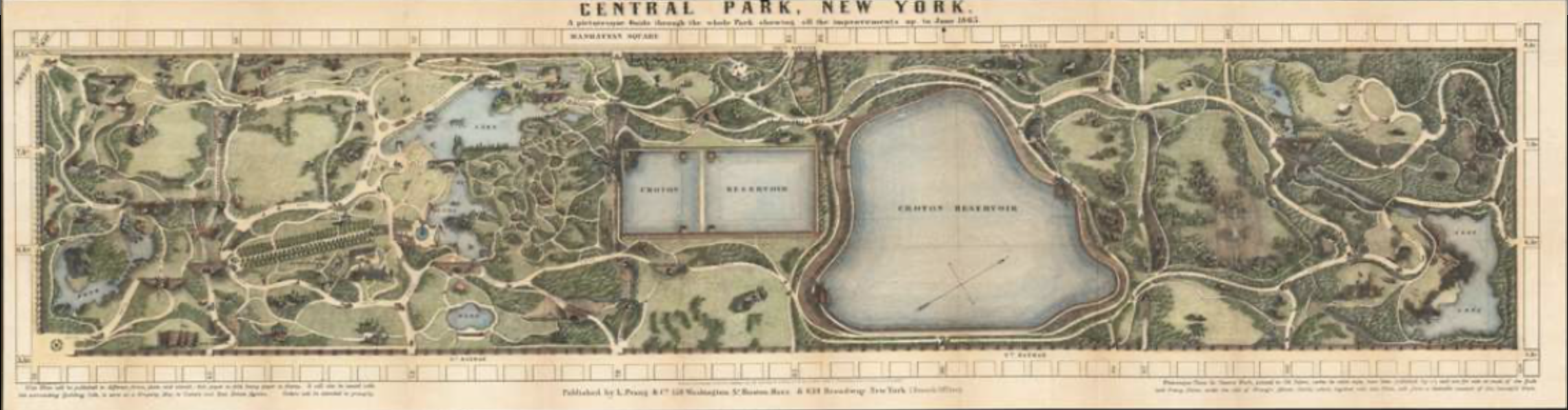
The placement of  initial folio perhaps as it was the most pressing communication of cartographical news–pays particular attention to the forms of habitation in Java, and the houses in which the inhabitants live and the palm-nuts on which they live:  as if to embody the information displayed in disembodied form in later world map projections:  in the years before Mercator’s Theatrum orbis terrarum, nautical charts concretized viewers’ material relation to spatial particularity.


First map Vallard atlas


The map offers something like a luxurious window into the newly discovered land for viewers to contemplate in ways that simple terrestrial projections did not allow.

The imagined continent of luxury and untold riches, filled with nutmeg and cloves as well as “idolatrous inhabitants,” made its way onto the globe by 1583, if somewhat assimilated to Antarctica:


Globe_terrestre_de_Jacques_Vau_de_Claye_(1583)


This might explain the staying power of nautical charts, based on observational practices of sailors and possessing a clearer pedigree as transcriptions of space, into the seventeenth century.  At the same time as material goods were arriving in Europe from west Africa and southeast Asia, maps provided something of a spatial catalogue to understand their arrival and place them somewhere in a lived topography, as much as they offered tools of orientation.  Java La Grande was attractive as something of an evidence of the inhabitation of a region later identified with Australia, before the arrival of Captain Cook, in ways that depicted the inhabitants that occupied its expanse in something of a romantic light.


Add. 7085, f. 1

4 Comments

Filed under Australia, Java La Grande, La Grande Jave, Nautical Charts, rutters

Mapping a World We Have Lost

Our way of moving through space determine the nature of our maps, and in a globalized world, it is both focussing and challenging to think about old ways of occupying and moving through or across space.  This map by a Venetian (Istrian) admiral who designed nautical charts, Pietro Coppo, incorporated the popular genre of “island books” to suggest the infinite number of places that one could visit by ship on the edges of the world–and the unknown continent of the Americas peek out from one edge–and the range of Mediterranean and west African ports to be reached by sea.

Coppo World Map

The nautical chart reveals a sense of the motion across waters to new lands, but I want to focus on how railway maps reveal the accessibility of space because they suggest a world we have lost in which the accessibility of space and routes of travel are rendered like a public good, even if for commercial ends.

Railways defined, in ways that highways later came to do, a new sense of national space like “the Highway of Nations,” because they graphically charted–much in the manner that this 1869 map of the transcontinental line from New York to San Francisco, a new way of moving through space.


map-c1869-transcon-1


The single thread of a line that reaches across the continent, names of stops stacked perpendicularly to its course, much as the names of ports in the nautical chart, the railroad’s path provides a metric by which terrestrial expanse was traversed.

The map charts a model for moving across an almost unknown expanse for rail-travelers, past an area defined only by a loosely understood hydrographic web.  It was, to be sure, replaced by the highway maps that provide individualized modes of transcontinental travel focussed on one destination.


800px-LH-Map-75

Almost a hundred years after the engraving of the Union Pacific Railroad as a network that linked the nation, and just before the issuance of the infamous 1961 “Beeching Report” addressed “The Reshaping of British Railways” by setting out to prune the branch and secondary lines that received limited traffic in Britain’s national rail system, there existed a network of timetabled traffic linked an astounding number of cities and towns to provide access across the nation’s expanse:


BR1961c

The cartographer’s pride of this map seems evident and on display, and it depicts an extent of lain railroad track unthinkable in the infrastructure of the twenty-first century.  Take, for example, the detail of the network of communications created between Aberdeen, Edinburgh, and Glasgow, before decimation by the folks who tried to tabulate the economics of rail use in terms of passenger-use per ride:

Glasgow, Edinburgh, Aberdeen

If Coppo’s world map offers a somewhat quaint rendering of the Americas that peek into one edge of a cosmos reminiscent of a medieval view of infinite islands ringing an habitable world, the railway map is a map of spatial access for all as remote, in those days before the denationalization of transport.

2 Comments

Filed under Beeching Report, British Railways, isolari, Pietro Coppo, Union Pacific Railroad

Infographics in America

If the nineteenth century America has been often described as an era of geographic integration, perhaps no one more than the ambitious statistician Francis Amasa Walker created a new way of seeing the nation that foregrounded both the local differences that continued to divide the nation, but staked out the challenges for integration that the country faced in geographical terms.  His extremely influential 1874 Statistical Atlas, based on the unprecedented 1870 US Census that he directly supervised and made the case before Congress about the undeniable need for funding, whose maps created an image of the challenges of national unity that remained in the republic in the wake of the Civil War in which he had fought:  the Statistical Atlas extends the enterprise of the expanded Census, validating how statistics present a synoptic picture of the political economy–illustrating relations of the local to the polity across continuous United States as if processing part of a mental effort of consolidation.

Even before the unprecedentedly bitter electoral divide of 1876, Walker advanced maps as providing a new way to embody the polity through the visual records derived from statistical aggregates.  Although Walker’s subsequent tabulation of the data on immigrants in the late nineteenth century led him to fear their arrival as threatening the nation’s productivity, based on his perception of the depth of racial differences to the national polity, and encouraged others to do so, he advanced the embodiment of statistics in geographic maps, in ways no doubt influenced by his close collaboration with his father, the economist Amasa Walker.  In ways that prepared a basis for his use of maps to express the contested electoral results of 1876, Walker treated maps as coherent statements about the nation’s divides otherwise not able to be articulated, as a basis to start debate about the well-being of its political economy.  (His maps were so convincing, indeed, in framing a question of geographical organization, that they may have encouraged a narrative of continental integration only recently challenged by investigations into local and regional geographies.)


Walker's Image of the Nation's PopulationMapping Population Density in the US, 1870 (Francis Amasa Walker)


Susan Schulten has recently advanced the quite compelling argument that Walker’s innovations constituted gave the “invention of the infographic” distinctly American roots.  Her argument spoke appositely to the almost obsessive return in recent elections to infographics that suggested the likely tendencies of voters, and indeed often reframed a narrative of division into “red” and “blue” states–and even designated some “purple”–in ways that revealed an undeniable undercurrent that verged on obsession of questions of national unity and division that were of the very sort that Walker had similarly sought to address when he undertook the reformation of the decennial Census in 1869 at an amazingly young age of twenty-nine–no doubt with insight as to the ability to advance and illustrate the distinct distribution of space that the nation occupied.

Even as a staggering proliferation of maps of electoral zones flooded airwaves, newswires and web during the 2012 election, Schulten traced the invention of the American infographic to the innovative visualizations of data and government statics by an enterprising statistical mapper who after working to organize the 1870 Census, not only drew up a comprehensive reform of the census but treated its findings to create a “statistical survey” that came to  embody the nation’s political and economic unity.  While earlier Censuses were strikingly unscientific, Walker advanced issues of political economy in maps as an extension of his expansion of the decennial census, organizing the tabulation of population, agriculture, mortality and manufacturing data on 39 million Americans, and placing prime importance on geographically orienting statistics as tools to better visualize the nature of social and economic divisions after the Civil War in which he had fought and been grievously injured.

Walker’s maps framed the issue of integration in legible fashion–and produced them to allow the fate of the nation’s unity and division to be processed for a wider audience than would have otherwise confronted them–they did so since they readily processed statistics that went far beyond physical phenomena to chart the racial composite by which the national economy could be understood, moving beyond existing models of its physical geology–which he also included in the Statistical Atlas

walker-map-geologyPrinceton University (from Statistical Atlas, 1874)

–to attempts to embody the composition of its human inhabitants whose aggregates were earlier not clearly understood, in what was indeed the first public census to count African Americans who were former slaves as part of the nation’s fabric.

Colored in Aggregate

Colored Populations in the United States (1874) (Courtesy of Princeton University Library)

Walker’s advocacy of such choreographic statistical maps as snapshots of the political economy led to an invitation to join the editorial board of the New York Times–which he declined, probably since he continued publishing in competitors from Scribners’ Monthly to Harpers’ New Monthly, emerging as a public intellectual of originally progressive bent.  For Walker had convinced the US Congress to adopt a variety of projects that used recent lithographic techniques and statistical correlations to use the results of the 1870 US Census map an coherently compelling image of the nation’s situation for public debate.  If all maps reflect both the character and competency of their makers, Walker’s maps reflect the excitement and tenacity of mining data from the Ninth US Census of 1870 that he had compiled with congressional authority, compiling, correlating, and refining the image of the distribution of wealth, illness, and health to a degree that had not ever been earlier achieved.

He engaged in mapmaking in print as a form of public discourse that elevated the statistical map as a tool for envisioning the nation as an aggregate.  Walker’s early involvement with late nineteenth-century newspapers like the Springfield Republican Newspaper as well, from the late 1860s, at the Atlantic Monthly, in fact no doubt encouraged his trust in the power of such organs of public debate–and the power of printed supplements based on the US Census, several of which he published for Harpers’ New Monthly, as well as in Scribner’s Monthly, The Century and North American Quarterly, in ways that no doubt led to his conviction in the infographic as a way to shape public debate on political economy, population density, home servitude, and the working classes.  Walker’s position as Chief of the Bureau of Statistics and Taxes may have helped him use his position as Superintendent of the fifth US Census at just twenty-nine to present the project of the first Statistical Atlas of the country, a project which he expanded in the 1880 Census, whose unprecedented twenty-two volumes collected an even greater range of information than ever previously collated and greatly refined the unscientific nature of previous decennial censuses.

Francis Amasa Walker saw the U.S. Census not only as a way to view populations of states, but to expand the vision of and the likeness of the nation by the more arduous measure of density per square mile, and to then use that image to chart the distribution of the national population as a demographic tool.  He worked with the census to conceive of the map as a measure for mapping complementary sets of data, by mapping relations between density and select quantifiable variables, mapping population density against wealth distribution, literacy, childbirth rates and disease–but not voting preference–in maps that created a legible record of the country, whose public good he convinced the US Congress to fund Atlases in 1872 and 1873.  By transferring statistical observations into a detailed picture of the nation, he began from a base layer of the contours by which its population was distributed, without focussing on jurisdictional bounds, in ways that effectively augmented the independent authority of maps as media of sociological investigation and public communication to an extent that had never before been the case, but established a central place for detailed choropleths in the American Grain.

Walker's Image of the Nation's Population

The maps are stunning choropleths that exploit lithographic techniques to picture the national population in great detail.  Walker started from the initial map of density, using the census of 1870, of which he was superintendent at the age of 29, and whose possibility for converting into cartographical form he seems to have readily perceived.  The plans led to the publication in 1874 of the Census’ data, in an initial atlas that totaled just fifty-six pages, each map of which has a degree of detail never seen as a visual embodiment of the nation, but emphasized its distribution of population and industry to an extent never realized–and, at least among its readership, posited questions of national coherence that concretize concerns for the country’s political economy:

Mapping Density in US

Density of Population in 1870–including African-Americans as well as Whites

For the first time, they also offer a mode to integrate African-American former slaves within a national economy, and posit a detailed, comprehensive and analytic image of population density across the north and south that suggest the value not only of statistics but of imaging the nation and its divisions in a decennial census.  The embodiment of issues formed as Assistant Secretary of the Treasury placed issues of political economy before the eyes of their readers in especially effective ways.
The fine grain of variations provided a new way to look at the nation, as the compelling lithographic choropleths of Alexander Bache, by using line-engraving to chart the population rather than topography as their concern, or coastlines or hydrography, than the shifts that the 1870 census revealed.  If riverine paths were noted, the South looked distinct when one saw the vast “gaps” or absences of population in much of the rural areas of Kentucky, Tennessee, and Georgia, and indeed the concentration of the population most entirely along rivers where agricultural trade grew.
Population Distribution chloropleth
The image of population density dramatically grew in Ohio, Indiana, and Illinois, in ways that charted the new image of the nation, and must have posed questions of how  population density mapped onto the distribution of wealth, or, an extension of it, childbirth rates, in order to refine and better understand the picture of national population it put forth.
Virginia to Georgia Chloropleth

Things got more complicated and more exciting when Walker mapped the distribution of wealth among these densities of population, in ways that helped reveal the uneven distribution of incomes across the post-war nation, and revealed a conspicuous ongoing divide between northern and southern states that related to industry but also to the extreme impoverishment of much of the population in the southern states that would continue to be a contradiction and difficult conundrum in the nation:

Mapping the Distribution of Wealth

The sort of graduated shaded in maps that Walker created provided something of a counter-map to the symbolic uses of mapping as a way to envision national unity, and pinpointed questions of the intractable nature of differentials of wealth.  If pockets of wealth extended deep West into Iowa and Kansas, and lit up Illinois, Ohio, and Pennsylvania in deep auburn hues, the Mason Dixon line was a divide in how wealth was distributed whose light ochre and pockets of white were rarely interrupted by redoubts of wealth, almost entirely along the coast or select segments of the Mississippi River.  His maps adopted the recent precision of mapping population density against its distribution that had been pioneered by Alexander Bache’s compelling visualization of the records of the 1860 Census with the German emmigre engraver Edwin Hergesheimer

The detailed cross-tabulation of population and wealth seems a bit of an odd ancestor of the modern infographic, although their kinship is clearly recognized.  For the image of Walker demanded the sort of detailed attention as a picture of the nation to which the compacting of information or metadata in the range of infographics generated by GIS programs rarely provide.  If Walker anticipated GIS in a fashion, the rapidity of generating the infographic that synthesized metadata with amazing facility and rapidity rarely demands the sort of attention that Walker’s images command.  In part, the lithographic medium habituated viewers to the parsing of refined distinctions in the economic landscape that variations of shading revealed:  the starkest of our blue/red maps with some pink or light blue question marks are removed from the fine-toothed sort of distinctions drawn in the census, or from a similar statistical subtlety.

But the proliferation of the infographic so readily produced and tabulated provides less of a reference tool than an attempt to hold onto the permanence of a snapshot provides within the rapidly shifting and changing landscape that often seems adrift in the electoral sea.  The questions that Walker asked–distribution of wealth, literacy, disease rates–are rarely raised in the infographics we see most frequently, even excepting Fox News’ proclivity for the infographics that perpetuate stark divisions.  The ‘mediazation’ of the modern infographic as a labor saving device not for observers, but whose construction demanded a more limited investment of detailed attention, has created a new assembly-line production of images of limited refinement, whose authority rests on their mapping substrates, rather than on the measurements they mediate and encode.

The limited subtlety of the infographic suggests not only their ideological points, but a shift in what might be called, with the late Michael Baxandall, a “period eye” to express the tastes of interpreting images from media to the viewing map–the habitual practices by which we look to maps in an age of the rapid-fire production of new infographics each day for broad consumption and, also, ratings appeal–or how infographics snappily  process an argument in a bottom-line nature, rather than approach the social topography whose complexities we’d maybe rather not want to detect or explore at close range:

Affordable-Care-Act-1-C5918

Most items that bear the name of infographics might not be data visualizations, or even use the map as a tool to construct the meaning of its contents, since the map is so often and so readily abstracted from the territory. Maybe a map might even suggest what we might want to keep distance from, rather than to consider up-close:

Top Party Schools

These pilfered objects are a bit extreme, but their divorce from any sense of geographic meaning is somehow telling.  Sure, these are something like visual jokes, but they make the point I want to make about the liabilities and deceptiveness that the using maps to organize contemporary infographics reveal that adopt maps to bolster their suasive abilities as much as frame a problem.  The mock-maps–the second based on an episode of Ira Glass’s “This American Life” by E. J. Fox, from a series he titles “This American Infographic”– illustrate the problem of the need that cartographical infographics fill, of both adopting the authority of the map (without containing much geographic information) and of using it to display the ready access to metadata that most images of GPS presume–or, in the most banal but most common case, the weather maps on the Weather Channel–and that most folks expect.  Data-mining becomes replaced by graphic design tools imported from the world of advertising, and the maps are a blunt instrument to make blunt arguments, or present an image of the status quo:  the big parties happen at big state universities.

Maps are especially powerful tools to process information for viewers.   Some less ridiculous examples of infographics reveal some surprisingly similar attempts at using mapping forms or mapping syntax to preserve an illusion of omniscience and often to illuminate or make a comment about national unity.  But they also often use maps in ways that, unlike the maps  derived from government censuses that Walker examined with considerable care to demographic variables, conceals an absence of  analytically meaningful argument.  They treat the map as a form of metadata that reduces analytic specificity–from a map of the “battleground states” that effectively uses a format of mapping in order to suggest either the limited support for the Democratic party in the nation (by using a shade of yellow closer to red than blue) or indicate the deeply flawed nature of the democratic process to their viewers.

Recall the sort of maps that were all the rage when Schulten described Walker’s innovative practice, if you can bear it.  Rather than resting on numeracy or the tabulation of relative measures of difference by a statistical model, the map foregrounds the indeterminate nature of places where polling was within a margin of error, rooted less in mathematical literacy but in pollsters’ relative ability of prediction.  The mediazation of the map is removed from a mathematics of mapping or an expectation of refinement, for it is almost more of a symbolization of a politics of stasis or an electoral divide:

photo

The greater refinement of other maps that shaded “tending towards” in lighter colors foregrounded the unpredictable nature of voters’ preferences, more than the composition of the electorate, as they seem to table the question of national coherence or cohesiveness as a whole other issue.

2012-swing-state-map

In each of these admittedly varied cases, mapping indicates an aura of accuracy or invests a sense of stability in the face of indeterminate data.  The map is a totem by virtue of its processing of information from varied diverse sources, but the map blunts potentially far more precise tools that seem to divide the polity and focusses on electoral results.   The questions of numeracy that divide the nation are less based in a tabulation of data or statistical familiarity; the block-hues of states mute meaning analysis.

Blocks of red in the map seem possible of being emptied of geographic meaning.  One famous FOX infographic purported to identify a strategy for Republican victory, but undermined the very legitimacy of this potential scenario for the attentive few by mislabeling the states it purported to count with accuracy–as well as deceptively reinterpreting polling trends:

%22Western Path%22

The absence of an expectation of reading measurements beyond numerical addition are evident in a map more reminiscent of the refined criteria of a jigsaw puzzle than in puzzling questions of national unity or ideological difference:

electoral colors map

In part, ideological differences are just not that pronounced, and the maps are oriented to processing polling numbers that were changing like a stock-market ticker-tape, rather than providing a firm basis for a national portrait.  But the father of the infographic would most certainly not be pleased.  The adoption and diffusion of mapping forms in infographics provide metadata constructions perhaps most significant for how they quash related questions or discussions, by ordering a massive amount of data whose impression of preponderance is more likely to take away one’s breath than pose a question, and is almost always likely to conceal an argument.

To some extent, of course, the new elevation of infographics is the creation of the new media economy.  There’s an odd dynamic of devaluing of the analytic power of the map at the same time as elevating its explanatory power.  The map, in an age of reduced news content, seems to substitute for the strength of an analytic news story, as a GPS program produces a snappy infographic that seems both content-heavy and a pleasing amuse-bouche.  The need to process different news sources or on-the-ground informants might be both excused and avoided, where we can come up with a symbolic rendering of what happened, even if we don’t need to look so closely at what its causes or its actual ramifications were.  The absence of analytics in the infographic–which presents, as with the weather, the state of things as they are as an actuality that does not need further analysis or attention to local variation–is perhaps its most pernicious feature as a medium.  They stand at a remove from the maps that the great nineteenth century statistical geographer Francis A. Walker so valuably labored to design.

We develop infographics such as the following by crunching some obtainable numbers–in an image that unsurprisingly perhaps uses the residue of a weather map as its base–to tell a story that collapses multiple different narratives into a single set of information that the viewer can quickly process.  The iconic map that was diffused after the last election was less about fault lines or divisions in the nation, than a cartogram of the new image of alliances in the nation, where the entire midwest stood as a block of blue with the Western states:

Final_2008_electoral_cartogram

That is not to say that infographics can tell a subtler story of similarly chorographic proportions, to describe the image of unemployment in 2003, for example in the country:

choropleth of unemployment in US 2003

But at what cost?  Choropleths such as the below seem to remove individual experience from their comprehensive picture–and provide a “big picture” that is actually difficult if  to comprehend for all the metadata they synthesize.  And they present an intractable image of a social divide whose dark bands of dark blue reveal a density of those out of work that only grew by 2008 in the very same areas:

choropleth of unemployment in US 2008

There was a similar crunching of numbers at a remove from individual experience of tragedy in a map of electric outages suffered as a result of Hurricane Sandy, providing a purview of outages from Augusta to Raleigh.  The map is powerful and striking, but also elided the stories of its destructions or narrative of its meteorology with an easy infographic of a sort of least common denominator to everyone can easily relate of the lights going out.

infographic on power outages from Sandy

These maps erase their inhabitants. So what, then, we might ask, is the territory?

The ghost of Walker, and continued prestige of his aesthetics, have led Nathan Yau of Flowing Data to provide a comparable set of visualizations that embody our national territory, based on the ongoing statistical surveys of the American Community Survey of 2010, to “revive” the project of a Statistical Survey in the footsteps of his august predecessor, noting with some evident pain the absence of any plans by the US government’s Census Bureau to produce one after 2000, perhaps due to the high costs of the Census itself–and the recent Republican-led effort to even claim that the decennial Survey is an unconstitutional invasion of privacy–even though it provides the best basis for the apportionment of government funds, and one of the clearest demographic portraits of the country–that tarred the survey in no uncertain terms as “intrud[ing] on people’s lives, just like the Environmental Protection Agency or the bank regulators,” according to Daniel Webster, an inspiringly named first-term Republican congressman from Florida, who questioned the random nature of the survey as illustrating its “unscientific” value, despite its assessment of over three million American households in considerable demographic detail about their occupations, housing, literacy, languages spoken at home and at work, and levels of education, as well as their approximate computer use.

Perhaps with some premonition of the dangers of resting our democracy on the thin infographics consumed by watchers of television news, the self-published Survey Yau published online imitated the august elegance and clarity of Walker’s maps to point up the absence of needed visualization of the data that the Census compiles.  The images–able to be bought individually as posters–suggest the deep presence of Walker’s idiom of visualization within our current media circus, when the proliferation of news maps from various outlets and Graphics Depts. seem dislodged from the interest of the public good.  Yau’s project was may seem to have obviated need for an impartial assessment of all the data that the Census compiled.  Indeed, while the Times, which once offered Walker a seat on its editorial board, created a brilliantly colored set of interactive visualizations based on data from 2005-9, Yau offered nostalgic images that embodied the images of the nation that the government has puzzlingly withheld, with climatological and agricultural data that provide a similarly detailed atlas of the coterminous United States which, in an age overflowing with data visualizations, remind us of the need to preserve a picture of the nation to ensure we keep the public informed.

Yau

FlowingData

The detail of the maps, set in a sepia background with shadings that somewhat approximate the exacting palette of Hergesheimer’s half-tones, provide a set of gradations of population as revealed in the data of the 2013 ACS,

population-density

FlowingData

Or, to depart from the demographic and verge into the statistics of the environment, the distribution of levels of rainfall,

weather-rain

FlowingData

wetlands
water-landcover-wetlands1FlowingData

or landcover:

landcover-forest1

The data waits to be visualized, and the simple monocular visualizations capture its complexion with quite understated elegance.  While less rooted in concerns of political economy, the visualization hearkens back to a unified choreography that we often seem to lack–even if it only pictures tornadoes–in ways that go beyond the existential qualities of weather maps as records of the present day.

Tornadoes

FlowingData

To be sure, the political economy of the nation has become so fragmented that it is hard to visualize by such clearcut lines or shadings, even though the Times’ visualization of the American Community Survey similarly uses the map as a surface on which to throw the composition of the nation–and the nation’s cities–into relief, here drawing on the Survey to present the complexity of the population of an actually quite segregated New York:

ACS 2005?

from New York Times–“Mapping America: Every City, Every Block

Should such mages serve to whet your appetite for better visualizations that embody an accurate image of the nation, folks based in the Bay Area might want to check out how the students at UC Berkeley’s I-School stack up against Fox News, Huffington Post, the New York Times, and even Francis A. Walker, by looking at the results that are now showcased at http://www.ischool.berkeley.edu/newsandevents/events/finalprojects2013.  (The website promises to present recent graphic charts of Changing BehaviorsEnhancing Information Systems, and Information Organization and Tools that have been refined over the last three years.)

Leave a comment

Filed under data visualizations, GIS, infographics, political economy, statistics

Mapping Nations as Birds of Peace (or Prey)

The “Rudiments of National Knowledge” engraved in 1833 from a form attributed to Joseph and James Churchman, presented itself both to “the youth of the United States” as well as “enquiring foreigners” was represented as if it embodied a dove of peace.  The original 13 colonies were expanded to an eagle posed in flight, facing Europe, as if they provided a model that responded to the period of continued war of Napoleonic and post-Napoleonic Europe, and a new exemplary model of a national space:  embodying the United States not as the first bird that Noah saw after the deluge, or a lasting image of peace if not a reminder of our better natures, but as a sign of liberty whose connotations weren’t lost on Churchman brothers.

In naming the “Eagle Map” as the region that extended over the Missouri Territory until Mexico, the current mid-West regions cast as the expanses of its avian wings, posed in flight, its talons filling the wild and scraggly expanses of Florida, the brown-ink tracery that seems executed on the surface of the map itself seems a far cry from the militaristic eagle of the twentieth century.  Although the map was colored by its owner, the delicate feathers engraved on its surface reveal the engravers’ intention to embody the region by its avian form.  Despite the statement of the intent of its authors–presumed brothers–to publish a further map to be sold by subscription, no other copies of it survive.

bird map united states known

An image that is newly accessible to all through the DPLA, a platform that exists in purely digital form, and is in part the brainchild of Robert Darnton and a group of Harvard  librarians, provides a digital archive of national memory as it’s been set up–although one might quibble whether to showcase exhibitions of the history of Fenway park (now expanded to “Boston Sports Temples“) or the Indy 500 at the same level as, say, the experience of women before 1900 or the place of African Americans in WWI, but the arrival of up to 38,000 maps and other items within the DPLA is a cause for true celebration, and not only among map freaks:  the repository dignifies a critical historical resource that has been underused and too often left in the hands of antiquarians–to whom we are all now deeply indebted to having preserved.  This is a magnificent opportunity, after all, to reflect collectively on what maps mean as documents, paying special attention to what sorts of arguments they present–as well as “what stories they tell.”  The national atlas collection alone that Rumsey has assembled provides an inventory not only for 38,000 places you’ll never go, but 38,000 ways of looking at the world.  The eagle of the United States is one of these.

Embodying the United States was a tricky proposition in 1833 because there was limited national iconography to draw upon.  Instead, say, of an imperial German eagle, recuperated a familiar emblem by putting it to new use for a democratic union. Printed in Philadelphia just after 1830, and engraved for the “Rudiments of National Knowledge,” the eagle was a starting point for national self-understanding and attempt to develop interest in geography, superimposing ornithological detail on the mapped nation as if to make the observation of its contents more interesting, or draw attention to its detail.

eagle of United States

One reader seems to have drawn the shape of the bird around it, as a sort of afterthought and an embellishment, to unite the region as a coherent whole.  Perhaps not much is to be made of the fact that its beak was located at Boston, or nearby, and its heart somewhere near Washington, D.C.–or its eye somewhere in Vermont.  These seem somewhat happenstance or by default.  The eagle was to a counter-map to the Hapsburg eagle, but also an icon of liberty, and a new symbol of national unity.

Unlike the first Tannen map of the United States, for example, also engraved in Philadelphia and in 1811, which oddly divided the coastal states from the interior by a series of striated imagined ranges of mountains,

striated states

the map presented a detailed interior hydrography, bound by the eagle’s form, and even foregrounded its natural riches, as did the book of the same title, Rudiments of Knowledge, that it seems to have accompanied of 1833, also printed by Carey & Hart.  Nor did mountain ranges stretch across the inland expanse, as a “New and Correct” map for travelers of the United States, Upper and Lower Canada, the Missouri Territory, and Floridas of 1817, by Samuel Lewis whose four colored depiction of the United States set it against a considerable expanse, mapped and unmapped alike:

 26275

Lewis is known as one of the first enterprising commercial mappers.  And while giving important details of the Lewis and Clark expedition up to the Missouri River, his large wall map took that river as a new frontier, as if to beckon readers to explore its unknown areas, even as it accorded considerable attention to the roads travelers might explore to a greater extent than earlier maps.  In giving coherence to the country in the form of the bird, or of the eagle poised and about to fly, the map depicted the country as a young country, whose integrity was hardly mapped.  The status of the Rudiments as a smaller map–accompanied by a book–without the temptation for readers to explore the areas “formerly Louisiana” and the mysterious mountain ranges that extend like fingers in the detailed topography extending beyond the red-lined border at the Missouri River that seem to demarcate legal bounds of the United States:

Formerly Louisiana--large

The contained country whose continuity the eagle elegantly bound encompassed all these states and turned its back on Mexico, looking out over the Atlantic with the western states confidently assumed into its form, as if to suggest a new stage in nation-building that was also one of national map-making.

17263

Leave a comment

Filed under "Rudiments of National Knowledge", DPLA, Eagle Map of United States, Joseph and James Churchman, Lewis and Clark, Rumsey, Tannen Maps

Mapping Each and Every Tree

The “Central Park Effect” describes the interrupted avian migration that annually funnels a range of species of migrating birds into the trees of Manhattan’s Central Park. As they move along the great flyways of the eastern seaboard in search of a roost, the patch of trees amidst urban canyons of inhospitable anthropogenic landscape seems an area with something like habitat, whose edges offer a target to rest on a flyway that, by the time it passes the northeast Atlantic, is nothing if not overbuilt. If the park long held the space for repose on promenades and staged wilderness, birds have made it a home, amidst the anthropogenic landscape of the eastern seaboard offering far fewer and fewer roosting places during migration, recognize the park’s arboreal density as the last place to stop on a long trip north.

For the urban resident, the interruption is idyllic: the refugee from rural New England, Frank O’Hara, drank up the urban landscape he arrived in 1951, through his death, in ways that didn’t need more greenery than the Park offered him on lunch breaks. “One need never leave the confines of New York to get all the greenery one wishes,” he wrote, in dialogue with Walt Whitman’s poem that takes its spin from Brooklyn’s Greenwood Cemetery, while allowing that the city had made him so urban “I can’t even enjoy a blade of grass unless I know there’s a subway handy.” As O’Hara exultantly catalogued the hidden space of New York’s landscape, inspired by the movie houses, Manhattan Storage & Warehouse Co., and cavernous subway, the Park’s trees were enough, but also suggested about as much of the rural that he could stomach in his urban aphrodisiac that was the city that was the “center of all beauty.”

If the early trees planted tin the carefully landscaped arboreal island was hardly bound by built space, and wasn’t really an island, but modeled after European beaux-arts parks, filled the settlements of squatters in upper Manhattan–Irish pig farmers; the African American Seneca Village; gardens German immigrants presided over–with a monumental space of curated trees, whcih a hundred years after its founding had fallen into some state of delapidation, as huge towers surrounded its walled perimeter.

Few thought to catalogue the trees that now populate New York’s Central Park, the tide has turned. Back in the mid-nineteenth century, the expansive 1859 fold-out Visitor’s Pocket Guide to the park’s principle ponds, opened a prospective on the newly wooded regions of the park, taking time to caution visitors from disturbing the picking of any berries or flowers, as if it were a site of nature, lest they disturb any “construction, tree, bush, rock or stone.”  Its trees appear carefully situated in rows, and planted beside promenades, in stark contrast to the arboreal density today. The expansive seven-sheet fold-out map was probably based on the original pen and ink design drafted by Olmsted and Vaux as a proposal for an open, recreational space in the city, the Greensward Plan, with many paths not yet constructed and others eliminated by the time it opened in 1857, as a truly bucolic space for strolling, rather than the wooded enclave that the park has since become. The product of human work of construction of some 5,000 laborers–a miniature army responsible for paving, bench-making, constructing tunnels and bridges, lighted electric lampposts, and wiring, as much as planting trees, the luxury of the park displaced the squatters’ shacks that filled the region between Fifth and Eight Avenues, bound by 59th and 106th Street per the City Council’s mandate. But trees were hardly the planners’ main intent in imagining what they called a democratic greenspace, a curated wilderness that might substitute for the dilapidated sites for squatting of the unhoused on the then-margins of urban life: the promise of a “life in the woods” was built just three years after Henry David Thoreau had waxed as a tranquil remove from urban life in Walden (1854) would have been realized in curated fashion as a sense of “wildness,” if not of lake-like reservoirs, that urban residents fortunate enough to live near to could retreat.

Map of Central Park New York. Exhibiting the Drives, Promenades, Walks, Buildings, Ponds, Rocks &c. as far as finished up to July, 1859 Courtesy George Glazer Gallery

The process of the planning and planting of trees proceeded by the time of the detailed lithography that Lewis Prang seems to have copied it in a form–“thin paper to fold, heavy paper to frame”–he hoped to distribute among realtors of surrounding lots, revealing a park whose “every tree and bush, as well as every arch, roadway, and walk has been placed where it is for a purpose,” as Olmstead boasted, a space urban residents might wander removed from its grid, as if to find pastoral respite from the density of urban lives. The German-American engraver Lewis Prang who desired the work, who began a chromolithography practice after emigrating, later finding notable success in chromolithographs of maps of Civil War battlegrounds, including maps able to be interactively annotated by blue and red pencil to trace the progress of armies, completed this “picturesque guide through the whole Park” in June, 1865, as what must have been a celebration of peace-time, printing it in full color only some weeks after Civil War hostilities had ceased.

Central Park, New York. A Picturesque Guide through the Whole Park, showing all the improvements up to June, 1865

How to call attention to the variety of trees that have come to populate that unpredictable planned green space of Central Park, to catalogue its rebuilt pastoral? If the park was long seen as a site of danger in my youth, long a nocturnal site of cruising and unplanned encounters, the park planned around the Central Park is lauded for modeling the abundance of urban nature as if in negative to the built space of surrounding skyscrapers that roost around its edges.  

The way we map the park on the subway, indeed, suggests it is somehow magnified as a needed refuge for those to remember as they are coursing in cars that rumble on tunnels underground, far from any sense of open green: if the park is magnified in the famous transit map to afford a greater legibility of the tangled web of midtown lines that twist like branches or snake like roots of the circulating urban collective, it is important to remember that its lakes exist, even if its trails need hardly be mapped for audiences orienting themselves to public transit routes. We map the park, whose green provides a pause and respite from the grey concrete facades of buildings, as well as a site for strolling, by a flat lime-green interruption of the urban grid in our public maps, as if the park was an abrupt interruption of the tan city blocks, cool blue ponds creating a shared space of reflection in a landscape dominated by private property and expensive residences. And there is a sense of lack, perhaps, or wanting, that the cartographic silences of that pea-green space open, like a yawning opening traversed by busses along curved horizontal line, set apart from the urban grid.

IMG_0436

The subway map affirms, in a weird remove from the rider who is traveling underground, a removed oasis of sorts, ringed by a tan frame of muted buildings–as if a place to experience wilderness, or a curated sort of wildness.

Created in the parks movement that redesigned urban space removed from unsavory elements and moral lassitude, and restored as a reprieve from the pace of urban life, the rebirth of the parks as open green-space has recently occasioned the first complete census of individual trees, those often uncounted inhabitants of Manhattan island. And each tree has been mapped, in recent years, to allow one to voyage through the space of planned trees, migrants, and recent arrivals of conifers and other volunteers, joining the staid oaks, elm, and London Plane tree.

The trees have been counted in Central Park, unpacking this light green space in an enumeration or ‘green census’ cartographers Ken Chaya and Edward Sibley Barnard created.  The result is a deeply ethical way of directing our attention to urban space, in a comprehensive map of the tree space often rendered as a stretch of undifferentiated lime green.  Indeed, the counting of large-trunked oaks, maples, individual pines, and sturdy sycamores in all their varieties offers a detailed abundance that is rarely evident in the parks maps that adopt a single cool shade of idyllic green, and offer a sort of palimpsest that will reward map-readers to pause over, examine, and explore–and indeed pore over, with the botanical level of detail and connoisseurship that the earliest planners of the park might well have appreciated and enjoyed–if not expected of city-dwellers.

Who wouldn’t have expected as much from urban sophisticates?

image

Map of Central Park: printed for the Department of Public Parks, 1873 (detail)

Yet today, the often-internalized map of the park of light green, far more familiar to all city-dwellers, may risk perpetuating an alienation from its dynamic urban forest, and obscuring the careful level of its botanical detail, or the accumulated palimpsest of urban habitats of its biodiversity. The vivid light green of most maps of Central Park may be muted, but seem rendered almost life-like in the rain–even if green is a generic “greenspace” it is one to be valued, and walked around on its circuitous paths, a space that is a distinct interruption of the equirectangular grid of the built city, and a respite from its straight lines and sheer heights.  One can see not urban canyons, but the sky.

Green aPark

In part, the duality of Central Park as rural and urban captures the hybrid identity as an urban park.  Even though the park seems to lie somewhat incongruously at the very center of Manhattan, as if the apparent preserve of trees and urban wildlife is defined by its porous relation to the urbanized setting of the park.  If Central Park was designed in the movement of urban greening and public space, as a site of health and interruption of urban life, the park is increasingly more of a heterotypic combination of urban activity, designed built spaces, and manicured wooded areas, a refuge where Manhattan is in a sense perpetually present, not only bur urban sounds, traffic, and lifestyles, in a dyadic relationship that seems captured by the fact that it offers not only the sole open space to inscribe the toponym of the island in subway maps.

In such maps of urban transit, it may be that Central Park acts less as a park, than it serves as a totem of urban space; the park holds the bold-faced word “MANHATTAN” that identifies the city, its flat green spaces and clear light blue lakes crossed by ribbons of white roads, indicating its nicely settled position as secure in an urban grid, as if fastened by crosstown routes, yet readily available to urbanites at multiple entrances as a site of repose.  The image of the interruption of urban space we encounter on subway cars with regularity reminds us of the existence of open green space which we can access, even while we ride in eardrum shattering rumbles of subway cars coursing on old tracks while winding one’s way downtown to one’s destination.  Is it an important reassuring reminder of the existence of open spaces that are in fact accessible, even while we may not feel it, nearby?

IMG_0436

The combination of nature and skyscrapers was a unitary construction, several ecopoets have observed, a conundrum or urban nature explored by ecopoets who take up the gauntlet that the urban spaces throw down.   When the poet Gary Snyder described his arrival in New York City, he evoked an ecosystem blending nature and culture that began form its trees and moved settle throughout the island’s sidewalks, streets and skyscrapers, even as it clung to the edges of its shores.  

John Bachmann, “Greenwood Cemetery, near New York” (1854), and detail

If the winding paths of the park were built as a space of democracy, modeled after the popular Garden Cemetery Movement of such exemplary success in the creation of Greenwood Cemetery as a preeminent public space of trees, winding roads, lakes, and monumental graves in Brooklyn–the trees and wooded regions central to its appeal.

The sense of the showcasing the green space of the park had declined considerably, of course, by the 1980s, when Gary Snyder admired by the crowded built environment of New York as an ecosystem–or rather as a “deep ecology”–in “Walking the New York Bedrock,” careful attending to the juxtaposition of its trees in the steel skyscrapers of its overbuilt financial hub. The ecosystem was vibrant, but removed from wildness, if oddly emulating it in its crowded urban density upon its paved grid and steel and glass towers; helicopters like insects “trading pollen,” above skyscrapers competing for photosynthetic abilities, sirens coursing through its valleys and paths of subways like lichen rooted underfund. Snyder sung the collective recreation of a lived connection to living landscapes, the Central Park Conservancy was in its early years. The dolomite and schist that provide the basis for the actual “bedrock”–the basis for the rich growth of foliage across the island, and support offered its ecosystem–resting atop a thick bedrock of metamorphic Hudson Schist, marble, and dolomite.

Snyder has meditated on the human relation to the built as a retraction from the wild in The Practice of the Wild (1990), which flippantly denies the vital sense of the wild in human life. Snyder wrote about the built the connection to the lived landscape that Snyder located in its wildness that remains in many natural environments was increasingly restored and retained in New York, where, as Snyder noted “there is nothing unnatural about New York City, or toxic wastes, or atomic energy…,” the trees which introduced and whose presence punctuate the poem were foregrounded in Central Park in the very years that Snyder wrote and following decades. The Conservancy has done much to call attention to the range of foliage of 20,000 trees whose foliage–Red Maple; Hickory; Sugar Maple; Scarlet Oak; Red Oak; Dogwood; Star Magnolia;–it keyed with classificatory precision–

Map and key of fall foliage via Central Park Conservancy

–to bring the space into crisper detail for us, and to attract us into its surrogate of the greater wild.

An abbreviated catalogue of a parade of urban trees–“”Maple, oak, polar, gingko/New Leaves, “new green” on a rock ledge“–are the starting points for Snyder’s urban walk on the. bedrock in Walking the New York City Bedrock (1987) that capture their dissonance with the “gridlock of structures,/ Vibrating with helicopters,” in an ecosystem populated by businessmen or by “Cadres of educated youth in chic costume,” coursing in the subways and paved surfaces under which run subways, the lichen or spiderwebs of the urban ecosystem. But the restoration of the wild within the built environment of the city are celebrated in the recent atlas of the parks trees. For they have been allowed to congregate as an interruption of the built environment, but also as an ecosystem in it.

The “park” was long promoted as the primary shared green space in the city–and a space where city-dwellers retreat, at times, to smoke some green stuff in a meadow or on a hill, the definition of the park as a set of individual trees has rarely been mapped in detail, examining the arboreal space that inheres within this interruption of the built environment–if only to excavate and explore its complex past.  For Central Park was built as a site of public promenades, a planned space akin to the popularity of the mid-nineteenth century Garden Cemetery movement that had led to the landscaping of urban areas as tranquil grounds of rest, designed within the city as sites of visitation and at a contrast from its commerce.

Walt Whitman, when a newspaperman, often entertained readers by the pleasures of knolls, rivers, and trees in faux rural Greenwood Cemetery that provided the illustration of Garden Cemetery in New York City by 1854, whose paths provided a sense of prospect over the harbor and winding paths, lakes, and hills among its monuments, that he inimitably exhorted all to visit, a combination of cultivated plants and open space John Bachmann crafted a perspective view in a tinted lithograph, inviting viewers to survey its planted trees and cultivated plants, as well as plains of grass and planted fields–

–that encouraged the viewer to detect the cultivated scenery of trees and plants as if to recall the praise of Virgil’s ancient Georgics to agricultural cultivation of a bucolic preserve where “in the woods the almond/Lavishly blooms so that her boughs bend low,/Fragrant with blossom,” beside where “the crops will be/Lavishly rich as well, with the great heat/Of the great exultant threshing following on.” Amidst trees burgeoning with leaves, “and therefore over-copiously shady,” the park as the cemetery would offer a place of rest, as much as work, where “Among the cultivated plants/Darnel and tares and sterile oat-grass thrive,” the overgrowth cut back with pruning knife to nurture and reveal a well-tended oak tree, juniper, cypress, spruce, willow, Linden, beech, almond, following proper precepts of cultivation to reap the benefits of sewn seeds in the properly tended imperial landscape.

If Virgil’s paeon to the benefits of agricultural labors of planting, binding, threshing, plowing, and tending are recapitulated in the precepts of harvesting and care for the land to present a rich visual landscape in which the reader is immersed to enjoy its benefits, the range of trees, both planted and arriving by chance, have since created a landscape to be decoded by the map of each tree that the park currently contained. Drawn by hand in laborious attention to each detail, but now available as an app for easy assistance in navigating the park, the green monochrome of many maps springs to life in lists and individual detail, so that one is able to pan and zoom close-up on trees while one is navigating it.

The range of trees that now fill Central Park have been mapped by Ken Chaya and Edward Sibley Barnard in Central Park Entire, a detailed poetic catalogue that itself presses thresholds of cartographic creativity, individuating tangled ecosystems of planted trees, forested areas, native plants, evergreens and new arrivals that are mixed within its landscape, moving easily to a “tree list” that provides an easy way of orienting oneself to the multiple species inhabiting Central Park, allowing users to scroll, pinch, and zoom into individual regions and, when geolocation is enabled, to be oriented to wherever you are. Users can find the names of each of the 20,000 trees in the Park, based on Ken Chaya’s two years of surveying each tree in the park’s hundred and seventy arboreal species.

Even if the landscape was built on granite and was defined by concrete and brick, the trees defined its space, however paradoxically, in ways that capture the serendipitous presence of the arboreal variety in the city  “Maple, oak, poplar, gingko,” ecopoet Gary Snyder mapped New York’s trees in syllabic feet, “New leaves, “new green” on a rock ledge,” taking the arboreal collage on Manhattan’s bedrock as a metaphorical ecosystem, an artificial reef of the human scheme of the “Sea of Information” filled with streams of “keen-eyed people,” “cadres of educated youth,” howling sirens, and squirrels, that peregrines sail above, whose gridlock opens like a sea anemone of which wind sends a shudder that “shakes the limbs on the/planted trees” beside “Glass, aluminum, aggregate gravel,/Iron. Stainless steel.

The poetics of these long lists of urban inhabitants survey an ecosystem in a new form of rhapsodic evocation of their heterogeneous admixture of natural and artificial between paved concrete urban spaces. If Virgil praised farmers, Snyder celebrates the varieties of urban trees and pavement encountered in “Walking the New York Bedrock in the Sea of Information” (1987)–an island whose gods are capitalists, where the lavish overgrowth of plate glass windows shine beside the gleams of white birch leaves, a built and natural congeries where culture and nature overlap.

A modern Whitman, Snyder embraced walled urban canyon walked by curb and traffic light, counting trees among built space seamlessly, from ginkgo trees of Gondwanaland or built bodies to the pictographs and petroglyphs of subways, beside cable and pipe, erasing any distinction of natural and artificial, as “beautiful buildings we float in, we feed in,/Foam, steel, and gray/Alive, in the Sea of Information.” Snyder’s metaphorical recasting of the urban ecology is an ecstatic wilderness, underpinned by a tabulation of trees that echoes, in contrast of the natural and the built city how Herman Melville described the city in mid-century exultantly as “belted round by wharves as Indian isles by coral reefs,” but naturalized the built walled canyons where sirens echo streets as a built landscape where urban trees and wildlife abound. 

Continue reading

1 Comment

Filed under American poetry, Central Park, New York City, open space, urban parks