All maps stake propositions: as much as embody geographical information, they make arguments about how a landscape is inhabited. But climate change maps that model future scenarios of warming, increasing dryness, sea-level rise, or glacial melting are propositions in a strict sense, as they construct frames of reference that orient us to, in the very ways Wittgenstein described propositions, “a world as it were put together experimentally.” Shoreline change can be mapped in deep historical time, or over the past century, in interactive ways that reveal and allow us to zoom in on individual sites of sensitivity–
–but the processes of mapping such change cannot rely on contour lines drawn on a base map. For to do so is to abstract a static photograph from a global process that they only compel one to try to better visualize and comprehend. The processes of change are extremely complex patterns of causation that exceed most map-viewers competencies, despite the wide diffusion of claims and counter-claims about global warming and climate change in public discourse, which has effectively increasingly threatened to dislodge the preeminence of any position of expertise on the issue, demoting the actuality to a theory and removing many public statements on its existence from the map of coastal change, or the relation of the land to submerged territory. We are in danger of adopting an increasingly terrestrial or land-locked relation to how climate change affects shores, because we map from the boundary of the landform, as if it were fixed rather than a frontier of interchange and exchange, both above an under ground.
Far more than other maps, maps of climate change demand unique training, skills, and education to unpack in their consequences. And when the propositions staked in maps of climate change have increasingly come under attack for political implications, as if the scenarios of climate change are formed by a cabal of data scientists and climate scientists to advance independent agendas, or a poorly articulated and politicized climate research, it seems that the special skills used to interpret them and the training to view them have come under attack for not corresponding to the world.
Real fears of the danger of the delegitimization of science run increasingly high. But attacking the amazingly dense arrays of data that they synthesize seems to suggest an interest in shutting down the very visualizations that allowed us to conceive and come to terms with climate change. The open suggestion that digitized scenarios of climate maps were only designed to terrify audiences and advance interests not only undermines discussion and debate, but seems a technique to destabilize the emergence of any consensus on climate change. Although the fears of an immediate loss of climate data may be overstated for the nation, the loss of a role in preserving a continuous record of global climate data is considerable given fears of reducing space-based remote sensing. Such observation provide one of the only bases to map global climate data, ranging from aridity to water temperature to temperature change over time. The hard-line stances that Trump holds about climate sciences are expressed in terms of the costs they generate–“very expensive GLOBAL WARMING bullshit,”–but extend to denigration of climate scientists as a “glassy-eyed cult” by science advisor William Happer–who in George W Bush’s Dept. of Energy minimized the effect of man-made emissions on climate change.
Both bode poorly for the continued funding of the research agenda of NASA’s earth sciences division. And the need to preserve a more coherent maps of man-made climate change grow, choosing the strategies to do so command increased attention. The dangerous dismissal of climate sciences as yet another instance of “listening to the government lie to them about margarine and climate change” or prioritizing the political impact of their findings to draw attention to global warming and climate change seems to minimize the human impact on climate and recall the censorship of climate science reports from government agencies by governmental agencies and political appointees from a time when de facto gag orders dissuaded use of the term “global warming” over a period of eight years, a period of the harassment and intimidation of climate scientists. The term of “climate change” seemed agnostic of human agency–unlike Al Gore’s conviction that “global warming” was a global emergency. As well as actively destabilizing ties between human-caused emissions of carbon dioxide and other heat-trapping gases with global warming, Bush asked government agencies investigate “areas of uncertainty” which his successor tried to clarify through explicit research goals.
Yet the role of maps in making a public case for climate change and its consequences seem to have made the project of climate tracking and earth observation under increased attack, as the project of mapping climate is in danger of being removed once again from scientific conclusions about global temperature rise, subsurface ocean temperature rise, or glacial melting–as the ways that climate change maps embody actual environmental risks is effectively minimized.
The first six months of 2016 brought the greatest increase in global warming in recent years, and a rise in temperature that far surpassed all previous records–and occasioned a rapid melting of polar ice challenging to map as well as to imagine in all its cascading consequences. The 378th consecutive month of land and water temperatures far above twentieth-century averages, as per the World Meteorological Organization, became an occasion to wonder how “many more surprises are ahead of us”for the director of the World Climate Research Program, and brought the arrival of strikingly new consequences of climate change with the unearthing of unmarked graves, as the once-fixed boundary to what had constituted the northern boundary of continents has begun to retreat.
A set of such surprises have already arrived. The increased melting of what were once thought permanently frozen regions of arctic permafrost first awoke dormant but contagious anthrax. While this latest development provided a note of panic, it seems only emblematic of the eventual cascading of after-effects that the melting of the arctic stands to bring, and of the difficulty to place them in any coherent narrative. Yet while we use maps to organize a range of data on climate change, it’s also true that the emergence of anthrax in the Siberian tundra provides a poignant illustration of the “surprises” that climate change will bring. And while the world has not known smallpox cases since 1977, the contraction of the permafrost stands to reveal extinct smallpox, and indeed prehistoric viruses of up to 30,000 years old, as cattle graves are newly exhumed from permafrost. The last smallpox epidemic in Siberia dates only from the 1890s, but the buried bodies by the Kolyma river have appeared as if by unexpected time-travel with Smallpox DNA, raising the possibility of with the unearthing of riverbanks, and sites of burial of both infected animals and diseased bodies as the ground thaws. Areas infected with anthrax spores release by preternatural global warming are being cordoned off, but the revived viruses and spores may travel widely in water in ways difficult if not impossible to map.
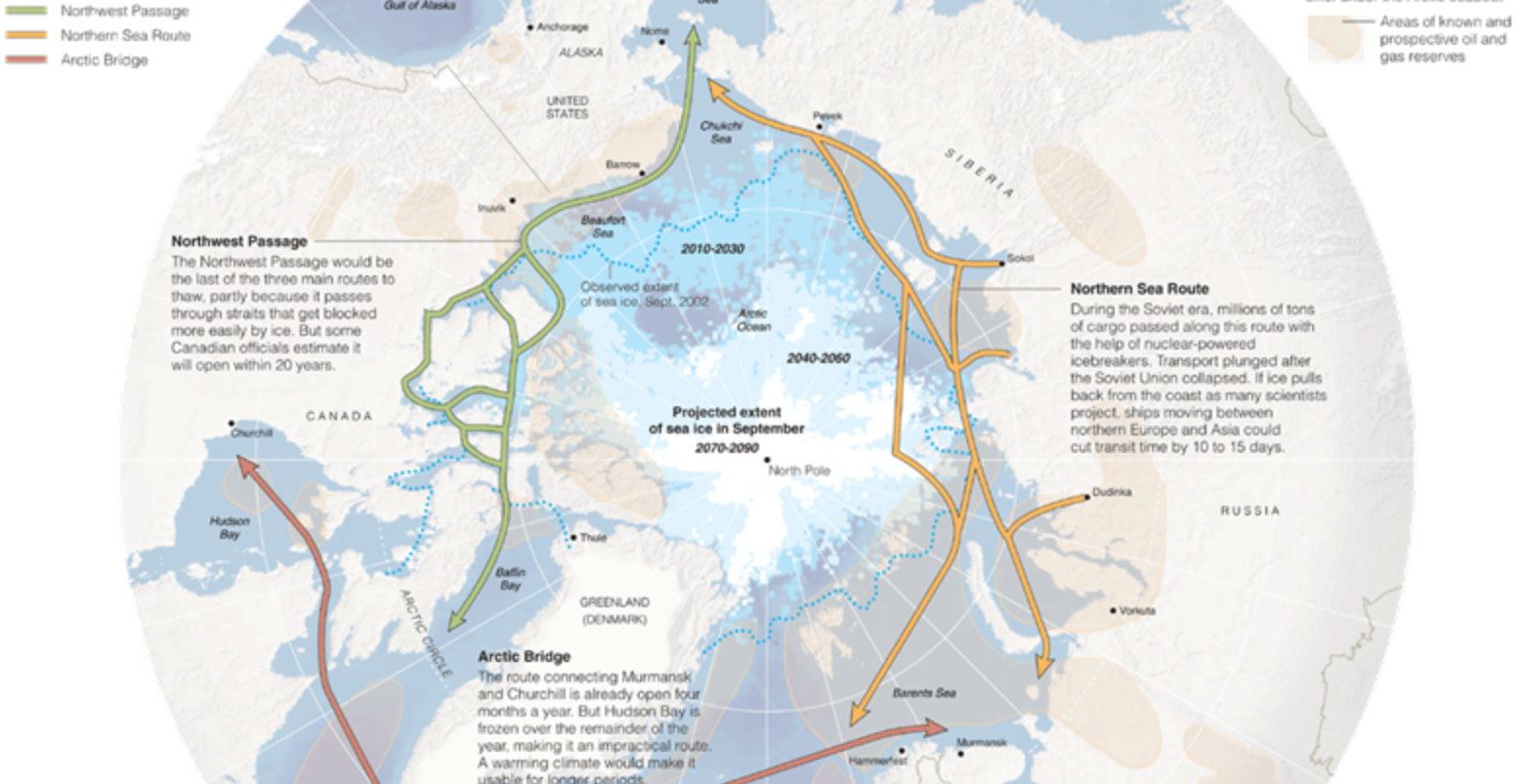
As we seem to be opening up much of the north pole and an Arctic Ocean for multiple new shipping routes, in ways that have led to projections of expanding trade-routes with names that reference imagined passageways like the Northwest Passage, the imagined increased shrinkages and thinning of layers polar ice due to global melting are understood as opening up new routes to nautical shipping as ice retreats from much of the arctic regions–but which, if they were only understood in the abstract in 2013, are now becoming increasingly concrete in the range of consequences that can cascade from them.
The arrival of a period of pronounced decline in arctic sea ice has produced a newly palpable intimations of the vanishing of what were once expanses of ice.
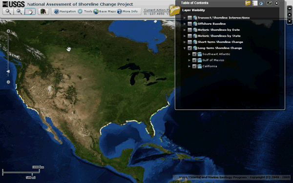
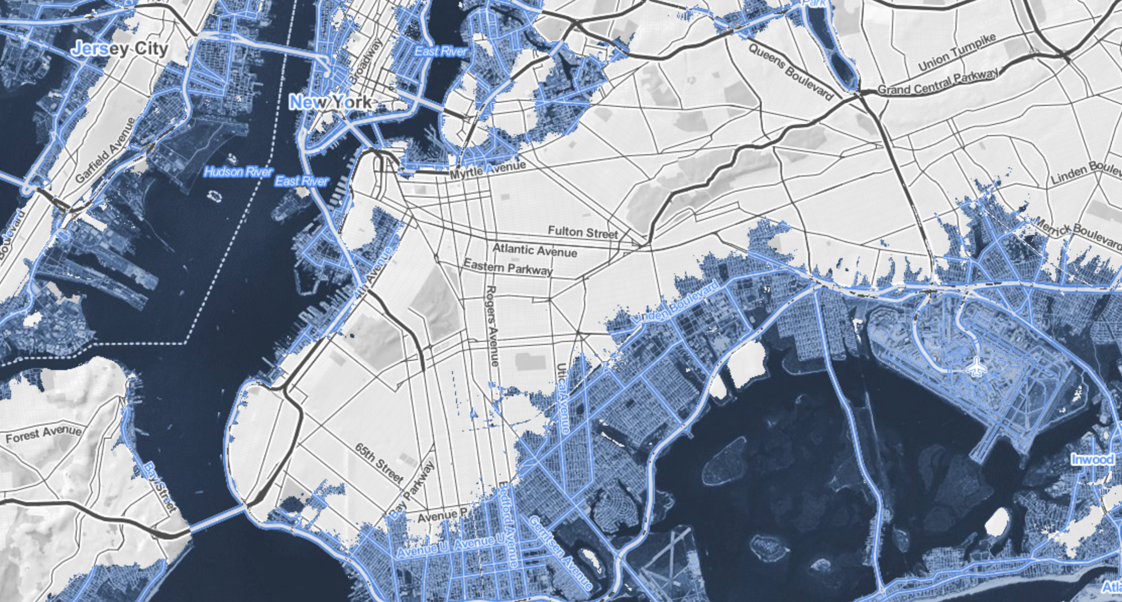
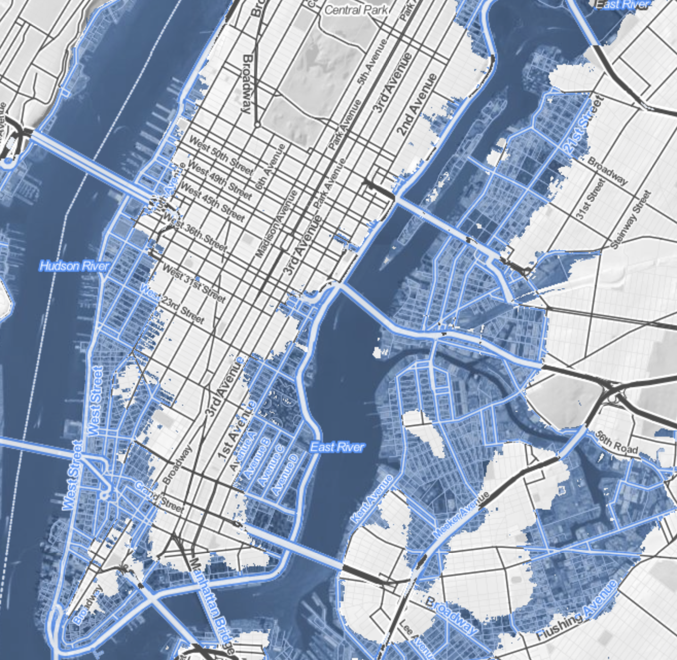
Coasts have provided the primary cartographical invention to understand the risks that erosion pose to property: the coast-line is the boundary of the known land, and determines the outer bound of the real estate. But the coastal fixation of the landlubber privileges the illusion of the fixity of the shore. More than ever, assumptions about the fixity of shorelines must fall away. Perhaps the most haunting take away from the Surging Seas web-based map of global shorelines forces us to take into account the inevitable mutability that must be accepted with the rising of ocean-level associated with climate change.
The web-map presents itself as a set of tools of analysis, as much as cartographical techniques, by which the rise of sea-level that has already risen globally some eight inches since 1880 stands to accelerate–emphasizing the alternate scenarios that the acceleration of sea-level rise stands to bring over the next hundred years, introducing a new concept of risk due to coastal flooding. The availability of accurate GPS images of the elevations of homes have provided the possibility of sketching scenarios of sea-level rise to create readily zoomable maps of elevated ocean levels that confront us with at least the image of the options which we still theoretically have. The contrasting futures created in this cartographical comparison shocks viewers with a salutary sort of operational paranoia only increased as one fiddles with a slider bar to grant greater specificity to the disastrous local consequences of rising sea-levels world-wide.
In ways quite unlike the wonderfully detailed old NOAA Topographic Surveys which map shorelines at regular transects, or T-Sheets, recording the high waterline of tides across 95,000 coastal miles and 3.4 million square miles of open sea, the coastline is less the subject of these web maps than levels of potential inundation. In a negative-mapping of possibilities of human habitation, blue hues invade the landscape in a monitory metric emphasizing the regions at risk of being underwater in a century. Whereas scanned T-Sheets can now be viewed by a historical time-bar slider, the fixity of space or time are less relevant to the web maps than the gradients of possible sea-level rise caused by carbon emissions might force us to confront.
Surging Seas forces us to confront the possibilities of the future underwater world. The infiltration of a deep shade of blue commands the eye by its intensity, deeper shades signifying greater depth, in ways that eerily underscore the deep connection that all land has to the sea that we are apt to turn our backs upon in most land maps, showing the extent to which a changing world will have to familiarize itself to water-level rise in the not-distant future. It’s almost paradoxical that the national frontiers we have inscribed on maps has until recently effectually made impossible such a global view, but the attraction of imagining the somewhat apocalyptic possibility of sea-level rise seems almost to map a forbidden future we are not usually allowed to see, and has a weirdly pleasurable (if also terrifying) aspect of viewing the extensive consequences of what might be with a stunning level of specific and zoomable local detail we would not otherwise be able to imagine, in what almost seems a fantasia of the possibilities of mapping an otherwise unforeseen loss, not to speak of the apparent lack of coherence of a post-modern world.
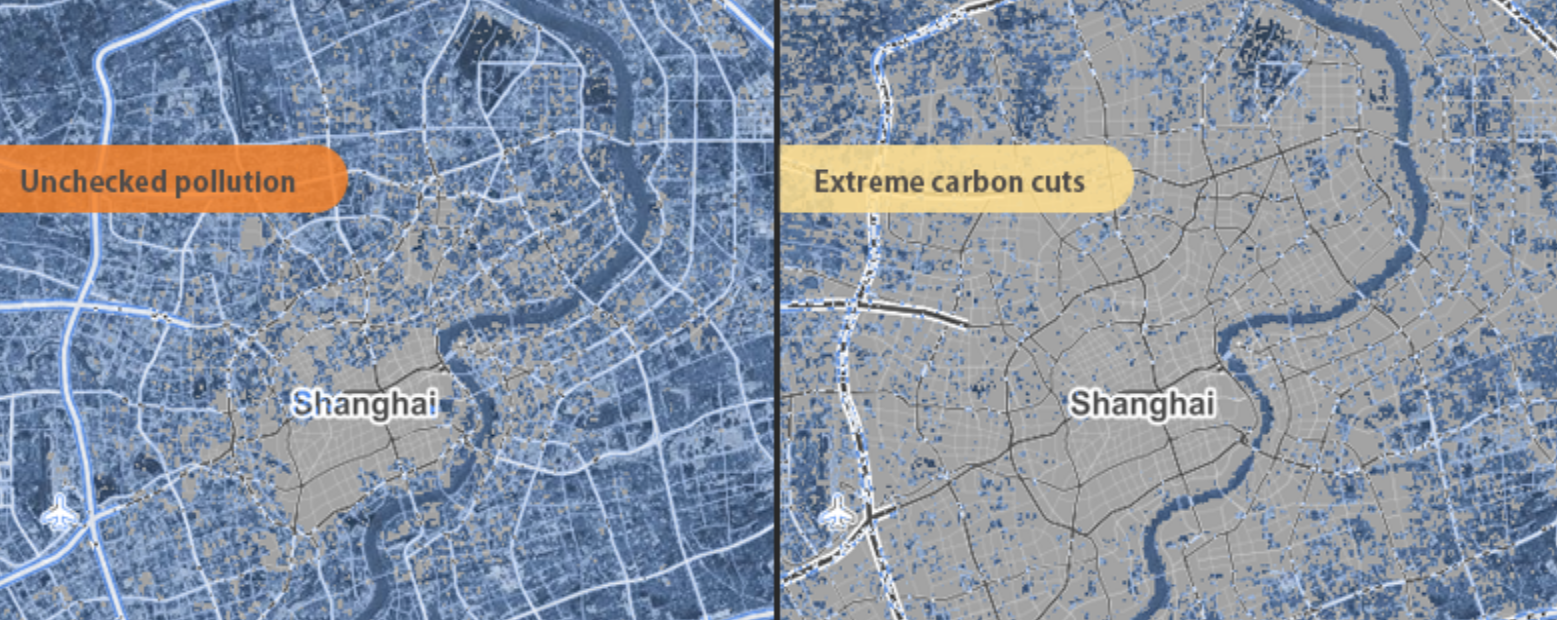
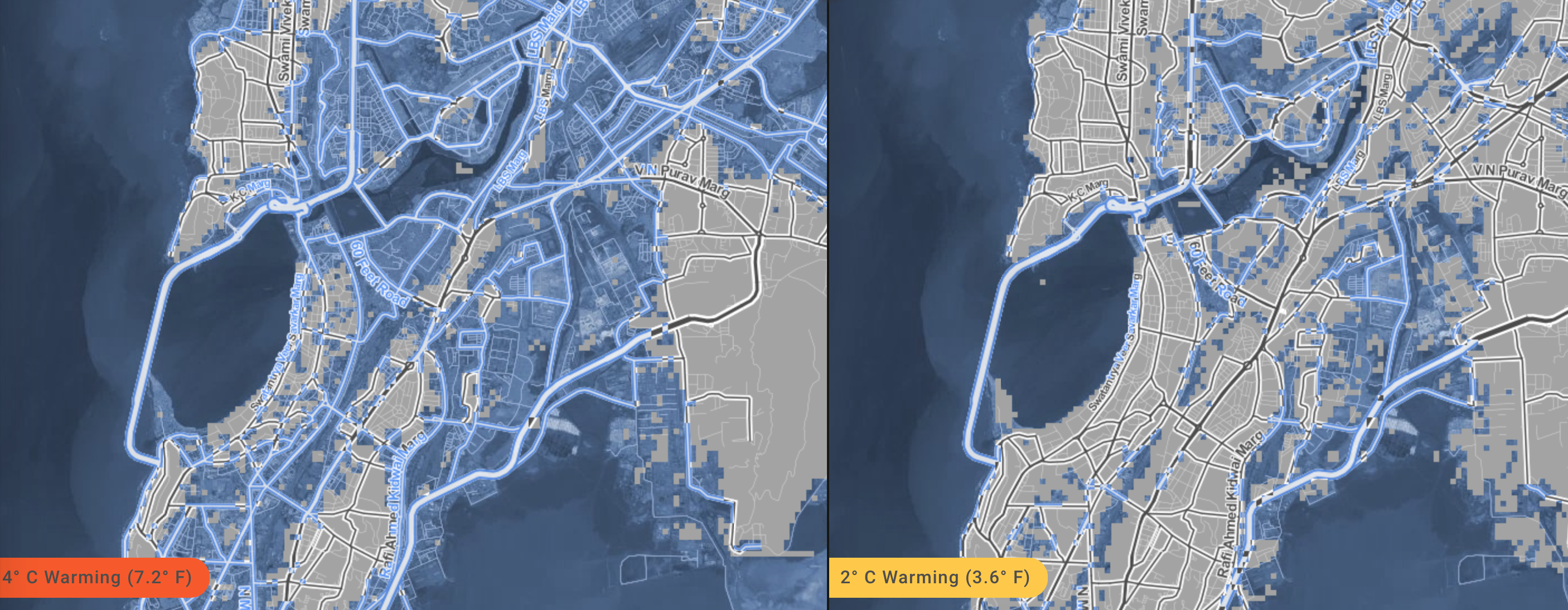
For the variety of potential consequences of disastrous scenarios of sea-level rise posed can be readily compared with surprisingly effective and accurate degrees of precision, in maps that illustrate the depths at which specific regions stand to be submerged underwater should sea-level rise continue or accelerate: zooming into neighborhoods one knows, or cities with which one is familiar, the rapid alteration of two to seven feet in sea-level can be imagined–as can the fates of the some 5 million people worldwide who live less than four feet above sea-level. For if the shores have long been among the most crowded and popular sites of human habitation–from New York to London to Hong Kong to Mumbai to Jakarta to Venice–the increasing rapidity of polar melting due to climate change stands to produce up to a seven feet rise in sea-level if current rates of carbon emissions, and a mere four degree centigrade rise in global temperature stands to put the homes of over 450 million underwater, which even the most aggressive cutting in carbon emissions might lower to only 130 million, if rates of warming are limited to but 2°C. (If things continues as they stand, the homes of some 145 million who currently dwell on land in China alone are threatened with inundation.)
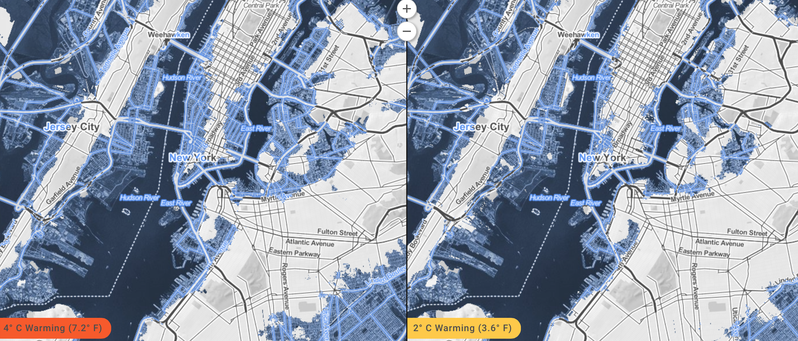
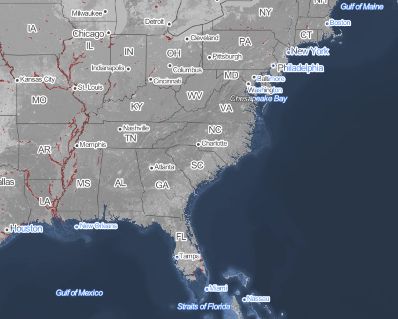
The recent review of the disastrous consequences of a rise of two degrees Centigrade on the land-sea boundary of the United States led Climate Central to plot the effects of a-level rise of at least 20 feet on the country–and foreground those regions that were most at risk. The webmap serves as something like a window into the possible futures of climate change, whose slider allows us to create elevations in sea-level that the ongoing melting of the polar ice-cap seems poised to create. As much as offer compare and contrast catastrophes, the immediacy of recognizing the degree to which places of particular familiarity may soon stand to lie underwater performs a neat trick: for whereas a map might be said to bring closer the regions from which one is spatially removed or stands apart, making present the far-off by allowing one to navigate its spatial disposition in systematic fashion, the opacity of those light blue layers of rising seas obscures and subtracts potentially once-familiar site of settlement, effectively removing land from one’s ken as it is subtracted from the content of the map, and charting land losses as much as allowing its observation.
The result is dependably eery. The encroachment of the oceans consequent to rising sea-level propose a future worthy of disaster films. But the risks can be viewed in a more measured ways in the maps of sea-level on the shores of the United States calculated and mapped by Stamen design in the Surging Seas project that allows us to imagine different scenarios of sea-level rise on actual neighborhoods–the set of interactive maps, now aptly retitled Mapping Choices, will not only cause us to rethink different scenarios of shifting shorelines by revisiting our favorite low-lying regions, or allow us to create our own videos of Google Earth Flyovers of different areas of the world. Mapping Choices provides a way to view the risks and vulnerabilities to climate change made particularly graphic in centers of population particularly low-lying, where they testify to the clarity with which web maps can create a vision of imagined experience as we imagine the actual losses that global warming is poised to create. And although the recent expansion of the map to a global research report, allowing us to examine possible global futures that are otherwise difficult to comprehend or process the potential risks posed by the inundation of low-lying inhabited regions for a stretch of thirty meters, the potential risk of inundation is perhaps most metaphorically powerful for that region that one best knows, where the efficacy of a simple side-by-side juxtaposition of alternate potential realities has the unexpected effect of hitting one in one’s gut: for debates about the possibilities of climate change suddenly gain a specificity that command a level of attention one can only wonder why one never before confronted as an actual reality.
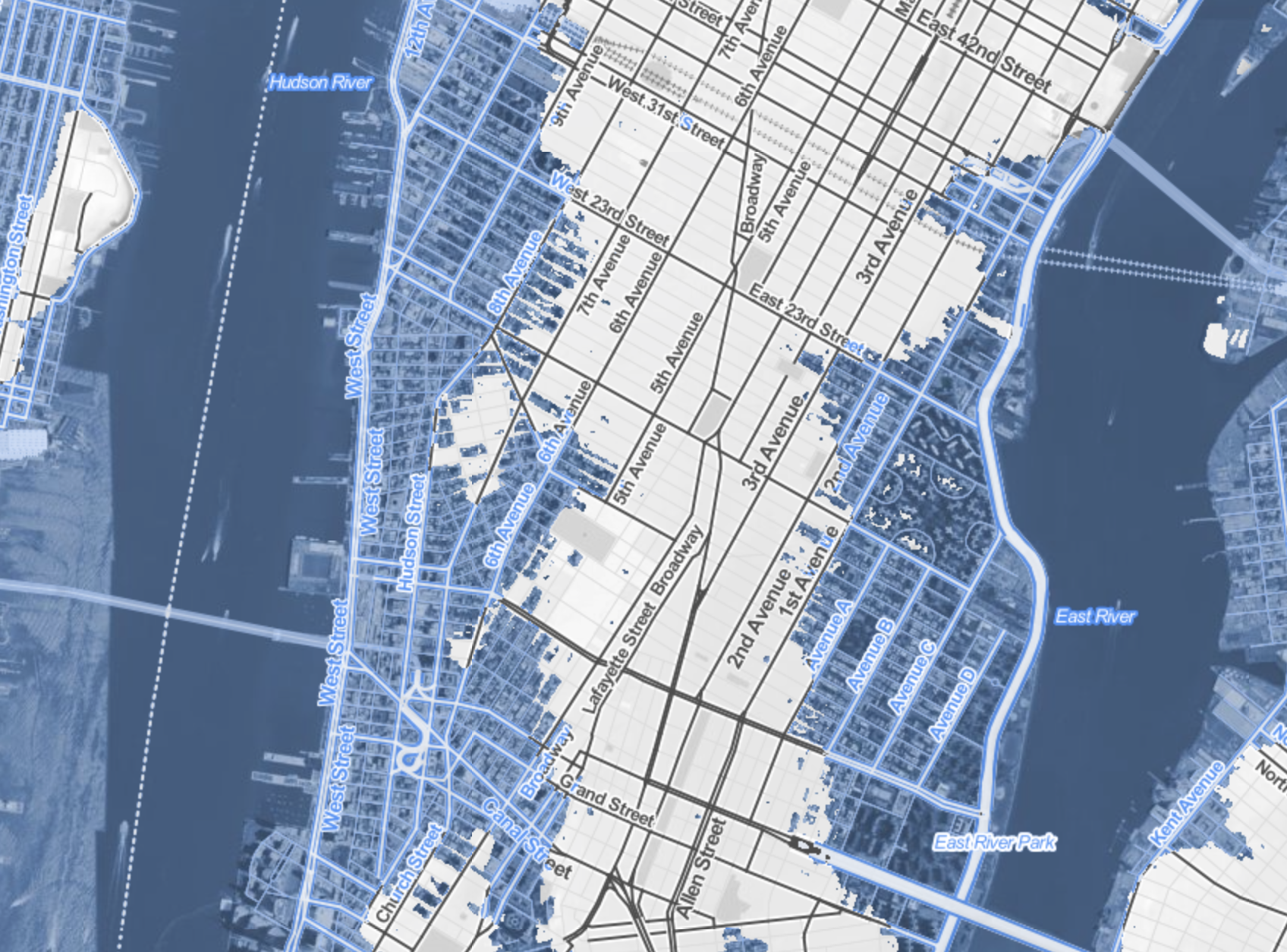
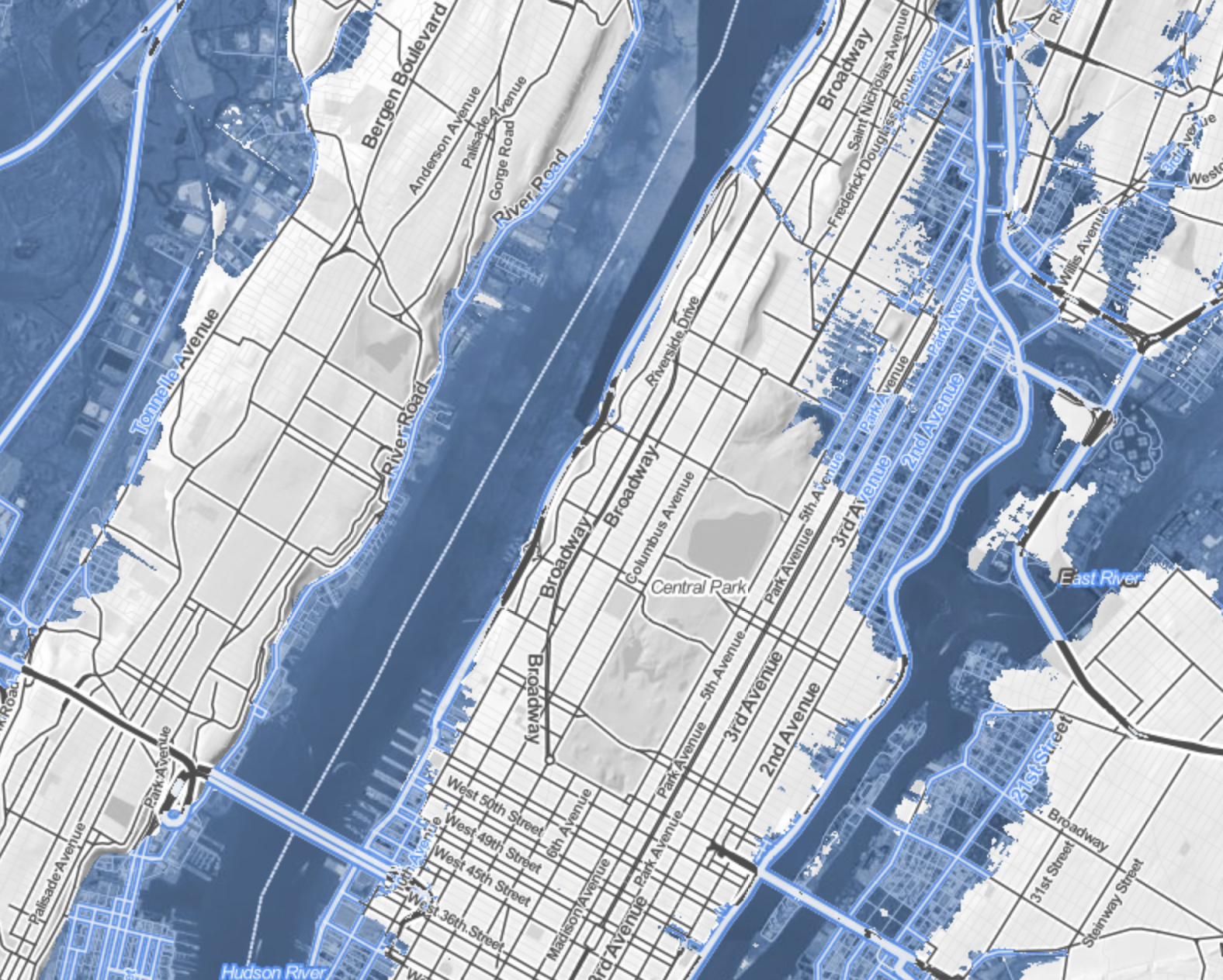
Maps are rarely seen as surrogates for observation, and web maps often offer something like a set of directions, or way finding tools. But the predicted scenarios of sea-levle rise allows one to grasp the local levels of inundation with a specificity that allow risk to be seen in terms of actual buildings–block by block–and wrestle with the risks that climate change portends. The lack of defenses of populations in many regions are definitely also at great risk, but to envision the loss of property and known space seems oddly more affecting in such an iconic map of Manhattan–and somewhat more poetic as an illustration of the fungibility of its hypertrophied real estate and property values.
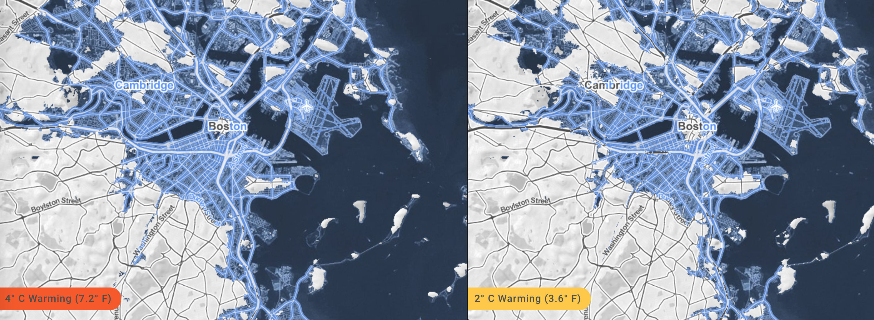
Of course, the data of Climate Change allows a terrifying view of the future of four degrees centigrade warming on low-lying Boston and the shores of the Charles, as the city is reduced to a rump of an archipelago–
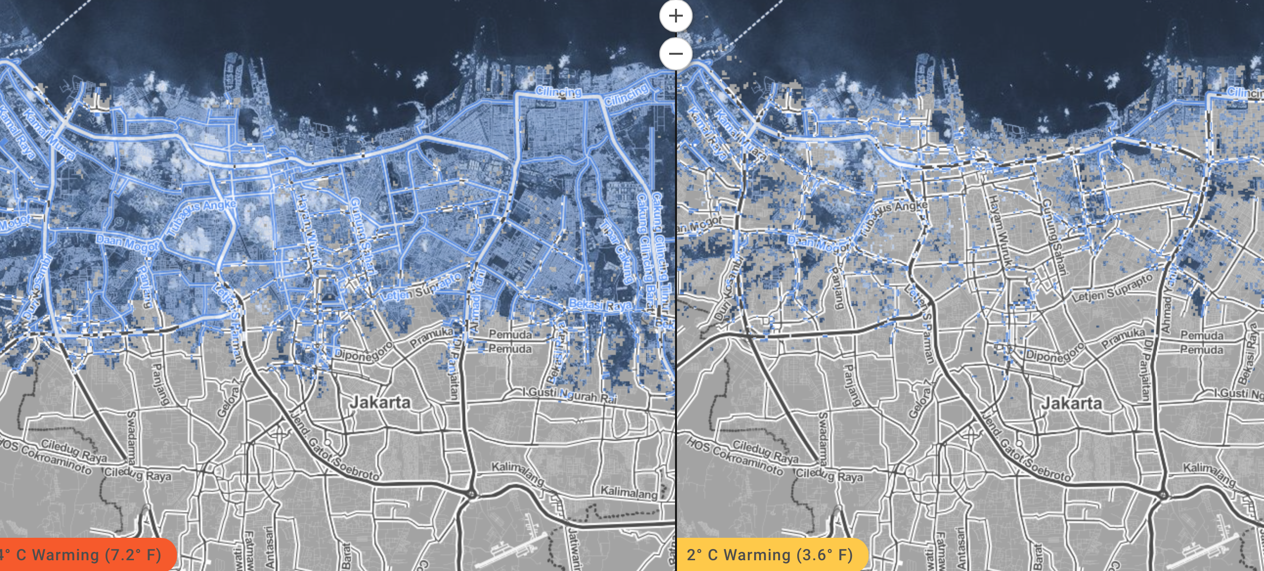
or the disastrous scenarios for the populations in the lower lying areas of Jakarta–
or, indeed, in Mumbai–
Viewers are encouraged to imagine the risks of the possible alternate futures of just two degrees with an immediacy that worms into one’s mind. The possibilities that GPS offers of instantaneous calculations of shoreline position and elevations allow one to view a potential reality where one can focus on individual streets with inspirational urgency.
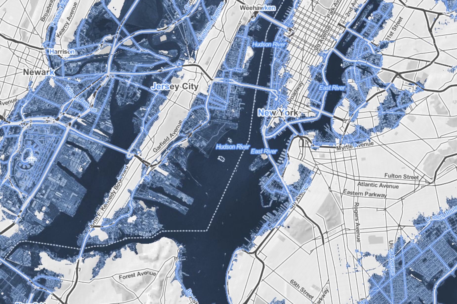
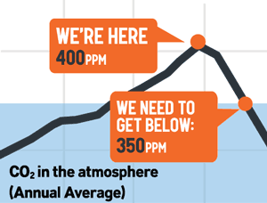
But such scenarios seem somehow particularly graphic illustrations of risk for those regions where there has been a huge investment of human capital, as New York City, where it might seem credible enough to be mapped that they are poised to melt not into air but vanish beneath ocean waves. For if Marx predicted with spirited apocalypticism at the very start of the Communist Manifesto that capitalism would destroy value to money as it expanded into future markets, as market forces abstracted all things into money–and “all that is solid melts into air”–the twentieth-century expansion of possibilities of environmental and human destruction have lent unprecedented urgency. While for Marx the metaphor of melting of inherent value was the product of the capitalist system, the capitalist system bodes a strikingly similar image of sinking into the seas. For huge expanses of the old industrial city–the piers and the old manufacturing zones, most all of the Jersey shore and area around Newark, Long Island City and the Gowanus canal seem sink apart from the shoreline in the future New York that Surging Seas creates, in ways that seem the consequence of industrial production and carbon surging far beyond 400 parts per million (ppm), with the addition of some 2 ppm per year, in ways that make it a challenge to return to the levels deemed healthy–let alone the levels of 275 ppm which the planet long held through the mid-eighteenth century.
That drought, hurricanes, disappearance of arctic ice (up to 80% in summertime) and rising sea levels are tied to the growth of greenhouse gasses hint how global capital might be closely linked to the sinking into the seas, and suggest the surpassing of a tipping point of climate change that is the counterpart to melting into air might be viewed, in New York City’s economic geography, as if to offer a poetic reflection of the migration of capital into the financial centers of the city downtown from its piers or areas of industry–
–although half-hearted joking references to Marxist maxims (or geographers) is hardly the topic of this post, and the island of high finance that would be created in downtown Manhattan would hardly have ever been planned as an island.
What one might someday see as the lopping off of much of lower Manhattan might be far better tied to the runaway markets of a free-trade economy, rather than rational planning, and has no clear correspondence to property values.
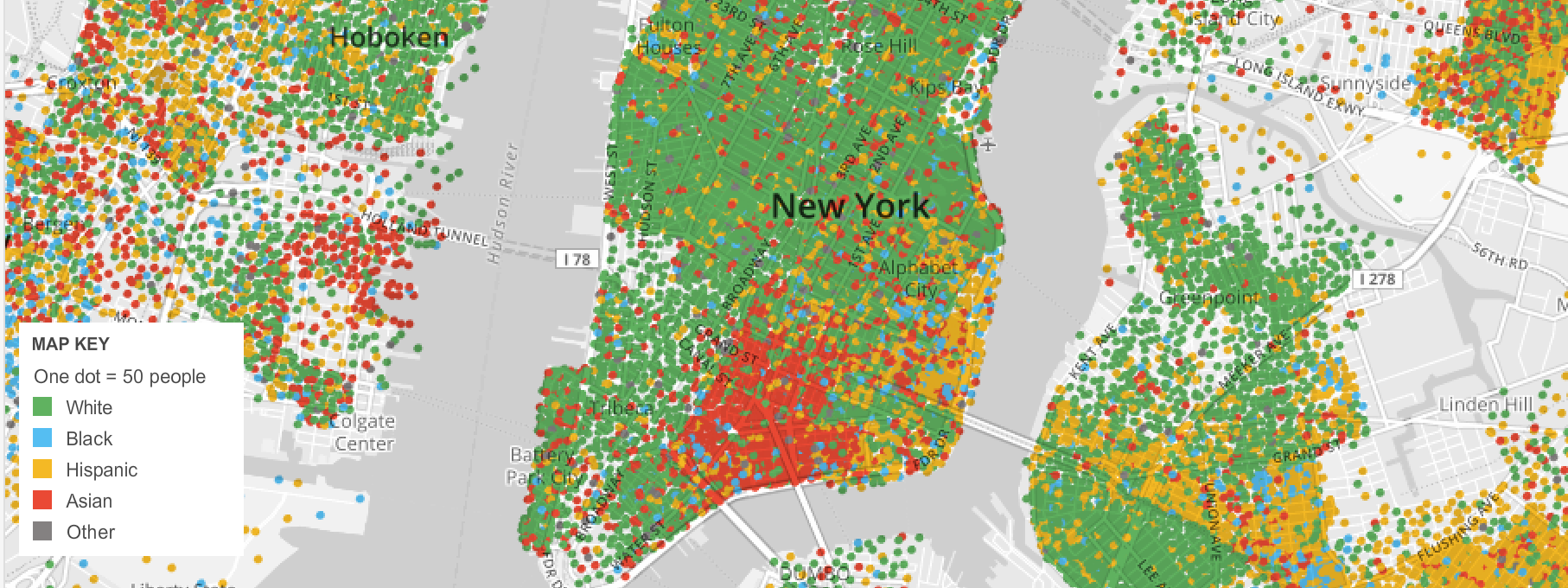
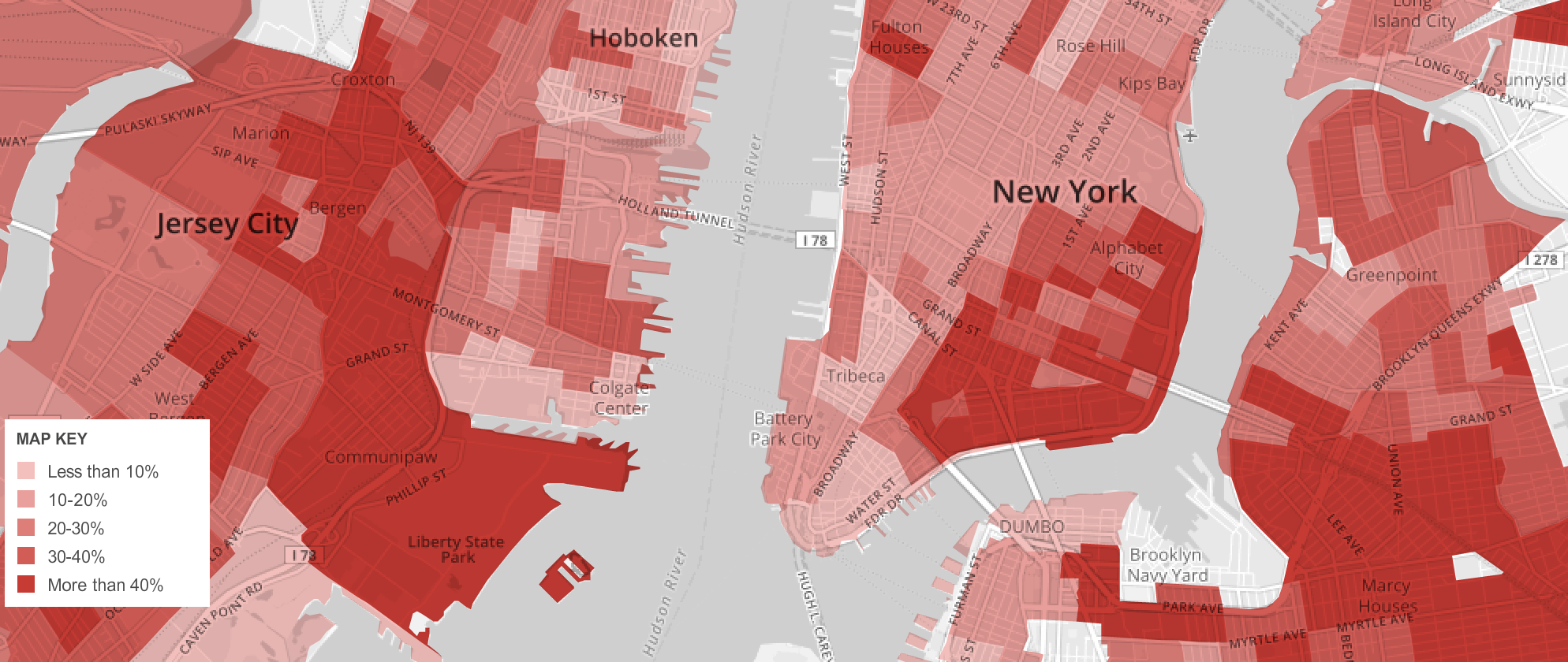
Indeed, the mapping of the prospective loss of those residential parts of the city “where poor people dwell” (as do minorities) is undeniable, if one looks at the 2010 American Community Survey, regarding either in the city’s distribution of ethnic groups or households earning below $30,000, who remain the most vulnerable to the danger of rising ocean levels.
But the disappearance of the Eastern Parkway and the Jersey shore are a blunt reminder of the extreme vulnerability of the built environment that lies close to sea-level–
–and an actually not-too-apocalyptic reminder, but the mapping of consequences of man-made change that goes under the rubric of anthropocene, and is most apparent in the increasing quotient of carbon dioxide in the atmosphere and the warming that this may bring. For if it has been approximated that there has already been a rise of sea-levels by some eight inches since 1880, the unprecedented acceleration of that rate, which will increase the dangers of floods from storms and place many of the some three thousand coastal towns at risk, are likely to increase as the sea level may rise from two to over seven feet during the new century.
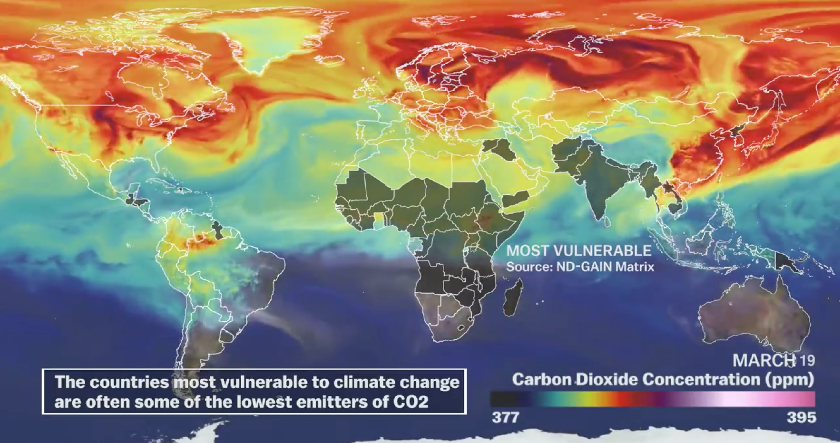
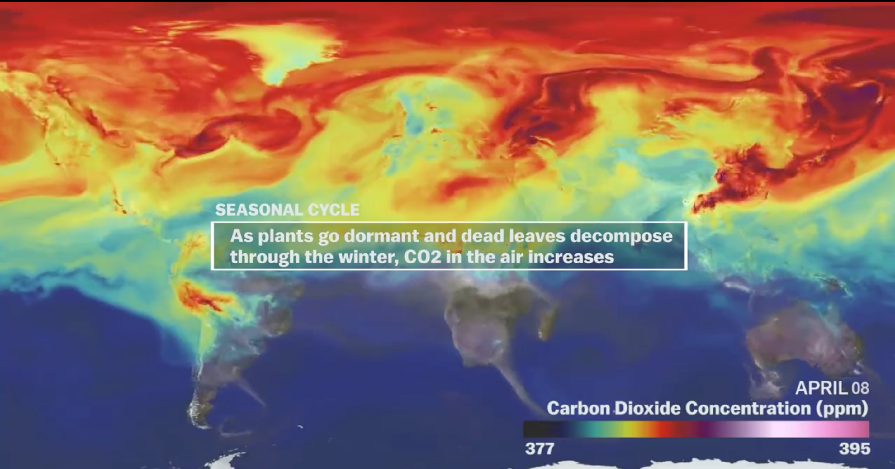
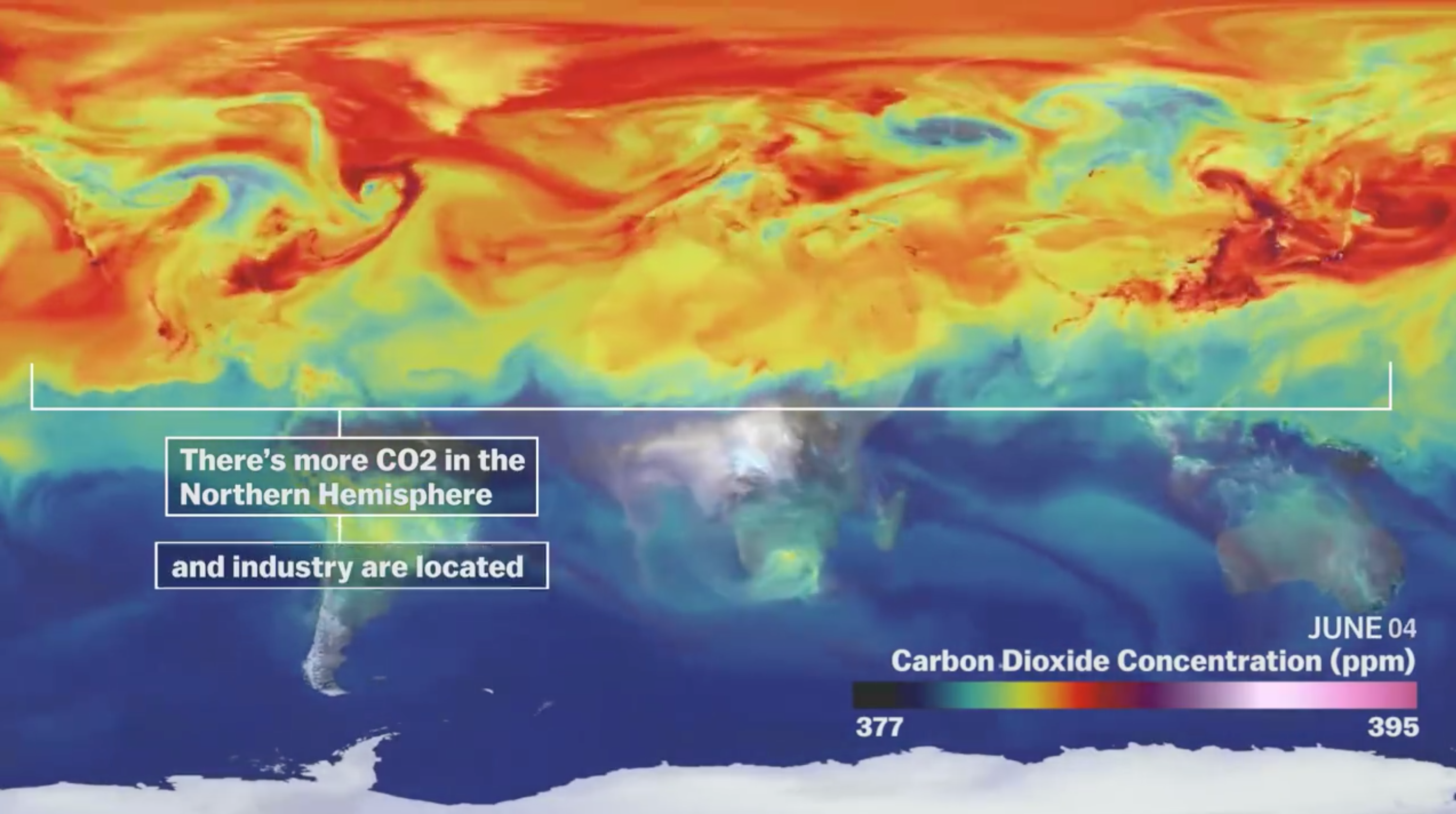
The distribution is by no means uniform, and more industrialized countries, like the United States, are producing far more particulate matter, although they have been recently overtaken by China from 2007, and have atmospheres above 380 ppm in the Spring, making them more responsible for rendering higher temperatures–although the lower-lying lands below the equator may be most vulnerable to the consequences of climate change.
The increasing levels of particulate matter are attempted to be more locally mapped in Surging Seas.
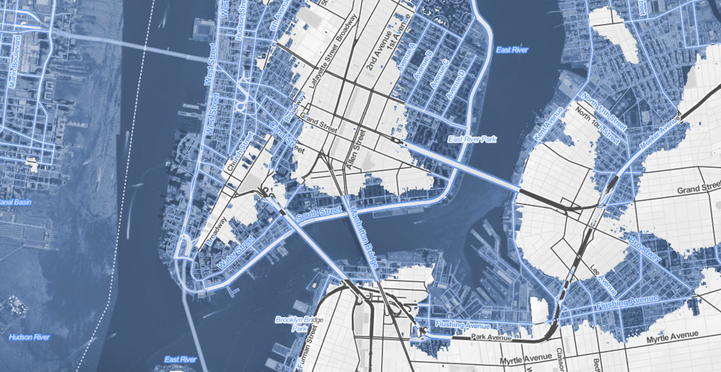
The changes extend, in a nice dramatic detail, into the Central Park Meer rejoining the East River with the predicted inundation of much of the posh residential area of Manhattan’s East Side, all the way to Fifth Avenue.
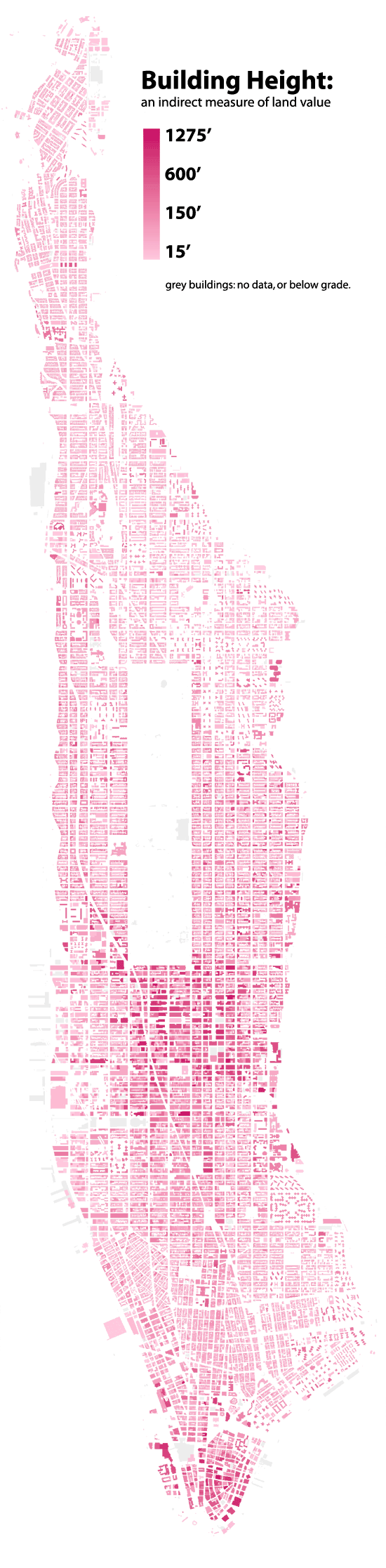
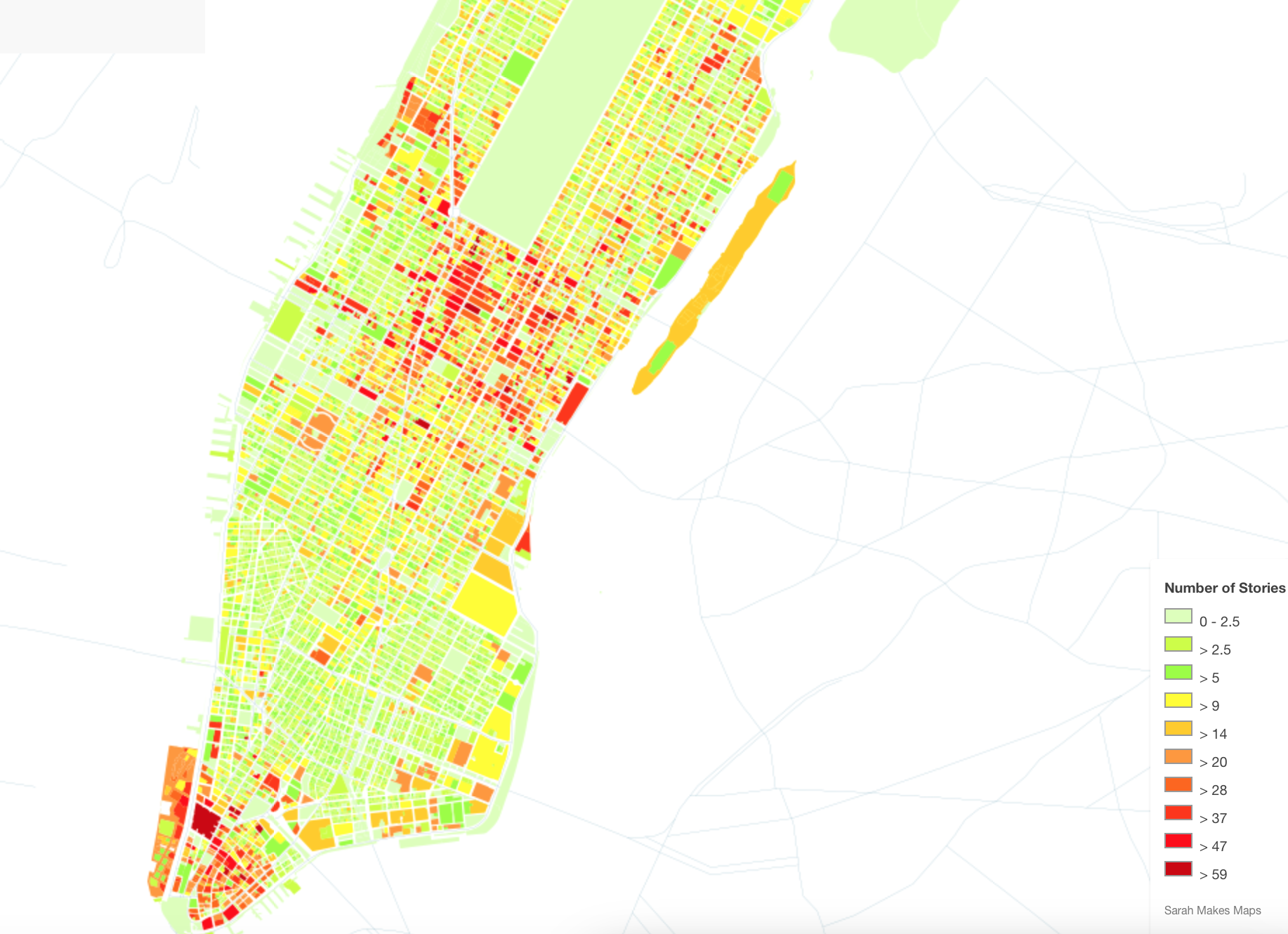
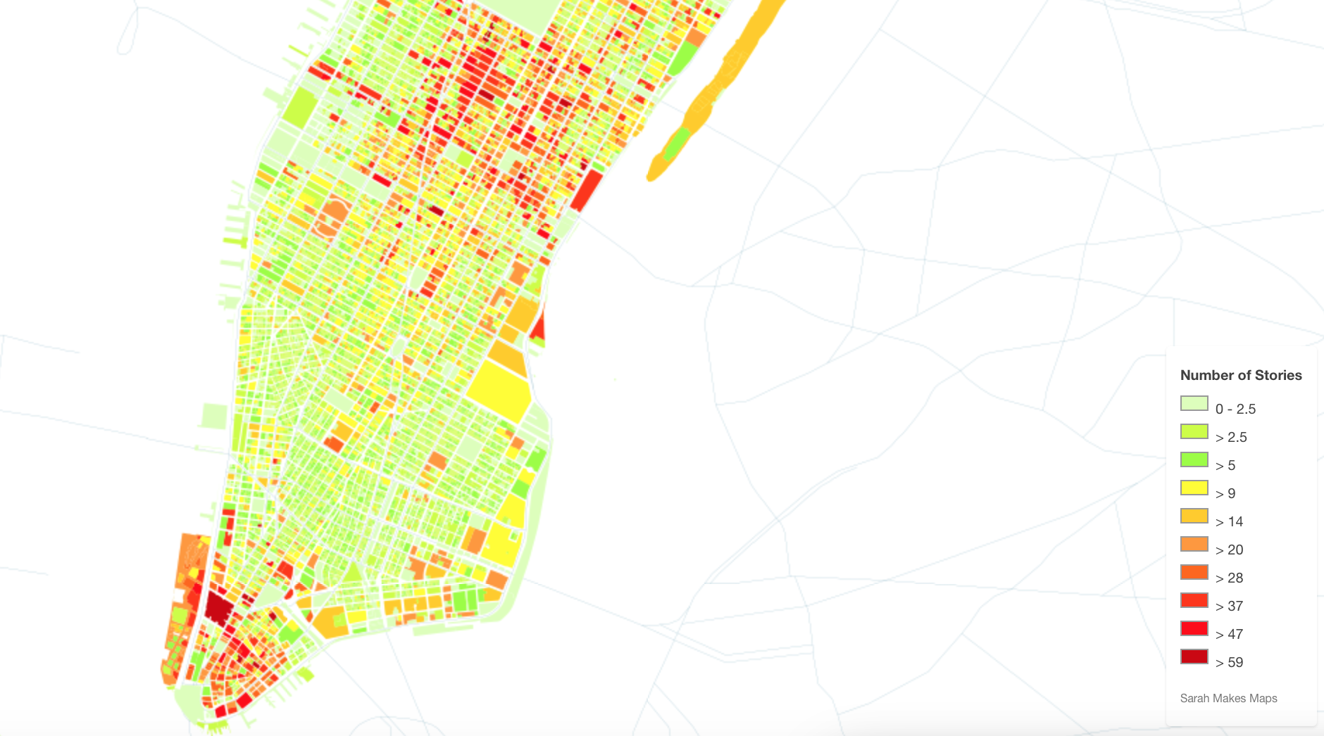
It is difficult not to compare the scenarios sketched in Surging Seas maps to some of the maps of those future islands of New York that Map Box and others allowed Sarah Levine to create maps of the heights of buildings from open data after the pioneering maps of Bill Rankin’s 2006 “Building Heights.” When Rankin remapped Manhattan by taking building height as an indirect index of land value, he saw the island as clustered in distinct islands of elevation above 600 feet:
Levine used similar data to chart the fruits of Mammon in buildings above sixty stories. Maps of skyscrapers beside the gloom of Surging Seas suggest those towers able to withstand the rising seas brought by global temperatures jumping by just two degrees Centigrade. If one moves from the map of the bulk of lowest sections of lower Manhattan–
with reference to Levine’s brilliantly colored carmine mapping of the highest buildings in the Big Apple, above forty-seven or fifty-nine stories, which one imagines might provide the best vantage points that rise above the rising waves, especially when located on the island’s shores.
There’s a mashup begging to be made, in which the tallest buildings of over fifty stories at the tip of the island peak up above the cresting waves, and the rump of buildings in lower Manhattan offer contrasting vistas of the city’s contracting shores. The buildings that create the canyons of urban life, the buildings of elevation surpassing sixty stories might suggest the true islands of Manhattan’s future, as much as the points that punctuate its skyline.
The realization of this possible apocalypse of property made present in these maps offer the ability to visit impending disasters that await our shorelines and coasts, and imagine the consuming of property long considered the most valuable on the shore–as rising seas threaten to render a whispy shoreline of the past, lying under some six meters of rising seas. The prospect of this curtailing of the ecumene, if it would bring an expansion of our nation’s estuaries, presents an image of the shrinking of the shores that suggests, with the authority of a map, just how far underwater we soon stand to be.
All actual maps, including Levine’s, provide authoritative reporting of accurate measures with a promise of minimal distortions. But visualizations such Surging Seas offer frightening windows into a future not yet arrived, using spatial modeling to predict the effects of a rise in sea-level of just five feet, and the potentially disastrous scale such a limited sea-level change would bring: the coasts are accurate, but their inundation is a conservative guess, on the lower spectrum of possibilities. For in a country in which 2.6 million homes are less than four feet above current sea-levels, the spectral outlines of chilly blue former coastlinespeak at a future world are still terrifying and seem all too possible, as much as potential cautionary tale. The concretization of likely scenarios of climate change remind us that however much we really don’t want to get there, how potentially destructive the possibility of a several degree rise in ocean temperatures would be.
On our annual northward migration to Ottawa this December, we gathered around the unused fireplace in an unheated living room during the warmest Canadian Christmas in personal experience–as well as in the public record for Atlantic Canada, where local records for rainfall have surpassed all earlier recorded years. Perhaps because of this, discussion turned to ownership of the North Pole for the first time for some time, as what was formerly a featureless area of arctic ice has become, as a receding polar ice-sheet exposes possible sites of petroleum mining, to become an area of renewed land grabs and claims of territoriality, as their value for nations is primarily understood in a global market of energy prospecting.
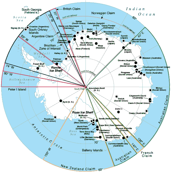
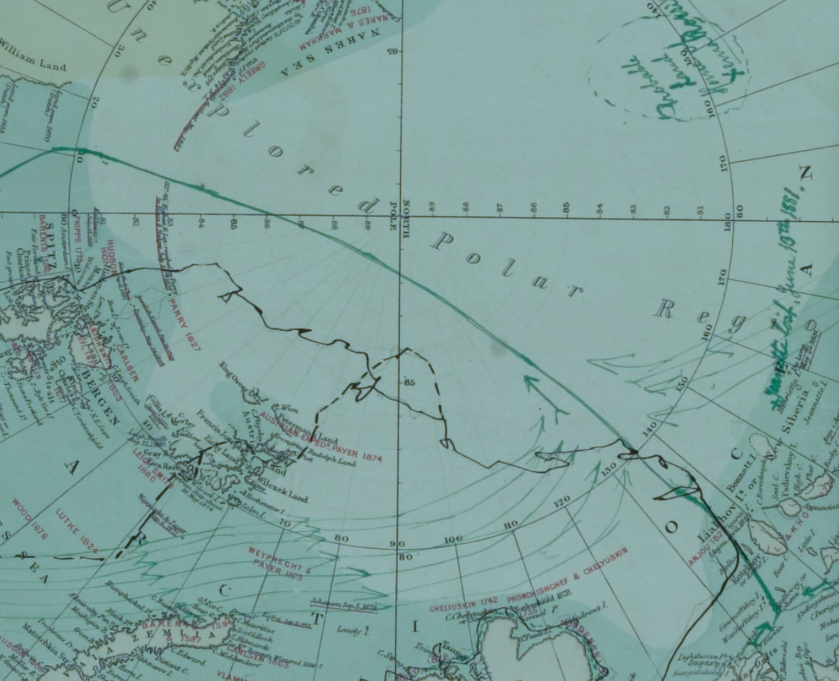
The story of the new mapping of territorial claims around the arctic ice cap goes back decades, to the exploration of offshore polar drilling, but the exposure of land raises new questions for mapping because boundaries of polar sovereignty are contested, even as oil companies have speculated by modeling sites of future exploration for petroleum deposits. In sharp contrast to the clear lines of sovereignty that were drawn along Antarctica, the ongoing disputes of the Arctic have become protracted indeed, only more contested as global warming and polar melting open the long-frozen shipping routes that have long been imagined across polar regions, opening up new fantasies and geographic imaginaries of globalization. While Antarctica remains sectorized with clear stability in the geopolitical maps per the C.I.A.’s World Factbook, the stability seven claims to ownership far less contested or open to international debate as no petroleum has been detected under the ice shelf, the southern lands that host McMurdo Station host stations occupied by sixteen governments, in a sort of tacit comity for goals of research, distributing rights but with both Russia and the United States refusing so far to recognize any as valid. And so although Argentina, Australia, Chile, France, New Zealand, Norway, and UK are eager to claim regions as their own, as if everyone can have a slice of the frozen pie, the lack of contestation and minimal interest in the sector between 90 degrees west and 150 degrees west stands in contrast to the intense mapping and remapping of the North Pole.
Maps are long primarily used as strategic tools to assert land claims and sovereign bounds. But this may seem increasingly foolhardy in an age that is defined by globalization, and where global warming seems to threaten to further blur the staking out of sovereign divides. Is this only another reason to the multiplication of assertions of arctic claims to melting lands? Although one assumption circulated that the place was Canadian by birthright—birthright to the Arctic?–since it is so central to national mythistory.
But there’s as much validity for its claims as the more strident claim the explorer Artur Chilingarov made to justify his planting of a Russian tricolor in the murky ocean bed 2.5 miles below the North Pole, during the 2007 polar expedition of the Mir submarine, with the timeless claim of Soviet-era bluntness, “The Arctic has always been Russian.” Canadian PM Steven Harper did not hesitate a bit before decrying these claims to territoriality, warning his nation of the danger of Russian plans for incursions into the arctic in his tour of Canada’s North, thumping his chest and professing ongoing vigilance against Russia’s “imperial” arctic “imperial” as a national affront in addressing troops participating in military maneuvers off Baffin island as recently as in 2014.
Harper’s speech might have recalled the first proposal to carve pie-shaped regions in a sectorization of the North Pole first made by the early twentieth-century Canadian senator, the honorable Pascal Poirier, when he full-throatedly proposed to stake Canada’s sovereign claims to land “right up to the pole” and transform what had been a terra nullius into an image of objective territory seemed once again at stake. Poirier claimed jurisdictional contiguity in declaring “possession of all lands and islands situated in the north of the Dominion.” Poirier’s project of sectorizing the frozen arctic sea and its islands, first launched shortly after Peary’s polar expedition, has regained its relevance in an age of global warming, arctic melting and climate change. But the reaction to the expanding Arctic Ocean in a language of access to a market of commodities has inflected and infected his discussion of the rights of territoriality, in ways that have obscured the deeper collective problems and dilemmas that the eventuality of global warming–and arctic melting–broadly pose.
Encyclopedia Brittanica
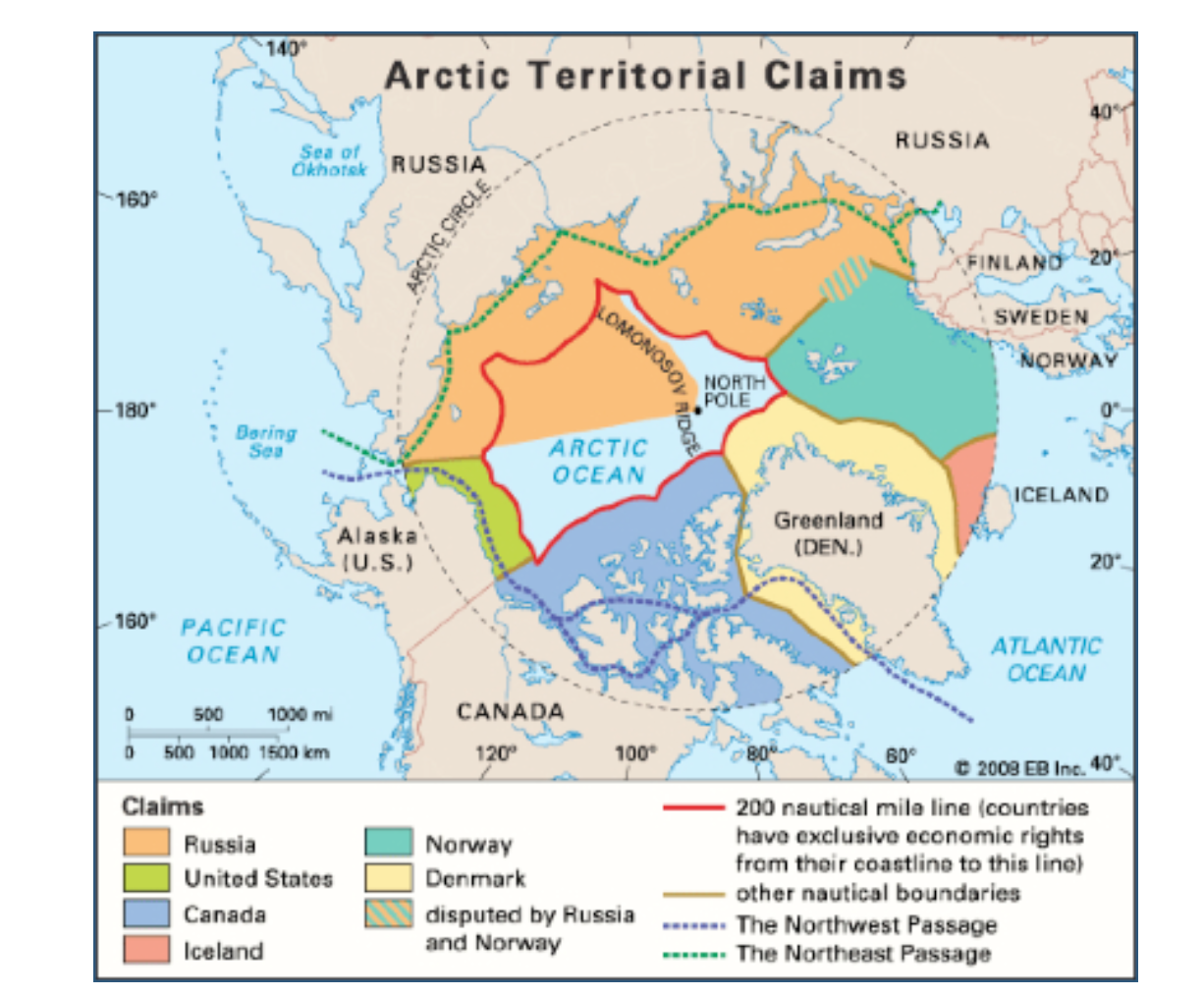
The question of exactly where the arctic lies, and how it can be bounded within a territory, or, one supposes, how such an economically beneficial “good” that was part of how parts of the north pole might get away from Canada, has its roots in global warming–rather than in conquest. The dramatically rapid shrinkage of ice in the Arctic Sea has raised newly pressing issues of sovereignty; the widespread melting of arctic ice has made questions of the exploitation of its natural resources and potential routes of trade has made questions of the ownership of the Arctic ocean–the mapping of the territorial rights to the seas–increasingly pressing, as some 14 million square kilometers of Arctic Ocean have emerged not only as open for exploration, but as covering what has been estimated as 13% or more of total reserves of oil remaining to be discovered world wide.
The Economist
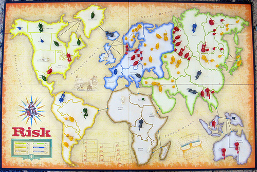
While it seemed unrelated to the ice melting from nearby roofs, or large puddles on the streets of Ottawa, conflicting and contested territorial claims that have recolored most maps of the Arctic so that its sectors recall the geopolitical boardgame RISK, that wonderful material artifact of the late Cold War. Rather than map the icy topography of the region as a suitably frosty blue, as Rand McNally would long have it, we now see contested sectors of the polar regions whose borderlands lie along the Lomonosov Ridge (which runs across the true pole itself). The division of the pole so that it looks like post-war Berlin is an inevitable outcome of the fact that the arctic is warming at twice the rate of the rest of the planet, resulting in the opening of an area that was for so long rarely mapped, and almost always colored white with shades of picturesque light blue to suggest its iciness.
The lands newly revealed in the northern climes have however led territorial claims of sovereignty to be staked by a four-color scheme of mapping. The uncovering of arctic lands–in addition to new technologies for underwater oil extraction and sensing–have complicated the existing maps of ocean waters premised upon expanding existing territorial waters an additional 278 kilometers beyond what can be proven to be an extension of a landmasses’ continental shelf–expanding since 1984 the rights to Arctic waters of the United States, Denmark, and Canada, according to consent to the United Nation’s Law of the Sea Convention (UNICLOS) which sought to stabilize on scientific grounds competing claims to arctic sovereignty.
The issues have grown in complex ways as the melting of Arctic ice has so dramatically expanded in recent years, exposing new lands to territorial claims that can be newly staked on a map that unfortunately seems more and more to resemble the surface of a board games. Even more than revealing areas that were historically not clearly mapped for centuries, the melting of the polar cap’s ice in the early twenty-first century has precipitated access to the untapped oil and gas reserves—one eight of global supplies—and the attendant promise of economic gains. Due to the extreme rapidity with which polar temperatures have recently risen in particular, the promises of economic extraction have given new urgency to mapping the poles and the ownership of what holes will be drilled there for oil exploration: instead of being open to definition by the allegedly benevolent forces of the free market, the carving up of the arctic territories and disputes over who “owns” the North Pole are the nature follow-through of a calculus of national interests. The recent opening up of new possibilities of cross-arctic trade that didn’t involve harnessed Alaskan Huskies drawing dog sleds. But the decline in the ice-cover of the arctic, as it was measured several years ago, already by 2011 had opened trade routes like the Northwest Passage that were long figures of explorers’ spatial imaginaries, but are all of a sudden being redrawn on maps that raise prospects of new commercial routes. New regions assume names long considered but the figments of the overly active imaginations of early modern European arctic explorers and navigators in search of the discovery of sea routes to reach the Far East.
The Expanded Shipping Routes of Global Warming: “The Melting North,” The Economist
On the one hand, these maps are the end-product of the merchant-marine wish-fulfillment of the eighteenth-century wishful mapping of the French Admiral Bartholomew de Fonte, whose maps promised that he had personally discovered several possible courses of overcoming a trade-deficit caused by British domination of the Atlantic waters, allowing easy access to the South Seas. The imagination of such routes proliferated in a set of hopeful geographies of trade which weren’t there in the late eighteenth century, of which de Fonte’s General Map of the Discoveries is an elegant mixture of fact and fiction, and imagined polar nautical expeditions of a fairly creative sort, presenting illusory open pathways as new discoveries to an audience easily persuaded by mapping pathways ocean travel, even if impassable, and eager to expand opportunities for trade by staking early areas of nautical sovereignty to promise the potential navigational itineraries from Hudson Bay or across the Tartarian nation of the polar pygmies:
Open-ended geographies of land-masses were given greater credibility by the dotted lines of nautical itineraries from a West Sea above California to Kamchatka, a peninsula now best-known to practiced players of the board-game RISK:
As well as imagine the increase potential shipping routes that can speed existing pathways of globalization, in fact, the meteorological phenomenon of global warming has also brought a global swarming to annex parts of the pole in confrontational strategies reminiscent of the Cold War that tear a page out of the maps, which give a similar prominence to Kamchatka, of the board game ‘RISK!’ Will their growth lead to the naming of regions that we might be tempted to codify in a similarly creatively improvised manner–even though the polar cap was not itself ever included in the imaginative maps made for successive iterations of the popular game of global domination made for generations of American boys–and indeed provided a basis for a subconscious naturalization of the Cold War–even while rooting it in the age of discoveries and large, long antiquated sailing ships, for the benefit of boys.
RISK (1968)
Following versions took a less clearly vectorized approach, imagining a new constellation of states, but also, for the first time, including animals, and updating those schooners to one sleeker ship!
Risk!, undated
The more updated current gameboard is curiously more attentive to the globe’s shorelines, as if foregrounding their new sense of threatened in-between areas, on some subconscious areas, that are increasingly prone to flooding, and less inviolable, but also suggesting an increasingly sectorized world of geopolitics, less rooted in individual. nation-states..
Risk–current board
Will future editions expand to include the poles as well, before they melt in entirety, as the ways that they become contested among countries percolate in the popular imagination?
We must await to see what future shorelines codified in the special ‘Global Warming Edition’ of RISK–in addition to those many already in existence in the gaming marketplace.
If the game boards suggest Christmas activities of time past, the ongoing present-day game of polar domination seems to be leading to an interesting combination of piece-moving and remapping with less coordinated actions on the parts of its players. We saw it first with Russia’s sending the Mir up to the North, which precipitated how Norway claimed territoriality of a sizable chunk of Arctic waters around the island of Svalbard; then Denmark on December 15 restocked its own claims, no doubt with a bit of jealousy for Norwegian and Swedish oil drilling, to controlling some 900,000 square kilometers of arctic ocean north of Greenland, arguing that they in fact belong to its sovereign territories, and that geology reveals the roots of the so-called Lomonosov Ridge itself as an appendage of Greenland–itself a semi-autonomous region of Denmark, upping up the ante its claims to the pole.
While the Russians were happy to know that their flag was strategically but not so prominently placed deep, deep underwater in the seabed below the poles, the problem of defining the territorial waters of the fast-melting poles upped the ante for increasing cartographical creativity. Recognized limits of 200 nautical miles defines the territorial waters where economic claims can be made, but the melting of much of the Arctic Ocean lays outside the claims of Canada (although it, too, hopes to stake sovereignty to a considerable part of the polar continental shelf), by extending sovereign claims northward from current jurisdictional limits to divide the mineral wealth. Were the Lomosonov Ridge–which isn’t moving, and lies above Greenland–to become a new frontier of the Russian state, Russian territory would come to include the pole itself.
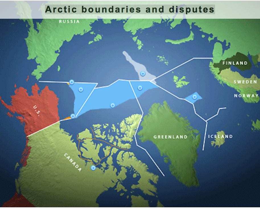
The actual lines of territorial division aside, the diversity of names of the single region indicate the competing claims of sovereignty that exist, as if a historical palimpsest, within an actual map of the polar region: from the Amundsen Basin lies beside the Makarov Basin, the Yermak Plateau beside the Lena Trough and Barents Plain, suggesting the multiple claims of naming and possession as one approached the North Pole, without even mentioning Franz Josef Land.
Contestation of the Pole
While the free market isn’t able to create an exactly equanimous or impartial division of land-claims, the new levels of Denmark’s irrational exuberance over mineral wealth led the country to advance new claims for owning the north pole, and oil-rich Norway eager to assert its rights to at least a sixth of the polar cap, given its continued hold on the definition of the northern lands. The increasing claims on proprietary rights of polar ownership among nations has lead international bodies such as the United Nations Conventions on the Law of the Seas (UNICLOS) to hope to codify the area peaceably by shared legal accords–presumably before the ice-cover all melts.
The maps of speculation of the “Arctic Land Grab” is economically driven and suggests an extension of offshore speculation for oil and gas that has long roots, but which never imagined that these claims would be able to be so readily concretized in terms of a territorial map as the melting of the ice cap now suggests. But as technical maps of prospecting are converted into maps with explicit territorial claims, planned or lain lines of pipe are erased, and the regions newly incorporated as sites of territoriality in ways that earlier cartographers would never have ventured.
The existence of laid or planned pipeline by which to pump and stream oil across much of Upper Canada from the Chukchi Sea, North Slope, and MacKenzie Delta have long been planned by Canadians. Similarly, the Russian government, echoing earlier claims of Russian stars to straddle the European and Asian continents, have claimed the underwater Lomosonov Ridge as part of the country’s continental shelf, even if it lies outside the offshore Exclusive Economic Zone, as is permitted by UNICLOS–so long as the edge of the shelf is defined.
Canada has taken the liberty to remap its own territory this April, in ways that seem to up the ante in claims to arctic sovereignty. In updating the existing map of 2006 to make it appear more ice exists in the Arctic than it had in the past, the Atlas of Canada Reference Map seems to augment its own sovereign claims to a region in ways clothed in objectivity: even as arctic ice-cover undeniably rapidly melts in a decades-long trend, the ice-cover in the region is greatly expanded in this map, in comparison to that of 2006, and the northern parts of Canada are given a polemic prominence in subtle ways by the use of a Lambert conformal conic projection and a greatly expanded use of aboriginal toponymy to identify lands that even belong to different sovereignty–as Greenland, here Kalaalit Nunaat–in terms that link them to indigenous Canadians, and by extension to the nation. Both tools of mapping appear to naturalize Canadian claims to the Arctic in a not so subtle fashion. Moreover, the map stakes out exclusive economic zones around Arctic regions: even as the Arctic rapidly melts, for example, disputed islands near Greenland, like Hans Island, are shown clearly as lying in Canadian waters.
Perhaps what exists on paper trumps reality, creating an authoritative image of an expanded Arctic–a white plume that expands the amount of Arctic ice beyond the rendering of the Arctic Sea in its earlier if now outdated predecessor.
It is instructive to look backwards, to grasp the earlier strategic sense invested in the Kamchatka Sea, before it migrated into Risk! The earlier pre-fifty-states rendering of this Russian area as an independent sea, fed by the Kamchatka River, was seen as an area apart from the Pacific, bound by the archipelagos of a future Alaska that were imagined to bound the region, as if to create an oceanic theater of entirely Russian dominance, above the “eastern ocean” of the Pacific, and almost entirely ringed by what must have seemed to have been essentially Russian lands.
The above map has, of course, nary a reference to a pole, but an expanded sea remaining fully open to navigation with charts.
What exists on paper, once officially sanctioned, seems to stand as if it will continue to trump the rapidly shrinking extent of arctic ice. The map trumps reality by blinding the viewer, ostrich-like fashion, or keeping their head deeply buried in the proverbial sand. The decision to show the thirty-year median of sea-ice extent in September in the years between 1981 to 2010 brings the map into line with the way that Environment Canada computes sea-ice extent. And the augmentation of Inuit toponymy for regions near the Arctic recognizes the indigenous role in shaping Canada’s toponym. But it would be hard to say that either would be advanced if they did not have the effect of expanding Canadian sovereignty to the arctic. The reality it maps clearly mirrors the shifting interests of the state at a time of the shrinking of Arctic ice due to climate change, more closely than it shows the effects of global warming on the ice-cover of the northern regions, let alone in the Arctic itself. With more maps that diminish the effects of global warming, the orienting functions of the map seem to be called into question in themselves.
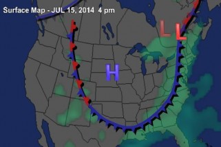
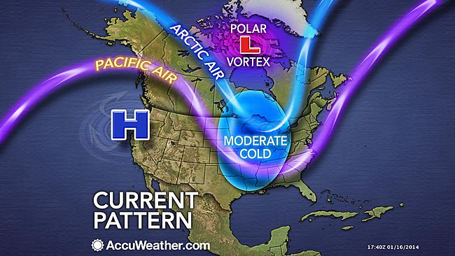
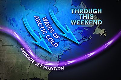
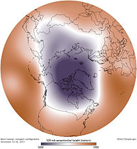
Since we use the conventions of map making to endow solidity, or reify, even the most abstract ideas, it is interesting to examine how the ‘Polar Vortex’ has spread across the mass media as both a meme and icon of the current weather patterns of the new millennium. Rather than map place by a matrix of fixed locations alone, maps of the Vortex offer a visualization of temperature variants that reveal an anomalous weather conditions that track the Vortex as it moves, intersecting with place, across the stratosphere into our own latitudes, tracking not only a “cold front” but, globally, the disruption of the path of the circumpolar winds, or splitting of the vortex from the north pole. We are most likely to “see” the Vortex as an incursion into our own map, effectively dividing the country (yet again?) this summer into regions of cold and heat. The currency of visualizations of the Vortex reveals not only a meme, but a model for encoding multi-causational weather maps. Indeed, the mapping of the divergence from usual temperature range reveals the anomaly of a north-south weather front with the solidity of a national divide, raising deep questions of its forecast of extreme weather throughout the year more than offering something like a “poor man’s vortex.”
As the term has gained wide currency as a challenge within data visualization world for throwing weather systems into legible relief, it set a new bar for producing visualizations that are challenging to fully comprehend. The Polar Vortex is mapped as it moves, as if on its own, across the stratosphere into our own latitudes, condensed in a range of data visualizations of stratospheric or tropospheric low-pressure fronts, in ways that map onto current quandaries of atmospheric and climactic imbalance. The animated superimposition of weather patterns condensed in a range of data visualizations of stratospheric or tropospheric low-pressure fronts themselves map onto concerns about climate change, and conjure narratives of global atmospheric change and climactic imbalance: the disruption of the usual harmony of the polar jet stream perhaps maps onto both notable rises in polar temperatures or torrential rains off the coast of Japan, but whether due to a spike in northern pacific offshore typhoons or openings in polar ice cover, the markedly increasing waviness of the vortex has allowed increased amounts of cooler air seep south once again, in an eery echo of last January’s mid-winter chill, that has lead weatherpersons to scramble for clarifying narratives about the return of that green blob. (To be sure, back in January, the naysayers of climate change parsed weather maps as counter-evidence to global warming, allowing them to indulge in alternate meteorological realities, before they were batted down in two minutes by the President’s Science and Technology Advisor, Dr. John Holdren.)
Offering a marvelous array of vowels and pattern of assonance, with a name befitting a Marvel comics super-hero as much as a weather pattern, the Vortex is a touchstone of climate change and a great case of how we have yet to ken the global as intersecting with the local. But we have unfortunately trended to oscillate, as it were, in our maps between national weather maps, where the Vortex made such a splash as a newsworthy low-pressure pattern, to maps of patterns in global environmental change, that might better direct attention to changing meteorological realities.
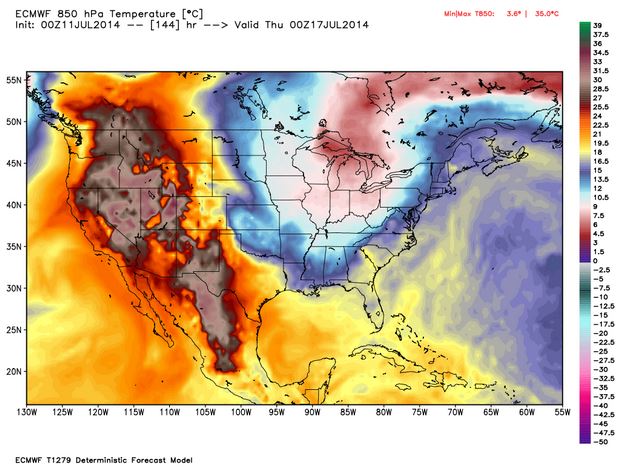
Part of the problem is adopting a point of view on the weather that we are tracking–or of viewing the Vortex as a stratospheric phenomenon around the polar regions, or charting a weather pattern forecast as occurring within our nation’s bounds. The reprise of the spill of northern air into the upper United States returned the Vortex into national news this July has provided a basis of the latter, to judge by this new visualization that projects the cooling temperatures in the northern United States, as a deep wave in the Jet Stream brought colder air to the Northeast. Even if the cooling air that arrived was not arctic, the pattern of its arrival to the continental US this summer has prompted some significant debate among meteorologists who have glossed the map in alternate ways, almost entirely still focussing, oddly enough, in a reprise of the mid-January news blip on the Vortex, on the unit of weather in the United States in isolation from a global context. The anomaly of the “Vortex” has become something of shorthand for a southern swing of cold air from north of the Great Lakes, produced by a decreased disparity between polar and sub-polar continental temperatures that lower the latitude of the jet stream, according to some research that has been endorsed by the National Academy of Sciences, and increased its waviness as the Arctic warms. The maps serve to embody the increasingly newsworthy weather in the Northeast, reaching down to the southern states as if an invading army as much as a meteorological cold front, placing the anomaly of the displacement of cold air against the screen of an iconic national map on which it has been superimposed.
AccuWeather.com
The map recalls a similar dispersion of circumpolar winds from the arctic into the lower forty-eight already called the “most upsetting” data visualization of the winter of 2014. The drift of circumpolar winds at stratospheric levels offers a compelling means to understand the arrival into the Midwestern states of cold air once more from the north during the mid-summer of 2014. Rather than only being a meme of the media, or being coined as a manifesto a group of avant-garde modernist meteorologists who found energy in the abstraction of weather forms, the term tracks the dispersion of the circumpolar whirl usually uniformly swirling about the pole offer both a rogue arrival into our national climate and a sort of emblem of an imbalance of circumpolar stratospheric harmony by pushing down the arrival of winds from the Pacific ocean.
AccuWeather.com
The benefits of shifting iconography to the global are immediately apparent if only because they reveal the divergence of the weather system from a meteorological status quo. The cycle of wind, usually located in the mid- to upper troposphere, has apparently begun to split or splinter from it usual centers above Baffin Island and Siberia as its air warms, and moves below the arctic regions. The displaced vortex, which migrates below the arctic circle in the stratosphere, reflects the warming of temperatures at the poles, creating currents able to funnel the figurative migration of arctic air currents to sub-arctic latitudes, even if the air in question this July might more likely be northeast Pacific more than arctic in its provenance.
Earth.com
The local is, however, far more easily digestible for viewers of The Weather Channel, and the Vortex is shown as an intersection of the global with the regional weather map. Collating data from divergences or temperature anomalies from a database covering local temperatures in 1981-2010, the spectrum of a “heat map” tracks currents of cold across the backdrop of the lower forty-eight in an easily digestible manner that packed so big a punch for folks trying to puzzle over the freezing over of roads, local lakes, or back yards:
Once more thrown off-balance, it sends cooler air below the lower forty eight and forty-ninth parallel, making it national news as a dramatic aberration that marked the entry of intense cold. Data visualizations provide new tools of making the meteorological concept legible in ways that gain sudden particular relevance for audiences familiar with weather maps, for whom immediately powerful associations of shifts in the measurements of regional temperatures will pop out at viewers of a forecast or weather map, forcing them to pay attention to the meteorological imbalances they portend.
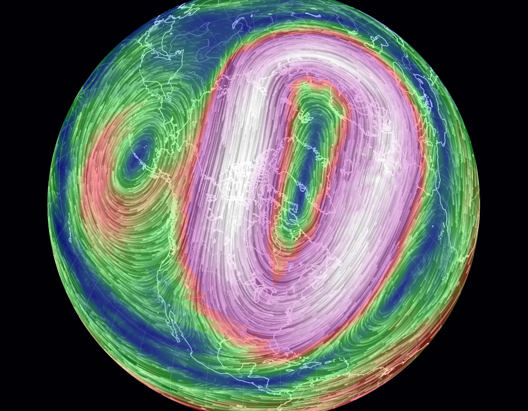
Recent global maps of the Polar Vortex offer more than an icon of the transcendence of territorial boundary lines systems, by processing and portraying the Vortex as an expansion and breaking off of cold air outside the restraints of an arctic air system.
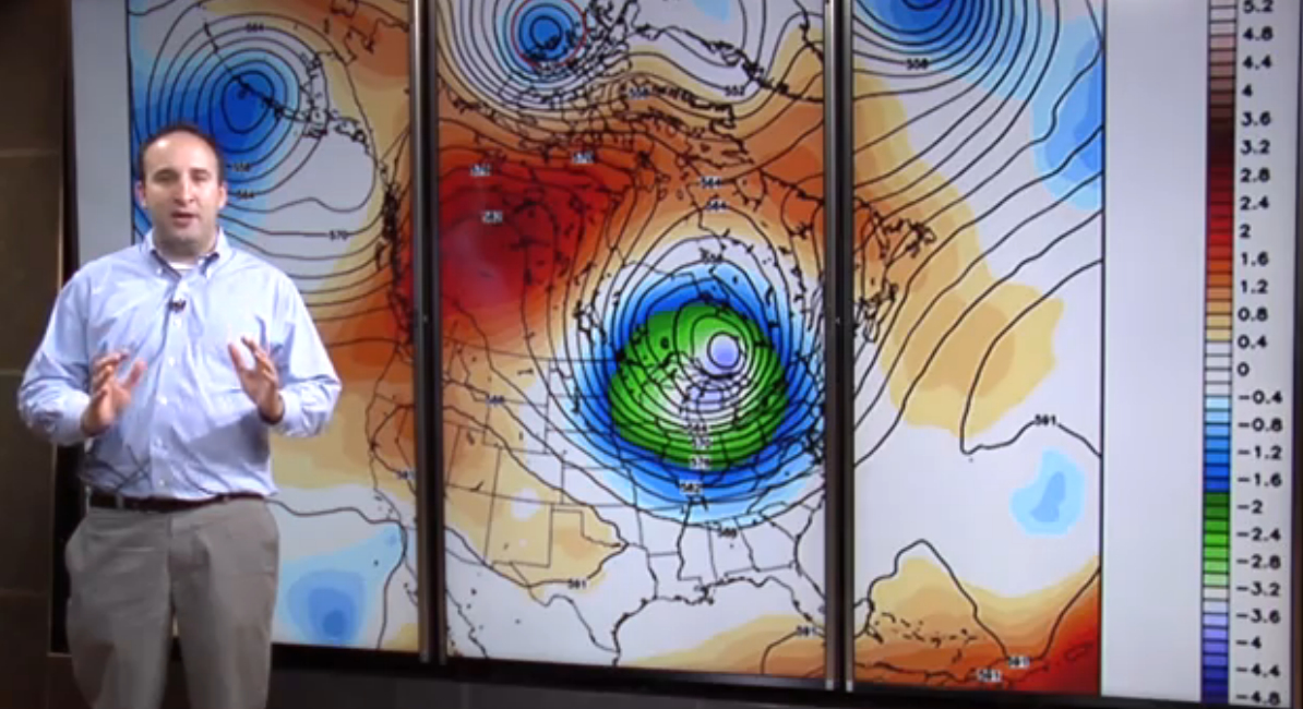
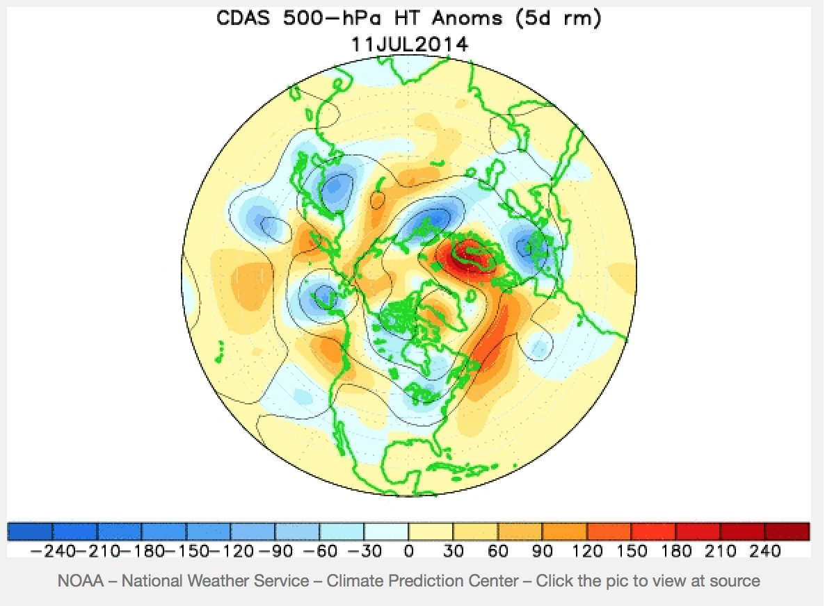
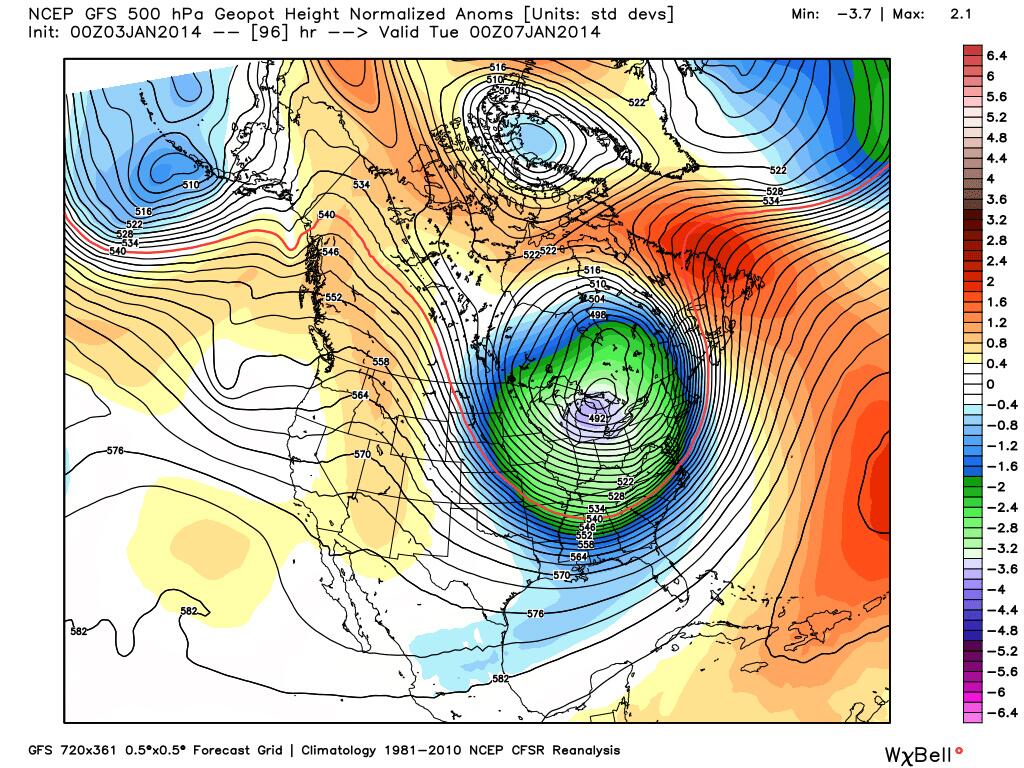
The dramatic splitting of the arctic jet, due to atmospheric pressure anomalies, was mapped by NOAA in this data visualization of July 2014, of a splintering of the vortex, in apparent response to the warming of our poles, hastened by the diminishing snowfall and ice-cover that create new chilly islands or microclimates on the ends of a warming pole we often seen as lying so far away:
The disruption that results brings the displacement of arctic winds that most often sit anchored around the polar region. A “weak” polar vortex, interacting with arctic ice-cover decline and reduced snow cover, was some time go modeled as resulting in a meandering arctic jet stream and occasional detachment of a polar weather systems and consequent decline or weakening of pressure gradients of the vortex, and consequent reconfiguration of the arctic jet stream:
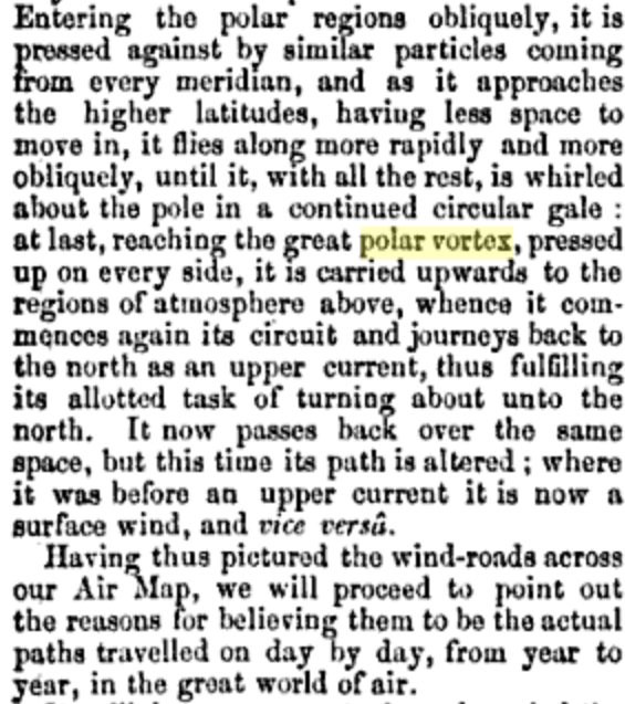
Has something like this occurred? The dynamic visualization of weather maps in five colors and striking contour lines provide clear tools to visualize its speed and energy, in ways that might even have helped resurrect a term that had languished in meteorological lexicons from at least 1853, when the “continued circular gale” was described as flying “more rapidly and more obliquely . . . carried upward to the regions of the atmosphere above,” as lying in the ambitions of a “great Air Map” but based on the recent 1851 NOAA mapping of “great undulatory beds of the oceans . . . for all practical purposes of navigation.”
But now we have a recognizable image that can be tracked over a recognizable terrestrial map that concretizes the Vortex in ways that its winds can be understood as extending over a region of truly global expanse.
Tracked in terms of actual temperature anomalies, in the winter of 2014, when newscasters and NOAA (the same agency) mapped the migration of cold air southwards of the pole into our frontiers, far outside the usual path of the jet stream, in a disturbance of the weather systems worthy of national news last January, in a data visualization which tracked a green (or purple) blob whose forced migration of frigid air from the polar regions that disrupted weather patterns with national consequence as it migrated out of Canadian airspace.
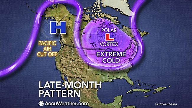
In the dramatically eye-catching graphics of television’s mass-media, as the bulge of purple and magenta of detached low-pressure systems migrate south, crossing the very same borders to which we are increasingly sensitized in our national news media, albeit at tropospheric altitudes no fence or border guards could ever patrol. Indeed, the map suddenly suggests the increasing vulnerability of our delicate weather systems, echoed by the language with which the Polar Vortex’s “EXTREME COLD” loops invasively southward across our northern border, cutting off Pacific Air:
AccuWeather
The apparent incursion of its jet stream into the bounds of our national airspace, as in this image of cold air migrating across the northern border, results in the proliferation of metaphors all too often violent in tone: Climate Central may have only adopted the robust rhetoric of sportscasters when it described high pressure systems in quite athletic terms that “block the eastward progression of weather systems, like an offensive lineman protecting the quarterback from the other team,” allowing the air that circulates around the arctic to start “spreading tentacles of cold southward into Europe, Asia, and North America.” Less dynamically interpreted and understood once cast in global terms, rising temperatures at the poles–the very sites where, we should note, global warming is occurring at a rate twice the global average–displaces the previously concentrated flow of a jet stream of cold air from its arctic abode.
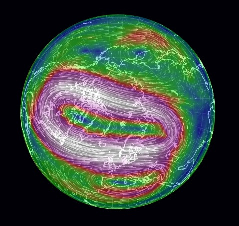
Of course, few seem ready to tie this to the diminishing ice-cover of the north pole, which still seem a leap too far to be made logically. Oddly, the meteorological mechanics of the expanding split-off of polar winds is modeled as an incursion of weather patterns echo the metaphorics of a military situation map of fixed borders, a historic hold-over for national weather organizations like NOAA: the global image of wind velocities around the pole, depicted below, is oddly absent from what is actually a global phenomenon.
But we are all too used to interpret and read weather maps with both a sense of voyeurism for our friends and relatives, but from a subjective lens.Despite the adoption of globalized images from our friends at National Geographic, who used Mass FX Media’s animation to visualize circumpolar air flows, and despite the continued live monitoring of wind-flows at “Earth,” the isolation of the nation in the maws of the vortex is so readily discussed as the “most upsetting map of the winter,” as if the migration of the pool of arctic air into the northern United States were best understood as a disturbance of national temperatures.
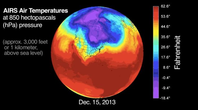
The similar narrative about the Vortex in national forecasts stands in contrast to the maps of rising temperatures, but create a visual modeling of a meteorological distribution that almost resembles an invasion. Even though the distribution and speed of the Vortex in summer is usually slow, the polar air however seems to be arriving from across the border with unstoppable velocity, the below global visualization, also based on a similar distribution of deviations from average temperatures craft a similarly compelling large-scale weather pattern–albeit one occurring some 3,000 feet above the earth’s surface–in which, rather than reveal a lack of equilibrium, arctic air dips south across the forty-ninth parallel and past the Mason-Dixon line, confirming its occurrence as a shift of national consequence.
Because the “most upsetting map of the winter” tracks the pooling of arctic air into the northern United States created a disturbance of national temperatures into the Eastern United States and much of the central region of the country.
Wasn’t it once more reassuring to understand the polar regions, its topography unknown, as somehow removed from the atmospheric currents than being mapped around the world?
The wonderfully protean animated map of disequilibria in the harmony of stratospheric currents of cold polar air within the jet stream opens breaches across national boundaries, albeit at considerable elevation, and also offers a way of tugging at one atmospheric phenomenon to unpack a web of inter-related phenomena. Unlike maps of habitation or land-surface, the map traces a low-pressure system at high altitudes far above the settled or occupied land, but intersecting with it in ways that conjure a failed ability to contain colder air over the polar regions. (Taking the iconography of weather maps as transparent, the blogosphere has suggested the adoption of charges of circumpolar intoxication.)
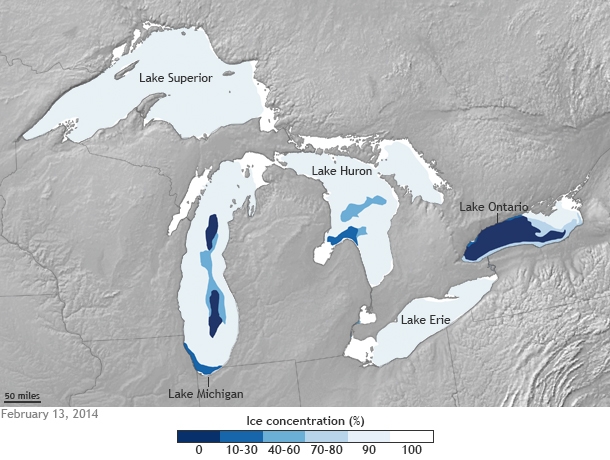
The distribution of stratospheric air whose flow is charted in global map as an irregular anomaly of temperatures’ spread, is perhaps most concretely rendered by the iced-over bodies of water it left in our own upper latitudes. The striking freezing over of the Great Lakes, covering some 88% of the lakes’ surface area by mid-February, a greater proportion of seasonal ice-cover than ever registered, and surpassing the 82% record of 1996, according to Caitlin Kennedy of NOAA, which render the striking concentration of ice in frozen lakes a concrete map of the local effects of truly polar weather.
The material manifestation of the cold on the surfaces of those five lakes–all frozen solid, to appearances, save Lake Ontario, seem as concrete a result of the consequences of climactic change one might have in a chart, by placing the ice-covered lakes in a local landscape.
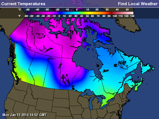
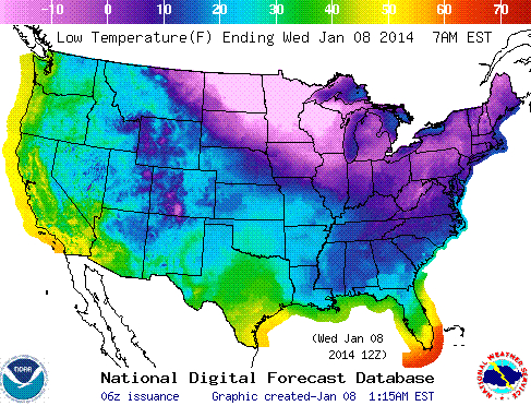
What seemed the displacement of the frigid polar air to the Great Lakes became something like a confusion of the local and the global in the news media that was played out in weather maps. Of course, the meteorological mapping of this winter’s Polar Vortex in Canadian outlets seemed more the status quo, with most of the country facing sub-zero temperatures:
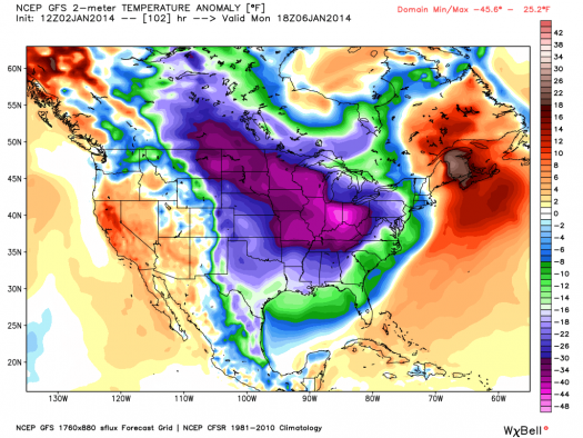
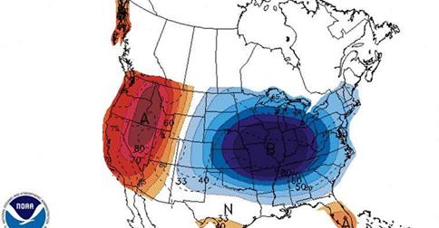
The US “low temperature map” used a slightly different temperature spectrum, but preserved a more alarmist image of anomalous weather conditions even in the National Digital Forecast:
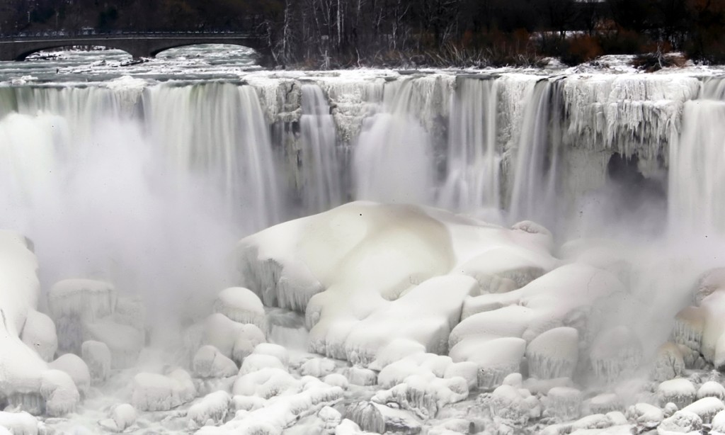
The striking visual by far was from a site located exactly on the US-Canada border, an eye-catching a frozen Niagara Falls, that icon of liminality:
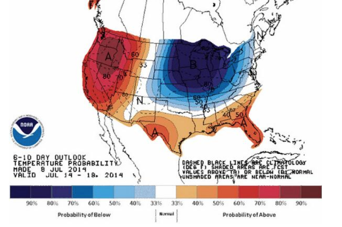
The distributions that charting the mid-July summer chill newly arrived in the Midwest and much of the East coast of the United States from Canada is less striking, even if it will bring dips of twenty to thirty degrees form the normal. NOAA omits Canada completely from its prognostications of the arrival of the coming cold, as befits its role as a national agency, and restricts its purview to United States coastal territories, even though it would make the graphic far more credible to offer a greater coverage. It provides something of a summertime counterpart, however, in which the probability of lower temperatures than usual seem to create a ring about the same lakes, radiating almost to the Atlantic coast:
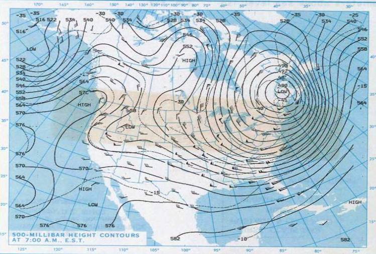
Where is the center of this new system of cold air? With roots in Hudson Bay–where else?–the polar air will be spinning southwards at the upper levels of the atmosphere, spinning southwards toward the United States. There were past migrations of arctic air over Quebec and Maine, back in late January, 1985:
The Detroit Free Press even seized on a recent NOAA projection of a similar displacement of arctic air, that locates the center of cool air migrated toward Michigan, forming a pool of air that had descended into the central United States, as if to cast the event as something like local news, even as it suggests the rise of two weather systems:
The occurrence isn’t strictly polar, or arctic, in its origin.
But the results are the consequence of a sort of distorting decentralization of the polar cold air outbreak that hovers around the arctic circle, running around the pole and allowing or protecting cold air from drifting south, containing cold air or not it its high altitude low-pressure system. (Of course, the west coast is poised for a dryer and hotter-than-normal week.) The decline of snow and ice around the Pole, combined with the warming of the wobbly gulf stream, will allow the chilly polar air to spill southwards to the plain states, covering not only Canada but spilling outside the low-pressure system and over to the seaboard, in a sort of nervous breakdown of meteorological model behaviors.
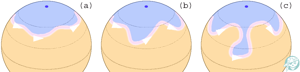
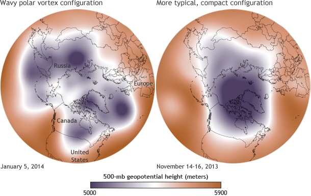
The disturbances of equilibria in our weather maps makes it worthy of more than symbolic note. The increasing variability that the waviness of the outer line of the low-pressure system, or jet stream, related to the declining snow cover in the far north, in the a “warm Arctic-cold continents” pattern, where the compact containment of colder airs was broadly breached.
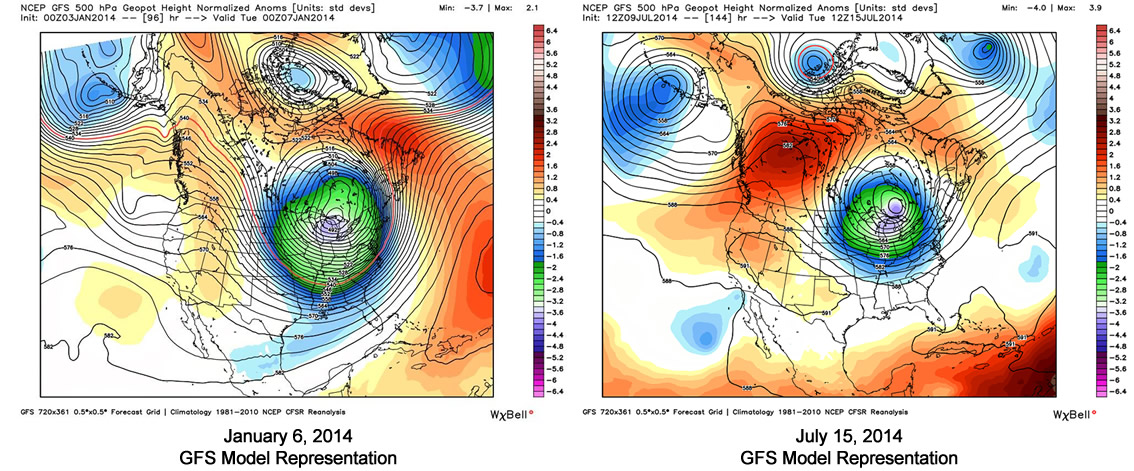
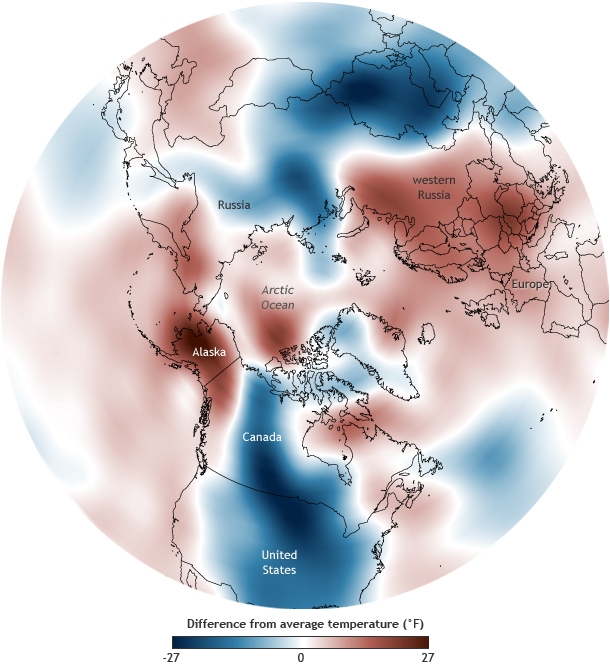
The lack of equilibrium in the stream of polar winds–distinct from the widening polar ozone hole–opens up more of the terrestrial surface to chilling shifts in temperature. As much as the embodying a low-pressure system, the map is a narrative of the disruption of climactic harmony, and view toward the future of weather systems world-wide. The results of the wavy polar vortex, joined with rising world temperatures, create a map of bizarre spottiness in average world temperatures that is difficult to conceive or map, precisely because its high-altitude distribution is difficult to transfer from a spherical to a flat surface, and because its distribution unfairly privileges the tracking of cold air in ways that seem, misleadingly, to fly in the face of the maps of our overheating world. This past January, NOAA crafted a digital globe that displayed the distortion of local temperatures distorted beyond the norm, with cold displaced from its polar resting place, resulting in a cognitively useful modeling of a disjointed jigsaw of cold and warm air, where the warmer deviations of global temperatures spick not only over western Russia and Alaska, but at the polar regions itself.
NOAA Climate.gov
The result is a jigsaw reveals the breaching of cold air from the cap of winds that encircle the polar cap has a enough of touch of biomomorphism to echo ecofeminism; the forcing of warmer air patterns resembles a blurry sonar image of curled-up embryonic twins resting in a womb as if evoking the shape of future weather systems, offering a biomorphic visual metaphor for something like an eery augur of a future holding limited possibilities for an afterlife–and of the unknown future of our planet’s atmosphere.
We read more maps than ever before, and rely on maps to process and embody information that seems increasingly intangible by nature. But we define coherence in maps all too readily, without the skepticism that might be offered by an ethics of reading maps that we all to readily consult and devour. Paradoxically, the map, which long established a centering means to understand geographical information, has become regarded uncritically. As we rely on maps to organize our changing relation to space, do we need to be more conscious of how they preset information? While it is meant to be entertaining, this blog examines the construction of map as an argument, and proposition, to explore what the ethics of mapping might be. It's a labor of love; any support readers can offer is appreciated!


