New fears that the infectious Ebola virus might mutate into an airborne disease have triggered deep anxieties of national safety in recent weeks–and elicited fears about national preparedness rarely–if ever–raised before the arrival of Thomas Eric Duncan at Texas Health Presbyterian in Dallas, Texas. Those fears are insistently restated and summoned in the range of monitory posters affixed in all hospitals across the country, creating a widespread mapping of the dangers of the spread of disease far more alarmist about the possible proximities of infection than about geographic knowledge: the point is almost to suggest that this modern disease, or potential third plague, will itself transcend spatial categories of the past, for the very reason that the possibility of contagion is augmented through the connections created by airplane travel and indeed that epidemiological understanding of the danger of infection by the disease is mapped as if mediated by the vagaries of the inter-connections afforded by the networks of global airplane travel–even if infection by the disease depends on the exchange of bodily fluids.
The not-so-reassuring sign at an Oakland, CA hospital reminds viewers to remap their possible relations to the disease, and be mindful of the network of possible communication of the Ebola virus by the vector of airline flights, much like that which brought Eric Duncan to Dallas, and the interconnected nature of a disease’s communication in a globalized world.

The rise of one case of infection that spread in that hospital helped further to transform a dire health emergency located only in West Africa into a danger seeming to lie at the edges of a nation increasingly obsessed with patrolling its borderlands. How did a virus whose expansion as a world health emergency was so sadly ignored for months as it spread in West Africa come to be re-dimensioned as a subject that, with a dose of posturing, was a concern of national security? The answer partly lies in the steep challenge to spatially orient individuals to the possible pathways of viral infection, and to hold the fears of potentially new pathways for its contagious transmission at bay. (The infections of two nurses exposed to the disease raised fears of the abilities that we have to contain the illness in a hospital setting early on.) Even if concerns that Ebola virus may mutate lack much grounds, given the virus’s unchanging nature over time, the mutation of mapping the spread of a disease in West Africa to tracking possible pathways of communication outside the continent has provoked far more intense reactions than did news of the spread of the virulent disease over several previous months.
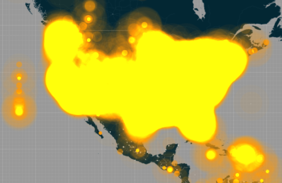
Fear is difficult to quantify by exact metrics or measures. But the increasing density of levels of tweeting with the term or hashtag of Ebola offers a barometer of alarm about Ebola virus’s transmission. For the 271 million active users of Twitter exploded with 140-character pronouncements about the arrival of the infectious disease across the Atlantic, beyond the expected boundaries in which the highly infectious disease had been first tracked over several previous months. The rapid expansion of tweets mentioning Ebola illustrates how the virus came to infiltrate (and infect) social media world-wide exploded from the first of October, when the increasing density of tweets in the United States’ 52.7 active users so drastically grew. The twitter maps show a marked explosion mentioning or tagged #Ebola dating from the announcement an infected Thomas Eric Duncan, a Liberian-American afflicted with the Ebola virus was being treated for the disease in Dallas on September 30. Within a week, and for the week before his recent death, the virus had migrated to national news when the arrival of a patient afflicted with Ebola in the United States had raised questions of how his arrival had not only been permitted, but how the way that Duncan had gone untreated after arriving at an emergency room in Texas Health Presbyterian in Dallas opened the avenue to the infection. Even as confidence grew that health risks were minimized, the density of tweets that illuminated the country insistently up to just three days before his death, as if threads that so inundated the twittersphere had themselves grown so intense so as to obliterate the boundaries of the United States, so intensely exchanged were tweets to overload the mapping abilities by firing off some 6,000 tweets per minute with astounding rapidity, compared, according to Time, to a frequency of 100 tweets per minute in the days before September 30.
At the risk of attributing the nation one identity, Twitter users across the country were suddenly passing news of the virus’s arrival in the United States with newfound intensity, in ways that don’t only betray the mass-enrollment of the medium’s 48.2 million US-based users. The electrifying confirmation of the actual arrival of an Ebola-infected patient spread throughout the country in something like a Great Fear which had been prepared for by the unrelenting news of the infectious virus’s spread across the Atlantic. While acknowledged, the disease’s spread–or the hashtag–was less clearly an issue of the moment that merited tweeting about.
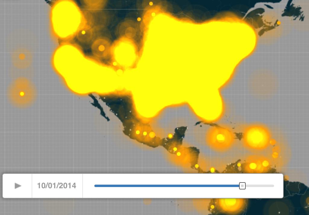
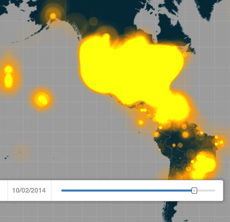


The mapping of geo-tagged tweets with the hashtag Ebola had dramatically mushroomed as early as October 1–or from the moment news of the arrival in Dallas of the tragically infected Duncan spread. They register the panic generated as word got out quite quickly that the first case of infection had arrived, undetected, in the United States, not only at the Dallas airport but in Dallas itself, to a local family, in ways that seemed suddenly to confirm both the permeability of our borders and the lack of geographic remove of a virus whose infectious virulence was widely known, but appeared contained in West Africa. While in mid-September, the extreme intensity of tweeting appears limited to the major cities in the United States, the proliferation of twittered conversations by October 1 triggered something of an information about the arrival of the term in public debate and led to issues that had no prior tie to the infectious disease. The tweet that the CDC issued describing the spread of the disease by contact with bodily fluids —
–retweeted over 4200 times, bearing the calming words “Ebola poses no significant risk to the United States“–have been balanced by numerous alarmist tweets of the arrival of infected airplane passengers who entered the nation’s purportedly poorly guarded borders and inadequately monitored points of entry.
From a concentration of alarmed tweets largely the coasts of the continental United States, messaging proliferated after the Duncan’s identification as a case of Ebola in the Homeland with an unheard of density that overwhelmed the nation’s cyberspace and clogged up the twitter sphere in something of an information overload as Ebola became the hot topic of 140 characters.


It is interesting that while the United States was set aglow with alarmist tweets, as was England, the countries across our borders, Mexico and Canada, show relatively low traffic–as to mark the rebirth of Ebola as a national phenomenon with Duncan’s arrival, at times, by October 2-5, in a startlingly uniform manner across the nation, whose tweeting density cartographically overwhelmed registration of its own borders: the radii of tweets expanded beyond the shorelines of the continental United States, as if registering the overwhelming nature of national attention to the virus on the internet. If as early as this last summer, tweets had wondered, with the first news of Americans infected with Ebola to return to the US in hopes of being cured, “How many degrees of separation are between you and #Ebola?,” our friends at Fox posted a handy projection whose alarmist tone seems designed to stoke fears by casting the disease as a national problem by mapping potential treatment centers within our shores, to suggest where those afflicted with the contagious virus might be transported in due time:
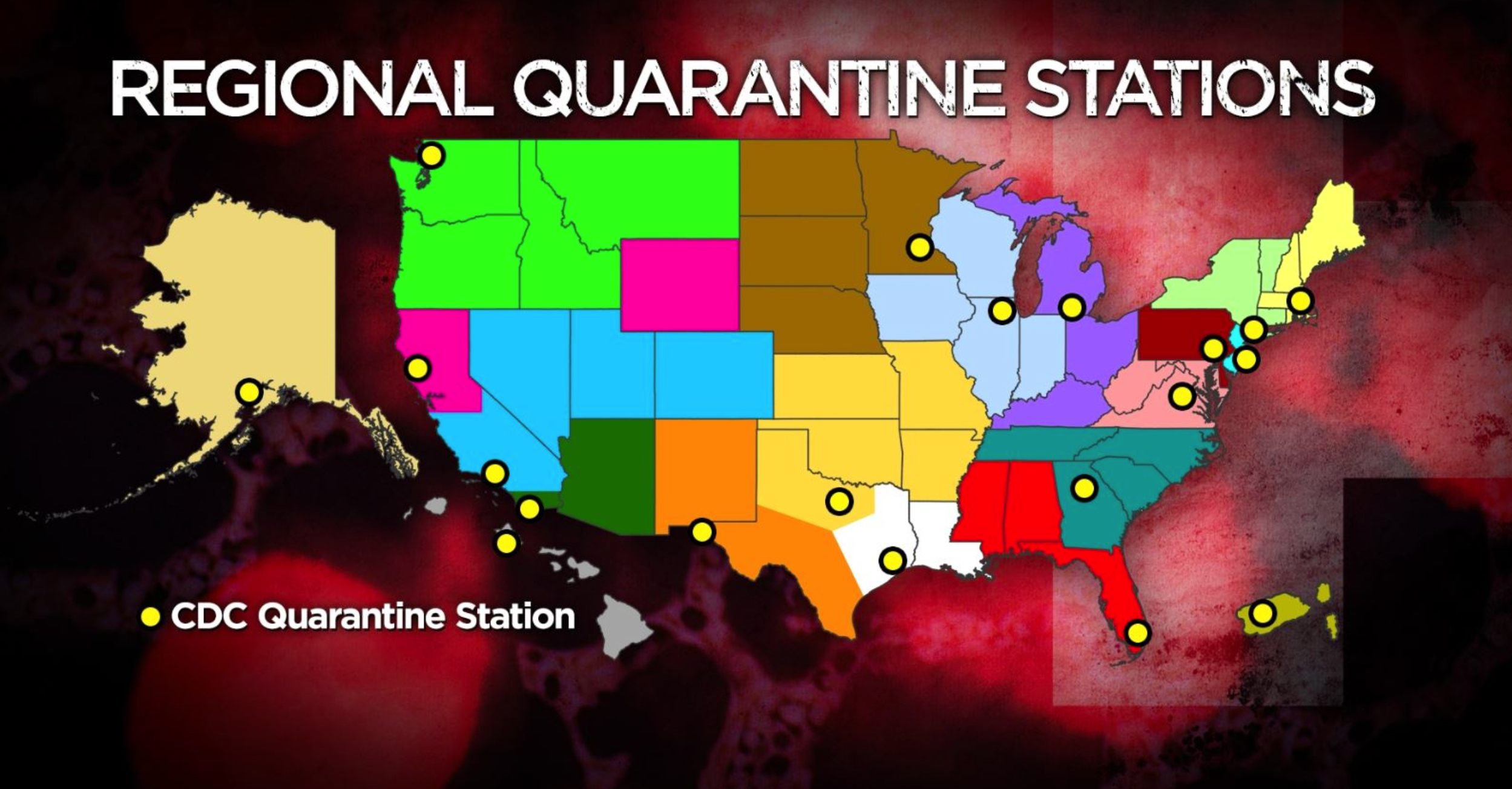
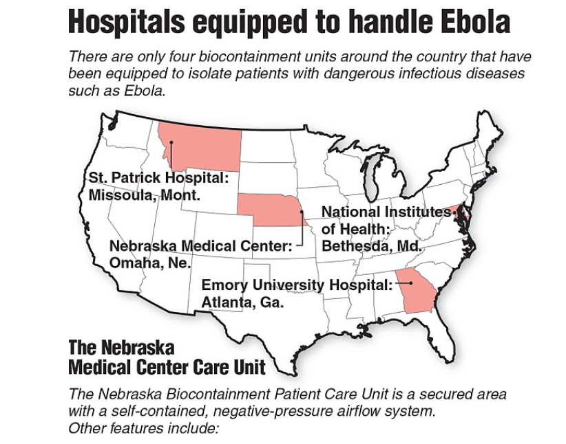
Coming shortly before the WHO declared the outbreak an “International Health Emergency” on August 8, the mapping of CDC Quarantine Stations on the nightly news recast the problem of mapping Ebola’s contagion as a problem that might be located within our shores, rather than across the Atlantic ocean. After all, the map reoriented our attention in relation to the Ebola story as if it were now a national issue.
(The BBC map of early October 2014 that tracked the future displacement of patients that contracted Ebola virus while in West Africa showed the eventual global ramifications of the virus, before the first known case where Ebola virus was contracted in the United States, spreading new fears of transmission that involved state, local, and federal officials; it provides a strikingly poor notion of the spread of the vectors of contagion–
 BBC
BBC
based as it is on a map of countries, rather than pathways of infection, and illustrates the high levels of anxieties around placing Ebola in space.)
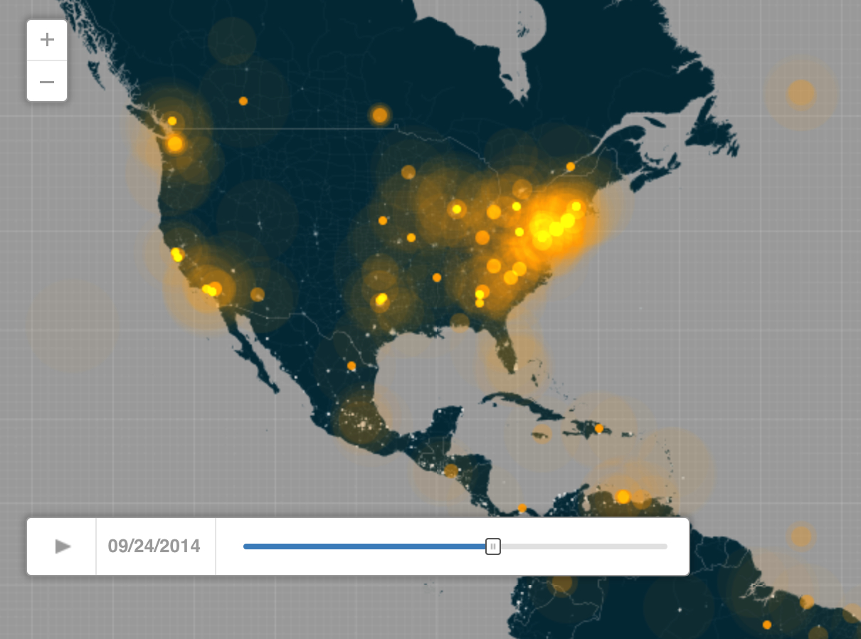
The expanding radiation of tweets from major cities charts the emergence of a geographically removed epidemiological crisis of Ebola within the national borders of the United States around a very precise date. From a phenomenon that was confined to major US cities on a September 28 twitter map, whose points of greatest density were confined to Baltimore and Bethesda, the New York area, Charlotte and Atlanta–

September 30 provided a burst of tweets from Dallas in the center of the country, consumed by tweets–

–which went national by the first day of October that suggest the knitting together of the national twittersphere with new focus by Oct 2 as the entire country increasingly tweeted about the virus’ spread grew to overwhelm the messages that Americans posted on the Internet:

The limitations on tweeting in mid-September in the United States–mostly confined earlier to the northeast and Los Angeles, as well as Texas, was truly explosive. #Ebola developed conversations in many fronts, at the same time as it was inevitably poised to enter public discourse about the nature of the United States’ borders, until regular checks and screenings at airports and screening agents in full protective gear, poised with thermal guns to greet visitors from the most severely Ebola-stricken nations like Liberia, Sierra Leone, and Guinea, in order to detect elevated temperatures that might betray signs of the fever associated with the virus, and, should need be, placed in quarantine. But even as attempts to start screening procedures in hospitals and airports, the fears about the invisibility of the disease, and the difficulty of detecting those infected in the earliest stages, has triggered deep-set anxieties (if not paranoid fears) into which several politicians have, however improbably, sought to tap, in ways that create a powerful new hybrid between infectious pathways and national threats. The difficulty of screening folks who arrive in the country on all flight pathways leaving countries afflicted with Ebola–given that no U.S. Airlines actually fly to West Africa, outside of Lagos and Dakar–and that any restriction of imports to the region would paralyze local responders. (One of the more widely diffused maps of the accelerated viral communication air flights from West Africa could encourage imagined the arrival of Ebola from Dakar to New York and Washington, DC alone, rather than Dallas.)
 Mother Jones
A subsequent more DIY iteration of a similar map projecting the dangers of contagion from airplane flights, if one of considerably more questionable politics, imagined the multiple flight-paths, this time from Lagos as vectors of disease from Ebola-afflicted countries:

Such maps raise impossible questions of how to quarantine for Ebola linked to questions of national safety, and oddly removed from a global context in which pathways of viral communication might be charted–or the global count that now exceeds 4,000 deaths. They have led to multiple maps of the global cases of Ebola to be charted on Wikipedia to more alarmist WordPress blogs, to come to terms with the spread of the fatal disease whose name is now on everyone’s lips–often suggesting, with the intensity of an infographic, information that is somehow being withheld or not fully released to the public. (The rise of such self-made maps of Ebola, often using data on a Google maps template, has put it into the hands of all to act as muckrakers and unmask the new dangers of the virus’s future spread.)
The “inside story” that has developed on Ebola’s transmission have no doubt generated the spread of miniblogs about Ebola across the twitterverse. Even the screening measures that are able to be introduced at airports, CNN reminds us, are, in the words of Laurie Garrett, author of The Coming Plague, “something to calm the nerves of the American people, the British people, the French people, and so on” as if this were a first-world problem of anxiety-control; Mary Schiavo, former Inspector General of the US Department of Transportation, dismissed them as “entirely window dressing, because we have to do something,” but have little sense of what to do at any rate. Schiavo cautioned “there’s much more that needs to be done to keep people safe,” as if the government were being lax. Yet for a disease that does not reveal symptoms for some three weeks after infection, the tracking of potential vectors of transmission is extremely difficult, if not impossible. On a related front, shortly after Texas Governor Rick Perry announced at Texas Health Presbyterian that “Professionals on every level of the chain of command know what to do to minimize this potential risk to the people of Texas and this country,” mutated over the following week to a message from a Border Control agent in the Rio Grande Valley that “we might not know how to respond [my italics added].” “Did they train up or come up with a plan to respond to this? I don’t know,” he added, spinning up new fears in the mind of the general public and linking border-mania to Ebola. The tie between Ebola and our borders materialized the threat of the virus as a “homeland risk” in ways that prepared for its entrance into national debate; members of Congress like Rep. Duncan Hunter (R-Calif.) preposterously describe Ebola as “another instance of the federal government ignoring the ongoing problems on the U.S.-Mexico border.”
Thomas Eric Duncan’s arrival in Dallas weeks after the mapping of imagined pathways of contagion itself suggests a far more complex threats of a network of indirect flight paths than can be revealed in a map of direct flights from Dakar–and reminds us that the danger of infection on airplanes is far less than the transport of the infected. The data overload mapped on Twitterfeeds reveals how Americans came to suddenly process their relation to a disease that had arrived on their shores, some seven months after volunteers first rushed to West Africa in hopes to contain the disease’s spread. The delay was astounding, as was the revealing of the increasingly limited and mutable nature of the attention spans that might be measured by Twitter feeds–and the inevitably metastisization of debate about the arrival of West Africans with the disease not only by airplane–a vector of transmission long feared as it almost inevitably hybridized with other discourses on national vulnerability. The first warning from a border guard about the danger of Ebola entering the United States in the Rio Grande came from the suspected apprehension of an Ethiopian, so widespread was the fear of African provenance of the disease that had come to appear as if it lurked just across our borders.
Did the relative lack of tweeting on Ebola in Mexico suggest a lack of interest in the spread of Ebola there, or just the absence of how the disease so readily intersected with fears about the preservation of boundaries?
Despite the confidence of the CDC at the abilities to control and staunch the spread of the disease, a panic rapidly grew around the vulnerability that the arrival of Duncan in Dallas suddenly suggested itself across the United States. For his illness, the story of his rejection at the hospital, and his ability to pass undetected through the Monrovia airport, beyond the fears stoked by quarantining of those with whom he had close contact, offered evidence that our borders were not secured. The anxieties that were unleashed were either cunningly paired or themselves latched onto, as if by haphazard association, the obsession with borders in the United States, from the wall that has been constructed to keep out Mexican immigrants from the country; fear of illegal migration was openly conflated with the arrival of a threat from which the US government was insufficiently protecting its citizens. And in a triumph of isolationist thought, talk radio foresaw that should any US soldiers be dispatched to help with the treatment of West African countries that lack an public health infrastructure, they would turn into vectors for the disease to be brought to the US, in something like a homeland security threat some even cast as a plot to inflict punishment on current residents of the United States for sins of slave-holding, linking the severity of the infectious disease in Liberia to the founding of the nation by former US slaves in a despicable bout of geographic free-association and tragicomic transhistorical whimsy.
The story of #Ebola, it was proved, not only has legs, but will travel with the rapidity of the infectious disease itself, in ways that make it the most attention-getting news item at a time when political pundits are thirsty for news stories that would be able to make a big impact and circulate. The contrast in twitter maps over the course of just two weeks is striking, as is the spike at the time of the announcement of Duncan’s arrival on US soil:

And by October 3, the United States seemed distinctly obsessed, aside from non-Twitter users in Montana:
 October 3
 October 4
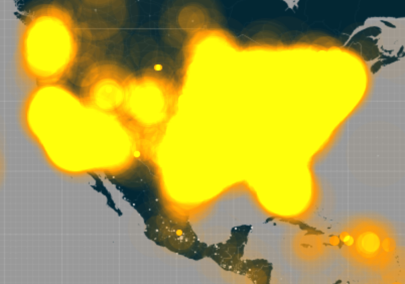 October 5
Much of this retweeting seems to have lain not only in an understandable fear, as the knowledge grew about levels of Duncan’s compelling tragedy and inadequacy of his care, but much of the tweets were no doubt panic-inspired 140 character alarms, a condensed Great Fear in miniature, as the shock that lurked behind Duncan’s tragic history mutated into intense fears about national vulnerability and preparedness–or national safety.
The notion that Ebola should mutate from a global public health emergency to national threat seems particularly cruel, since the long-threatening virus has suddenly gained such widespread traction after being grafted onto free-floating fears for national security. A categorical confusion occurred bout the infectious nature of Ebola, which mutated as make Ebola’s attack on the lining of internal organs suddenly gained immediacy. Despite the concern about the future spread Ebola outbreaks historically confined to West and Central Africa, the illusion of the geographical remove of Ebola created a compartmentalization of public health responses that were suddenly, with Duncan’s arrival in the United States, been breached:

Several public response, as manifested in Pennsylvania health posters, predictably seem considerably more measured:

But the fears of how Ebola disrupts previous models of the communication of especially virulent diseases seems to reflect how it stands to disrupt our categories of thought, breaking imagined gulfs between cultures and bridging oceanic expanse, in ways that even the utmost vigilance creates no barrier for. And in an era when making barriers to immigration, to terrorism, and to the new nature of risk. The readiness to install teams of officials equipped with infrared temperature guns to take the temperatures of all passengers arriving from Liberia, Sierra Leone, and Guinea is by no means a fool-proof method or one even guaranteed to detect the presence of the virus among all passengers, but the intensity of the screening procedures enacted by the CDC’s division on global migration and quarantine (who knew it existed?) to be conducted by customs and border protection officials from the Department of Homeland Security–wearing Homeland Security badges–who are already mobilized and stationed at John F. Kennedy International airport, and already invested with authority to stop and search all international travelers. Eventually, their place is to be taken by members of the Coast Guard and eventually medical workers under contract with the government at five airports, but the men conducting the “expanded screening measures” are supervised by the Office of Homeland Security’s unit if US Customs and Border Protection.
The link was present in fear of border-crossing allowed the risk of Ebola to grow so expansively across the country. But the breach was apparent not in the breaking of any actual national boundaries, but in the new category of the “homeland”–from airport screening to border stations to the protections that the government can offer to its residents–in a way that made no real sense, but that suddenly invested a new logic in Ebola virus that allowed it to move from the far-off to the close-at-hand. All of a sudden, the disease acquired a new identity as it became a “homeland risk.”
That said, we might do well to pause, even given the dangers that outbreaks of Ebola poses, over the multiple other risks for death in the nation.
 Business Insider
For the magnification of the local risk of screening for Ebola, for all its rootedness in a deep instinct for self-protection, seems to mark a turn away from an epidemic that is already worldwide–in a dramatically misleading graphic which, while this map by AmericanXplorer13 has made its way to Wikipedia, misleadingly suggested that local transmission of the virus has spread throughout the Eurozone and to at least three states in the US.

“Map of Ebola Outbreak – 1 October 2014″ by AmericanXplorer13 – Created with tools from Kartograph, released under the AGPL license
The irresponsibility of such a map, or self-made data-visualization, even though it was careful to note that no deaths from Ebola had yet occurred in several regions, almost intimated that the spread of the virus from West Africa, or out of the zone of its “widespread transmission,” had breached the barrier of containment. Far better is the graphic from the New York Times, which transposed the same data to a far less troublesome data vis, but is so striking for how it attached a medical narrative to the two cases contracted out of Africa it described, but where the slight narratives of different coloration contrast with the anonymity of the ochre spaces that mark “Countries with Ebola outbreaks,” as if the responsibility lay with their governments. How can one, indeed, give individual faces to the upwards of a thousand cases contracted each week.
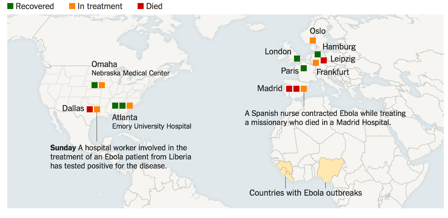 New York Times
The problem that we face of mapping the international health crisis of Ebola demands more informative ways to map the virus’s transmission. We are in danger, even in our hospitals, of transmitting cartographies of fear that derive from a demand of soothing incoming patients’ deeply seated fears about the virus as if it might be indeed airborne–when will it mutate, and where?–instead of providing accurate information. Indeed, the expansion of those countries included in the info graphics that confront patients in a rather hastily affixed sign taped to the welcoming desk found at the entrance of a basic hospital in northern California–where no cases have been reported as of yet, and where no Ebola treatment centers exist–dramatically magnify the precautions taken with those arriving from “countries with outbreaks,” building on the immediacy of the case of Thomas Eric Duncan in ways that seem designed more to prey upon fears than truly to calm nerves.

The odd adoption of afrocentric colors in the warming poster–green, orange-yellow, and red–evoking an African flag or a Kente cloth fabric or a Rastafarian trim–both tries to remove the disease spatially as resolutely African, and to locate it as a by-product of cultural and human migration that has arrived on our shores.


