
13. In the Bay Area, we had been sheltering in place rather early, and its early place in the national roll-out may be bearing some fruit. There is a pleasure in concentrating on place, if only because the broader picture is so dismaying. While we are privileged to live close to outdoor spaces that are still open, if we maintain distance, we can thankfully try to take walks in canyons, meadows, or open spaces, rediscovering some of the trails that we once walked on with a newfound appreciation, as exits that enabling our cloistering in often small homes, San Francisco Estuary Institute invited us to help continue a collective mapping project of “hidden nature” in the city by convergent it into an exercise of cartographic therapy, by mapping those sites we wish we could visit in San Francisco’s removed ecological past. Many such open spaces are closed, however, and it is best to look to the past topography to find the locus amoenus that one would want to rest in one’s mind.

Attending buried ecological treasures in the city from hidden creeks to animal habitat is perhaps a desperately needed sort of therapy, as we try to navigate a new present, listening to our family members or children talk to friends to retain a sense of social contact, or enter into sometimes comforting, sometimes painful, teleconferencing where one painfully discovers one often has less to say than one expected, or perhaps hopes for much more than videoconferencing allows–or are refreshed just in looking into other peoples’ homes, rather than our own, and remembering how deprivation leads to an appreciation of the taken for granted technology, appreciating the hollow miracle of the ease of contact with those spatially removed, but savoring its taste for what it is. (Or looking out our windows with new eyes: low car traffic led one friend to spot a Road Runner outside his house, an oddity far greater than a turkey hen, as we look out our windows with new eyes.)
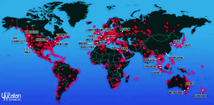
But the unknown extent of the virus’ travel and its regular mutation are worrying. Rather than rooted in familiar geographic categories, they offer more evidence of the global pandemic–perhaps for that very reason so hard for Trump, FOX, or the right wing social media aggregators to process–than we have ever had. Globalization is not the ability to navigate the world; it is the sense that we have been displaced by things that travel across borders, globally, and along spatial frameworks which we might have fashioned, but which are not inhabited by us: we no longer travel around the world like internet cable, digital transactions, and financial wires, or with the amazing rapidity and mundane mutability of SARS-CoV-2: the virus is moving at a rate that challenges our mapping engines, displacing us from its advance, and offering no clear narrative by which it can be processed for some time, creating a web of an interlinked globe that is stretching far beyond the scope of our claims to governmentality, and that we demand multiple mapping resources to try to process, to chart the different strains of COVID-19 that have developed globally, their relations, intersections, and the possibilities that antivirals might be developed to contain their spread.
By late March, the eight major stains that NextStrain mapped as unfolding over space that used an amazing availability of open data–and data sharing of an unheard of velocity in to respond to the face of an emergency that was global scale–reminded us that the continued parsing of the virus by cases in different nations, and different health systems, was no longer adequate, as one was no longer looking at maintaining national lines of defense. For NextStrain’s genomics maps used the quickly mapped genomic sequence of the virus to map its mutation of its multiplying strains over space, tracing the interconnection among the growth of infections that, by late March, had considerably shifted their global concentration, to be centered in Europe, and to be spreading in a complex global web, more akin to a map of airline travel, underwater cables of high fiber optic transmission, or the intensity of frenetic shifts of the global distribution of goods, more than the ways that we had seen diseased and infections behave in the past or had mapped their behavior.

We continued to see the virus in something like a divine onslaught, a mess of data, that evoked a global crisis of biblical proportions, in the sense of an external onslaught not tied our own remaking of global space.
The immediate impact of maps of a global pandemic is to disorient, and to strike panic, removing us from a sense of attending to a global expanse, calling attention to the emergency status of multiple individual point without any sense of mindful indviduation.
14. We need new narratives of globalization, to tell visual stories of global pandemics, to map the spread of COVID19, and where can we find them? As we fall back on an apocalyptic narrative of the globe, the networks of transit are far more mundane–transit in human bodies, air ducts, internal cabin airplane atmospheres, transit corridors, conference rooms, dispersed droplets, and vaporization in what we must call heterotopia, far more than meat markets, in which the non-living virus globally. But we also need an intense granularity in such maps, given the already evident clearer vulnerability of poorer populations to COVID-19, with not only less access to space, environmental cleanliness, but opportunities to isolate themselves from social interaction, and often to have access to medical protection from masks, whose wearing can staunch the spread of disease, to access to medical care or public medical notices.
National and global maps, of dot density and with added buffers, may mislead by tracking humans, and humans who contracted the novel coronavirus, without much sense of how it was so widely communicated, modes of communication misunderstood, as we marvel at how it travels between individuals over such a huge expanse, or even its own presence in human hosts, from asymptomatic or symptomatic subjects, and why it is so hard to detect by figures of infection or mortality alone.

The value of these arresting maps, which call attention to their individual points as growing sites of viral contraction, are hard to take; the gravity of the maps is all the more hard to process in all its immensity, if the weight of each of those growing red transparencies seems to way upon the social fabric like measured weights on a scale of justice, that might be thrown out of what at any moment.
They seem to register, like a counter-measure to the obliviousness of the executive who nominally oversees the nation, a sense of the possible stress tests that the spread of the virus poses as it is rapidly transmitted in congested areas, and as public health measures, often were discouraged for overly long as viral incubation occurred. In an ear when we have lacked national leadership, we have literally reified news bubbles that plagued our politics, it seems, in the tripartite division of bulletins–

–as the”daily briefings” become opportunities for spin, chances for potshots, and restraining his own health advisers, degenerating into the President’s incongruous delight at the unforeseen bonanza of surges of ratings averaging 8.5 million to 12.2 million viewers on CNN, more than information, he seems stalled before the whose scale and scope he fails to process, portraying it as a domestic dispute or squabble for authority. The odd theater of briefings before authoritative backdrops at 5 pm Eastern that bleed into the six o’clock news that they often upstage have almost generated alternate news points of orientation.
One is Andrew Cuomo’s s daily combative press conferences in New York City, nominal front lines of America’s war on COVID-19; from the west coast, daily press conferences hor Gavin Newsom’s midday briefings, held at noon, Pacific time, delivered with reassuring command from the state capital in Sacramento, based on “real data,” feature maps breaking down numbers to demonstrate effects of public responses to the virus and numeric results of Sheltering-in-Place to contain virus’ spread. Newsom is not only openly defending the “SIP” order, but is promising locations of sites of testing that will be provided–first setting a goal for 27,000 tests a day in mid-March, then growing that to 60-80,000, in mid-April, for those at high risk, with locations for rural populations, and minorities who have been hit hard and are often without as secure health care programs in place. Kaiser Permanente is constructing a $14 million, 7,700 square-foot laboratory in Berkeley capable of processing 70,000 Covid-19 tests a week when it opens from June 1; the variety of drive-up sites in the Bay Area already offer the chance for local testing.
The assuring image of leading a collective response with a public health agency.–as well as assuring that the numbers of infections may well go “through the roof,” a good concrete metaphor, should we suspend Shelter-in-Place. As we have found local infections far greater than reported, the danger is clear–while letting us know that, without any mitigation, up to 22.4 million Californians would contract COVID-19, creating a clear counterman of open contingency to suggest the urgency of a reaction.

The number that Governor Newsom cited was in an open letter to President Trump may have reflected his close communication with Nancy Pelosi, Speaker of the House, a comrade from Northern California. But it raised questions of what sort of landscape we want to confront, and the contingency of possible futures we are in need of mapping.
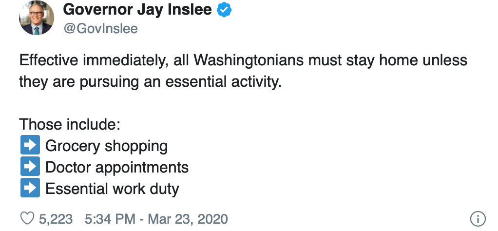
But the terminological fragmentation in confronting COVID-19, resting often in spin suggested a linguistic re-dimensioning of urgency and need the reshaped the topography of danger: the mapping of infection that has led California to declare its “Shelter in Place” or “SIP” program on March 19 as an efficient response transformed into top-down “Stay at Home” orders in Ohio (March 22); or measures in Tennessee, Ohio, and Colorado that were contingent on gubernatorial decisions, cast as restrictive more than beneficial, many suggesting a need to transition to no-capitals “safer at home” policies of advisory form; the “Safer at Home” modulation begun by Ron DeSantis in Florida from April 3, leaving houses of worship from churches to synagogues exempt from the order, in ways that will undercut the fundamental need to restrict large gatherings where the virus can be easily transmitted. Lexical fragmentation led Kentucky’s Andy Beshear to issue a “Healthy at Home” order March 26, banning out of state travel March 29, as if to isolate the state, and imposed a 14-day quarantine on those who do, if he acted late in the day; “Stay at Home Missouri” began only on April 3; Oklahoma’s Gov. Keven Stitt limited its “Safer at Home” order to older residents on April 1; South Carolina issued a “Home or Work” order–one of the last in the nation –on April 6. Governors insisted on their own ability to interpret the data, given the absence of a national policy, as they were effectively delegated explanatory roles given the absence of meaningful national statements of health policy. The voice of clarity of Jay Inslee of Washington’s “Stay Home, Stay Healthy,” laid out a logical explanation often missing:
The sense of contingency is already implicit in the symbolic abstraction of these maps. To be sure, the abstract formal rigor of some may remove the crisis of COVID-19 and its exposure among more vulnerable populations of critical importance to be mapped.
The wishful thinking of many choropleths that suggested that the health care crisis could be contained–or was contained!–obscure the deep disparities to health care and even of maintaining distancing and cleanliness, vital to issues of national security as well as forms of empowerment and tools of survival. The fault lines that exist in the landscape of health in America that underlie this uncertain data distribution, underscored by the fact that low-income jobs in the service economy, retail, delivery, or gig economy fields both offer few health care options or sick leave and cannot be performed remotely, and the tie of income to higher rates of chronic health conditions that can provide cases of comorbidity–from diabetes to asthma to heart disease, significantly increasing vulnerability to COVID-19.
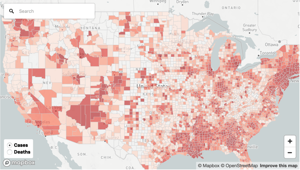
New York Times/Mapbox/US Census Bureau/OpenStreetMap
15. But are these maps not on the entirely wrong scale to depict a virus that moves locally, microbially, in our lung linings, if it moves also on a global scale?
Mapmakers of the distribution of vulnerability must represent heightened dangers of contracting particles smaller than 10 micrometers in size by the scale of aerosolization. For as strands of the virus are distributed over local spaces through an exhalation, cough, or sneeze, we might consider the scale of global maps or national maps deeply incommensurate with tracking their progress over space in national buckets in which the data comes: the different dispersal into the ambient air may linter over hours, but a greater load might be unsuspectingly released with a degree of atmospheric dispersion we must consider to appreciate the rationale for the rapid spread of the virus, both on the front lines with health care workers, and across territorial bounds or administrative divisions.
The danger of breaching a barrier with health care workers on the front lines of containing COVID-19 is not only extremely sensitive, but should be a crucial boundary line not to breach.

As asymptomatic individuals prove as infectious as symptomatic, public guidelines for managing personal care have proved erroneous, as is so often the case, and protective measures may be insufficient. The difficulty ctontaining a virus that is transmitted in a world that is increasingly intimately connected reminds us of the dangers of modeling host-to-host transmission on physical proximity, rooted in an understanding that the size of droplets determined the “load” of viral transmission, propelled and preserved in turbulent clouds, over thirty feet, persisting in ventilation systems, air ducts, airplanes, and homes, in ways that make the transmission of the respiratory syndrome extremely difficult to consider by existing models of the transmission of infection diseases, depending on direct contact and physical proximity, fail to model the extent of airborne infection emitted at high speeds into the environment, most certainly exposing care givers and health care workers far beyond the six feet they are asked to remain from patients, or the six feet that CDC has advised Americans to remain from one another.
Without providing the necessary protection of health care workers to maintain a safe physical distance, do numbers of infection create a false sense of a spatial buffer of security needed to halt the spread of a disease? Even as we map its spread in the outdated categories of datasets–in the government and in the national and international news–based on state or national agencies, but not integrating the several spatial levels–regional, global, and local–which is masked in the aggregation of massive data of a virus that is communicated at the level of droplet dispersion across space?

Suggestions of distancing, cleaning, and social etiquette are constantly being redefined in the face of the dangers of airborne aerolsolization; viral transmission occurs in droplets of a diameter below 10 micrometers, and can extent beyond six meters in radius, with a cough–one of the classic signs of infection, a sound making us freeze in the street or in line at a grocery shop as we hear its rumble, sending shivers in our sympathetic nervous system, not only from sympathy. Although the diagram is crude, its metrics focussing on a dispersion of red dots is one we must better attend to understand the importance of personally mapping social distancing, as we more grossly map numbers of confirmed infection and disease in geographic space, or tracking exposure of individuals to those infected with COVID-19.

The above crude diagrams of droplet dispersal is, eerily and terrifyingly, formally quite similar to the visualization practices of dot density maps that position infections by red dots. But the scale is wildly different, as if reflecting the hard ability to process the global pandemic by set scales. If the spatial persistence of payload travel in space that is deemed to protect one from exposure to the pathogen suggest far easier routes of contracting the virus than the spatial distribution of cases of infection across the country would suggest. But as such approximate tallies of new infected in the United States, if decidedly only partial, have come to surpass any country in the world, the scale of the event, which seems poised to reveal social fracturing lines in multiple ways as terrifying to the viewer as the progress of the virus that starts with a loss of smell, coughing, and proceeds to starve the body of oxygen and send patients into delirium or worse, progressing to potential loss of parts of lungs.
More than indicate the fault of earlier paradigms of infection on which social distancing guidelines that health authorities suggested were based, they suggest how much we are unprepared for the dynamics of the transmission of the respiratory diseases dominant. (Has retaining such metrics in health care industries left many health workers tragically unprepared to contain the virus’ rapid spread, and severely hindered collective preparation to come to terms with infectious transmission in unprecedentedly rapid ways on a national scale?) As the long-deferred prospect of testing prepares to ramp up with needed acceleration to slow the disease’s spread, we worry that more removed than ever from global news, of the increased vulnerability of those who are without shelter or defenses, from refugees housed in crowded conditions, to strongmen who take advantage of reduced oversight.
The potentially new pathways for mapping the dispersion of droplets in the atmospheres in the environment by airborne droplet dispersion in urban spaces suggest a new paradigm of tracing the virus’ spread. They might offer a basis for transforming our relation to the world, by attending better to the environments where particles of RNA are dispersed into immediate surroundings by infected bodies: if runners are not imagined to be especially infected or sensitive to the coronavirus, new ways of modeling atmospheric diffusion by exhalation suggests that the models employed for determining criteria of safe social distancing might be expanded. For although most studies of distancing rely on models of the atmospheric diffusion of droplets of immobile peoples, with quiet air turbulence, the diffusion in cities, buildings, and urban pathways may be profoundly different in ways that effect the epidemic–and may be a useful proxy for the difficulties of limiting contact with droplet dispersal in crowded or congested areas, of limited possibility of social distancing:

Maps based on confirmed presence of infections nationwide cases must remind us of the thresholds of intimacy we are so often engaged in crossing, not in our personal space, but in circulating air, busses, theaters, elevators, stadiums, conference halls, houses of worship, playgrounds, schools, or other sites of social congregation–a hidden map that the density dots of cases of infection trace in a manifestation of something more like superficial symptom than objectively registered signs of the disease’s confirmed presence in our most populated cities–that already hinted at the possibilities of the density of viral load that accumulated in crowded spaces, from churches to public transit to supermarkets, where the mitigation of the virus and prevention of ambient transmission led to an increasing shutdown of shared spaces. The crowded hospital of Wuhan and northern Italy provided horror stories of the incubators for viral transmission in large public health centers that were not adequately equipped with mitigation practices or sterilized spaces to contain the airborn virus.
We do not want to come into contact with the virus, and apply distilled sanitizer to our hands with abandon. We stay indoors, looking at maps, hoping to stay the spread of infection, and taking only small walks. As the figures grew far above the numbers of cases recorded in each state to the thousands–Illinois to 15,000+ and Michigan to 20,000+, Louisiana to 18,000+, Florida to 16,300+, and New York to an astronomical 159,000, by April 9, 2020, we were looking at a scenario of which we could hover but hardly had resources or skills or ability to navigate, as we seemed to live in an animated map that tracked the pathogen’s spread in human hosts and to live in a timetable of the viral communication more than mark time. The possible pathways of particulate diffusion suggest the frameworks to which we might better attend to understand the pathways by which the novel coronavirus has so widely spread globally, and allowing more to attend to it with greater care.
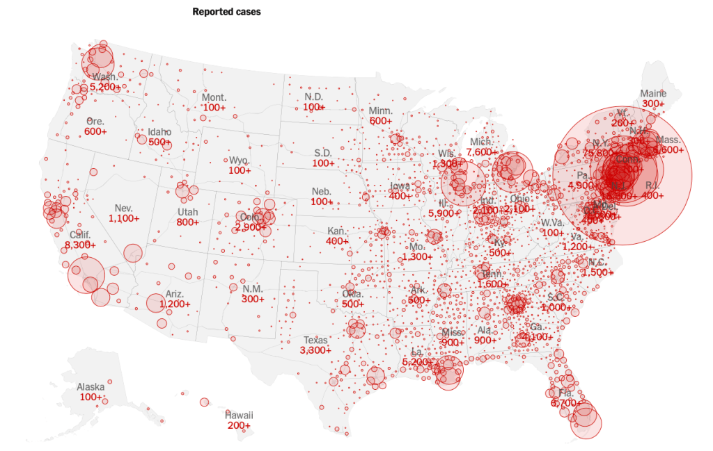
The dots and buffers in the powerfully crowded choropleths revealed the striking virulence of the viral infection whose transmission we are still so tragically late processing; the peaks sized to death lift a corner on the impending conclusions of the maps of infection by which the spread of disease was earlier charged. While weighted to New York, Detroit, and Seattle, where the disease first spread, and to Chicago and New Orleans and Miami, they give the lie to a signal poet of entry, we turn to the maps of infections to interpret the epidemiological spread of a virus that migrates in the ambient atmosphere in airborne form.
The buffers of different transparency and intensity to an extent mirror population density patterns in the nation. But we focus on the huge circle englobing the northeast and centered on New York City, in this Mapbox visualization of national reported cases of infection. We can see the weight with which the spread of the novel coronavirus has weighted down the local health system, resources of hospitals, and hospital beds, and the problems of creating a space of healing for the virus we hope and pray we will survive.
The intersecting rings of local buffers on the numbers of infections at specific sites jumped as cases were confirmed at a some considerable lag from their actual spread across all fifty states by March 27, a distribution of a truly national emergency we were long slow to acknowledge. Even after a global pandemic had been declared March 13, social distancing was advised, but we believed the buffers around ourselves would secure us, and that the “disease” was for off–President Trump was eager to announce that he had cut off all flights, and no passengers would arrive from Wuhan or China–even if the exclusion of entry was limited to non-citizens, and untold Americans returned from Wuhan to Seattle, Silicon Valley, without any reviewing of their health, and of the thousands who returned from voyages, SARS-CoV-2 was incubating already in many. While guidelines of “social distancing” were set forth by the US President on March 16, initially limited to fifteen days, the arrival of the virus was apparent, and utter inadequacy of a two-week pause in life as normal was evident. If Trump described the “peak in death rate” as likely to occur just weeks after he put in place distancing guidelines on March 16, with an initial time frame of 15 days, even he acknowledged two weeks wasn’t long enough to stay its spread.


It is amazing that his response is to close the borders. Has to be something weirder than denial, as you suggest. Border closing as both cause and “cure”.
The denial seems cognitive, but inability to acknowledge the responsibility of governments suggests a stunning lack of prioritizing public health safety. The script of demonizing foreign countries was on auto loop, and the world will suffer!