
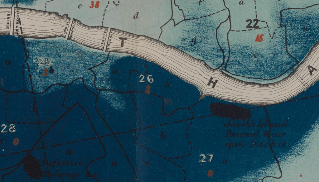
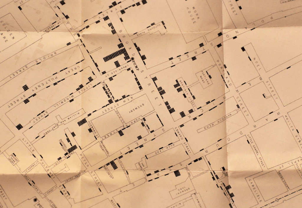
9. Dr. Snow had largely anecdotal evidence of the communication of cholera by water, but was eager to find a new way to visualize the map of the statistics on deaths from cholera in England, often argued to be far more fatal on the coasts of England, and to be concentrated in its ports. Snow sought to offer a counter-argument of the spatial distribution of the disease–abandoning the national distribution of deaths for a microcosm of the transmission of cholera in its busiest port, after finding numerous density of deaths in the Soho neighborhood, to give a profile of the disease a greater spatial specificity. In order to depict the communication of the disease to the London Epidemiological Society in December, 1854, he mapped the locations of deaths of cholera in clusters around pumps, to rebut the perception of its communication by effluvia, often associated with the poor–in what is often cast as the first case of data journalism, but might as well be seen as a new direction of statistical medicine.

before localizing its spread from the pump on Broad Street in Soho-more visible to modern eyes if we translate his bars to dots aggregating individual cases-

–or a 3D translation, more familiar from computing languages like R, as by Mapsmania, to give an even more concrete cast to his use of Joseph Farr’s statistics of mortality that he saw as concentrated on the ports.
Snow sough to ground his anecdotal observations of London deaths in local neighborhoods, showing their proximity to pumps–and polluted water–with far more specificity than to the notoriously polluted River Thames, identified in contemporary Cholera maps based on miasmatic transmission of the disease in low-lying areas–

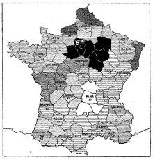
Snow designed the map to contrast with the statistician Farr’s conviction that cholera spread predominantly in low-lying areas–like ports!–that had used the map as a “register” of the effects of cholera on the nation, whose bursts of infection were outbreaks on rivers, ports, or low lying areas–also centers of population, to be sure, but sites where miasmatic effluvia could be imagined to gather. Nothing reveals the miasmatic nature of such effluvia pooling by the lowlands as Richard Grainger’s almost Rorschach-like image but Snow’s focus on lives concretized the transmission, famously, about pumps, and human lives, that revealed the life of the virus contracted by the human bodies it came into contact, as much as finding it in the dark, obscure areas of the metropolis, where the fumes of the notoriously polluted Thames settled, in what was a “statistical map” of the density of cholera, mapped onto elevations whose darkest regions of choleric morality to show their proximity to the polluted river, in this detail of Richard Grainger’s elegant map, which has the eery similarity to a Rorschach blot:
Snow provided physicians a fold-out version that registered disease in ways that could be readily examined as the neighborhood was navigated.

While Farr famously followed existing concepts of disease, Snow focussed on individual lives, deaths, and spatial proximity to shape a cartographic argument apart form an aggregation of mortality statistics.
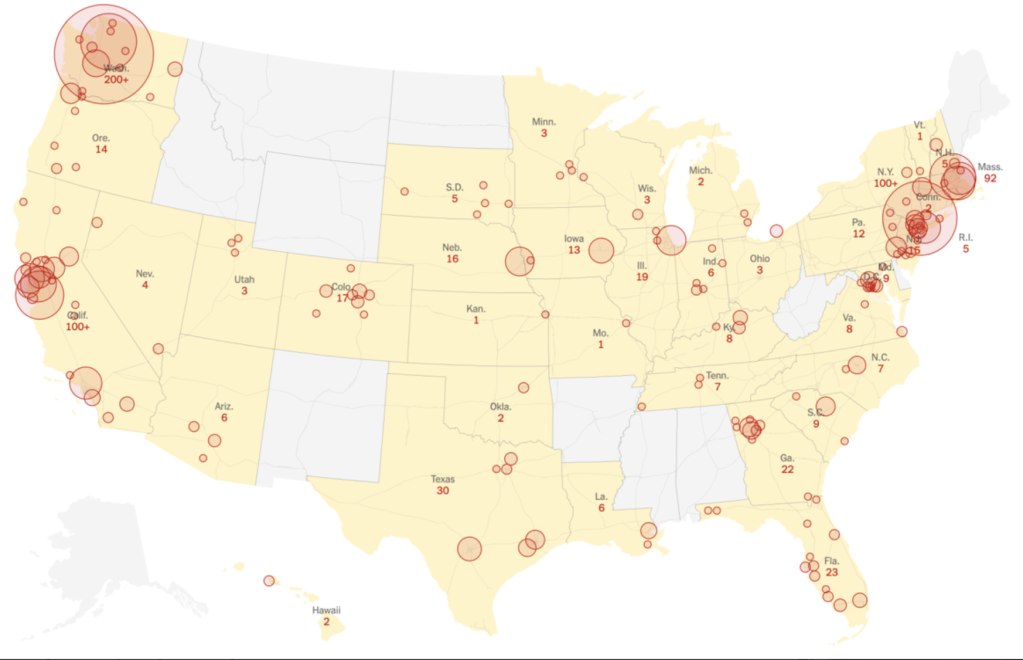
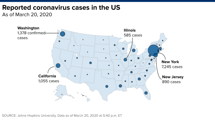
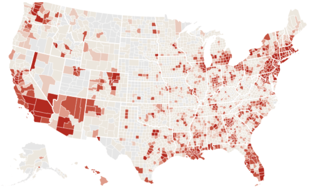
In contrast to Snow’s reshaping of the map as a cogent argument, our overwhelming reliance on choropleths to show infections and mortality are poorly transferred to the global scale at which COVID-19 has spread so suddenly over three months: for the aggregation of infections, often distorted by the incomplete nature of data available, tells us little about the dangers of the transmission of outbreaks to a potentially far greater population, inspiring what might be unwarranted confidence in our abilities to contain its spread–save the importance of transmission of the pandemic that had not yet been named, and would not for a week–
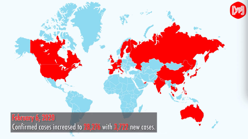
–and even the aggregated geocentering of choropleths around spatial points proved difficult to provide more than the vaguest metric of the communication of the disease–a crucial question in early March, as questions of mitigation of the newly arrived virus turned on new and emerging hot-spots in the United States, and the questions of allocating health care resources to cities in need or potentially in need of greater ICU and hospital beds.

We were missing the global mutation and changes in virus, as it changed in different populations, or the perplexity of an illness that had itself migrated from the forests around Wuhan, or “jumped” to the human biome, tracking the novel coronavirus by its effects on humans, before understanding the virulence of its spatial spread or infectious nature.
Maps of the spread of infection provided, historian Tom Koch argued, a basis to trace “epidemics on the ground,” converting the Hippocratic ancient term comprising climate, constitution, astrological influences, and symptomatology–signs of the presentation of a disease, to process the transmission of an unknown illness. If the clinical histories compiled in the Hippocratic corpus presented a composite picture of confronting a disease’s manifestations, the forty-two cases Hippocrates describe in some detail offered tools for diagnosis that have encouraged many to hone their own medical abilities; of the cases recounted, just over half, twenty-five, end in the individual’s death, providing a sort of test-case for the abilities to judge the progress and therapeutic responses to diseases, and indeed a sort of tracking of the course of disease in the body, long assimilated to arts of dying by non-professional medical writers to confront their own senses of mortality. Are we looking for a new sense of how to confront the questions posed by COVID-19 in consulting the maps that appear daily in different resources, or are we only barraged by them online?
While these maps of infection seem to be combined with the images of state-supervision that was honed and designed in tried and true cartographic fashion in choropleths that were developed in the nineteenth century, are they the best models to use? They help to plot disease from the perspective of a state created a worthy ancestry for data visualizations of elegance, immediacy, and such immediate impact that they almost lack legends, as we have been seduced by the charisma of data to consult incomplete undercounts of infections, and imagine to be able to orient ourselves to the spread of the novel coronavirus by universally acknowledged undercounts, we have used old models for how states embody a top-down vision of collective rates of literacy, mortality, criminality, by bounded geographic districts–
The spatial translation of clinical histories provided a new way to view a narrative of the contraction and communication of illness in the early nineteenth century, and come to terms with the invisible spread of pathogens. If maps from the eighteenth century offered an illustration of processing public responses to a concept of disease-spread, evident in early maps of quarantine, in the case of COVID-19, when many have fallen back on the concept of the quarantine as a basis for containment, we are still grasping with the pathways of diseases–and confronted by the global spread of a more contagious pathogen that smallpox or cholera. The fears of arrival of disease in nineteenth-century New York led to the creation of a “quarantine island” in the Harbor, off Staten Island, as a localization of the sick, akin to a madhouse or jail, but of temporary dimension, the maps of infection we have made are only beginning to come into dialogue with the problem of mapping the virus in terms of how it moves in the body, or travels across space. Such data is simply not available, and the broad arrival of data of counts of infection or mortality are hard to parse in spatial terms for ready interpretation.
The statistical availability of datasets and military mapping tools provided a new sense of regarding the legibility of a map as a public repository of meaning, for the staging of an argument intended for the public good: growing levels of the public tabulation of mortalities linked to specific causes of death and their locations in a city provided a manner to present maps as a way to confront an epidemic of massive scale like cholera–whose paths of infection were the subject of Dr. Snow’s map, presenting data to doctors as a way to rebut the theory of infection by effluvia as “Asiatic cholera” sought to be placed in London, based to be sure on the “pollution” that was inherent in water, more than a result of the crowding of the urban poor or a miasma naturalized by their lack of cleanliness.
Such maps stage arguments of proximity that concretize the feared disease. Their suggestion of a mastery over the spread of the illness contrast to the containment strategies were contrasted to the maps of containment of disease by civil authorities, but act as proxies of a sort for understanding and theorize contagion across a bound sense of space. In contrast, maps of strategies of cotnainment that seek to slow the progress of disease by creating clear boundaries, to block infected populations from passing–often bounding sites of infection, as below, in ports bordering seas often feared to be exposed arrive on plague-ridden boats, creating the geographic association implicit in the name of Asiatic Cholera, but reflecting the susceptibility of port towns like Marseilles, London, or New York.–also congested ports, to be sure, but suspiciously populated with foreigners.

The proliferation of maps based on pools of data, often of incomplete or uncertain validation, was made for audiences of far less familiarity or interest in the disease, anxious about the dangers of contracting disease, and increasingly dependent on extracting what information they could from maps readily produced and consulted. The failure to perceive evidence of communication of cholera after post-mortem dissections–followed by a rigorous washing of hands among medical physicians–in contrast to the communication of cholera among working class who often contracted the disease after laying out of bodies–provided a clue contributing the theory of contraction Snow drew attention in spatial terms by allowing his audience to investigate in the engraved map that is taken as an early form of data journalism. Snow’s cartographic strategy was in itself strikingly similar to the tools by which Dr. Valentine Seaman, an early advocate of smallpox inoculation, had already mapped the sewage dumps clusters on the shoreline of New York City as a site of transit of disease communicated in the plaguey ships bringing Small Pox and Typhus.
Seaman, unlike Snow, attributed the spread of disease to the “influence of putrid effluvia” from pools of putrefaction that traveled on unseen paths used the map to render the locations of a recent uptick in mortality from the pestilence, plotting deaths of yellow fever in 1797, marked by “x”‘s to show their proximity to the practices of dumping of sewage on Manhattan’s shore, at “S”; the clustering concretize the unseen paths of infectious transmission for the first time, indicating possible pathways on the liminal boundary where disease was believed to enter the city shores, to come to terms with how emanations from the putrifying sewage whose dumping served to communicate disease.

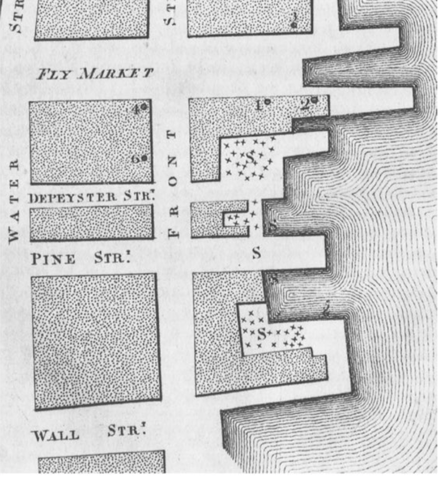
Seaman’s engraved maps failed to include the mosquitoes who transmit the disease. When we come to terms with COVID-19’s incidence, we are in a sense like Seaman, more than Snow: we have no comparable theory as to its spread, but confront its arrival in real time: we produce a range of maps to come to terms with the outbreak of infections, but are adjusted them as we reshape our notions of infection, without the benefit of observations of the sort on which Seaman and Snow based their work. The first known choropleth that the civil servant, economist, and statistical Pierre Charles Francois Dupin pioneered through new engraving media, in a post-Napoleonic image of a national landscape of literacy, inspired by the work of German statisticians, framed the question of the nation’s regions’ productivity of “goods” that isolated the nation from its geographic context.

We may parse the occurrence of infections, mortalities, or hospitalization rates by the oldest of statistical vehicles of visualization techniques–here, in the imaginary of the nineteenth century French state that parsed literacy, murder rates, suicides, or alcoholism, making each legible by departmental jurisdiction, in an administrative state and spatial classification inherited from the Napoleonic era, and suited for statistical measurements.
While we have a far more complete sense of data, we are using a statistical model to accumulate data that fits into choropleths to increase their legibility, although the ability to geocode information have not been often structured in interactive terms save scale, time bars, or daily updates, and in terms of local government responses. But we preserve the sense of national isolation, and idealized concept of “space” without examining its human context, or the lived experiences of the individuals who move in it–an idealizing that is appealing in its vertiginous absolute, to be sure, as monitoring a national landscape for a state, but ignores its own limits.
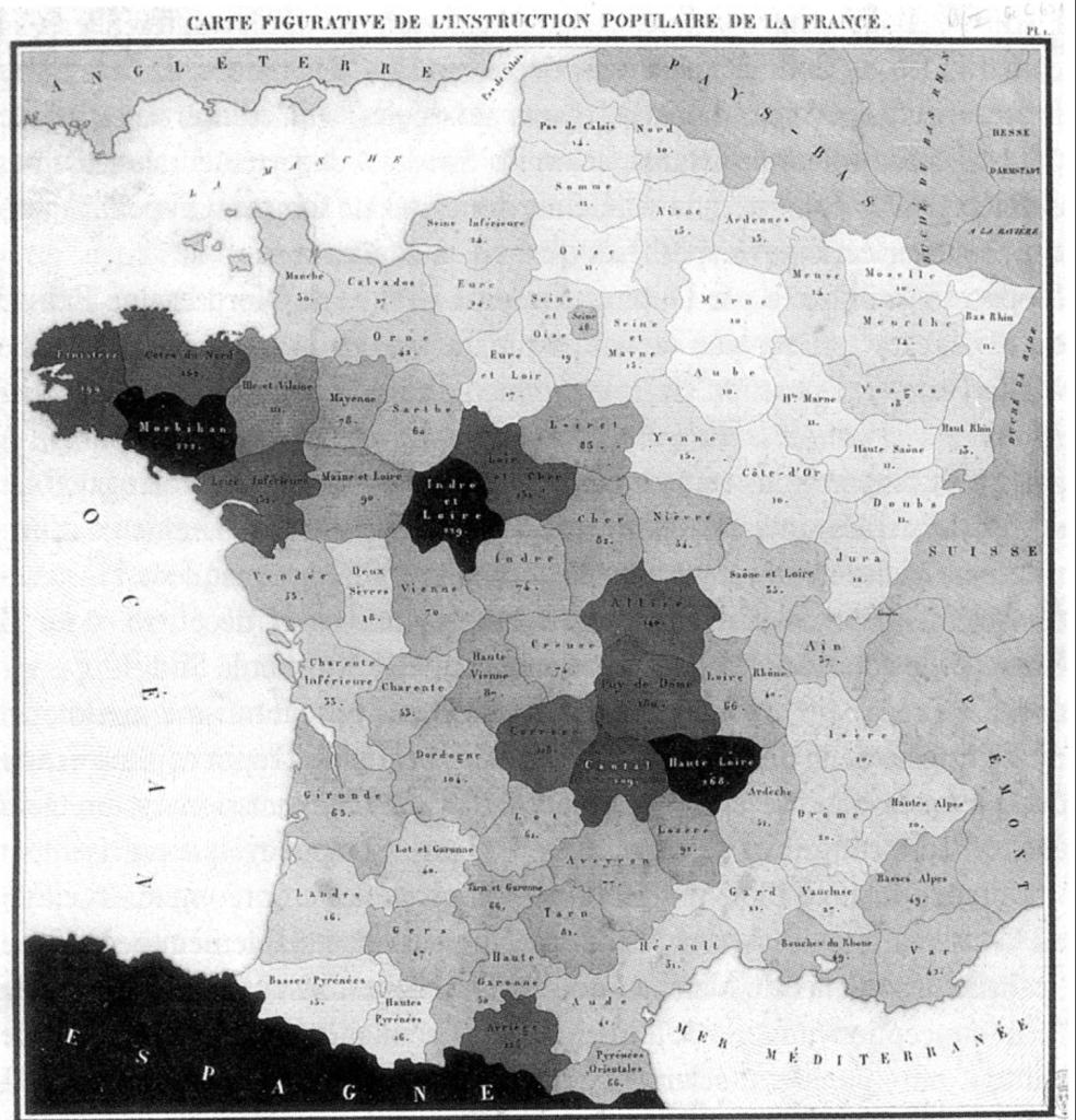
Such maps conceal how such boundaries of administration cannot be assumed to be respected by pathogens, which migrate by drops of water, exhaled by lungs, or by individual states’ inhabitants. While Dupin exploited engraving techniques to create a sense of spatial legibility across a nation, can we really assume take administrative boundaries as a proxy to map viral dispersion or contraction, as if departments can be a proxy for social networking?

Dupin was confident of adopting départments units to understand industrial productivity, we face problems of tracking communication and contraction in a far more permeable boundary lines. Most confusingly, however, the division between national experiences of the disease no longer make sense: the world is both too interconnected to parse the national mortality rates in any way, and the unfolding of different epidemics in different regions of states, or across several, make the mapping of distinct experiences of the coronavirus more difficult to understand than able to clarify the disease.
Indeed, we are facing a very different vision than the fiction of complete observation of the state that Dupin’s statistical maps presented and presupposed: if Dupin sought to make the national population of each départment in the state legible I graphic form, our data visualizations conceal or mask the quite sharp discrepancies in testing rates and data that the Covid Testing Project has shown to be based on strikingly bad data, at a time when tests were overwhelmingly concentrated in California and in New York, the feared “hot spots” of the novel Coronavirus, and the rates of confirmed infections in Texas prisons are being excluded from the Texas health department tally, as were rates of infection in camps of refugees along the border, and mortality statistics from many nursing homes in new York, California and elsewhere: New York was believed to hold roughly a third of all national cases, but was also the region of greatest testing, and that had prepared the greatest public health response:


To be sure, rates of infection from the coronavirus are higher in Italy, where the load of SARS-CoV02 to which people were exposed seems higher than in Germany, but the disease knows no national bounds. There are fewer infections in Canada than in the United States, were infections have grown most dramatically, but the overall global numbers of infections seem to have risen at a surprisingly steady rate. The virus arrived at different times and in different strains, but different nations reveal so far surprisingly different case-fatality rates, which the mapping of viral spread seems to raise questions about the nature of the virus, even if it and the different rates of hospitalization may help understand the best response to the pathogen and its global dispersal. Or is the issue bad data? While such disparities in death rates due to the novel coronavirus in urban areas have been on more local levels tied to environmental disparities; sharp distinctions between nationalities may make far less sense to distingish than the questions of environmental pollutants and other demographic factors of comorbidity than nations per se–despite the evident divergences.
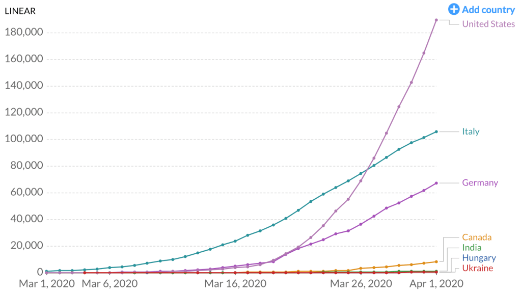
United States; Italy; Germany; Canada; India; Hungary; Ukraine
Our own maps, unlike the statistical maps for which the civil servant Dupin pioneered from 1826, when he created the first known choropleth, demand different sorts of legibility: if Dupin valued to the practices of legibility that statistical model would create, his work bequeathed less of an effective model for discussing pathogens, embedded as it was in notions of national productivity as much as the transmission of disease of which men and women remain the conduits and subjects,–rather than the agents.


It is amazing that his response is to close the borders. Has to be something weirder than denial, as you suggest. Border closing as both cause and “cure”.
The denial seems cognitive, but inability to acknowledge the responsibility of governments suggests a stunning lack of prioritizing public health safety. The script of demonizing foreign countries was on auto loop, and the world will suffer!