
31. But does indication of “hotspots” provide a very faulty and unhelpful way to chart the airborne transmission of the disease that clearly afflicts more seriously coteries of people with preconditions, and unexpected correlations from hypertension to heart disease to diabetes, that afflict many in both rural and urban areas alike? The notion of such hotspots seems indebted to the mapping of infection that John Snow pioneered in 1854, using mapping tools to plot clusters of cholera’s spatial spread from the Broad Street Pump in London, focussing on transmission through surfaces and person to person contact. The mainstay of cartography courses easily transferred to GIS–to make points about spatial clustering–
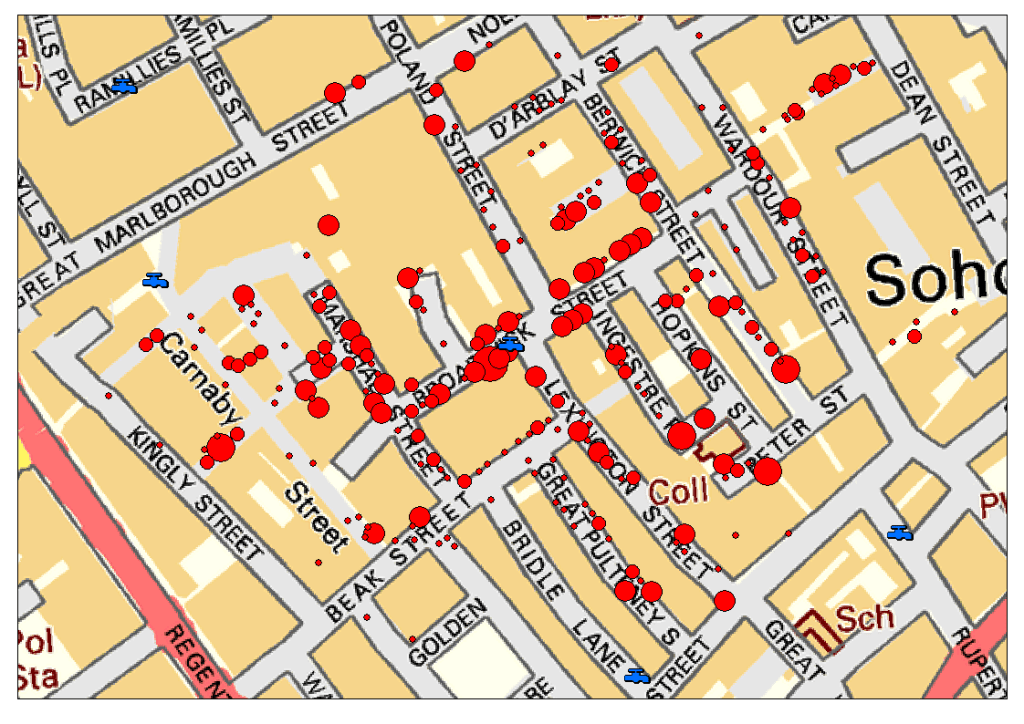
–and use new tools to reveal the clear centering of mortality to pump locations, mapping a network of walkability about pumps in Soho’s streets embedded in the spatial and social contexts of a 19th-century working-class neighborhood, located twenty-five meters from the mean center of deaths from cholera, as Leah Meisterlin showed, and the closest pump to a majority (57%) of cholera deaths.

But a landscape of cumulative infection conceals the time-lag among the contraction and manifestation of COVID-19, and the other geographic factors that complicate the spatial transmission of its spread: the mapping is neither so neat or so clean in its correlations, and the situation we are in now not nearly so stable as a GIS seminar.


It is amazing that his response is to close the borders. Has to be something weirder than denial, as you suggest. Border closing as both cause and “cure”.
The denial seems cognitive, but inability to acknowledge the responsibility of governments suggests a stunning lack of prioritizing public health safety. The script of demonizing foreign countries was on auto loop, and the world will suffer!