
10. We have long been assured, in the United States, that test kits for COVID-19 were imminent, on their way, and about to be made manifest, only to be disappointed. The extent of misinformation that the administration has provided, from the securing of frontiers, to the roll-out of a vaccine, to the monitoring of public health and increased resources for such monitoring, have undermined public trust. The absence of orientation to a global pandemic–despite increased orders to shelter, wear masks outdoors, increase social distance, and be vigilant about distance are at odds with the man on the screen without a mask.
And so we look to data visualizations for orientation, guidance, and assurance, as if we were able to find ourselves in the map of the miasmatic-like growth of COVID-19 infections across continents, If we look to data visualizations for guidance, does it help that they employ old models, both from earlier concepts of disease–cholera, malaria, or small pox–developed to grasp a given disease’s infectious spread, and help understand the space of infection and origins of contraction? The discourse of containment that has been treated predominantly in terms of boundaries of jurisdiction is outmoded, even if it is the one in which we are accustomed to parse data.
But the readiness to declare a mandatory quarantine on visitors from China’s Hubei province, then understood as the epicenter of disease’s spread, the move to enforce quarantining foreigners came only as any endorsement of social distancing was rebuffed, and his reference to the “coronavirus outbreak in China” marked a refusal to take responsibility for cases of infection already in the United States–if underreported, due to a lack of early action, funds and scrutiny in the nation before the restriction of travel from China on February 2, 2020–as the epicenter that seemed congregated in Asia had spread far outside national bounds–despite undercounts in infections.
How can we try to chart across these artificial and increasingly less important lines, through which we are most habituated to travel?
Our own administrative state only has illusions to such totality. They are adopted in biostatistical models for influenza–but the novel coronavirus behaves differently from COVID-19 in its pathways of infection and passage through the body.

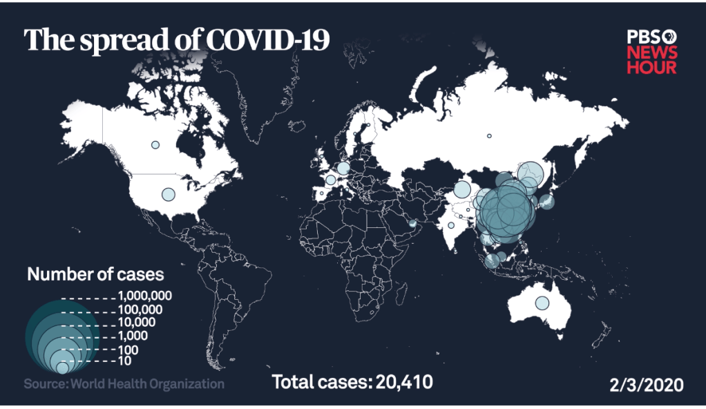
To steady ourselves before a global pandemic whose scale we don’t know and haven’t undertaken testing to detect have led us to depend, unsurprisingly, on maps, driven by the need to determine our relation to the pandemic virus’ global spread, most often to try to grasp our danger of exposure–or the exposure of loved ones and family–before global acceleration rates of the virus’s spread, and to map the relation of the nation, and indeed the state, and city, or county, to the global dispersion of SARS-CoV-2, the primary topic of global media attention, and the topic of increasing global stress and concern.


On the one hand, such maps reveal the global coverage of infection–and the fact that no place in the nation, or in the globe, is isolated from the infection’s spread. But it is also true that the retention of a Web Mercator projection is also a model inherited from states, if designed by a maker of wall maps to mediate first truly global record by uniting nautical and terrestrial charts in a single continuous surface. The buckets of national infection rates continue to cast COVID-19 as a national problem, and a subject of national administrative oversight, even as the roll-out of national plans for testing,
In the increasing stress-test of COVID-19 poses to civil society, we seem to be doing surprisingly well. But the path forward increasingly depends on a successful ability to negotiate the local and global, and indeed the regional nature of epidemics in different parts of the United States, and the globe, evident not only in the local strains present at different site–there are at least eight strains of virus causing COVID-19 in the Bay Area, and eight main strains globally, but, perhaps, over thirty in Europe, and fifty that were recently sequenced in San Francisco, with over half coming from outside the state–and some, it seems, directly from Wuhan to Silicon Valley, and to a cluster of cases in the Bay Area–

–even as the United States is becoming, after having long tried to map the virus as outside our borders, the epicenter of the virus and fastest rising site of infections–the epicenter!–in the world.

And as we contemplate what Earth Day is, and what it has meant over the years, Over the past weeks, we looked to a range of data visualizations to find answers about the proximity of the viral pathogen to ourselves, our loved ones, and our neighborhoods, in maps of confirmed cases of incidence that have grown across the nation, puzzling out the progress of the disease that has been for too long poorly understood at different scales. Unclear and perhaps unintentionally distorted national rates of infection were long only roughly known may have delayed preparation on a national level, but their misguided reading seems especially tragic and hard to ignore. For the very maps we make with increasing rapidity are, in ways we have sometimes failed to recognize, meaningless without the statistical tables and any sense of the accuracy of the data–often partial, limited, and constrained–they embody.
How we can map a disease of this scope with bad data has led to an increased reliance on ramping up forms of tracking, data-sharing, and mapping of mobility–from geolocation data to thermometers with geotracking chips to mapping the genetic profile of the virus–but the soft underbelly of all these maps remains the data that they contain–as much from national maps of incidence to animated choropleths–are dramatic underestimates, their aura of authority inevitably based on undercounts, not including asymptomatic cases, even when tabulated and released by Johns Hopkins University, or, especially, the CDC. (This is of course not malicious, but only reflects the incomplete nature of testing practices and limited testing kits.)
The limited datasets of infections makes it difficult to map, but we turn to maps, reflexively, as if we are able to situate ourselves within them–by analogy to our habitual use of GPS–without realizing, perhaps, the liabilities of tracking an often airborne infections by the ways infections were long ago concretized in choropleths. But they would have more sense if they included a sense of where testing occurs, if they include populations presenting signs of the illness, or also the symptomatic bearers of disease, if they include vulnerable, rural or aging populations, or what sort of percentage of the population they reflect. If they only reveal cumulative numbers, or only new infections detected, without a sense of sampling, the numbers must be called bad data or taken with a grain of salt.
11. The frustration with getting good data–or indeed relying on the Center for Disease Control (CDC) for information, exacerbated by the lack of clarity and poor policy decisions that prevented testings from being accelerated in February, after the CDC failed to expedite delivery of test kits and prevented laboratories from developing new test kits, and distributed faulty test kits, may have led to a crowd-sourced mapping of “CovidNearYou” that mapped self-reported symptoms and those taken tests–providing a way of integrating oneself within the map!

All too often, if the discourse of the map was containment, the coronavirus had already spread far outside any horizon of containment; besieged by a range of successive visualizations of “latest” numbers of infection and the tallies of deaths, we have been hardly been to process over time, let alone place them in a recognizable narrative.
Has the closure of borders, mental as well as administrative, been in a sense a cause, as it was promoted by the Trump’s White House as a ‘cure’ for a pandemic that they could not process or admit? While President Trump mis-maps the spread of COVID-19, using hugely limited undercounts of infections that are officially “confirmed”–and delaying further testing–we seem to use maps to try to come to terms, embody, and grasp the exponential spread of the virus SARS-CoV-2 in spatial term–but the peaks of its intensity, the uncertainty of data about who is infected, at a time when testing is restricted to those who display symptoms, asymptomatic infected going uncounted,–cumulative fatalities tied to COVID-19 are magnified and distorted by commorbidities difficult to parse on the front lines–if they reached roughly 70-80% among those requiring hospitalization, the data is just not there.
We need data to visualize the impact of a slippery disease that doesn’t respect borders, in short, but risk misconceptions by mapping the disease.


It is amazing that his response is to close the borders. Has to be something weirder than denial, as you suggest. Border closing as both cause and “cure”.
The denial seems cognitive, but inability to acknowledge the responsibility of governments suggests a stunning lack of prioritizing public health safety. The script of demonizing foreign countries was on auto loop, and the world will suffer!