
37. We are still trying to orient our range of statistical maps and visualization tools, as we have been over three months, in attmpets to bring into focus the dynamics of the virus’ spread over space, accounting for the time late of incubation, incomplete data counts of confirmed cases, and even of testing, looking for data about the curves of folks affected and the brunt reality of unprecedentedly increasing mortality rates. Before GIF’s that process a staggering amount of data, the progressive narrative suggests a global cancer whose narrative tends to a dystopian world, akin to a video game or apocalyptic scenario is of little comfort, removed from the collective call to map oneself in relation to the spread of disease that as map users we are habituated.
We have little place in theses map, in other words, save as being ineluctably part of the spread of a growing death; there is no sense of an art of placing oneself in relation to this spread, or ability to orient ourselves to the map, save passively watching the spread of disease across space that will be spreading near to where we live. It hasn’t helped that the Narcissist in Chief has been congratulating himself on his policies of banning border-crossing, as if this has been effective, while he has provided few guidelines for states, or for health policy, and is acutely uncomfortable in dealing with a crisis global in scope. While attacking global health organizations, hospital administrators, and government officials, charging others with incompetence, social distancing practices are advised with one hand while arguing that he will relax the very same guidelines with time, in order to “re-open the economy,” with little sense of responsibilities or leadership that might be expected from his public office–never having held such a position of responsibility to anything but a corporate entity. Indeed, the hopes to “re-opening the economy,” as COVID-19 cases surpass one and a half million (1.6), and global deaths have reached 100,000, the future of the rates of infection in the nation are by no means clear, and the horror show continues.
The travesty of recurrent “daily briefings” have become opportunities for spin, chances for potshots, and restraining his own health advisers, more than information. Delighted by the opportunity to address a nightly audience of viewers of hitherto unforeseen expectations, drawing a surge of viewers averaging 8.5 million, and reaching 12.2 million at times on CNN, giving the Narcissist-in-Chief a surprisingly familiar role, even as he seems to choke on the global pandemic whose scale and scope he fails to process, portraying it as a domestic dispute or squabble for authority, held daily before authoritative backdrops at 5 pm Eastern to dominate or bleed into the six o’clock news that they often upstage. One means of resistance seems Andrew Cuomo’s s daily combative press conferences from the front lines of America’s war on COVID-19 in Manhattan’s Jacob Javits Center, daily press conferences hor Gavin Newsom’s midday briefings, held at noon, delivered with reassuring command from the state capital in Sacramento, California, before the flag, prominently featuring maps breaking down numbers to demonstrate effects of his response to the virus by mandating Shelter-in-Place to contain virus’ spread, and the active role he has taken in structuring a combative response with a far more coherent and effective public health agency.
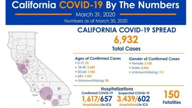
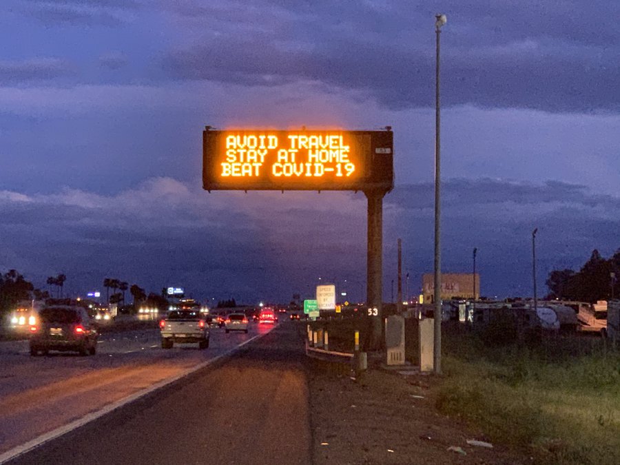
Americans are not the best at following rules, and no public punishment has been declared–but California has even crafted a slogan, “Stay Home. Save Lives.” as our highways have exploited public signage to message the policy of states that the nation still in mid-April sadly lacks.
While a free market of maps seems the best way to ensure a variety of data visualizations and images, is the dissensus that is allowed by divergent data, often using bad data, is a range of proliferating information sources at different times of day and different networks the best way to go in a national emergency? While we have relished the highly partisan nature of maps of migrants, we are struggling for a visualization strategy for imaging COVID-19 and its spread.
And are old-school choropleths of allegedly accurate counts a good gauge of the virulence of the disease that allows viewers to process its scope? They raise questions of the future ahead without any clear recommendations. Before maps of the dispersion of the illness in other nations where the spread of the contagion has been particularly vigorous and sustained, we can only hold our breaths and suppress the fight or flight instincts by which our sympathetic nervous system might be buffeted before acutely threatening circumstance of sensing dangers in our immediate environments–true emergencies, unlike the staged emergencies President Trump was priming the nation for in the form of the arrival of migrants; now the emergency was indeed mappable, but, the press conferences seemed to say, we didn’t need to worry about the spread of confirmed cases of the virus–or even worry ourselves about its contagious spread, in way that made the affirmation of real map that might orient us to the dangers of contagion even more incumbent.
38. All of which poses the widely debated question of how to best map the virus and its spread–and how we could have been mapping confirmed cases, but lured ourselves into a state of quiescence, and of the comfortability of our distance, even if we had data sources–even if limited data!–that we had an opportunity to map to better understand its human-to-human transmission. Can we map the real threat with space for its processing, without losing all sense of our stability in relation to it, as the dangers of the arrival of the epidemic has progressed to all parts of the nation, and parsing deaths by boundaries makes no sense? For even in states where there are only thirteen cases, the chance of an actual epidemic are nearly 100%. And in the face of a national crisis, the continued absence of leadership is more than a tragedy,

–or the persistence of the sense of an ability to avoid the “hot-spots” where COVID-19 spread with such unprecedented virulence in March in the United States, as if these time-stamped maps of “known locations” were sufficient to perform accurate prognostications of future spread; we adopted an almost existential paralysis into these images, as if without ano sense of agency we could adopt in relation to them.

Indeed, the striking if unaccountable divergence in “shelter-in-Place” policies that divided the nation, along red states v. blue states, seemed a symptom of a deeper disease of pro-market capitalism, that ostrich-like submerged considerations of the absence of adequate health insurance exchanges in many states across the south, as MSNBC’s Rachel Maddow alerted the nation–compliance being considerably higher in urban areas in the northeast and upper midwest able to imagine the dangers of increasing proximity to spread the disease and imagine their enformcement by police. and to imagine working at home, unlike rural areas in the South, Great Plains, and midwest–sources of deep Trump support, where the absence of directives from the man in the Oval Office may have left Republican Governors uneasy to take initiative: yet if 37 states, 74 counties, 14 cities, the District of Columbia, and Puerto Rico issued stay at home orders within two weeks after California issued the nation’s first stay-at-home order on March 19, many hold-outs occurred.
There was perhaps a lack of eagerness to consult the dangers of a map of viral transmission. We seem to map of the sort that acted as a needed point from which to understand the individual’s relation to the ineluctable miasmatic transmission of disease to place him or herself in an unfolding of a new landscape of death in this quite elegant Mapbox animated heat map–below–a grim landscape of infection with no hope for a positive end, or agency before the scale of infection’s spread.
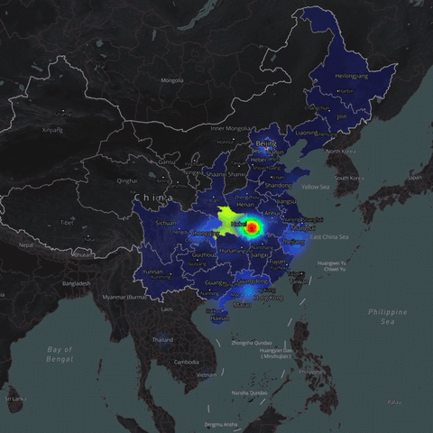
The sense of a broad cloud of aerosolized diffusion that works its way through the collective respiratory apparatus of Chinese citizens is perhaps the best means to interpret the heat map of infection, as the populace inhales and exhales in ever greater proximity to one another, driven by the dense population and crowding of space, to be sure, but also by the increased intimacy in which we all live, either in China or in the United States, however easy it is for some to surpass the interconnected nature of that spatial proximity and intimacy. The germaphobe who is the President of the United States, in other words, is using a model of infection and interpersonal transmission that is outdated and inapplicable, if he is using one.
The explosion of the outbreak of SARS-CoV-2 across China with such tragically concealed virulence, suggests that it is not quarantining that is a medieval response to the outbreak of the virus, but that we are medieval in the incommensurability of our health practices for medical care workers before the disease, even more than our models of spatial etiquette and social distancing in the general population.
39. There is no clear sense, in other words, of the scale at which the disease progresses or the relation of the viewer to its geographic expansion of the timate the distance, timescale, and persistence over which the cloud and its pathogenic payload travel, thus generating an underappreciated potential exposure range for a health care worker. For these and other reasons, wearsort we have come to demand and expect from maps, save that the man who is trying to guide the narrative from the new Reality TV show set in the Oval Office seems inadequate, as we are left looking at narratives where health officials from Dr. Anthony Fauci to are contestants, we watch wondering when they will be fired by Donald Trump, the sort of narrative that is commensurate to Reality TV–or, alternatively, as a television host, presenting imagined prizes that contestants can win.
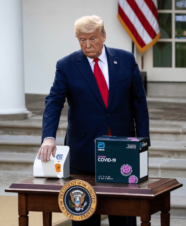
Trump seemed to alternate storylines with alacrity to situate the novel coronavirus he in early March compared to “the flu,” claiming “when the warm weather comes, it will get better,” without grounds, even if it was Spring; Joe Biden crossed himself on national television, exclaiming “You couldn’t make it up.” And as Trump claimed in late February that “everything is really under control,” asking crowds to recognize that the virus was a Democratic conspiracy designed to depress the stock market, claiming the infection rate, without evidence, to be “going very substantially down,” he continued to cite a relatively low number of deaths–as of March 9, “546 confirmed cases of coronavirus, with 22 deaths–think about that!”–he disseminated disinformation. The President seemed to have muzzled his own CDC, as he muzzled Dr. Anthony Fauci, who directs the National Institute of Allergy and Infectious Diseases, by responding to a direct question about from the viability of hydroxychloroquine as an antiviral remedy, in early April. And so, finally, testing kits arrived!
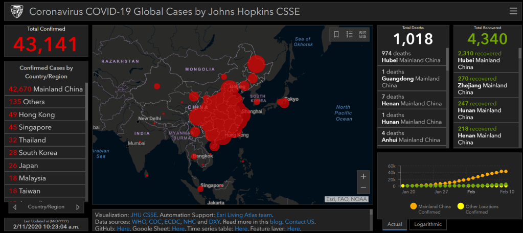
Perhaps it makes some sense to see this censorship prefigured in thee opacity of the the visualizations of national spread of cases of the disease. As much as the maps created from statistics seem tried to foreground a rational counterpart to the White House’s promotion of a discourse of collective calm before a situation over which it had alleged control. The CDC had been a bit gutted of effectiveness in recent years, and the very statistics were removed from an epidemiological narrative that made sense to the public. The data of the proliferation of infections that CDC did document told a different story, as imaged in the start of this post, whose density of dots revealed a narrative of inadequate preparation and collective mismanagement, if it also pushed a stubborn epidemiological reality that health policies seemed to deny was a national problem.

But the problem of scale persisted. And it was increasingly mapped, more sensibly, by rates of growth, placing cases in an epidemiological narrative that made sense, if offered a similarly terrifying storyline.

The most recent Microsoft BING map of the virus’s spread shows the bloody ravages of collective numbers of infection, but breaks down confirmed cases of infection, mortality rates, and numbers of recoveries in interactive form–but with buffers so broad that the viewer is only able to shake her head, try to empathize with the toll of the infected and the terrors through which they and their families live, and the low chances of health care that many face, which risk severe problems of destabilization of the sort recent generations have perhaps not experienced, and Americans have rarely perceived.

The elegant tracking map followed the principles of spatially translating data to space that were pioneered iy the time-trusted manner of the choropleth, a projection of statistical modernity of the early nineteenth century, that celebrated counting of discrete objects, as translations of tables of numbers, an ideal register of knowledge outside historical context. The same images of data tabulated on rates of illiteracy, criminality, or suicides were assimilated to the continuity of the administrative nation-state’s departments, removed from a broader geographic context, and reflect the heightened anxieties of national identity that led to the discipline of sociology, aggregating isolated statistical records to create an allegedly objective image of the state that underscored the state’s close relation to national inhabitants, rather than its relation to a global phenomena.

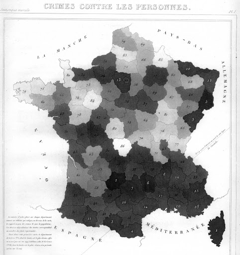
Despite its mathematical elegance and appearance of objectivity, such snapshots of “data” presented an idealized image of the identity of a national administrative state, translating tabular data to geographic form that is the basis for our concepts of geodata, where the map is but a visual expression of comma separated values. The problem of communicating the spatial transmission of the virus or pathogen was understood in similar terms in the case of cholera, general disease, and madness, viewing each as similar tables that demanded spatial representation, but fail to attempt to illustrate the relevance of administrative continuities to each.
The time-stamped maps of mortality that were widely produced, consumed, and consulted in the months of January to March, dazzled the viewers by the overwhelming nature of the contagion, but filtered it through an inadequate if similar logic of the administrative state–and accepted as equal the divergent practices of tabulation, and practices o of testing, in each nation. Our picture of cases depended on the distinction of COVID-19 from pneumonia, however, creating huge undercounts, it seems, in Russia, and raising questions of the uniformity of data quality in all areas of the world, and indeed across states in the choropleths issued by the CDC that so distort the spatial partition of the pathogen, and by necessity omitted periods of presymptomatic incubation, carriers of the disease in which the virus is not visibly manifest, or the presence of the virus in other media–as water–or crowded centers where contagious outbreaks are likely to occur if the virus is contracted, from jails, detention camps where immigrants live with inadequate sanitary conditions, and indeed all refugees. The carceral logic of the American state that has so expanded in recent years will surely foster virulent spread of the novel coronavirus across topographies of incarceration we have continued to black-box and neglect.


It is amazing that his response is to close the borders. Has to be something weirder than denial, as you suggest. Border closing as both cause and “cure”.
The denial seems cognitive, but inability to acknowledge the responsibility of governments suggests a stunning lack of prioritizing public health safety. The script of demonizing foreign countries was on auto loop, and the world will suffer!