
For if we map confirmed cases, we follow the logic of the spatial containment and hopes for the success of measures of mitigation of the viral pathogen and the ensuring of the preservation of the status quo and the effectiveness of our government in securing the nation, without suggesting the public health crisis that is posed by the spaces between individual space where the virus circulates within the circumambient air. As much as posing a problem of containment of a pathogen, the transmission and contraction of the irus poses a threat to our public health systems that stands to infection of the democracy that poet Walt Whitman identified with the odorless atmosphere of ambient air for which he went wild, famously, in Leaves of Grass, rather than the perfumed spaces of indoors, and as open to all in the nation’s public spaces and great cities. If Whitman is in love with the odorless atmosphere uncorrupted by the distillation of perfumes that filled the indoor rooms of houses, and was intoxicated by it–“The atmosphere is not a perfume . . . . it has no taste of a the distillation . . . it is odorless/It is in my mouth forever . . . . I am in love with it/ . . . . mad for it to be in contact with me.”
We are now indoors, isolating ourselves from the atmosphere in which we fear droplets are dispersed. And we are glued to watch maps of its rates of infection, and the increased proportion of minorities, poor with poor health care, and prisons whose inmates are not even, often, counted in health department tallies. If we are recently hearing that Michigan leads the nation in coronavirus deaths among incarcerated in the feeral prison system, and that rampant spread of COVID-129 in prisons and federal correction system has not been tallied. The rampant spread of infection in prisons in Arkansas, Ohio, North Carolina, and California, both in federal system and in state prisons, seems responsible for a spike in reported coronavirus cases behind bars.
State agencies reflexively confronted COVID-19’s spread by a quarantine of the sort that was pioneered in the seventeenth century to contain outbreaks of pestilence or plague–but if such quarantines have led to some success in some places, the stage of their implementation and the increased connectedness with which we live has made the very practice of isolating the virus in a familiar sense less apparent in an era when our spaces not only overlap, but we have already globally transmitted All too often, we exploit our browsers and toggle between maps are of multiple scale–or shift scales from the local to the global with a quite terrifyingly familiar ease–informed by increasing hopes to formulate our relation to the disease on global grids, born of our internalization of GPS in world where we are drawn to looking at maps on screens to track global progress.
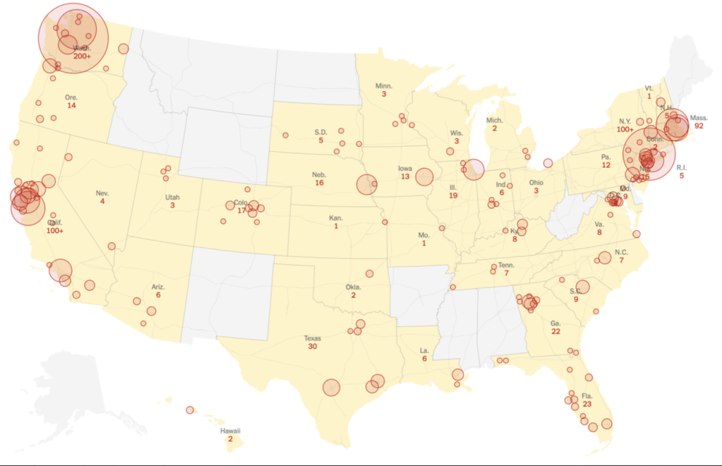
An unavoidable sense of disorientation that is part and parcel of the medium of the screen: while we watched the virus from afar, based in Wuhan, and in China, tracking some hotspots as its spread, now we look at individual states, asking when they will “reopen” or might do so, while at a remove from the highly contingent nature of the pathogen’s spread: we are rooted in existing data, often incomplete, and far from the counts that would create a coherent picture, we are reduced to considering greater chances of danger and exposure to viral loads in different public spaces, realizing that the scale of national maps, useful to define the scope of the national emergency, cannot orient us.
Even in “hubs” of the communication of disease, we find that questions of comorbidity, crowding, levels of exposure to viral loads, and other environmental factors may play a huge role in defining the density of the pathogen at such “hotspots” that disappear in the low-scale image of the nation or globe: the Association of Neighborhood & Housing Development that have swung into action in local mapping of COVID-19 in New York have continued to provide on-the-ground perspectives on viral spread, far more finely-grained than national news maps convey, that suggest the local pathways of viral communication we look at only in opaque manners in the buffers and dot-density maps adopted to process the first tabulation of infections–in way that are truly eye-opening, using CARTO templates to describe those areas hit hardest by the rapidly progressing pathogen. Can social distancing alone explain the crowding of COVID-19 infections in the outer boroughs, or are these people who are most exposed to transit lines, commuting, and daily interactions? Or can we explain such lopsided distributions by something else, like their poorer health conditions? That seems unlikely, but the pockets of increased infection rates were terrifyingly pronounced, absent from smaller scale maps–the preferred metric for ‘tracking’ COVID-19 globally.

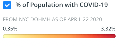

The social inequalities of COVID-19 are well-documented, but the massive tracking of indviduals who carry the pathogen or affected by it can be blurred by the inclination towards aggregating communities and nation, rather than parsing the data in closer detail. Not only because of the rates of death, infection, and hospitalizations are striking in New York, but as my mother, brother, nieces, and sister-in-law are in New York, my mind goes their often, but the inequities are strikingly similar in Oakland, CA, where the very service economies of the city seem to have made many more vulnerable through increased interaction to the pathogen the now claims the news, and seems the pathogenic underside of globalization.


While looking at a larger map of hotspots, or of the virus’ global spread, we are often struck by where the outbreaks could be contained.
Indeed, in our GPS-inflected sensibility, we perhaps most want to see where COVID-19 lies in relation to ourselves: the logic of reading these maps, undoubtedly modulated by the rhetoric of America’s Commander-in-Chief, as he downplayed the danger of the pandemic that had spread widely by February, pointing to the low numbers of confirmed cases reported to the Center for Disease Control, as if reported infections provided an image of the virus’ spread in real time.
A similar scenario of the pronounced vulnerability of confirmed COVID-19 cases that emerged rather quickly in more densely populated lower income areas of San Francisco, where the density of confrimed cases per 10,000 grew pronouncedly in residences in the Mission district and urban space close to the water, in ways that would have confirmed theories of early modern doctors that linked plague , typhus, or cholera to low-lying areas of the city near the Bay, but were also areas of minority residence, both lower income and without adequate health care, and living in increasingly crowded conditions in a gentrifying city.


These maps of urban vulnerability reveal the deep inequalities and inequities in health care that the virus for which we were so inadequately collectively prepared to address has revealed are indeed fault lines in our democracy.that the President was spectacularly unwilling and unable to address. The focus on national maps of trying to suggest a picture of containment, and imagining steps of mitigation we might take, shifted attention away from these profound inequalities and lines of vulnerability.
Was Trump exploiting the artificially low CDC numbers to distance himself from the danger? His lack of interest in the spread of disease was certainly more typical of a germaphobe, than a national leader–and raised questions of fundamental human empathy or the inability to conceptualize suffering and illness, as well as stress. Trump’s seeming denial incubation periods and the limits of testing outside major cities and hospitals prevented the nation from appreciating the scale of the virus, or the nature of susceptibility, as did the large number of deaths in the older population, often tied to comorbidity, from diabetes to asthma to cardiological conditions, pulmonary conditions, high blood pressure, and senescence. Did the deep discrepancies of hospitalizations and infections by mid-March reveal the start of fault-lines in the nation Trump attempted to conceal, or to which he has long remained oblivious?

Trump perversely benefitted from the low numbers of infections officially reported, a tally he cited over the coronavirus’ growing spread. As the disease spread by mid-March, a month after the novel coronavirus was named, and infections in California began to grow, while numbers of reported infections were low, the low numbers in many states offered little confidence: we had no sense of how the disease was communicated, and seemed back in the seventeenth century before a miasmatic disease that spread by effluvia and we had no sense of how to contain, or even if it could be contained. There was almost a cruel finality in the undermining of the value of any testing protocol, the failure of testing and monitoring of nursing homes, inadequate federal responsibility over incarcerated populations or facilities housing detained migrant refugees–who are often without soap or disinfectant.


It is amazing that his response is to close the borders. Has to be something weirder than denial, as you suggest. Border closing as both cause and “cure”.
The denial seems cognitive, but inability to acknowledge the responsibility of governments suggests a stunning lack of prioritizing public health safety. The script of demonizing foreign countries was on auto loop, and the world will suffer!