
26. Could increased incidence of COVID-19 be driven by not only increased human contact, and proximity, and the increased intimacy of cities, but the anthropogenic changes in the ambient in which the pathogen travels and is communicated, which so compromises our lungs to render them all the more sensitive to its effects? The problems of mapping transmission would not depend on how the disease is communicated by human contact, in such a model, or the quarantining of individuals, but the ways that environment and senescence both render the lungs more susceptible and vulnerable to the pathogen.
Amidst these difficulties in reading a map of COVID-19 infections, there exists the possibility of the Holy Grail of immunity as a needle in the haystack, hidden within data visualizations of infection and mortality, that might offer a new way to read maps’ contents and elucidate the still cryptic or mute RNA strand of SARS-CoV-2. In the lack of an antiviral cure, some hope blood tests will identify future immunity–as antibody tests in a German town of Gangelt have found that in the midst of a pandemic hotspot, a sixth of recovered from COVID-19 were found to be “immune,” by publically administered blood tests on a scale to certify immunity response to allow a partial return to workplaces, as well as “efficient and effective” contact tracing maps of those infected, to allow public issuance of “immunity cards” as others worry about the toll stress and anxiety place on immune systems in the COVID-19 pandemic.
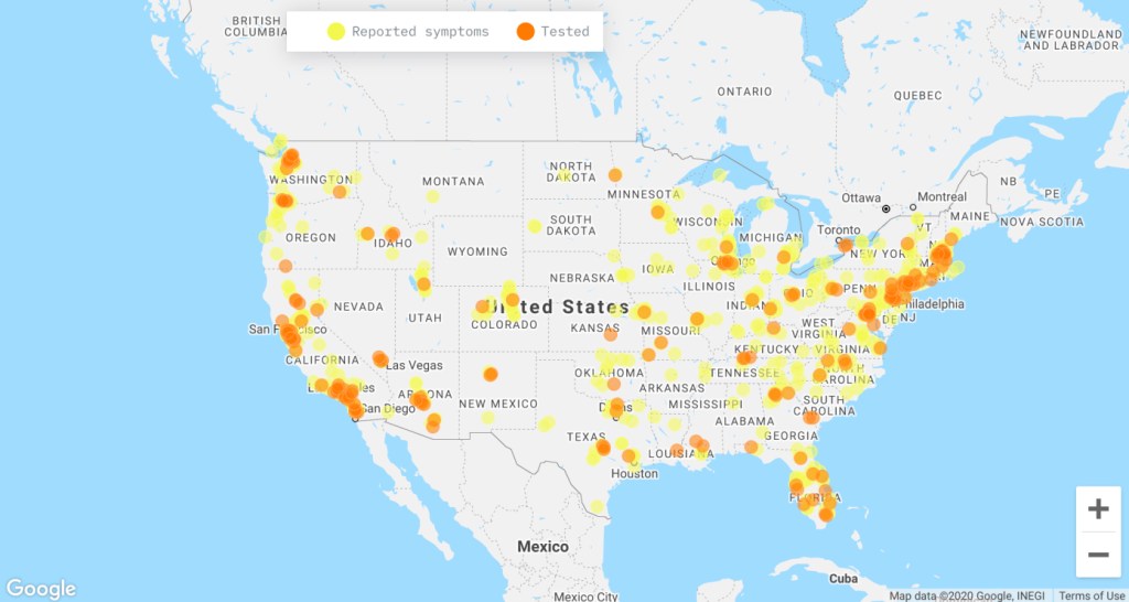
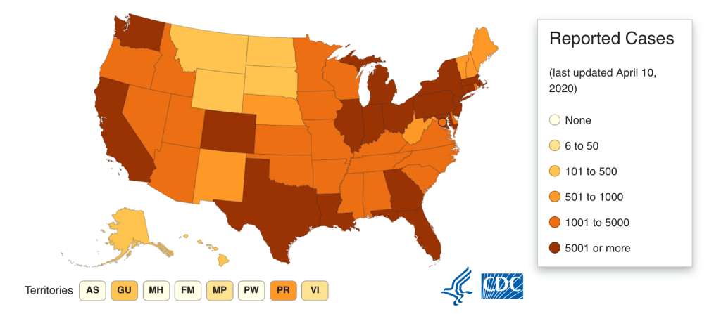
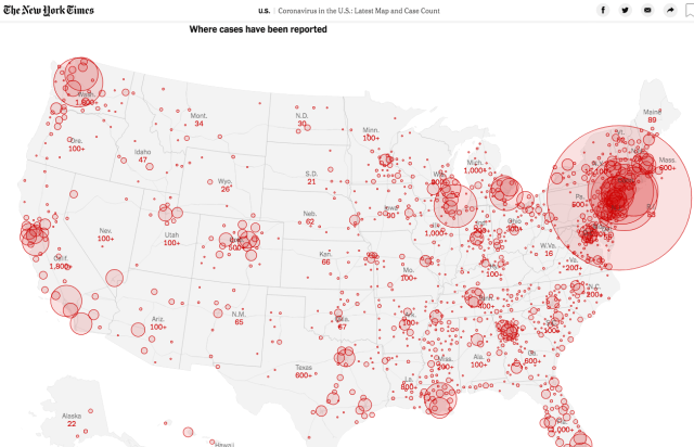
27. For the maps often conceal what we should already know, trying to stalk the lack of knowledge, at this point, that we have about a virus for which there is no cure, and no real sense of how many infected human bodies exist over space: even despite the many problems of accuracy of tabulation that have been illuminated by the collection and publication of the most accurate and complete testing data by the COVID Mapping project, which has tried to amass the most accurate counts for United States states and territories, given the difficulties in compiling data by the U.S. government and CDC, and importance of new crowd-sourced maps of those afflicted by COVID-19 symptoms, we still do not have a clear sense of how many people stand to be infected by the SARS-CoV-2 virus, a severe respiratory syndrome that stands to compromise or destroy parts of the delicate alveoli and lungs of an uncertain number of Americans across the nation, but we find clusters where the confirmed cases of infection multiply with increasing rapidity across the nation, and the CDC itself, by April 12, 2020, confirms over half a million cases of infection in the United States.
While we depend on how counts vary over space, and know that maps are only as good as the statistics available, as alarming as they might look, counts of possible deaths of COVID-19 have ranged from the millions to the hundreds of thousands, as respected epidemiologists and demographers have argued in recent weeks, uncertain of how to predict human behavior and contact over space, as they chart the spatial distributions of infections and mortality rates, assuming authority in public pronouncements while uncertain of the accuracy of actual prognostications and modeling, dependent as they are on the ability of the nation to contain the disease and treat afflicted, watching mortality rates across each county in the United States.are, We are not even certain of our ability to predict the exact peaks of the infections in any part of the nation as accurately as once thought, leaving us even more on uncertain ground before maps of its apparent advance.
28. While we know that the increased mortality rates among older populations for COVID-19 are pronounced, an underlying question in this map is whether exposure to a “load” of the pathogen was particularly pronounced in the tristate area, or whether the exposure to the infection should be even more pronounced in cities with increased older population, from Florida to the midwest, and Great Plains, that a county-by-county breakdowns would allow us to explore. If the health among New Yorkers is not considerably better or different than the nation, the state of air pollution in the tristate area is. The breaking down in mid-March of any clear ability to map the pathogen’s incidence, future virulence, and led us to finally enact guidelines of social distancing, if even these guidelines are unevenly adopted and enforced.
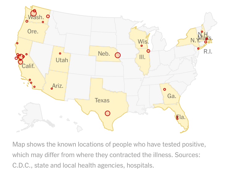
The increasing seeding of infections across the nation make the naiveté of the misreading of these maps that imagined an infection of only several weeks apart, that seems to reveal hotspots or selective seats of the United States hopelessly misguided as reminders of the poor preparation that the country undertook, both as testing was so limited, and the pathogen was widely transmitted even by those among whom it was not manifest: the confirmation of positive tests of the disease revealed a small sliver of those infected, and who would transmit the virus across space in ways a quarantine could not contain.
29. While we plot numbers of infection over space, in data visualizations, hoping to create an image that confirms the infection of the nation and that stand as cautionary images of its spread, COVID-19 serves as a trigger that reveals the landscape of danger behind the extreme economic insecurity by which the country is gripped. If the virus is a network that demands to be understood for its agency in moving so tenacious across space, we have continued to map the confirmed cases, constrained by bad data, illusions as to the ease or ability of its control, leaving us more vulnerable to its impending spread. We have such reduced agency before these maps, as they lack any sense of being able to chart a future.
Can we even predict the collective response to mortality on such a massive scale, and human immune systems to the stress and anxiety before such contagious virus? We don’t know the rates of infection in the world, but may also lack the empyrean remove of an ars moriendi that might allow or invite us to dispassionately survey the spread of infections, imagining crowd behavior before the geographic distribution of its advance.
How can we contain fears of viral mutation, which would create steeper difficulties in its containment? There is no empyrean remove before these maps.
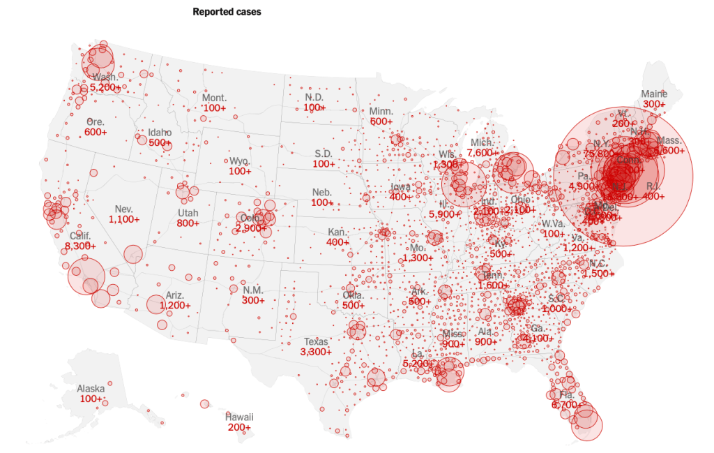
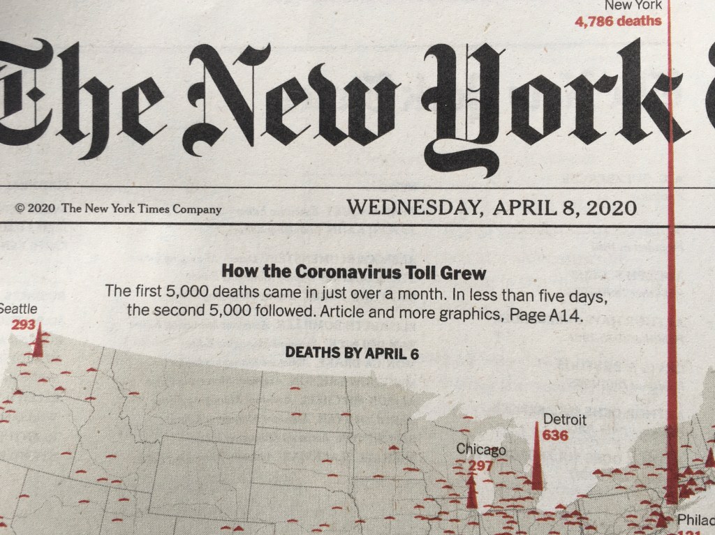
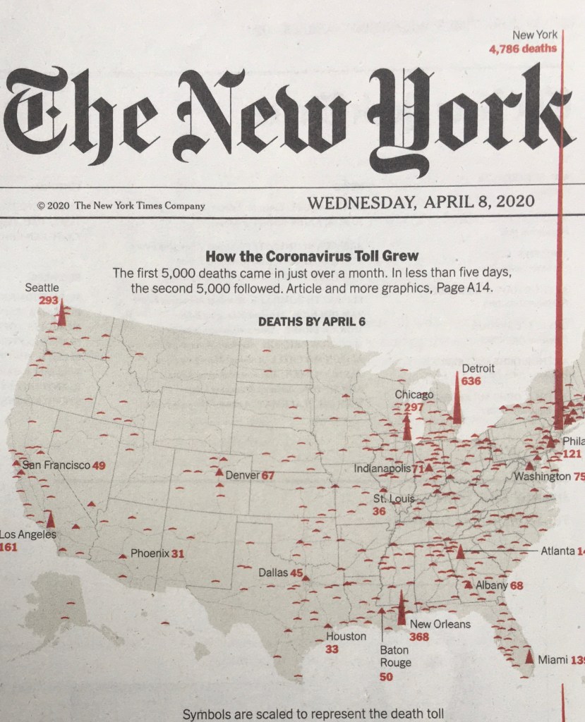
30. We have perhaps been fortunate that the virus SARS-CoV-2 has not radically mutated as it has been contracted and transmitted, but plagued by the geography of health care that divides the nation. And when we noticed, on the front page of the New York Times, a primary source of the data visualizations we use to confront, process, and gain a purchase on the state of the nation before COVID-19, and the progression of counts: even if the health of New Yorkers outperforms that of the nation, and the rates of comorbidity are not significantly higher, if the greater density and shared spaces in the city creates more chances for rapid infection.
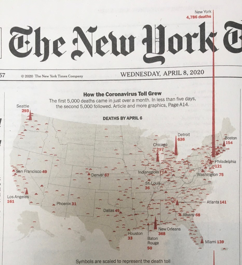
While President Trump warned the nation that the “peak in death rate is likely to hit in two weeks,” in mid-March, the escalation by mid-April of still higher peaks was evident; the statistical metaphor in circulation was literalized as the newspaper of record, long seeking to stabilize the daily news cycle as regular Presidential public addresses each evening at 6:00 pm sought to dominate nightly news, and indeed bleed into the news programming, seemed to immolate its own masthead on local mortality rates that approached 5,000, in one of the most efficient and restrained uses of color printing it has employed. Even as reported infection rates in New York have started to decline, the rise in cumulative mortality may well prompt changing behavior patterns we have not encountered, as the watershed of over 9,000 deaths in the tri-state area–220,000 infections–raise questions of the virus’ future spread across the nation, and whether such peaks will move west, and the statistical foothills of the midwest will come to dominate the national landscape.
Precipices of cumulative mortality rates on both coasts, the one based in New York rising to pierce the very masthead of the newspaper, popping out of the frame of reference of news, rising into the header as if heading off the page, and with that our expectations, even as the number of counted infections in the city have seemed to decline–as they have in those places where “Shelter-in-Place ” policies are in place, from Seattle, to San Jose, to Portland, to San Francisco, but implementation of similar policies in other cites are uncertain. Cities that lacked social distancing create a terrifying exemplum for the country, as if an inadequate image of memento mori that challenges us to hold the future waves of mortality that may cascade across the country from one of the first sites where the virus gained virulence, even as the curve of infections starts to flatten.
Urban areas seem to have had among the highest mortality rates in the nation, according to a census conducted over March 2020.
If the range of data visualization that the Times, Washington Post, and The Atlantic have prepared, often with help from Mapbox, searches for better data sources, and open data, The precipice of the spiked peaks of mortality are scaled to death toll in a haunting echo of the distribution of voting patterns in the 2016 election; we are, yet again, of course, haunted by the consequences of redirection of the nation, and by the lack of any clear policies being framed for the nation to confront the disease that was broadly raging across China. The spikes more real than the peaks and valleys of the stock market tally, displaced to a register of mortality tallied by crimson red, in a spike that pierces the masthead of the Newspaper of Record running through the curved belly of a stroke of the gothic “k,” as if in an act of typographic seppuku of the Newspaper of Record.
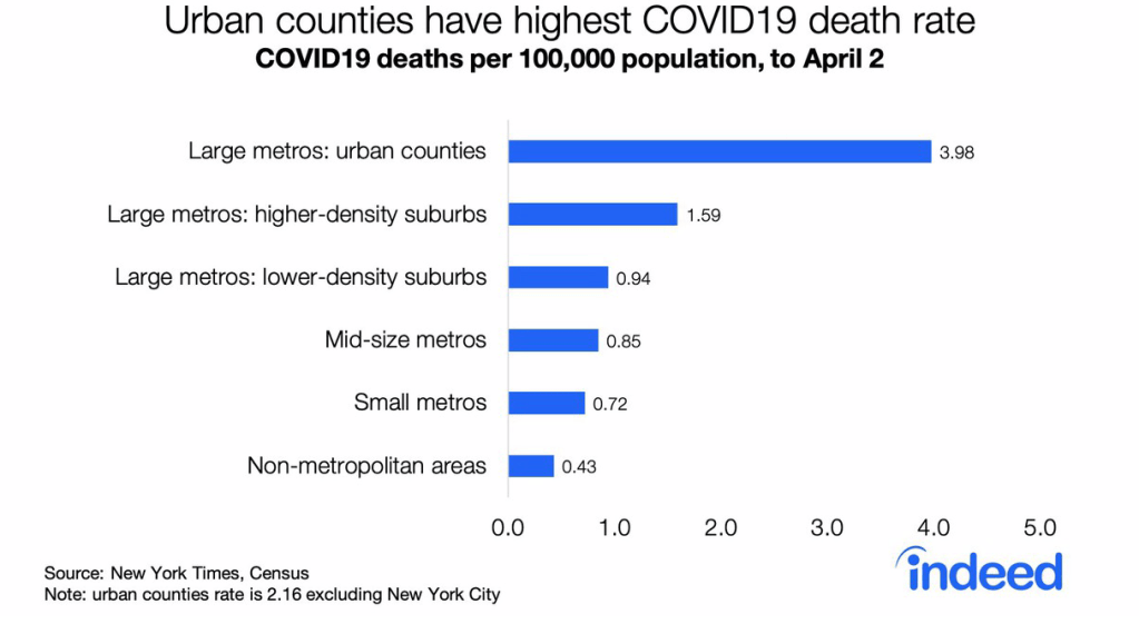
But they are more populous: cumulative COVID-19 cases reveal, when divided by populations, a complex growth of potential hotspots across the nation, dividing COVID-19 infections through late March per 10,000, revealing sites in Utah, Idaho, Montana, and rural areas in Oklahoma, Georgia and Arkansas, that would otherwise go unregistered in the grosss data of cumulative mortality counts alone–and leaving sites like San Francisco, Arizona, and Los Angeles to vanish temporarily as peaks, according to researchers at the University of Chicago.

The broader redistribution of new hotspots revealed in the map is not fine grained, but reveals a geographic progression that cumulative rates alone cannot capture, tracking migration of the virus in human hosts.

Appropriating the state-driven science of statistics for a counter-narrative of peaks of mortality so astounding to puncture the status quo, it seemed that the spike advancing off of the newspaper of records’ usual frame of printed matter registered a crisis of the severely contagious syndrome caused by the virus SARS-CoV-2 as it ravaged populations. The spikes were so much more overpowering than any of the alleged “national emergencies” declared in the past year, they undercut the illusion of American exceptionalism as a baseless fiction in economic ways. The peaks revealed the crisis of a health care system that is adequately underprepared, without hospital beds, adequate supplies of ventilators, and, yes, still without anything like a clinically effective response.
The printers red of the heightening spikes of mortality in early April punctured the pace of the pathological nightly news conferences that assured the nation of adequate preparation, and seemed to chart the course to a future path of victory, which seemed to send the fight or flight responses triggered in our sympathetic nervous systems down a memory hole, as we were instructed to refrain from full-blown claims of victory on the telescreen, but savor its imminence.
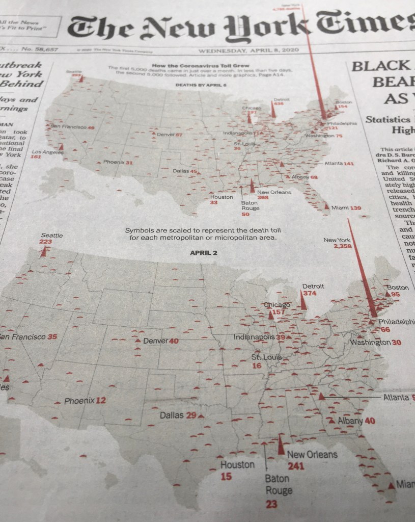
As acceleration of the rates of mortality ramp up the panic, they send us spinning for images to process the pandemic in ways we can take stock. The level of catastrophe registered is hardly magnified by what seems a blood-spattered image of the country, as if charting miasmatic growths that can be measured by the ill, which seem the spatter of coughed up tubercular blood. It is hard to know if the peaks over New York City are an effect of increased comorbidity in a landscape of increased counts of particulate matter. But the precipitous peaks in the above images are a healthy counter mapping of the groundless assurances dispensed by the willful inaccuracies and distortions in President’s daily briefings, and its crimson peaks chart a growth that breaks out of the boundaries of our mapping tools, more vivid in its starkness than the many animated maps of mortality rates, as points in the northeast near New York burst outside our familiar categories of data visualization.
Whether this proves true or not, they staged a picture of the collective future for the whole nation–the danger for the nation regularly minimized in daily Presidential briefings. For the spike that advanced off the newspaper of record’s front page, as if piercing its long-stable header was more than a victory of the medium of print in the age of social media. It registered arrival of a crisis of the impact of the acutely contagious respiratory syndrome and virus SARS-CoV-2 as it has ravaged populations as the hardy single strand of RNA has changed life across the nation, more than any of the alleged “national emergencies” declared to create a nation impervious to migrant entrance, undercutting with absoluteness the baseless fiction of American exceptionalism, and revealing the wholesale lack of preparation we have collectively allowed, its central red spike rising from New York seeming to puncture the pace of increasingly pathological news conferences that have unfolded like a new Reality TV show seeking to assure the nation of preparedness, as if the central protagonist were the American President, and not the dexterity of responding to the virus’ spread since the first case was registered in the United States on January 21–or the virus itself.


It is amazing that his response is to close the borders. Has to be something weirder than denial, as you suggest. Border closing as both cause and “cure”.
The denial seems cognitive, but inability to acknowledge the responsibility of governments suggests a stunning lack of prioritizing public health safety. The script of demonizing foreign countries was on auto loop, and the world will suffer!