
33. As the figures grew far above the numbers of cases recorded in each state to the thousands–Illinois to 15,000+ and Michigan to 20,000+, Louisiana to 18,000+, Florida to 16,300+, and New York to an astronomical 159,000, by April 9, 2020, we were looking at a scenario of which we could hover but hardly had resources or skills or ability to navigate, as we seemed to live in an animated map that tracked the pathogen’s spread in human hosts and to live in a timetable of the viral communication more than mark time.
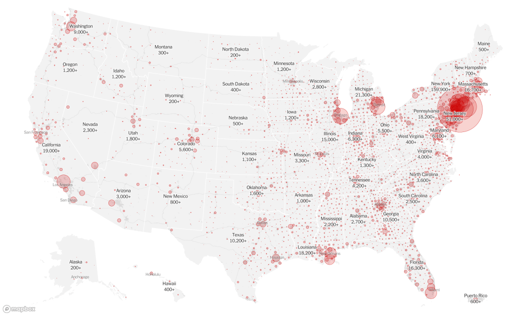
The buffers of different transparency and intensity to an extent mirror population density patterns in the nation. But we focus on the huge circle englobing the northeast and centered on New York City, in this Mapbox visualization of national reported cases of infection. We can see the weight with which the spread of the novel coronavirus has weighted down the local health system, resources of hospitals, and hospital beds, and the problems of creating a space of healing for the virus we hope and pray we will survive.
34. The usual spatial maps may not help to understand the pathways of the biophysics of droplets that animate such unprecedented interpersonal transmission, and the relative uselessness of a purely geographic modeling of cases of infections to confront the spatial distances at which the novel coronavirus spreads–and the incommensurability of the very practice of quarantine, isolation, or familiar models of public health and medical care to contain its transmission across space.
The spread of the virus seems to have countermanded our therapeutic skills, systems of health care warning, and indeed the efficacy or accuracy of statistical models and modeling, in such cumulative maps. The very design and pervasive presence of pathogenic forms the maps register seem to ensure us of their objective claims of accuracy, but provide no narrative context for their spread, or the measures we might take to contain them. They are eery counterparts to repeated emptily assurances in no uncertain terms that we have the best health care system in the world, as if it could not be at fault–even as we have seen that it clearly is, and is without the very tools of modeling spatial transmission in ways the viewer can udnerstand. The expanded public safety measure issued in California is an emergency alert, depending on limiting our social exposure to anyone infected with the pathogen, even if they are asymptomatic.

The emergent nature of the infection that might have incubated for ten days or even fourteen, depending probably on the degree and duration of exposure, seems destined to grow, as each circle becomes larger, radiating out until the map assumes a shade of red that obscures the nation. This, the map is saying, is the real thing–the true emergency, more than terrorism, migrants crossing the border, or even domestic terror, and the other needs of securitizing the border that seem to have convulsed the nation.
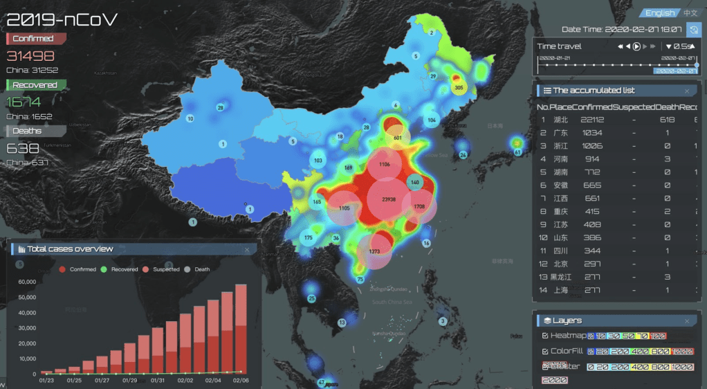
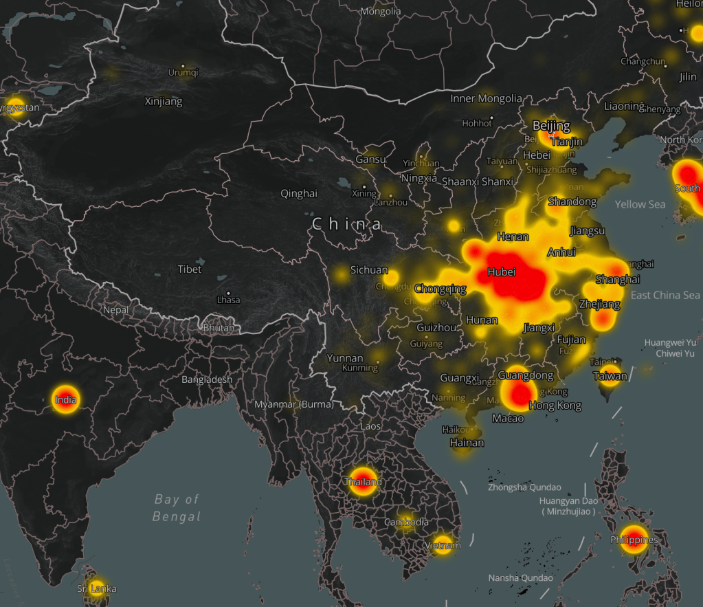
The crucial nature of gaining the best counts of the virus seems to be the point. But the problem of mapping the growth of infections of the virus over time, and the problem of the growth and transmission of something like a pandemic, and the problems of tracing the outbreak as akin to a heat map, using Chinese data from January 20-February 15, the period when the disease spread across Chinese provinces, in animated form, whose saturated chromatic layers almost suggest the cool ability to process overwhelming statistics in their cool, futuristic format, akin to a dashboard for a disaster we are still learning to navigate, whose futuristic design suggests we have arrived in a dystopian terrain where suspected scales are rising bars, and curves of death are maybe flattening but also similarly staggeringly high.
The urgency of mapping the overwhelming tallies of the virus’ detection across the nation and the spread of illness offer needed forms of orientation, on an event so deeply disorientingly we are compelled to map, remap, secure better data, and map again, seeking better aggregations to materialize the replication of a single stubbornly resilient strand of RNA against which most all the population has little immunity.

Such images of cumulative infection and its spatial progression evoke the transmission of a miasmatic presence, broadly growing over space, with terrifying predestination, and are as impossible to process as they deeply shock our expectation to look to maps for assistance in understanding spatial spread. The outdated image of miasmatic spread that they evoke, englobing space in no clear logic, remind us of the extent of our interconnection that make them so difficult to accept, for many, and easy to compartmentalize as distant from our own health disaster, even if they are more likely only a first run-through for it, and a run-through that provides no clue for grasping its overwhelming data, save that we have no means of grasping what is in store.
Perhaps spread of infections, if only partial, must be read against the spread of aerosolized droplets of almost undetectable size from the lungs, so small in micrometers to be out of scale with the massive national maps that we use to map them. What would be the correct scale, proportions, and detail of these maps to best communicate the implications of contagion the they provide? How can we scratch their surfaces?


It is amazing that his response is to close the borders. Has to be something weirder than denial, as you suggest. Border closing as both cause and “cure”.
The denial seems cognitive, but inability to acknowledge the responsibility of governments suggests a stunning lack of prioritizing public health safety. The script of demonizing foreign countries was on auto loop, and the world will suffer!