
The spatial tracking of the rise of confirmed infections of COVID-19 across almost all of the Chinese provinces revealed the national scope of the emergency at hand: the outbreak of disease which was not yet named as COVID-19 was not limited to the borders of China, but was already a global emergency, even before the coronavirus outbreak was officially declared a pandemic on March 10–as the virus SARS-CoV-2 had spread to 114 nations, sparking global Googling to discover what a “pandemic” was, suddenly saturating the world’s online attention–

–a leap in interest American Googling habits reflected more pronouncedly, as the world tried to come to terms with the potential globalized nature of a disease to be contracted by over three million, if with a lower rate of mortality or even manifestation of illness than previous zoonotic diseases as MERS or SARS, or Ebola–and a fatality rate of about 4%.

The problem with processing a pandemic by maps lay in its transcendence of national boundaries. But national maps was the terms in which the data existed and was parsed. Mapbox mapped Chinese data on the January 20-February 15 outbreak in a base map of nations and provinces, to gain a handle on its paid spatial growth, tracking its progress long after the spread of the disease outbreak that had begun in at least December, in chromatic layers of an animated heat map that almost appear, to a historian of maps, more miasmatic than related to modern models of the communication or contraction of an infectious disease: the animated map reveals a rapid spread of infections across Chinese provinces, set in a a futuristic format akin to a dashboard for a disaster, as cases of confirmed infection exponentially grew.

But we are still learning to navigate, as if acknowledging we arrived in a dystopian terrain, as it raises more questions about data and contagion, more than clearly orienting us to its spread: the heat map of infections and mortalities call attention to its rapid communication, but orients us to the expanding data collection by public health authorities, more than the contraction or communication of the virus.
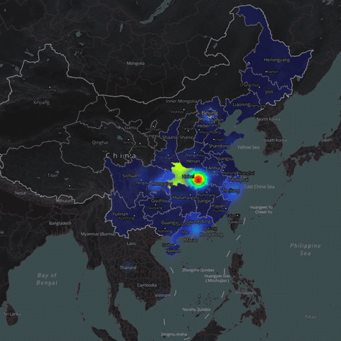
What began as a dot in Wuhan had metastasized in some way far beyond Hubei, to Sichuan, Chengquing, Beijing, Qinghai, Hainan and Inner Mongolia, across the Yellow Sea, East China Sea, and into Laos, not respecting boundaries of land and sea or national frontiers, in ways that demand visualization outside of the jurisdictional base map that we are used to organizing statistical maps.
Data that we used to map the spread of the disease thought to have begun at a wholesale outdoors seafood market in Wuhan, led the region not be placed under quarantine on January 23, roughly from the start of these heat maps that followed its viral spread, in an attempt to contain the spread of the virus by implementing closures to traffic unprecedented in scope, all but recalling the quarantines that were associated with an era of belief in miasmatic spread of disease, as the world faced a novel coronavirus whose means of transmission, contraction, and movement were poorly understood–as some five million had left the major global hub before the quarantine was begun, many flying to the United States.
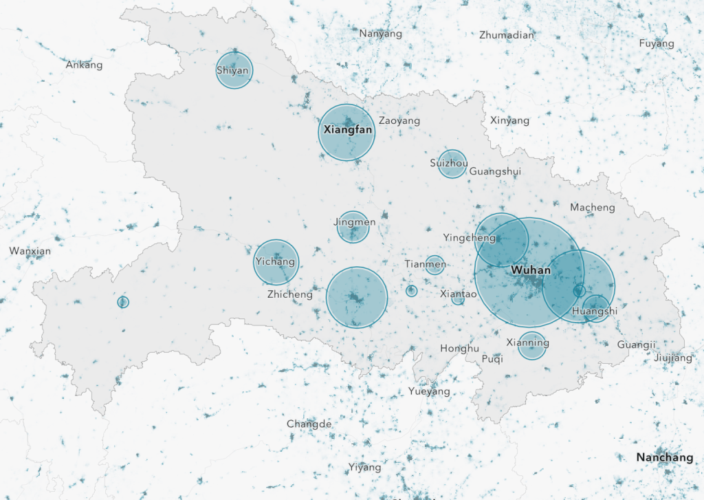
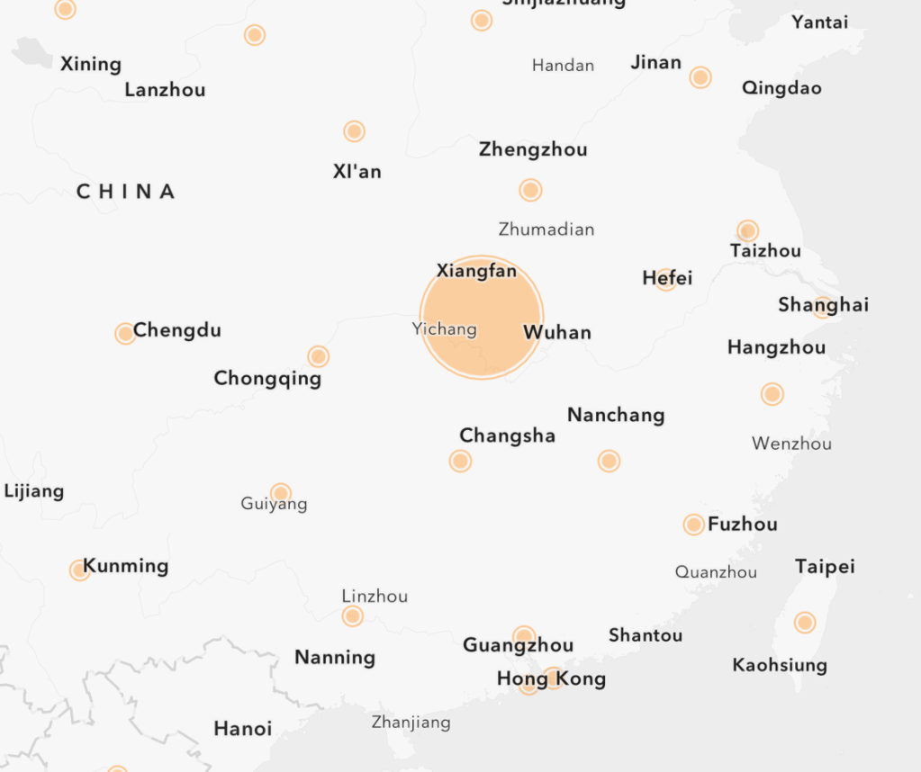
Although cases of the novel coronavirus were largely concentrated in Hubei Province, the global migration of the virus that was transmitted by some portion of the five million travelers who had left the city created the first global pandemic we have experienced, and are still struggling to map, to create a visual register of confirmed cases of infection, although the nature of such visualizations provide limited purchase on outbreaks or the geography of its spread.
If the logic of confronting the disease was containment, as confirmed infections spread, the shifting ground beneath our feet of rates of infection, hospitalization needs, denial and differential vulnerability that increasingly demand mapping needs to integrate a virus that now seems part of our changing globalized world.
The evidence in subsequent “official maps” were not comforting; but we watched them ready to suspend fears and have them define our relation to an illness as we learned about its symptoms, and travel through our body, and watched disturbing evidence of the arrival of those infected and unable to breath at hospitals. The increasing attempts to integrate national maps with global pandemics since March 11–when the pandemic was finally processed in cartographic form–have opened the formats in which we have tried to imaging the relation between local and global in COVID-19’s spread, hampered as we are by deeply limited data–and often bad data–to try to visualize that spread as authoritatively and legibly as we would hope.
How we use cartography is a strategy as much as a way of making the surface manifestation of confirmed cases, mortality maps, and hospital beds filled legible to viewers–a demand increased by the internet, but also the increased demand for global orientation to the pathogen’s spread. As our national agencies respond to the spread of the pathogen, the role of maps to illuminate, interrogate, and help instruct us about that spread are increasingly important, making the cartographies of COVID-19 both a recurrent topic in this blog, and a topic worth investigation and attention as we seek to understand the relation between how we understand its global spread and confront the possibility of containing and conceptualizing its local spread.
68 From chilling scenes of mortality, we turned to maps to concretize the pathogen, to maintain a sense of its distance from us: we talked about “hot-spots” of outbreaks that moved from China to Iran, to the French Alps, and to Washington State and New York City, multiplying before us, but watching something like a mortality play in progress, delayed a week or so for the incubation periods of infection by the pathogen.
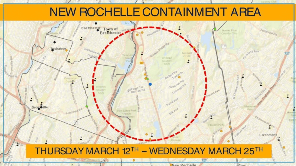
I was driving in an RV across the Golden Gate bridge in San Francisco, when my close friend’s brother came on speakerphone from New Rochelle, apprising us of the rising infection rate in an east coast enclave, a community my friend was about to visit for a seder, apprising him of the needs to revise travel plans, as we were almost oblivious of the advancing threat of infections that were about to change the state of affairs; the first “containment area” created that very day, just after the announcement of the pandemic, as the news of a new epicenter of the outbreak led Governor Andrew Cuomo almost to apologize for the “dramatic action” taken so suddenly as “literally matter of life and death.”

John Minchillo (AP)
There was a sense, as we pulled across the Bay Bridge, and rearranging travel plans, refunding plane tickets, and reassessing, that the landscape was changed. The new conditions of emergency living were a first sign of the changed landscape of a disease we had bracketed as lying in China and select hot spots, not yet spread to our world. The Containment Area was fired across the world, raising fears of the new potential spread of the virus down the Hutchinson Parkway, as the fear of mapping a similar epicenter of disease that seemed at that point localized in density distracted from virus already arrived in differentiation mutations across the east coast–but the apparent proximity to New York City was alarming.

Westchester city’s Young Israel synagogue was the site of the outbreak of 108 of 173 cases in the entire state, and the one mile containment area around the New Rochelle synagogue was described as “a particular problem,” but blocked all large gatherings–my friend’s brother, a doctor who summoned his strength to channel lack of panic, let him know the prospect of a cross-country visit was maybe not the best idea as we drove to a community already under self-quarantine, where the National Guard were about to arrive to clean all public spaces and deliver food to homes, as a sense of palpable anxiety was already in the air before their arrival.
In the face of the steady rise of infections, the steep slope of global infection rates have grown in ways that make it difficult to measure successes, or even to know what has worked well, entirely, to contain the spread–and the disease has become a recipient of increased projections, invoking global theories of conspiracy, imagined laboratories or hidden state interests, as the infection rate has steadily risen, albeit in ways far less exponential or cataclysmic than feared from pandemic films.
The maps of COVID-19 have often featured this graph of growing cases, often hindered by limited testing, and datasets, but revealed a steady rise, almost uninterruptedly, globally, in confirmed cases, if not the exponential rise that many worried seemed to be contained–if it was hard to know what factors contributed to containment, or, indeed, how to integrate the statistics of global COVID-19 confirmed cases with the maps that we watched apprehensively of its continued rise. While the rates of mortality and severe sickness for COVID-19 were less severe than breakouts of other zoonotic diseases like SARS, MERS, or Ebola that had been occurring in recent years, and seemed to lie around 4%, the steady growth of infections suggested that the novel coronavirus had become part of a landscape with which we would have to live: the steady progress of reported cases of infection, if perhaps far less than the actual number, seemed to inexorably rising, even if some local cases of distancing seemed to reduce new infections over periods of two weeks.

We benefitted from sophisticated disease tracking systems that themselves have evolved and developed in the ecosystems of online communities, and users of online platforms, harvesting data in new ways by mobile applications and in hospitals, transposing public health information to a new graphic form, benefitting from advances in location technologies, more than understandings of the disease. And the proliferation of maps of the COVID-19 outbreak matured to reflect the wide availability of mapping tools, comprehending available data to process them in new graphic form, using GIS tools that captured attention even as we knew little about the communicability of the disease that we were told was not communicated in the air, or dispersed outside of physical contact, in order to gain a sense of the stability with which we in the west could observe the spread of health data through GIS tools.
We are less aware of presumptions or suppositions of the cartographies of COVID-19, however, and the stories of infection that they spread. The rootedness of such cartographies of contagion in national paradigms and models are difficult to transition to a sense of the global underpinnings and creation of a pathogen like COVID-19, which just as it has leaped species, since being tied to an open-air fish market in Wuhan, China, is both a poster child for the zoonotic diseases that are a consequence of overpopulation and global crowding into forested spaces, and is transmitted and contracted across borders by global routes, as its rising rates of mortality are shaped by the disparities in high concentrations of particulate matter in environments accelerated by petrochemical processing and fuel consumption, from the pollutants blanketing northeastern China to much of Northern Italy, to the northeastern United States.
We turned to maps with a newfound eagerness to gain a better grasp on the pathogen’s spread in human bodies, but were often frustrated by the very outpouring of maps, for they allowed us little place in them, save as being ineluctably surrounded by the apparently miasmatic spread of a growing infection and a tally of cumulative deaths that offers no purchase on the terrain; frustratingly, there is no ability of placing oneself in relation to this spread, or ability to orient ourselves to the map, save passively watching the spread of disease across space that may well be spreading near to where we live.
The heat maps that were made out of data on infection only provided a sense of what were registered, we had to remind ourselves, and perhaps these limits suggested far less objectivity than they seemed to claim. The amount of data in itself, however, was beyond anything like a simple narrative, and was not organized in any way a narrative would suffice to capture: we could imagine we were mapping infection and contraction to process the illness caused by the novel coronavirus, or map its mortality rates, but we had no sense of its relation to the bodies of patients in which it traveled, or how it was communicated across space. Was the data even good? Or was it being identified with such readiness only after it was identified?
So compelling is the need for such a connection that we turned en mass to literature of the plague, as a sort of coping strategy: when we read Defoe we seem to find a fellow-spirit, learning to live in London in a time of plague; Defoe’s account is not personal, but we seem the bookend to how Defoe’s picture of the final plague epidemic London suffered in 1655, seeking to understand the behavior in an epidemic which he didn’t witness. The book of disorientation before disease was aplty republished during the 2009-10 Swine Flu epidemic, that earlier outbreak of zoonotic disease—one of the earliest disorienting of zoonotic epidemics on with we are still all orienting ourselves. It hasn’t helped that the Narcissist-in-Chief of Little Empathy has been congratulating himself on his policies of banning border-crossing, as if this has been effective, while he has provided few guidelines for states, or for health policy, and is acutely uncomfortable in dealing with a crisis global in scope.
While attacking global health organizations, hospital administrators, and government officials, charging others with incompetence, social distancing practices are advised with one hand while arguing that he will relax the very same guidelines with time, in order to “re-open the economy,” with little sense of responsibilities or leadership that might be expected from his public office–never having held such a position of responsibility to anything but a corporate entity. Indeed, the hopes to “re-opening the economy,” as COVID-19 cases surpass one and a half million (1.6), and global deaths have reached 100,000, the future of the rates of infection in the nation are by no means clear, and the horror show continues. Eerily, the ways that Trump removed the United States from the Paris Accords on global warming and climate change were echoed in the decision to withdraw contributions to the World Health Organization, rescinding United States funding of an annual $400 million at a time of need–and accusing the W.H.O. of favoring China by tilting the scales of impartiality.
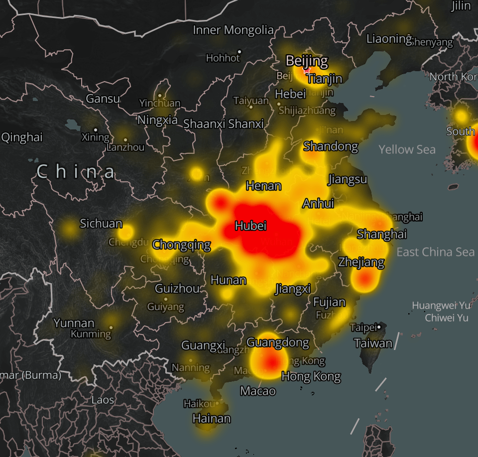
The barfing Apple emoji matched the viewer’s reaction to a map of SARS-CoV-2 infections. The heat map of transmission of the novel coronavirus over the entire country is emanating as an evil effluvia beyond the borders of coronavirus, and the viewer cannot process what the intensity of this radiating heat map means: the emoji’s scrunched up eyes clench with an intensity, suggest an intense reflexive reaction to the heat map itself, that seems to obscure the nation: the revulsion of spewing green vomit seems a reaction of the sympathetic nervous system, no longer able to process the amount of data and loss of lives communicated in the map.
The scrunched eyes of the vomiting emoji unveils the entity of COVID-19, newly named only on February 11 by the World Health Organization, and not yet named a pandemic, the brilliant heat mapt transforming China to a. radiating blob and an evolving reality, radiating far beyond its coasts.

The map is fundamentally about the failure of our health care systems to be commensurate to an infection that we do not know how to address, and cannot cure, save by distancing ourselves from it, COVID-19 has made us uncomfortably close to the reality of the globalization of space. We cannot map but at multiple scales in this brave new world, and look to maps repeatedly to grapple with the question of the novel coronavirus’ spread, even if we rely on or use old images of the contraction and transmission of the disease as a communicable infection–informed by the optimism of the first maps that allowed us to visualize and grapple with new infections like cholera that John Snow was able to wrestle with and teach us how to visualize in the progenitor of good data journalism.


It is amazing that his response is to close the borders. Has to be something weirder than denial, as you suggest. Border closing as both cause and “cure”.
The denial seems cognitive, but inability to acknowledge the responsibility of governments suggests a stunning lack of prioritizing public health safety. The script of demonizing foreign countries was on auto loop, and the world will suffer!