
Is the notion of localizing a pandemic in China outright deception or sloppy thinking, or an attack on logic, projecting the pandemic onto an obsession of walling up national space? Is the poor mapping of the disease to blame, or did an image of global economic competition between nations provide a lens through which viral transmission was mediated, among members of Trump’s team less familiar with epidemiology, and more habituated to defer to The Donald, lest they be fired from the White House or COVID-19 Emergency Response Team, which when it was formed in mid-March, just after the search for “pandemic” on Google escalated in the United States, used a designated landline (not even toll-free!) to report cases of suspiciously high temperatures of a fever over 100.4 o F, 202-586-COVID?
4. Can we create more cartographies that show the inequities of the virus’ spread, or the danger in which its spread has based vulnerable populations? There was less interpretation of the advance of disease against the range of national vulnerabilities or susceptibilities about which we knew already–or suspected–
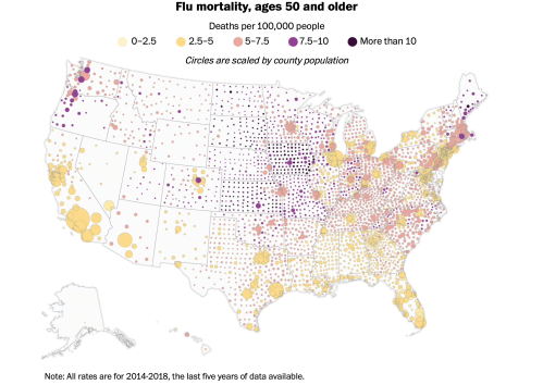
–that should force us to look at the uneven landscape of health and wellness, with sudden clarity, in an era when the danger of COVID-19 comorbidity elevates the presence of hypertension to the leading cause of death among the terrifying jump in fatalities in New York City in its worst days of increased mortality, which underlies the need to map against health risks particularly present in those most at risk.
In part, this can be localized. The danger of susceptibility to the highly infectious coronavirus in assisted living facilities and those of nursing care in the nation, privately developed by the Society for Post-Acute and Long-Term Care Medicine to confront the need to distribute protective equipment (PPE) and other resources to contain COVID-19
The range of dangers from diabetes to asthma to senescence provide problems to integrate into statistical maps or data modeling, because they invert the categories of danger of man diseases, like diabetes–that create a different map of health risk.

In the case of quickly advancing dangers of infection, often managed remotely in an age of distance-learning and tele-medicine, there is also the risk of entering a new topography of medical care, defined by in regions far from medical care less well-served by access to medical expertise–often important in a disease where quick diagnosis may be late in arriving, and proximity to ICU wards, respirators, and caregivers may be as crucial as proximity to a testing center.

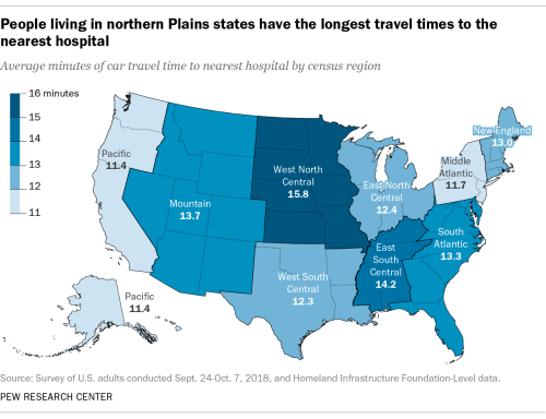
–or access to hospital beds.
What was the dominant narrative of viewing the potential spread of the virus, and what sort of narratives were associated with them?
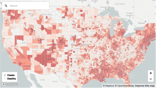
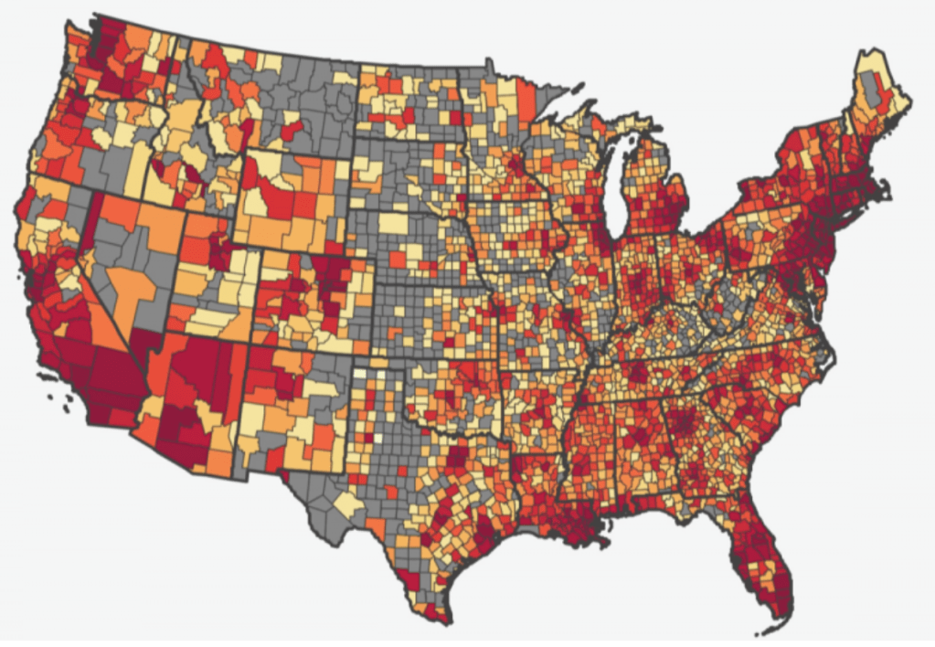
A wishful thinking informed choropleths of outbreaks that suggested that the health care crisis could be contained–or was contained!–that obscure the deep disparities to health care and even of maintaining distancing and cleanliness, vital to issues of national security as well as forms of empowerment and tools of survival. Should we start a finer-grained map of the country, whose layers called attention to the dangers of places where social distancing is less in place or easy to maintain–like ocean liners, Wuhan markets, New York City’s outer boroughs, or more crowded neighborhoods, with less access to open space? It increasingly seems that the uneven geography to which the choropletss we have inherited from old models of data visualization are spectacularly blind from levels of class, uneven health care, exposure to pollution or overcrowded living conditions, that they, indeed, seem to naturalize in their appeal to a miasmatic notion of disease transmission or effluvia–common to many of the first statitistical data visualizations of cholera, like the London maps developed by Richard Grainger, and Dr. John Snow. The uneven geography of the nation should not be bleached from our own choropleths in an attempt to explain or communicate the topography of infection that is increasingly apparent.
For the changing actual maps of national distribution of the illness as they evolve reveal an expanding growth of infection rates along the Mississippi, in Florida and the US South, as well as southern California, Chicago, and Detroit.

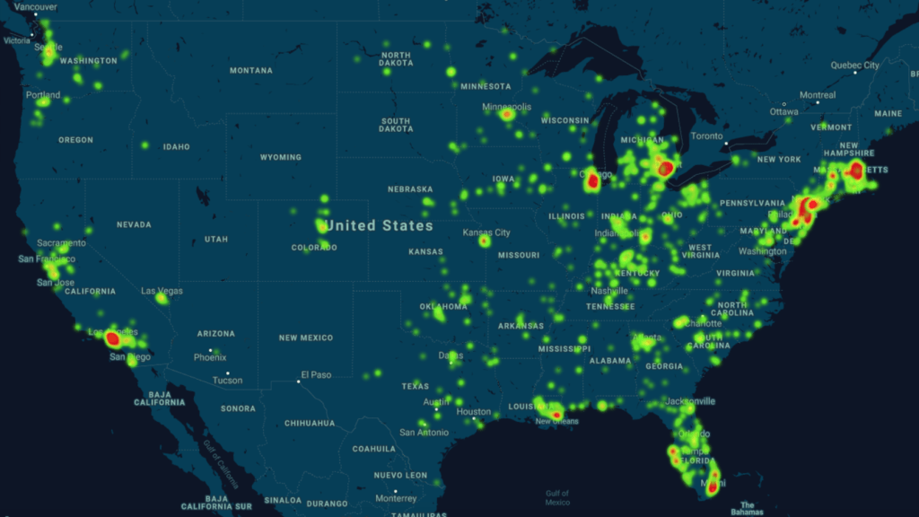
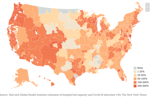
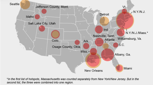
Although notions of containment were long gone by April 15, 2020, the notion of sites of focus for the disease still seem to underly the maps of “hotspots” that were made by mid-April, a month after the declaration of the pandemic, as we should have been watching, studying, and responding to the populations affected in greater detail than as below, COVID-19 infections in total in ocher and per 100,000 in red–an attempt to suggest some specificity of density, bt which results in grouping New York/New Jersey and Massachusetts as one red almost vibrating blob that troublingly recalls a radiating miasma.
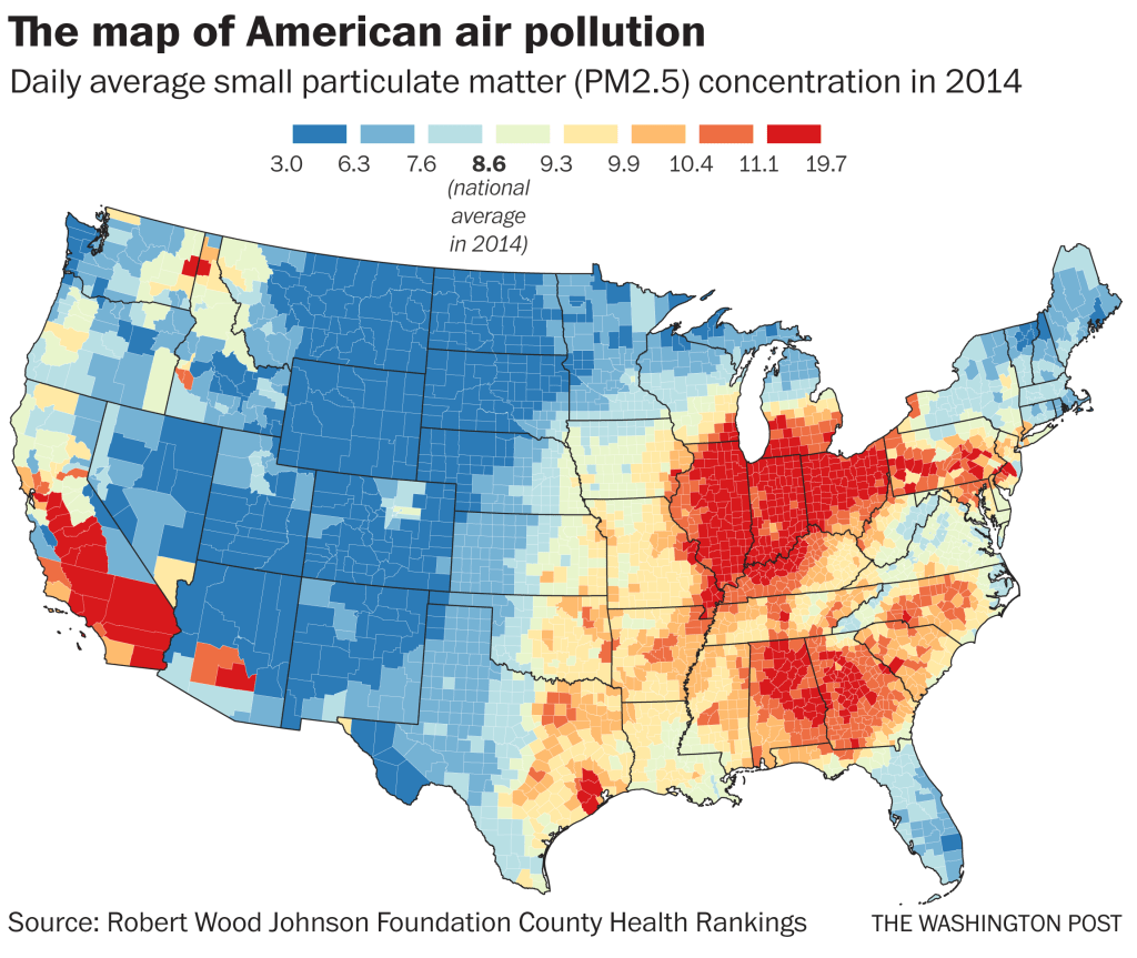
The intersection of such maps and those of “hot spots” of disease with places where social distancing is impossible or unable to be performed is striking, as is the relation to poor air quality and ambient pollution that could create a virtual comorbidity by compromising the linings of lungs. Long-term exposure to air pollution–a metric of asthma and respiratory impairment–may well map onto vulnerability to greatest compromise by COVID-19. We might consider how such exposure affects the lungs and surfaces of the lungs that COVID-19 attaches, and seems to make some more susceptible to infection and death on the cells lining the lungs, settling in the alveoli that tiny air sacs where oxygen enters the blood stream–and which the virus uses as a launching pad to enter the body, presenting a respiratory illness able to leave lasting damage to the lungs?
For once the virus invades the respiratory tract of the individual, as it makes its way into the lining of the lungs, it seems as if it would be encouraged by any compromise in the lungs’ functions–from circulation to senectitude–for those among whom any irritation or infection could be more consquential.
The often ignored fault lines that exist in the landscape of health in America that underlie this uncertain data distribution, underscored by the fact that low-income jobs in the service economy, retail, delivery, or gig economy fields both offer few health care options or sick leave and cannot be performed remotely, and the tie of income to higher rates of chronic health conditions that can provide cases of comorbidity–from diabetes to asthma to heart disease, significantly increasing vulnerability to COVID-19.
The concentration of air pollutants is by no means a sole filter to interpret the data maps, but high particulate matter is one metric and needed sort of stability to read the overpowering spikes of mortality on the east coast, hard to maintain any bearing to, in the midst of an increased stress at the witnessing the rapidity of COVID-19’s spread and high infectivtivity. As the nature of overcrowded spaces encourages its notorious infection rate, the concentration of particulate matter in the atmosphere has been linked to increased COVID-19 morbidity by Harvard’s T.H. Chan School of Public Health, who find sustained exposure to air polluted by particulate matter above 13 micrograms/cm maps map onto increased mortality, affirming the pronounced role of anthropogenic environmental changes on chances of contracting the disease. Francesca Dominici, co-director of the Harvard Data Science Initiative, argued “only 1 gram per cubic meter in fine particulate matter in the air associated with a 15% increase in the COVID-19 death rate;” we now find increased incidence of infections in polluted Southern California counties, as well as the rise of cases of infection, presumably from a lesser load, as confirmed cases grow by over 2,000 daily and collective deaths have passed 80,,000–drenching the continent by mid-April in red, as cases of infection bleed across the entire land.
But the “cartographies of COVID-19” that we are invited to navigate on digital platforms are often organized by the inheritances and tools of data visualization that, as statistical models, see outbreaks and diseases in relation to the state, even if our state is unable to contain the highly infectious novel coronavirus, and we aren’t developing the best tools to visualize its spread. For as we are mapping mortality and hospitalization, we are registering shock at the virulence of a pandemic of the sort that seems as if it should be foreign to the modern world, or modernization, but is sending ripples across the world difficult to hold together with the need toot contain but eliminate the pandemic virus as it spreads. We can review the range of visualization tools at our disposal, but even we fail to have complete data, run the risk of relying on older models of mapping the coronavirus that don’t successfully communicate the risks posed by crowding, inabilities to distance, and unhealthy ecosystems that are apt to encourage and facilitate its spread: even if we could control the forced crowding in jails, camps of refugees or deportation, and the powder kegs of old age homes where the presence of comorbidity is impossibly multiplied–and remember, in New York, the presence of comorbidity defined h86% of COVID-19 deaths, with hypertension and diabetes being the leading factors present, above coronary disease or cancer–as what were seen as non-mortal illnesses are flipped to causes of death.
As we begin to make better “prognostic maps” of the regional vulnerability of counties across the nation, we see disparities in cumulative rates of infection. Such maps might integrate the breadth of the project of need for national testing that has spread across the country, and demands congressional oversight–rather than left to a fragmented national administration. Such vulnerability to contracting the virus are based on cumulative incidence, but reflect a widespread contraction of the virus not limited to population density or metro areas, but of disturbing broad-stroke correlation to airborne pollution–which has been argued to increase sensitivity to contracting airborne diseases and compromising immune systems.
All sense of gaining orientation form maps and data visualizations shift when we try process the spread of COVID-19.
The pathogen was given foreign identity from Trump’s first address to the nation, of March 11, about a “foreign virus” that was to be seen in national terms that demanded to be confronted as a nation. The interpretation of sovereign terms was accentuated in Trump’s continued mis-mapping of the novel coronavirus as a “Chinese plot”–or, as Trump prefers, a “Chinese virus,” in danger of being brought by migrants, rather than able to illuminate fault-lines within our health care systems in a globalized world. Is such intentionally mipmapping the virus by investing it with nationality, Trump sought to deny the global nature of the emergency facing the nation? The termwhich Mike Pompeo seems to have introduced on FOX on March 7 was used by Trump on social media, and after being tweeted out by Republican congressmen–“Chinese coronavirus” (Kevin McCarthy, March 9) or “Wuhan virus” (Paul Gosar, March 8) became a viral shorthand for alt right bloggers for the novel coronavirus that Trump embraced in public policy debates.

The remapping of the virus with a national geographic origin injected the raunchy Trump persona of an attack dog into the staid tones of a national scripted address read directly off the teleprompter. But the false “correction” that Trump performed by Sharpie on the speech he later gave to the Coronavirus Task Force was a canny injection of inarticulateness, above, was a dramatic attempt to displace the danger of the virus as a national emergency form foreign agents. Akin to the remapping of the course of a hurricane by sharpie to elevate a national threat to our borders, Trump tired to start a meme of altering the scientific name of COVID-19 in two tweets of March 16 that invested the virus with national provenance. And if he defended as akin to the Spanish Flu–“because it comes from there!”–he mapped the virus spreading in the United States as a foreign threat, as if offering talking points to energize a crowd. By intentionally transforming the virus in unhelpful terms of national sovereignty, Trump seemed to remap the contagion as a national contest by wielding his sharpie wand of disinformation with clearly disruptive intentionality.

Did Trump not intend to introduce a meme in his tweet and address to the Coronavirus task force, to be carried in major news sources, infect debate, and shift attention from his own mismanagement of a public health crisis, so that the reality of its discussion would displace the attention?
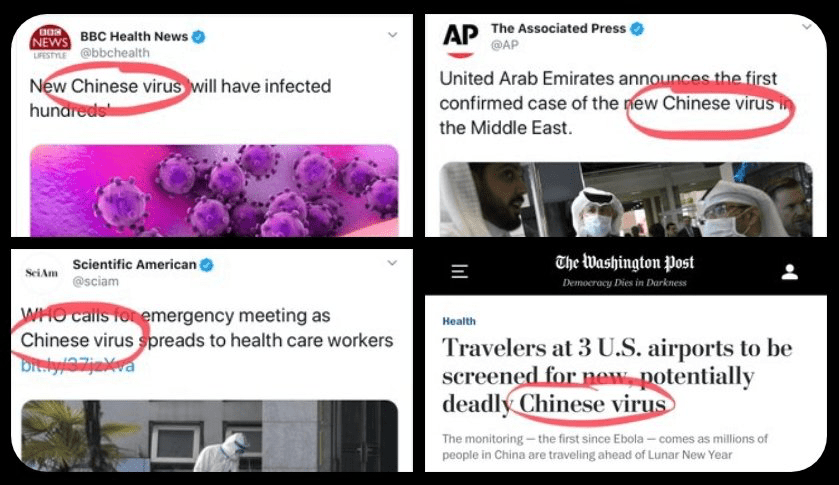
Insistent mis-mapping of the virus by casting it as a national threat, a creation of other foreign laboratories, as Pompeo returned to mischaracterize the virus as an enemy plot in early May, 2020, alleging that COVID-19 derived from “a Wuhan lab” almost mask the disruption of United States’ scientific monitoring of a global threat in the Trump administration. Pompeo’s strikingly poor command for a Secretary of State of the global map, which he had fetishized as the blank map he wielded to challenge NPR’s Mary Louise Kelly in his living room in January, by challenging her even to locate Ukraine on a map, stripped of toponymy, haunted his assertions, as Pompeo wielded a map of viral spread to confound the site of origin of the novel coronavirus with a map of global politics: he argued without grounds that China that was to bear the blame for its failure to prevent a global “descent into an economic malaise” and prevent the deaths of “hundreds of thousands of people worldwide” and indeed “perpetrated” a zoonotic virus on the globe, confounding the contraction of the virus with amorphous global fears.
Did Americans need to know anything else but that it originated abroad?

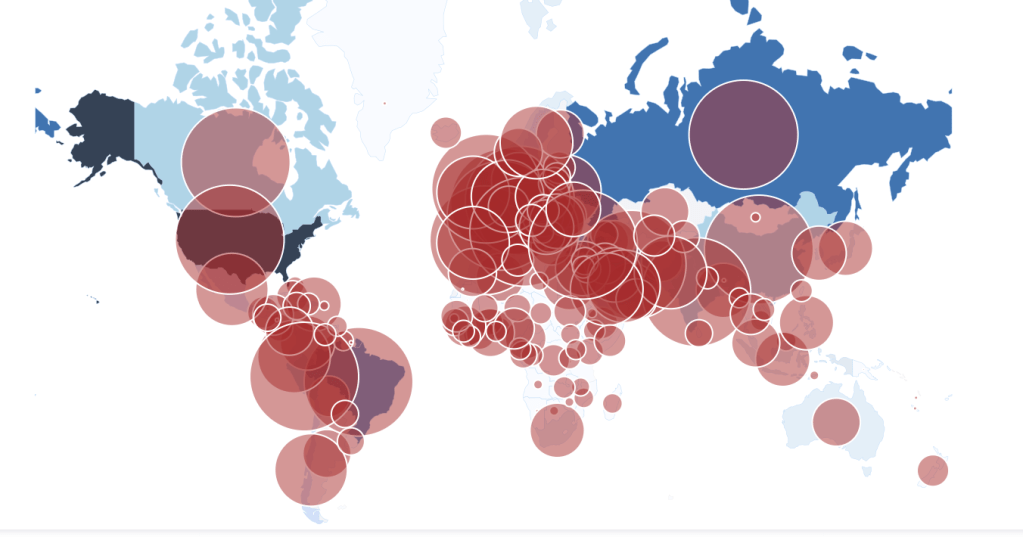
The outbreak of the novel coronavirus that began on the China mainland before it spread worldwide has confirmed that we live, the rhetoric of governments who seek to reveal their control of events notwithstanding, in an edgeless world, where the pathogen knows no edge; we track its appearance in human hosts and mortality rates, at a time-lag from its actual contraction or spread, with uncertain and shaky means of testing, trying to view it through the refraction of civil government. If maps are increasingly authoritative presentations of data, our maps may be on the wrong scale. In a time when we are beyond containment, maps have a curious role.
To steady ourselves before a global pandemic whose scale we don’t know and haven’t undertaken testing to detect have led us to depend, unsurprisingly, on maps, driven by the need to determine our relation to the pandemic virus’ global spread, most often to try to grasp our danger of exposure–or the exposure of loved ones and family–before global acceleration rates of the virus’s spread, and to map the relation of the nation, and indeed the state, and city, or county, to the global dispersion of SARS-CoV-2, the primary topic of global media attention, and the topic of increasing global stress and concern.
5. We trust visualizations as forms that can be consumed, digested, and grasped in better ways, the questions of the availability of good data to orient us to the disease to the side, our maps track cases that cannot describe the fine grain on which the virus moves through bodies, or even moves through space. As is so often true for a GPS-derived base-map, the story of COVID-19 is increasingly about our changing relation to global space; the recent proliferation of maps seek to track that relationship. But the danger of these global maps is both that they neglect the vulnerability of specific populations that are decimated by the disease–often without health care and living in crowded conditions–and that they lack any narrative that allows us to process the progress of the disease with has globally spread as the United States government has spread disinformation about the pandemic and often not enabled full counts of infected.
We lacked a sense of the narrative of this spread, of course, and were not ready to link the proliferation of data to an interpretation of the virus’ rapid spread. Even as we were barraged by maps, as the benificiaries of new location technologies, that have helped facilitate and improve the provision of maps, even if based on bad data, they were produced at a disconnect from the lack of official response to the disease.
This gap may have been enabled by an absence of many on-the-ground CDC officials or representatives in China: their number reduced, the United States’ official reaction to the spread of COVID-19 was subsumed into a personal relation of Trump and Xi, so often the optic of foreign relations and affairs, with less epidemiological expertise: “You have to consider the possibility that our drawdown made this catastrophe more likely or more difficult to respond to,” confessed one familiar with the consequences of eliminating three-fourths of Chinese medical and disease experts whose “institutional knowledge” provided stability in Beijing, now headed by a temporary deputy director. The sole epidemiologist embedded in China’s disease control agency where she trained field epidemiologists had been fired, her position unfilled, and agencies designed to combat global disease and build scientific relations had been shuttered in China since 2019, ending research into multi drug resistant malaria and other viruses.
The Center for Disease Control hamstrung its global knowledge of the zoonotic disease, as CDC officers in China by half before the pandemic, giving us far fewer epidmiological eyes on the ground–cutting a Beijing staff from almost fifty to fourteen, under the Trump administration, including all local employees; in two years, only two thirds of its staff remained–agencies for international development in Beijing closed, curtailing the ability to monitor outbreaks as if setting us up for a pandemic. The cutting of Chinese on U.S. payroll and shuttering of National Science Foundation and CDC offices was deeply damning evidence of the denial that anything outside of the United States was relevant to its well-being, as much as being “anti-science”: shuttering of NSF offices in Beijing led by respected scientists like Nancy Sung, critical in establishing ties between United States and Chinese scientific communities who ran the NSF’s international Science Program, closed outreach ties to Beijing before the outbreak.
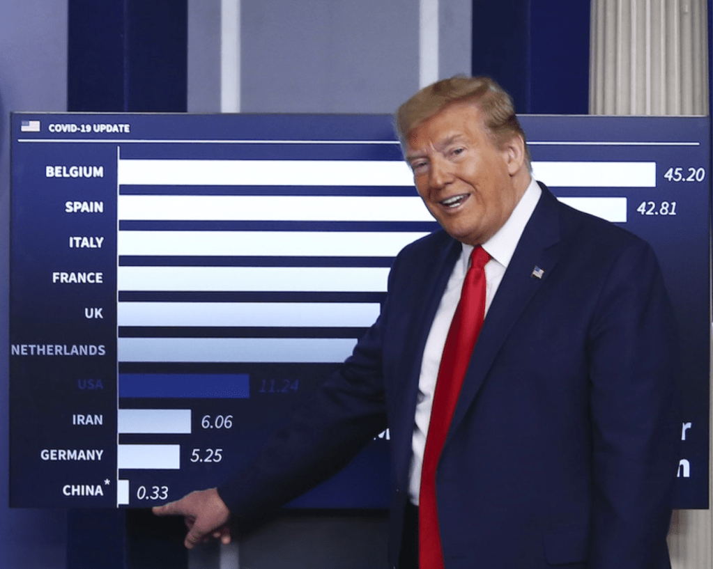
The concealment of such mismanagement of scientific open-ness in the assertion in anti-globalist terms that the novel coronavirus was “inflicted on the USA and the rest of the world” viewed the spread of COVID-19 as an actual war. By the time a pandemic was declared on March 10, after the virus had long spread on the ground, strains had arrived in multiple cities in the United States, with no coherent strategies–and those testing positive revealed only hinted at the scope of the virus’ spread. Yet anti-science attacks that began with the end of National Institutes of Health to help fund research in a Wuhan Institute of Virology to develop a cures for emerging pandemics, and zoonotic diseases that jump species from bats; the alt right Florida Representative who slandered work with an institute that “may have birthed a monster” or the novel coronavirus,–debased the value of its research in the anti-globalist rhetoric of the alt right, as President Trump described the virus as “inflicted on the USA and the rest of the World,” as he sewed doubts about the accuracy of mortality counts in ways predicted to occur by Trump’s biographer: his staff members queried figures’ accuracy given “lack of uniform standards in the United States or internationally“–undercutting World Health Organization–and explained them by the lack of practice–“America’s out of practice of how to deal with something like this and to report it accurately“– as if a similar pandemic had ever occurred.
Would Trump charge a departmental conspiracy in the public health sector, despite undoubtedly overly low mortality counts, and lack of attention to the many deaths not diagnosed or due to comorbidities, in an effort to gloss the statistical records of the death toll in a more advantageous manner?

The assertions from senior administration officials that the numbers of dead were imprecise and that “we need more autopsies” seemed to undermine one of the oldest forms of proof. The assertion of better tools to diagnose death blurred not only the limited capacities of prioritizing COVID-19 as a cause of death in relation to comorbidities that were increasingly present in the diagnosis of death, and blurred the consistency of any national tallies of death. The demotion of the accuracy of statistics blurred not only a standard of proof, but multiple needs, all important to prioritize: from protective equipment among medical staffers (PPE); better and more accessible testing; full tallies of the extent of deaths among undercounted communities of elderly, Native Americans, poor populations, homeless, incarcerated, and migrants deportation camps. Autopsies were, indeed, a basis for proof and evidence of the sort that Trump takes pleasure in destabilizing.
But as much as obfuscating, the demand for better autopsies suggest the difficulty in detecting the blood clots that began to appear in multiple patients with severe SARS-CoV-2 infections, not only in the lungs, but in the brain, causing strokes, in the heart, in the kidneys, and the different diagnostic categories to read autoopsies and diagnose the virus: the medical record-keeping processes allowed little basis to cross-check the many deaths that the virus hastened or introduce through clots that were not recognized as the ause of death. Austopsies were the first discovery of bacterial infections, those performed by doctors who cleaned their hands carefully rarely being vectors of viral communicate–but if autopsy was a classic form of proof, the autopssies that accounted for actual mortality rates tied to SARS-CoV-2 might change understanding infection and emergency response, as we lack adequate forms of testing.
And the absence of accurate testing tools was deeply frustrating. And when Trump has doubted escalating mortality counts to conceal the gravity of the pandemic, he may conceal actual undercounts lying in officially reported numbers that offer the basis to develop better diagnostic models, and the scale and proportions of the current national health emergency–the basic lay of the land. If the mid-March “testing gap” was acute both globally and among states–

–improved, tests were notoriously inaccurate and in short supply, and policies from the Center for Disease Control and guidelines of the Food and Drug Administration were increasingly muddied as to the ability of private label to provide or develop home testing kits for SARS-CoV-2, even as testing supplies were widely divergent, as if no coherent policy had been developed. The increased reliance on “community-based testing sites” that were public-private partnerships, rather than government policies, continued even as one third of Americans were at risk of infection.

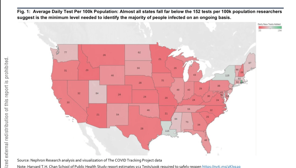
And by mid-April the COVID Tracking Project estimated almost all states performed fewer than the 152 tests per 100,000 demanded to identify the range of individuals infected.
The consistent absence of good data in such numbers prompted a rise in to remedy their undercounts in self-organized sites from motivated individual aggregators, from Alexis Madrigal’s CovidTracker, or the clever web-scraping of high schooler Avi Schiffman in Seattle, both of whose sites were relying on official statistics, filling a need underscored by evidence of a substantial if fairly stable gap from mid-March between excess deaths across the nation and those deaths attributed to SARS-CoV-2. As Madrigal and Schiffman, among others, collated and broadcast evidence of the rising mortalities and infection rates that underpinned our maps of the potentially deadly coronavirus’ spread–Anthony Fauci felt a compelling need to add an edge of objectivity and pronounce that “the numbers of deaths are most likely higher” than officially certified counts, risking his job by acknowledging the lack of good numbers–and the danger implicit in the fact that only about 5% of the American population had been exposed to the virus raised increased concerns about the prospect of “opening up” the country–and that we were “opening it up” to further viral spread.

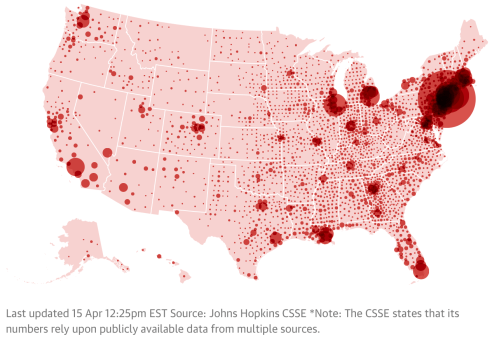
And when by early April that a single app became available to track testing across counties and states, large swaths of the country remained greyed out, but most of the nation was bright red. The best data of COVID-19 infections on county and state levels, both of total infected, mortality, and new infections, showed case numbers for most the nation elevated; total morality was projected to rise from 1.7 to 2.2 million in mid-April, if only 30,000 were infected by the virus.
If there was no clear narrative in maps, and no clear sense of how best to integrate the graphs, legends, and scales which cartographers may increasingly come to depend, and data visualizations can fail to foreground, this is because their is of course not only no clear narrative for COVID-19, and no sense of how the narrative will unfold. We turn to maps in the desire for orientation in a time of crisis, and for a sense of stability. Desiring orientation, and coherence, we elide crucial questions of what makes data “good,” in our eagerness to find comfort in visualizing the spread of the pathogen: with limited testing around the world, from the most developed to undeveloped countries, the gaps in data about the disease is both masked over in many maps, or how data is massaged or ignored: the prestige of data makes some terrifyingly sure of their ability to pronounce on the disease’s advance or its retreat, and the insecurity of tracking non-living RNA strands in human societies is balanced with the brute force of mapping mortality rates that seem somehow to constantly escalate, breaking the barriers of our expectations, to pierce the very capacities of the news to cover adequately.
What do such maps show? Increasingly, the story is itself blurred, and if the maps no longer present a sense of desperation of the lack of any space on the map where one might take refuge from the novel coronavirus, the question of there interpretation is increasingly coming down to the difficulty of integrating the multiple scales at which the coronavirus can be mapped–while we adhere to the national chloropleth, the figure familiar from the operations of statistics and state-based knowledge-making from the mid-nineteenth century, the tried and true bread-and-butter of data visualization antecedents, we are going to be forced to integrate and toggle between the multiple scales of the coronavirus–not only the global and national, which have been the preferred building blocks of mapping data, but the microscopic level of the course of the virus in bodies, and the pathological results of mortalities that suggest the range of variables like age, occupations, health, and senescence among the dead, as well as the mutation of the virus’ different strains. For the question of mutation is not only central to the viability of a vaccine–the basic desideratum for opening up the nation or returning to life as “normal” among virologists and medical experts–but to how the coronavirus travels.
But the question of dismissing the expert knowledge of doctors or virologists that Trump & Friends promote, in the brand of false populism that they purvey, are in danger of running against the lack of knowledge we face about the disease. And only by parsing, sifting, and defining that data on different scales can we get beyond the gross aggregations of choroplethic distortions that only distance the spread of disease.
7. The scale of such tracking maps grapple with the spread of infections, but don’t orient us to communication of a pathogen whose spread depends on proxemics, often tied to population density, but also social proximity and shared spaces, chance, and droplet dispersion in different crowded ambient settings–in ways that suggest that the spread of the pandemic may alter personal space, social space, and interpersonal space: genetic material of the virus found floating in the Wuhan hospitals, indoor spaces filled by large crowds, and the spaces medical staff removed their protective gear suggest the virus lingers in the air of crowds. But they are tied to old cartographic models, inadequate for the mapping of contagion or the pandemic’s spread.
If novelist Don DeLillo felt that “the future belongs to crowds,” where people can lose themselves, fit in, blend in, lose themselves in something larger, in his powerful American global novel of the place of the writer and novelist in the impending dissolution of nations, Mao II, it is what is smaller about COVID-19 that moves in the air crowds occupy, that is so hard to map. While the coughing or sneezing of those infected with SARS-CoV-2 is most dangerous in communicating the virus in public spaces and to health care workers, rather than the passersby who are biking, jogging, or walking, the danger of droplets suggest the viral micro-crowds dispersed so easily in clinics, elevators, theaters, public transit or public lavatories. If the sneeze was indeed among the first filmed sequences of Edison’s Kinetoscope, communicating COVID-19 by atmospheric droplet dispersion in coughs, sneezes, and heavy exhalations pose risks that demand social distancing in public spaces–and increased the danger of ease of contraction in crowds. Can COVID-19 define a new proxemics? The possibility is not high.

The differentials among these spaces may well be, in fact, the most crucial questions to map. If the range of arresting data visualizations challenges us to try to come to terms with its spread, it is clear that New York had served as an incubator for the pathogen, late as it was to be able to adopt practices of mitigation or containment before the virus’ spread. And in the crowded spaces of New York, where the virus had arrived far earlier than restriction of transatlantic travel was able to effect, the tragic intensity of a wave of mortality of 5,000 deaths by early April created a terrifying image of the dangers of contraction in crowded public spaces, raising the stakes on mitigation.
Would the rest of the nation be prepared for the dangers implicit in its spread? The printers red to which the Times returned on its front page in a graphic that punctured the masthead in arresting ways a premonition of the future, or could new measures contain its spread?

Would a rolling wave of mortality grown across the country, in coming weeks and months, which better or earlier-enacted mitigation processes might prevent? Or do the aggregated tallies mask how the virus will be a crisis that will divide us from ourselves, and leave the most vulnerable?
In an era when we map globally, COVID-19 provides a test case for the ability of mapping the global progress of a pandemic of the sort we have not often confronted. The scales at which we can trace the growth of COVID-19, from a market in Wuhan to different countries from France to Italy to Iran, and to the United States, cross boundaries in ways that indeed resemble the sort of mapping we make to follow wars. But the spread of the pathogen is more elusive of our mapping systems, than it is grasped by them; the status of what is the nature of the pandemic seem all too often up for grabs in the reduction of the virus to signs on a map, in ways that seem to allow local governors to set thresholds for reopening states, determining the threat level of the pathogen, and how vulnerable we still were to the coronavirus.


It is amazing that his response is to close the borders. Has to be something weirder than denial, as you suggest. Border closing as both cause and “cure”.
The denial seems cognitive, but inability to acknowledge the responsibility of governments suggests a stunning lack of prioritizing public health safety. The script of demonizing foreign countries was on auto loop, and the world will suffer!