
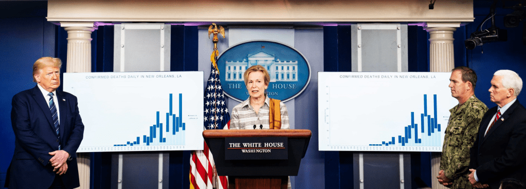
The dissonance between the fight-or-flight arousal of sympathetic nervous systems by the assurance of these addresses, even as we watched the numbers of “confirmed” COVID-19 infections escalate in the temporal bar graphs that were absent from many maps, but were needed to read time-stamped maps of confirmed cases across the nation with accuracy, seemed a solemn exercise of awaiting for mortality rates to rise, a fact that the President himself seemed to acknowledge might well upstage his predictions of preparation, and guarantees of averting still greater disaster scenarios of the horror show from which we all hoped to awake.
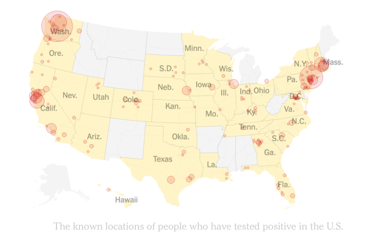
How could we navigate the landscape of these new precipices of collective death, imagining that similar heights of mortality rates might be scaled beyond the Tri-State Area, where the virulent pathogen had first spread by virtue of its increased social intimacy, to other parts of the nation, urban and rural alike, even if of less density? Older age brackets faced scarily elevated chances of mortality in this new landscape, as did those among whom chances of comorbidity were high, but could we break down these peaks by age groups, to examine the landscape among different populations of a problem of population health? We had the spread of the pathogen from Wuhan as it traveled in China to try to visualize, and turned to GIS maps to try to imagine the unfolding of what seemed strikingly similar inevitable spreads of infection in those pink to dark red patches and rising peaks of suddenly increased mortality, left to wonder how we would navigate that landscape, or if we could do so.
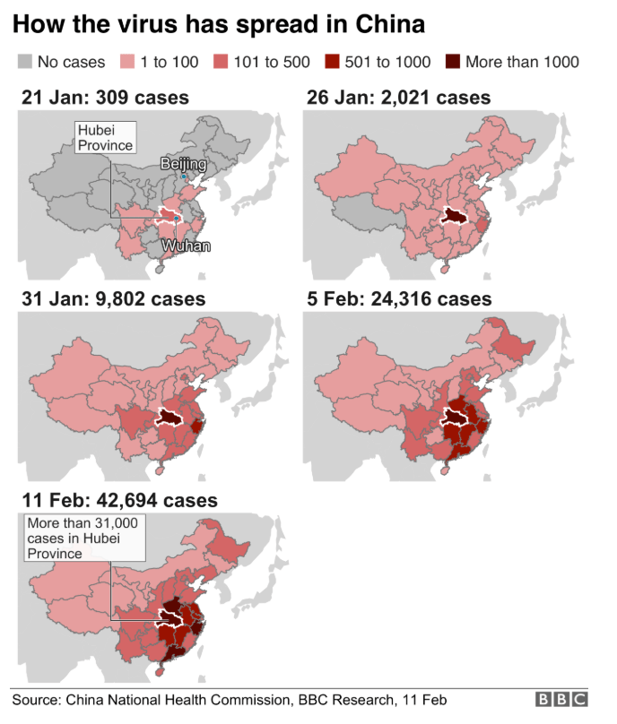
Expert technologies to conduct geospatial analyses of the spread of disease over space and time went mainstream as it suddenly entered public consumption and discussion, leaving many to puzzle over the ties between geography and epidemiology, as if to grasp the contours of this outbreak of a virus across space, before we could come to terms with the vectors of its transmission, how it lay on surfaces or remained in the air in inter-personal spaces, or was transmitted in those massive heterotopia where we travel daily, from airports, public transit, arenas, schools, or hospitals, the institutions of modernity, or the new spaces that we create to compartmentalize the life cycle, from old age homes to prisons.
The acceptance and adoption of such mapping tools in the media created new contours of how the spread of the pathogen that created a severe respiratory syndrome, SARS-CoV-2, was understood in public life, and led many to modify or change their behavior in accord, or, instead, to resist such changes, encouraged by the assurances of an unruly chief executive that the borders in which such choropleths compartmentalized its spread would translate into real life, and would stop at the borders at which the China Health Commission stopped counting its outbreak.
Many suffered from the deep breaks in data literacy over space, in other words, as we saw the playing out of a new experiment in cartographic literacy and practices of reading maps playing out at a large, global scale, encouraged by a President who rather than offering new guidelines for collective behavior, worried about economic downturns able to pierce his political fortunes, rather than examining an issue of population health.
Hit is unclear how much the cumulative tallies suggest an advance of the future of the topography of national public health in its east coast, where increased waves of infection from Europe seem to have first arrived, but that seems its immediate impact. We have been so buffeted by data visualizations that have terrified our nation for the past five years that it is especially hard to gain a sense of stability before the map in a time of undue stress about the pathogen’s inland spread.
Visualizing the growth of cumulative tallies of mortality rates over just five days suggest the sense of peaks off of which we are in danger to fall, departing from the buffers by which cases of infection are represented, and seem the bitter fruit of the landscape of death to which the nation seems about to face; the peak that bursts the framing header of the newspaper of record that approaches a staggering 5,000 individual deaths suggests the unnavigated landscape of health care in store for the country; the staggering processing of cases of the novel coronavirus in city hospitals and arrival of body bags in morgues, lifting a corner on the landscape of grieving we are all poised to enter, and will find difficult to process–even as we are told that health investigators poorly tracked the arrival of the first folks who confirmed as testing positive as they moved about the crowded city, with the the vigilance required for this health emergency.
After issuing refined static maps of confirmed cases of the novel coronavirus that had broken records, the images of the first confirmed cases to the present, the demand for defining a graphic able to capture the scale of mortality rates unprecedented in their scale, weighted concentration, and the fears they created of what seemed a progressive wave of future mortality rates across the nation, from the relative paucity of cases that seemed to confined to three or four “hotspots” March 12, just hours before Trump first addressed the nation.


It is amazing that his response is to close the borders. Has to be something weirder than denial, as you suggest. Border closing as both cause and “cure”.
The denial seems cognitive, but inability to acknowledge the responsibility of governments suggests a stunning lack of prioritizing public health safety. The script of demonizing foreign countries was on auto loop, and the world will suffer!