
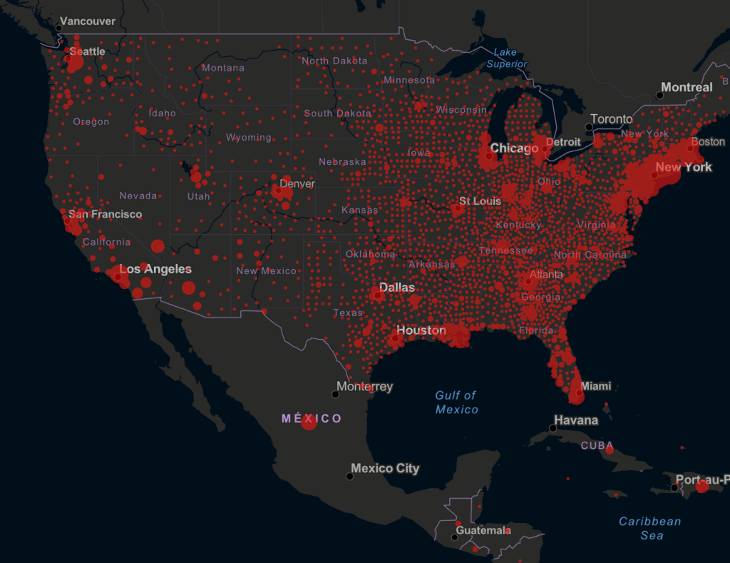
18. In a critically important non-governmental project of open science, Dr. Trevor Bedford has tracked genetic codes of virus samples to chart global movement of SARS-CoV-2 across time and space for NextStrain. Bedford dexterously employed a bright Mapbox palette to try to suggest the linkages between the multiple scales at which COVID-19 spread globally that complicates our narrative, and combines multiple scales, effectively, from the level of viral genetics to space: the innovative map plots daily combines its mutation as a virus over expanse, tracking changes in its genetic fingerprint in real time in particularly helpful terms, tracking the communication of the virus in human bodies, rather than charting a miasmatic plague of undifferentiated character: discrimination of viral fingerprints from a global database offers good data that allows him to connect the transmission of different clusters of the virus as much as mortality rates, revealing a dual scale mapping of the COVID-19 pandemic often mapped instead by mortality rates.
While we too often map the clustering of “outbreaks” or infections in alarmist ways that present global dispersion as a fait accompli, only if we can move beyond the fake objectivity to images of the network of infection can the dynamics of an evolving virus be mapped, and the virus’ global diffusion be able to begun to be grasped as a global event.

The failure to register the different scales at which COVID-19 travelled and was entering the nation may well have created obstacles of reaction not only in terms of leaving little time for national preparation. We learn that the United States knowingly sent millions of dollars of masks, protective equipment, respirators, and medical supplies to China in January and February, including twelve million dollars of face masks in February alone, trying to make money while ignoring multiple warnings that the arrival of the pandemic that soon became global; wholesale denial of a global emergency led the government to prioritize American procurement of needed medical supplies, by fast-tracking sales–while issuing public statements that the epidemic would drive jobs from China as if it would “accelerate the return of jobs to America,” in the deeply distorted primitive view of global ties that Trump’s economic preoccupations has promoted. Perhaps one needs to displace such maps from such artificial national divides.
The mental map of the U.S. government continued to insist on primarily mapping discrete national competition in the face of a global pandemic in late January. If the “donation” and sale of nearly 17.8 tons including respirators, masks, gowns, gauze, respirators, and other materials by early February prepared for the announcement of absences of the same supplies in the United States, the absent responsibility of preparation, as 10,000 health care workers in America have been infected by the virus. It is a wonderful counter mapping to consider how Chinese parents of American university students at Berkeley, if separated by 6,000 miles, from Shanghai to Las Vegas to Pinole, Calif., organized to send protective gear, including gowns and 45,000 masks to a local Berkeley hospital. Can we try to redress the lack of national preparation for the coronavirus on the ground?
When will we ever gain the equilibrium necessary to gauge the progress of the novel coronavirus over space? There was something deeply disturbing and worrisome about Donald Trump summoning faux moral authority, even as the vast majority of global COVID-19 infections in the United States, due to his administrative negligence, warning his vaunted friend in China that if they were “knowingly responsible” in any way for the pandemic’s growth, with deaths in Europe rising toward 100,000, that they would pay, before offering the usual three card monte swirl of potential doubt by complaining, “It could have been stopped in China before it started and it wasn’t, and the whole world is suffering because of it“–he hardly considered how much America was suffering because of his dismissal of the seriousness of the infection reported to him in January, an insufficient acceleration of accurate testing kits or research, and the disbanding of large shares of the CDC’s authority, even as his predecessor had carefully organized a team to target epidemic threats.

The fate of the contagious virus travels through respiratory systems and causes complications with breathing that stand in contrast to the smooth inflation and deflation of the colored buffers of the CARTO imagery, but the data helps us peer into the viral strains whose progress in individual bodies we are perhaps beginning to be able to map.PAGE BREAK
The advance of the novel coronavirus measures our relation to globalization, as its reception is filtered through the relation that each state, city and place adopts to the global diffusion of the disease, and as the shortages of food, masks, or ventilators we rarely associated with the health care system or economy of the United States have arrived. We hope for closure as we try to map the peaks of the arrival of the disease in American bodies, giving an undue authority to data modeling, but entranced by the charisma of data, more than words, imagining a nation of “peak-dates” in states, as if we can use a lightly hued choropleth to divide regions into the false familiarity of old units as a pandemic that unites us has developed its own itinerary and pathways, often, as in California, creating epidemics within individual states— epidemiological micro-climates have arisen with their own logics–obscured in the false authority of choropleths statistical mappers have left us overly attached?
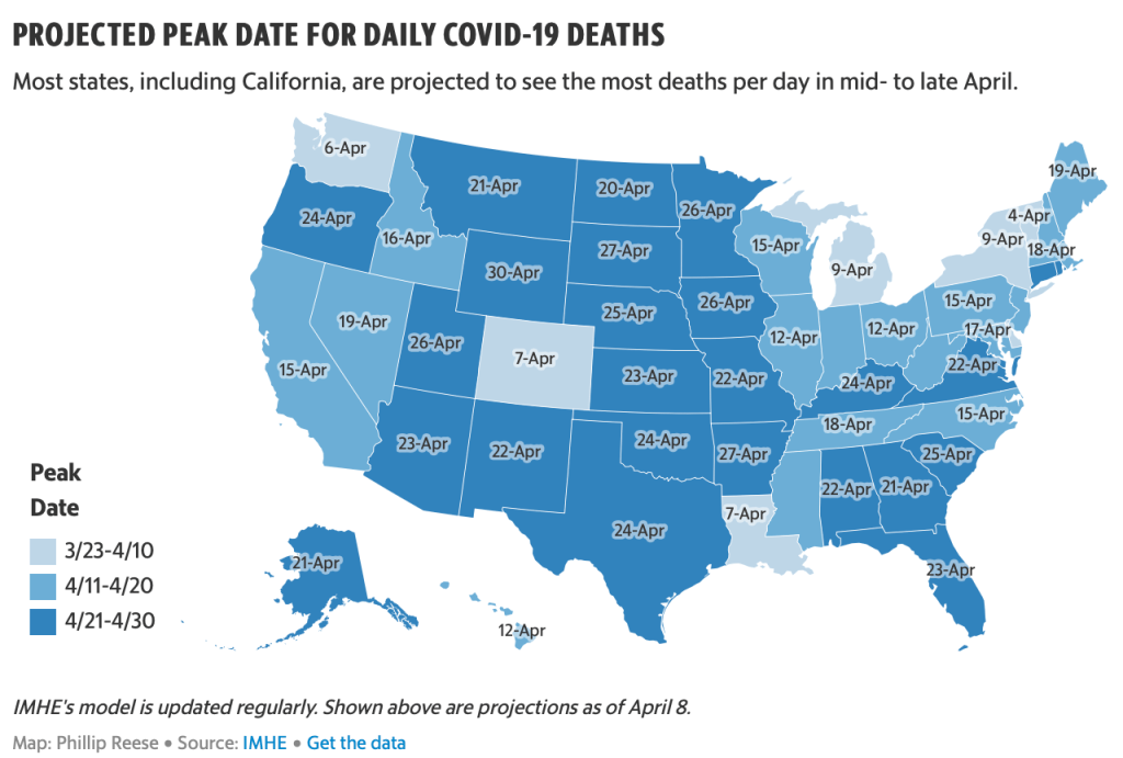
Such choropleths fail to register the interconnected world, provoking a false if reassuring security, as we imagine that COVID-19 has peaked in California, and as the New York Times and governors of states discuss and debate exit strategies, even as governors of New York and California caution that we are not nearly at a place to undertake a reopening of life as usual.
19. All too often, watching the public addresses of governors, an impotent President, and public health advisors, we are all Winston Smith, in the moment when he curiously curious “seemed not merely to have lost the power of expressing himself, but even to have forgotten what it was that he had originally intended to say” after gazing stupidly at our own newspapers, turning from the telescreens that radiate an image of public confidence in pronouncements of “opening up the economy” again, as if that will change something, or hoping we can find rational grounds in the leveling of different curves, even as we navigate uncertain waters. Is the best narrative we have to watch films, and hopefully not Contagion?
As we turn away from the streets, and from collective behaviors, save on screens, we seem to live in a failed state. As we stay indoors, sheltering in place in the Bay Area, we are in a sense more dependent on the maps we receive passively on social media and in the press, watching images of disease, as if they were confined to “hot-spots,” returning to our familiar choropleths, for a sense of security and increasingly needed stability. The graphic realization of the invisibly spreading disease, whose pathways of communication were not yet fully understood, but already evidently difficult to contain, were best materialized, perhaps, in such blobs of death rates and infections, as a massive national enemy. But the echo of a miasmatic growth of SARS-CoV-2 in such buffers hardly oriented us to the scope of its spread, or of its communication, as did the best disease maps: the paths of contagion haunted the nation.

Can we blame our maps, or the poor nature of past forms of mapping to understand the transmission, virulence, and airborne transmission that seems common as a vector of interpersonal transmission of COVID-19? We map outbreaks of disease so that we might understand and define the nature and scope of illnesses, pathways of transmission, and gain insight into the nature of pathogens that we face.
Since the impact of the Snow map of cholera, the formation of maps was determinative in defining the scope of an infection, and the nature of infectious diseases that were once understood as miasmatic entities.
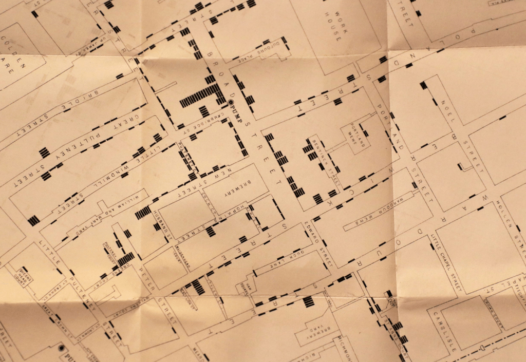
19. To create meaning in maps of the global pandemic COVID-19, we however struggle against the fact that they must remain stubbornly opaque and awfully uncertain as we still don’t really know actual rates of infection, patterns of communication and chances of re-infection, and have little sense of how COVID-19 might be contained, or of been the scope of its infections. We might expect the contours of the communicability of the pathogen SARS-CoV-2 to emerge with time in maps, when John Snow use maps to deduce the distribution of the spread of cholera from shared pumps in London by aggregating deaths from cholera in an early disease map of 1854, around the pumps he believed served to spread the disease–a practice in some ways graphically similar.
The shift in mapping disease that is identified with mapping cholera mortality in a London neighborhood marked the start of statistical mapping: it made John Snow the father of epidemiology, when he mapped those killed by the cholera outbreak over a month and a half, placing their homes relative to neighborhood water pumps to test a theory that the linked mortality rates to a water-borne pathogen: the clustering of deaths from cholera victims about the Broad Street pump and its contaminated handle confirmed, by the pump’s proximity to a cesspool, a contagious model of transmission with spatial precision of an urban plan, mapping Vibrio cholerae flourishing in the spout or handle of the contaminated the pump migrated to human hosts mark a paradigm shift in diagnosing the outbreak; its now strikingly self-evident spatial continuity rebut miasmatic theories of disease by superimposing the self-made database on a neatly legible lines of the English Ordnance Survey designed for military needs of defense:

Snow’s map seeming clarity dispatched a miasmatic theory of disease transmission, tying the disease to a pump on Broad St. and the daily routine of distributing water with military precision. The sense of clarity both seemed to offer on transmission are elusive for COVID-19 maps, which seem to register shock at the level of lost lives, the sudden scale of mortality that seems to rehearse a disaster film, and offers few narratives for coming to terms with its spread.
20. Maps focussing on local detail and spatial precision like Snow’s have become talismans of statistical mapping that offer epistemic stability in relation to the spread of disease. But unlike cholera, the tracking of the arrival of COVID-19 and its linkages to surfaces is less clear. The human-to-human contraction of the virus by airborne droplets, hands to eye transmission, or inhalation after atmospheric diffused is something whose mapping more recalls miasma. We cannot track in space as clearly the transit of the virus into the lungs and ACE enzymes lining the surface of the lungs; infection from the virus is far more complex to map, as our map might better comprehend unclear spatial routes of human mobility, dispersion into air systems (of old age homes, hospitals, schools, prisons and other institutions) as well as the complex pathway of the virus’ routes in the body, as Atul Gawande suggested recently.
These two levels of space need to be balanced with one another; there is an increasingly clear difference between the transmission of COVID-19 not exclusively from surface to hand to mouth, if hand to mouth and eye may be vectors of its viral transmission; the transmission of the small RNA strands suspended in the air, aerosolized in the breath, their loads preserved in droplet form. The increased mobility of human agents who serve to incubate the virus as it mutates over our geographic space have also increased the possibilities for spatial spread of the virus far more than in Seaman’s time or Snow’s: Seaman may have gotten the paradigm of transmission of infectious disease wrong, but revealed a pattern, as did Snow, that made the disease visible for the first time: as we try to make COVID-19 visible, we might consider the far greater human mobility of the disease, and the different degree of viral load to which populations are exposed.
21.There is, moreover, a very likely possibility of different levels of susceptibility to the disease–akin to other epidemics as the 1918 influenza epidemic or the annual flu. The striking comorbidity among those infected–with a range of there health conditions, making diabetics and diabetic or blood pressure patients, perhaps due to enzyme inhabiters, enable the virus to penetrate their lung tissue more successfully, and the vulnerability of lung tissue among the suffering diabetes, hypertension, or obesity, as those suffering asthma, pulmonary illnesses, or senescence, making it far more complex to map vectors of spatial transmission on one register or dimension. The progress of the advance of infections in human hosts is hard to map by spatial indices alone: even if our mapping tools have far advanced with GIS systems and GPS precision, and the tools of aggregation of geolocated atypical fevers or genomic signatures far beyond what Snow imaged, the rapid diffusion of SARS-CoV-2 over space doesn’t allow us to prepare similarly lucid conclusions.
The arrival of infections in the lining of lungs has gained a global geographic spread, uniting the mapping of disease in the body and the mapping of incidence of infections, and will demand far more than a single isolated intervention, like the removal of the Soho pump’s handle that ended the outbreak of cholera, and are more often more destabilizing in nature: the only intervention that makes sense is to reduce sites of human-to-human interaction, and overlap of what might be called atmospheric intimacy.
That there is no single intervention able to be imagined to end its spread should not make such maps rob us of agency or any narrative before the disease: the distance of removal of chances of infection makes us passive spectators to the etiology of the virus’ spread, hoping for that isolation will help us flatten curves of infections, awaiting the pronouncement of the flattening of its curves, and hopeful to maintain a sense of social responsibility as it multiplied in bodies and progressed across space.
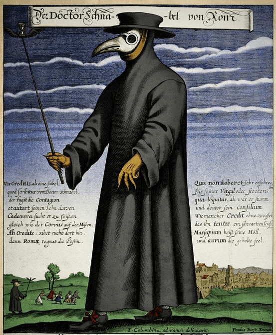
While maps of infection as Snow’s created a sense of epistemological stability before an infectious disease like cholera, surface-to-hand or hand-to-mouth transmission so central in mapping deaths of cholera provide little comparable epistemologic stability for us as we seek to map the contraction or progression or infection by COVID-19. Maps as those of Dr. Snow were, after all, opposed to a model of miasmatic infection by which the doctor equipped himself with miasmatic herbs stocked in his “beak” in order to ward off the spread of disease from entering his lungs–and maintain his distance from the ill.
Snow’s map suggested the isolation of the disease, while we have little sense of the purchase on the disease by our maps of confirmed cases, save as a warning to remain indoors or at a social distance from others.
As we stand before a map or any spatial visualizations of the rapid diffusion of SARS-CoV-2, as a result, we feel unable to draw similar conclusions about its transmission; the maps destabilize our security, charting an unquieting fatal progress to the advance of the infections in human hosts over space in the bodies of those who contract it is transported by them in ways far more complex to track to other hosts–creating a map of multiple scales, and multiple continuities, that overlap in ways we cannot clearly map by choropleths that almost appear to reflect population density.
22. Our tracking maps seem woefully inadequate, in other words, to understand the nature of transmission, and they have been tragically misused to suggest the concentration of “hot-spots” of viral transmission that have only concealed the swift advance of the SARS-CoV-2 strand by other routes, which are hardly able to be mapped at the correct degree of scale that mortality statistics and municipal maps of water and housing helped Snow hit upon, even as we are using surveillance systems for respiratory diseases and influenza in modified form to track COVID-19. With almost two million cases of infection, half a million in the United States, each area suggests a different nature of an epidemic across the globe, and even in individual states across the United States, where loads, interpersonal contact, and infection rates have created their own sense of self-contained (if also possibly porous) dynamics as SARS-CoV-2 has been enters individual bodies as global interconnectedness has slowed, with airplanes oddly absent from the skies, roads less filed with traffic, and public transit often empty.
What purchase such maps offer on the virus and its travel is unclear, perhaps especially in the United States, where the movement of the certified infections were assimilated or unapologetically cast in terms of maps of migration, and the maps of migration by which the nation had been effectively terrorized. Indeed, maps have proliferated in an odd counterpoint to the intensified unfolding of the horror show that reveals the lack of controls to the virus’s spread, and our own sense of the possibility of stability seemed unrooted, as we watch infections and rates of mortality advance.
The progress of mortality, as that of infections, and indeed the contours of life seemed altered in ways that even maps of the same space seemed obsolete and temporally removed. Despite the initial speculations that the primary vectors of contagion from hand to eye or mouth or nose may fail to capture the danger of dispersal in droplets, that while declining may be transmitted through the air, by vents, and circulate in crowded spaces. The rising rates of infection in the United States in particular seem to parallel our increasing intimacy in urban spaces, the rapid rates of infection in New York, Detroit, Chicago, New Orleans, and Los Angeles, reveal vulnerability of populations not more infirm, but more apt to share a greater exposure to loads of the virus that seems able to be contracted without physical contact.
Although China no longer houses a large number of cases, and the stoppage of work noticeably improved air quality in the nation–

–is it possible that the improvement in air quality hastened the slow of the virus’ spread?
If Camus wrote that one can only “mark time” in times of plague, data visualizations have offered us new senses of marking times by waves of infection, hospitalizations, and contagion’s spread: never have we experienced a pandemic as a globe with so many images of the charting of “confirmed cases” or lowering of the curve of infection, as we have no basis to understand the mortality rates experienced in New York and other cities, save in apocalyptic films. The rising share of infections in the United States has revealed COVID-19 to have its largest share of human hosts in Americans. The virus cast as foreign has become something we own, and won before a global audience, as hosting bodies are overwhelmingly outside Chinese territoriality.

Why cumulative rates of infection of COVID-19 seems to accelerate so quickly and asymptotically in the United States over a month is a troubling map of profound mismanagement of the virus and lack of understanding of its contagious transmission–and a refusal to accept the global dimensions of a contagion conceptualized as a foreign threat, akin to an alien invasion rather than as homegrown. Even if its mortality rate is far less, so far, than SARS or MERS, the quadrupling of global cases of infection since mid-March, the dangers of death rises greatly for elderly and in cases of comorbidity that has been pronounced–raising possibilities of its transmission in cultures where elderly live more in institutions, and contact in public spaces is greater.
23. We depend on and are drawn to maps of virulence, perhaps conditioned by the status of maps as a basis for epidemiological understanding of a virus or contagion, to map the spread of infections and to master it. Maps recall the determining role of maps in controlling and quarantining to limit a disease’s spread, from seventeenth century Italy, to the diagnositic role in understanding the etiology of cholera, tied to John Snow’s energetic mapping of proximity of mortality to water pumps in London’s Soho neighborhood, a focal point of mortality rates, and the previous maps that plot the communication of disease in a restricted, defined, and manageable space.
If such maps of disease are still a powerful case of evidence of data visualization of a disease’s spread, it is important to remember that they are primarily military, and based on a military concept of a clearly mapped battlefield. The terms of the master of a a war against a virus, an infection, or, indeed, an illness as complex as cancer, has provided a sense of a logic in fighting a disease, even if there is a problem in conceptualizing the fight as with a single logic. The metaphor of a war was, however, adopted by Pasteur to describe the eradication of microbes, and a similar hope of eradicating pathogens such as polio, tetanus, or the measles, mumps, or whooping cough, and even influenza. But bounds are not so clearly able to be applied to zoonotic illnesses that have jumped species, and whose RNA we have not clearly understood.
The mapping of a disease’s progress and containment is firmly rooted however, in military terms. The early use of a chorographic map of the community of a maritime province in the southern shore of the Adriatic allowed Arrietta to map how plague affected the community, however, more than populations, and to record a basic governmental response to control its miasmatic spread by a strategy of spatial containment. Arrietta included the map in his account of the administrative response to spread of contagious disease in the Kingdom of Naples, of which he was an auditor of the cordoning off of one hundred and seventy meters along the Adriatic coastline, extending fifty meters inland, patrolled by guard boats on its Adriatic coast to prevent maritime traffic: Arrieta included the map of the cordonment was a strategy of isolation of a miasmatic disease for his superiors in the Kingdom of Naples without medical or epidemiological agendas; for the royal auditor showcased administrative management of the outbreak to his Neapolitan superiors, it was evidence of good government akin to the recently repainted cycle of maps in the Vatican that naturalized the papal administration of the peninsula’s spiritual integrity and administration of the privileged theater of christianity, its format of prospective view modernized by the Bolognese cartographer: as much as illustrate quarantine zones.
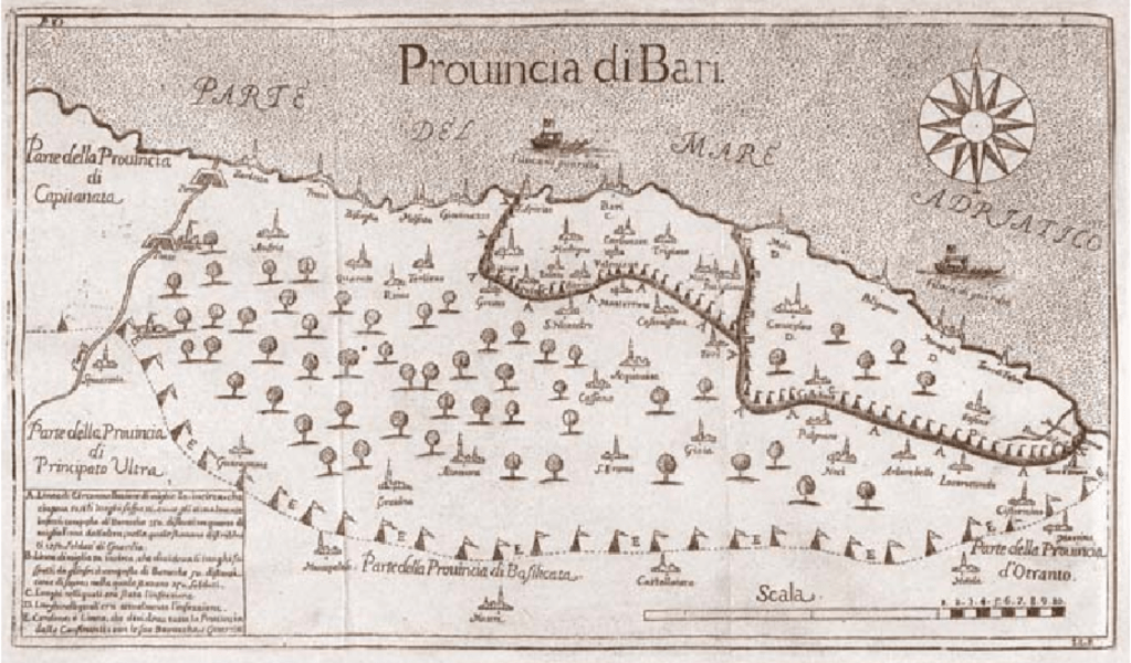
The 1691 engraving mapped continued good government in an age of new miasmatic containment strategies, first evident in the 1630 plague, but now demanding offshore containment, only after waves of plague that killed a third of the Kingdom’s population by c. 1680 had begun to subside. The map of the province recalled the wall-sized map of Naples’ provinces presented to Philip IV of Spain in 1655 designed to be “fixed . . . to the wall, so that the sense of the work could be more easily and pleasantly displayed” to “show how said kingdom can be attacked and defended from within and from without.”


The maps of plague and pestilence provided a basis to assert an illusion of control, often set up by military bureaucracies, before they were interpreted for diagnostic ends. But the quick spatial spread multiplies vectors of communication across space, and the relation of infection to exposure to viral loads, as transit of confirmed infections reflects our own practices of global mobility from the hub of Wuhan in Hubei province in China, which had no predictive value, but by which we were persuaded cases of infection were hoped to be quarantined.
The restircaiton of travel ban on airplane, train, and bus during the busiest travel season in China, seemed urgent, as if to contain the arrival of the novel coronavirus before its RNA coronavirus moved to its human hosts across borders: while our choropleths of infections detected are organized by borders, as the geographic default, they don’t map the lags between contraction, infection, and possible transmission that would provide a map of the disease.


It is amazing that his response is to close the borders. Has to be something weirder than denial, as you suggest. Border closing as both cause and “cure”.
The denial seems cognitive, but inability to acknowledge the responsibility of governments suggests a stunning lack of prioritizing public health safety. The script of demonizing foreign countries was on auto loop, and the world will suffer!