
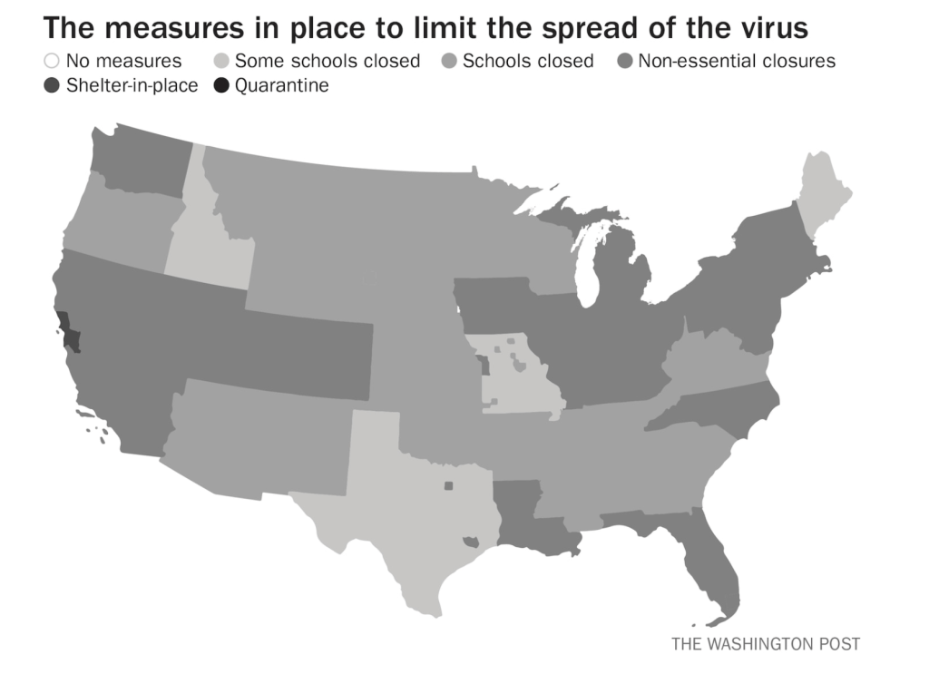
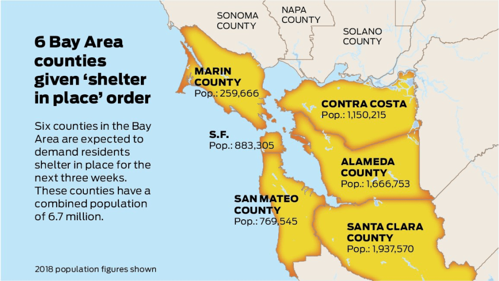
While we are increasingly deadened by data visualizations that track the infectious spread of COVID-19 across the world and country, their logic has often been implicit. As much as tracking real-time data of deaths and “hot-spots” in the world and the nation, we trust the data viz to orient us to the infectious landscape to better gain understanding of viral spread. We seek to grasp nature of the virus’ transmission, and perhaps hope that we can better grasp its spread. We depend on these daily updates to retain a sense of agency in the chaos, but realize that they are provisional, contingent, and selective snapshots, based on testing, and exist at a time delay from the virus’ actual distribution–without much predictive value. We maddeningly realize they are dependent on testing rates and reporting, and only as good as the datasets which they re-present.
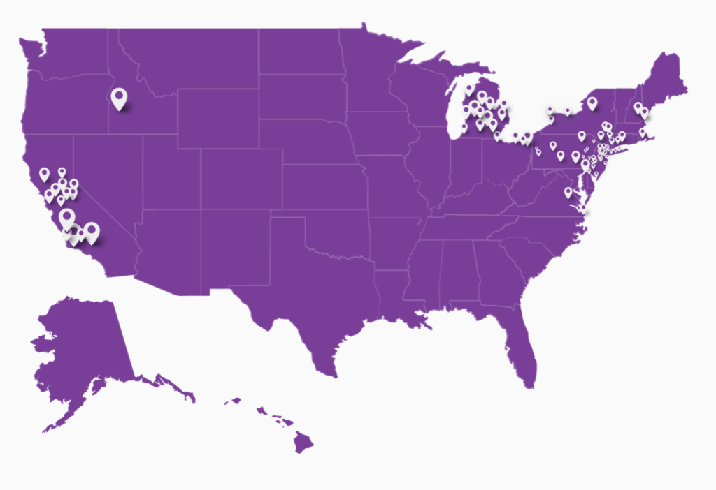
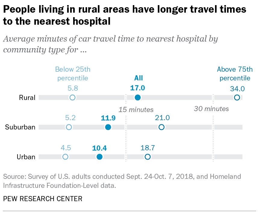
On the heels of a 5% statewide positivity rate on December 5, 2020, California was declared in a state of shut down in all its counties. It almost seems that such graphics have started to fail us, as the spread of the virus overflows the boundaries of the map and permeates its space. The choropoleth renders individual counties all but indistinct, the state drowned in widespread infections, with only a few of its less populated regions as refuges. With a flood of purple overflowing the coastal counties, the delta, the Central Valley, and the entire south of the state, was there even any point in mapping the danger of viral spread beyond a state of red alert?

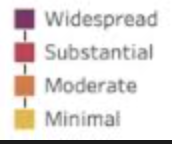
While mapping offers little comfort in the era of saturation of heightened risk, the color-codes alert inhabitants to the danger of increased stresses on the public health system–as much as visualization challenges to translate tools of data aggregation to visualize the pandemic., as December 6 rates grew by December 19. As we shift to map a decreasingly multi-colored state by the moderate, substantial and widespread virus, and widespread cases seem to flood the state, the map offers a security of some sort of monitoring of the pandemic’s spatial spread.
The sea of purple is like Spinal Tap going raising the volume “up to eleven,” and are a sign that we are in unexplored territory that won’t be accommodated by a simple color ramp–or, indeed, a familiar cartographic iconography among our current tools of styling space. While we are used to maps embodying meaning, what the colors of the map embody–beyond risk–is unknown. To be sure, at a time when fatalities from the coronavirus in the south of the state have skyrocketed from the middle of the month, hitting records in ways terrible to even contemplate, the field of purple is a deeply human story of loss, as a surge of hospitalizations have flooded the entire healthcare community, and stretched facilities of critical care beyond anything we have known, filling half of intensive care beds in LA County at Christmas. 2020 enough to make it hard to feel any relief in the close of a calendar year, as if that unit still held any meaning, and very grim about 2021: and while the CDC allowed that there may already be a new, more contagious strain, in the nation two days before Christmas, the arrival of the more contagious strain in California and Colorado increased alarm before New Year’s.

How to get a handle on the novel coronavirus that we have been pressing against COVID-19 dashboards since March to grasp better, and will we able to do so in 2021?
Whatever sense agency the maps impart, it is an agency that is only as good as the compromised sense of agency that we expect in an era of geolocation, on which most maps track reports of infection. Even as we face the rather grim warning that we are waiting for the arrival of a vaccine that, in the Bay Area, rates of immunization face steep obstacles of vaccine distribution due to pragmatics of freezer space required, training of extra health care workers, and monitoring and tracking the two-stage process of vaccination, we will depend for public sanity on maintaining clear communication in maps. The actual tracking of the novel coronavirus doesn’t translate that well to a state-wide model, or a choropleth, although it is the method for public health advisories that makes most sense: we do not have small-scale public health supervision in most of the nation, although they exist at some counties. The stressed Departments of Public Health in areas are without resources to manage COVID-19 outbreaks, public health compliance, or retaliations for public health violations: and the effort to create public health councils to manage compliance and violations of public health orders may be seen by some as an unneeded bureaucracy, but will give local governments resilience in dealing with an expanding epidemic, at the same time as governmental budgets are stressed, and no body of law about COVID violations exists.
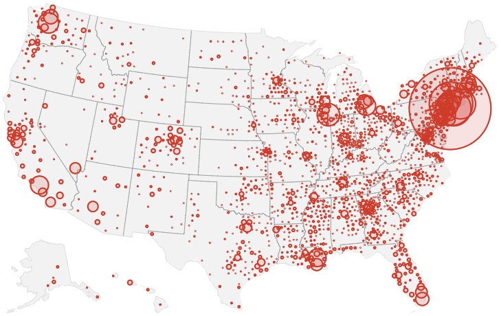
Rather than map on a national or state-wide level, we can best gain a sense of how much virus is out there and how it moves through attempts of contact tracing–even if the increasing rates of infection may have gone beyond the effectiveness of contact tracing as a methodology that was not quickly adapted by a federal government the prioritized the rush to a vaccine. The basis for such a map in LA county can reveal the broad networks of contagion, often starting in small indoor gatherings across the region, and moving along networks of spatial mobility across the city and San Fernando Valley, and help embody the disease’s vectors of transmission as we watch mortality tallies on dashboards that give us little sense of agency before rising real-time tolls.

If such ESRI maps suggest a masterful data tracing and compilation project, the data is large, but the format a glorification of the hand-drawn maps of transmission that led to a better understanding of the progress of Ebola on the ground in 2014, used by rural clinics in western African countries like Liberia and Rwanda to stop the infectious disease’s transmission and monitor the progress of contagion to limit it–as well as to involve community members in the response to the virus’ deadly spread.
We may have lost an opportunity for the sort of learning experience that would be most critical to mitigate viral spread in the United States, as no similar public educational outreach was adopted–and schools, which might have provided an important network for diffusing health advisories to families, shifted predominantly to distance learning and providing meals, but we became painfully aware of the lack of a health infrastructure across America, as many openly resisted orders to mask or to remain indoors that they saw as unsubstantiated restrictions of liberty, not necessary measures.

We are beyond contact tracing, however, and struggling with a level of contagion that has increased dramatically with far more indoor common spaces and geographic mobility. Yet the broad public health alerts that these “news maps” of viral spread offer readers omits, or perhaps ignores, the terrifying mechanics of its spread, and the indoor spaces in which we know the virus is predominantly acquired. The rise of newly infectious mutated strains of the novel coronavirus was in a sense inevitable, but the rising tension of what this means for the geographical distribution and danger of the coronavirus for our public health system is hard to map to assess its wide distribution, and we take refuge in mitigation strategies we can follow.
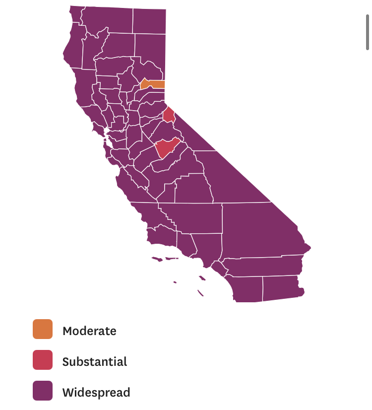
Why have we not been more vigilant earlier to adapt the many indoor spaces in which the virus circulates? It bears noting that the spread of virus in the state was undoubtedly intensified by over a hundred deaths and 10,000 cases of infection to spread in the density of a carceral network, which seems an archipelago incubating the spread of viral infections in the state. We only recently mapped the extent of viral spread across nineteen state prisons by late December 2020, tracked by the Los Angeles Times, but often omitted from public health alerts–
–and the density of Long-Term Care centers of assisted living across the state, which were so tragically long centers of dangers of viral spread, as the New York Times and Mapbox alerted us as the extreme vulnerabilty of elder residents of nursing homes, skilled nursing facilities, retirement homes, assisted-living facilities, residential care homes who cannot live alone was noted across the world. The data that was not provided in the grey-out states interrupted the spread of infections among those often with chronic medical conditions was not surprising, epidemiologically, but terrifying in its escalation of the medical vulnerability of already compromised and vulnerable populations–and steep challenges that the virus posed.

unlike those greyed out states that fail to release data on deaths linked to COVID-19 infections, congregate on the California coast: while the New York Times depicted point-based data of the over 100,000 COVID-related deaths in nursing homes are a small but significant share of COVID deaths, exposure for populations with extraordinarily high probability of possessing multiple possibilities for co-morbidities is probably only a fraction of infections.

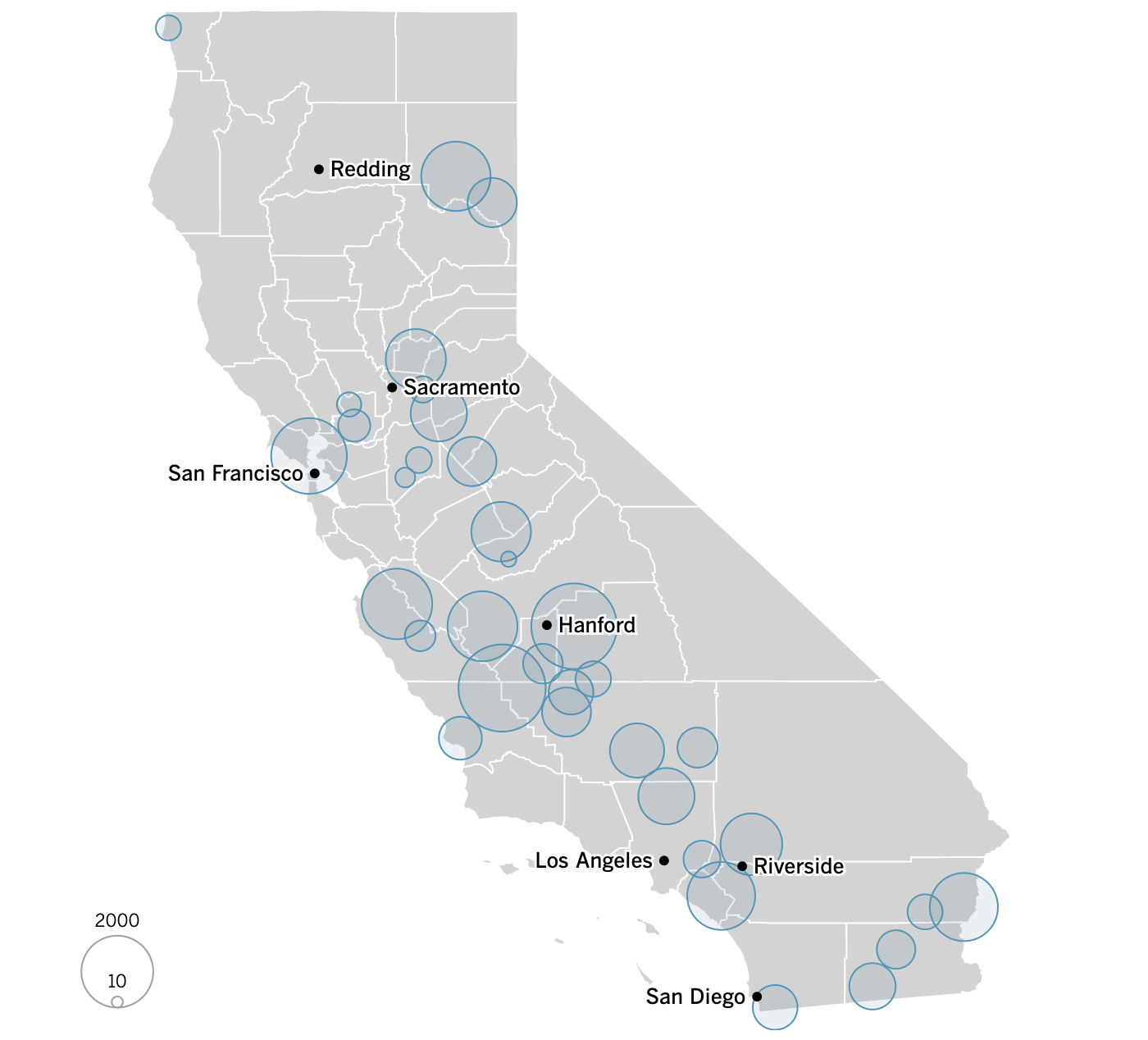
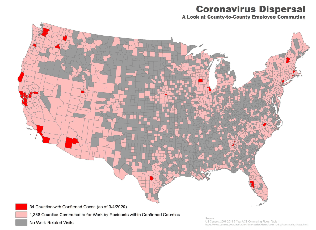
We strain to find metrics to map the risk-multipliers that might be integrated into our models for infectious spread. It seems telling to try to pin the new wave of infections in a state like California to increased contact after Thanksgiving–a collective failure of letting up on social distancing in place since March–as the basis for a post-Thanksgiving boom in many regions of the state, using purely the spatial metrics of geolocation that are most easily aggregated from cell phone data in the pointillist tracking of individual infections in aggregate.

Based on cell-phone data of geolocation, a proxy for mobility or social clustering that offered a metric to track Americans’ social proximity and geogarphical mobility–including at shopping centers, oceanside walks in open spaces, and even take-out food curbside pickups, as well as outdoor meals and highway travel, few counties curbed aggregation as one might hope–although the fifty foot metric accepts the many outdoor congregations that occurred, well within the Cuebiq metric, wearing or without masks. A magenta California registered pronounced proximity, grosso modo, discounting any mindful innovative strategies in the state.

It is stunning to have a national metric for voluntary mobility, rough as it is, to measure internalization of social distancing protocols and potential danger of a post-holiday COVID-19 bump. To be sure, we are stunned by geolocation tools to aggregate but risk neglecting the deeper infrastructures that undergird transmission, from forced immobility. While geolocation tools offer opportunities for collective aggregating whose appeal has deep historical antecedents in measuring contagion and anticipating viral transmission by vectors of spatial proximity, geospatial tools create a geolocation loop in visualizations which, however “informative” perpetuate a spatiality that may not clearly overlap with the actual spatiality of viral transmission.
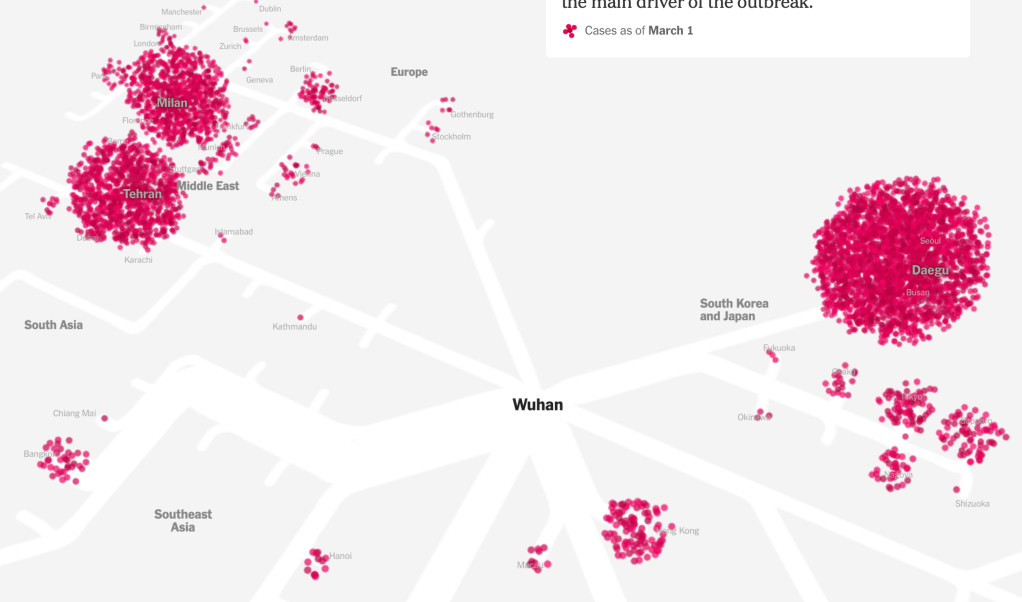
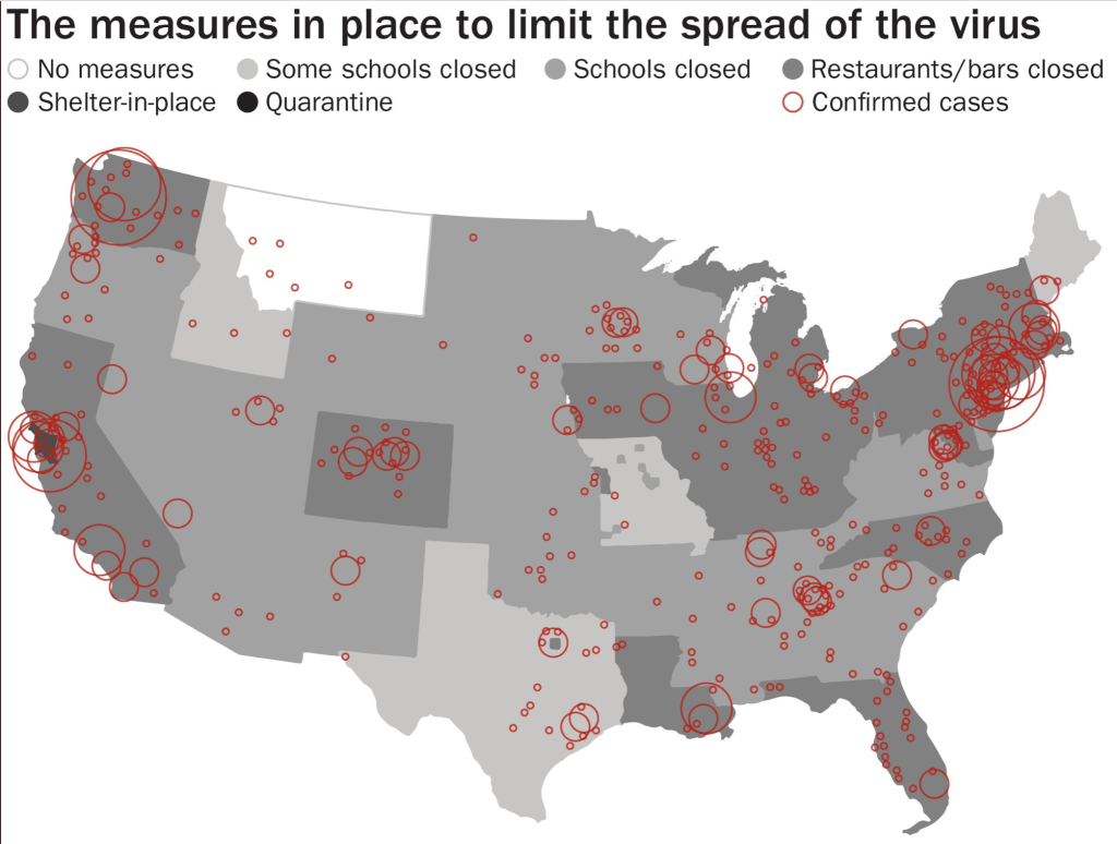
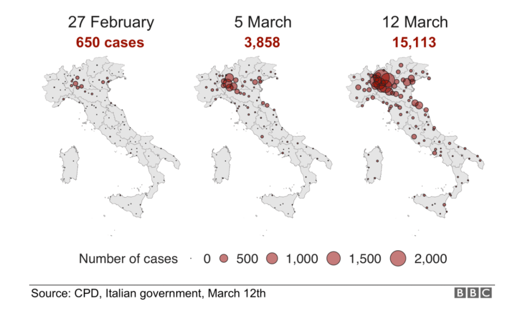
Even if we demanded to map what were the novel coronavirus had “hot-spots” in mid- to late March, as if processing the enormity of the scale we didn’t know how to map, aggregating data without a sense of scale.


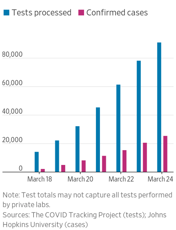
Across the summer, it seems best to continue to map daily numbers of cases, relying on whatever CDC or hospital data from Hopkins we had, trying to aggregate the effects of the virus that was spreading across the country whose government seemed to provide little economic or medical plan, in maps that tallied the emergence of new cases, as new hotspots appeared across the land, meriting attention difficult to direct.

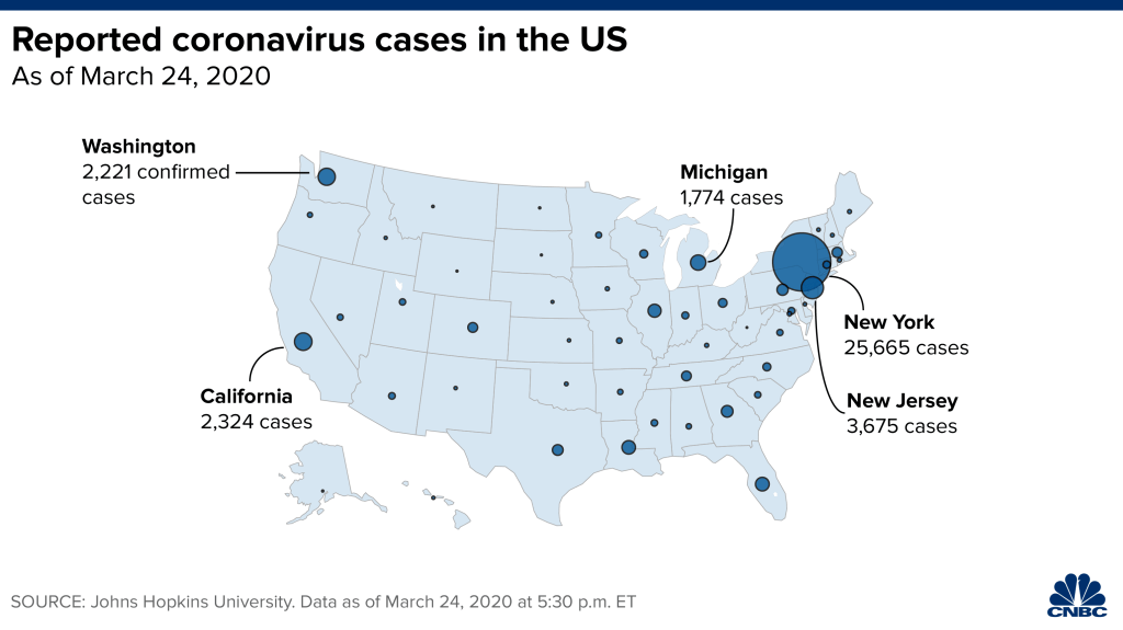
We are plowing infections and mortality with abandon in a steady diet of data visualizations that purport to grasp disease spread, that were once weighted predominantly to the New York area, even as they spread throughout the nation by the end of March, but remaining in the thousands, at that point, as even that low threshold was one by which we were impressed. The tracking of the local incidence of reported cases seemed to have meaning to grasp the meaning of transmission, with a pinpoint accuracy that was assuring, even if we had no way to understand the contagion or no effective strategy to contain it. But we boasted data visualizations to do so, focussing on the nation as if to contain its spread in antiquatedly national terms, for a global pandemic, not mapping networks of infection but almost struggling to process the data itself.

After all, the John Snow’s cholera maps of John Snow are the modern exemplars foregrounded in data visualization courses as game-changing images as convincingly precise pictures of infection progressing from a water pumps in London neighborhoods is often seen as a gold standard in the social efficacy of the data visualization and information display. The elevation of the pinpoint mapping of cholera mortality in relation to a water pump from which the deadly virus was transmitted in a nineteenth-century London neighborhood:
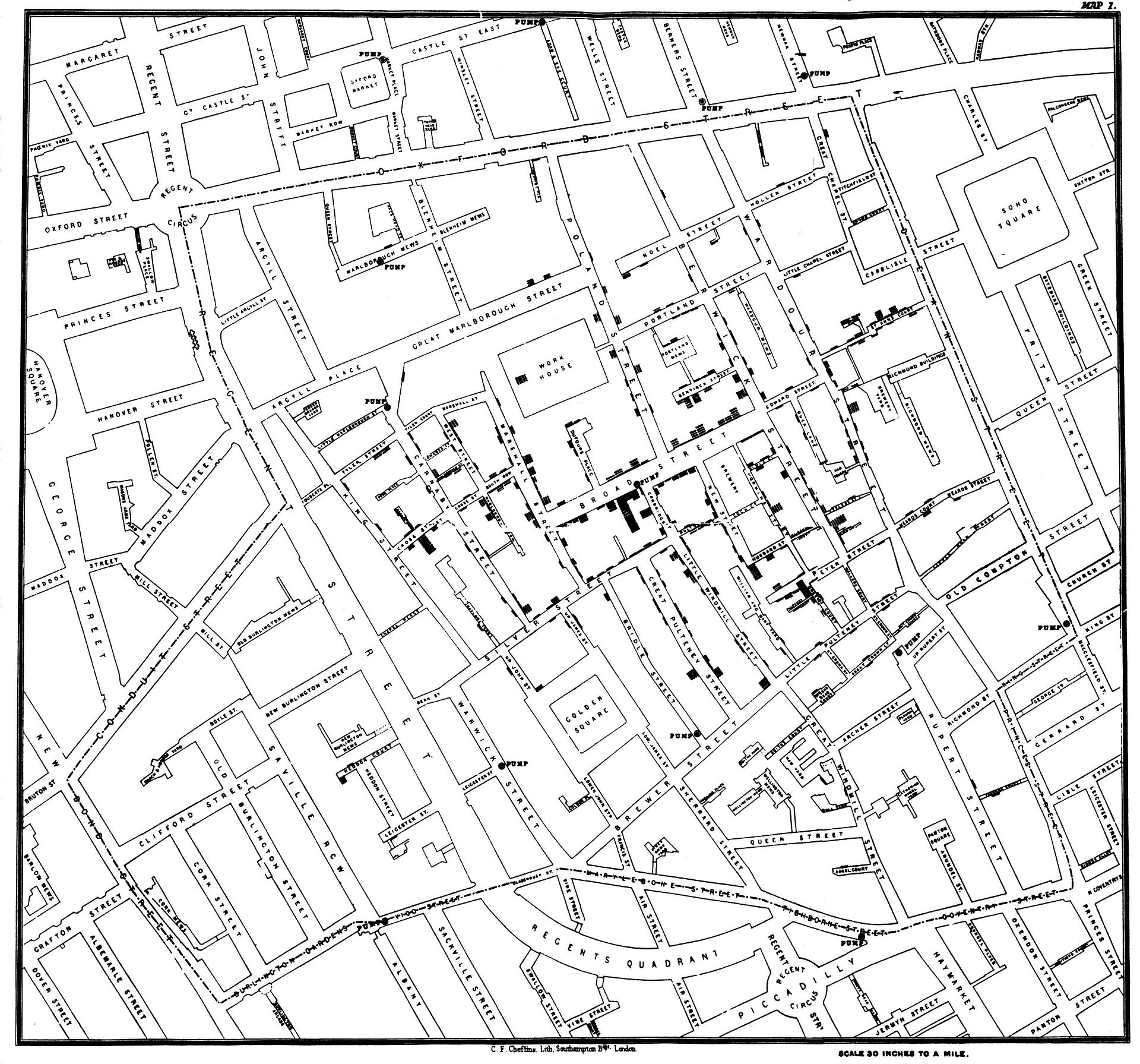
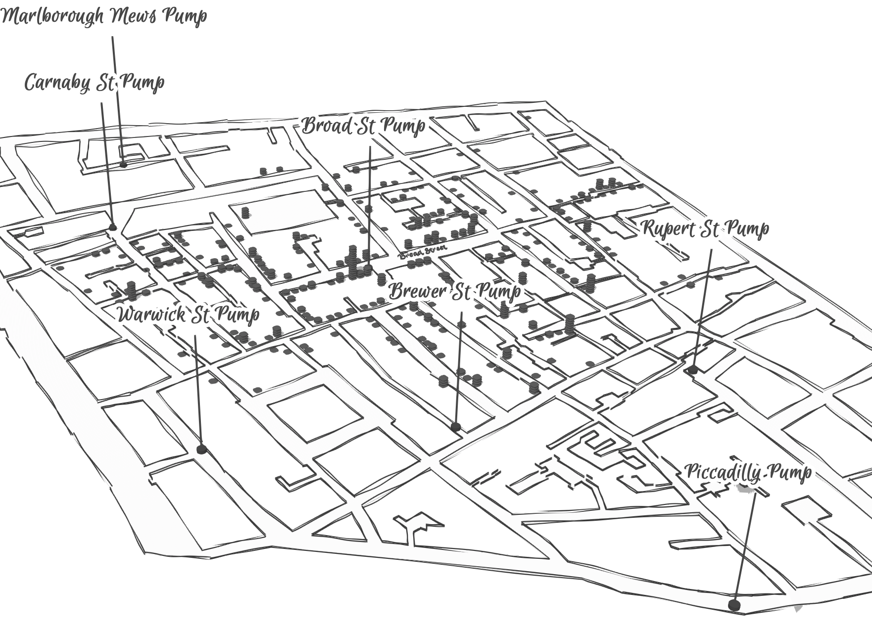
The Snow Map so successfully embodies a convincing image of contagion that it has taken on a life of its own in data vis courses, almost fetishized as a triumphant use of the plotting of data that precisely geolocated mortality statistics allow, and can indeed be transposed onto a map of the land to reveal the clustering of death rates around the infamous Broad St. pump, that created a legible vector of the transmission of diseases in the Soho neighborhood, so convincing to be touted as a monument of the data sciences.
Snow is lauded for having effectively showed that, in ways that changed scientific practices of collective observation and public health: rather than being communicated by miasmatic infections that spread to low-lying London from the Thames, mortality rates could gain a legibility in proximity to a pump that transmitted an infectious virus, often presented as a conceptual leap of Copernican proportions (which it was, when contrasted to miasma that emanated from the Thames to low-lying areas–if it anticipated a bacteriological understanding of viral transmission). The association of danger with the water procured on errands from neighborhood pumps however replaced the noxious vapors of a polluted river, as in earlier visualizations of the miasma that lifted the noxious fumes of the polluted Thames river to unfortunate low-lying urban neighborhoods, who were condemned by urban topography to be concentrations of a density of deaths of more striking proportions and scale than had been seen in the collective memory.


Snow made his argument by data visualizations to convince audiences, but he mapped with a theory of contagion. But if Snow’s maps works on how the virus is communicated in outdoor spaces–and how a single site of transmission can provide a single focus for the aggregation of mortality cases, COVID-19 is an infection that is most commonly contracted in indoor spaces, shared airspace, and the recycled unfiltered air of close quarters. And the indoor spaces where COVID-19 appears to be most often transmitted stands at odds with the contraction in outdoor common spaces of the street and service areas of water pumps, that create the clear spacial foci of Snow’s map, and the recent remapping by Leah Meisterlin that seeks to illuminate the urban spaces of the contraction of cholera in a digital visualization as a question of intersecting spatialities.

Current visualization tools compellingly cluster a clear majority of cholera deaths in proximity to a publicly accessible pump where residents drew water where viral pathogens that had colonized its handle. But we lack, at this point, a similarly convincing theory of the transmission of the novel coronavirus SARS-CoV-2.
But the logics of COVID-19’s communication is nowhere so crisp, and difficult to translate to a register that primarily privileges spatial contiguity and proximity–it is not a locally born disease, but a virus that mutates locally across a global space: a pandemic. And although contact-tracing provides a crucial means of trying to track in aggregate who was exposed to infection, we lack any similarly clear theory to metaphorically grasp the contagion–and are increasingly becoming aware of the central role of its mutation to a virus both more infection and that spreads with greater rapidity in confronting the expansive waves of infection in the United States–as if an escalated virulence grew globally in the first months of this rapidly globalized pandemic.
Our dashboards adopted the new versions of web Mercator, perhaps unhelpfully, to offer some security in relation to the nature of viral spread, which, if they served as a way of affirming its truly global scope–

–also suggested that global traffic of the virus demands its own genomic map, as the virus migrates globally, outside strictly spatial indices of global coverage, and that perhaps spatial indices were not the best, in the end, for accounting for a virus that had began to develop clear variants, if not to mutate as scarily as many feared, into a more virulent form.
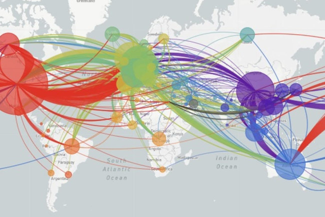
And it may be that a genomic map that allow the classification of viral strains of genomic variability demand their own map: for as we learn that genomic mutation and variation closely determines and affects etiology, communication of the viral strains offers yet a clearer illustration that globalization articulates any point in terrestrial space to a global network, placing it in increased proximity to arbitrary point not visible in a simple map, but trigger its own world-wide network of markedly different infectiousness or virulence.

From December 4 2019, indeed, we could track emergent variants of the virus best outside of a spatial scale, as much as it reminded us that the very mobility of individuals across space increased the speed and stakes of viral contagion, and the difficulty to contain viral spread, in the interconnected world where viral variation recalled a flight map, set of trade routes, or a map of the flow of financial traffic or even of arms. Mutations were understood to travel worldwide, with a globalism that a spatial map might be the background, but was indeed far removed, as we moved beyond questions of contact tracing to define different sizes of genomic mutation and modifications that we could trace by the scale of mutations, not only the actual places where the virus had arrived.

Was place and space in fact less important in communicating the nature of COVID-19’s increasing virulence?
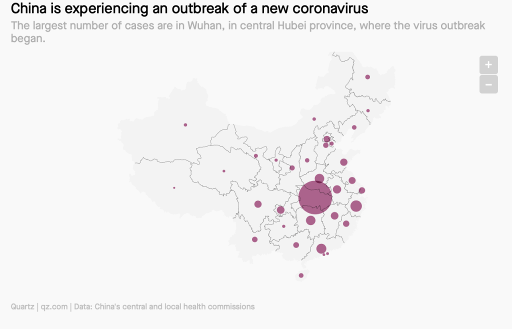
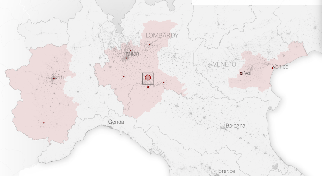
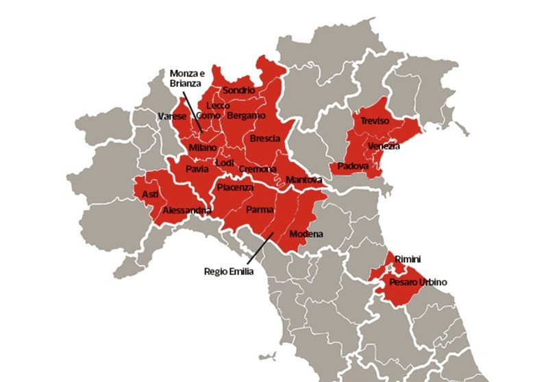
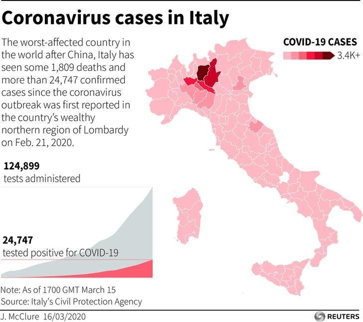
The maps of genomic variation traced not only the globalization of the virus, but its shifting character, and perhaps etiology across some thirty variants by late April, that show both the global spread of the virus, and the distinct domination of select strains at certain locations, in way that researchers later theorized the ability to “track” mutations with increasing precision. If researchers in Bologna defined six different variants of coronavirus from almost 50,000 genomes that had been mapped globally in laboratory settings to map variants of the virus whose signatures showed little more variability than strains of the flu in June, variations of signatures seemed a manner to map the speed of coronavirus that had traveled globally from by February 202 to the lungs of the late Franco Orlandi, an eighty-three year old retired truck driver from Nembro, Italy, whose family could not place China on a map when, following diagnostic protocol, attendant physicians in Bergamo asked if Orlandi had, by chance, happen to have traveled to China recently.
Despite lack of serious mutation, thankfully, the data science of genomic sequencing of the COVID-19 cases triggered by genomic mutations of SARS-CoV-2 genome of just under 30,000 nucleotides, has experienced over time over 353,000 mutation events, creating a difficult standard for transmission into equivalent hot spots: some hot spots of some mutations are far more “hot” than others, if we have tried to plot infections and mortality onto race, sex, and age, it most strikingly correlates to co-morbidities, if all co-morbidities are themselves also indictors of mortality risk. While the mutations have suggested transmission networks, have the presence of different levels of mutations also constantly altered the landscape of viral transmission?

It makes sense that the viral variant was tracked in Great Britain, the vanguard of genomic sequencing of the novel coronavirus as a result not only of laboratory practices but the embedded nature of research in the National Health Services and the monitoring of public health and health care. Enabled by a robust program of testing, of the some 150,000 coronavirus genomes sequenced globally, England boasts half of all genomic data. Rather than being the site of mutations, Britain was as a result the site where the first viral variant was recognized and documented, allowing Eric Volz and Neil Ferguson of Imperial College London to examined nearly 2,000 genomes of the variant they judged to be roughly 50% more transmissible than other coronavirus variants, magnifying the danger of contagious spread in ways feared to unroll on our dashboards in the coming months. As teams at the London School of Hygiene and Tropical Medicine studied the variant in late 2020 in southeast England, they found it to be 56% more transmissible than other variants, and raised fears of further mutations in ways that rendered any map we had even more unstable.
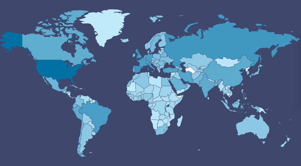
The virus SARS-CoV-2 can be expected to mutate regularly and often. While England boasts about half of all global genomic data on the virus, of the 17 million cases of SARS-CoV-2 infections in the United States, only 51,000 cases of the virus were sequenced–and the failure to prioritize viral sequencing in America has exposed the nation to vulnerabilities. And although California has sequenced 5-10,000 genomes a day of the novel coronavirus samples by December, and Houston’s Methodist Hospital have mapped 15,000 sequences as it watches for new viral variants; an American Task Force on viral variants will be rolled out early in 2021, as the discovery of viral mutations haves spread across five states in the western, eastern, and northwestern United States. While it is not clear that the viral variant or mutations would be less susceptible to polyclonal vaccines, most believe variants would emerge that would evade vaccine-induced immunity.
Continue reading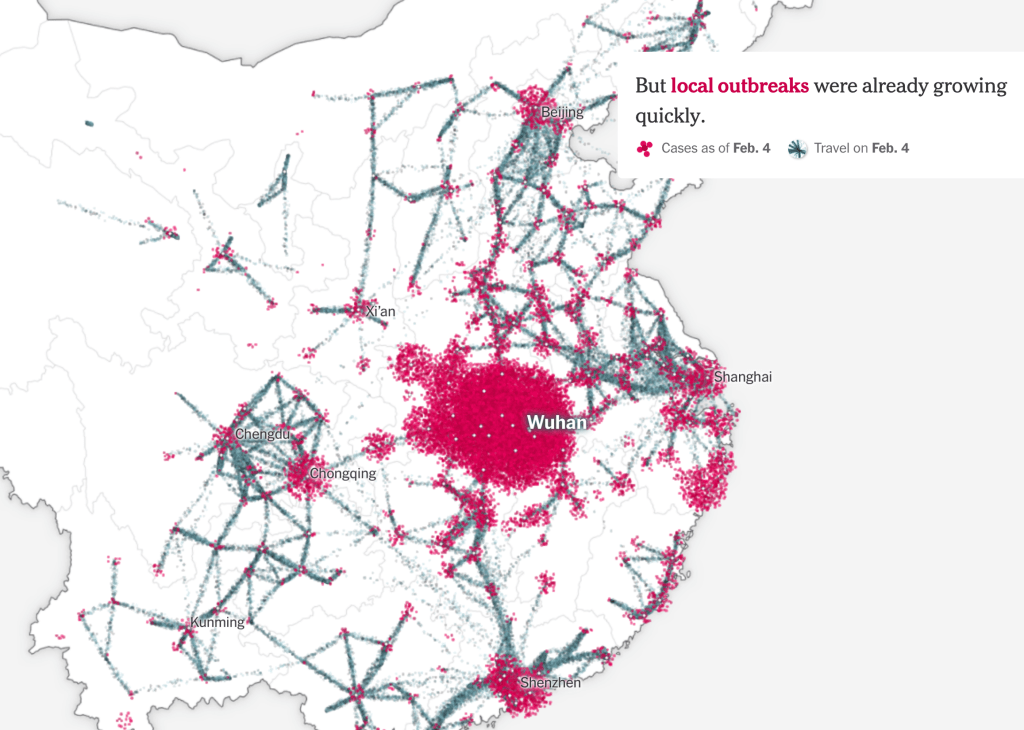


