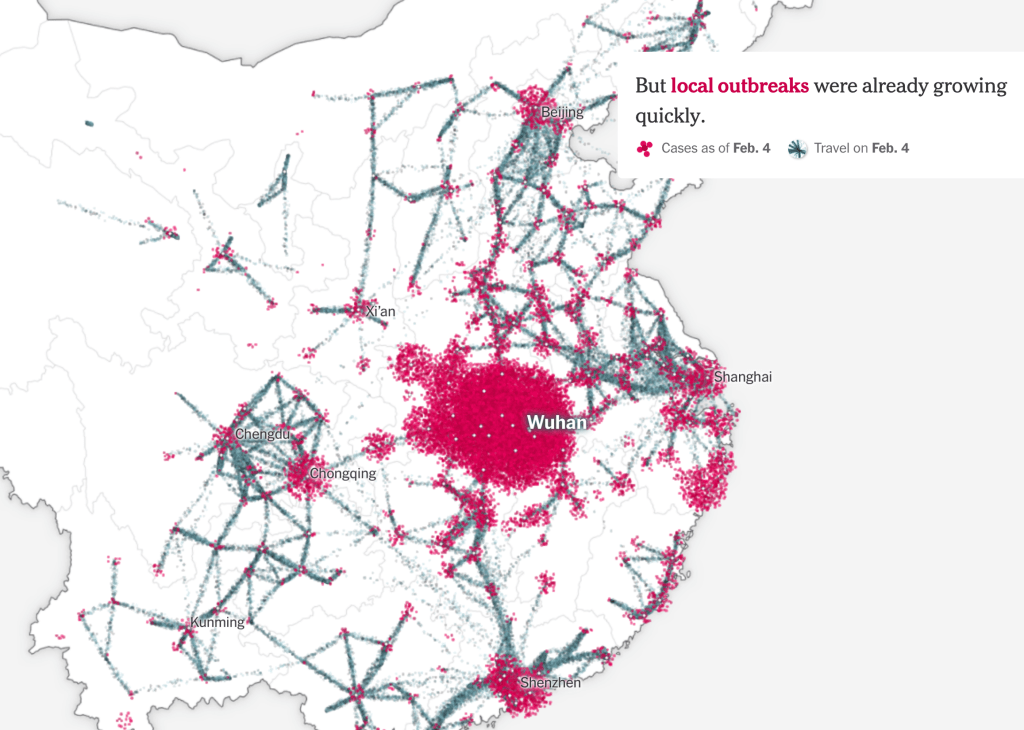
A pandemic is by its nature both local and global by definition–and begins from a local outbreak. But if the only way to gain orientation to a pandemic is by accurate local counts, the problem of balancing–or toggling between–the local and global has become staggeringly pronounced in the case of COVID-19, as if the point-based cartography that we use to track the disease has the better of us, and upper hand, with the absence of accurate local counts. The lack of clear data that came from Wuhan in the days that followed the outbreak of the virus revealed worrisome problems of transparency. The difficulties Chinese government authorities faced in getting bearings on the zoonotic virus, lab-born or not, raised problems of even trying to map its rise, and we tired to look at maps as tea-leaves of future responses, as well as retrospective diagnoses of the point of origin of disease spread–as if maps could explicate our uncertain conditions, and increased vulnerability.
Data visualizations since seem to proliferate in response to uncertainty and an absence of consensus, as we turned to maps as a hope for truth in an age of increased uncertainty: as local officials were loathe to shoulder responsibility, the tally of infected in Hubei Province jumped, astoundingly, forcing the government to recognize the ease of its transmission among humans, was far more virulent than believed. But at this point, looking back in the mirror provides little sense of orientation to the multiplication of dispersed local outbreaks of coronavirus that we are increasingly challenged to map in relation to ourselves. Were the first maps of the New World similar responses to the deep sense of religious and eschatological uncertainty of the early modern period? Whether or not that was the case, we all felt especially early modern now, plague victims of a sort that led us to look back on the mapping and mapping of responses to the spread of pestilence, and hoping that past experience–or our current increased ability of empathy–gave us more meaningful access to the epidemics and pandemics of the past.
The sudden uptick of cases reveals a reticence in tallying the infected out of fears of reprisals for apparent incompetence, an institutional blame-shifting triggering mechanisms of concealment that has led American meat-packing plants to hide numbers of infected workers, and numbers of tests for infection to be far lower than official records suggest: the absence of ability to control the spread of SARS-CoV-2 led us to proliferate maps in hopes to grasp its rapid doubling, uncomfortable at the world they began to show, apprehensive at how to come to terms with the rapidity of local outbreaks of confirmed cases with sufficient granularity, and enough continuities, hoping to track contagion as hopes of containment were beginning to fade in the new aggregates that were increasingly evident.
The warning of the virus’ spread was raised by Li Wenliang on December 30 from Wuhan, inter-agency shifting of blame and responsibility in Wuhan– a reflexive institutional blame-shifting by “throwing woks”–abruptly ceased with summons of Shanghai Mayor Ying Yong, he who lured Elon Musk to Shanghai, to restore order: as a new hospital was built, tallies of new cases of coronavirus in Hubei astronomically grew by nine from 1,638 to 14,840, shocking the world–a figure was in keeping with the nearly 1,400 people dead in the country, but suggesting a viral load of unprecedented proportions. Americans apprehensively watched the disease afflicting passengers of cruise liners as if it would arrive ashore, its virulence was in fact already of pandemic proportions: yet American disinformation here took over, as we were told to stick our heads in the sand, ostrich-like, as fears were overblown, and tried to keep calm. And then, the tables were turned, as the United States President described, or suggested, a national policy of intentional undercounts, and limited testing, lest the counts discovered tank his popularity–the stock market value of Trump, International, or, rather, Trump-in-Office, Trump-as-Chief-Executive, whose new season might be canceled due to low ratings. And although the virus began in China, how the United States increasingly came to be the outlier in the numbers of infection confirmed weekly suggested a national story of mismanagement, as the narrative we told ourselves of American exceptionalism before illness seemed to have boomeranged, with the three-day averages of confirmed infections skyrocketing, and setting us apart from the very nations we compare ourselves to, but whose health-care policy we increasingly realize we are distinct from.
Americans were soothed by deceptive common-sense talk. But the results of a lack of investment in public health are all too evident, if our maps are . Robert Redfield, a virologist who served as the public spokesperson of reassurance who had long sustained false theories about retroviruses causing HIV and AIDS, argued that even if the fourteen confirmed cases of the novel coronavirus were monitored and traced, “the virus more exploded . . beyond public health capacity,” he seemed to forget he had not developed that capacity. Virology is of course Dr. Redfield’s area of expertise, but he won his political post in no small part by being practiced in massaging truth statements for political ends. During AIDS outbreak, the last major plague in the United States, he had advocated unproven drugs billed as HIV vaccines and encouraged quarantine, abstinence, and stripping the medical licenses of HIV-infected medical workers, more than accelerating cures; Redfield took time to blame the Obama administration for implementing clinical tests, to please his patron. Bt he obscured the level of infections that in truth were not known, blinding the nation to a cartography of COVID by not advancing adequate levels of testing, that returned us to the simple equation of the dog days of AIDS, only able to make us yell, yet again, this time with Larry Kramer, stalwart resistor of the silencing of AIDS by the failure to use on-trial medicine–
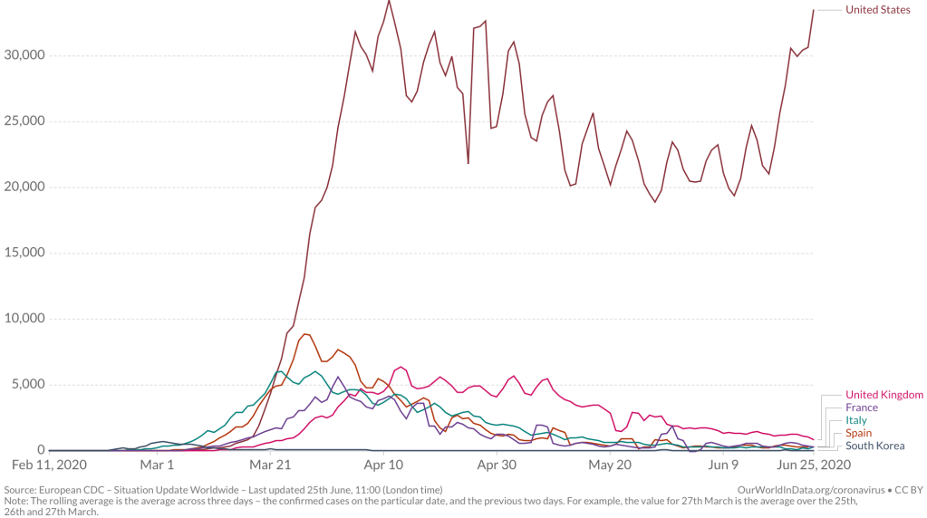
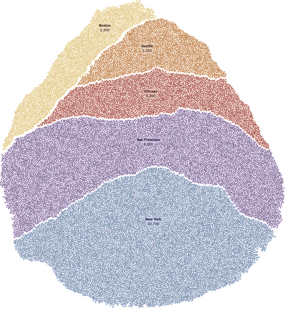
–at the utter deception with which we met the pandemic. Dr. Redfield must have met his commission to radiate calm by assuring Americans in late February. As he assured us only fourteen cases had been diagnosed in the United States, the number meant little, as any virologist should kmow; while hindsight is a benefit that obscures us from the need to life life forwards, we suspect urban hotspots were already laden with infected individuals by March 1, a silent ticking bomb of urban outbreaks already infecting 28,000 as it spread broadly its “hotspots”–New York, Chicago, San Francisco, Seattle, Boston and Chicago–all of massively different density, without tests being able to affirm the scale of its spread.
There was no map. And then, all of a sudden, the globalization of coronavirus hit home; any place in the world could be related to any other place, as rates of infection bloomed globally in geographically disjointed hotspots, spatially removed from one another, even as a standard for uniform testing lacked. And there was no sense of an art of dying, as the amazingly rapid contraction and worsening of illnesses left many without a script, and many more silent before a dizzying multiplication of statistics of mortality in the face of COVID-19, several weeks later.
Every other map of COVID-19’s spread seems an attempt to persuade the viewer of its accuracy and totality, in retrospect, even as we have no clear sense of the total figures of infection-or even of the paths infection takes. We are mystified by the geography and spatial dynamics of the virus’ travel, but realize the severe communicability of a virus whose load is stored in the naso-laryngeal passages, and can be communicated by airborne drops. Is distancing the best way we can constrain the geographic spread of infection? Can statistics demonstrate the success of curtailing its spread?
It was a hidden agenda in the maps of news agencies and to register the accurate levels of infection, promising the sorts of transparency that had been clouded in much of January. And while we watch the progress of the pandemic on screens, there is a sense of truth-telling, as a result, of revealing the scope of the virus’ actual spread that compensates for the lack of clarity we once had. But it is also increasingly difficult to orient ourselves to the GPS-enabled scales of its spread, for we still are looking at pretty limited and almost superficial data, in the sense we have trouble plotting it in a narrative context, or find a reaction more than shock. The virus is easy in ways to personify as a threat–it wants us outside; it comes from afar; it pervades public spaces and hospital grounds; it demands vigilant hand-washing and sanitizing–but the very numbest are elusive. While we try to track reported cases, hoping that these limited datasets will provide orientation, we have been lumping numbers of tests that might be apples and oranges, and have not found a consistent manner of testing. Deaths are difficult to attribute, for some, since there are different sites where the virus might settle in our bodies.
Even while not really following the pathways of its transmission, and the microscopic scale of the progress of the pathogen in bodies. And if we rely on or expect data visualizations will present information in readily graspable terms, we rarely come to question the logics that underly them, and the logics are limited given the poor levels of global testing for COVID-19. It is frustrating that our GPS maps, which we seem able to map the world, can map numbers of surrogates for viral spread, but we have yet to find a way to read the numbers in a clear narrative, but are floored by the apparently miasmatic spread of such a highly contagious disease that makes us feel, as historian of science Lorraine Daston put it, that we are in “ground zero of empiricism,” as if we are now all in the seventeenth century, not only in being vulnerable to a disease far less dangerous or deadly than Yersina pestis, but without explanatory and diagnostic tools.
This was, to be sure, a past plague come to life, requiring new garb of masks, face-shields, and protective gear for health workers–
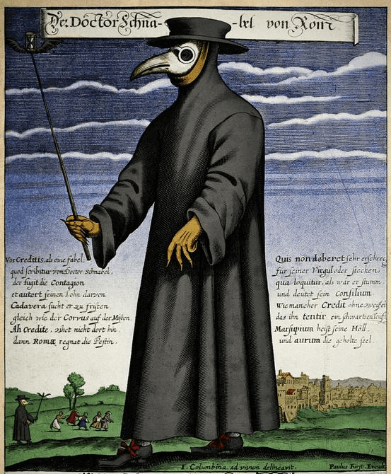
–as the cloaks, leather gloves, staffs and masks that made up early modern protective gear returned to fashion, as if in a time warp, in new form.
We find a leveling between folk remedies and modern medicine, as we live collectively in what she calls a “ground-zero moment of empiricism”–if one in which we are deluged by data, but short in knowing what is data, as we are lacking in explanatory models. This is a bit unfair, as we still can profit from autopsies, and have been able to contain spread by hand-washing–but the images of a single magic bullet, or antiviral cure, are far, far away in time. But there is no longer any familiarity with an art of dying, although we found we encountered death with an unforeseen and unpleasant rapidity: we moved from hopes for awaiting immunity or antivirals to a basic need for some consolation of our mortality. There was no possibility of transcendence in a crisis of mortality of dimensions and scope that seem outside the modern era.
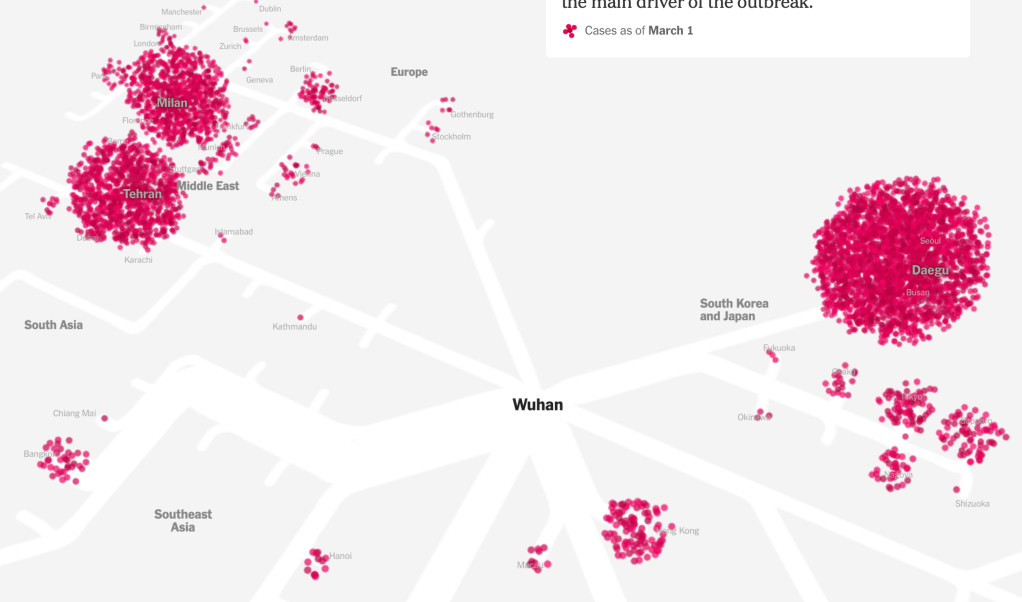
And it is ironic that distancing is the best mode to prevent infection–and many deaths may have been enabled by quicker decisions to adopt practices of distancing that could manage viral spread, Trump seemed not to notice that the very globalization he had resisted, and swung against with all his force to win votes, had facilitated the spread of a viral agent whose arrival was denied even as SARS-CoV-2 had already begun to flood the United States, in ways we only mapped in retrospect, as a global village that by March 1 had already grown satellites of viral loads in South Korea, the Middle East, Iran (Teheran), Europe (Milan; Gotheborg), South East Asia, and Hong Kong, as we anticipated its arrival with no health policy in place and no strategy for containing what was already on our shores. The global crossroads defied any choropleth, but we had only mapped the virus for some time in choropleths, as if believing by doing so we could not only map it by national boundaries to keep the virus at bay.
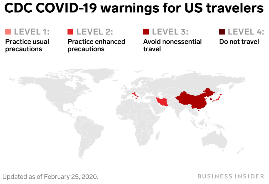
But if we lacked a model of infection and communication of COVID-19, we lacked a sense of the geography by which to understand its spread–and to map it–and also, deeply problematically, an inter-agency coordination to assess and respond to the virus’ spread as we sought to contain it: and in the United States, the absence of any coordinating public health agency has left the country in something like free-fall, a cluelessness emblematic by a map cautioning American travelers to take enhanced protections while traveling in Italy or Japan, two major destinations of travel, and avoid all nonessential travel to China, but refrained from ceasing travel plans.
1. The most compelling language of the novel coronavirus is “false positives” and “false negatives,” that seem to betray the unsure nature of standards; the most haunting is the multiple sites COVID-19 can appear in the sites of the body we use to map most disease. While we associate the virus with our respiratory tracts, the virus can do damage to multiple organ systems, as well as create blotchiness of “covid toes” due to burst peripheral blood vessels; it can damage multiple organ systems simultaneously, including the kidneys, heart, lungs, brain, and linger in our intestinal tract where it can flourish and proliferate; the virus can reduce the ability of our blood to form clots, or disable our ability to form clots. The ACE-2 receptor protein, a launching pad for viral infections, lies in our lungs and respiratory tract but in stomach, intestines, liver, kidneys, and brain. Increased sensitivities among those suffering from high blood pressure, cardiac disease, and diabetes reflect the nosological difficulties of classifying the virus as a cause of death or to grasp it as an illness, let alone to read data about the disease. If the virus lodges in the most delicate structures of the alveoli, which it causes to collapse as it infects their lining, it can take multiple pathways in the body, and as its pathway of infection may be multiple, medical response must be improvised with no playbook for clinical care.
All we know is that our medical staff desperately need protective gear. On top of that, it hardly helps that we are without a clear national policy, and find that the United States government has engaged in far less transparency that one could have ever expected.
We can only say its spread is accelerated dramatically by structures of globalization, and it stands to disrupt them. utterly Even as we map what seem total global knowledge of the disease, analogous to what we have come to expect from Global Positioning System, the multiple holes in our picture of the spread of the disease provide little sense of mastery over the pathways of communication, contraction, and infection we have come to expect from maps. These maps may even be especially disorienting in a world where expertise is often dismissed in the United States–not only by the U.S. President, but out of frustration at the inability to distance, diagnose, track or supervise the disease that is increasingly threatens to get the better hand. Have our visualizations been something of a losing battle, or a war of atrophy we will not win? Or do we even know what sorts of data to look at–indeed, what is information that can help us process a sense of what might be the geography of the contraction or the transmutability of the virus? Is the virus eluding our maps, as we try to make them? These sort of questions of making sense may be the process of science, but they trace, suddenly, a far steepder learning curve than we are used.
A dismissed biomedical researcher who ran efforts to develop a vaccine cautioned that we still lack that the failure a trusted, standard, and centralized plan for testing strategies must play a part in the coordinated plan “to take this nation through this response.” Dr. Bright, who was abruptly removed last month from his position as head of the Biomedical Advanced Research and Development Authority, bemoaned the limited statistics, alas, in large part as fear of providing too many tests–or fanning the flames of insecurity that testing might promote in the general public and in our financial markets, seem to have created the most dangerously deceptive scenario in which the United States seems to be committed to projecting confidence, even if it is the global epicenter of the pandemic.
Have we developed a language to orient ourselves to the scale of emergency in the spread of COVID-19? While we turn to images of natural disasters in describing the “epicenter” of the outbreak in Wuhan, this hardly conjures the species jump and under-the-radar communication of the virus that was not tracked for months before it emerged as a global threat. In tracking COVID-19 globally, or over a broad expanse of nations or states, we often ignored the pathways by which the novel coronavirus is spread in crowded spaces, where the single strand of RNA may hang in droplets that linger in the air, and are looking at the small scale maps to track a microscopic pathogen. But we are increasingly aware the spread of these strands, of the virus SARS-CoV-2, that infect populations along increasingly unequal fault lines that divide our cities, nations, health care systems, and crowding, or access to open space, are all poorly mapped in the choropleths into which we continue to smooth the datasets of infections and hospitalizations. While the problems are posed for national health services in each region, the devastation and danger of overloading public health systems and hospitals outweighs are local manifestations of a global crisis of the likes we have not confronted.
2. And the crowding of such numbers beyond the buffers that began with lead to a visual crowding by which we continue to be overwhelmed–and will have been overwhelmed for some time.
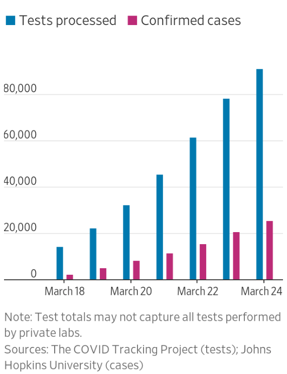
For although the global pandemic will clearly be with us for a long time, spatial narratives might be more likely to emerge in networks and in forms of vulnerability, in ways that might reveal a more pronounced set of narratives for how we can respond to a virus than the deep blues of even the limited and constrained datasets that we have, as we struggle against the blindness we have in containment and mitigation, and the frustration of the lack of anything like a vaccine. (This pandemic is almost a metastasis of the anti-vaxxers: confirmation that a vaccine cannot check a disease, it gives rise to concerns that vaccinations might have left us immunologically more vulnerable to its spread . . .and a sense that the hope of eradicating COVID-19 by the availability of a vaccination in four to five years will be widely resisted by anti-vaxxers and their acolytes, to whom the pandemic has given so much new steam. Yet as the virus interacts with the viral posting of anti-vaxxers resisting social distancing or collective policies of response, the stresses that exist in our society will only be amplified.) And if as late as February 24, only three laboratories in the United States did test for COVID-19–artificially lowering public numbers–even confirmed numbers through March and April were as a result tragically low. Could maps even help to track the disease without a testing apparatus in place?
The prestige of the data visualization has been a basis for reopening the nation. Yet if less than a tenth of the world’s population has yet to be exposed to the disease–and perhaps only 5% of the American population, in one estimate, if not lower–the virus is bound to be endemic to the global landscape for quite a considerable length of time. At the same time, one must wonder if the many fault lines that have created such peaks and valleys in the virus’ spread, if confirming its highly infectious nature, to be sure, are not removed from us in some degree by the smooth surfaces of the screens on which we watch and monitor, breath bated, with some terror, its spread, unsure of the accuracy or completeness of the data on which they are based but attentive to whatever they reveal. In many ways, these maps have created an even more precarious relation to the screen, and to the hopes that we find some sign of hope within their spread, or hope to grasp the ungraspable nature of COVID-19.
These datamaps suggest a purchase on a disease we don’t understand, and we don’t even have good numbers on contraction. Yet we are discussing “reopening” the United States, while we do not have anything approaching a vaccine, let alone the multiple vaccines that medical authorities desire before resuming social contact at pre-pandemic levels. How to process the data that we have, and how to view the maps not only by hovering, zooming in, or distancing the growing rates of infection, but tracking the virus in spaces, mapping levels of infection against adequacy of testing, mortalities against comorbidities, against with the chronic nature of the virus must be understood, as well as levels of hospitalization levels; and distinctions or mutations of the virus and against age ranges of afflicted–by, in other words, drilling beneath the datasets to make our maps’ smooth surfaces more legible, as horrifying as they are?
Can we use what we have to pose problems about the new nature of this contagion we don’t fully understand, but has been mapped in ways that seek to staunch fears of a decline in the stock market, as much as an emergency of public health, with up to one third of the population at risk of infection? The instinctive reaction of the Trump Health and Human Services to create public-private “community testing sites” for drive-thru or drive-up testing at Walgreens, CVS, Rite Aid, Kroger and other pharmacies seems reflexive for a government wanting to minimize federal overhead, but a far less exact means, and a far less intuitively sensible basis to attract potentially infected individuals to sites of public congregation. The hope of Verily–a subsidiary of Alphabet, whose Project Baseline boasts the slogan, “We’ve Mapped the World, Now Let’s Map Human Health,” in a bizarrely boosterish rhetoric, aggregates medical for medical screening in California–
–and select states–was the primary response that Trump had promised of a network of drive-up testing sites that has never materialized, even as it expanded to a hundred sites in thirty states. After Walmart opened two sites, and Walmart 40, the difficult accuracy of creating multiple testing sites was prohibitive, the testing sites that were rolled out with the assistance of private entrepreneurs that Jared Kushner enlisted, that filled the absence of any coherent public health response–perhaps, terrifyingly, in concert with his brother’s health care company, Oscar, which also partnered with CVS and some of the same pharmaceutical services, focussing on drive-thru sites more than sustained medical care, focussing largely on calming retailers who feared the arrival of infected patients on their parking lots, more than on the efficacy of testing, which they didn’t understand. If only 40% of promised test kits were made available, the absence of providing staffers or selling, as in Massachusetts, self-testing kits–and failing to provide many in large cities like New Orleans, as if to keep the final tally of infected artificially low. Even if the Center for Disease Controls had never done clinical tests on hydrochloroquine, whose dangers on humans were not studied, and despite some benefits of the antiviral on cell cultures, none appeared in mice, the drug was promoted widely on social media as late as April, although its mention on Twitter grew, even as the government delayed any roll-out of testing sites.
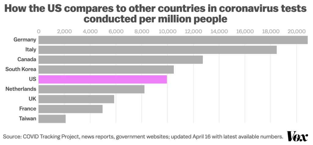
The demand to calm the nation, a position dangerously close to concealment, delayed action on a wave of infection that President Trump had long sought to deny, claim to be overblown, or call Fake News. The lack of a public testing initiative, and rejection of the tests of other nations, forced the United States to adopt a disorganized go-it-aloneist approach, akin to isolationism, not benefiting from the potential ties to Chinese doctors’ response, or the testing kits that would have been available that the World Health Organization (WHO) had suspected since January, and made test kits for poorer countries that might be replicated in the United States–which chose to make its own tests to ensure the highest quality. When WHO had urged countries “test, test, test” for the coronavirus to contain its spread, the global health organization provided 1.5 million tests to 120 countries who lacked the ability to test by March 16; the United States went without the diagnostic tests developed in Berlin by la Charité, implemented in Germany. If the United States had submitted a test to WHO as well, the German test the health organization adopted was never used or ordered–and by mid-March processed a sixth the specimens as in Italy, with found over six times as many cases, and an eleventh as in South Korea, which found double the cases.
By April, the picture had improved, but not much.
And based on later data of the virus that spread to other American cities, the virus that had infected so many in New York seems to have spread to other American metropoles by May, as we were still awaiting broad testing.
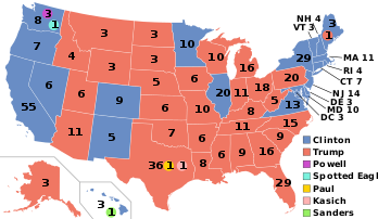
Read more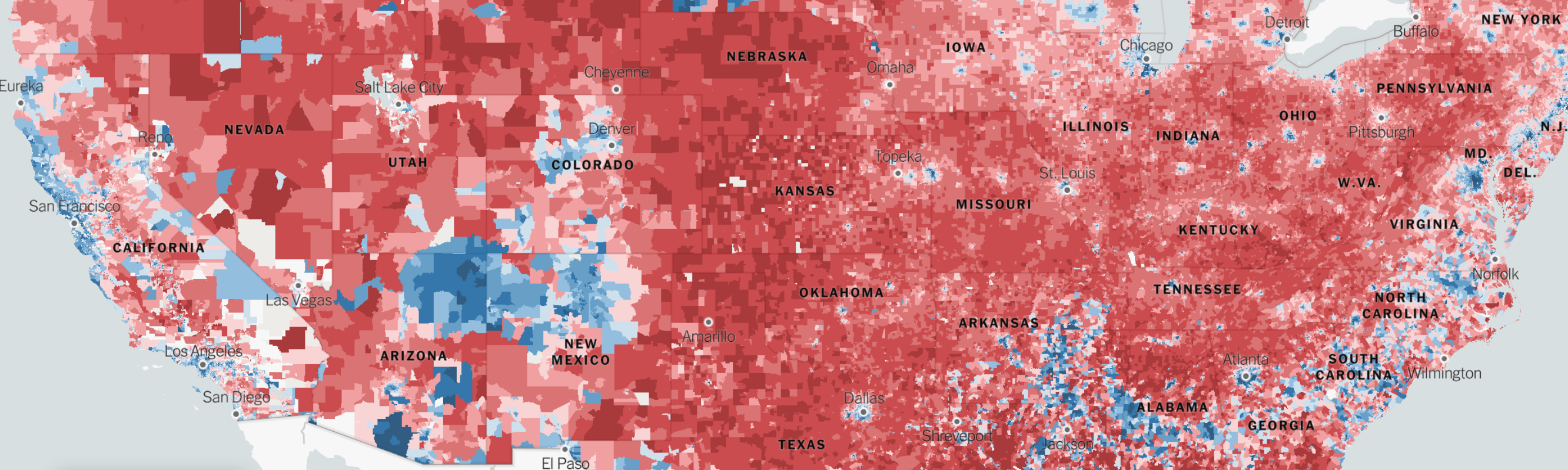
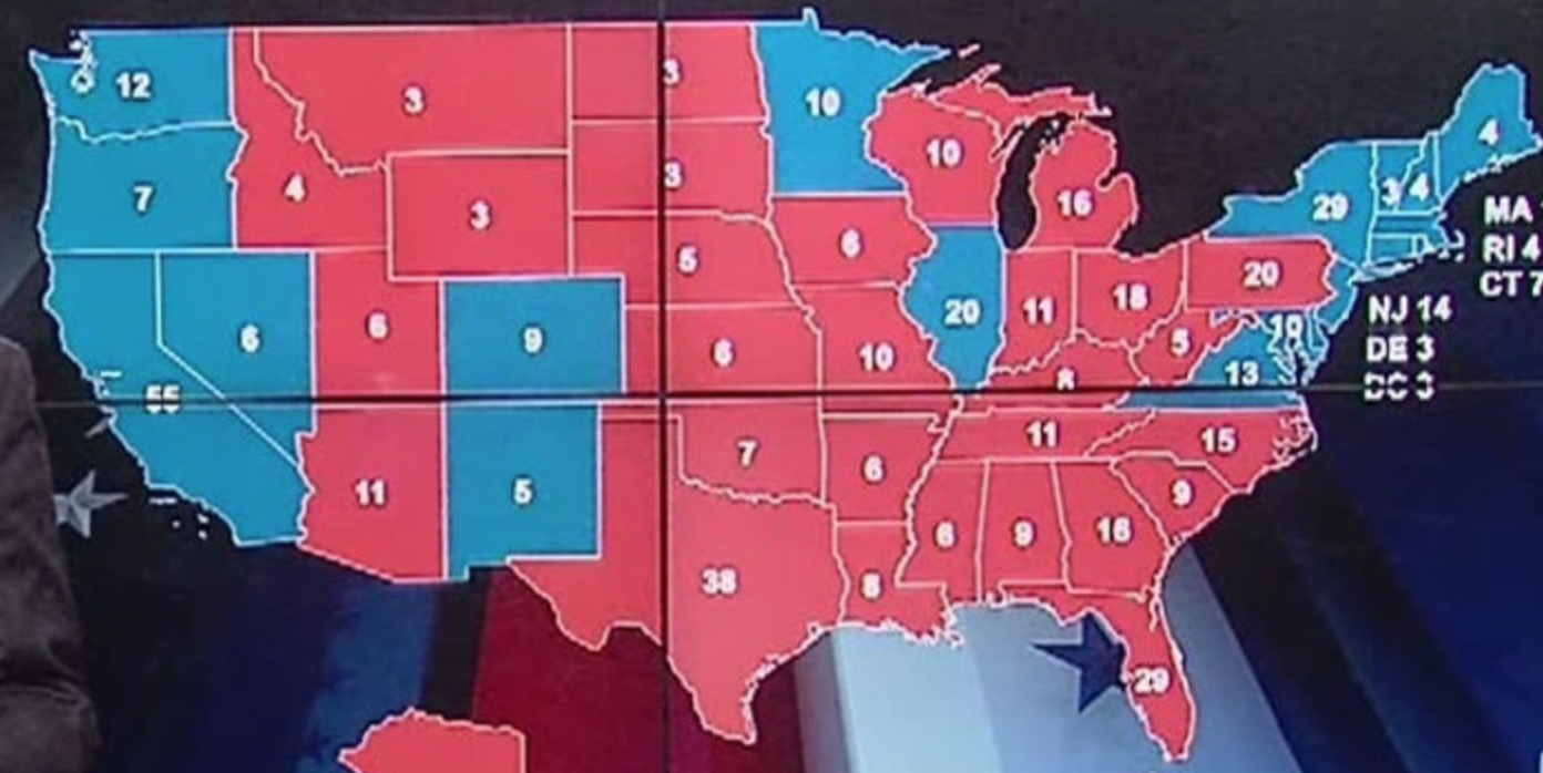
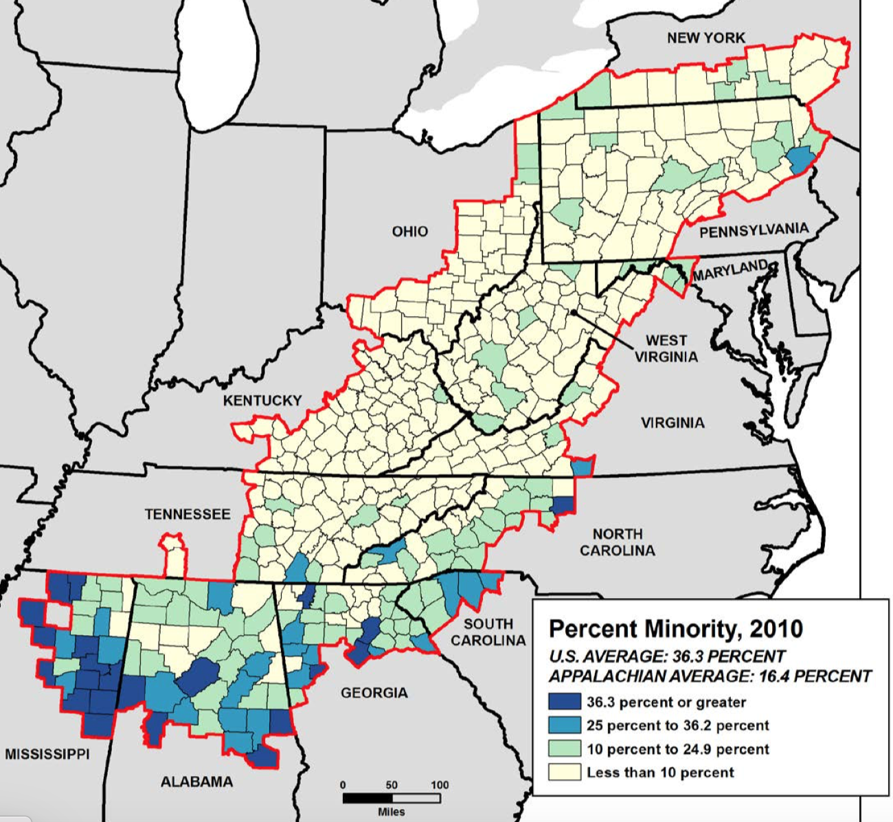
 Detail of above
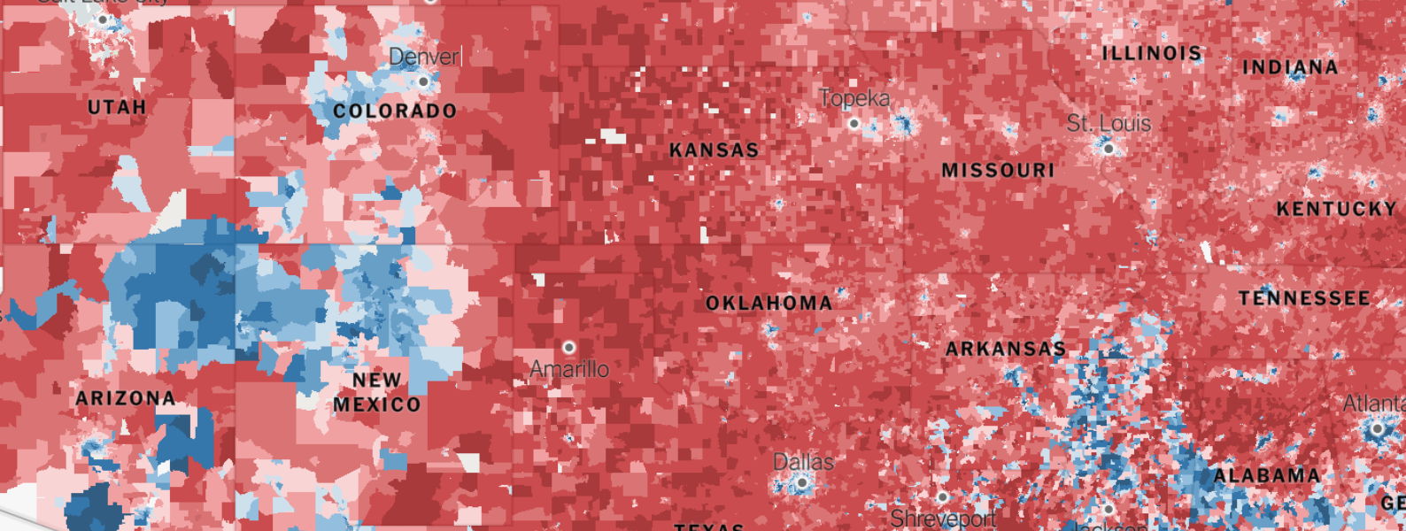
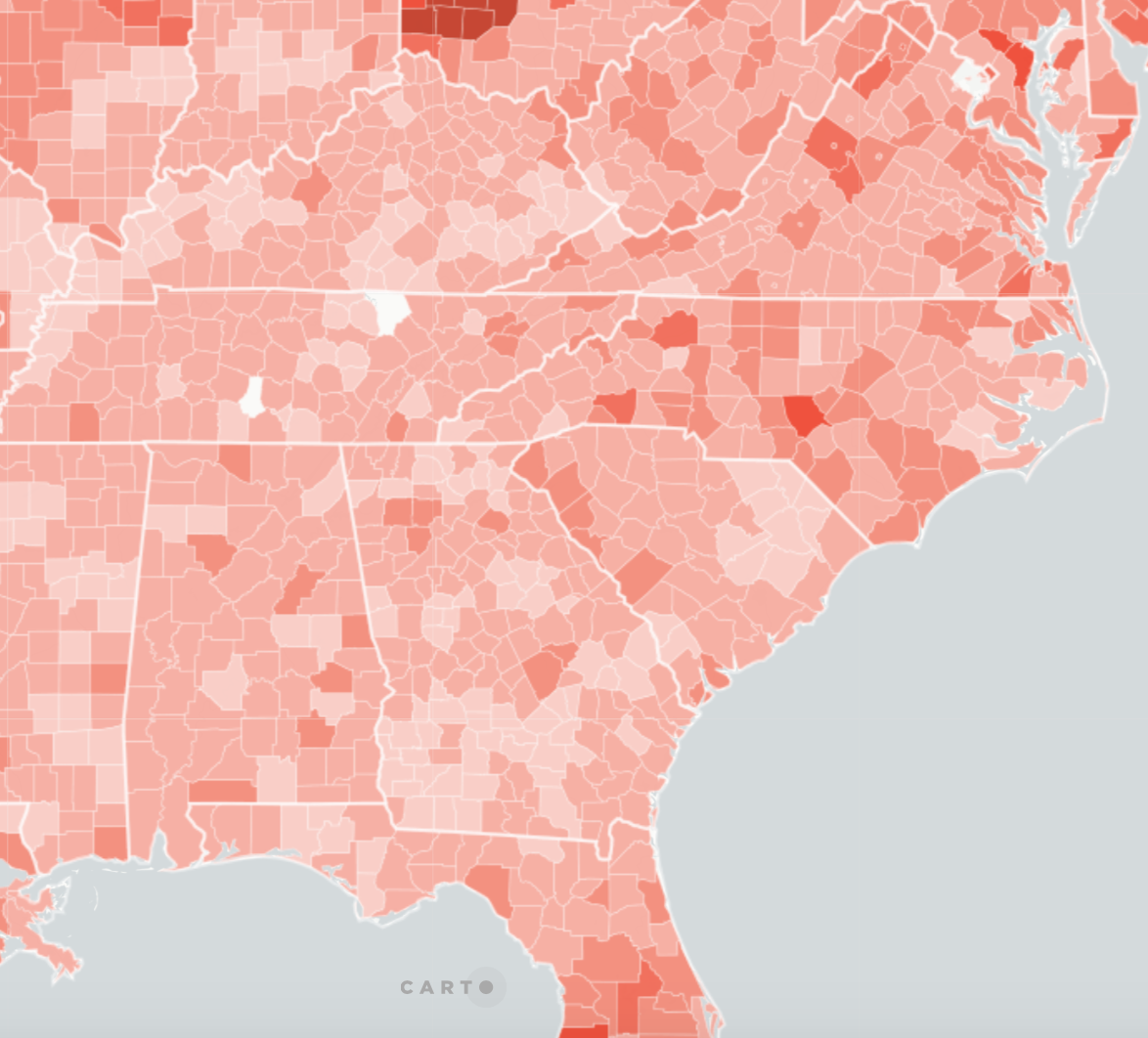
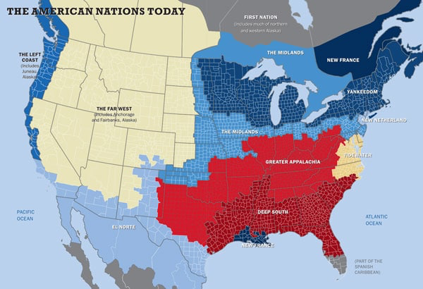
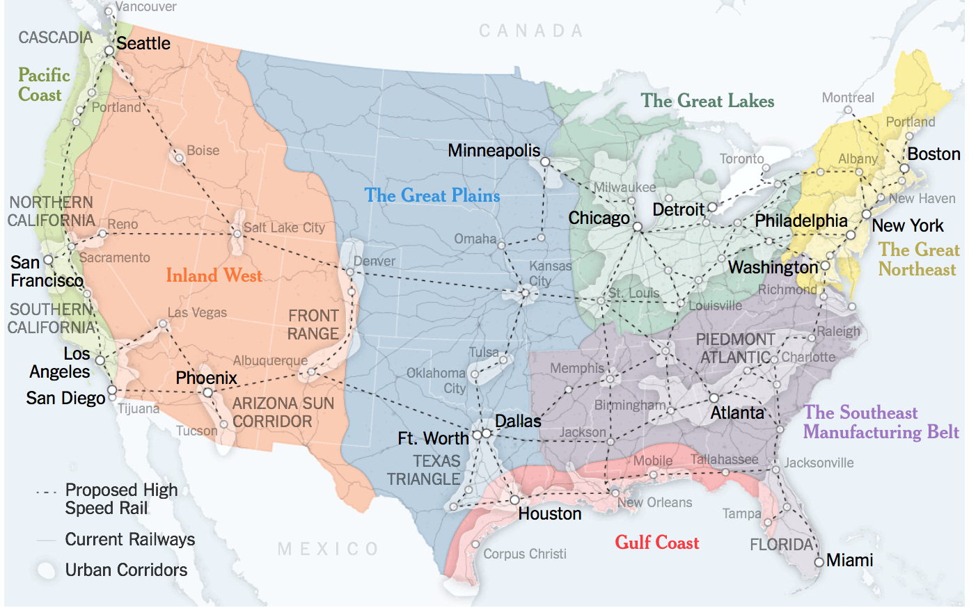
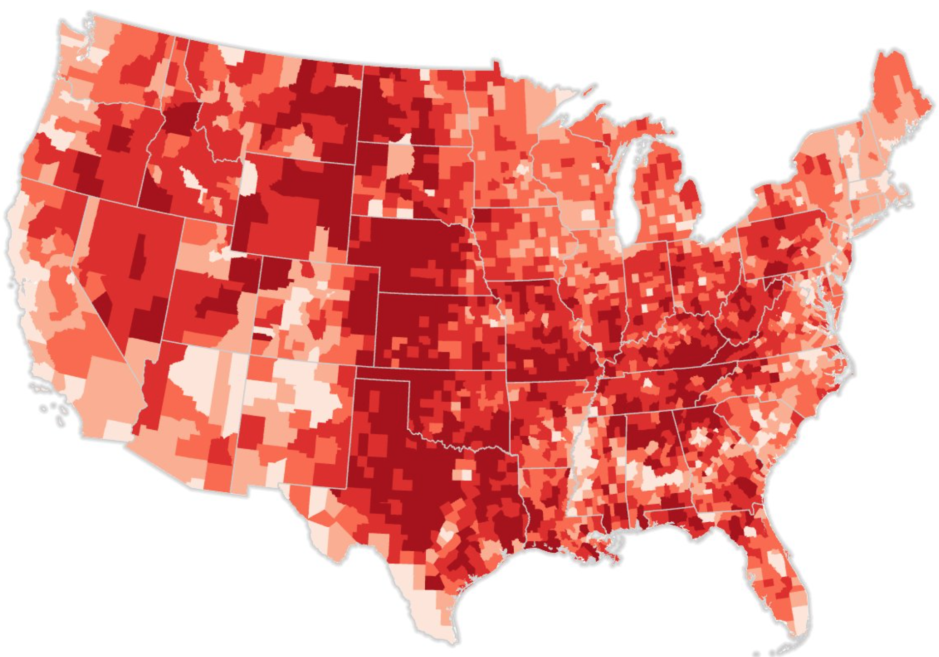
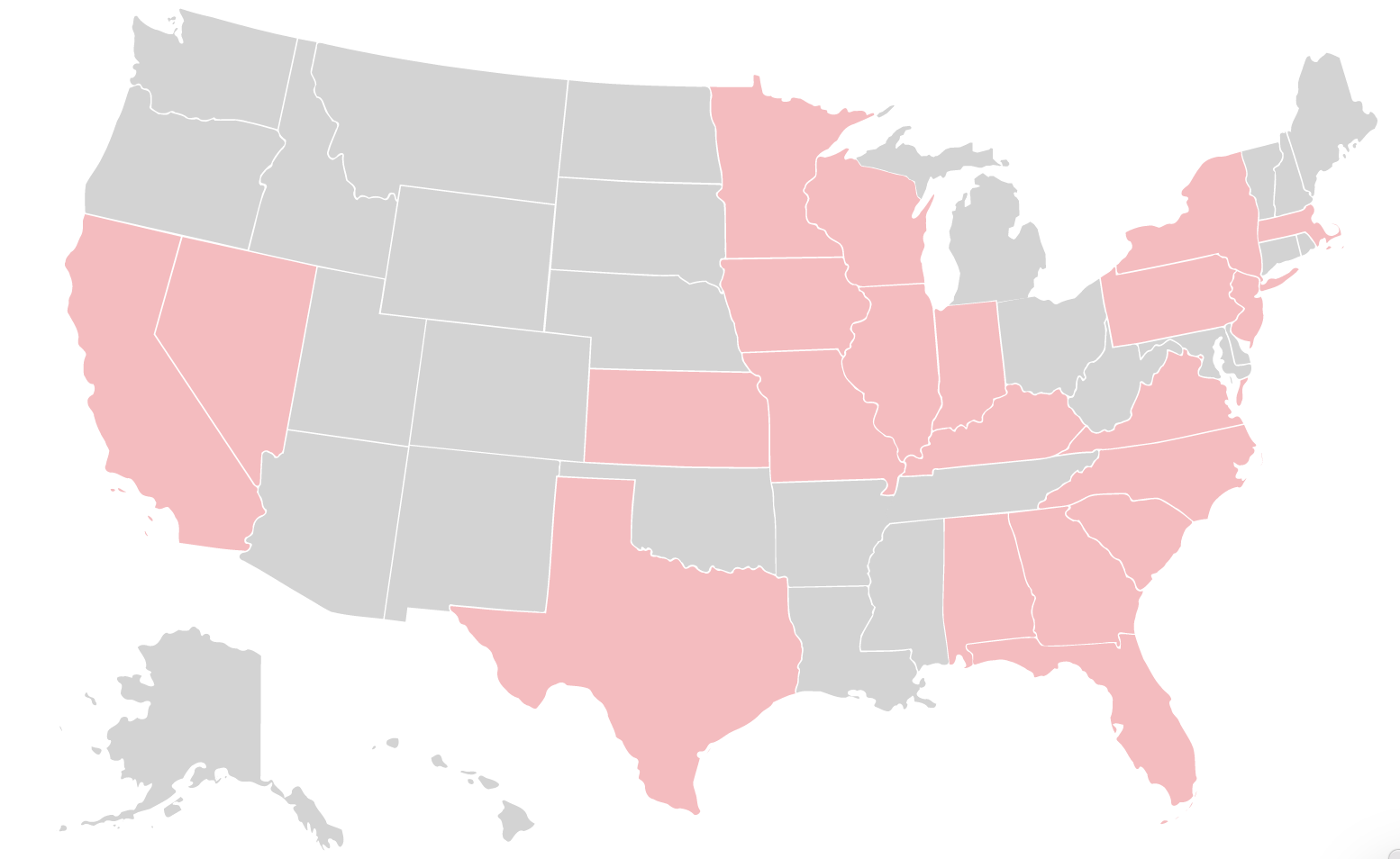
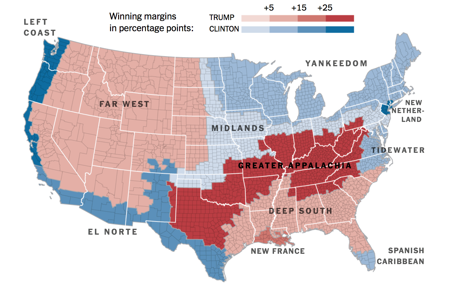
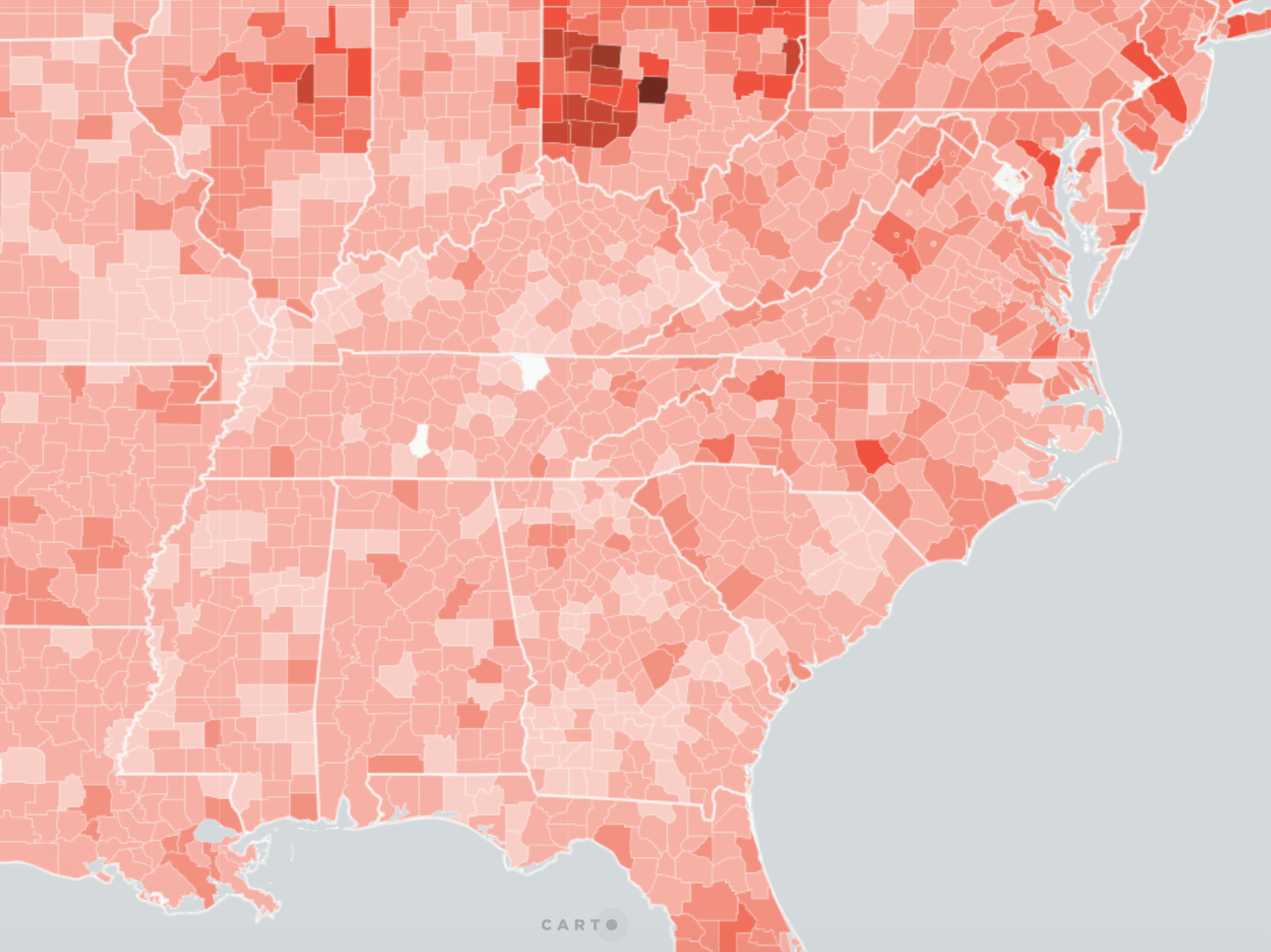
 Area roughly corresponding to Greater Appalachia/Mapbox/New York Times
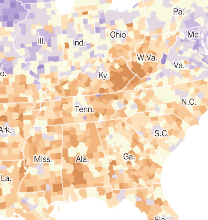
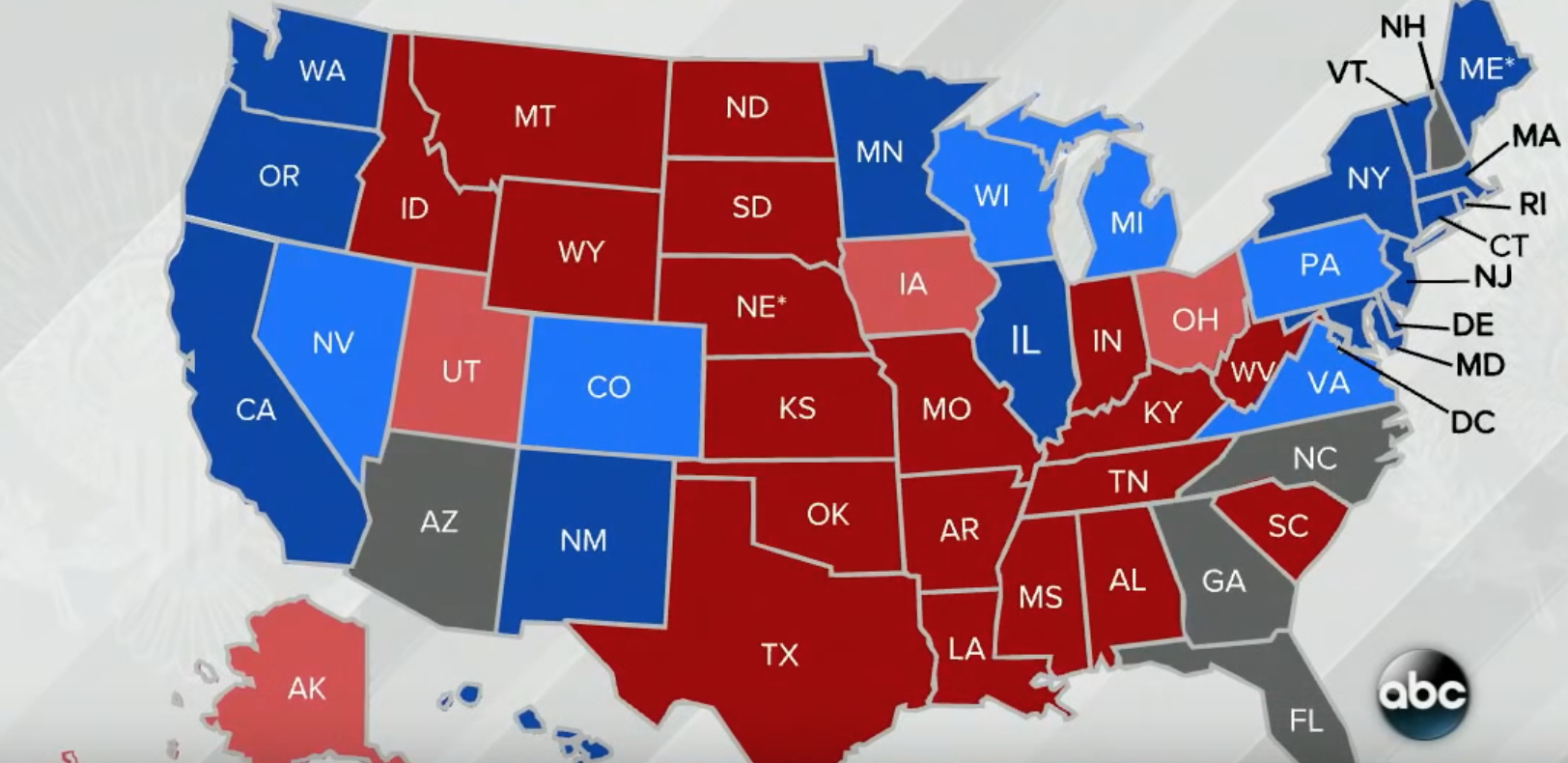
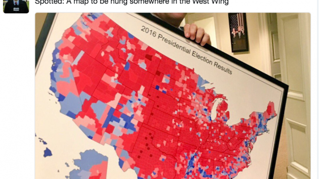
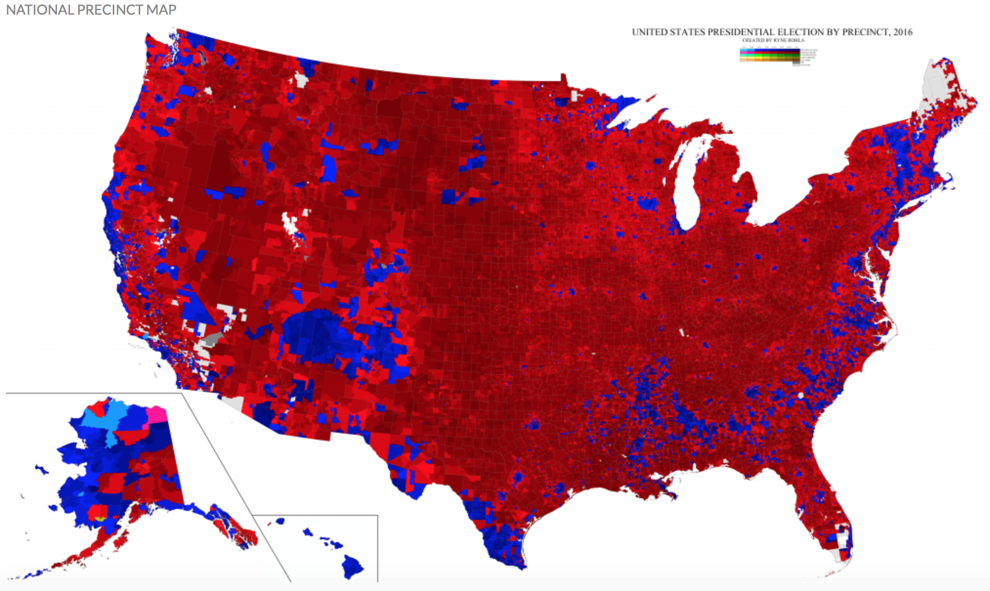
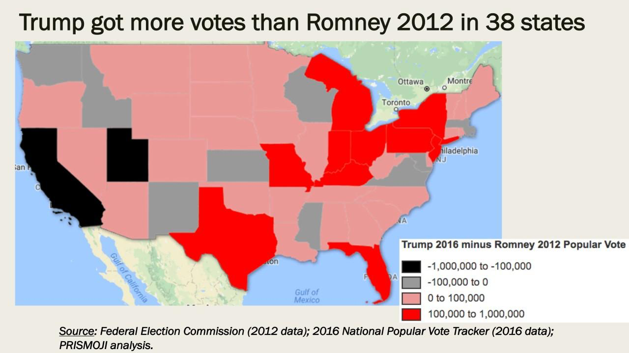
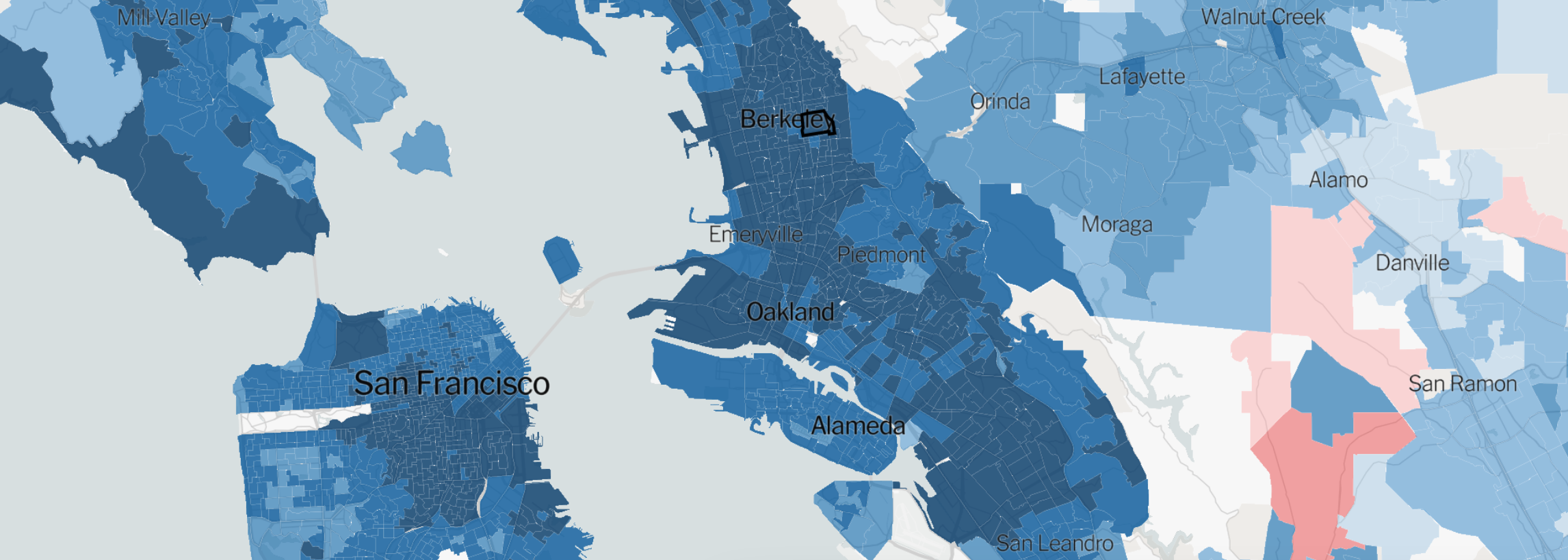
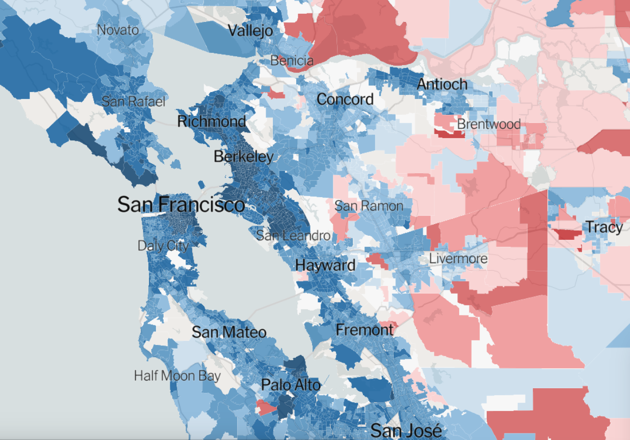
 Ryne Rhola/Mapbox (2018), 2016 US Presidential Election

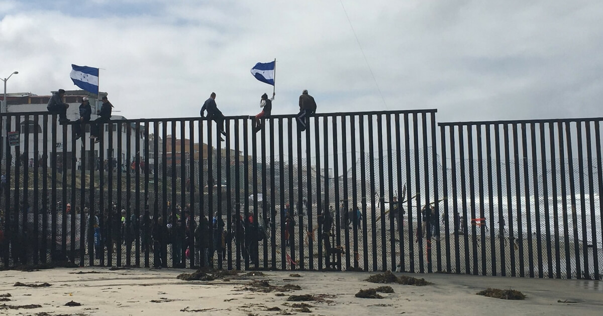
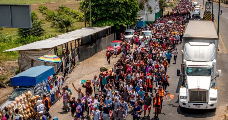
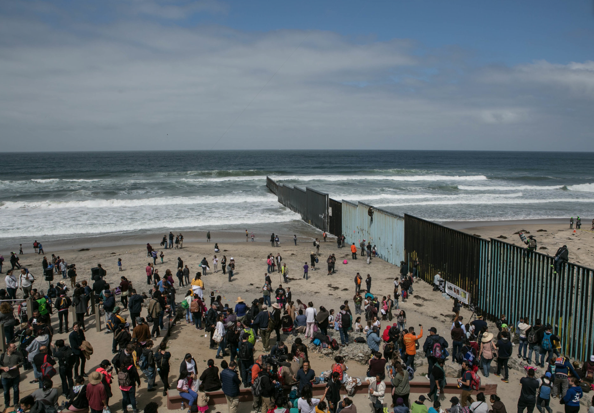
 Kendrick, “And We Open Our Arms to Them”
  ICE Arrests of undocumented immigrants, 2014